")
Pop-ups are a great tool for capturing attention and driving engagement on your website. Whether you want to grow your email list, promote a special offer, or guide visitors towards a specific action, a well-designed pop-up can make all the difference. With the release of Divi 5 Interactions, creating custom, dynamic pop-ups has never been easier.
In this post, we’ll walk you through creating a pop-up using Divi 5‘s Interactions feature. Let’s dive in!
- 1 What Are Divi 5 Interactions?
-
2
Step-By-Step Guide To Building A Pop-Up In Divi 5
- 2.1 1. Install A Layout Pack
- 2.2 2. Create A Section For The Pop-Up
- 2.3 3. Design The Pop-Up
- 2.4 4. Create A Close Button
- 2.5 5. Adjust The Section’s Settings
- 2.6 6. Create The Interaction To Display The Pop-Up
- 2.7 7. Test and Refine Your Pop-Up With Divi 5’s Customizable Responsive Breakpoints
- 2.8 8. Set Display Options
- 3 Advanced Pop-Up Customization Options
- 4 Best Practices For Effective Pop-Ups
- 5 Download For Free
- 6 Create Pop-Ups With Divi 5 Interactions
What Are Divi 5 Interactions?
Divi 5 Interactions is a new feature integrated into the Visual Builder, designed to make websites more dynamic and engaging. It allows you to create custom animations and responses based on user actions or page events, such as clicks, hovers, or scrolling. Unlike static designs, interactions enable you to create pop-ups, toggles, mouse movements, and scrolling effects, all with Divi’s familiar interface.
Subscribe To Our Youtube Channel
Key Components Of Divi Interactions
Every interaction in Divi 5 consists of three core components:
- Trigger: The event that initiates the interaction, such as a click, hover, or an element entering or exiting the viewport.
- Effect: The action that occurs when the trigger is activated, such as toggling visibility, applying a preset style, or changing an attribute.
- Target: The specific element affected by the interaction, which can be the same element, another section, row, column, or module on the page identified by its admin label.
These components work together, allowing you to create complex interactions with a simple, no-code interface.
Why You Should Use Interactions For Creating Pop-Ups
Divi 5 Interactions offers several advantages for building pop-ups:
- You Don’t Need Any Plugins: Unlike traditional pop-up builders, Divi 5 Interactions is built directly in the Visual Builder, eliminating the need for third-party plugins.
- Located Within The Visual Builder: You can build pop-ups using Divi’s familiar interface, modules, and styling options, making it easy for users of any skill level.
- Versatile Options And Effects: Combine pop-ups with other Interactions, like scroll-based animations or mouse-movement effects, to create unique, engaging experiences.
- Full Control: Customize triggers, effects, and targets to create pop-ups for your specific goals, all without writing code.
Step-By-Step Guide To Building A Pop-Up In Divi 5
Creating a pop-up in Divi 5 is straightforward, making matching your site’s existing design easy. In this section, we’ll demonstrate how easy it is to create a pop-up to match one of our pre-made layouts, show you how to style it, and set the Interactions to display the pop-up with a timed delay.
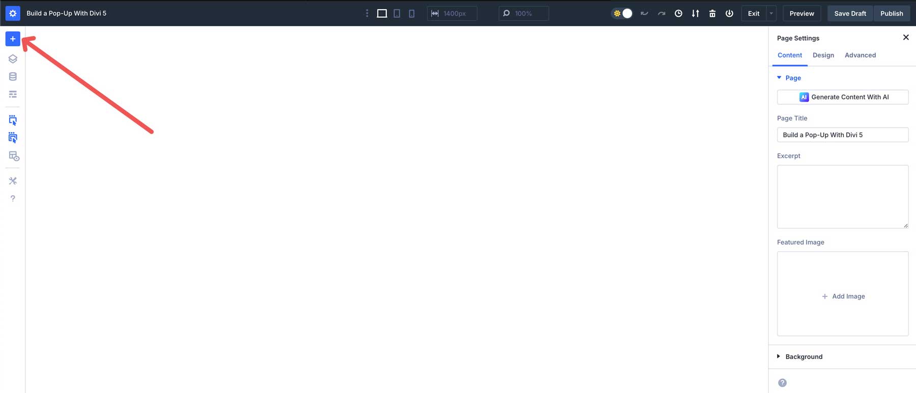
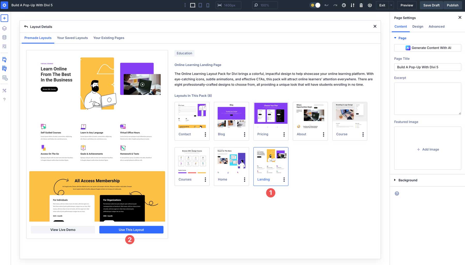
1. Install A Layout Pack
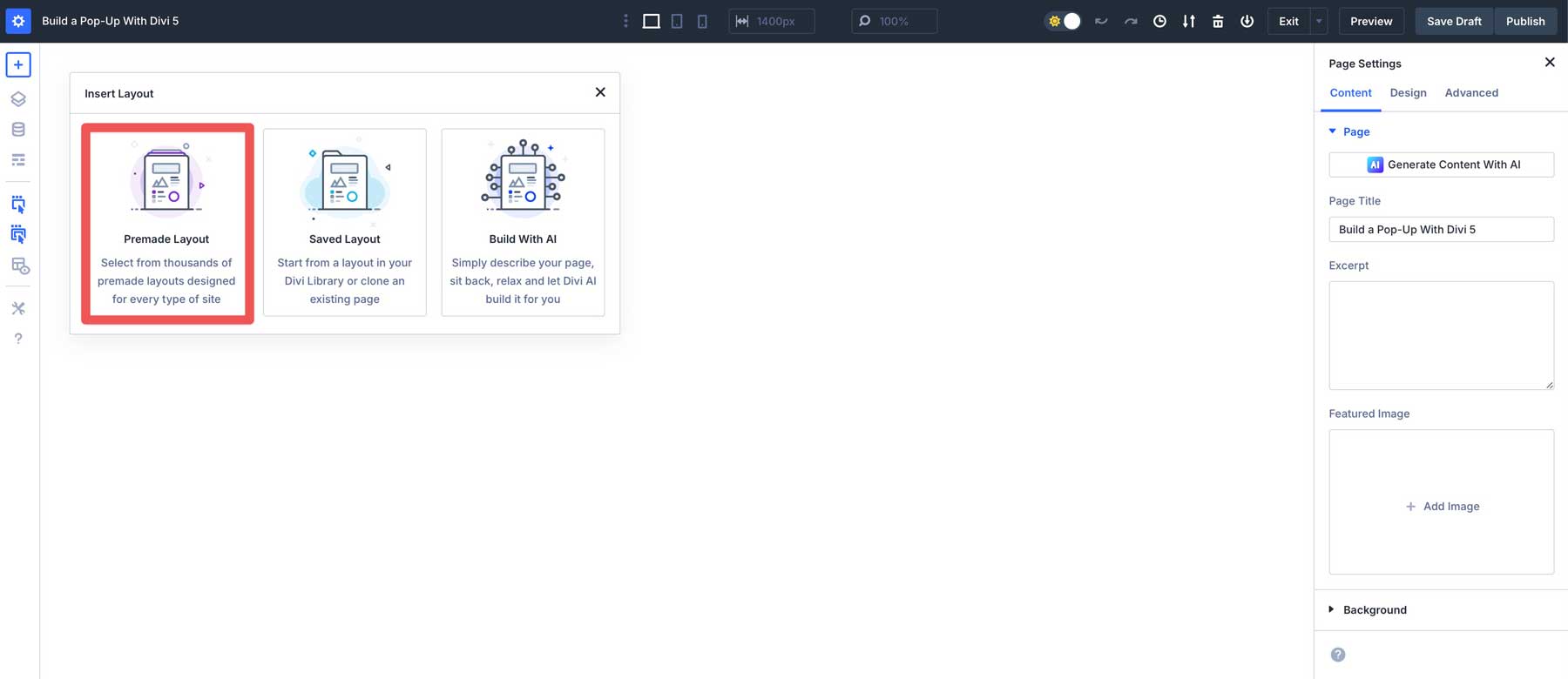
For this tutorial, we’ll simplify things by starting with one of our Layout Pack designs and then building a pop-up with the same styles. To do so, click the + icon at the top left corner of the Visual Builder.
When the dialog box appears, choose Premade Layout from the available options.
Click the Online Learning Layout Pack thumbnail to highlight the available pages.
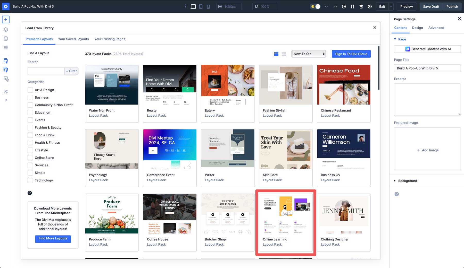
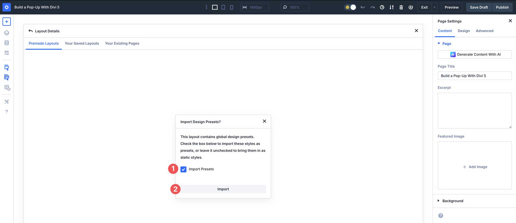
Select the landing page design and click Use This Layout to load it into the Visual Builder.
The last step in importing the Layout Pack is to choose whether to import presets. After making a choice, click the import button.
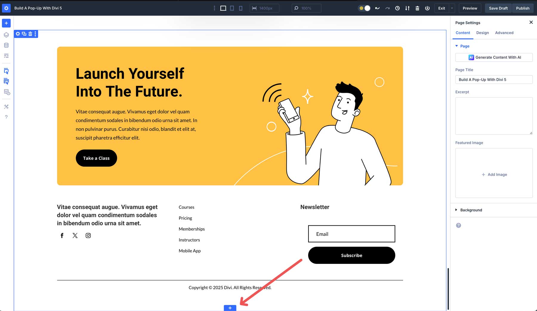
2. Create A Section For The Pop-Up
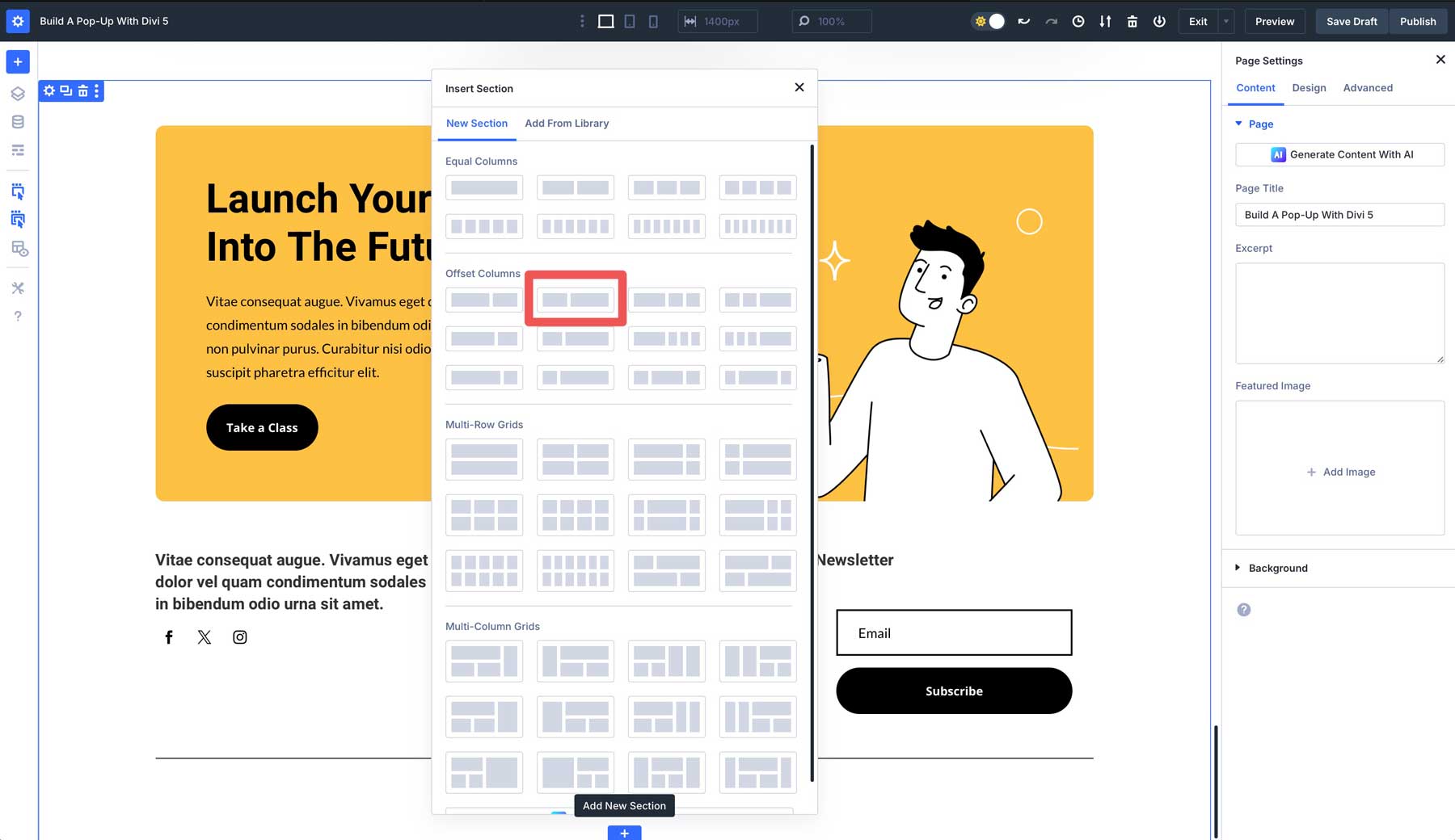
Now that the Layout Pack is imported, we must create a new section for our pop-up at the bottom of the page. Scroll to the end of the page and add a new section.
Click on the icon to insert a new row. Choose the second option under Offset Columns.
3. Design The Pop-Up
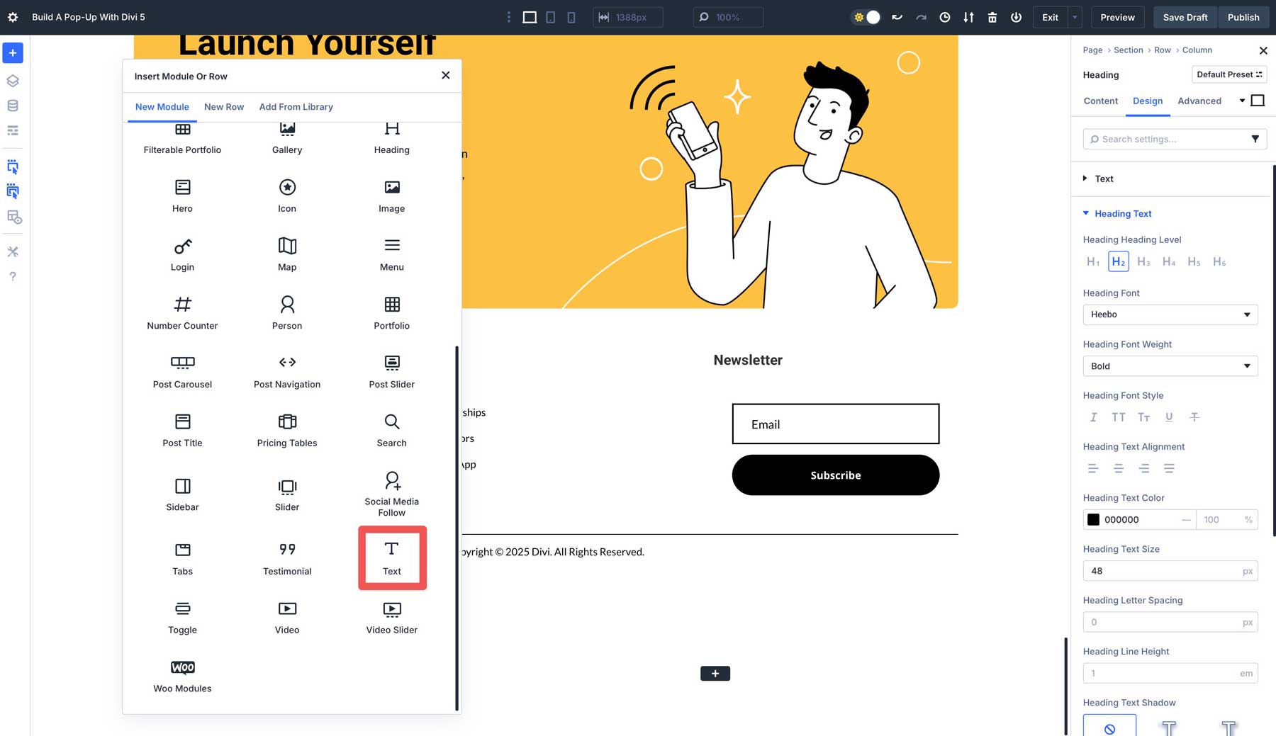
Now we can start adding content to our pop-up. When the Insert Module or Row dialog box appears, click to add a Heading module.
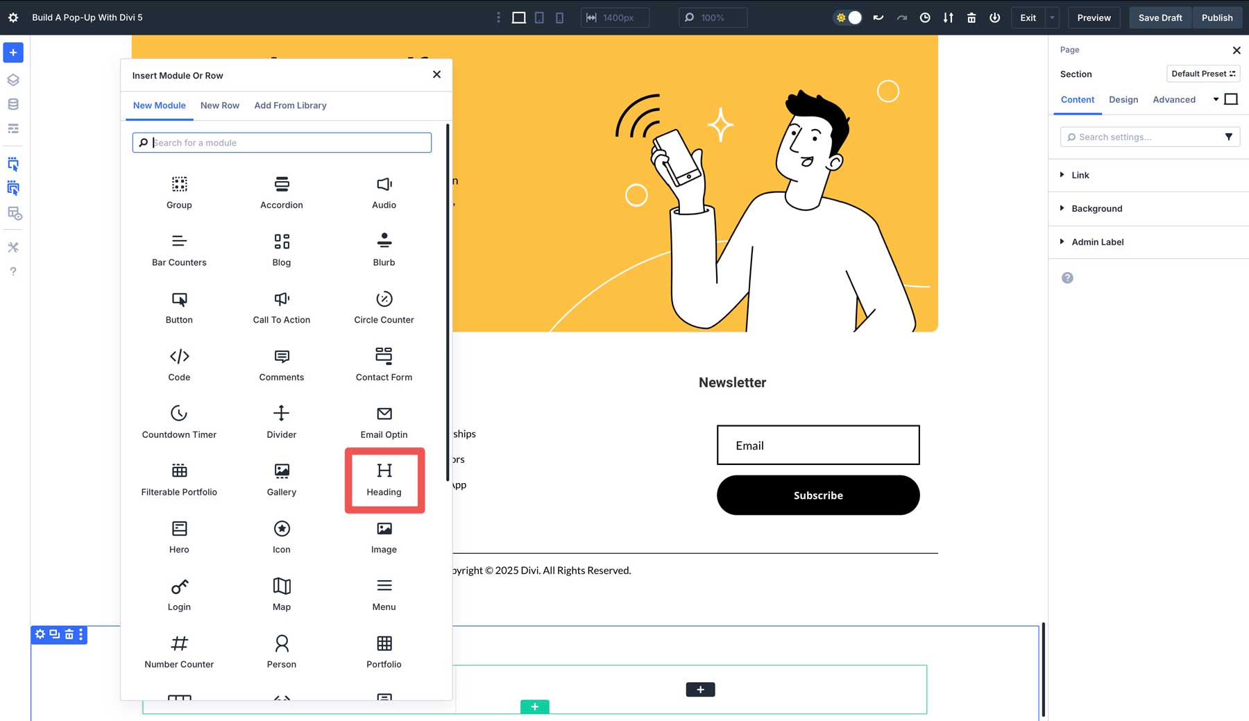
Enter “Want 15% Off?” in the Heading field under the Content tab.
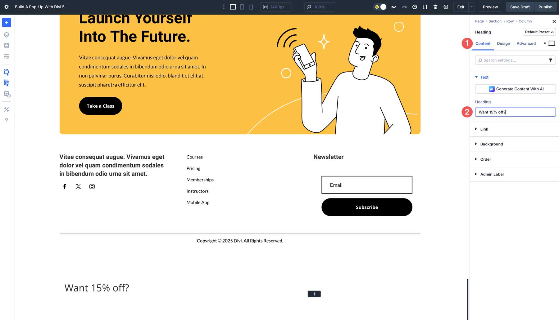
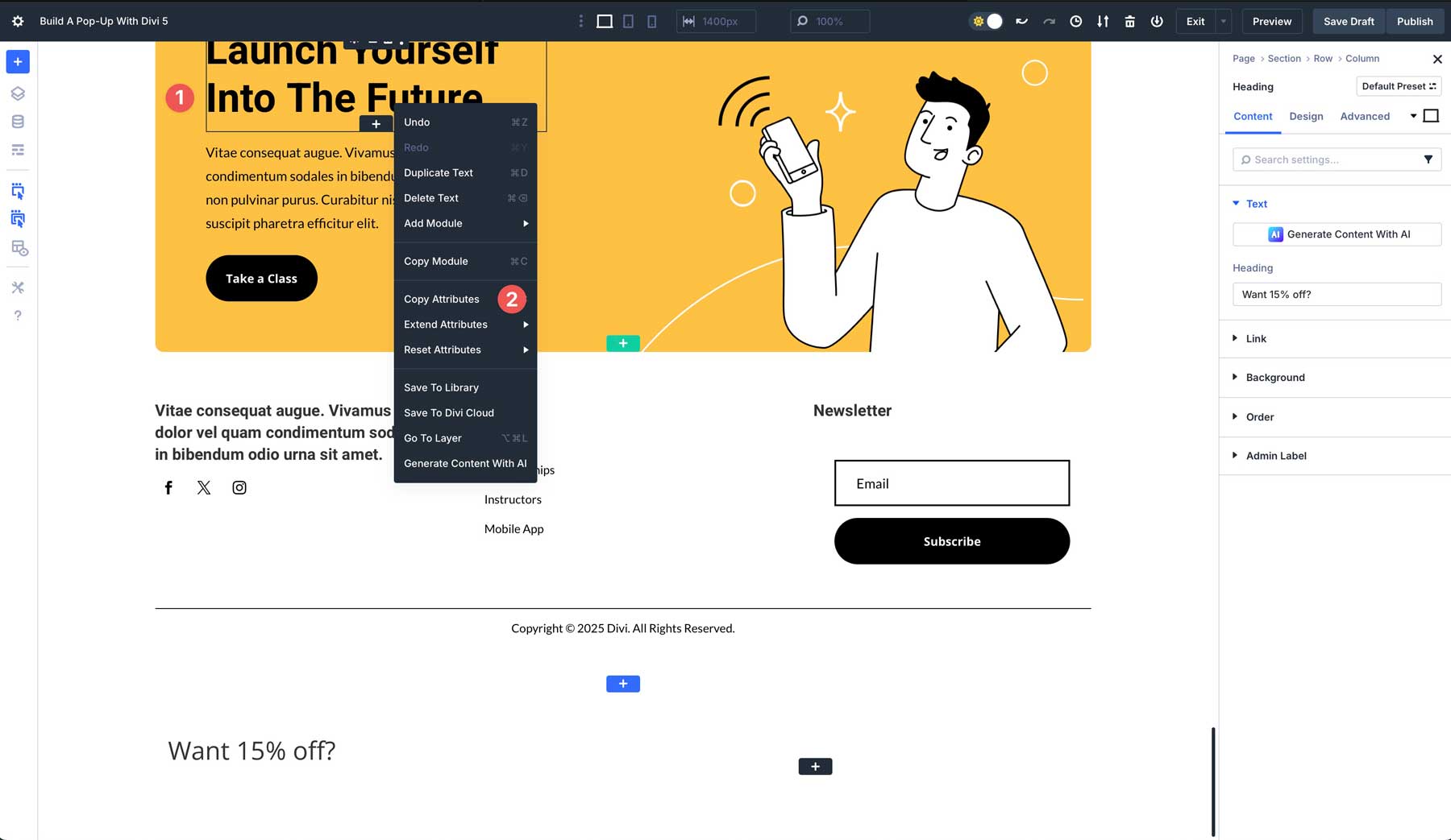
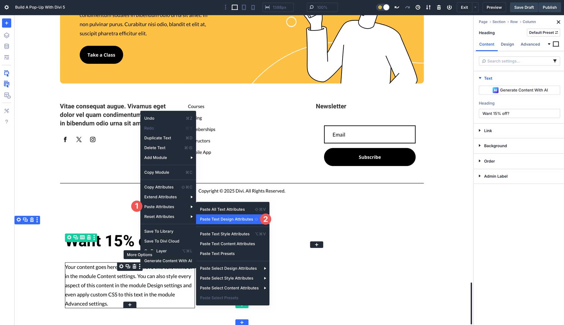
To keep designs consistent across the page, you can use Divi 5’s Attributes feature to copy another heading module’s settings for our pop-up. In the section directly above, hover over the Heading module, right click, and click Copy Attributes.
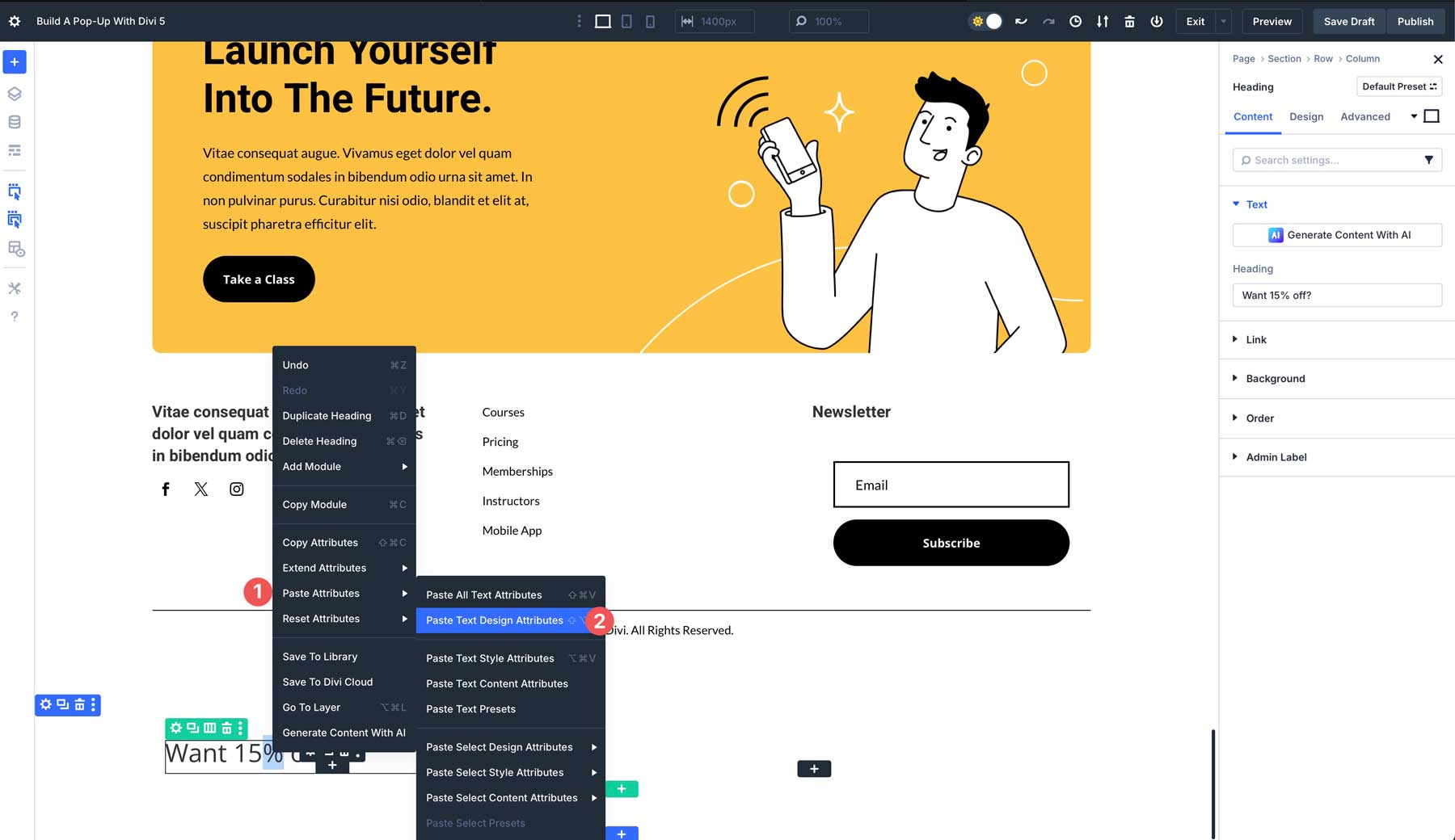
Next, hover over the Heading module we just created, right-click, select Paste Attributes, and then click Paste Text Design Attributes. This will paste the styles from the other heading module, allowing design consistency.
Under the Heading module, add a new Text module.
As with the Heading module, locate the Text module in the section above, right-click, and select Copy Attributes. From there, click on the new Text module, tap Paste Attributes, and then Paste Text Design Attributes.
You can either add your text into the text field or use Divi AI to generate it for you.
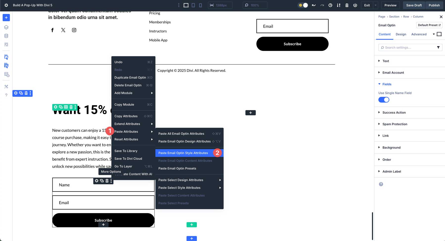
Next, we’ll add an Email Opt-In module under the Text module.
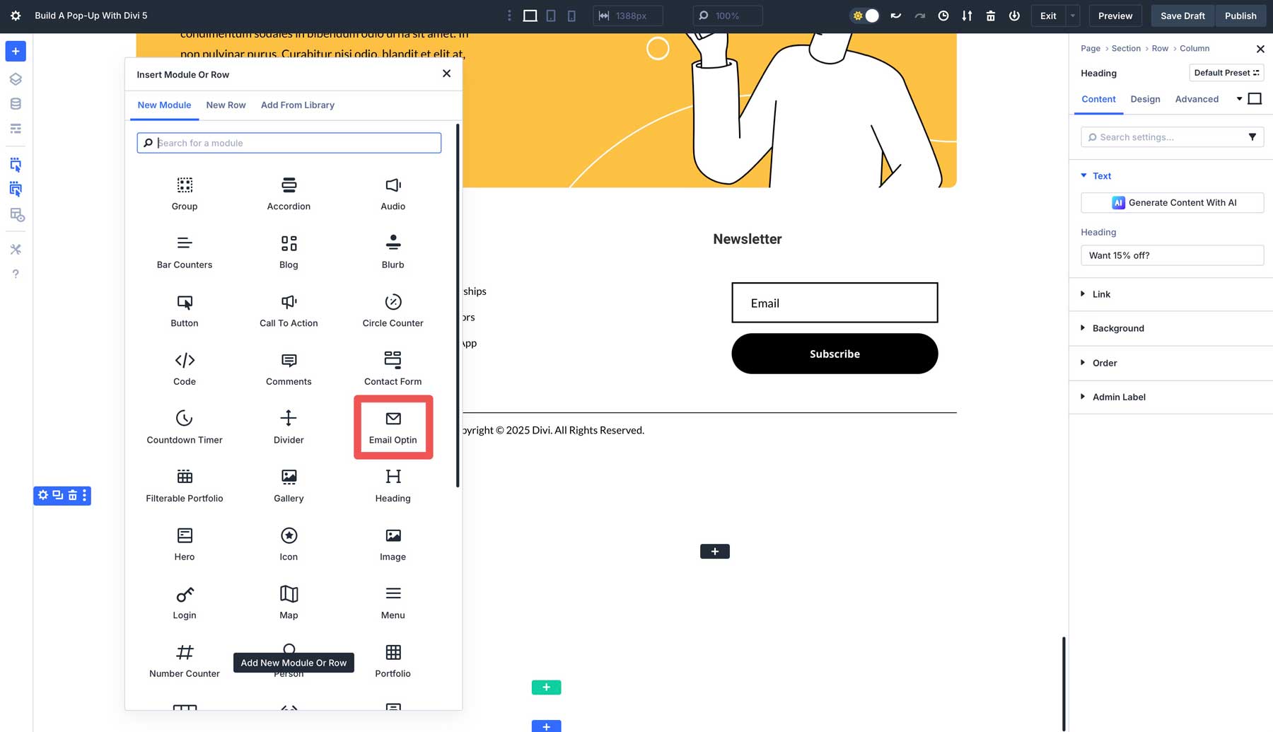
The section above has an email opt-in module, so you can copy its attributes and paste them into the new email opt-in we added to our pop-up.
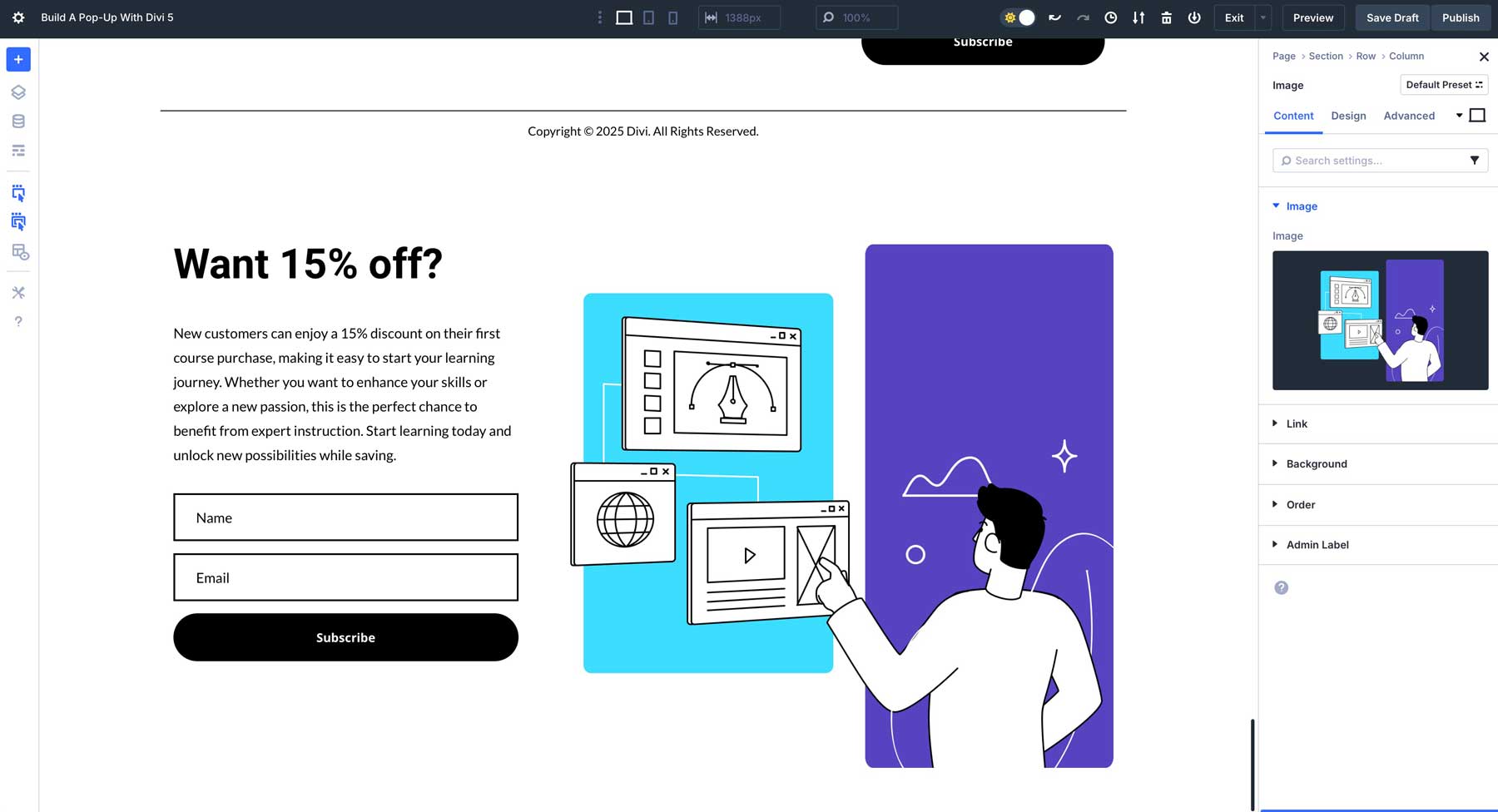
The last step is to add an image to the right column of our pop-up. Locate the Image module and add it to the 2nd column of our layout.
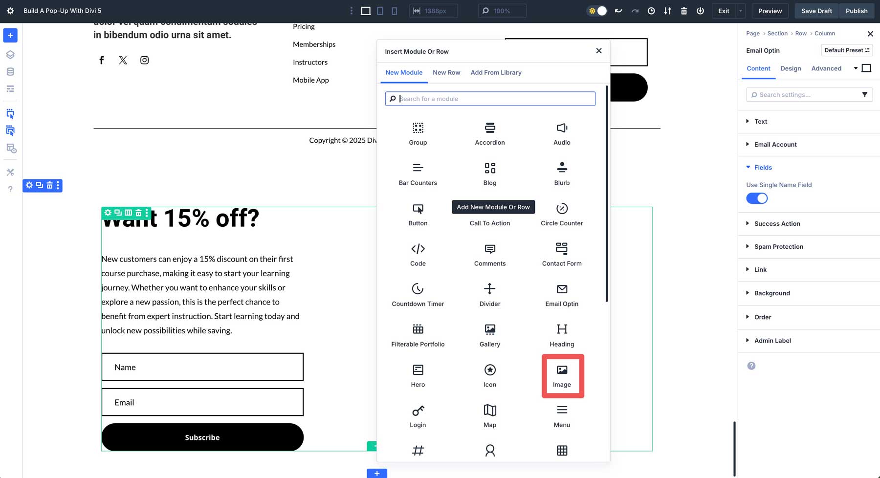
Upload an image and add it to the Image module. By this point, your section should look similar to this:
Now that our pop-up’s design is in place, we need to add a new row above it to add a close button icon. This will allow your visitors to close the pop-up at their convenience. Click the green + icon to add a new row.
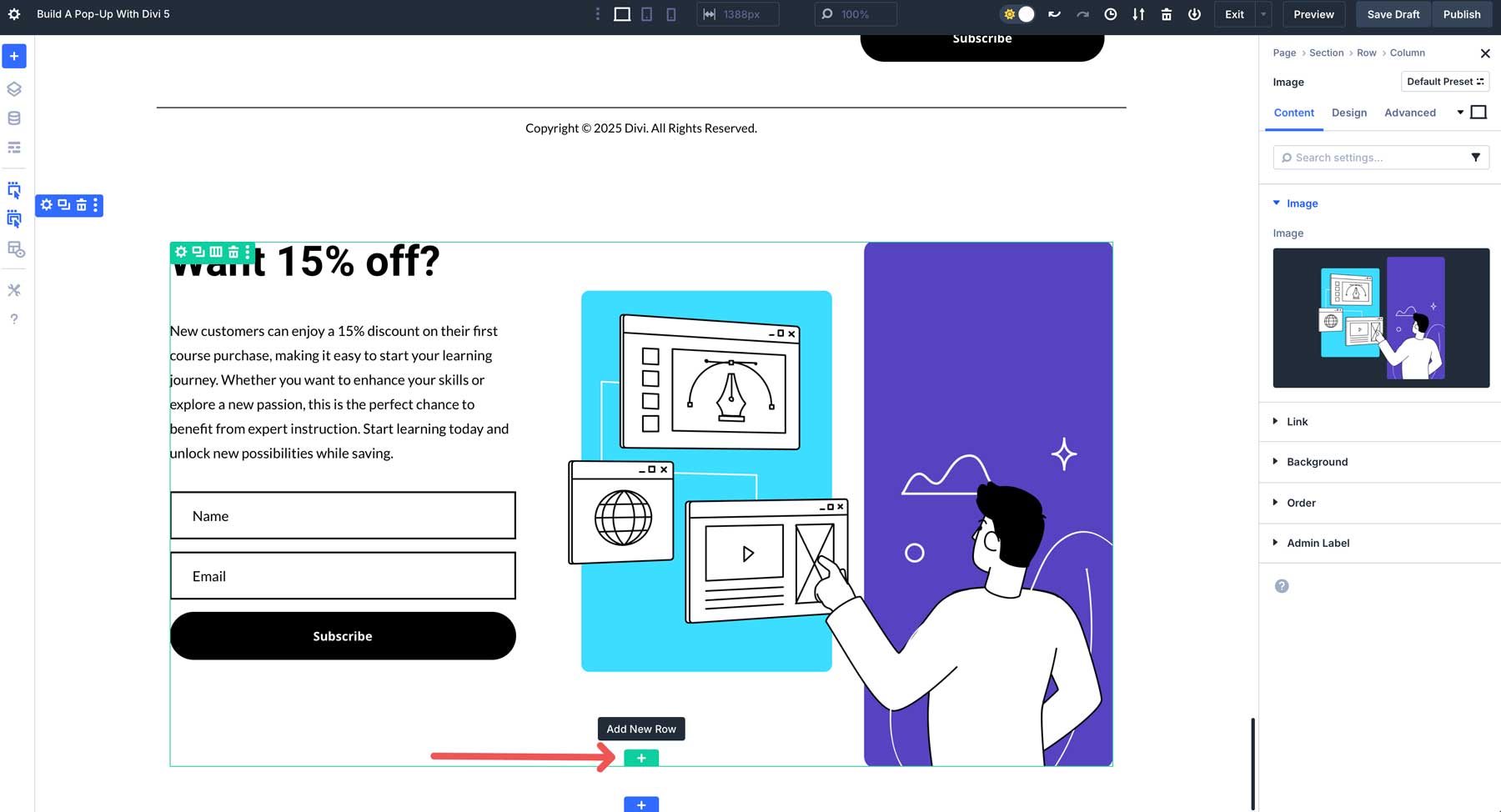
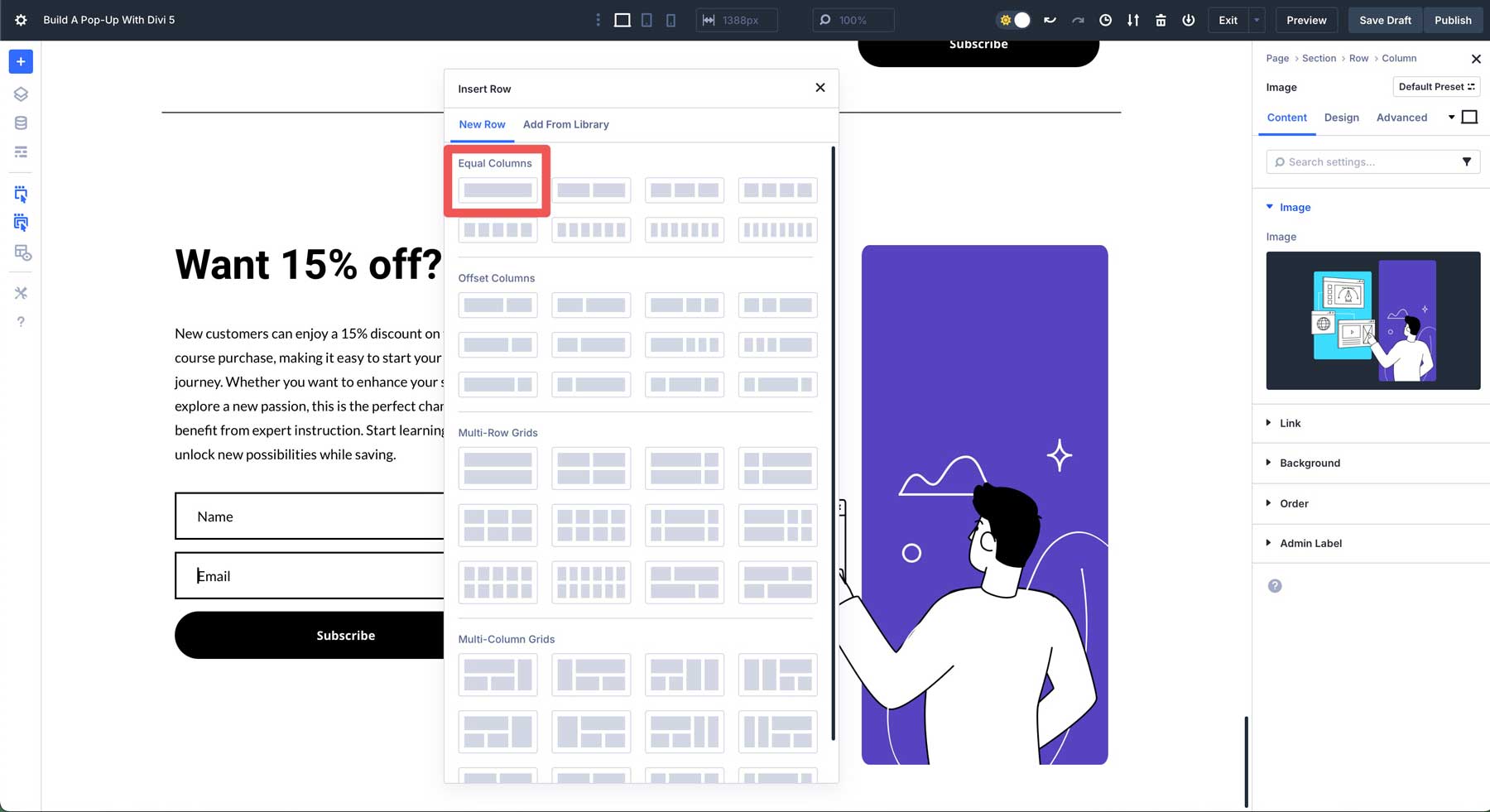
When the Insert Row dialog box appears, click the single column layout under Equal Columns to add it to the section.
Click to add a Icon module to the row.
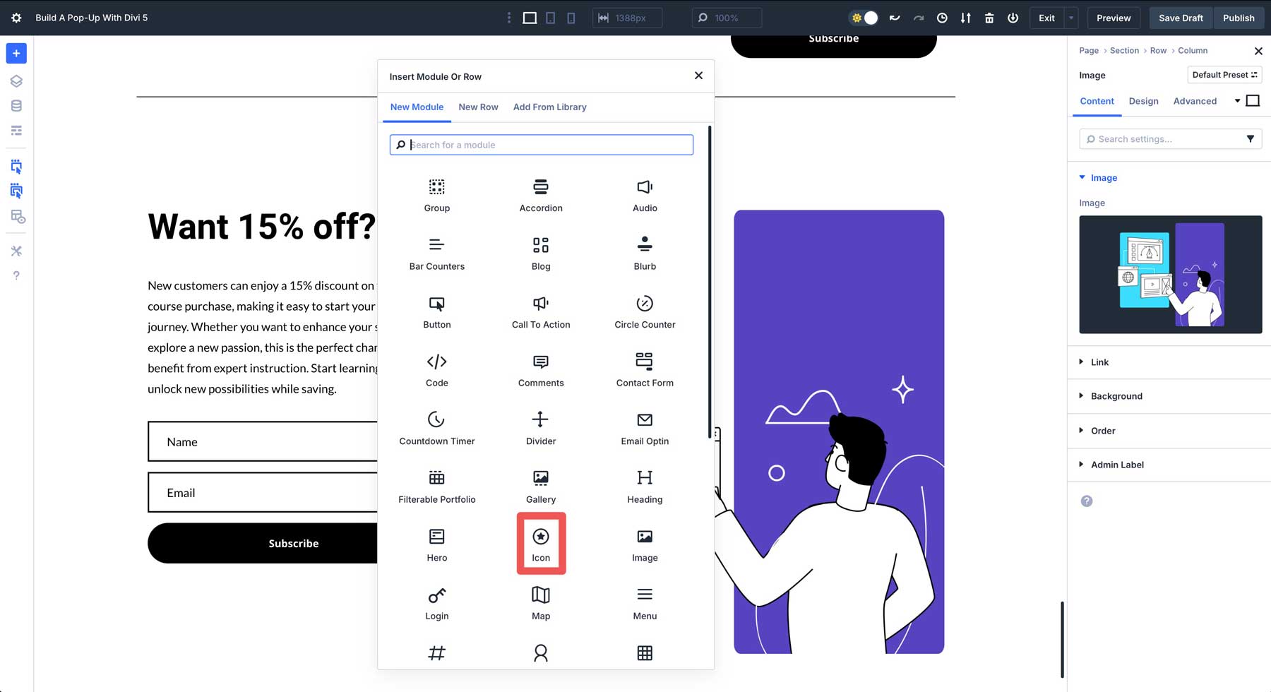
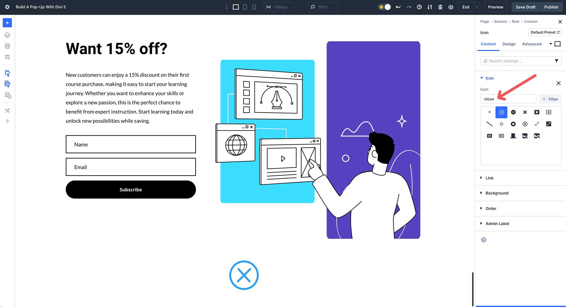
Select the close icon from the available options. It can be easily located by typing “close” into the search box above the icon list.
Switch to the design tab and enter the following design settings:
- Icon Color: #5344b9
- Icon Size: 36px
- Alignment: Right
The last step is to move the row above the two-column row containing our pop-up’s content. Use the Layers View to rearrange the rows into the correct order. While there, rename the section to POP-UP.
5. Adjust The Section’s Settings
Before creating our interactions, we have to ensure that the pop-up is sized appropriately for the browser’s width. We don’t want it to be a full-width pop-up, so navigate to the design to make some adjustments. Expand the Sizing drop-down menu to reveal the settings.
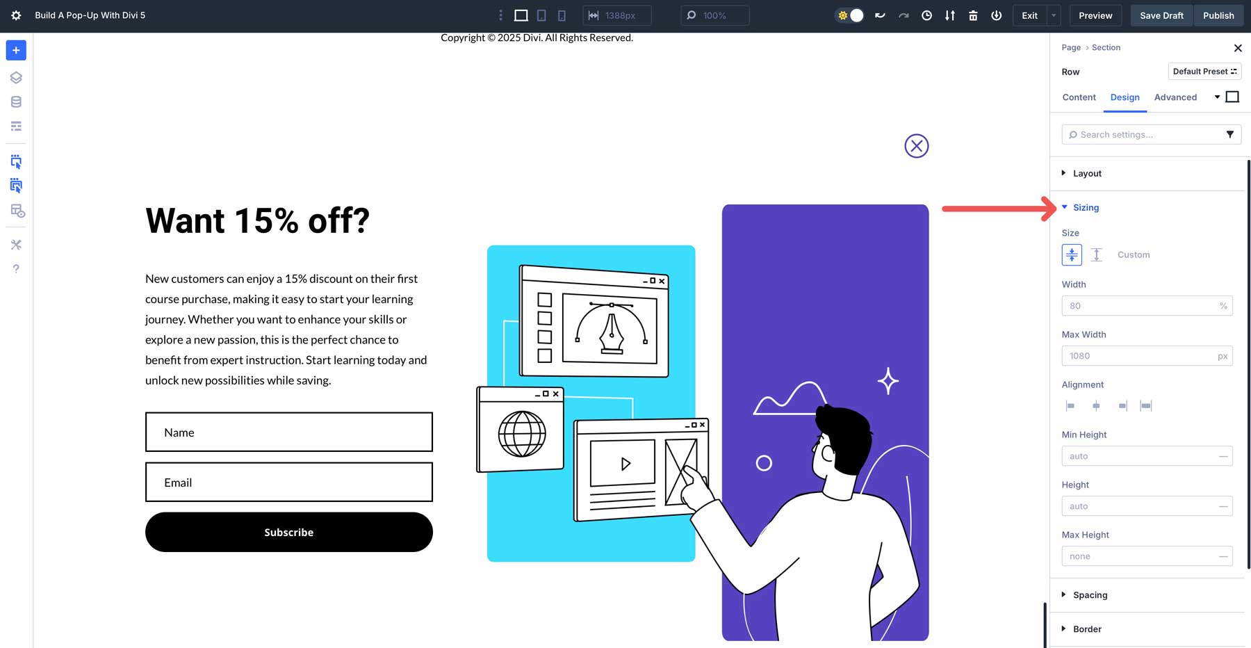
In the Width field, enter 80% for the width. Next, set the Section Alignment option to Center.
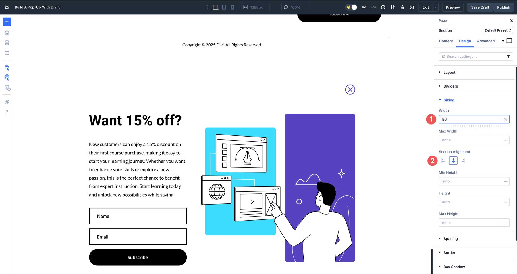
Under Border, set a 10px Border Radius.
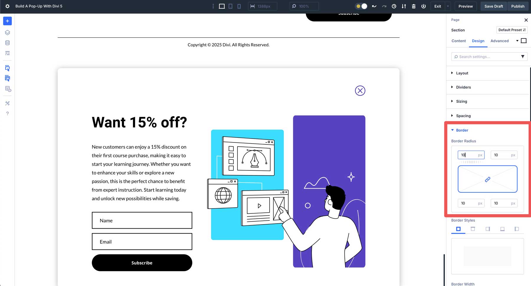
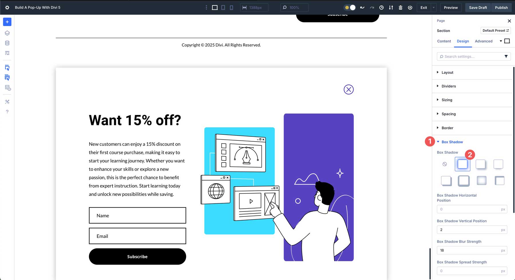
We’ll also add a box shadow so our pop-up stands out over the rest of the content. Locate the Box Shadow drop-down menu and expand it. Under Box Shadow, choose Preset 1.
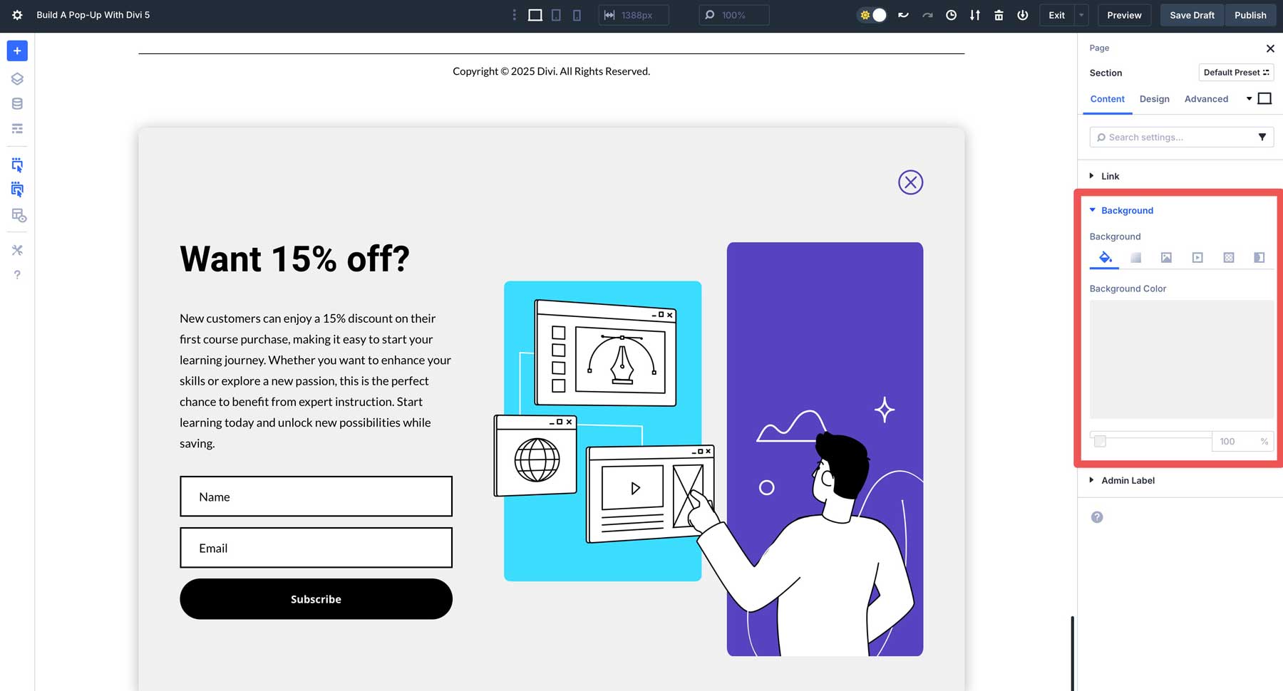
Lastly, head to the content tab to add a color for the background of our pop-up section.
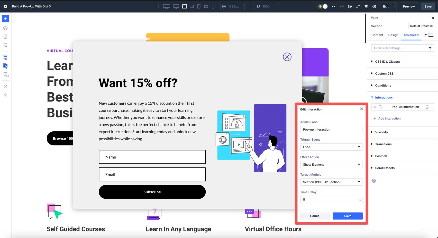
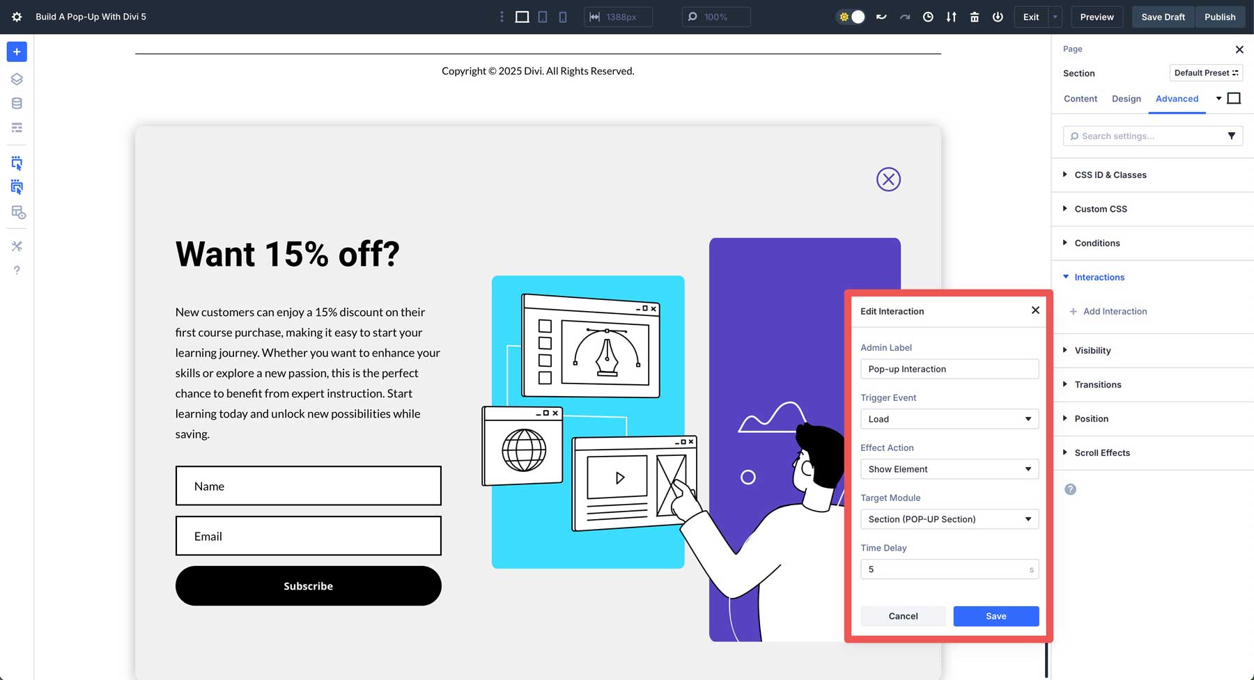
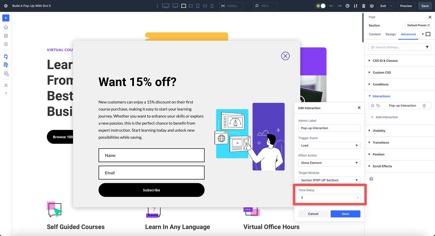
6. Create The Interaction To Display The Pop-Up
With the design in place, we can set our interactions. We’ll set our POP-UP section to display 5 seconds after a user lands on the page. Navigate to the Advanced tab of the section and locate the Interactions drop-down menu. Click + Add Interaction to start.
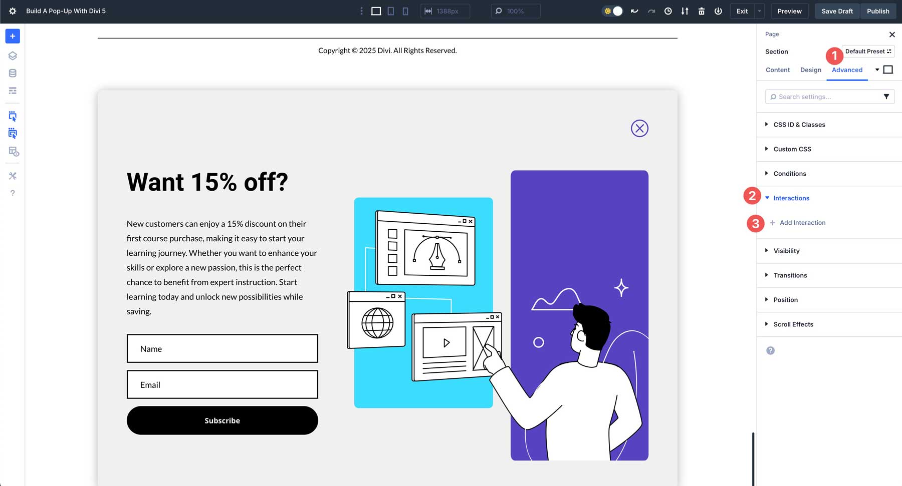
Choose Load from the available options. This setting will allow the pop-up to appear on page load.
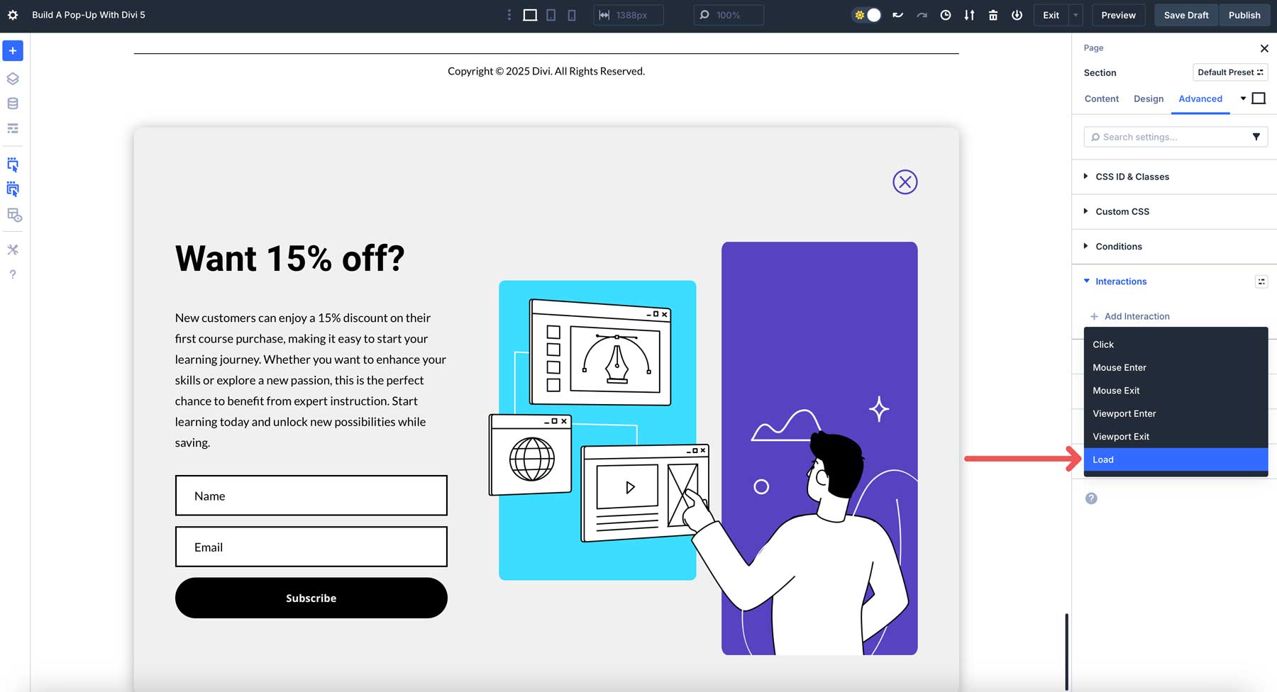
When the Edit Interaction dialog box appears, enter the following settings and click Save:
- Admin Label: Pop-up Interaction
- Trigger Event: Load
- Effect Action: Show Element
- Target Module: Section (POP-UP)
- Time Delay: 5 seconds
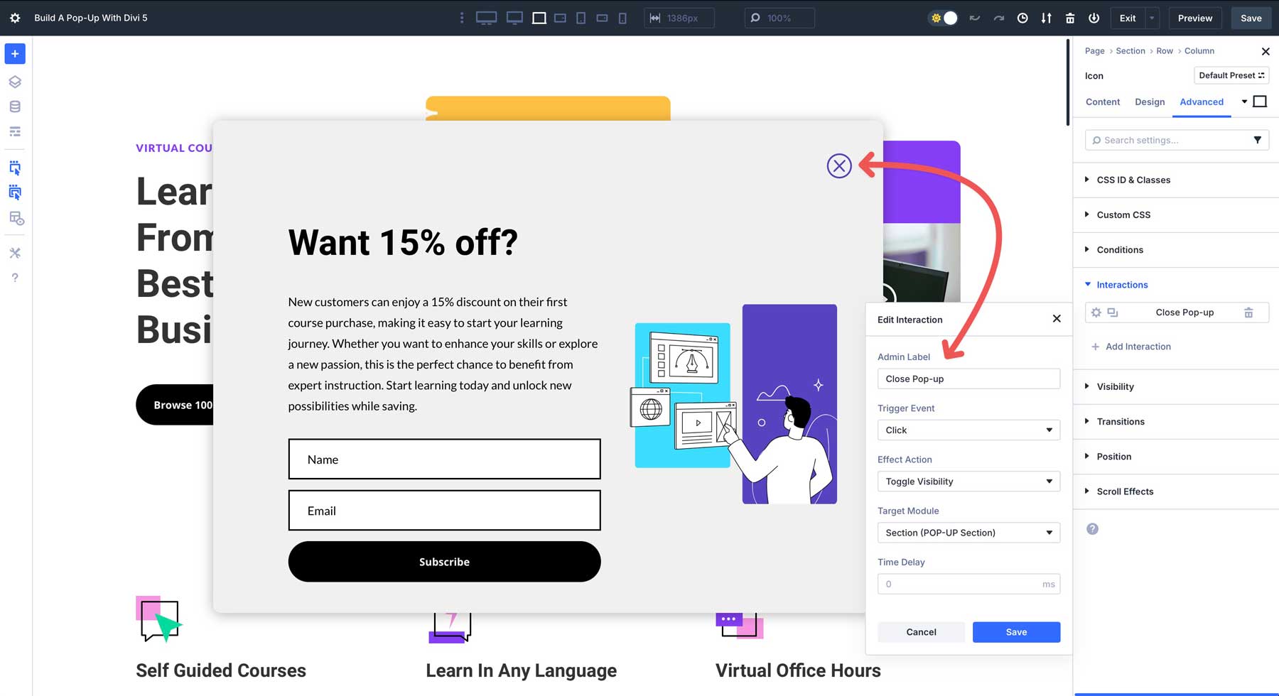
Next, we need to add an interaction for our close button. Select the icon module in the first row of our pop-up section. Navigate to the Advanced tab, click + Add Interaction, and enter the following settings and save:
- Admin Label: Close Pop-up
- Trigger Event: Click
- Effect Action: Toggle Visibility
- Target Module: Section (POP-UP)
- Time Delay: 0

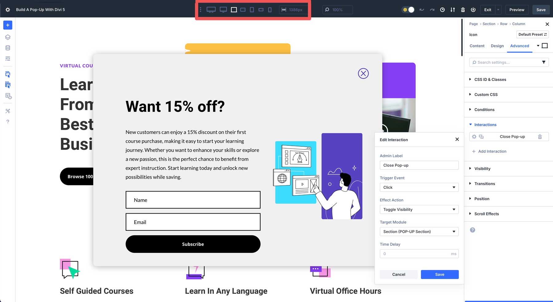
7. Test and Refine Your Pop-Up With Divi 5’s Customizable Responsive Breakpoints
Before proceeding to the last step, it’s a good idea to use Divi 5’s Customizable Responsive Breakpoints to ensure your pop-up looks good on all screen sizes. In Divi 5, there are now 7 breakpoints to choose from.
By default, only three are enabled. Having 7 allows you to test your pop-up on more breakpoints, ensuring a seamless user experience with any screen size. To allow all 7, click the ellipsis menu at the top middle of the admin bar. From there, enable all breakpoints by toggling them on.
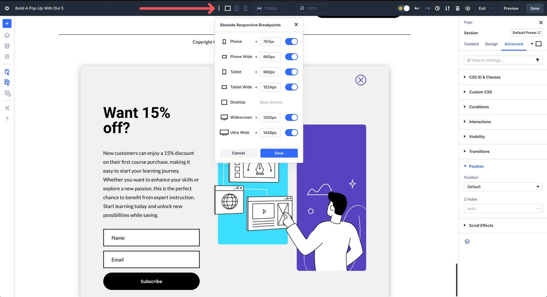
Divi 5’s new Flexbox Layout System allows you to easily make changes to ensure your pop-up looks great on any device. For example, you can use Divi 5’s Change Column Structure field to change the number of columns displayed on smaller devices. This option will stack the content on mobile with one click.
8. Set Display Options
For your pop-up to display correctly, we need to adjust the pop-up section’s visibility, positioning, and z-index. This will allow your pop-up to display where you want, keep it hidden until it’s time to display, and ensure it appears above the rest of the page’s content.
Navigate to the Advanced tab for the pop-up section. Locate the Visibility drop-down menu. Click to disable the section on all views (phone, tablet, and desktop).
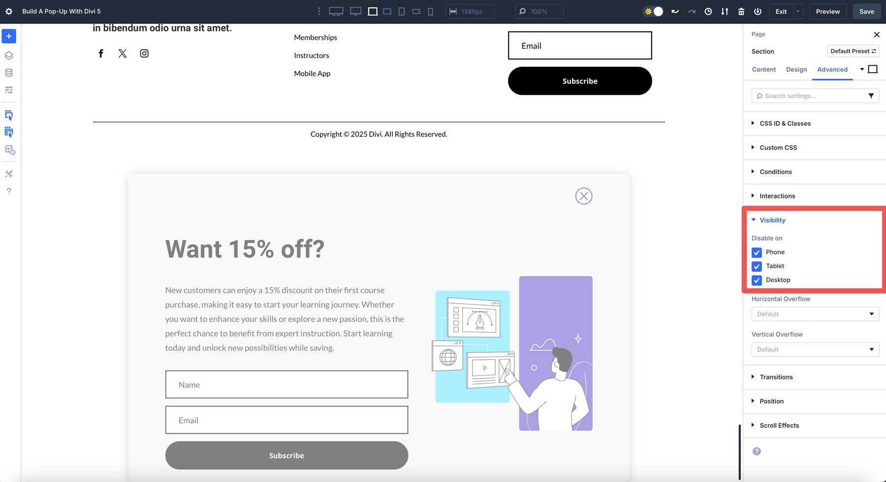
Next, click the Position drop-down menu. Set the position to fixed and choose an offset origin. Finally, add a z-index of 99999 to ensure the pop-up displays above the rest of the page’s content.
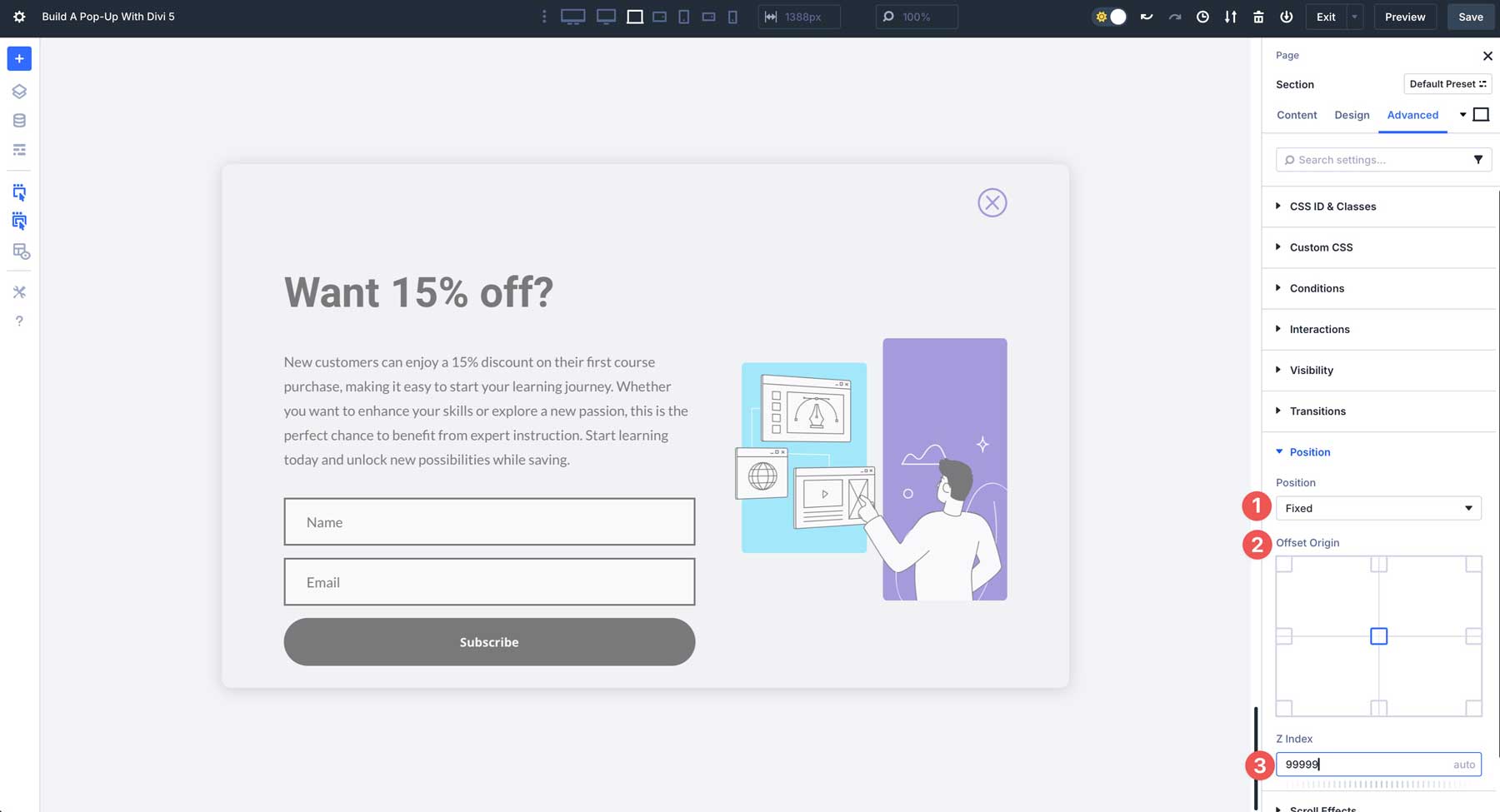
Once all settings are in place, save the page and preview it in another tab. The pop-up should display in 5 seconds after the page loads. You should also be able to close the pop-up using the close interaction we created.
Advanced Pop-Up Customization Options
Divi 5 Interactions allows you to take your pop-up to the next level with advanced features like display conditions, combining effects, or even using Divi AI to generate pop-ups. Let’s look at some ways you can make your pop-ups more advanced without needing custom CSS or JavaScript snippets.
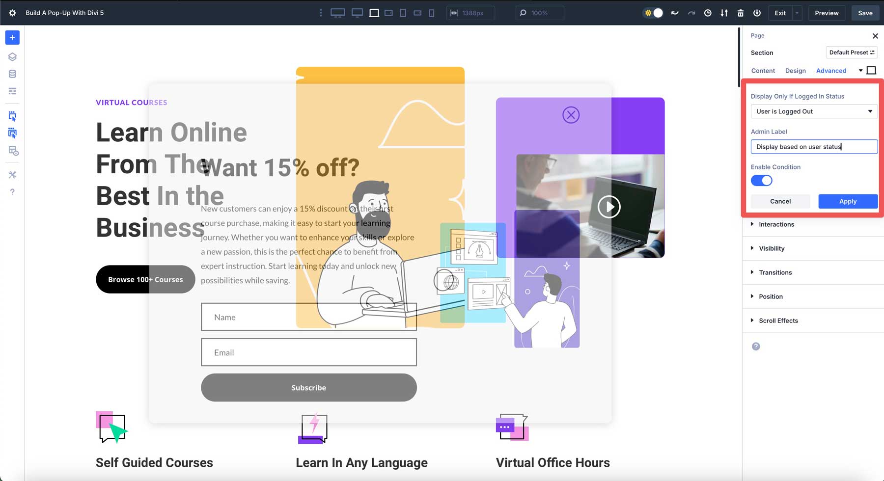
Display Conditions
You can use Divi’s condition options to show the pop-up based on user behavior, like user roles. For example, you can show the pop-up only to logged-out users to encourage signups.
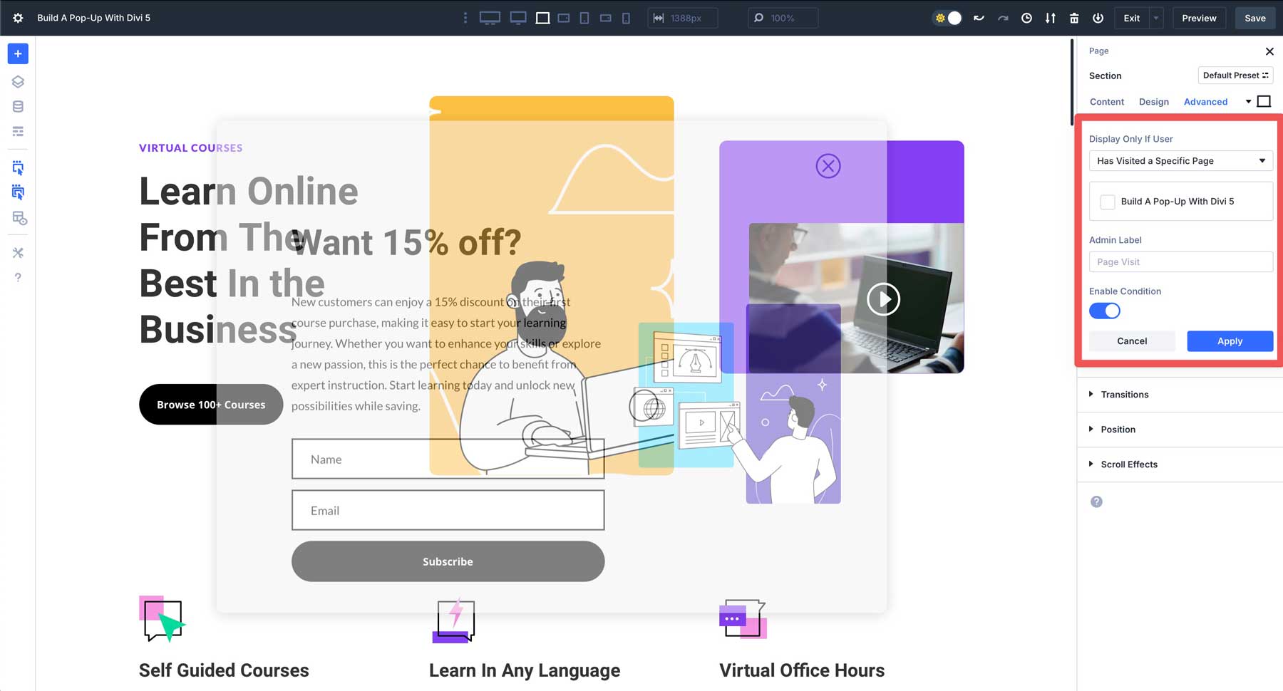
You can also enable conditions to display the pop-up based on page visits. For example, you should disable the pop-up if a specific user has already visited the page. You could also set it to display only if a user hasn’t visited the page. This can be useful for visitors who find your site through a different page and click on the home page next.
Combine Effects
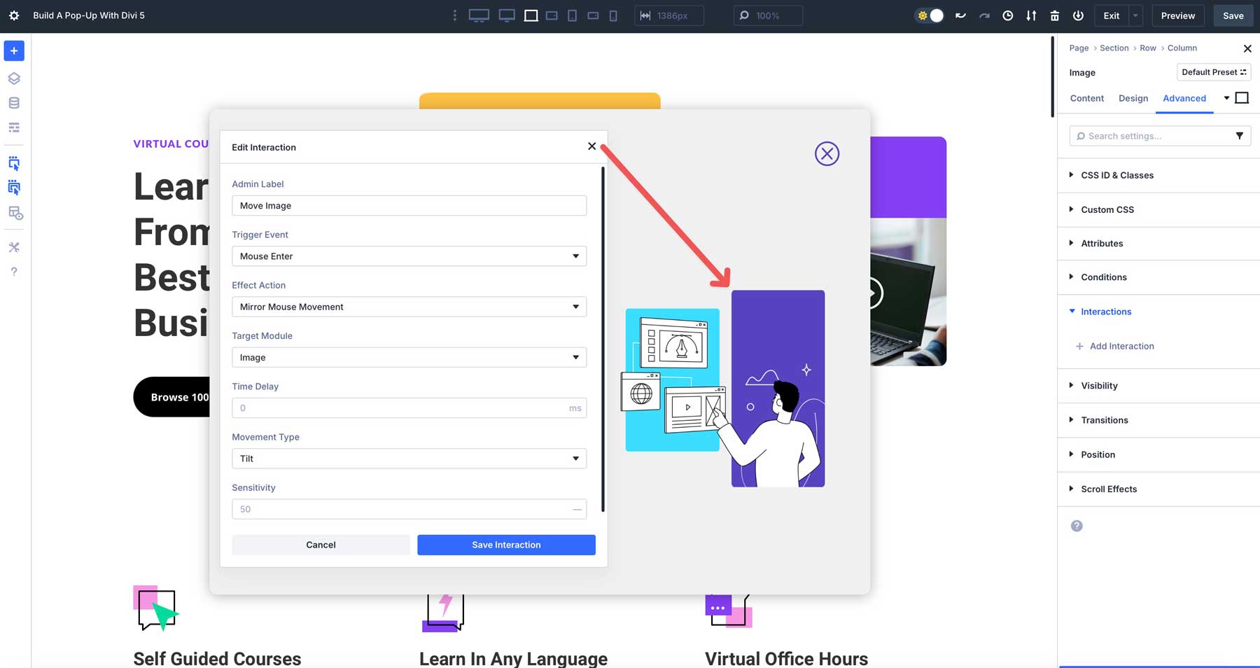
You can enhance your pop-up with scroll-based animations or mouse-movement effects. These can be added as additional interactions by selecting additional triggers and effects. Interactions can be combined, and there is no limit to the number you can create. For example, you can easily apply an interaction on the image in our pop-up using mouse-movement effects.
Divi AI Integration
Speed up the design process by using Divi AI to generate a layout. You can instruct Divi AI to create specific sections, including one you can convert into a pop-up. In the example below, we asked Divi AI to create a layout for a business coach, complete with a CTA section we can turn into a pop-up.
Best Practices For Effective Pop-Ups
To ensure your pop-up improves user experience and drives results, consider these best practices:
1. Keep It User-Friendly
Avoid intrusive pop-ups using timed delays, between 5 and 10 seconds, instead of immediate triggers. This gives users time to engage with your content before being prompted. Launching a pop-up too soon can be distracting, causing users to close the pop-up and potentially miss out on a promotion, newsletter signup, or other important action you want them to take.
Set a timed delay on your pop-up to avoid losing user engagement.
Additionally, always include a clear, easily identifiable close button so users can dismiss the pop-up and maintain a positive browsing experience.
2. Optimize For Performance
Performance optimization is critical for effective pop-ups. To keep load times fast, minimize heavy animations or large, unoptimized images. Opt for compressed images and limit complex effects to ensure a snappy, seamless experience, especially for users on slower connections or mobile devices. This approach improves user satisfaction and supports better engagement and conversion rates.
3. Design Pop-Ups With Accessibility Standards In Mind
Accessibility is another key consideration in making your pop-up inclusive for all users. Always add descriptive alt text to images to assist screen readers, ensure high contrast between text and background for readability, and use font sizes of 16px or larger to accommodate users with visual impairments.
These practices help ensure your pop-up is accessible to a diverse audience, aligning with web accessibility standards.
4. Test On All Screen Sizes
Finally, thoroughly test your pop-up on all screen sizes to ensure a consistent experience across all devices. Leverage Divi 5’s Customizable Responsive Breakpoints to ensure your pop-up looks great and functions as intended on desktops, tablets, and smartphones.
Pay close attention to the close button to ensure it works as it should and that text is legible on smaller screens. Additionally, check spacing, sizing, and layout as needed to provide a polished, professional look.

Create Pop-Ups With Divi 5 Interactions
Divi 5’s Interactions feature makes creating a pop-up easy by allowing you to build custom, engaging designs directly within the Visual Builder. Combining triggers, effects, and targets allows you to build pop-ups that capture attention and drive conversions while seamlessly matching your site’s design. Explore other features like Module Groups and Nested Rows to create even more dynamic pop-up layouts.
Are you ready to give Divi 5 a try? Download the latest Divi 5 Public Alpha, experiment with Interactions, and share your thoughts in the comment section below. Please share your creations with us on our social media channels and visit our blog for more tutorials using Divi 5’s innovative features. We look forward to seeing what you create!


Form me, maybe it’s because I didn’t find it, but there is one of the most important thing missing: on load, show only once per session or not before a few days. It’s like a basic thing for on load popup. Otherwise, the popup gets very annoying. Mostly for those who already answer the popup and coming back.
I also found out, that if you make the section background black with opacity and be 100vw and 100vh, you will have the grayed out background which is useful for modal.
Have a nice one
That’s a fine idea, Mike. Thanks for the comment. The current cookie implementation adds/removes/toggles Session Cookies, so there’d have to be additional fields added so you could include a Max-Age or Expiration Date to turn them into a Persistent Cookie usable for what you had in mind.
I am trying to create a button popup (like a Get A Quote button in the header) but the only way to close it is if you click on the quote button again (which is not intuitive). I created a close ICON with an interaction to close it but it does not work.
I even had support look at it and every but the Close ICON worked great.
Are there plans to make a button popup that will close with a Close Icon?
I assume that when you said you created an Icon with a “close” interaction, you meant with a “Hide Element” or “Toggle Element” interaction?
Hi there,
can I have a pop-up I’ve built on one page automatically display on all other pages? Is this possible if I place it in the global header or footer, for example?
Thank you!
Hey, Stefanie! 😊
That would be possible, but would need to be in a location that loads on every page, like the Theme Builder Header or Footer. You would need to create your Interactions-based pop-up in one of them. 👍
Hello, is it possible to hide the pop-up by clicking outside the row instead of (or as well as) the “X” icon in Divi5?
When setting up a click interaction to hide an element for a section, the pop-up also closes after clicking inside the pop-up, naturally.
Or just using javascript?
Thanks.
Currently, Divi 5 Interactions do not support closing a pop-up when clicking outside the pop-up area by default. The click interaction to hide an element reacts to all clicks inside that trigger area, including inside the pop-up. To achieve closing the pop-up by clicking outside its area, custom JavaScript would be needed to detect clicks outside the pop-up and then hide it. Thanks for your question!
Can the interactive popup be created to slide in, or fade in, or any other of the appearance events? The sudden appearance is not my favorite. I’d love to pick not only how long it waits to appear, but how quickly it appears.
Is it possible to trigger the popup from a button on a different part of the page? For example, I have a Blurb and Button section on my page where I want the ‘Learn more’ button to trigger this popup? Is this possible with this solution? Or do you know of any other ways to achieve this in Divi 5?
Yes, absolutely! Divi Canvases make this super easy and clean.
Create your popup content in a new detached Canvas (perfect for reusable popups). Design it with a section, modules, and a close button.
Then, on your “Learn more” button (anywhere on the main page), open the Interactions panel and add a Click trigger. Target your popup Canvas directly to open/toggle it—add animations, centering, and an overlay for that true popup feel.
The close button can target the same Canvas to hide it. Game-changer for organized, global popups!