")
Using WordPress and a suitable theme, it’s easy to get a site up and running in a matter of hours. However, creating a design that looks professional takes work – particularly if you’re not a dab-hand with a virtual paintbrush.
Fortunately, you don’t need to be an experienced designer to put together an attractive website. As long as you make an effort to avoid some of the most common pitfalls, your designs should come out looking as good as a professional.
In this article, we’ll explore what makes for good web design, and eight of the most common errors that people make during the process.
Let’s get started!
What Constitutes Good Web Design
There isn’t a universal standard for what constitutes ‘good’ web design, but there are some best practices that are universally accepted by many web designers. For example:
- Good web design focuses on achieving its objective.
- Good web design should take usability into consideration.
- It should highlight the key elements of your site, as well as its message.
- A well-designed website should be easy to navigate.
- It should remain consistent throughout an entire site.
- It should display well on mobile devices.
We’ve touched upon some of these topics in the past, and we’ll be discussing some of them throughout this article as well. Now, let’s discuss what doesn’t constitute good web design.
8 Common Web Design Errors to Avoid at All Costs
While there are plenty of mistakes you could make when designing your website, we’ve decided to stick with the eight most common and easily avoided. If you make an effort to circumvent these stumbling blocks, your designs should be well ahead of the pack.
1. Poor Readability
Regardless of what type of website you’re working on, written content will be likely be dominant. If this applies to you, it’s important to make each of your posts as easy to read as possible, in order to not frustrate your visitors.
An example of a design with poor readability.
People may be willing to put up with long unbroken paragraphs when it comes to books, but the same can’t be said for websites. Easy to scan content enables visitors to quickly make sense of your writing and find what they’re looking for.
There are plenty of ways to make your content more readable, but these are the simplest to take into consideration:
- Separate your posts and pages into logical sections, using subheadings if possible.
- Make your subheadings as descriptive as possible. This will enable readers to scan through the content more easily.
- Consider implementing a color scheme that’s easy on the eyes. After all, you want visitors to stick around and read your content.
- Whenever possible, use sans-serif fonts for the bulk of your posts. They’ve been proven to be more readable than their serif counterparts.
This should make sure that your content isn’t a chore to read through from a design standpoint.
How Divi Can Help
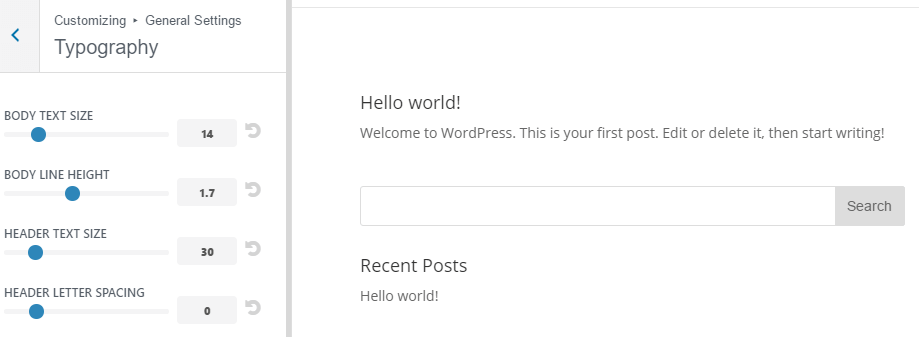
Divi enables you to tackle readability issues with ease thanks to its Theme and Module customizers. You can access both of these features from the Divi tab on your dashboard, then play around with the font settings, the style of your headers, and even the size of your sections if some of them are too small to read properly.
If you’d like to make further tweaks, you can always check out each module’s Advanced Design Settings using the Divi Builder. These sections are packed with almost everything you need to improve your readability (including the ones we mentioned earlier), and you can also preview any changes to your website without leaving the builder.
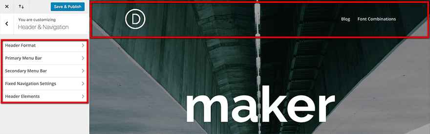
A website shouldn’t be hard to navigate through, and any user should be able to find the content they’re looking for without having to dig for it. If your website doesn’t meet those two criteria, you have work to do.
There are few things as frustrating as having to browse a website with nonsensical navigation. This might happen if its navigation bar is placed in an odd position, includes broken links, or is organized haphazardly. Furthermore, this frustration may lead to a higher bounce rate, lower conversions (since people won’t be able to find what they want), and less return visits overall.
An example of a website with no navigation menu.
Thankfully, most websites these days are well-schooled in the benefits of simple navigation. However, it’s always worth considering the following tips to keep yours easy to use:
- Make sure your navigation menu is easy to access. We recommend ditching so-called ‘hidden’ or ‘pop-out’ menus unless we’re talking about mobile implementations.
- Users should be able to decipher where each link will lead them to and the information they will find there.
- If your website includes several categories, you may need to implement multi-level menus. In this case, make sure your design implies a clear hierarchy between components.
A lot of people tend to put their navigation menus together carelessly. However, these elements can be critical to the success of your site, and they need to be treated accordingly. Don’t make the same mistake!
How Divi Can Help
Divi enables you to tweak your navigation settings on the fly using its Header and Module customizers, which work much the same way as the tools we discussed during the previous section. If you’d rather switch navigation styles altogether, you can do so by modifying the theme’s settings:
Finally, you can also tweak your post navigation settings, either using the Customizer or the Post Navigation module. This feature enables you to tweak what posts should appear when users click on the Previous or Next options, as well as hiding them globally or for specific devices.
3. Unbalanced Negative Space
If used correctly, negative space can enhance the content it surrounds. This enables you to guide the eyes of your visitors to where you want them to go.
How to use negative space properly.
Conversely, not leaving enough negative space around key sections can cause your website to look cluttered.
An example of a cluttered design.
In this example, users may feel overwhelmed, causing them to back away from your site, and to a competitor.
Negative space can also be used to enhance your site’s readability. You can achieve this by leaving some extra space between each subheading, and by using images and lists to break up long paragraphs. The goal here is for your content to look organized and prevent readers from becoming fatigued. You can also apply some of these fundamentals to your website’s overall design to keep things looking clean (as we’ve done for our blog).
Getting negative space right can be tricky, but it’s one of the simplest ways to achieve a modern, clean look for your designs.
How Divi Can Help
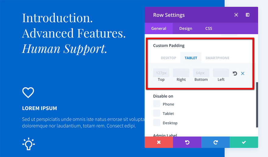
Divi’s Advanced Design and Custom CSS options enable you to tweak pretty much any element of your design including margins, padding, and the gutters for any section you choose, which is more than enough to get creative using negative space:
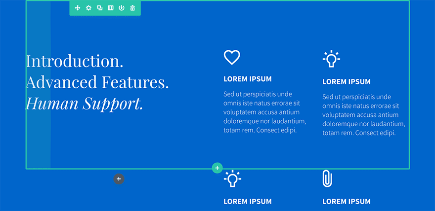
Modifying each of these options couldn’t be easier. In most cases, all you need to do is set their values in pixels, use the Preview feature to check if they’re on the mark, and continue tweaking it if necessary until you get there.
4. An Unoptimized Call to Action (CTA)
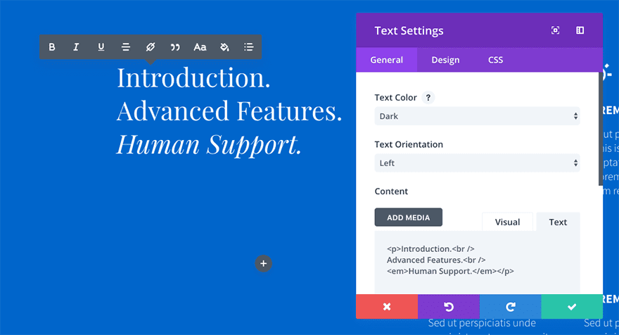
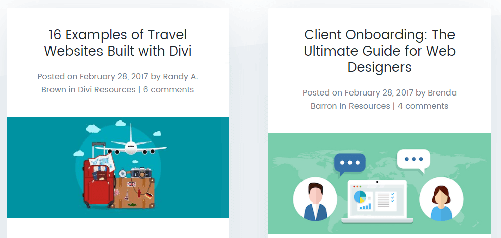
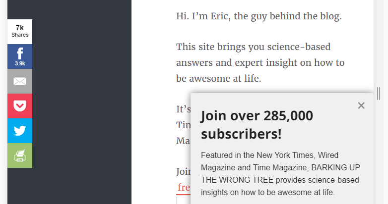
CTAs come in many forms, such as buttons, headings, and even plain text. However, their purpose is always the same – a prompt for the reader to take action. Check out an example of how we use them on our blog:

If you know a thing or two about internet marketing, you know how important good CTAs are. Using the right message can trigger significant increases in your conversions and the way you present them is just as important. Conversely, not implementing CTAs or using vague words can cause your conversions to take a hit.
When it comes to CTAs, you need to keep two things in mind – placement, and prominence. Here’s how to do it:
- Ideally, you should try to include CTAs near the beginning and end of your pages. This will enable you to catch visitors who are ready to convert immediately, and those who are intrigued after reading your content.
- Your CTAs should stand out from the rest of your page. You can do this by taking advantage of contrasting colors, unique button designs, or even just using bold text.
- Make sure your CTAs are easy to click on, particularly for mobile users. Typically, this means not making them overly small.
Paying a little attention to your CTAs can pay off big time when it comes to conversions. It doesn’t matter whether you’re angling for email subscriptions or sales, CTAs are vital to your efforts.
How Divi Can Help
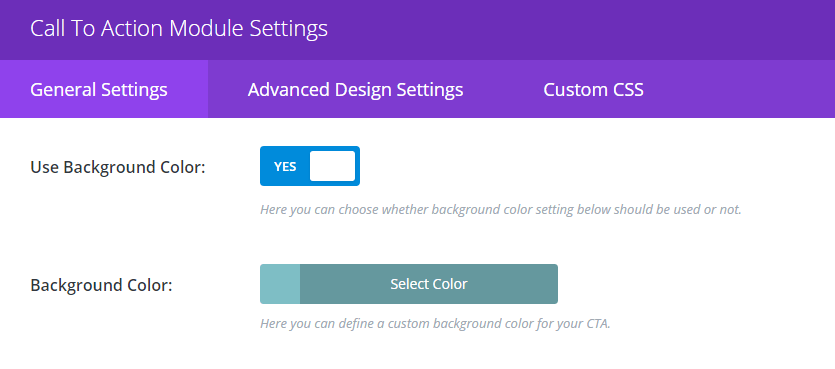
Divi’s Call to Action module comes with almost all of the customization options you need to make sure that your CTAs stand out, including settings that deal with style and mobile optimization:
In addition, you can always look to optimize your CTAs using Divi’s built-in split testing feature, Divi Leads. This brings powerful split testing functionality to Divi, and is managed directly from your WordPress dashboard.
5. A Lack of Mobile Optimization
Making sure your website is mobile-friendly has never been more important. Mobile traffic surpassed that of desktops for the first time during 2016, and the trend isn’t likely to turn back anytime soon.
An example of a poorly optimized mobile site.
To put it simply, if you aren’t optimizing your web designs for mobile users, now would be an excellent time to start. Otherwise, you run the risk of scaring a significant segment of your traffic away.
Fortunately, we’ve already covered several of the elements that you need to keep in mind when it comes to mobile optimization, such as:
- Readability: Making sure your content is well-formatted is critical, since you’ll be dealing with small viewports.
- Navigation: Your navigation menu should be easy to find and use, considering mobile users won’t have access to a mouse.
- CTA optimization: Much like your menus, these need to be easy to spot and interact with.
There’s plenty more to be said when it comes to this subject, and we’ve already covered it in-depth in the past. For more information on the subject, check out this list of ten tips for mobile web design optimization.
How Divi Can Help
When it comes to mobile optimization, Divi’s got your back! The theme is optimized for responsiveness right out of the box, and you can always check how your site looks on mobile devices using the Theme Customizer feature.
However, if you’d rather take on a more hands-on approach, you can fine-tune how each of your modules will display through their dedicated Advanced Design menus. This enables you to tweak the design controls for desktop, tablet, and mobile viewports.
6. Inconsistent and Unfocused Design
Ideally, your entire website should sport a uniform design with a clear focus. Using multiple styles throughout a single site can have a jarring effect, and it may even confuse your users.
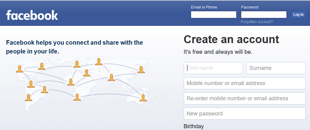
What’s more, creating a unique identity for your website – such as a color palette and a uniform style – will enhance its branding. Take Facebook, for example. They’ve been rocking the same style for years now – clean and with a recognizable blue palette. It may not be the most stylish design on the web, but it gets the job done, and by now, it’s come to be associated with the brand.
The style you use on your website is mostly a personal decision – that’s fine as long as you keep it uniform. If you’re struggling with the details, you can always seek inspiration in visual design languages such as Material Design.
How Divi Can Help
All of Divi’s modules are uniformly styled to look great out of the box. However, you can also customize them individually using the Advanced Design Settings and Custom CSS features, and also save your tweaks to your Divi Library for future use:
The Theme Customizer also enables you to tweak your entire theme’s aesthetic on the fly, and it includes options for changing your color scheme and mobile styles, among other features.
7. Incorrect Use of Images and Animations
A lot of people think that including images and animations whenever possible on a website is a good thing. If you happen to remember the fad of Flash-based sites in the early 2000s, you should know what we’re talking about.
Relying too much on either of these media types not only can cause your site to look cluttered, but it can also impact its loading speeds (and there are few things worse than a slow website). What’s more it can also have an impact on your Search Engine Optimization (SEO) if you get it wrong.

An example of an unnecessary animation on a web page.
Of course, almost every site needs some graphics here and there to enhance its design, and the key word here is “enhance”. Any images or animations you choose to include shouldn’t distract from your content, and they should only be used if they’re relevant. For example, in this article, we’ve only included images to provide context, not as the main focus.
Finally, as we discussed in our recent article on web design trends, you should also consider replacing full-blown animations with microinteractions whenever possible. They’re far less intrusive, and they still enable you to highlight specific actions to the user.
How Divi Can Help
A lot of Divi’s modules come with built-in tasteful animations that won’t distract visitors from your content. You can even add your own using CSS if you’re not opposed to rolling up your sleeves.
Furthermore, some of Divi’s modules – such as Fullwidth Header – enable you to implement the popular parallax feature. You can even add it manually to some modules that don’t support it by default, as is the case with Divi’s Slider.
Last but not least, let’s talk about contact details. Depending on the type of website you’re designing, chances are at least some of your visitors will want to get in touch with you, or whoever’s in charge. Making sure your contact information is displayed prominently is the best way to enable this.
It goes without saying, but some websites will be more affected than others if they don’t make their contact information easy to find. For example, missing or hidden contact details on a service website can cost you dearly in lost business opportunities.
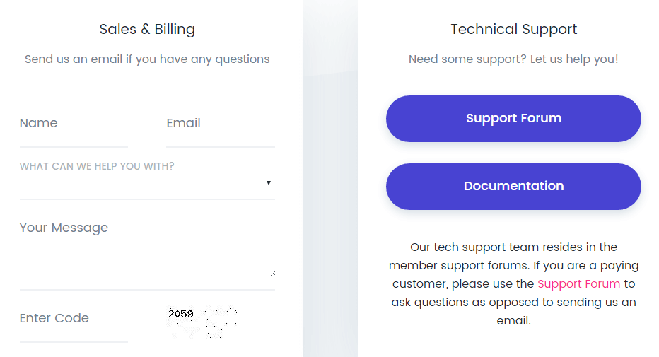
For most sites, we’d recommend setting up a simple contact form, which should be available either on your home page, its own section, or both:
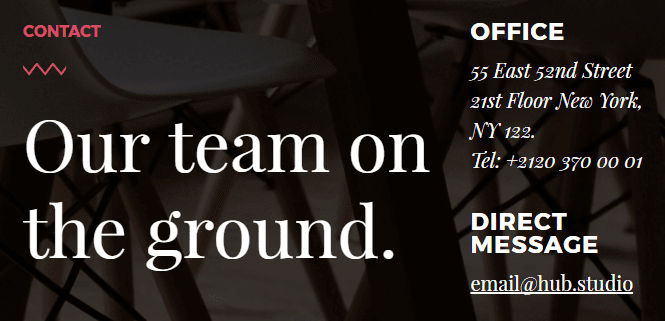
Adding your email or telephone to your footer – or a secondary menu – can also be a great approach depending on your site’s design. Regardless of what you include, the main takeaway is that it must be prominent!
How Divi Can Help
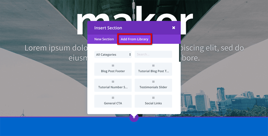
Just as with most key features, Divi provides the Contact Form module that comes pre-styled with an optimized format. A while back we also released a free pack of contact page layouts, which are a great help if you’re looking for a simple and modern design:
If you’d rather tweak your design manually, Divi’s Contact Form module enables you to add as many fields as you want and style them individually. You can even set up success messages for your users to read after making a submission, all without leaving the module’s settings.
Conclusion
WordPress users have a simpler time than most when putting together an attractive website, thanks to its easy to grasp functionality. However, because of this, it’s easy for poor design choices to creep into your project, which can easily bring the overall visual quality down.
In this piece, we’ve shown you the eight most common web design pitfalls you need to avoid during your next project. Let’s recap:
- Poor readability.
- Bad navigation.
- Unbalanced negative space.
- An unoptimized CTA.
- A lack of mobile optimization.
- Inconsistent and unfocused design.
- Incorrect use of images and animations.
- ‘Hidden’ contact information.
What do you think is the number one web design error every user should avoid? Subscribe and share your thoughts with us in the comments section below!
Article thumbnail image by Meilun / shutterstock.com


It’s surprising how many sites on the web suffer from poor navigation. Run into that problem ever day. Good post.
Thanks Eric! 🙂
Nice tips to avoid web design errors. Divi is very useful for buliding pages.
Thanks for your comment! We think Divi is pretty great too. 🙂
I love my DIVI, even more, these days. I only was 1:7. Not too bad right?
Hi Jason! That depends on whether you mean you knew about 7 of the errors, or only 1. 🙂
This is a good reminder of the points which I now tend to do instinctively.
Practice makes perfect but I never want to get complacent!
Thanks for commenting, Martin! It’s always good to remind yourself of these things every now and then, even when they start to seem obvious. 🙂
The hardest thing I have to deal with is the “HOOK”.
I mean that first thing the customer sees on the home page or any other page that compels them to keep reading. I figure we have about 3 seconds to make up their mind that this is the best thing in the universe. I agree with Mr. Hughes on his assessment of “Shaky” pictures being a distraction, but what else demands that you fixate on it? For me the answer might be something green that scrolls slowly right to left. What is your solution for the perfect “Hook”?
Hi Donald! You’re right that we often have only a few seconds in which to hook visitors, so it’s very important what they see first.
Hahahahaha, oh my god – you used thebestpageintheuniverse.com (Maddox) as “An example of a design with poor readability.” Oh, the irony…
The Best Page in the Universe (the first image example) is a much more readable and much faster website than this one. Saying it’s poor design is poor judgement.
Possibly not number 1, but please please PLEASE consider those who access your site using a screenreader or other assistive software. These days, there’s no excuse for a website not being accessible to everyone. Whether that’s making sure your images’ alt text is informative and isn’t cluttered with your credits, or simply ensuring that your site makes sense read left to right even if you’ve used columns, accessibility is definitely an important factor to consider.
Hi Sarah! That’s a very good point.