
You’ve probably already chosen a responsive WordPress theme. Most modern themes take into account the growing prominence of mobile traffic. But did you go any further? Did you put any special effort into your mobile landing page?
In this post, I’ll contend that responsive design alone is not enough to create a quality mobile landing page. You need to go one step further. In this post, I’ll give you some best practices for creating mobile landing pages. I’ll also go further and show you how to easily implement many of these tips with Divi and the Divi Builder.
- 1 Why You Need to Care About Mobile Traffic
- 2 What Makes a Mobile Landing Page Different?
-
3
Mobile Landing Page Best Practices
- 3.1 Minimize Distractions by Removing Unnecessary Elements
- 3.2 Shorten Your Headline on Mobile
- 3.3 Shorten Your Copy, Too
- 3.4 Follow Google’s Mobile Recommendations
- 3.5 Make Phone Numbers Clickable
- 3.6 Put Your CTA in An Easily Clickable Location
- 3.7 Shorten Form Lengths if Possible
- 3.8 Page Load Times Matter More Than Ever
- 4 Wrapping Things Up
Why You Need to Care About Mobile Traffic
If you’re still living in a dreamworld where desktop visitors are king, I apologize for the shock I’m about to drop on you…
According to a 2016 report from Hitwise, ~58% of Google searches are now done on mobile. This jives with a 2015 blog post from AdWords, in which they admitted the same (though for limited markets).
And the stakes are high when those searchers land on your website – ~40% of them will choose another result if your site isn’t mobile friendly.
Mobile traffic is also more purchasing-oriented than you might think. For example, a surprising 40% of online Black Friday purchases came from mobile devices. In real dollars, that was over one billion in sales from mobile.
With numbers like those, you can’t afford to ignore mobile.
What Makes a Mobile Landing Page Different?
1366 x 768…
That’s the most popular screen resolution on desktops.
Do you know what it is on mobile?
- iPhone 7 – 375 x 667
- Google Pixel – 411 x 731
- Samsung Galaxy S7 – 340 x 640
It doesn’t take a mathematician to figure out those numbers are pretty different.
First off, mobile just flat out has a smaller visible resolution. And second, the aspect ratio is completely flipped.
Add in the different dynamics of touch and you can’t expect mobile landing page design to perfectly mimic its desktop counterpart.
Mobile Landing Page Best Practices
For these best practices, I’m not going to touch much on general landing page best practices. There are concepts that apply to all landing pages, irrespective of the device. If you want general tips, we already have some posts on landing pages:
- How to Build an Effective Landing Page from Scratch with Divi Leads
- 5 High Conversion Landing Pages Built Using Divi
- Create Landing Pages Using WordPress
For tips specific to mobile landing pages, keep reading…
Minimize Distractions by Removing Unnecessary Elements
Whether it’s mobile or desktop, you never want distractions on your landing page. But on the small screen of a mobile, the stakes are higher…and the definition of what’s a distraction is broader.
Mobile screens are small – so your headline, subheading, and CTA will probably already take up much of the viewable space. Any other large elements risk distracting your readers from completing your CTA.
If you’re using Divi, you can easily choose to remove some elements from the mobile responsive version of your site.
Not sure how?
Whenever you add a new module in the Divi Builder, just scroll down to the Disable on setting under General Settings:
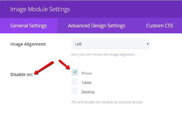
If you check the box next to Phone, then that specific module won’t display for mobile users. You might want to check Tablet too, depending on the module.
If you do disable specific modules, a good best practice is to note that by using a custom admin label. The Admin Label box is also under General Settings:
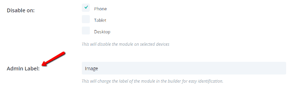
That way, you can create a note reminding you that a module is disabled on mobile. Something like this:
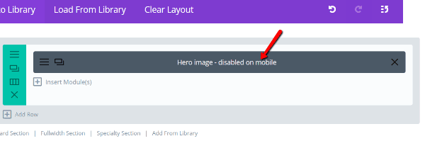
It’s not necessary – but it’s quite helpful if you ever need to make changes to your page at a later date.
Shorten Your Headline on Mobile
Because you have less viewable space on mobile, if you want to keep your headline bold and attention-grabbing, you need to shorten it.
If you’re using Divi, you can display different versions of your headline by using the same concept I outlined above. Except you’ll need to make one addition.
Instead of one module containing your headline, create two. Disable the desktop version of your headline on mobile and tablet, and disable the mobile/tablet version of your headline on desktop.
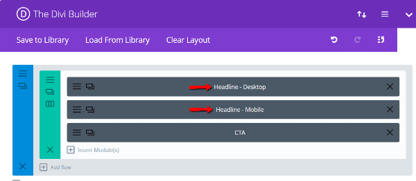
Bam! A simple way to shorten your mobile landing page’s headline without having to resort to external solutions.
When visitors go to your site, they will only see the headline which is enabled for their specific device.
Shorten Your Copy, Too
It’s not just headlines that need pruning, you’ll also need to shorten your copy if you want mobile visitors to actually stick around and read it. The average mobile session length is about half the duration of the average desktop session.
So that same long-form copy which converts well on the desktop version of your site may not do the same on mobile.
Cut your copy down to the bare essentials. When in doubt, show your friends your copy on mobile. If the length is overwhelming for them, it will probably overwhelm your visitors, too.
You can use the exact same Divi trick I outlined above to add different copy versions for different devices.
Follow Google’s Mobile Recommendations
Usable landing pages are good landing pages. If your readers are struggling to read the text on your page, they won’t convert well. Nobody wants to spend time zooming and scrolling just to understand what’s happening.
Thankfully, you don’t have to try to figure out what makes a usable page. Google has set up mobile usability guidelines as part of their push to improve the mobile user experience around the web.
For example, Google recommends that you use a minimum font size of 16px on mobile. That means your regular text should be 16px – headings should be larger.
But what if you don’t want to make your text size 16px for all devices? Well, if you’re using Divi, you can actually set different font sizes for different devices.
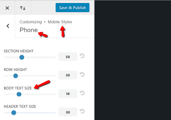
Just go to Divi → Theme Customizer. Then find the Mobile Styles box and click on Phone.
There, you can configure custom text sizes specifically for the mobile version of your site:
You can find more of Google’s recommendations in the Mobile Usability Report at the Google Search Console (you will need to have your site added as a Property in the Search Console to run the report). This is the same report that used to be a part of PageSpeed Insights.
Make Phone Numbers Clickable
This is a massive personal pet peeve…
If your visitors are on mobile, they’re absolutely primed to call you. They’re already holding the necessary device in their hand!
So don’t make it difficult for them to call. Let them click on your number to immediately call you rather than forcing them try to remember it or copy and paste it.

We have a whole post on how you can add click-to-call functionality to both Divi and other WordPress sites.
Put Your CTA in An Easily Clickable Location
On a computer screen, visitors can click pretty much anywhere on your screen with ease. But on mobile phones, things aren’t so flexible.
Research from UX Matters shows the clickable areas for the most common methods of holding a phone. For example, if your readers are holding a phone with one hand, their clickable area looks a lot like one of these:
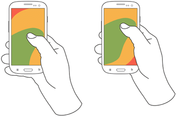
Image by UX Matters
Image Source: UX Matters
The full UX Matters article includes such examples for all of the common hand positions.
A good general rule is to put your CTA in the lower left quadrant of the screen. That should be easy to click for most right-handed users, no matter how they’re holding their phone.
Shorten Form Lengths if Possible
If you’re asking your users to fill out a form on your landing page, e.g. an opt-in, you need to be cognizant of how long that form is. Remember that your users are typing on a mobile keyboard – if your form is too long or includes too many annoying checkboxes, your visitors may just scrap it altogether.
Shorter forms typically convert better, anyway.
Additionally, you also need to ensure there’s enough spacing between form fields for visitors to use touch taps. Fingers don’t have the same pinpoint accuracy as a mouse, so you need a bit more buffer between form fields if possible.
Page Load Times Matter More Than Ever
Obviously, this one isn’t strictly mobile. Page load times matter for every single version of your website.
But the consequences of a slow-loading mobile site can be even more disastrous when visitors are on mobile data instead of their (typically) faster home connection.
In fact, 74% of mobile visitors are likely to abandon a website that takes longer than 5 seconds to load.
So if your mobile landing page loads slowly, you’re not just lowering your user’s experience…you’re flat out driving them away.
If you completed the “minimize distractions” step I mentioned above, you hopefully already removed some unnecessary elements from the mobile version of your site. Removing large images and videos will go a long way to improving the page load time for your mobile landing page.
Following our other tips to improve page load times will also make a massive difference, no matter if your visitors are on mobile or desktop.
Wrapping Things Up
While many of the same general conversion principles that apply to desktop landing pages carry over to mobile landing pages, they aren’t all the same.
In general, the two specific aspects you absolutely need to consider for your mobile landing page are:
- Drastically reduced visible resolution. With less real estate, you need to be more concise and minimalist.
- The shortcomings of touch. Always remember your visitors don’t have a mouse – navigation needs to be simple.
While those two principles aren’t everything, if you keep them in mind (and follow my other tips), you’ll be ahead of most of the competition.
Have you used Divi to create a custom mobile landing page for your site? If you have any additional tips for doing so, I’d love to hear them.
Article thumbnail image by inspiron.dell.vector / shutterstock.com


Very useful, thanks for great tips for building perfect landing pages, this is one of best resources I found online.
This has been asked before. Unfortunately, there has been no answer yet. If I build a website with disabled sections (…and alternative sections) for certain devices, such as mobile, will the disabled sections still be downloaded to mobile devices? Will the disabled sections be striped out or downloaded and simply be hidden? If the later, would this not have a significant impact on page load time?
I meant stripped out 🙂
Excellent article. I will borrow some of the keypoints to my clients, so the better understand the importance of this.
I typically build 2 different modules like CTAs for any website I create. Even though the changes can be subtle, I have learned that a mobile-first design requires you to development some things differently to account for the smaller real estate. In the end it makes for a cleaner design with less restrictions.
This is my understanding too. I would like to see the DIVI Community develop a mobile-first mindset, rather than the current website-first and then tweak the mobile and tablet versions. Perhaps mobile-first tutorials, templates, examples, etc. already exist.
Thanks Colin. We have taken the first step.
Perhaps we can get something going on “How to Build an Effective Mobile Website (with DIVI)”.
Would it be correct to assume that sections that are hidden from the Mobile will never be transmitted to a mobile device, and vice versa. Or are all sections/modules transmitted but some not shown/discarded. How does this work in practice please?
Colin,
Great article and it has inspired me to revisit some of my current sites.
When you talk about Page Load Times I understand that Google optimise their search results for mobile friendly pages. So, if they look at your example page (above) with lots of sections for Desktop and Mobile what do they see?
I’m guessing they see a lot of content and depending on the viewport size a lot of it might be hidden. So, when you tick the box to hide an image for desktop (say it is sized: 1366 x 768) then this image still downloads to the mobile device but is hidden by CSS. yes?
I think the ability to hide or display content based on the Viewport size is going to be incredibly useful in the future (even now) but it needs to identify the Viewport size and construct the html output accordingly before pushing it to the device.
So…. unless the features you talk about in this article stop certain content from being sent to the device (depending on its Viewport size) then what you end up with is even more content being sent. Which in turn would affect page load even more.
At least this is my view of it.
What are your thoughts?
Thanks,
John.
I was informed by the Elegant themes support staff that indeed all elements/ sections are being downloaded. The disabled elements/sections are hidden via CSS.
I really had hoped disabled content would not be downloaded. Being able to disable or enable sections depending on viewing device right in the Divi Builder is great. However, it only really makes sense if the content would be downloaded to the devices accordingly.
I am interested in the same issue. Are the disabled elements downloaded and simply hidden? Thank you!
I was wondering the same thing and would like to hear the answer. Are those elements merely hidden by CSS?
Colin,
Thanks for this. It’s about time there was a decent explanation of using Divi for mobile. For example, don’t try to use the SAME module to create three outputs, create proprietary modules for DT and mobile.
But I still have some questions.
1. When I disable sections, they show up grayed out on the visual builder screen and it’s very difficult to get a decent idea of what your spacing is. Sometimes, the control sections are not accessible because of the the other segments. Do you have a solution for that?
2. To combat this problem with the double module/section method, is it possible to not do it by alternating them throughout but by making consecutive sections, the first 8 sections for desktop, THEN 8 sections for mobile? That way the grayed out sections shouldn’t affect the ones that you are currently trying to see.
3. What about a video tutorial on this? I think that would be killer.
Thanks again!
I sympathize, Randy! That grayed-out duplicate module in the visual builder is really a pain. Wish we could fold sections like we can fold code in Coda! That would be cool!
Oh the irony… I’m reading this on a mobile phone (considering this site is not responsive)
IKR?
This is so helpful! Thank you.