
Welcome to Day 10 of our Divi 100 Marathon. Keep tuning in for 100 days in a row of awesome Divi resources as we count down to the amazing release of Divi 3.0 on the final day of the series!
Creating an effective landing page isn’t easy, and in order to pull it off, you need to get lots of elements just right. The design needs to be eye-catching, the layout needs to emphasize the product or service you’re trying to sell, and the copy needs to be just right in order to convince people to trust you with their hard-earned money. Even if you do manage to pull all of this off, doing it effectively and managing to keep a high rate of conversions is another matter entirely.
While the copy is entirely up to you, we can help you out when it comes to the design and the layout – or more specifically, the Divi theme can. With our flagship theme, you’ll be able to create beautiful landing pages using the Divi Builder, and optimize them for conversion using the Divi Leads tool for A/B testing.
In this post, we’ll take a look at five landing pages built with Divi that we think tick all the right boxes when it comes to obtaining high conversion rates. Let’s get started!
5 High Conversion Landing Pages Rebuilt Using Divi
The following entries are landing pages rebuilt using the Divi theme, and they each highlight different aspects of what makes a fantastic landing site.
Sadly, we weren’t able to obtain specific conversion numbers for these pages, since that information isn’t public. However, with quality like this, we don’t have a single doubt that these pages get the job done as far as conversions go.
So, without any further ado, let’s take a look at number one.
1. ConversionLab
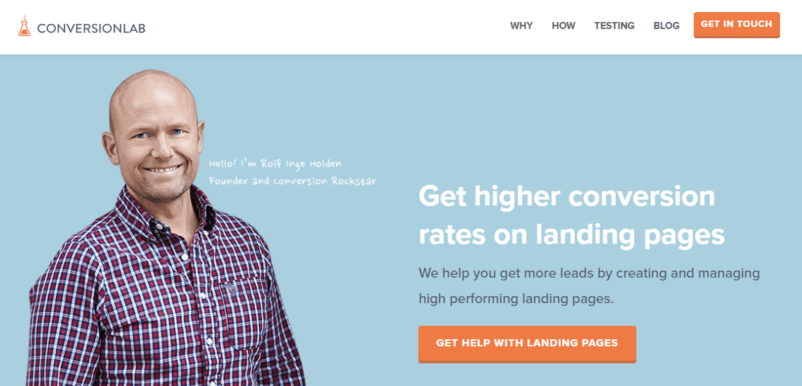
You might already be familiar with ConversionLab, since it’s one of the sites featured in the Elegant Themes Customer Showcase. That, plus having the word “conversion” within its name, naturally made it all but a foregone choice to include it in our list of Divi landing page examples. As if that wasn’t meta enough, ConversionLab’s field of expertise is landing page conversions, and as you would expect, their experience shines through.
This landing page begins with a concise navigational bar with sections such as Why and How, plus an eye-catching call to action in the corner. Below is a now commonplace full-width header, which includes a nice handwritten section on its background image – a small detail that adds a personal touch to the proceedings.
The navigational sidebar is also a fantastic addition, considering how overly long landing pages tend to get. It provides visitors with an easy method (a dot) to make their way up and down the page without wearing out their keyboard. Moving on, the blurb module is used to great effect here, with colorful icons and concise descriptions.
Next, we see the testimonial module being put to use with one single strong quote, surrounded on both sides with full-width sections – including nice percentage counters, which serve to make the site look a little more interactive.
Perhaps our favorite part of the entire page is the contact form, which appears after clicking one of the many calls to action. It’s a slim sidebar that slides out from the right, and enables you to continue browsing the site as you fill it out – so customers never have to leave the landing page in order to make an inquiry. Not only that, it includes an option to sign up for the newsletter, so it also serves to collect leads!
2. Devine Wellness
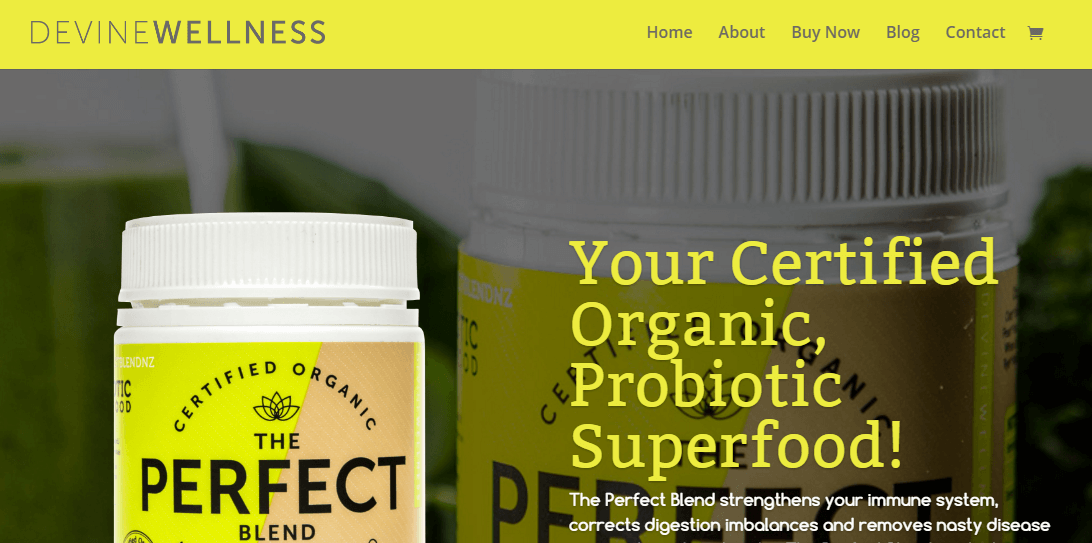
Let’s kick this off with Devine Wellness – a nice, ‘certified organic’ example. Devine Wellness is both the name of the site and the product, which happens to be a probiotic superfood. I’m not exactly sure what that means since I’m more of an I’ll eat whatever is in front of me type, but it sounds impressive.
Since you’re not on the Elegant Themes blog to receive advice about your diet, let’s just focus on the design aspect. Devine Wellness was built using Divi, and it’s a fantastic example of a well made landing page. It immediately grabs your attention with its use of contrasting colors, and gets you interested in the product with a full-width parallax header. It then moves onto a strong call to action, with more information in case you haven’t made your mind yet.
The homepage also makes great use of both the Blurbs and Testimonial modules, with the first using custom icons, and the second including a few solid personal stories. When it comes to testimonials, we feel that providing a few strong examples on your landing page can have a better impact than drowning visitors in them.
Moving on, the page also features a concise list of product ingredients. This is highlighted by an accordion module covering more related questions, so that the entire section doesn’t feel bloated (as is often the case with landing pages) from the get-go.
To wrap things up, the site includes a gallery of the product built using Divi, and a simple contact form, perfect for collecting further leads or answering customer questions.
3. Boxit
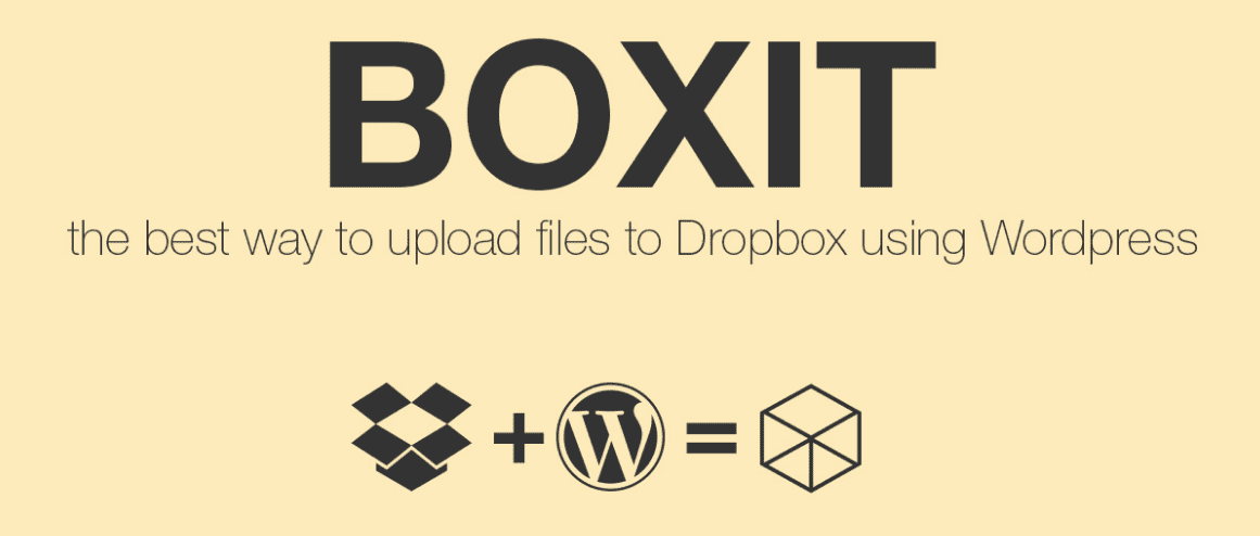
Boxit is the epitome of a succinct (yet effective) landing page. It doesn’t waste time with flowery descriptions, instead providing you only with information regarding the tool’s key features. Sure, it helps that the product is pretty easy to understand if you’re at all familiar with WordPress and Dropbox. However, it’s still a bold choice, considering how filled with information landing pages usually tend to be – especially those geared for sales, such as Boxit.
The page features a fixed navigational bar with a simple Boxit logo, then follows with a full-width header, which manages to sum up the entire product using three simple icons.
The key features section is a blurb module with custom icons, and it’s followed up by a demo section (using a simple contact form in order to connect you to the service), before going in for the kill with a call to action to purchase the product.
As if the lack of repetitive descriptions weren’t enough to make you appreciate the folks over at Boxit, they wrap things up with an instructional video to guide you through the process of installing their app.
4. Pierce Bivens

Unlike the other entries on our list, Pierce Bivens isn’t a business, service, or product. He’s a twelve-year-old musical prodigy from Kauai, and his site just happens to be a nice example of a good landing page (plus, the kid isn’t half bad on the ears).
The site makes use of a nice green and orange color palette (matching Pierce’s album design) and the album itself is the centerpiece of a full-width header, which includes a very concise call to action.
Moving down, the site includes embedded audio and video modules (as you’d expect from a musical website), and it wraps things up with a simple mailing list signup and a row of social media icons. It’s all pretty basic stuff, but using Divi, the whole thing turns out looking really good.
5. 28 Days to Alpha
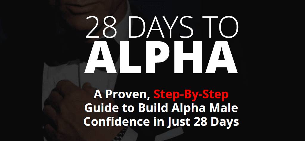
28 Days to Alpha is a more traditional example of a landing page, and one clearly geared towards a more masculine public – in case the title of the program and the James Bond-inspired background weren’t enough to make that clear.
This landing page opens strongly with a header making good use of contrasts, followed by a list of publications where the product has been mentioned. That’s followed by a traditional Divi Blurb module, with four rows and custom icons, plus a nice use of bold lettering to establish a pattern among the informational paragraphs.
The rest of the landing page is by the books for the most part, with alternating rows of text and images on opposing sides to facilitate the flow of reading, all leading down to the crucial call to action – which should be a cinch for visitors who’ve gotten that far.
While the design of 28 Days to Alpha doesn’t necessarily make use of many advanced features included in the Divi theme (aside from blurbs, headers, and testimonials), it does serve as a good starting point if you’re looking to improve upon traditional landing pages.
We’re pretty sure most Elegant Themes readers with Divi experience could quickly put together a similar landing page, but why not add your own personal touches to improve the basic format? Include countdown timers to your next update, make use of pricing tables, or include video sliders. The sky’s the limit!
Conclusion
Building high-converting landing pages is an art form, and if you’re going to attempt it, you might as well go the whole hog and arm yourself with all the tools you need in order to succeed. With Divi’s simple drag-and-drop builder, plus its A/B testing tools, you have everything you need to make your landing pages stand out from the crowd.
As a matter of fact, we just happen to have a few articles to help you get started with building landing pages using Divi. Let’s dive into our archives:
- Mastering Conversion Design with WordPress and Divi Leads.
- 10 Conversion Rate Optimization Techniques You Can Test with Divi Leads.
- Improve Your Website’s Conversion Rates Using Three Core Principles.
Has A/B testing ever resulted in your conversion rates skyrocketing? Subscribe and share your numbers with us in the comments section below!
Article thumbnail image by filborg / shutterstock.com


Hello Tom,
Can you answer a few “basic” questions about landing pages in general? What is it that they do exactly and why are they even necessary? Why do I even need a landing page? Why not just send people to my product page to buy before they get all tired and leave? Why make them go thru all the hoops first then leave w/o buying anything because it was too much overload or hard selling involved? Why use them at all? Why not just send them directly to the buy page and get the sale? Where am I going wrong here?
Can you just get back to me on these landing page questions via email? I’m at [email protected] and then I can feel better about any purchase decision I make.
Thanks a lot, Lou.
Louis, you’ve asked a lot of questions, and that deserves a detailed answer. Therefore, take a look at this article – https://blog.kissmetrics.com/beginners-guide-to-landing-pages/ – and it should answer all of the questions you’ve asked, and many more you haven’t even thought of yet. 🙂
Hope this helps!
Hello Guys,
how can I can make the effect (side) of the module contacts the first landing page?
thank you so much
Hello Davide,
I’m a bit unsure as to what you’re looking to achieve. Have you seen an example of what you want within the article?
Hello
visit Landingpage ConversionLab and click “Contact”.
I would like to create the same effect of the pop side form.
David
Ah, Davide! If you look through the comments above, you’ll find that the website’s developer has already given away his secrets. 🙂
Are those for free? Where is the download link?
This is more of an inspiration post. These are websites “out in the wild” built using Divi.
thanks for sharing,this article is just amazing.
Cheers, Krish. 🙂
Tom – this is a great article as always. Thank you for sharing this awesome collection of high conversion landing page built using divi theme. Conversion lab is really awesome.
Thanks for your kind words – it seems a lot here like ConversionLab, so you’re in good company. 🙂
I continue to come back to the Divi theme . You all continue to your creative process helping others grow to active ongoing improvements. Can’t say enough “good stuff” ( mid west U.S.A. Talk). Lovin it !!
Thanks team .
No problem, Jon! Thanks for your continued support. 🙂
I’m yet to purchase the Divi theme but have a new client whose key business is capturing leads via email. Without revealing too much information, they collect email leads for a lot of different corporate services, I’m going to have to create about 120 different lead pages in total. Is Divi easy enough to use to crank out this kind of number easily and efficiently? Also, what features are built in to the page builder that would help with this task? Thanks.
@Al Carr You can add your customized landing page designs to your library of page templates within Divi. Makes it easy to replicate and customize/tweak for the next landing page you’re creating.
i get high conversion rate after the implementation of the instructions of this article. tank you elegantthemes
Thanks for your comment. 🙂
I’ve never refreshed my browser so hard as in the last few hours. Where is day 11? Yes, you made me very enthusiastic, it’s your own fault!
😉
5 minutes after I posted this, a new one appeared! But not day 11.. day 12! Must be hard having fans like this 🙂
When fixed, feel free to delete this comment!
😀 Glad you’ve got your fix, Verdi!
Awesome landing page example (1) by ConversionLab!
Sadly … Elegantthemes make it sound as if this was easy to achieve by just using the Divi Builder:
“While the copy is entirely up to you, we can help you out when it comes to the design and the layout – or more specifically, the Divi theme can. With our flagship theme, you’ll be able to create beautiful landing pages using the Divi Builder..”
Well, I had a look at the source code, and it became instantly clear that ConversionLab created this page by using a child theme where they added *A LOT* of css customization, which means this landing page was NOT created by purely using the Divi features and functions.
http://conversionlab.no/wp-content/themes/conversionlab/style.css?ver=2.7
Look at all the code below this line:
@import url(“../Divi/style.css”);
It’s the equivalent of 10 pages code.
While it is great to see what’s possible, I think it is a bit misleading as most people may think this type of page could be achieved by using the features and functions provided by Divi Builder.
Comments?
Hi Roland,
You are spot on about the custom child theme, however most of that code we used to simply style the theme.
As Divi has evolved we should have cleaned this up and removed most of it as that would have made our life A LOT easier. We added a lot of styling, but most of it can now be done straight from the Divi editor.
Customizing has it’s downsides. As you’ll notice there’s a bug with the CTA button in the menu when you scroll down on the page. The menu shrinks, but the CTA remains in its original place.
If anyone knows how to make sure the menu doesn’t shrink on scroll off hand, feel free to send me the code so we can fix that 😉
I guess you can say for now we are stuck with the code.
Basically what you’d need the extra CSS for is the menu CTA, slide-in form and our email signup in the footer.
What irony; the one site I liked, Boxit, is no longer available. Goes to show what I know.
There are some very helpful tips in these replies – thanks to all! ET does do some censoring, though. I was the 3rd commenter yesterday and was critical of the first two landing pages and explained why I was not impressed and why I liked the 3rd one. The comment never appeared.
“5 High Conversion Landing Pages Rebuilt Using Divi” …
“… one of which is designed to be responsive on SmartPhones” – would have been awesome 🙁
Appreciate the content examples/demos, but some info on the specifics of a high conversion landing page that works on a Portrait screen would have been a good addition.
Whilst these sites look awesome on desktop, all five of these sites seem to degrade pretty poorly when viewed on a SmartPhone.
Dean, if you don’t like the way these sites look on smart devices, maybe it could give you some inspiration to do an even better job than these!
Thanks for your comment. 🙂
Hi,
please does anybody knows how the sliding contact form (after clicking CTA buttons) is done on http://conversionlab.no ?
Thank you
Hi Johannes, I made a comment on how you can achieve this above 🙂
They are using Contact Form 7, however they customize the HTML output.
Great demonstration of good landing pages.
I will try them, i havea few clients who need help and need great landing pages to make the difference with the competition.
Thanks, Jean-Luc. Glad you enjoyed the post!
Thanks for the examples Tom!
Request: A post about creating the best menu’s (top, side, full screen & slide in)
I’m currently building a site which sadly needs a lot entries (about 80, mostly to pages). I’m really struggeling with making it good looking versus not to crowded, including not to many clicks for users. It’s breaking my brain 🙂
Can it be done with Divi? Do I need a (premium) plugin, questions like that.
Verdi, we’ll bear it in mind. 🙂
Talk about teasing us, i need that slide contact form? Is that a plugin or a built in feature in Divi – if not it needs to be!
It looks like a little extra functionality. Others have also asked within the comments!
They all look like single page ads
Dude, the Boxit image URL is broken, you need to remove the front bit.
Cheers!
It appears to be working again now John – thanks for the heads-up!
Currently I am using free theme.very soon I am planning to use DIVI theme for our site.However do you have any coupon for discount ? Thank you
Despite using Divi, I find it hard to believe most of these sites are converting very well. Especially the Boxit and Alpha Male ones.
In particular, what is so hard about uploading things to Dropbox in the first place that you need another service to do it?
Oh, I’m convinced. ET are great.
Thanks for the kind words. 🙂
Thanks again
No problem, George. 🙂
You’re right!
The contact form on ConversionLab is great, it would be nice to include a tutorial
Hi Andrew, see comment regarding the form above 🙂
Thank you for your continued input through these comments, Finge. It’s much appreciated, especially for an obviously popular piece of coding. 🙂
Hello Andrew,
That appears to be a piece of additional functionality, rather than a Divi-specific feature.
How was the sidebar contact form created? Is that a plugin?
If you mean for ConversionLab, then yes, it appears so!
Any ideas tools/plugins used by ConversionLab in #1 to creat the slideout Contact Form. Pretty slick actually.
It appears to be an additional plugin, but I wouldn’t know which one unfortunately..
I’ve been looking for a clean way to put a CTA button such as ConversionLab’s “Get in touch” button, but instead a donate button. Does anyone have any suggestions?
Hello Blake,
I’m not too sure what you mean – the button is simple to implement, but perhaps I’m misunderstanding you. Could you explain a little more?
I’d love to know how to get the sidebar slide in like on the ConversionLab site. It’s such a cool effect.
Thanks.
Hi Jana, and thanks for the nice words. The script we used to create the slide-in form has been removed from the developer, but it’s more or less the exact same as this one http://www.jqueryscript.net/demo/jQuery-Plugin-For-Responsive-Page-Slide-Menu-PageSlide/examples/
Look at the second method, that’s how we did it. We then added a Contact Form 7 to the hidden content area 🙂
Hello Jana,
It appears to be additional functionality added to Divi, rather than a default setting.
Me too please! How is it done? 🙂
How do you get the section dividers like in number 4? I used to do something like that in Visual Composer but I didn’t know Divi had them too and since I started using Divi, VC is out of the question…
Hello Ivan,
If you inspect the element in your favorite browser, you’ll see it’s a transparent PNG overlaid on a standard divider.
Use background images.
It would be GREAT, if we were shown just how these landing pages were created. I love the site “Pierce Bivens”, but have no idea how it was done. I have Divi and watched every video tutorial and read everything I can get my hands on. I want my site to use parallax like was created on this site and I can’t get these results. The images I want to be fixed scroll as normal. What do I need to do? Are there any Divi designers available for hire that know how to create a site like the Pierce Bivens site?
I´m fascinated about the pierce site too. The site is eye catching, beautiful in simplicity, and with few but well ordered and designed info and design elements, inclusive ear catching music 🙂
Craig and Richard to the rescue, Jim. 🙂
Good luck!
Hey Jim. The parallax scrolling effect is straightforwards to achieve, here’s how you do it:
– Create a fullwidth section
– Add a fullwidth header module
– On the fullwidth module go into the general setting section (the hamburger menu) and scroll down to ‘Background Image URL’ select the picture you want
– Three options below the picture selection is a switch called ‘Use parallax effect’ Turn this on.
– Save and view. Note you should add another section below with some text or something to get the full effect.
Note that if you want something overlayed on the parallax section like on Pierce’s site you would choose a normal section (not fullwidth) and then go into the leftmost menu for the section (the blue one) and within that is an option to set the background image and turn on parallax. You could then overlay whatever you like on top of this background using the modules.
That should give you the look you are after 🙂
Thanks for chipping in Craig and Richard. 🙂
That website is using background images for sections like listen to the album.
Great effort, I’m really excited! Thank you for all of the extras! P.S. Is it me, or is this page NOT responsive? Exceedingly difficult to read on mobile.
Awesome examples!
Headsup….Boxit has a 404 error
Thanks for all the wonderful examples!!!!
Hello David,
I’m not seeing that – so it must be back up and running now.
Thanks for the comment. 🙂
thanks for sharing,this article is just amazing.
Thanks, Karan!
The link is wrong in number 3.
In what way, Bruno? All three links appear correct.
As a visual learner, I appreciate seeing different examples of landing pages. It helps spark ideas for how to create my landing pages – so it’s not important to me if I don’t agree with a complete design for any of these. It’s enough to be able to take away snippets from each one. Thank you.
Thanks for your comment, Heather! You’re right – it’s not about whether you like a particular design, more about the inspiration it can give you. 🙂
Great Post..
Thanks, Mark!
Nice examples. I love to learn from looking at how other sites are using Divi.
Thanks, Donna. 🙂
In the Divine Wellness layout, how do you get the Learn More button to anchor to some other section on the page?
Assign a CSS ID under CSS options. Then create the link as example.com/#cssid
Hello Glenn,
That’s just simply linking to the relevant section on your page. In this example, they’ve linked to the About section using #About. It’ll scroll down to the correct section – try it yourself!
Not to be negative here, but I’m not sure if Boxit is a great example. The bottom of their homepage says “… yeah, it’s responsive too” while most of that background image isn’t even showing…
Actually, it says, “…responsive to…” Wrong word. Also “…its only…” which should be “It’s only…”
Percentage wise, that’s a lot of errors on a website!
Good design but that only highlights bad grammar.
1+ noticed that too.
I was thinking the same thing!
In addition Tom (and Roland), a quick trip to CodeCanyon rewards one with the information that, drumroll please…
“Item No Longer Available”
It appears that’s true, Michael. Still, the website created using Divi is still running for you to dissect!
Roland.. I was coming to say the exact thing :/
Especially since it said they’re responsive
I think that the URL is incorrect on the BOXIT image Tom.
The text link is fine.
It seems to working again now, Keith. Thanks for the heads-up!
Awesome post guys. Any thoughts into adding a 5 and 6 column layout into the Divi theme and builder? Right now I have to use an additional plugin to get the extra columns that I need. It would be nice if it was a choice built right into Divi. Maybe in version 3.0???
Tech support said to do this, please create a full width 1 column for this with 5 text modules. Set your modules one by one as fullwidth for it.
Define the section css ID as: myfive
Then use this code in the custom css section:
#myfive .et_pb_module {
float: left;
width: 20%;
}
That seems to work in my test but the issue is that all the content has to be in each text element. I can’t have separate elements because they won’t line up when the site is mobile.
Please tell them to add 5 and 6 column layouts within the Divi builder.
Thanks!
Matt, I think you and everyone else here wanting this would benefit from visiting our forums, and making your voices hear in the Theme Suggestions subforum – https://www.elegantthemes.com/forum/
Thanks for your comment. 🙂
+1 for more columns
You can add more than 4 columns by using the elegant shortcodes in a text module.
True story.
Thanks for the tip, Riley!
I would like to see it as well. I do not know when it is coming or how much it would explode the CSS file for the theme.
Richard, as mentioned elsewhere, you can always make your voice heard in our support forums – https://www.elegantthemes.com/forum/. We have a dedicated Theme Suggestion subforum for this very purpose. 🙂
I’m just chiming in to say I feel like 5 and 6 column options are basically the one thing Divi is lacking, would love to see that happen as well
Vincent, you can let us know in our forums – https://www.elegantthemes.com/forum/. We have a Theme Suggestion forum for this kind of thing!
I would like to see it as well. I do not know when it is coming or how much it would explode the CSS file for the theme.
Hi Matt. Which plugin do you use for that purpose?
+1 for more columns !!
Yes please, It would have saved me many hours.
HI Matt … I agree, having the possibility of 5 or 6 columns will really help. Do you mind me asking which plugin do you use to add the extra columns?
Thanks !
Pablo
My client at smartzhongyi.com also have a very high conversion rate. We built using divi for them and teach them how to make changes on the back end. They are just another happy customer! However these 5 sites are great !
Thanks for your comment, Ken. 🙂