
So you’ve discovered Divi and went on a quest of creating a website. But as the website went live, you discovered that although it looks great, you’re not hitting the conversion targets you had in mind.
This doesn’t mean you should abandon your efforts. Even though Divi lets you skip all the learning you have to do to make a beautiful website, you still need to understand the principles of creating a design that converts.
To do this, you need to learn the basic principles and try and implement them on your own website. Granted, you will need to experiment with the application for a while, and doing A/B testing would help you get there faster. Without these principles, though, you’ll be figuring out what to do with the website to make it convert a lot longer.
The problem is, working your way up to the perfect conversion rates for your landing pages isn’t a fast journey for most. There is no magic formula that would make a landing page jump from 0% to 50% conversion rate.
However, increasing the conversion rate your website already has by 100% or even 300% is not an unusual thing when you apply yourself. Even if it grows from 1% to 3%, it’s two more leads per hundred visitors, which can be a game changer for your business.
The only thing you need to do to achieve these results is to learn some common rules that will allow your landing pages to become more profitable.
In this post, you’ll discover eight design principles that will help make your landing pages more effective.
Design for People
Every business’s audience is different. They are different people, they want different things from the product, and they think differently. You need to learn everything about yours to deliver the message they need to hear.
If you haven’t developed buyer personas just yet, you’ll need to do that for the landing page. Complete beginners would be better off checking that whole article, but if you know a bit about buyer personas already, here’s where you can find information on your audience.
- Conduct quick surveys
- Google and Facebook analytics
- Searching Google keywords for intent
- Looking for public opinion on Reddit and Quora
- Studying users’ social media profiles
- Conducting personal interviews
Now, doing a personal interview may be overkill for most small to medium-sized businesses. You don’t need to go that far with customer research, the first five methods are more than enough to upgrade your landing page. Many landing page plugins offer modules that can help you build effective, eye-catching, and high-converting pages fast.
The most important thing is to design each specific landing for its audience. Are you holding two distinct marketing campaigns for high-value lifetime customer leads and for discount shoppers? You can’t have the same landing
Consistency
This piece of advice may sound like “don’t mix it up.” Well, it kind of is just that. You need to make the design and the message of the landing page consistent with the design and message of the source link.
Some landing pages get traffic from search results, some from paid ads. If it’s the latter in your case, make sure the banner, the message, and the landing page design are in line.
If there’s a big difference, users may think it’s a scam. But coming off as malicious is not the only thing you should worry about. If the message is inconsistent between the link to the page and the page itself, many leads would simply bounce because they don’t find what they’re looking for.
Minimalism
This design principle is not only useful when you’re creating contemporary art. It’s also very useful for designing landing pages out of all things.
The thing is, a landing page is not about giving as much information as you can to the visitors. It’s about streamlining conversion. The fewer additional elements there are on the page, the better.
Make sure there are no distractions on the page, and users are led straight to the CTA section.
This NGO website is as minimal as it gets. The straight line on top slightly cues scrolling down to see more.
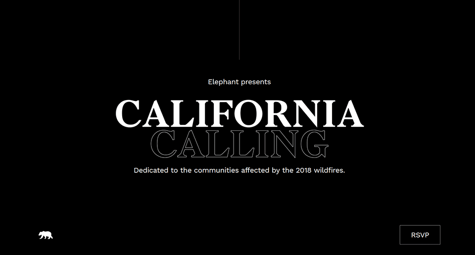
source: california calling
But you don’t have to go full artsy minimalist on your landing page like this California NGO. You can just keep the number of elements minimum like Shopify.
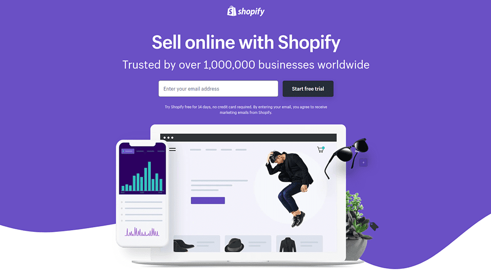
source: shopify
When the leads are not bombarded with CTAs and distractions on the landing page, they’ll read what little information you give them and keep scrolling.
Foregrounding
This design principle is so simple that you’re already using it in your daily life. Treat your landing page as a student’s textbook. All the information in the book is important, but the most important bits are highlighted with a hard to miss yellow marker.
Use background and font color, font size and shape, and white space to foreground the most important elements on your page.
The simplest example of foregrounding is making sub-headings larger and giving them a different color.
Giving important CTAs a contrasting color is also a common practice.

Catch Attention
When a new lead lands on the page from an ad, you have a small timeframe to catch their attention. Some sources claim the timeframe is as small as 2.6 seconds. How can you get a stranger’s attention in just under 3 seconds? Here are four suggestions.
- Use movement (we unwillingly react to it) or human faces above the fold
- Explain your offer in one sentence that you foreground
- Spur interest, possibly by offering a free trial
- Show an important statistic or figure
This Airbnb landing page does three things from the list.
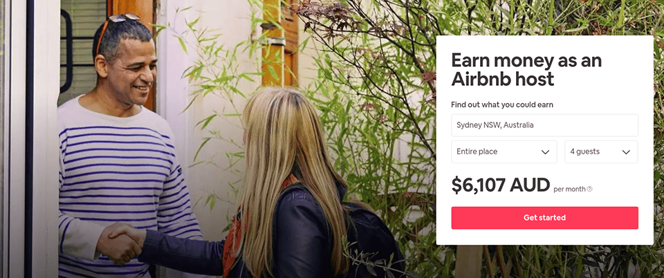
source: Airbnb
It has a friendly face on it that automatically attracts attention. The next thing a person sees is an offer to make money. When Airbnb shows them the monthly estimate, the company has that lead’s full attention.
Grids and Visual Communication for UX Writing
Good website design is more or less uniform. A good pitch isn’t. Consider all your knowledge about your audience and craft a message that would convince users to convert. Make use of social factors, pains, and values of your customers that you learned about.
Don’t write a 1,000 word essay on why your product is good, though. Be as brief as you can and use grids to structure what you have to say.
It’s a design principle you may already know because every framework and template including Divi has it. Here’s a three-column grid that Shopify uses.
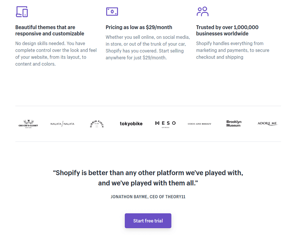
source: shopify
Here’s a grid with two columns from Airbnb’s landing page.
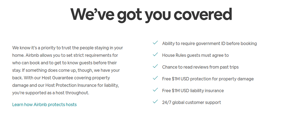
source: Airbnb
Grids may seem a bit boring because everybody uses them, but it’s one of the few things that helps to get your point across, so it’s a compromise. If a simple grid with icons and text looks too boring for you, spice it up with white space and different foregrounding. With Divi, you can design on the go and get your grid pattern to look just right.
Another important design principle you can use for UX writing is visual communication. UX writing doesn’t only involve text. Use imagery, animation, or videos to explain what your product can do for the customer.
Here’s a minimalistic and bold example from that California NGO.
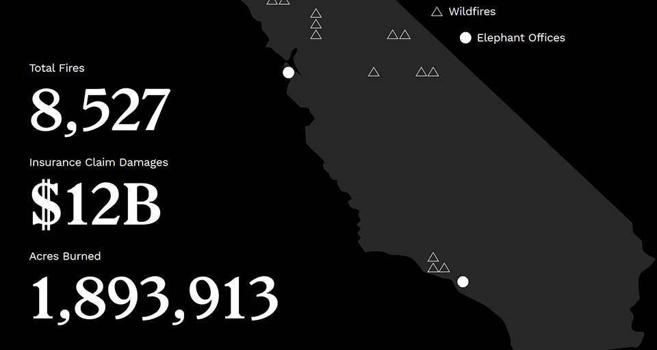
source: california calling
Effortless Conversion
People who design brick-and-mortar stores don’t make customers jump through hoops to pay for groceries. Neither should you require customers to go through a 10-minutes registration process to make a purchase. In fact, the more form fields you have on the landing page, the fewer conversions you’re going to get.
Keep the number of moves a person needs to do to convert as little as possible and make the call to action foregrounded and very obvious. If you offer a free trial of sorts, you may only need one CTA button. After all, the offer requires very low effort already.
If you don’t, leave the second option in case the user is not ready to convert now. The choice should not be between yes and no, but between yes and yes but later.
Using an AI chatbot or adding a live chat feature on your site using a plugin is also a great idea. This lets visitors contact you to get their questions answered and could turn them into a warmer lead for your sales team.
Study How People Interact with the Design
Starting out with these principles and learning more about Google UX guidelines is a solid foundation for a converting website. However, if you want to excel as a designer, you should study how users interact with what you design. Especially so, if hundreds of thousands of dollars in revenue are at stake.
How do you do that? You can start off by exploring how the website would look from your client’s perspective.
Use the Chrome or Firefox developer tool to resize the browser window to see how the design changes on different-sized screens. Does your website target customers from different locations around the globe? For better testing, you should additionally use VPN. For example, there are many VPNs for Mac, Android, and others. This will help you not lose customers.
It also helps you see how fast it would load if you were a visitor from Japan or New Zealand. If your servers are located only in the US, visitors from other countries may experience a longer loading time, and that’s not something you want.
Lastly, you need to look at how actual people interact with your website. Design multiple versions of the landing page and use Divi’s split test tool to see what performs best.
To get even more insight, get a heatmap tool like Hotjar to see where people are clicking and hovering their mouses. If your CTA doesn’t get the attention you wanted it to get, it’s a sign you need to improve.
Final Thoughts
These eight design principles will go a long way in making your landing pages better. But don’t stop learning just because you got to know eight of them. Learn more about design principles for landing pages, and upgrade your knowledge of UI design by learning how to create parallax backgrounds in Divi to catch your leads’ attention.
Featured Image via PureSolution / Shutterstock.com


Thank you for this! I don’t know if it would be appropriate to ask the Elegant Themes guys to create a tutorial teaching us how to make these effects/animations from the “California NGO” page? 🙂 Thanks again