
Welcome to part 3, the final post in our mini series “Effective Divi Web Design Principles” where we’re exploring effective design practices to help empower new web designers and those who identify as someone without an “eye for design.”
Now that we’ve covered preparing and learning how to have a better eye for design and have gone over some effective design principles to have in our toolbox, we’re going to focus on 3 very important areas of design that are key to achieving a well-designed site.
Let’s get right to it!
3 Important Areas of Design to Focus on for Every Website Build
If you’ve kept up with the first two posts in this series, you’ve heard me point out that there’s no right or wrong when it comes to design, but along with the effective design principles we went over, there are a few important, practical areas of design that I focus on to ensure a successful, eye pleasing website build every time. And the best part is, these ideas are transferrable to any type of industry or web design style!
1) Typography and Fonts

Your site can have beautiful imagery, engaging colors and pleasing design elements, but if the type looks off or doesn’t fit the style of the site, it can be a major deterrent. Since we’re not getting into the basics of typography in this series, please refer back to our 50 Typography Terms Every Web Designer Should Know (And Understand) post if you’d like to learn more about the basics. An understanding of kerning, leading, tracking, sans and sans-serif fonts will greatly behove the person looking to get better at type and design.
Let me offer you a few practical typography guidelines I stick to as a successful Divi web designer with clients who differ greatly in design styles and different industries:
Use fonts that pair well with your sites industry/design – In the first post of this series, I recalled an example where I self-admittedly designed a site that had great imagery and colors but the font didn’t match well. In short, it was an industrial manufacturing site and the font I initially used was a more modern, sleek style that indeed didn’t fit the look and brand of the company.
This doesn’t mean that you can’t get creative with fonts or that you have to match the industry status quo, but practically, if you’re working on a professional service site, you’re probably not going to want an over-the-top, artsy font involved. And vise versa, if you’re working on something with a unique, perhaps artsy vibe, maybe Arial or Helvetica isn’t going to match the vibe you’re going for. This brings me to my next point of mixing and matching fonts.
Stick with 2 to 3 fonts – A basic design principle that has stood the test of time for decades is to limit the number of fonts you use. Too many fonts distract the reader, often confuse hierarchy and frankly, end up looking like an old western flyer seeking a reward for an outlaw. I often stick with one font for headers and titles, then typically use an easily readable sans-serif font for all my paragraph text. Sometimes I’ll have a 3rd style font for the main menu but my menu font is often streamlined with my titles.
For more ideas on how to pair fonts together, please refer to this previous post on Font Pairing in Web Design: 7 Key Principles Revealed and Explained
Have visuals with your text – A decent amount of text in your content is great. In fact, it’s recommended to have at least 300 words per page to help from an SEO perspective. But beware having too much text and not enough visual aids. For books, blogs, articles and other long form content, a lot of text is expected but if you’re designing a nice engaging landing page, too much content will bore the user before they look any further. I often design with the mindset that the front page should be the sales funnel that gets clients through the door THEN they can dive into more pages, blogs and other resources for more detailed information.
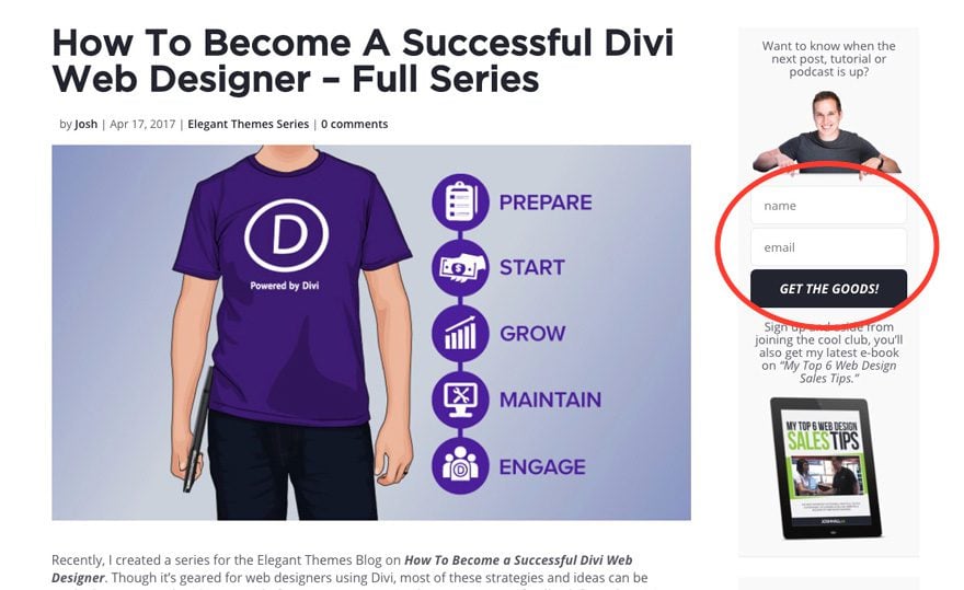
The Elegant Themes homepage is currently a perfect example of that.
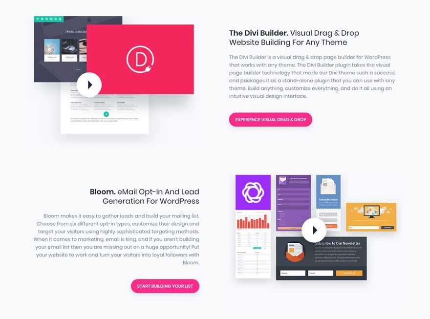
In this example, we see an engaging title, a paragraph of text with a call to action button and a nice visual graphic that ties in the message which keep the user engaged. This is a great example to follow when organizing a decent amount of text with visuals.
I once had a beautiful front page designed with text and visuals and when I turned it over to my client to make basic edits, they had dumped what looked like a small chapter of a book into the front page which completely ruined the flow of the design I created. So let that be a lesson and know that while content is great, it needs to be placed accordingly!
Another great resource to refer back to is 20 Typography Trends to Pay Attention to in 2016 as those trends are still very valid today and will be moving forward.
2) Imagery and Color Management

Similar to typography, I tend to stick with at most 2 to 3 primary colors for my website builds. Unless it’s a company or organization with a plethora of colors in the branding, I find that too many colors (particularly if they don’t match well) can be very distracting and often confusing. Here are some guidelines I stick to when mixing color and images:
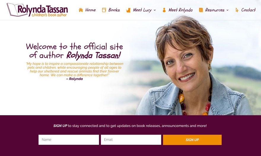
Base colors and accent colors – One method I’ve found very successful in recent projects is to take a client’s branding and if they don’t already, pick a nice accent color for call to actions, links, etc. For example, on this site, I took the branding of the logo with the grey and orange and added a subtle, dark teal/blue to help make the orange “pop” as the primary accent color.

Streamline color with images – One way to bring your design and images together in a great way is to match website colors with some of the primary imagery. This example is a bit rare as I was able to match the website colors to my client’s outfit which made for a very nice streamlined feel between the imagery and website color.
I took a nice maroon and orange color from my clients outfit and was able to bring the entire site together in a nice uniformed look. Now you’ll rarely be in a situation where you can brand an entire site off an image, but this same principle can be applied when using background images with call to actions, etc!
Practically, if you’re not sure how to pick certain colors, here are 10 Color Picker Tools
Steer clear from colors that are too vibrant – I often see newer designers use super bright greens, pinks, yellows, etc that make one squint and back away from the screen. I won’t point out any bad examples here but I’m sure you’ve seen plenty of sites where the colors made you turn away and never want to look back. There’s certainly nothing wrong with vibrant colors, just make sure they don’t give off that effect. This is where getting constructive criticism and feedback from other designers can pay off.
My recommendation is to use fairly neutral colors for base colors like text, background graphics, etc then use more vibrant colors for call to actions, links and more attention-drawing areas of the page design. If you’re new to design and color is not a comfortable area for you, feel free to refer back to our Color Matching Techniques for WordPress Web Designers which will provide plenty of options on how to better pick colors.
3) Strong Call-To-Actions

Lastly, one very important area of web design is to have strong and clear call to actions (CTA’s). One of the most common problems of bad web design is to have heavy text driven content with no clear call to actions. Content is great but if it’s all information and no conversion, your client will certainly not be satisfied. I recommend making your CTA’s stand out from other elements in your design with an accent color or nice hover effect.
Here’s an example of how I implemented a call to action for a recent client.
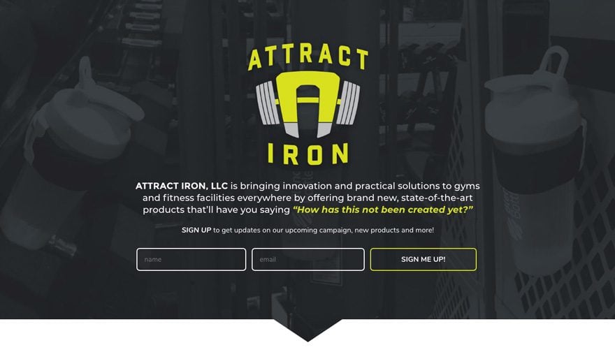
In this case, the client’s primary call to action for website users is to sign up for email updates so right off the bat, we have the logo popping out from a darker background image, a little bit of text with an immediate opportunity to sign up before even scrolling down. Ideally, you want to draw your user’s eye to your call to action. That’s where have a vibrant accent color or effect on a site is extremely beneficial.
Here are a few guidelines I stick to when it comes to call to actions:
End your homepage with a strong call to action – More often than not, my homepage designs are almost a recap of the site as a whole. For example, if a site has a structure like this:
- About Us
- Services
- Testimonials
- Blog
- Contact
I’ll make a call to action for each one of those sections in the homepage then a final, sleek design for the main call to action, which in this case would be to sign up. Here’s a prime example of what I mean:
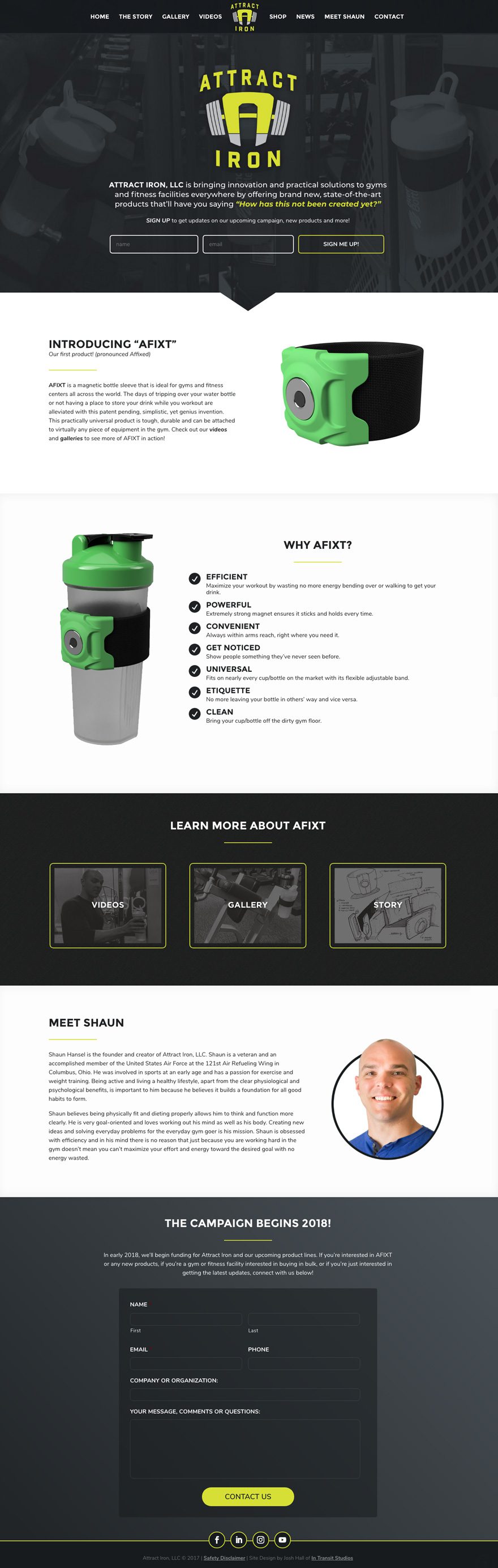
The front page essentially encapsulates the entire site and is a starting point for users to click off to view galleries, videos and more information. Perhaps that mindset will help you out as in your homepage designs!
Have a call to action in your sidebar – Don’t forget the opportunity for a strong call to action in the sidebar! Especially if you have a site with blog posts or other pages that frequently use a sidebar. This is a great opportunity to put an extra email sign up, donation button or link to another main CTA.
Similar to the site above, one of the main call to actions for my personal site is an email sign up and while that’s front and center on my homepage, I wanted to be sure to also make it very apparent on my blog post and tutorial pages.
Here, I have it at the top right of each post template along with a strong visual above and below the main sign up form. So if you have pages with sidebars, remember that those areas are valuable real estate for strong call to actions! And you want to be sure and make your CTA’s noticeable and preferably at the top of the sidebar which will show up first on mobile below the main content.
Have a call to action after subpage content – Lastly, and perhaps most overlooked, is to remember to have a call to action on your normal pages! I’ve self admittedly overlooked this until recently when it was requested by a client. The example below has a strong call to action at the end of their main services pages.
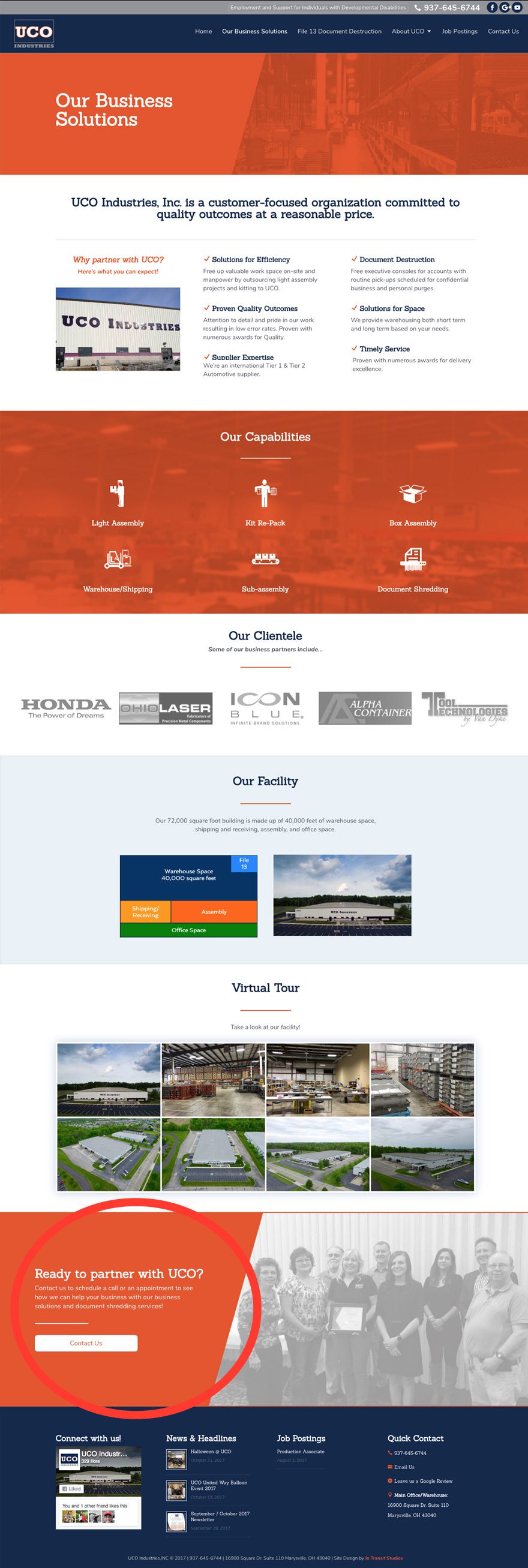
When a website user views that page, they’ll take in all the information then have a chance to contact my client if interested with a nice, welcoming image to the right and CTA button on the left backed by a vibrant orange which helps that section pop off the page. Yes I know I said in a previous post that I usually put my CTA’s in the middle or right but this layout just seemed to work nicely 🙂
Series Wrap Up
Well I hope this series has helped inspire you with some good web design principles and tactics that you can apply to your web design endeavours! Let’s do a quick recap of what we went over in the entire mini series:
Part 1
- Preparing your Mindset
- How to Learn Good Design Trends
- Get Feedback and Constructive Criticism on Your Work
Part 2
- Follow the Rule of Thirds
- Layout and Flow
- Visual Hierarchy
Part 3
- Typography and Fonts
- Imagery and Color
- Strong Call-To-Actions
Again, entire academic studies have been dedicated to good design so we’re just scratching the surface here but my hope is that these principles and practices have helped point those of you who are wanting to get better at design in the right direction. If you have any other design principles or methods that have helped you that you would like to share, feel free to let us know in the comments below!
Here’s to all of us becoming better Divi Web Designers every day!
Be sure to subscribe to our email newsletter and YouTube channel so that you never miss a big announcement, useful tip, or Divi freebie!


Love these tips. Awesome. Thanks!
Just been through all three parts of your mini series. Time very well spent by this left-brainer. Many thanks.
Loved these. Thanks!
Awesome to hear. Thanks, Dimitris!
Thanks a lot. The articles are incredibly useful.
Thanks, Rafael! Really appreciate the feedback!
hi Josh,
thank you very munch for your mini-series. This goes helps me to correct my errors, to consolidate some of my ideas and has to think in a more rational way for my Web projects future.
Do not hesitate to realize of other one put into series about so good quality;)
Awesome to hear. Thanks so much for the feedback!
This has been a brilliant mini-series and I’m so glad you’ve broken it down like this. You’ve covered many things that I sometimes stumble upon and in other areas you’ve reassured me that I’m working on the right path.
Can’t wait to implement this into the next project.
Thanks for the awesome feedback, Imran! So glad to hear that the ideas in this series helped and hope it all contributes to your next project. Cheers and thanks for the comment!
Must read.
Thanks, Yakin!