
The website’s header is usually the first thing your visitors will see when they land on your website. It loads first, so it’s your visitor’s first impression of your site. As always, you want the best first impression you can get. This means we should always pay extra attention to our header designs. In this article, we’ll look at 11 header types you can create with Divi.
The articles we’ll cover for these 11 header types are detailed tutorials with free JSON file downloads. Many of these tutorials include CSS and some include jQuery. Several include video instructions to help you through each step. You can follow the tutorials to create your own header, or simply download the files, upload them to your Divi Theme Builder, and make any changes you need. The step-by-step instructions ensure that all are easy to use.
Now, onto the 11 header types you can create with Divi!
- 1 1. Global Header
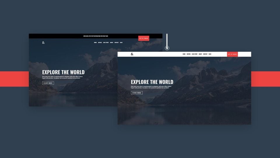
- 2 2. Sticky Header
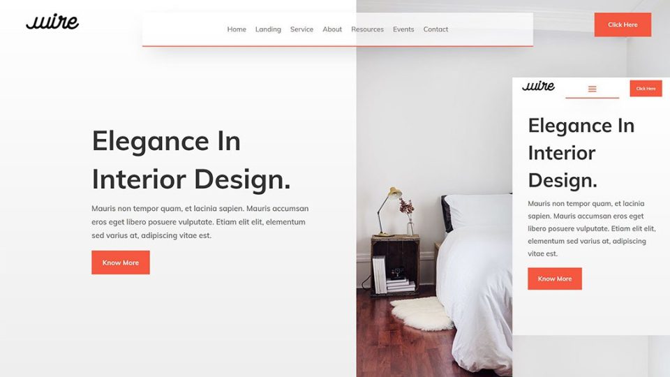
- 3 3. Fullscreen Global Header
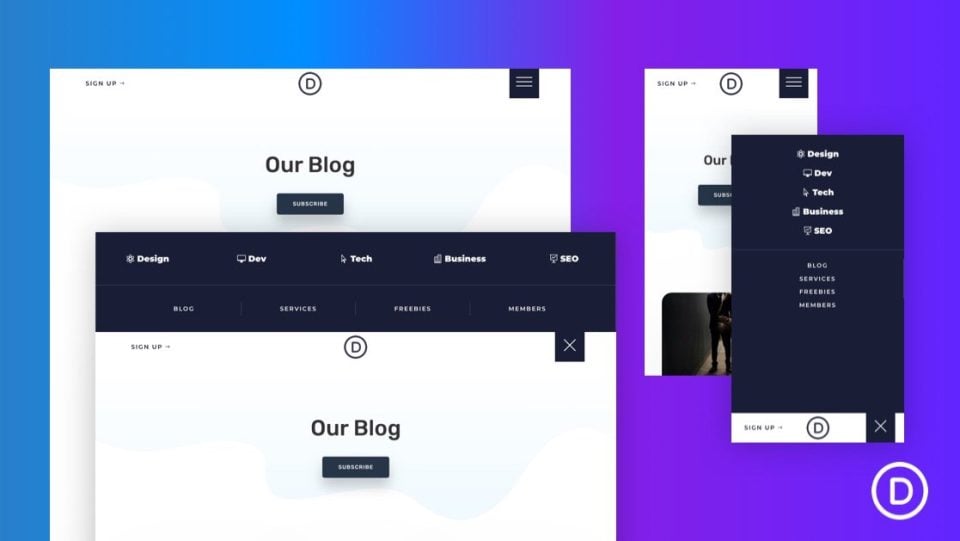
- 4 4. Responsive Slide-In Menu
- 5 5. Slide Down Push Menu
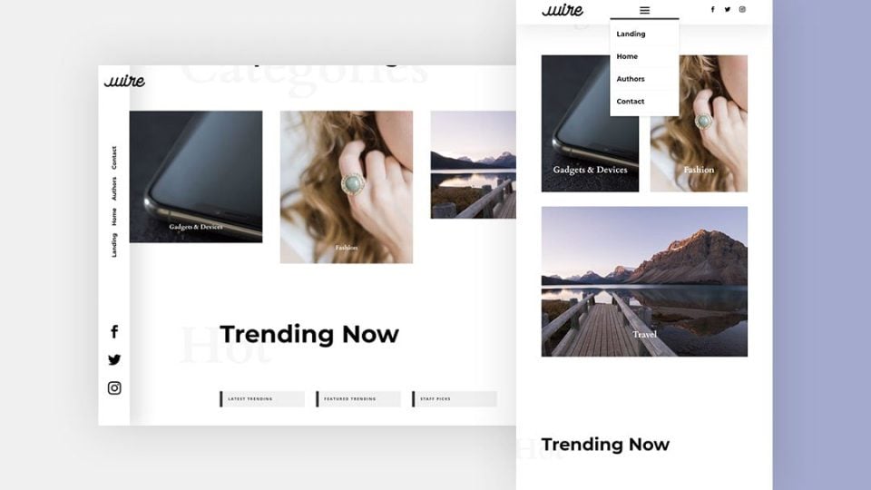
- 6 6. Vertical Navigation Menu
- 7 7. Transparent Floating Menu Bar
- 8 8. Transparent Sticky Header
- 9 9. Rotated Global Header
- 10 10. eCommerce Mega Menu
- 11 11. Advanced Elegant Themes Dropdown Menu
- 12 How to Get Header Templates
- 13 Ending Thoughts
1. Global Header
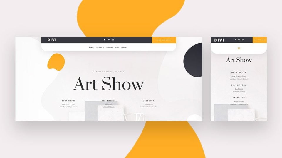
If you want to create a custom global header, this tutorial is a great place to start. It covers how to set up the WordPress menus, and how to design a custom global header with the Divi Theme Builder to display and style those menus. The design includes a sticky bar at the top. The tutorial includes CSS and video instructions.
2. Sticky Header
This tutorial shows how to use Divi’s sticky options to build a sticky header. The header includes a menu bar that changes color and size when it sticks to the top of the screen. The other rows and elements scroll as normal. It includes CSS and works on both desktop and mobile.
3. Fullscreen Global Header
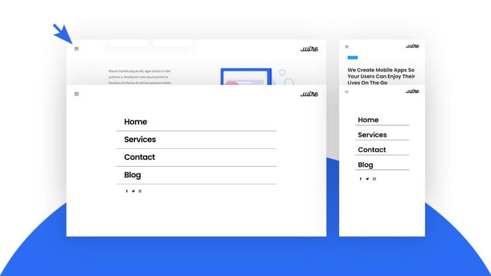
This is a great tutorial for anyone interesting in creating a custom fullscreen global header with the Divi Theme Builder. The header includes a hamburger menu that opens in fullscreen. It works on both desktop and mobile and includes CSS and jQuery with instructions on how to use them. This is one of the most common header types and it’s always a good idea to know how to make them.
This tutorial shows how to create an interesting menu that slides in from the right side of the screen when the user clicks the hamburger menu icon. The icon is a large button with reduced opacity to allow the page to show through. The menu slides over the screen on both desktop and mobile. The effect is created with CSS and jQuery.
This tutorial shows how to create a menu that slides down from the top of the screen when the hamburger menu is clicked. The desktop menu has a horizontal layout, while the phone menu stacks vertically. It includes custom CSS and jQuery and includes CSS for each of the screen types. It also builds a hamburger icon using HTML. You can also make this menu sticky using optional CSS.
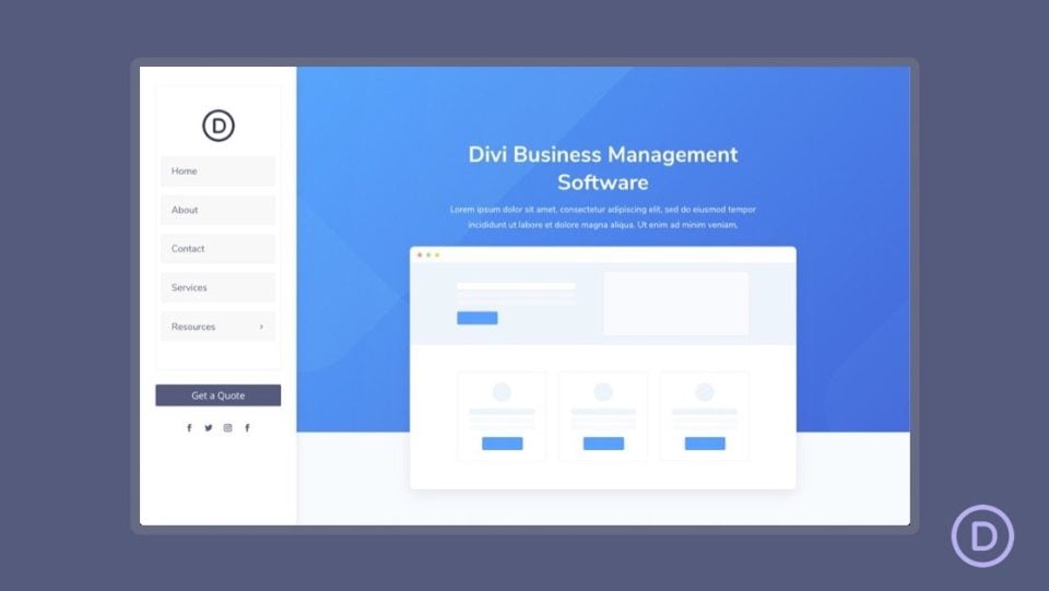
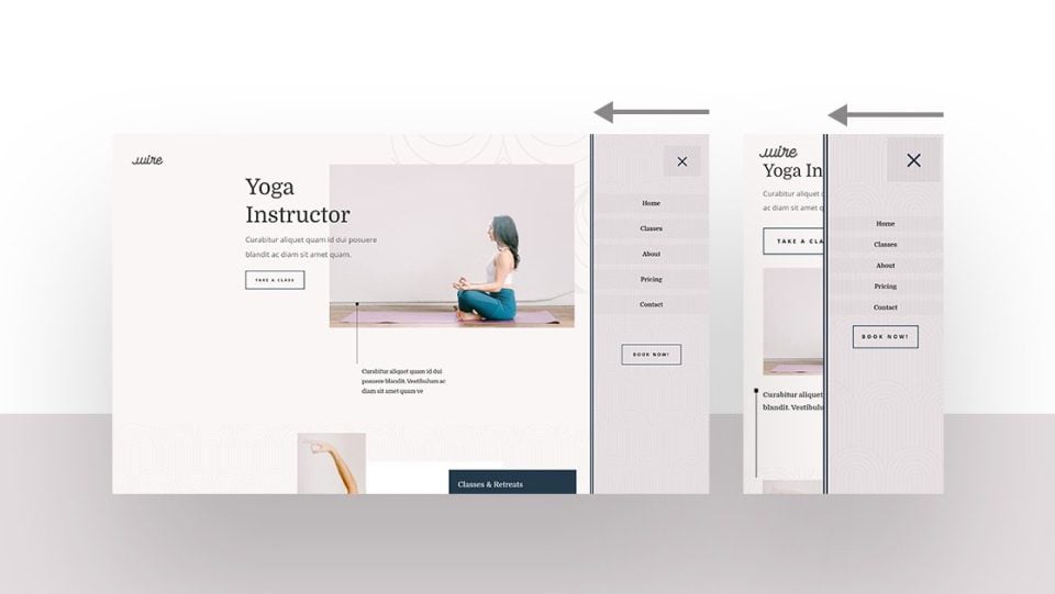
This tutorial covers one of the few vertical header types. shows how to create a vertical navigation menu for the desktop that remains on the left side of the screen as the user scrolls. The submenus open over the screen. The menu includes a CTA button and social follow icons. For mobile, the menu is placed at the top of the screen. Custom CSS and CSS specifically for desktop and tablet are included. It also shows how to add the vertical navigation menu to the body area of a page template. You can also use this tutorial to create custom sidebars.
In this tutorial, you’ll learn how to create an interesting transparent floating menu bar. The menu bar takes only a portion of the header area, making it a great way to add a menu to a hero section. It works on desktop and mobile screens. This tutorial also includes CSS and step-by-step video instructions.
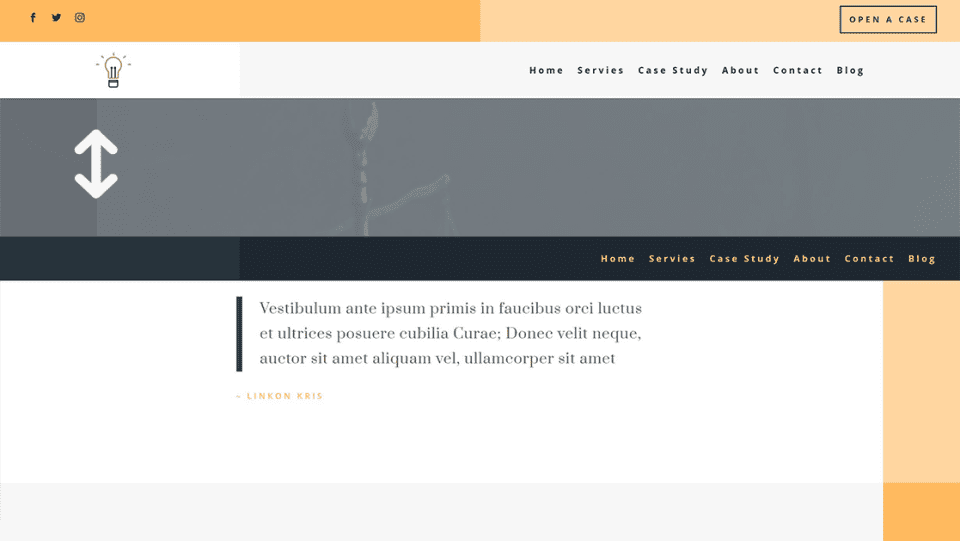
8. Transparent Sticky Header
This tutorial shows how to create a transparent sticky header that changes as the user scrolls. The header includes a top bar, a bottom menu bar with a logo, and a call to action that overlaps the two bars. The menu bar is transparent. When the user scrolls, the top bar scrolls away, and the menu bar becomes solid and changes colors. The CTA sticks with the menu bar and is no longer overlapped. It works on desktop and mobile.
9. Rotated Global Header
If you want a menu that looks different from most on the web, you’ll like this tutorial. This is one of the most interesting header types. It shows how to create a slim menu that sticks vertically to the left of the screen. The menu links are rotated. The logo overlaps the header and the body content. The header’s background shows the background of the section that’s scrolling past, but it’s separated with a shadow. The menu sits horizontally at the top of the screen on mobile devices. It includes CSS.
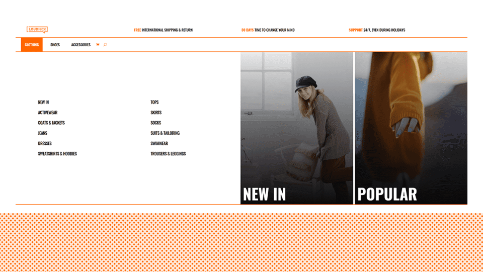
This tutorial shows how to create a mega menu to highlight your WooCommerce products and shop categories. This is one of the more unique of the header types. The mega menu opens on hover and includes text links and image links in multiple columns. The mobile version shows the text links with toggles for the main categories. This one also includes CSS and jQuery.
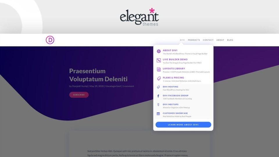
If you’d like to create an advanced menu like the one on this blog, this tutorial is for you. This is one of the most advanced header types. This tutorial shows how to create multiple dropdown nested menus with icons, text, and CTAs in multiple colors just like the one here on the ET website. The mobile version works with toggles. As you could guess, this tutorial uses lots of CSS and jQuery, which are included.
How to Get Header Templates
All these tutorials include JSON files that you can upload to your Divi Theme Builder. If you’re interested in other headers for Divi, take a look at the Elegant Themes blog. There are lots of free headers that are designed to match the free Divi Layout Packs. Simply search the blog for “free header template” or similar keywords and download what you want, upload them to the Divi Theme Builder, and make your changes.
Ending Thoughts
That’s our look at 11 header types you can create with Divi. These tutorials show how to create simple or complex headers for any purpose. Most of these headers include CSS and many include jQuery to give them unique features. These tutorials are also a great way to learn how to apply CSS and jQuery to your Divi templates. For the ET blog for more tutorials like these.
We want to hear from you. Have you tried any of these 11 header types with Divi? Let us know about your experience in the comments.


Brilliant themes. Cannot wait to overhaul my existing blog with your templates.
Thank you!
I am not using the sticky header on my website but I will try to switch to sticky header. I believe, it will look far better than my current website design. Also, I think I need to change my theme to DIVI, it looks more professional.