
When it comes to setting up a global header for your website, there are many ways to approach it. One of the more subtle approaches is a transparent header. Transparent headers are placed on top of your pages’ hero sections, which can lead to beautiful designs that focus on a minimal but clear approach. If you decide to go for a transparent header but need a sticky header on scroll, you’re going to love this tutorial. Using Divi and its built-in sticky options, we’ll show you how to go from a transparent header to a differently-styled sticky header on scroll. The transition between transparent and sticky is effortless! You’ll be able to download the JSON file for free as well.
Let’s get to it.
Preview
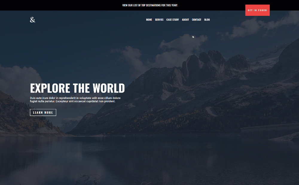
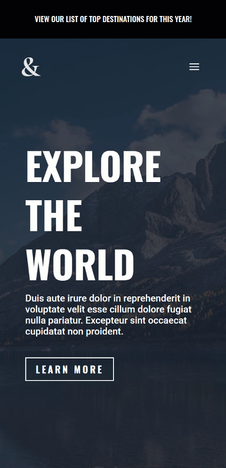
Before we dive into the tutorial, let’s take a quick look at the outcome across different screen sizes.
Desktop
Mobile
Download The Global Header Template for FREE
To lay your hands on the free global header template, you will first need to download it using the button below. To gain access to the download you will need to subscribe to our newsletter by using the form below. As a new subscriber, you will receive even more Divi goodness and a free Divi Layout pack every Monday! If you’re already on the list, simply enter your email address below and click download. You will not be “resubscribed” or receive extra emails.

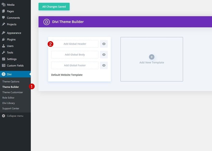
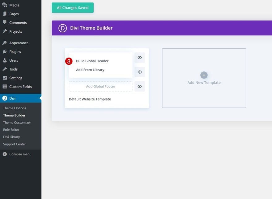
1. Building The Header Element Structure Inside a New Header Template
Create New Global Header Template
Start by going to the Divi Theme Builder. There, start building a new global or custom header.
Section #1 Settings
Background Color
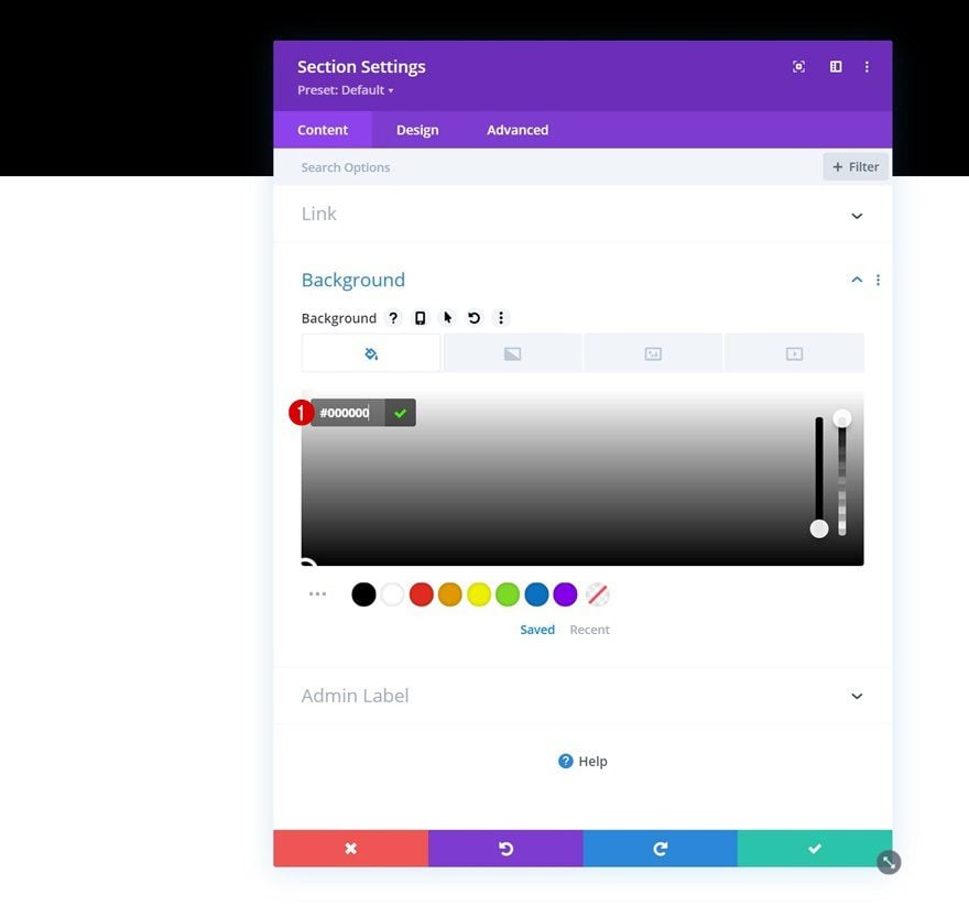
Once inside the template editor, you’ll notice a section. This section will be dedicated to the top header bar that you can notice in the preview of this post. Open the section’s settings and add a black background color.
- Background Color: #000000
Spacing
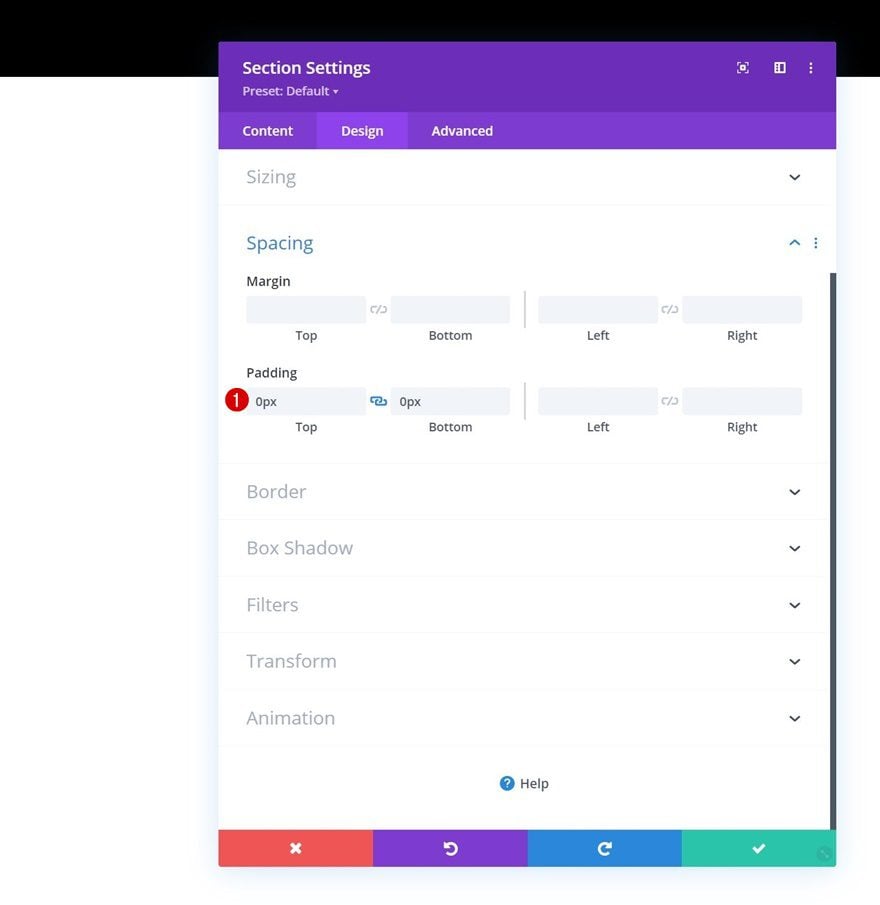
Move on to the section’s design tab and remove all default top and bottom padding.
- Top Padding: 0px
- Bottom Padding: 0px
Add New Row
Column Structure
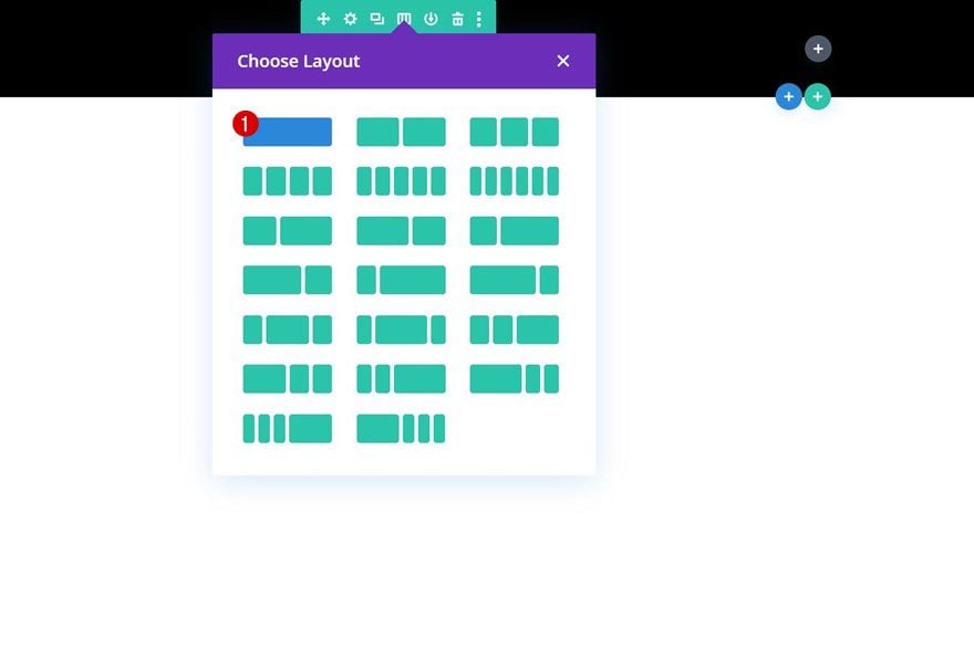
Continue by adding a new row using the following column structure:
Add Text Module to Column
Add Content
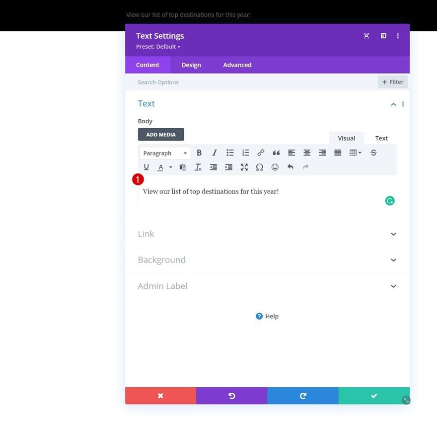
Add a Text Module to the row’s column and enter some copy of your choice.
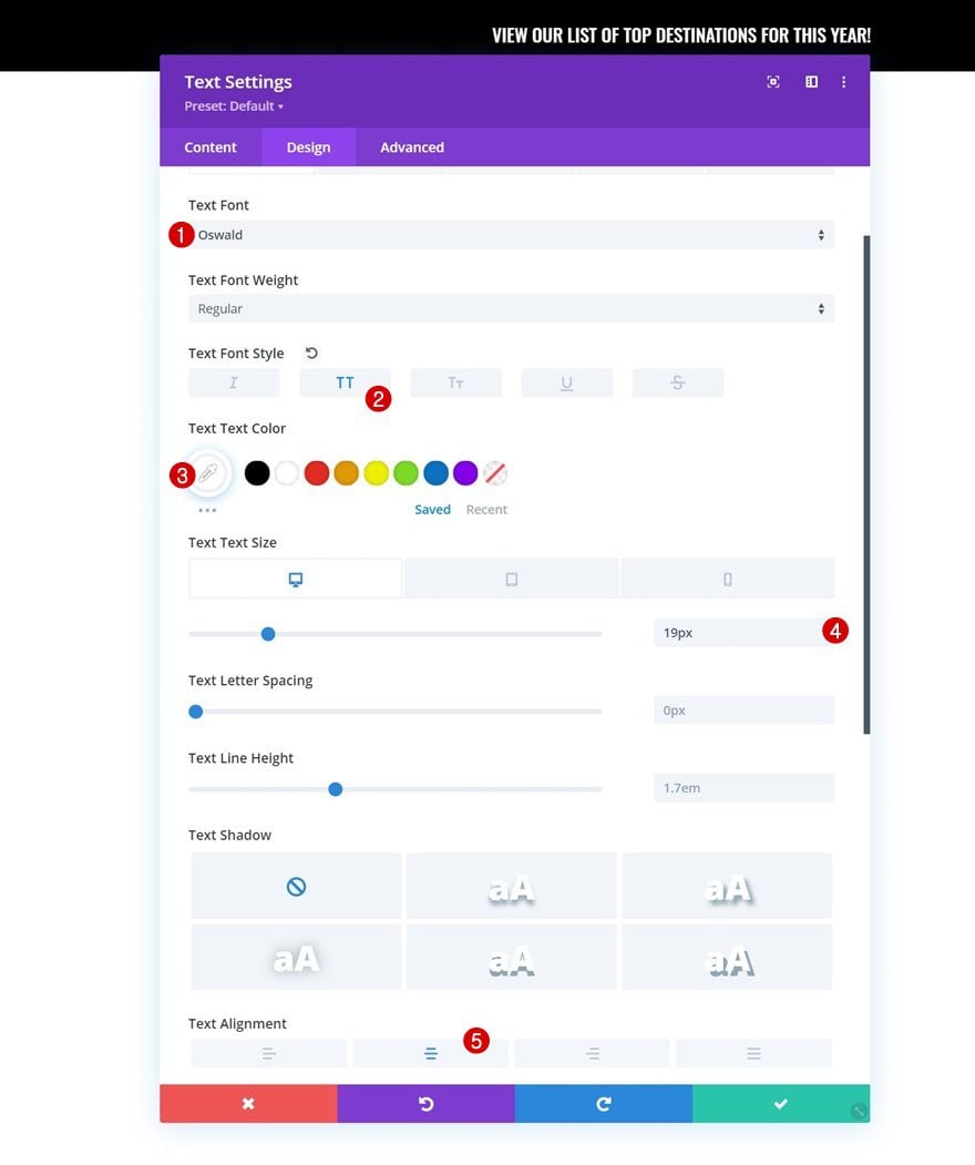
Text Settings
Move on to the module’s design tab and change the text settings accordingly:
- Text Font: Oswald
- Text Font Style: Uppercase
- Text Color: #ffffff
- Text Size:
- Desktop: 19px
- Tablet: 18px
- Phone: 16px
- Text Alignment: Center
Add Section #2
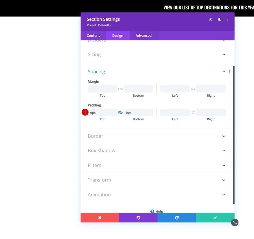
Spacing
Right below the first section, add another regular section. This section will be dedicated to our transparent menu that’ll be turned sticky on scroll. Open the section settings and remove all default top and bottom padding in the design tab.
- Top Padding: 0px
- Bottom Padding: 0px
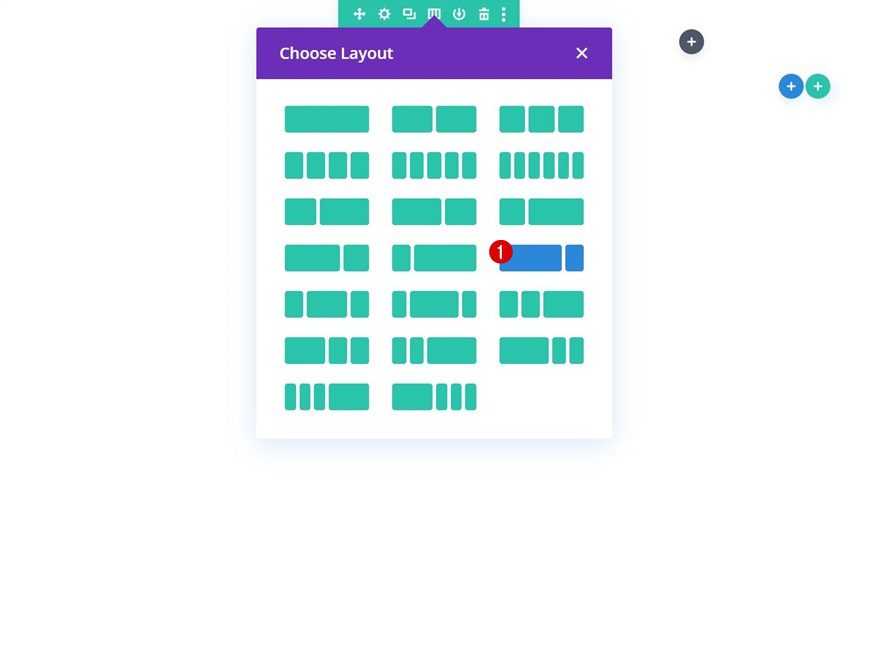
Add New Row
Column Structure
Continue by adding a new row using the following column structure:
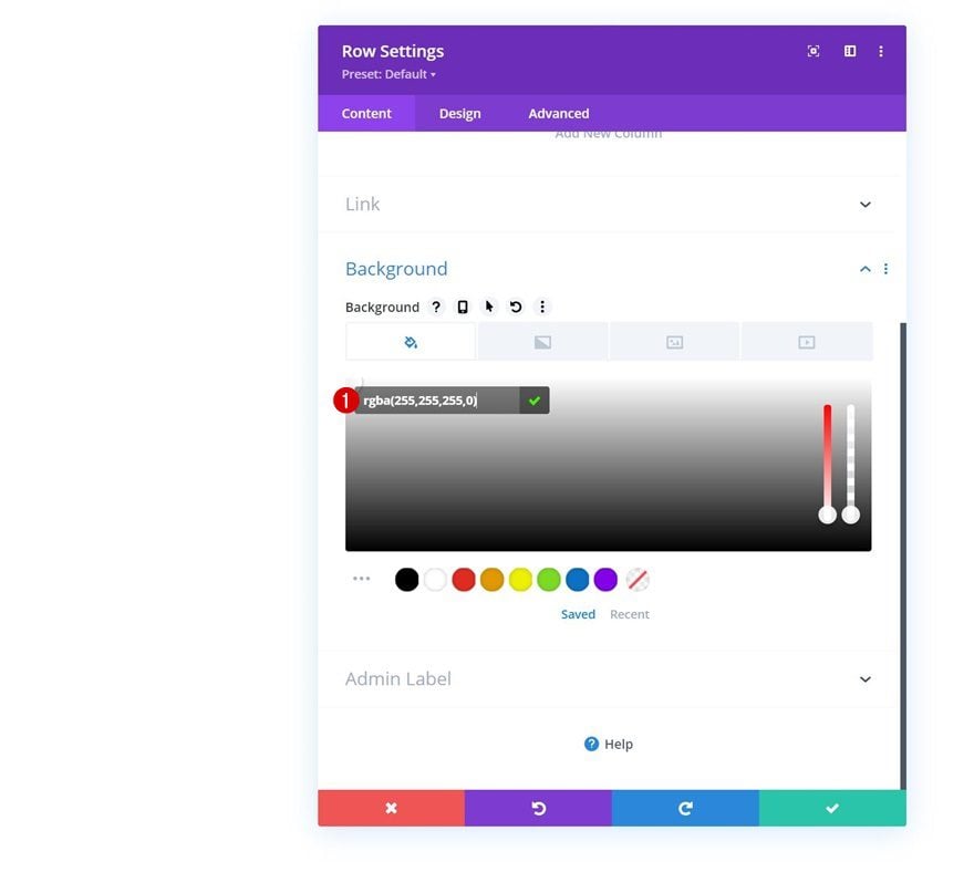
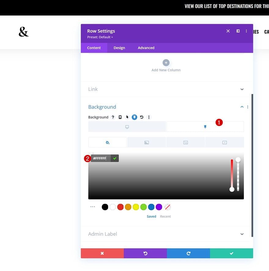
Transparent Background Color
Open the row settings and apply a completely transparent background color to the row.
- Background Color: rgba(255,255,255,0)
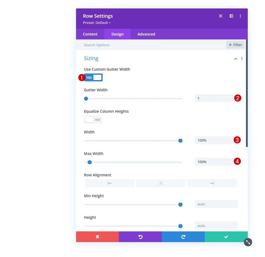
Sizing
Move on to the row’s design tab and modify the sizing settings.
- Use Custom Gutter Width: Yes
- Gutter Width: 1
- Width: 100%
- Max Width: 100%
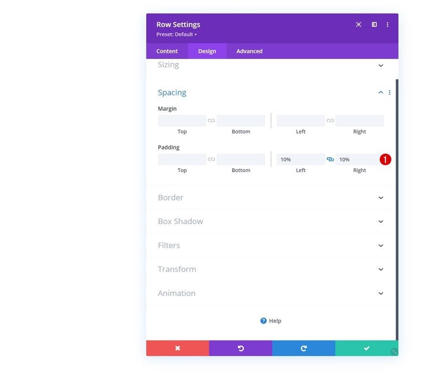
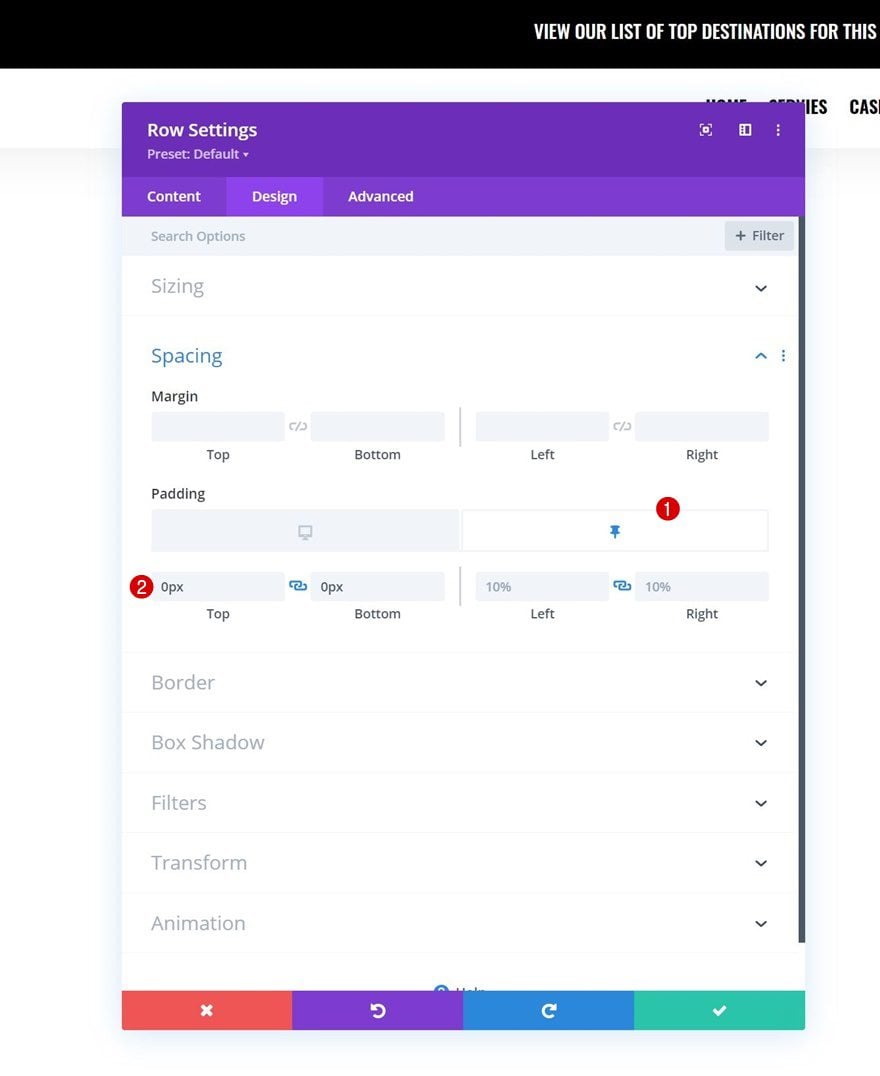
Spacing
Add some custom left and right padding next.
- Left Padding: 10%
- Right Padding: 10%
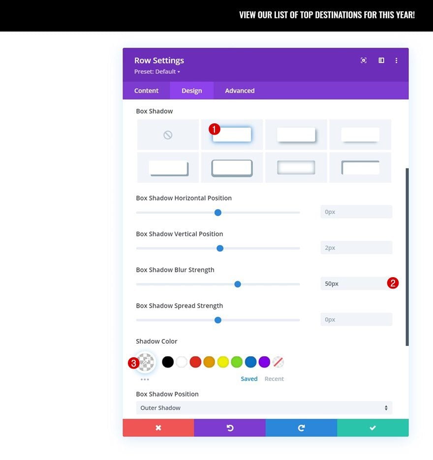
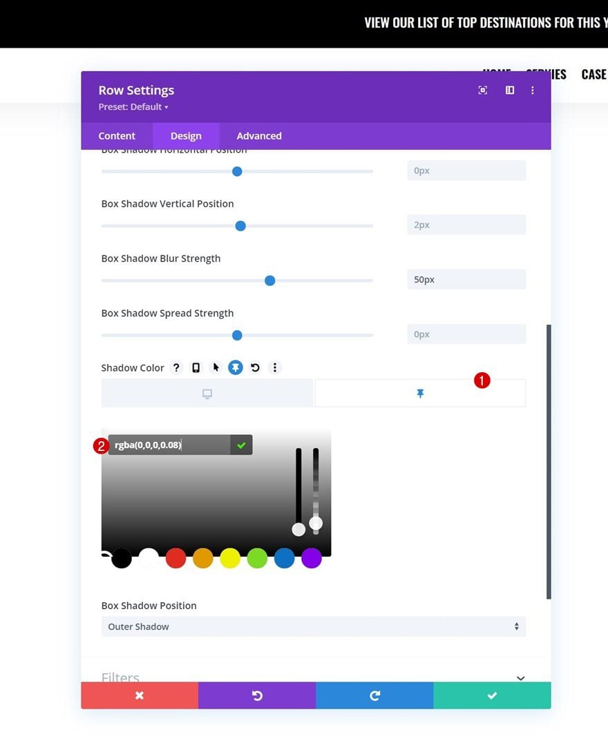
Box Shadow
Then, apply a transparent box shadow. Later on the tutorial, we’ll use this box shadow in a sticky state with a different shadow color.
- Box Shadow Blur Strength: 50px
- Shadow Color: rgba(0,0,0,0)
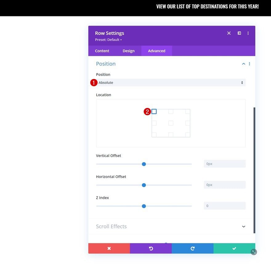
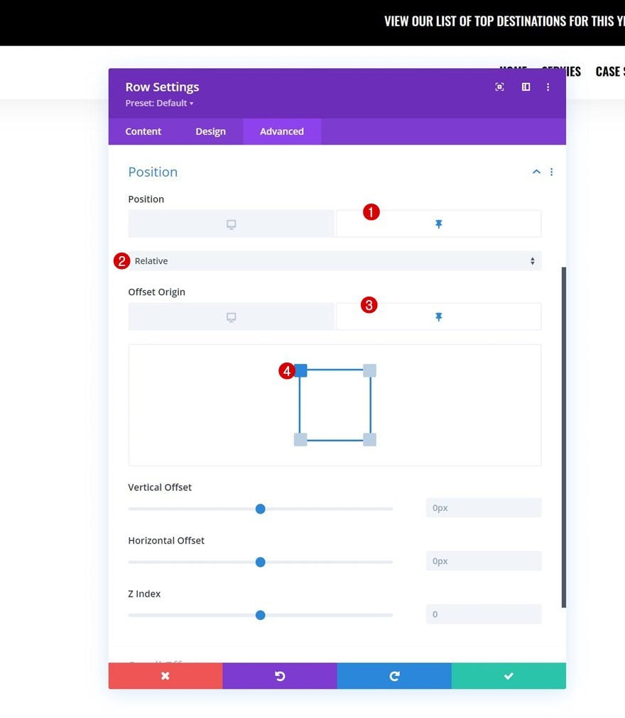
Position
To make sure the row appears on top of the page content, with a transparent background, we’ll use an absolute position for our row in the advanced tab.
- Position: Absolute
- Location: Top Left
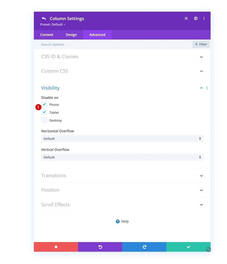
Column 2 Visibility
We’re also hiding the second column of our row on tablet and phone to have a less complex header design on smaller screen sizes.
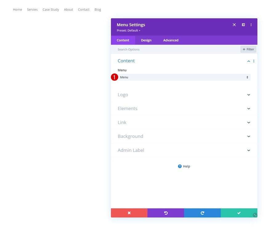
Select Menu
Now that our row settings are in place, it’s time to add modules, starting with a Menu Module in column 1. Select a menu of your choice.
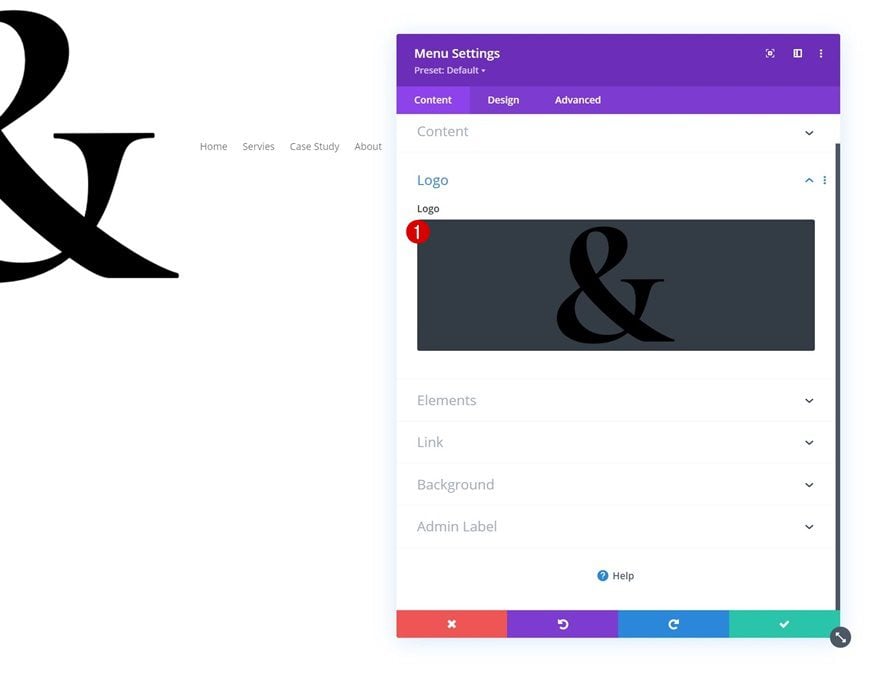
Upload Logo
Upload a logo next.
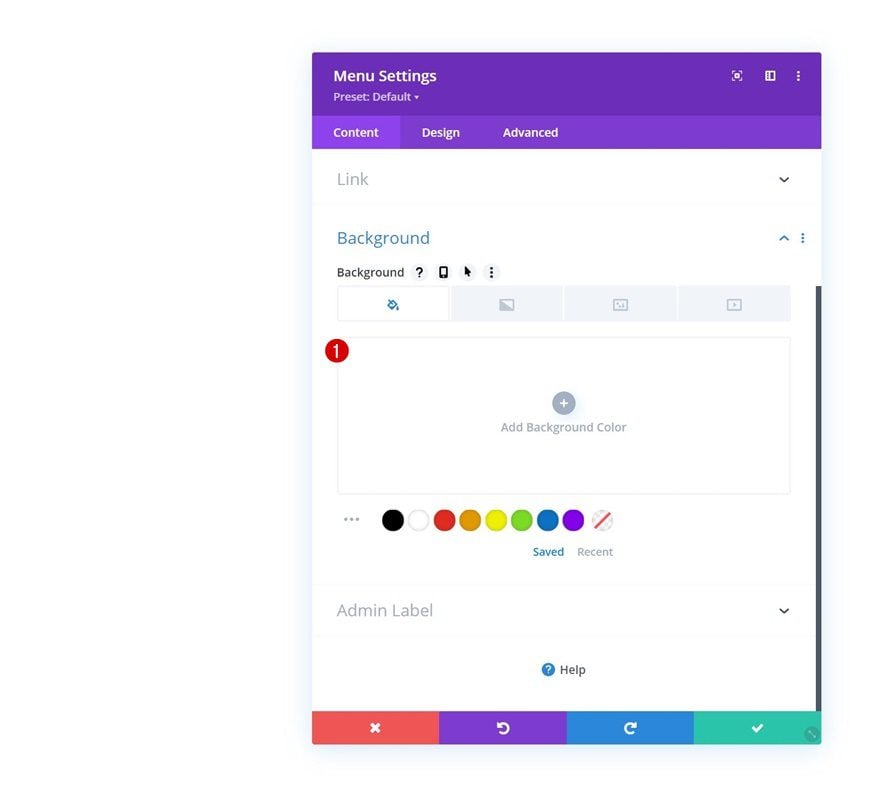
Remove Background Color
Remove the module’s background color too.
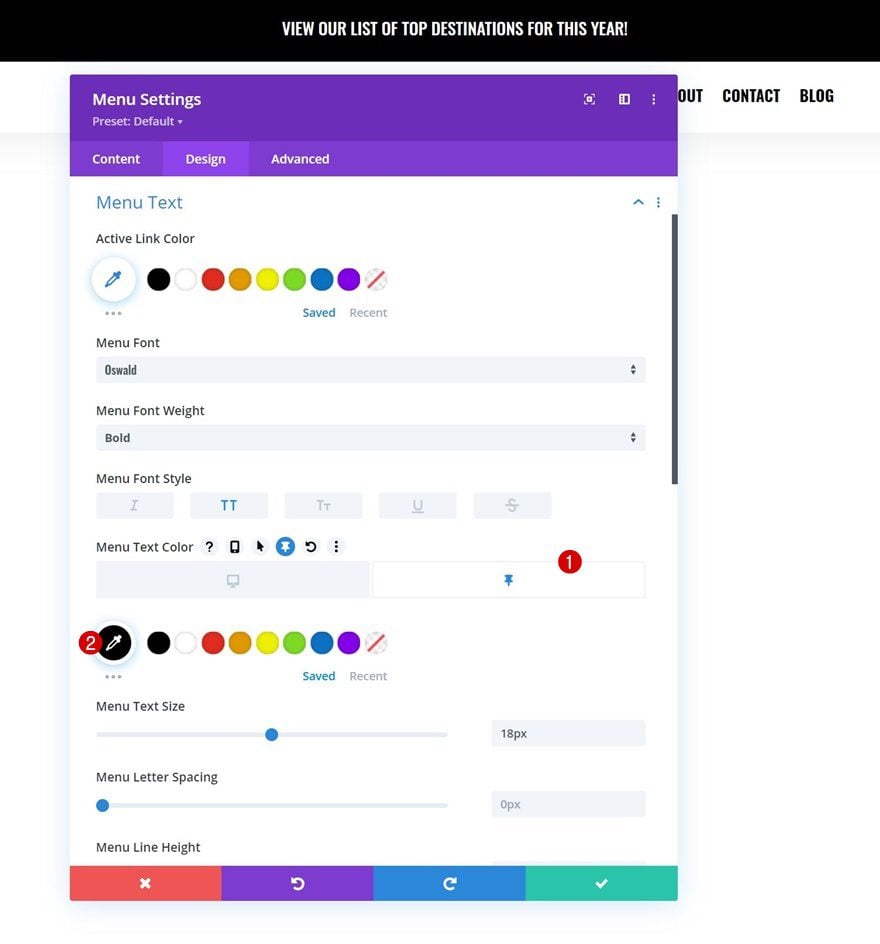
Menu Text Settings
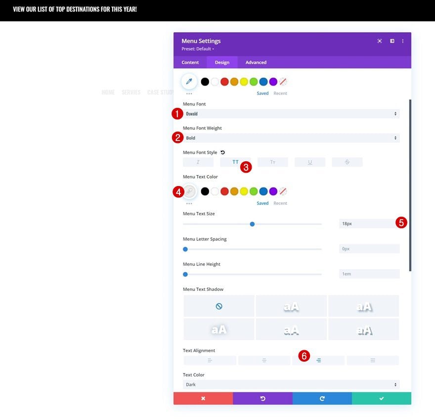
Move on to the module’s design tab and change the menu text settings accordingly:
- Menu Font: Oswald
- Menu Font Weight: Bold
- Menu Font Style: Uppercase
- Menu Text Color: #efefef
- Menu Text Size: 18px
- Text Alignment: Right
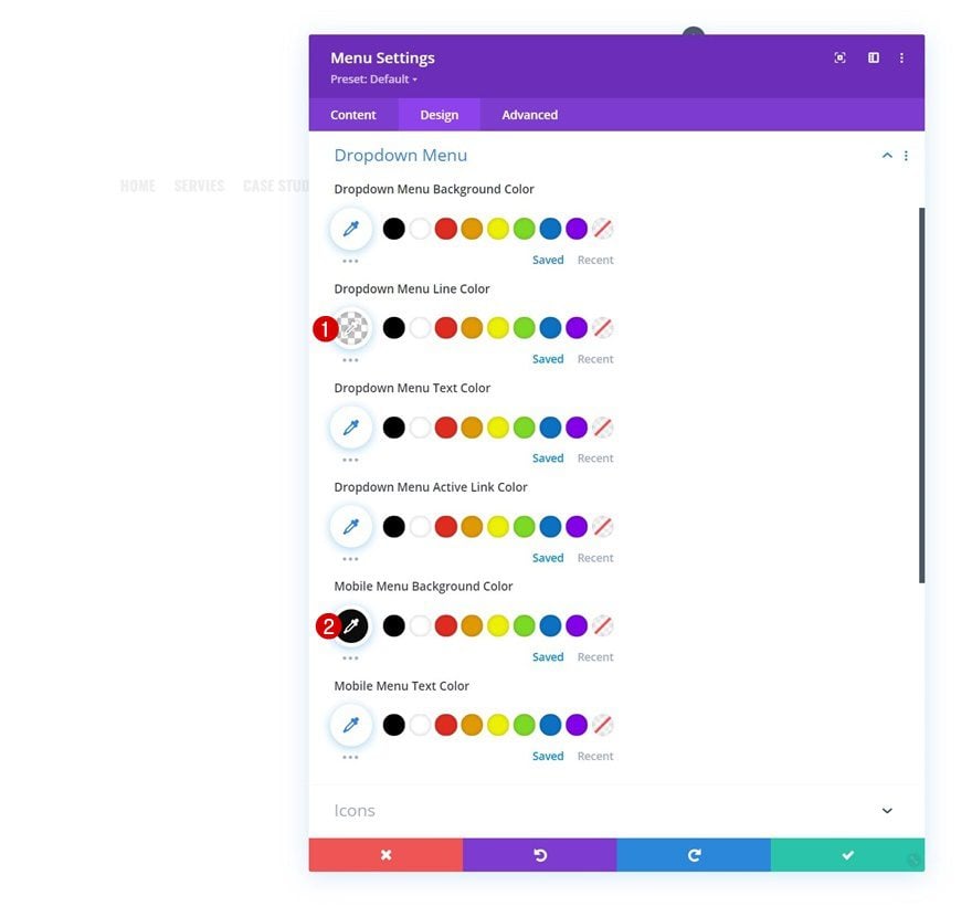
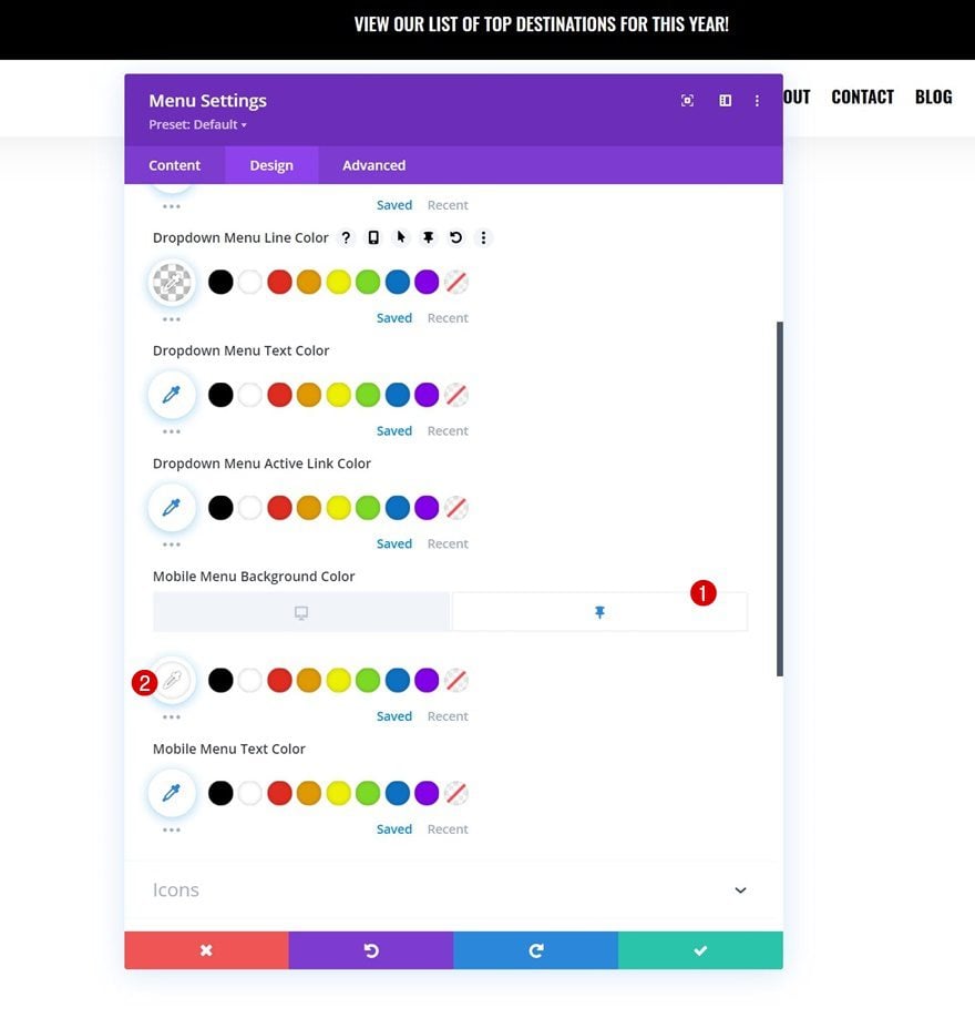
Dropdown Menu Settings
Change the dropdown menu settings too.
- Dropdown Menu Line Color: rgba(0,0,0,0)
- Mobile Menu Background Color: rgba(0,0,0,0.95)
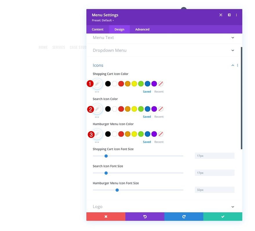
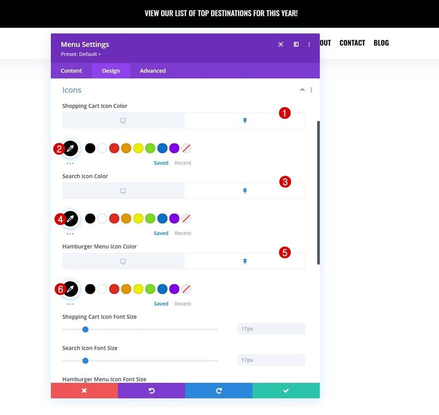
Icons Settings
Then, change the icon colors in the icons settings.
- Shopping Cart Icon Color: #ffffff
- Search Icon Color: #ffffff
- Hamburger Menu Icon Color: #ffffff
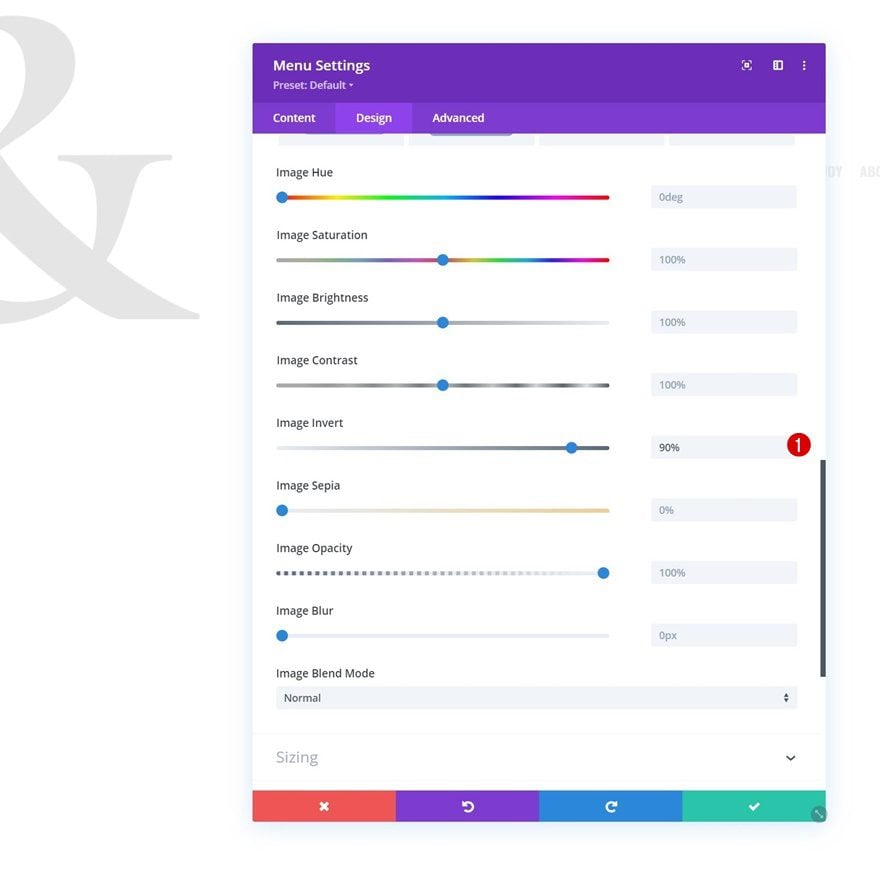
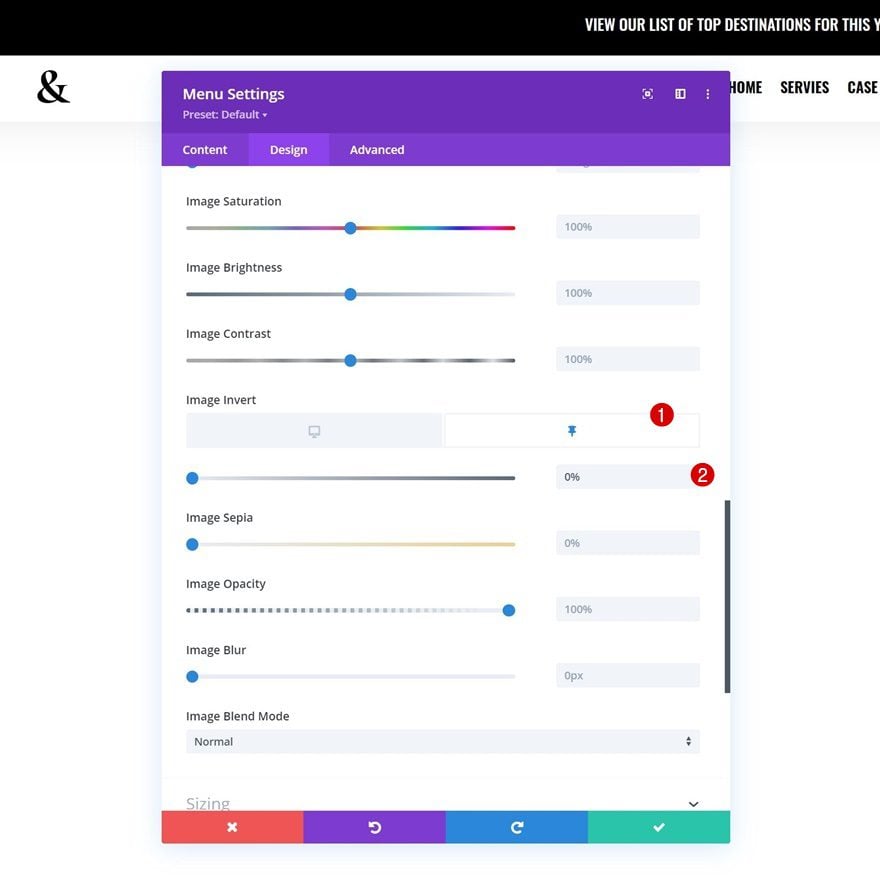
Logo Settings
We’re changing the color of our logo in the logo settings too by changing the image invert filter.
- Image Invert: 90%
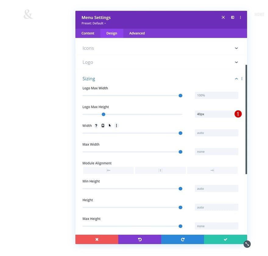
Sizing
Then, we’ll assign a max height to our logo.
- Logo Max Height: 40px
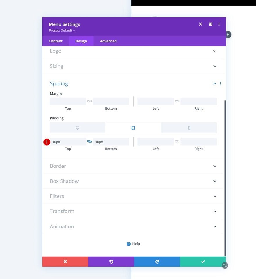
Spacing
Next, we’ll add some top and bottom padding on smaller screen sizes.
- Top Padding:
- Tablet & Phone: 10px
- Bottom Padding:
- Tablet & Phone: 10px
Add Copy
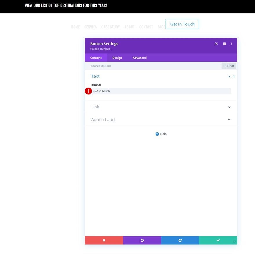
In column 2, the only module we need is a Button Module. Add some copy of your choice.
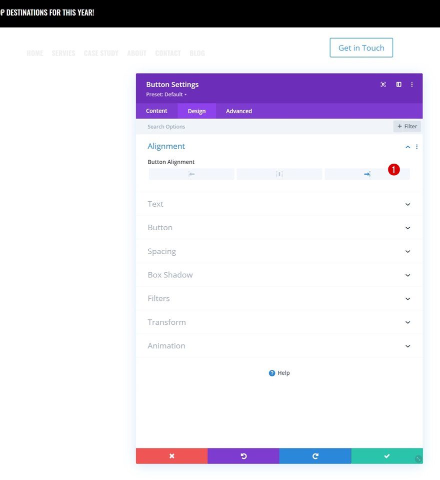
Button Alignment
Move on to the module’s design tab and change the button alignment.
- Button Alignment: Right
Button Settings
Style the button next.
- Use Custom Styles For Button: Yes
- Button Text Size: 16px
- Button Text Color: #ffffff
- Button Background Color: #ed4441
- Button Border Color: #ed4441
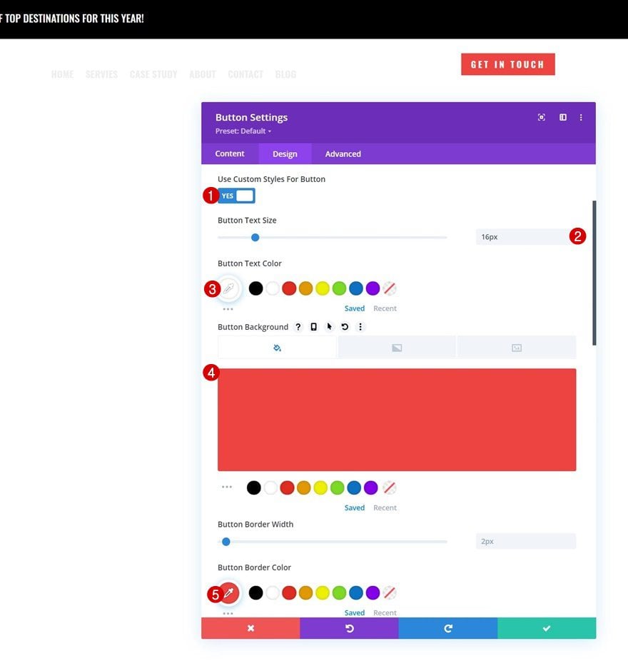
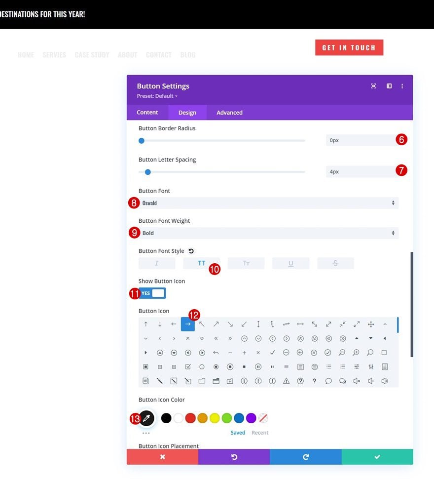
- Button Border Radius: 0px
- Button Letter Spacing: 4px
- Button Font: Oswald
- Button Font Weight: Bold
- Button Font Style: Uppercase
- Show Button Icon: Yes
- Button Icon Color: #1a1a1a
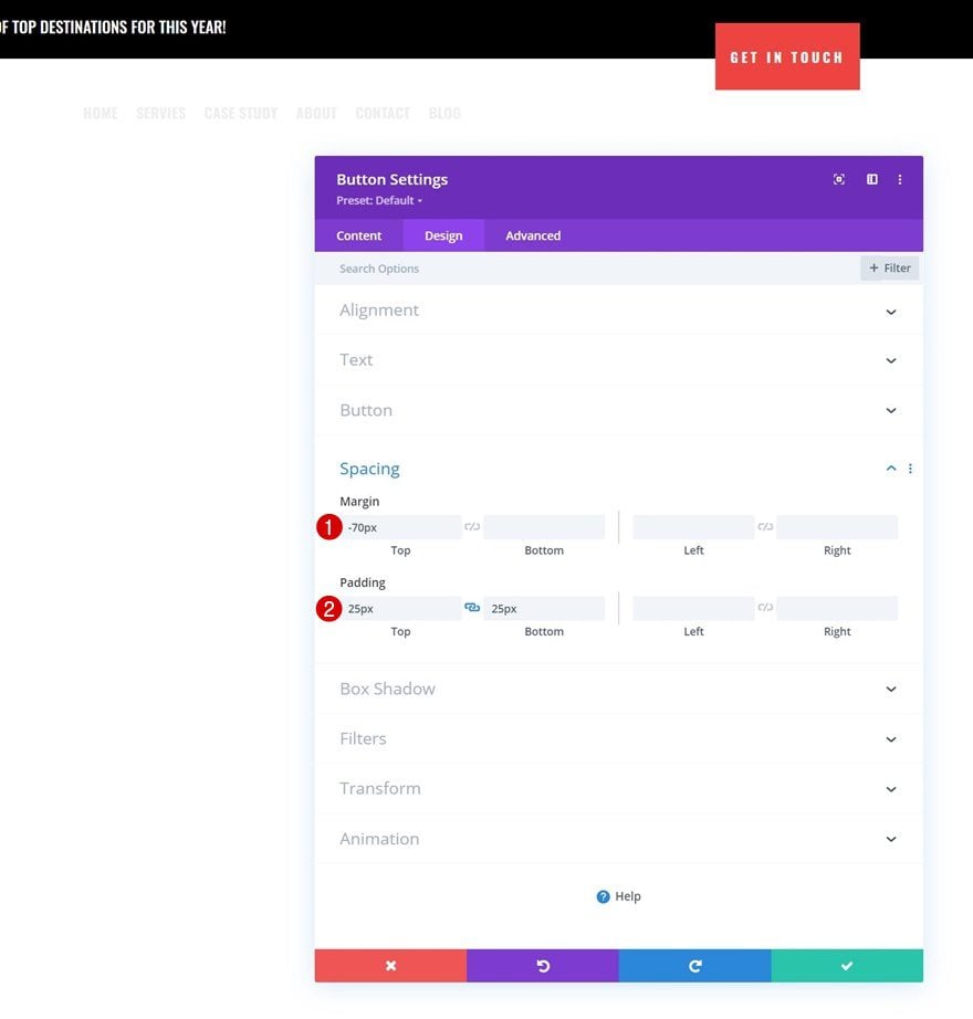
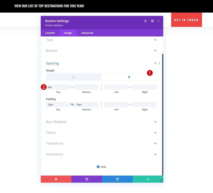
Spacing
And complete the module settings by adding some custom spacing values.
- Top Margin: -70px
- Top Padding: 25px
- Bottom Padding: 25px
2. Apply Custom Sticky Effects
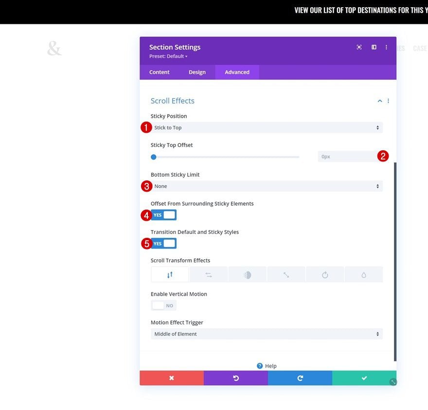
Turn Section #2 Sticky
Now that we’ve set the foundation of our header, it’s time to apply the sticky effect! To do that, start by opening the second section’s settings and apply the following sticky settings to the advanced tab:
- Sticky Position: Stick to Top
- Sticky Top Offset: 0px
- Bottom Sticky Limit: None
- Offset From Surrounding Sticky Elements: Yes
- Transition Default and Sticky Styles: Yes
Sticky Row Background Color
Now that the sticky option is enabled, we can make sticky design changes to all the elements inside the section. We’ll start by opening the row containing of our menu and apply a white sticky background color.
- Background Color: #FFFFFF
Sticky Row Spacing
Next, we’ll modify the row’s sticky spacing values.
- Top Padding: 0px
- Bottom Padding: 0px
Sticky Row Box Shadow
We’re changing the box shadow color in a sticky state too.
- Shadow Color: rgba(0,0,0,0.08)
Sticky Row Positioning
Then, we’ll bring back the row positioning to relative in a sticky state.
- Position: Relative
- Offset Origin: Top Left
Next, we’ll change the sticky menu text color.
- Menu Text Color: #000000
Along with the mobile menu background color in the menu dropdown settings.
- Mobile Menu Background Color: #ffffff
Change the icon colors in a sticky state too.
- Shopping Cart Icon Color: #000000
- Search Icon Color: #000000
- Hamburger Menu Icon Color: #000000
Sticky Logo Filter
Then, remove the logo image invert filter in a sticky state.
- Image Invert: 0%
And complete the tutorial by removing the button’s negative top margin while sticky.
- Top Margin: 0px
Preview
Now that we’ve gone through all the steps, let’s take a final look at the outcome across different screen sizes.
Desktop
Mobile
Final Thoughts
In this post, we’ve shown you how to combine Divi’s Theme Builder with the new sticky options. More specifically, we’ve shown you how to go from a transparent header to a differently-styled sticky header on scroll. This approach allows you to merge your page design with your menu while still keeping a beautiful sticky header on scroll. You were able to download the JSON file for free as well! If you have any questions or suggestions, feel free to leave a comment in the comment section below.
If you’re eager to learn more about Divi and get more Divi freebies, make sure you subscribe to our email newsletter and YouTube channel so you’ll always be one of the first people to know and get benefits from this free content.


No matter where I tried to add the json, I got an error: This file should not be imported in this context.
You can import the layout by going to Divi > Theme Builder > Portability Option:
https://prnt.sc/4AIuDtV5IVfS
https://prnt.sc/aDAVksTakF2r
The sticky menu works on scroll but the transparent one doesn’t.
Thanks for the tutorial, Donjete. I’m unable to import the template (json) file into the Divi Layouts library. I get an error message “this file could not be imported in this context”?
if you just import the Zip file it does’nt work ! extract first the json file and then import it !
I am very surprised that no one has replied this post for years now.
me too
Nice One
Hi Donjete, I’m using a one page design with anchor links. Unfortunately, there has been a year long error in Divi. Also, setting Responsive Breakpoints doesn’t work with old solutions anymore, either.
thank you for the tutorial step by step
Thank you so much for the tutorial. I tried it and it works perfectly on desktop but the mobiles are non responsive.
it wont let me load the JSON file?
Fantastic!! Thanks for this.
Perfect – I like that. Works perfectly! Thank you Donjete.
I have one issue: I want to use “DIVI Booster” plugin’s option “Set mobile content width” to 90% (default is 80% I think) to reduce DIVI’s left/right margin on mobile. But with that also the created header SHRINKS to 90% on mobile (instead of 100%) and so leaves a gap at the right.
I can’t find the CSS which I can add that 100% again – do you? Or is there quite another option to change the left/right margins on mobile?
Best regards, Gregor
Doesn’t work on Extra. Can you solve it please?
Hello, please how to do the same thing but without the first black section on top and keeping the menu background transparent above photo?
I’ve tried this on numerous sites, and as soon as I save the sticky positioning items, sticky options disappear and the section doesn’t stick.
Thank u so much!
You’re welcome, Joe! Happy you liked the tutorial 🙂
Thanks for this tutorial! My question is: is it possible to leave also the first section with text sticky on scroll? Thanks!!
Yes! You can turn the first section sticky as well 🙂