 for Your Divi Website")
Vertical navigation menus can come in handy for certain websites that need more menu items at the forefront. Horizontal menus can be difficult to fit all the menu links needed, especially on smaller browser widths. In this tutorial, we are going to show you how to build a custom vertical navigation menu using the Divi Theme Builder. This will allow you more room for showcasing your WordPress menu items. And you will have full power to add additional Divi Modules to the vertical header and design them with the Divi builder.
Let’s get started!
- 1 Sneak Peek
- 2 Download the Layout for FREE
- 3 Download For Free
- 4 Part 1: Building a New Global Header
- 5 Part 2: Designing the Vertical Section Layout
- 6 Part 3: Designing the Vertical Menu
- 7 Part 4: Adding the Custom CSS for the Menu
- 8 Part 5: Designing the Button and Social Media Follow Icons
- 9 Final Result
- 10 How to Add the Vertical Navigation Menu to the Body Area of a Page Template
- 11 Final Thoughts
Sneak Peek
Here is a quick look at the design we’ll build in this tutorial.


Download the Layout for FREE
To lay your hands on the designs from this tutorial, you will first need to download it using the button below. To gain access to the download you will need to subscribe to our newsletter by using the form below. As a new subscriber, you will receive even more Divi goodness and a free Divi Layout pack every Monday! If you’re already on the list, simply enter your email address below and click download. You will not be “resubscribed” or receive extra emails.

To upload the template, navigate to the Divi Theme Builder in the backend of your WordPress website.
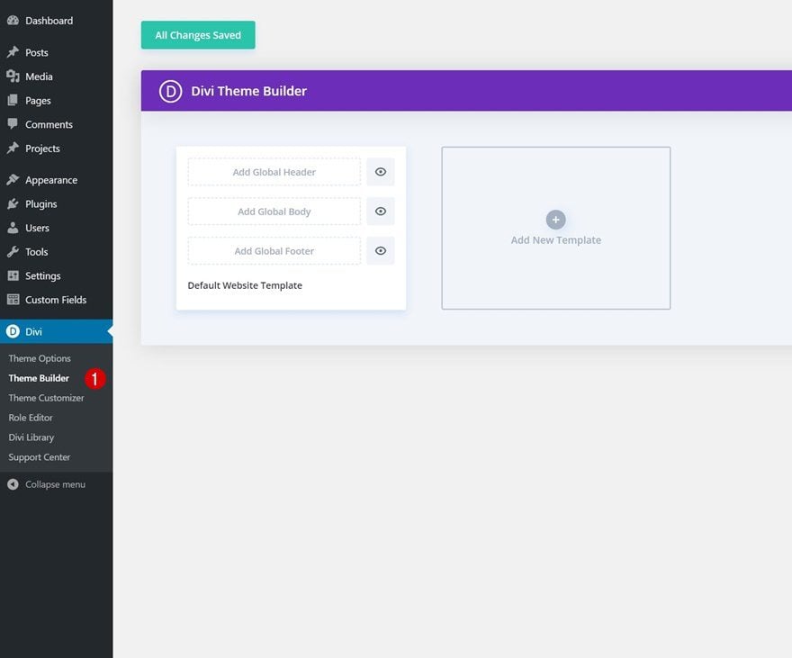
Upload Global Default Website Template
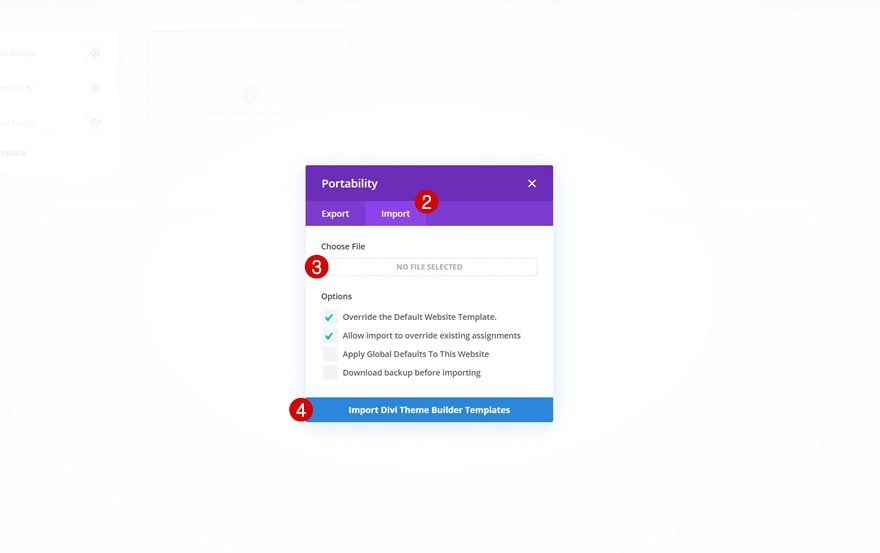
Then, in the top right corner, you’ll see an icon with two arrows. Click on the icon.

Navigate to the import tab, upload the JSON file which you were able to download in this post, and click on ‘Import Divi Theme Builder Templates‘.
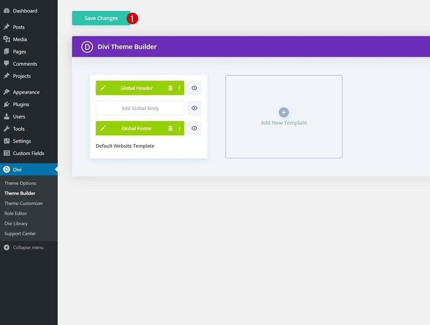
Save Divi Theme Builder Changes
Once you’ve uploaded the file, you’ll notice a new global header and footer in your default website template. Save the Divi Theme Builder changes as soon as you want the template to be activated.
Let’s get to the tutorial, shall we?
Part 1: Building a New Global Header
For this tutorial, we are going to build the vertical navigation menu in a Global Header using the Divi Theme Builder. However, we will show you how to add the same menu to the body of a page template at the end of the post, just in case you want to use it in addition to the main menu of your site.
To start, go to the WordPress Dashboard and navigate to Divi > Theme Builder.
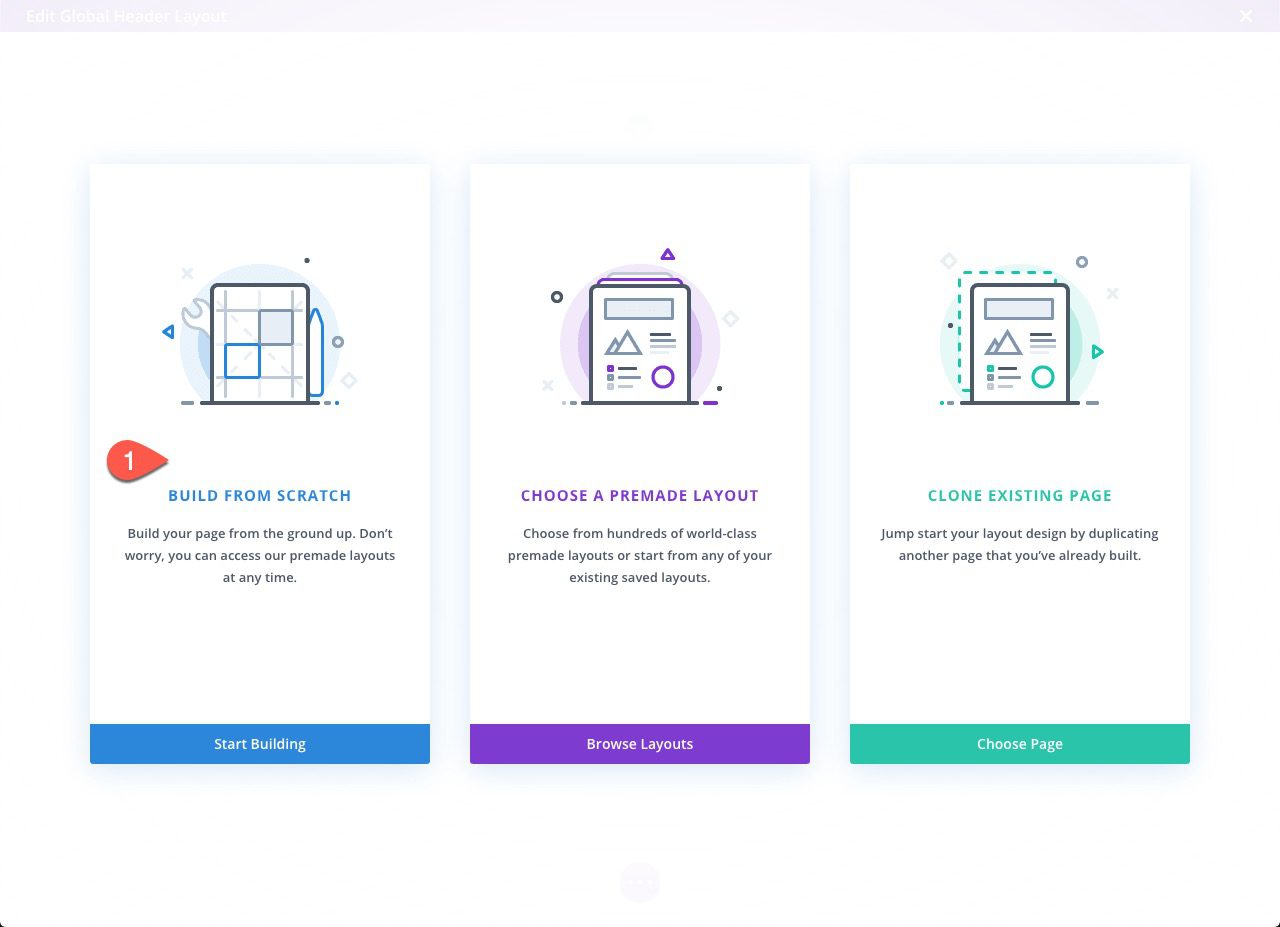
Then click the “Add Global Header” area of the Default Website Template and select “Build Global Header” from the dropdown.
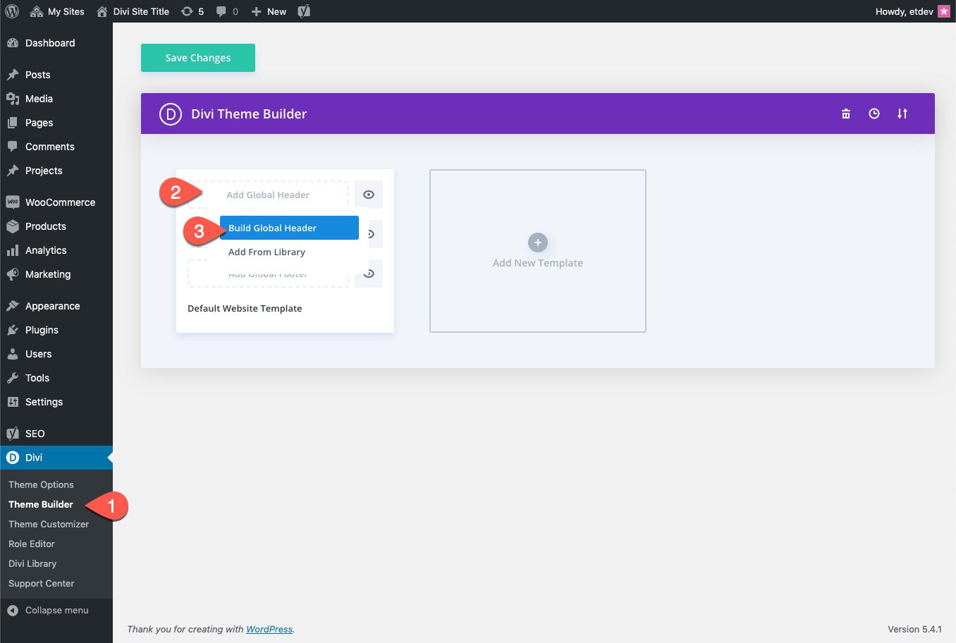
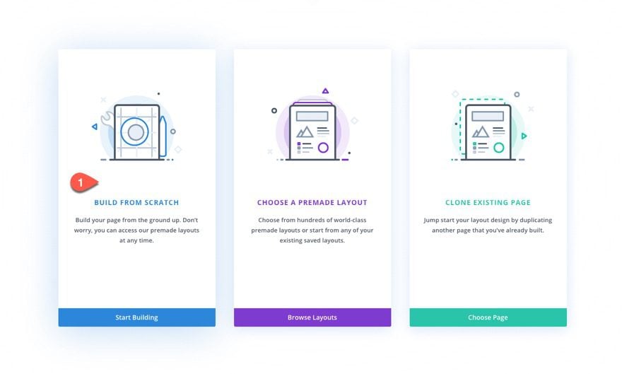
Then select the option “Build from Scratch”.
Part 2: Designing the Vertical Section Layout
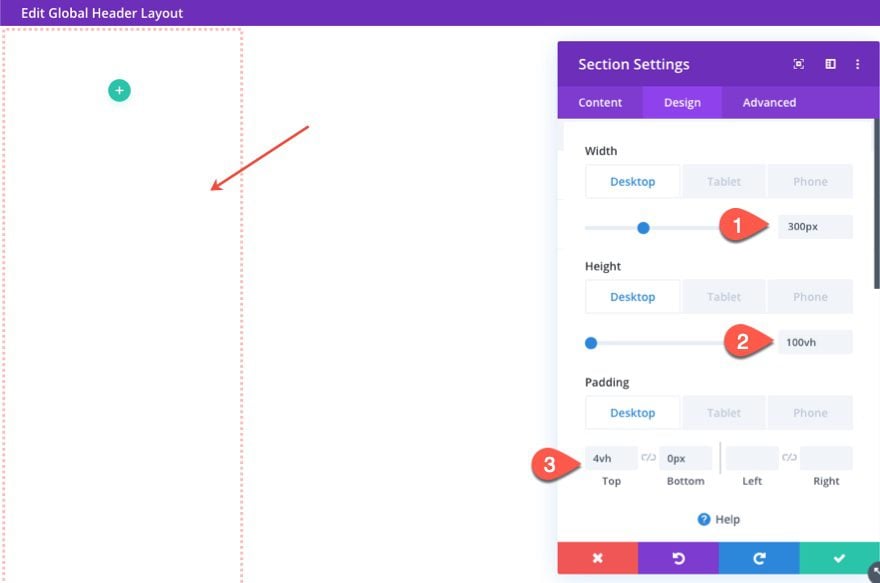
Inside the Global Header Layout Editor, open the settings of the regular section already there and update the following.
- Width (desktop): 300px
- Width (tablet and phone): 100%
- Height (desktop): 100vh
- Height (tablet and phone): auto
- Padding (desktop): 4vh top, 0px bottom
- Padding (tablet and phone): 0px top, 0px bottom
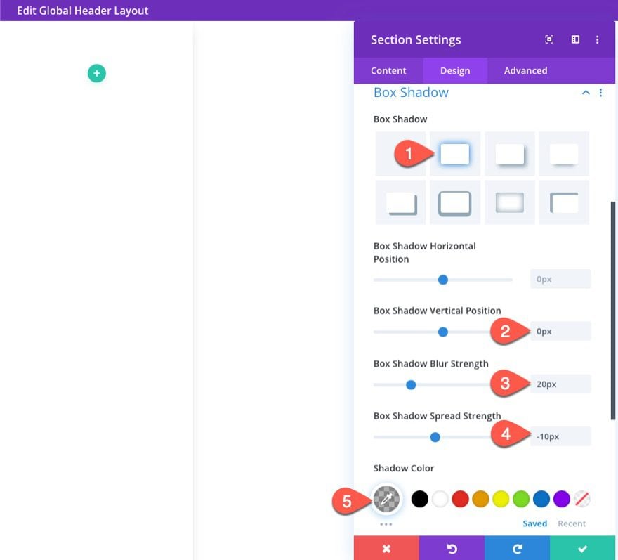
Continue the design by adding a box-shadow as follows:
- Box Shadow: see screenshot
- Box Shadow Vertical Position: 0px
- Box Shadow Blur Strength: 20px
- Box Shadow Spread Strength: -10px
- Shadow Color: rgba(0,0,0,0.3)
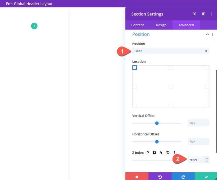
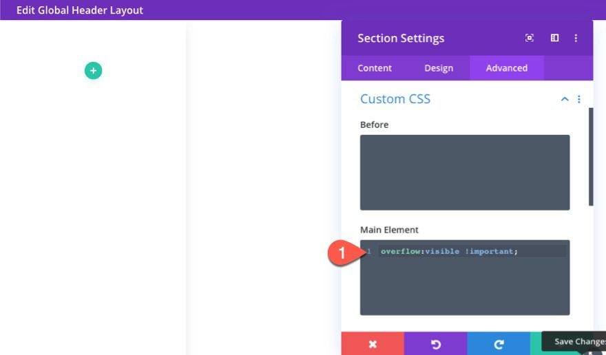
To make sure the vertical navigation menu stays visible on the left as the user scrolls, update the position to fixed and update the z index as follows:
- Position: Fixed
- Z Index: 9999
To ensure that we will be able to see the submenu navigation that will extend outside the section, add the following custom CSS to the main element:
overflow: visible !important;
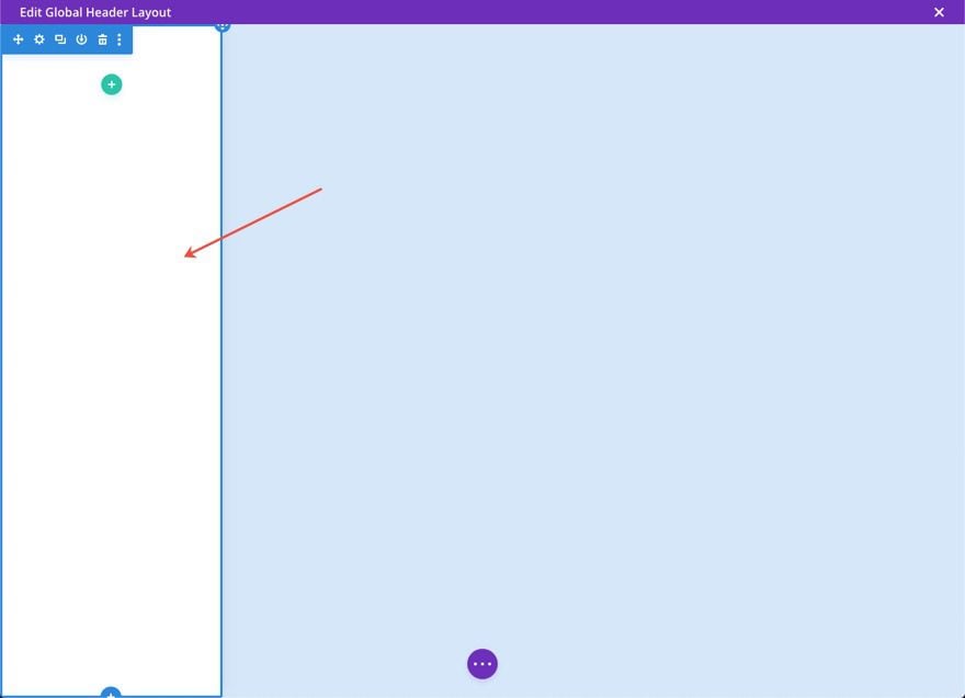
Now your section is in a vertical layout on the left side of the template.
With the section in place, we are ready to design the vertical menu. To do this we will be using a menu module with some custom CSS to style the navigation to be displayed vertically.
We will also use the vh length unit so that the menu will scale nicely with different browser heights.
Adding the Row
To start, add a one-column row to the section.
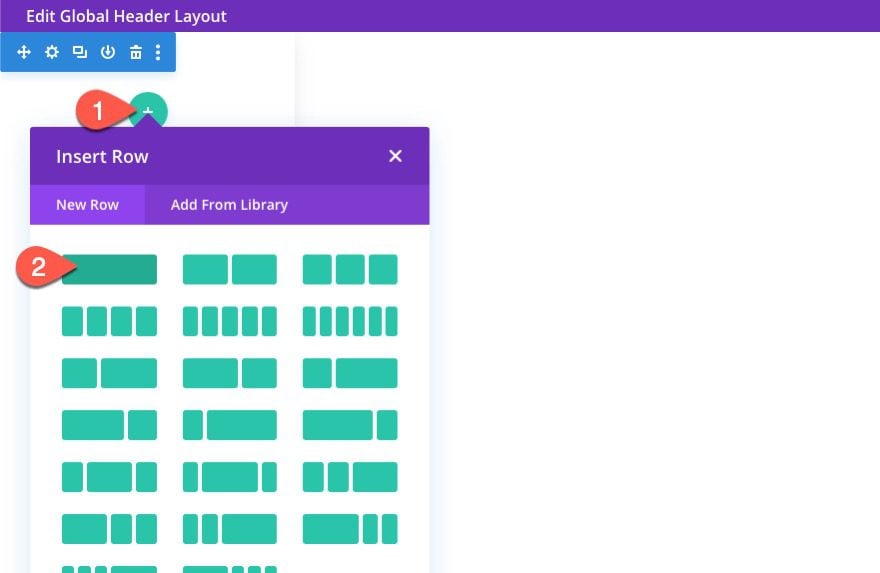
Then update the row settings as follows:
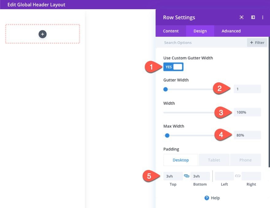
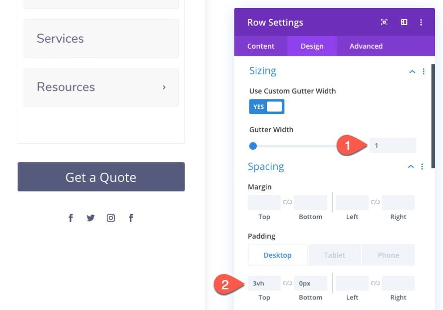
Size and Padding
- Gutter Width: 1
- Width: 100%
- Max Width: 80%
- Padding (desktop): 3vh top, 3vh bottom
- Padding (tablet and phone): 0px top, 0px bottom
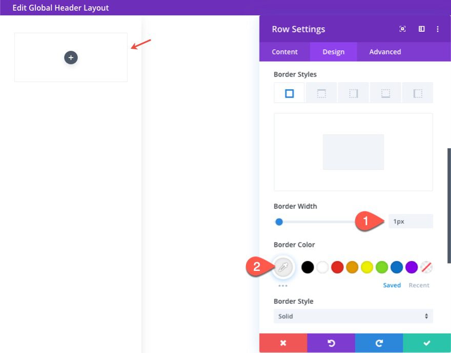
Border
- Border Width: 1px
- Border Color: #eeeeee
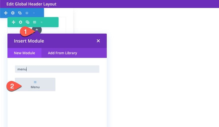
Inside the one-column row, add a new Menu Module.
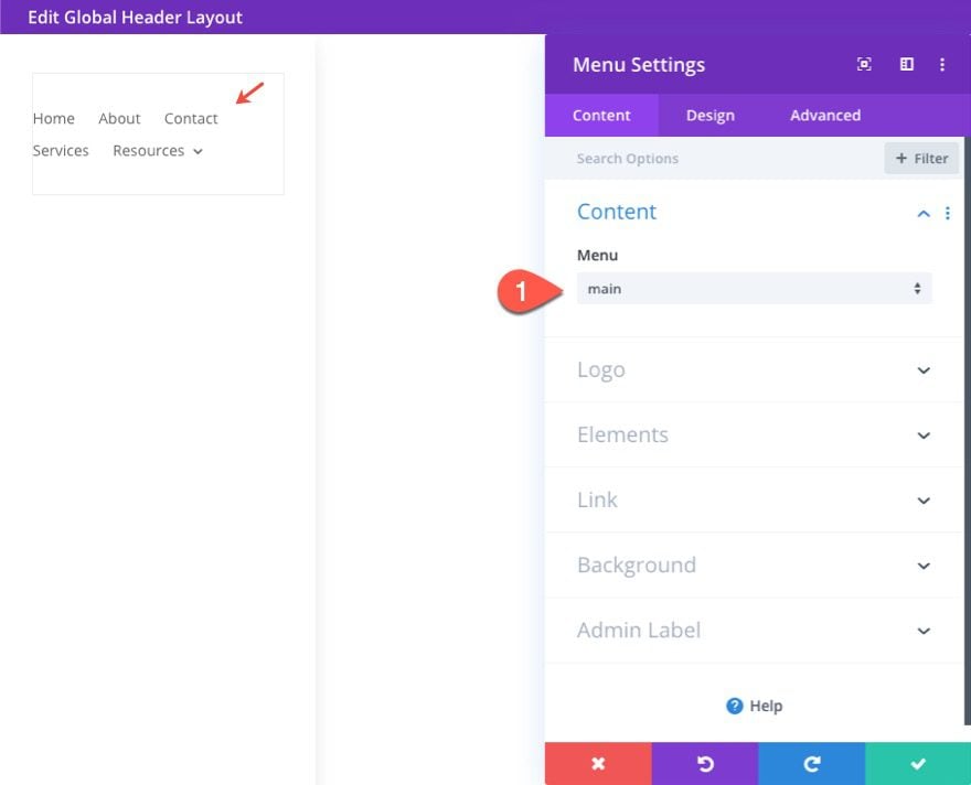
Select a menu to be displayed under the content toggle.
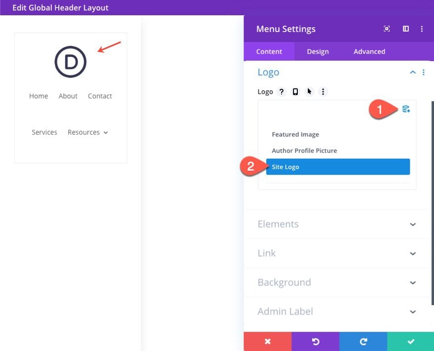
Then add your Site Logo as dynamic content under the Logo toggle.
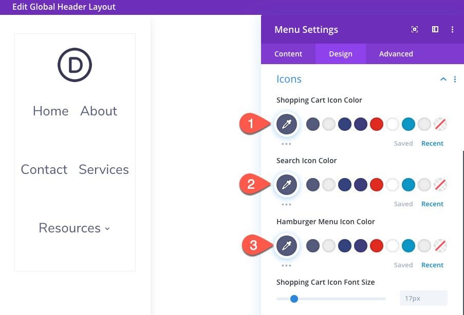
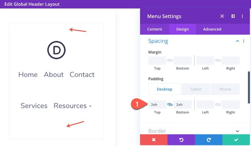
Under the design tab, update the following:
- Style: Centered
- Menu Font: Nunito Sans
- Menu Text Color: #535b7c
- Menu Text Size: 18px (desktop), 14px (tablet and phone)
- Menu Line Height: 2em
- Dropdown Menu Line Color: #535b7c
- Dropdown Menu Active Link Color: #535b7c
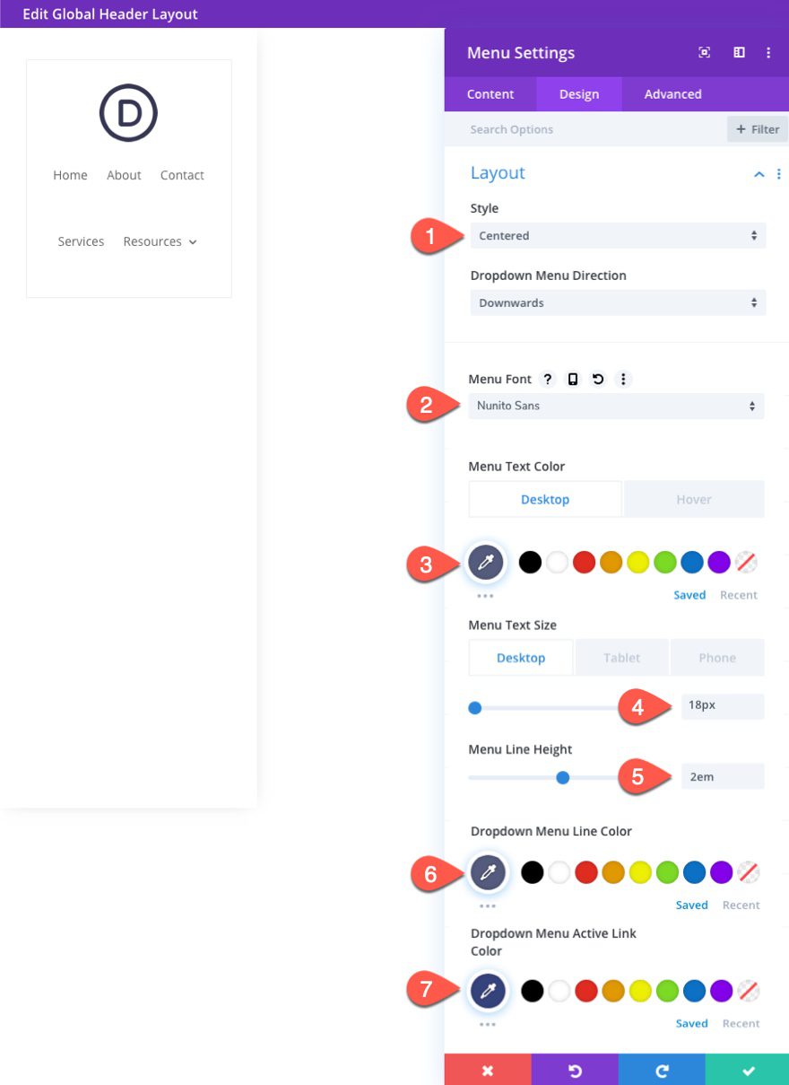
- Shopping Cart Icon Color: #535b7c
- Search Icon Color: #535b7c
- Hamburger Menu Icon Color: #535b7c
- Padding (desktop): 2vh top, 2vh bottom
- Padding (desktop): 10px top, 10px bottom
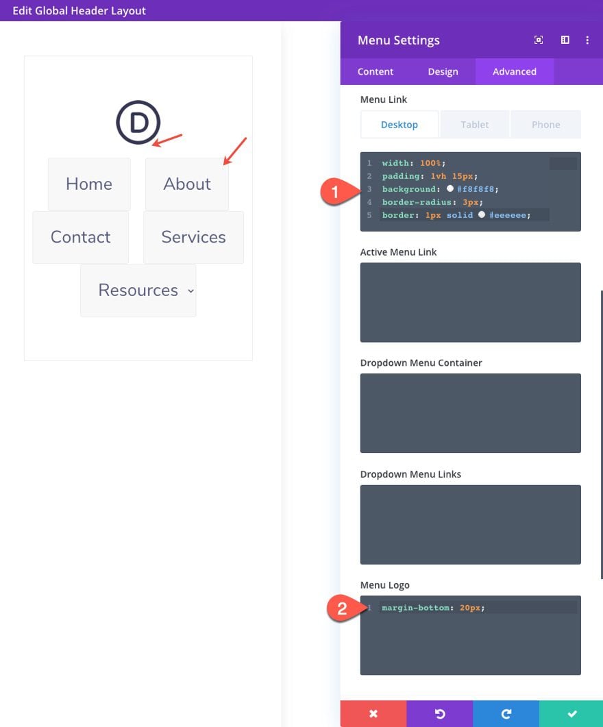
The menu needs some custom CSS to get the vertical navigation we are looking to achieve. To start, go under the advanced tab and add the following custom CSS to the Menu Link and Menu Logo.
Menu Link CSS (desktop):
width: 100%;
padding: 1vh 15px;
background: #f8f8f8;
border-radius: 3px;
border: 1px solid #eeeeee;
Menu Link CSS (tablet):
width: auto;
border:none;
Menu Logo CSS:
margin-bottom: 20px;
Next, add a custom CSS Class to the menu module as follows:
CSS Class: et-vert-menu
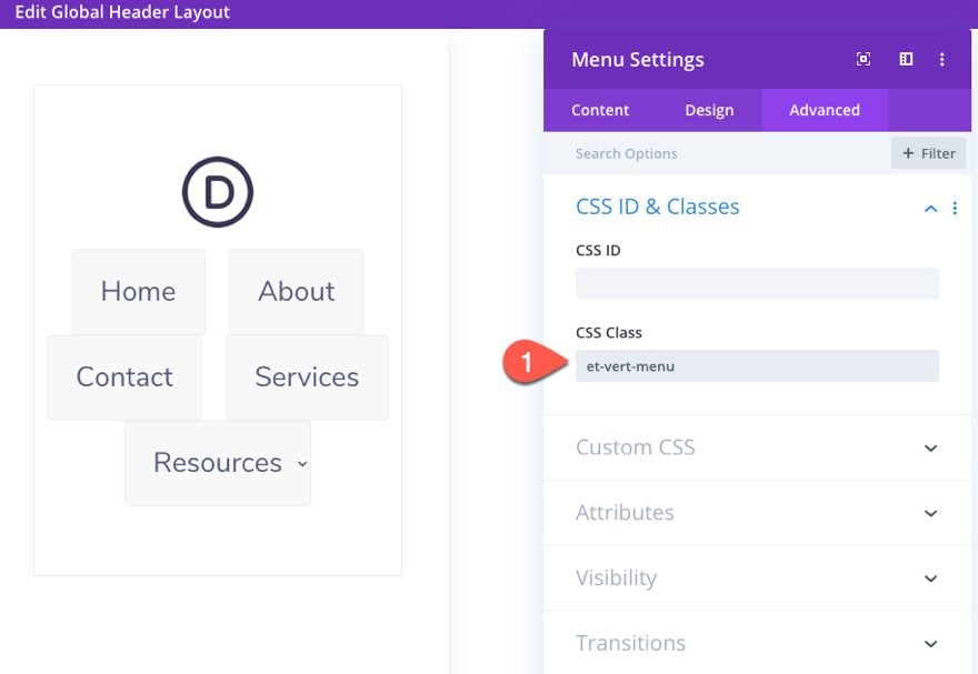
The will be used to target this particular menu in our external custom CSS we will add using a code module.
Adding Custom CSS with Code Module
Under the menu module, add a new code module.
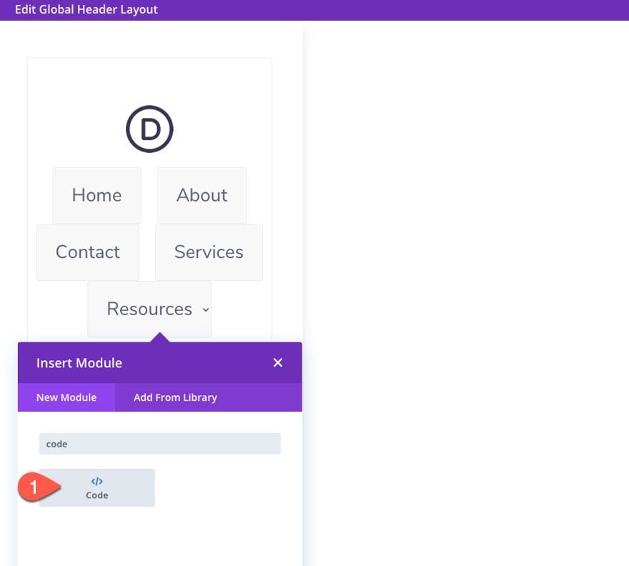
Then paste the following code into the code box (be sure to place it between style tags):
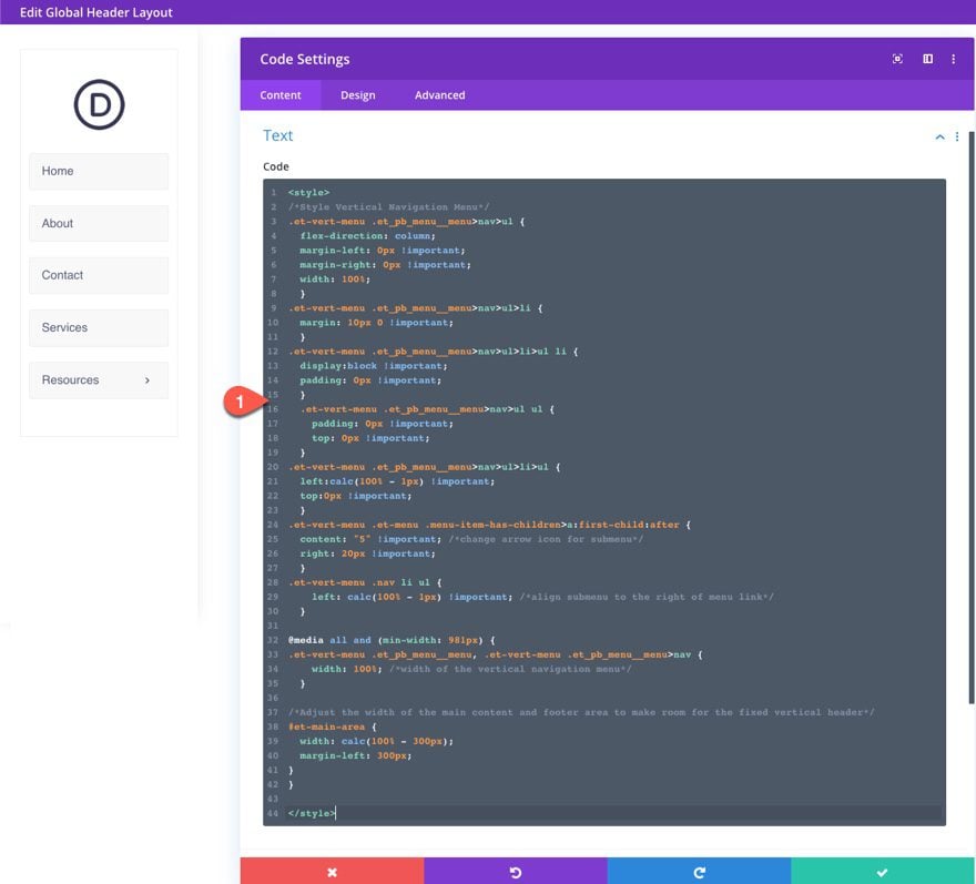
/*Style Vertical Navigation Menu*/
.et-vert-menu .et_pb_menu__menu>nav>ul {
  flex-direction: column;
  margin-left: 0px !important;
  margin-right: 0px !important;
  width: 100%;
  }
.et-vert-menu .et_pb_menu__menu>nav>ul>li {
  margin: 10px 0 !important;
  }
.et-vert-menu .et_pb_menu__menu>nav>ul>li>ul li {
  display:block !important;
  padding: 0px !important;
  }
  .et-vert-menu .et_pb_menu__menu>nav>ul ul {
    padding: 0px !important;
    top: 0px !important;
  }
.et-vert-menu .et_pb_menu__menu>nav>ul>li>ul {
  left:calc(100% - 1px) !important;
  top:0px !important;
  }
.et-vert-menu .et-menu .menu-item-has-children>a:first-child:after {
  content: "5" !important; /*change arrow icon for submenu*/
  right: 20px !important;
  }
.et-vert-menu .nav li ul {
    left: calc(100% - 1px) !important; /*align submenu to the right of menu link*/
  }
@media all and (min-width: 981px) {
.et-vert-menu .et_pb_menu__menu, .et-vert-menu .et_pb_menu__menu>nav {
    width: 100%; /*width of the vertical navigation menu*/
  }
/*Adjust the width of the main content and footer area to make room for the fixed vertical header*/
#et-main-area {
  width: calc(100% - 300px);
  margin-left: 300px;
}
}
Now that the menu is complete, we can add a button and some social media follow links to complete the vertical header.
Adding the Row
Add a new one-column row under the current row.
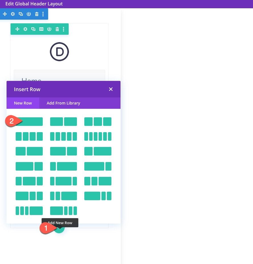
Then add a new button module to the row.
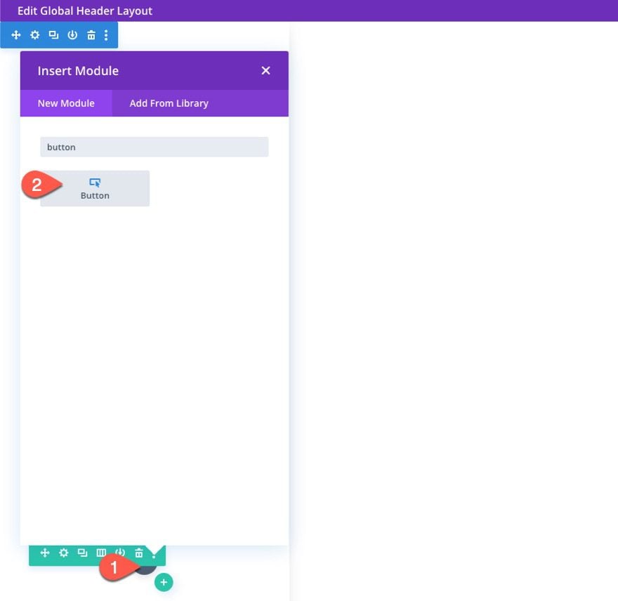
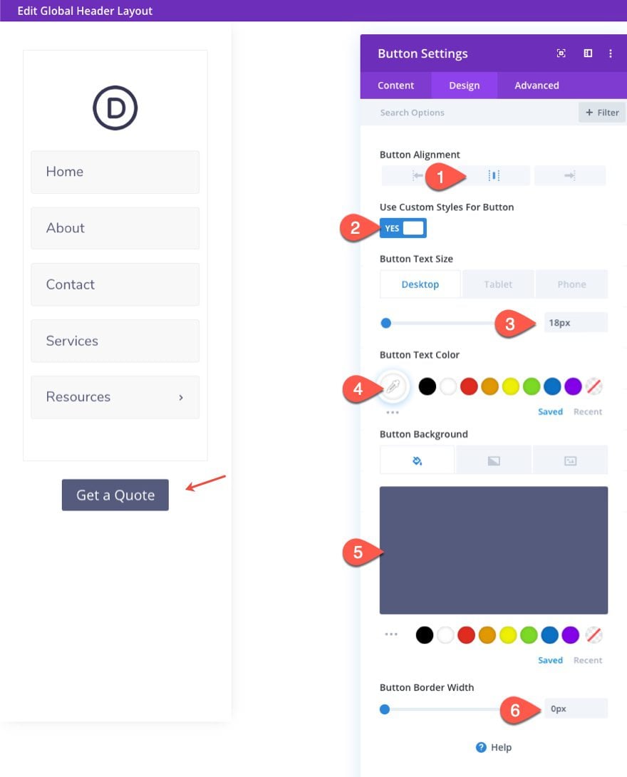
Update the button settings as follows:
- Button Alignment: center
- Button Text Size: 18px (desktop), 14px (tablet and phone)
- Button Text Color: #ffffff
- Button Background Color: #535b7c
- Button Border Width: 0px
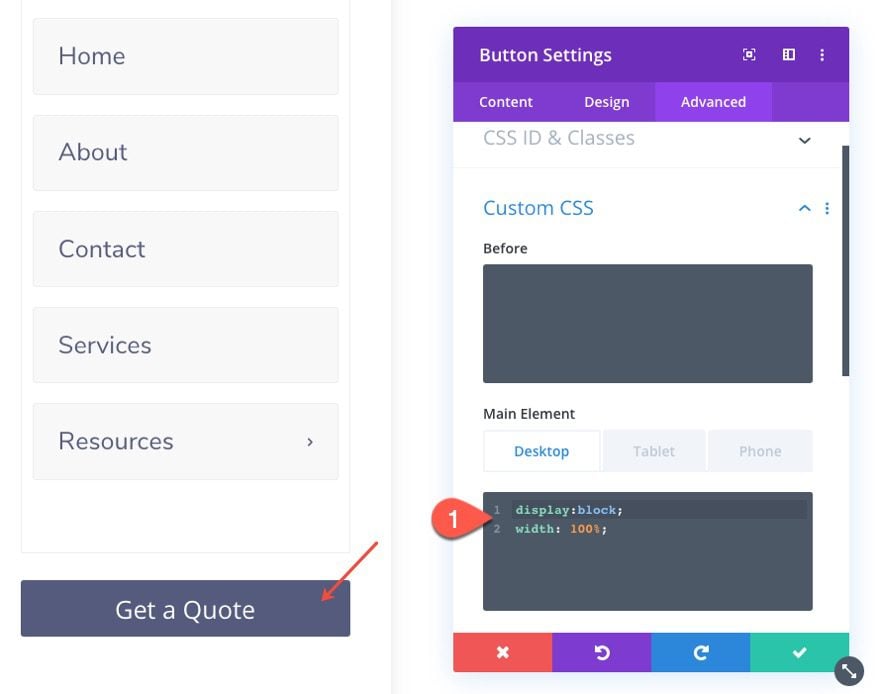
Then go to the advanced tab and paste the following custom CSS to the Main Element:
Main Element CSS (desktop)
display:block;
width: 100%;
Main Element CSS (tablet)
display:inherit;
Under the button, add a Social Media Follow module.
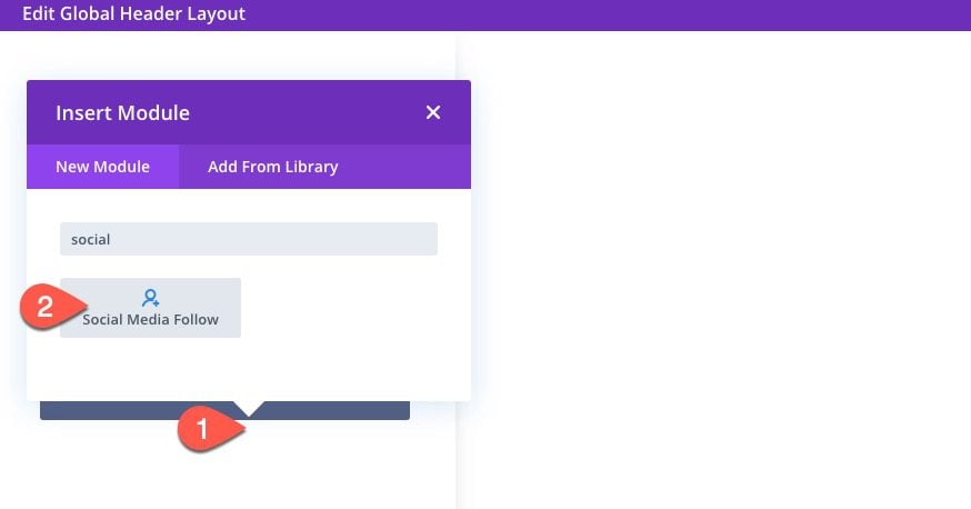
Add the Social Networks that you want under the content tab.
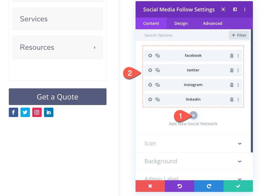
Under the Design tab, update the following:
- Module Alignment: Center
- Icon Color: #535b7c
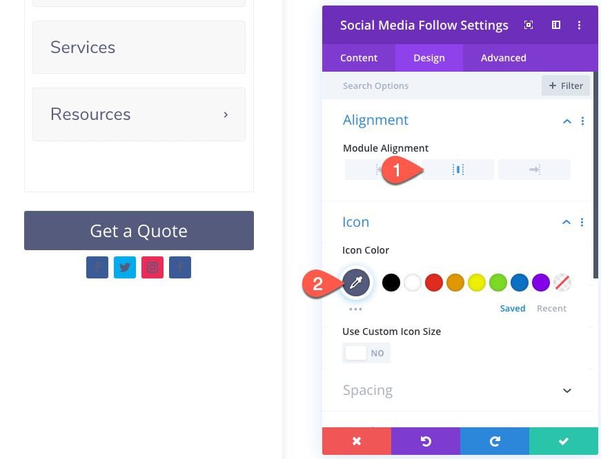 Then open the settings of each of the networks and delete the background color.
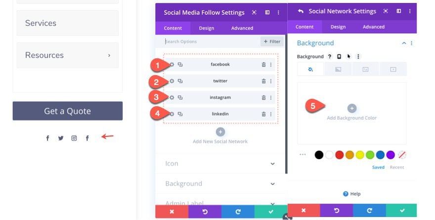
Then add a little top margin as follows:
- Margin: 3vh top
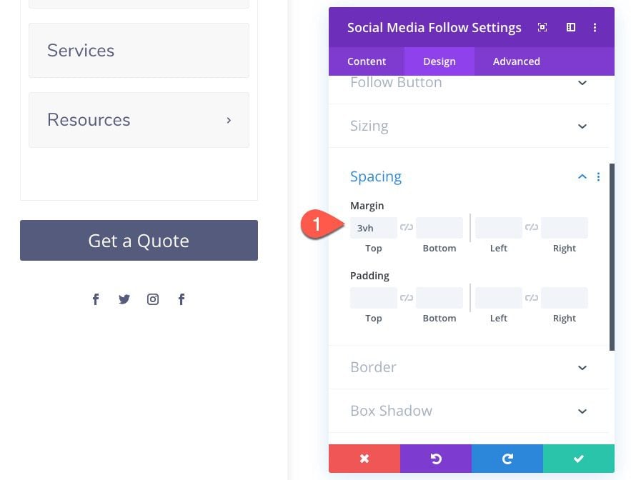
Update Row Settings
After the social media follow icons are complete, open the row settings and adjust the following:
- Gutter Width: 1
- Padding (desktop): 3vh top, 0px bottom
- Padding (tablet and phone): 10px top
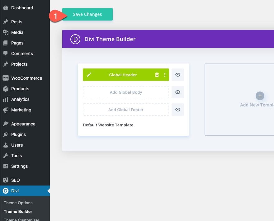
Save Layout and Template
Once done, save the layout and the template.
Final Result
Here is the final result on a live page.
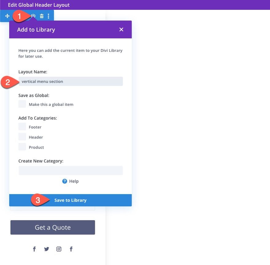
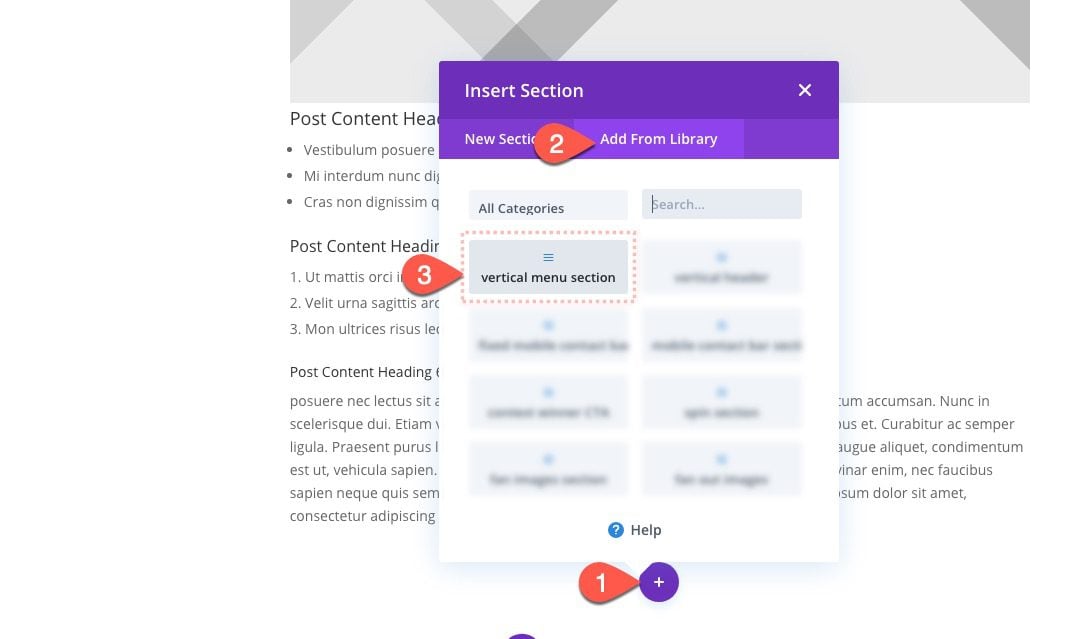
If you want to add the vertical navigation menu to a page layout (instead of your global header), you must first save the section layout to the Divi Library.
To do this, open the Global Header Layout Editor and save the vertical section (containing the menu) to your Divi Library.
Then exit the layout editor and create a new template and assign it to whatever page(s) you want. The click to build a custom body for the page template.
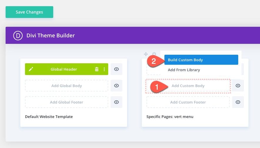
Select to build it from scratch.
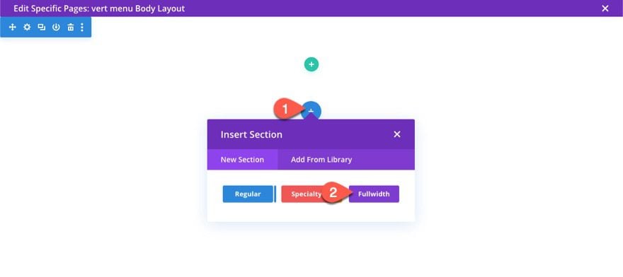
Add a new fullwidth section to the layout.
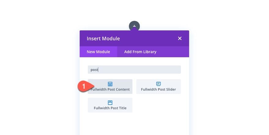
Then add a Fullwidth Post Content Module to the section.
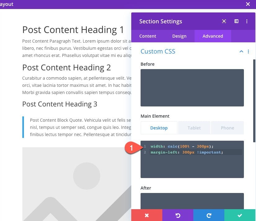
Delete the default regular section at the top of the page and then open the settings for the fullwidth section and add the following custom CSS to the Main Element:
Main Element CSS (desktop)
width: calc(100% - 300px);
margin-left:300px !important;
Main Element CSS (tablet)
width: 100%;
Under the regular section, click to add a new section and, under the Add From Library tab, select the vertical menu section you have previously saved to the library.
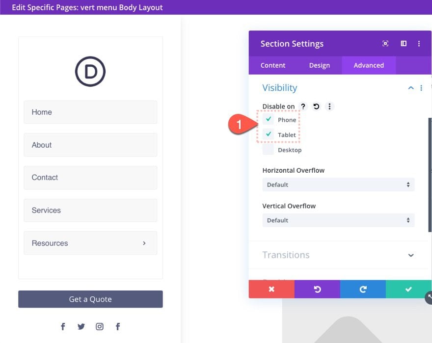
Because we don’t want the section to show on mobile, open the section settings and disable the visibility of the section on tablet and phone.
Then open the code module within the section layout and replace this code snippet…
#et-main-area {
width: calc(100% - 300px);
margin-left: 300px;
}
With this…
#main-header, #main-footer {
width: calc(100% - 300px);
margin-left: 300px;
}
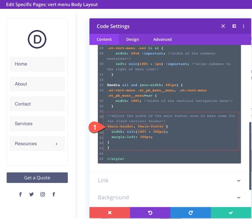
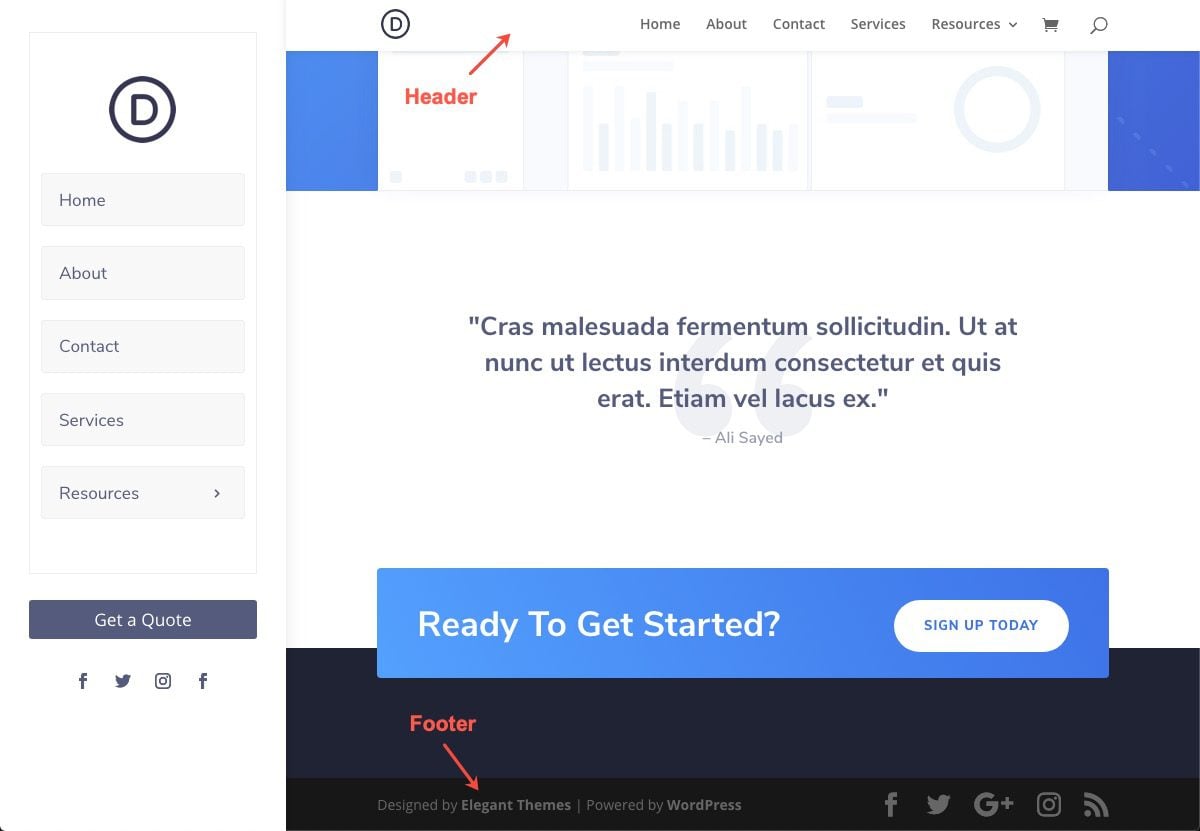
This will move the main header and footer over to fit the fixed vertical menu on the left of the page template. Here is what it looks like on a live page using Divi’s default header and footer.
Final Thoughts
The vertical navigation menu featured here has been given a fixed position. However, if you need more room for additional menu items or content, you can change the position of the section to absolute. You could also change the vertical overflow to scroll in order to give the user the ability to scroll through the menu items (just note that you won’t be able to see/use submenus with this overflow setting).
The vertical section setup opens the door for creating some custom sidebars as well. I hope this comes in handy for future projects.
I look forward to hearing from you in the comments.
Cheers!


Is it possible to use this method with Divi 5, or does a direct way exist?
You’re correct in thinking that Divi 5 might offer a better way. You’ll see one of these downloads a having a slide in menu using Divi 5’s new canvas feature. And you can read here to learn about the new Canvas feature.
HI. Great menu thank you! But I do have difficulty viewing the full menu on my laptop, with roughly 8 tabs, and logo readjusted as small as I could go, the bottom 2 menu links are still hidden from view. Is there any way to make the menu slide up and down so the full menu can be accessed?
You can enable scrolling by going to the Section in the Header Template, then go to the Section Settings > Advanced > Visibility and setting the Vertical Overflow to Scroll:
https://prnt.sc/u2r91aQ_J7_v
I have the same issue. On a 13″ macbook a lot of the side menu is cut off. Is there a way to make the left vert nav scroll with the page content? So its a natural thing. If they scroll they will see more of the menu and the page content. But of course the menu will stop scrolling once it reaches the bottom of itself. Then when you scroll back up then menu will scroll back up as well.
Not many vertical divi nav options out there. It would be cool in the future if this menu just collapses into a mobile menu just as it is. With the button etc included within the collapsed mobile menu.
Thank you!
Hey, Chris!
Currently, the vertical menu parent section is set as fixed, however, if you change its positioning to absolute, in Theme Builder > Global Header > Section Settings > Advanced > Position, the vertical menu will scroll with the page.
The collapsable variant of this header layout is not available at this time, but we will certainly suggest this idea to our Content Team. Thanks! 😊
any chance in 2025 someone has a solution for a right side vertical menu. I adjusted the margin to offset from the right instead of the left, but my drop-down menus don’t show and on mobile the drop-down goes behind the page content
Is there a new update for this? It doesn’t work when I upload the Divi Vertical Navigation menu Header .json_zip.
I’d love to use this but the upload gives me a RED X error and then disappears. Cannot go any further. I’ve tried re-downloading and do this step over many times. Any help?
-Rob
Did you unzip the download? The file you upload needs to be a .json
Yep, this still works. The JSON file has to be imported in Divi > Theme Builder > Portability:
https://i.imgur.com/1NHlIHb.png
Charry, That’s exactly what I did and I am getting an error right after clicking IMPORT DIVI THEME BUILDER TEMPLATES. This is the reason I was asking.
Very helpful information. Ine question: how can I ensure the menu disappears when scrolling on mobile mode?
You would expect this to be a one or 2 clicks in Divi to create any vertical menu and flexible control for style and responsiveness in the design settings.
Thanks for this tutorial – I have had great success with it on Desktop. On Mobile and tablet though, it takes up a lot of the room of the screen, and the top of each page is behind the menu. Is there a way to a) reduce the height of the mobile/tablet menu and b) have the page butt up against the menu, rather than it sit behind it?
I too am struggling with this! Made my mobile/tablet site hidden behind a wall of white. Can’t for the life of me figure out how to fix it!
Same here, did you find a solution?
I’m having the same issue. Has anyone found a fix. This looks great on desktop and doesn’t work at all on mobile
Here’s one fix for the overlap issue…paste this into the code module in Part 4. It pushes the top of the page content below the menu. It still scrolls up under menu, but now the top is visible. You’ll need to change the top-padding value based on the size of your menu.
/*Fix menu overlap with top of page content on mobile*/
@media (max-width: 980px) {
.et_pb_section {
padding-top: 250px;
}
}
Rad post, very thorough. Do you know if this is possible to customize the ‘slide-in’ menu like this?
Thank you so much for posting this. Saved me a lot of time customizing it.
Wow its nice Article
Thanks!
Wow amazing
Thanks!
Also I forgot to say, Nice work Jason! This teaches me so much
Awesome! Love it! Thanks a bunch!
You are very welcome, Elisandro. Always good to hear from you.
Thanks, nice tutorial, but this amount of customization did not play well in the past. I am sure something will break badly with future updates.
It would be really appreciated, if Divi developers would add Layout > Style > Vertical option with options to choose between roll-out and accordion styled menus. Collapsing accordion style menus provide better UX and are really well usable on mobile devices, especially with larger menus that don’t fit into horizontal fancy modern designs.
Agreed! Especially since this is possible using the old way of doing headers in the WP customiser.
Yes, I agree Canagon, a good vertical menu with Collapsing accordion style menus. I had to buy a plugin to achieve results. This has got to be a built in feature.
I hear you, rod. Thanks for the comment.
Hey Jason! Useful and inspiring! Thank you!
Glad you liked it, Ramon!
i did it and tnx but is there any horizental one?
Not sure what you mean by this. Are you wanting to keep the horizontal menu and the vertical menu on desktop? If so, see the end of the article where I explain how to add the vertical menu to a page template. I hope that helps.
Informative blog.
Thanks for the download. I love how much you can customize the menu. My concerns are the weight of the menu for load speed and how mobile friendly it is.