
When building an eCommerce website using Divi and WooCommerce, there are tons of ways to customize the overall look and feel of your website. Divi’s WooCommerce modules in combination with the Divi Theme Builder allow you to build templates for your product pages, category pages and more. But besides making sure your website structure and WooCommerce pages are ready for launch, it’s also important to think about the navigation experience visitors will have. The menu you build for your eCommerce website sets the tone for your visitors’ purchase behavior on your website.
To help your eCommerce website reach its full potential, we’re going to show you how to create a custom eCommerce mega menu with Divi’s Theme Builder. We’ll build everything visually, using Divi’s built-in elements, and use the elements as dropdowns with some code. Using this approach, you’ll be able to build any kind of eCommerce mega menu for the eCommerce websites you build! You’ll be able to download the JSON file for free as well.
Let’s get to it.
- 1 Preview
- 2 Download The eCommerce Mega Menu Layout for FREE
- 3 Download For Free
- 4 1. Add CSS Classes to Menu Items
- 5 2. Create Global Header with Divi’s Theme Builder
-
6
3. Build Dropdown Row Inside Header Template
- 6.1 Add New Section (Dedicated to First Menu Item’s Dropdown)
- 6.2 Add New Row to Section
- 6.3 Column 1 & 2 Settings
- 6.4 Column 3 Settings
- 6.5 Column 4 Settings
- 6.6 Add Text Module to Column 1
- 6.7 Clone & Modify Text Module as Many Times as Needed
- 6.8 Add Text Module to Column 3
- 6.9 Clone Text Module in Column 3 & Place Duplicate in Column 4
- 6.10 Clone Entire Section to Reuse as Dropdown for Other Menu Items
- 7 4. Add CSS & JQuery Code
- 8 5. Enable CSS Class Once You’re Done Customizing the Menu
- 9 6. Save Divi Theme Builder Changes
- 10 Preview
- 11 Final Thoughts
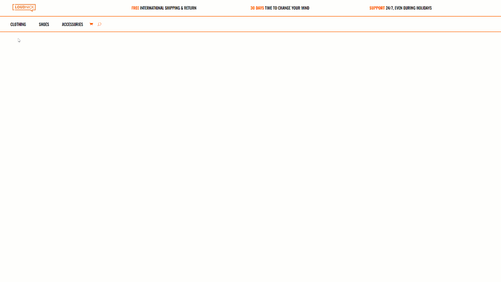
Preview
Before we dive into the tutorial, let’s take a quick look at the outcome across different screen sizes.
Desktop
Mobile

To lay your hands on the free eCommerce mega menu layout, you will first need to download it using the button below. To gain access to the download you will need to subscribe to our newsletter by using the form below. As a new subscriber, you will receive even more Divi goodness and a free Divi Layout pack every Monday! If you’re already on the list, simply enter your email address below and click download. You will not be “resubscribed” or receive extra emails.

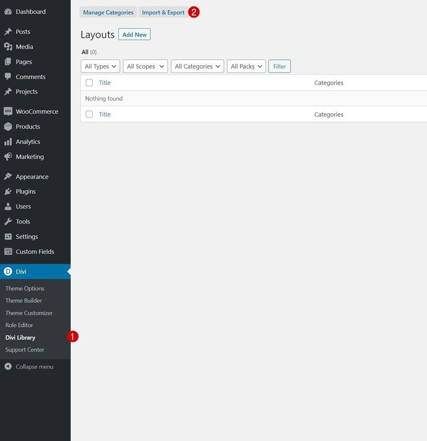
How to Upload the JSON File
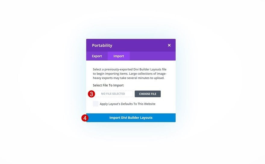
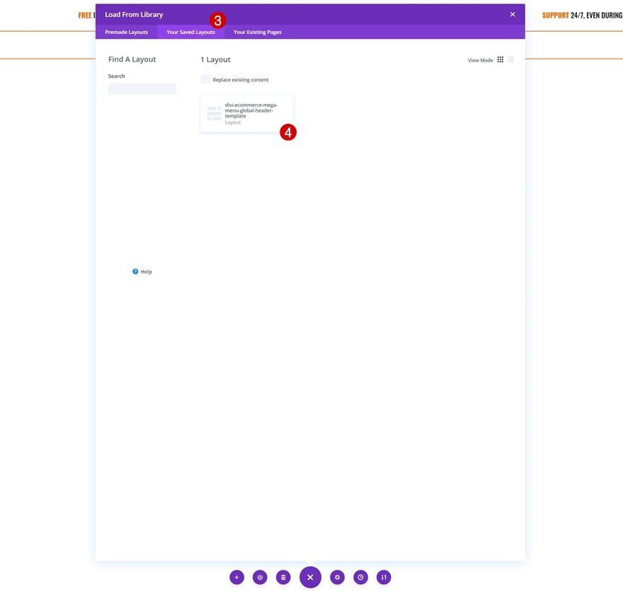
Unzip the zipped folder you were able to download above. Then, navigate to your WordPress website > Divi > Divi Library and upload the JSON.
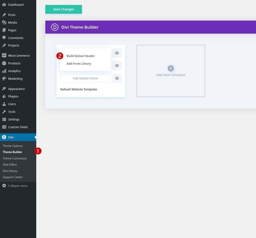
Once your layout is saved in the Divi Library, you can navigate to the Divi Theme Builder and import the saved layout by clicking on “Add Global Header” or “Add Custom Header” and selecting “Build Global/Custom Header”. Go to the “Your Saved Layouts” tab in the Divi Library, select the layout you’ve uploaded in the previous step and save all Divi Theme Builder Changes.
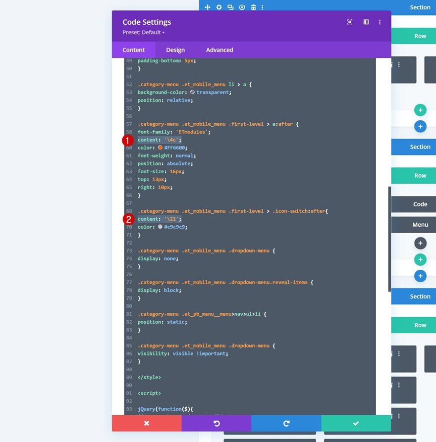
To have a functioning menu right off the bat, you’ll be required to go through the first part of this tutorial below; adding the CSS classes to menu items on an individual level. You’ll also need to enable one of the CSS classes inside the Code Module as is shown in part 5 of this tutorial. If the icons are not showing up correctly, make sure you check on the icon content inside the Code Module. The icons must contain the “\4c” and “\21” content as you can notice in the print screen below.
In the first part of this tutorial, we’re going to assign two different CSS classes to the menu items we want to add a dropdown mega menu to. To do that, go to menus in your WordPress dashboard’s appearance settings.
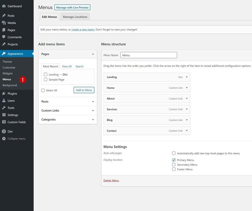
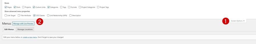
Enable CSS Class Option
Make sure the CSS class option is enabled at the top by toggling the screen options and enabling the CSS classes option.
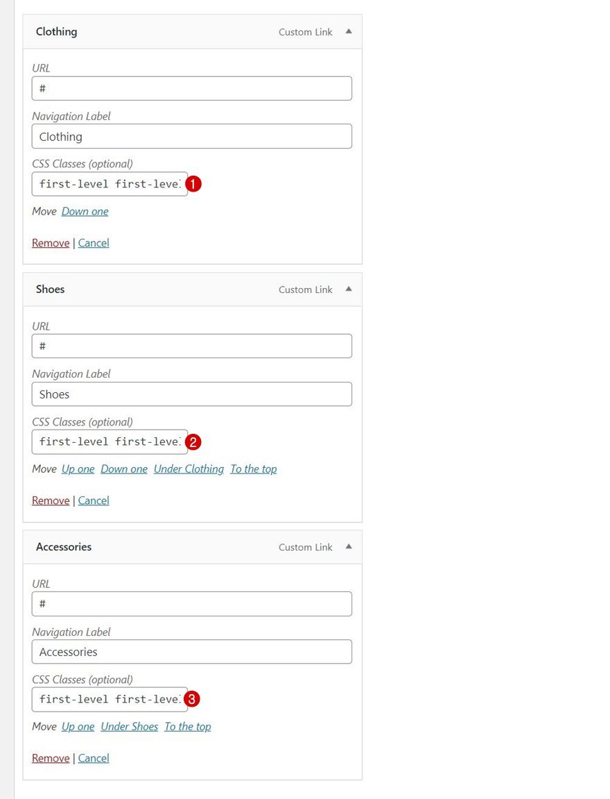
Each one of the menu items you want to assign a dropdown mega menu to needs two CSS classes. First, a general CSS class that’s called “first-level”. The second CSS class contains a consecutive number at the end of it, “first-level-1”, “first-level-2”, “first-level-3”, etc.
- First menu item containing dropdown: first-level first-level-1
- Second menu item containing dropdown: first-level first-level-2
- Third menu item containing dropdown: first-level first-level-3
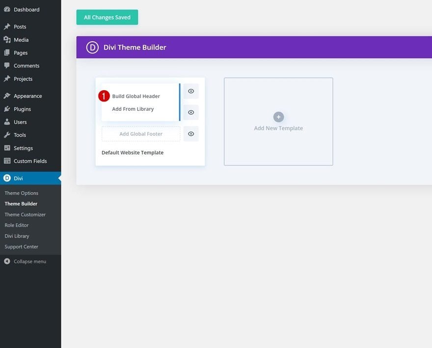
2. Create Global Header with Divi’s Theme Builder
Go to Divi Theme Builder & Start Building Global Header
Once your menu items are in place, it’s time to switch over to Divi. We’ll create a new global header by navigating to our Divi Theme Builder and clicking on “Add Global Header”. We’ll build the global header from scratch.
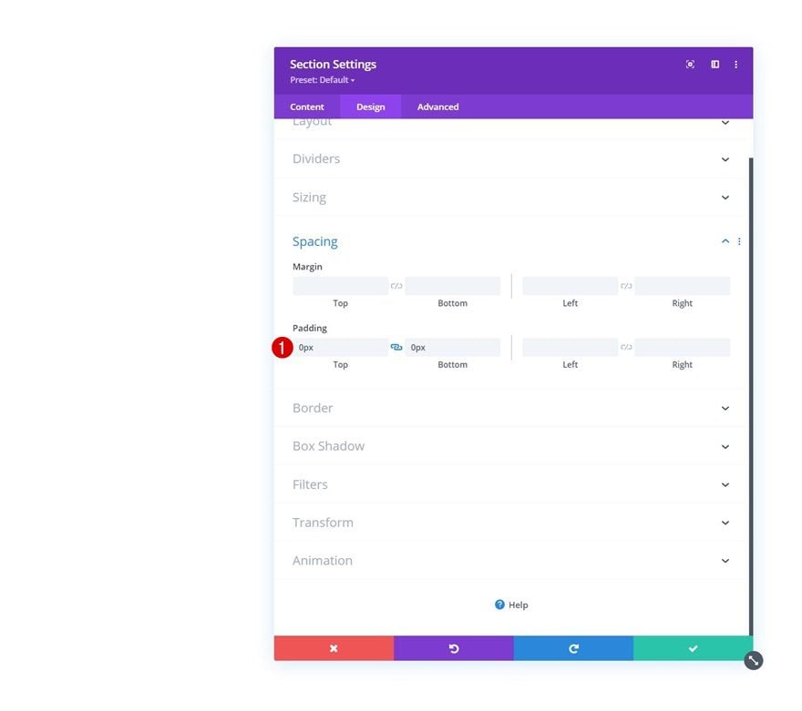
Section #1 Settings
Spacing
Once inside the template editor, you’ll notice a section. Open that section and remove all default top and bottom padding.
- Top Padding: 0px
- Bottom Padding: 0px
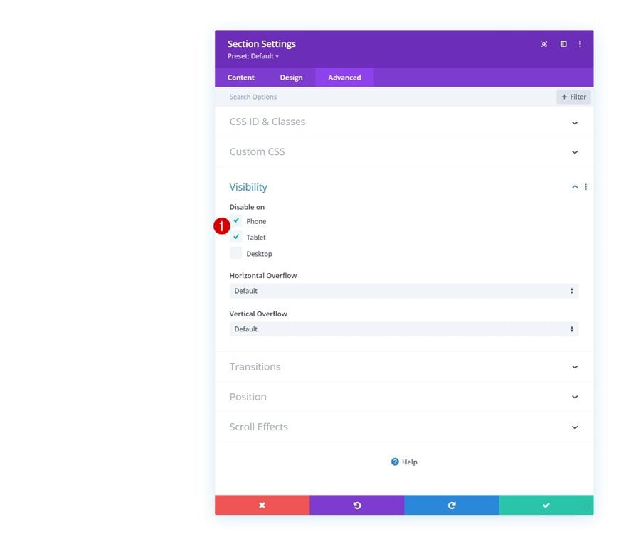
Visibility
Hide this section on tablet and phone next. We’re only keeping this section on larger screen sizes to make sure the navigation experience on smaller screen sizes doesn’t become overwhelming.
Add Row #1
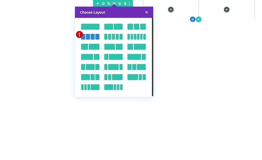
Column Structure
Continue by adding a new row using the following column structure:
Sizing
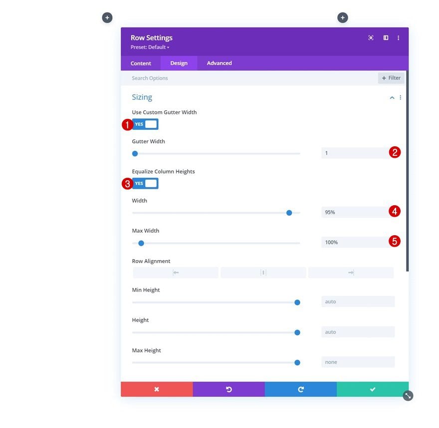
Without adding any modules yet, open the row settings and change the sizing settings as follows:
- Use Custom Gutter Width: Yes
- Gutter Width: 1
- Equalize Column Heights: Yes
- Width: 95%
- Max Width: 100%
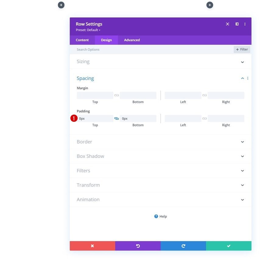
Spacing
Remove all default top and bottom padding next.
- Top Padding: 0px
- Bottom Padding: 0px
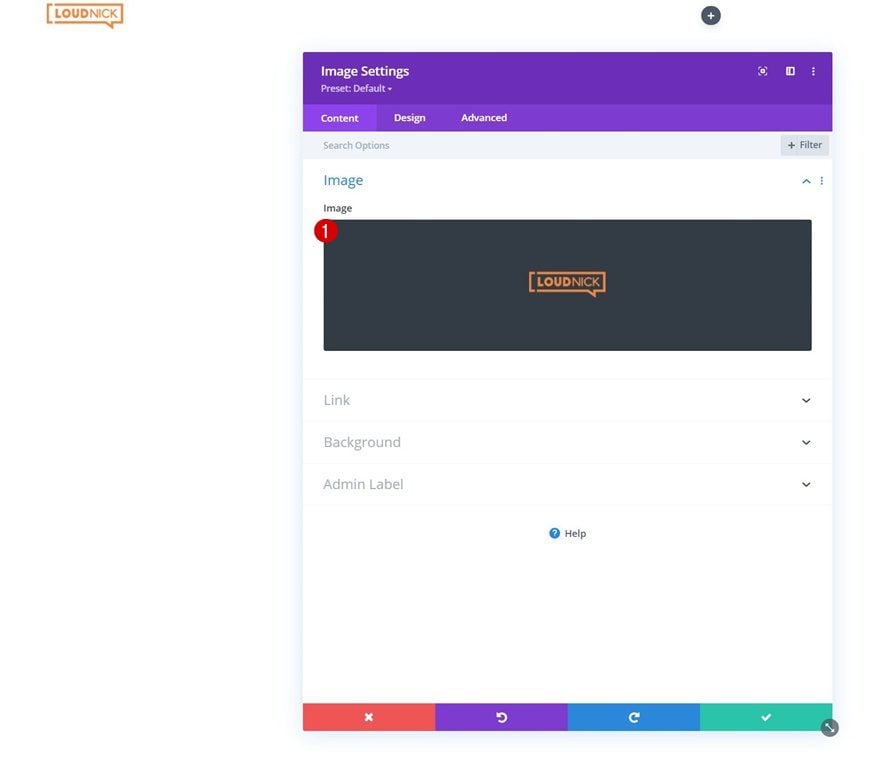
Add Image Module to Column 1
Upload Logo
Time to add modules, starting with an Image Module in column 1. Upload your logo.
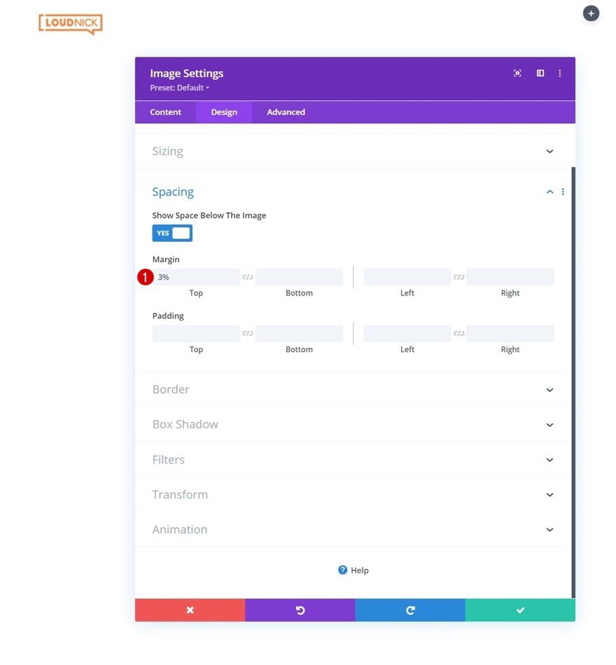
Spacing
Move on to the module’s design tab and add some top margin.
- Top Margin: 3%
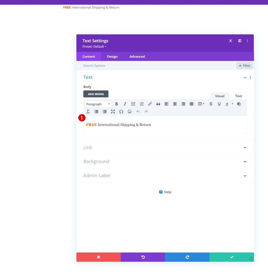
Add Text Module to Column 2
Add Content
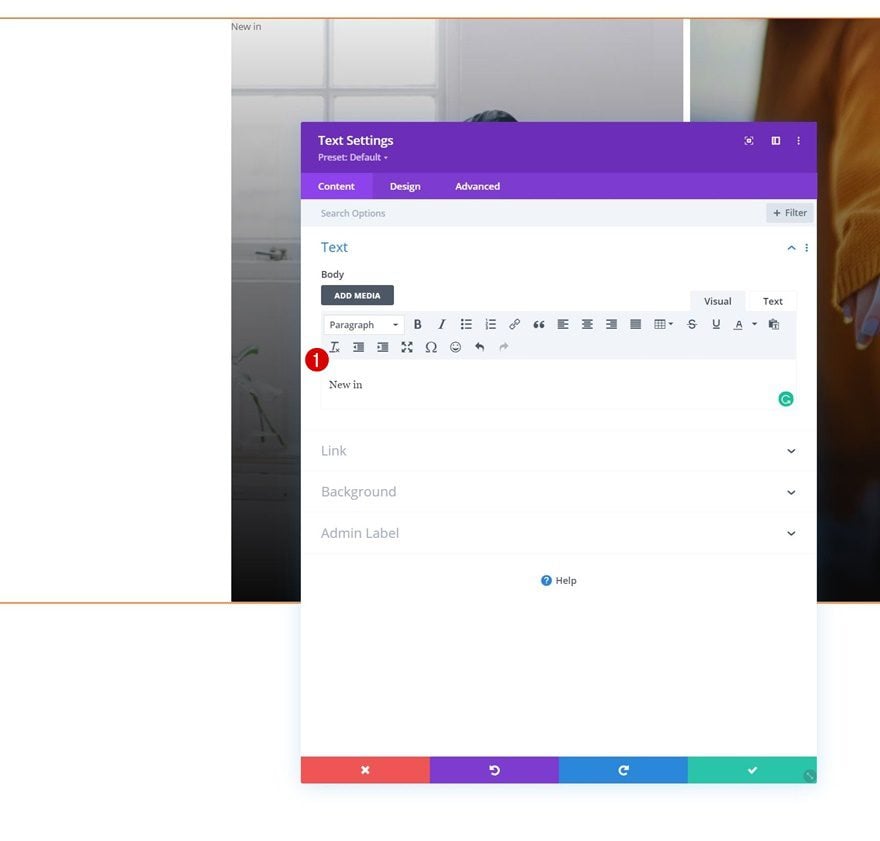
On to the next column. Add a Text Module with some content of your choice.
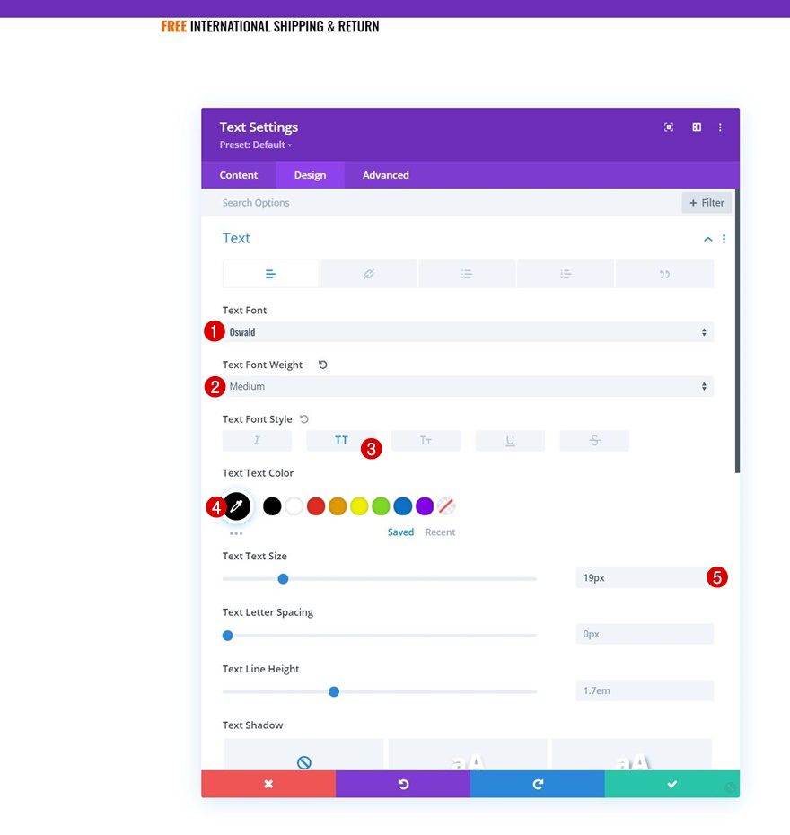
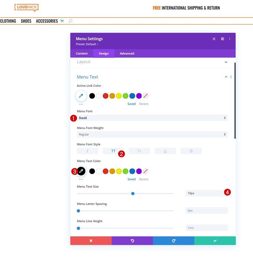
Text Settings
Move on to the module’s design tab and change the text settings as follows:
- Text Font: Oswald
- Text Font Weight: Medium
- Text Font Style: Uppercase
- Text Color: #000000
- Text Size: 19px
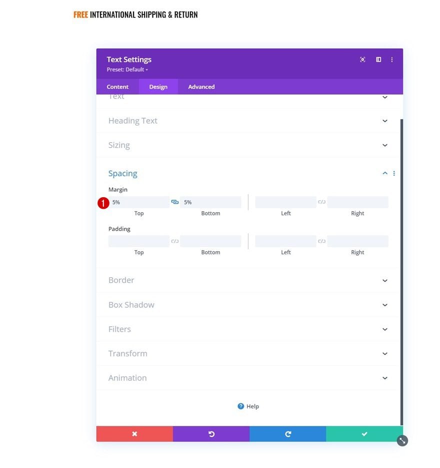
Spacing
Add some top and bottom margin too.
- Top Margin: 5%
- Bottom Margin: 5%
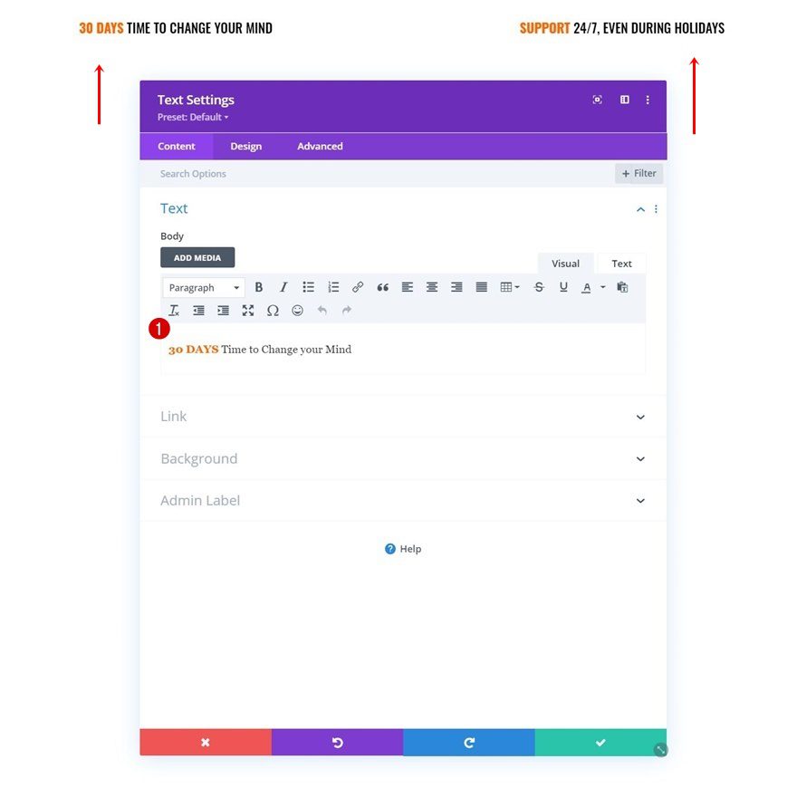
Clone Text Module Twice & Place Duplicates in Column 3 & 4
Change Copy
Once you’ve completed the first Text Module in column 2, you can clone it twice and place the duplicates in column 3 and 4. Make sure you change the content in both duplicate modules.
Add Section #2
Spacing
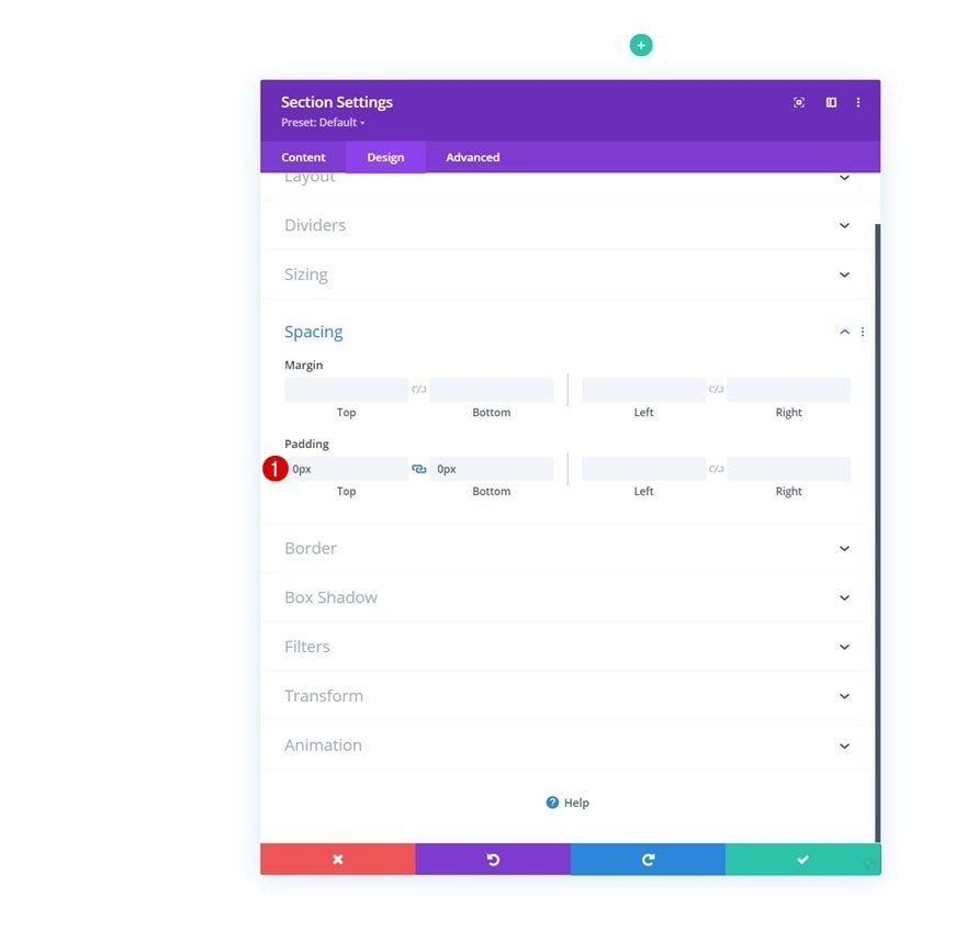
Add another section right below the previous one. Open the section settings and remove all default top and bottom padding.
- Top Padding: 0px
- Bottom Padding: 0px
Add Row #2
Column Structure
Continue by adding a new row using the following column structure:
Sizing
Without adding any modules yet, open the row settings and modify the sizing settings as follows:
- Use Custom Gutter Width: Yes
- Gutter Width: 1
- Width: 100%
- Max Width: 100%
Spacing
Remove all default top and bottom padding next.
- Top Padding: 0px
- Bottom Padding: 0px
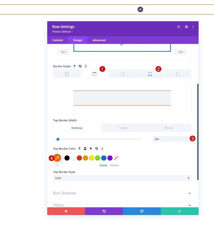
Border
Then, go to the border settings and apply a top and bottom border.
- Top Border Width:
- Desktop: 2px
- Tablet & Phone: 0px
- Bottom Border Width: 2px
- Border Color: #ff6600
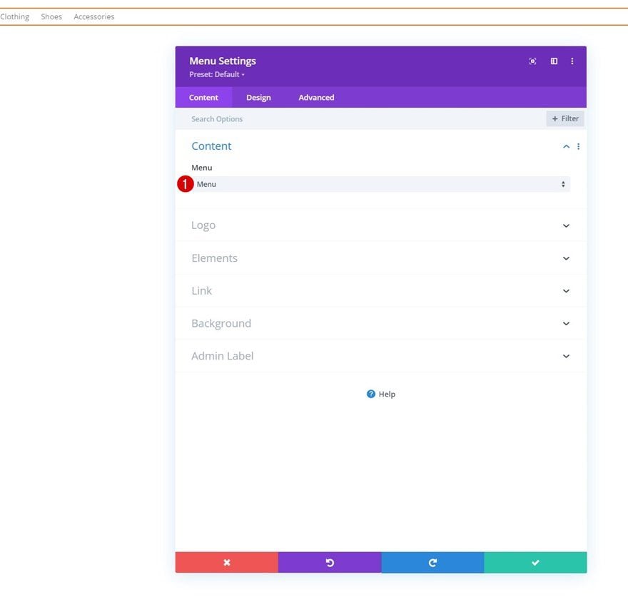
Select Menu
Add a Menu Module to the row’s column and select a menu of your choice.
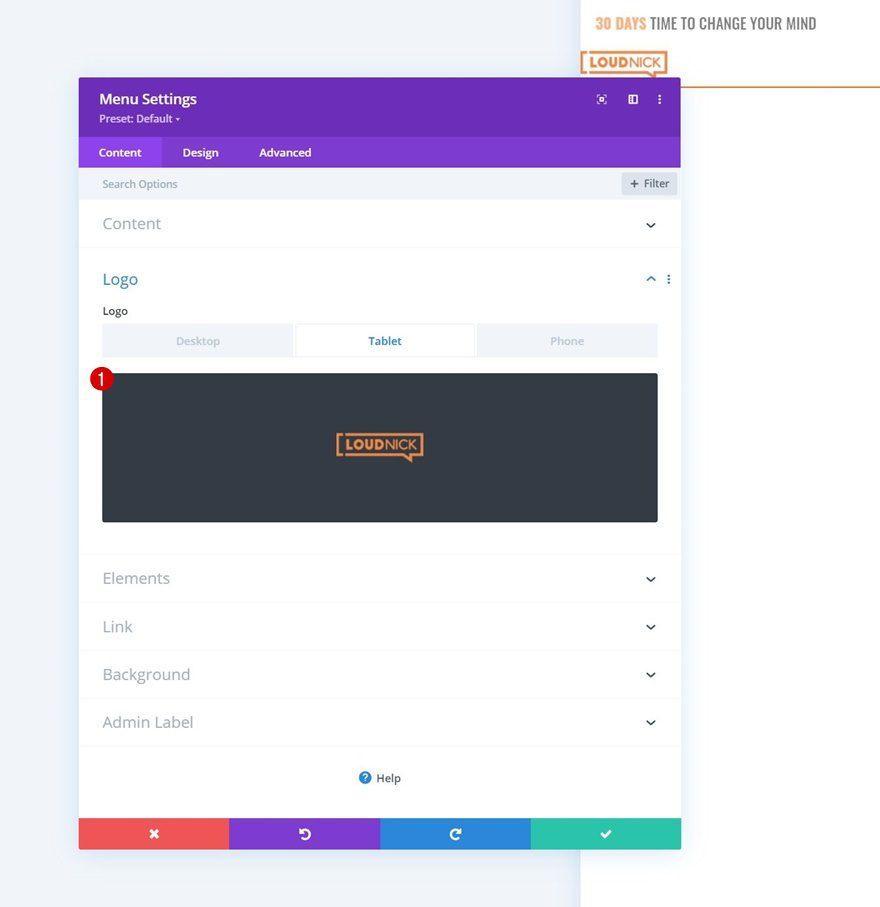
Add Logo on Tablet & Phone
Then, add a logo on tablet and phone by enabling the responsive options and uploading your logo image file. Leave the desktop area empty.
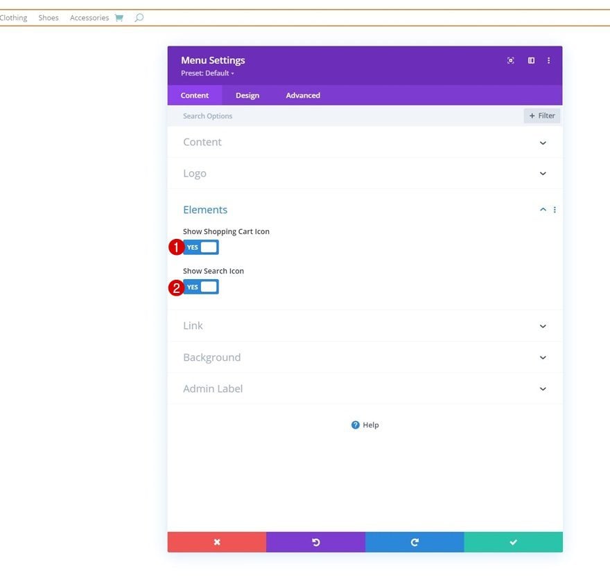
Elements
We’re enabling the shopping cart and search icons too.
- Show Shopping Cart Icon: Yes
- Show Search Icon: Yes
Menu Text Settings
Move on to the design tab and change the menu text settings as follows:
- Menu Font: Oswald
- Menu Font Style: Uppercase
- Menu Text Color: #000000
- Menu Text Size: 19px
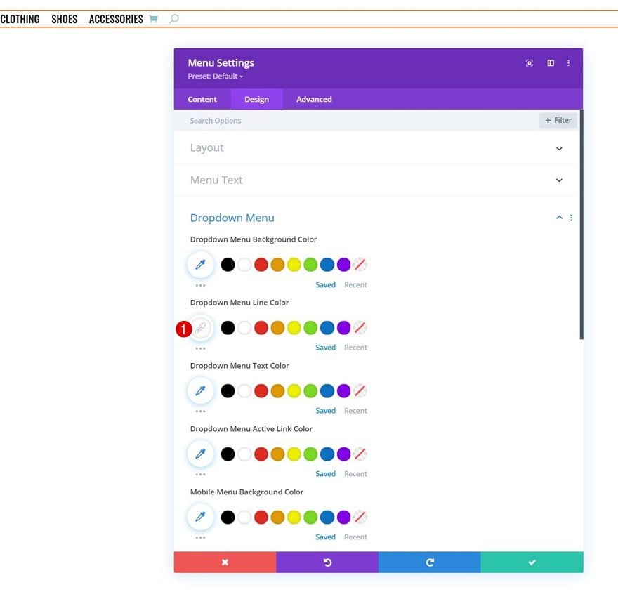
Dropdown Menu Text Settings
We’re changing the dropdown menu line color too.
- Dropdown Menu Line Color: #ffffff
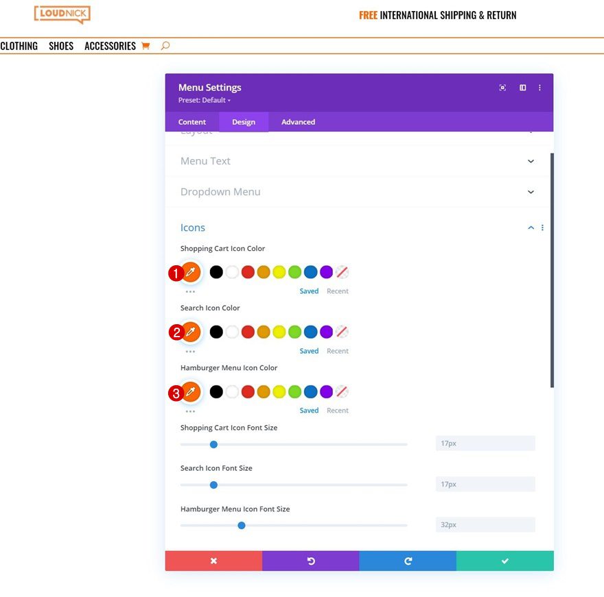
Icons Settings
Along with the icons settings.
- Shopping Cart Icon Color: #ff6600
- Search Icon Color: #ff6600
- Hamburger Menu Icon Color: #ff6600
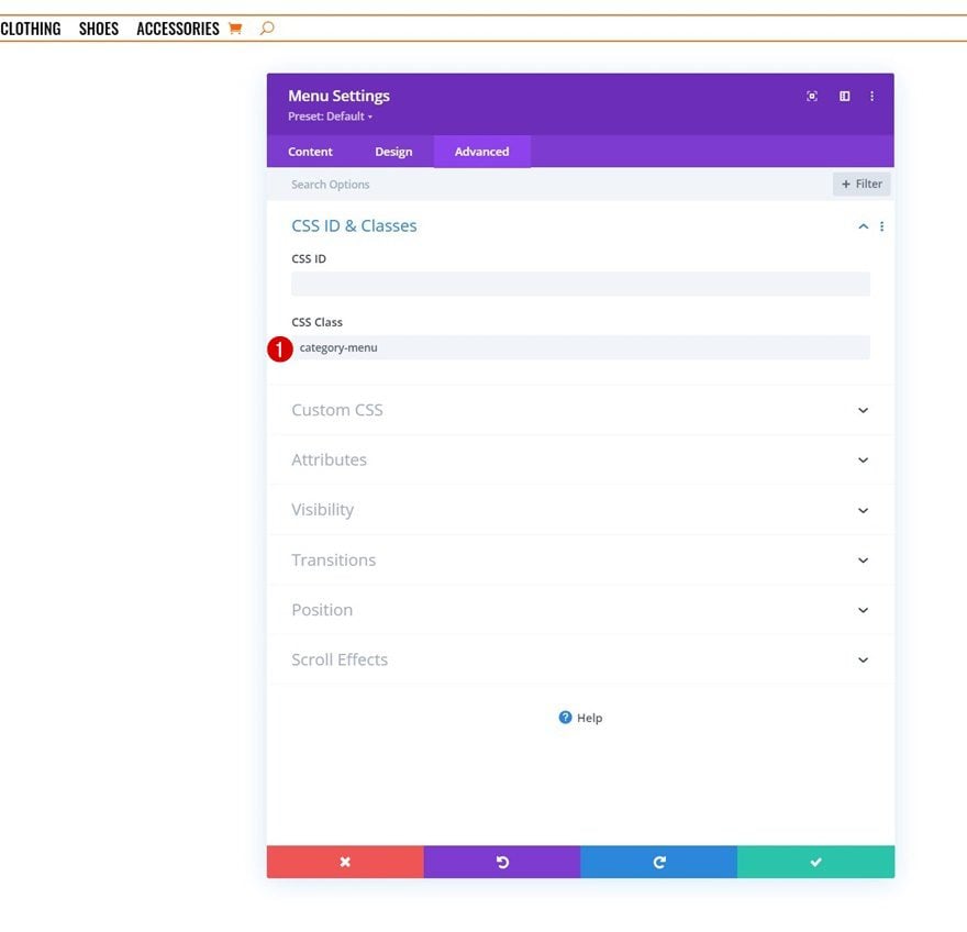
CSS Class
Complete the module’s settings by adding a CSS class. We’ll use this CSS class later on the tutorial when we’ll add the code.
- CSS Class: category-menu
3. Build Dropdown Row Inside Header Template
Sizing
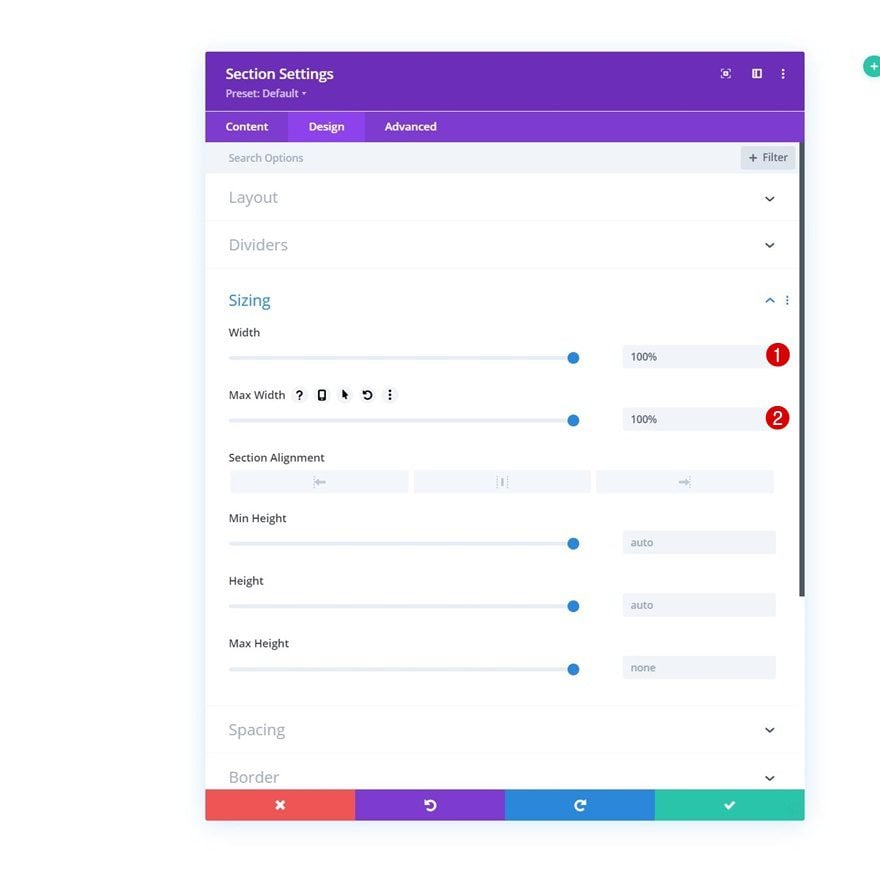
Now that we have our menu in place, it’s time to move on to the next part of the tutorial that’s dedicated to creating the eCommerce mega menu dropdowns. To build the first dropdown eCommerce mega menu, we’ll add a new section. Open the section settings and make sure the width and max width are set to 100% in the sizing settings.
- Width: 100%
- Max Width: 100%
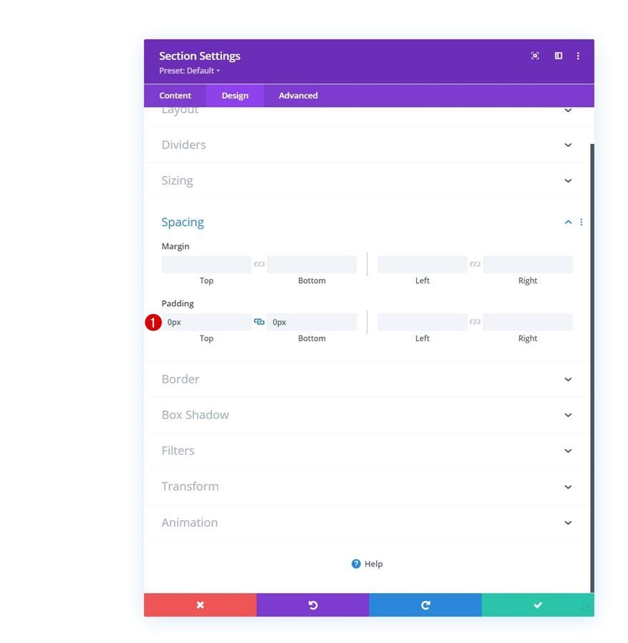
Spacing
Remove all default top and bottom padding next.
- Top Padding: 0px
- Bottom Padding: 0px
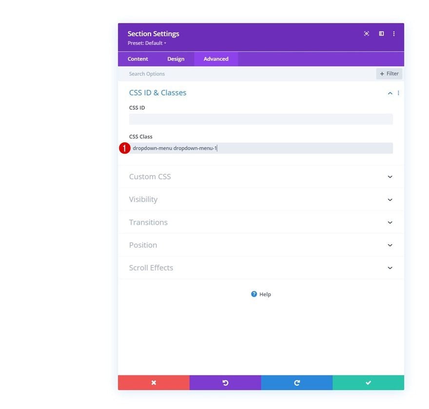
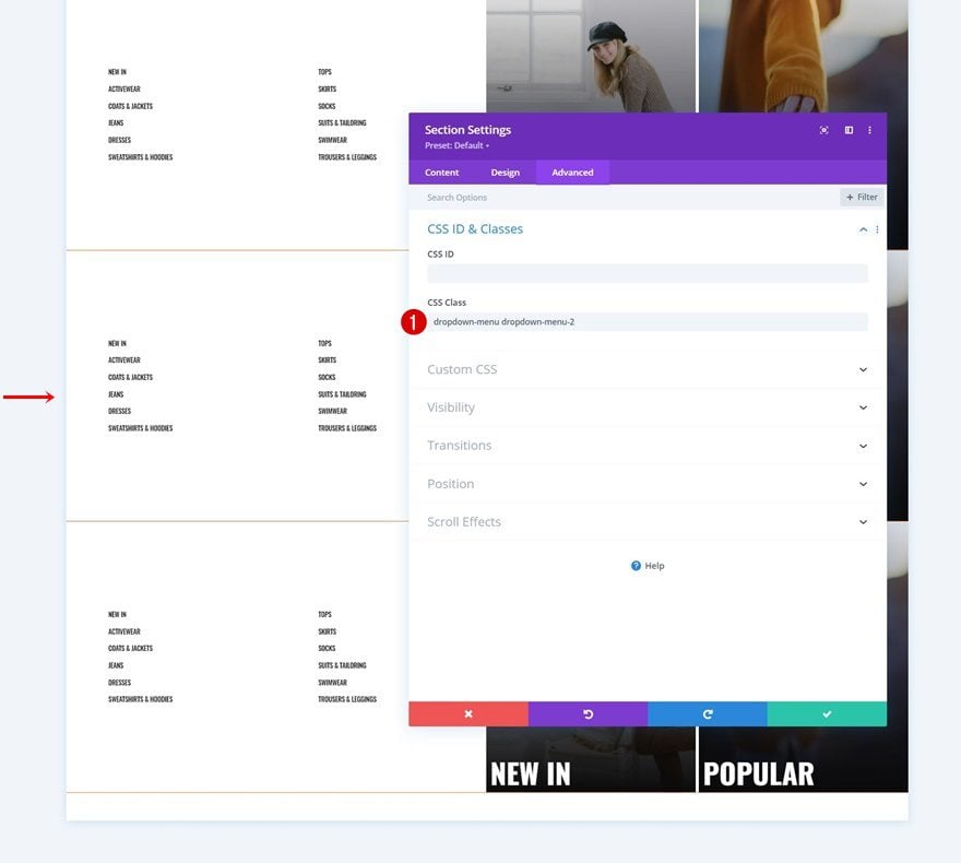
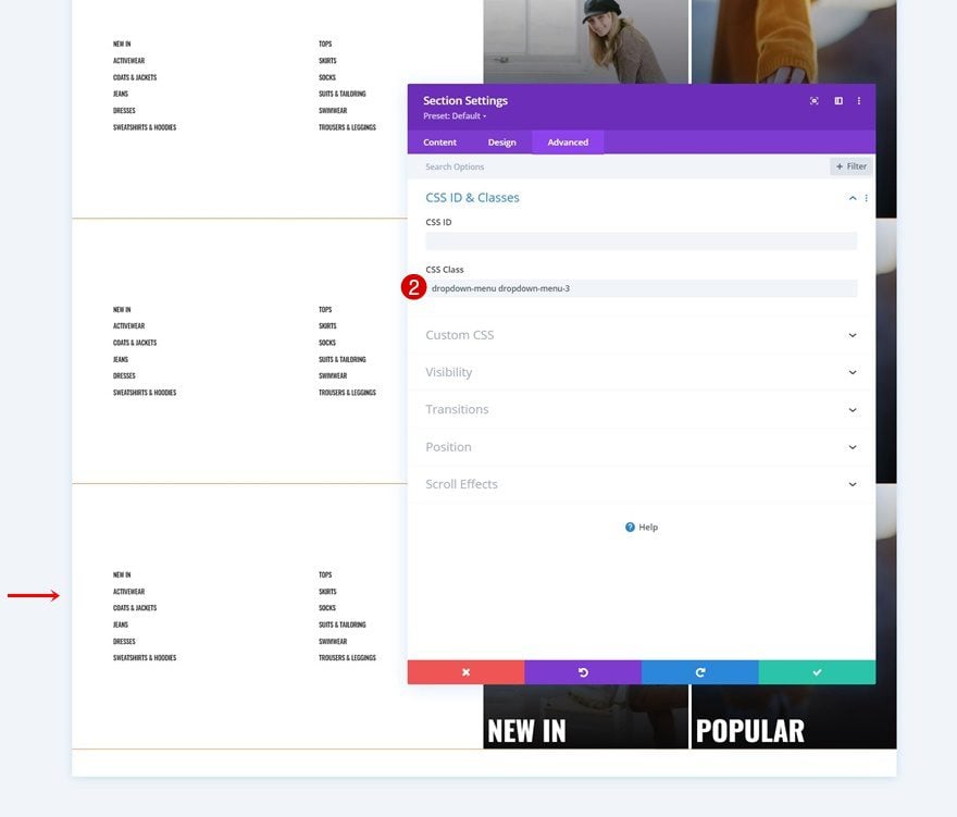
CSS Class
Then, add two CSS classes. The number at the end of the second CSS class is the same number as the number used for the first menu item in the first part of this tutorial.
- CSS Class: dropdown-menu dropdown-menu-1
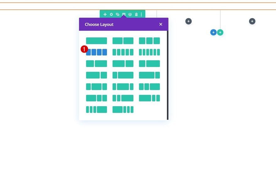
Add New Row to Section
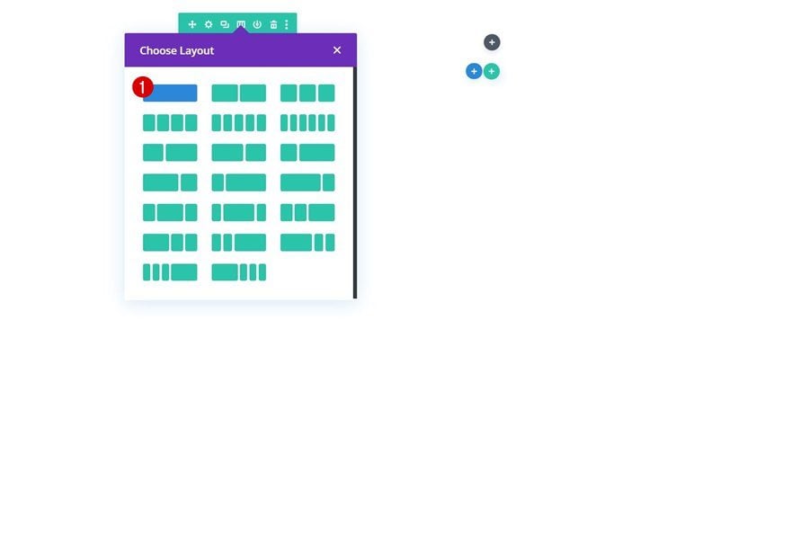
Column Structure
Continue by adding a new row to the section using the following column structure:
Background Color
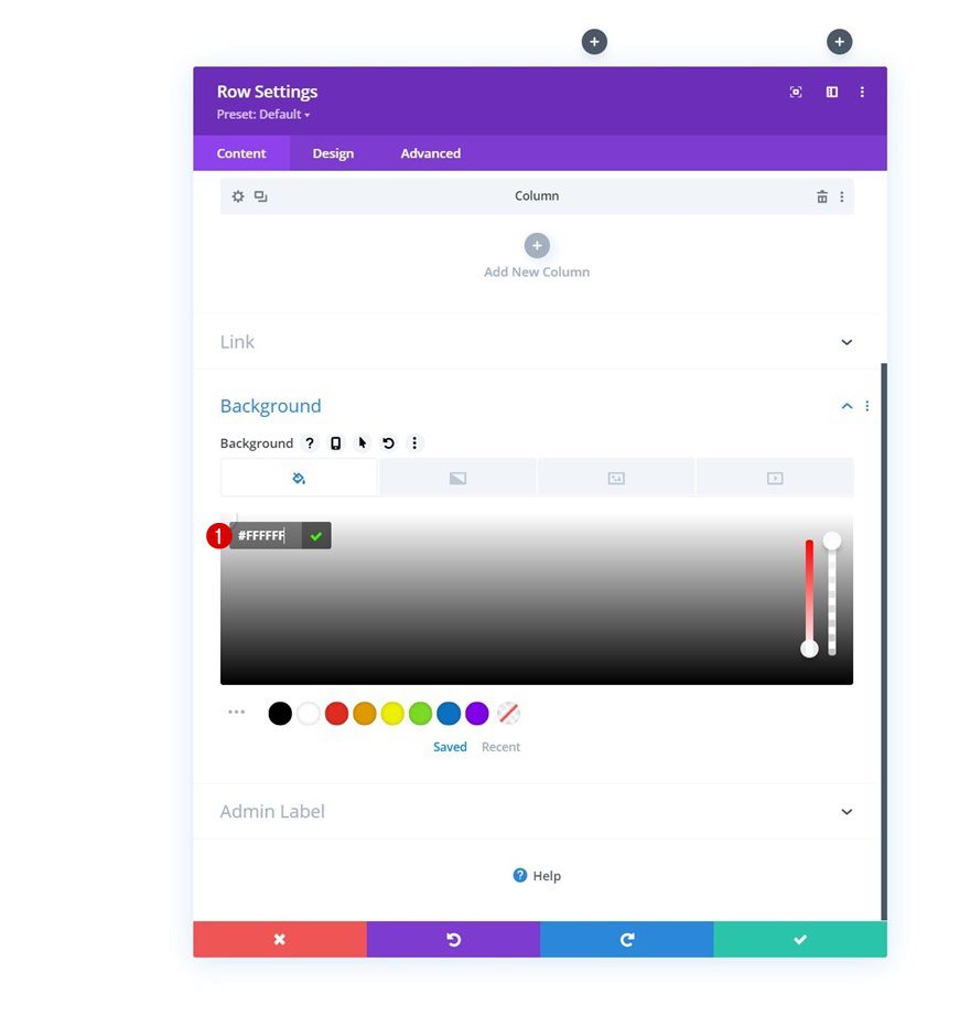
Without adding any modules yet, open the row settings and add a white background color.
- Background Color: #ffffff
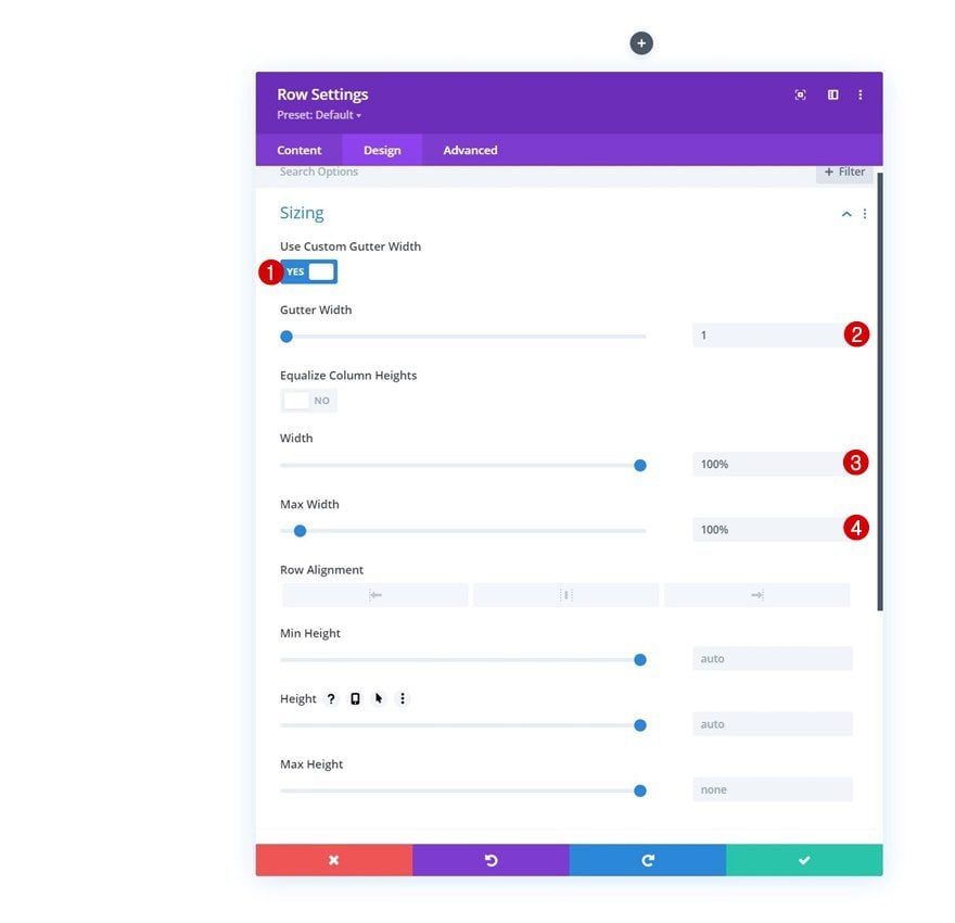
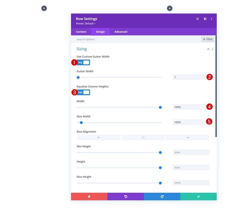
Sizing
Move on to the row’s design tab and change the sizing settings as follows:
- Use Custom Gutter Width: Yes
- Gutter Width: 1
- Equalize Column Heights: Yes
- Width: 100%
- Max Width: 100%
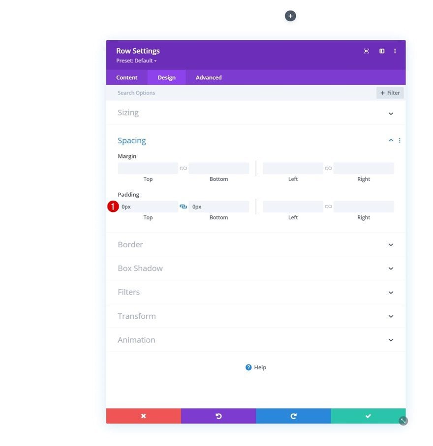
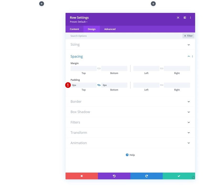
Spacing
Remove all default top and bottom padding too.
- Top Padding: 0px
- Bottom Padding: 0px
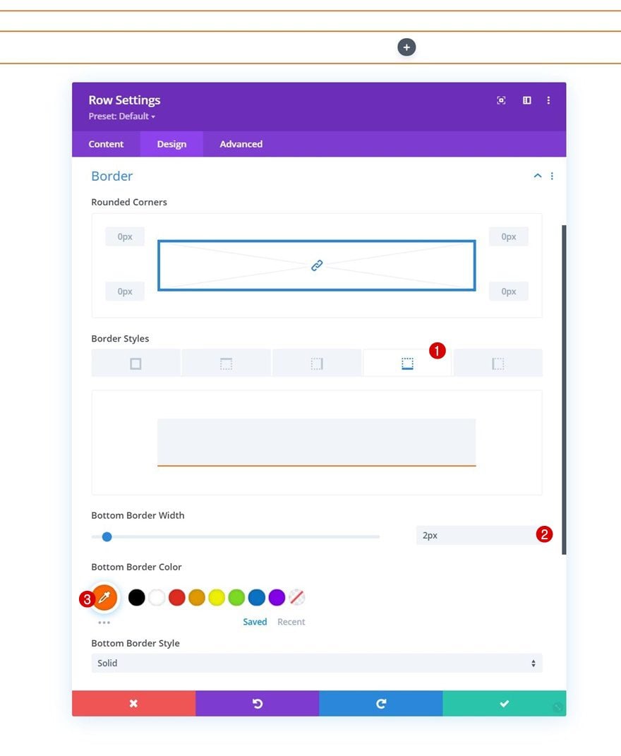
Border
And apply a bottom border.
- Bottom Border Width: 2px
- Bottom Border Color: #ff6600
Column 1 & 2 Settings
Next, open the column 1 and 2 settings individually.
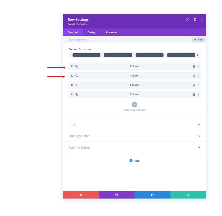
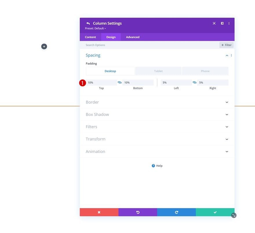
Spacing
Add the following responsive padding values to both columns:
- Top Padding:
- Desktop & Tablet: 10%
- Phone: 5%
- Bottom Padding:
- Desktop & Tablet: 10%
- Phone: 5%
- Left Padding: 5%
- Right Padding: 5%
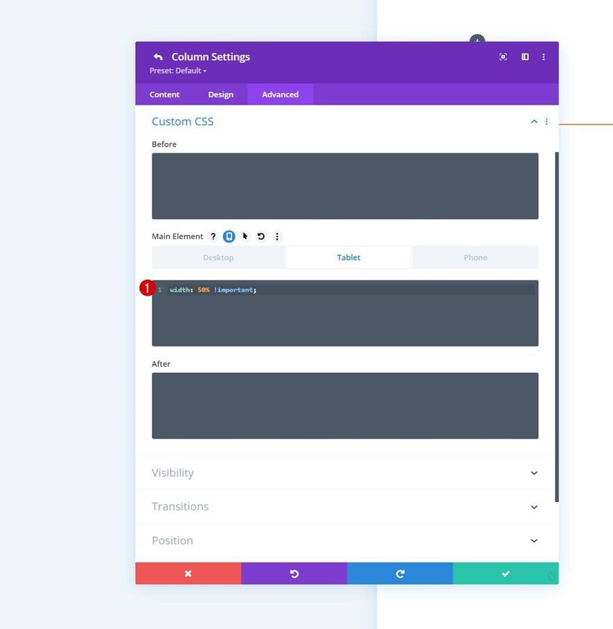
Main Element CSS
Along with one line of CSS code. This will help us place the columns next to each other on smaller screen sizes as well.
width: 50% !important
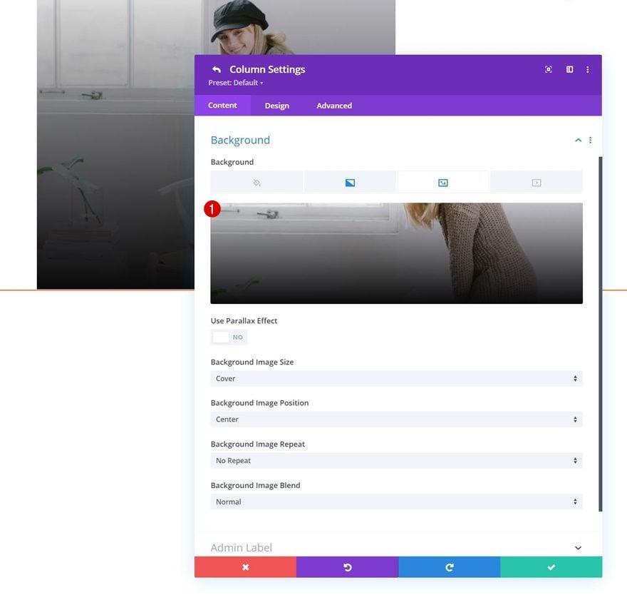
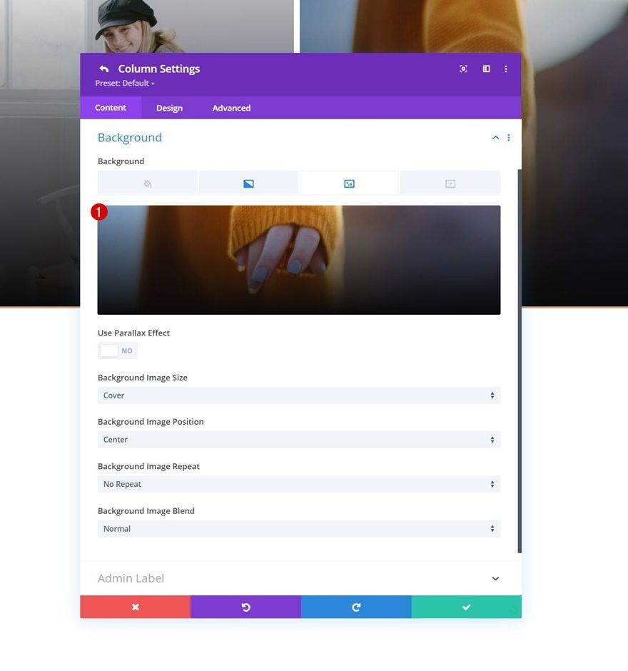
Column 3 Settings
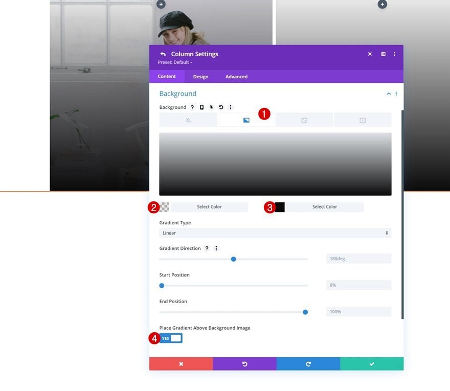
Gradient Background
On to the column 3 settings. Apply the following gradient background:
- Color 1: rgba(0,0,0,0.08)
- Color 2: #0a0a0a
- Place Gradient Above Background Image: Yes
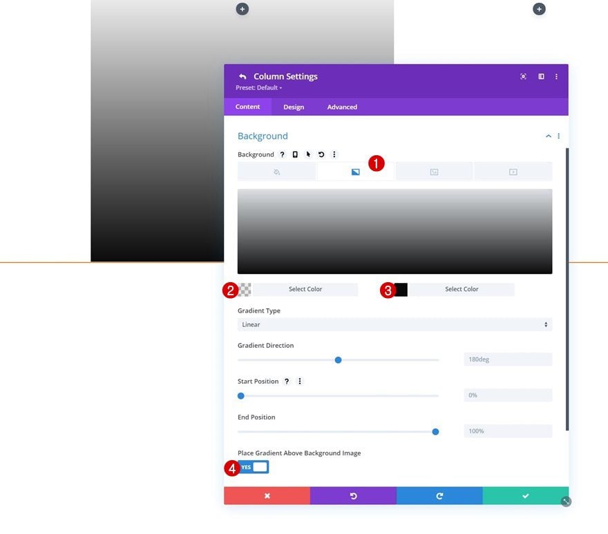
Background Image
Upload a background image of your choice next.
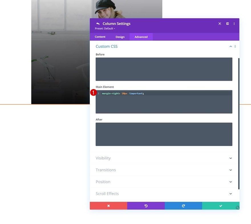
Main Element CSS
And add some right margin to the column using one line of CSS code.
margin-right: 10px !important;
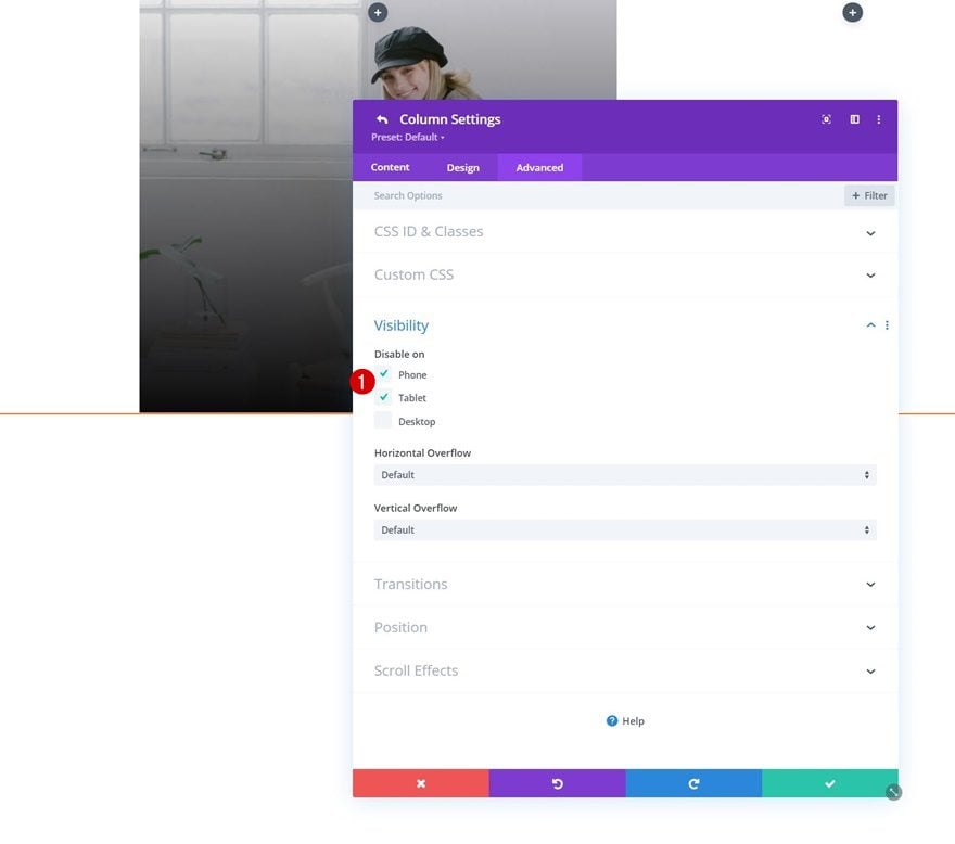
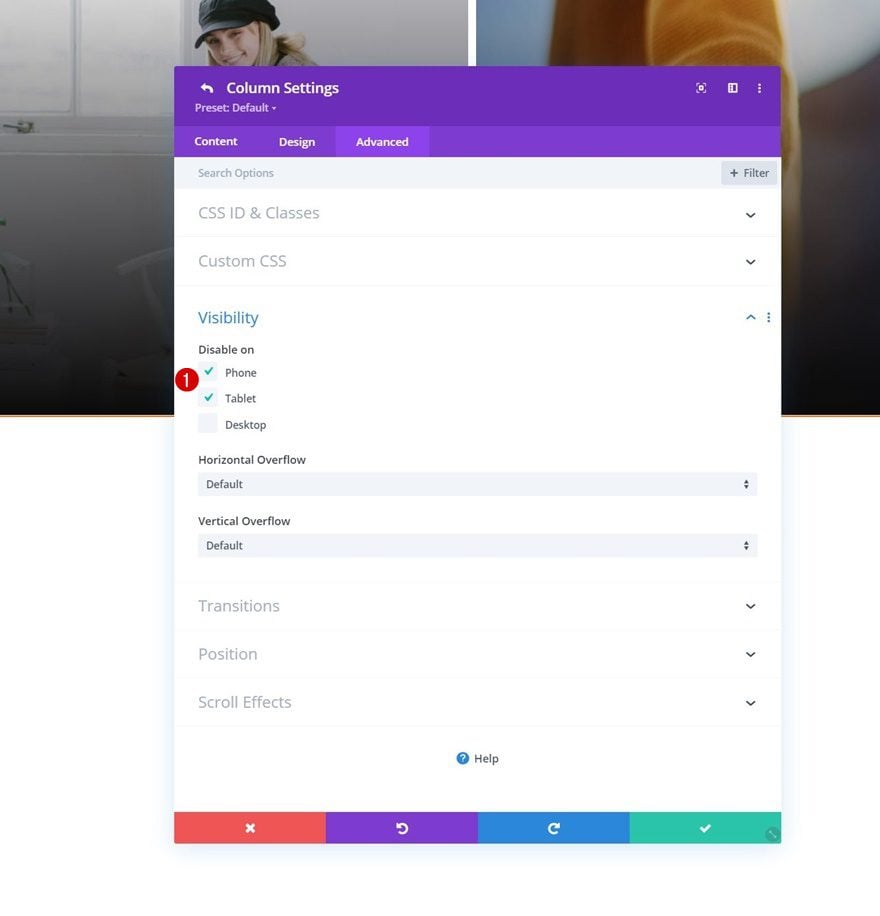
Visibility
To make sure our mobile dropdown isn’t too overwhelming, we’re hiding this entire column on tablet and phone.
Column 4 Settings
Gradient Background
Next, we have the fourth column. Add the same gradient background.
- Color 1: rgba(0,0,0,0.08)
- Color 2: #0a0a0a
- Place Gradient Above Background Image: Yes
Background Image
Upload a background image here too.
Visibility
And hide the column on tablet and phone.
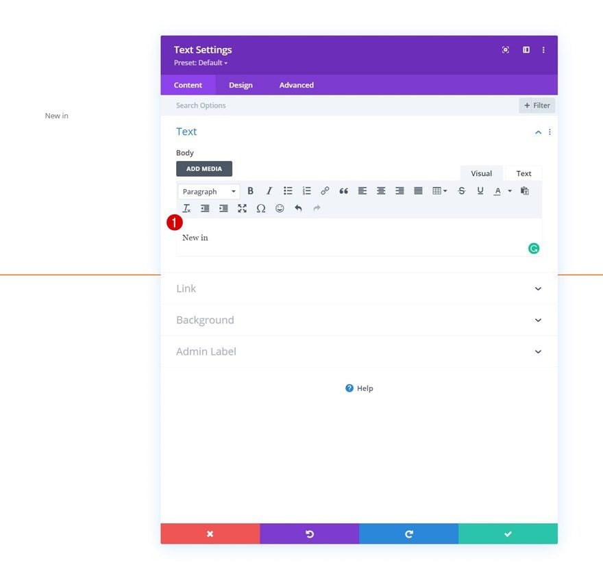
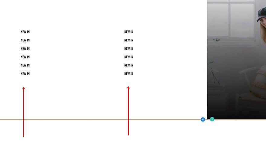
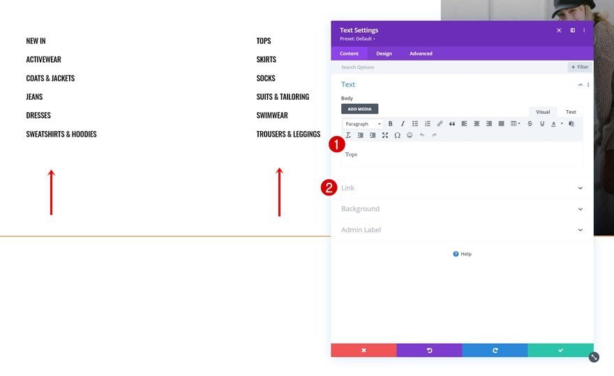
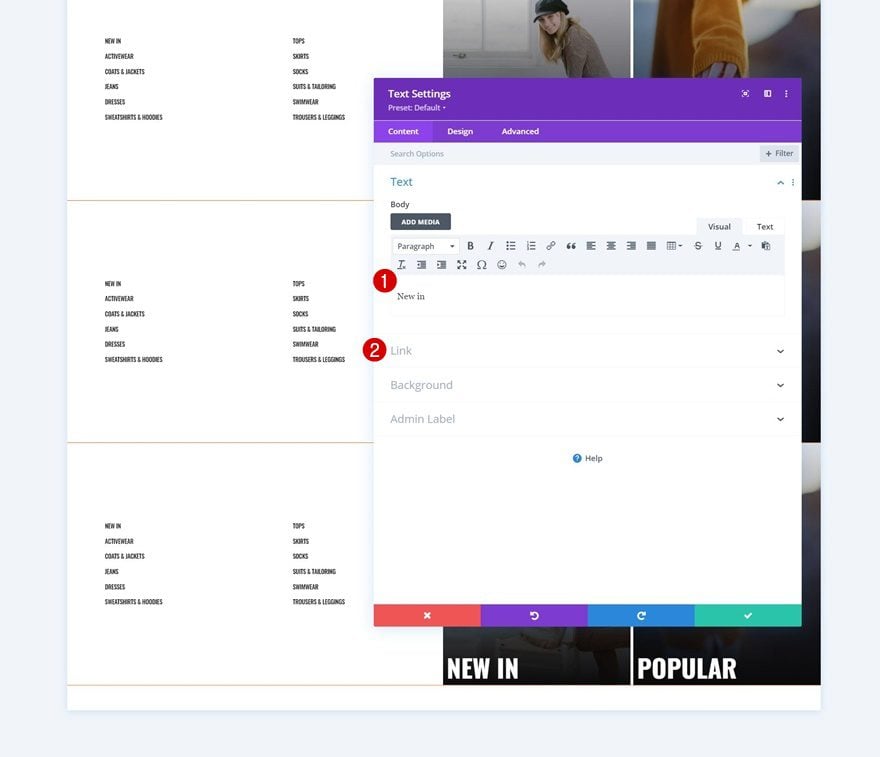
Add Text Module to Column 1
Add Product Category Name to Content Box
Time to add modules! You can place anything you want in this dropdown. We are using Text Modules, starting with a first one in column 1. Add a category name.
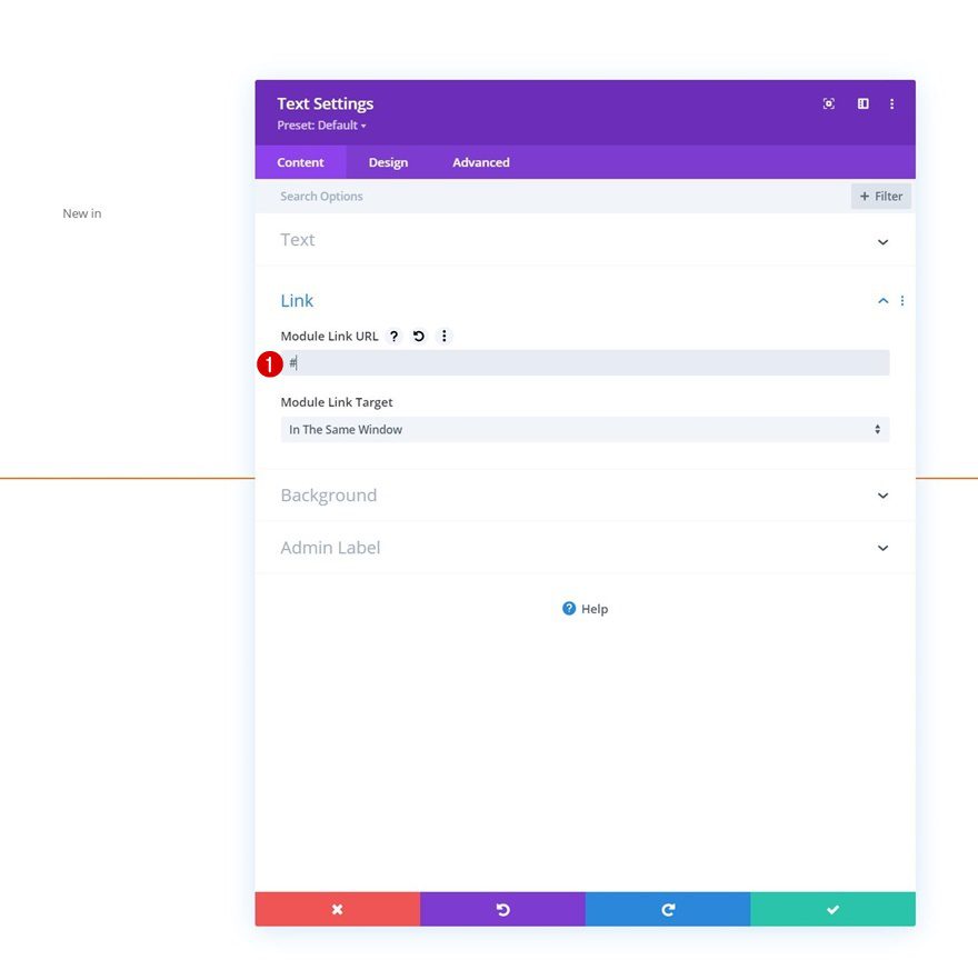
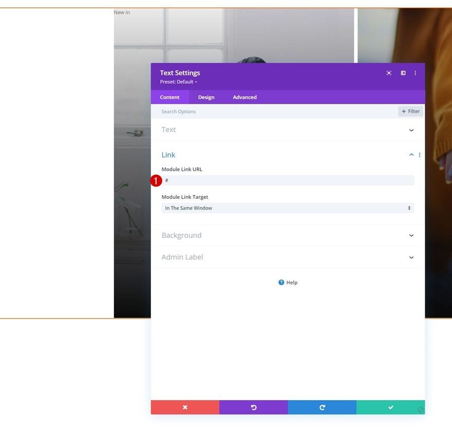
Add Product Category Link
Add the link to this category next.
Text Settings
Move on to the design tab and change the text settings as follows:
- Text Font: Oswald
- Text Font Style: Uppercase
- Text Color: #000000
- Text Size:
- Desktop: 22px
- Tablet: 18px
- Phone: 16px
- Text Letter Spacing: -0.6px
- Text Line Height: 2.4em
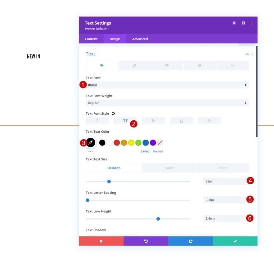
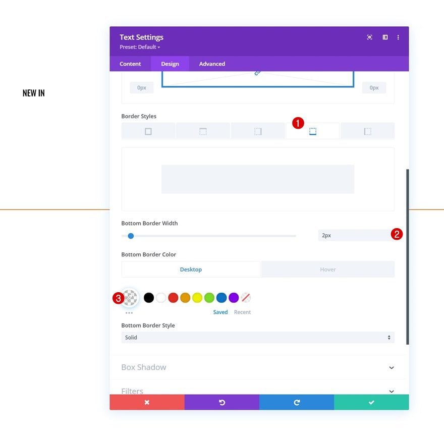
Border
Add a bottom border too.
- Bottom Border Width: 2px
- Bottom Border Color:
- Default: rgba(0,0,0,0)
- Hover: #ff6600
Clone & Modify Text Module as Many Times as Needed
Once you’ve completed the first one, you can clone it as many times as you want and spread the duplicates across both column 1 and 2.
Change Product Category Titles & Links
Make sure you change all product category names and links.
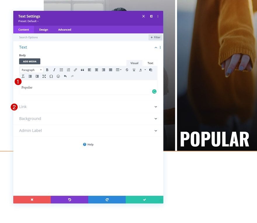
Add Text Module to Column 3
Add Product Category Name
On to the third column. Add a new Text Module and insert the product category name.
Add Product Category Link
Add the link too.
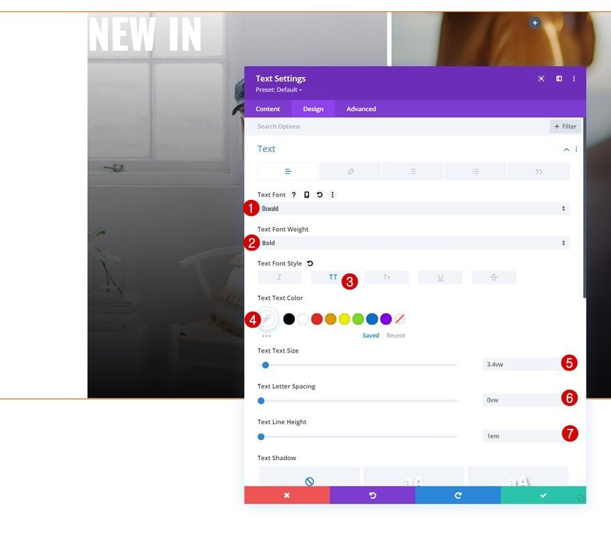
Text Settings
Move on to the module’s design tab and change the text settings as follows:
- Text Font: Oswald
- Text Font Weight: Bold
- Text Font Style: Uppercase
- Text Color: #ffffff
- Text Size: 3.4vw
- Text Line Height: 1em
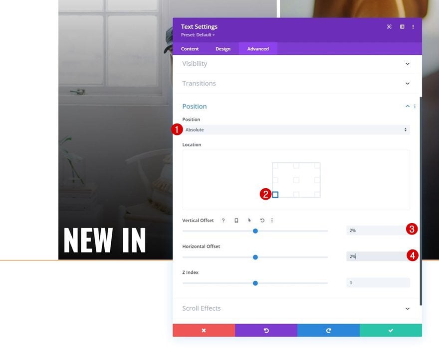
Position
Reposition the module too.
- Position: Absolute
- Location: Bottom Left
- Vertical Offset: 2%
- Horizontal Offset: 2%
Clone Text Module in Column 3 & Place Duplicate in Column 4
You can clone the Text Module in column 3 and place the duplicate in column 4.

Change Product Category Name & Link
Make sure you change the product category name along with the link.
As soon as you’ve created the first section dropdown, you can clone it twice.
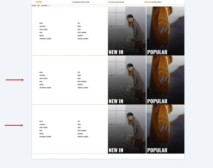
Change All Product Category Names & Links
Change all product category names in the new dropdowns.
Change Section CSS Classes Consecutively
Along with the last section CSS class for each duplicate. Make sure you’re following a consecutive order.
- CSS Class: dropdown-menu dropdown-menu-2
- CSS Class: dropdown-menu dropdown-menu-3
4. Add CSS & JQuery Code
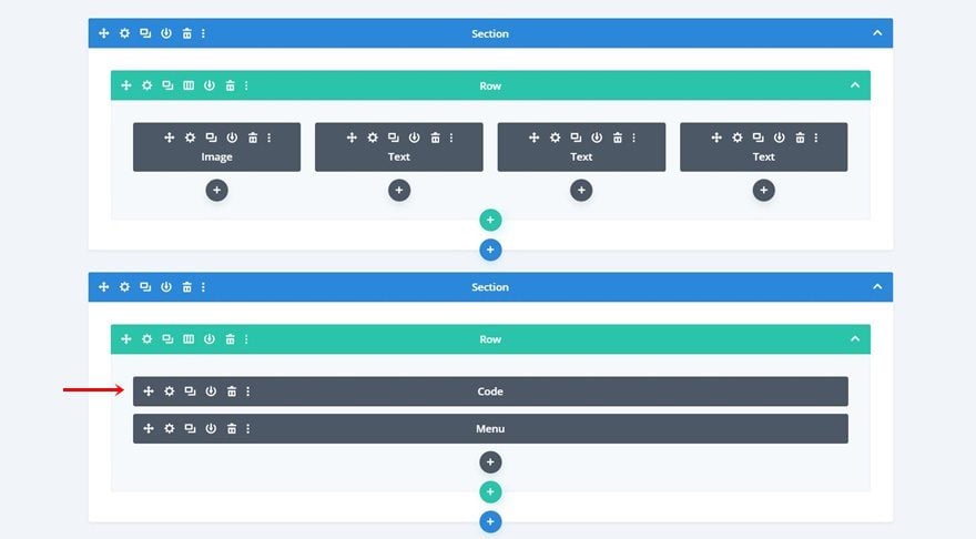
Now that we have all menu elements in place, it’s time to place the eCommerce mega menu dropdowns inside our menu. To do that, we’ll add some code to a new Code Module. Place this Code Module right above the Menu Module of your second section.
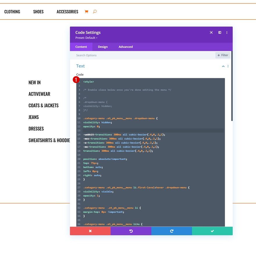
Insert CSS Code
Open the Code Module and add the following lines of CSS code between style tags as you can see in the print screen below:
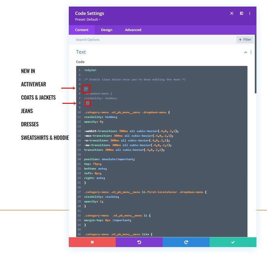
/* Enable class below once you're done editing the menu */

/*
.dropdown-menu {
visibility: hidden;
}
*/

.category-menu .et_pb_menu__menu .dropdown-menu {
visibility: hidden;
opacity: 0;

-webkit-transition: 300ms all cubic-bezier(.4,0,.2,1);
-moz-transition: 300ms all cubic-bezier(.4,0,.2,1);
-o-transition: 300ms all cubic-bezier(.4,0,.2,1);
-ms-transition: 300ms all cubic-bezier(.4,0,.2,1);
transition: 300ms all cubic-bezier(.4,0,.2,1);

position: absolute!important;
top: 75px;
bottom: auto;
left: 0px;
right: auto;
}

.category-menu .et_pb_menu__menu li.first-level:hover .dropdown-menu {
visibility: visible;
opacity: 1;
}

.category-menu  .et_pb_menu__menu li {
margin-top: 0px !important;
}

.category-menu .et_pb_menu__menu li>a {
margin-top: 0px !important;
padding: 30px 20px !important;
}

.category-menu .et_pb_menu__menu li.first-level>a:hover {
background-color: #FF6600;
}

.category-menu .et_mobile_menu .dropdown-menu {
background-color: white;
padding-top: 25px;
padding-bottom: 5px;
}

.category-menu .et_mobile_menu li > a {
background-color: transparent;
position: relative;
}

.category-menu .et_mobile_menu .first-level > a:after {
font-family: 'ETmodules';
content: '\4c';
color: #FF6600;
font-weight: normal;
position: absolute;
font-size: 16px;
top: 13px;
right: 10px;
}

.category-menu .et_mobile_menu .first-level > .icon-switch:after{
content: '\21';
color: #c9c9c9;
}

.category-menu .et_mobile_menu .dropdown-menu {
display: none;
}

.category-menu .et_mobile_menu .dropdown-menu.reveal-items {
display: block;
}

.category-menu .et_pb_menu__menu>nav>ul>li {
position: static !important;
}

.category-menu .et_mobile_menu .dropdown-menu {
visibility: visible !important;
}
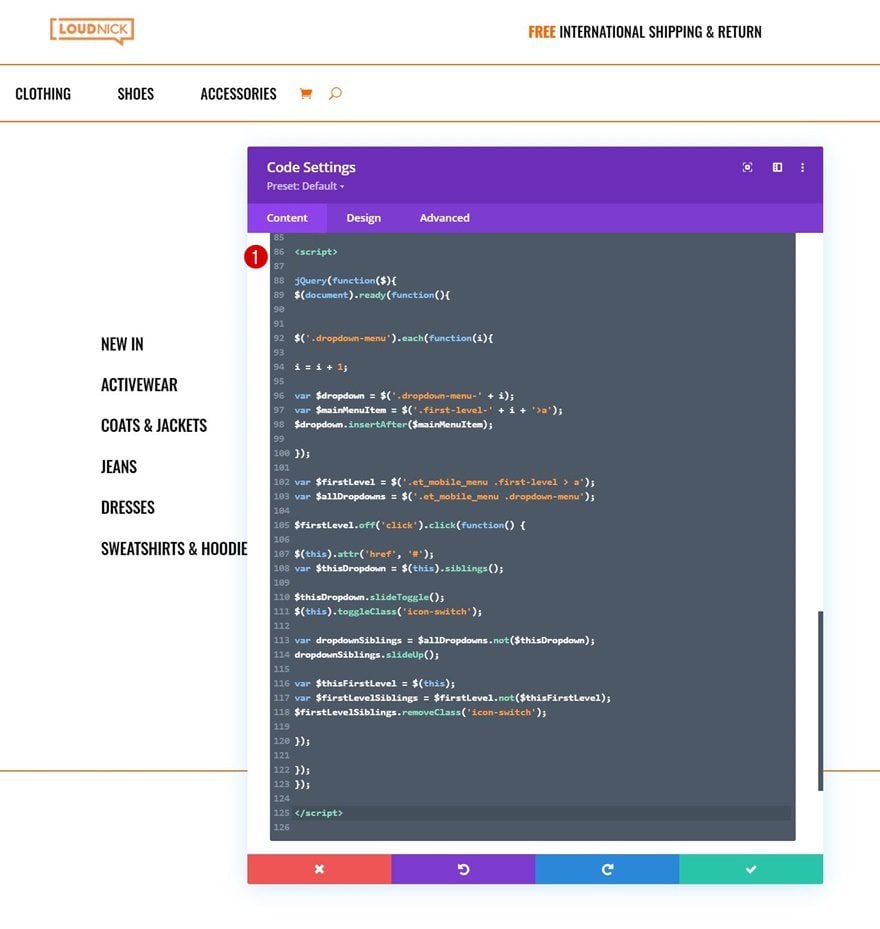
Insert JQuery Code
Add the JQuery code between script tags as you can see in the print screen below too.
jQuery(function($){
$(document).ready(function(){


$('.dropdown-menu').each(function(i){

i = i + 1;

var $dropdown = $('.dropdown-menu-' + i);
var $mainMenuItem = $('.first-level-' + i + '>a');
$dropdown.insertAfter($mainMenuItem);

});

var $firstLevel = $('.et_mobile_menu .first-level > a');
var $allDropdowns = $('.et_mobile_menu .dropdown-menu');

$firstLevel.off('click').click(function() {

$(this).attr('href', '#');
var $thisDropdown = $(this).siblings();

$thisDropdown.slideToggle();
$(this).toggleClass('icon-switch');

var dropdownSiblings = $allDropdowns.not($thisDropdown);
dropdownSiblings.slideUp();

var $thisFirstLevel = $(this);
var $firstLevelSiblings = $firstLevel.not($thisFirstLevel);
$firstLevelSiblings.removeClass('icon-switch');

});

});
});
As soon as you’re done customizing all the dropdown sections, you’ll have one thing left to do: hiding them on first sight. This will prevent the dropdown menu from showing up when loading the page. Once you enable this CSS class, you won’t see the dropdown sections inside the Visual Builder anymore, but you’ll be able to access them in the wireframe mode and/or temporarily disable the CSS class when making changes to your dropdown sections. To enable the class, remove the ‘/* */’ brackets at the beginning and end of the CSS class.
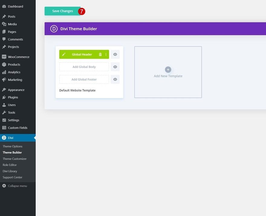
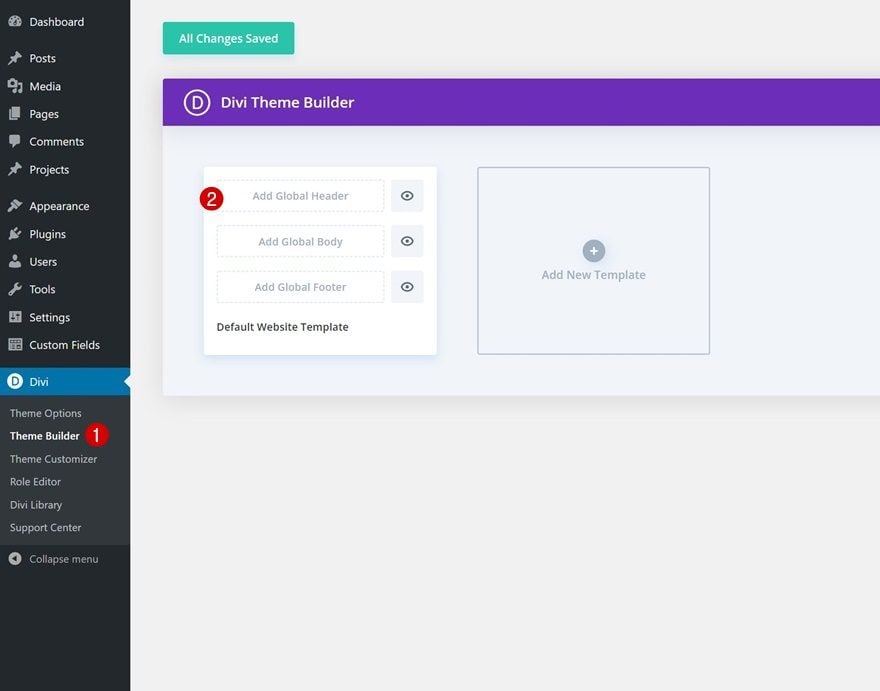
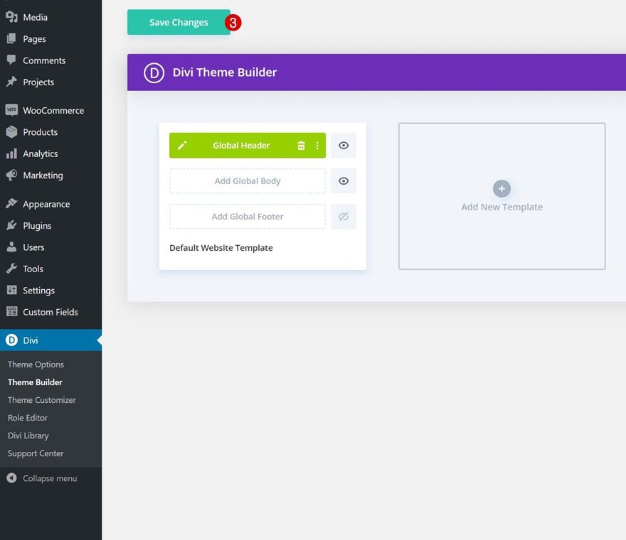
6. Save Divi Theme Builder Changes
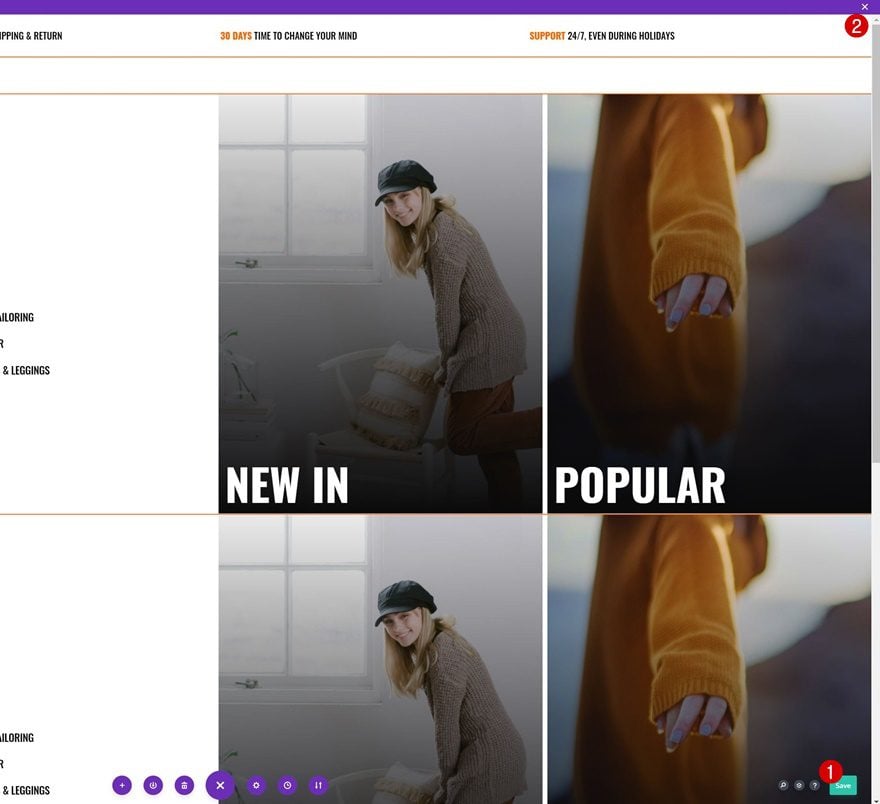
Once you’ve completed the global header, make sure to save all Divi Theme Builder changes before viewing the outcome on your website!
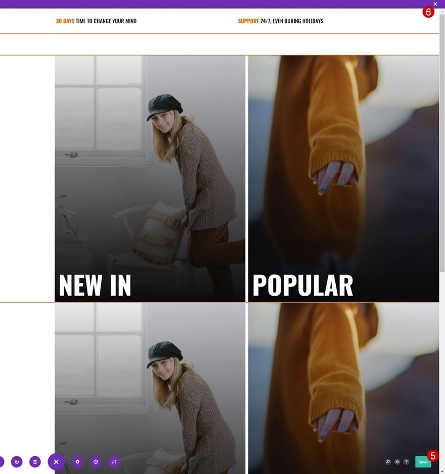
Preview
Now that we’ve gone through all the steps, let’s take a final look at the outcome across different screen sizes.
Desktop
Mobile
Final Thoughts
In this post, we’ve shown you how to create a custom eCommerce mega menu inside Divi’s Theme Builder. We’ve built the dropdowns using Divi’s built-in elements and combined it with some code that helps connect the menu to the dropdowns accordingly. This approach allows you to fully customize your eCommerce dropdown, across different screen sizes, without the use of a plugin! You were able to download the JSON file too. If you have any questions or suggestions, feel free to leave a comment in the comment section below.
If you’re eager to learn more about Divi and get more Divi freebies, make sure you subscribe to our email newsletter and YouTube channel so you’ll always be one of the first people to know and get benefits from this free content.


For the life of me I cannot figure out how to change the mobile view drop down icons in the menu. I have two sets on icons and one is broken and it is reallllllly annoying.
How can I be able to create a CUSTOM BUTTON at the right side of the menu while keeping the dropdown menu full-width?
I tried with CSS but it is limited in the menu module if I want to add a button module at the right side of the menu section
Great tutorial. I have problems when I activate the first part of the coding. the dropdown is hidden however it changes the look of the menu. Makes it look really strange.
Amazing tutorial! I have done this step by step from scratch and also tried it with the json file download and on both versions I cannot get the drop down items to display on mobile version. I have gone through the code to see if there is something missing. Im stumped, any help please.
I insert woocommerce shop module in the ‘dropdown menu’ but is doesn’t show in the front. I tried others modules (including woocommerce ones) and it is all good. Just the products that doesn’t show. I even tried with woocommerce shortcodes, but it simply doesn’t show up in the front. Any tips please?
It’s really cool stuff.. but it ‘s not showing full width in woocommerce page desktop. in another page/post it really nice. Am I missing something?
Lots of cool, slick little elements in here (like the plus/up arrows in the mobile menu, and collapsible 2 column sub-menu) I really like. Thanks for the great tutorial.
I love these tutorials, but it would be really helpful to have a link to a live demo of what the menu really looks like.
Definitely! +1
+1
How do we display number of products in cart in the shopping cart icon?