
Ever since the Divi Theme Builder has come out, we’ve tried to guide you through the process of creating your own global headers. We’ll continue doing that by showing you how to create a rotated global header that appears on the left side of your pages and posts. The header’s background color is completely transparent, allowing the page/post content to show through. We’ve made sure that the global header stays fixed to the left side while scrolling and we’ve transformed the menu into a mobile-friendly version as well. In this use case tutorial, we’ll show you how to recreate the design from scratch and you’ll also be able to download the template JSON file for free!
Let’s get to it.
Preview
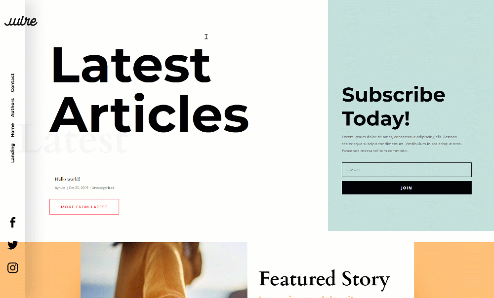
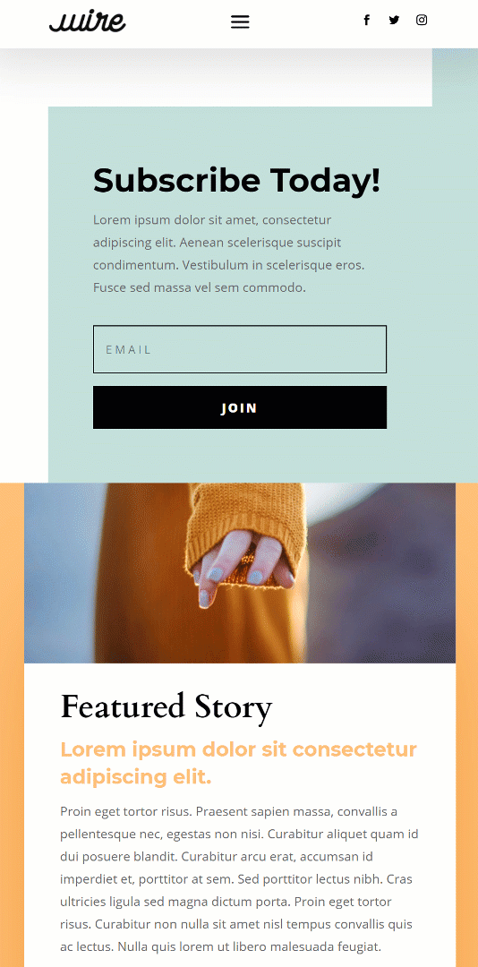
Before we dive into the tutorial, let’s take a quick look at the outcome across different screen sizes.
Desktop
Mobile
Download The Rotated Global Header Template for FREE
To lay your hands on the rotated global header template, you will first need to download it using the button below. To gain access to the download you will need to subscribe to our newsletter by using the form below. As a new subscriber, you will receive even more Divi goodness and a free Divi Layout pack every Monday! If you’re already on the list, simply enter your email address below and click download. You will not be “resubscribed” or receive extra emails.

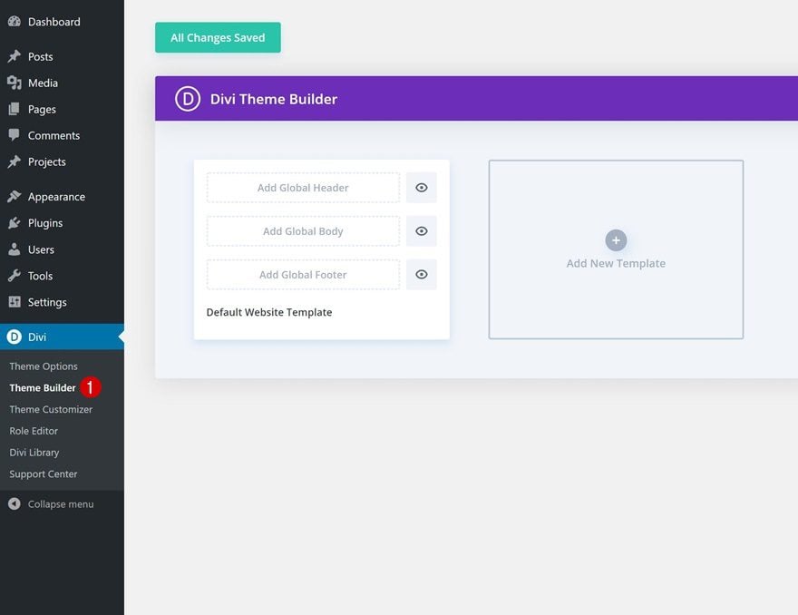
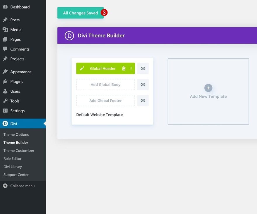
1. Go to Divi Theme Builder & Start Building Global Header
Go to Divi Theme Builder
Start by going to the Divi Theme Builder on your WordPress website.
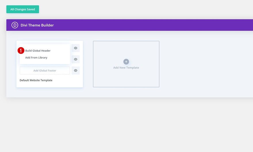
Start Building Global Header
Click on ‘Add Global Header’ and select ‘Build Global Header’.
2. Start Building Rotated Side Global Header
Add New Section
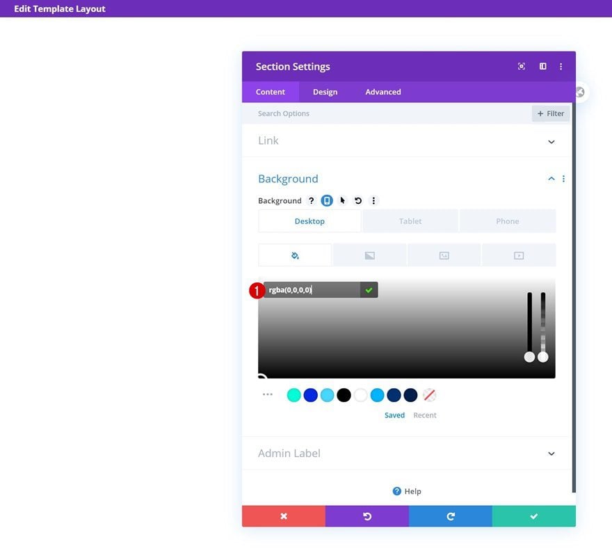
Background Color
Once inside the template editor, you can open the section that’s already there and change the background color across different screen sizes.
- Background Color: rgba(0,0,0,0) (Desktop), #FFFFFF (Tablet & Phone)
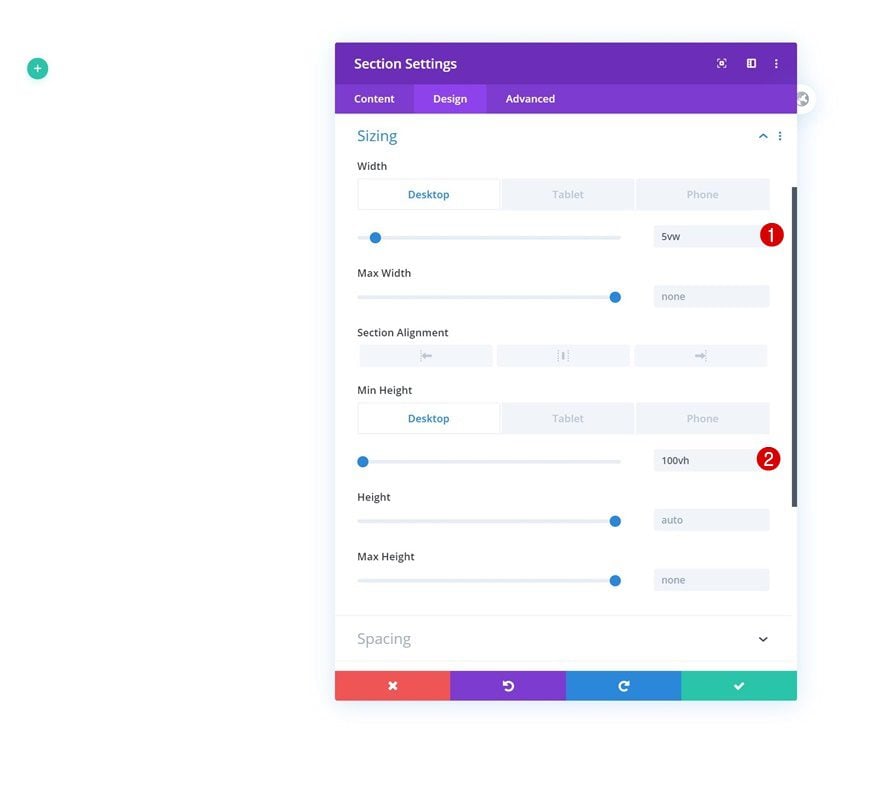
Sizing
Modify the section’s sizing settings next.
- Width: 5vw (Desktop), 100% (Tablet & Phone)
- Min Height: 100vw (Desktop), auto (Tablet & Phone)
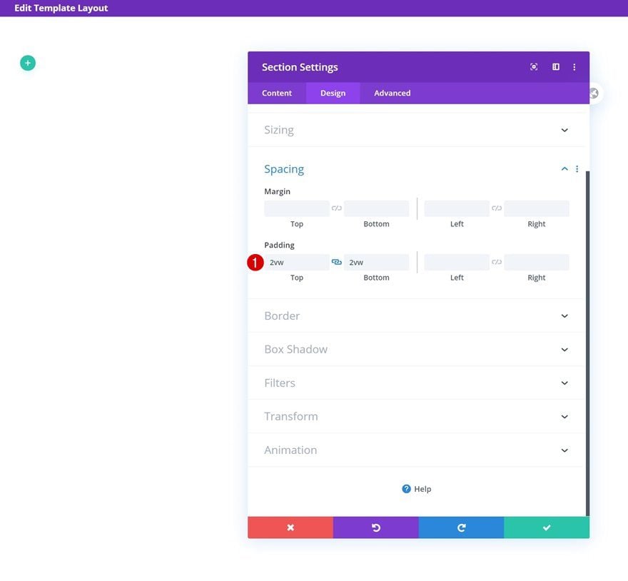
Spacing
Add some custom top and bottom padding too.
- Top Padding: 2vw
- Bottom Padding: 2vw
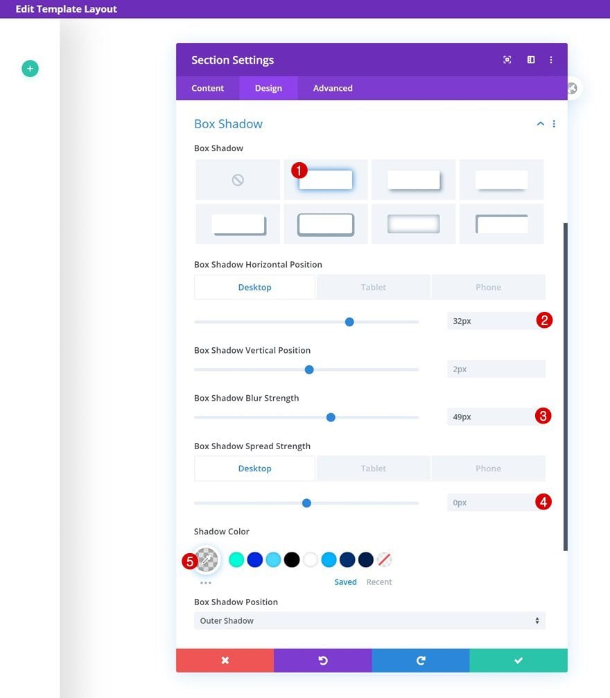
Box Shadow
Then, go to the box shadow settings and add a custom box shadow across different screen sizes.
- Box Shadow Horizontal Position: 32px (Desktop), 0px (Tablet & Phone)
- Box Shadow Blur Strength: 49px
- Box Shadow Spread Strength: 0px (Desktop), 19px (Tablet & Phone)
- Shadow Color: rgba(0,0,0,0.12)
Default Main Element
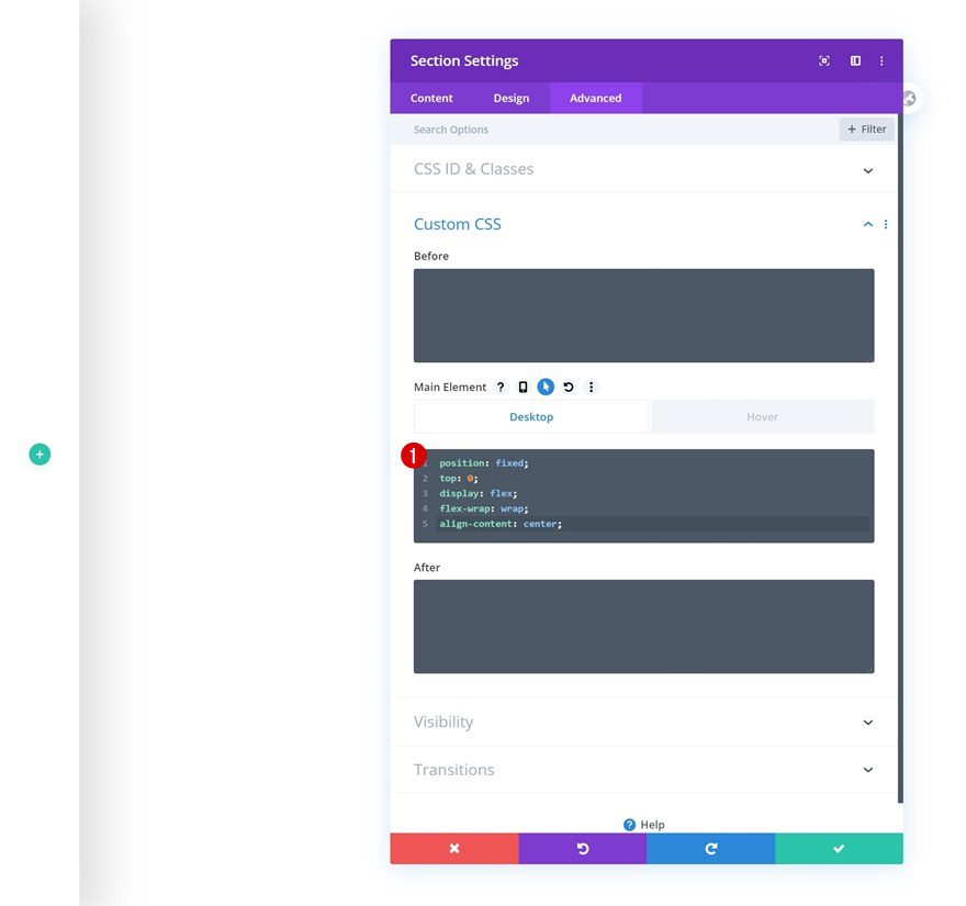
We’ll also make sure the rotated global header stays fixed to the left side by adding a few lines of CSS code to the section’s main element.
position: fixed;
top: 0;
display: flex;
flex-wrap: wrap;
align-content: center;
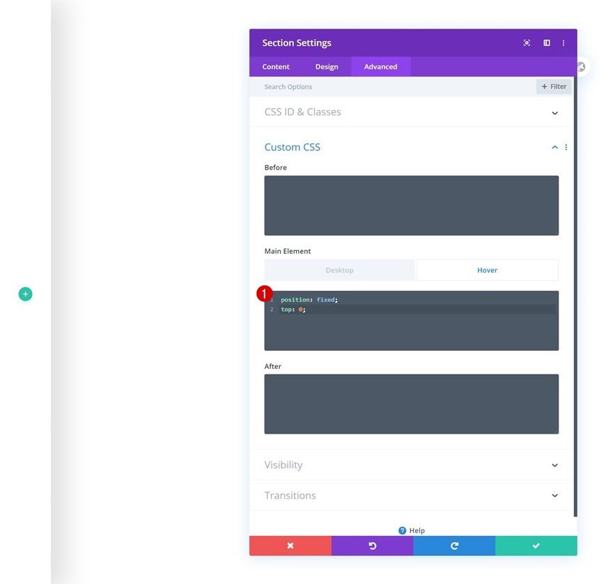
Hover Main Element
Make sure you add those same lines of CSS code to the hover main element of the section too.
position: fixed;
top: 0;
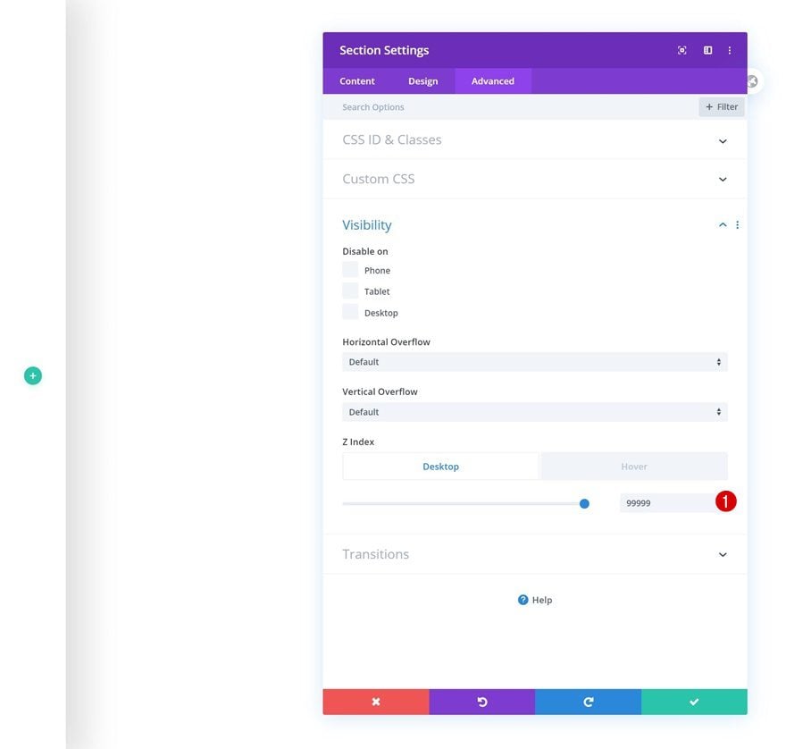
Default Visibility
Then, increase the z index in the visibility settings.
- Z Index: 99999
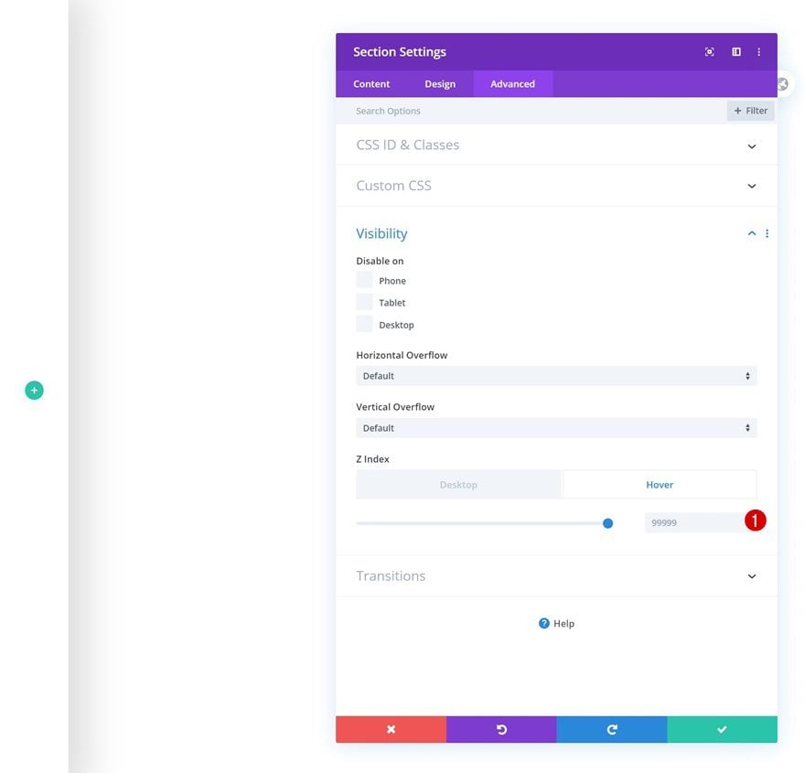
Hover Visibility
Make sure that same value applies on hover.
- Z Index: 99999
Add New Row
Column Structure
Once you’ve completed the section settings, continue by adding a new row using the following column structure:
Sizing
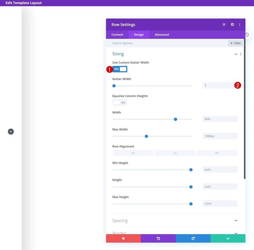
Without adding any modules yet, open the row settings and change the sizing settings.
- Use Custom Gutter Width: Yes
- Gutter Width: 1
Spacing
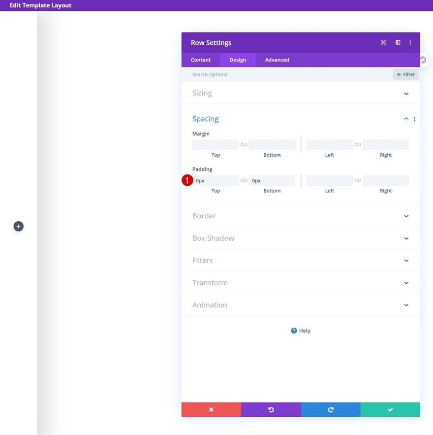
Remove all default top and bottom padding too.
- Top Padding: 0px
- Bottom Padding: 0px
Column Settings
Main Element (Tablet & Phone)
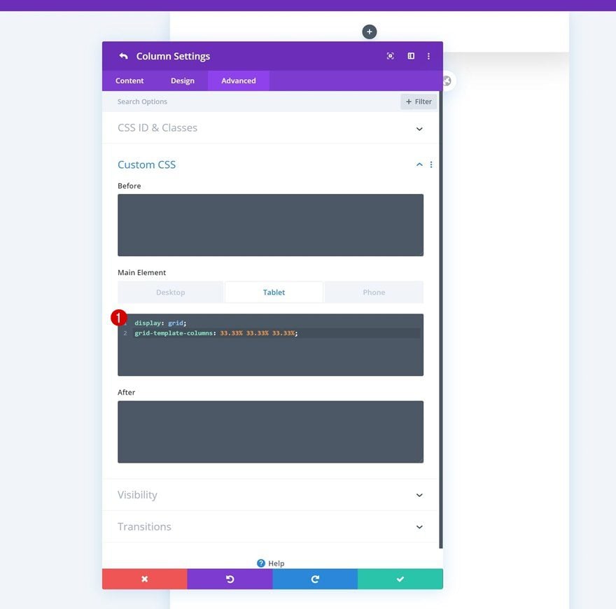
On tablet and phone, we’re going for an entirely different look and feel. We’ll place three different modules next to each other. To do that, we’ll need to add a bit of CSS code. Open the column’s settings, go to the advanced tab and insert the following lines of CSS code into the main element of tablet and phone:
display: grid;
grid-template-columns: 33.33% 33.33% 33.33%;
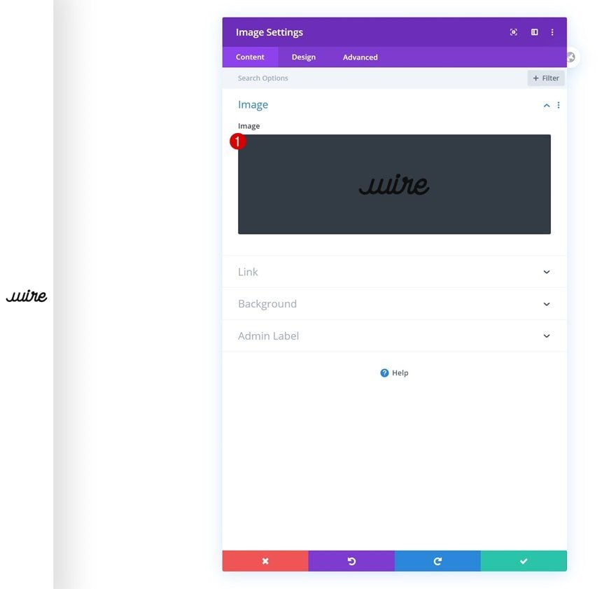
Add Image Module to Column
Upload Logo
Time to start adding modules! The first module we need is an Image Module. Upload a semi-transparent logo image file of your choice.
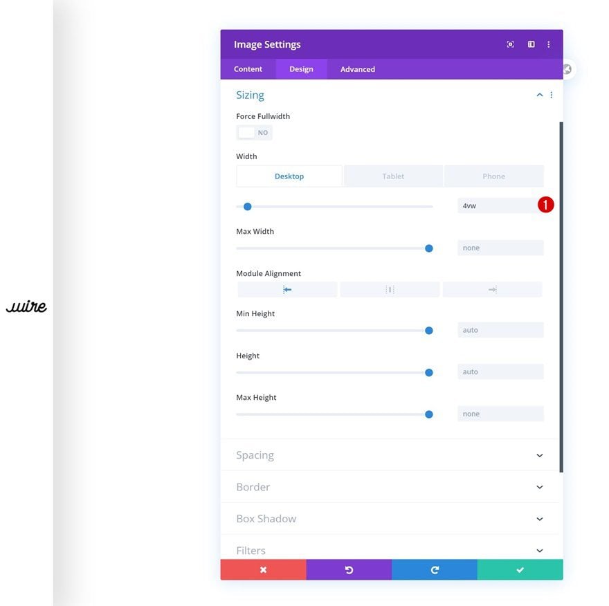
Sizing
Then, go to the design tab and change the width across different screen sizes.
- Width: 4vw (Desktop), 12vw (Tablet), 16vw (Phone)
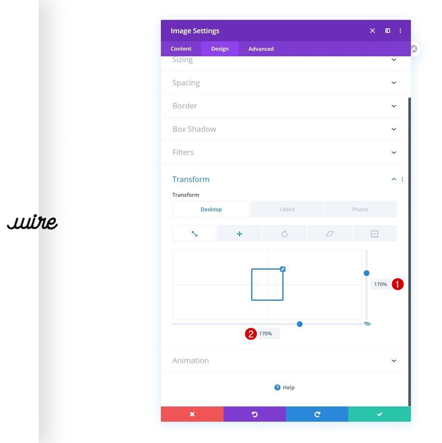
Transform Scale
Increase the size of the module by modifying the transform scale settings next.
- Right: 170% (Desktop), 100% (Tablet & Phone)
- Bottom: 170% (Desktop), 100% (Tablet & Phone)
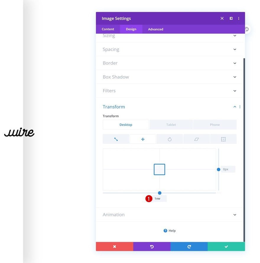
Transform Translate
And push the module to the right by adding a bottom transform translate value on desktop.
- Bottom: 1vw (Desktop), 0vw (Tablet & Phone)
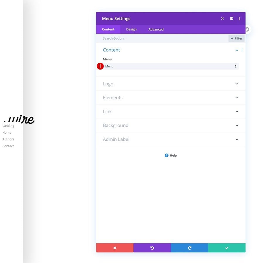
Select Menu
The next module we need is the Menu Module. Select a menu of your choice.
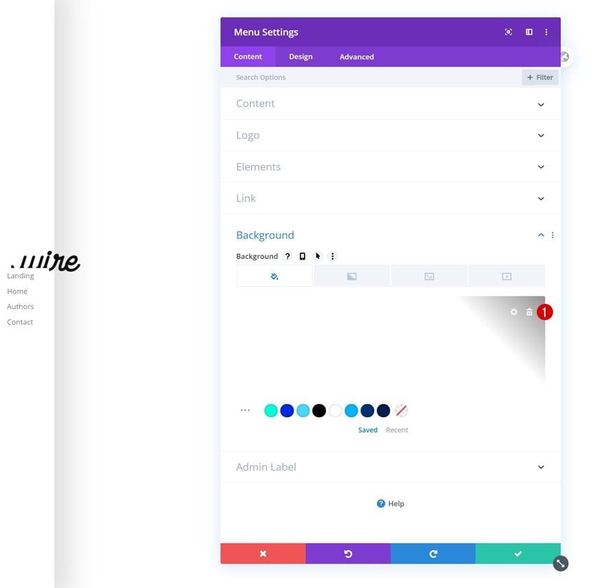
Remove Background Color
Remove the module’s background color next.
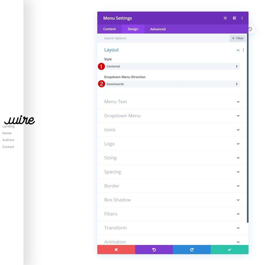
Layout
Then, go to the design tab and change the layout settings.
- Style: Centered
- Dropdown Menu Direction: Downwards
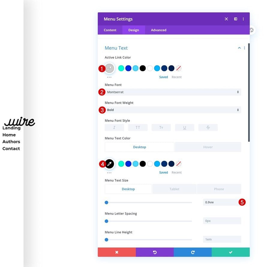
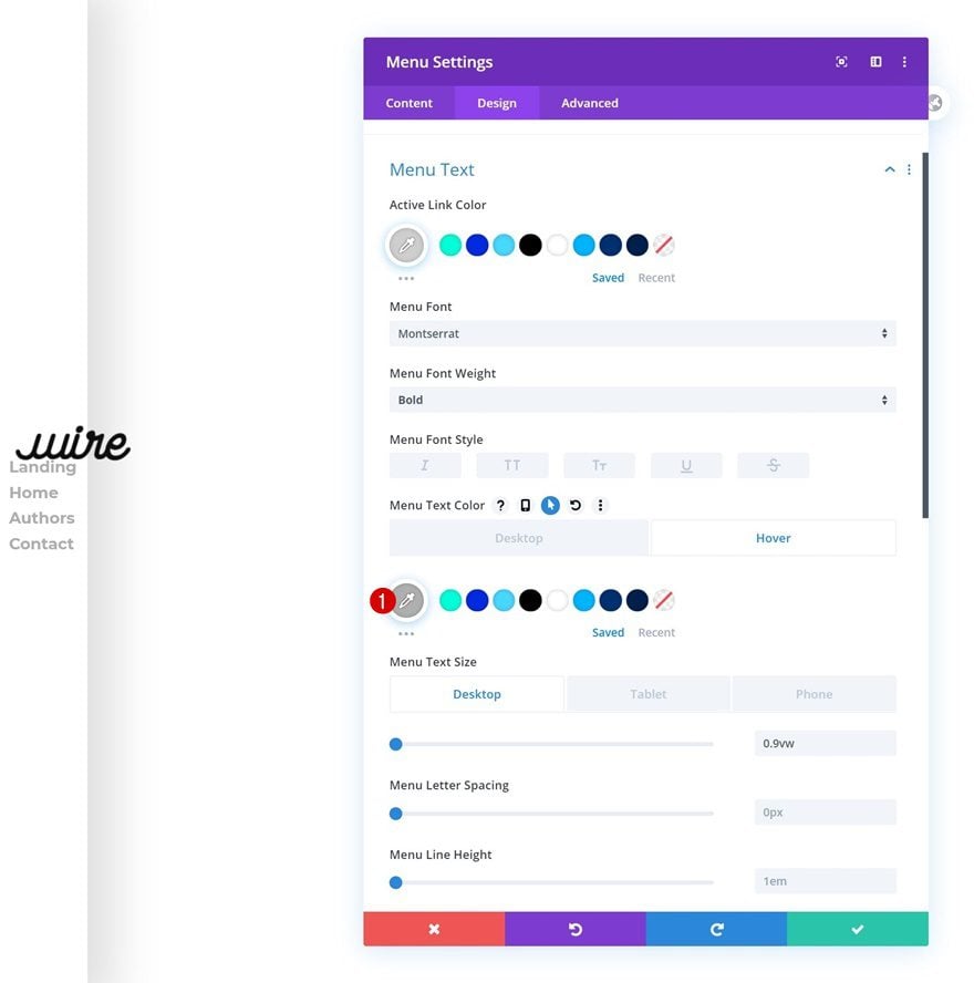
Default Menu Text
Modify the menu text settings too.
- Active Link Color: #cecece
- Menu Font: Montserrat
- Menu Font Weight: Bold
- Menu Text Color: #000000
- Menu Text Size: 0.9vw (Desktop), 2vw (Tablet), 2.5vw (Phone)
Hover Menu Text
Change the menu text color on hover.
- Menu Text Color: #afafaf
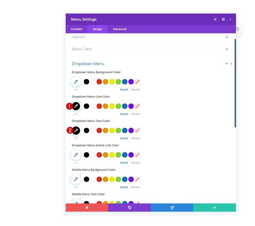
Dropdown Menu
We’re also making some changes to the dropdown menu settings.
- Dropdown Menu Line Color: #000000
- Dropdown Menu Text Color: #000000
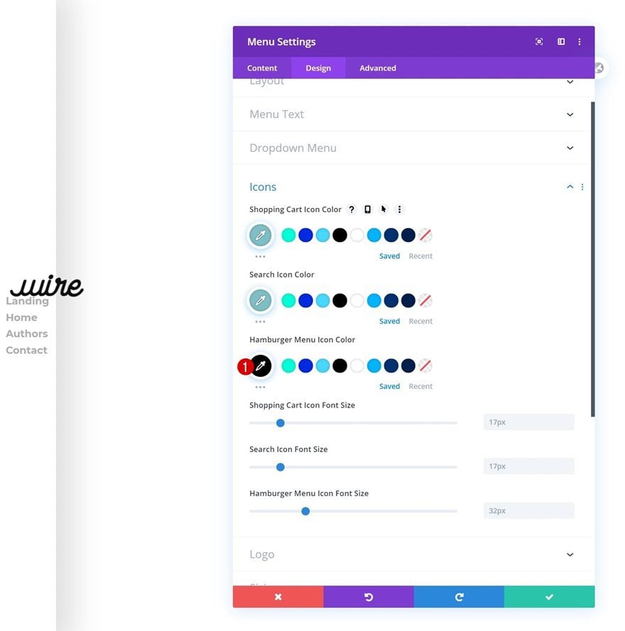
Icons
Change the hamburger menu icon color next.
- Hamburger Menu Icon Color: #000000
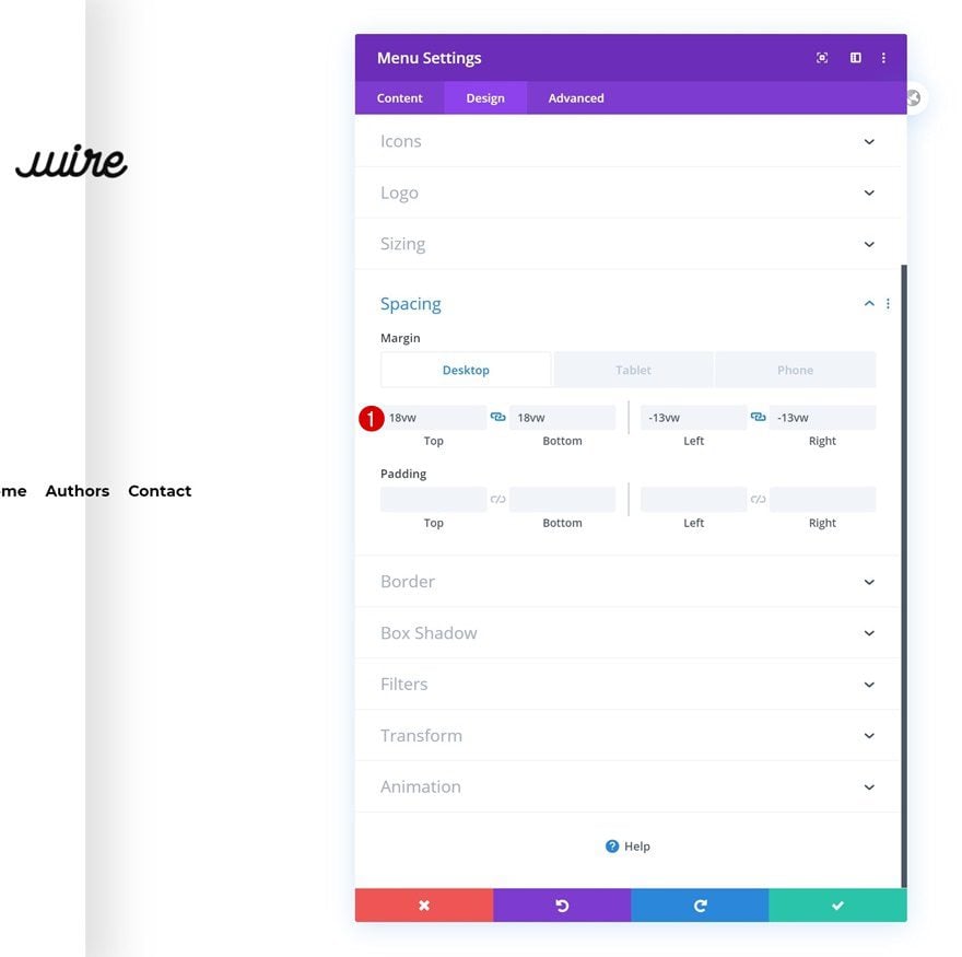
Spacing
And add some custom margin values across different screen sizes.
- Top Margin: 18vw (Desktop), 0vw (Tablet & Phone)
- Bottom Margin: 18vw (Desktop), 0vw (Tablet & Phone)
- Left Margin: -13vw (Desktop), 0vw (Tablet & Phone)
- Right Margin: -13vw (Desktop), 0vw (Tablet & Phone)
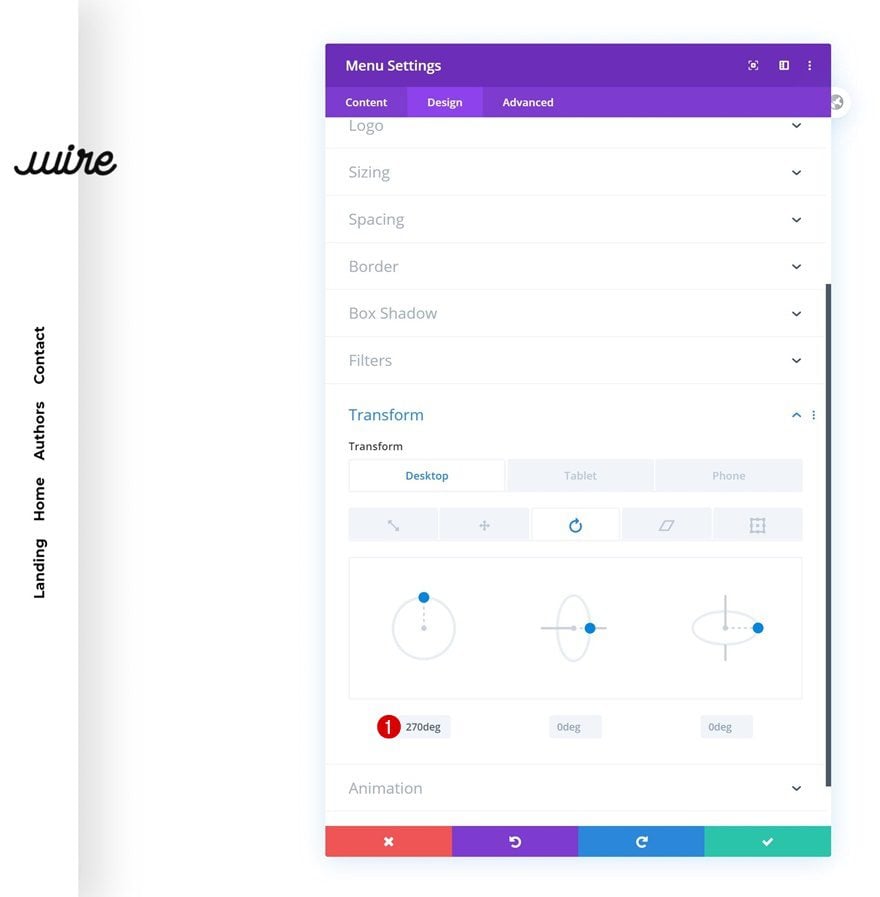
Transform Rotate
Now, to create the rotated effect, we’ll play around with the module’s transform rotate values.
- Left: 270deg (Desktop), 0deg (Tablet & Phone)
Add Social Networks
On to the Social Media Follow Module, which is the next and last module we need to complete our rotated global header. Add some social networks of your choice.
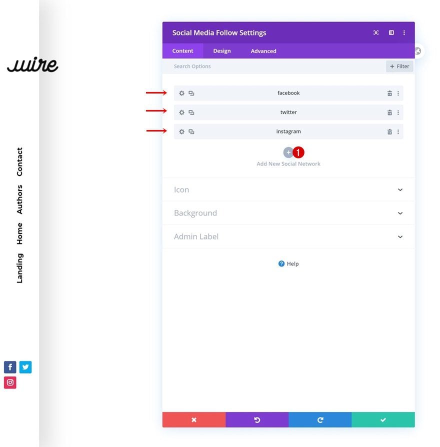
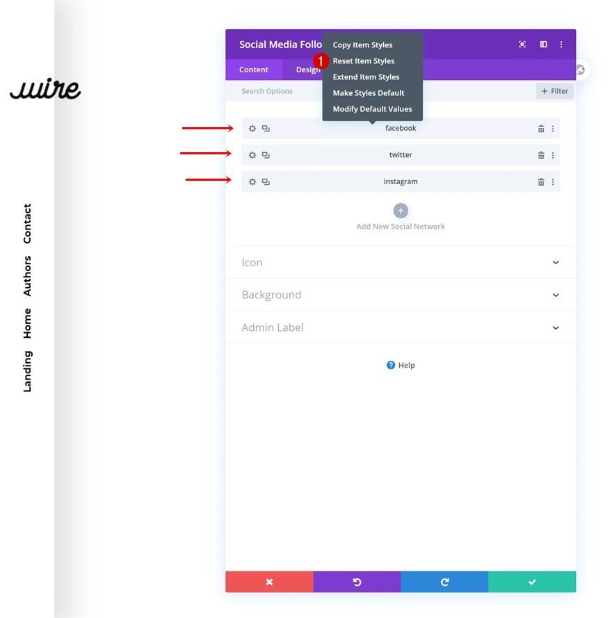
Reset Social Network Styles
Continue by resetting the settings of each social network individually. This will help us get rid of their background color.
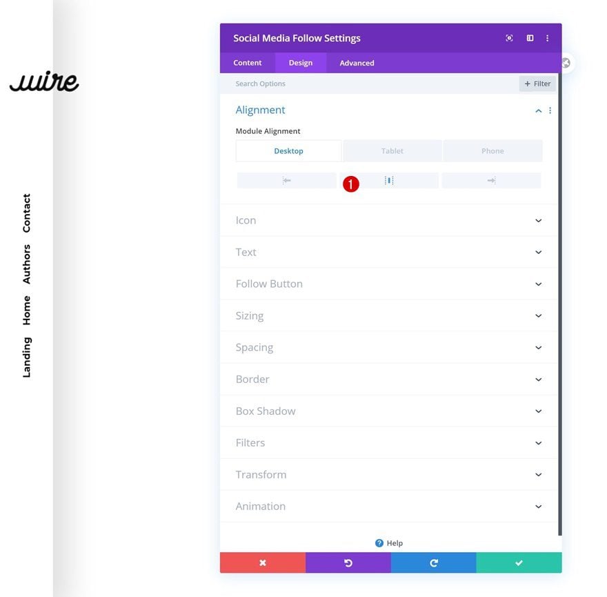
Alignment
Then, move on to the design tab of the module and change the module alignment across different screen sizes.
- Alignment: Left (Desktop), Right (Tablet & Phone)
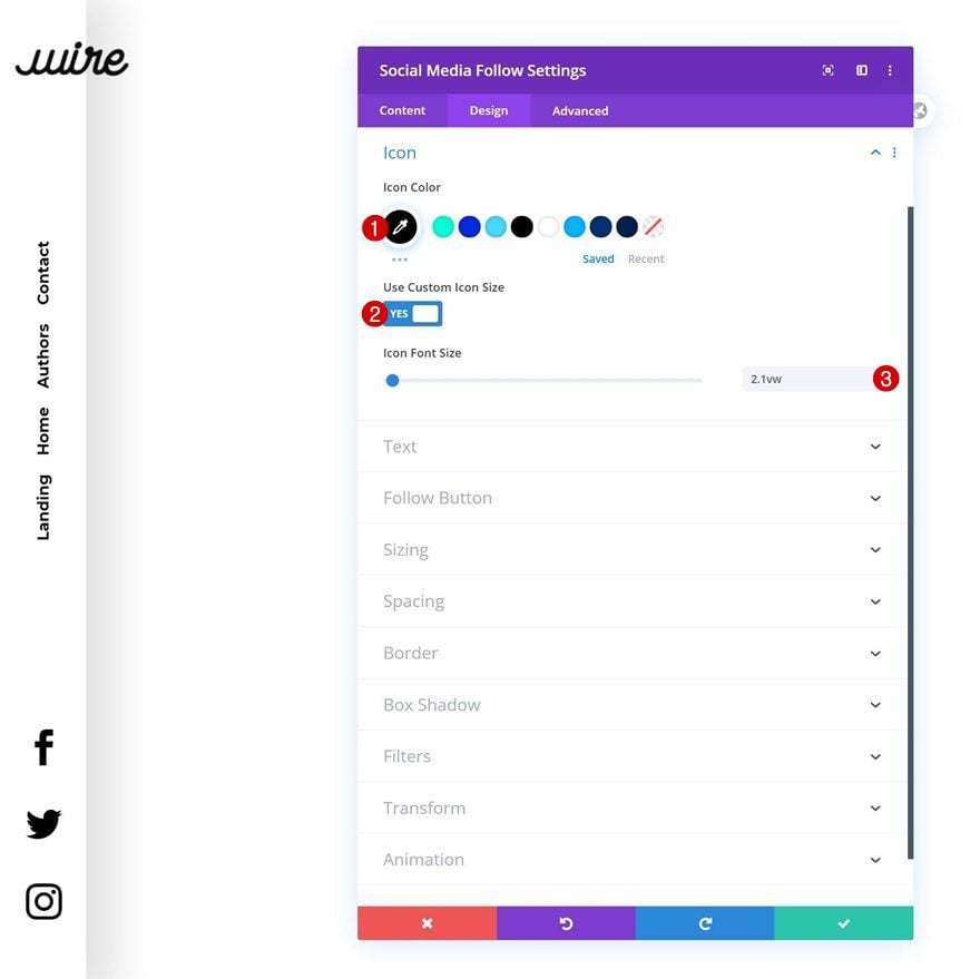
Icon Settings
Last but not least, change the icon settings too.
- Icon Color: #000000
- Use Custom Icon Size: Yes
- Icon Font Size: 2.1vw
3. Save Builder Changes & View Result
Once you’ve completed all the modules, you can save the template, exit the Divi Theme Builder and view the outcome on your website!
Preview
Now that we’ve gone through all the steps, let’s take a final look at the outcome across different screen sizes.
Desktop
Mobile
Final Thoughts
In this post, we’ve shown you how to create a rotated global header using Divi’s new Theme Builder. We’ve also transformed the menu bar into a highly mobile-friendly version on mobile. Unless chosen otherwise, the global header we’ve created will show up on all your post and pages. You were able to download the JSON file for free as well! If you have any questions or suggestions, feel free to leave a comment in the comment section below!
If you’re eager to learn more about Divi and get more Divi freebies, make sure you subscribe to our email newsletter and YouTube channel so you’ll always be one of the first people to know and get benefits from this free content.


I Really love this layout, it is awesome and I build it entirely. It was a bit low on desktop so I had to change the margin. However, how to make the mobile menu wider and the buttons bigger? It is way to small now.
Hi there, this is a beautiful way to have a precise identity on the web. But I have some problem: is there a way to modify the global header in the classic Divi editor?? with the visual builder we can’t select module correctly when we use padding 🙁 my situation actually is this:
https://www.federicomazza.it/critical-text/
– I would like to eliminate the hamburger menu on desktop (if you resize the browser window it appears..
– I would like to modify the social media module but I can’t select it anymore. Thank you. Best
Awesome tutorial and resource, thank you!
I’m having a struggle to figure out where to import the JSON file. I’ve tried in the Theme Builder, in the Theme Library and two other places, and every time I get a message saying that it’s the wrong context. Could you please assist?
Awesome tutorial and resource, thank you!
Is there a way to make the dropdown items horizontal, by any chance?