
When setting up a website for a client of yourself, you’ll find yourself contemplating what type of header to build. The most used one around the web is the horizontal menu bar at the top, but there are other options as well, such as a slide-in menu. Slide-in menus help you limit the space that’s taken up by the global header. Rather than show all your menu items right off the bat, you can let a slide-in menu appear when your visitors click on the hamburger icon in the top right corner. Using a slide-in menu helps you add additional interaction to your website.
In today’s use case Divi tutorial, we’ll show you how to create one using Divi’s Theme Builder, the built-in Divi elements and some additional code. The design of this slide-in menu matches the Yoga Instructor Layout Pack perfectly but you’re free to modify it to match any website you build. You’ll be able to download the JSON file for free as well!
Let’s get to it.
- 1 Preview
- 2 Download The Responsive Slide-In Menu Global Header Template for FREE
- 3 Download For Free
- 4 1. Go to Divi Theme Builder & Start Building Global Header
- 5 2. Create Header Design
- 6 3. Add Slide-In Functionality
- 7 4. Save Theme Builder Changes & View Outcome on Website
- 8 Preview
- 9 Final Thoughts
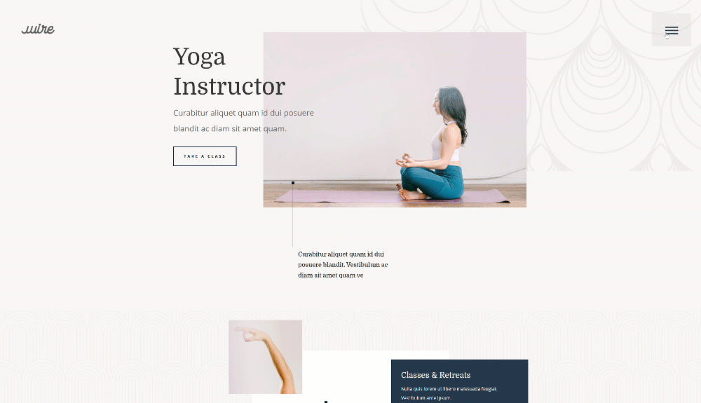
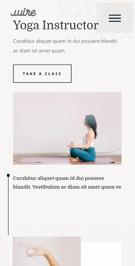
Preview
Before we dive into the tutorial, let’s take a quick look at the outcome across different screen sizes.
Desktop
Mobile
To lay your hands on the free slide-in menu global header template, you will first need to download it using the button below. To gain access to the download you will need to subscribe to our newsletter by using the form below. As a new subscriber, you will receive even more Divi goodness and a free Divi Layout pack every Monday! If you’re already on the list, simply enter your email address below and click download. You will not be “resubscribed” or receive extra emails.

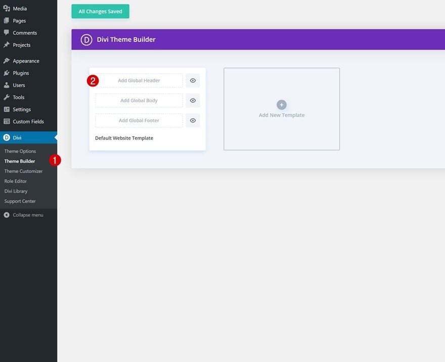
1. Go to Divi Theme Builder & Start Building Global Header
Go to Divi Theme Builder
Start by going to the Divi Theme Builder in the backend of your WordPress website and click on ‘Add Global Header’.
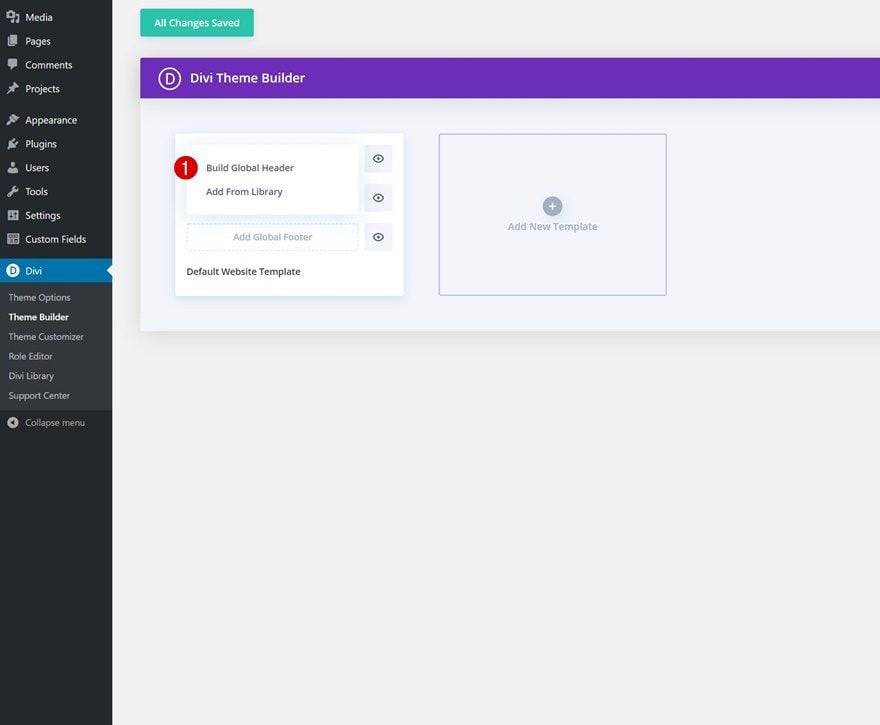
Start Building Global Header
Continue by selecting ‘Build Global Header’.
2. Create Header Design
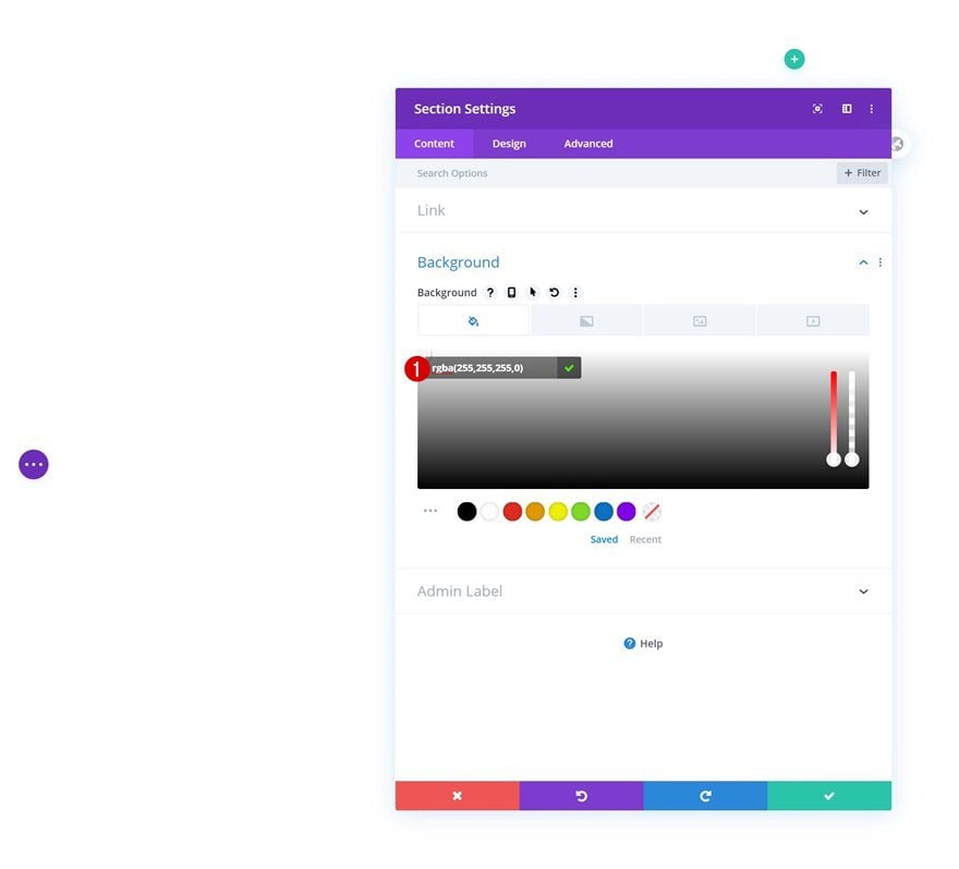
Section Settings
Background Color
Once inside the template editor, you’ll notice a section. Open that section and make the background color transparent.
- Background Color: rgba(255,255,255,0)
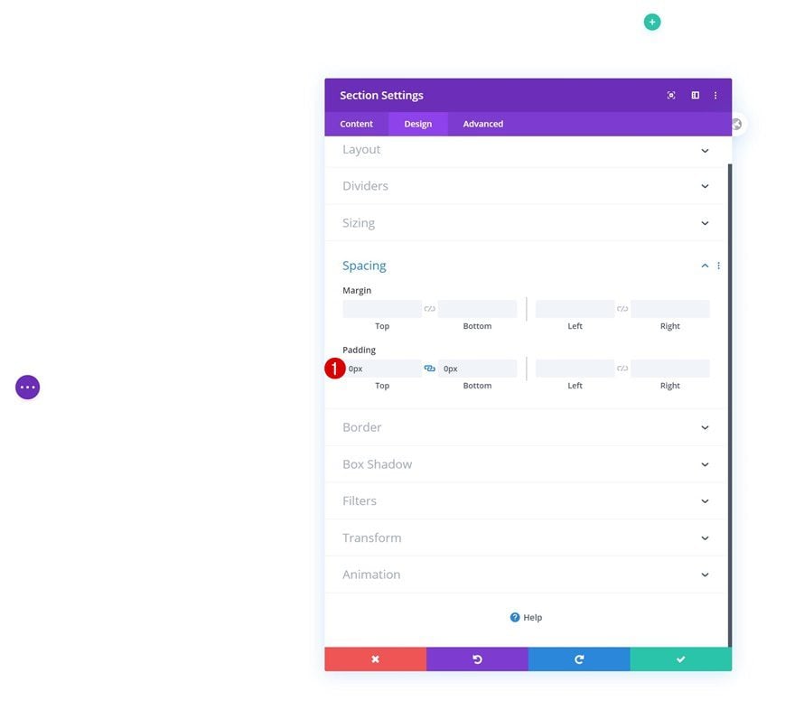
Spacing
Move on to the design tab and remove all default top and bottom padding.
- Top Padding: 0px
- Bottom Padding: 0px
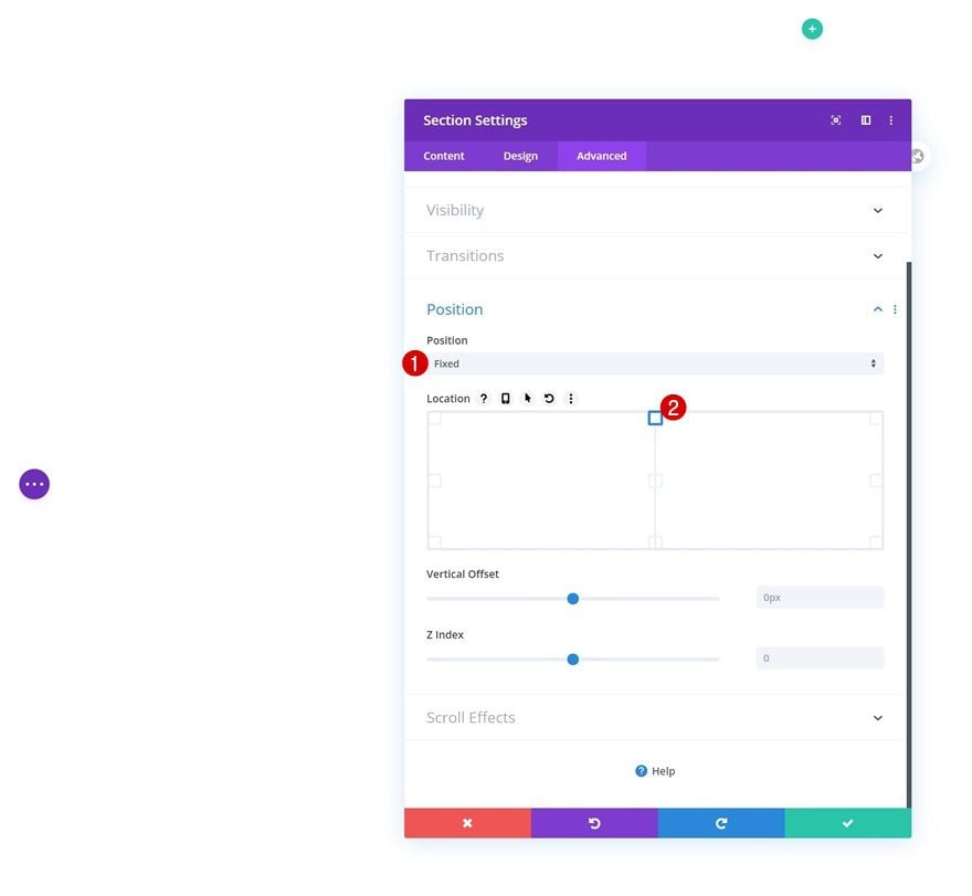
Position
Then, we’ll turn the section fixed by going to the advanced tab and modifying the position settings.
- Position: Fixed
- Location: Top Center
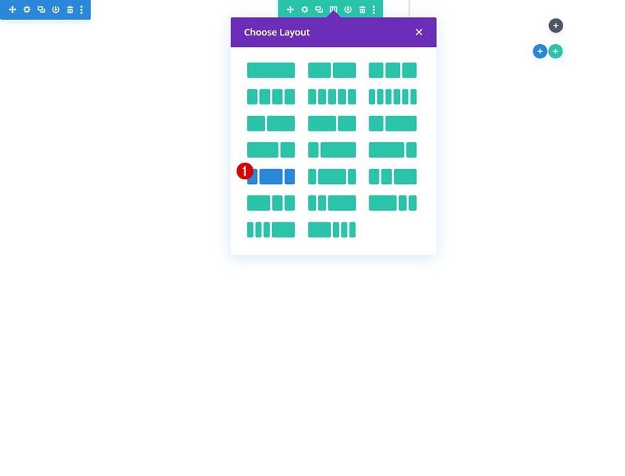
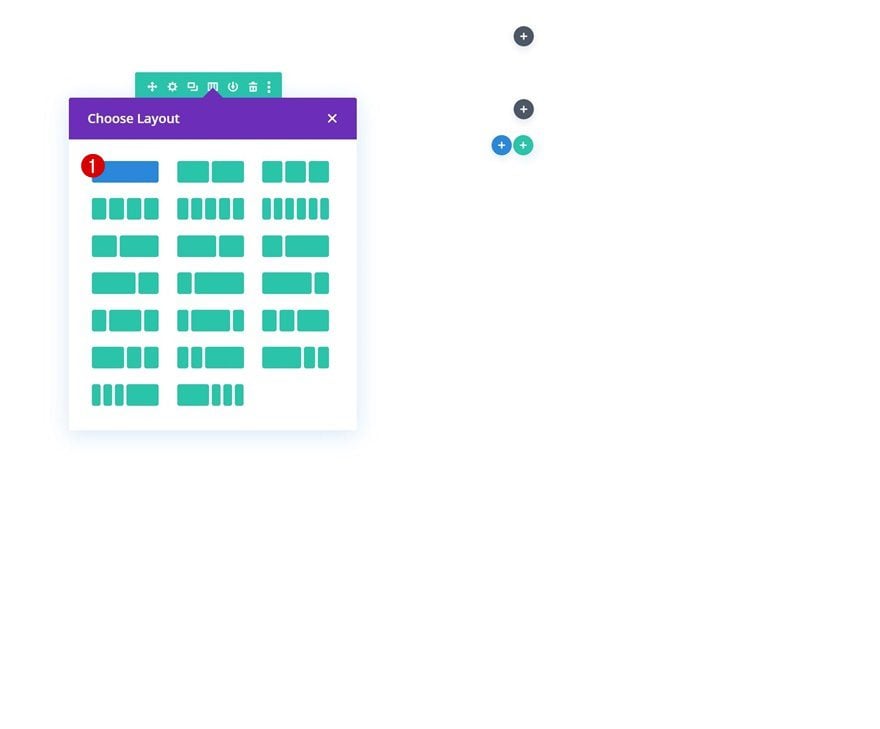
Add Row #1
Column Structure
Once you’ve completed the section settings, add a new row using the following column structure:
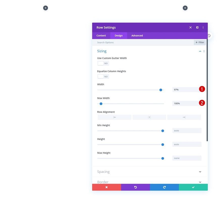
Sizing
Without adding any modules yet, open the row settings and modify the sizing settings as follows:
- Width: 97%
- Max Width: 100%
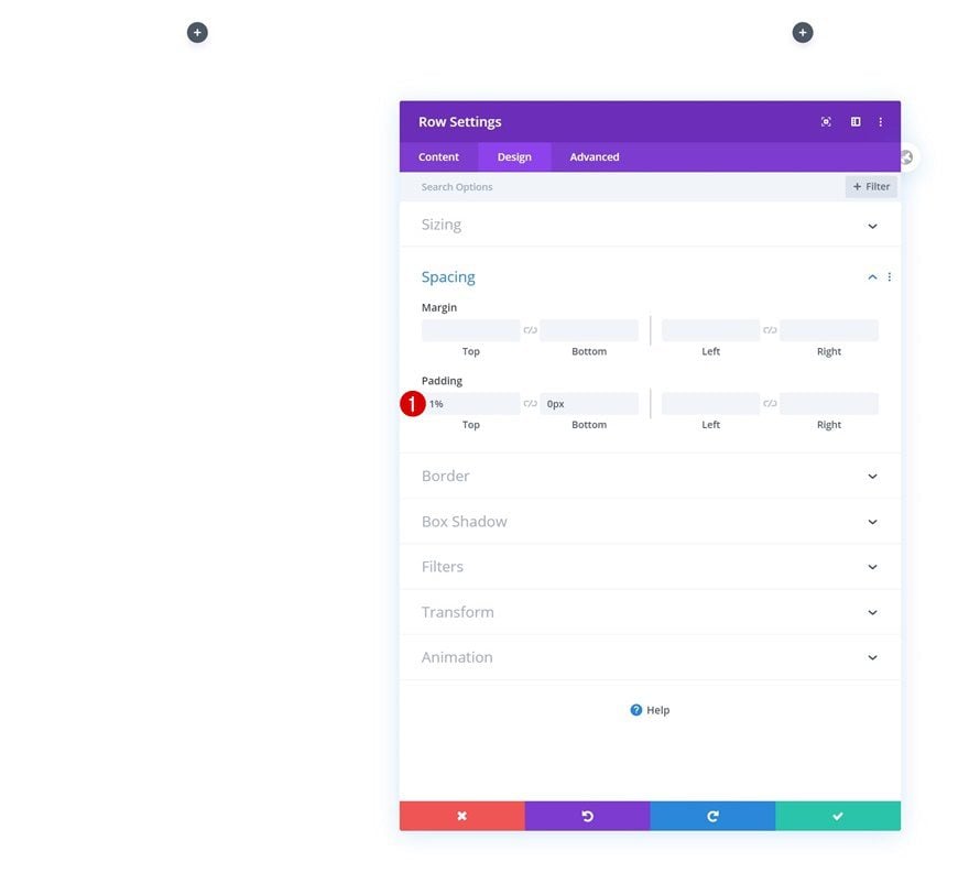
Spacing
Modify the spacing settings next.
- Top Padding: 1%
- Bottom Padding: 0px
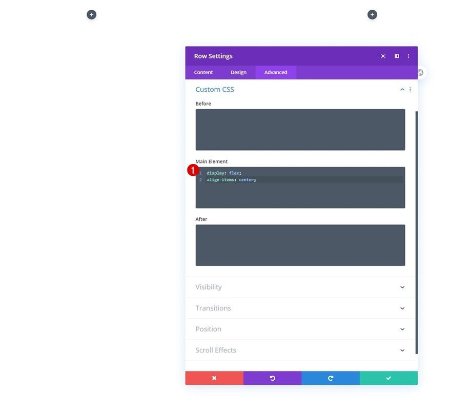
Main Element
Then, go to the advanced tab and add two lines of CSS code to the row’s main element. This will help us vertically align column content in our row.
display: flex;
align-items: center;
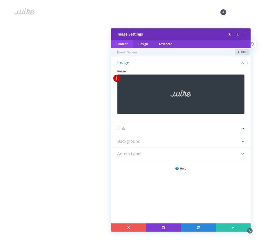
Add Image Module to Column 1
Upload Logo
Time to add modules, starting with an Image Module in column 1. Upload your logo.
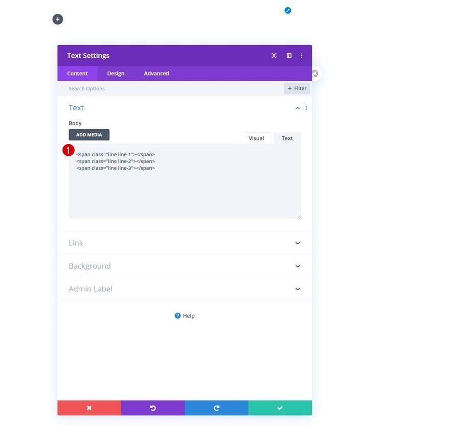
Add Text Module to Column 3
Add 3 Spans to Content Box
Then, move on to the third column and add a Text Module. We’ll use the Text Module’s text tab to add three HTML spans with custom classes assigned to them. Later on the tutorial, we’ll use these spans to create our interactive hamburger icon.
<span class="line line-1"></span>
<span class="line line-2"></span>
<span class="line line-3"></span>
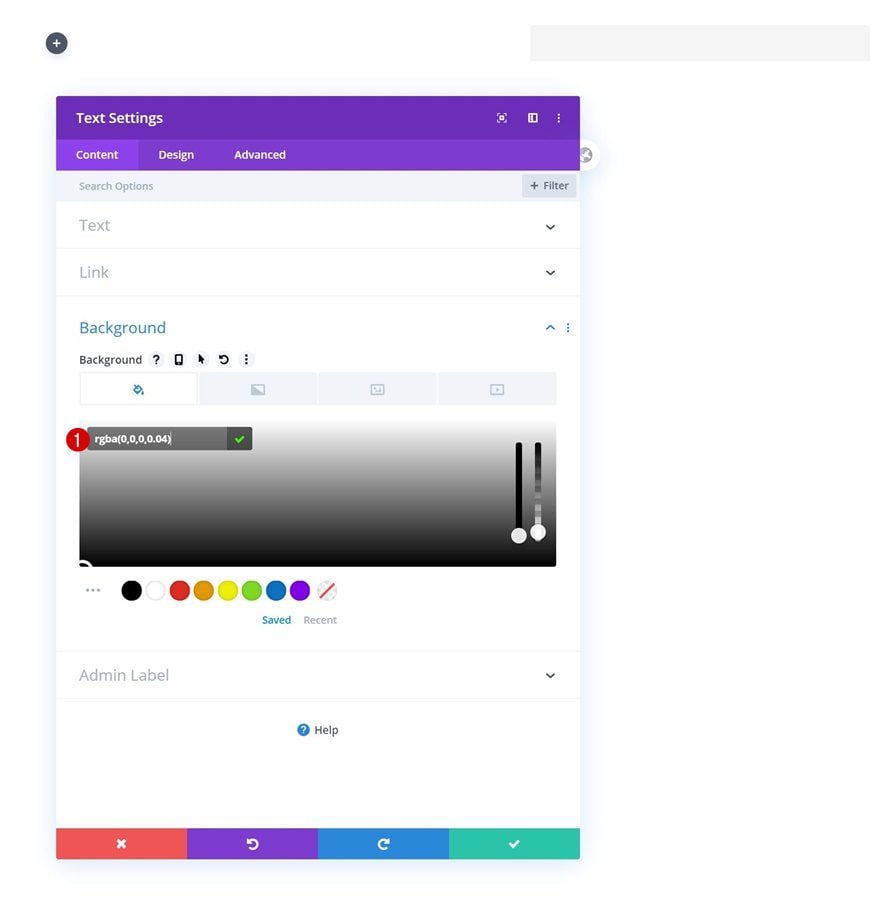
Background Color
Change the module’s background color next.
- Background Color: rgba(0,0,0,0.04)
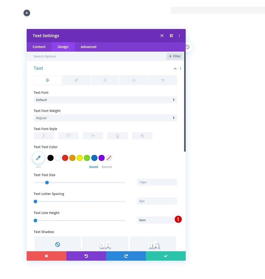
Text Settings
Then, move on to the design tab and remove the text line height. This will help us have full control over the spans we’ve added.
- Text Line Height: 0em
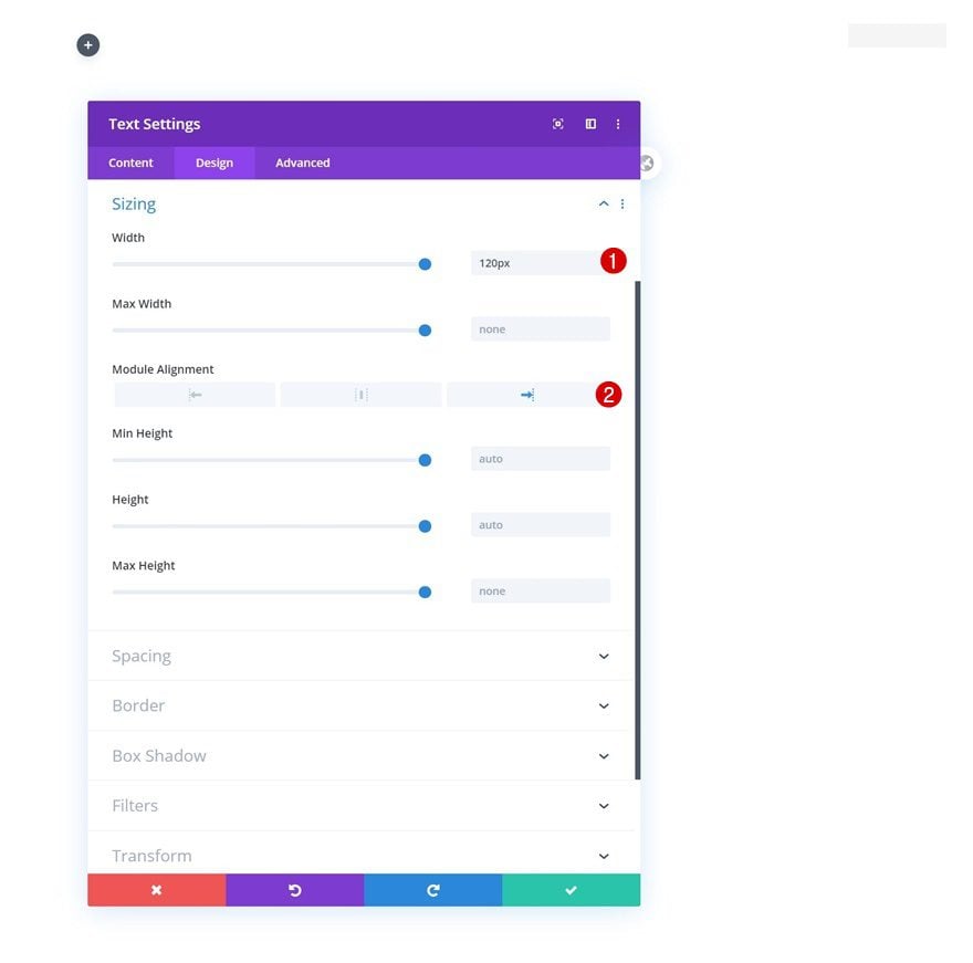
Sizing
Next, we’ll modify the module’s sizing settings.
- Width: 120px
- Module Alignment: Right
Spacing
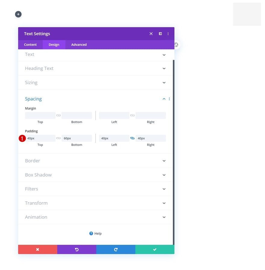
And we’ll complete the module settings by turning the module into a square using custom padding values in the spacing settings.
- Top Padding: 40px
- Bottom Padding: 60px
- Left Padding: 40px
- Right padding: 40px
Add Row #2
Column Structure
On to the next row! We’ll use this row to design our entire slide-in menu. Use the following column structure:
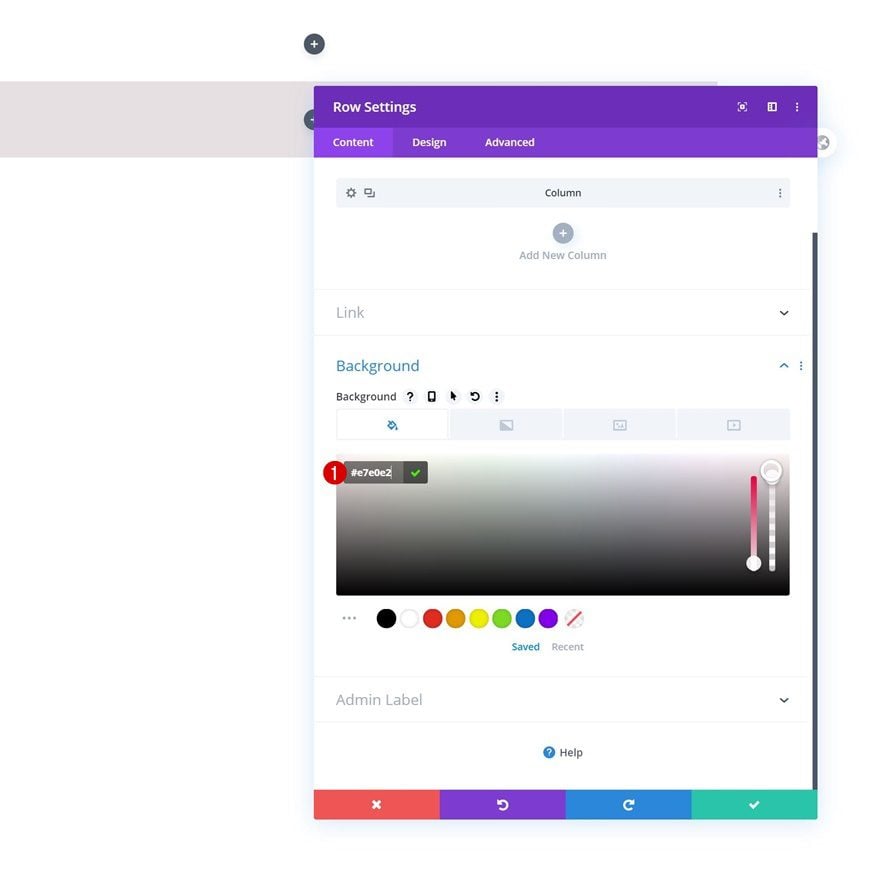
Background Color
Without adding any modules, open the row settings and change the background color as follows:
- Background Color: #e7e0e2
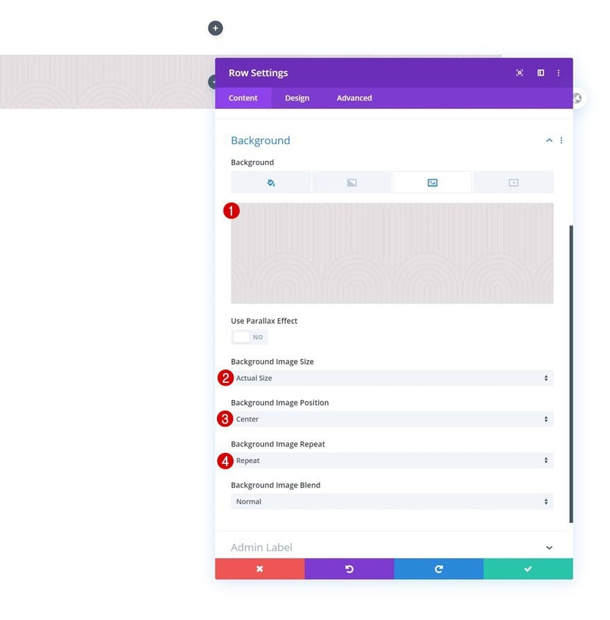
Background Image
We’re using a pattern background image as well. You can find the image we’ve used in the download folder you were able to download at the beginning of this tutorial but feel free to use any other background pattern of your choice.
- Background Image Size: Actual Size
- Background Image Position: Center
- Background Image Repeat: Repeat
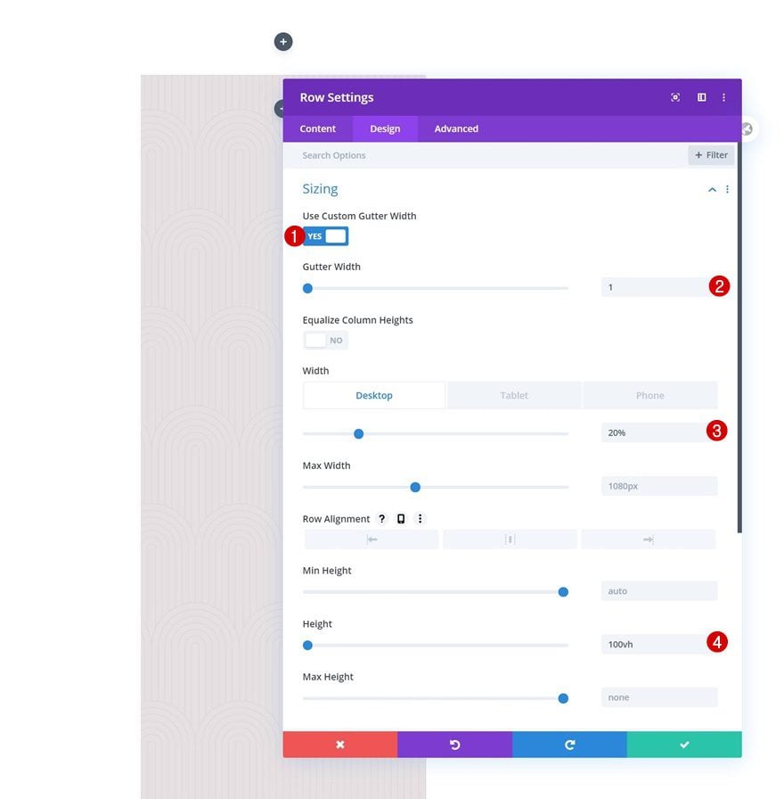
Sizing
Then, move on to the design tab and change the sizing settings accordingly:
- Use Custom Gutter Width: Yes
- Gutter Width: 1
- Width: 20% (Desktop), 40% (Tablet), 60% (Phone)
- Height: 100vh
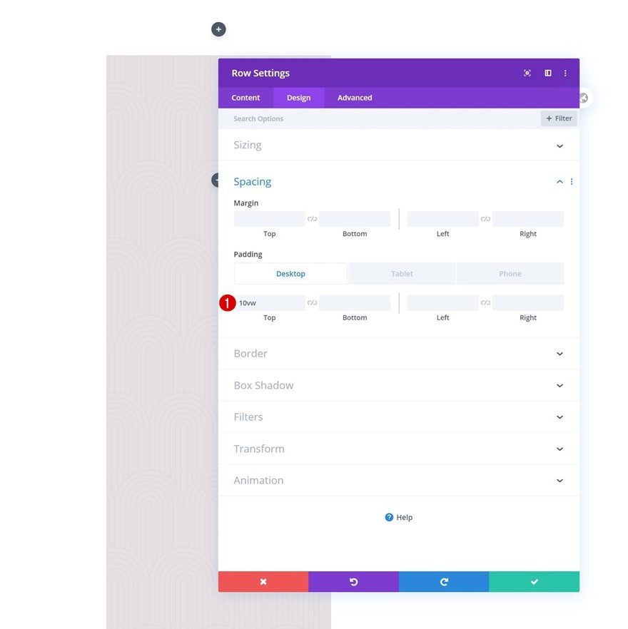
Spacing
Modify the spacing settings across different screen sizes too.
- Top Padding: 10vw (Desktop), 30vw (Tablet), 40vw (Phone)
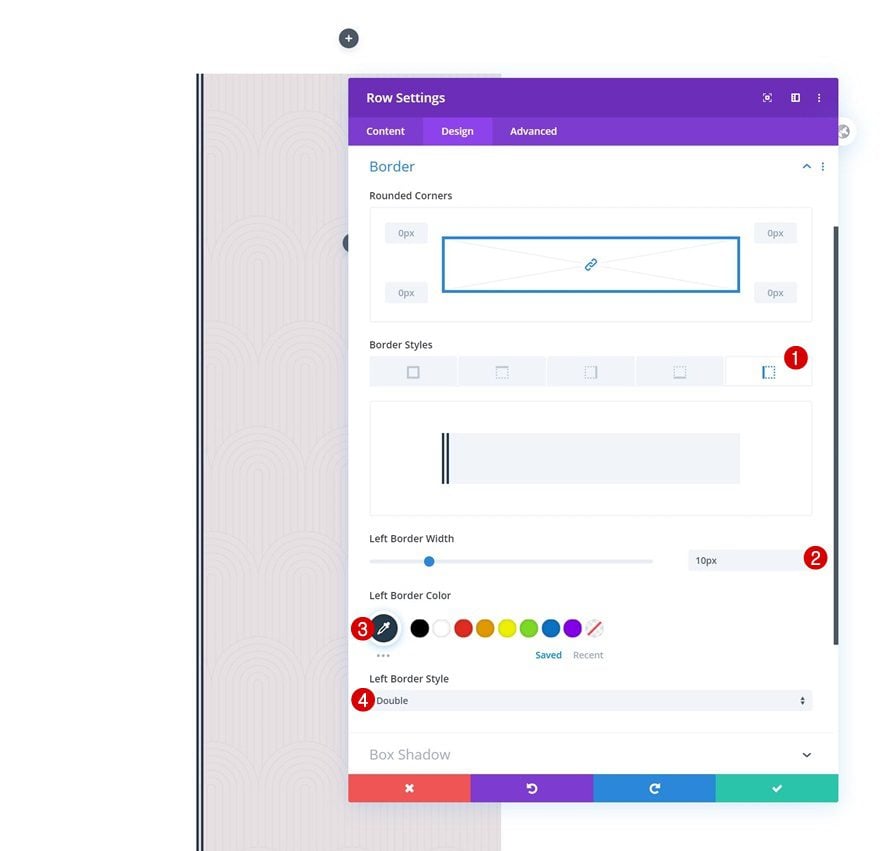
Border
And complete the row settings by adding a left border.
- Left Border Width: 10px
- Left Border Color: #24394a
- Left Border Style: Double
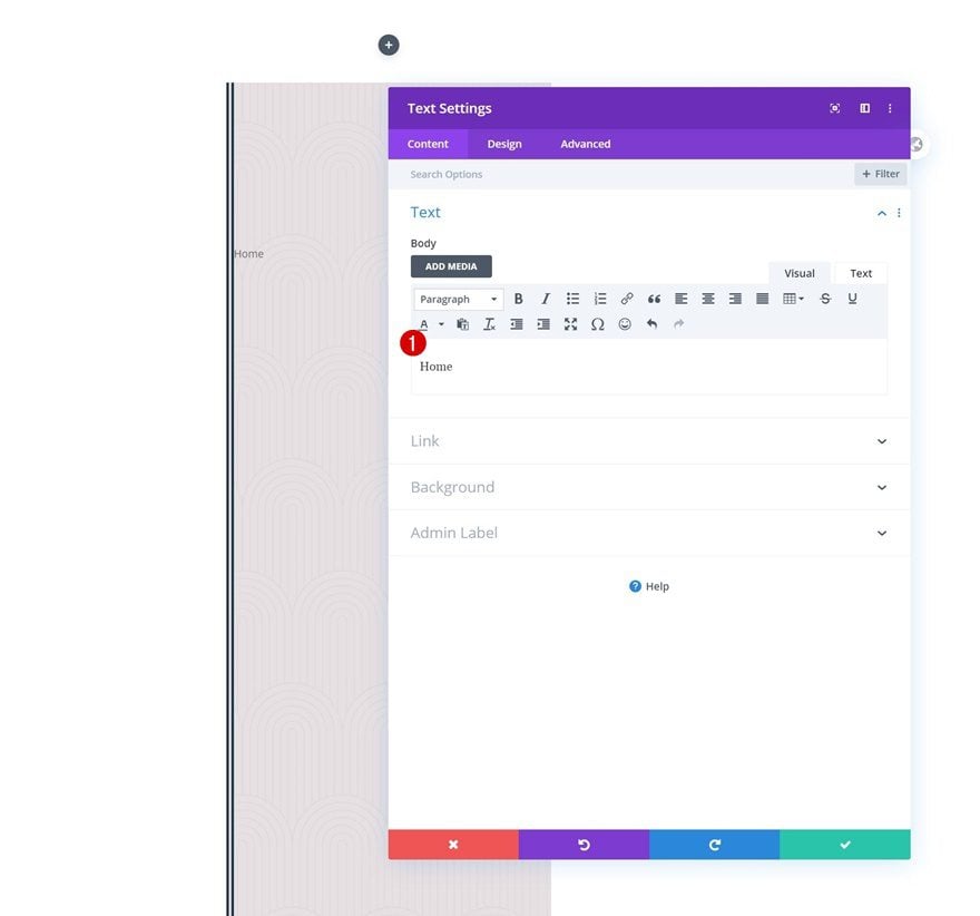
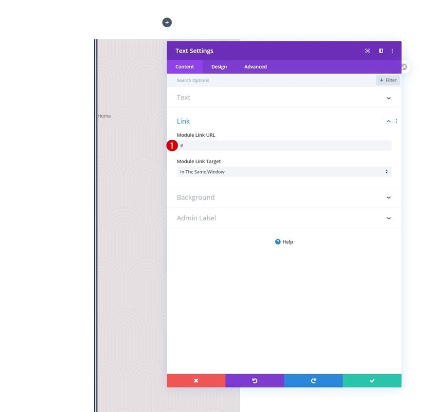
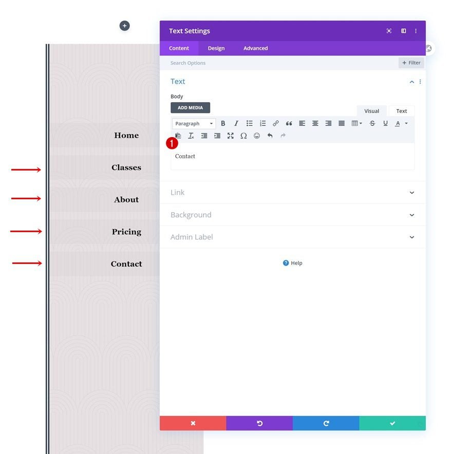
Add Text Module to Column
Add Content
Time to add the first menu item Text Module! Add the copy to the content box.
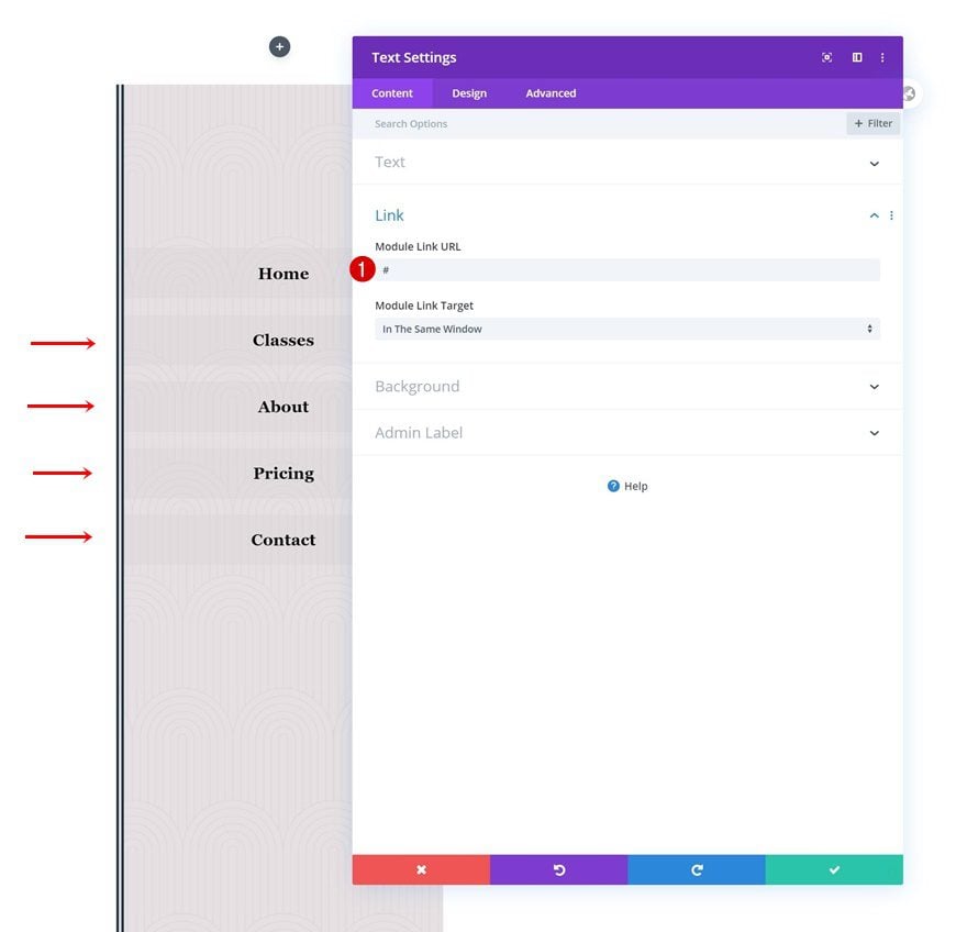
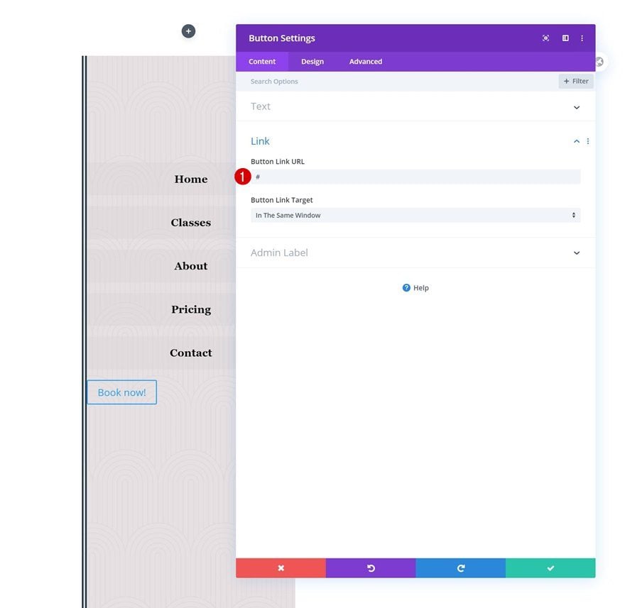
Add Link
Continue by adding a relevant link to the menu item.
- Module Link URL: #
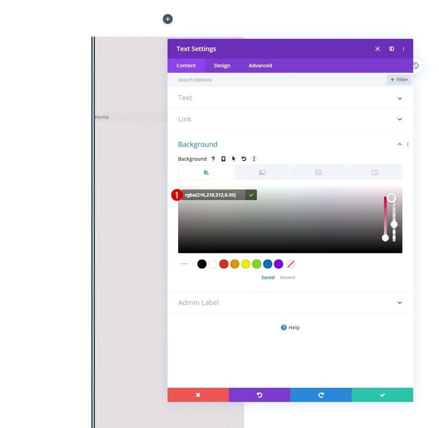
Background Color
Modify the background color next.
- Background Color: rgba(216,210,212,0.35)
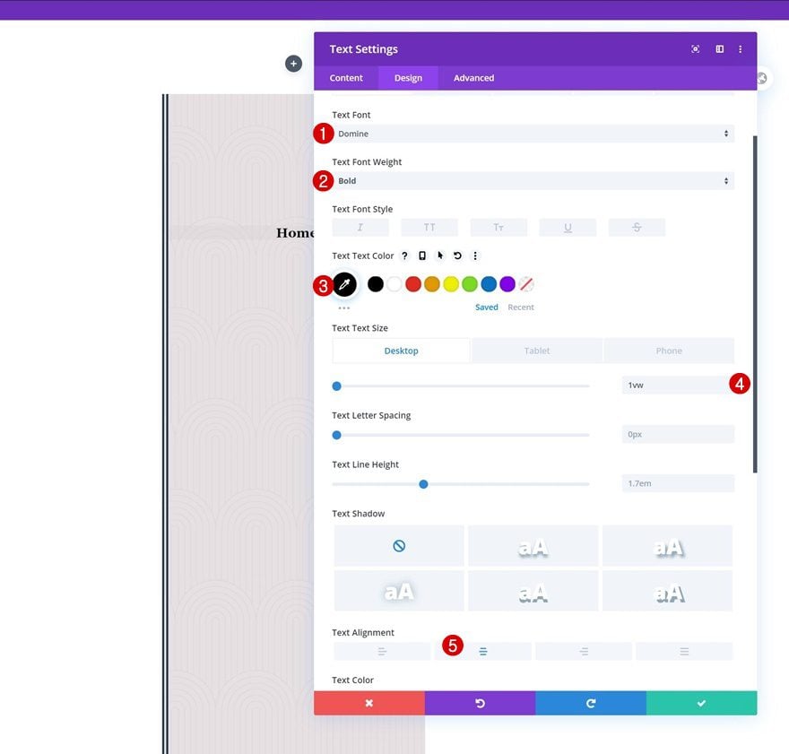
Text Settings
Then, move on to the design tab and change the text settings as follows:
- Text Font: Domine
- Text Font Weight: Bold
- Text Color: #000000
- Text Size: 1vw (Desktop), 2vw (Tablet), 3vw (Phone)
- Text Alignment: Center
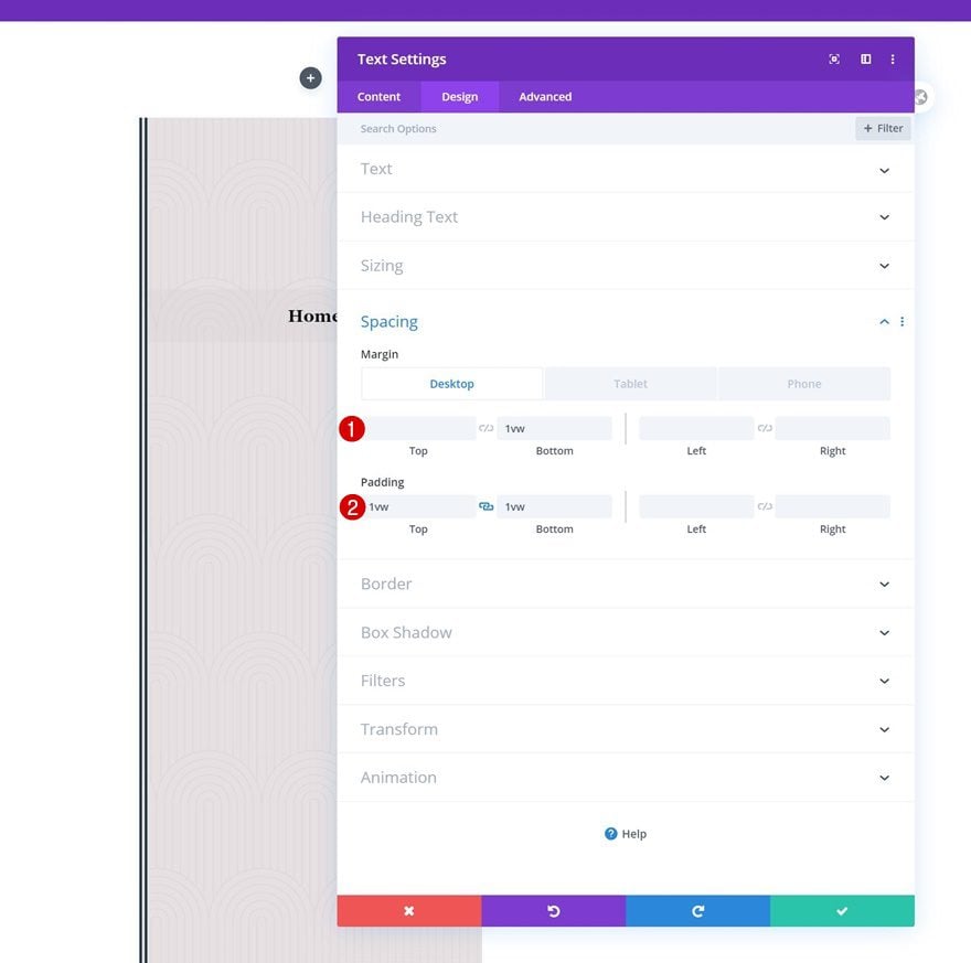
Spacing
Complete the module settings by adding some custom spacing values across different screen sizes.
- Bottom Margin: 1vw (Desktop), 2vw (Tablet), 3vw (Phone)
- Top Padding: 1vw
- Bottom Padding: 1vw
Once you’ve completed the first menu item Text Module, you can clone it as many times as needed. Just make sure your modules don’t exceed the viewport height.
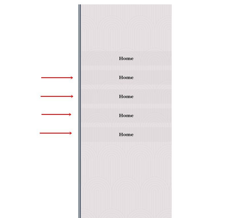
Change Content & Links of Duplicate Text Modules
Change the content and links of each duplicate Text Module.
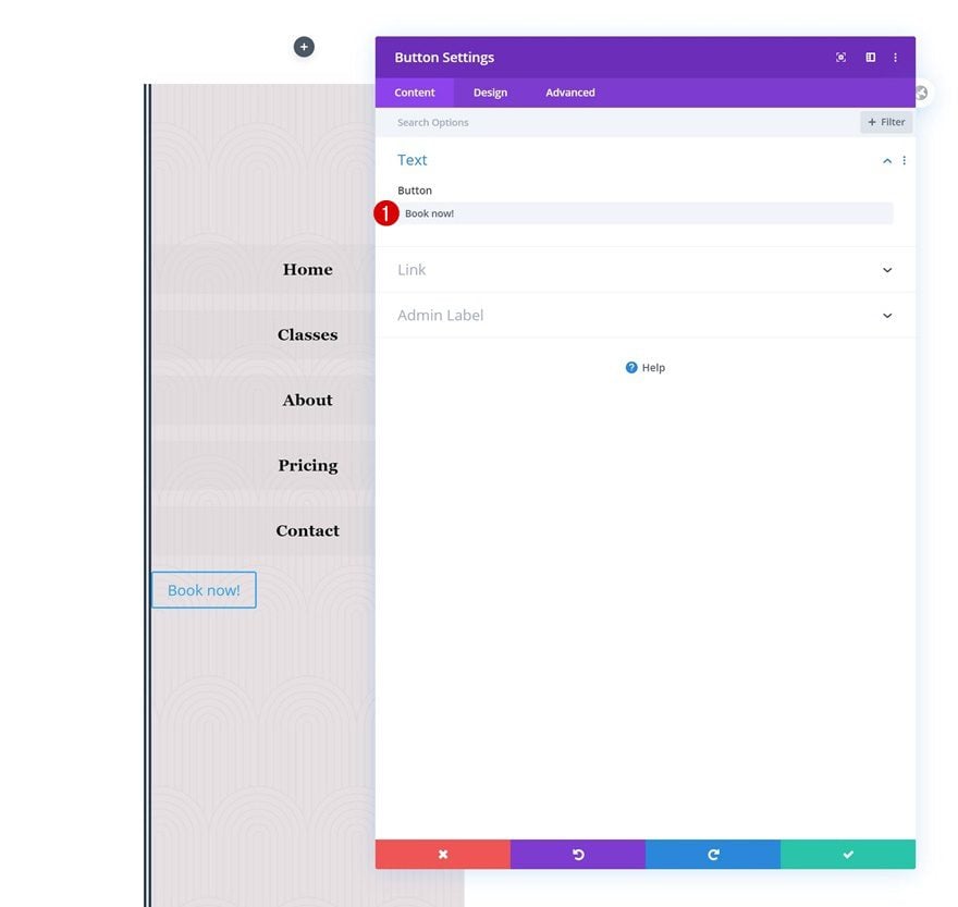
Add Copy
The last module we need in this row is a Button Module. Add some copy of your choice.
Add Link
Add a link too.
- Button Link URL: #
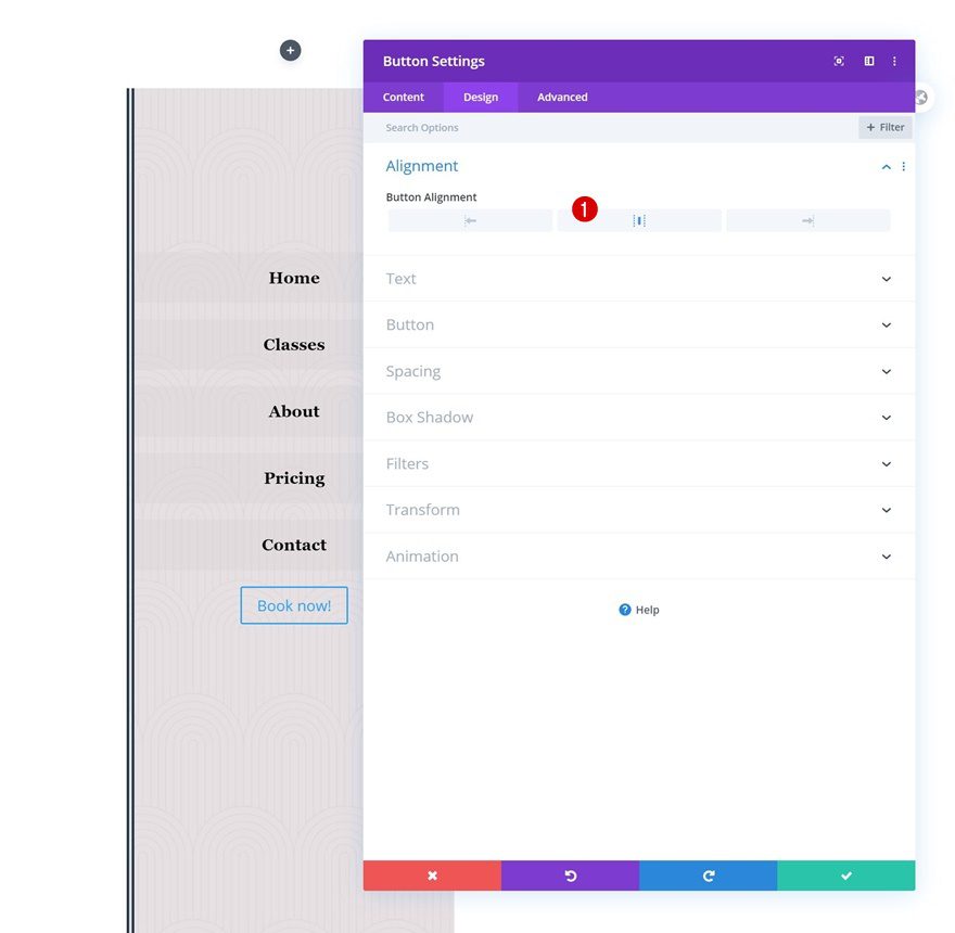
Alignment
Move on to the design tab and change the button alignment.
- Button Alignment: Center
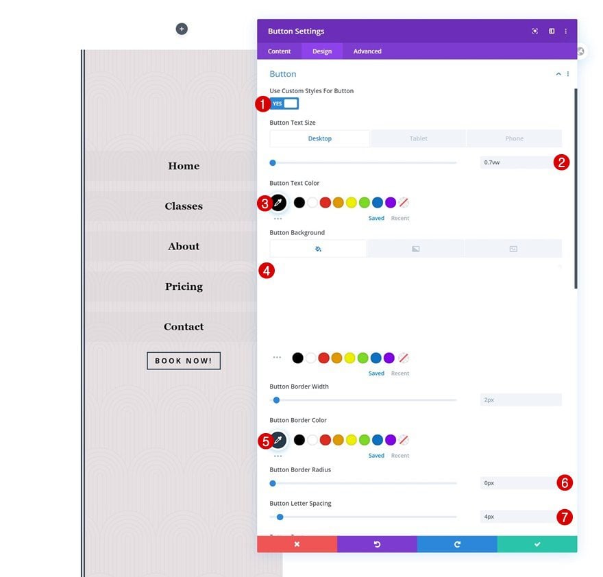
Button Settings
Continue by styling the button module as follows:
- Use Custom Styles For Button: Yes
- Button Text Size: 0.7vw (Desktop), 1.5vw (Tablet), 2.5vw (Phone)
- Button Text Color: #000000
- Button Background Color: rgba(0,0,0,0)
- Button Border Color: #24394a
- Button Border Radius: 0px
- Button Letter Spacing: 4px
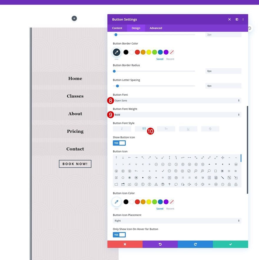
- Button Font: Open Sans
- Button Font Weight: Bold
- Button Font Style: Uppercase
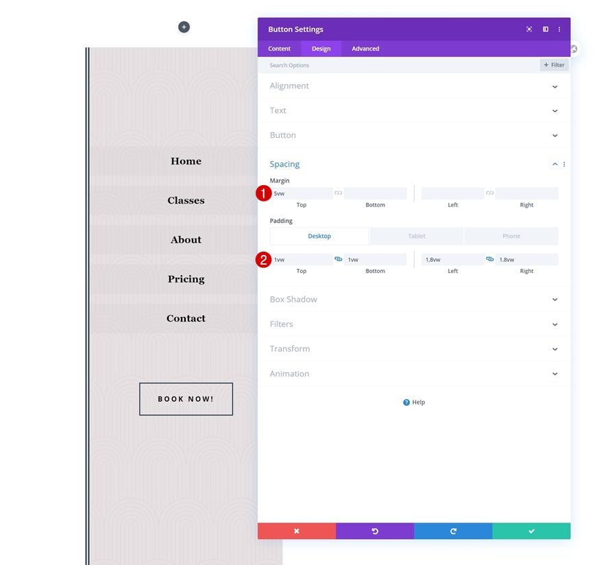
Spacing
And complete the module settings by adding custom spacing values across different screen sizes.
- Top Margin: 5vw
- Top Padding: 1vw (Desktop), 2vw (Tablet), 3vw (Phone)
- Bottom Padding: 1vw (Desktop), 2vw (Tablet), 3vw (Phone)
- Left Padding: 1.8vw (Desktop), 3vw (Tablet), 4vw (Phone)
- Right Padding: 1.8vw (Desktop), 3vw (Tablet), 4vw (Phone)
3. Add Slide-In Functionality
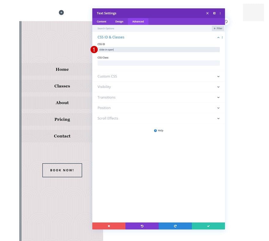
Now that we have all elements in place, it’s time to create the responsive slide-in menu effect! First, open the Text Module (containing the spans) in the third column of your first row and use a custom CSS ID in the advanced tab. We’ll use this CSS ID to create a click function in our code.
- CSS ID: slide-in-open
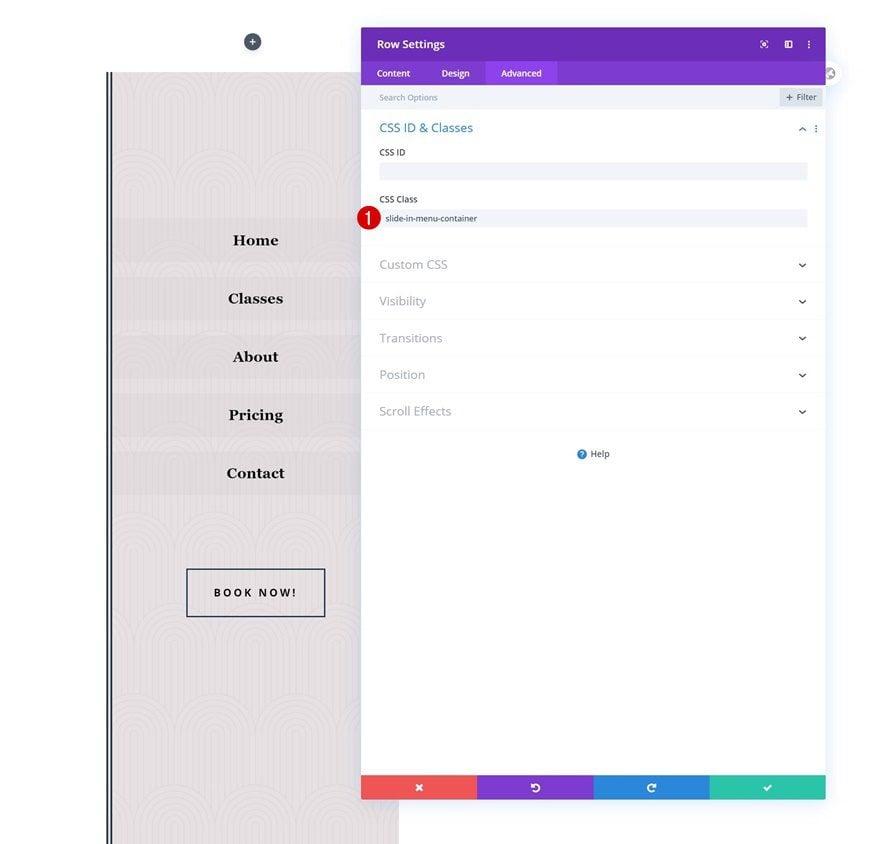
Add CSS Class to Row #2
Then, open the second row, go to the advanced tab and add a custom CSS class. On click, we’ll allow the row to slide in.
- CSS Class: slide-in-menu-container
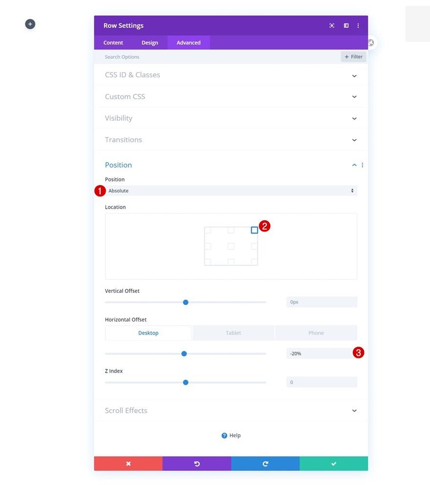
Change Row #2 Positioning
We’ll reposition this row too. Notice how the horizontal offset matches the row’s width across different screen sizes in the sizing settings.
- Position: Absolute
- Location: Top Right
- Horizontal Offset: -20% (Desktop), -40% (Tablet), -60% (Phone)
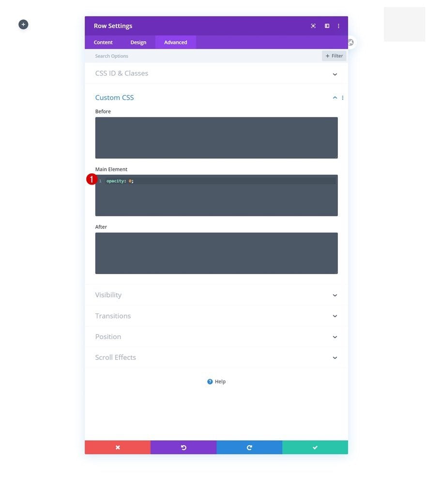
Change Row #2 Opacity
And bring the opacity to 0 in a default state.
opacity: 0;
Add Code Module to First Row’s Second Column
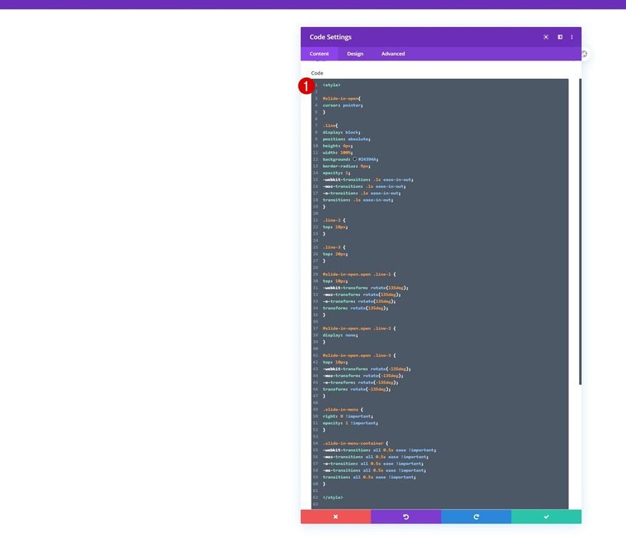
Insert CSS Code
To create the click function effect and style the spans of our hamburger icon, we’ll need some CSS code. Add a Code Module to the second column of your first row and place the following lines of CSS code in between style tags as you can notice in the print screen below:
#slide-in-open{
cursor: pointer;
}

.line{
display: block;
position: absolute;
height: 4px;
width: 100%;
background: #24394A;
border-radius: 9px;
opacity: 1;
-webkit-transition: .1s ease-in-out;
-moz-transition: .1s ease-in-out;
-o-transition: .1s ease-in-out;
transition: .1s ease-in-out;
}

.line-2 {
top: 10px;
}

.line-3 {
top: 20px;
}

#slide-in-open.open .line-1 {
top: 10px;
-webkit-transform: rotate(135deg);
-moz-transform: rotate(135deg);
-o-transform: rotate(135deg);
transform: rotate(135deg);
}

#slide-in-open.open .line-2 {
display: none;
}

#slide-in-open.open .line-3 {
top: 10px;
-webkit-transform: rotate(-135deg);
-moz-transform: rotate(-135deg);
-o-transform: rotate(-135deg);
transform: rotate(-135deg);
}

.slide-in-menu {
right: 0 !important;
opacity: 1 !important;
}

.slide-in-menu-container {
-webkit-transition: all 0.5s ease !important;
-moz-transition: all 0.5s ease !important;
-o-transition: all 0.5s ease !important;
-ms-transition: all 0.5s ease !important;
transition: all 0.5s ease !important;
}
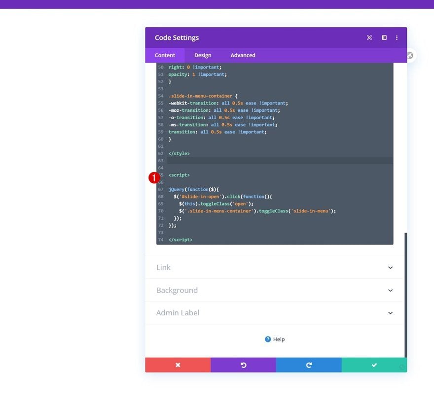
Insert JQuery Code
We’ll need to add some JQuery for the click function too. Make sure you place the code in between script tags as you can notice in the print screen below:
jQuery(function($){
$('#slide-in-open').click(function(){
$(this).toggleClass('open');
$('.slide-in-menu-container').toggleClass('slide-in-menu');
});
});
4. Save Theme Builder Changes & View Outcome on Website
Once you’ve completed all elements in your global header, the only thing left to do is save all changes and view the outcome on your website!
Preview
Now that we’ve gone through all the steps, let’s take a final look at the outcome across different screen sizes.
Desktop
Mobile
Final Thoughts
In this post, we’ve shown you how to use Divi’s Theme Builder to create a responsive slide-in menu for your next Divi project. We’ve combined the best of Divi’s built-in elements and options with some custom click function code. This allows you to focus on designing the slide-in menu and let the code take over the functional part of the global header! You were able to download the JSON file for free as well. If you have any questions or suggestions, feel free to leave a comment in the comment section below.
If you’re eager to learn more about Divi and get more Divi freebies, make sure you subscribe to our email newsletter and YouTube channel so you’ll always be one of the first people to know and get benefits from this free content.


The negative horizontal position for the desktop is not working in the DIVI 5. Is there a work around or can someone help me figure this out. It works for the tablet and the phone sizes, but the desktop keeps defaulting to 0 once it is saved. This is creating problems with buttons on the pages since the menu is hidden but is blocking the content on the desktop settings.
That sounds frustrating, but we’d love to help get that sorted out! 👍
Please, reach out to our support team directly via the chat icon on our website so we can take a closer look at your specific setup, help you get the bottom of it and, if needed, log this behavior for our developers. Thanks!
You have forgotten some key code. Your example does not work as in the animation.
You forgot the close function as has been mentioned numerous times here.
This makes this tutorial almost useless
Missing the answer on previous question:
Awesome Slider but there’s something missing, could i get a piece of code that would retract the slider back in when the user would click anywhere on the screen?
Can you help?
This is very frustrating can the tutorial be updated to include a close button?
If you’re referring to the Menu Close button, it’s already included in the article, the button will look like this when the Menu is opened: https://prnt.sc/AKWmQ1BLLu1t
You can add the Hamburger Menu through this step: https://prnt.sc/s5NWepnIar3J
Which will be converted to an X button when opening the Menu through this part of the CSS code provided from the article: https://prnt.sc/OdXl71544cNK
Also make sure to add a ID slide-in-open to the Text Module Settings > Advanced > Classes > CSS Class & ID which you can see from this step: https://prnt.sc/aC9cX_H6bQ9h
the menu is shownig briefly while pages are loading, That’s not great. Is it possible to avoid that ?
Awesome Slider but there’s something missing, could i get a piece of code that would retract the slider back in when the user would click anywhere on the screen?
I wish it was working on my side.. but i keep having a weird white gap on the top of the nav.. Everything is transparent so i don’t know.. Wish i could find it ^^
Thanks for the tutorial! Is there a way to have the menu close once an item is clicked or if the user clicks outside of the menu?
That’s what I’m looking for too.
Please show us the CSS snippet.
This would be very handy indeed, I have the same question
Nice Work!
Im having just one problem, can’t upload the .json file anywhere. Suggestions?
It’s a custom header, so it can be uploaded only in Divi > Theme Builder > Portability. Check this screenshot, https://i.imgur.com/SGv42aX.png.
Any ideas on how to make this menu slide in from the left instead?
Great Menu!
How can I color highlight the active page in menu?
“-> I’m on Home -> Home should change colour in Menu to green”
Happy to hear back from you!
regards
Uli
The problem is, the closed menu, though invisible, is still clickable and overrules underlying items, like a form. Do you have a solution for this?
This is absolutely the one thing frustrating me about this menu. It’s perfect for what I need but i cannot figure out why its doing that.
Did you checked the z-index from highest section?
Dear Elegant Themes,
Thank you for this tutorial, very helpful and i’ve followed along in order to get it working.
One thing I can not seem to change is how to get the color to white and the size of the hamburger icon to shrink?
Would you please be able to advise?
All of your tutorials are assisting me greatly so thank you for that.
Best regards,
Frans
How can we implement a menu like this on mobile only? Menus like these aren’t great for usability on desktop devices, though they may look nice. Slide in menus are great for mobile use since they give the user a large area to tap to select the links and get out of the way when they aren’t needed. Can Divi implement an option to create menus like these natively? Practically any site out there right now would find it tremendously useful.
Beaver and Elementor has it as standard and it works pretty great in Beaver. So I will also like DIVI to have some native menu design.
Am I missing something on mobile? From the preview it seems as though the logo and hamburger move inward & cover the text areas on scroll?
Pre Made Layout doesn’t work. It’s impossibile to upload. The only message that appear is “import estimated time is 1 minute” with 0%….lol not very good.
I have try with all the imported methods:
– importing in divi library
– in divi live builder
– in page builder
no results.
The same issue with all that.
“import estimated time is 1 minute” with 0%
When uploads time out like this it is usually a hosting issue. However, please feel free to contact our support and they’ll help you troubleshoot.
Thank you Donjete for tutorial! Both the video and this step-by-step were extremely easy to follow. I do have one question for anyone who may be able to help, I have a one page site and I’m having issues adding anchor links to jump to various sections using this menu. Any thoughts or resources? I’ve checked a few videos but still no luck. Thanks in advance and thanks again Divi team for these excellent resources. – David
Disregard my previous comment. NEWBIE at this. I didn’t realize I needed to exit the visual builder in order to preview the anchor link functionality. Man I was losing my mind for a bit there. Thanks again for the tutorials! – David
Thanks for the tutorial. I have a problem. The hamburger menu disappears when the menu is opened. I’ve set the z-index to 9999 but still it’s not shown. Any idea why?
Make sure your first row’s Position is set to Relative (in the advanced settings). That fixed it for me.
Ahhh Great, You did an amazing job. Thanks Guys
These settings look great in portrait, but how do you handle it when the device is in landscape? The menu doesn’t allow for scrolling and unless you’ve only got a menu with a couple of items, it doesn’t work in landscape at all?
Going to the visibility settings and setting the vertical overflow to scroll should allow the menu to scroll separately
Great! Thank you’d for the explanation!
Great work. Congratulations!
I would like to place this menu only in the mobile version, is it possible? How can I do it?
Yes, I was wanting the same thing actually
and another request.
It would be nice that in every design/solution involves left or right design (such as this Right side design)
that at the end, instructions will be give on how to mirror it to the opposite direction, Left in this case.
Many tutorials deals with directional design and mirroring it is not straight forward, so please, when you present
any design on one side, think that some of your viewers would like to use it on the other side.
I would personally make it mandatory for every tutorial, I’m sure it will reduce the number of support tickets.
Thanks
Very nice, thank you.
I would like ET also to suggest a solution to present long list of content items/menu items, say for example a list of 25 chapters or menu items and how to do it with similar graphic thinking to what is presented here.
The challenge is to enable a long menu/list to vertically scroll *separately* from the main content and that it will work on all platforms.
There is another nice ET tutorial named “How to Create a Floating Pop-out Menu in Divi” but it also deals with a very short list of items and does not allow vertical scrolling of the menu independently from the main content.
I can also think of using the accordion module for such a task, but ET accordion is missing many functions such default close on start, 2 or more columns setup, control over button size and design and more…
I wish ET would present solutions to a more heavy pages and not only present solutions/ideas based on very simple, basic menu that has only 4-5 items …
Thanks
Amazing!! I love these kind of tutorials!
added this back in the old days. Conclusion after a year, analysing Analytics and talking to people… people didnt know that the menu on desktop could be pressed…. mind boggeling. So I removed it, results are way better now, a lot more leads!
Added to my knowledge! Very good article, thank!