After years of watching clients struggle with clunky, one-size-fits-all designs, we’ve learned that a great website needs to fit perfectly into any screen it meets, no matter how great the design is.
Many see responsive design as a technical maze, but in this post, we’ll try to guide you through some of the challenges (and show you how Divi might make this journey surprisingly enjoyable). Let’s get started.
- 1 What Is Responsive Design?
- 2 What Makes Design Truly Responsive?
- 3 Why Does Responsive Design Have Such Great Impact?
- 4 Make Responsive Design Effortless: Why Thousands Of Designers Choose Divi
- 5 Common Responsive Design Challenges (And How To Solve Them)
- 6 Breakpoints To Breakthroughs: Responsive Design Is A Must
What Is Responsive Design?
When browsing websites on your phone, you might have encountered pages where you needed to pinch, zoom, and scroll sideways just to read the content. This usually happens on old websites or government-related websites.
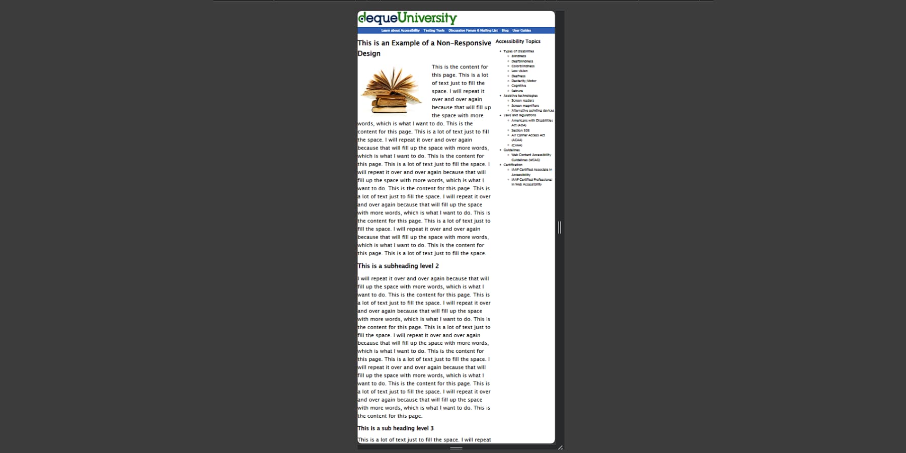
This would be a prime example of an unresponsive website. Before responsive design took the web design field by storm, around 2010, every website was built with only desktop screens in mind, and websites like those are relics of that time.
If you’re on a desktop, grab the corner of your browser and drag it smaller — notice how this blog post’s elements rearrange themselves. The menu might collapse into a hamburger icon, images scale down, and columns stack vertically.
These automatic adjustments ensure visitors never struggle with unreadable text or awkward horizontal scrolling, regardless of their device. That’s responsiveness.
Responsive design allows websites to automatically adjust their layout, images, and functionality based on the visitor’s screen size. The magic happens through fluid grids that use percentages instead of fixed widths, images that scale within their containers, and specific CSS rules that kick in at different screen sizes.
What Makes Design Truly Responsive?
When browsing websites on your phone, have you ever noticed how some feel naturally mobile-friendly while others fight against your thumbs? The difference often lies in how deeply responsive design principles have been implemented throughout the site.
These days, every website has to be designed mobile-first instead of the old way of planning for a desktop and then optimizing for mobile. We have to nail the essentials by starting with the smallest screens before expanding to larger displays. This approach fundamentally changes how we structure content and code, leading to leaner, faster-loading websites.
Responsive design excellence depends on several critical components. Great responsive design relies on three key pillars. First, navigation must adapt seamlessly — those expansive desktop menus must transform into something that works on mobile without losing functionality or confusing users. Second, content needs to scale appropriately — text stays readable, images remain crisp, and everything fits without horizontal scrolling. Videos should scale smoothly, too, flawlessly, regardless of screen size.
Also, touch targets should be sized for actual fingers — not pixel-perfect mouse pointers. Buttons, links, and form elements need adequate spacing and size to prevent frustrating mis-taps.
Truly responsive websites consider these elements holistically rather than treating them as separate concerns. Each component must work in harmony with others while adapting to different screen sizes and interaction methods.
Why Does Responsive Design Have Such Great Impact?
Mobile traffic now dominates the web, with almost 60% of visitors browsing on phones and tablets. This shift has transformed responsive design from a nice-to-have feature into a crucial business investment that directly impacts revenue, user engagement, and brand perception.
Google’s mobile-first indexing heavily favors responsive websites in search rankings. Sites performing poorly on mobile devices see decreased visibility in search results, leading to reduced organic traffic. As paid advertising costs continue rising across platforms, this loss of free organic traffic creates an increasingly expensive problem for businesses relying on digital presence.
When examining user behavior, the connection between responsive design and revenue becomes more apparent. Load speed, a core component of responsive design, shows that every second of delay reduces conversions by up to 20%. Mobile users abandon sites taking longer than three seconds to load, making responsive images and optimized layouts essential for keeping potential customers engaged.
These optimization efforts translate directly into better conversion rates. Mobile-optimized sites convert at 2-3 times the rate of their non-responsive counterparts. For eCommerce sites, this means thousands in additional revenue through appropriately sized product images, easy-to-use shopping carts, and touch-friendly checkout processes. Lead generation websites benefit similarly, seeing increased form completions through appropriately sized input fields and accessible buttons.
Beyond immediate revenue impacts, responsive design significantly reduces ongoing maintenance costs. A single codebase serving all devices eliminates the need for separate mobile and desktop versions. Updates, content changes, and feature additions happen once, creating substantial savings in development resources over time.
Brand perception cuts deeper than just lost sales. Mobile users have grown incredibly savvy, ditching clunky, poorly-optimized sites without a second thought. Frustrated visitors aren’t just leaving — they’re walking away with a lasting impression of your business’s standards and professionalism. Think of it like running a brick-and-mortar store with broken signs and a jammed front door. Your competitors with smooth, responsive sites aren’t just winning clicks — they’re building genuine connections with every satisfied mobile visitor.
Make Responsive Design Effortless: Why Thousands Of Designers Choose Divi
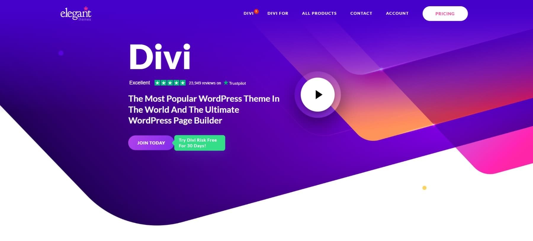
Modern web design lives or dies by its mobile experience — a reality that shapes how Divi approaches responsive design from the ground up. Developed by us at Elegant Themes, Divi stands at the forefront of WordPress themes, powering thousands of responsive websites.
Rather than treating mobile layouts as an afterthought, Divi‘s responsive capabilities weave adaptability into every aspect of the design process, helping create websites that feel perfectly at home on any screen size.
The magic starts with Divi’s adaptive layout system. Desktop navigation menus morph smoothly into space-saving hamburger icons on mobile, while content blocks reorganize themselves based on screen real estate. Rather than forcing desktop layouts onto phone screens, Divi helps content find its natural flow.
Through the visual builder’s device-specific controls, you can fine-tune everything from font sizes to spacing without touching code. Want more prominent headlines on tablets but tighter margins on phones? A few clicks handle what used to require custom CSS gymnastics.
The responsive preview mode brings these adjustments to life, showing real-time changes across device sizes. Tweaking a desktop layout might reveal opportunities to enhance the mobile experience, all visible within the same interface. Combined with visual tools, this flexibility helps create sites that feel purposefully designed for every screen size – not just adapted as an afterthought.
Responsive Design: The Good, The Quick, & The AI
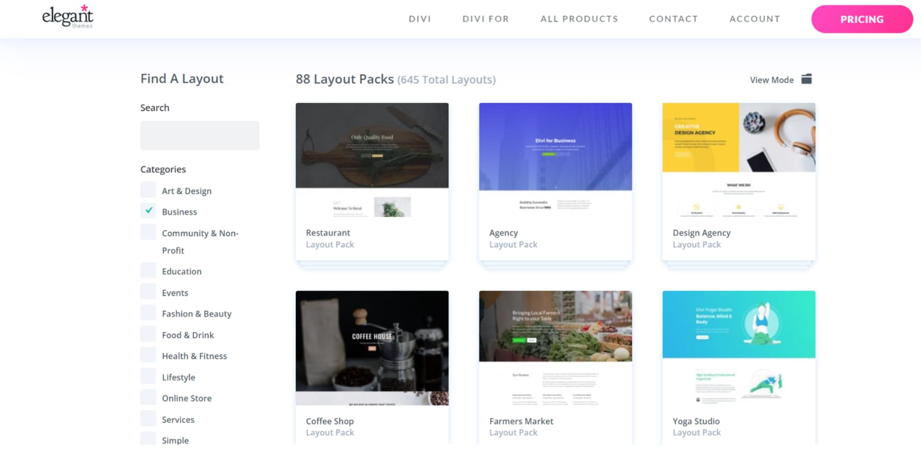
Divi accelerates responsive design workflows further through three powerful features. The extensive library of premade layouts offers 2000+ responsive-ready sections and full-page designs, each optimized for every screen size. These layouts serve as building blocks, letting you mix and match components while maintaining consistent, responsive behavior across devices.
Divi Quick Sites takes this approach further, providing complete website packages with matching headers, footers, and page templates with just a description.
Each site generated comes fully responsive, with carefully crafted breakpoints and mobile-optimized elements that maintain design integrity across screen sizes. This dramatically cuts development time while ensuring professional results.
As we have already established, responsiveness really aids conversions on your website. Great marketing copy and graphics also boost conversions. That’s where Divi AI comes in handy. In no time, Divi AI can generate context-aware, brand-matching content and images.
You can even edit and enhance images using Divi AI.
Divi AI can also generate custom layouts for your website. These layouts, too, maintain responsive integrity while matching your brand’s style. The AI considers mobile-first principles during generation, creating designs that naturally adapt to different screen sizes.
Stop wrestling with breakpoints and media queries. Join the designers who let Divi handle responsive design automatically.
Make Responsive Design Easy With Divi
Common Responsive Design Challenges (And How To Solve Them)
Even seasoned designers face recurring headaches with responsive design challenges that can turn simple projects into time-consuming puzzles. Let’s tackle the most common challenges and explore how Divi’s toolkit turns these potential roadblocks into smooth sailing.
Remember the last time you tried tapping a dropdown menu on your phone only to hit the wrong item? That’s just one of the many navigation challenges designers face on mobile phones. Desktop menus, especially those with multiple levels and complex interactions, often fall apart on mobile devices. While the hamburger menu has become a standard solution, research shows it’s not always optimal.
Modern responsive design requires brighter navigation patterns that adapt naturally to different screen sizes. Some sites keep critical items visible, such as important page links and CTA buttons, while elegantly condensing others into the hamburger and using a logomark on phones instead of full logos to better utilize the limited real estate.
With the advent of mobile phones, which are more significant than ever, anchoring your menus at the bottom instead of the usual top on mobile phones is becoming the norm. The key lies in finding the right balance between functionality and simplicity without sacrificing usability.
Divi makes this transformation seamless, allowing you to maintain usability across all devices while preserving your brand’s visual identity. Whether you prefer a traditional hamburger menu or an innovative priority-based navigation, the visual builder lets you implement and test different approaches without diving into complex code.
Divi‘s capabilities don’t only stop there. With thousands of extensions and layout packs available on the Divi Marketplace, you can easily make your site’s navigation responsive with minimal effort.
2. Text That’s Too Tiny (Or Takes Over The Screen)
It’s a classic responsive design dilemma – text that’s perfectly sized on a desktop becomes microscopic on mobile, or headlines that look elegant on larger screens end up dominating mobile devices. This balancing act frustrates designers and users, often leading to accessibility issues and poor user experience.
Finding the sweet spot for text sizing extends beyond selecting visually appealing numbers. It involves carefully considering how different content types need to scale across devices. Headlines, body text, and navigation items need to be scaled across devices. While a 48px headline might not impact the desktop, it could consume precious mobile screen space. Conversely, 16px body text that’s comfortable on a mobile might require squinting on bigger screens.
Modern responsive design has evolved toward fluid typography systems that adapt smoothly across breakpoints, moving away from fixed font sizes that abruptly jump between devices. Through proportional scaling with screen size, these systems help maintain readability and design integrity across the device spectrum.
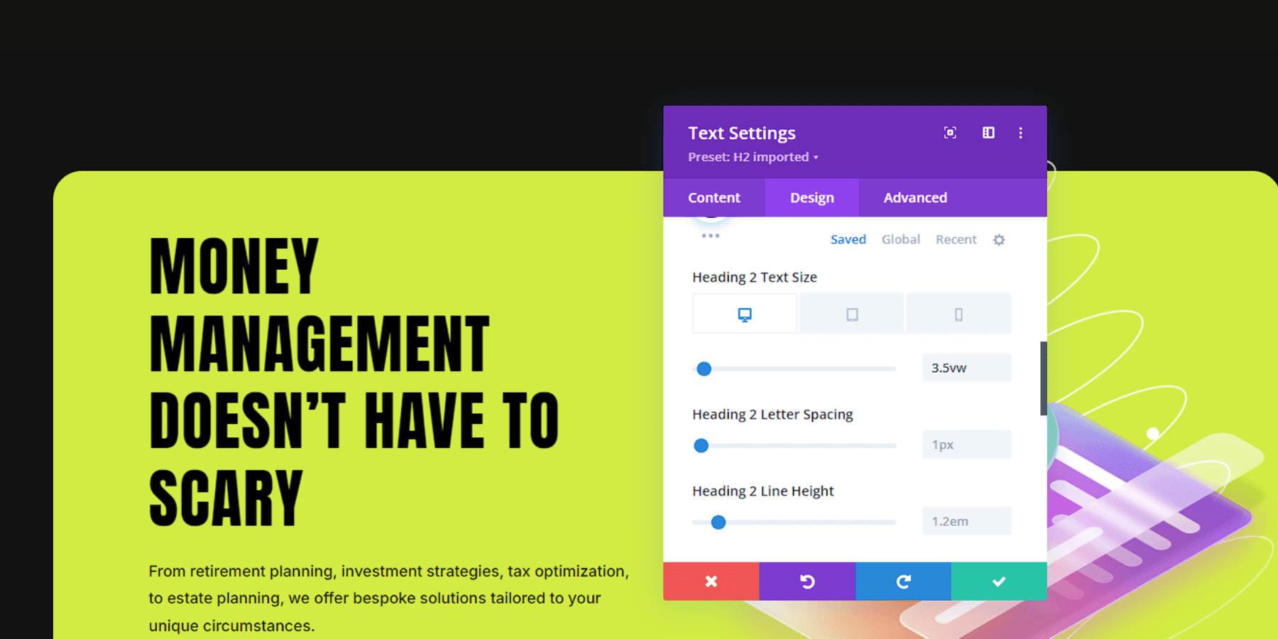
Divi tackles this balancing act head-on with its responsive typography controls. The visual builder lets you preview and adjust text at every breakpoint.
Moreover, you can easily use responsive units such as Viewport Width (vw), Viewport Height (vh), percentages, and even relative units such as em and rem to adjust your font sizes and break away from the monotony of pixels (px).
You can also set up fluid typography for your website, though it might take some time and trial and error to perfect it.
3. Layouts That Don’t Flow
Even the most elegant desktop layouts can hide a frustrating secret – as screens shrink, this layout can quickly become a cacophony of misaligned elements and awkward spacing. While designers have mastered creating stunning full-screen experiences, the journey from expansive desktop views to compact mobile screens remains one of web design’s most nuanced challenges.
Beyond simple element stacking, effective, responsive layouts demand thoughtful consideration of content relationships and user behavior patterns.
A three-column feature section might elegantly showcase services on a desktop, yet the same arrangement could create endless scrolling on mobile. Similarly, side-by-side images and text that tell a compelling story on larger screens might lose their narrative connection when forced into a linear mobile layout.
Modern responsive design approaches this challenge through modular thinking and content-first strategies, considering how each component contributes to the overall user experience across devices. Rather than forcing desktop layouts to fit mobile screens, successful designs adapt their structure while preserving content relationships and visual storytelling.
Divi‘s approach to responsive layouts combines intelligent defaults with granular control, offering a hands-free approach and custom flexibility. Through the visual builder’s responsive preview mode, you can fine-tune how elements reflow and resize across breakpoints. You may also design device-specific sections and hide them on other devices.
This helps you design purposeful experiences that feel natural on every screen.
4. Improper Image Scaling
The perfect hero image captures attention, sets the mood, and engages users on desktops. However, on smaller screens, images can become bandwidth-heavy or pixelated, turning from impactful visuals into design obstacles. Image scaling involves balancing artistic intent with technical limitations. What works well on desktops may lose focus on mobile devices, while detailed product galleries can become difficult to navigate on smartphones.
High-resolution images that provide clarity may conflict with mobile performance needs. Instead of relying solely on CSS for image adjustments, modern responsive design recommends making thoughtful choices in media selection and design. Fortunately, AI has made addressing these resource-intensive challenges more affordable and manageable.
Divi approaches this challenge by turning complex image handling into visual decisions rather than technical hurdles. Through the builder, you can preview and adjust how images behave across breakpoints in real time. You can also change a focus by playing around with its size and position.
Do you have a cropped or modified image for a different screen size? Switch it easily.
Here’s where Divi AI can do the heavy lifting by letting you modify images directly within the builder, no matter how many images you have for a single subscription. You can create new images, reimagine existing ones, and change their styles. Furthermore, you can adjust specific details of an image while keeping the rest unchanged. For example, your image couldn’t cover the entire canvas. No worries. Extend the image with just a few clicks, naturally.
Is the image too pixelated on your desktop or mobile? Effortlessly upscale and de-pixelate your media.
Divi also plays well with almost all image optimization plugins, such as EWWW Image Optimizer, and performance plugins like WP Rocket, giving you another edge when it comes to actually making your graphic-reliant websites truly responsive.
5. Forms & Tables That Fumble
Although they might not be considered the most glamorous elements of web design, forms, and tables do the heavy lifting. They handle user interaction and data presentation. Yet these essential workhorses often become the first casualties of responsive design. They struggle under the pressure of smaller screens and varying device capabilities.
The challenge runs deeper than mere aesthetics. A form with several fields that flow logically on the desktop might force mobile users to scroll between related fields endlessly. Meanwhile, data-rich tables that offer clear comparisons on larger screens can become virtually unreadable when compressed, leaving users to scroll horizontally – a notorious mobile UX sin if not implemented properly.
As you may have guessed, transforming tables into cards or accordions is better than forcing desktop layouts into mobile views. Complex forms adapt their design and can be distributed in multiple steps to avoid overcrowding and being overwhelmed.
Divi‘s helpful community and integrations come in handy in such cases. Several extensions on the Divi Marketplace, such as Divi Form Builder by Divi Engine and Table Maker by Divi-Modules, can help you create multi-step forms and responsive tables.
Do you want to separate the forms and tables from Divi’s visual builder? You are never locked into a single approach. Divi works well out-of-the-box with popular form plugins such as WP Forms and table plugins such as wpDataTables.
Breakpoints To Breakthroughs: Responsive Design Is A Must
The web has evolved from its desktop origins into a dynamic space where content must flow seamlessly across devices. While responsive design might seem like just another technical requirement, it represents something more fundamental – a commitment to making the web accessible to everyone, everywhere.
Today’s visitors move fluidly between devices, so your website must keep up. Every element, from navigation to images, is crucial for delivering adaptable experiences. The path to responsive excellence lies in understanding the challenges and opportunities it presents.
Modern web design tools like Divi handle technical complexities and transform responsive challenges into opportunities with its visual builder, responsive controls, and AI-powered tools. It gives you the power to create websites that don’t just work everywhere — but excel everywhere.



Leave A Reply