")
Fluid typography is web text (or font size) that scales fluidly with the width of the browser. Typically, typography in responsive web design (or responsive typography) involves changing the font size at certain breakpoints via media queries. But this can be a tedious process whenever you are trying to get the right font size for various devices and screen sizes. With fluid typography, the idea is to have the font scale fluidly from a minimum font size and a maximun font size. This gives a more consistent design across various screen sizes without all the fuss. But to make a font size fluid, we need to employ CSS methods that involve using relative length units (like vw), CSS math functions (like calc(), min() and max()), and custom media queries.
In this post, we will help you understand fluid typography and how to create fluid typography in Divi using 6 methods.
- 1 Sneak Peek
- 2 Download the Layout for FREE
- 3 Download For Free
- 4 What You Need to Get Started
- 5 What is Fluid Typography?
- 6 Creating a Simple Divi Layout to Explore Fluid Typography Methods in Divi
-
7
6 Methods for Creating Fluid Typography and How to Use them in Divi
- 7.1 #1 Using a VW Length Unit for Font Size (useful but limiting)
- 7.2 #2 Using Calc() and VW Length Unit for Font Size
- 7.3 #3 Using Divi’s Built-in Responsive breakpoints with calc(), and vw for Fluid Font Size on Tablet Display
- 7.4 #4 Using Custom Media Queries with calc(), and vw for Fluid Font Sizing at Custom Breakpoints.
- 7.5 #5 Using min() and max() to Create Fluid Typography in Divi
- 7.6 #6 Using clamp() to Create Fluid Typography in Divi
- 7.7 Browser Support
- 8 Final Thoughts
Sneak Peek
Here is a quick look at the type of fluid typography we will design using various methods.
Download the Layout for FREE
To lay your hands on the designs from this tutorial, you will first need to download it using the button below. To gain access to the download you will need to subscribe to our newsletter by using the form below. As a new subscriber, you will receive even more Divi goodness and a free Divi Layout pack every Monday! If you’re already on the list, simply enter your email address below and click download. You will not be “resubscribed” or receive extra emails.

To import the section layout to your Divi Library, navigate to the Divi Library.
Click the Import button.
In the portability popup, select the import tab and choose the download file from your computer.
Then click the import button.

Once done, the section layout will be available in the Divi Builder.
Let’s get to the tutorial, shall we?
What You Need to Get Started

To get started, you will need to do the following:
- If you haven’t yet, install and activate the Divi Theme.
- Create a new page in WordPress and use the Divi Builder to edit the page on the front end (visual builder).
- Choose the option “Build From Scratch”.
After that, you will have a blank canvas to start designing in Divi. But before we start testing out some fluid typography examples in Divi, let’s start with a better understanding of what it is.
What is Fluid Typography?
Fluid typography, in the world of web design, is text content that scales fluidly with the size of your browser window (or screen size). Making typography (or text) “fluid” is the method of applying the practices of fluid web design specifically to web text (which is most commonly used in responsive design for scaling the width content containers like columns, rows, and sections). In other words, fluid typography is text on your web page with a font size value that is relative to the width of the browser window. So, as your browser width increases or decreases, so does the text on your page. To accomplish this, we must rely on using a relative length unit like vw (viewport width) instead of px (pixels) which is an absolute length unit. But that’s not all. We must also think about how to properly control that vw font size within a min and max font size.
Fluid typography is different from the traditional responsive design methods for abruptly resizing text at multiple breakpoints using media queries. In Divi, for example, we can add a text module and then use the built-in responsive text design options to set a font size for desktop, tablet, and phone. Although the font size is responsive in that it will change according to each device (or breakpoint), it is not fluid. Fluid typography doesn’t break or jump to a different size at different breakpoints. The font-size starts with a min value and then scales along with the browser until it reaches the max font size you determine.
Why Fluid Typography?
It seems that web design is leaning more toward fluid design practices rather than those of traditional responsive design. With the varying devices and screen sizes out there, it makes sense to have a “fluid” design that’s relative to the browser width. It takes the headache out of resizing elements on different devices. for example, rows and columns are now commonly sized with percentages rather than pixels. And for the most part, content can also be sized to adjust fluidly to their containers (i.e. an image with 100% width will scale fluidly with the column width).
Fluid typography is a helpful tool in web design because it allows font size to scale along with those other fluid design elements on the page (like rows, images, graphics, etc…). This ensures that the design remains more consistent on multiple screen sizes because those design elements won’t be moving (or jumping) around at different breakpoints.
But fluid typography is not as easy to accomplish.
The Unique Challenge of Fluid Typography: Setting a Min and Max Font Size
Using fluid typography in web design has always been a unique challenge for web developers because for a long time CSS didn’t provide a min or max size to a font until very recently. Thankfully, comparison functions like min(), max(), and clamp() have been introduced and are becoming more and more mainstream. But this hasn’t been the issue with other HTML elements like a div or section. For example, you can give a section a max-width and a min-width in CSS with no problem. But for text elements (p, h1, h2, etc…), we need some different methods.
Creating a Simple Divi Layout to Explore Fluid Typography Methods in Divi
Before we tackle the different methods for creating fluid typography in Divi, we need to create a simple layout with a few text modules to use as a template for testing these methods.
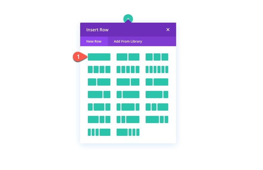
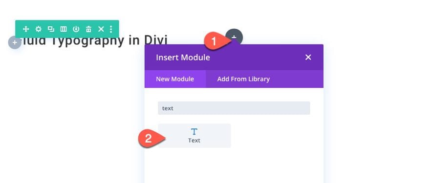
To start, add a one-column row to the section.
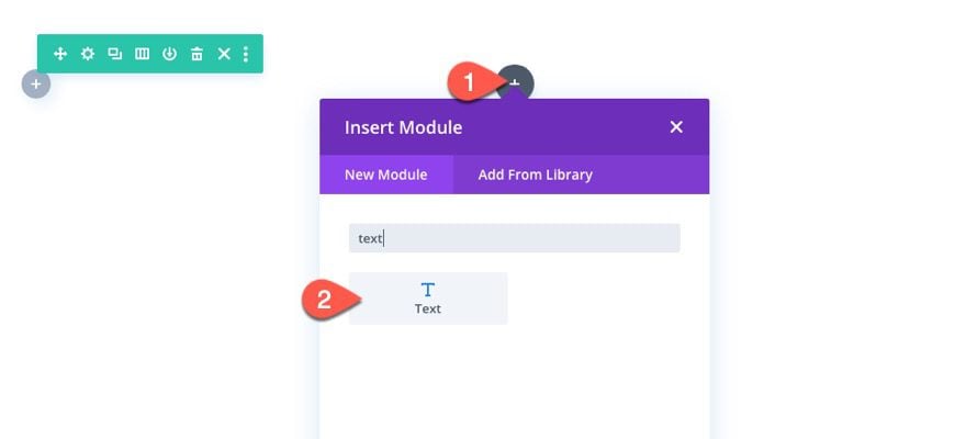
Then, add a new text module to the column. This will be used to text fluid typography on an H1 heading.
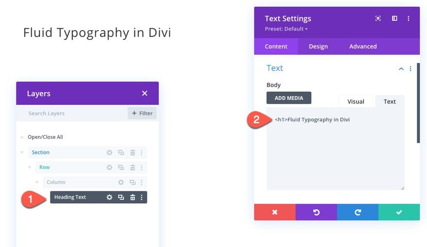
Add an H1 heading to the body content of the text module.
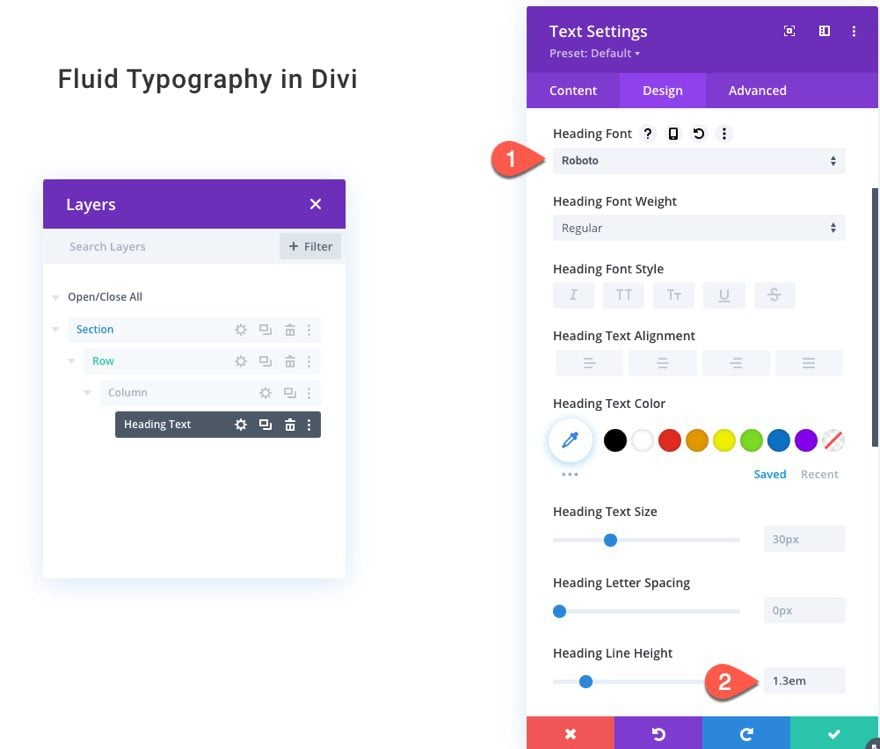
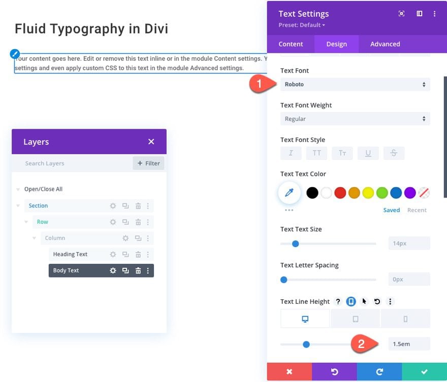
Then update the design as follows:
- H1 Heading Font: Roboto
- H1 Heading Line Height: 1.3em
Next, add a new text module under the previous one. This will be used to test fluid typography on paragraph text.
You can keep the default mock body content for our testing purposes. Under the design tab, update the following:
- Text Font: Roboto
- Text Line Height: 1.5em (desktop, 2em (phone)
That’s it! We will use this entire section, including the heading text module and the body text module, as a template to jumpstart each of our example builds in the next part of the tutorial.
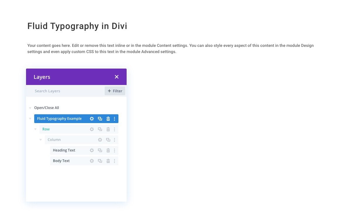
Using the Template
If you plan to build each example, you may want to save this section to the Divi library so that you can add it back to the page after each build. Or you can simply duplicate the section before each new build.
Now let’s take a closer look at those fluid typography methods and then use them in Divi.
6 Methods for Creating Fluid Typography and How to Use them in Divi
#1 Using a VW Length Unit for Font Size (useful but limiting)
Using the vw length unit for font size is a key ingredient to fluid typography because the vw length unit is relative to the viewport (or browser width) so it will increase and decrease as the browser width changes. However, using the vw length unit for font size alone does not give you any control over the min or max font size. This means the font size will continue to scale with the browser (or viewport) width without limitation. As a result, you can easily get text that is way too small on mobile and way too large on big monitors.
However, using a vw font size by itself can work perfectly in some instances. For example, if you are wanting to display a fluid heading for your site, you can simply assign a vw length unit as the font size (something like font-size: 5vw). However, you must make sure the container wrapping the heading text has a width equal to the width of the browser window. So, if you were to use this in Divi, you must make sure the section, row, column and module will have a width of 100%.
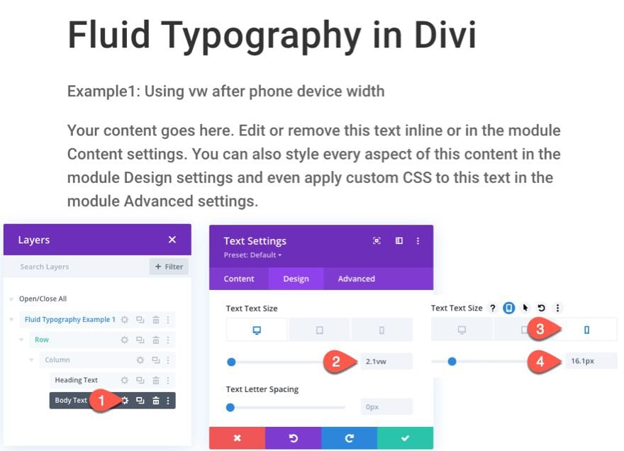
Divi Example 1: Using the VW length unit After Phone Width to Create Fluid Typography in Divi
Here’s how to use this method in Divi.
The Heading Text
Using the layout template we built earlier, open the settings for the heading text module (the one that includes the H1 heading) and update the following:
- Heading Text Size (desktop and tablet): 5vw
- Heading Text Size (phone): 38.35px
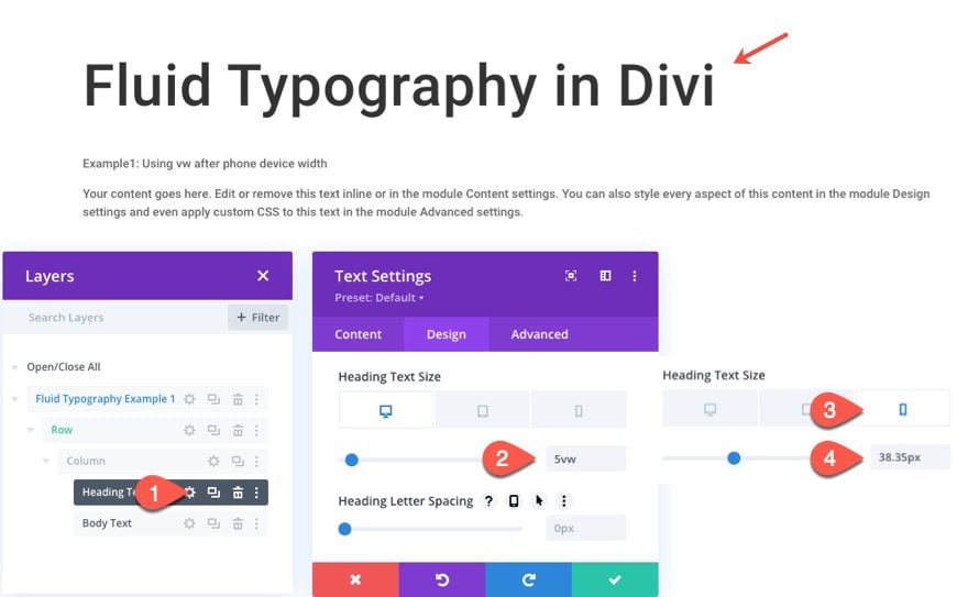
The odd px value for the heading text size on phone is actually calculated based on the 5vw used. The actual breakpoint where phone display turns into tablet display is at 767px. And 5% of 767px is 38.35px. This gives me the exact size of the font needed at the breakpoint so there will be no jumping in font size on the transition.
Once the heading text size is set, save the module.
The Body Text
Open the setting for the body text module and update the following:
- Text Text Size (desktop and tablet): 2.1vw
- Text Text Size (phone): 16.1px
Example 1 Result
Here is a preview of the result when adjusting the width of the browser window (or viewport).
Notice that the min font-size is 16.1px on phone display and then once it gets to the 767px tablet breakpoint, the 5vw font-size kicks in and continues to font-size continues to scale with the browser.
Main Limitation
If you have a font size with a vw length unit inside a container that has a max-width of 1080px, the font will continue to grow with the browser width while the container stays at a 1080px width which will lead to some design inconsistencies (like having really big text in a small row on large monitors).
#2 Using Calc() and VW Length Unit for Font Size
Using the calc() CSS function to calculate a font-size value with a vw length unit will allow you to designate a min font size while also allowing the text to scale with the browser window using the vw length unit. The limitation is that there is no max limit so although you have solved the min font size problem, you still may find the text getting too uncontrollably big on large monitors.
Divi Example 2: Using a Calculated VW Length unit to Create Fluid Typography in Divi
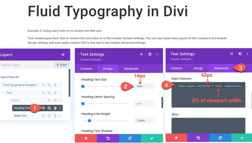
The Heading Text
Starting from a fresh version of the layout template we built originally, open the setting for the heading text module.
Then update the heading text size:
- Heading Text Size: 1em
Then head over to the advance tab and add the following custom CSS to the Main Element:
font-size: calc(3em + 2vw) !important
The em length unit is relative to the element’s font size. So we give the heading text size a value of 1em which is relative to the font size set for the body text of the module which is 14px by default. So that means in our calculation, 3em is 3 times 14px which is 42px. This font-size calculation value gives you more control over starting font-size by adding 2vw to the font-size which is 3em. This will make the text fluid while also making sure the font will never get smaller than 3em.
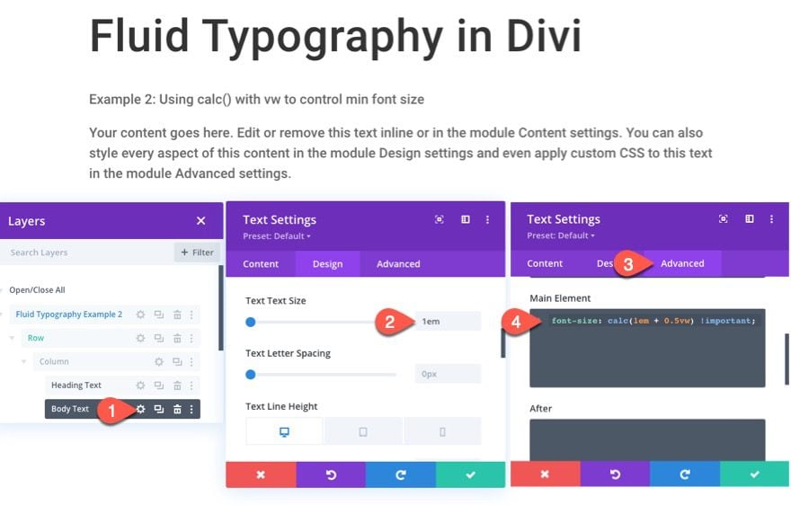
The Body Text
Next open the body text module and update the text size:
- Text Text Size: 1em
Then add the following CSS to the Main Element:
font-size: calc(1em + 0.5vw) !important
Example 2 Result
Here is a preview of the result when adjusting the width of the browser window (or viewport).
#3 Using Divi’s Built-in Responsive breakpoints with calc(), and vw for Fluid Font Size on Tablet Display
With Divi, breakpoints are predetermined (built into the theme). But we can still target each of these breakpoints using the built-in responsive tabs for desktop, tablet, and phone displays. This will allow us to add a min font size on phone display, a fluid font size on tablet display, and a max font size on desktop display.
Here’s how to do it.
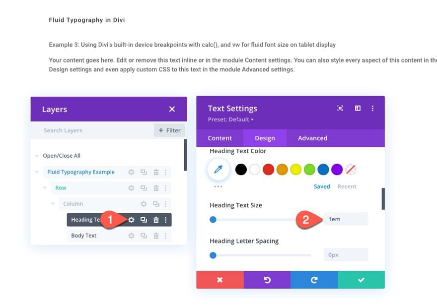
Heading Text
Using a fresh layout template, open the heading text settings and update the heading text size:
- Heading Text Size: 1em
Under the advanced tab, add the following custom CSS to the Main Element:
Desktop
font-size: 80px;
Tablet
font-size: calc(40px + 40 * (100vw - 767px)/213) !important;
Phone
font-size: 40px;
This will set a min font size of 40px on phone, a fluid font size on tablet, and a max font size of 80px on desktop.
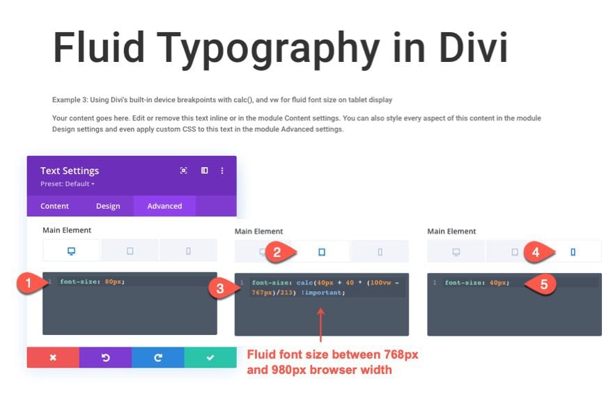
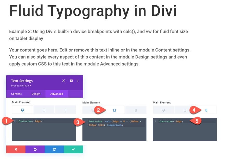
Body Text
Next, open the body text module settings and update the body text size:
- Text Text Size: 1em
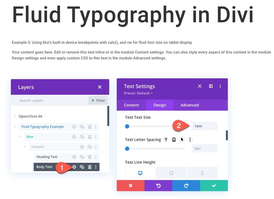
Under the advanced tab, add the following custom CSS to the Main Element:
Desktop
font-size: 24px;
Tablet
font-size: calc(16px + 8 * (100vw - 767px)/213) !important;
Phone
font-size: 16px;
This will set a min font size of 16px on phone, a fluid font size on tablet, and a max font size of 24px on desktop.
Example 3 Result
Here is a preview of the result when adjusting the width of the browser window (or viewport).
This method is really just a warmup for the next method because it limits the fluid font size on Divi’s built-in tablet breakpoints (between 767px and 980px), but it is helpful for getting a fluid font size on tablet display in Divi. It also introduces the idea of how you can add a fluid font size at certain breakpoints which we will explore further in our next method.
#4 Using Custom Media Queries with calc(), and vw for Fluid Font Sizing at Custom Breakpoints.
For a more customizable and complete fluid typography solution, we must add some custom breakpoints (using media queries) that will extend the area that we want to engage our fluid font size to whatever we want. This will allow us to set a min font size at a small breakpoint (like 480px width) and a max font size at a large breakpoint (like 980px). Then we can use the middle area between the small and large breakpoints to give the font a size that is fluid using a calculation that incorporates the vw length unit. The trick is to use the right calculation in the middle area so that the font size starts becoming fluid (or scaling with the browser width) at the min font size (set at the small breakpoint) and stops at the max font size (set at the large breakpoint). For more info, check out the post on fluid typography by CSS Tricks.
Here’s how to do it.
Using a fresh layout template, open the settings for the heading text module and give a custom CSS Class:
- CSS Class: fluid-text
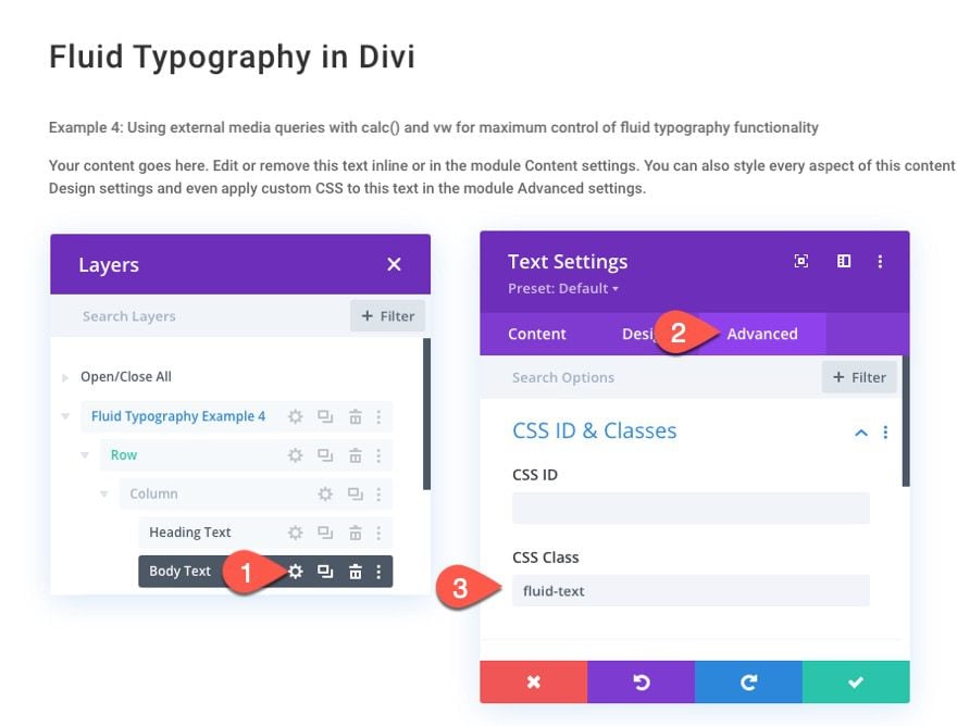
Next, open the body text module and give it the same CSS Class:
- CSS Class: fluid-text
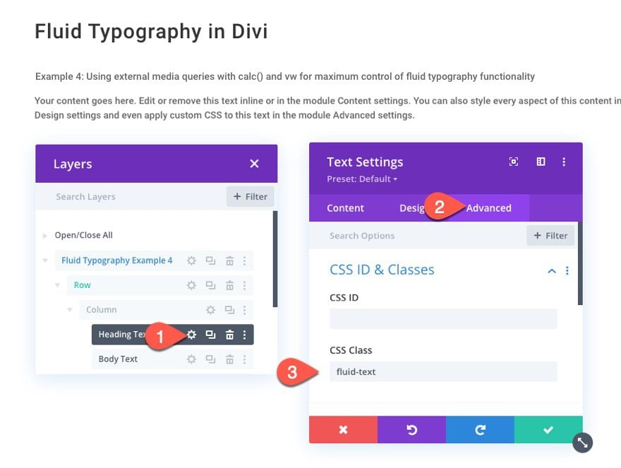
Add a code module under the body text module.
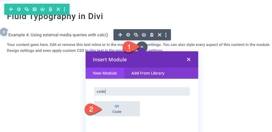
Then open the settings for the code module and paste the following code inside the code box making sure to wrap the code in the necessary style tags:
.fluid-text h1 {
 font-size: 3em !important;
}
.fluid-text p {
 font-size: 1em !important;
}

@media all and (min-width: 480px) {

 .fluid-text h1 {
 font-size: calc(3em + 40 * ((100vw - 480px) / 500)) !important;
 }
 .fluid-text p {
 font-size: calc(1em + 10 * ((100vw - 480px) / 500)) !important;
 }
}

@media all and (min-width: 980px){
 .fluid-text h1 {
 font-size: calc(3em + 40px) !important;
}
 .fluid-text p {
 font-size: calc(1em + 10px) !important;
 }
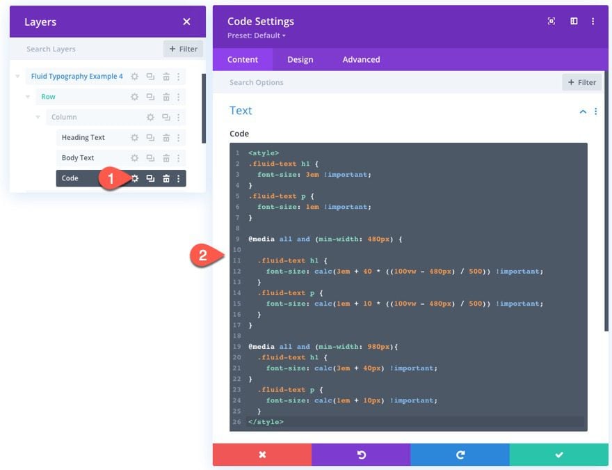
This will give our heading (.fluid-text h1) a min font size of 3em on a screen size below 480px, a fluid font size between 480px and 980px, and a max font size of (3em + 40px) above 980px.
You don’t have to use em length units for the size but I did for this example because it does give you the added bonus of being able to change the font size of the heading and body text using Divi’s built-in text size option, instead of having to update the custom CSS code in the code module.
For example, to adjust the size of the heading text on the heading text module, simply update the body text size (not the heading text size; em is relative to the body text).
To update the body text module body text size, you can simply adjust the body text size in the module as well.
Example 4 Result
Here is a preview of the result when adjusting the width of the browser window (or viewport).
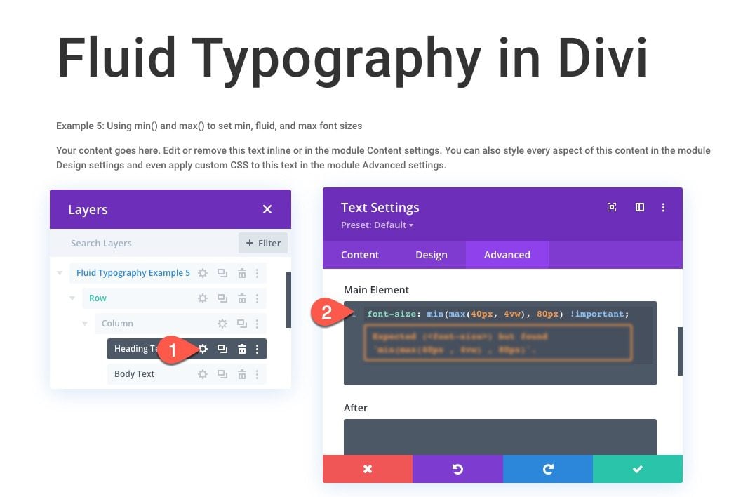
#5 Using min() and max() to Create Fluid Typography in Divi
In addition to calc(), more advanced math functions have been introduced that simplify how we create fluid typography in CSS. These include the min() and max() functions.
On the plus side, creating fluid typography using the min() and/or max() functions to generate font-size is a much simpler solution that doesn’t require media queries. Using basic math, you can establish min font size, a max font size, and a fluid font size that scales between the min and max.
Let’s see this in action using the Divi Builder.
Heading Text
Using a fresh template layout, update the heading text module settings as follows:
- Heading Text Size: 1em
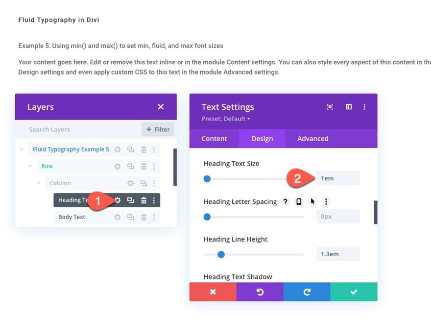
Under the advanced tab, add the following CSS snippet to the Main Element:
font-size: min(max(40px, 4vw), 80px) !important;
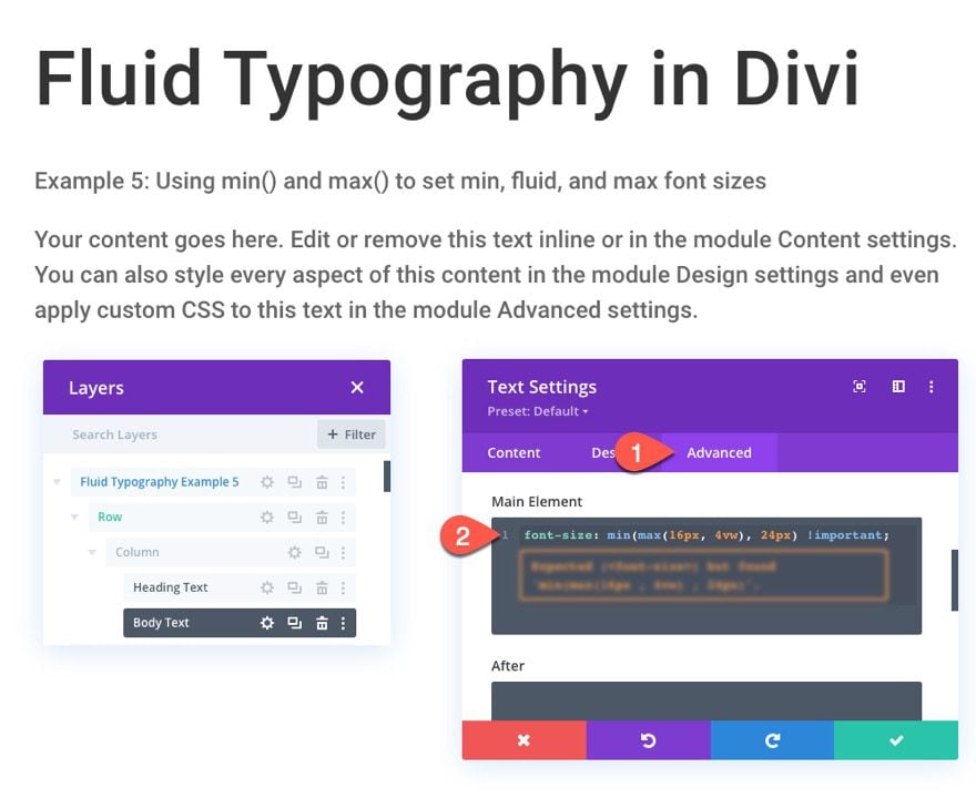
Body Text
Next, open the body text module settings and update the following:
- Heading Text Size: 1em
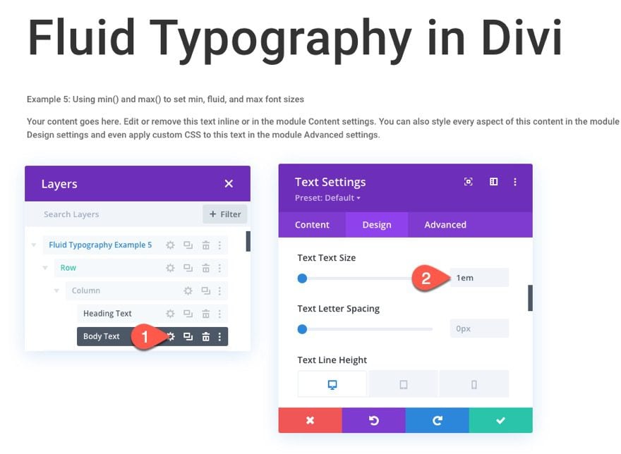
Under the advanced tab, add the following CSS snippet to the Main Element:
font-size: min(max(16px, 4vw), 24px) !important;
This will assign a min font size of 16px, a fluid (or scaler) font size of 4vw, and a max font size of 24px. The 4vw font size will kick in whenever that value falls between the min and max values.
Example 5 Result
Here is a preview of the result when adjusting the width of the browser window (or viewport).
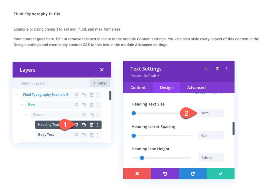
#6 Using clamp() to Create Fluid Typography in Divi
If the min() and max() functions aren’t simple enough for you, then you might as well use clamp(). It is extremely easy to use, understand, and, in my opinion, more intuitive than using min() or max(). The clamp() function has everything we need in one place, a starting point to set the min font size, a middle area to place to set the fluid font size, and an ending point to set the max font size. These three parameters are a perfect solution for fluid typography.
Now let’s see how easy this is to use in Divi.
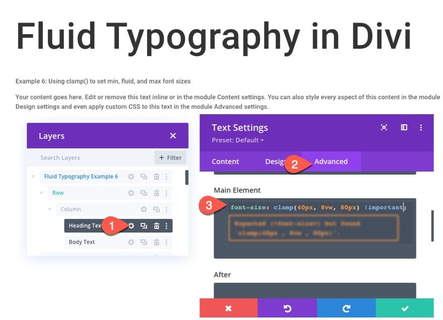
Heading Text
With a fresh layout template, open the heading text module and update the heading text size:
- Heading Text Size: 1em
Under the advanced tab, add the following CSS snippet to the Main Element:
font-size: clamp(40px, 8vw, 80px) !important;
This will set a min font size of 40px, a fluid font size of 8vw, and a max font size of 80px.
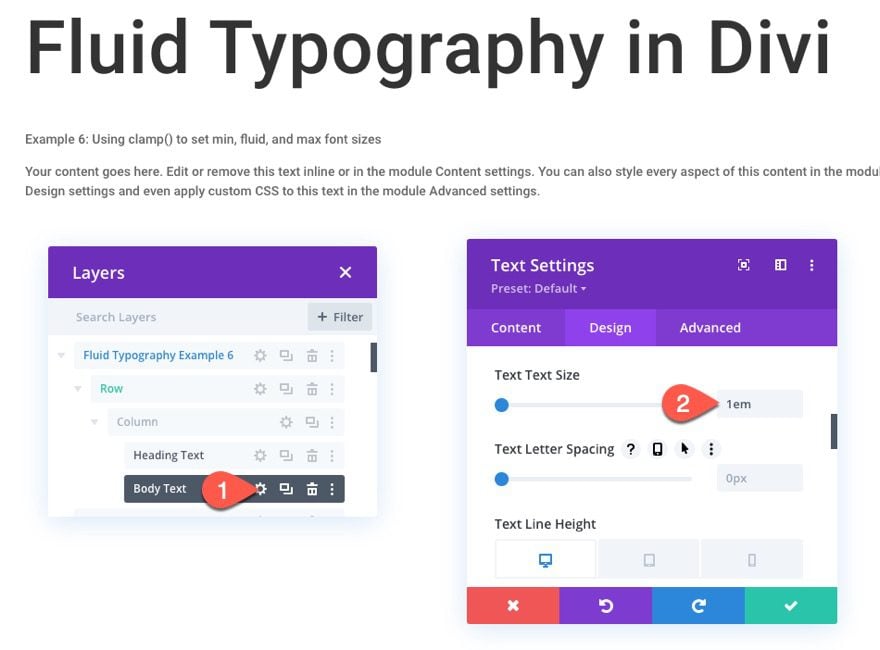
Heading Text
Next, update the body text module text size as follows:
- Text Text Size: 1em
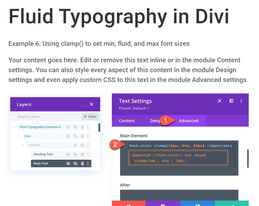
Under the advanced tab, add the following CSS snippet to the Main Element:
font-size: clamp(16px, 4vw, 26px) !important;
This will set a min font size of 16px, a fluid font size of 4vw, and a max font size of 26px.
Example 6 Result
Here is a preview of the result when adjusting the width of the browser window (or viewport).
Browser Support
For the most part, the fluid typography solutions in this article are supported by most browsers. All browsers (even IE) seem to support calc() in CSS, but Safari seems to be a little buggy in that it doesn’t scale when adjusting the browser but will show the correct size on page refresh (weird). However, this bug seems to be solved using custom media queries as we did in method #4 above. The min() max() and clamp() functions (featured in Methods #5 and #6 above) are surprisingly well supported. But they also seem to have the weird safari bug and aren’t currently supported by IE.
So if you are looking for a clear winner on browser support, I guess method #4 is probably the best so far. But if you don’t mind leaving IE in the dust, using clamp() for fluid typography is an amazing solution!
Final Thoughts
Creating fluid typography in Divi has a bit of a learning curve, I’ll admit. However, the benefits of having a fluid font size can be crucial to the overall design of your website. Plus, it takes out the headache of adjusting the font size using a ton of media queries to get it just right for every device. Hopefully, these methods will help you create fluid typography on your own Divi project.
I look forward to hearing from you in the comments.
Cheers!


Hi…
It’s a good tool, but sometimes we have this:
TESTIMONIA
LS
because the fluid method… often in titles.
What can I do to solve this?
Leo, I’m having the same problem, and can’t find a fix anywhere. Hopefully someone from elegant will reply?
Hello
Whenever I am using max(), min() or clamp() on the page CSS divi throws the following warning (example for clamp()):
“Expected … but found ‘clamp …'”
Is there any way to get rid of that? It makes the code hard to read.
Thanks
Blake
The warning you’re encountering is likely due to CodeMirror that WordPress utilizes for its CSS editor. CodeMirror is the underlying code editor library that powers the WordPress Customizer’s Additional CSS feature and other CSS editing functionalities within WordPress. You can consider using a child theme for your custom CSS. This allows you to bypass the editor warnings since you’ll be adding your CSS directly to a stylesheet file rather than through the WordPress Customizer.
Awesome guide on Fluid Typography thank you!
Hi there,
This tutorial is fantastically structured and very clear !
Sorry if the question is very elementary, but I cannot seem to get the three responsive buttons under the Text Heading section (you know the buttons that look like a PC, a tablet and a phone) ? I just have the sections like “Heading Text Size” or “Heading Line Height”, but without these buttons.
Is there something I should do to display them?
Yes – Hover over the words ‘Heading Text Size’ and you’ll see a row of icons appear as follows…
info | responsive options | hover options | revert | extend options
You’ll also see a ‘pin’ here if the row or section are ‘sticky’
Compared to everyone else here, I’m a novice. I’ve only recently been trying to learn responsive design and it’s been a struggle…especially the TEXT! The format you used in this tutorial was exceptionally effective for me, (e.g. replicate this and here’s how). Building a demonstration page that I can access on my personal site for learning Divi is how I intend to start. One of your other tutorials, “A Guide to Understanding and Applying CSS Length Units in Divi” I’m still struggling with, but I will try to build my own demo page of it using this one as a model. I’ll save some of these text modules to my library, and when I need a text module, I can just import one with all your code in place. Thanks, Jason, for this very necessary tutorial!
Can this be or has anyone been able to implement this globally with out having to add a class to every single page or module?
The post was helpful. keep up
Thanks, James. Will do!
I’d like to know the same as Yvonne and Stephanie. Is there no way to set the clamp css code universally throughout the site. Having to add the code to every single text module seems vastly counterproductive.
Is there no way to set responsive scale points for h1, h2, h3, p or body text, without the need to add css to every module on the site?
I find it much easier to style all my text with headings tags in a single text box.
Can you explain how this calculation is made “font-size: calc(40px + 40 * (100vw – 767px)/213) !important;”
Alan,
I’ll try by explaining what each value represents in the calculation:
Together the equation picks up the min font size (40px) at 767px and scales it fluidly until it reaches the max font (80px) at 980px. Like I mentioned in the post, this really only generates fluid typography between Divi’s phone and desktop breakpoints which is only 213px so if you want a greater area where the text is fluid, you will need to resort to methods 4-6.
Also, this post may help you understand the equation a bit more… https://css-tricks.com/snippets/css/fluid-typography/
What a great tutorial – this must be the most useful and practical tutorial for a long while.
Much appreciated Jason.
… there’s nothing to add to that.
Thanks, Brian. Glad you found it so helpful!
same question as Stephanie and Yvonne…
Great Article!!! Thanks a lot!
thanks for posting informative post
Thank you, that’s a very good explanation of all possible ways to make it responsive!
One question though. I your examples you use a different piece of css for H1 and the body and in the modules you set the site of each to 1em. You then have to repeat for h2~h6 and always change the actual values in the css in stead of in the body.
Would it not be easier to have a single line of ccs and vary the ’em’ value in the Divi modules? Like:
font-size: clamp(16px, 4vw, 26px) !important;
Then in the modules
– 1em for the body
– 2em for H1
– 1.8em for H2
– etc.
The main reason for keep the heading text module separate from the body text module is because the min and max font values (in clamp()) will probably be considerably different. Remember that the font size using the clamp() function in the main element css of the module is actually setting the base (or root) font size of the module (which is the body font). So if you declare that function to have a max font size of 26px or 2em in the clamp function, you will not be able to get the font size range or fluid font range you would like for a heading. Hope that makes sense.
One thing I am wondering is, does the clamp css (or any of the other options) require you to use 2 (or more) modules to separate out the header/sub header/body texts? Does that require further css or classes to be set up – to have for eg h1, h3, para – all in one module and responding fluidly?
yvonne,
This is a great question and one that should be explored. It may be possible but not quite sure yet how to get the range (min to max font size) you need both for headings and paragraph text when using a single clamp function as the base font size on a single module.
I was thinking the same thing. Since I have different modules of text in my site. Some just a header, others will have text with or something above them. If you can make it just one single CSS rule you can paste it in your childtheme and all other sizes (the customer also uses) will be ruled out as well. Something like:
h1 {
font-size: clamp(2em, 4vw, 3em) !important;
}
h2 {
font-size: clamp(1.8em, 3.3vw, 2.8em) !important;
}
h3 {
font-size: clamp(1.6em, 3.0vw, 2.6em) !important;
}
h4 {
font-size: clamp(1.6em, 3.0vw, 2.6em) !important;
}
p {
font-size: clamp(16px, 3vw, 18px) !important;
}
Stephanie – It seems to me that none of us want to have to put the clamp() CSS in each and every module and then have separate text modules for h1,h2,p etc. I’ve tried to make clamp() work but the Divi seems to have built in code to change the font sizes depending on the viewport. However initial experiments seem to work okay if I put your code into the Page Custom CSS. It got overridden if I put it in the child theme CSS. It gets incredibly confusing if you have also entered different values for Desktop|Tablet|Mobile in the module settings!!
Stephanie, did you try this in the global CSS settings to see if it works?
Thanks for this tutorial. I ran through all the examples, like the simplicity of the clamp css. Pretty sure IE doesnt even exist anymore, its called Edge now and is only 3% of the browser market. I tried clamp in safari and when scaling the window, nothing scaled down at all, but when using dev tools it was working perfectly.
Great, the clamp () option seems to be the best. IE still exists ???
Thanks for this, Jason. It’s exactly what I was looking for.
If I’m reading the tutorial correctly, these would be set on a case by case basis. I’m assuming that these settings can be applied globally but I wonder if you can speak to that at all.
As a side, I foresee Fluid typography as being the standard moving forward. Are there any plans to implement fluid typography system-wide through a Divi setting?
Interesting info… I don’t know about clamp()… was always using media queries and vw…
Okay got a question… I build sites for clients that are accessed by phone around 45-50% of visits, and about 40% computer & 10% tablet views. They’re just simple data sites, no e-commerce or long forms with small field text or anything like that. Given that parameter, which of the 6 options would be the way to go?
Thanx
This is going to be so much fun to experiment with – I’ve already tried the first example and it worked great. The container size limit will be a problem for me, though, so I’ll be working through the other examples to see which one suits my site best. Thanks for the great ideas on how to implement fluid typography in Divi!
Good stuff. So my question is, is this intended to illustrate several techniques, and we choose the one that best fits our preferences and workflow? Or are there different scenarios where one or two of these techniques may be more appropriate than the others?
Great question. I probably should have been more clear about that. Basically, these are all the methods I could find currently that will accomplish fluid typography. To your first question, yes, it is intended to illustrate the techniques available. And to the second question, yes, there are scenarios where you would want to use one over the other. For example, method #4 using custom media queries can give you easier control over when you want the min or max font size to kick in. However, using clamp() is much easier to implement fluid typography in general.
In short, methods 1-2 both have no limit on the max font size so the type will continue to scale (this is limiting for most cases). Method #3 is effective but only for a small area in tablet display. Methods 4-6 are the best complete solutions and all can do the same type of fluid typography, but #4 is more complex (yet slightly more browser-friendly) than #5 and #6.
Awesome, thank you for that.
I like the last option using clamp the best but will explore the others as well.
I know right!? What’s not to love. The only issue I see is the lack of support on IE currently.
Creating typography has been made very easy with Divi theme. This is the best theme online
I have been using Divi theme for some time now and I Mus confess, they are the best in the mark