
When designing a website with Divi, you have to make a lot of decisions that have to do with size. This could be the width of a row, the size of a font, or how much padding to add to a module. And to make things more challenging, we must decide on sizes appropriate for all devices.
In the world of CSS, the size (or length) of an element is expressed by length units. Length units are small letters/symbols that follow a number value (10px, 2em, 100%, etc.) to establish the length of an element.
We use length units all the time. And even though Divi has made the process a lot easier, length units are still very much a part of the everyday business of designing a website. That’s why today I’m going to attempt to give you a guide that will help you understand and apply the right length units with Divi.
In this post, I will be addressing the following elements that use a length unit value:
- Width
- Margin
- Padding
- Border
- Text (font size, letter spacing, line height)
Quick Overview of Length Units
Length units are often separated into two main categories: absolute and relative.
Absolute Length Units
Absolute length units are considered absolute because they are not relative to any other element. These units will not scale to browser size and will always remain the same size. These include the following:
pt – points
px – pixels
in – inches
cm – centimeters
mm – millimeters
pc – picas
Pixels are really the only absolute CSS length unit we should consider using for the web. The others are mostly used for physical (not digital) measurement (like print). A pixel unit refers to the size of one “dot” of your device display (which will vary slightly with each device). Because of this, pixels are commonly used for things that don’t necessarily need to scale with browser sizes.
Relative Length Units
Relative Length units are considered relative because they change/scale depending on the length of other elements. One common example is percentage, which is dependant on the length of the parent element.
em – relative to the element’s font-size
rem – relative to the root element’s font-size
vw – relative to 1% of your browser’s viewport width
vh – relative to 1% of your browser’s viewport height
vmin – relative to 1% of the smaller of the two browser viewport dimensions (height or width).
vmax – relative to 1% of the larger of the two browser viewport dimensions (height or width).
% – relative to 1/100 of the parent element’s width.
All of these units are used for the web. For this post, I won’t be concentrating on rem, vmin, or vmax because they are less common and do not work as well with Divi. Although I would love to hear suggested use cases.
Divi’s Box Sizing
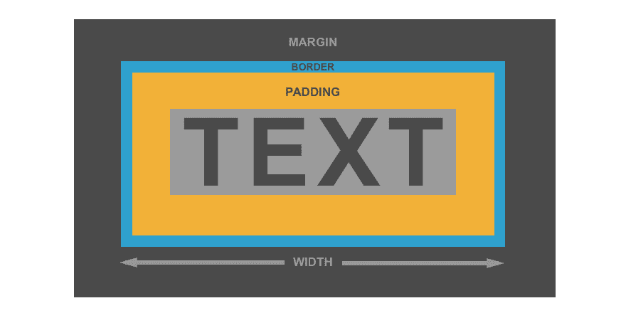
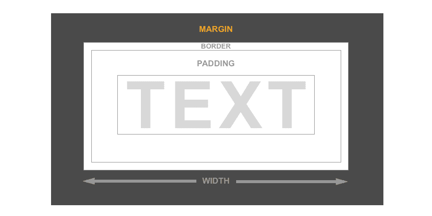
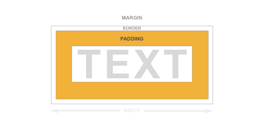
Divi determines box sizing with the border-box CSS property. This basically means the width and height of a section, row or module is determined by the sum of its content, padding and border. If you have built websites with Divi, you already know how this works. Think of a row as a box.
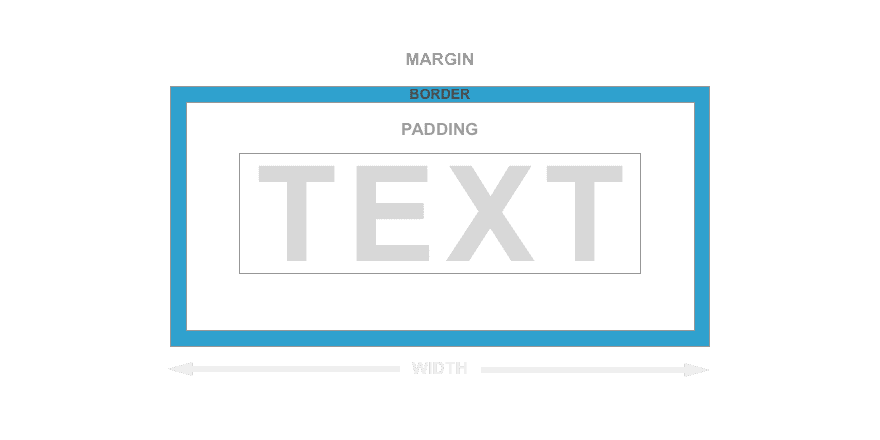
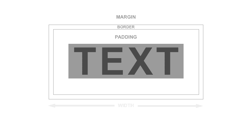
Let’s say you create a row that has a width of 1000px. Adding content to the row (like other boxes/modules) will not change the width of the row. Adding padding to the row will not change the width of the row either but will be applied inside the box. If you add a border to the row, the border will also be applied inside the box and will not affect the set width. In other words, adding 50px of right and left padding will not result in a 1100px row just as adding a 10px border around your row will not make your row 1020px wide. The only thing that will change is the height as you add more content padding or border. Margin is what adds space outside of the box and is what is used to separate boxes (sections, rows, and modules) on the page.
I mention this because it is helpful to understand the building block (or boxes) of how Divi works so you can know what adding length unit values (30px, 5em, 50% etc.) to elements on your page actually does.
Width
Suggested Length Units: %, vw, and px (as max width)
The width property uses length units to set the width of an element.
Divi allows you to easily adjust the width of any section, row, or module.
Using px for Width
Rarely should you ever set an element to a pixel width, unless you plan on adjusting that width at the necessary breakpoints for mobile. This is simply not good practice in the world of responsive, adaptive, and fluid design. It is useful, however, to set a max width using a pixel value, as long as the width is set to a percentage. More on this later.
Using % and px to Adjust Max Width for Responsive Design
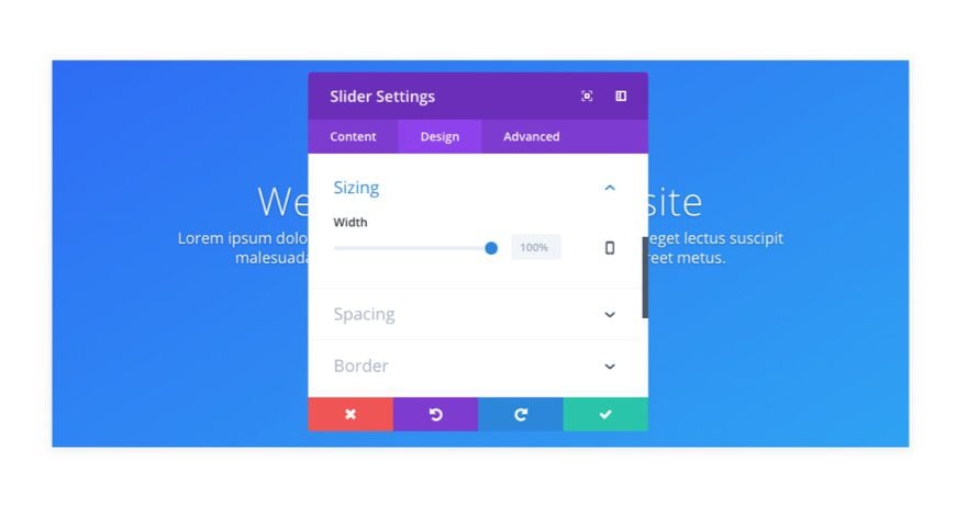
As you know, Divi allows you to adjust the width of any module, row, or section. This width will be adjustable by a percentage unit by default, but you can enter a pixel unit value as well. But the width value set is technically the max width. The actual true css width is 100%. All sections, rows, columns, and modules are inherently 100% in width because they are all built using the div block element. And block elements always span the full width of the container (100% width).
What do you know… Divi is built with Divs.
Here is a little test. Let’s update the module width to 1000px for this text module in the left column. I’ve given the module a gray background for easy recognition.
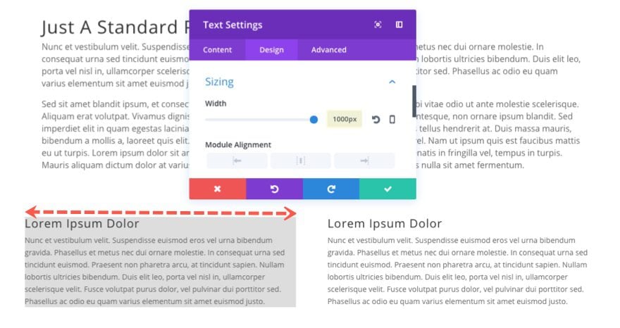
Notice that it doesn’t actually go the full 1000px because this is technically a max width. However, if I wanted to override the default 100% width and declare an actual width of 1000px, I could go over to the advanced tab and set the main element to have a width of 1000px.
Now look at the module.
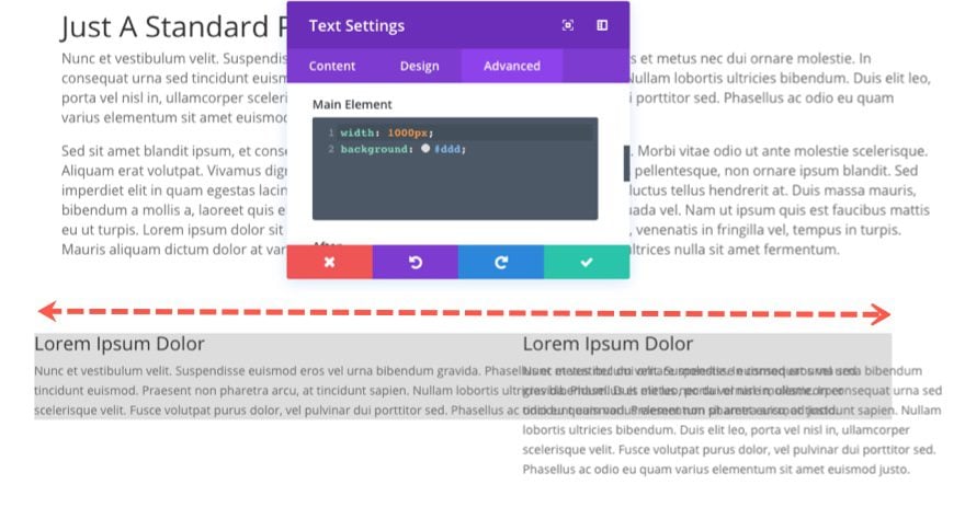
The problem is that you are using an absolute value surrounded by elements with relative values. So even if you shrink your browser, the module will remain 1000px.
This is why Divi adjusts the max width of your elements instead of the actual width.
It is common to use pixels in combination with relative length units (like percentage) in order to build responsive sites. Divi uses this method to set the content width for all of your pages. If you go to Theme Customizer > General Setting > Layout Settings you will see the main content width is set to 1080px.
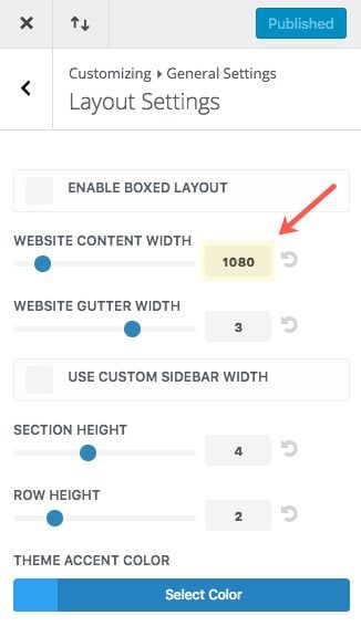
The 1080px is actually the max width for your content. The actual css width is 80%. That is why when you increase the width of your browser, the content width will stop expanding at 1080px. And if you shrink the browser width below 1080px, the content will continue to scale according to 80% of the parent element.
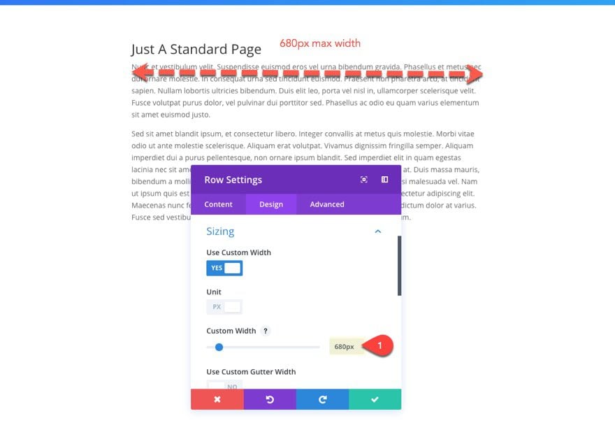
Adding Custom Width Values in the Divi Builder
When using the Divi builder, your rows are considered the website content and will inherit a default setting of 80% width and 1080px max width. If you change the width of a row using the Divi Builder by setting a custom width, the new width value will be a max width regardless if it is set as a percentage or a pixel value.
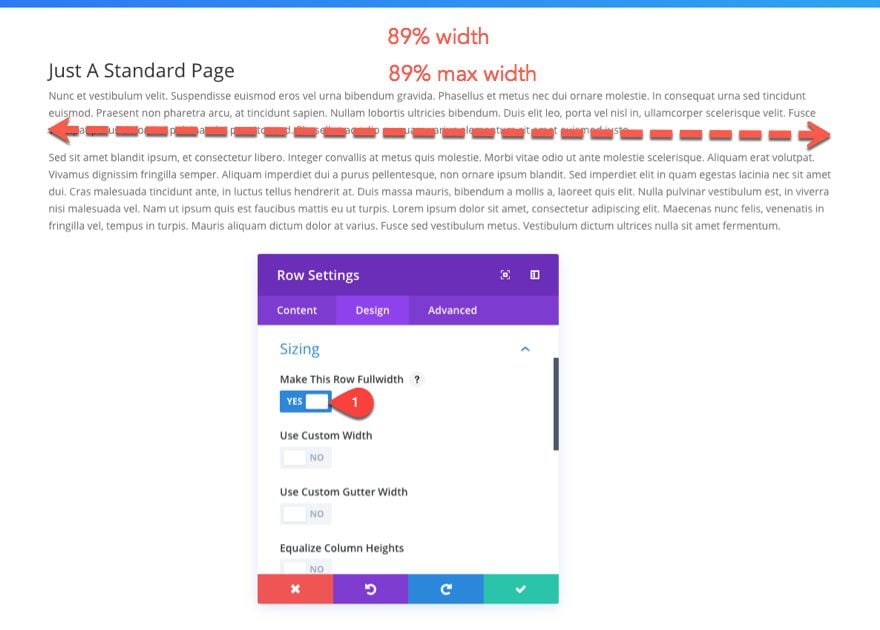
If you change a row to be fullwidth, both the width and the max width is set to 89%. This means that the row will always have a with of 89% of the parent element (the section) which is 100% of the browser window.
In short, the Divi builder is smart enough to automatically use max width when adjusting the width of your sections, rows, or modules.
Using vw to Adjust Width
Viewport Width (vw) is very similar to the percentage value. The difference is that the vw value is always relative to the browser viewport/window width. The percentage value is always relative the the parent element. Be careful of setting your sections to 100vw (in custom css) because this can cause some problems with extending past the scrollbar that shows up when scrolling down the page.
Since Divi is built on percentage widths, unless you are creating a special design that requires vw, I would stick with percentage values.
Margin
Suggested Length Units: px, %, and vw
The margin property uses length units to add spacing outside of the element. It is also useful for positioning an element using positive and negative values.
Divi allows you to adjust the margin of any section, row, or module.
Using px for Margins
Using pixels for margins and/or padding is fine as long as you understand that those length values will not adjust with your different screen sizes unless you assign specific length values for different screen sizes.
Avoid using pixels for left or right margin
In general, you will want to avoid using pixels for adjusting margins, especially for left and right margins. Having an absolute length for margins will not scale properly with your content and will ultimately leave you with more or less margin than you want on certain browser widths. There are exceptions to this where you will want to have absolute margins for design purposes. Just make sure that you adjust the margin length for mobile devices when needed.
Using pixels for top and bottom margin
There are times when using pixels for margin is quite useful. For example, if you are wanting to move an element up or down on a page, giving the element a positive or negative pixel value will allow you to move that element in a precise location vertically. If you were to use a percentage for this, the element will move up or down as you change the browser width.
Using Percentage for Margins
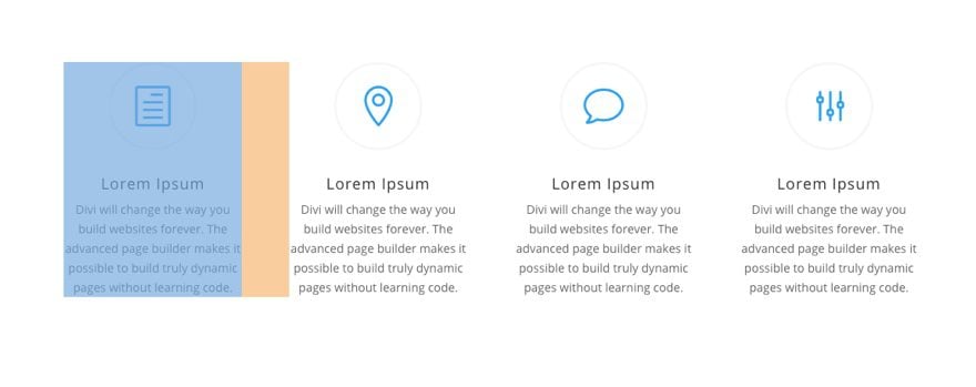
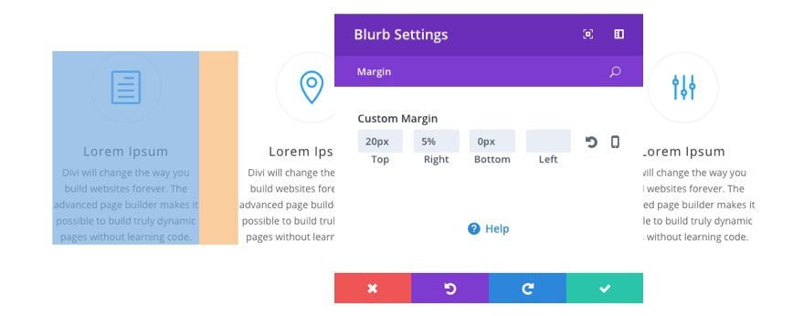
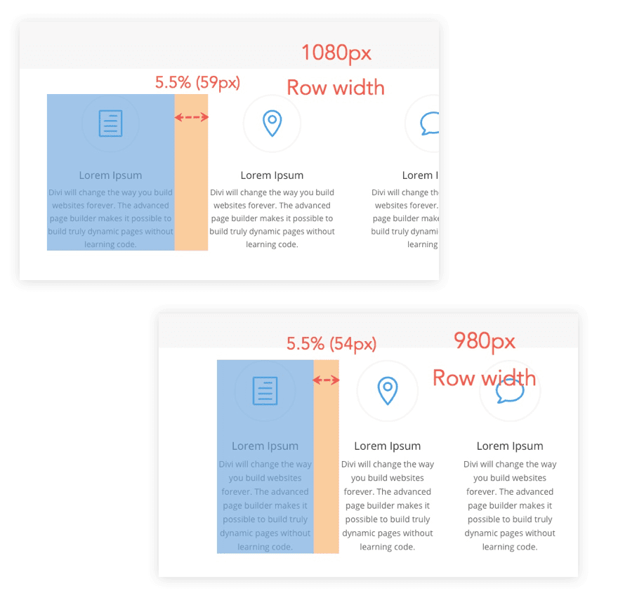
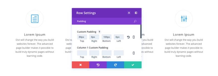
Using percentage for margins is a great way to build sites that are responsive. As mentioned earlier, percentage values are relative to the length of parent elements. Divi uses percentages for right margin to create space between columns. This margin percentage is easily adjusted by changing the gutter width within the row settings. Gutter width is basically the percentage of margin you want between your columns.
With gutter width set to 3, the margin between columns is 5.5%. Notice how the space scales when adjusting browser width.
So if you ever need to adjust a right or left margin of a module, keep in mind that it will be best to use percentages in order to keep things scaling appropriately.
Use Percentage Margin for Positioning Objects Horizontally
Sometimes certain creative designs call for moving objects from left to right to overlap objects or to create asymmetrical designs. In this case you can use a negative percentage value for a right or left margin. This will move the object over but still adjust to browser widths.
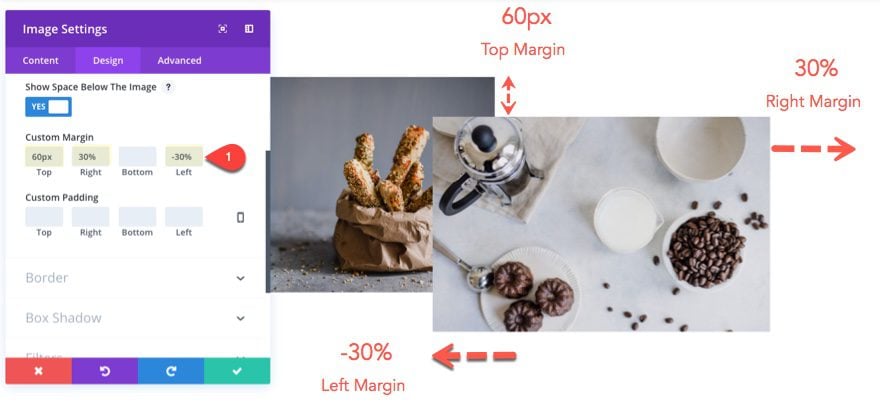
Here is an example of using percentage values to overlay an image with another image. Notice the use of percentage values for horizontal positioning and the use of pixels for top and bottom positioning. This is because the percentage value is relative to the width of the parent element (the column). So if you were to put a 30% top margin, the image would move up and down as the column width changes. That is why in most case you will want to position vertical elements with an absolute length value like pixels.
Using vw and vh for custom Margin
Like percentages, the vw and vh length units can be helpful to add margins between sections, rows, or modules in a way that scales with your browser viewport. The difference is that vw and vh are always relative to the viewport size, not the parent element (like percentages).
Padding
Suggested Length Units: px, %, em, vw and vh
Divi allows you to customize the padding for sections, rows, columns, and modules.
Using pixels for Padding
There was a time when I used pixels for padding for pretty much everything. But, I have come to my senses. Like margin, you can use pixels for padding if you want to have an absolute length of padding no matter what the browser size may be. But generally, padding should scale to the size of the browser. So instead, I would suggest using percentages for padding.
It is common in responsive web design to use pixels for top and bottom padding in order to keep a consistent vertical spacing between elements while the width of the browser changes. Divi does this for Sections and Rows. Depending on the section or row height you select (1-10) under the Theme Customizer, your section and/or rows will have a greater or lesser top and bottom padding.
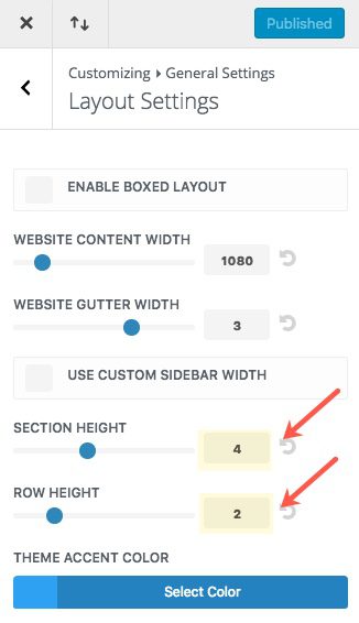
But if you look at the CSS, you will notice that the top and bottom padding is set to a percentage value at a certain breakpoint and a pixel value for others. For example, if you leave the default section height to the value of 4, on larger screen widths (greater than 1350px), the top and bottom padding will be 54px. On screen widths between 980px-1350px, the top and bottom padding will be set to 4% (which is 4% of the section width). On screen sizes less than 980px, the top and bottom padding is set to 50px. This technique is great for setting a minimum padding value for smartphone and a max padding for large monitors while have the padding scale with the percentage value for devices in between the two extremes.
Using % for Padding
Sometimes it is just a lot easier to use a percentage value (not pixels) for padding in order to keep things scaling nicely without needing to add any additional values at certain breakpoints. And, for those of you interested in keeping important content “above the fold”, using percentages instead of pixels for top and bottom padding will help simplify this process.
Here is an example of a section with a top padding set to 50px. Notice how the same 50px padding doesn’t look as good on smartphones as it does on desktop because there is too much space between the sections.
Here is an example of a section with a top padding set to 4%. Notice how nicely it scales from Desktop to smartphone. In a browser window that is 1920px wide, the top padding is 76px (0.04 times 1920). But when you scale the browser window down to 375px wide, the 4% padding equates to 15px (0.04 times 375).
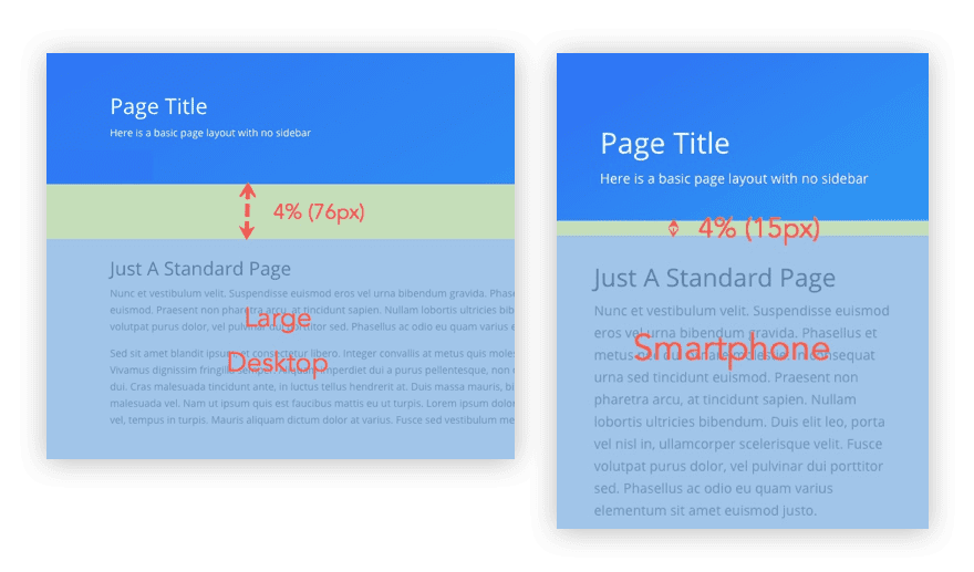
NOTE: It is important to remember that top and bottom percentage values will always be relative to the width of the element, not the height.
Using em for Padding
Using the em length value for padding is suprisingly useful. Let’s say you have a text module with a body text size of 22px for desktop, 18px for tablet, and 14px for smartphone. 1em would be equal to 22px on desktop, 18px on tablet, and 14px on smartphone. Stay with me. Adding a padding of 2em for the text module will adjust according to the text size. On desktop, the padding will be 44px because 2em would be 2 times 22px. On tablet, the padding will be 36px. And on smartphone, the padding will be 28px. This helps to scale the padding according to the font size which works really well for responsive design.
Using vh and vw for Padding
You can use vh and vw for padding in much the same way as you would percentage. The difference is that vh and vw are
always relative to the viewport size. Percentage is always relative to the parent element.
In this example, I took out all the padding from the section and row and gave each text module the following padding:
2vh Top, 5vw Right, 2vh Bottom, 5vw Left
Notice how adjusting the browser height will decrease or increase the top and bottom padding of each module.
Borders
Suggested Length Units: px, em, and vw
Using pixels for borders
Using pixels for borders is fairly common and is recommended unless you want the border to scale according to the size of the parent font size (em), or the browser viewport(vh,vw).
Borders do not support the % unit
You may have noticed in the header above that I didn’t include percentage as an option. This is because the percentage value is not a supported unit for borders. But you can have your borders scale by using the other relative length units (em,vh,vw).
Using em for borders
Using em for borders is similar to the idea of using padding around text modules. The em value will be relative to the parent font size and will adjust as the font size changes.
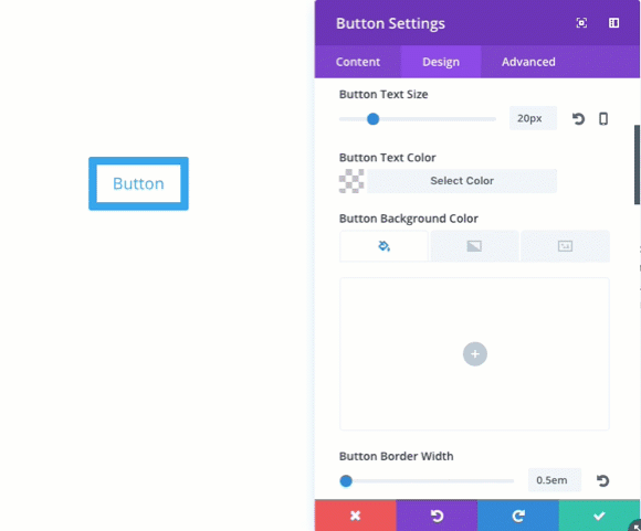
Here is an example of a text module with a border of 1em. I also give the module a padding of 1em. Notice what happens when you adjust the font size. The border (and padding) will change as the font size increases and decreases.
This also works with button borders. Here is an example of a button with a border width of 0.5em. Notice how it scales with the size of the button text.
Using vw and vh for Borders
If you are wanting to scale your border width according the size of your browser viewport, you can use the vw or vh length unit. I haven’t seen this done much, but it is interesting to think about.
Text
Suggested Length Units: px, em, and maybe vw
The Divi Builder Allows you to add custom length values to customize your text. These options include text size, letter spacing, and line-height.
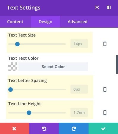
You can use any of the CSS length values for these text options, but for this post I’m going to cover the most common – px, em, and vw.
Using px for Text Size
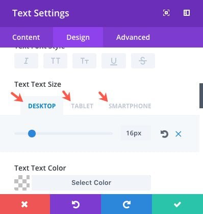
It is common to set your font sizes to a pixel value because you want those sizes to remain consistent. You can still change the font size according to browser width using media queries. Divi makes this really easy to do by allowing you to enter three different device font sizes within all Divi modules.
Using px for Letter Spacing
It is common to use px for letter spacing. Just note that if you plan on changing the size of your font considerably between devices, you will probably have to adjust the letter spacing as well. To make letter spacing scalable with your text size, you could use the em length value instead.
Using px for Line Height
The px unit is not the best option for line height because it becomes a hassle to change the line height everytime you change the font size. That is why em is normally used (more on this later).
Using em for font sizes
You can use em for custom font sizes. The value of 1em will equal the font size of the most immediate parent tag. When adding an em value to a text element in a module, the most immediate parent tag font size is whatever you have set in the theme customizer. So, in Divi, if you have your body font set to 16px, 1em is equal to 16px, 2em is equal to 32px, and so on.
Using em for Line-Height
Let’s say you are using a text module and change the body font to 18px. Since em is always relative to the most immediate parent tag, the value of em changes for that module and now 1em equals 18px. This is helpful to understand why Divi sets the line-height to an em length value. Setting your text font of 18px to have a 1.5em value will set the line-height to 27px (1.7 times 18px). So if you decide to change the font size later on, the em line height will adjust accordingly.
Using em for letter spacing
Using em for letter spacing can be useful and I would definitely recommend it. The main reason to use em for letter spacing is so that the space will increase and decrease depending on the size of your text.
Look at the letter spacing in the following image. Notice how the 5px letter spacing doesn’t change as you change the size of the header text.
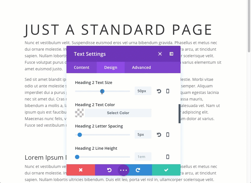
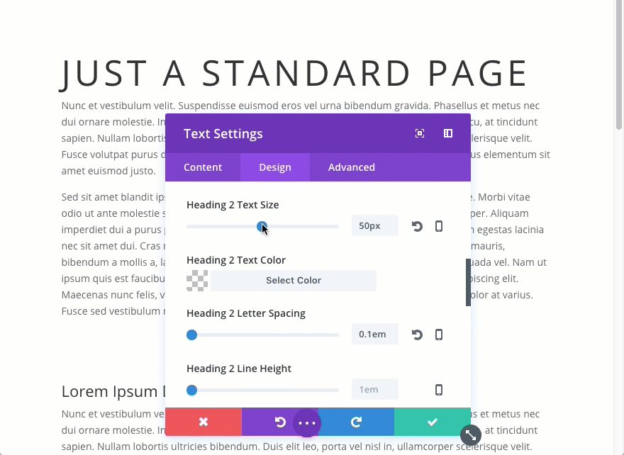
Now look at the same example text using 0.1em for the letter spacing. If the font size is 50px, 0.1em is going to equal 5px. But if you decrease the font size down to 25px, 0.1em is going to equal 2.5px.
Using rem for Text Elements
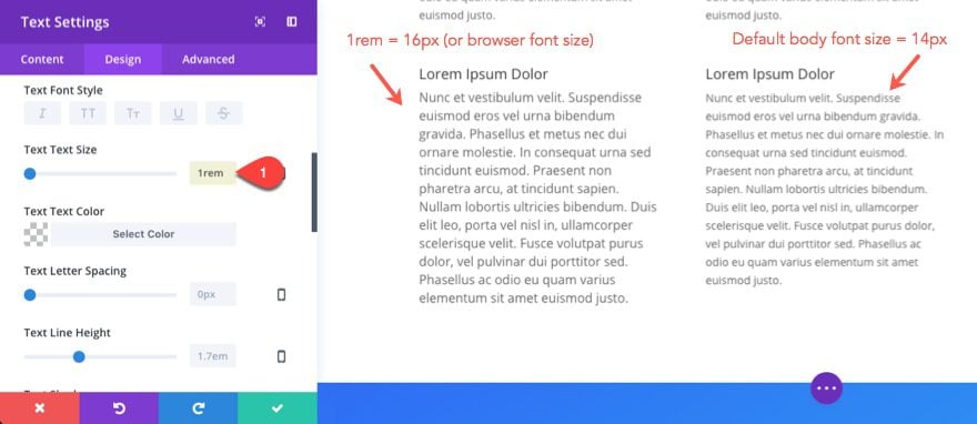
Using rem is generally more predictable than using em because it is always relative to the root font size. The root element in your html tag. This is the tag that wraps your entire website. In Divi the html is actually set to have a font-size of 100%. This may seem a little strange. I mean, 100% of what exactly? Actually, this is pretty common practice. You may not know this but setting your root/html font size to 100% is a way to declare the same font size as your browser. Most browsers have a default font size of 16px, so, in Divi, the value of 1rem is actually 16px (or the font size set in your browser settings). It isn’t what you have set as the default body text in the theme customizer.
For example, Notice what happens when I add 1rem to the body text size of a text module. The text actually increases in size from 14px (what I have set as theme body font in the theme customizer) to 16px (my default browser font size).
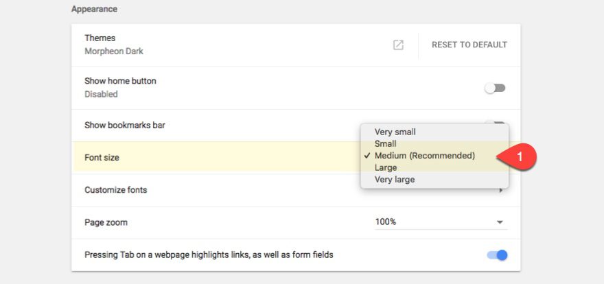
Now if I change my browser font size to something larger, the text in that text module will also increase.
So if you are interested in having text that adjusts to the users browser settings, the rem value may be helpful. But, for the most part, using rem in Divi will just be more trouble than it is worth unless you want to start changing the basic framework of the Divi Theme (ie. change the root font-size to something else).
Using vw for Text Elements
This is perhaps the most interesting length value to use for text. I’m not going to go into great detail on the possibilities here, but I will introduce you to the idea.
Using vw for font size allows you to completely scale your text with your browser window. This can be useful if want the line length to remain constant.
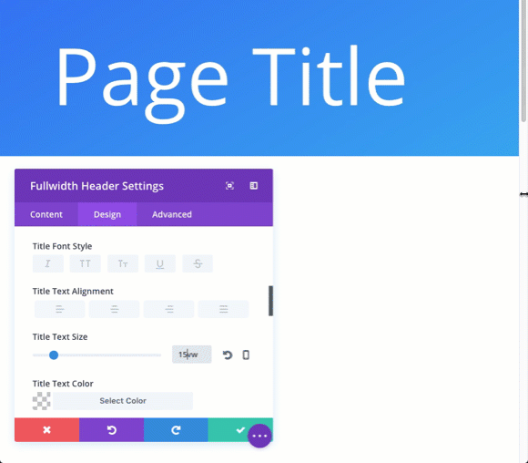
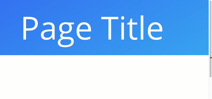
Look what happens to this title text when I adjust the size of my browser viewport/window. The title has a text size of 15vw (which is 15% of the broswer viewport).
If you wanted to take this a step further, you can set a custom em padding for the title that will automatically scale with the title text. This will only work if you apply the em padding to the title tag so you would need to add it to the custom CSS title box under the advanced tab.
Notice how the padding above and below the title scales with the title.
Special Use Cases
Using vh to Create Full Height Headers
The Fullwidth Header Module has an option to change the layout of your header to fullscreen. This makes sure your header takes up the entire screen when the page loads, no matter the screen size.
You can accomplish this same effect with any section using the divi builder. All you have to do is go to the Section Settings advanced tab and enter the following custom CSS in the Main Element input box:
height: 100vh;
If you haven’t guessed already, this makes sure your section spans the full height of the browser viewport.
If you don’t already know, the default padding for Divi’s buttons is as follows:
0.3em Top, 1em Right, 0.3em Bottom, 1em Left
But you can change this by adjusting the padding of the button module to something like this:
0.5em Top, 2.5em Right, 0.5em Bottom, 2.5em Left
Your custom padding will scale with the size of your button font.
Then you can change your font size to a value of 4vw.
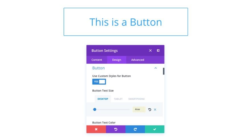
This will display a really large button on large monitors and scale nicely as you adjust your browser window. In order to keep the button from scaling too small on phones, you can set a pixel value to your button for smartphones.
Other Helpful Resources
- CSS Length Units
- The Lengths of CSS
- Custom CTA Sections Using vw
- Better Mobile Design
- Responsive and Fluid Typography with vh and vw units
Let’s Review. Shall We?
Width – Use percentages for custom widths. Also, pixels are acceptable in the Divi builder because this is a max width value and will maintain responsiveness on mobile.
Margin – Since Divi uses percentages already to add margins between columns in your themes grid, it would make sense to keep using percentages unless you have a specific reason not to. You can also use vw and vh for margins as long as you understand what you are doing.
Padding – You have a lot of options that work well for padding. In general, I would use percentages for padding rows and sections for consistency. But I would use em for module padding in order to scale with font sizes. Pixels are always good for padding but in my opinion should be avoided unless you have a specific design reason to do so.
Font Size – Use pixels for custom font size. Em is also acceptable if you are wanting the font size to be relative to the parent font size, making it easier to change all font sizes by changing the parent. Using vw for font size is a nice option for headers or for those designs that need text to scale with the browser viewport.
Letter Spacing – Use em for letter spacing in order to make it scale when changing the font size later on.
Line Height – Use em for line height so that it adjusts to the font size.
Borders – You can’t go wrong using pixels for borders, but don’t ignore the other options. Using em will adjust your border to the native font size (useful for buttons). And using vw for borders is an interesting thought.
Final Thoughts
Thankfully, the Divi builder has a ton of built-in features that allow you to build beautiful responsive websites without having to be an expert in CSS length units. But, it is helpful to understand what length units to use whenever you do decide to make customizations to your page. Having your site look great on all screen sizes is an absolute must and using the right length values will make your job a lot easier down the road.
I hope this guide was helpful. And as always, I look forward to hearing from you in the comments.
Cheers!


Hi Jason, I don’t understand your explanation in the chapter ‘Using % and px to Adjust Max Width for Responsive Design’. If I make the text object 1000 pixels wide, an overlap occurs immediately. For this you don’t need any additional code under ‘Advanced > Main-Element’ as you explained ?!?!
Thank you,
Its all play of light and shadows, gradients, and contrasts. I love these posts. Super interesting and very helpful.
Hi Jason – thanks so much for this article. This was exactly what I was looking for!
When using, vw, vh, em and %’s, soley on a website, should I disable the responsive Divi shortcodes, especially because of the page breaks?
I’m finding that when I build a page with the above CSS lengths that the Divi tablet and mobile view look nothing like the actual views on devices.
Any help or suggestions is greatly appreciated.
Thanks,
Charles
Charles,
I’m not sure if disabling responsive Divi shortcodes would help with this. It sounds like you are referring to how the layout looks when toggling to tablet and smartphone view within the Visual Builder. Correct? I know that when using vh and vw will not be accurate in the previews because, remember, those are still relative the browser window, even if the tablet and smartphone view changes in the visual builder.
Maybe you can simply shrink your browser width when using those elements.
Does that help?
I found this genuinely really informative & interesting, but upon using % for column padding I found issues in Top & Bottom padding for both Firefox & Edge (Chrome & IE appeared fine).
On looking into a solution in ET Support I came up with this
“We are using “display:flex” css property to implement Equal Columns Height. There is an issue in Firefox with “%” padding when “display:flex” is used. To fix the issue please use “px” or “vh” values of column padding instead of “%”.”
With this limitation in mind, when would % ever be the right way to go for vertical padding? (I used vh instead and everything seems OK on all browsers).
Alan,
Thanks for this. I probably should have mentioned this issue. Yes, if you are using “Equal Column Heights” then I would suggest using vw or vh.
However, if you are using a max-width for your page content or rows (like the default 1080px width set in the theme customizer), you may not want to use vw or vh because this would continue to scale the padding of the content inside the row as you increase the size of your browser viewport even though the row will stay the same width. So in most cases, I would suggest percentages since they adjust to the parent, not the browser. Unless, of course, you are using the “Equal Column Heights”.
Hope that wasn’t too confusing.
Many thanks Jason, no that makes sense, thanks for expanding on it. As more of a ‘front end’ guy, this article has really opened my eyes to something I should have probably known long ago in how to create better responsive websites without necessarily having to set different values for desktop, tablet & mobile.
Cheers 🙂
Hi Jason! Excellent post. You could not imagine shitty Jquery or JS workaround I used for instance to responsively resize titles, while using vw + css padding would probably have done the trick based on the example of your post.
Thanks!
We’ve all been there, Chris. 🙂 Glad it helped.
Really enjoyed this article.
Great post. Should be required FIRST-TIME-USER stuff. Answered a lot of questions I’ve only just created ill-informed work-arounds for.
IMO this is much more valuable than, well, lots of stuff recently. Thanks!
That’s good to hear, Randy. Thanks!
I totally second this, many thanks Jason
Just amazing! Thank you!
This. Is. Gold. THANK YOU!
One of many GREAT!! posts. Keep on the good work 🙂
You guys made easy to website design and building
This is great! Thank you very much!
Thanks for a very useful and clear post! I learned a lot from this.
One question: Why do you use both 30% right margin and -30% left margin when creating overlapping images? Isn’t it enough to just add -30% left margin to achieve this effect?
Thanks for reaching out Wilhelm,
It depends. If you are moving an image to the left from the right column and you don’t have the Force fullwidth option selected, the -30% left will increase the overall width of the image by creating more containing space. So adding the 30% right margin will adjust the size of the image back to normal.
Hope that makes sense.
Thank you for this article really very detailed!
It’s a very big job, well done.
The subject is really interesting and important
Thank you Jason
I bookmarked this one!
The image guide is really useful too https://www.elegantthemes.com/blog/divi-resources/the-ultimate-guide-to-using-images-within-divi
Thanks Jason
Thank you for this detailed explanation. This is one of the few posts I’ve read all the way through!
Awesome!
Great article. One thing missing is how to place a full height image for example right under the menu and header. Let’s say the header’s height is 200px and the menu height is 50px. So, for this example we would have:
Menu – 50px (height)
header – 200px (height).
The Image height should be set at 100vh minus the total of all the elements above it (menu and header, which in this case would be 50+200=250px.
Therefore, as a result, the Images height should be: calc(100vh – 250px).
Thanks Nick. This is very true. For a header and navigation default setup (with a fixed nav in place), I would suggest adding the following CSS to any section to set it span the full height viewport:
However, this method isn’t perfect as it cuts off the bottom of the section by 53px. This isn’t a big deal unless you are needing to add content at the bottom of your section.
Thanks again for the tip.
More than helpful thanks 😉
The use of vw looks like it may well solve having to apply px values for mobile, tablet and desktop if im not mistaken…I will definitely give this some time to see if it does.
yes it can definitely solve that problem, although it becomes more tricky for body text because it tends to scale way too big on larger screens. So you would need to set a pixel size for phone so that it doesn’t get too small and another pixel size for large monitors so it doesn’t get too large. Currently CSS doesn’t support a “max font-size” option, so you are forced to do this through media queries.
Great article. Very clear explanation of what these values do, how to use them, and the best ways to use them… This tutorial really gets you thinking about ‘mobile first’ when building a site with Divi, or any other framework.
Exactly Bernard. Glad you liked it.
very useful, it is always good to be remembering these aspects, especially vw in texts helped me a lot to achieve the design 🙂 thank you very much!
Is it possible to do a tutorial to align vertically (center) or only possible by css?
Yes. Aligning content vertically within a section is tricky, especially when you want it to adjust on all browser viewport sizes. Good idea for a tutorial. Thanks.
This is excellent stuff. A very, very useful tutorial. It’s helped to fill a gap or two in knowledge. Thank you.