")
You’ve probably seen various CSS units in web code before, but understanding how they work lets you use them more intentionally. In this post, you’ll learn what CSS units really are, how they affect your layouts, and how using them inside Divi 5 helps you design more responsively.
Divi 5 brings native support for CSS units right into the builder. Thanks to the new Advanced Units feature, you can use %, em, rem, vw, and more without custom code.
What Are CSS Units?
CSS units tell the browser how big or small something should be. Whether you’re setting the size of a heading, the width of a section, or the spacing between elements, you’re using units to define that space. Without them, the browser has no idea what to do with your values.
For example, writing width: 100 doesn’t mean anything to the browser. But add a unit, like 100px or 100%, and now it knows exactly what you want.
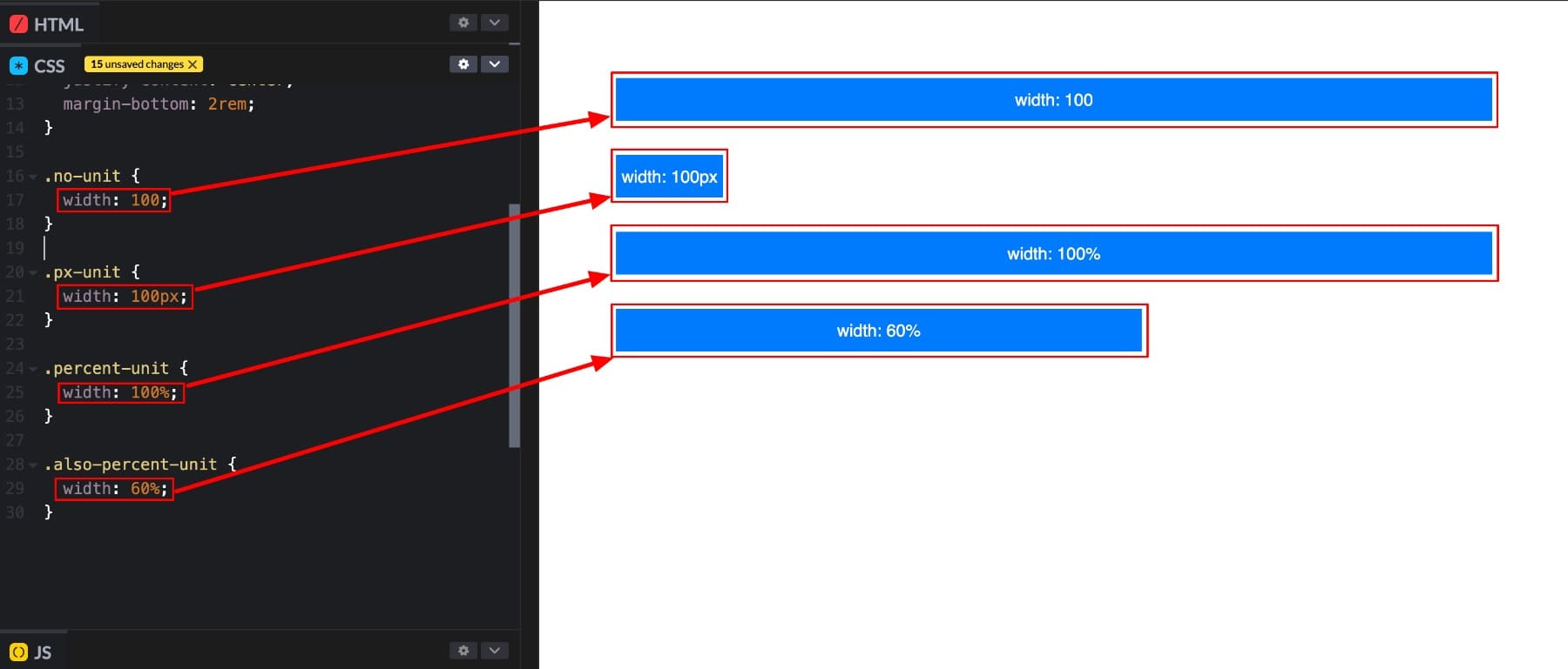
Take this example with four boxes, each using a different CSS value:
- The first uses width: 100. Technically invalid, but many browsers will render it as 100%.
- The second (100px) uses a fixed width.
- The third and fourth (100% and 60%) scale relative to the parent container.
You may wonder why the first box with width: 100 still appears full-width, even though it’s technically invalid.
Width: 100 is ignored by the browser because it lacks a unit. But in this case, the box still stretches across the container, not because the CSS was accepted, but because block-level elements like div naturally span the full width of their parent by default. It’s a coincidence of default behavior, not a result of the invalid CSS being interpreted as 100%.
Popular CSS Units
Though px and % commonly appear, many others are just as useful once you know when to use them:
| Unit | Type | Scales With | Use Case |
|---|---|---|---|
| px | Absolute | Nothing (fixed) | Precise spacing, borders, icons |
| % | Relative | Parent element | Flexible widths, heights, layout |
| em | Relative | Parent font size | Spacing or sizing based on text scale |
| rem | Relative | Root font size | Global consistency in spacing or text |
| vw | Relative | Viewport width | Fluid typography, full-width sections |
| vh | Relative | Viewport height | Full-screen sections, hero blocks |
| vmin | Relative | Smaller of vw/vh | Scales with the smaller screen edge |
| vmax | Relative | Larger of vw/vh | Scales with the larger screen edge |
You’ll see these units everywhere in web design, from setting font sizes, defining section widths, adjusting padding and margins, and building flexible grid layouts. They’re one of the most important deciding factors in how your layout looks and behaves. And where you use which units matters more in effective design, we’ll get to that shortly.
But first, it’s helpful to know that all CSS units fall into two main types: absolute and relative.
Absolute & Relative Units
Understanding the difference is essential if you want your layout to work well across different screen sizes.
Absolute Units
Absolute units have fixed values. This means that when you set something to 100px, it will always be 100 pixels wide, whether the user is on a phone, a tablet, or a massive desktop monitor. These units don’t respond to the screen size or surrounding layout, which makes them great when you need exact control.
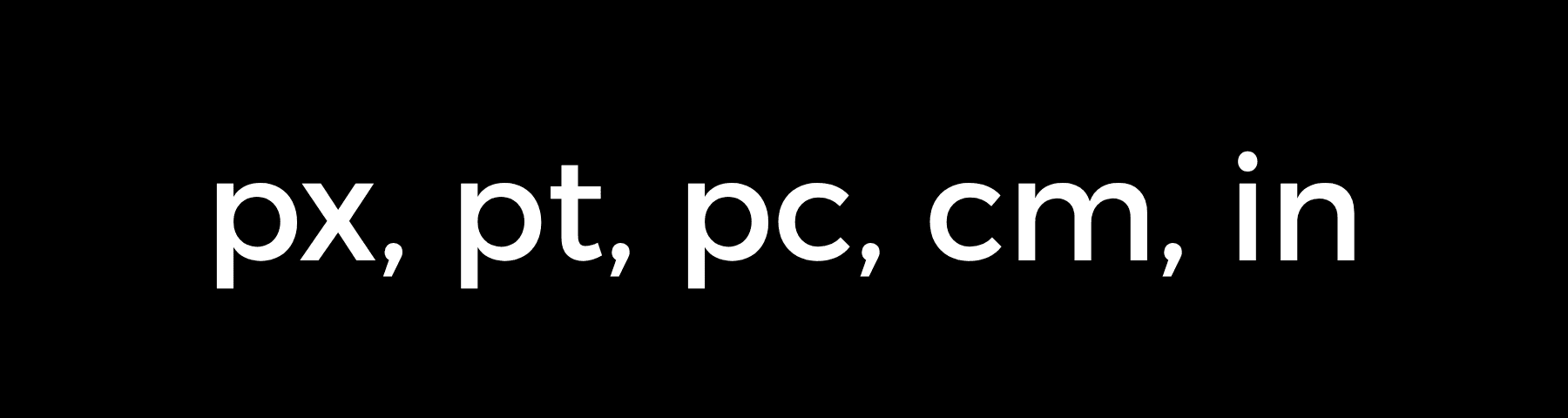
They’re often used for borders, icon sizes, or fixed box shadows, usually where precision matters more than flexibility.
But that same precision can cause issues. A design that looks perfect on a large screen might overflow, shrink awkwardly, or break entirely on smaller devices. Since absolute units don’t adapt, they can make your layout feel rigid unless used carefully.
Relative Units
As the name suggests, these adjust based on their surroundings. Instead of staying locked to a specific size, they scale depending on the context (parent element, viewport, etc). This makes them much more flexible for responsive design.
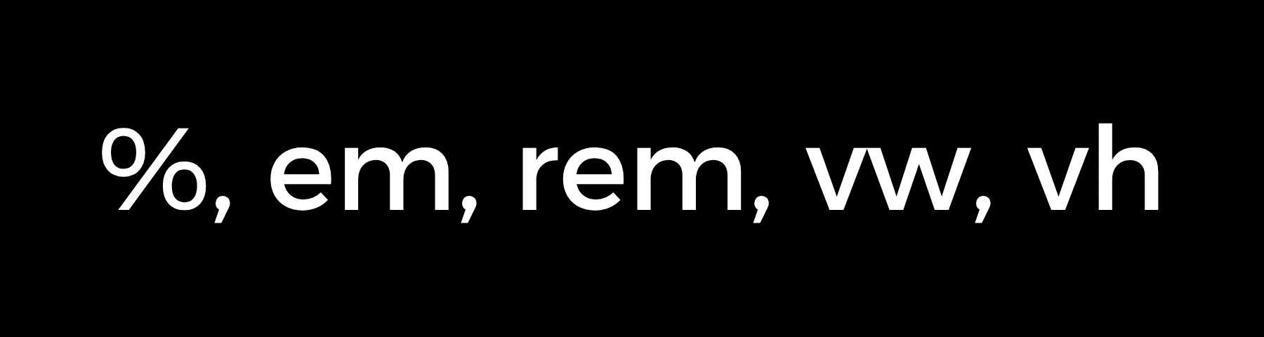
Some units respond to the parent element’s size, others to the root font size of the page, and some even react to the browser window itself. Here are a few key ones:
- % scales with the parent container.
- em adjusts based on the parent element’s font size.
- rem follows the root font size of the page.
- vw and vh respond to the width and height of the browser viewport.
Because they adapt to different environments, these units help you build layouts that feel natural on any screen. They expand or shrink with the space they’re given, which keeps your content readable and your design balanced across devices.
Let’s look at a quick example to see why this flexibility matters. Suppose you’re building an image section and set its width to 1200px.
That might look perfect on a large monitor, but on a tablet with a screen width of 768 pixels, the image could overflow and look weird. Now try using:
width: 100%;
This tells the browser to make the image fill the width of its container. Whether the screen is wide or narrow, the image adjusts automatically.
The real benefit of using a relative unit is responsiveness. You’re not just assigning a size but giving the browser clear instructions on how your layout should behave in different scenarios. And when you get it right, your content fits on every screen.
| Absolute Units | Relative Units |
|---|---|
| Fixed size no matter what | Adapts to surroundings |
| Perfect for borders, shadows | Great for text, layouts |
| Same on every device | Changes with screen size |
| Easy to predict | Requires more planning |
| Breaks on small screens | Stays proportional |
| Uses px, pt, cm | Uses em, rem, %, vw, vh |
| No math needed | Multiplies parent values |
| Works with media queries | Works automatically |
By using relative units where they make sense, you avoid rigid layouts, reduce the need for breakpoints, and keep your design easier to manage. And with Divi, you don’t have to write a single line of code to use different CSS units. Select the unit you want in the builder and see your layout respond in real time.
When To Use Which CSS Unit
Now that you understand the difference between absolute and relative units, the next step is knowing when to use each.
As a rule, go with relative units when your layout needs to adapt to different screen sizes. These are perfect for section widths, typography, spacing between elements, or full-page layouts. Because they scale automatically, they help you maintain consistency without creating separate styles for every device.

On the other hand, absolute units are helpful when you want something to stay the same regardless of screen size. Think borders, icons, fixed spacing, or small visual details.
Here are a few examples to guide your choices:
- Use px when you need exact control, like for icon sizes. Since it doesn’t adapt, avoid it for layout widths or text.
- Use % when you want elements to scale with their container.
- Use em when you want spacing to scale with the parent element’s font size.
- Use rem (commonly referred to as root em) if you want consistent sizing across your site. Since it’s based on the root font size, it keeps spacing and typography predictable.
- Use vw and vh for full-screen sections, hero areas, or spacing that responds directly to the viewport (the entire view of your device screen).
For more advanced control, you can also combine units using CSS functions. calc() is handy when mixing values like 1rem + 5vw for responsive spacing with a minimum base. And clamp() is ideal for setting fluid values that grow or shrink between limits, making it a cleaner alternative to media queries.
In the end, choosing the right unit involves considering how each element should behave in different scenarios and picking the unit that best accomplishes that.
Divi’s Advanced Units To Build Responsively Without Coding
We’ve already seen how CSS units give you control over layout behavior. Divi 5 takes that control and makes it effortless to use with Advanced Units.
Subscribe To Our Youtube Channel
With native support for %, em, rem, vw, and vh built directly into the builder, you can apply real CSS values to modules, sections, spacing, and typography, without needing to open a code panel. In any numerical field, just select your preferred unit from the Advanced Unit dropdown, adjust the value, and see the changes live.
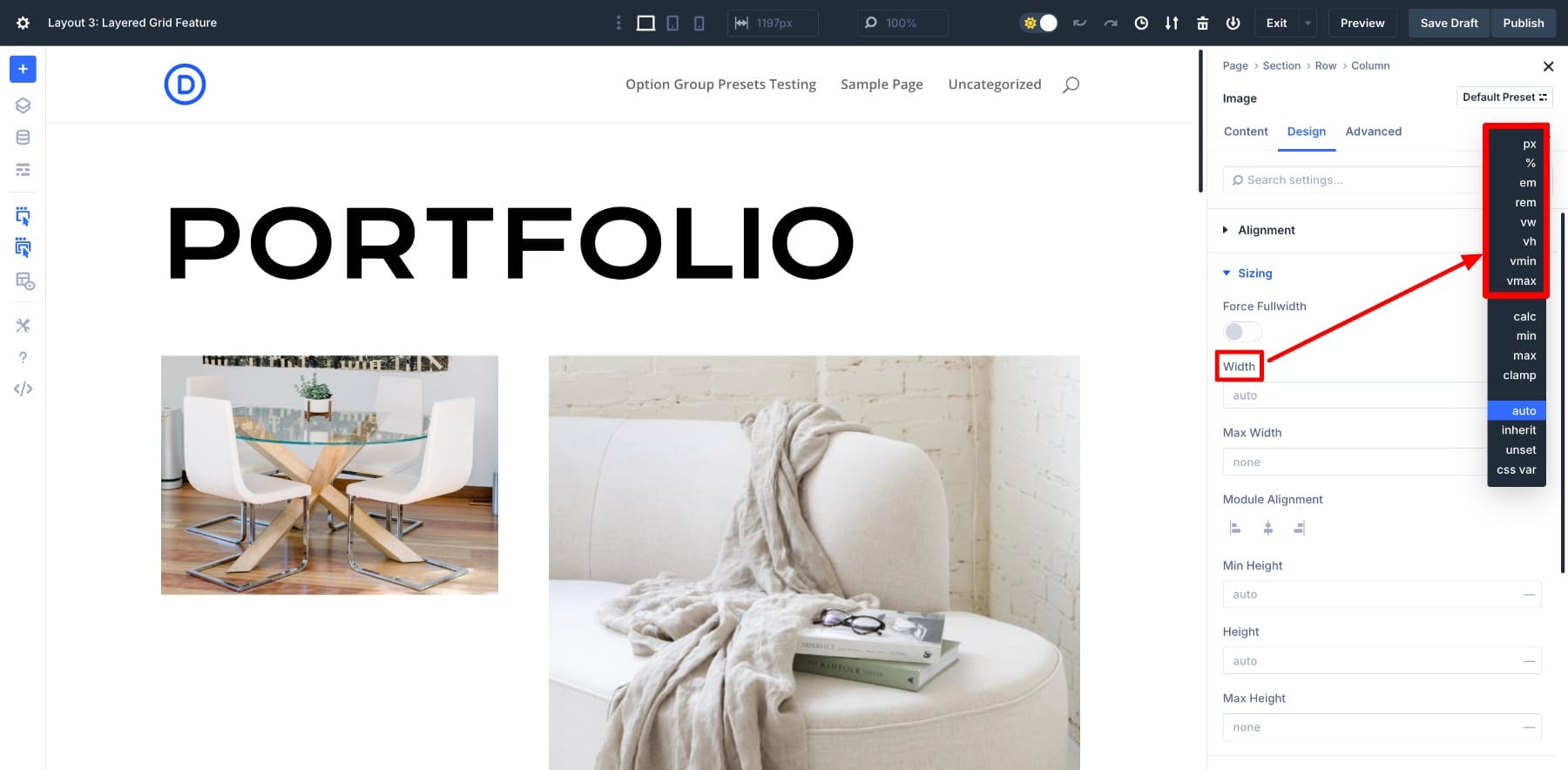
And it doesn’t stop there. Divi also lets you use advanced CSS functions like calc() and clamp() in the visual builder. That means you can create fluid values, mix units, and fine-tune layouts with the same level of precision developers get from hand-written CSS, but visually.
Need a font size that scales fluidly across different screen sizes? Use clamp(). Want to offset spacing with a mix of fixed and flexible values? Try calc(). Divi handles it all, instantly and visibly.
You’re not guessing or switching between design and code anymore. Divi gives you the visual power and instant feedback to get the responsive logic right with full control over how your elements scale and behave across devices.
Learn Everything About Divi 5’s Advanced Units
CSS Units Sync Perfectly With Divi’s Advanced Workflows
You’ve already seen how Divi makes using individual CSS units easy right inside the builder. But the real strength shows when those units work together across your entire site. That’s where features like Design Variables, Option Group Presets, and advanced CSS functions like calc() and clamp() really shine.
Divi doesn’t just let you enter CSS units into fields. It helps you integrate them into your entire design system without writing code. Everything stays consistent, scalable, and easier to maintain.
Let’s see how Divi helps you use CSS units as part of a flexible, logic-driven workflow:
1. Create Layout Logic With Design Variables
One of the easiest ways to save time on any project is to plan your layout logic upfront. Instead of adjusting the same spacing or font size in multiple places, you define those values once and reuse them across your entire design, with Divi’s Design Variables.
You can create reusable values like –card-padding or –section-gap, using real CSS units like 2rem, 5vw, or even formulas like calc(2rem + 1vw). Once set, these values can be applied across modules, rows, and sections to keep everything consistent.
You only have to update the variable if you want to change it later. The change reflects everywhere it’s used, saving you the back-and-forth of hunting down individual settings. And because CSS units are built right into Divi’s system, you’re not relying on guesses but applying real CSS logic, visually. That makes your layout more manageable, scalable, and easier to adjust as your project grows.
2. Use clamp() And calc() Visually
CSS functions like clamp() and calc() help you build responsive layouts. They let you define flexible values that adjust across screen sizes without writing media queries. So instead of setting fixed sizes for each device, you can write logic like clamp(1rem, 2vw, 2.5rem) to let the browser scale things smoothly between set limits. Or use calc(100vh – 80px) to adjust a hero section based on your viewport height.
Normally, they require writing CSS manually. In Divi, you can enter these directly inside any number field.
And because CSS units are supported inside both functions, you can mix values like rem, vw, and px to get exactly the behavior you want. You see the results live as you type, which makes it easy to experiment and get responsiveness right without leaving the builder.
3. Save Unit Logic With Option Group Presets
Once you’ve set up layouts using advanced units or formulas, you don’t have to rebuild them again. Divi allows you to save your styling logic, including things like padding: clamp(1rem, 3vw, 2rem), as an Option Group Preset.
That means the next time you need the same spacing or layout pattern, you don’t apply the same settings, but only the saved preset.
And if you use Design Variables inside presets, it’s even better. You can easily create an interconnected system in which modifying your entire website’s styles depends on only one thing: changing the variable.
In Divi, using a CSS unit isn’t just about size; it’s about behavior. Each value you set becomes part of a visual system that adapts, scales, and stays consistent across your layout. And because it’s all built into the builder, it feels less like coding and more like designing with logic.
Divi Turns CSS Units Into A Visual Superpower
You don’t need to write CSS to use CSS units. Divi 5 brings them all into a visual interface where you can explore, apply, and preview in real time. Whether you’re adjusting spacing, building fluid typography, or creating layout logic with variables and presets, Divi lets you do it all visually.
Ready to try it? Download Divi 5 and start using real CSS units in your designs.


Leave A Reply