Are you experiencing slow website loading speeds? The low website speed could result from many factors, and large image sizes are one of them. If you have a website with a great deal of content, image size could likely be one of the factors behind your site’s slow speed. Hence, it is important to optimize your WordPress images so they don’t hamper your site. This guide will help you determine the best image sizes for your WordPress website and how to optimize them using WordPress and Divi. This would help in enhancing customer interaction and boosting productivity.
Understanding Image Sizes in WordPress
Image sizes in WordPress are determined by the dimensions (in pixels) and the size of the image file in kilobytes (KB) or megabytes (MB). When displaying an image on your WordPress site, it is important to know that image size is not just about aesthetics — it directly affects site performance, user experience, and search engine optimization (SEO). WordPress will help safeguard users from using extremely large images by automatically creating a scaled version on upload. Plus, every image you upload will have different variations or sizes that are displayed depending on where it’s used on your site. More on that below.
SRCSet Functionality
When you upload an image to WordPress, the platform automatically creates multiple sizes of that image (thumbnail, medium, large, etc.). The SRCset attribute allows the browser to select the most appropriate image size depending on the device’s screen size and pixel density.
For example, if your blog post contains an image, and a user visits your website from a desktop with a large screen, the browser might load the large version (e.g., 1024px). On the other hand, if the user is browsing from a mobile phone, the browser will choose a smaller version (e.g., 300px), which is faster to load.
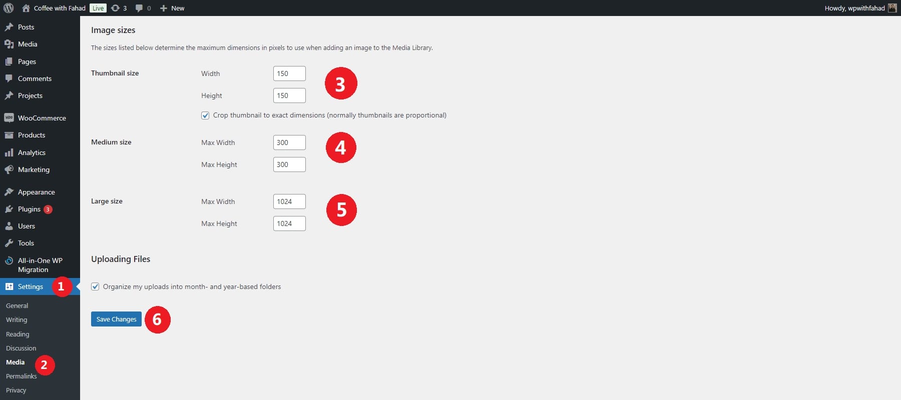
Here are the default sizes you’ll get for every image you upload in WordPress:
- Thumbnail: 150 x 150 pixels
- Medium: 300 x 300 pixels (can vary based on your settings)
- Large: 1024 x 1024 pixels (can vary based on your settings)
- Full size: Original dimensions
If you want to change the default image sizes, you can find them in the Settings → Media in the WordPress dashboard:
What Size Image To Use On WordPress
In most cases, your image file size shouldn’t exceed 200kb. Most images should be closer to 50kb-100kb or less. To keep your image files in that range, you will need to consider other factors like dimensions.
Here are some common recommended image dimensions for WordPress:
- Blog Post Images: 1200 x 630 pixels
- Featured Images (Post Thumbnails): 1200 x 800 pixels
- Header Images / Hero Images: 1600 x 900 pixels or 1920 x 1080 pixels
- Background Images: 1920 x 1080 pixels
- Sliders and Banners: 1200 x 600 pixels or 1920 x 800 pixels
- Product Images (WooCommerce): 800 x 800 pixels or 1000 x 1000 pixels
- Logo Image: 200 x 100 pixels or 250 x 100 pixels
Unless you have a specific reason to do so, you shouldn’t be uploading 5mb images that are 5000 pixels wide. WordPress will help by creating more website friendly versions you can use. But if you display that original size, your pageload speed is going to suffer.
Choosing the right image size to upload in WordPress is crucial for optimizing your website’s performance and ensuring images look sharp on all devices. The ideal image size depends on the context in which the image will be used (e.g., for blog posts, thumbnails, sliders, etc.), as well as responsiveness, file size, and quality considerations.
Key Factors to Consider for WordPress Size Image
When selecting or creating images for WordPress, several key factors should be considered to ensure they are optimized for performance and design. These factors include image size, file type, dimensions, and more. Here’s a detailed breakdown:
Image Dimensions
Image dimensions directly affect how images appear on different parts of your website. Using too large images slows down load times, negatively impacting user experience and SEO. Images that are too small can appear pixelated or blurry, lowering the overall visual quality of your site.
Your WordPress theme often dictates the ideal image dimensions for different sections, such as headers, blog posts, or galleries. Check your theme’s documentation for recommended dimensions.
File Size
Larger file sizes result in slower loading times, which hurts both the user experience (especially on mobile devices) and your search engine ranking. Slow sites lead to higher bounce rates, meaning visitors are likelier to leave your site before it fully loads.
Ideally, keep image file sizes below 500KB. However, if the image is displayed prominently, you might allow up to 1MB for better quality. Use image compression tools to reduce file sizes while maintaining visual quality. For manual compression, tools like TinyPNG or JPEG-Optimizer work well. After compressing, test your page’s load time using tools like Google PageSpeed Insights or GTmetrix. If load times are slow, reduce image sizes further.
File Format
Different file formats serve different purposes, and choosing the right one can balance quality and performance. Using the wrong format may result in unnecessarily large file sizes or poor image quality, especially if transparency or sharp edges are involved.
JPEG (JPG) is best for photographs or images with many colors and gradients. It supports lossy compression, meaning it reduces file size by eliminating some detail, but it’s great for reducing file sizes of complex images. On the other hand, PNG is ideal for logos, icons, or images with transparency. PNG provides lossless compression, preserving image quality at the cost of larger file sizes.
Aspect Ratio
A consistent aspect ratio ensures your images display correctly across different devices and screen sizes. Using inconsistent aspect ratios can lead to cropped, distorted, or poorly aligned images, affecting your site’s visual coherence.
For images in fixed layouts (like sliders or banners), always follow the recommended aspect ratio from your theme or plugin documentation (e.g., a 16:9 ratio for banners). For galleries or grids, choose a single aspect ratio (e.g., 4:3 or 1:1 for square thumbnails) and crop all images to that ratio for uniformity. If you use responsive image settings, test your site on different devices and screen sizes to ensure the aspect ratios work well across various viewports.
Best Practices for WordPress Image Sizes
Website speed is crucial for user experience and SEO, and oversized images can significantly slow down your WordPress site. Optimizing your image sizes is important to maintain fast loading times without sacrificing quality. Here’s a quick guide on effectively reducing image sizes and boosting your site’s performance.
Resize Images to Appropriate Dimensions
Upload images with dimensions that fit your site’s display needs. Avoid uploading large images automatically resized by WordPress, as this consumes storage and bandwidth. Before uploading images, determine the maximum dimensions you need based on your theme layout. For example, if your content area is 800px wide, images wider than that won’t display correctly and will slow down your page.
Resize Images on WordPress
If you’ve already uploaded an oversized image, you can resize it directly in WordPress. Go to Media > Library on your WordPress dashboard.
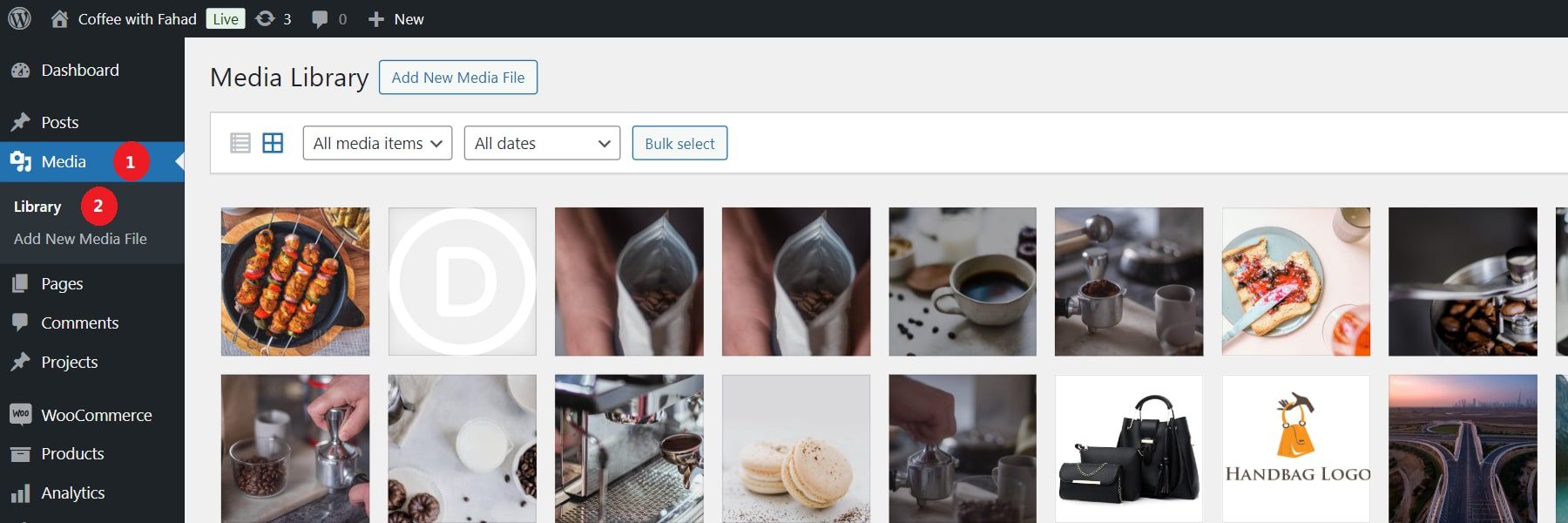
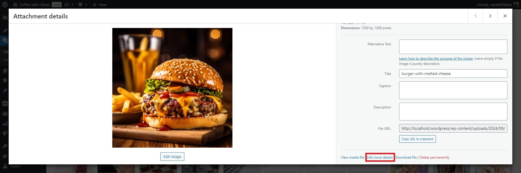
Either click on an existing image or upload a new image file. In our case, we have chosen to upload a new image file.

After clicking on the added image, you will be shown all its details. Click ‘Edit more details’ in the bottom right corner to access the added settings.
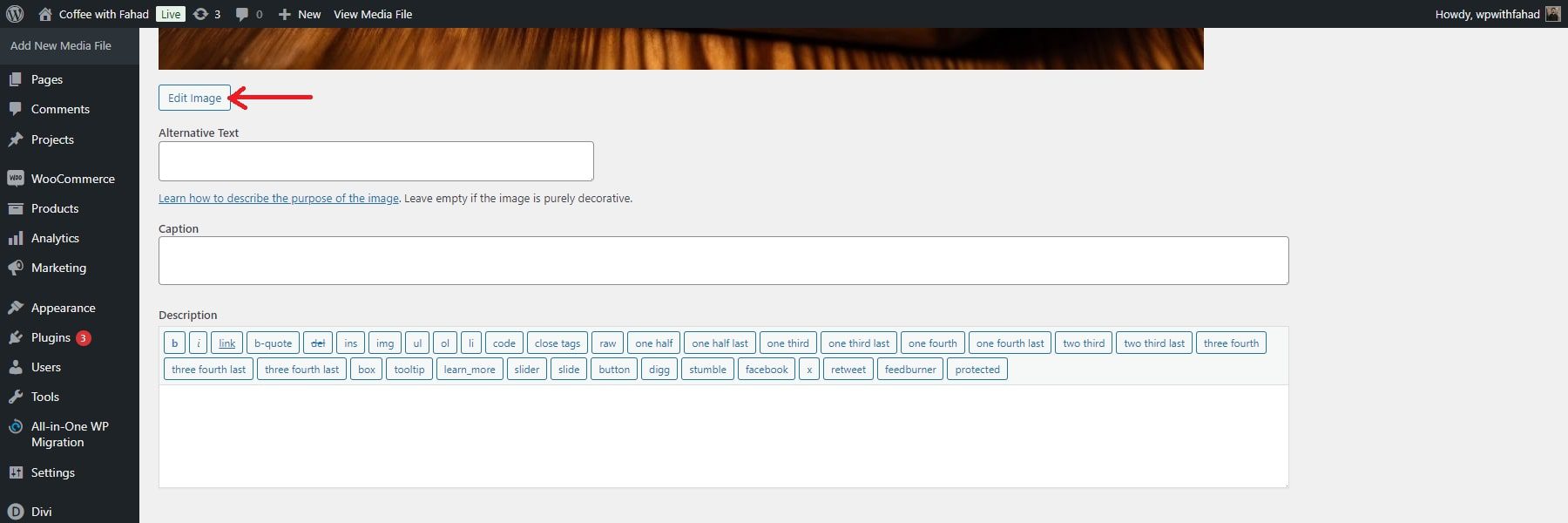
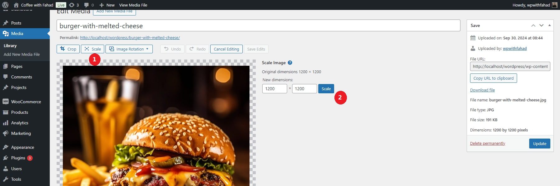
In the image details, click the Edit Image button.
Under Scale Image, enter the new dimensions (either width or height), and WordPress will scale the image proportionally. Click Scale to apply the changes.
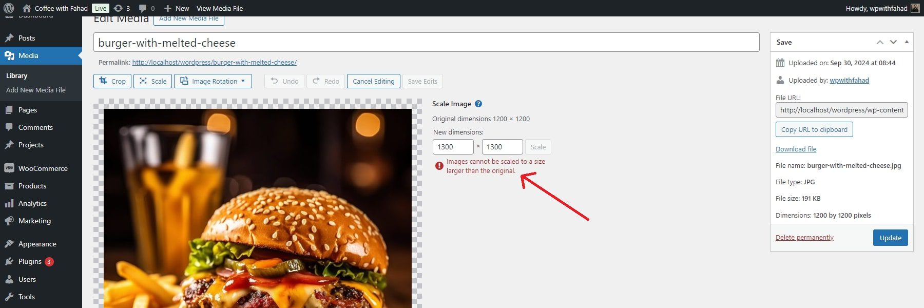
NOTE: You cannot scale your images larger than the original version. WordPress will let you know the in case you do that.
Use Image Compression Tools
As previously discussed, compressing your images helps reduce their file size. Various image compression tools, including editing software like Adobe Photoshop or Microsoft Photos, are available.
Alternatively, you can use online tools such as TinyPNG to achieve this.
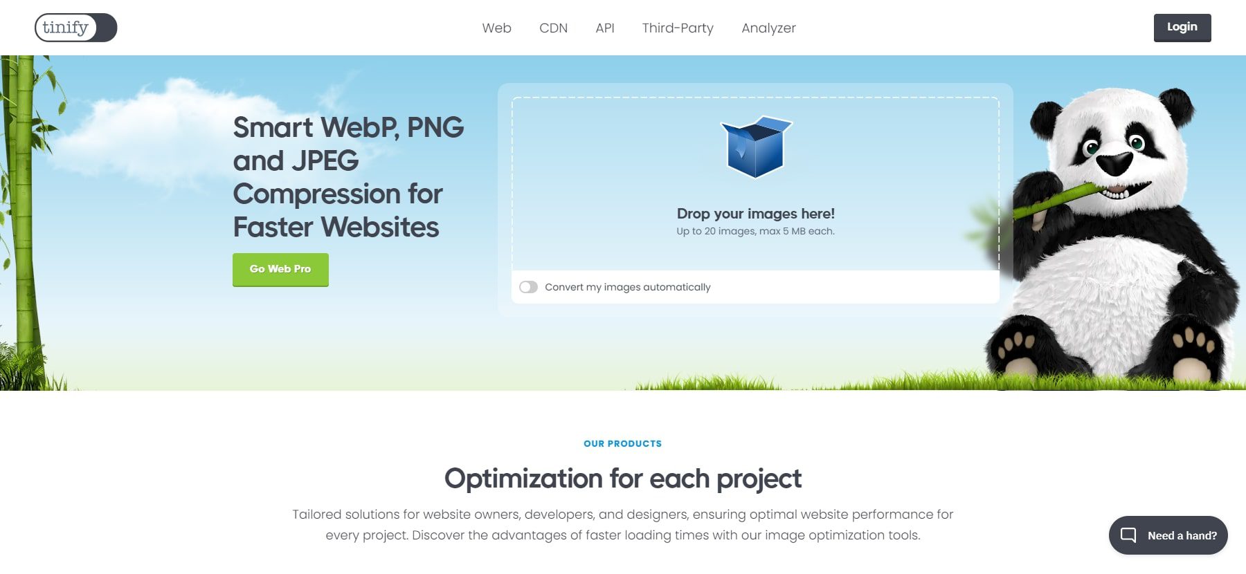
This tool prefers lossy compression to minimize the size of your WEBP, JPEG, and PNG files. Simply upload your images, and TinyPNG will handle the compression for you.
Alternatively, you can utilize a robust image optimization plugin like Imagify. Add a new plugin from your WordPress dashboard’s “Plugins” section before installing and activating it.
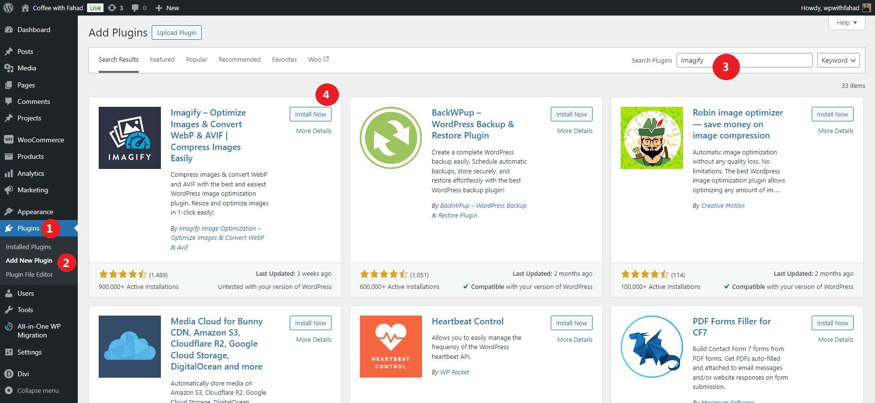
After installing and activating Imagify on your WordPress site, navigate to Settings > Imagify to configure your compression preferences:
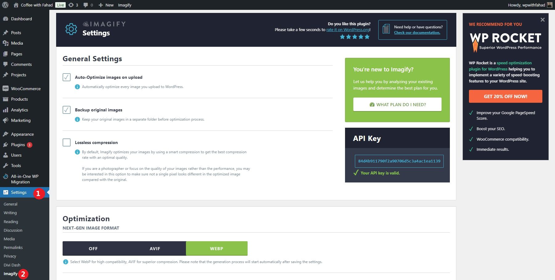
Once you’re set, click on Save Changes. Imagify will then automatically compress any images you upload to your site.
Change Maximum Upload Limit
WordPress sets a maximum file upload size, which can differ based on the limits imposed by your hosting provider. Go to Media > Add New in your WordPress dashboard to determine your current file upload limit. The upload size restriction will be displayed on this page.
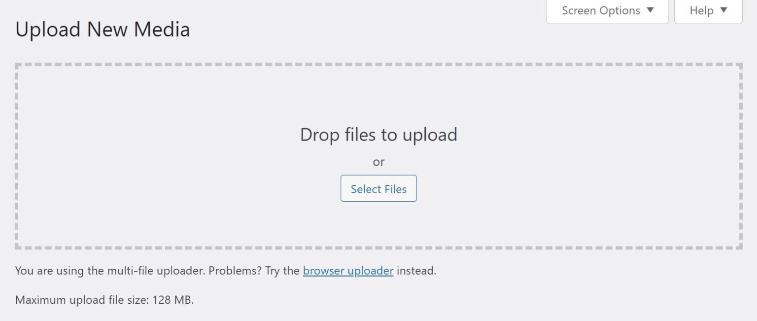
Generally, there’s no need to adjust this limit unless you plan to upload larger files. However, lowering the file size limit can be useful, especially if you manage a multi-author blog, to prevent others from uploading unnecessarily large images. You can contact your hosting provider to modify the maximum upload size or update the limit by editing the php.ini file.
Use Lazy Loading
Lazy loading is a performance-boosting technique that delays the loading of images on a webpage until they are actually needed. Instead of forcing all images to load immediately when a page is accessed, lazy loading only loads images as the user scrolls down and they come into view. This reduces the page’s initial load time, saves bandwidth, and improves the user experience.
Most WordPress themes and plugins today offer built-in support for lazy loading. WordPress itself even includes native lazy loading as of version 5.5. Additionally, various plugins like WP Rocket, Lazy Load by WP Rocket, and a3 Lazy Load offer more advanced control and customization over the lazy loading process, making it easy to implement on any WordPress site without much technical expertise.
All these practices are fundamental to maintaining professional image sizes on WordPress. However, Divi, our prolific WordPress theme and builder, elevates them further through its responsive attributes.
How to Create Perfect Image Sizes with Divi
If you want more control over your image design and sizing options, you can use a page builder like Divi. Divi comes equipped with advanced responsive features. This tool integrates several functionalities into your WordPress site, including image resizing. Here, we’ll delve into how Divi can improve the dimensions of your images while maintaining their quality.
1. Download and Install Divi
Divi can be purchased through Elegant Themes, offering two pricing options: an annual license for $89 or a lifetime license for $249. After purchasing, you can easily download and install the theme on your WordPress site by following these steps:
- In your WordPress dashboard, go to Appearance > Themes.
- Click Add New, then select Upload Theme.
- Choose the downloaded Divi .zip file and click Install Now.
- Once the installation is complete, click ‘Activate’ to make Divi your active theme.
For a detailed guide, check out the video below.
After completing the setup, you can start building your site. To get comfortable with the process beforehand, take a look at our tutorial on using the Divi Builder.
2. Create Your Website, Open the Divi Builder and Select Your Image
After installing the Divi Theme on WordPress, you can quickly create your website. Divi provides you with multiple options to build your website. You can build your website from scratch, take advantage of our pre-made layouts, or use Divi AI to build your website.
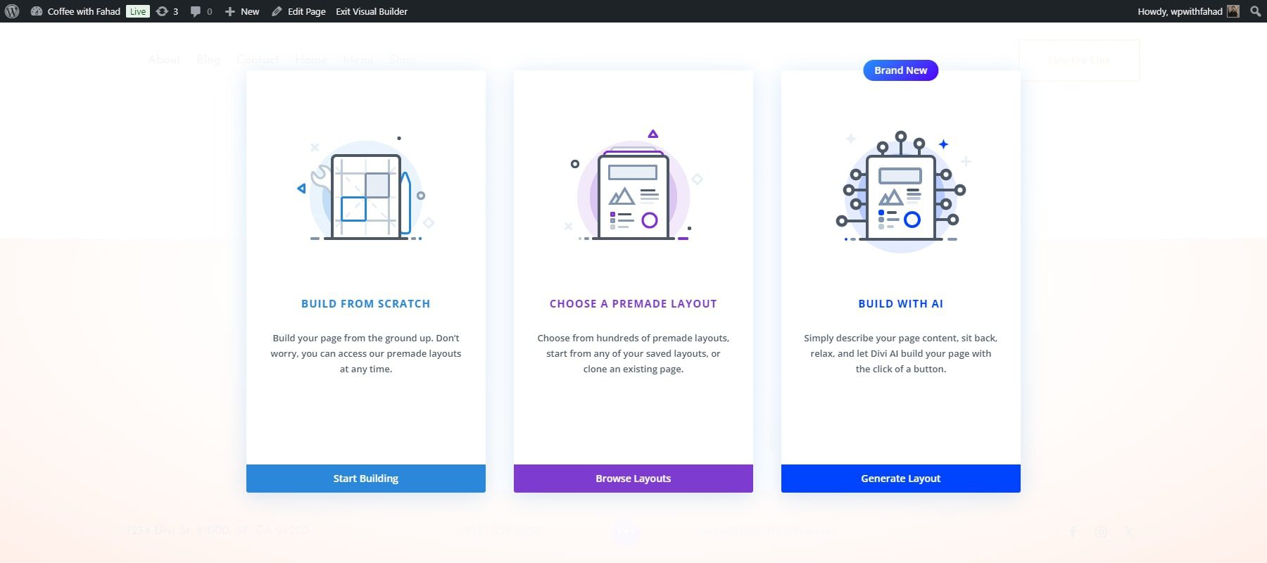
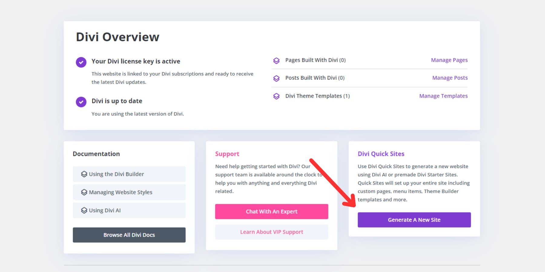
In addition, you can use Divi Quick Sites to build a professional website in one or two minutes.
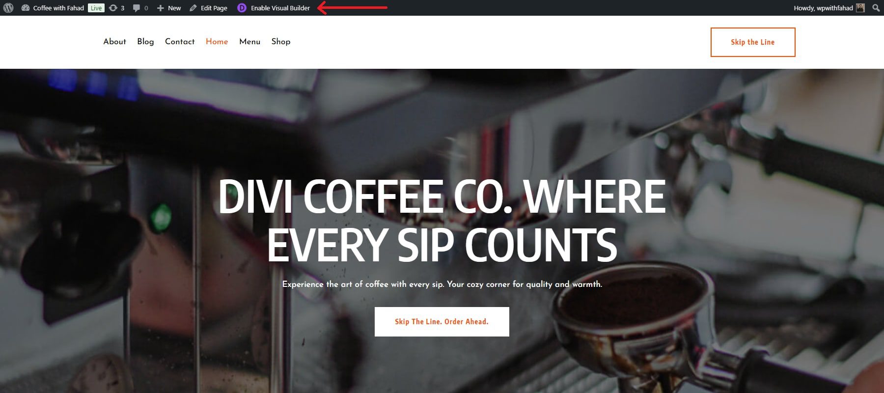
After creating your website and adding your respective images, you can access the Divi Builder and configure your WordPress image sizes. First, go to your established Divi website and click on ‘Enable Visual Builder.’
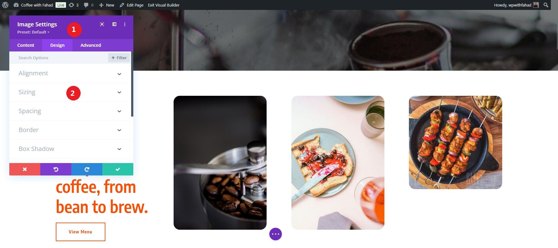
Click on any added image for resizing purposes. Open the Divi image module by clicking on the wheel icon.
![]()
3. Resize Your Added Images on WordPress with Divi Responsive Settings
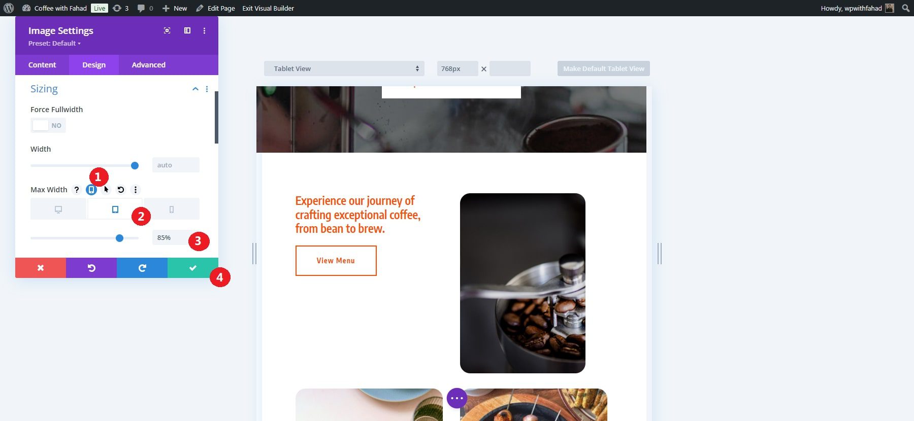
Divi’s responsive settings make resizing images on WordPress for different devices (desktop, tablet, and mobile) easy. In the Image Module settings, navigate to the “Design” tab. This is where most of the customization, including responsive settings, happens. Inside the Design tab, scroll down to find the “Sizing” section.
Here, you can adjust multiple dimensions of your selected image, such as:
- Width
- Maximum Width
- Module Alignment
- Minimum Height
- Height
- Maximum Height
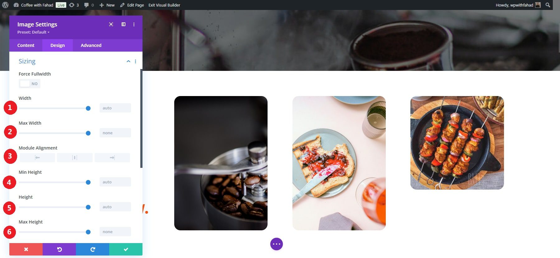
NOTE: You can also force full width by enabling the provided option. However, that will make the width and maximum width unchangeable.
Next to each attribute, you’ll see a small icon resembling a smartphone or tablet (the responsive settings icon). Click this icon to enable different Desktop, Tablet, and Mobile view settings.
![]()
In this case, we’ll set the tablet version’s maximum width to 85%. The reduced width and centered positioning will save space on the homepage, making the image more visually appealing on smaller devices. Click on the green tick button to apply the saved changes.
SRCSet functionality
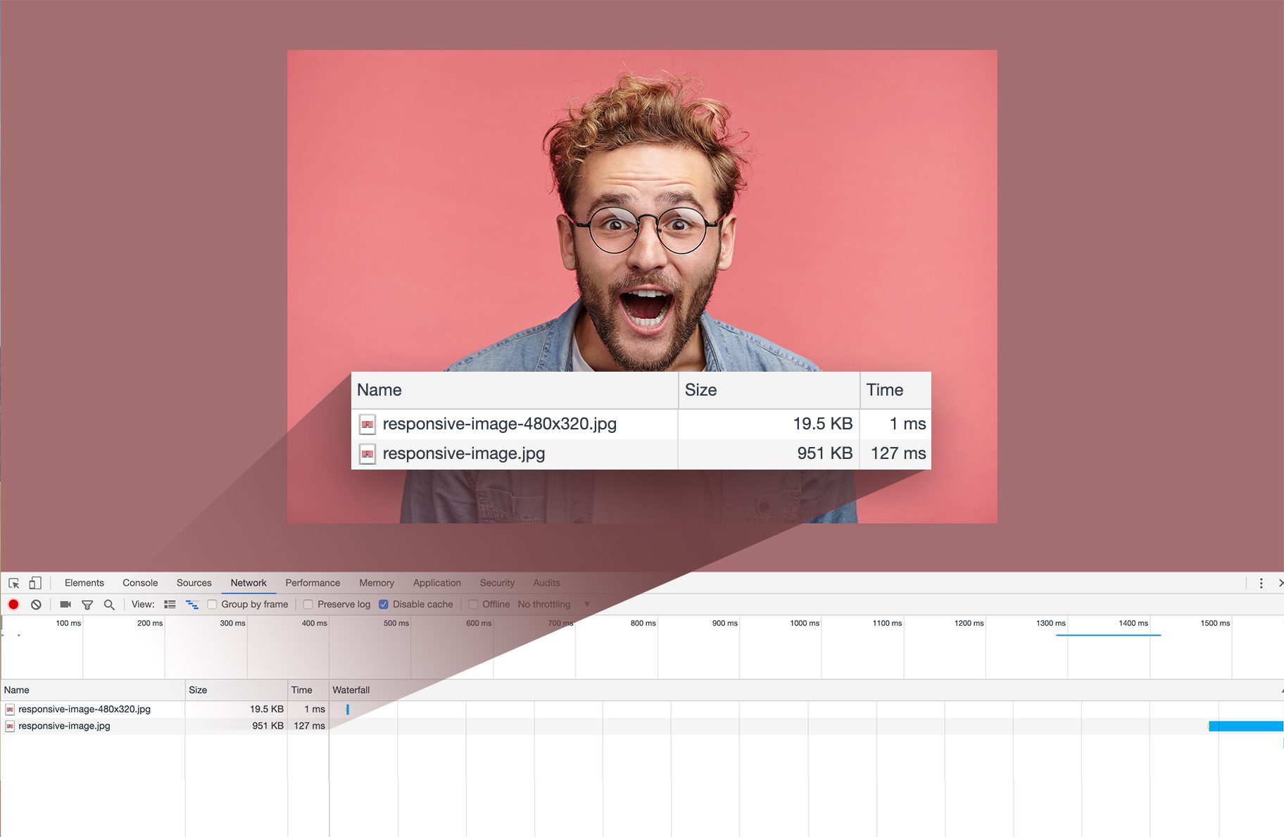
Divi brings native SRCSET support for all images, allowing the theme to make your images responsive automatically. It ensures that the appropriately sized image is delivered to each device, improving loading speeds by serving smaller images to smaller devices. Best of all, it happens automatically, without any additional effort from you.
Other Tools for Image Optimization
Although Divi’s responsive settings offer a great solution for resizing images in WordPress, you might need additional optimization tools that Divi currently lacks. Here are some external image optimization tools you can use:
- EWWW Image Optimizer: A powerful WordPress plugin that automatically compresses new images upon upload and offers a Bulk Optimizer for existing media. It allows for image resizing and metadata removal and supports lazy loading and conversion to the WebP format for better compression. The free version operates directly on your server without file size limits, while the premium version leverages cloud services for enhanced optimization and higher compression ratios.
- ShortPixel Image Optimizer: This plugin optimizes images and PDF files while automatically resizing images. It offers flexible compression options—lossy, lossless, and glossy—providing a balanced choice for users. The plugin backs up original images, removes metadata, and converts PNGs to JPEGs, optimizing Retina images and thumbnails. However, you must share your email for an API key.
- Optimole: A free, all-in-one image optimization plugin that processes images in real time through a cloud-based server. It distinguishes itself by selecting the optimal image size based on a visitor’s viewport and implementing lazy loading for efficient display. Upgrading to a premium plan offers unlimited image conversions and advanced features, including high-quality compression that retains original clarity while reducing file size and automatic creation of Retina and WebP versions.
- WP Smush: This plugin is part of the WPMU DEV plugin suite. It automatically optimizes images after they are uploaded to your WordPress site. WP Smush features a bulk optimization option that allows you to compress up to 50 images at once, making it easy to enhance your existing media. The plugin also includes options for image resizing and lazy loading, and you can configure it to remove metadata from images upon upload. It supports images up to 5 MB, but you’ll need to upgrade to the premium version to optimize larger files.
Regardless of your approach, you can enhance your website’s performance. Optimization of images contributes to improving loading times and a better user experience.
Conclusion
Creating a successful site on WordPress goes beyond basic functionality; providing a seamless and engaging experience for your customers is essential. Optimizing image sizes is crucial to achieving this, as it helps ensure fast loading times and a visually appealing layout that reflects your brand’s identity. By utilizing smart plugins and customization options, you can enhance your site’s performance and transform it into an inviting storefront that captivates visitors.
If you are looking for more customization options for sizing your images using a visual builder, Divi makes it easy to make those on-the-fly adjustments to ensure your images look perfect on all devices.
Looking to boost your WordPress website? Discover the ideal image sizes to enhance your website’s performance and visual appeal. Explore our curated list of tools and tips that can help you effectively manage image sizes for a better user experience.



Leave A Reply