
Given the prominence of tech, handwriting is arguably falling by the wayside. However, there’s still an appreciable charm to be had, and carefully-chosen lettering fonts can invoke a more ‘writerly’ feel, perfect for many different niches. The good news is that there are thousands of options to choose from online.
With this in mind, this post will look at 15 of the very best lettering fonts, and break down what makes them unique. We’ll also clearly note whether each font is free or premium.
Let’s bust out the inkwell!
15 Best Lettering Fonts for Achieving a Custom Creative Feel
Lettering fonts are all about a classic, elegant style. However, choosing the wrong one will just look messy. As such, we’ve looked at each example’s rating and reviews to narrow this selection down to 15. What’s more, this list isn’t in any particular order, so feel free to dive into any lettering font that takes your fancy.
1. Gilded Hand
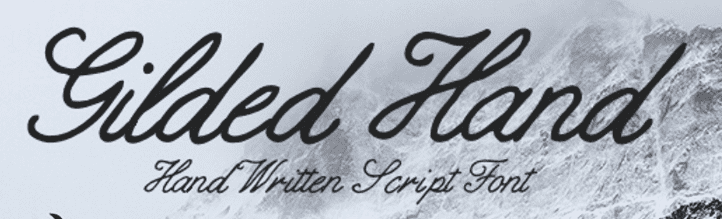
Our first font in this list was literally created by hand, which is evident when you view it. It’s a typeface that wouldn’t look out of place on an old parchment, and despite the ornate styling, its cursive nature is easy to read – not bad for $4.
However, we’d recommend using this solely for titles and headings, as Gilded Hand can be a bit hard to read at smaller sizes. This is to be expected though, as smaller-sized cursive scripts are often tougher to read.
2. Ball Pen
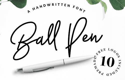
Next up, Ball Pen is a handwritten ‘hipster’-style font that manages to look both classic and modern at the same time. We’re particularly big fans of the way it looks in white, which could give your designs a carefree style.
We think this would look right at home on a vintage logo, although authors may also appreciate the way it invokes a quickly-jotted signature. As with Gilded Hand, it’s recommended to use this for applications such as super-sized titles or potentially callout text.
3. Daisy Dog
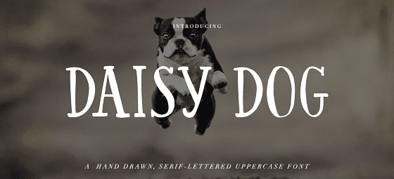
Daisy Dog has a vintage look, and this all-caps font is effortlessly stylish. It’s also highly readable, due to its design, which makes it an excellent option for header images, titles, and logos.
Just like Ball Pen, this font also looks very classy in white, which means sites with darker backgrounds should check this one out. Because Daisy Dog is all-caps, it’s not going to be suitable for general body text, although you could potentially find a place for it for callout or otherwise prominent text.
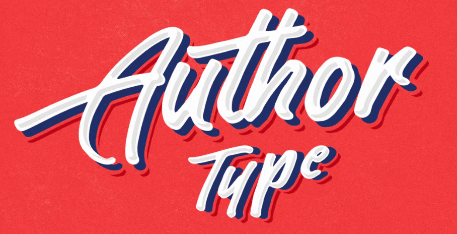
Author Type is the kind of font you’d expect to see in an old comic book or emblazoned on vintage streetwear. It oozes an old-school 50s charm, and due to its drop shadow, will give a site a slight sense of depth.
As for using the font, Author Type looks particularly at home within colorful designs. However, it’s a particularly great option for logos too, especially when using bold or monochrome palettes.
5. Stay Classy
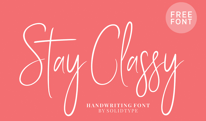
Arriving with much more refinement than Ron Burgundy in Anchorman, Stay Classy looks like a calligrapher’s dream. The letters are tall and narrow, giving the text a touch of elegance, and its semi-cursive nature offers ‘movement’ and leading lines as you read.
We’d recommend you try out this typeface within logos, and wherever you need to invoke style. We’d argue that social events websites would suit Stay Classy, although mommy bloggers will be pleased with how this looks in pastel colors on a white background.
6. The Delight
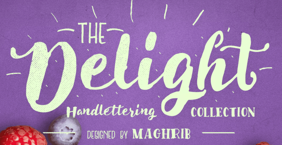
While the other fonts had a clear focus, The Delight’s style is hard to pin down. It references vintage posters or the kind of lettering fonts you see in print ads gone by.
To put it another way, The Delight is all about retro charm, and it’s ideal for a title you want to tower over an entire design, such as the heading for a wedding invitation. Food websites may also suit this font, as the ‘flecks’ and ornate elements have a slight feeling of ‘spilled cream’ as it were.
7. Adventura
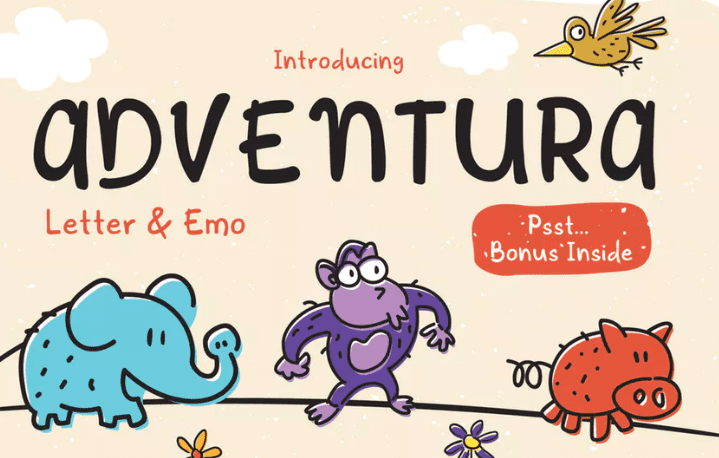
Adventura is the result of combining hand-lettering with a childish spirit. Unlike a lot of other fonts on this list, it’s sans-serif and non-cursive, which offers a ‘blocky’ look, albeit with some level of movement.
It’s the perfect pairing for a children’s book cover, or if you need to add text above an illustration. Even though it’s whimsical, it’s still very readable, and may even suit a more informal site in an otherwise formal niche. Overall, it can help you create some very fun designs.
8. Bigbang
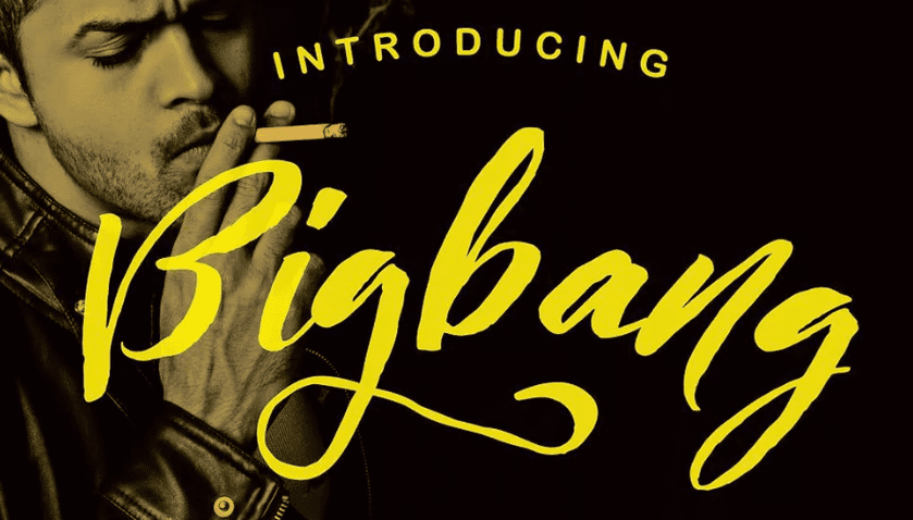
If you’re looking for a hand-lettering font that screams ‘rebel without a cause’, Bigbang is for you. Its grungy style makes it look like it was written using brushstrokes, which provides a distinctly personal touch.
However, the overall shape suggests it’s the kind of font that dominates designs, so we recommend you stick to using it for logos or impactful headers. ‘Hipster’ websites will also have yet another font to add to the wishlist.
9. Authenia
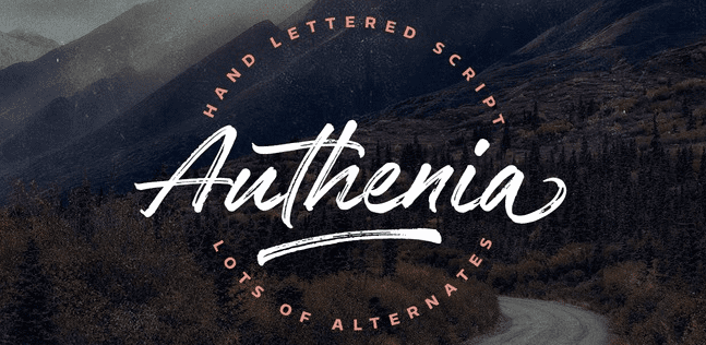
An example of another semi-cursive font, Authenia is a simple option based on brushstrokes. It’s almost ‘touchable’ and has a lovely texture that offers both depth and movement.
It’s the kind of typeface tailor-made for vintage t-shirts or outdoors activities, as it’s laid-back and italicized. We’d also suggest trying it as a primary logo font, especially given the alternates included.
10. Organika
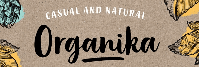
As the name implies, Organika is all about natural writing styles. It’s a casual font that’s also highly readable, despite being cursive and irregularly-shaped. As with other choices on this list, it’s going to be better used at larger sizes because of this.
If you’re looking for a typeface that wouldn’t look out of place on a jar of organic jam, this could be the perfect fit. Don’t let its ‘hippie’ style fool you, though – Organika has a lot of thought put into its design, and it’s a match made in heaven for cooking-related sites, and personal blogs.
11. Fineday
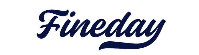
If you’re harking after a font to invoke thoughts of classic Cadillacs, jukeboxes, and malt shops, Fineday is likely near the top of your list. You may also notice its thick brushstrokes and devil-may-care swashes are similar to the logo of a distinctly red variety of cola. This font is also more flexible than most, as you can choose between cursive and non-cursive lettering.
It may seem niche, but if you’re working on a parody design, this is going to be a first-ballot font choice. However, it can also stand on its own – on restaurant websites, or vintage clothing logos, for example.
12. Beautiful People
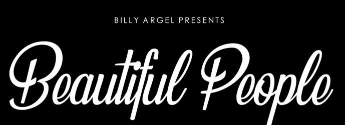
For our final few fonts, we’re going to look at the Billy Argel foundry, as there are some great examples of lettering fonts within. For example, Beautiful People has an ‘end credits’ feel for a black and white movie, which immediately gives it a touch of class. It features beautiful cursive loops, and very tight letter spacing. This means at anything but the most prominent of sizes, you could find readability a concern.
In our opinion, Beautiful People is ideal for beauty websites or wedding invitations. You could also employ this again within parody designs, or those situations where you need the visitor to relate to the golden age of Hollywood.
13. Tomatoes
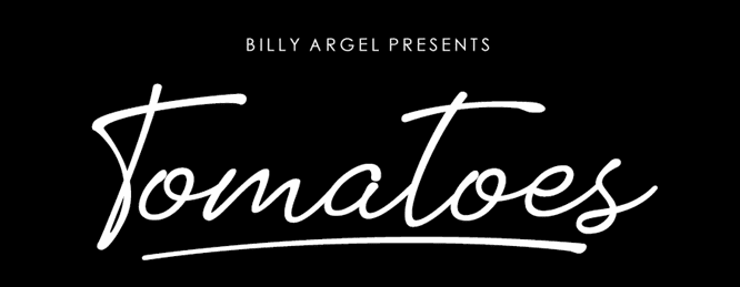
We’ve looked at ‘signature’-style font earlier in the list, and here’s another example. Tomatoes has the feel of an autograph, and although it has a ‘scrawly’ quality, it’s still readable. Because it’s also thin, you’ll likely want to make this font large.
Much like other letting fonts based on handwriting, Tomatoes is ideal for anywhere you need to fake text created by the human hand. We’re thinking author websites, prominent sign-offs, and similar.
14. Bite Chocolate
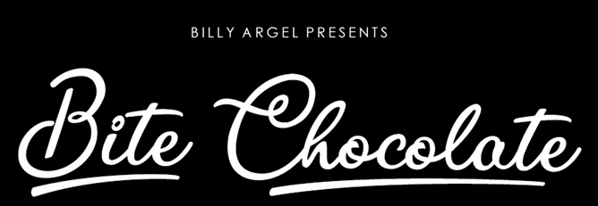
Our penultimate font looks incredibly similar to the style of lettering found on French chocolate wrappers – in other words, it’s incredibly classy. Bite Chocolate has plenty of movement and alternates, but we’d argue its main strength is its lack of flexibility.
To put it another way, you’d probably consider this for food-related designs, or otherwise whimsical looks. We couldn’t see how this would suit other designs where you’ve used cursive scripts, but of course, the specific application is key.
15. Cassandra
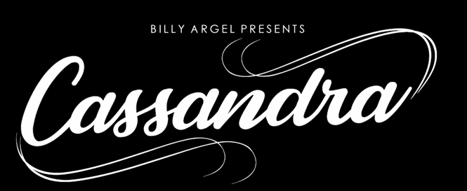
Last but not least, Cassandra features the kind of design that wouldn’t look out of place on a perfume ad or a fashion magazine. There are some great alternates and other extras, meaning it offers flexibility while still doing one thing really well.
All in all, it’s vintage and down-to-earth in one package. We think it’s a great fit for logo designs, although you could rein in its flourishes and use it for titles and headings too.
Conclusion
Fonts can come in all shapes, sizes, and applications. While lettering fonts won’t ever be mistaken for more professional choices, they’re going to be just the ticket for those looking for a writerly or whimsical site design. They hold an especially personal touch, but choosing the wrong one can give off a poor impression.
Our favorite lettering fonts are effortlessly elegant. For example, Gilded Hand is as fancy as its name sounds. In contrast, Ball Pen or Stay Classy gives off a signature-style air to suit personal blogs. You can even find examples such as Adventura, which could be perfect for websites focused on younger visitors, or otherwise informal businesses.
Do you have any questions about lettering fonts and their applications? Ask away in the comments section below!


Thank you
This fonts will be helpful for enhancing my website http://inheritindia.in/
Now i don’t have to search for fonts from the huge list.
Really very helpful. thank you for your awesome information. its really important for me to make my website more attractive.
You’re welcome, Kumar! 🙂
I’d love to see a similar article using only the fonts that are inside the Divi theme. The Google fonts. I haven’t had any luck with custom fonts. Or maybe an article on how to install a custom font 🙂
Nice collection, would be glad if you can mentioned few such lettering font from google library since most of these font are paid. i have never implemented any custom font in my projects yet.
I’m glad you liked the list, Abdul. You can actually find plenty of similar fonts by simply filtering the Library: https://fonts.google.com/?category=Handwriting 🙂
I like Tomatoes, and as I see it is free to download. Great font. Reminds to me stylistics of this movire “Bad Times at the El Royale”.
Great top, btw!
Thank you, Mike. 🙂
why do you call them lettering fonts? That sounds silly. Some are script fonts, some are handwriting style, some are decorative and artistic. All fonts are lettering fonts.
simply all fonts are professional but some particular fonts attract younger visitors.