
The fixed position property is a crucial position type to learn how to use properly. Fixed elements are important for improving user experience on your website. Fixed headers stay in view when scrolling through a web page, making it easier for users to navigate the site. Fixed sidebars keep important CTAs and Email Optins visible, boosting conversions. And the same goes for fixed notification bars, popups, and many others. Once we understand how the fixed position works and how to use it properly in Divi, we will have a powerful design tool to take our Divi sites to the next level.
Overview of Divi’s Four Types of Positioning
The fixed position is one of four position types available in Divi’s Position Options. Here is a quick overview of each one below.
Static (Default)
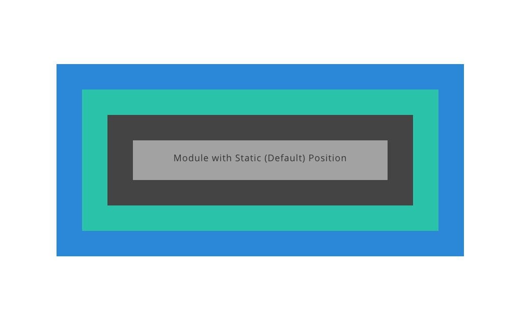
Static elements technically aren’t “positioned” since they stay with the normal flow or order of elements on the page, and they don’t respond to the top, right, bottom, and left properties like other positioned elements (which is why no offsets are available in Divi for elements in the static/default position). In Divi, when we choose the default position for a module, we are choosing the static position. It is also worth mentioning that some elements in Divi (like rows and sections) will have a relative position by default (not the static position).
Relative
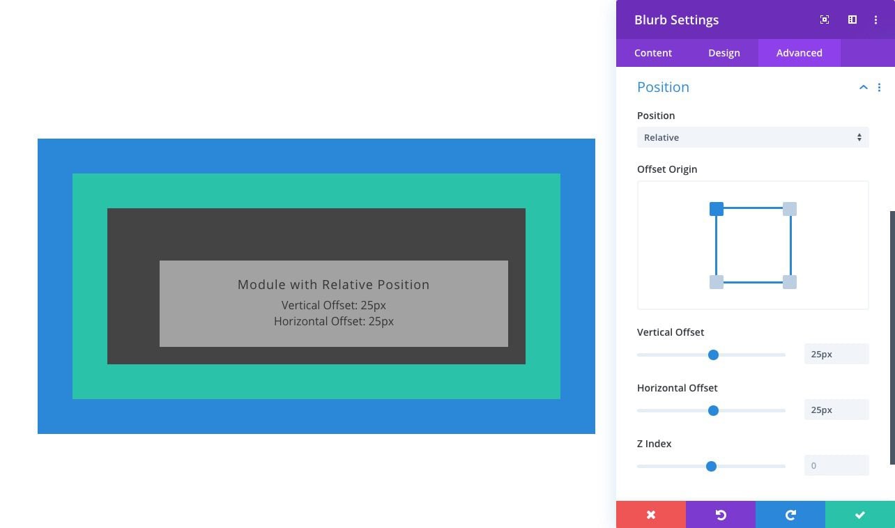
Relatively positioned elements are kind of like static elements in that they follow the normal flow of the page. The main difference is that relatively positioned elements can be positioned using the top, bottom, left, and right properties. Also, unlike static elements, they can also be positioned using the Z Index property.
For more, check out our guide to understanding and using the relative position in Divi.
Absolute
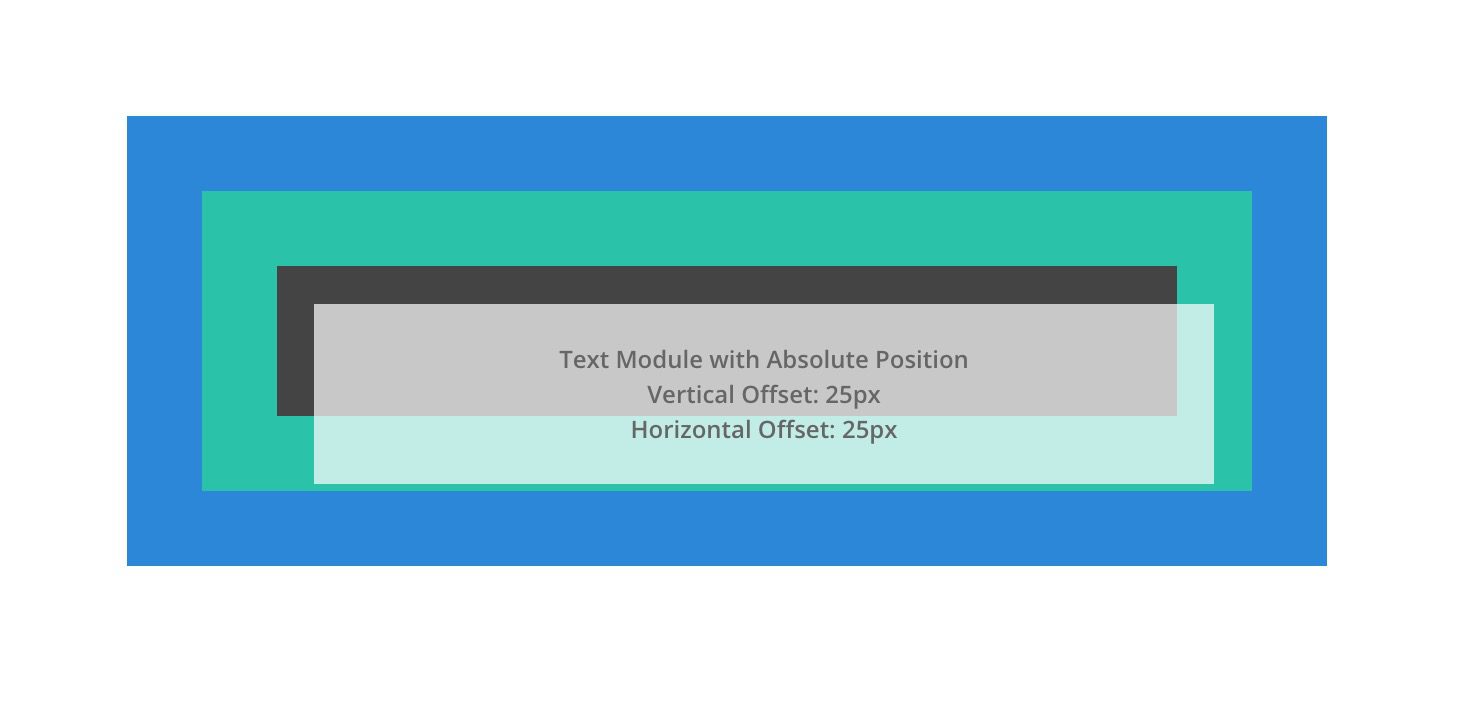
An absolutely positioned element breaks out of the normal document flow and therefore no actual space is created on the page for the element. We can think of it as an element that is floating on top of the other elements on the page that take up actual space. It will be positioned relative to the nearest positioned parent container.
For more, check out our guide to understanding and using the absolute position in Divi.
Fixed
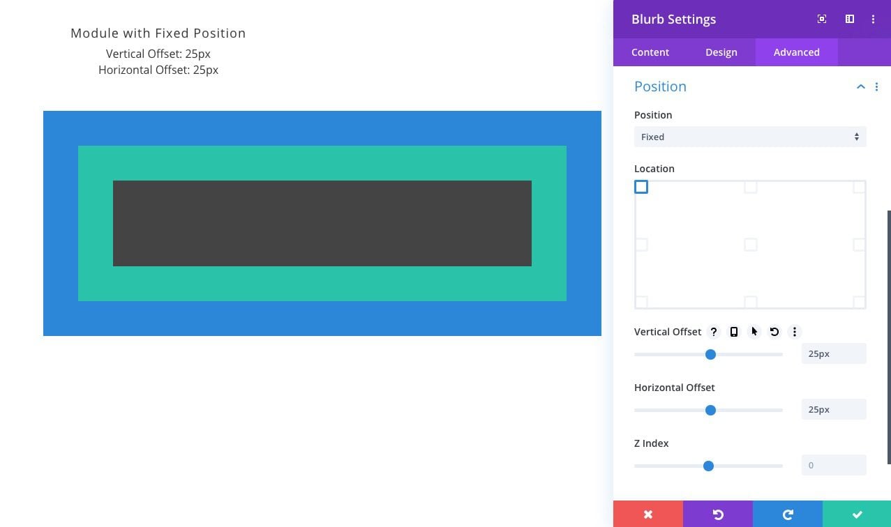
Like the absolute position, elements with the fixed position will break out of the normal flow of the page and have no actual space created within the page. The key difference between absolute and fixed is that the fixed position is relative to the browser window or viewport. In other words, no matter where the element is within the normal flow of the page, once it is given a fixed position, its position will now directly relate to the browser window. We can use the top, bottom, left, and right properties to position the element within the viewport. Because fixed elements will often hover behind or in front of other elements on the page, Z Index will help order fixed elements above others.
NOTE: There is another type of positioning in CSS called sticky. A sticky positioned element behaves like a relatively positioned element until we scroll to its container (at some point determined by the top value). Then the element becomes fixed (or stuck) until the user scrolls to the end of the container. However, the sticky position can be a bit unpredictable since other factors may inhibit the functionality. Sticky positioning will be built into Divi in the near future.
How the Fixed Position “positions” an element in Divi
As mentioned in the overview, the fixed position type is similar to the absolute position because the element breaks out of the normal flow of the document (the HTML on the page). Breaking out of the flow of the document means that the element won’t leave behind actual space where it was originally located on the page. Here is an illustration of a module with a relative position being changed to a fixed position. Notice how the area it originally created/occupied within the column is now gone and the module is now fixed at the top left of the browser window.
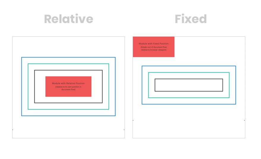
The big difference between fixed and absolute is that, unlike the absolute position which is relative to its parent container, the fixed position is relative to the browser window or viewport. This is why fixed elements say in view when the user scrolls down a page and absolute positioned elements may not.
Here is an illustration of how the three positions (relative, absolute, and fixed) function when scrolling down the page. Notice that the fixed module stays in place (positioned relative to the browser) as the user scrolls.
Using the Fixed Position Options in Divi
In Divi, you can give any element a fixed position by selecting the fixed position option in the Position option group toggle under the Advanced tab. You will also find the additional fixed position options (location, offsets, z index) once the relative position has been selected.
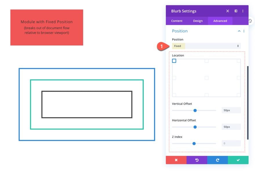
Adjusting the Base Location of the Fixed Position
Once you select the fixed position, you can choose a base location using the visual location interface. Depending on which base location you select, new X and Y Offset controls will become available.
Using Offsets with the Fixed Position
The Vertical and Horizontal Offset controls allow you to further adjust your fixed element’s base location across its location axis.
The Offset Origin and the Offset values will work together to position our element anywhere we want within the browser viewport. In this example, we have a module that has a fixed position, a top-left offset origin, a vertical offset of 50px, and a horizontal offset of 50px. Notice how the offset values will move the element away from the offset origin horizontally and/or vertically (away from the top left corner of the browser).
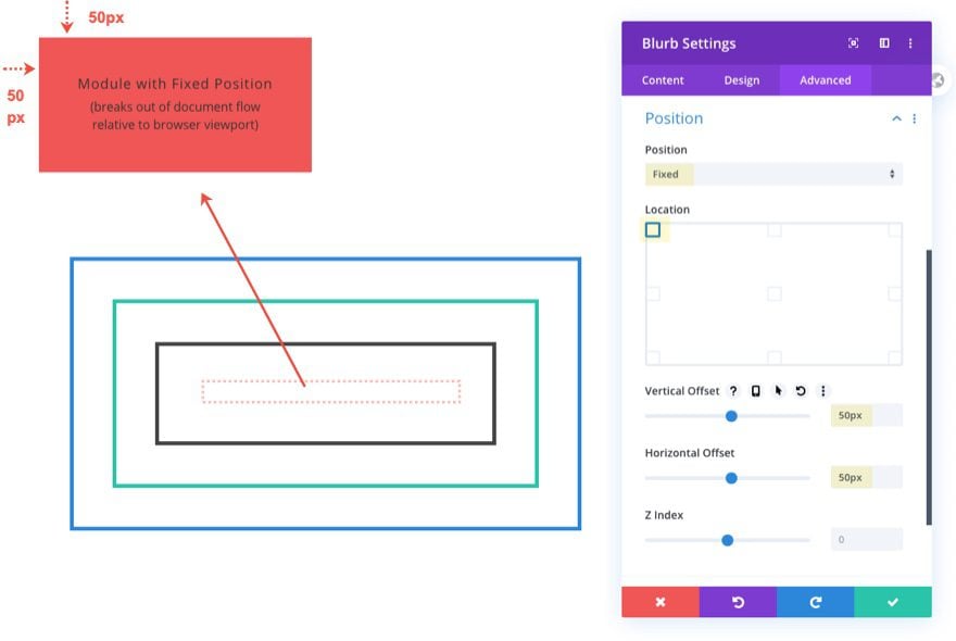
When using horizontal and vertical offset values in Divi (like top, bottom, left, and right properties in CSS) for a fixed element, it is important to remember that those values will position the element relative to the browser viewport. The Z Index property also comes in handy with a fixed element. Because most of the time you want those fixed elements to stay in front of the other elements on the page, you will need to give it a high Z Index value (like 9999).
Use Draggable Anchors To Reposition Fixed Elements On The Page
When you change an element’s position to Fixed, a draggable anchor will appear when you hover over the element. This allows you to drag the element to change its position. As you reposition the element, its X and Y Offset is adjusted within the module settings.
A Few Tips for Using Fixed Positioning
Adjust Fixed Elements for Mobile
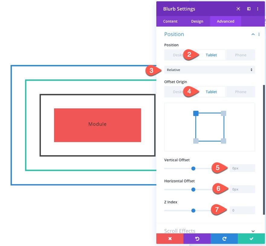
Don’t forget, you can set different positions and offsets on different device displays for responsive designs. For example, you may want a fixed header on desktop, but not on mobile. And fixed sidebars make sense for desktop, but aren’t really possible on a mobile phone display. To make the switch, you can adjust the position option in Divi to Relative on tablet and phone. This will snap it back to its original position within the flow of the document.
Create Space for Fixed Elements
Because the fixed position places elements outside the document flow, they sit above the content on the page. So if you don’t want the fixed element to hide content, you will need to create space for the fixed element. This can be done in a number of ways but is usually accomplished by adding padding or margin to the page layout.
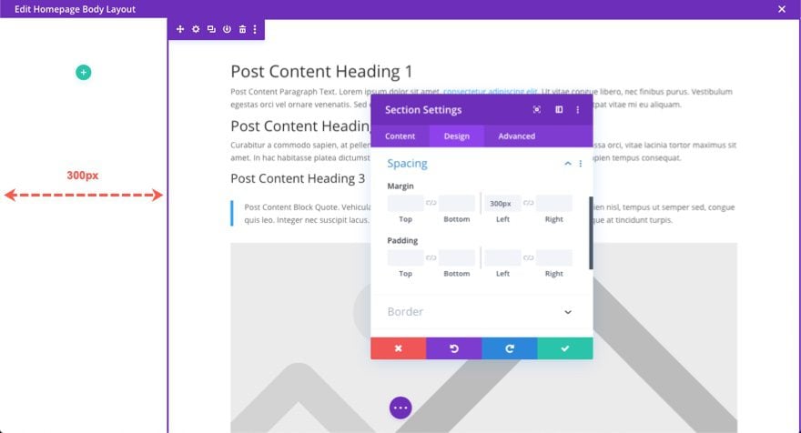
A good example is a fixed sidebar. If you wanted to add a fixed sidebar to your page template in Divi, you would first need to make sure the width of the main content area is decreased to create the necessary space for the fixed sidebar. So if you are using a section to create the sidebar, you could give the section a fixed position, a height of 100%, and a width of 300px.
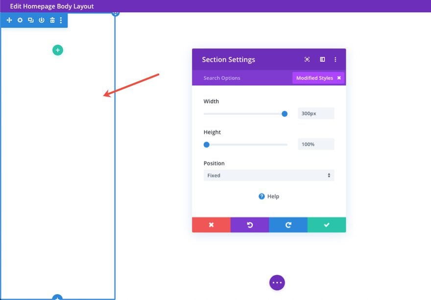
Then you would need to give the other section holding the post content module (the main content area of the page) a left margin of 300px to accommodate the width of the sidebar on the left side of the page.
Use a Higher Z Index for Fixed Elements
Unless the fixed element has been given adequate space for it on your page, it will overlap the other content on the page. In most cases, you will want the fixed element to remain visible (on top) as it collides with other elements on the page while scrolling. To do this, you can add a higher Z Index to your fixed element to make sure it stays above all other content in Z space. If you don’t know what value to give, you can add a large number like 9999.
6 Ways to Use the Fixed Position
#1 Fixed Headers
One of the best uses of the new fixed position options is the creation of fixed headers. Using the Divi Theme Builder, you can build an entirely custom header and make the whole section fixed.
How-to Post
Here is a post on how to build a fixed header in Divi:
Much like fixed headers, some websites benefit from fixed footers or footer bars as well. This allows users to keep prominent info at the forefront in a more subtle location. Fixed footer bars are great for mobile phones because they are really close to those thumbs itching to click a button.
How-to Posts
Here are a few posts on how to build a fixed footer bar in Divi:
- How to Create a Fixed Footer Bar for Your Divi Theme
- How to Create Fixed Mobile Footer Bars with Divi
- How to Create a (fixed) Mobile Contact Bar in Divi
Fixed sidebars keep things like menus, email opt-ins, and CTAs readily available to visitors as they navigate your site. And if you want, you can add overflow scroll to the fixed sidebar to have a nice scrollable fixed sidebar with tons of content.
How-to Posts
Here is a post on how to build a fixed sidebar in Divi:
- How to Build a Responsive Fixed Sidebar with Smooth Scrolling Anchor Links with Divi
- How to Create a Vertical (fixed) Navigation Menu for Your Divi Website
Back-to-Top buttons usually are fixed at the bottom right of a website, always available for users to click in order to send them back to the top of the page.
Here is a post on how to build fixed back-to-top buttons in Divi:
Most menus that slide in or popup have a fixed position. These are great for mobile as well.
Here is a post on how to build a fixed menu in Divi:
#6 Fixed Notification boxes, Calls to Action, Email Opt-ins, etc…
Here is a post on how to build a fixed notification box in Divi:
Final Thoughts
You won’t get very far in web development before encountering the need to use the fixed position. It is used in many key elements that make up a website. In Divi, the fixed position is only a click away, but it is important to understand how it works to use it well. Hopefully, this article has helped you understand how to better use the fixed position in Divi so that you can take your next project to new heights.
What has been your experience with the fixed position type?
I look forward to hearing from you in the comments.
Cheers!


How do you modify the vertical offset with CSS?
By using the
translateY()CSS function. Check this guide: https://developer.mozilla.org/en-US/docs/Web/CSS/transform-function/translateYWonderful article Jason! Very well written and explained. Thanks for sharing.
So glad you liked in, Kedar! Thanks for the support.
Hi jason I really enjoy the fixed position feature with the new divi theme update You have explained this very nicely
That’s very glad to hear, Sam. Thanks.
Thanks Jason! As Love Divi Always LOVE Divi!
You are welcome!
Stay tuned. It’s coming.
I’ve been exploring these options lately and am a little undecided about whether it is best practice to apply position settings to a column or the module itself? Any thoughts?
Actually, it would depend. If you were looking to position a group of modules within a column, adding the position option to a column could work. But if you want to position a single module, add it to a single module, not the column. Just keep in mind that using the absolute position on a module will be relative to the column container. So you will need to give your column a set height, or more padding, to increase the space available for the module to be positioned within the column. Hope that wasn’t too confusing.
I don’t keep that many articles in my “most useful” folder but I will be adding this one to it. Many thanks as I now have a much better understanding.
That’s so good to hear, Brian. Thanks for the support. Glad it helped.
Awesome feature that I use in all my designs.
Me too! For the most part.
Thanks for the info for Fixed Position with Divi, this is one of my favorite features with the new divi theme update. Glad I got the membership with Elegant and looking forward to learning more.
Awesome, Jasmin!
Awesome. Thank you!
Excellent article, Jason! Very well explained. Thank you!
You are very welcome, John-Arild.