Introducing Position Options
Take Full Control Over The Position Of Any Element
Today we are excited to introduce yet another wonderful visual design tool for the Divi Builder in the form of Position Options. Position Options give you a new level of control over the position of every element on your page, including fixed and absolute positioning options that allow you to move elements freely around the page untethered from their parent containers. You can create fixed headers and banners, dynamic images collages, fun and interesting overlapping effects, and it’s all done using a super intuitive new visual interface. You can even move elements around right on the page using new draggable anchors. It’s a lot of fun and it gives Divi designers even more ways to be creative.
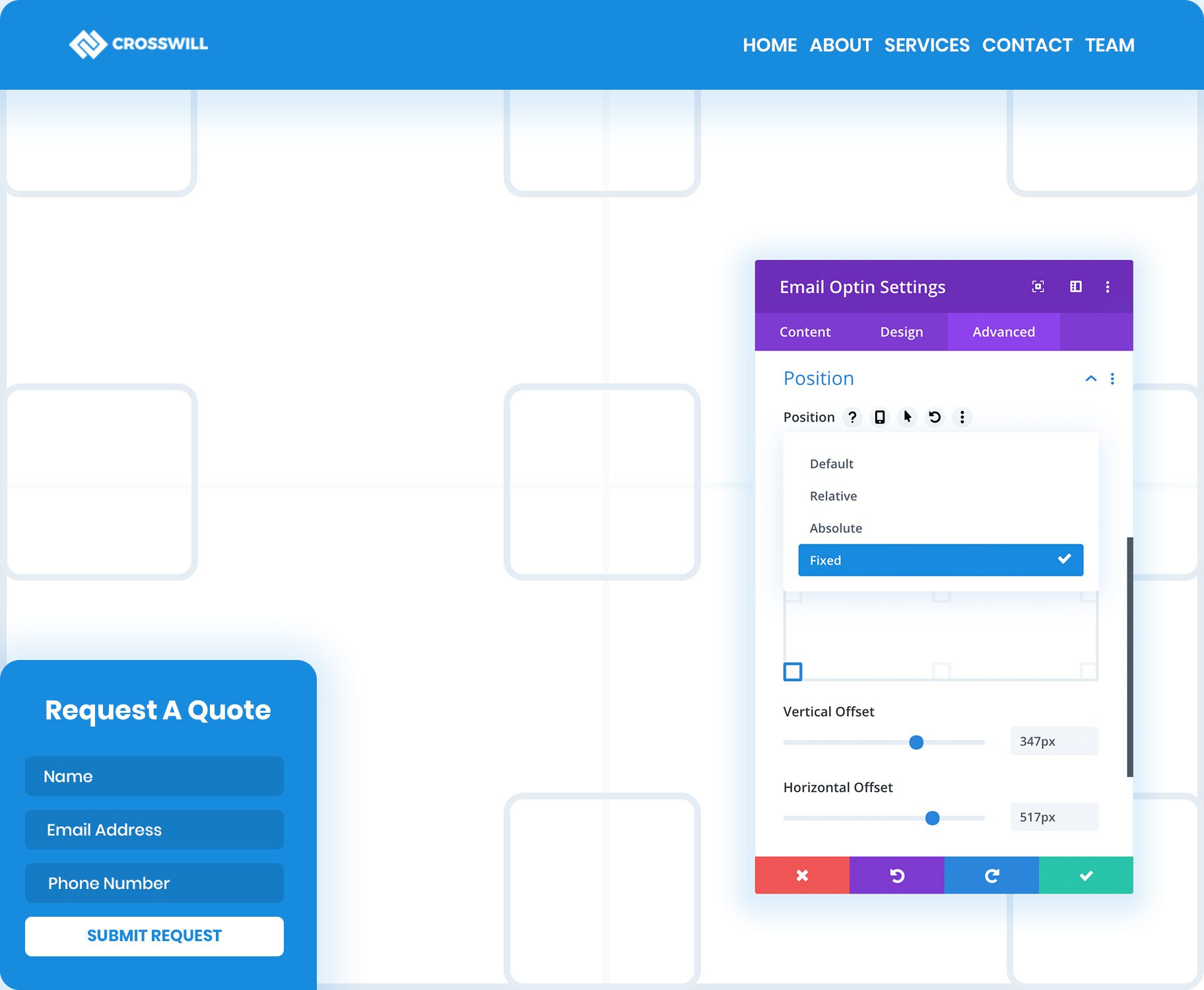
Choose Between Fixed, Absolute & Relative Positioning
Every Divi module, row and section has a new Position option group. Here you can assign a position to your element, including Fixed, Absolute and Relative. If you know CSS, these options will be familiar. Relative, fixed and absolutely positioned elements can be moved around the page freely without disrupting the elements around them. The position of fixed elements are based within the browser viewport and they remain stuck to their location within the browser viewport as your scroll down the page. Absolutely positioned elements are based within their parent container and do not remain stuck to the browser viewport as your scroll. Relatively positioned elements work similarly to absolutely positioned elements, except the original block element does not collapse, leaving empty space and structure behind as you adjust the element’s position. To reiterate:
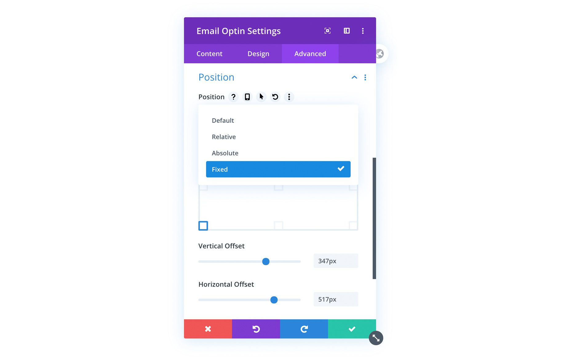
- Fixed Position – Used to create sticky elements such as fixed headers and floating banners that stay visible as you scroll down the page. The element is broken free from its parent container and is positioned with the browser viewport instead.
- Absolute – Breaks the element free from it’s static position and instead allows the element be moved around relative to its parent container.
- Relative – Allows you to adjust an element’s position, but does not change the element’s relationship to the elements around it. The element’s positioned is relative to itself.
Control Base Location & Horizontal/Vertical Offset
Once you select a position, you can choose a base location using our new visual location interface. Depending on which location your select, new X and Y Offset controls will become available. These allow you to further adjust your element’s location across its location axis.
Use Draggable Anchors To Reposition Elements On The Page
When you change an element’s position to Relative, Absolute or Fixed, a new draggable anchor will appear when you hover over the element. This allows you to drag modules, rows and sections right on the page to change their position. As you reposition the element, its X and Y Offset is adjusted within the module settings. As with all Divi settings, the X and Y Offset controls can be adjusted on desktop, tablet and smartphone independently, allowing you to use position options to create responsive designs.
Fixed Headers & Floating Elements
Keep Important Elements Front And Center As You Scroll
Using fixed positions allows you to create floating elements, such as fixed headers or floating banners. Fixed elements can be positioned anywhere within the browser viewport and will remain fixed to that location as you scroll down the page. You can make any element fixed and some common uses include: Fixed headers, floating opt-in forms and lead generation forms, sticky buttons, important notices and more.
Create Custom Fixed Headers In The Theme Builder
One of the best uses of the new fixed position options is the creation of fixed headers in the Divi Theme Builder. You can create fixed menu modules or you can build an entirely custom header and make the whole section sticky.
Build Floating Banners, Buttons & Opt-In Forms
Anything can utilize the new fixed position options, not just headers. You can create fixed opt-in forms, lead generation forms or floating call-to-actions. If there is something important that you want to remaining accessible for your visitors, you can fix it to their browser viewport so that it’s always a click away.
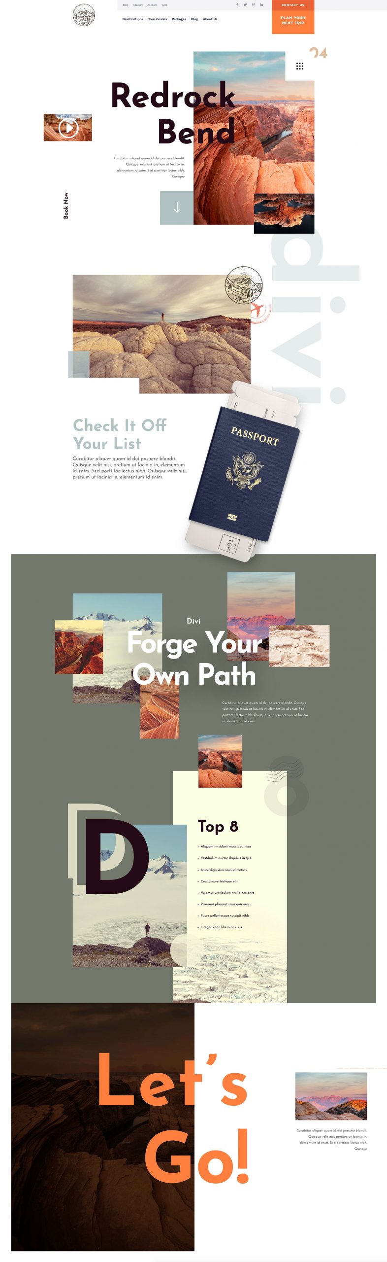
Stack Elements To Create Fun Overlapping Effects
When you change an element’s position to Relative or Absolute, it allows that element to be moved around the page freely without disrupting the elements around it. You can even stack modules on top of each other to create overlapping effects and image collages.
Think Outside The Box
Unlock Your Creativity With Unique Element Positioning
View The Position Options Demo
Join Or Upgrade Today For 10% Off!
Today's The Best Day To Get Divi Or Upgrade Your Account To Lifetime
Join the most enthusiastic and loving WordPress theme community on the web and download Divi 3.0 today. Using the new Visual Builder, you can build websites faster than ever before with its incredibly fast and intuitive visual interface. You have to see it to believe it!
Join Today For 10% OFF!
Renew Your Account Today For 10% OFF!
Upgrade Your Account Today For 10% OFF!

Really impresive, i have created a hundred of website using this builder
Can you please tell me about amp plugin for wordpress, means how to configure it
Great update, thanks!
Divi is great, so simple… but, yes, but, please, renew the UI! Too many clicks, To many panel, to many section… Give us the possibility to block a widget/option-panel/seo interface (did you see what RankMath did with Elementor) somewhere in the screen… just to have more flexibility and order.
Wow thats great feature, now all the elements gone break free from the layout! i’m loving it, it will save a lot of time and testing.
Keep them coming…
but one issue
the site which are using lot of css are having a lot of problem with every update, now we have to check site after every update.
Thanks Nick
The demo looks amazing – elements being moved around so quickly and freely. But in practice, they move excruciatingly slow when I try to use the position anchors – am I doing something wrong – or was the demo sped up to make it look cooler!?
Hi,
Good work but since version 4.2 some bugs appear on some sites:
– the video module in a normal section: distortion of the video
– why did you add min-height: 40px for the class .et_pb_column; the personalized top bar and the personalized bottom bar are wider in height than original
Thanks
Where’s position: sticky?
Yes, sticky was demonstrated a while back in one of the tutorials and would be a great addition in the headers templates. I tested it there and it didn’t seem to work and had to revert to jQuery for the effect I was looking for. Perhaps it isn’t technically possible at this stage, perhaps a future update.
Excellent job! Thank you guys
Awesome! Thank you!
These are brilliant! Thanks elegant themes team! ❤️ Much love from me!
Great feature but the 4.2 update just broke 4 sites of mine after update. I managed to rollback 3 of them but the 4th had a bad backup set so I will either just have to go through each page and try to fix each image not loading properly or setting not being applied and hopefully get back to square one 🙁
Nice update, well done.
By cons it is difficult to use the anchors on small modules like buttons.
Learning will sometimes be complicated, but congratulations on this major advance.
Here’s a question – Why does the 4.2 update throw {position: static !important} on random sections and modules? We just updated a bunch of our sites and now my Friday has become quite stressful.
Use the “Divi Rollback Feature” Michael – That should save your Friday. Revert to the previous version.
Yes! So excited for this! Can’t wait to build out these new modules!
You. Guys. Are. So. Ridiculously. Awesome!
Oh I’m glad I bought the lifetime deal on Black Friday!
That is awesome, brilliant. Thank you!
It is going to save so much time and headaches adding CSS classes here and there.
I don’t know how you manage to keep all these enhancement coming so rapidly. They’re all good, but this one is really outstanding. I imagine this will complicate things from a Responsive point of view, but it’ll be well worth it and enable professional developers using Divi to add even more value.
I must say, the presentation of information on this article is amazing.
Hi guys,
Can we get ta template of the ‘position options’ page to see how its built?
https://elegantthemesexamples.com/position-options
Thanks, i love Divi!
Hi,
Good update but, I have a question:
If I want to have a fixed module only inside its own section and not on the entire page, is it possible to do that with this new option?
This is great news! Thanks you! But will scrolling animations be added in the future updates?
I would like to see an option that you can turn off the standard style.css sheet when the website goes live. Now my own css overrides the standard css. Speed improvements and more customization to the mobile header (able to use .svg as a logo file). And customization to the dropdown menu’s.
Hello,
really nice, I hope I will soon learn how to use this.
When I saw that update announcement I thought that this will be the solution to make the MENU on se side, vertically. I tried the fixed-options on the menu-element, the row and the section I inserted with the menu element to try this new feature but I do not how to do this.
Maybe I should wait a blog post that explains it for “dummys” as me?
Thanks, greetings from Italy
This update is incredibly wonderful!
You guys have given me MORE reason to continue using Divi. Thank you guys for looking out for your customers. Amazing product, amazing team!!!
You Rock guys ! That’s awesome !
Super option.
Any update list of theme in date-wise from ver.1 to 4.XX
Really delighted to be a Divi lifetime member. The theme keeps getting better and better, you guys are just blowing away the competition.
Wait, I’m considering use DIVI for my blog….
Oh yeah, I’m looking forward to experimenting with this! Thanks, ET!
Woow, well done guys! And happy new year!!
Thats really great feature. When divi is going to introduce block elements – like predesigned sections to design a webpage?
Yes! I love how Divi keeps innovating in the WordPress space. So cool to see yet another new feature so soon!
What plugin are you running to achieve the video popout/screen overlay when you click the play button in the header of this article? I’d like our videos to play in a popout window but it doesn’t seem like Divi offers that as built-in functionality so wondering what plugin is used (assuming it’s been vetted and recommend by your dev team). Thanks!
I’ve installed 4.2 but now I can’t edit sections or rows. When I click the cog icon, nothing happens.
I rolled back to 4.1 and everything works again.
Any ideas?
having the same issue –
any solutions here?
You can try to clear the browser cache
Very interesting ! Thanks a lot !
And… Happy New Year for you and for all your team !
how to use overlap option position is ok but i could not do overlapping moves
Okay. LOVE THIS. Awesome addition and update.
One question – is there a way to release the FIXED position when another section appears on scroll? I can see having the fixed position solve some content scrolling design challenges.
Example: image to the left stays static in col 1 and in col 2 the text scrolls past. Once the text has passed, there is no need for that image to be fixed anymore. How would you recommend releasing the fixed image when a new section scrolls into view?
This is great – thank you!
I really appreciate you guys! Always I had wish this featurein Divi and it comes true tonight. It’s 2:04 am now and I’m very excited like who his dream cames true ! Thank you guys Divi is the best by far in the industry. Love you guys. Keep going❤️
Always impressive! Thank you for this amazing update.
AMAZING.
Nice update!
That’s amazing Nick ! Perfect not-CSS beginners! Thank you!
Hi Nick,
While these new features look good on theory (and in the video) in practice things don’t look great. So, I have two test sites, one is on hosted server, the other is local. The online site is using the Divi Builder plugin and third party theme. It already has several theme builder headers for testing. I previously rolled my own css for the fixed effect. Tonight when I do the update the first thing I observe when I scroll is that several sections scroll over the header? So I undo the mods and try the new Divi feature. No improvement!
My local site is a collection of layout tricks, many of which are from much appreciated Divi tutorials. I have the espresso layout and its header set up as one these and it is very nice. Same scenario, I set up the header to be fixed, but with the update, this does appear and then suddenly fades away into the ether as the main part of the page fades in. Again with the new Divi feature the same thing. I do notice though that in between my mods and adding fixed by the settings that in its relative state the headers appear fine. It may be related to fading in page sectionsI have seen this cause a few issues with theme builder headers but nothing like this.
I could do a bit more testing but I am tired now and I would like to stress really tired of the increasing testing I have to do to be sure Divi is functioning properly.
I see too many breaking changes with the updates on the last year. Luckily I usually test on local backups and can deploy workarounds quickly without having to contact support or bring it to this party. But lately it is getting unbearable.
You have a great product in Divi but you need to look after it. There are many others saying the same thing, you need to dedicate the next number of months on development and release cycles in fixing all these problems and improving compatibility with certain third party plugins.
Thumbs up for the new position updates. Definitely very useful, as demonstrated in the video. The only issue is not getting confused between when to use these settings or the transform options. They seem similar but are different in what they are designed to do.
Apologies for forgetting to give my positive feedback earlier. It got overlooked in the grumbling conflicts I was having with this update.
The z-index of the header needs to be higher than your content. That includes parent elements, such as the section containing the header. Z-index can be adjusted in the Position option group.
Even with 99999 it makes no difference?
You also need to set the z-index of the object below. So the bottom one 1 and the top 999999. z-index only works if you set values for all objects
That worked for me! Thanks.
I have the z-index problem ALWAYS with a 3 column section. I can NEVER get the left section to sit on top of the middle section. Something about the basic behavior of WP? I have left and right at 999 and the middle at -999. No joy.
Nick, Robin,
Keeping an open mind, subject to some additional testing and troubleshooting I need to do, your suggestion that I need to apply a z-index to body content elements to fix this, doesn’t add up. If you read my initial comment it says that these layout were already and that the fixed header was already being applied with custom css. Body layout should not suddenly take on a higher z-index all of a sudden, unless there is something untoward with the Divi update. I also added the appropriate z-index values for the header section and first body section by the inspector in Chrome, and even with !important, zero effect.
Nice , thanks
ET lifetime membership was the best thing I ever bought!
I can totaly second that!
Upgraded to lifetime during the last !black friday”.
Best ever!
+1 on that! Divi makes my life easier.
Wow, wow, wow… It’s sounds very great option for work.
Congratulations…!!!
Good job…!!!
Now this could well break the standard grid type design, brilliant feature.
I have to admit that after years of slogging through various themes and page builders for client sites, Elegant Themes and DIVI continues to amaze me. My folders of premium/professional themes and tools for WordPress acquired over the last 12 years are flowing with “has been” and “was barely adequate”. I’d have to rank your products as about the smartest tool in my box. Keep up the good work.
So how about building in whitelist? I know there are third-party plugins, but faster sites demand fewer plugins!
Wwwwwow! Thank you team!
Will ET be introducing a time travel module soon that will enable me to use position options in Divi websites I built without them, thereby saving massive amounts of time spent in the past and applying that time to present and future projects?
Also, can I use position options to get better seats at concerts and sporting events?
You continue to amaze.
I hope this isn’t the only solution you have to making Theme Builder headers be better. Would like to have more control over the position and height during scroll; such as header shrinks on scroll, or changes to a different layout entirely.
+1 – is there any way to achieve this currently eg make the logo smaller on scroll?
+1 from me as well, would love to be able to mimic and then improve on the behavior of the old header (pre theme builder) with fixed positions, shrink on scroll, and so on.
+1
Great work! This is a great new functionality to have when designing and thinking through layouts.
When can we try it??. I hope very soon!….I was just fighting with this in the last days!.
GAME CHANGER!
Looks good. I get the fixed & absolute position stuff but how is the position adjustment different to the existing CSS position transform option?
You guys killed it with this one!! <3
looks great. I’ll give it a try.
How does it work in mobile view?
Position options can be adjusted for desktop, tablet and smartphone just like all other Divi design settings.
would it also work seemingly across all browsers?
Yes this is standard CSS. It’s supported by all browsers.
:)!!!!!!!!!:)
is this available on “extra” theme too ?
Yes it’s available for Divi, Extra and the Divi Builder plugin.
Wow, I love this one. ❤️
Amazing! Thank you so much.
Divi 4 is really a game-changer as you said before and not like before, improvements that you made, is faster, more usefull and more creative.
We are also waiting for more options, include a modern mega menu with category and image capabilities, more Woocomerce options like image change on hover, & also performance improvements and etc.
I believe in your team.
Regards
I am definitely loving Divi more and more. Thanks Nick
NOW er’re talking! This just saved me a lot of time and provides more creativity!
Thank you! This looks great but I wonder how the mobile responsiveness of this feature
Rebecca Nguyen = Exactly what I’m wondering. My guess is that it has to be set up separately from scratch for larger screens, then for mobile screens.
This is a very awesome feature! In my opinion Divi is one of the best Theme exixting on the market. I have some features suggestion for the team:
– Display options: flexbox (in particular) and the others
– Align Items / Justify Content options (linked to flexbox)
– Possiblity to manually edit the column size ( similar to VC. Ex: 1/2 + 1/4 + 1/4 for having more freedom )
– Possibility to add more than six columns
– Nested rows for extend the power of special sections ( quite limited )
Really nice suggestions Tony! Those are one of the options I’m missing the most, just like these Position options they are introducing now (which means less CSS to write on the child theme)
Wow! Why was this not hyped up with a countdown for a new release, honestly the best upgrade yet imo 👍🏼
Love it
Thankyou
How about simple ADA compliance!!!!!!!!!!!!!! PLEASE ADDRESS THIS!!!!!!!!!!!!!!!!!!!
Timothy Graf – “Simple ADA compliance” is an oxymoron.
Amazing.
Nick please consider improving the Woocommerce functionality like better ways to build Shop e Product Category pages.
The process could be smother and with more options like show the product short description or the button, without using code in the functions file.
And a way to show a query of products based on categories that can be built with the theme builder and custom fields and display in any page that we want/need.
Nick you are spoiling us with great features and it is human nature to always want more.
But great work.
It is getting very hard NOT to choose Divi.
Now this is what I call freedom! I can’t wait to try it!!! <3
This is yet another superb update from the guys at Divi.
Looking forward to testing on a staging site later.
THANK YOU! Finally we can position modules at the bottom of columns without hours of CSS flex and align hacks that often fail! THANK YOU!
Thank you! You and your team just keep impressing me. Well done, Elegant Themes!
Very nice, takes away some time for me to do the CSS as Im like a noob level CSS skill lol
Nice, less custom CSS code!
Wow! Love this.
This is a very welcome addition. Positioning freedom and ease of use is going to save me a ton of time in making custom layouts.
Mind blown!!! I know you’re trying to make us ditch the design softwares altogether and damn you’re on the right path, I give you that!
OMG you guys are on FIRE! 🙂 x
This looks so awesome! I can’t wait to play!
AMAZING.
Yes! Congrats Elegant Themes! 😍
AMAZING!!
Divi recent updates are fantabulous! Please have these coming soon: grids, flex and tools to speed up websites be selective loading scripts and lean code.
Agree! Though the updates of the last year are a milestone for a front builder. I’ve tried others and there’s anything as flexible as Divi. But yes, selective loading would be sweet
BOOM! Divi just got real… heck yes! Thankyou! This happy girl is no longer considering jumping on the bandwagon of another builder that I won’t name 🙂 So excited about this upgrade! Can’t wait to start on some limitless designs and see what is actually possible!
Selective loading is an amazing idea!
I love this update! It’s absolutely awesome. Thank you. But I am still waiting for more subtle features such as being able to customize the mobile menu or more mobile menu options. Its the little things that I hope can improve for me. I am tired of paying 3rd party fees to customize the menu for mobile devices.