
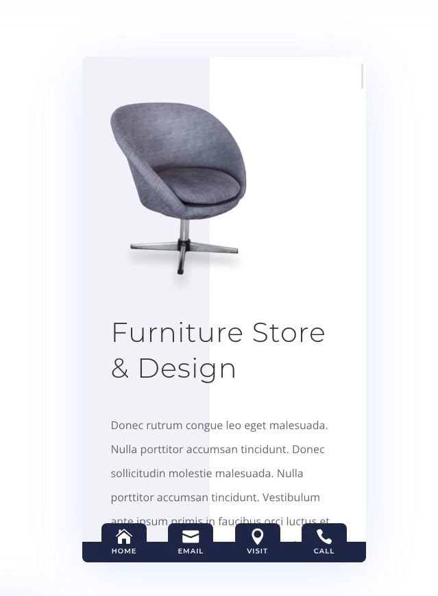
Sticky footer bars can be a useful addition to any website, especially for mobile devices. A sticky footer bar remains fixed (or stuck) at the bottom of the screen as the user scrolls through the page. Its position makes it more accessible to mobile users (especially on phones) because it is so close to the thumb. That’s probably why designers often include navigation buttons inside sticky footer bars. It can boost the navigation UX on mobile.
In this tutorial, we are going to show you how to create mobile sticky footer bars in Divi. The foundation of any sticky footer bar is the fixed position which is easily controlled with Divi’s built-in sticky position options. We’ll show you how to use the sticky position and the suite of Divi design tools to design 3 different sticky footer bar designs, each with 4 navigation buttons. This will work well for any company looking to improve its site’s UX on mobile.
Let’s get started!
- 1 Sneak Peek
- 2 Download the Sticky Footer Bar Template and Layouts for FREE
- 3 Download For Free
-
4
Creating Mobile Sticky Footer Bars in Divi
- 4.1 Part 1: Creating a New Footer Template in the Theme Builder
- 4.2 Part 2: Creating the Sticky Footer Section and Row
- 4.3 Part 3: Creating the Footer Bar Buttons
- 4.4 Part 4: Save It to the Divi Library
- 4.5 Part 5: Creating Mobile Sticky Footer Bar Design #2
- 4.6 Part 6: Creating Mobile Sticky Footer Bar Design #3
- 4.7 Part 7: Disabling the Sticky Footer on Desktop
- 5 Final Result
- 6 Final Thoughts
Sneak Peek
Here is a quick look at the mobile sticky footer bar designs we’ll build in this tutorial.
To lay your hands on the designs from this tutorial, you will first need to download it using the button below. To gain access to the download you will need to subscribe to our newsletter by using the form below. As a new subscriber, you will receive even more Divi goodness and a free Divi Layout pack every Monday! If you’re already on the list, simply enter your email address below and click download. You will not be “resubscribed” or receive extra emails.

How to Import the Free Template and Layouts to your Divi Website
This download contains two files. One can be used to import the footer template to the Theme Builder and the other can be used to import the individual section layouts of each footer to the Divi Library.
To import the sticky footer bar template to your own website, unzip the download zip file to access the JSON files.
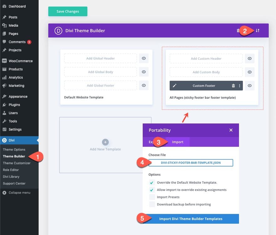
Then go to the WordPress Dashboard and navigate to Divi > Theme Builder.
Then click the portability icon at the top right of the page.
Inside the portability popup, choose the JSON file from the folder called “divi-sticky-footer-bar-template”.
Then click the Import button.
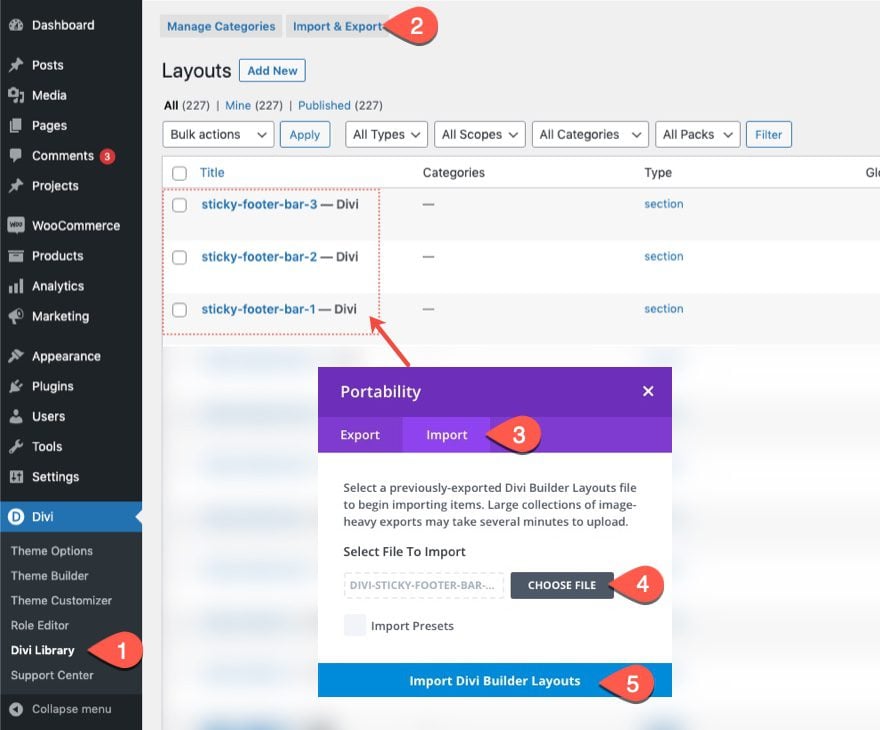
To import the 3 sticky footer bar section layouts to your Divi Library, navigate to the Divi Library.
Click the Import button.
In the portability popup, select the import tab and choose the JSON file (“divi-sticky-footer-bar-section-layouts.json”) from the folder you downloaded (and unzipped).
Then click the import button.
Once done, the section layouts will be available in the Divi Builder.
Let’s get to the tutorial, shall we?
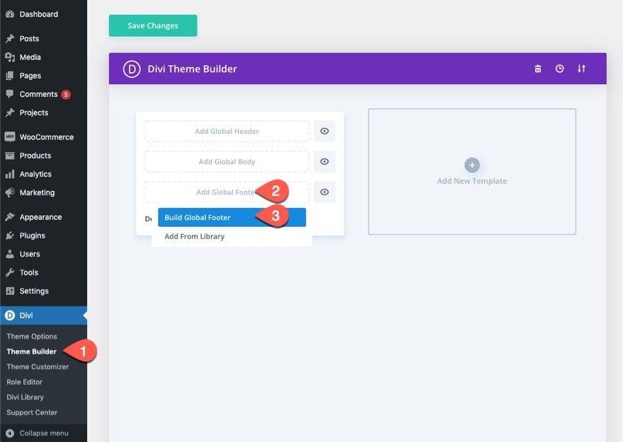
To kick things off, navigate to the Theme Builder and click to build a new global footer in the default website template. (Alternatively, you can add a new template for testing purposes.)
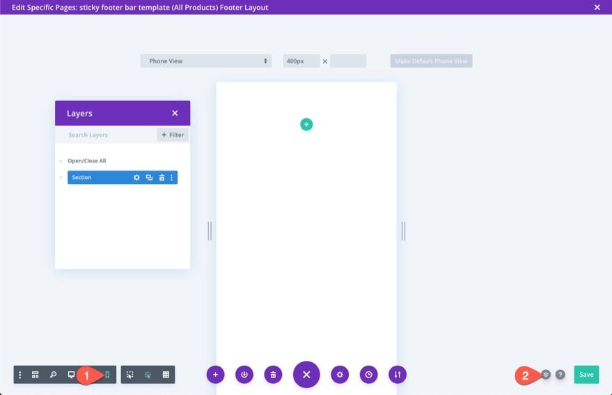
Deploy Phone View and Layers Modal
Once inside the footer layout editor, open the settings menu at the bottom of the page.
Click the phone icon on the left side to open the phone view of the builder. This will help visualize how the sticky footer will look on mobile as we design.
Then click the layers icon on the right to open the layers modal. This will help with selecting elements whenever they get too close together.
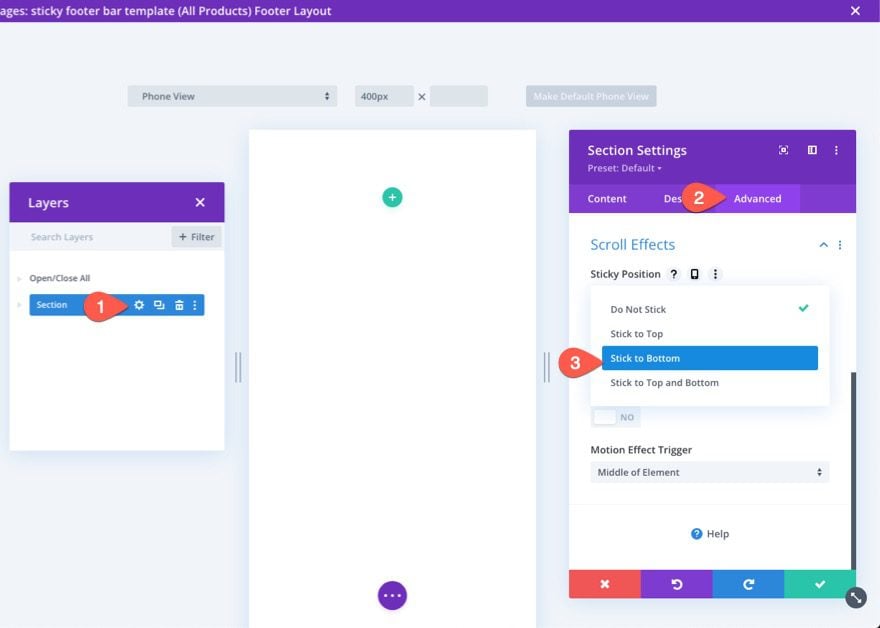
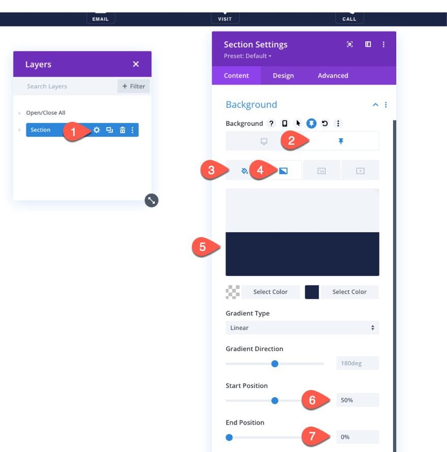
Creating the Sticky Section
To create the sticky section, we can use the existing default regular section.
Open the settings for the section and, under the advanced tab select the sticky position option Stick to Bottom.
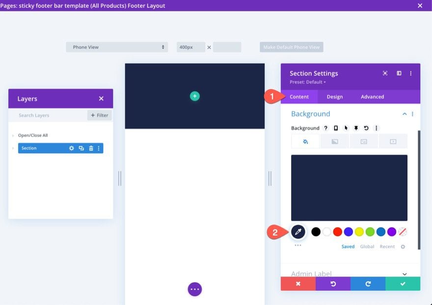
Under the content tab, add a background color to the section.
- Background Color: #1a2545
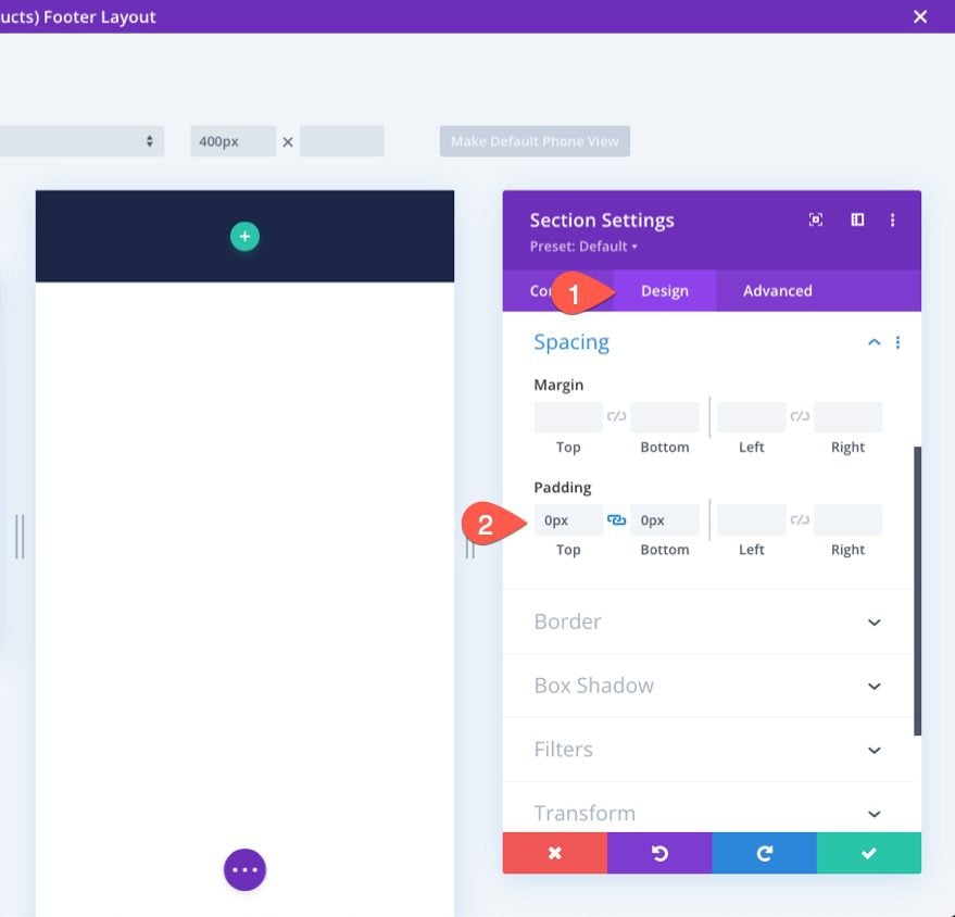
Under the design tab, update the padding as follows:
- Padding: 0px top, 0px bottom
This will shorten the height of the footer bar section for mobile devices.
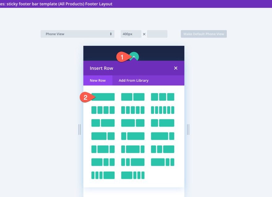
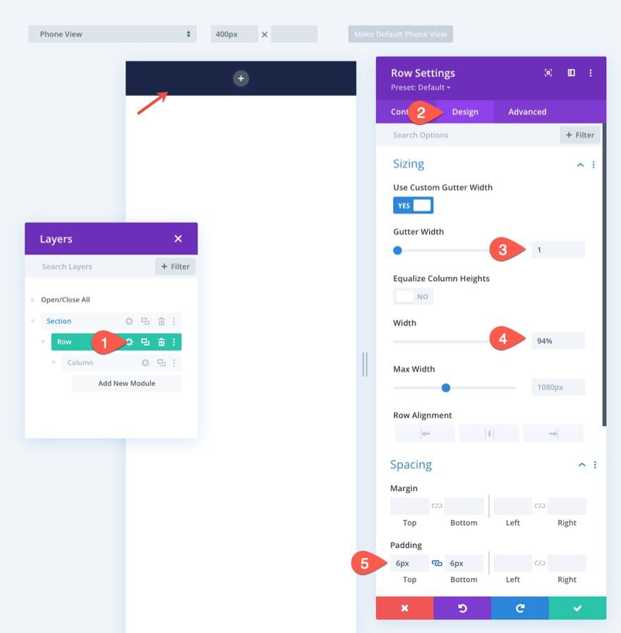
Creating the Row
Once the section is in place, add a one-column row to the section.
Open the row settings and update the sizing and spacing options under the design tab as follows:
- Gutter Width: 1
- Width: 94%
- Padding: 6px top, 6px bottom
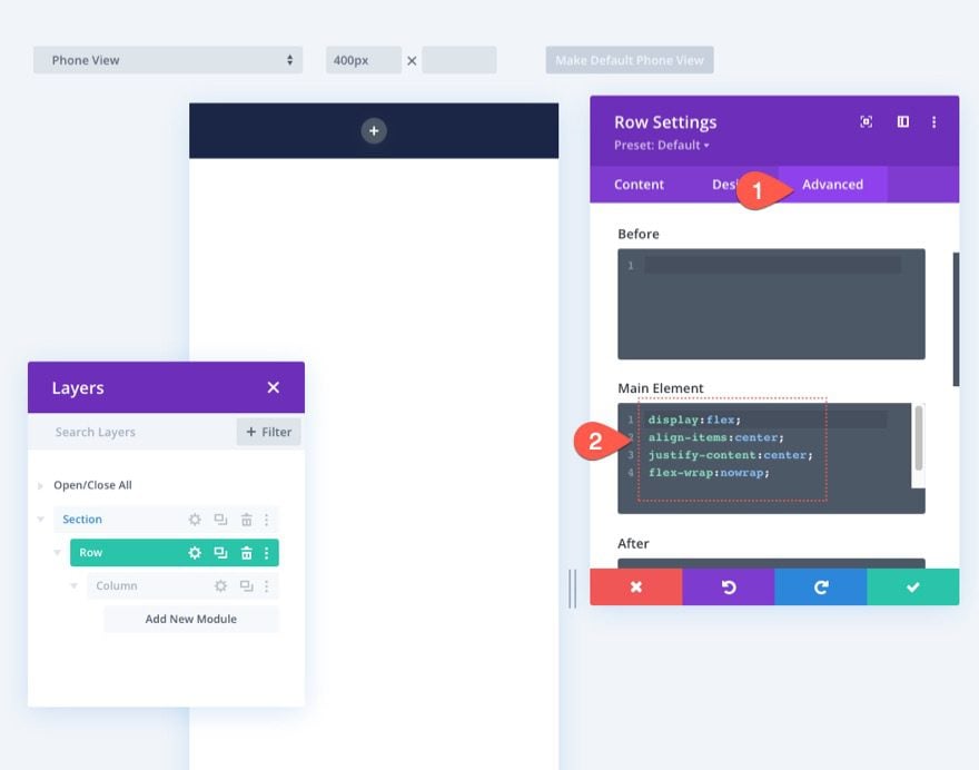
In order to make sure the additional columns we are going to add remain adjacent (won’t stack) on mobile, we need to add a short CSS snippet using the Flex property to keep things aligned nicely.
Under the advanced tab, add the following custom CSS to the main element:
display:flex;
align-items:center;
justify-content:center;
flex-wrap:nowrap;
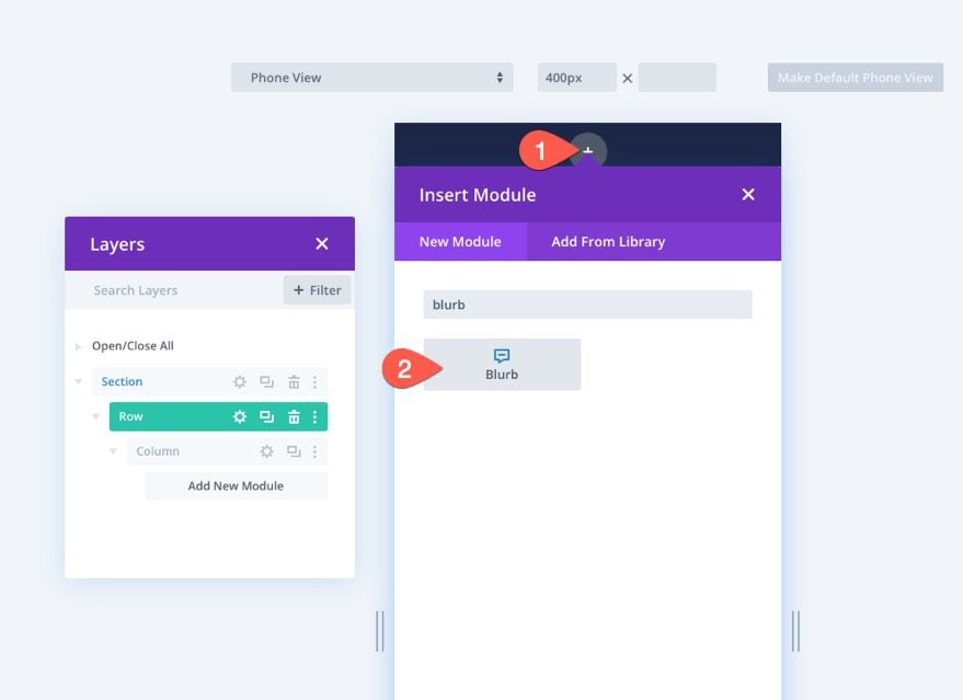
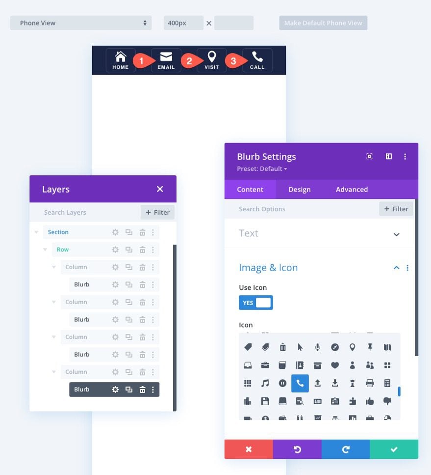
To create the footer bar buttons, we are going to use the blurb module. This allows us to create a button that resembles a mobile app (a small icon with a title under it) which is perfect for mobile navigation.
Inside the column, add a new blurb module.
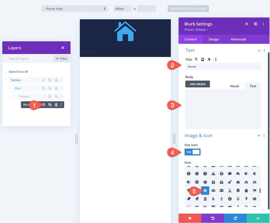
Update the blurb content as follows:
- Title: Home
- Body: leave empty
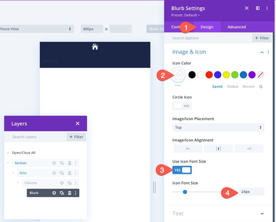
- Use Icon: YES
- Icon: home icon (see screenshot)
Under the design tab, update the icon styles as follows:
- Icon Color: #fff
- Icon Font Size: 24px
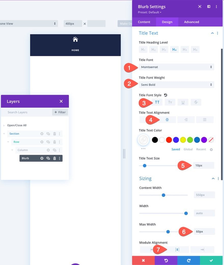
Then update the Title Text and Sizing options as follows:
- Title Font: Montserrat
- Title Font Weight: Semi Bold
- Title Font Style: TT
- Title Text Alignment: Center
- Title Text Color: #fff
- Title Text Size: 10px
- Max Width: 60px
- Module Alignment: Center
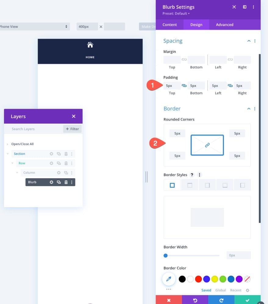
Continue to add the following padding and rounded corners to the blurb:
- Padding: 5px (top, bottom, left, right)
- Rounded Corners: 5px (top, bottom, left, right)
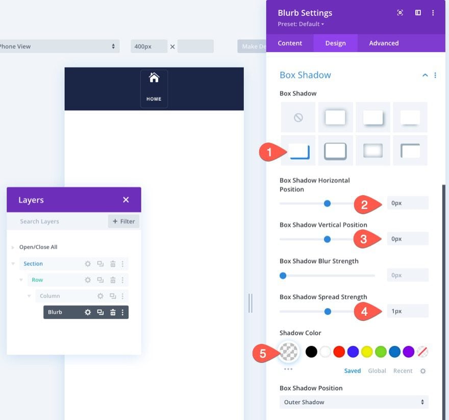
To add a border around the blurb, we are going to use a box-shadow, mostly because it doesn’t add any additional actual space to the design.
- Box Shadow: see screenshot
- Box Shadow Horizontal Position: 0px
- Box Shadow Vertical Position: 0px
- Box Shadow Spread Strength: 1px
- Shadow Color: rgba(255,255,255,0.12)
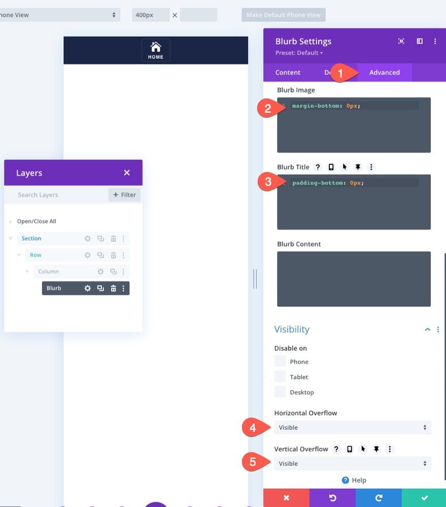
In order to take out the default spacing between the blurb image and title, add the following CSS snippets under the Advanced tab for the Blurb Image and Blurb Title:
Blurb Image CSS
margin-bottom: 0px;
Blurb Title CSS
padding-bottom: 0px;
Also, update the horizontal and vertical overflow options to Visible. This will make sure the module settings bar doesn’t get cut off when editing inside the Divi Builder.
Duplicate the Column to Add More Buttons
In order to create the remaining three buttons, we can duplicate the column (containing the blurb module) three times. This will create a total of 4 columns each containing identical buttons.
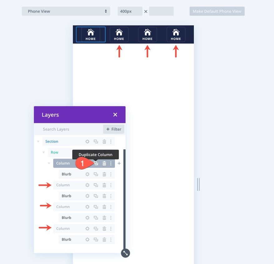
Once the columns (and buttons) are duplicated, you can go back to each of the blurb modules and update the Title Text and Icon to whatever you want.
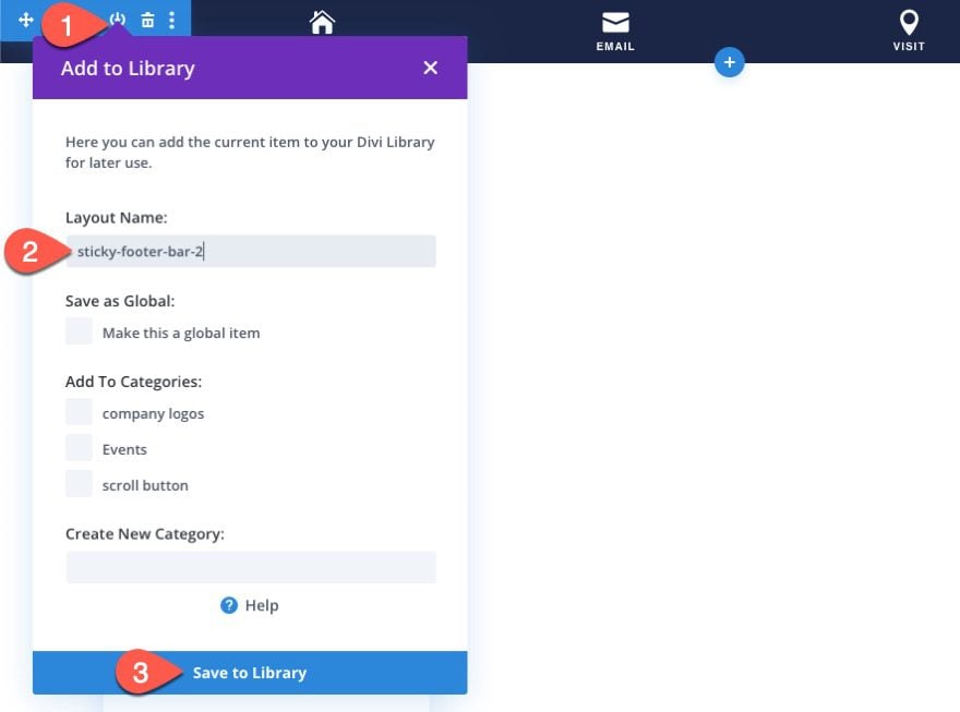
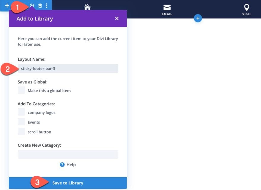
Part 4: Save It to the Divi Library
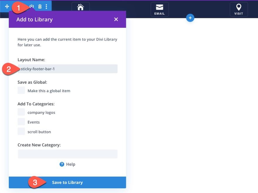
Now is a good time to save the section to the Divi Library so that you can add the sticky footer anywhere you want later on.
To save it, click the Save to Library icon in the section settings bar when hovering over the section. Then give the layout a name and save it to the library.
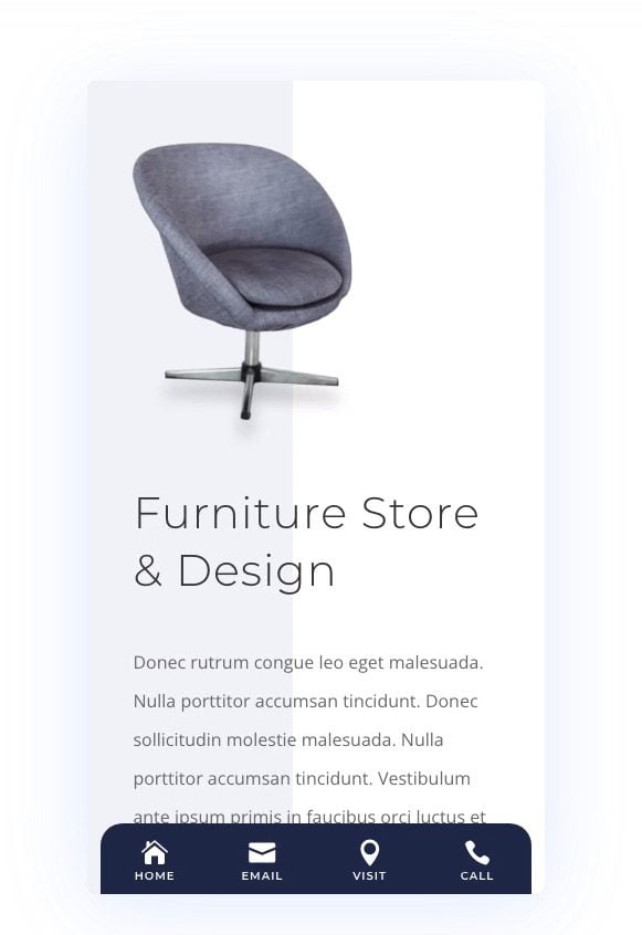
That’s it! Let’s check out the result of our sticky footer bar on a live page in mobile display.
Result
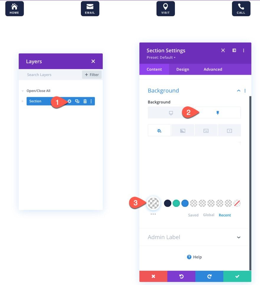
For an alternative design to this sticky footer bar, we can get a little creative with the section background and the blurb’s box-shadow to give the impression that buttons extend above the bar.
Update Section Settings
To do this, open the section settings and update the background as follows:
Under the desktop tab…
- Background Color: #1a2545
Under the sticky tab…
- Background Color: transparent
- Background Gradient Left Color: transparent
- Background Gradient Right Color: #1a2545
- Start Position: 50%
- End Position: 0%
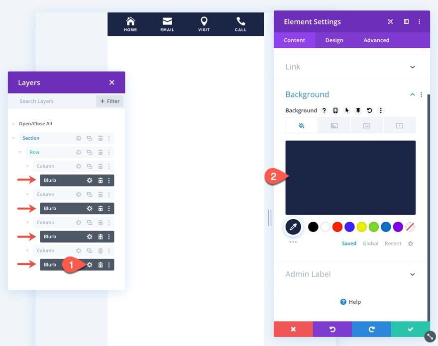
Update Blurbs
Next, use the multiselect feature to select all four blurb modules. Once they are selected, open the settings for one of them and update the background color for all of them at once:
- Background Color: #1a2545
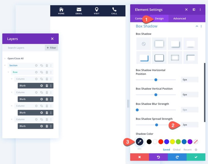
Under the design tab, update the box shadow for the blurbs as follows:
- Box Shadow Spread Strength: 3px
- Shadow Color: #1a2545
To save this sticky footer bar section layout, click the Save to Library icon in the section settings bar when hovering over the section. Then give the layout a name and save it to the library.
Result
Here is a peek at the final result.
For another alternative design to this sticky footer bar, we can get a little creative with the row by adding rounded corners to make the footer bar look more like a tab.
Update Section Settings
First, open the existing section settings and update the sticky background color to transparent.
- Background Color (sticky): transparent
Make sure to delete the background gradient as well.
Update Row Settings
Next, open the row settings and add the following background color:
- Background Color: #1a2545
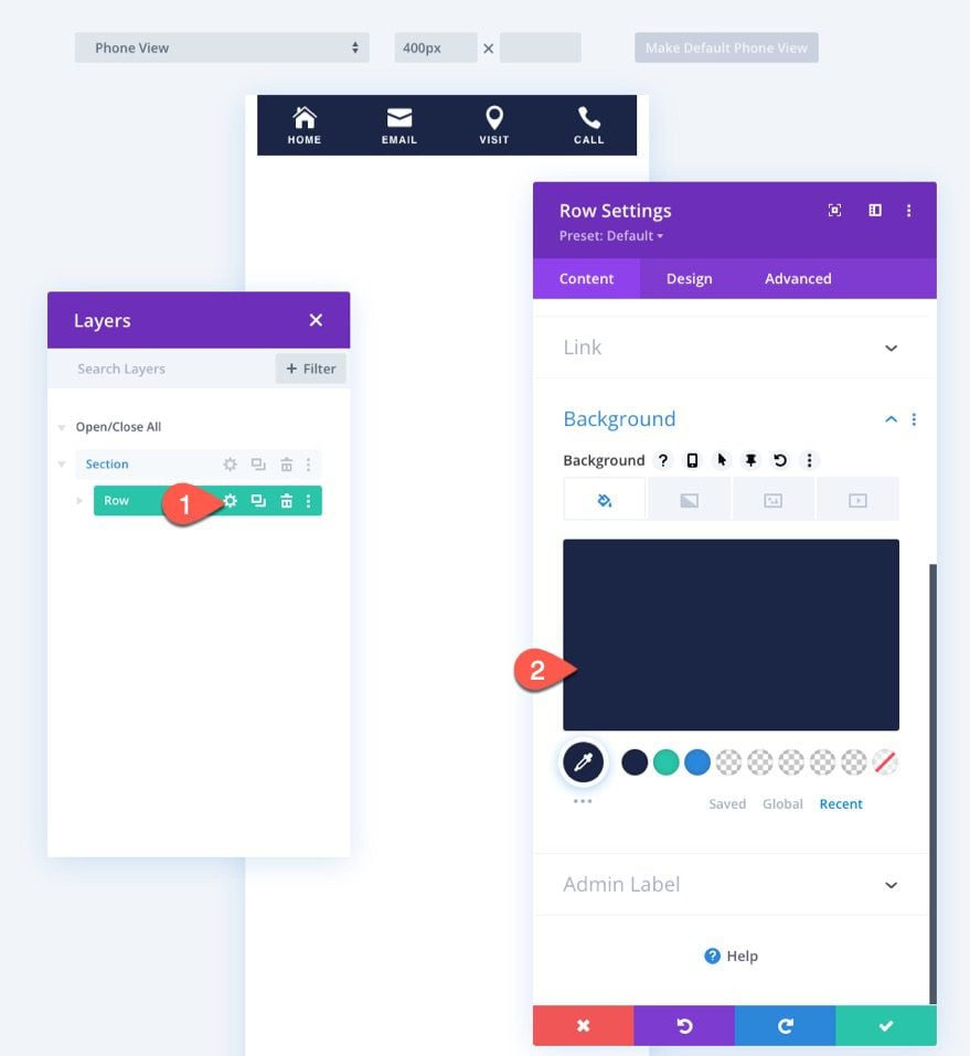
Under the design tab, update the following:
- Padding: 10px top
- Rounded Corners: 20px top left, 20px top right
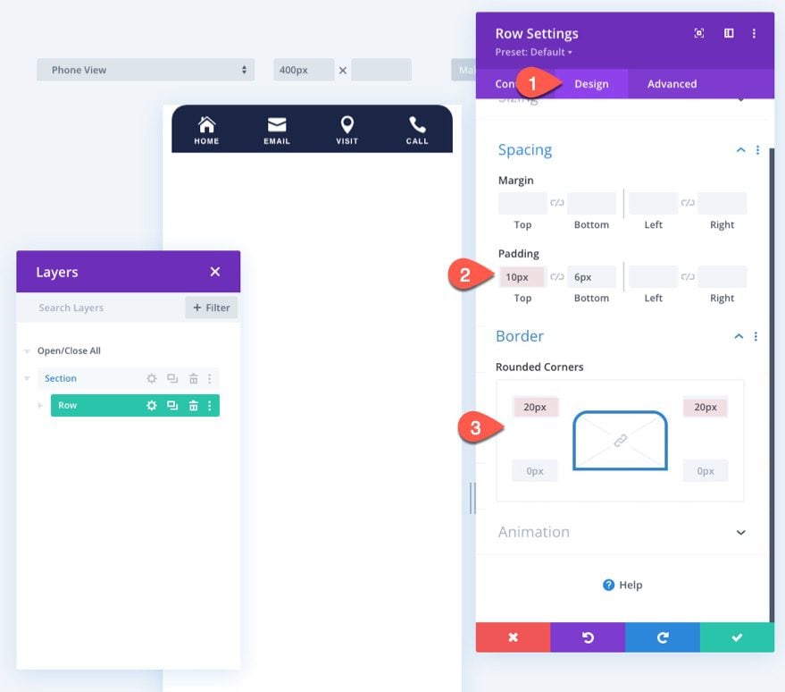
To save this sticky footer bar section layout, click the Save to Library icon in the section settings bar when hovering over the section. Then give the layout a name and save it to the library.
Result
Here is the result.
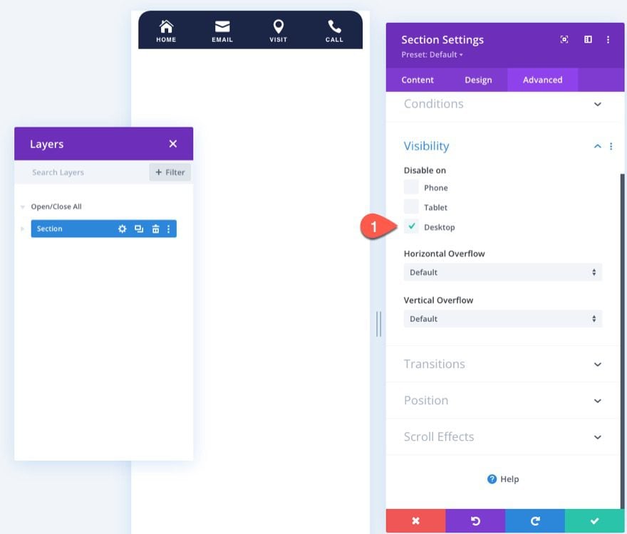
In order to hide the footer on desktop view so that it shows only on mobile, you can always update the visibility option for the section. Simply select Desktop under the Disable on option.
Final Result
Let’s take a final look at the mobile sticky footer bar designs.


Thanks for the Tutorial! how can with “add” a fifth element in the middle like a “plus” sign and instead of a “clickable” link, it open a menu?
thanks!
Thanks for your comment! Adding a fifth element like a “plus” sign in the middle that opens a menu would require custom development. Our free layouts which come with our tutorals are provided as-is, so we can’t offer support for that type of customization.
Hi,
Great tutorial but I also get stuck in the first part.
I think I’m fairly experienced with webdesign/divi but I can’t get the layers visible and in the section settings->advanced I don’t see “Scroll effects” so I can’t select “stick to bottom”.
It al seesm very straight forward when I read it but trying to get this to work on my websites seems impossible because I haven’t got the same options as you do.
I’m working with the latest Divi version and everything else is also up to date.
Could you please help me out? Thanks in advance!
Go to section> advanced > Scroll effects at the end > Select Stick to bottom.
Nice Article. We are the best mobile app development company in Pune and looking for interns interested to learn mobile app development.
Please share if you get any references for us.
I’m stuck at Part 1. I already have a Global Footer in the Theme Builder for the Copyright notice. When I tried to upload the sticky footer in the Theme Builder it went in to a new Templates Settings box which only has a “Custom”, not “Global”, Footer option. If I add a new Global Footer, it will over-ride the Copyright one, yes? Can these be combined? I’d really love to have some links from my Secondary Menu in a sticky mobile footer as a hamburger option, as people on mobile don’t see that set of links as they’e too far down the single menu that both my Primary and Secondary menus all becomes on mobile. I was hoping this Sticky Mobile Footer you’re providing, above, might help.