
Every week, we provide you with new and free Divi layout packs which you can use for your next project. For one of the layout packs, we also share a use case that’ll help you take your website to the next level.
This week, as part of our ongoing Divi design initiative, we’re going to show you how to create custom sticky back to top designs with Divi and the Green Energy Layout Pack. This technique will help you improve user experience on your pages while taking advantage of Divi’s built-in options on the design-side of things. We hope this tutorial inspires you to create your own alternative back to top designs and use them on your next website!
Let’s get to it.
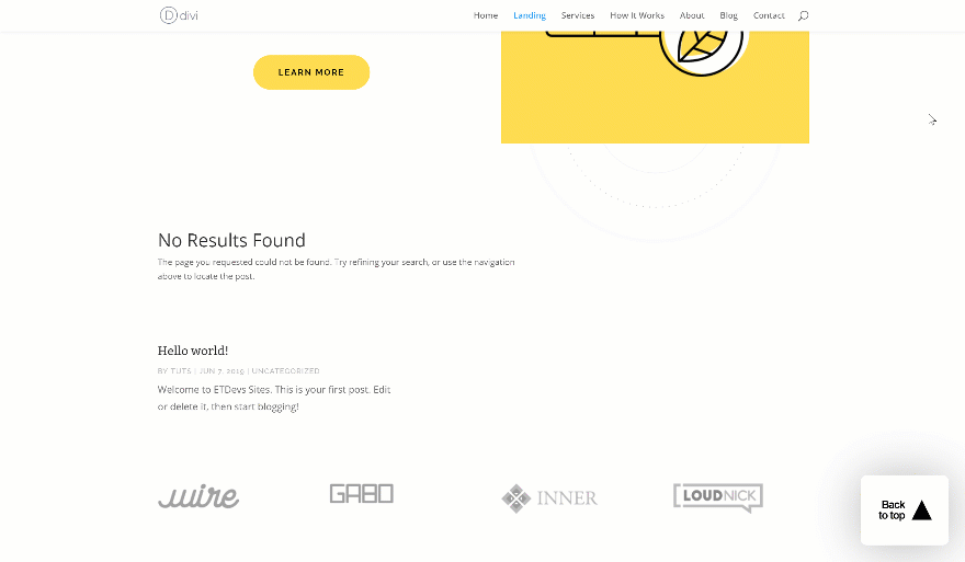
Preview
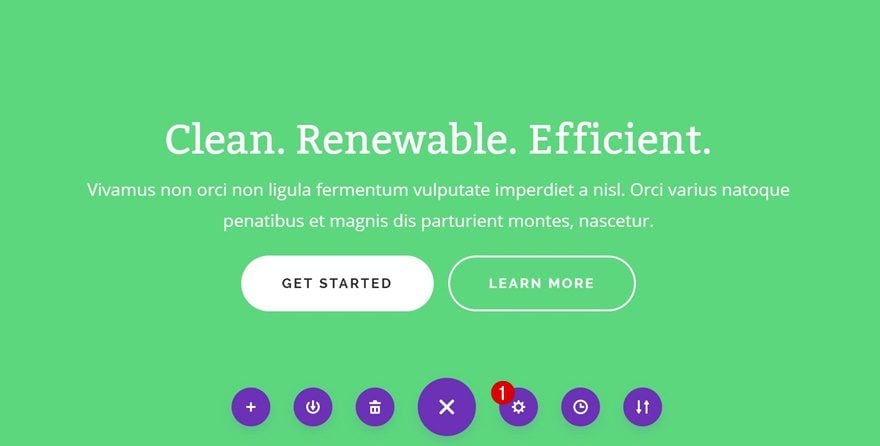
Before we dive into the tutorial, let’s take a quick look at the outcome of this tutorial.
GIF
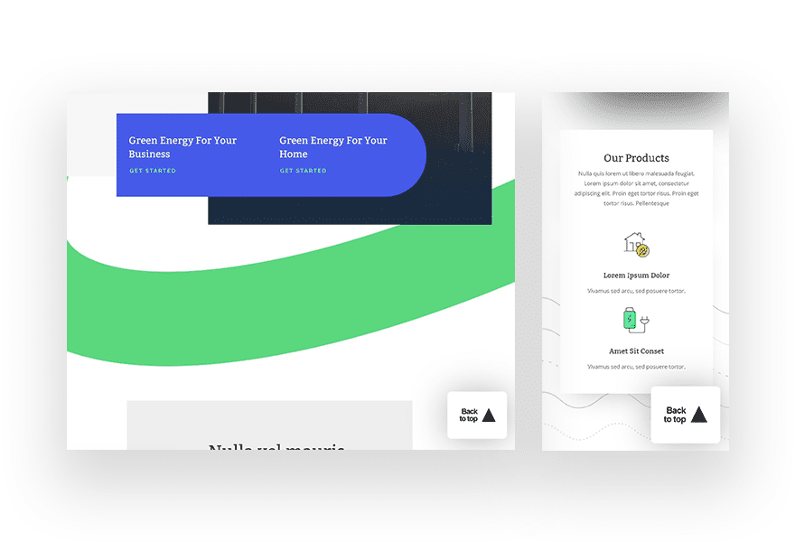
Example #1
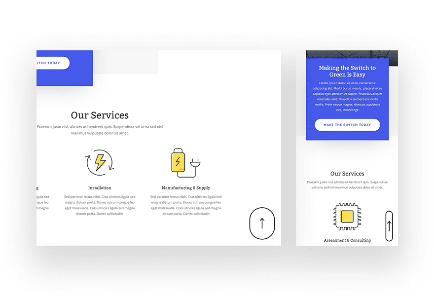
Example #2
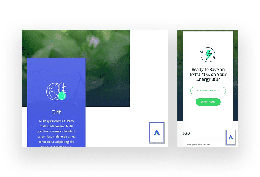
Example #3
1. Add Smooth Scroll to Page HTML
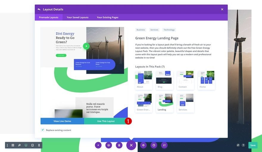
Upload Green Energy Landing Page to New Page
The first thing you will need to do is create a new page and upload the Green Energy Layout Pack’s landing page.
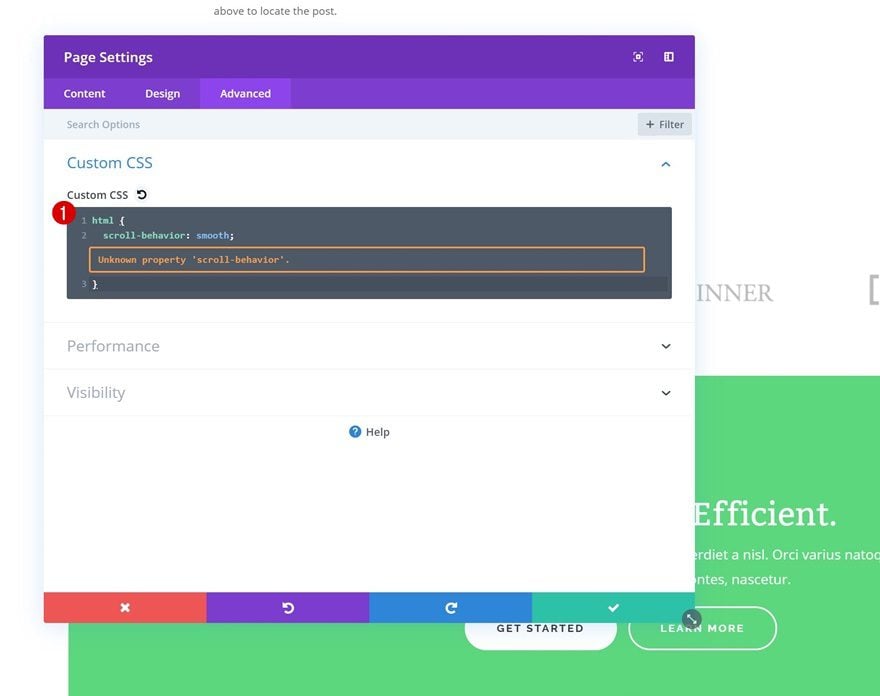
Open Page Settings
Open the page settings by clicking on the icon marked in the print screen below:
Add Smooth Scroll to Custom CSS Box
Move on to the advanced tab and add a smooth scroll behavior to the entire page by adding the following CSS code to the Custom CSS box:
html {
scroll-behavior: smooth;
}
2. Add CSS ID to Hero Section
Open Hero Section
The back to top design will redirect visitors to the hero section. To pull it off, you’ll need to open the hero section settings first.
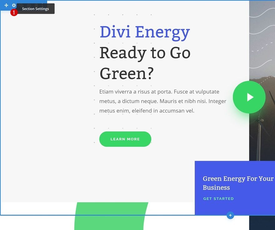
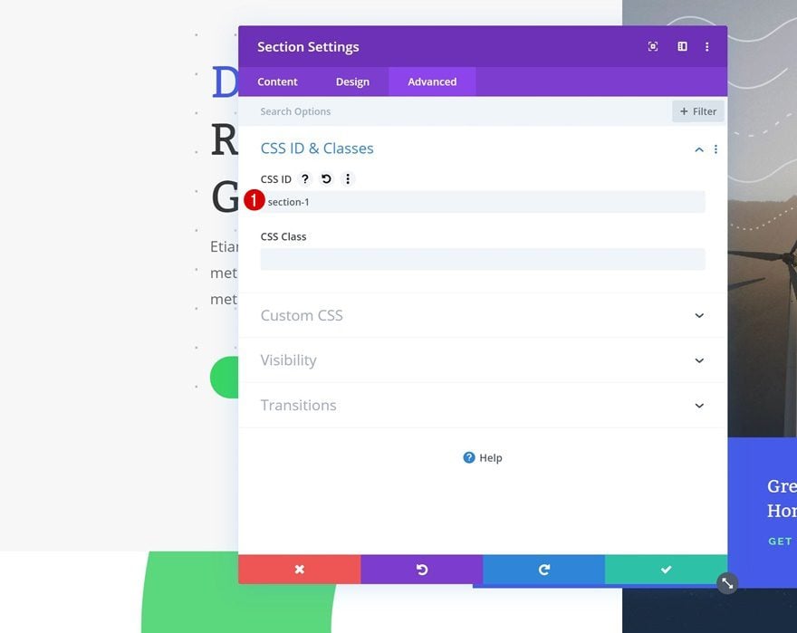
Add CSS ID
Then, go to the advanced tab and add a CSS ID to the section. Later on this post, we’ll add an anchor link that’ll lead visitors to this section.
- CSS ID: section-1
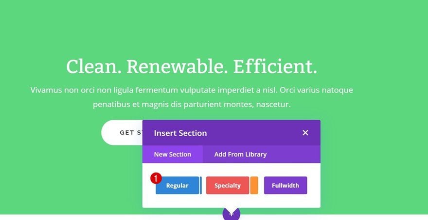
3. Add New Section to Bottom of Page with “Back to Top” Design
General Steps
Add New Regular Section to Bottom of Page
As you could notice in the preview of this post, we’re going to recreate three different design examples. To streamline the process, we’ll start off with some general steps first and focus on each design example individually later on the post. Add a new regular section to the bottom of your page.
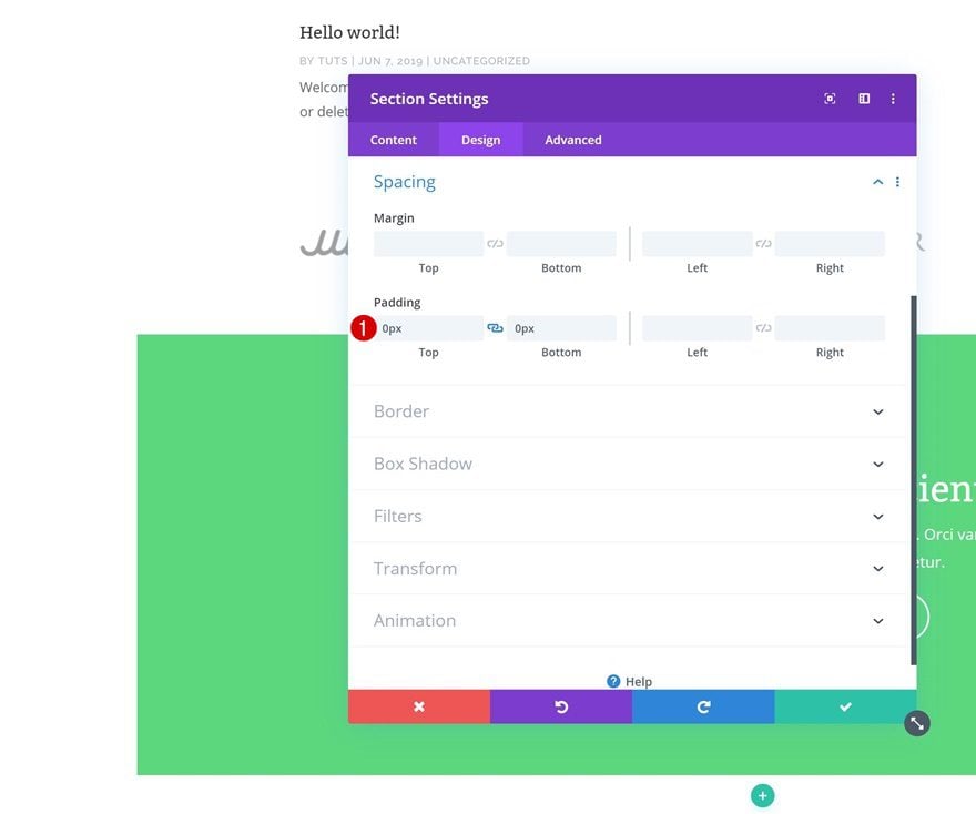
Spacing
Open the section settings and remove all default top and bottom padding.
- Top Padding: 0px
- Bottom Padding: 0px
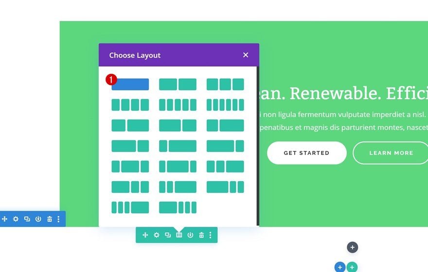
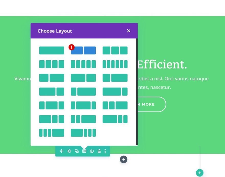
Add New Row
Column Structure
Continue by adding a new row using the following column structure:
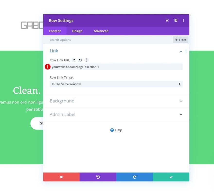
Add Anchor Link
As soon as someone clicks on the entire row, we want them to be redirected to the top of the page. To do that, we’ll add a link that redirects to the hero section of the page.
- Row Link URL: yourwebsite.com/page/#section-1
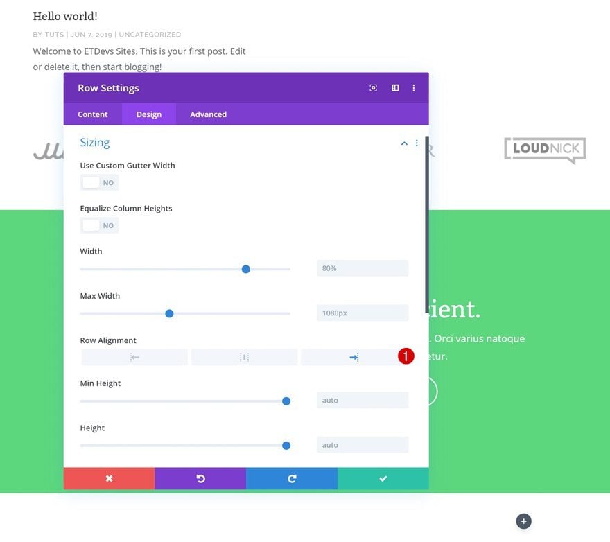
Row Alignment
We’re also placing the row at the right side of the section container.
- Row Alignment: Right
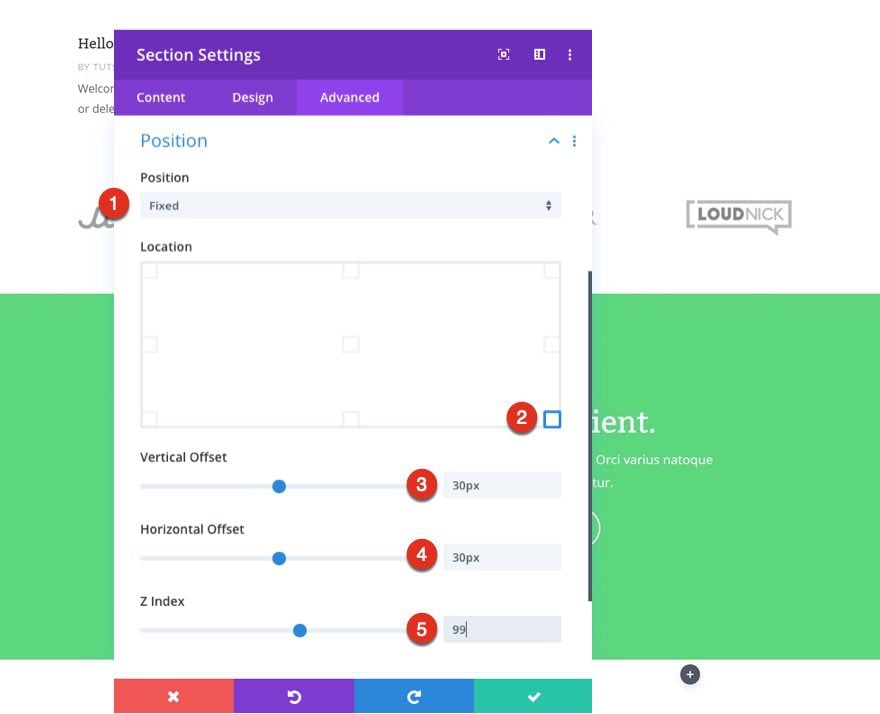
Fixed Position
Next, we’re making the entire row fixed by going to the advanced tab of the row and updating the following position options:
- Position: Fixed
- Vertical Offset: 30px
- Horizontal Offset: 30px
- Z Index: 99
In addition to making the row fixed, we make sure the row overlaps all page content by increasing the z index.
Recreate Design Example #1
Row Settings
Change Column Structure
Now that we’ve gone through all the general steps, we’re going to recreate the three different examples that you were able to see at the beginning of this post. Let’s start with the first one! Change the row column structure:
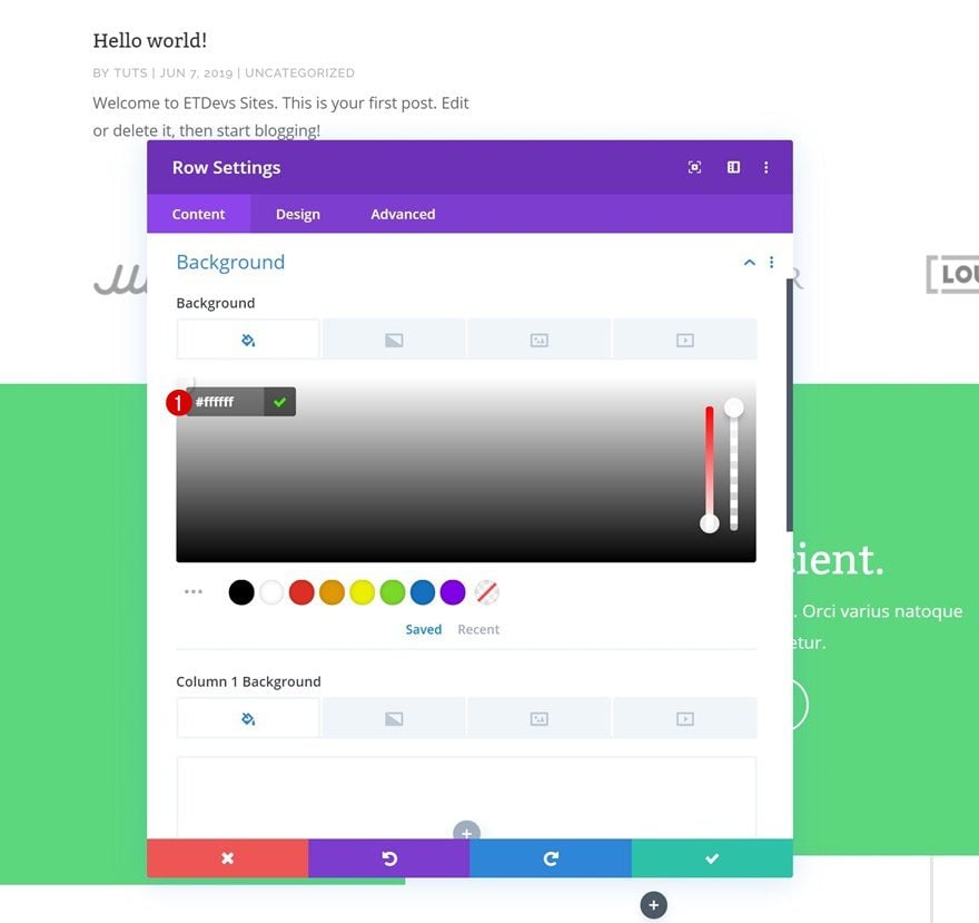
Background Color
Continue by opening the row settings and add a white background color.
- Background Color: #ffffff
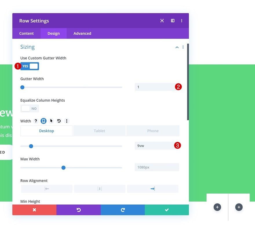
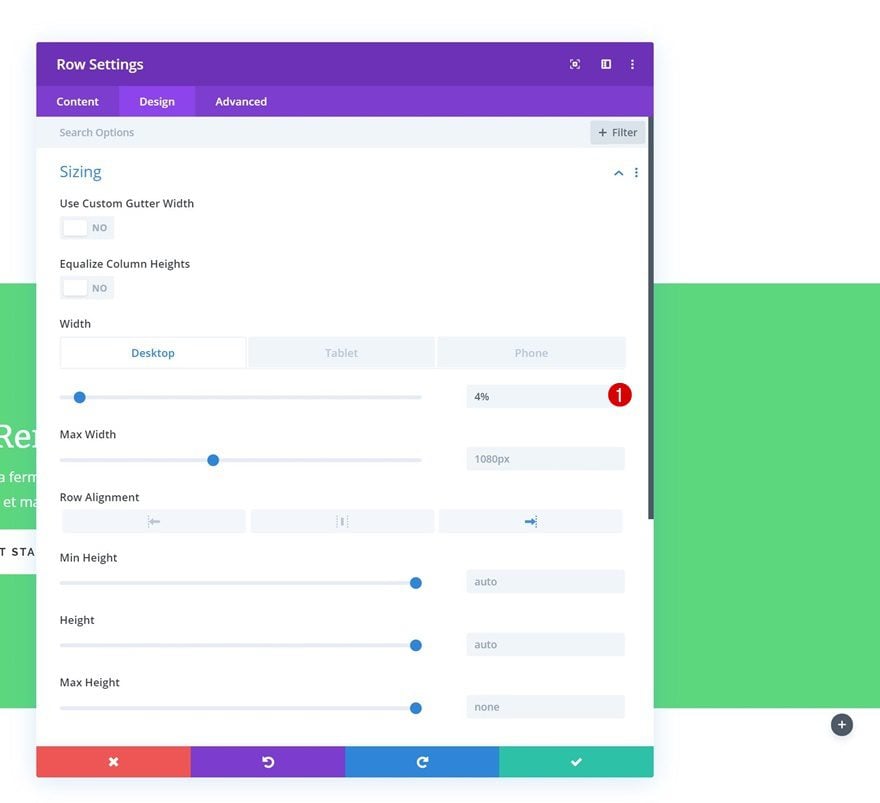
Sizing
Move on to the design tab and change the sizing settings.
- Use Custom Gutter Width: 1
- Width: 9vw (Desktop), 23vw (Tablet), 35vw (Phone)
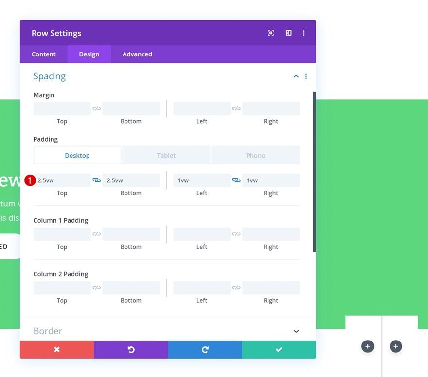
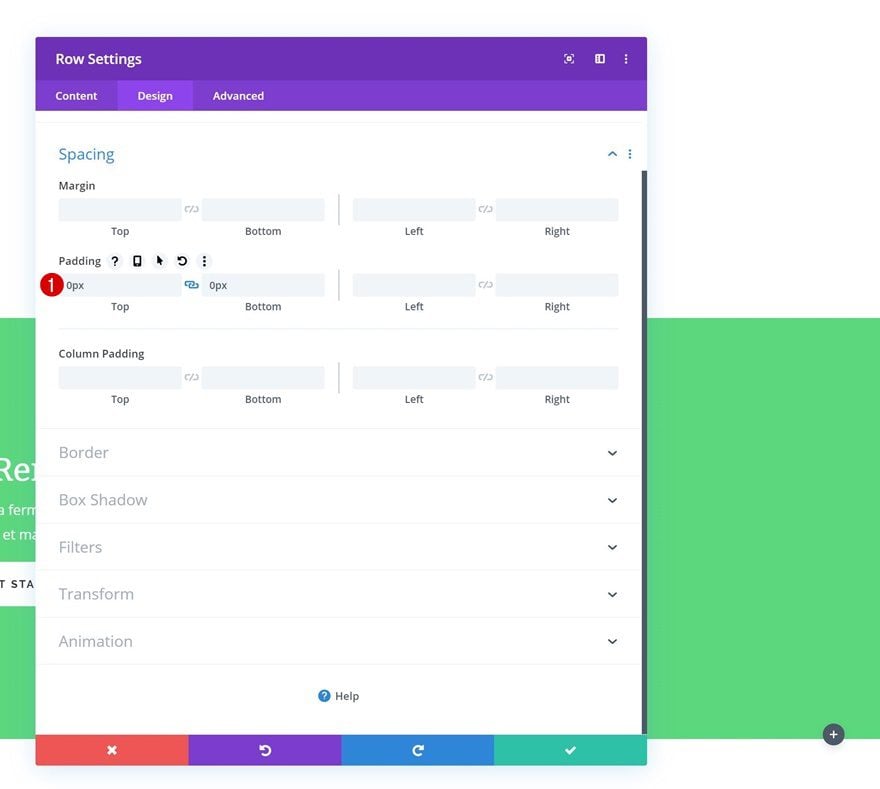
Spacing
Add some custom padding values as well.
- Top Padding: 2.5vw (Desktop), 6vw (Tablet), 10vw (Phone)
- Bottom Padding: 2.5vw (Desktop), 6vw (Tablet), 10vw (Phone)
- Left Padding: 1vw (Desktop), 2vw (Tablet), 4vw (Phone)
- Right Padding: 1vw (Desktop), 2vw (Tablet), 4vw (Phone)
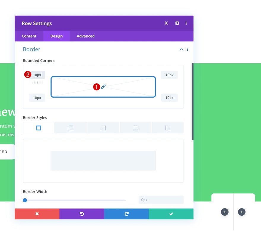
Border
Continue by adding ’10px’ to each one of the corners in the border settings.
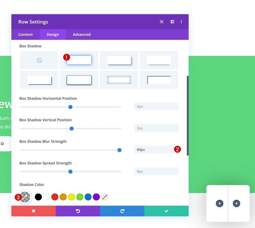
Box Shadow
And add a box shadow using the following settings:
- Box Shadow Blur Strength: 80px
- Shadow Color: rgba(0,0,0,0.3)
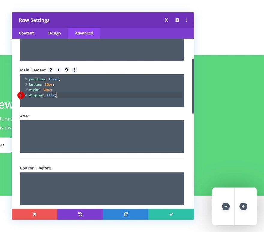
Display
To make sure the columns remain next to each other across all screen sizes, we’re going to add an additional line of CSS code to the main element of the row.
display: flex;
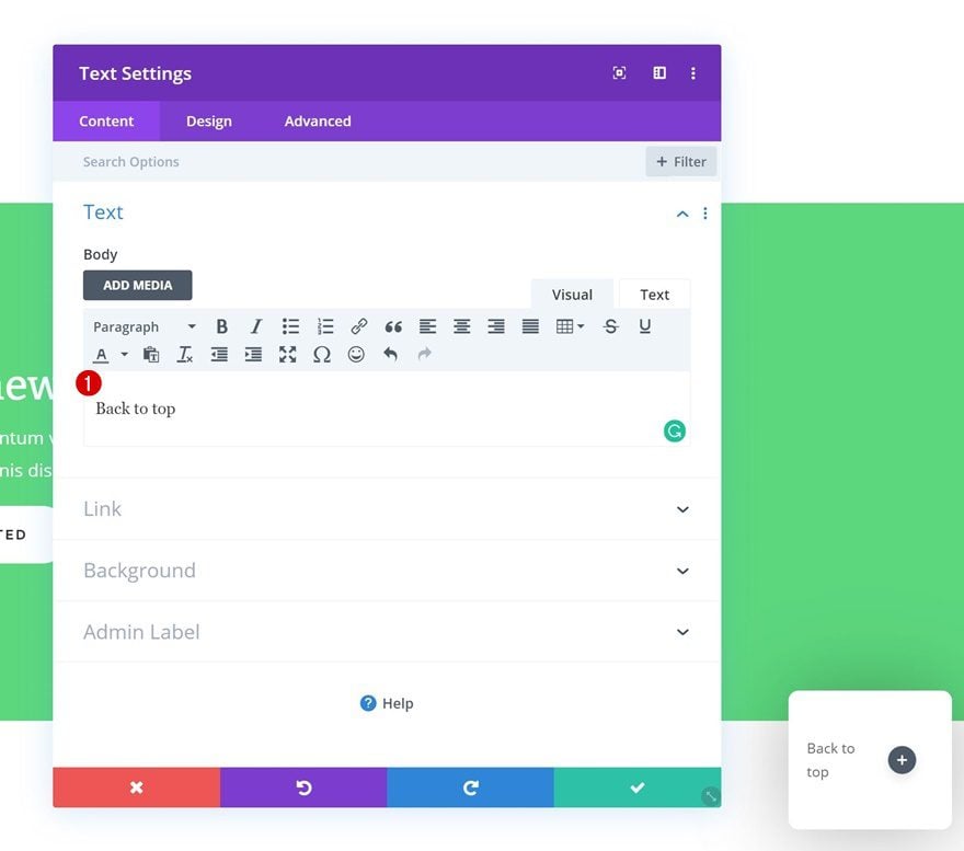
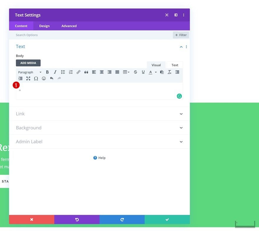
Add Text Module to Column 1
Add Content
Time to start adding modules! Add a Text Module to the first column with some content of your choice.
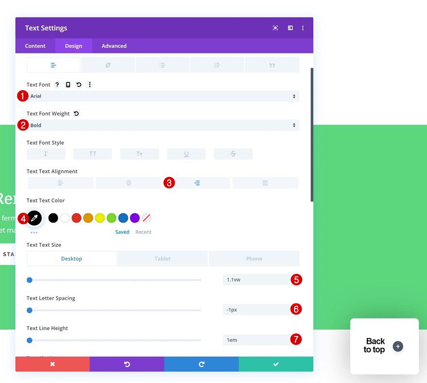
Text Settings
Move on to the design tab and change the text settings accordingly:
- Text Font: Arial
- Text Font Weight: Bold
- Text Alignment: Right
- Text Color: #000000
- Text Size: 1.1vw (Desktop), 3vw (Tablet), 4.4vw (Phone)
- Text Letter Spacing: -1px
- Text Line Height: 1em
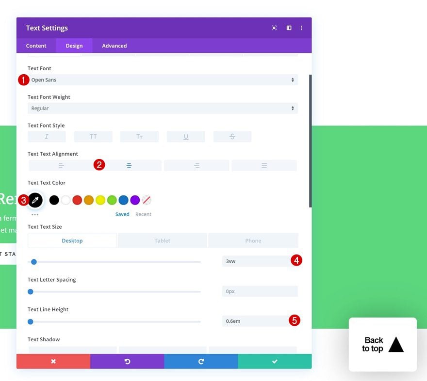
Add Text Module to Column 2
Add Symbol
Move on to the second column and add a Text Module there as well. Add the ‘▲’ symbol to the content box.
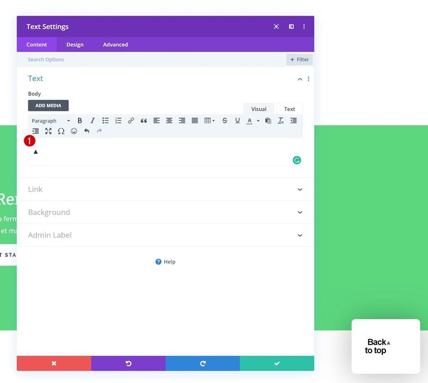
Text Settings
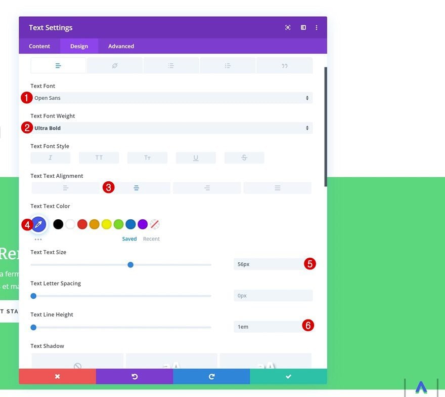
Last but not least, go to the design tab and change the text settings.
- Text Font: Open Sans
- Text Alignment: Center
- Text Color: #000000
- Text Size: 3vw (Desktop), 8vw (Tablet), 12vw (Phone)
- Text Line Height: 0.6em
Recreate Design Example #2
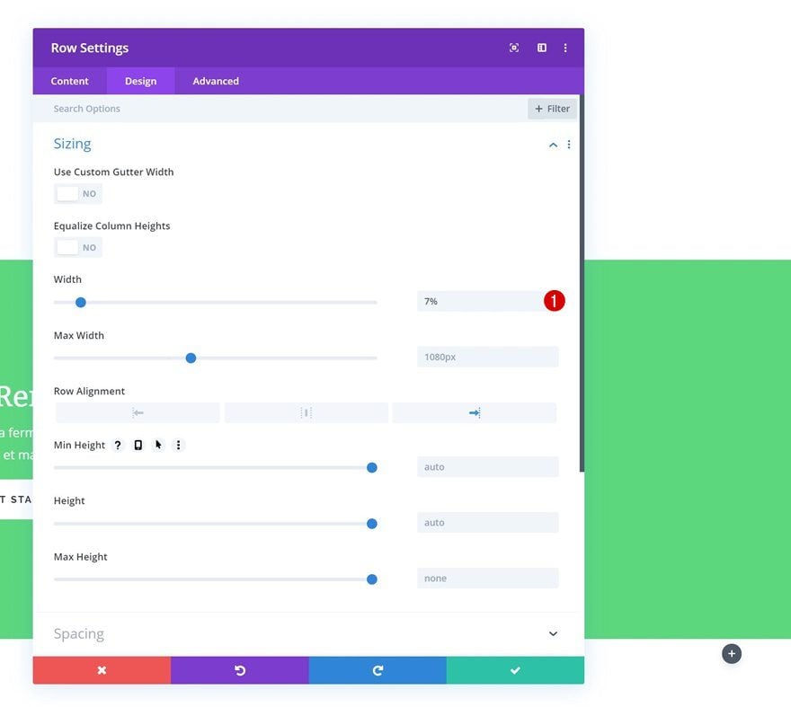
Row Settings
Sizing
On to the second example! Open the row settings and change the width of the row.
- Width: 7%
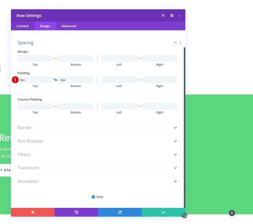
Spacing
Move on to the spacing settings and remove all default top and bottom padding.
- Top Padding: 0px
- Bottom Padding: 0px
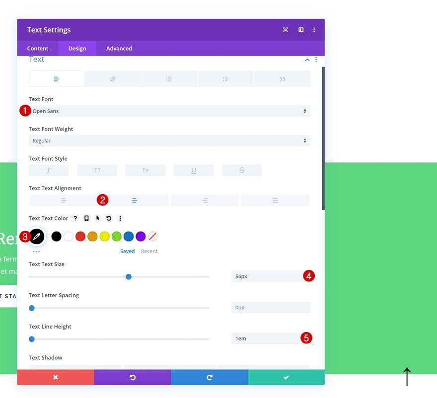
Add Text Module to Column
Add Symbol
Continue by adding a Text Module to the row and enter the ‘↑’ symbol.
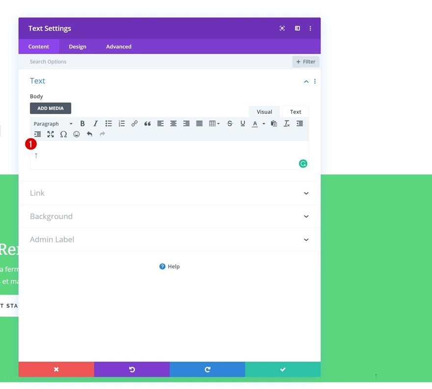
Text Settings
Go to the design tab and change the text settings.
- Text Font: Open Sans
- Text Alignment: Center
- Text Color: #000000
- Text Size: 56px
- Text Line Height: 1em
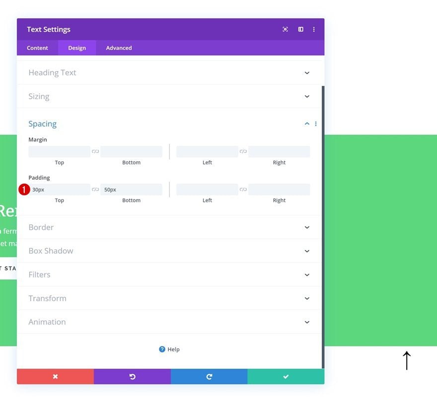
Spacing
Next, we’re going to add some custom top and bottom padding.
- Top Padding: 30px
- Bottom Padding: 50px
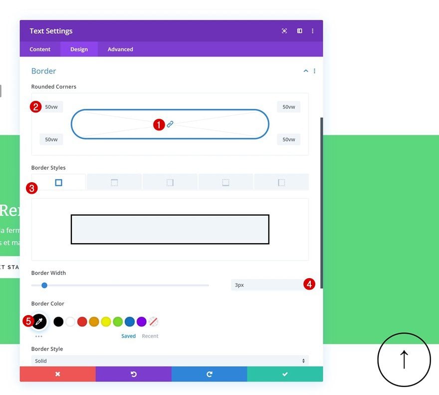
Border
Move on to the design tab and add ’50vw’ to each one of the corners. Add a border as well using the following settings:
- Border Width: 3px
- Border Color: #000000
Recreate Design Example #3
Row Settings
Sizing
On to the next and last example! Open the row settings and modify the width.
- Width: 4% (Desktop), 10% (Tablet), 15% (Phone)
Spacing
Remove the default top and bottom padding next.
- Top Padding: 0px
- Bottom Padding: 0px
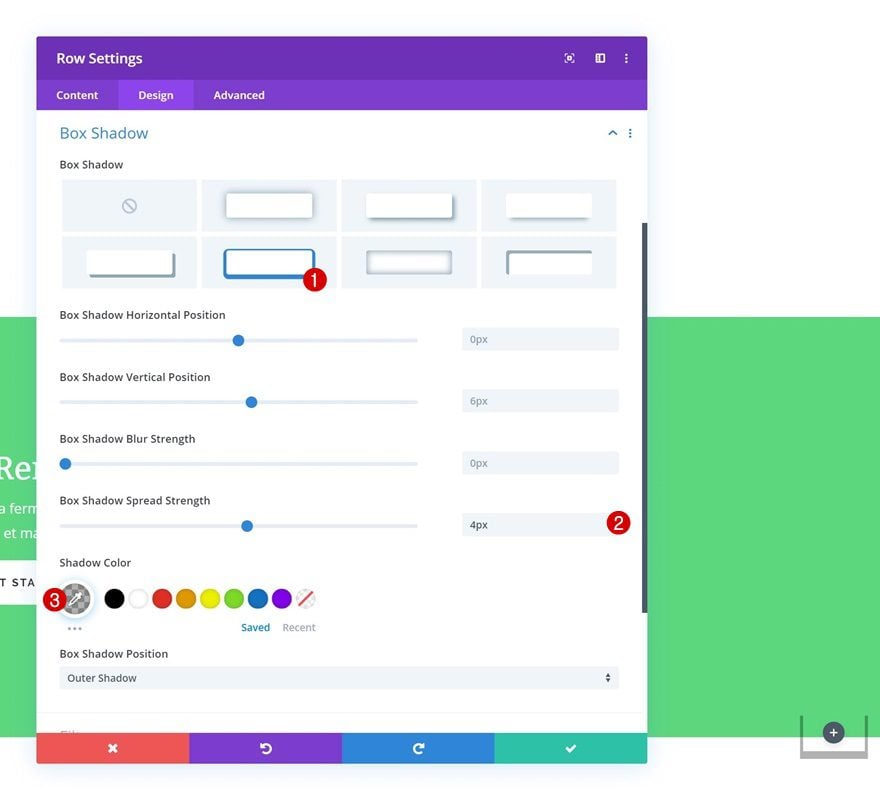
Box Shadow
Add a custom box shadow to the row using the following settings:
- Box Shadow Spread Strength: 4px
- Shadow Color: rgba(0,0,0,0.3)
Add Text Module to Column
Add Symbol
The only module we need for this design example is a Text Module. Add ‘^’ to the content box.
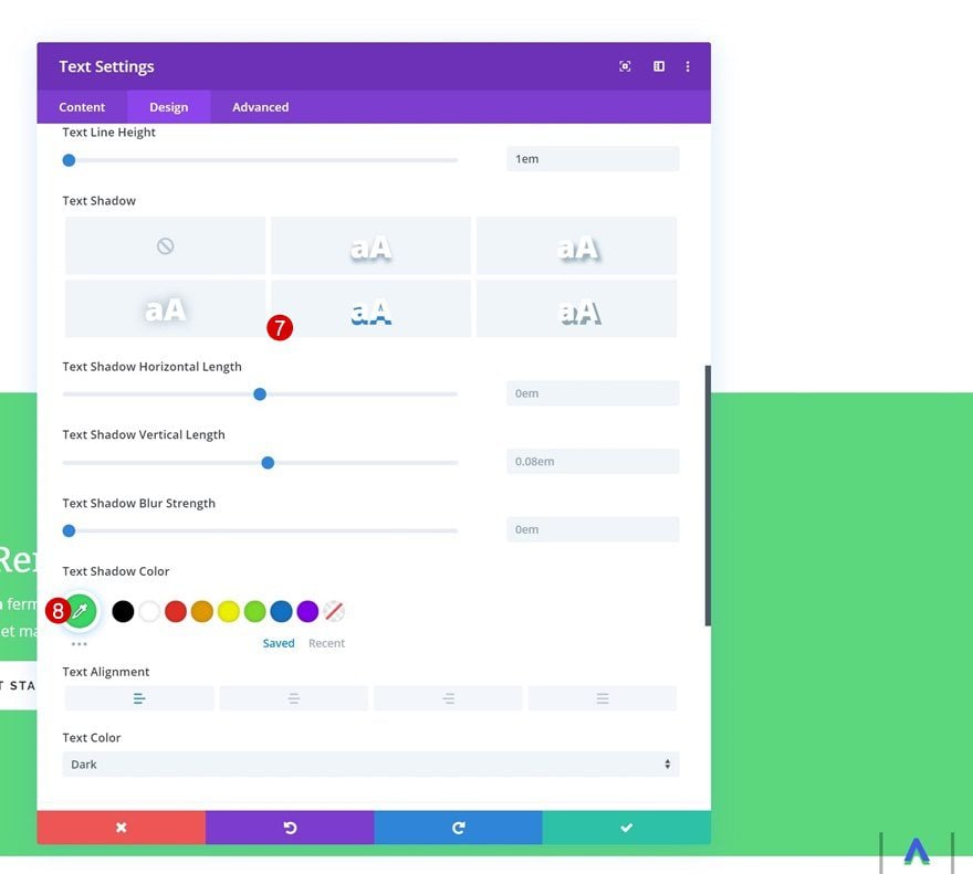
Text Settings
Move on to the design tab and change the text settings accordingly:
- Text Font: Open Sans
- Text Font Weight: Ultra Bold
- Text Alignment: Center
- Text Color: #4359e9
- Text Size: 56px
- Text Line Height: 1em
- Text Shadow Color: #35d764
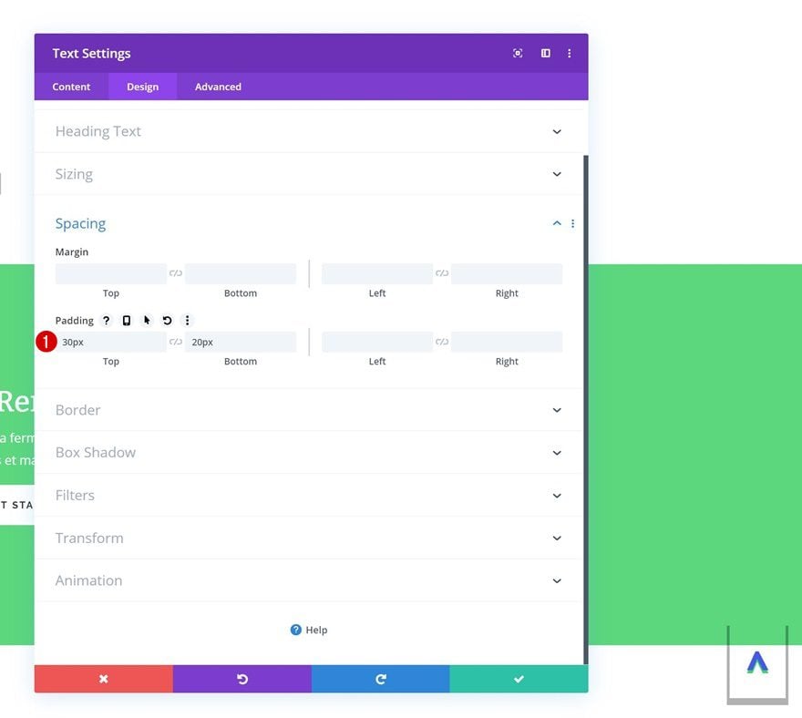
Spacing
Continue by going to the spacing settings and adding some custom top and bottom padding.
- Top Padding: 30px
- Bottom Padding: 20px
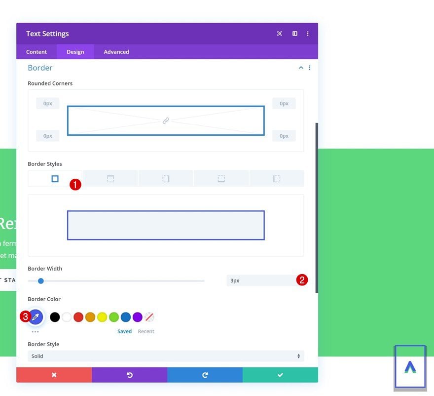
Border
Last but not least, add a border to the Text Module and you’re done!
- Border Width: 3px
- Border Color: #4359e9
Preview
Now that we’ve gone through all the steps, let’s take a final look at the outcome.
GIF
Example #1
Example #2
Example #3
Final Thoughts
In this use case tutorial, we’ve shown you how to create custom back to top designs with Divi. We’ve added smooth scrolling to our pages, assigned a section ID to the hero section and linked a fixed row to the hero section. This tutorial is part of our ongoing Divi design initiative, where we try to put something extra into your design toolbox each and every week. If you have any questions or suggestions, make sure you leave a comment in the comment section below!
If you’re eager to learn more about Divi and get more Divi freebies, make sure you subscribe to our email newsletter and YouTube channel so you’ll always be one of the first people to know and get benefits from this free content.


How could I to show this button in a specific scroll point on page?
Hi,
Thanks for this – very thorough.
Is there a site wide solution so we can apply it to every page? Perhaps by assigning an iD to the header?
Would rather not do this to every page but I guess I could save as a template on new sites.
Thanks again.
Hello Donjete,
This tutorial is almost the same as the one you create few weeks ago. You teach us to install a sticky corner menu thanks adding a section in the bottom of a page and add some CSS and settings.
I have a feedback for that and your actual tuto.
Do you know this tutorial build a zone when it’s now impossible to click ? It’s the invisible line of the section we put in the bottom of the page.
Exact position : all the invisible part to the left/right of the button we will create (or the corner menu if we have to speak of your previous tuto).
It’s a little bit frustrating on cpu, and on mobile phone too. Do you got a solution for that ?
Thank you 🙂
Very cool tutorial.
I hope in the theme builder that we have the ability to design a layout that can be used as a scroll to top section.
If you have a long pages and posts, you need to use back to top button. And Divi builder has the solution for you.
Back to top buttons really do help with long pages and posts!
It’s simple and has lots of possibilities. And it is memorable, i.e. it’s logical and you don’t need to refer to your original post each time it is required. Thanks
It really does have a lot of possibilities! Happy you like it, Ron! 🙂
Impressive!Thanks for the post
Glad to hear you like it, Tony! 🙂
Thank you for sharing this, I am waiting for the next Divi design tutorials. I hope I will learn Divi better from this series. Cheers!
You’re welcome, Edison. Keep an eye on the blog, we publish Divi content every day of the week! 🙂
This looks really nice. I am going to try it out today. Thank you for the wonderful article.
You’re welcome, Bill! Happy to hear that. 🙂