
Some people need larger text, higher contrast, or motion turned off to use a website comfortably. Accessibility Sidebar gives your visitors those options, all built to work seamlessly with Divi 5.
Let’s explore what it does, how it works, and why it matters before the June 28 deadline.
Your visitor lands on your Divi site and immediately squints at the screen. Your carefully chosen 16px font looks perfect on your monitor, but it needs something bigger to read comfortably. Instead of zooming their entire browser and breaking your layout, they spot a small accessibility icon. One click opens a sidebar with real controls. They bump the text up to 20px. The change happens instantly, affecting every page they visit.
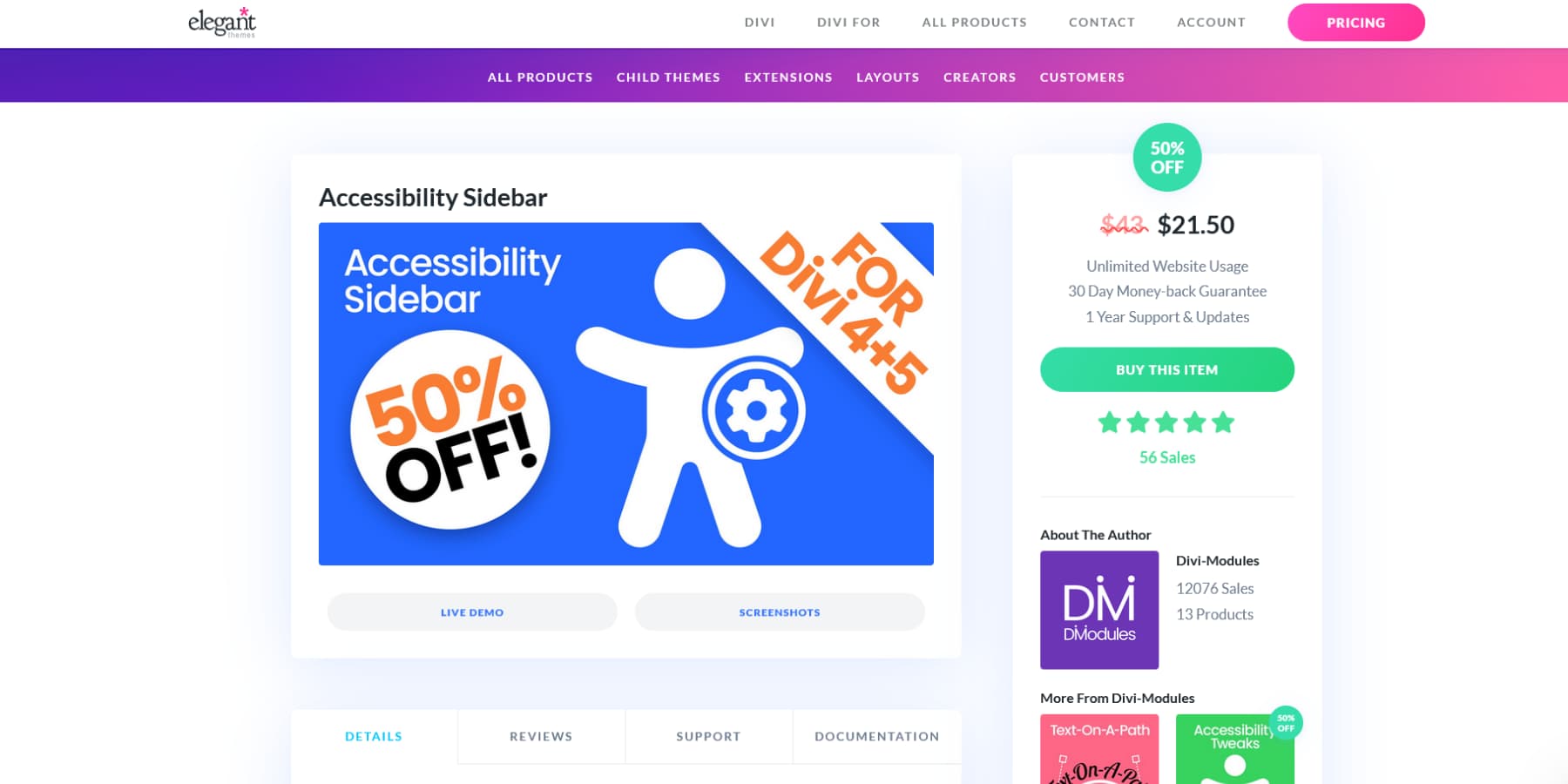
This exact scenario can be achieved by using Accessibility Sidebar by Divi-Modules, which is currently available at 50% discount until June 28 on our Marketplace (check the page for up-to-date pricing).
Works With Divi 5’s New Architecture
Divi 5 represents a complete rewrite of the website builder from the ground up. We threw out the old shortcode system and built everything from scratch using a modern API-first approach that changes everything.
Since this represents such a major change, we’re working closely with our community to make their add-ons and extensions compatible with Divi 5. The good news? Divi-Modules, the creators of Accessibility Sidebar, have already updated their plugin to work seamlessly with both Divi 4 and Divi 5.
This means if you’re starting a new project with Divi 5, you can build accessibility right into your site from day one. No workarounds, no compromises. Your website stays accessible as you grow and evolve, without needing major overhauls or plugin replacements down the road.
Why Accessibility Testing Matters Now (EU Compliance Deadline: June 28)
135 million people in the European Union (EU) live with disabilities. They use screen readers to hear web pages out loud, navigate with keyboards instead of mice, and need bigger text or higher color contrast to read comfortably. When websites don’t support these tools, these people are shut out completely.
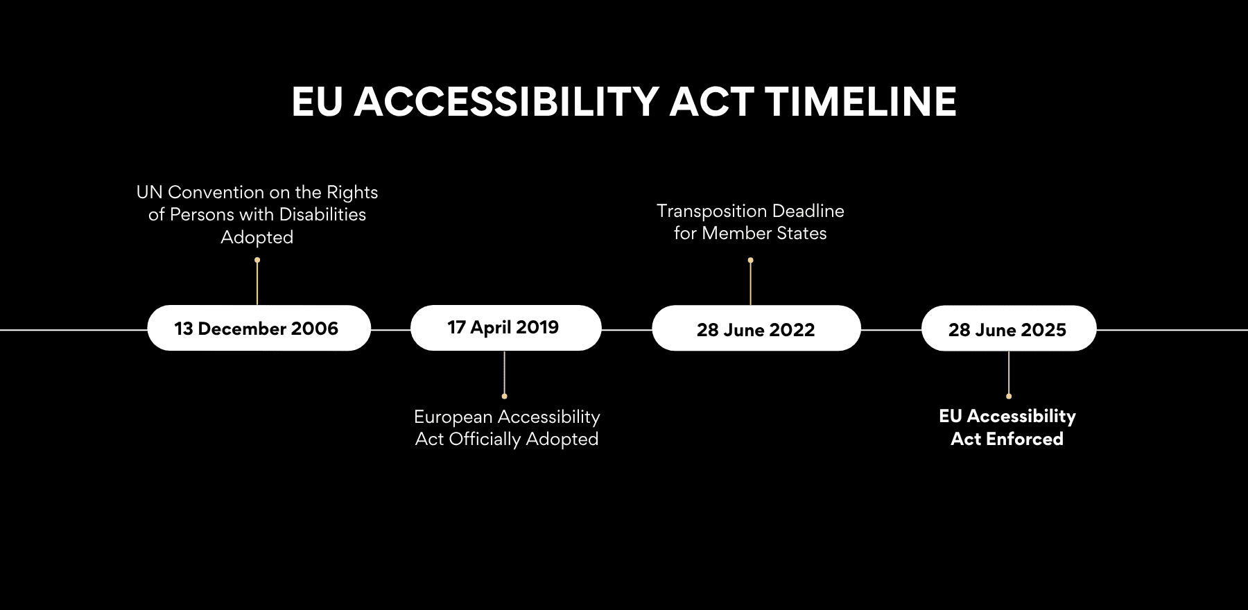
June 28, 2025, marks a significant shift. The European Accessibility Act (EAA) comes into force, requiring websites and apps in e-commerce, travel, and banking to embrace accessibility. This law recognizes what should have been obvious: everyone deserves access to the same online services.
This Law Reaches Beyond Europe
The EAA applies to any provider that offers e-commerce services to consumers in the EU, regardless of whether that provider is in the EU. Your business could be based in New York, Toronto, or Sydney. If you sell to European customers, these rules apply to you. This includes any business with at least 10 staff and a turnover above €2 million.
Accessibility Sidebar packs several tools into one plugin. Visitors get text-to-speech features, visual customization options, and enhanced navigation controls. You get appearance settings, page-level controls, and integration options. Here’s how each feature works and why it matters for both you and your site visitors.
Core Accessibility Tools For Visitors
When visitors click the accessibility icon on your site, they see six tool categories waiting for them. Each category solves different browsing challenges people face every day:
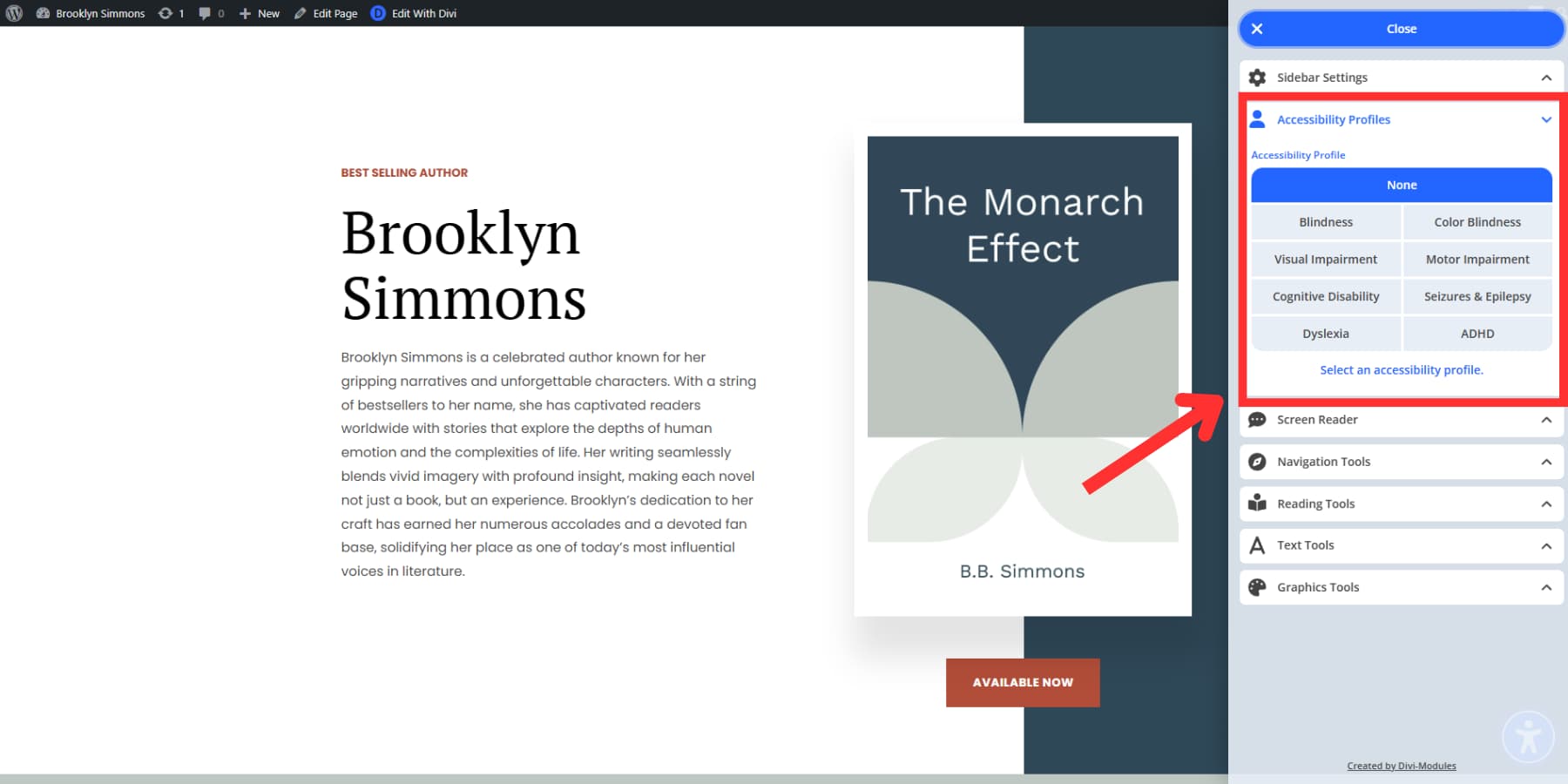
Accessibility Profiles
Profiles let you set everything up with one click. Eight different options match different needs. Someone with dyslexia gets fonts designed to prevent letter confusion. Movement stops completely, so text stays still.
Visual impairment profiles activate seven features together: a bigger cursor, sharper text, stronger colors, and outlines that track where you are on screen. ADHD profiles include a mask that covers everything except what you’re reading right now. Seizure profiles turn off movement and reduce color intensity.
Motor impairment profiles add outlines to clickable items and show labels explaining what buttons do. Each profile combines features that work together. You can adjust settings later but start with combinations that make sense for your specific needs.
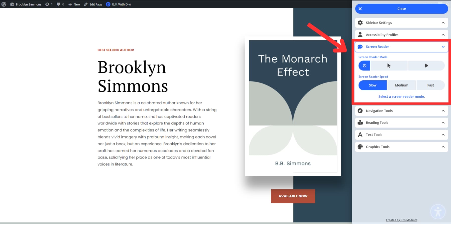
Screen Reader
This tool speaks website text aloud. Some visitors can’t see the screen clearly, and others simply prefer listening over reading. While blind users typically have their own specialized screen readers, this gives everyone else audio support when they need it.
The reader offers two modes. Manual mode speaks only what someone clicks or tabs to, giving them control over what they hear.
Navigation Tools
These tools help people find their way around your site instead of getting lost in poorly designed navigation.
The prominent cursor feature addresses something most designers never think about: that tiny default pointer becomes nearly invisible for people with vision issues, so this tool makes it bigger and lets users change its color to something they can see. It also lets you navigate effortlessly through your website’s page structure.
Reading Tools
Some people cannot focus when there is too much happening on a page. Reading tools help them zero in on what matters without getting distracted by everything else.
Reading guides act like rulers that move down your page. You can choose from small, medium, or large sizes. People with dyslexia or ADHD find this helpful because it keeps them focused on one line at a time. Without it, they might skip around the page or lose track of where they were in long blocks of text.
Reading masks work differently. They darken your whole screen except for the part you’re reading. You move a bright window across the page to highlight the text you want, while everything else fades into the background. This helps when websites have too much stuff going on or when sidebars and other elements keep pulling your attention away.
Text Tools
Text tools help visitors change how words look so they can read better, fixing real problems affecting millions daily.
The text font option gives visitors two choices: regular OpenSans font or OpenDyslexic. OpenDyslexic was created especially for individuals with dyslexia. It features thicker bottoms on letters and distinct shapes that prevent the letters from appearing reversed or mixed up in the reader’s mind. For those with dyslexia, using this font makes reading significantly easier and less tiring since the letters remain stable. You can also modify the text size, line height, spacing, and alignment.
Graphics Tools
Websites can overwhelm people with visual chaos. Graphics tools help tone everything down. Color saturation control makes bright colors less intense. That glaring orange button or electric green headline becomes gentler on the eyes.
People with color blindness often can’t see text that looks clear to everyone else. Certain color combinations simply vanish for them. Color contrast fixes this by creating a stronger separation between text and backgrounds. Pale gray words on white turn into black text that people can actually read. Dark mode flips everything to white text on black backgrounds for those who prefer it. You can also hide images and stop animations.
Customizable Appearance
Your accessibility sidebar shouldn’t look like it was slapped onto your website as an afterthought. Nobody wants a bright blue sidebar interrupting their carefully chosen color scheme.
The appearance settings let you pick colors that actually work with your site. You get color pickers for the sidebar background, button colors, and text. Match your brand colors or choose something that blends naturally with your existing design.
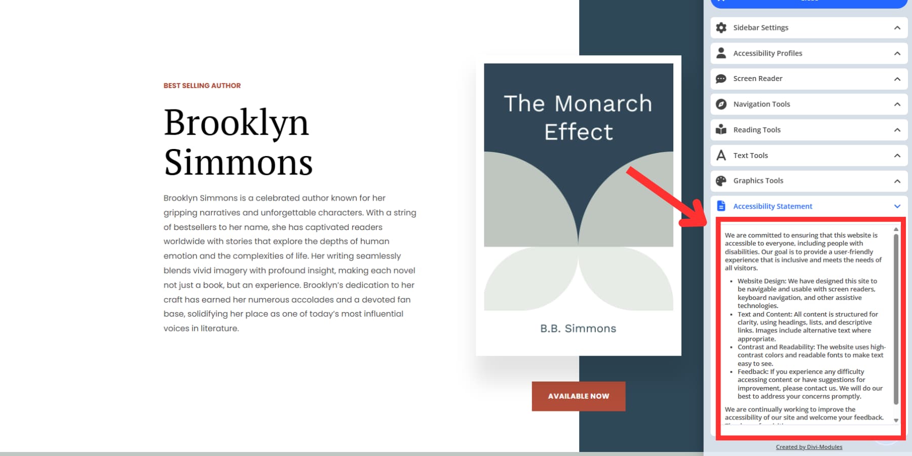
Accessibility Statement Manager
Every website needs an accessibility statement, but most people are unsure what to include or where visitors should find it. The statement manager handles both problems.
You get two ways to share your accessibility information. The first option links to a separate page on your site where you’ve written out your full accessibility statement. Visitors click a button in the sidebar and get taken directly to that page.
The second option puts your statement text right inside the sidebar itself. People can read it without leaving the page they’re on. This works well for shorter statements or summaries of your longer policy.
Getting Accessibility Sidebar running on your site takes just a few clicks. When someone with vision problems lands on your site and spots that accessibility button, they’ll know you built something with them in mind. That small icon represents hours of thoughtful planning on your part:
1. Download And Install The Plugin
The installation process works exactly like installing any WordPress plugin. Download the ZIP file after purchasing, head to your WordPress admin area, and go to Plugins > Add New > Upload Plugin. Choose your file and hit Install Now. Once WordPress finishes processing, click Activate.
You’ll see a new “Accessibility” menu appear in your WordPress admin sidebar. This menu houses all the plugin settings, and you’ll spend most of your setup time here.
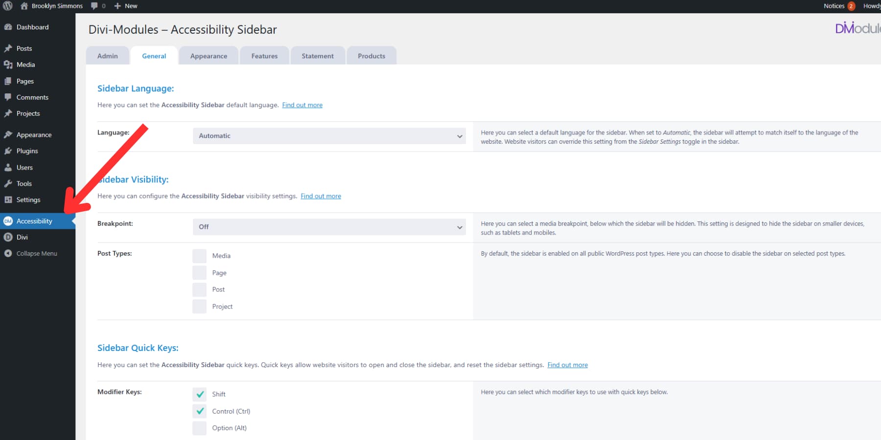
2. Configure The Basic Settings
Click on that new Accessibility menu, and you’ll find several tabs across the top. Start with the General tab, which controls how the sidebar behaves across your entire site.
The language setting deserves your attention first. Set it to “Automatic” and the sidebar will try to match your website’s language. If you run a multilingual site, this saves visitors from seeing English accessibility tools when they’re reading content in Spanish or French.
Next comes the breakpoint setting. This controls when the sidebar disappears on smaller screens. Mobile devices already have some built-in accessibility features, so hiding the sidebar on phones and tablets might make sense. Leave this set to “Off” unless you specifically want mobile users to see it.
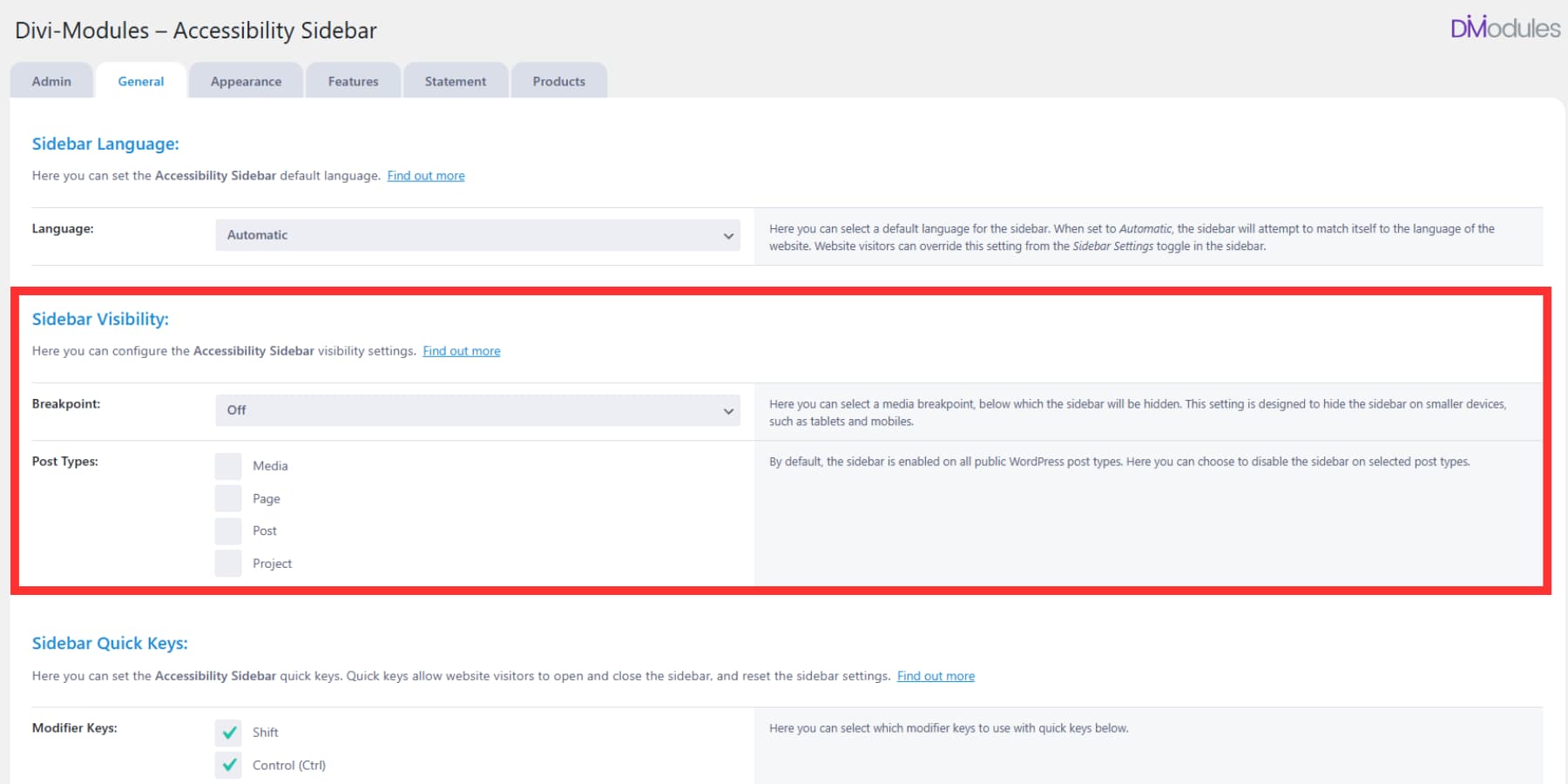
Post types let you choose where the sidebar appears. Maybe you want it on regular pages and posts but not on your portfolio items or testimonials. Uncheck the post types where the sidebar would get in the way.
3. Set Up Quick Keyboard Access
Your keyboard-only visitors need a fast way to open the sidebar. The quick keys section lets you set up hotkey combinations that they can press anywhere on your site.
Pick modifier keys first. Most people use Shift and Control together because these don’t conflict with browser shortcuts. Then choose a letter for the toggle key. “K” works well because few websites use Ctrl+Shift+K for anything important.
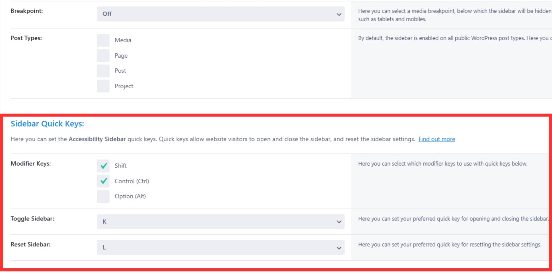
You can also set a reset key combination. This is handy when someone accidentally changes too many settings and wants to start over. “L” makes a good reset key since it’s right next to “K” on most keyboards.
4. Customize The Visual Appearance
The Appearance tab controls how the sidebar looks on your site. You want it to blend naturally rather than screaming, “I’m a widget!”
Start with the button appearance. You have options for selecting several widget icons. The Universal Access Icon is the default and most-used icon. This small icon sits in the corner of your site, so pick colors that work with your design. Choose a color that visitors can see but doesn’t clash with everything else.
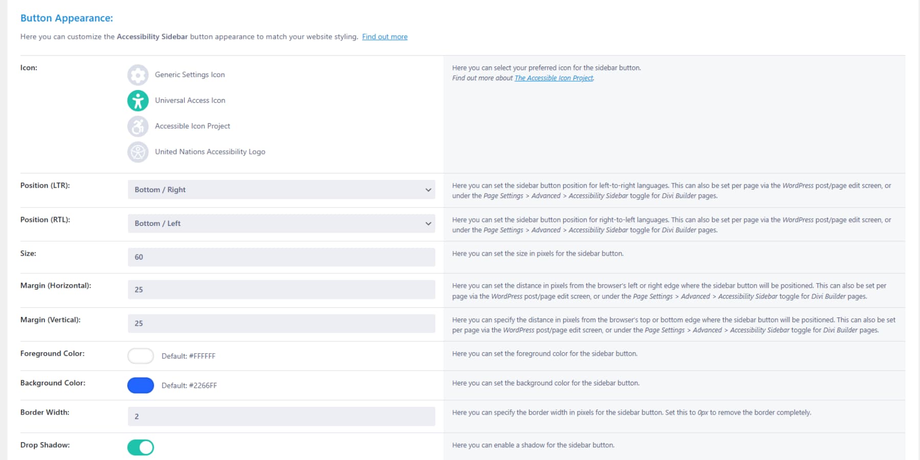
The sidebar itself gets similar treatment. Pick background colors, text colors, and button colors that feel like part of your site. Most people go with subtle grays or match their site’s accent colors. You can also customize the highlight colors as needed.
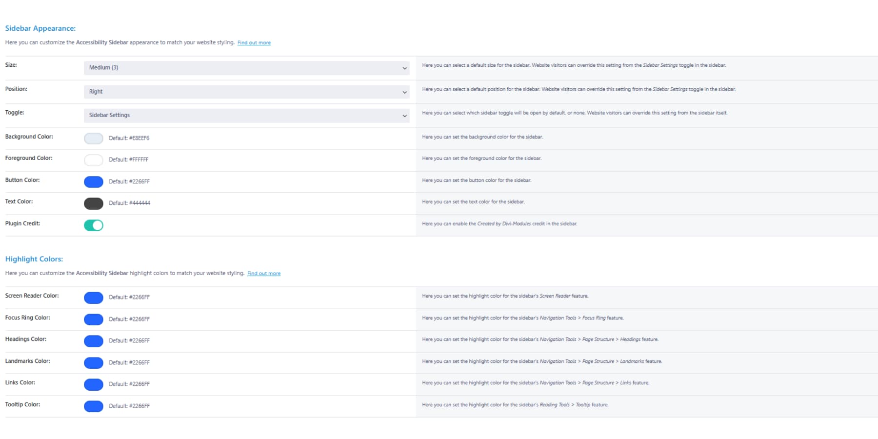
Position matters too. Right-handed people expect controls on the right side of the screen, but left-handed folks might prefer the left. Pick what works best for your audience, knowing visitors can change this later if needed.
5. Enable The Tools Your Visitors Need
The Features tab contains the real control. Here you decide which accessibility tools appear in your sidebar. You don’t have to enable everything: just the tools that make sense for your audience. However, enabling everything isn’t a bad idea.
Accessibility Profiles work like preset buttons. Someone with dyslexia clicks their profile and gets the dyslexia font plus slower animations. Visual impairment users get bigger cursors and higher contrast. Enable these profiles if your visitors struggle with multiple issues at once.
Text tools help people read more comfortably. Font switching, size adjustments, and line spacing changes solve different reading problems. Most sites benefit from enabling all the text tools since reading is so fundamental to using websites.
Graphics tools help when your site feels overwhelming. Color adjustments and animation controls let people tone down visual noise. These tools work well for sites with lots of images or moving elements.
Start Building Accessible Sites That Welcome Everyone Today
Building websites that work for everyone isn’t some grand mission. It’s just good business sense. When your site visitor can adjust the text size to something they can actually read, they stick around longer. When someone with motor difficulties can navigate using just their keyboard, they complete purchases instead of giving up.
Every day you wait, someone leaves because they can’t use your site properly.
The June 28 deadline gives you a target date, but the real payoff happens every day after that. Accessibility Sidebar handles the technical parts so you don’t have to rebuild everything. Your design stays intact, your visitors get the controls they need, and your site actually works for the people trying to use it. Grab it today for half the cost. This offer lasts util June 28.


Leave A Reply