
When you’re building complex sites, a few deliberate adjustments to your environment can save hours each week by reducing friction and keeping you focused on the work that matters.
Divi 5 makes this easier with workspace tools that adapt to how you work instead of slowing you down. In this guide, we’ll walk through the settings and workflow choices that make the biggest difference, with concrete examples, so efficiency in the Visual Builder becomes second nature.
What Divi 5 Brings To The Table For Power Users
The workspace changes go deeper than visual polish. They address the layout bottlenecks that add up when you’re building at scale. Here are some of the quality-of-life improvements we introduced:
| Workspace Feature | What It Does |
|---|---|
| Command Center | Press Cmd + K on Mac or Ctrl + K on Windows to execute commands for adding elements, navigating pages, opening panels, and jumping to settings |
| Page Manager | Create, edit, duplicate, and delete pages without leaving the builder |
| Preview Mode | Hide all builder UI elements instantly to preview your design in-app, with an option to generate a front-end preview link |
| Content Drill Down | Navigate into child elements using the drill-down icon in the breadcrumbs or the arrow keys |
| Consolidated Page Menu | Access page-level actions, recently opened pages, and keyboard shortcuts from a single menu |
| Multi-Panel Docking | Open multiple settings panels simultaneously and dock them side by side |
| Panel Positioning | Dock panels on either side or float them within the workspace |
| Canvas Scaling | Drag the canvas edge or enter a custom width to preview different screen sizes without leaving the builder |
| Light & Dark Mode | Toggle the interface between light and dark modes |
| Settings Search | Type keywords to filter settings and jump straight to matching options |
| Settings Filtering | Filter settings by modified values, colors, sizes, font families, or font weights |
| Keyboard Shortcuts | Use key combinations to speed up navigation and common builder actions |
| Customizable Breakpoints | Set and adjust screen widths for seven responsive breakpoints |
| Breadcrumb Navigation | See your exact position in nested content with a clickable hierarchy in the settings panel |
Arranging Your Workspace
Divi 5’s Visual Builder already comes with a clean, thoughtful layout, but it’s also built to adapt to the way you work. That flexibility matters most before you start building, when a few deliberate choices can shape a workspace that fits your habits instead of fighting them. This section walks through how to arrange your workspace so it supports your process and keeps your attention on the design.
Configuring The Builder Interface
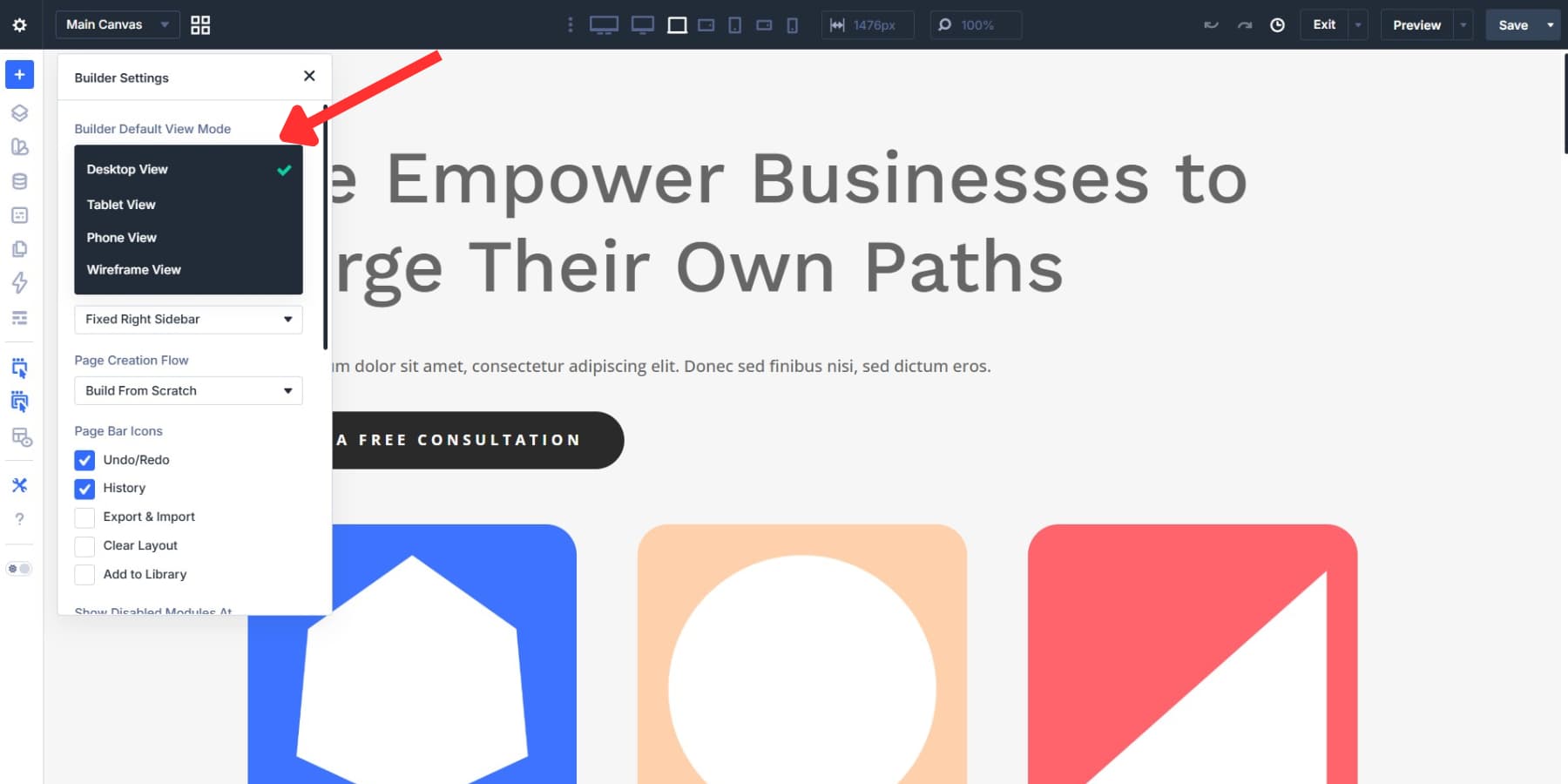
Open Builder Settings using the gear icon in the builder interface. Everything you change here is worth setting up intentionally before you begin.
We’ll get to the initial layout options in a moment. First, let’s focus on appearance. Interface Mode is set to Light by default, but if you tend to build for long stretches, Dark Mode can be easier on the eyes.
You can also use the interface toggle to switch quickly between light and dark modes while you work.
Right below that, Color Scheme lets you choose the accent color used for builder UI elements such as active controls, selected modules, and highlighted options. Blue is the default, and it works well in most cases. But if the site you’re building also leans heavily on blue, switching the UI accent to green or red can make it easier to distinguish the builder chrome from the page design itself. For this setup, we’re sticking with the default blue.
Cleaning Up The Interface
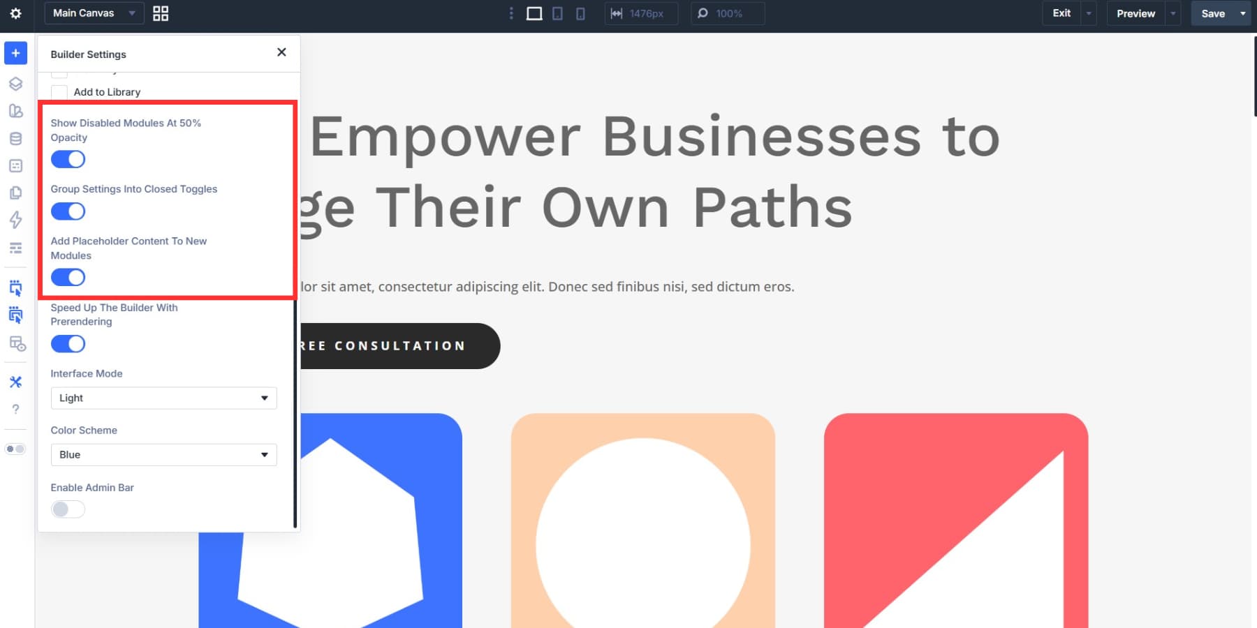
A few additional toggles can help clean up the interface. Collapsing settings groups by default gives you a shorter panel every time you open a module. Dimming disabled elements to 50% opacity makes it obvious which items are inactive at the current breakpoint without forcing you to click into each one. If those defaults suit your workflow, leave them on. We are.
And if you prefer starting with empty modules, turn off the default placeholder content so new modules don’t load with dummy text and images.
Speeding Up Navigation With Prerendering
The last toggle in that group is Speed Up The Builder With Prerendering.
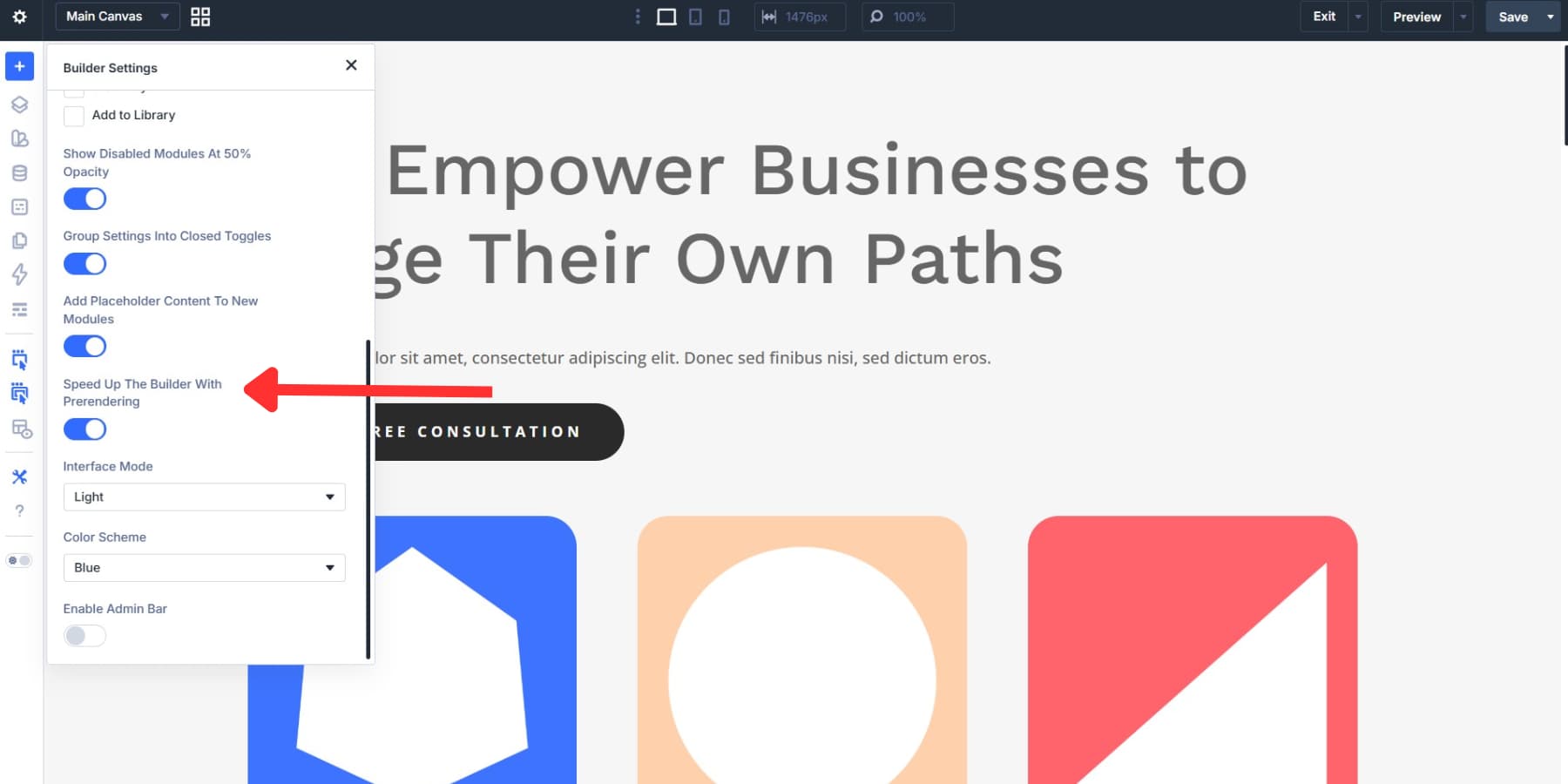
This feature uses speculative prerendering to predict where you’re headed and load that destination in the background before you click. In practice, it speeds up entering and exiting the builder and switching pages during active build sessions. It’s enabled by default, and if you move between pages often, the time savings add up quickly.
Do note that speculative prerendering currently depends on Chromium-based browsers, so Chrome, Edge, Opera, and similar browsers get the benefit, while Safari and Firefox do not yet. Also, each prerender counts as a page request on your server, so you may want to disable it if you need to limit extra background requests.
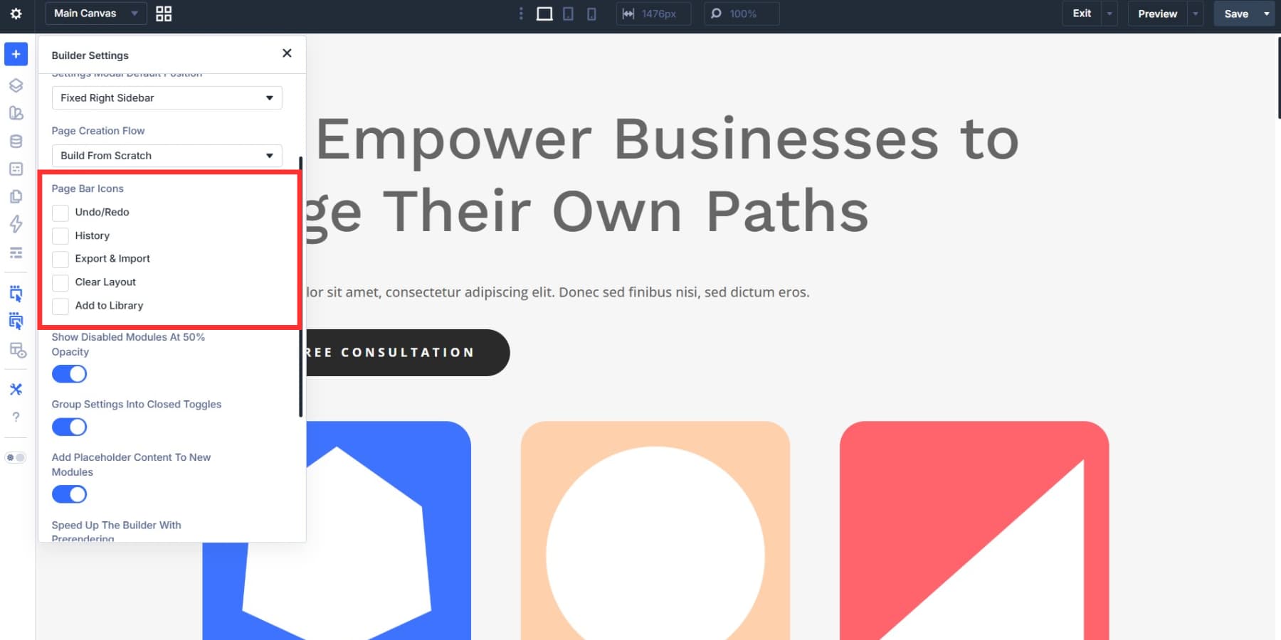
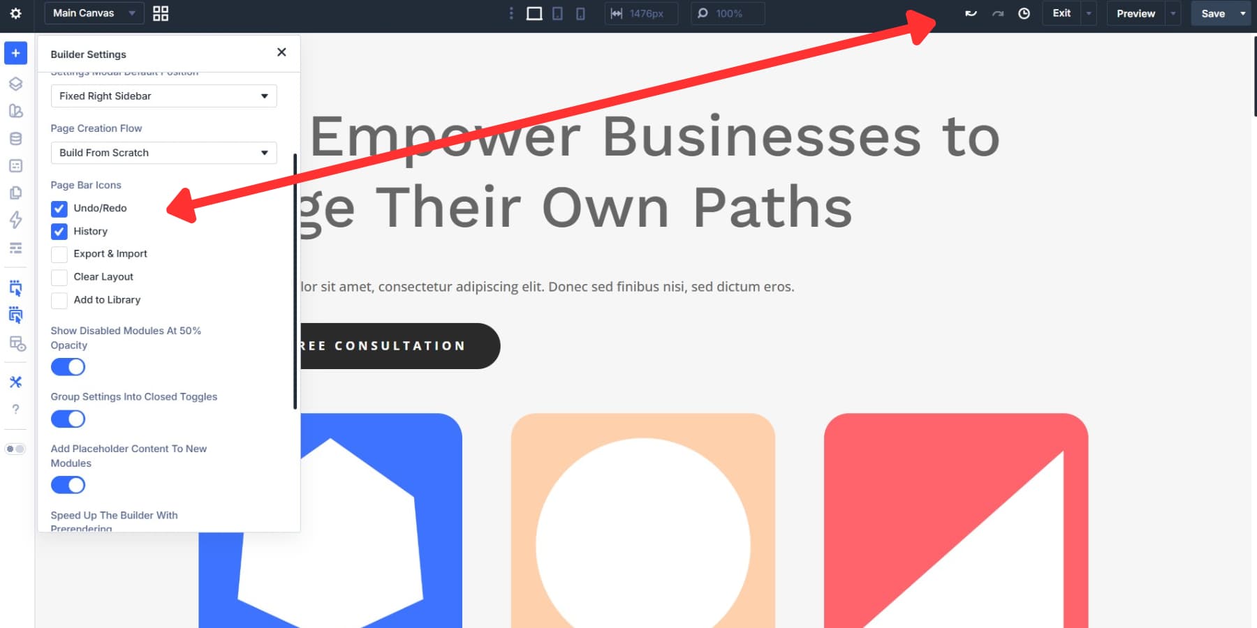
Customizing The Page Bar
Still inside Builder Settings, the Page Bar Icons group controls which action buttons appear in the top toolbar. Each toggle adds or removes an icon, so you can keep only the controls you actually use visible:
- Undo/Redo: Adds forward and back arrows so you can step through recent changes with a click.
- History: Opens a timeline of actions from your current editing session so you can jump back to an earlier point.
- Export & Import: Lets you export your page layout as a JSON file or import one.
- Clear Layout: Removes the entire page layout so you can start fresh.
- Add to Library: Saves your current layout to the Divi Library for reuse elsewhere.
We’re turning on Undo/Redo and History and leaving the rest off. Undo/Redo is the control you’ll reach for constantly during spacing tweaks, color swaps, and quick layout experiments.
History goes a step further. Instead of stepping back one change at a time, it gives you a visual action timeline for the current session, so you can jump back to an earlier state without hammering Ctrl+Z. Together, these two tools cover the majority of day-to-day reversions without adding clutter to the toolbar.
When you scroll farther down, you’ll also see the Admin Bar option. It’s off by default, which preserves more vertical canvas space. If you want quick access to the WordPress admin toolbar while building, toggle it back on.
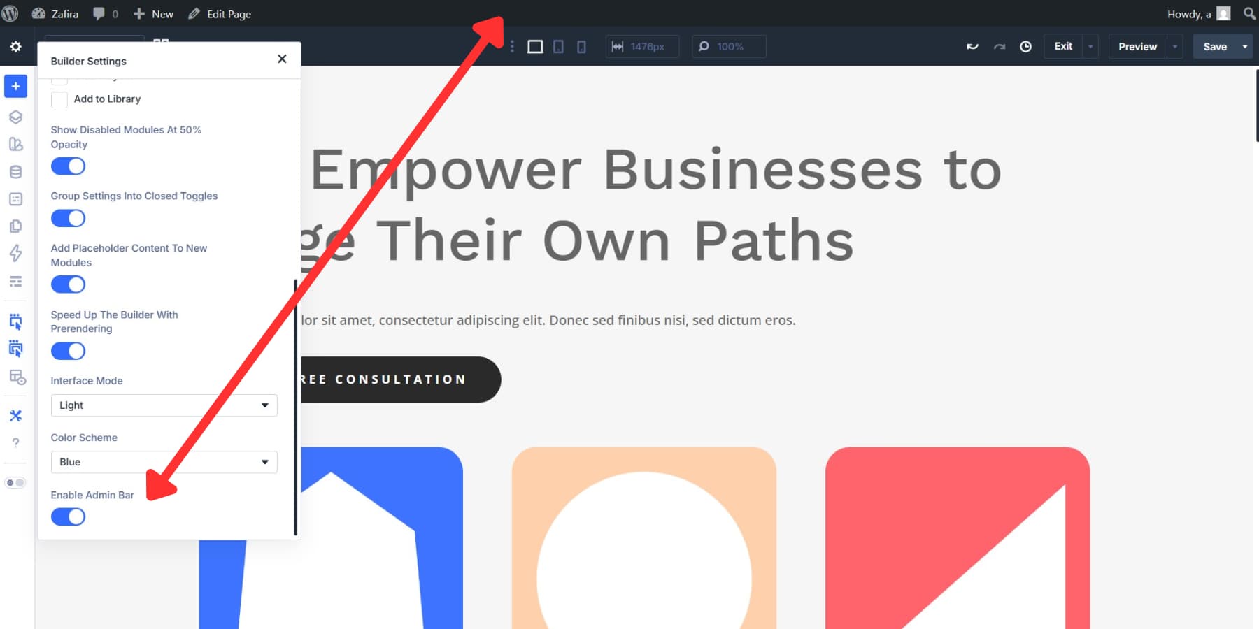
That said, the extra canvas space is usually more valuable, especially now that Divi 5 includes tools like the Page Manager for switching pages without leaving the builder, so we’re leaving it off.
Floating Panels For A Flexible Layout
Not every build needs every panel pinned to an edge. On large monitors, floating panels give you a looser, more flexible workspace. Right-click any docked panel and select Undock Panel to free it from the sidebar, then place it wherever it fits best.
To undock non-settings tabs, you can drag them directly onto the canvas. This works especially well when you want your settings panel closer to the element you’re editing instead of forcing your eyes back and forth across the screen.
On a hero section, for example, float the settings panel near the top of the canvas and turn on X-Ray from the left toolbar. X-Ray outlines the page structure so you can see exactly where one element ends and the next begins while keeping the settings panel close to the work area. When you move farther down the page, drag the panel with you.
You can also float multiple panels at once. For example, you might keep Layers and module settings open side by side without sacrificing your docked workspace.
Docking And Tabbing Your Panels
Floating every panel can get messy on complex pages, so the next step is deciding where your most-used panels should live. Settings, Layers, module options, and page settings all need a home, and the way you place them changes how efficiently you move through a build.
Selecting A Default Panel Position
Back in Builder Settings, the Settings Modal Default Position option gives you three choices: Fixed Right Sidebar, Fixed Left Sidebar, and Float. This preference carries over from session to session, so the builder opens the same way each time.
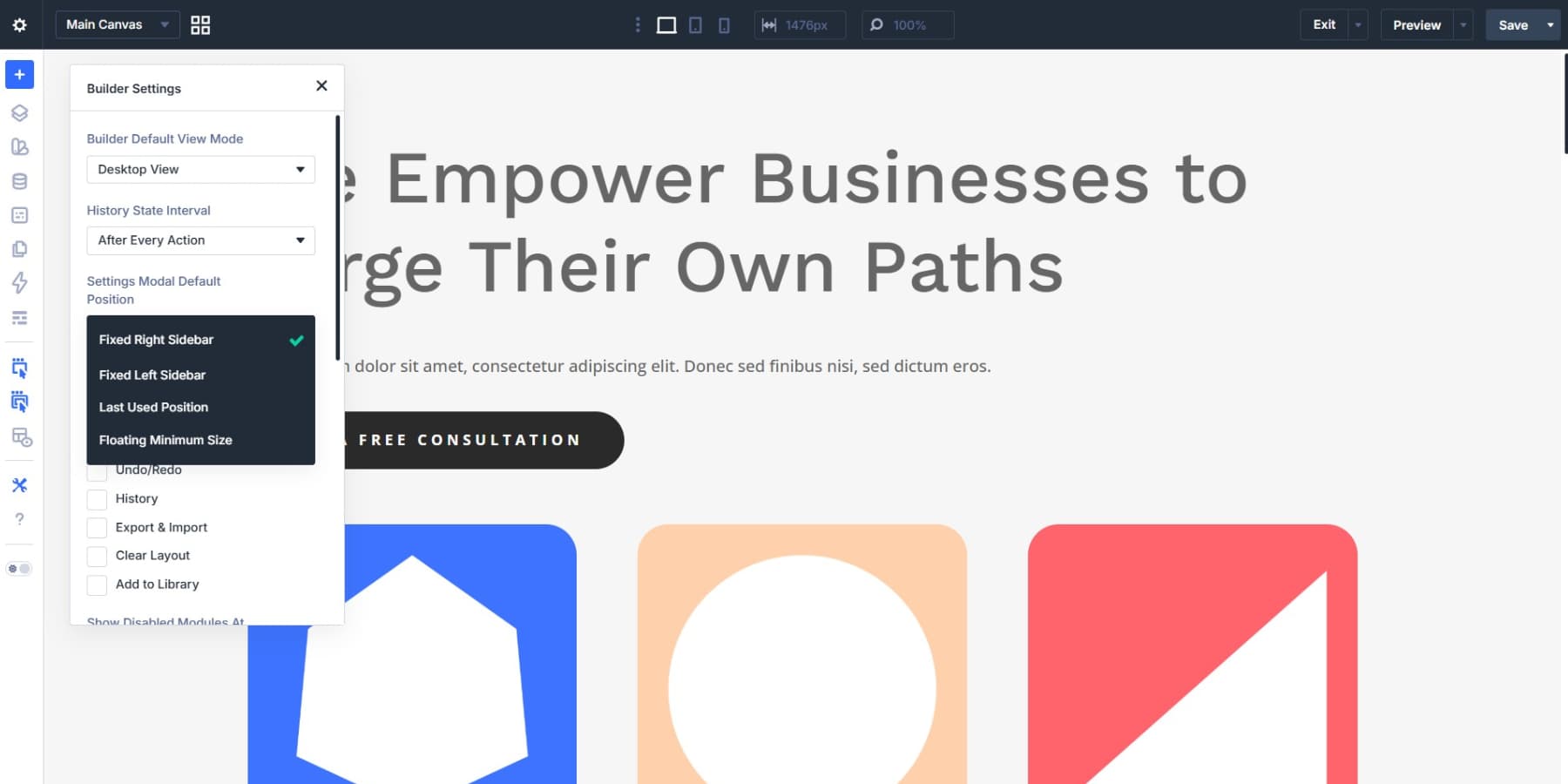
Fixed Right Sidebar is the default. It keeps your canvas on the left and your settings on the right, which feels natural for most workflows, so that’s the setup we’re using here. If you prefer your settings closer to the left toolbar, Fixed Left Sidebar flips the arrangement.
If you need to re-dock a floating panel, drag it toward either edge of the interface and it will snap into place. Drag another beneath it, and it will stack below the first.
Grouping Panels Into Tabs
You can also group panels into tabs during a session. Undock a panel and drag it onto another open panel to combine them into a tabbed stack.
For content-heavy builds, try tabbing Page Settings alongside module settings so you can switch between global page options and element-level controls without losing canvas space.
Docked and floating panels can coexist in the same session without conflicts. Dock the panels you use constantly, and float the ones you need closer to a specific point on the page.
A layout-heavy page might call for Layers next to module settings. A content-heavy page might work better with Page Settings in the foreground. These tab groupings are session-based, which makes them easy to adapt to the page in front of you.
Setting Up Your Responsive Editing Environment
Divi 5’s responsive editing environment is highly configurable, and the way you set it up affects how accurately and efficiently you work across screen sizes. Here’s how to get it right from the start.
Configuring Your Seven Breakpoints
A breakpoint is a screen width where your layout changes to suit a different range of devices. When a visitor crosses that threshold, Divi applies the styles assigned to that breakpoint. Divi 5 includes seven predefined breakpoints:
- Phone
- Phone Wide
- Tablet
- Tablet Wide
- Desktop
- Widescreen
- Ultra Wide
Each breakpoint has a default width you can adjust to better match the devices your audience uses.
Only three breakpoints are enabled by default: Phone, Tablet, and Desktop. Click the ellipsis icon next to the device icons in the top bar, open Sitewide Responsive Breakpoints, and you’ll see all seven options with toggles and editable widths. Desktop always remains enabled.
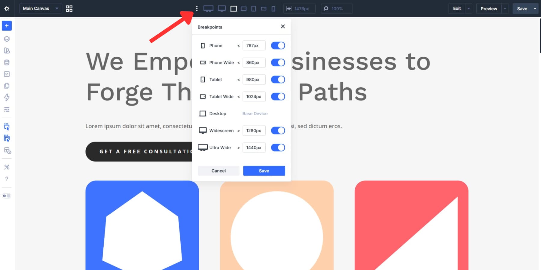
Start by deciding which breakpoints your audience actually needs. If your traffic skews mobile, enable Phone Wide. If you’re building for teams using larger monitors, add Widescreen or Ultra Wide. Just note that changes in the Sitewide Responsive Breakpoints modal don’t apply until you save them.
Once enabled, you can make device-specific changes by switching breakpoints using the device icons in the top bar, the device selector inside element settings, or the Responsive Editor.
One detail worth knowing: if you later disable a breakpoint, Divi keeps the styles assigned to it. Re-enable that breakpoint later, and those styles come back.
Using Canvas Scaling To Preview Screen Sizes
Canvas scaling gives you a live preview of different screen widths without leaving the builder. Drag the edge of the canvas to resize it freely, or type a specific pixel value into the width field in the top bar to jump to an exact size. Divi scales the preview proportionally either way.
Two keyboard shortcuts make this faster: Ctrl + = zooms into the next smaller preview size, and Ctrl + – zooms out to the next larger one within the current breakpoint.
If you build mobile first, set your default breakpoint in Builder Settings so each session opens at the screen size you care about most instead of defaulting to desktop.
Working Faster In The Visual Builder
Divi 5’s Visual Builder packs in a lot of workflow improvements, and the more comfortable you get with its built-in tools, the less time you spend on repetitive actions. These are the habits and features that tend to save the most time during a real build session.
Finding Any Setting With Search And Filtering
Divi 5 modules include a large number of options, and the search bar at the top of each settings panel keeps them accessible. Type a keyword, and matching settings filter down instantly without requiring extra tab switching or scrolling.
The filter button next to search gives you more control. The Modified filter shows only the settings you’ve changed on that specific element. On a page you didn’t build yourself, such as a starter site or a client handoff, that makes it much easier to see what’s been edited already.
Other filters narrow settings by type, including colors, sizes, font families, and font weights.
That means you can skip long lists of spacing controls and jump straight to typography or color. Between search and filters, you spend a lot less time hunting.
Losing your place inside a deeply nested element is one of those small frustrations that slows a build down more than it should. Breadcrumbs at the top of the settings panel solve that by tracking your current position in the content tree. Click any breadcrumb to jump back to that level.
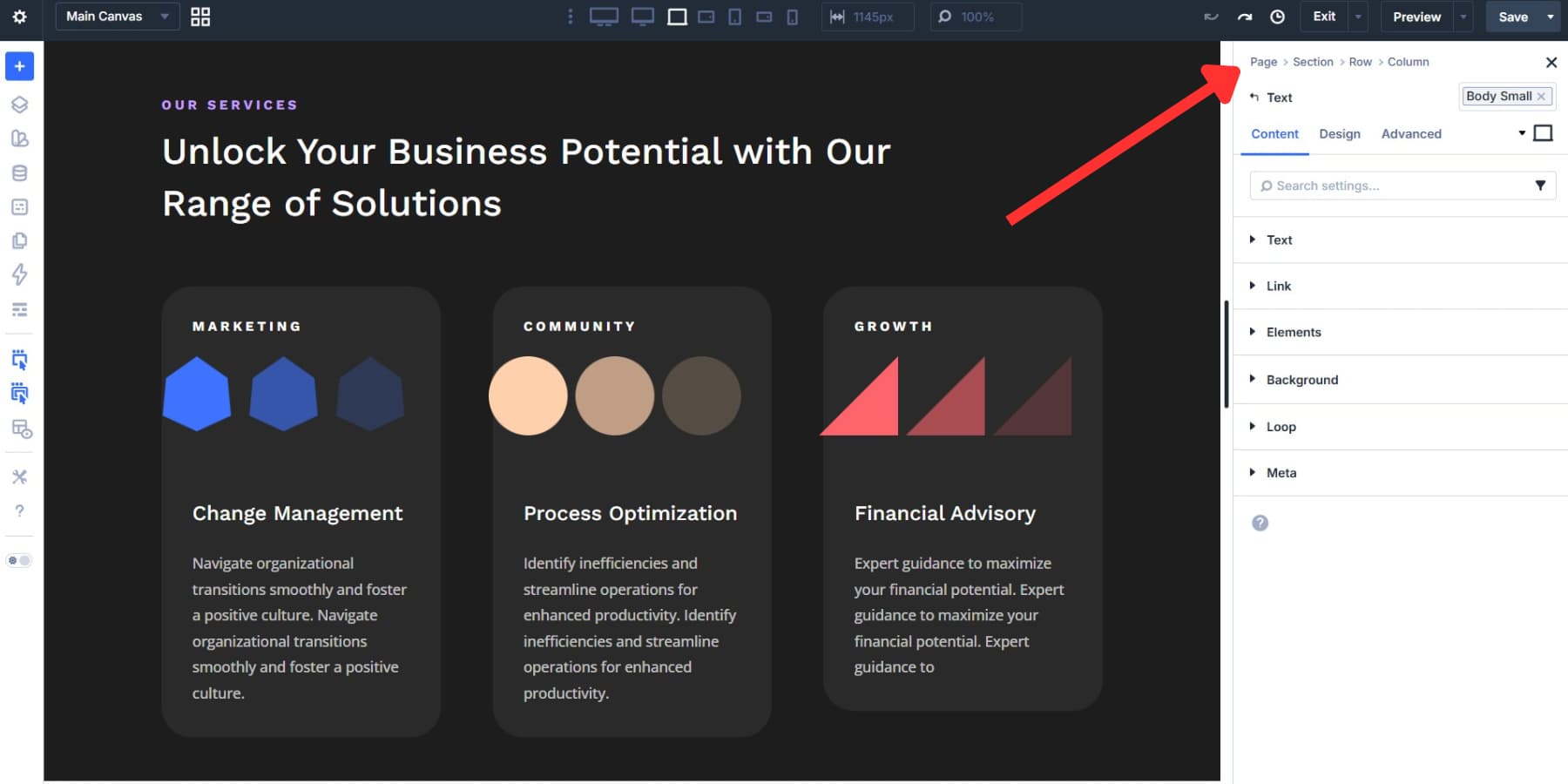
The drill-down icon at the end of the breadcrumb trail takes you deeper into the child elements of the currently selected item.
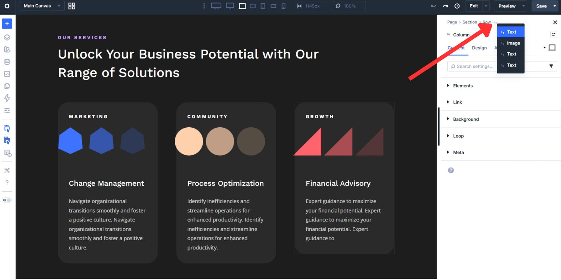
You can also navigate the content tree with the keyboard. Left and right arrow keys move between parents and children, while up and down move between adjacent elements in the same container.
The Page Manager extends that same idea to page-level navigation. Instead of returning to WordPress every time you need to switch pages, you can open, create, duplicate, or delete pages directly inside the builder. On multi-page projects, that keeps your momentum intact.
Keyboard Shortcuts To Use
The arrow-key navigation above is a great start, but Divi 5 includes a broader shortcut system worth using. The right-click context menu shows relevant shortcuts next to many actions as you work, so you can pick them up naturally. Press ? at any time to open the full shortcut reference inside the builder.
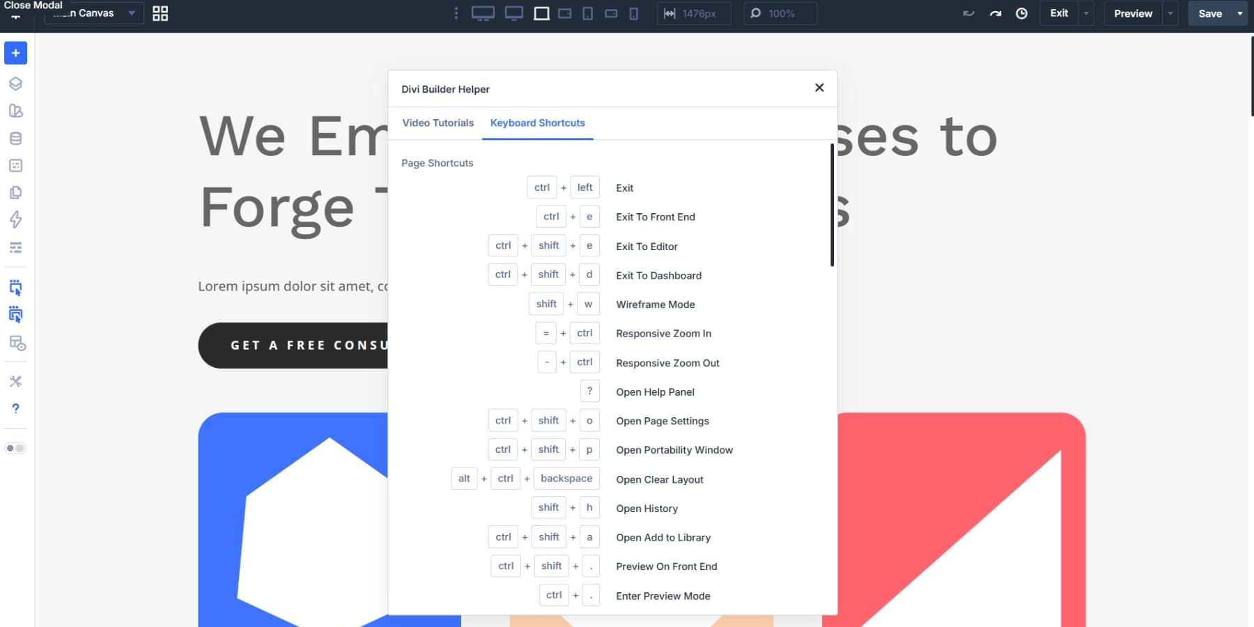
A few are worth learning early:
- Cmd + K on Mac / Ctrl + K on Windows opens the Command Center.
- Cmd + . on Mac opens Preview Mode.
- Arrow keys help you move through the content tree without relying on the canvas.
| Action | Windows | Mac |
|---|---|---|
| Wireframe Mode | Shift + W | Shift + W |
| Open History | Shift + H | Shift + H |
| Open Portability Window | Ctrl + Shift + P | Cmd + Shift + P |
| Add New Section | S + 1 / 2 / 3 | S + 1 / 2 / 3 |
| Add New Row | R + 1 / 2 / 3 / 4 / 5 | R + 1 / 2 / 3 / 4 / 5 |
| Change Column Structure | C + 1 / 2 / 3 / 4 / 5 | C + 1 / 2 / 3 / 4 / 5 |
| Make Row Full Width | R + F | R + F |
| Copy Module Style | Alt + Ctrl + C | Option + Cmd + C |
| Paste Module Style | Alt + Ctrl + V | Option + Cmd + V |
| Copy-Paste Module | Ctrl + C + V | Cmd + C + V |
| Padding Nudge (1px) | R / S / M + Arrow Key | R / S / M + Arrow Key |
| Padding Nudge (10px) | R / S / M + Shift + Arrow Key | R / S / M + Shift + Arrow Key |
Using Extend Attributes, Inspector, & Find And Replace
Divi 5 also gives you three tools for handling repetitive styling work quickly. Knowing which one to use keeps bulk edits precise instead of messy.
Start With Inspector
The Inspector gives you a high-level view of an element before you edit it. Right-click any element in the Visual Builder and choose Inspect, or click the Inspector icon in the sidebar.
The panel groups what it finds into three tabs: Styles, Content, and Presets. You can inspect a single element or broaden the view to include its child elements, which makes it especially useful for audits, revisions, and imported layouts.
It’s particularly useful during design audits or client revisions, where you want to understand what has been applied before changing anything. Click a value in the Inspector to update matching instances across the inspected selection. Presets behave similarly, making large-scale cleanup much faster.
Use Find And Replace For Known Changes
Find And Replace is the tool to use when you already know what needs to change. Open an element’s settings, click the three dots next to the field you want to edit, and choose Find And Replace. The current value loads automatically. Enter the replacement value, choose a scope, and run it.
The scope options let you target just that element, its parent container, or the entire page. The element type selector narrows things even further, so you can replace padding only in columns or change fonts only in headings. Turn on Only Replace Identical Fields to avoid matching unrelated settings that happen to share the same value.
Use Extend Attributes For Repetition
Extend Attributes is what you use after styling one element correctly and needing the rest to match. Right-click the styled element, choose Extend Attributes, then define the source, target scope, and exactly what should be copied, such as styles, content, presets, or specific option groups.
It can also work across different element types, which makes it far more flexible than simple style copying.
When To Use Which Tool
Used together, Inspector, Find And Replace, and Extend Attributes remove a lot of the repetitive back-and-forth that normally slows styling work at scale. Start with Inspector when you need to understand what’s already there. Use Find And Replace when you know the exact value you want to swap. Use Extend Attributes when you’ve perfected one element and need to propagate that setup across the page. For a deeper comparison, see this post.
Using The Command Center
The Command Center is a keyboard-driven action bar built into the Visual Builder. Press Cmd + K on Mac or Ctrl + K on Windows to open it, type a command, and press Enter. Actions that normally take several clicks become a few keystrokes.
What You Can Do With It
You can use it to add elements, jump to settings, open modals, switch view modes, navigate between pages, and run common page-level actions.
Queueing Commands For Speed
Command queuing is where the real speed gains show up. Press Cmd + Return on Mac or Ctrl + Return on Windows to queue commands without executing them immediately, then press Enter to run the queue. For example, “Blurb > Group > Button + Primary Preset *2” builds the structure and applies the preset to both buttons in a single flow.
Filtering Command Results
To narrow the results list while typing, use “:” followed by a category name. Type “:modal” and the list filters down to modal commands only.
The Best Workspace Is The One You Don’t Fight With
Your workspace should match the way you think, not the other way around. Divi 5 gives you that flexibility across panels, breakpoints, shortcuts, and navigation tools. Dock your panels one way for a layout-heavy page, then rearrange them for a content-heavy build the next day. Float your settings closer to the canvas when precision matters.
The environment can adapt as your workflow changes from project to project. Set up Divi 5 the way you actually work, and the builder starts getting out of your way.


Leave A Reply