


Changing a button color or adjusting a card’s spacing should be a quick task. But when that change needs to reach several elements on a page, you can spend more time reopening modules and entering the same values than deciding how the design should look. As the layout grows, even small revisions can become a tedious series of edits.
Divi 5’s Extend Attributes handles that repetition by letting you apply settings from one element to others across your page.
Beyond matching repeated modules, you can reuse compatible settings across different module types, carry section spacing into rows, and extend selected content or presets. Here are ten practical ways to use those controls on your next page.
- 1 How Extend Attributes Works
-
2
10 Ways To Save Time With Extend Attributes
- 2.1 1. Match Button Styles Across Different Modules
- 2.2 2. Carry Section Padding Over To Rows
- 2.3 3. Standardize Rounded Corners Across Containers
- 2.4 4. Roll Out A Design Change Across Repeated Elements
- 2.5 5. Reuse Background Styles Across A Layout
- 2.6 6. Synchronize Flex Settings Across Containers
- 2.7 7. Extend Presets Across Matching Elements
- 2.8 8. Reuse Content Attributes Where Content Should Match
- 2.9 9. Reuse Transform Settings Across Different Module Types
- 2.10 10. Harmonize Hover Effects
- 3 Spend Less Time Repeating Design Settings
How Extend Attributes Works
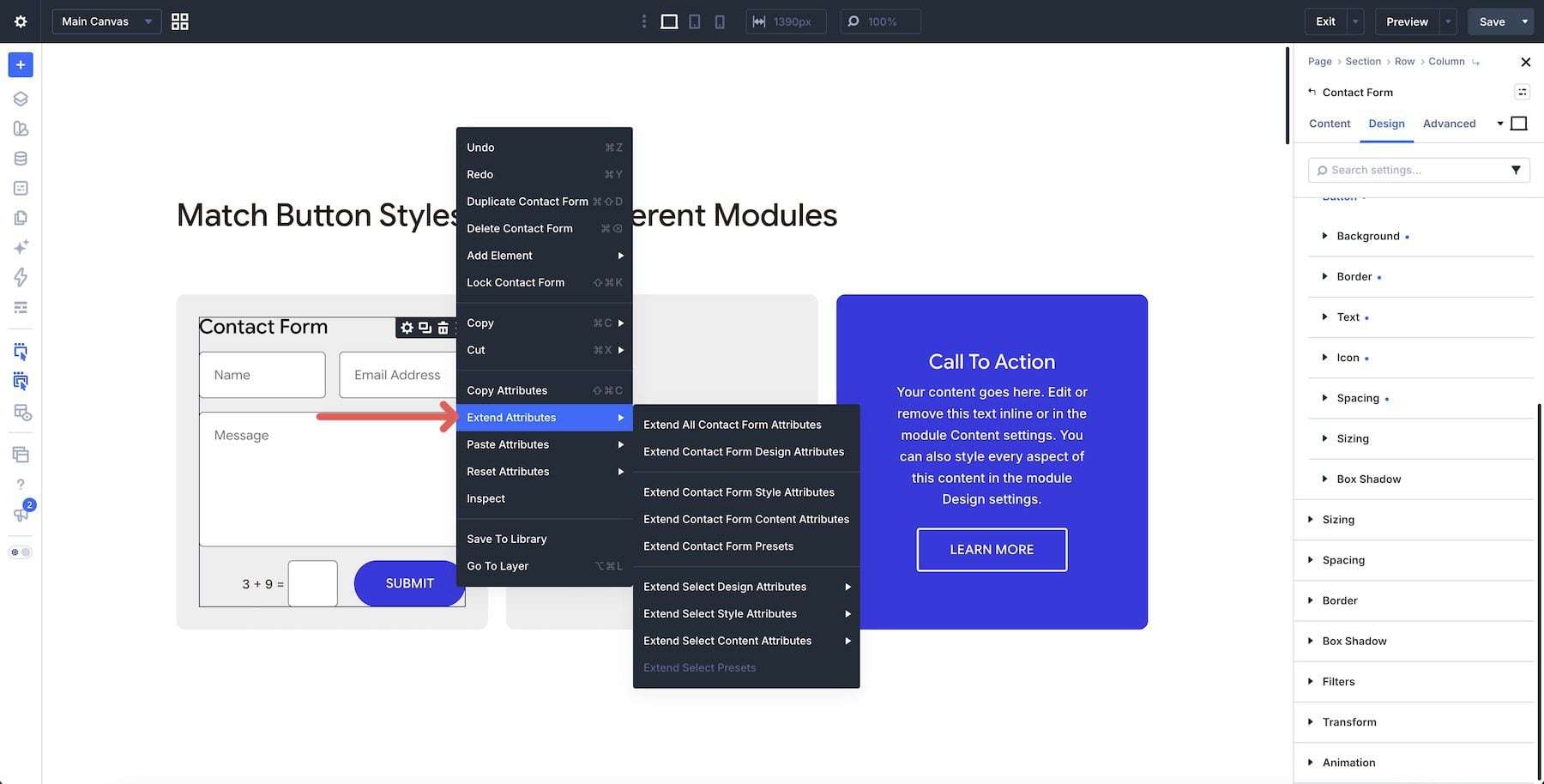
Extend Attributes uses one element as the source for a change. To open its controls, right-click that element in the Visual Builder and select Extend Attributes (you can also right-click an item in the Layers view or an option group in a module’s settings). The panel lets you choose where the change goes and how much of the source’s configuration to reuse.
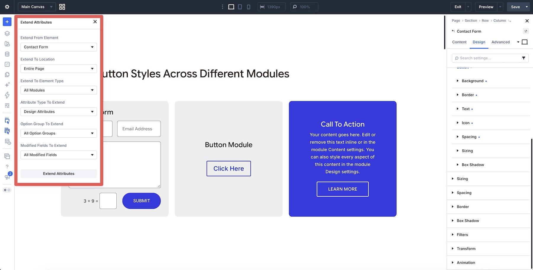
Use Extend To Location to choose how far the extension reaches, such as the current section or the entire page. Extend To Element Type narrows the receiving elements at that location. For example, you might apply a single background color to every row in a section while leaving its modules unaffected.
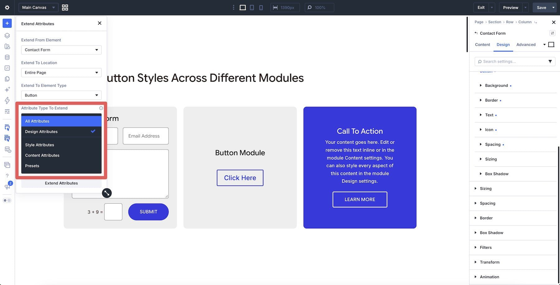
Next, choose the Attribute Type To Extend. Style Attributes copies modified styling without preset assignments. Design Attributes includes styles and presets, while Content Attributes covers content such as text and links. Presets focuses on preset assignments; the preset example below uses Design Attributes to transfer a Blurb element preset.
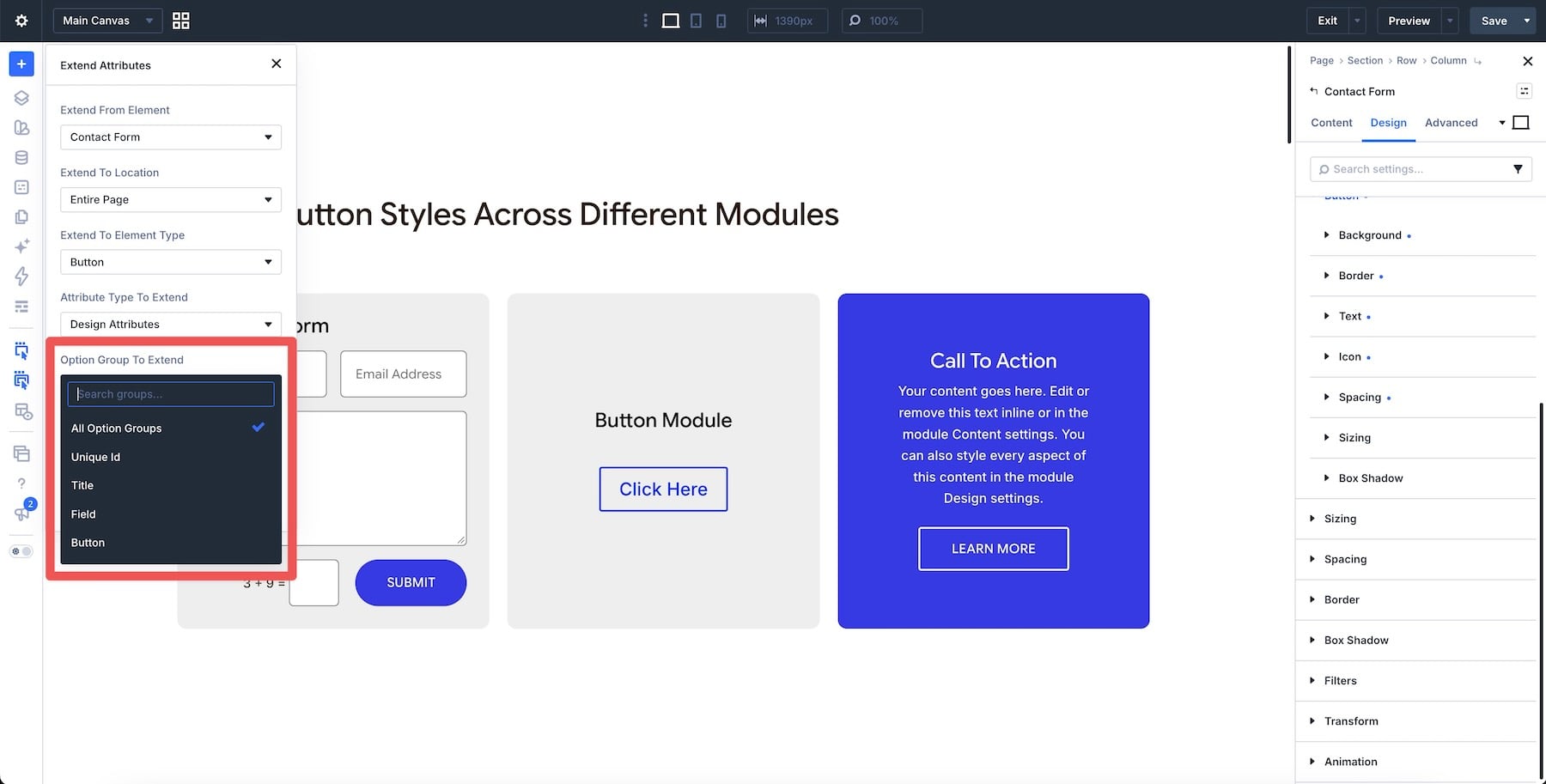
The Option Group To Extend field narrows the operation to related settings, such as Background, Spacing, or Button. Use Modified Fields To Extend to select individual settings within that group. All Modified Fields includes earlier customizations on the source, so review the list before applying it. Extending ordinary styles or content copies the selected values; future changes to the source require another extension. Shared presets provide a reusable definition for ongoing design updates.
These controls work together to keep the change specific. Once you know what should match, you can choose the settings and targets accordingly. The Extend Attributes documentation covers the available controls in more detail.
10 Ways To Save Time With Extend Attributes
These examples show how to reuse settings across common page elements.
Buttons are a good place to start because the same design often appears in several parts of a page. When those buttons should match, finish the styling on one source button and extend it to the others. This lets you reuse the treatment without having to enter its settings in each Button module.
That same approach also works across modules with compatible Button option groups. A Contact Form’s submit button, a standalone Button module, and a Call To Action button can share a treatment even though they perform different jobs on the page.
To use the Contact Form as your source, choose Parent Row, All Modules, and Style Attributes, then select the Button option group.
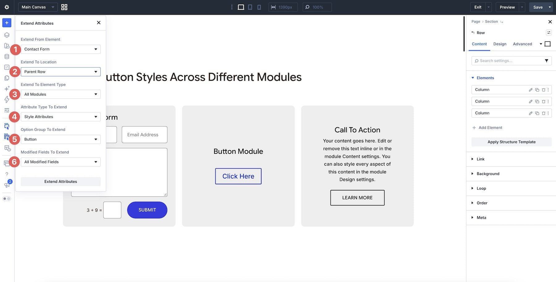
The buttons receive the shared color, typography, and rounded corners while keeping their labels and links. Review padding separately when extending across module types; a standalone Button can need its own spacing adjustment.
2. Carry Section Padding Over To Rows
Padding helps establish the spacing pattern for a page, especially when you use boxed rows and sections with similar amounts of inner space. Once you’ve settled on the values for one section, Extend Attributes can carry them to the rows that should use the same spacing.
Right-click the section and choose Extend Attributes. In the panel, select Design Attributes as the attribute type to extend.
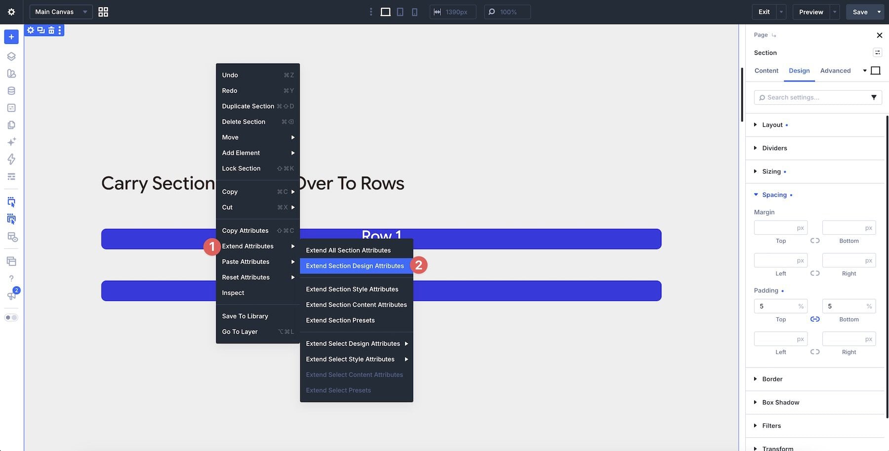
Set Extend To Location to Current Element & Children for the section’s direct rows, or Current Element & Descendants to include matching rows farther down its hierarchy. Choose Row, Design Attributes, and Spacing.
In this example, All Modified Fields carries the source’s linked top and bottom padding of 5%. Check the combined section and row spacing afterward: the section keeps its padding, and its rows receive their own. Percentage padding also depends on the receiving container’s width, so matching values need not produce identical pixel spacing.
3. Standardize Rounded Corners Across Containers
A rounded section, a boxed row, and the columns inside it may all need the same corner treatment. Setting each radius separately makes it easy to introduce small differences, particularly when you build those parts of the page at different times.
Use the container with the finished corner shape as your source. To carry a row’s corners into its columns, choose Current Element & Children, Column, and Design Attributes. Select the Border option group and the Border Radius field. That selection copies the corner shape while leaving other border settings outside the operation.
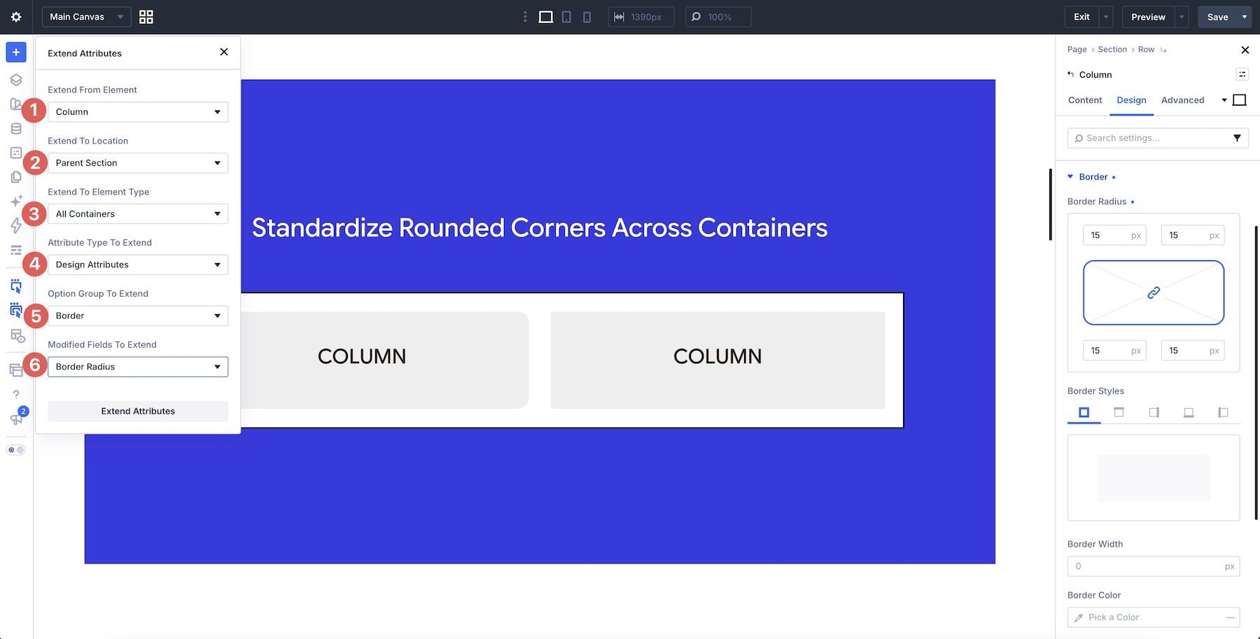
This is useful when you’re bringing an existing layout into line with a new design direction. You can adjust one radius and carry it through the chosen containers, then inspect how their backgrounds and images meet the rounded edges.
4. Roll Out A Design Change Across Repeated Elements
Extend Attributes is also useful during the finishing stage, when a page is built, but a repeated detail needs to be changed. In our service-card example, one column already has the shadow and border treatment we want the other two to share.
Adjust the shadow and border styles on one card first. For a complete styling match, use its column as the source, choose Parent Row and Column, then extend Style Attributes with All Option Groups and All Modified Fields. This copies the source’s modified styles across those columns, including earlier spacing or background customizations. Their module content stays individual, but this selection covers more than your latest shadow and border edits.
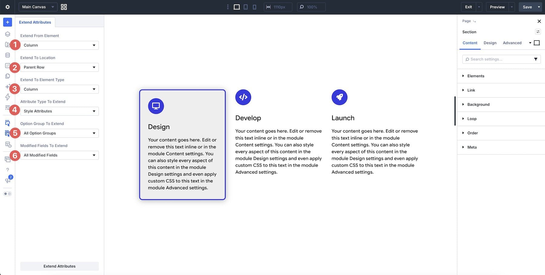
For a shadow-only revision, select Box Shadow instead of all option groups; extend Border separately if that also needs updating. Working from one finished card lets you settle the treatment in context and choose how much of it the others should share.
5. Reuse Background Styles Across A Layout
A background treatment can bring a set of cards together without changing their content. In our row of three Testimonial modules, the first card’s blue gradient provides a consistent treatment to apply to the other two, saving another trip through their background settings.
Use the first Testimonial as the source, set the location to Parent Row, and choose Testimonial as the element type. Under Design Attributes, select Background and keep All Modified Fields selected to carry the complete background treatment to the other cards.
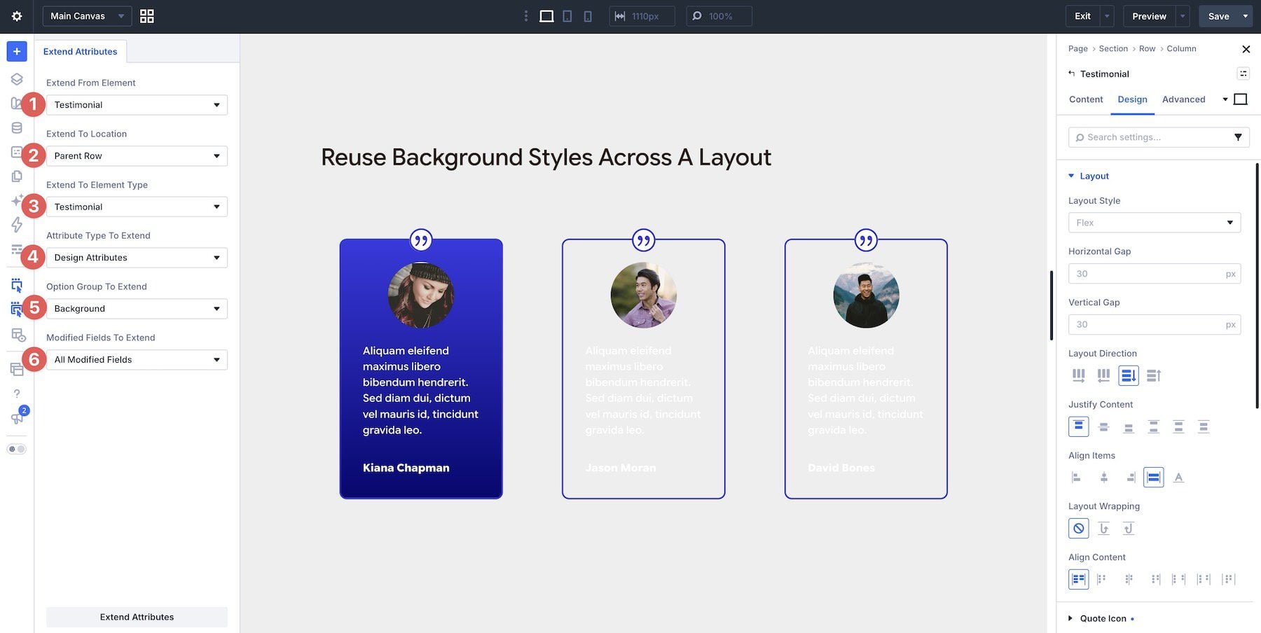
Choosing a limited location is helpful when the background belongs to one area of the design. You can carry the treatment through that section without recreating it in each element’s settings.
6. Synchronize Flex Settings Across Containers
When several containers use a similar arrangement of elements, matching their alignment and spacing can require many repeated adjustments. This is common in rows of cards or sections that pair short pieces of content with a button.
Start with a container whose Flex layout already suits the design. Our first pricing column uses Start alignment and a 20px vertical gap. Choose Parent Row and Column, then extend the modified Layout fields under Design Attributes to reuse those two settings.
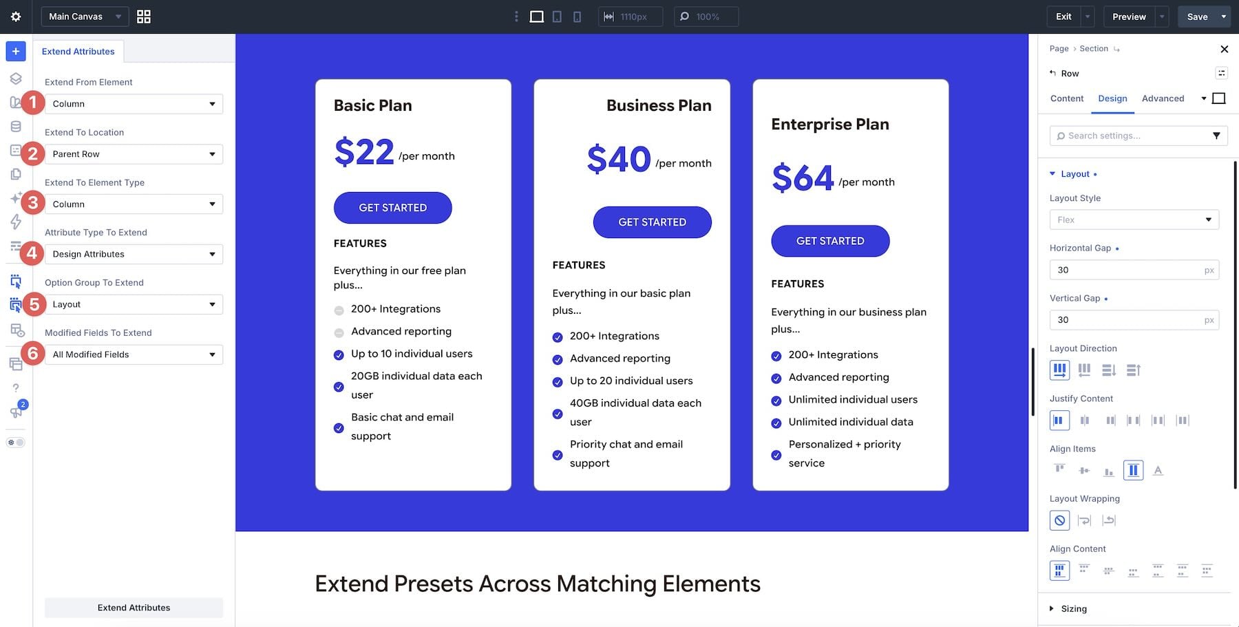
The receiving columns keep settings outside that selection. Here, the source’s modified Layout fields are alignment and vertical gap, so the targets retain their existing End justification. If the source has other modified Layout settings, select the specific alignment and gap fields instead. Review smaller widths afterward, since longer content may need different wrapping. Our guide to Flexbox spacing with gap explains how those values control the space between children.
7. Extend Presets Across Matching Elements
Presets help you reuse a design through a shared definition. In this example, the first Blurb module uses an element preset called Blue Title Blurb, which includes its blue heading, typography, and image styling. The other Blurbs give us targets for that preset.
To give the other Blurbs the same design, right-click the first Blurb and choose Extend Attributes, using it as the source for the rest of the row.
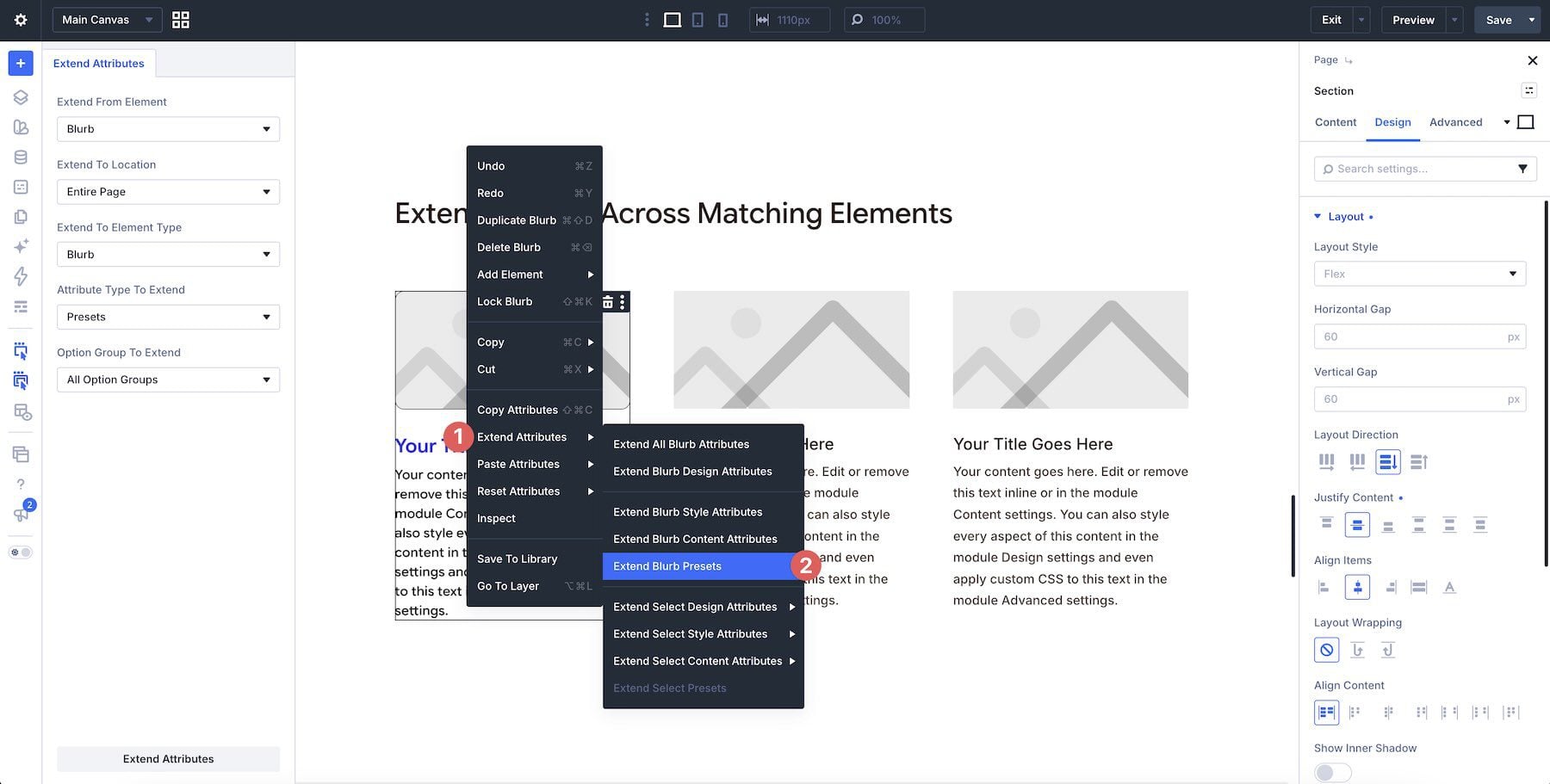
Choose Parent Row as the location and Blurb as the element type. Set Attribute Type To Extend to Design Attributes, with All Option Groups and All Modified Fields. The same controls can target a parent section or the entire page when those Blurbs should also use this design.
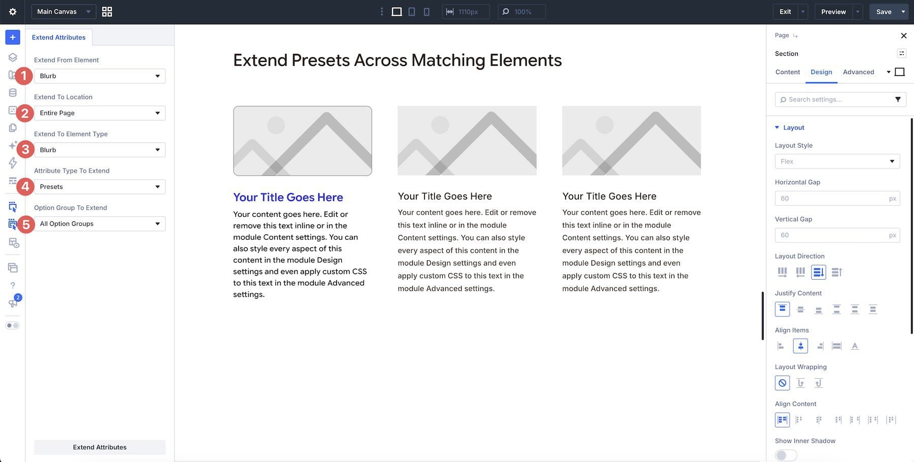
Design Attributes includes the source’s preset assignments and modified styles, so review both before extending. For an option group preset, such as Background, use Presets and select that group. Extending assigns an existing preset to the targets; it does not create a new preset definition. Local overrides on the receiving elements can still affect the result.
8. Reuse Content Attributes Where Content Should Match
The attributes you extend can include both content and design settings. That’s useful when a page repeats the same message across several calls to action, such as a reminder about a registration deadline.
Our example uses two Call To Action modules that should display the same registration reminder. Right-click the CTA with the finished headline and choose Extend Attributes.
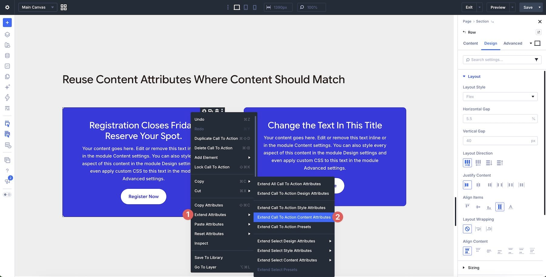
Choose Parent Row for these two modules, or Entire Page if every matching CTA should receive the headline. Select Call To Action as the element type, Content Attributes as the attribute type, and Title as the option group. Keep the field selection limited to that title content.
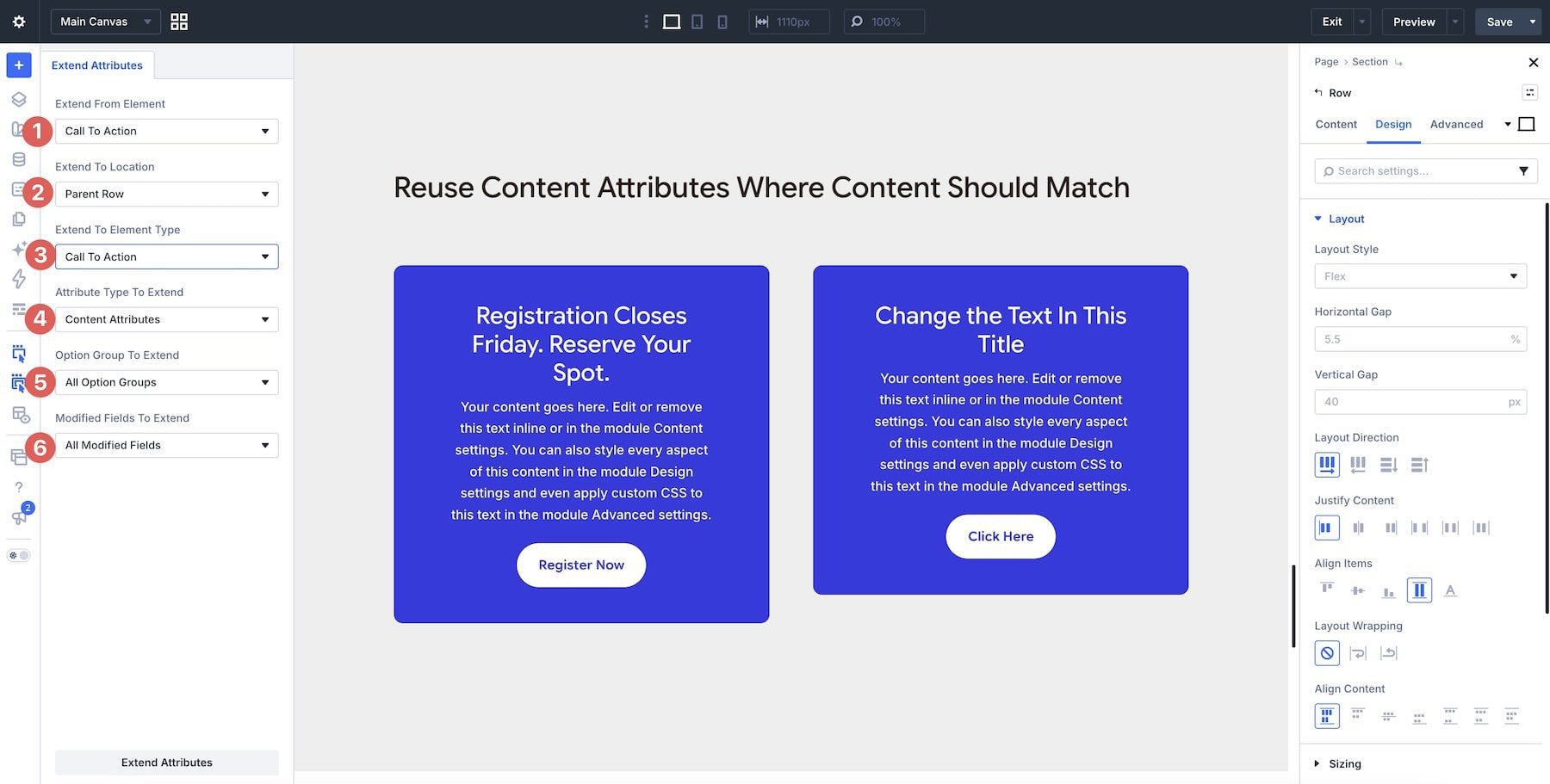
Selecting that field lets you carry the headline through the chosen modules without replacing their other content. After extending, check that both CTAs show the intended message and that their button labels, links, and design still suit their locations.
9. Reuse Transform Settings Across Different Module Types
Transform settings can connect elements with different functions through a similar visual treatment. Our example places a Contact Form beside a Blurb and a Call To Action module, with the Contact Form supplying the rotation we want to reuse.
The source form has a Transform Rotate value of 355deg on the Z axis, giving it a slight tilt. Choose Parent Row, Design Attributes, Transform, and All Modified Fields. All Modules reaches a broad set of targets, including nested modules such as form fields. For this design, extend to Blurb first, then repeat with Call To Action to limit the operation to the two intended module types.
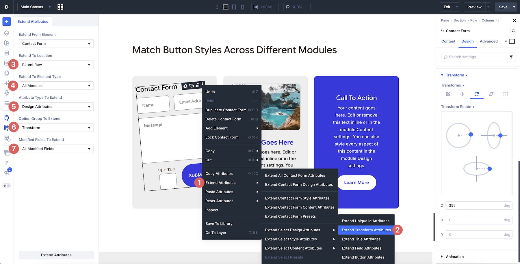
Selecting the modified Transform group carries the rotation’s saved axes together. Review any other modified transform settings on the source, since they are included too. After extending, inspect the space around each module and check that its text, fields, and buttons remain readable and easy to use.
10. Harmonize Hover Effects
The finishing details on a page include how repeated elements respond to user interaction. A set of cards may look alike at first, yet show different border colors or widths when someone hovers over each one.
Use a finished Person module as the source. Right-click and select Extend Attributes, then choose Parent Row, Person, and Design Attributes. All Option Groups and All Modified Fields reproduce the source’s broader design, including other modified settings and preset assignments. To match only the border treatment demonstrated here, select Border as the option group and extend its modified fields.
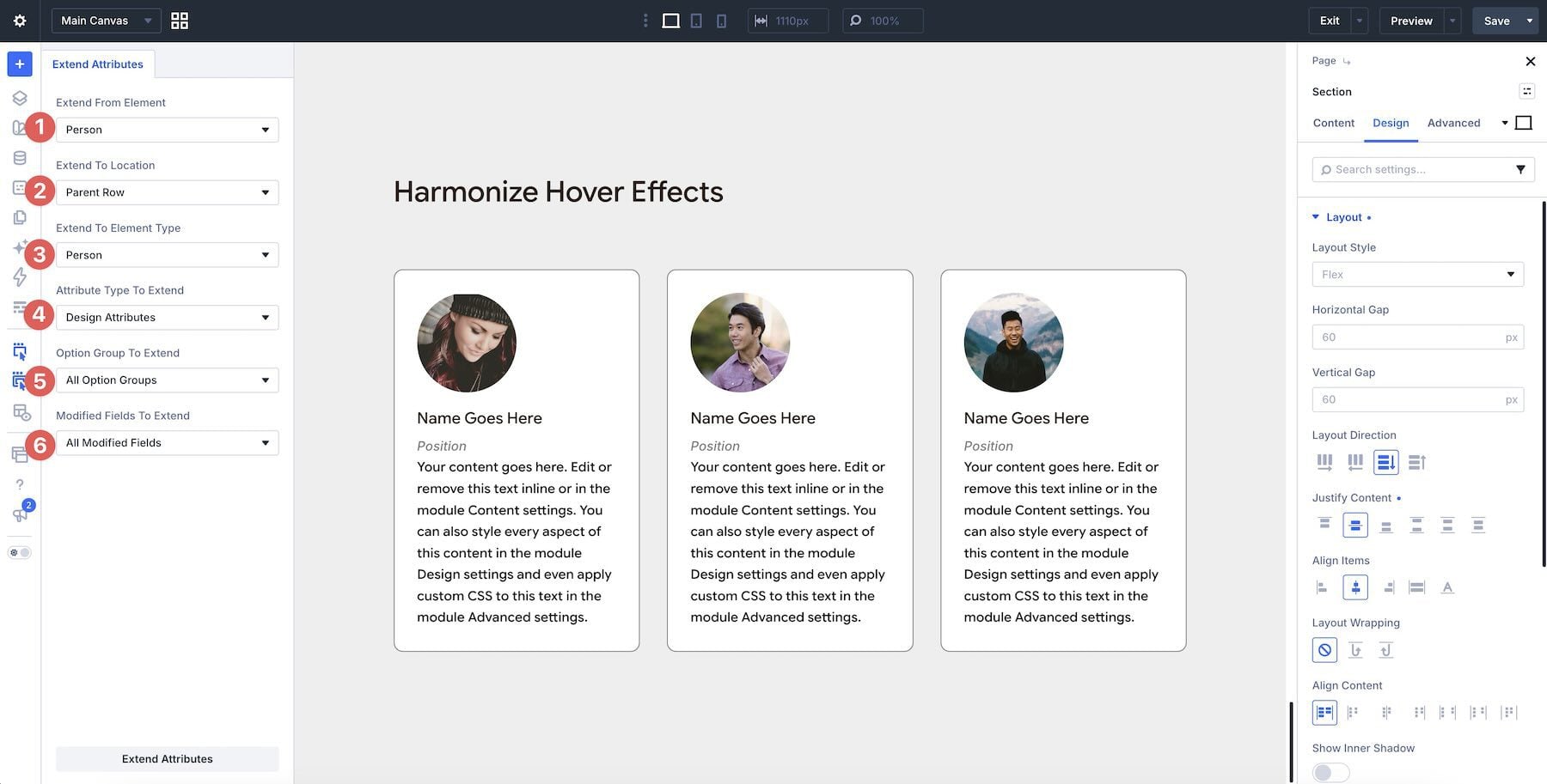
The selected border fields include their saved normal and hover values. Preview each receiving card in both states: the example changes from a gray 1px border to a blue 2px border on hover. Background, text, or transform effects require their corresponding option groups; a Border extension applies the border treatment. Check the cards together before making any individual refinements.
Spend Less Time Repeating Design Settings
With Extend Attributes in Divi 5, you can carry a finished button design, spacing pattern, or preset through the parts of your page that should use it. Choose individual fields for a focused update or a group of settings for a broader design change.
Start with a single repeated task on your next page, and limit the extension to a section while you get familiar with the controls. Review the result, make any changes the individual elements need, and use the same approach wherever the layout calls for it.
Which of these uses would save you the most time? Let us know in the comments.








Leave A Reply