")
A well-designed form needs more than a background color and a font size. The field text, labels, placeholders, buttons, checkboxes, radio buttons, focus states, and checked states all need to feel like part of the same design system.
Divi 5 makes that easier with new form styling options. Instead of relying on one broad field style, you now get dedicated controls for different field types, along with Focus and Checked editing modes and preset support.
In this post, we’ll walk through the new form field options, show how to style inputs, checkboxes, and radio buttons, and explain how to save those styles as presets so you can reuse them across your site.
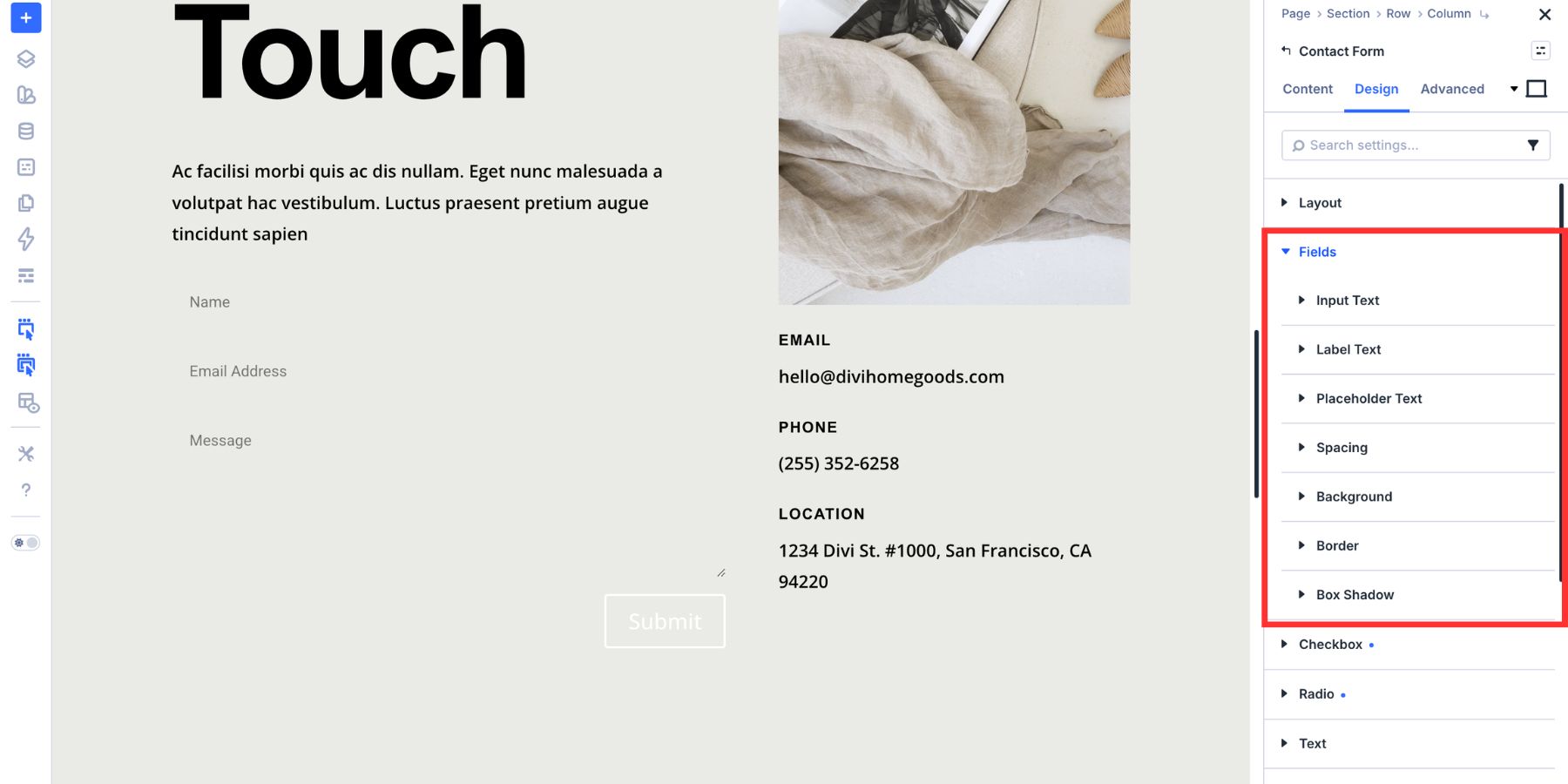
What Changed With Form Fields In Divi 5
Divi’s older form styling workflow relied on one broader Field group for many form controls. That made it harder to style each field type on its own terms. Label controls were not always consistent, background options were more limited, and styling one form module did not always feel the same as styling another.
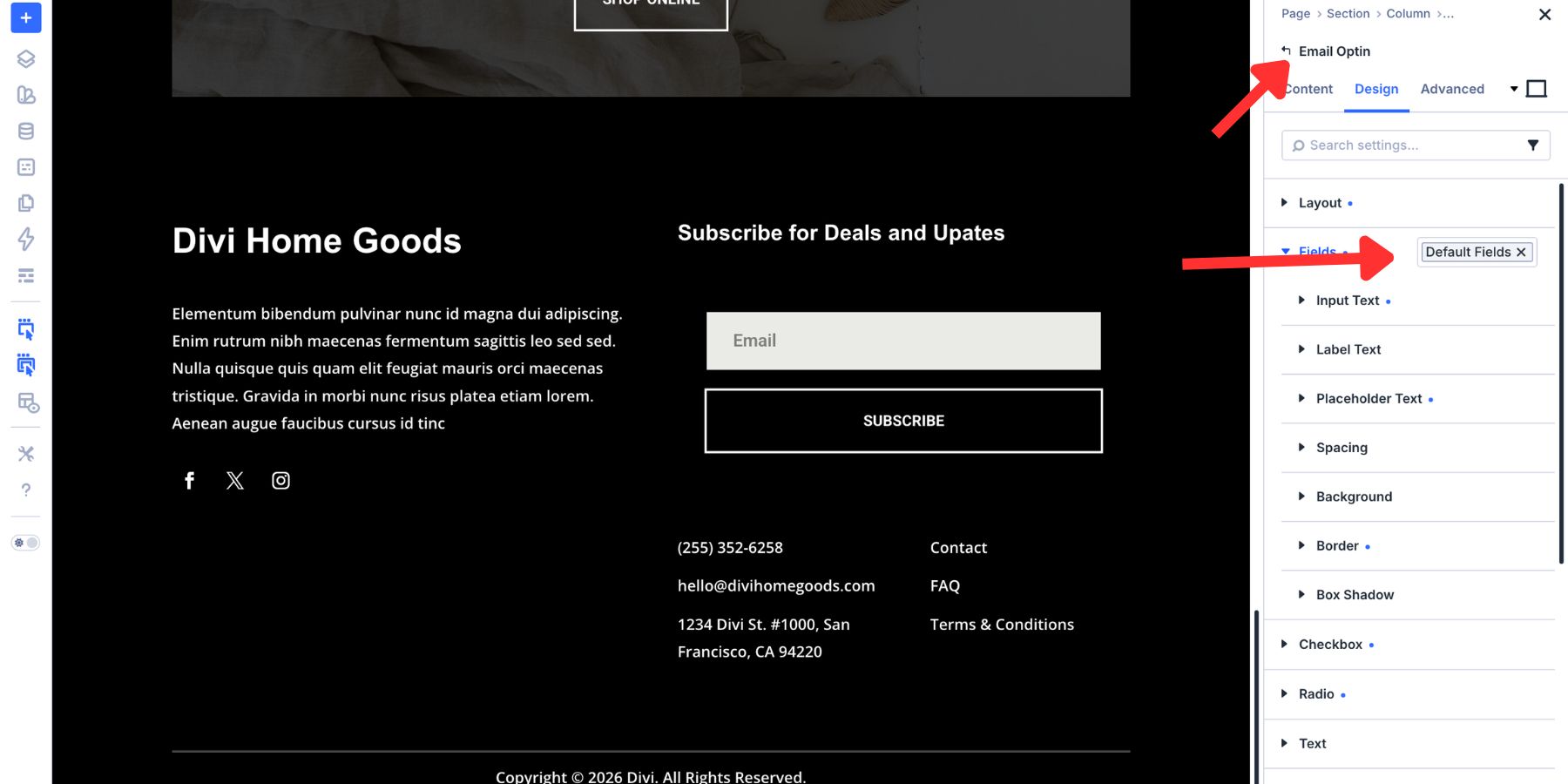
Divi 5 improves that structure by splitting form design into dedicated Input, Checkbox, and Radio option groups. Those groups are shared across Divi’s form-based modules, including Contact Forms, Email Optins, Login forms, Comments, WooCommerce forms, and the new Contact Form 7 module.
That consistency is what makes the new state editing modes more useful. Focus and Checked work like other state modes in Divi. Switch to the state you want to style, adjust the settings, and those styles apply only when that state is active.
Focus applies when a visitor clicks or tabs into a field. Checked applies when a checkbox or radio option is selected. The legacy focus settings have been replaced by the new Focus mode, so focus styling now fits the same pattern as other Divi state styles.
The new field groups also support Presets. That means you can style an Input, Checkbox, or Radio group once, save it, and reuse it across compatible form modules.
That is the real value of the update. Form design becomes more consistent, more reusable, and easier to manage as part of your larger Divi 5 design system.
How To Style The Input Group
Text fields are usually the first part of a form visitors notice. They set the tone for the entire experience, so the Input group is where many of your most important form styling decisions happen.
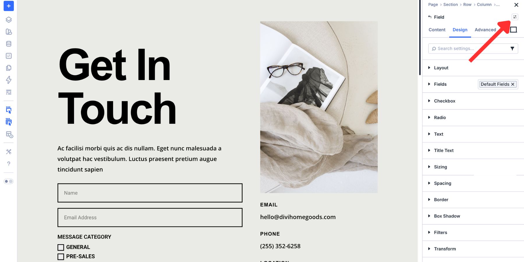
To start, add a form module to your page. This tutorial uses Divi’s Contact Form module, but the same general approach applies to other Divi form modules that use the new field option groups.
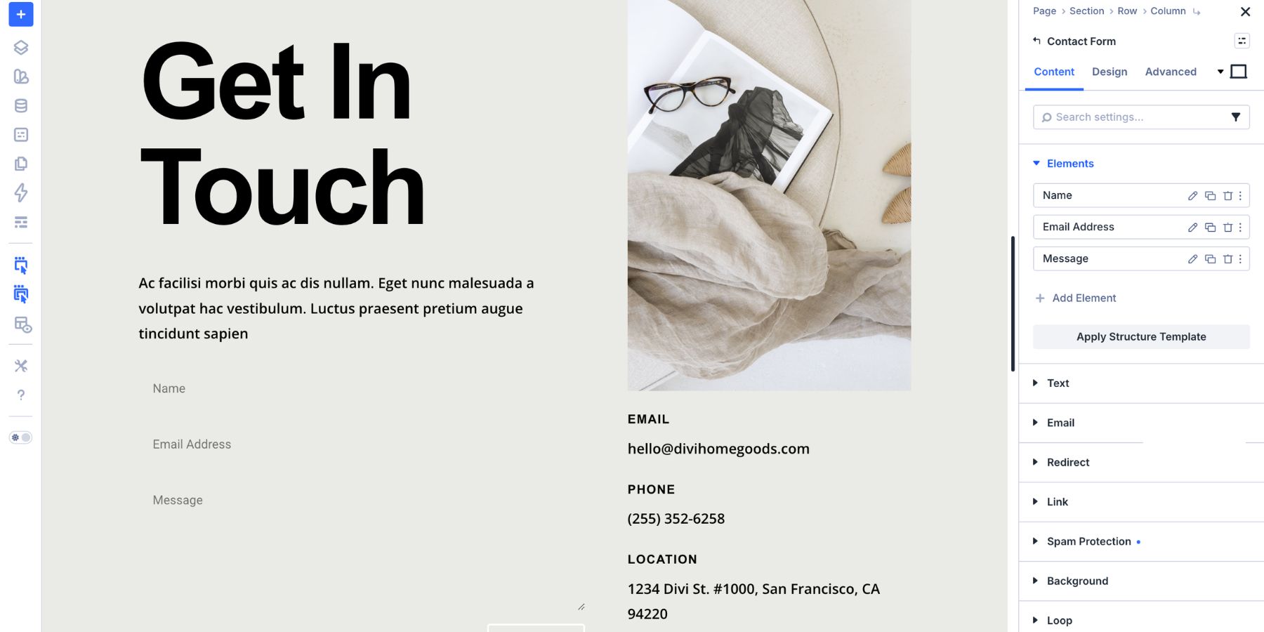
After adding the form, open the module settings and go to the Design tab. From here, you can style the field text, labels, placeholders, backgrounds, borders, spacing, and focus state.
Customize Input Text, Labels, And Placeholders
The Input group gives you separate controls for the text visitors type, the labels above fields, and the placeholder text inside fields.
Each text type has its own role:
- Input Text: Styles the text visitors enter into the field.
- Label Text: Styles the label that identifies the field.
- Placeholder Text: Styles the hint text that appears before the visitor starts typing.
Each one includes typography controls such as font family, size, weight, line height, letter spacing, and color. You can also connect these values to Design Variables so your form typography follows the same system as the rest of your site.
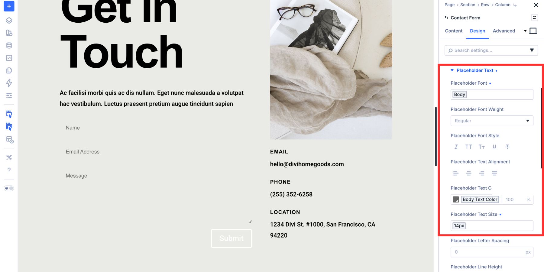
For most forms, keep Input Text and Placeholder Text similar in size. Labels can match that size or be slightly smaller depending on the layout. A range of 14px to 16px works well in many designs.
Use enough contrast for real input text. Placeholder text can be softer, but it should still remain readable. Labels should usually have slightly more weight than placeholder text so visitors can scan the form quickly.
The Button group gives you the same kind of typography, background, border, spacing, and hover controls you use elsewhere in Divi.
Use the button design to reinforce the form’s main action. If the rest of your site uses a primary Button Preset or button-related Design Variables, use the same values here so the form feels connected to the rest of the layout.
In this example, the button background uses a Button Background Color variable.
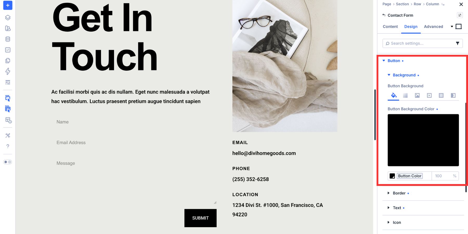
The button uses a clean flat edge, bold uppercase text, and the same typography system as the rest of the page. You can adjust the border radius, text size, weight, spacing, and hover styles to match your brand.
Set Background, Border, And Spacing
The Input group gives you more background control than a simple color picker. You can use solid colors, gradients, images, masks, and other Divi background options.
Most forms only need a simple field background, but having the full background suite available means your fields can match more expressive designs when needed.
If you have not built a color system yet, Divi 5’s Variable Generator can create a palette of tints, shades, tones, and transparent variants from one primary color.
Once your color variables are available, apply a field background variable to the Input group. This keeps the field color connected to your broader design system.
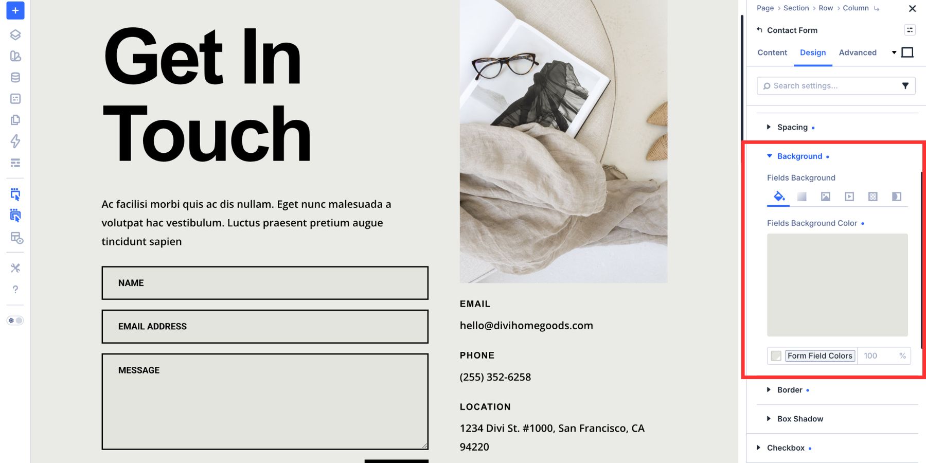
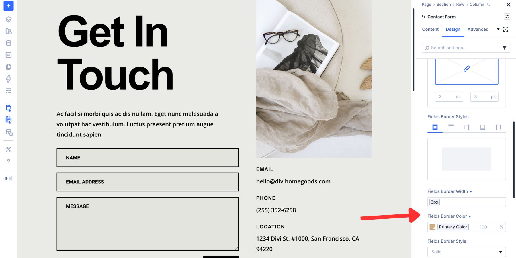
Next, style the border. Border style, width, color, and radius all help define the field container.
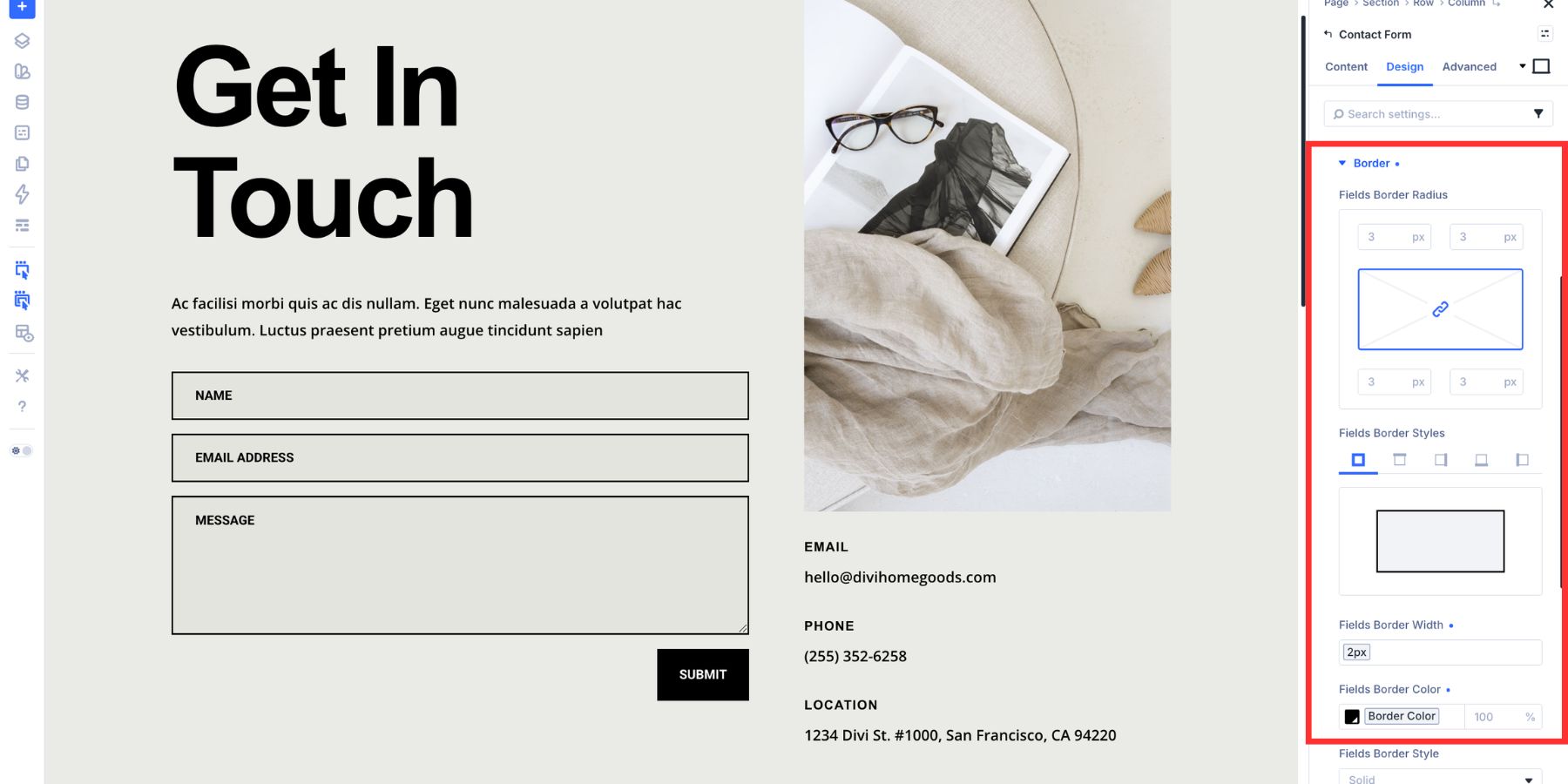
Use padding to control the size and comfort of the fields. More padding can make a form feel easier to use, especially on mobile. Box Shadow is also available, but a clean border and background are often enough for a minimal form design.
Style The Focus State
The styles above define the resting state. The focus state controls what the field looks like when a visitor clicks into it or reaches it with the keyboard.
To style it, open the mode switcher at the top of the settings panel and select Focus.
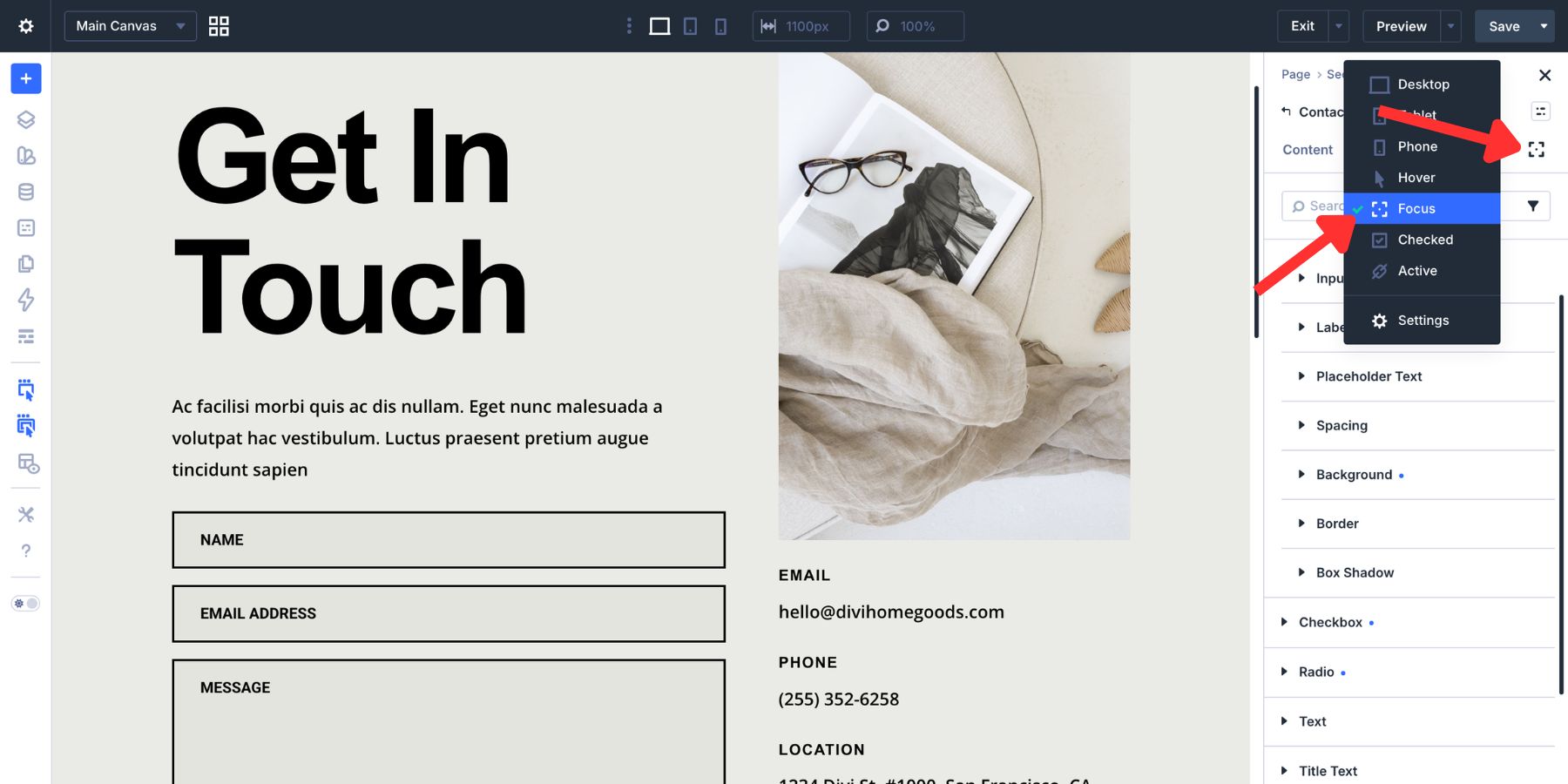
The same Input controls remain available. Any changes you make in Focus mode apply only while the field is focused.
A good focus state should be visible without feeling distracting. A slightly different background tint can help, especially when paired with a stronger border. If your resting placeholder or input text is soft, make sure the focused field text remains easy to read.
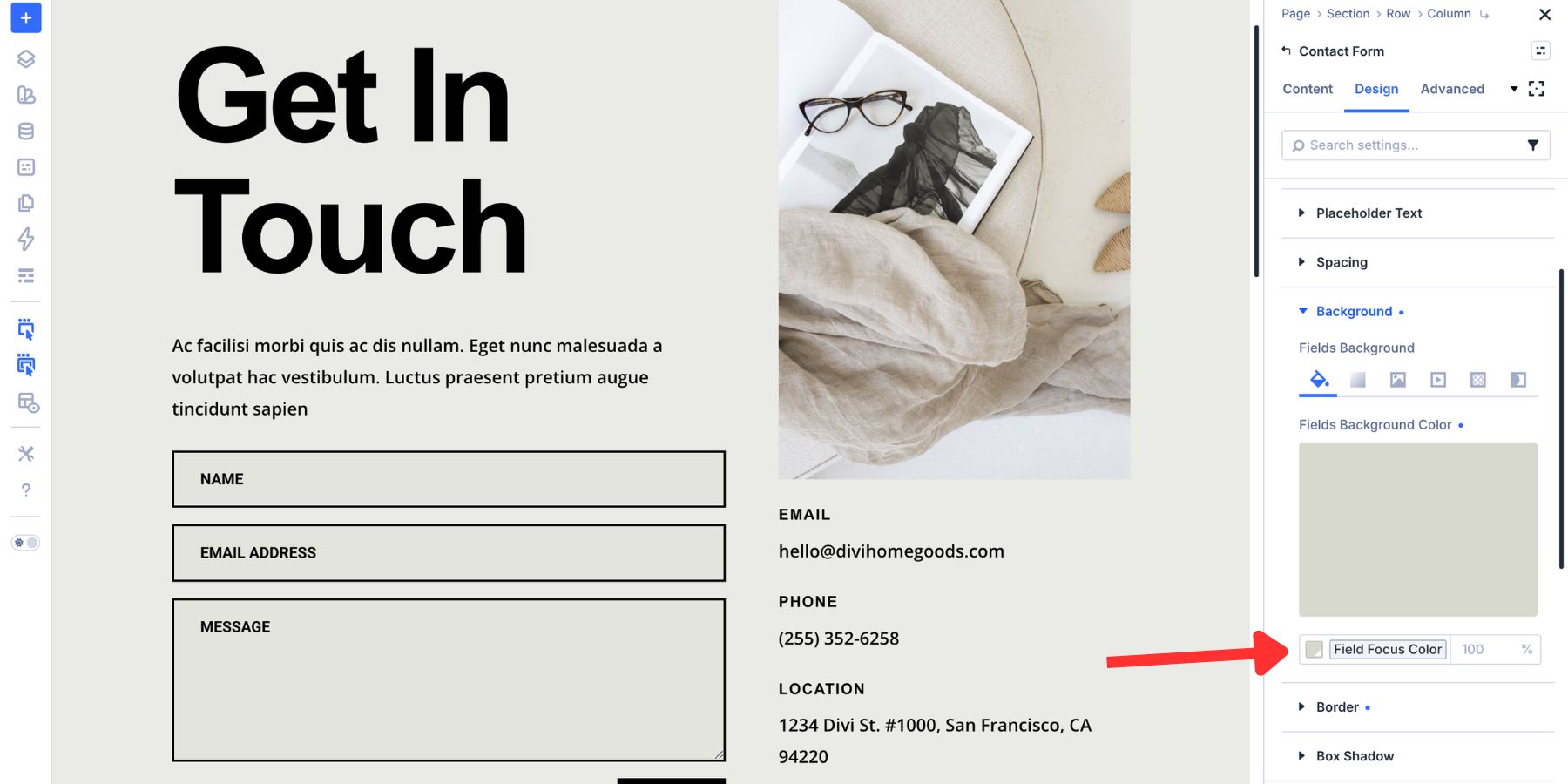
The border is usually the clearest focus signal. In Focus mode, switch the border color to your primary brand color or another high-contrast variable. You can also increase the border width so the active field is easier to identify.
Before publishing, test the form with a keyboard. Use the Tab key to move through each field and make sure the focused field is easy to see at every step.
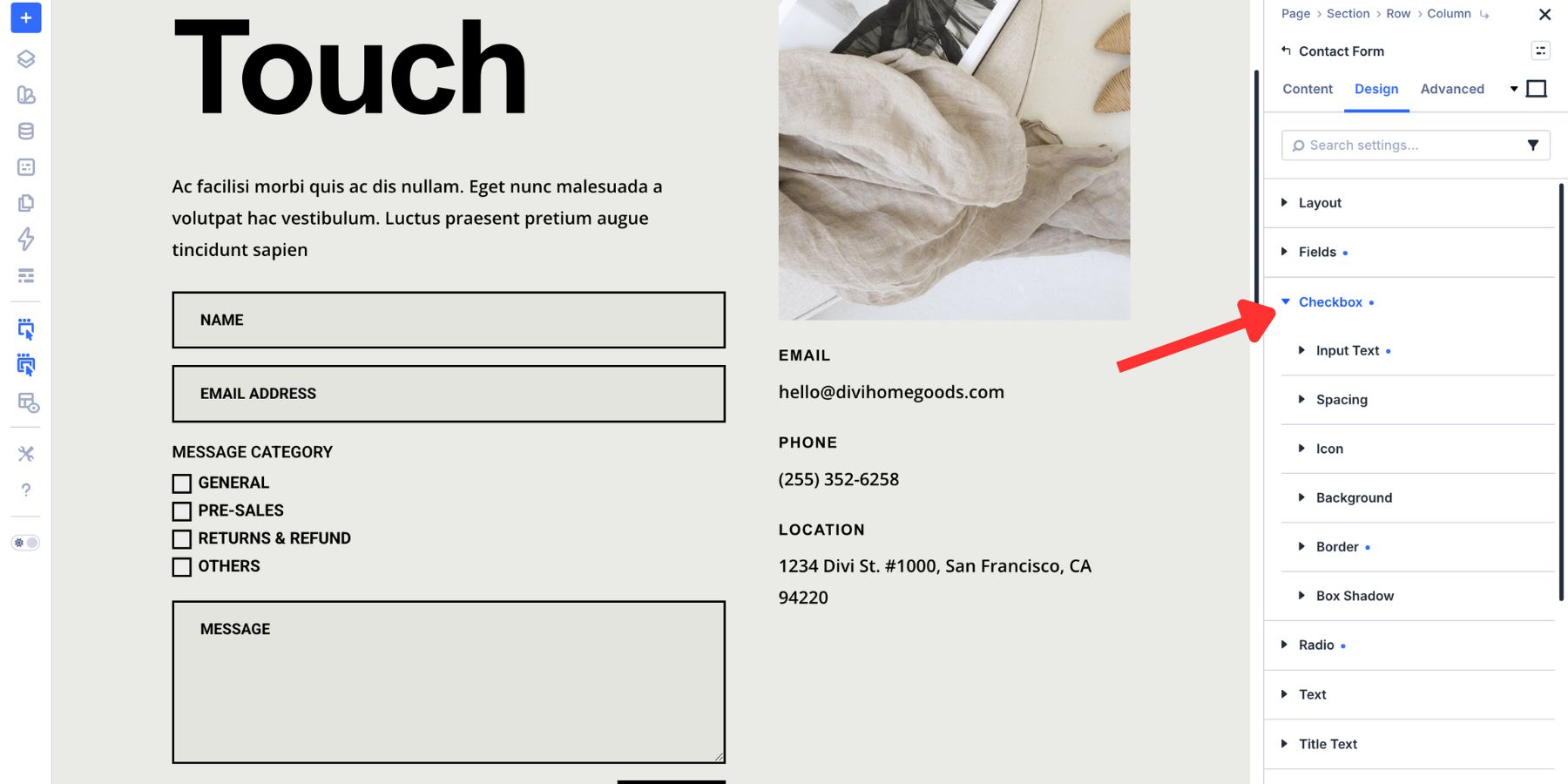
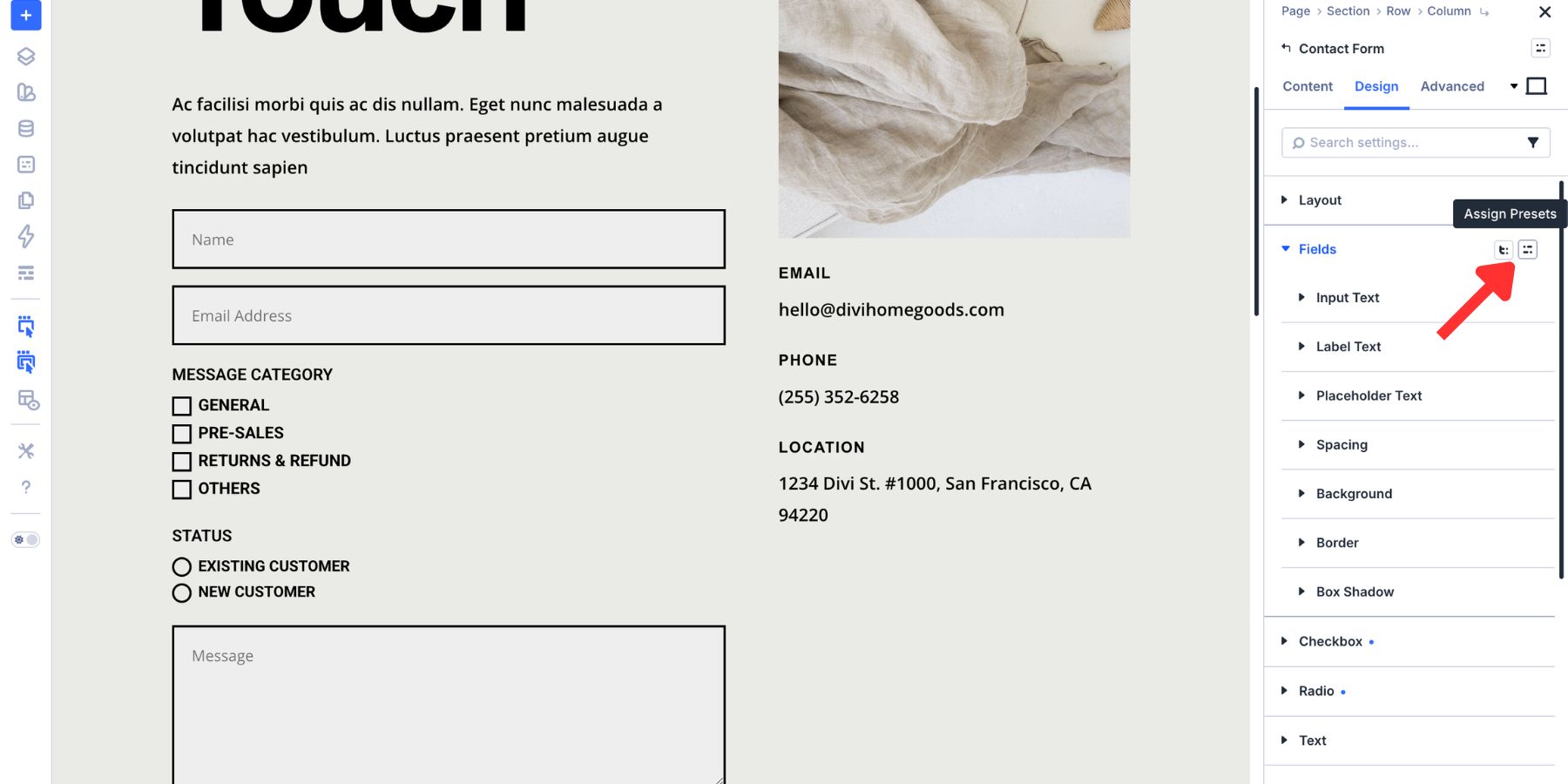
How To Style The Checkbox Group
Checkboxes ask visitors to make a selection. Their styling needs to make two things clear: what the option means and whether it has been selected.
Divi 5’s Checkbox group gives you controls for the label, box, icon, border, background, spacing, and checked state.
Style Checkbox Labels And Appearance
Open the Checkbox group in the Design tab. Use the Label Text controls to match the rest of the form typography.
Checkbox labels should be easy to read and spaced clearly from the checkbox itself. Keep them visually consistent with your input labels unless the design needs a different hierarchy.
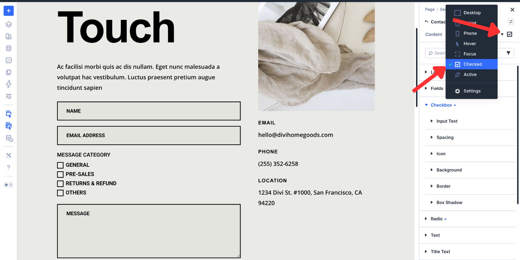
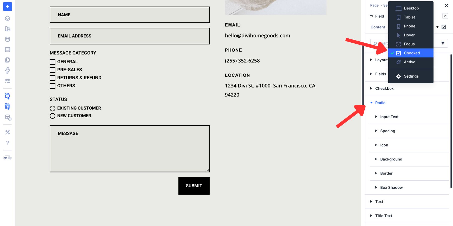
Configure The Checked State
Open the mode dropdown at the top of the settings panel and select Checked. The Checkbox controls remain available, but the styles you set now apply only when the checkbox is selected.
In this example, the check icon color uses a border-related Design Variable.
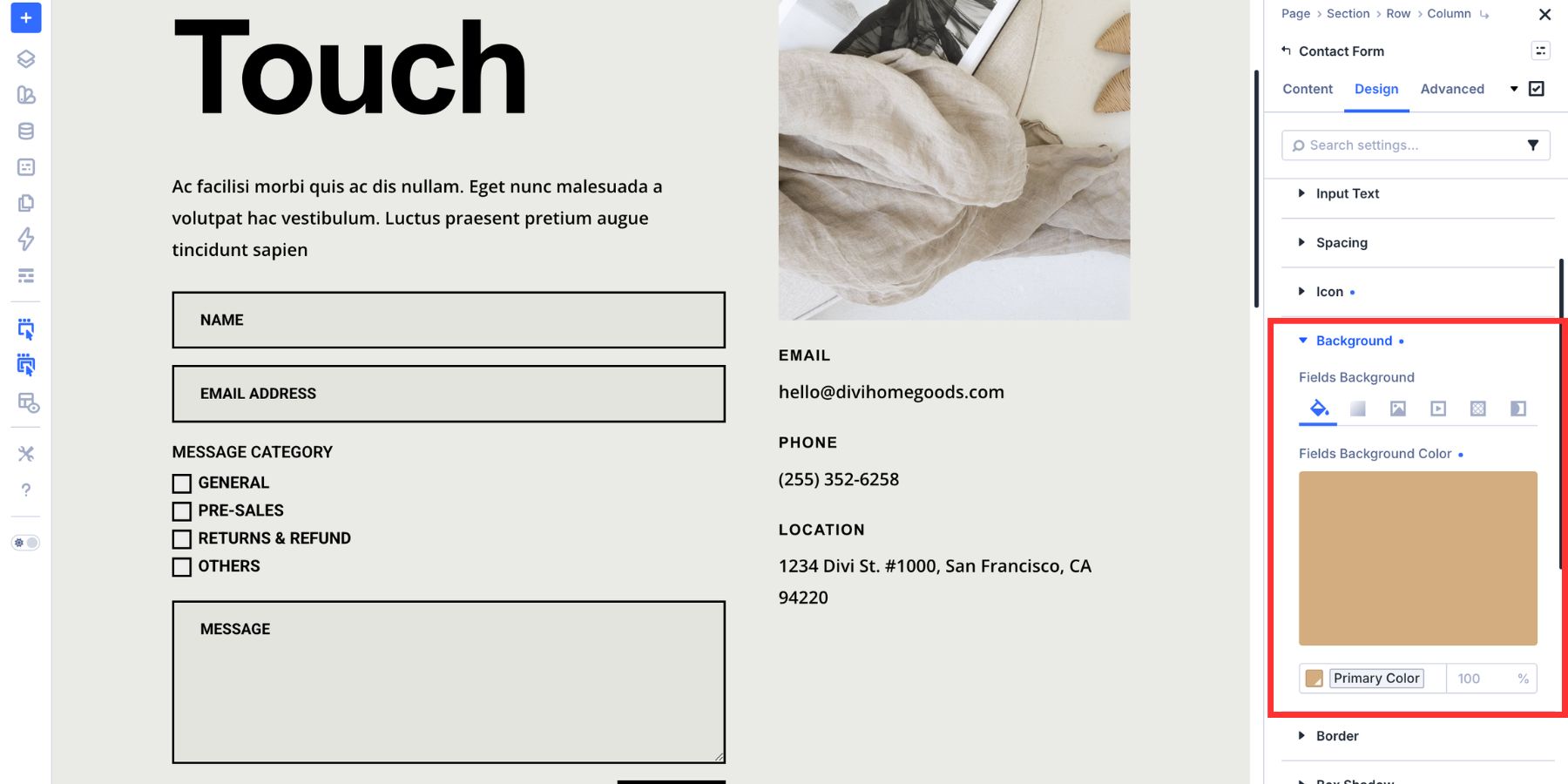
The checkbox background uses the primary brand color.
That contrast makes the selected state clear without needing extra decoration. You can also adjust the checkbox border, size, spacing, or hover state if your design needs more emphasis.
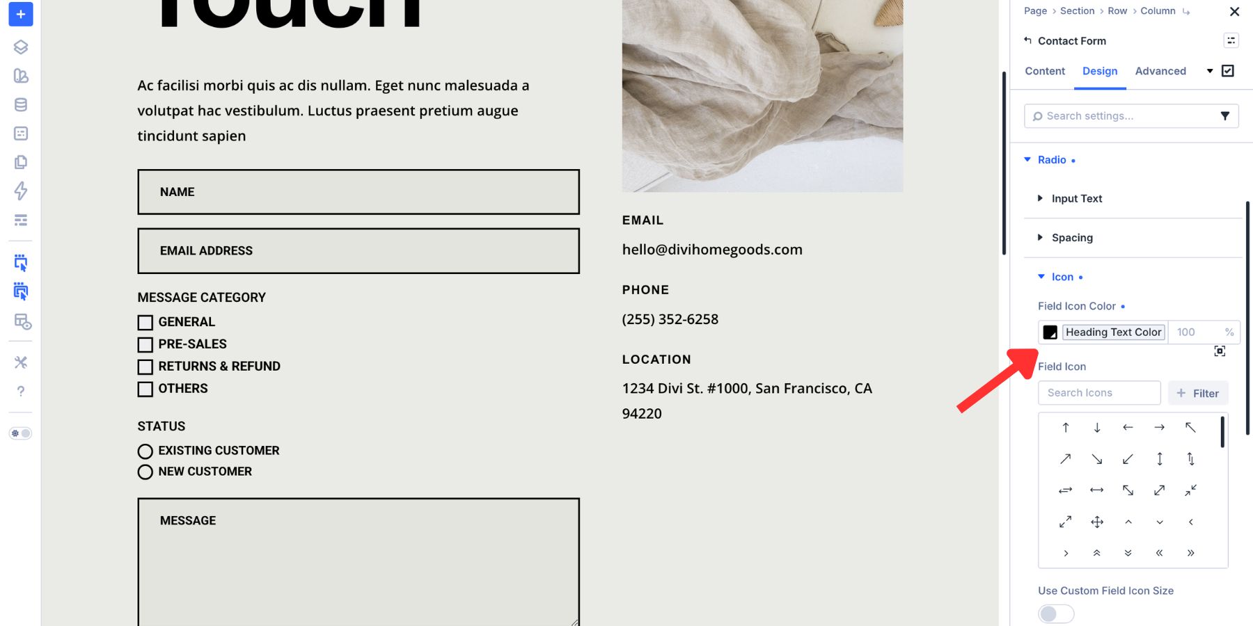
How To Style The Radio Group
Radio buttons let visitors choose one option from a group. Because only one option can be selected, the selected and unselected states need to be easy to tell apart.
The Radio group follows the same general pattern as Checkbox styling, but it applies to radio controls instead.
In this example, the selected radio icon uses the Heading Color variable.
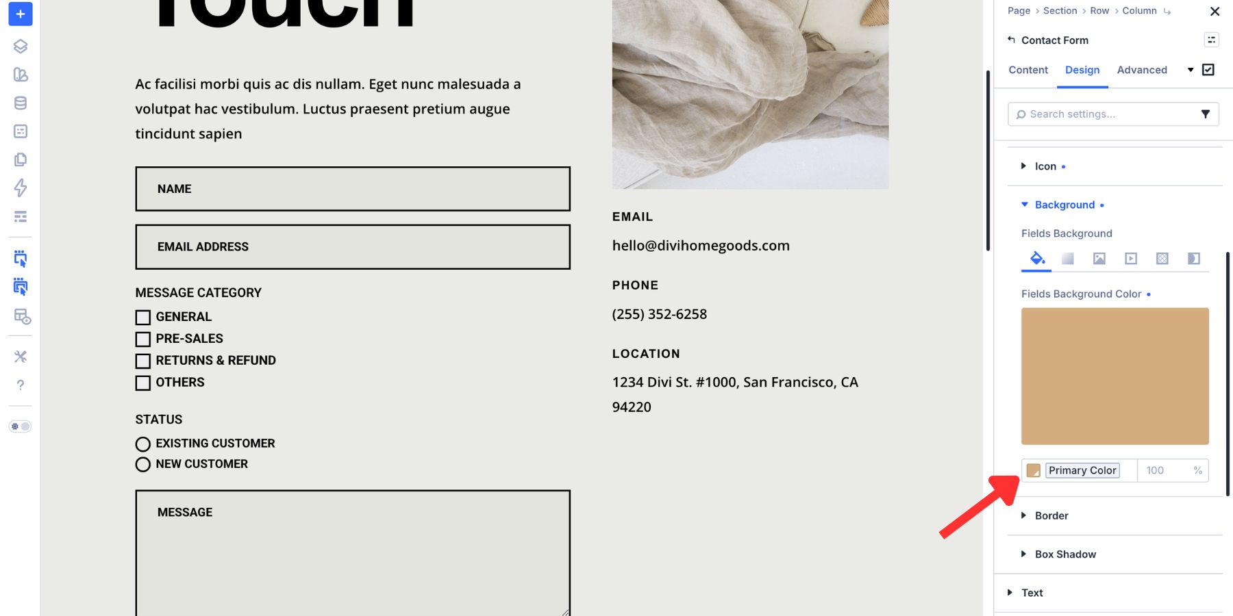
The selected radio background uses the Primary Color variable.
The selected radio border also uses the Primary Color variable.
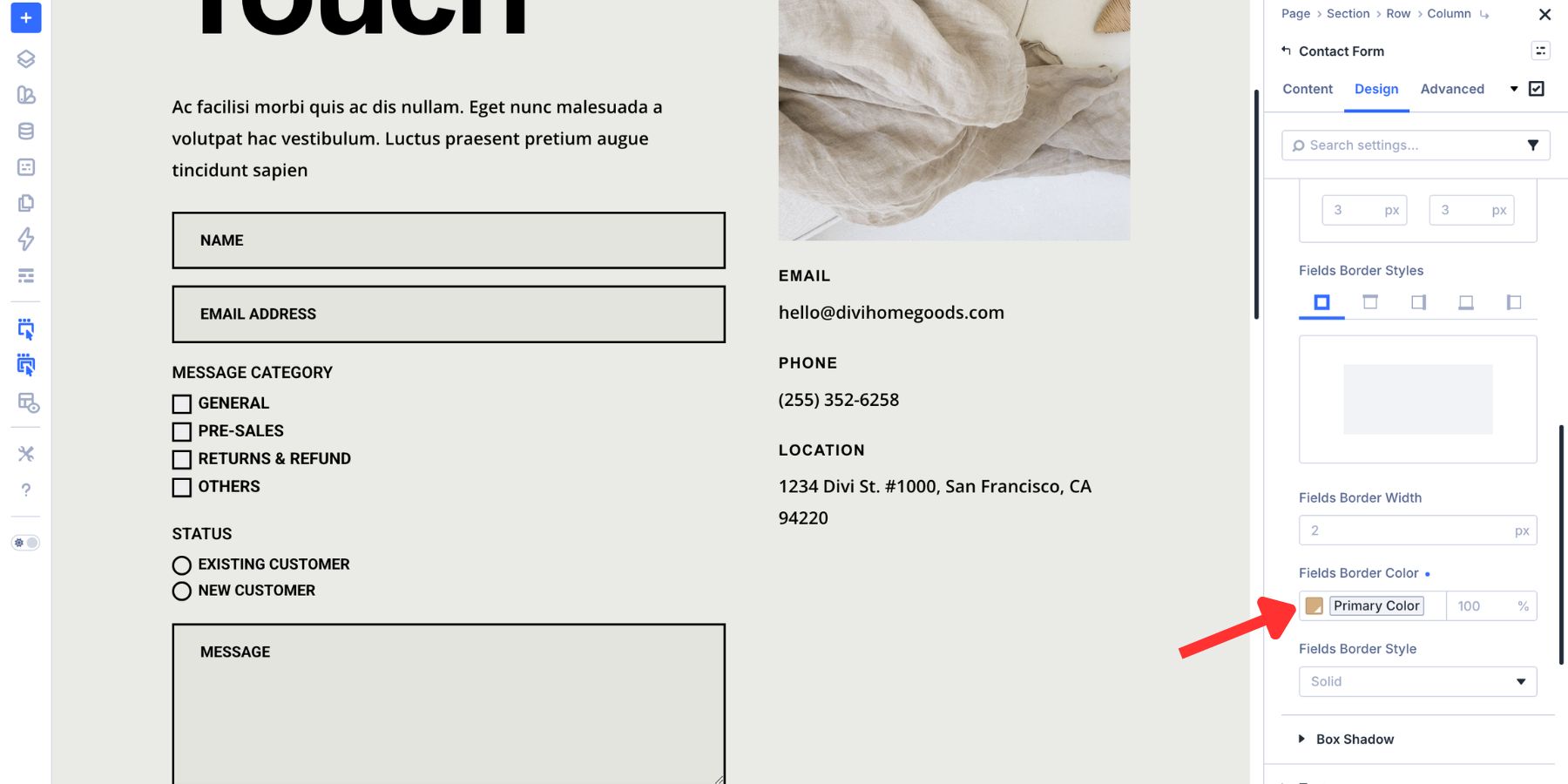
This creates a clear selected state that still matches the rest of the form. Keep radio labels readable, leave enough space between options, and test the field on mobile so each option is easy to tap.
Create Presets For Your Form Styles
Once your form fields look right, save the styles as presets. This turns one styled form into a reusable system. Divi 5 gives you two useful preset layers for forms:
- Option Group Presets: Save individual groups such as Input, Checkbox, Radio, Button, Border, or Spacing.
- Element Presets: Save the full module design, such as an entire Contact Form module.
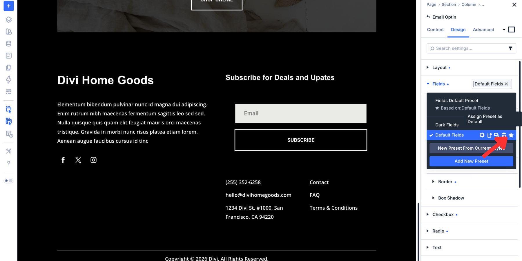
Save Field Groups As Option Group Presets
Start with the field groups. After styling the Input group, hover over the group header in the settings panel. Click the preset icon, choose New Preset From Current Styles, name the preset clearly, and save it.
Repeat that process for Checkbox and Radio.
Those styles are no longer tied to one module. You can open another Contact Form, Email Optin, Login form, WooCommerce form, or Contact Form 7 module and apply the compatible field preset there.
You can also mark a preset as the default by clicking the star icon. When a preset is set as the default for that group, new compatible elements can start with that style automatically.
Option Group Presets are attached to the setting group, not just the module where you created them. For example, a Border preset can be reused anywhere a compatible Border group appears, including forms, buttons, cards, images, and Loop Builder layouts.
That also means existing presets from other parts of your design system can help style forms. If you already have a reusable Border preset, apply it to your Input group instead of recreating the same border manually.
This is where Divi 5’s preset system becomes valuable. Update the preset once, and every element using that preset can follow the change.
Save The Full Form As An Element Preset
Option Group Presets save one group at a time. Element Presets save the full module design.
Once your Contact Form has the right field styles, spacing, typography, button design, and state styles, open the module-level preset menu. Choose New Preset From Current Styles, give it a clear name, and save it.
Set the Element Preset as the default if every new Contact Form should start with that full design.
Use the two preset layers for different jobs. Edit an Option Group Preset when one shared style needs to change, such as a border, field background, or checkbox style. Edit the Element Preset when the full Contact Form pattern needs to change.
Style Your Forms Completely With Divi 5
Good form design should feel intentional before, during, and after interaction. Divi 5’s new Input, Checkbox, and Radio groups make that easier because each field type gets controls that match how visitors actually use it.
Focus and Checked modes let you design the active and selected states visually. Design Variables keep your colors, spacing, and typography connected to the rest of the site. Presets let you save those decisions and reuse them across future forms.
Start with the resting state, add clear focus and checked states, then save the result as presets. That gives you forms that look consistent, feel easier to use, and fit your Divi 5 design system.


Leave A Reply