

Images are one of the few elements that touch almost every part of a build: hero sections, blog grids, team pages, product listings, portfolio cards, galleries, icons, backgrounds, and call-to-action sections all live or die on how their imagery is handled.
In Divi 5, the image system is more consistent across modules that display images. New Aspect Ratio and Framing settings, the consolidated gradient picker, Custom Attributes, reusable Image Presets, and tight integration with the Loop Builder change how images get placed, cropped, styled, and maintained across a site.
This guide covers the full image workflow in Divi 5: the Image Module, background images, aspect ratio and framing, choosing image ratios by scenario, gradient overlays, accessibility, SEO, loop behavior, presets, and file optimization before images ever reach the builder.
- 1 Images In Modules
- 2 Image Module Or Background Image?
- 3 Aspect Ratio And Framing
- 4 Choosing Image Ratios By Scenario
- 5 Images In The Loop Builder
- 6 Image Presets For Reusable Styling
- 7 Background Images And Gradient Overlays
- 8 Accessibility: Alt Text, Captions, And ARIA
- 9 Image SEO
- 10 File Types And Saving Space
- 11 Image Workflow Best Practices In Divi 5
- 12 The Full Picture In Divi 5
Images In Modules
Divi 5 has taken big steps toward making the builder feel consistent no matter which module you are working with. One of the clearest examples is how different modules handle images.
Of course, there is the Image Module, whose entire job is to display an image. Use it when the image is part of the content itself: a product photo, team portrait, portfolio thumbnail, screenshot, diagram, chart, or any image visitors need to understand the page. To add one, insert an Image Module, open the Content tab, and choose an image from the Media Library or upload a new one.
Other modules include images as part of a larger element. A Person Module has a portrait, a Blurb Module can include an image or icon, WooCommerce modules display product images, and Loop Builder templates can pull featured images, project thumbnails, product images, author photos, and other dynamic media.
In the Design tab, you will usually find an image-related option group for styling that image. Depending on the module, you may style it directly or inside a nested option group such as Image, Image & Icon, or a similar label. This is where you will typically manage sizing, framing, borders, shadows, filters, transforms, and presets.
Image Module Or Background Image?
Before styling an image, decide what job the image is doing. Use an Image Module when the image is content: a photo that carries meaning, a product image people need to inspect, a portrait that identifies a person, a portfolio image that represents a project, or an image that needs a link, lightbox, caption, or alt text.
Use a background image when the image acts as a surface for other content to sit on top of. A hero section with a heading and button layered over a photo is the clearest example. Decorative textures, abstract shapes, background patterns, and image washes behind CTA content also belong in this category.
A standard Section is an easy way to see the difference. Open the section’s Content tab, expand Background, choose the Background Image tab, and add a wide photograph. Then add a Heading Module and Button Module in the row above it. The photo supports the section visually, but the copy and button carry the actual message.
This distinction matters for accessibility. Background images are rendered through CSS and do not carry alt text. Screen readers ignore them, which is correct for decorative surfaces. But if an image communicates meaning, such as a product photo, diagram, portrait, or portfolio thumbnail, it should not live only as a background image.
Aspect Ratio And Framing
Two Divi 5 design controls solve the most common image-layout frustration: inconsistent upload sizes breaking an otherwise clean layout.
Aspect Ratio defines the frame. Framing controls how the image sits inside that frame.
Aspect Ratio lives in Design > Sizing. Enter a ratio in width-to-height format, such as 16:9 for widescreen, 1:1 for square, or 4:5 for portrait. Divi calculates the element’s height from its rendered width, so the shape holds as the element scales across breakpoints.
Aspect Ratio is especially useful for images because it stops uploaded file dimensions from controlling the layout. A wide image, square image, and portrait image can all sit inside the same frame. It also applies beyond images, including icons, containers, decorative shapes, cards, buttons, and other elements that expose the Sizing controls.
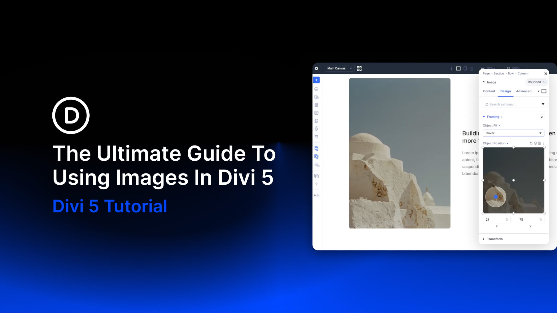
Framing controls how the image behaves inside the frame. On the Image Module, it appears as its own option group under the Design tab. On sub-element modules like Person or Blurb, you will usually find it under Design > Image > Framing. The core control is Object Fit:
- Fill: Stretches the image to fill the frame and can distort it.
- Contain: Scales the whole image inside the frame and may leave empty space.
- Cover: Fills the frame while preserving proportions, cropping the overflow.
For most image cards and grids, pair Aspect Ratio with Object Fit: Cover. This keeps the image proportional while filling the frame. Then use Object Position to control the focal point. Nine preset anchors range from Top Left to Bottom Right, and custom X/Y percentages let you fine-tune the crop more precisely.
One clarification is worth making because it trips people up: Framing changes how the image is displayed inside its frame. It does not permanently crop the image file, and it does not change which source file the browser downloads. Object Fit Cover can visually crop a 3:2 image into a tidy square, but the browser still downloads the full file unless WordPress responsive image sizes provide a smaller version to serve. Framing handles the display crop, while srcset and file optimization handle file weight.
Choosing Image Ratios By Scenario
The best image ratio depends on where the image appears and what it needs to do. Divi 5 makes it easy to enter almost any ratio, but that freedom works best when the choice is intentional.
For hero sections, start with 16:9 for a reliable wide layout, 21:9 for cinematic banners, or 3:2 when the image should feel large without becoming too shallow. On mobile, a hero may need a different crop, often closer to 4:5 or 1:1, especially when the subject needs more vertical room. Choose photos with enough calm space for copy, and avoid placing faces, products, or important details near the edges.
For blog featured images and blog grids, use ratios that can survive repeated uploads from different authors or sources. 3:2 is a strong default for general editorial grids. 4:3 works well when cards include titles, metadata, and excerpts below the image. 16:9 suits tutorials, video-led posts, and YouTube-style thumbnails. 1:1 works for social-style grids and roundups, while 4:5 gives food, fashion, lifestyle, and photography blogs a taller editorial feel.
For portfolio grids, let the work guide the ratio. Web design, branding, UI/UX, decks, and horizontal mockups usually work well at 3:2 or 4:3. Fashion, portrait photography, posters, and vertical editorial work often need 4:5 or 2:3. Mixed portfolios can use 1:1 to keep the grid neutral, while video-first portfolios should usually use 16:9.
For product grids, the category should drive the decision. 1:1 is a safe default for broad catalogs, electronics, books, accessories, and many white-background product shots. 4:5 works well for apparel, beauty, and taller product photography. 3:4 gives bottles, bags, shoes, and packaged goods more vertical room. 3:2 can work for furniture, bundles, and lifestyle product images with wider compositions. Use Contain instead of Cover when cropping would cut into the product itself.
For team photos and headshots, consistency and face protection matter most. Use 1:1 for avatars, author cards, and compact team grids. Use 4:5 or 3:4 for a more editorial portrait layout. Pair Cover with Object Position: Top Center when faces sit high in the frame.
For logo grids and icon-based images, avoid cropping. Use a consistent container shape such as 1:1, 4:3, or a shallow rectangle, then set Object Fit to Contain so the full logo, mark, badge, seal, or icon remains visible.
These are starting points, not rules. The ratio should support the content, protect the subject, and keep repeated layouts consistent.
Images In The Loop Builder
Aspect Ratio and Framing become even more useful in dynamic layouts. The Loop Builder turns any element, or group of elements, into a query-driven repeating template. That means one image decision can reach every repeated blog post, product, project, author, event, or custom post type in the loop.
Images can appear in a loop in two main ways: as dynamic content inside an Image Module, or as dynamic background images on containers such as Sections, Rows, Columns, or Groups. If the image is content, use an Image Module and set the ratio in Design > Sizing. Then use Framing to set Object Fit and Object Position. If the image is decorative or part of a card surface, apply the ratio to the container and use the background image controls to position it.
In the loop, set your image to a shared aspect ratio, such as 16:9, 3:2, 4:5, or 1:1, then pair it with Object Fit Cover. Every card follows the same frame regardless of the source image dimensions.
This is one of the strongest uses for image ratios in Divi 5. A single loop template can keep a blog archive, portfolio grid, product feed, or author directory visually consistent as new content is added.
Image Presets For Reusable Styling
If you repeat the same image treatment across a site, save it as an Image Preset. Image Presets let you reuse styling from the Image option group instead of rebuilding it manually on every module.
A preset can include repeated image styling such as Aspect Ratio, Object Fit, Object Position, border radius, border styles, box shadow, filters, and other image-related design settings. This is useful for image treatments that should stay consistent across a build.
Examples include:
- Blog Card Image: 3:2 ratio, Object Fit Cover, slight radius.
- Product Grid Image: 1:1 or 4:5 ratio, Object Fit Cover or Contain, clean border.
- Team Portrait: 4:5 ratio, Object Fit Cover, Top Center position.
- Portfolio Thumbnail: 3:2 ratio, Object Fit Cover, subtle shadow.
- Logo Tile: 4:3 frame, Object Fit Contain, generous padding.
The preset keeps the styling connected. If the site’s image treatment changes later, update the preset instead of editing each image module one by one.
Background Images And Gradient Overlays
Background images often need help because text sits on top of them. A photo can look beautiful on its own and still fail inside a hero section if the headline becomes hard to read. The most reliable fix is an overlay. In Divi 5, the consolidated gradient picker makes it easier to combine background images with gradients that improve contrast, add depth, or guide attention toward the copy.
Common overlay patterns include:
- Dark-to-transparent gradient: Good for hero sections with text on one side.
- Soft color wash: Good for brand-heavy landing pages.
- Top or bottom fade: Good when text sits near one edge of the section.
- Radial glow: Good for spotlighting a product, portrait, or CTA.
- Gradient Variable overlay: Good when the same brand treatment repeats across several sections.
Do not rely on the image alone for text contrast. Test the section with real copy, real buttons, and responsive views. A strong background image should support the message, leave enough calm space for copy, and preserve contrast across desktop and mobile. If the image fights the text, reposition it, add an overlay, or choose a quieter photo.
Accessibility: Alt Text, Captions, And ARIA
Accessibility in Divi 5 is handled through the Attributes option group on the Advanced tab, which now manages HTML attributes for an element.
For images, the Image Module can pull alt and title attributes from the WordPress Media Library when they are defined there and not overridden in Divi. That makes the Media Library the practical source of truth: add descriptive alt text on upload, and Divi can use it wherever that image appears in a module.
Alt text should describe the image’s purpose in context. A product image might need the product type and a visual detail. A diagram should describe what the diagram explains. A decorative image should not be described at all. For purely decorative images, use an empty alt attribute instead of adding unnecessary text. Decorative icons or visual-only elements can also be marked with attributes such as aria-hidden=”true” when appropriate.
For images that need a visible caption or attribution, use the figure and figcaption HTML elements. The figure element wraps content that stands on its own, while figcaption ties a caption to it semantically. Alt text and figcaption serve different purposes: alt describes the image to screen readers and search engines, while figcaption adds visible context that users can read on the page.
Use captions when they genuinely add context, such as source credits, team names and titles, diagram explanations, portfolio project notes, or editorial image attribution.
Image SEO
Image SEO starts with the same fundamentals as accessibility: accurate alt text, useful captions where needed, and images that support the surrounding content. Alt text helps search engines understand what an image depicts, but it should still be written for people first. Keep it specific, accurate, and free of keyword stuffing.
Background images are different. Because they are rendered through CSS and not as image elements, they are not the right place for meaningful SEO imagery. If an image is important to the content, use an Image Module or another semantic image output instead of relying on a CSS background.
The next biggest SEO lever is performance. WordPress generates multiple image sizes on upload and uses srcset so browsers can choose a file that fits the visitor’s screen. With responsive images enabled, your job is to upload a source that is large enough for the biggest place it needs to appear, then let WordPress and your optimization workflow handle smaller versions.
For important above-the-fold images, especially the image most likely to become the Largest Contentful Paint element, you can add fetchpriority=”high” through Advanced > Attributes. Use this carefully. It is not a setting for every image on the page, but it can help the browser prioritize the most important image in the initial viewport.
File Types And Saving Space
Some of the most consequential image decisions happen before Divi. A beautiful layout can still feel slow if the images are too large, poorly compressed, or exported in the wrong format.
The method matters less than the process. Resize and compress images before uploading, or use a reliable optimization plugin to handle compression and modern-format generation at upload time. See our guides on optimizing images for web performance and the best WordPress image optimization plugins for a deeper breakdown.
Use these file type rules as a starting point:
- JPEG: Good for full-color photos when modern formats are not available.
- PNG: Good for transparency, UI graphics, logos, and screenshots with sharp edges, but heavy for photos.
- WebP: A strong modern default for most web images because it often reduces file weight while preserving quality.
- AVIF: Useful when your optimization workflow supports it and can provide proper fallbacks.
- SVG: Best for logos, icons, and simple vector artwork when the file is clean, trusted, and properly prepared.
Do not upload full camera originals unless the project truly needs them. Start with the largest size the image needs to display. Hero images often need larger sources than card thumbnails, and lightbox images need enough resolution to look good when opened at a larger size.
As a practical baseline, full-width hero images often land around 1600–2400px wide, full-width content images around 1200–1800px, and blog, portfolio, or product card images around 800–1200px. These are not fixed rules. A retina-heavy portfolio site may need larger sources, while a simple blog may not. The point is to avoid uploading far more pixels than the layout can use.
File-weight targets should also stay flexible, but a useful goal is to keep thumbnails small, standard content images lean, and large hero images compressed enough that they do not dominate the page load. Do not crush images so much that faces, product labels, gradients, or screenshots become blurry. The goal is the smallest file that still looks right in context.
Image Workflow Best Practices In Divi 5
A good image workflow is part design system, part content process. Set the foundation early so every new image has a clear role, ratio, crop, file size, and accessibility treatment.
Use these habits to keep image-heavy layouts consistent:
- Decide the image role first. Content images belong in Image Modules. Decorative images can be backgrounds.
- Choose one ratio per repeated grid. Blog cards, product cards, and portfolio cards should usually share a consistent image shape.
- Pair Aspect Ratio with Object Fit Cover. This prevents stretching when uploaded images vary.
- Use Object Fit Contain for logos and sensitive product images. Do not crop marks, labels, or product edges unless the crop is intentional.
- Use Object Position to protect the subject. Top Center often works for faces. Center often works for products and general blog images.
- Save repeated image treatments as presets. Reuse common crops, borders, shadows, filters, and framing styles.
- Add alt text in the Media Library. Treat it as part of the upload process, not an afterthought.
- Prepare product images with enough padding. A little whitespace around the subject gives Object Fit more room to work.
- Test responsive views. A crop that works on desktop can fail on mobile.
- Optimize before or during upload. Display settings do not solve file weight on their own.
The best image systems are predictable in the right places. The ratios are consistent, the crops are intentional, the files are not oversized, and the meaningful images have useful alt text.
The Full Picture In Divi 5
Every section of this guide points back to one idea: images should support the design, not fight it.
Divi 5 gives you the tools to control that system directly inside the builder. Aspect Ratio defines the frame. Framing controls the crop. Loop Builder repeats the rule across dynamic content. Image Presets keep repeated treatments consistent. Gradient overlays improve readability over background images. Custom Attributes help with accessibility and performance details when you need more control.
Start with the image’s role, choose the right ratio for the scenario, frame the subject carefully, and optimize the file before it slows the page down. Once those decisions are in place, Divi 5 makes it easier to keep images consistent across standalone pages, dynamic loops, product grids, team sections, portfolios, and every layout that depends on strong visual content.






Can you go into using SVGs in Divi 5 please?
I am finding they become problematic with module margins, if they show at all, they tend to throw everything off. It would be good to gain some control over that.
Thanks
Divi 5 has a dedicated SVG Module that solves this perfectly. 😊
Use it to upload files or paste raw SVG code directly. This module natively supports our Sizing and Spacing options, giving you exact control over margins, flex properties, and widths so your layout stays intact.
If perhaps some of those options are not working as expected, please reach out to our support team through web chat, and we’ll investigate. 👍
From each image uploaded, Divi creates 10 additional images of different sizes, which takes up a lot of space. Can’t that be disabled when Responsive Images is enabled and Srcset images are being used?