

Vertical text used to require custom CSS in Divi. You either had to add a writing-mode snippet, rotate an entire module with transform settings, or fake the effect with an image. Each method worked, but each one also introduced layout issues that usually took more time to fix than the effect was worth.
Divi 5 now includes Text Direction settings that let text flow vertically with one click. The text remains real text, the typography controls still work, and the layout can be adjusted visually inside the builder.
In this post, we’ll cover where the Text Direction settings live, what each direction mode does, and what changes once text starts flowing vertically. Then we’ll build a full vertical text header step by step and look at two more layout examples that use the same setting at different scales.
- 1 What Are Text Direction Settings In Divi 5?
- 2 How Vertical Text Behaves With Longer Content
-
3
How To Build A Vertical Text Header In Divi 5
- 3.1 Step 1: Set Up The Section
- 3.2 Step 2: Add A Two-Column Row
- 3.3 Step 3: Add The First Vertical Heading
- 3.4 Step 4: Turn The Heading Vertical And Fix The Alignment
- 3.5 Step 5: Add The Body Text Below The Heading
- 3.6 Step 6: Add The Second Vertical Heading
- 3.7 Step 7: Add The Paragraph Beside The Second Heading
- 3.8 Step 8: Adjust The Design For Tablet And Mobile
- 4 2 More Vertical Text Layout Examples
- 5 Best Practices For Vertical Text In Divi 5
- 6 Get Creative With Text Directions In Divi 5!
What Are Text Direction Settings In Divi 5?
Text Direction is a typography setting in Divi 5 that controls the axis your text follows. By default, text runs horizontally from left to right. Switch the setting to one of the vertical modes, and the same text flows along a vertical axis instead.
Only the rendering changes. Your content is still text underneath, not an image and not a rotated screenshot. That means you can still style it with normal typography settings such as font, size, color, capitalization, letter spacing, stroke, and line height.
You’ll find Text Direction inside the typography option groups in the Design tab. Open a module’s settings, go to the Design tab, and expand the option group that controls the text you want to change.
For a Heading module, open Heading Text and look for Heading Text Direction. For body text in a Text module, open the Text option group and look for Text Direction. The setting appears as a row of three icon buttons.
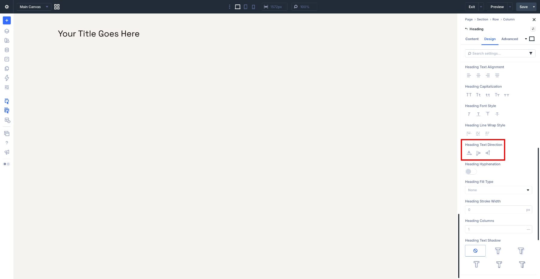
The three options work like this:
- Standard Horizontal: The default option. Text reads left to right, and new lines stack below the previous line.
- Vertical (Right To Left): Text displays vertically from top to bottom, and each new line starts to the left of the previous one.
- Vertical (Left To Right): Text displays vertically from bottom to top, and each new line also starts to the left of the previous one.
The difference between the two vertical modes matters most when text wraps onto multiple lines. With a short heading, the main visible change is the direction the word reads. With longer text, line wrapping becomes part of the design, so test both modes and choose the one that fits the layout best.
Applying the setting is quick once you know where it lives. Add a Heading module, type your text, open the Heading Text option group, and choose one of the two vertical direction icons. The heading changes direction directly on the canvas.
Vertical text works best as a supporting design element. A thin vertical label running along the edge of a section can give the layout structure without competing with the main headline. That is why the pattern appears often in editorial layouts, agency sites, portfolio pages, product launches, and poster-style hero sections.
At smaller sizes, vertical text can handle quiet jobs: a date stamp on an event card, a category label on a portfolio tile, a client name beside a testimonial, or a brand label along the side of a product section. In each case, the vertical element carries secondary information while the primary message stays horizontal and easy to read.
How Vertical Text Behaves With Longer Content
A short heading only shows part of the behavior. Longer text reveals what really changes when you switch from horizontal to vertical flow.
Think of the normal horizontal rules, then rotate them. In horizontal mode, lines wrap downward and paragraphs stack from top to bottom. In vertical mode, each line becomes a vertical column, wrapped lines stack to the left, and a new paragraph starts beside the previous one instead of below it.
That means vertical text grows differently. A horizontal text block usually gets taller as content wraps. A vertical text block can get wider as content wraps because new vertical columns are added beside the first one.
Plan your containers with that in mind. If you place a long sentence in vertical mode with no height limit, it can keep running down the page. If you want the text to stop at a specific height, place it inside a Group or another container and set a max height. The text will wrap once it reaches that limit, similar to how horizontal text wraps when it reaches the edge of its container.
One more clarification matters if you have worked with vertical text in CSS before. CSS writing-mode includes related controls that can affect whether letters rotate with the line or stay upright. Divi 5 keeps the builder setting simple and exposes the three direction modes only. For English text, the rotated vertical look is usually easier to read and more useful for graphic layouts.
The same general behavior applies whether you use the setting inside Heading Text or Text. The difference is the type of content you are styling, not the way the direction setting works.
How To Build A Vertical Text Header In Divi 5
Now that you know how the setting behaves, let’s use it in a real header design.
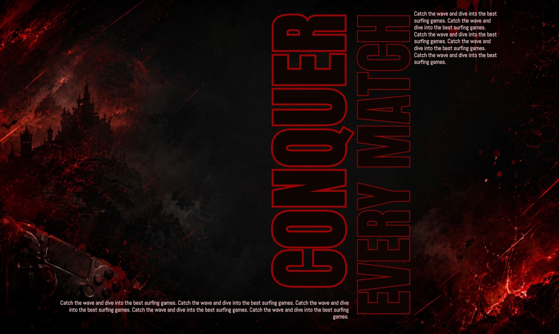
This header uses two outlined vertical headlines at different scales. The body text stays horizontal in the top corner and along the bottom edge, so the layout keeps its poster-like structure without making every piece of copy harder to read.
The dark background creates contrast, while the stroked vertical text sits inside the composition instead of covering it. Along the way, you’ll also see how to handle the alignment behavior that appears when a vertical heading sits inside a flex column.
Step 1: Set Up The Section
Start with a fresh page in the Visual Builder. Divi adds a Section automatically, so open the Section settings by clicking the gear icon.
Go to the Design tab and expand Sizing. Set the Height to 100vh. This makes the section fill the full height of the browser window and gives the vertical headlines enough room to run through the design.
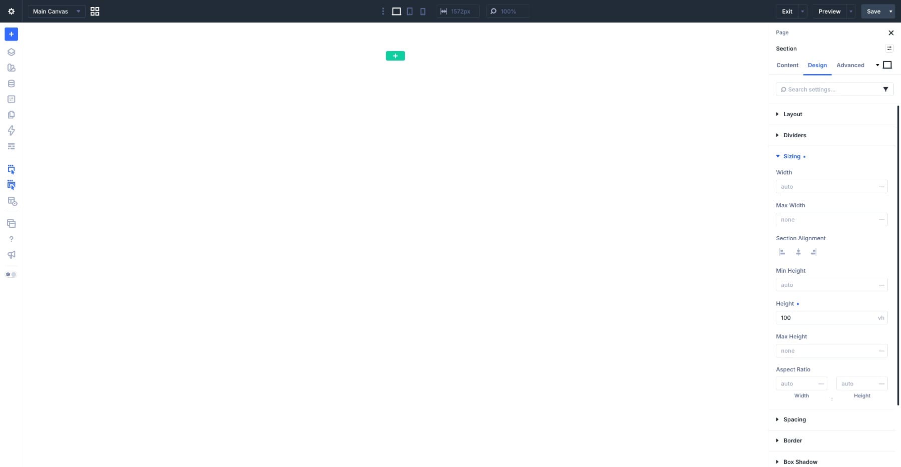
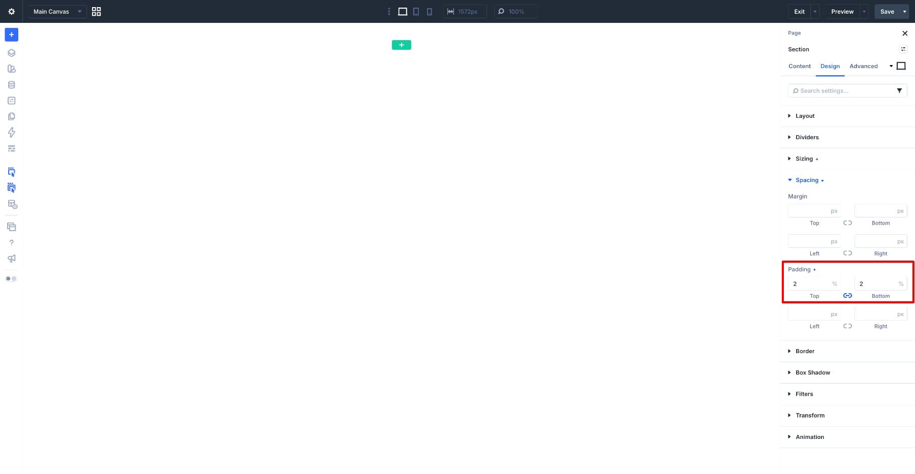
Next, expand Spacing. Set the Top Padding and Bottom Padding to 2% each. Divi sections include default padding, but a full-height hero needs more available vertical space. Smaller padding keeps a thin buffer at the top and bottom without shrinking the main layout too much.
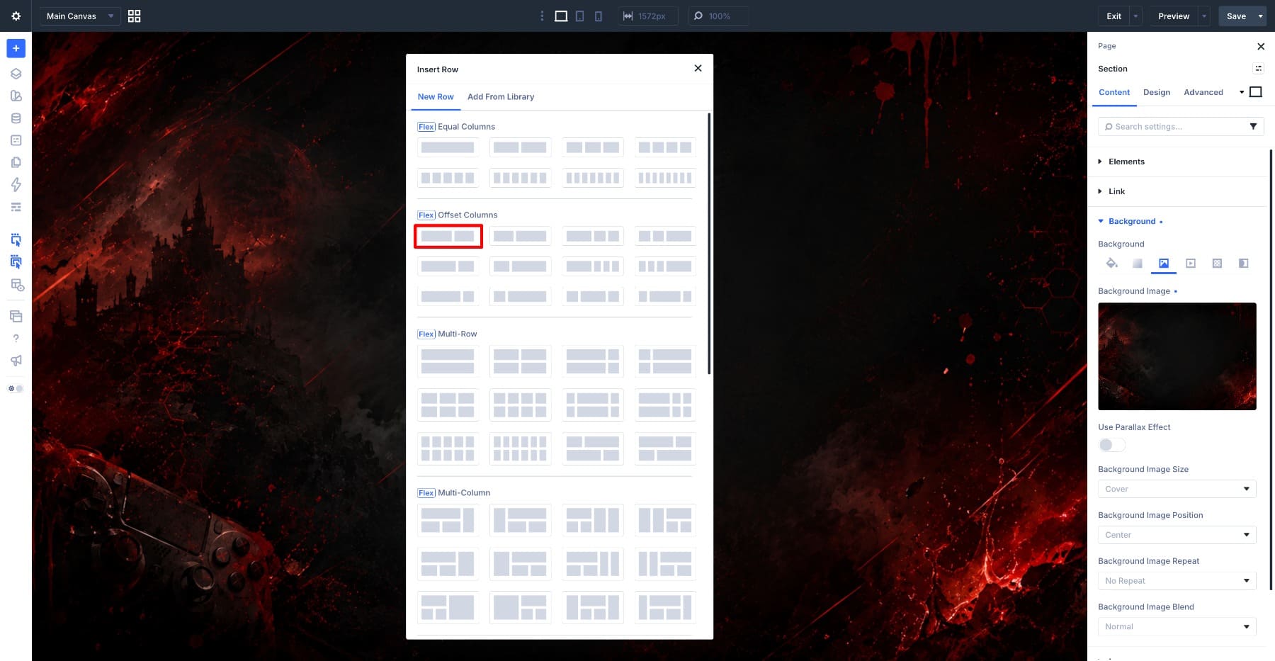
Now add the background image. Go to Content > Background > Image and choose your image.
For this layout, the background image matters. Choose an image with a calm area where the vertical headline can sit. If the subject, light source, or busiest part of the photo sits directly behind the text, the outlined heading will become harder to read.
Step 2: Add A Two-Column Row
Add a new Row inside the section and choose a two-column structure. The first column will hold the main vertical headline and the bottom paragraph. The second column will hold the supporting vertical headline and the top paragraph.
Open the Row settings and go to the Design tab. Expand Layout and set the Horizontal Gap to 0.
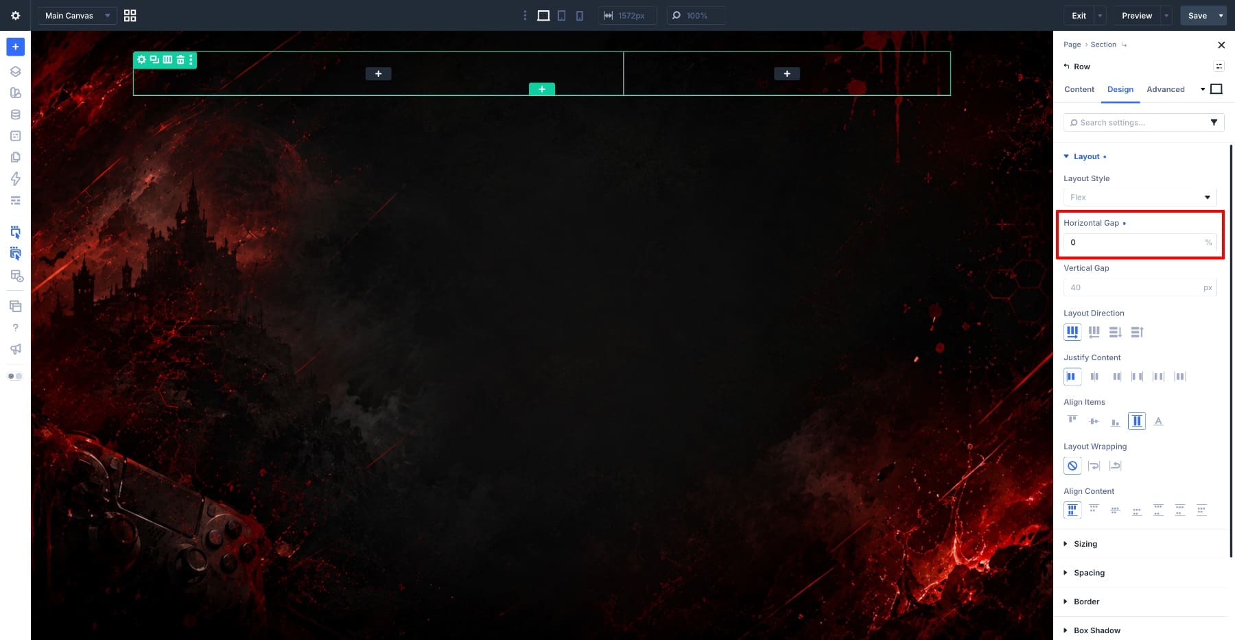
This design does not need extra space between columns. The vertical headlines and body text need to sit close together around the center of the layout, and removing the gap prevents the columns from pushing the composition apart.
Step 3: Add The First Vertical Heading
Click the plus icon inside the first column and add a Heading module. Type Conquer as the heading text.
Open the Design tab and expand Heading Text. Keep the heading level set to h1, since this is the main headline of the page. Then apply these settings:
- Heading Text Font: Anton
- Heading Text Font Weight: Thin
- Heading Text Size: 24vh
- Heading Text Capitalization: Uppercase
- Heading Text Stroke Width: 10px
- Heading Text Stroke Color: #9f0000
The stroke creates the outlined look, which lets the headline become part of the image instead of covering it with a solid block of text. Anton works well here because its condensed letterforms hold their shape at large sizes.
The size uses vh instead of pixels because the heading will run vertically through a section set to 100vh. Sizing the text against the viewport height helps the headline stay proportional to the space it occupies.
Step 4: Turn The Heading Vertical And Fix The Alignment
With the heading styled, stay inside the Heading Text option group and find Heading Text Direction. Select Vertical (Left To Right). The heading now runs vertically through the design.
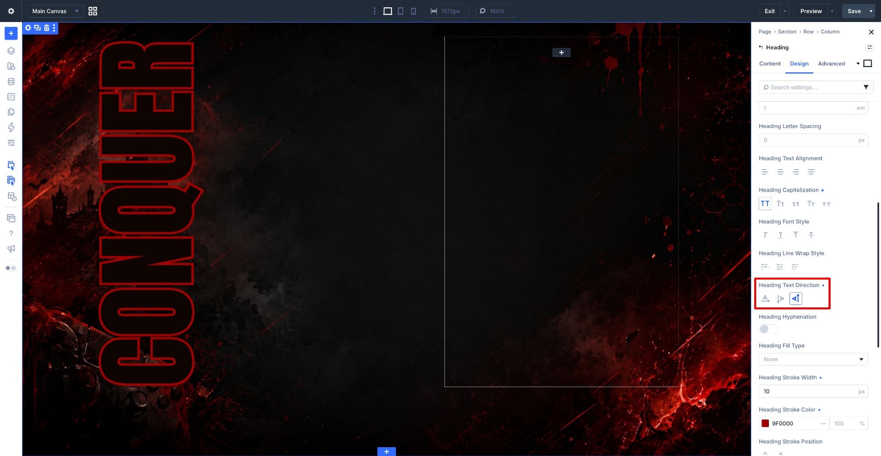
You may notice that the module takes up more horizontal space than the letters need. The vertical word is narrow, but the module box can still stretch across the column. Margins and padding will not fully solve that because the issue comes from the column layout.
The column’s Flexbox Align Items setting defaults to Stretch. Stretch forces modules inside the column to fill the column’s available width. A horizontal heading hides this behavior because the text naturally uses horizontal space. A vertical heading makes the stretched box more obvious.
To fix it, open the Column settings, go to the Design tab, and expand Layout. Change Align Items from Stretch to End.
The Heading module now shrinks closer to the text. Since End aligns the module to the column’s right edge, the vertical headline moves toward the center of the layout, right where the second headline will sit.
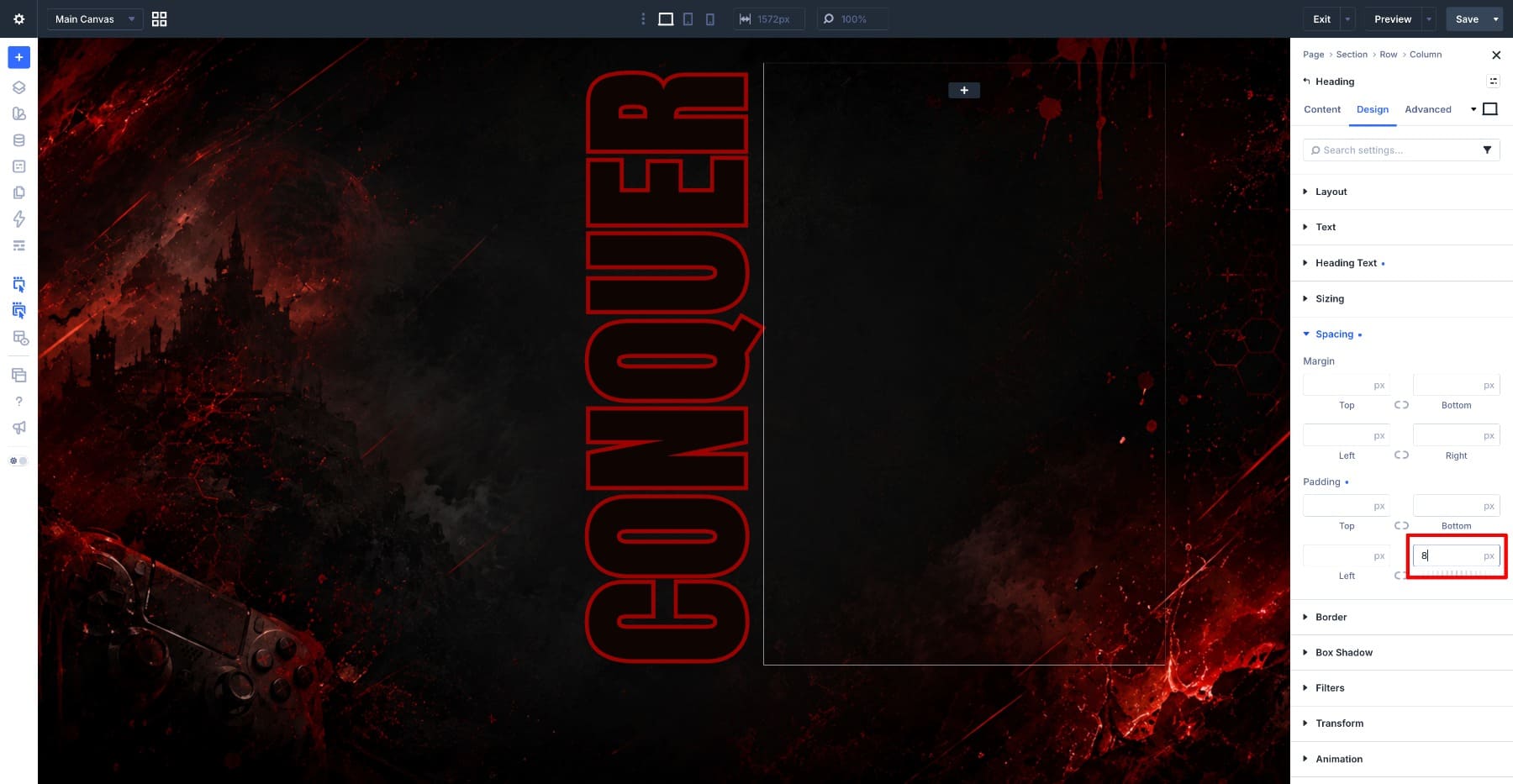
Finally, open the Heading module again, expand Spacing, and set the Right Padding to 8px. This adds a small buffer between the two vertical headlines so they do not touch.
Step 5: Add The Body Text Below The Heading
The first column also holds the paragraph that sits along the bottom of the header. Click the plus icon inside the column, below the Heading module, and add a Text module. Add your paragraph in the Content tab. Then go to the Design tab, expand Text, and apply these settings:
- Text Font: Abel
- Text Font Weight: Semi Bold
- Text Size: 16px
- Text Color: #FFD4D8
- Text Line Height: 1.2em
- Text Alignment: Right
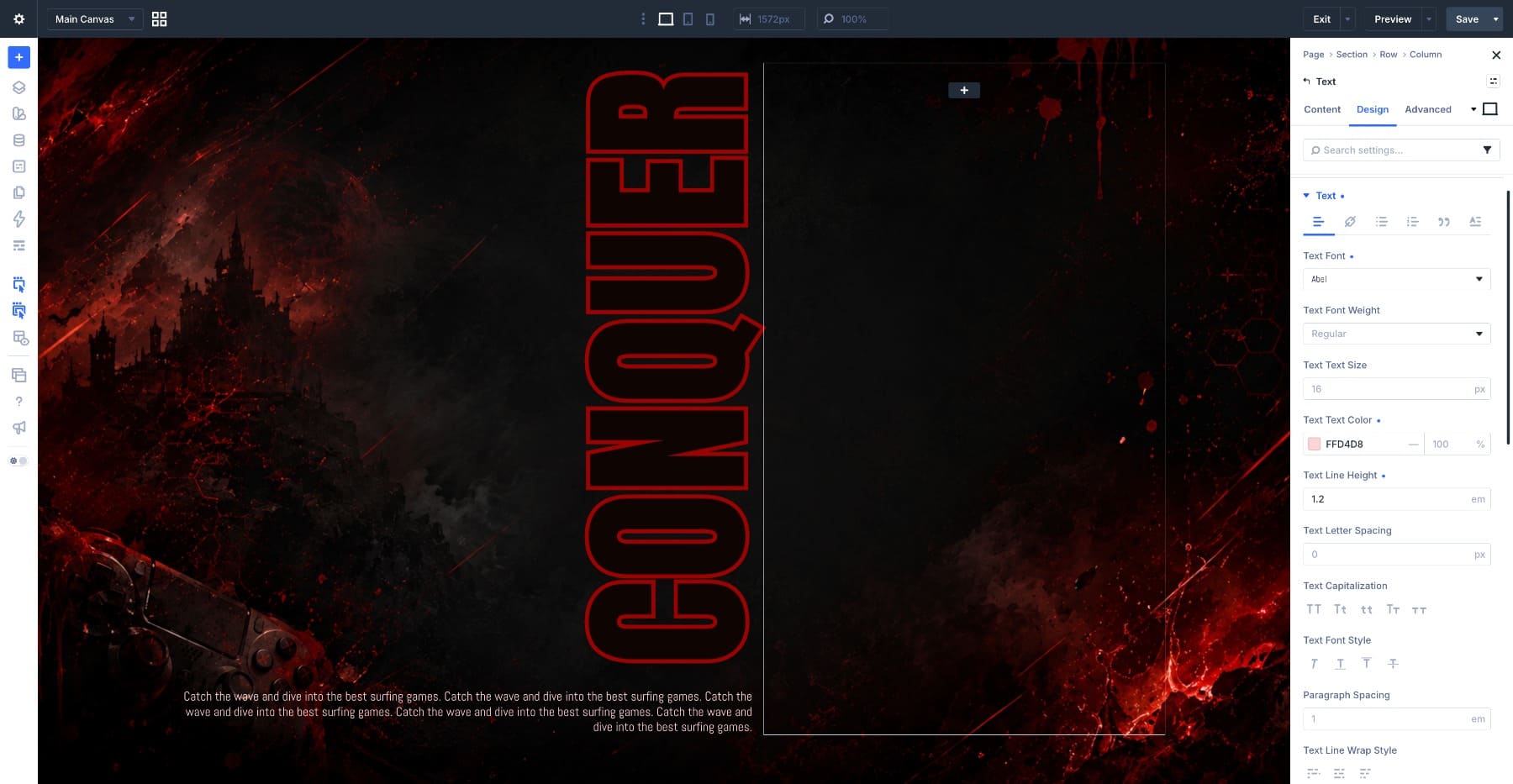
The soft pink text color stays readable against the dark image without competing with the red stroke of the headline. Right alignment lines the paragraph edge up with the vertical heading above it, so both elements share the same axis.
Finally, expand Spacing and set the Right Padding to 15px. This gives the paragraph a little breathing room near the center column edge.
Step 6: Add The Second Vertical Heading
Move to the second column and repeat the same general setup. Add a Heading module, type Every Match, and use the same heading styling as before with two changes:
- Heading Text Size: 18vh
- Heading Text Stroke Width: 4px
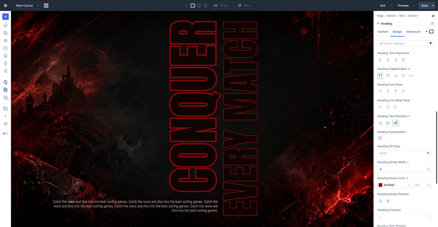
Then set Heading Text Direction to Vertical (Left To Right).
The smaller size and thinner stroke make this second heading feel like a supporting layer instead of another main headline. It creates depth without splitting attention.
Step 7: Add The Paragraph Beside The Second Heading
The second column also holds the paragraph that sits in the upper-right area of the design. Click the plus icon inside the column, below the Heading module, and add a Text module. Use the same text styling from Step 5, but keep Text Alignment set to Left.
By default, the paragraph stacks below the heading. This design needs the two elements to sit side by side, with the paragraph starting near the top of the column. That is a Flexbox adjustment. Open the Column settings, go to the Design tab, and expand Layout. Apply these settings:
- Layout Direction: Row
- Horizontal Gap: 0
- Vertical Gap: 3px
- Align Items: Top
Setting Layout Direction to Row places the vertical heading and paragraph next to each other. Align Items: Top pins them to the top of the column, which places the paragraph in the upper-right corner while the vertical heading runs beside it.
Step 8: Adjust The Design For Tablet And Mobile
The final step is responsive cleanup. Vertical headlines depend on available horizontal room, so tablet and phone layouts need different treatment.
Start with the tablet breakpoint. The vertical layout can still work here, but the desktop sizes may feel too large for the narrower screen. Open each Heading module and reduce the Heading Text Size until the two vertical headlines sit comfortably side by side. Then open the Row settings and lower its top padding if the layout crowds the top of the section.
Next, switch to the phone breakpoint. Two large vertical headlines side by side will usually become too narrow to read on a phone. Instead of forcing the effect to work everywhere, turn the phone layout into a clean stacked header.
Open each Heading module, go to Heading Text, and set Heading Text Direction back to Standard Horizontal on the phone breakpoint.
Divi applies the change only to the phone breakpoint, so the desktop and tablet versions stay vertical. Then reduce the Heading Text Size on both headings so they fit the narrow screen without awkward wrapping.
With the headings horizontal again, the layout becomes a standard stacked header: main headline, supporting headline, and body text. Check the paragraph alignment at this breakpoint and switch it to left if the previous alignment no longer fits the flow.
The design loses the poster effect on mobile, and that is the right trade. A readable simple header is better than a broken vertical one.
2 More Vertical Text Layout Examples
The header we just built is one way to use Text Direction, but the same setting can support several layout styles. Here are two more examples built around the same core idea: use vertical text for framing, labels, and visual structure while keeping the main readable content horizontal.
Design 2: Editorial Fashion Header
This design frames a photo with vertical headlines on both sides, creating the layered look of an editorial magazine spread.
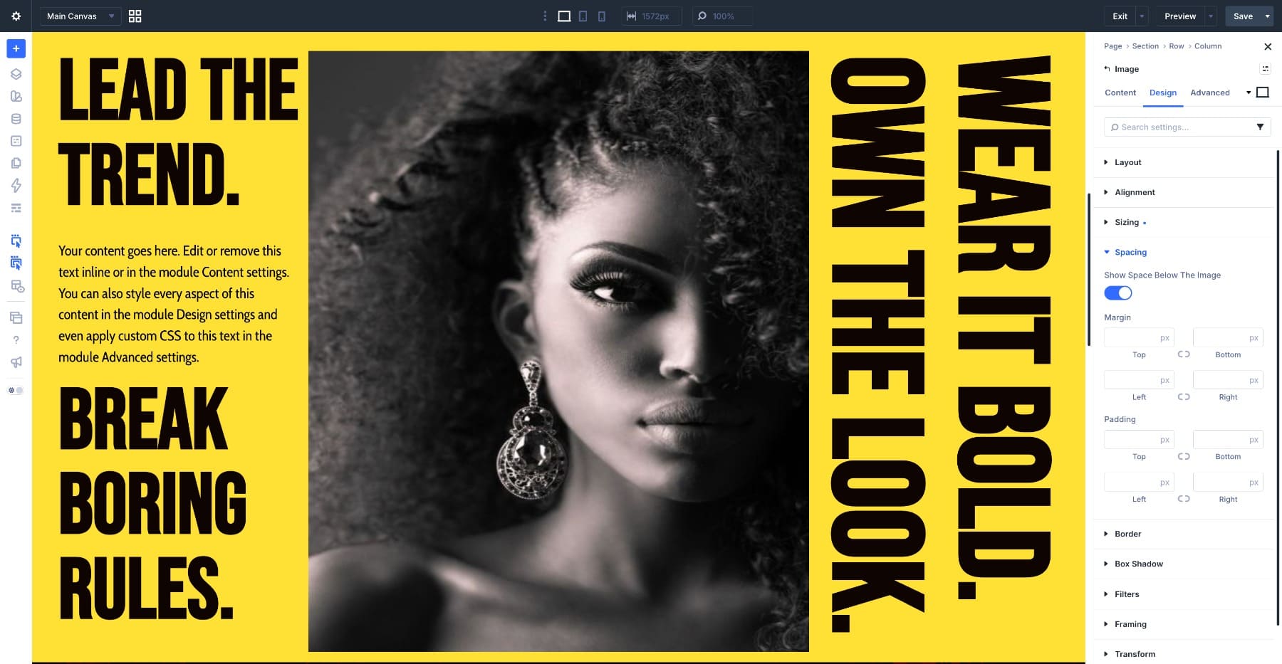
The layout uses a three-column row. The left column holds a horizontal heading, a paragraph, and a second heading stacked below it. The middle column holds a full-height Image module. The right column holds two vertical Heading modules side by side, both set to Vertical (Right To Left) with the same Align Items adjustment used in the main tutorial.
The structure suits fashion sites, editorial brands, portfolio pages, and visual landing pages. The vertical headlines act as a frame for the photo, so visitors experience them as part of the composition before reading them as words. The horizontal text on the left carries the details, and the vertical text on the right balances the image.
Swap the photo, background color, and copy, and the same three-column skeleton can work for many editorial layouts.
Design 3: Product Launch Header
This design uses vertical text as a brand label along the edge while keeping the main focus on the video in the center.
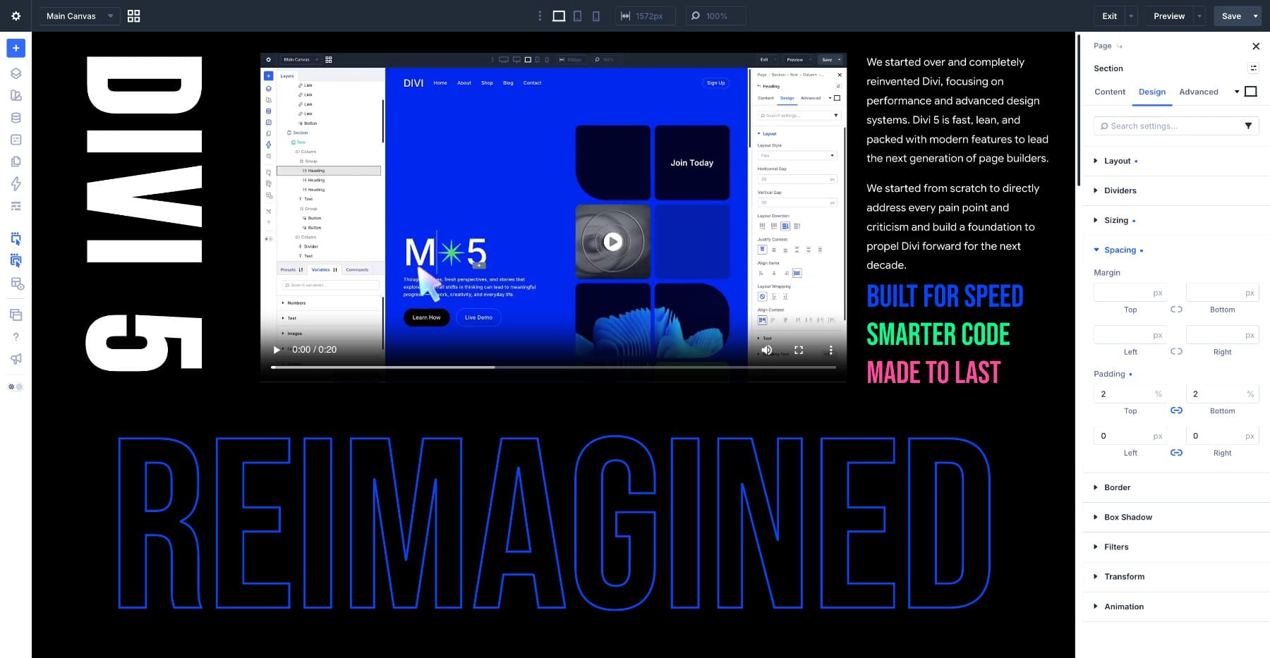
The layout uses two rows. The top row has three columns: a vertical Heading module on the left with the brand name set to Vertical (Right To Left), a Video module in the middle, and a column of horizontal text on the right. The bottom row holds a full-width Heading module styled with a transparent fill and a stroke, sized large enough to run edge to edge.
This structure works well for product launches, feature announcements, and landing pages where one word or brand label needs to create atmosphere without taking over the main content. The vertical brand name labels the page, the video carries the attention, and the horizontal text explains the offer.
Best Practices For Vertical Text In Divi 5
Vertical text is powerful because it changes the shape of a layout. That also means it can become distracting if too much of the page depends on it.
Use these guidelines when working with Text Direction in Divi 5:
- Use vertical text for secondary information. Labels, categories, brand names, dates, and decorative headlines usually work better than long paragraphs.
- Keep the main message horizontal. Important copy should stay easy to scan, especially on landing pages and mobile layouts.
- Watch the container size. Vertical text can grow wider as it wraps, so plan the column, group, or row around that behavior.
- Use calm backgrounds. Vertical text needs contrast and breathing room, especially when placed over an image.
- Fix stretched module boxes with Align Items. If a vertical heading creates too much empty horizontal space, adjust the parent column’s layout settings.
- Test both vertical directions. Short labels may work in either mode, but longer text behaves differently once it wraps.
- Switch back to horizontal on mobile when needed. A strong desktop effect should not come at the cost of phone readability.
The best vertical text layouts have a clear hierarchy. The vertical element gives the design structure, while the horizontal text handles the reading.
Get Creative With Text Directions In Divi 5!
Every design in this article follows the same rule: vertical text works best when it supports the layout instead of carrying the whole message. Use it for a brand label, section marker, decorative headline, date stamp, or editorial frame. Keep the primary message horizontal, then let the vertical text shape the composition around it.
Divi 5’s Text Direction settings make that effect much easier to create. You no longer need to rotate modules, fake vertical words with images, or rely on custom CSS for a simple vertical label. Choose the right text group, switch the direction, adjust the parent layout, and refine the design across breakpoints.
Try it on a page you already have. Add a vertical label along the edge of a section, test how it changes the structure, and save the module as a preset if the pattern earns a place in your design system.






Leave A Reply