

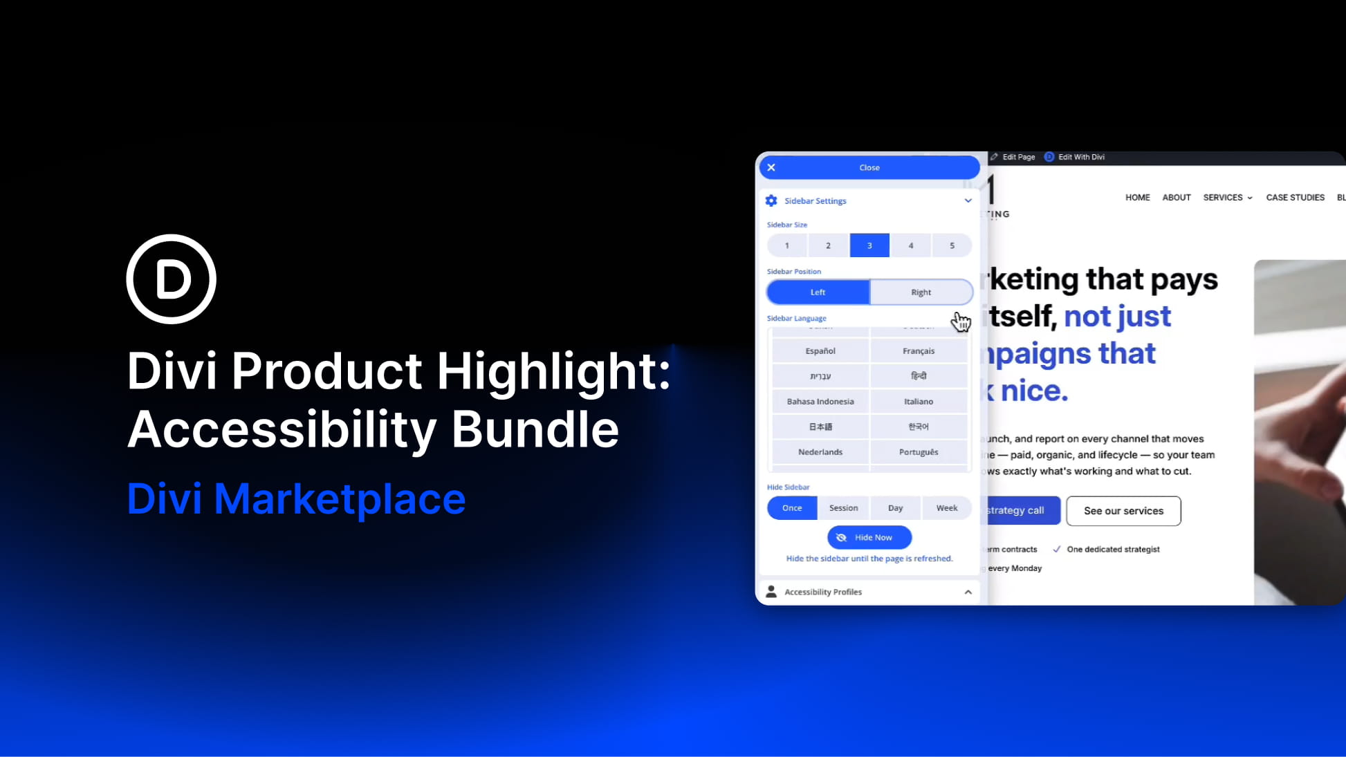
Accessibility is not something you add after a website is finished. It affects how visitors move through a page, understand content, use menus, interact with buttons, read text, and adjust the experience to their own needs.
Divi 5 already gives users more control over accessibility-related details through its Custom Attributes system. You can add attributes such as roles, labels, titles, and ARIA values directly from the builder, which gives Divi users a stronger foundation for semantic structure and assistive technology support.
The Accessibility Bundle from Divi-Modules builds on that foundation with a more complete accessibility workflow for Divi websites. It combines three plugins: Accessibility Attributes, Accessibility Tweaks, and Accessibility Sidebar.
Together, these tools help you add accessibility attributes inside the Visual Builder, apply site-wide improvements for navigation and focus behavior, and give visitors front-end tools to adjust the website experience for themselves.
The bundle is compatible with both Divi 4 and Divi 5, making it useful for existing client sites as well as new builds. At the time of writing, it is available on the Divi Marketplace for $72 with unlimited website usage, 1 year of support and updates, and a 30-day money-back guarantee.
In this product highlight, we’ll walk through each plugin in the bundle, look at the most important settings, and show how the bundle can improve a real Divi page without rebuilding the design from scratch.
Overview Of The Accessibility Bundle
The Accessibility Bundle combines three plugins into one package:
- Accessibility Attributes: Adds accessibility-related controls to Divi elements so you can apply ARIA roles, labels, descriptions, hidden states, details, and other attributes from the Visual Builder.
- Accessibility Tweaks: Applies site-wide improvements such as focus rings, keyboard navigation support, skip links, menu behavior settings, reduced motion support, duplicate ID cleanup, and module-level accessibility tweaks.
- Accessibility Sidebar: Adds a visitor-facing toolbar with profiles and tools for text, navigation, reading, graphics, contrast, motion, screen reading, and more.
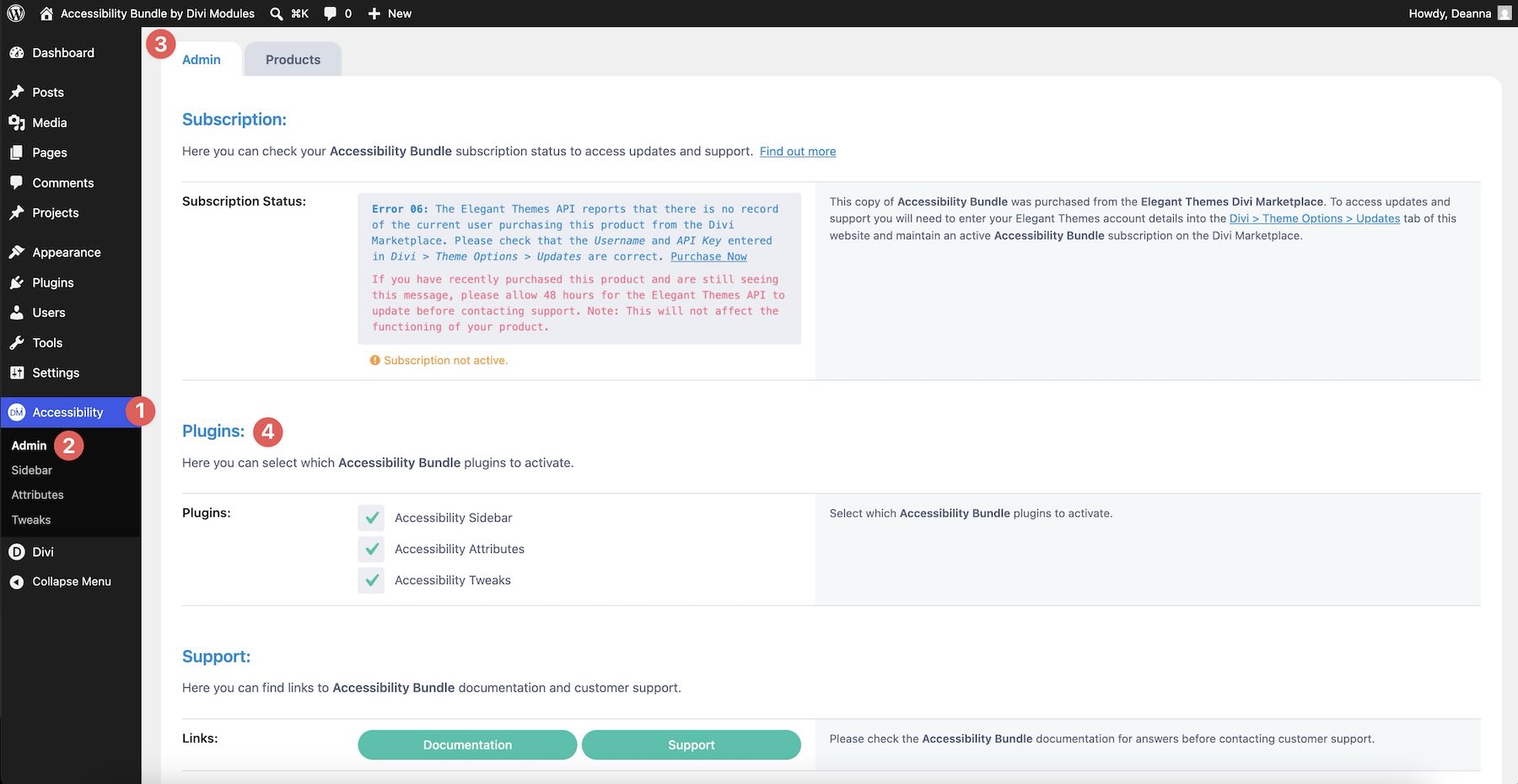
Each plugin solves a different part of the accessibility workflow. Attributes gives you precise control over individual elements. Tweaks handles broader site and module behavior. Sidebar gives visitors their own controls once the site is live.
The bundle is fully compatible with both Divi 4 and Divi 5, so you can use it on older Divi sites, current client projects, and new Divi 5 builds.
Accessibility Attributes
Accessibility Attributes is the foundation of the bundle. It lets you add important accessibility attributes directly inside Divi, so screen readers and other assistive technologies can better understand the purpose of specific elements.
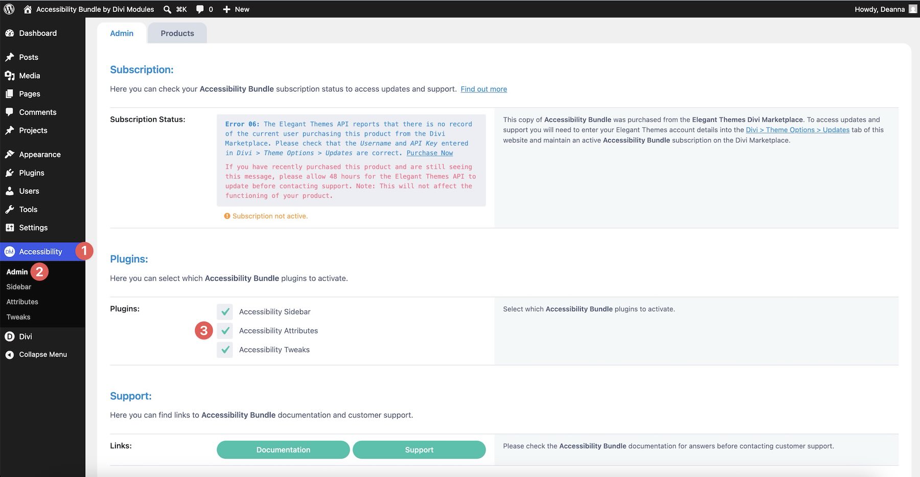
After activation, go to Accessibility > Attributes in the WordPress dashboard.
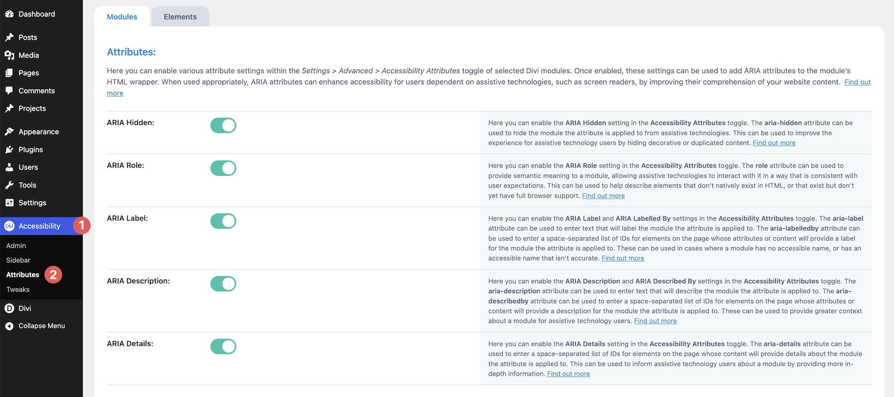
You’ll find two main tabs: Modules and Elements.
Modules Tab
The Modules tab controls which accessibility attribute groups appear inside Divi module settings.
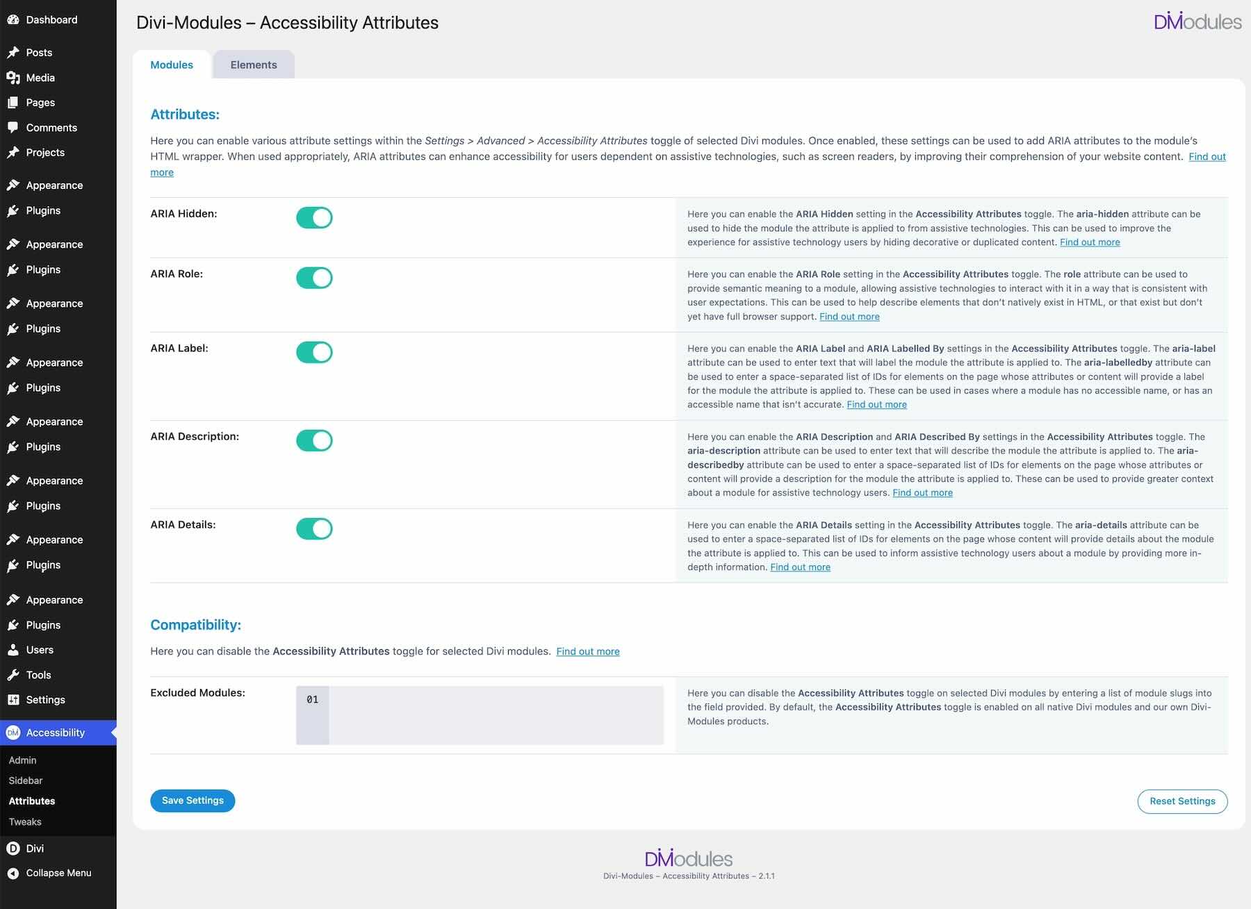
The available module attribute groups include:
- ARIA Hidden: Hides decorative or repeated elements from assistive technologies when they do not add meaning. This is useful for icons, background-style images, decorative visuals, and repeated elements that would clutter the screen reader experience.
- ARIA Role: Assigns a semantic role to an element when its purpose is not obvious from the HTML alone. For example, you might clarify whether an element is acting as a button, navigation item, list, dialog, or another interface pattern.
- ARIA Label: Adds a short accessible name for elements that need a clearer spoken label. This is especially useful for icon-only buttons, repeated links, buttons with vague visible text, or interactive elements where the visual design carries meaning that screen readers cannot see.
- ARIA Description: Adds longer explanatory context when a short label is not enough. This can help describe complex cards, repeated service blocks, or grouped content that needs more explanation.
- ARIA Details: Connects an element to more detailed information elsewhere on the page. This can be useful when a button, link, or card points to supporting content lower in the layout.
There is also a Compatibility section where you can exclude specific modules by slug if you do not want the Accessibility Attributes controls to appear on them. This keeps the builder interface cleaner when certain modules do not need those options.
Elements Tab
The Elements tab lets you apply common accessibility attributes across the site using CSS selectors. Instead of editing one Divi module at a time, you can target theme elements, menus, footers, third-party plugin output, or other elements that are not built as standard Divi modules.
The available element settings include ARIA Main, ARIA Hidden, ARIA Link, ARIA Button, ARIA Required, and Tab Index.
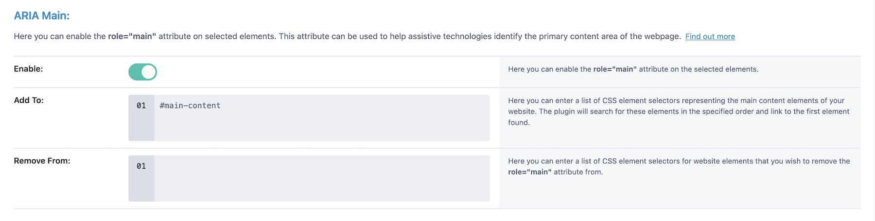
The ARIA Main section identifies the primary content area of the page.
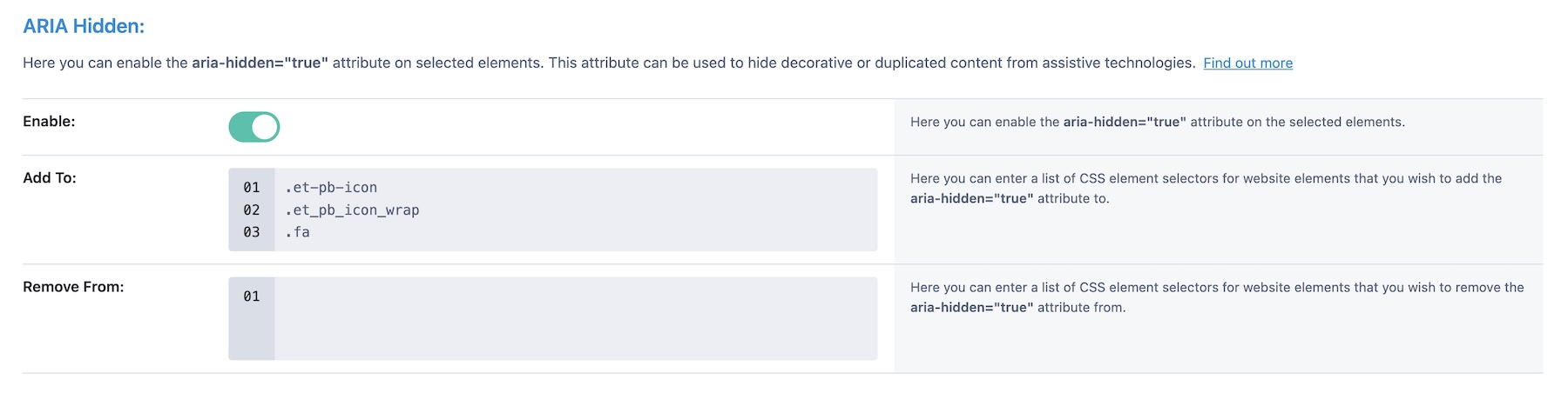
The ARIA Hidden settings let you hide decorative content site-wide.
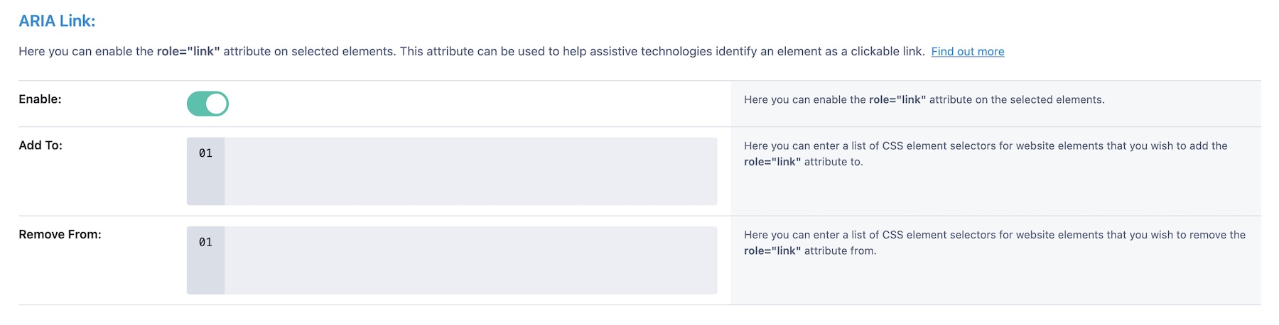
The ARIA Link option can mark custom elements as links when the markup or behavior needs clarification.
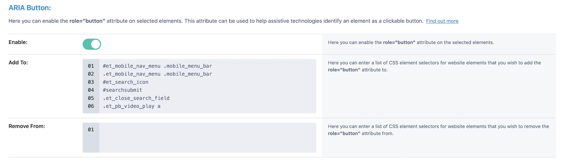
The ARIA Button option can mark custom elements as buttons.
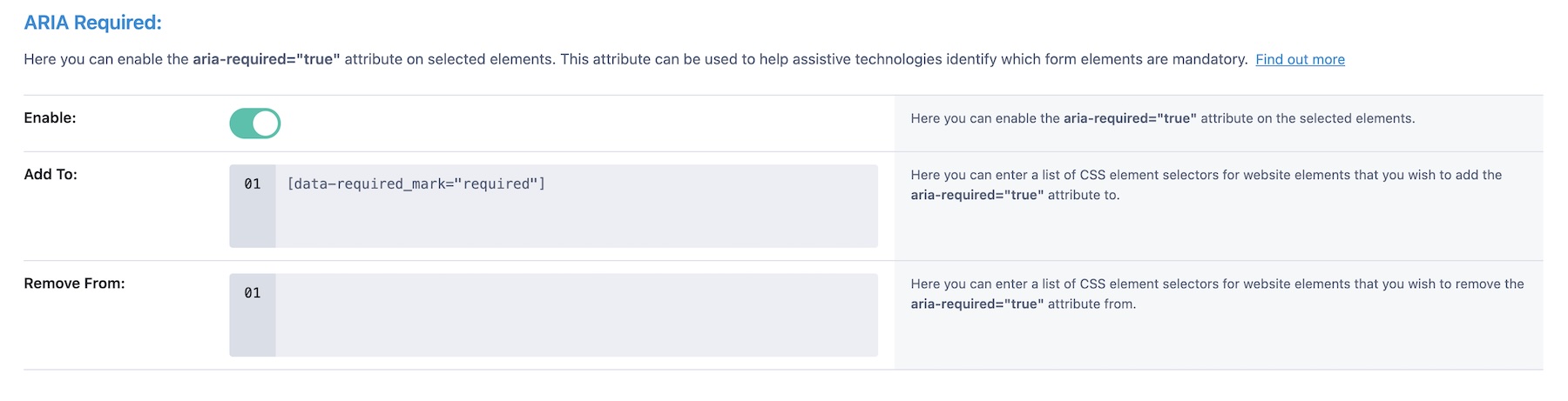
The ARIA Required setting identifies required form fields.
The Tab Index setting helps control whether selected elements can be reached through keyboard tab navigation.
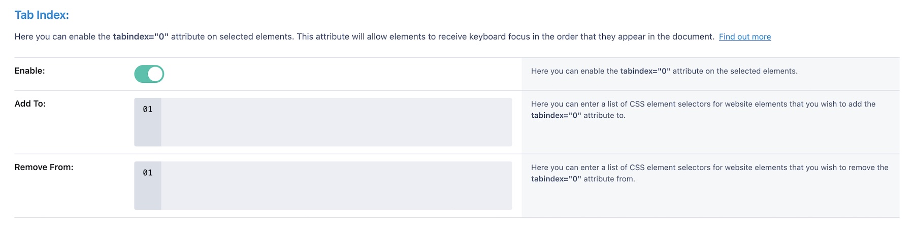
For each selector-based attribute, you can define where the attribute should be added and where it should be removed. This makes the Elements tab useful for broad site-level adjustments that would be tedious to apply one element at a time.
Using Attributes Inside The Visual Builder
Once configured, Divi elements gain new Accessibility Attributes groups in the Advanced tab.
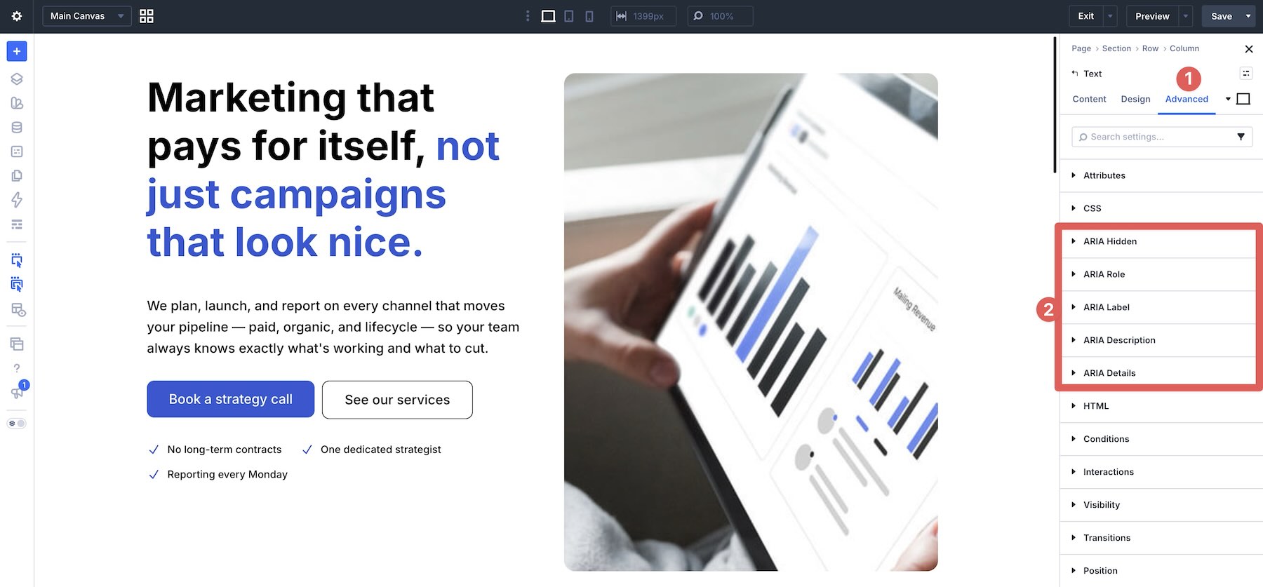
This is where the plugin becomes useful during normal Divi work. You can label an icon-only button, hide a decorative image, add a role to a custom interactive element, or describe a complex card without leaving the Visual Builder.
The key is to use attributes intentionally. More ARIA is not automatically better. The goal is to add meaning where it is missing, remove noise where it does not help, and make the page easier for assistive technologies to interpret.
Accessibility Tweaks
Accessibility Tweaks works quietly at a broader level. Instead of requiring you to edit every element manually, it applies improvements across menus, links, supported modules, website behavior, and focus states.
Go to Accessibility > Tweaks in the WordPress dashboard.
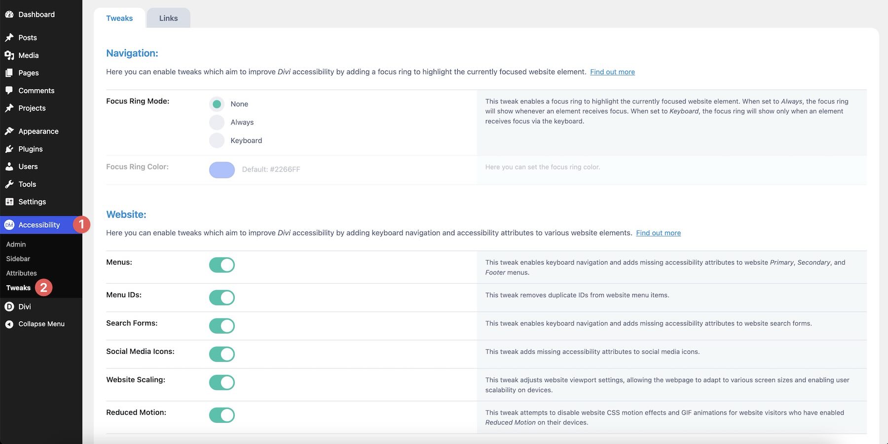
There are two main tabs: Tweaks and Links.
Tweaks Tab
The Tweaks tab includes settings for navigation, website behavior, supported modules, and menu behavior.
Navigation Settings
The Navigation settings let you enable a focus ring with customizable color and behavior.
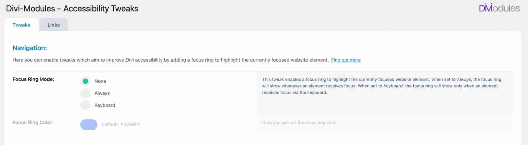
A visible focus ring helps keyboard users see which element is currently active. This is one of the most important accessibility improvements on interactive pages because keyboard navigation becomes frustrating when focus is hard to track.
You can style the focus ring so it fits the site’s brand instead of relying on a browser default that may look inconsistent or be too subtle.
Website Settings
The Website settings include improvements for keyboard navigation, menu behavior, search forms, social media icons, duplicate menu IDs, scaling, and reduced motion.
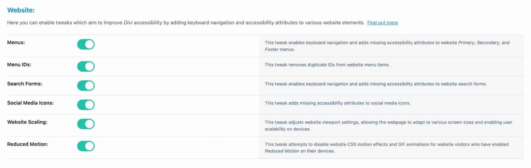
Reduced motion is especially useful on pages that use animated counters, scroll effects, moving backgrounds, GIFs, or transition-heavy sections. Visitors who prefer reduced motion should not have to fight through animation to use the page comfortably.
The Website section also includes duplicate menu ID cleanup. Duplicate IDs can interfere with labels, descriptions, form controls, and ARIA relationships, so cleaning them up helps assistive technologies interpret the page more reliably.
Modules Settings
The Modules settings apply targeted accessibility tweaks to supported Divi modules.
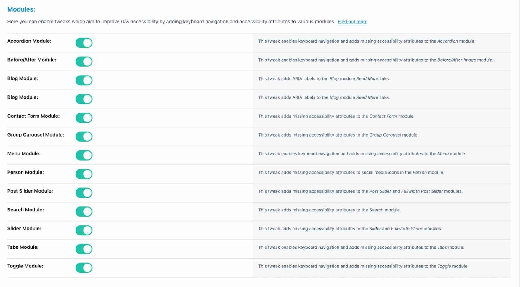
This can help with modules such as Accordions, Blog, Contact Forms, Group Carousel, and other interactive or content-heavy modules where missing labels, ARIA states, or keyboard behavior can make the experience harder to use.
Menu Settings
The Menu settings give you more control over tab navigation, arrow key behavior, and submenu handling.
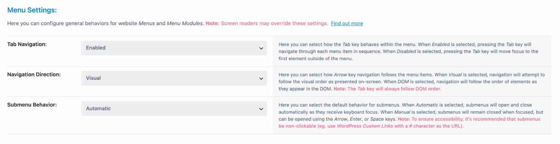
Navigation is one of the first places keyboard users feel accessibility problems. A menu that opens, closes, and moves predictably from the keyboard feels much better than one that only works smoothly with a mouse.
Links Tab
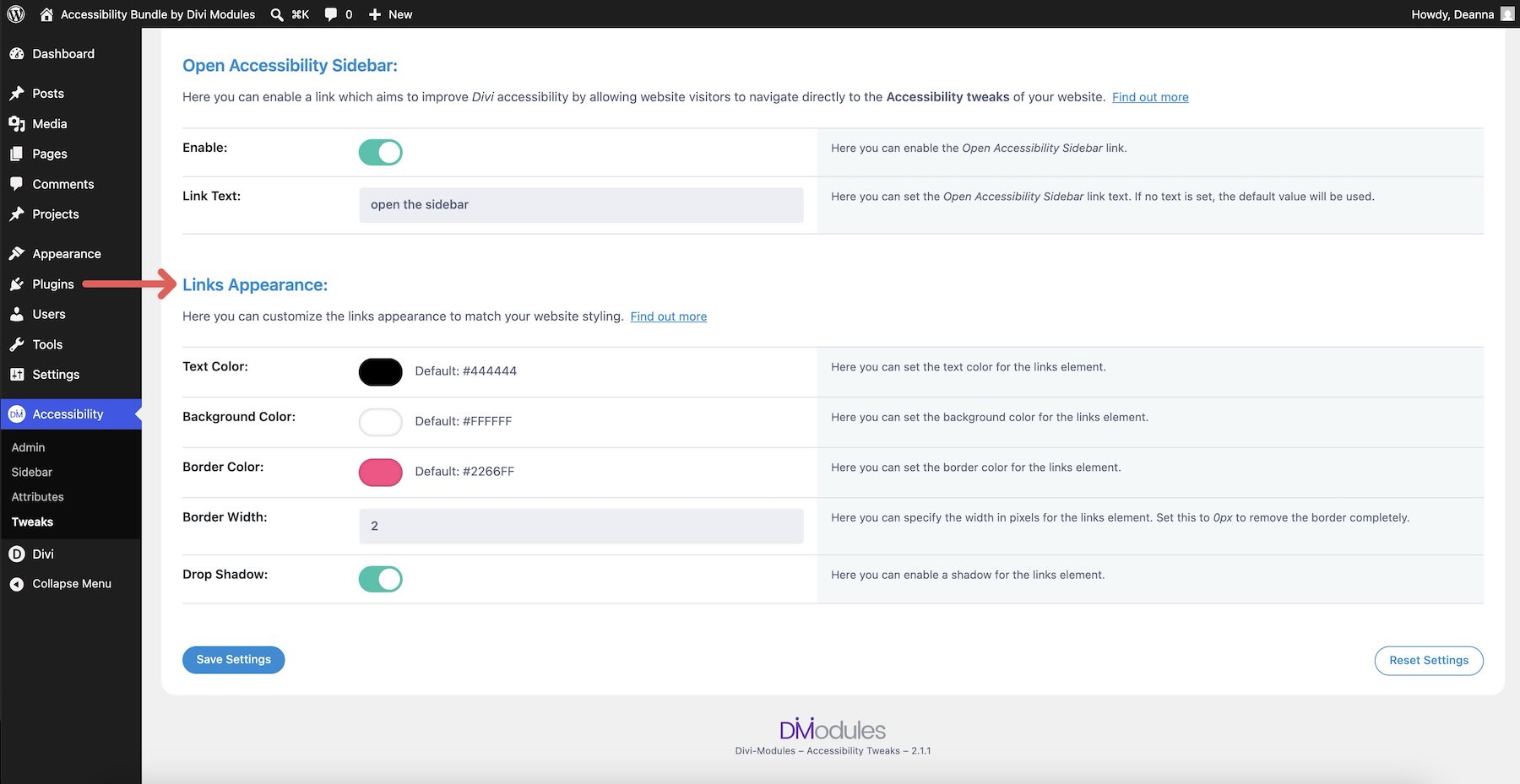
The Links tab handles skip links and styling.
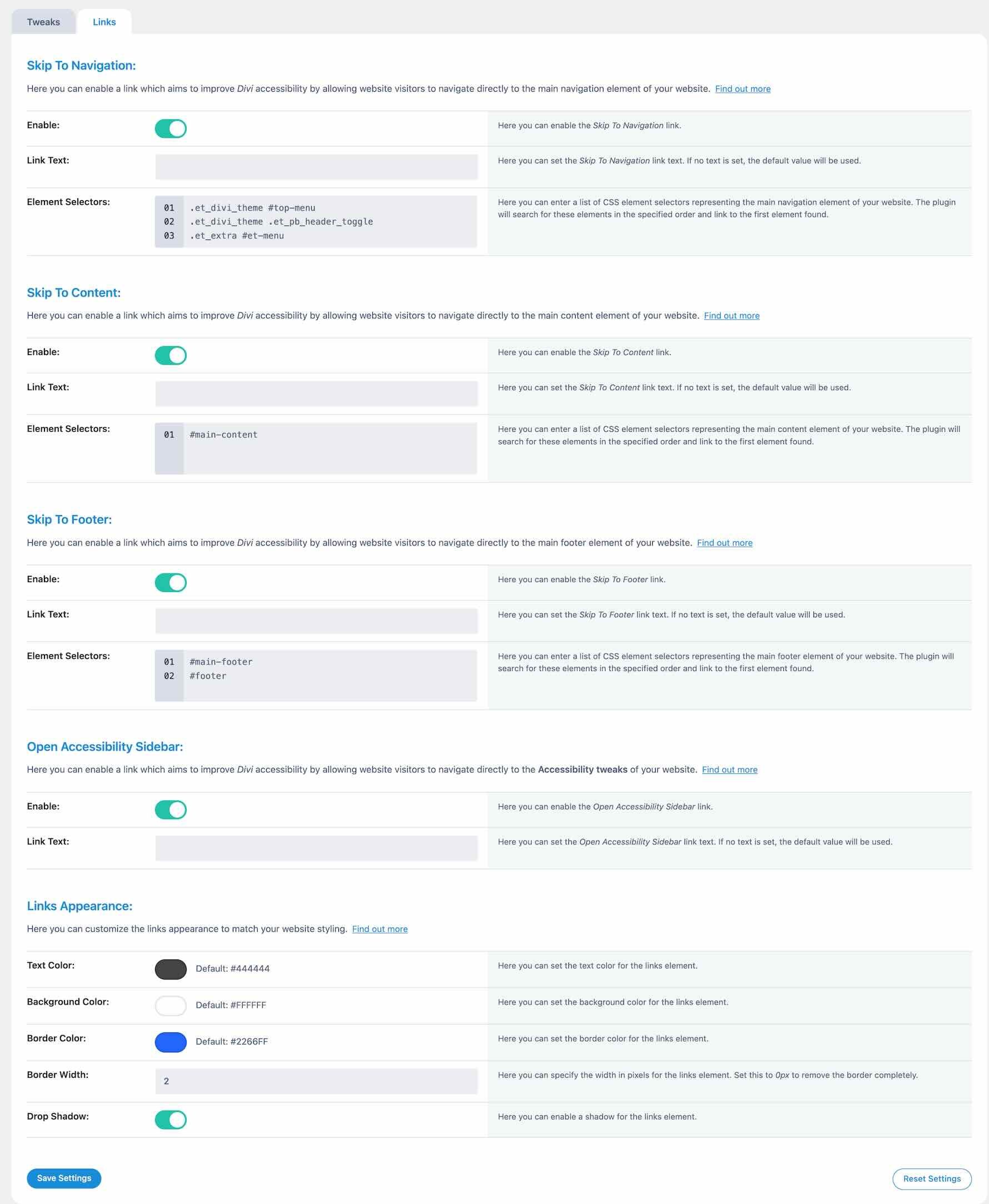
You can enable links such as Skip To Navigation, Skip To Content, and Skip To Footer. If Accessibility Sidebar is active, you can also add a link that opens the sidebar.
Skip links help keyboard users bypass repeated areas and move directly to the part of the page they need. You can also style the links with colors, borders, and shadows so they look intentional when they appear on focus.
Used together, the Tweaks settings can improve keyboard usability, focus visibility, menu behavior, skip navigation, and module-level accessibility with very little ongoing work.
Accessibility Sidebar is the visitor-facing part of the bundle. It adds a front-end toolbar that lets visitors customize parts of the website experience to better fit their needs.
Go to Accessibility > Sidebar in the WordPress dashboard.
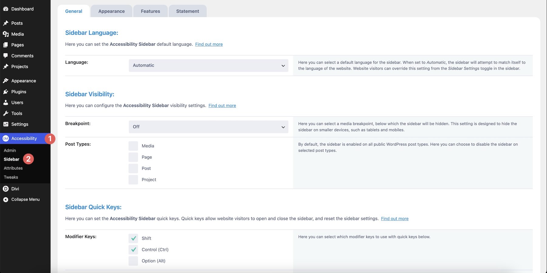
The plugin’s dashboard is split across several tabs, including General, Appearance, Features, and Statement.
General Tab
The General tab controls the sidebar’s default behavior.
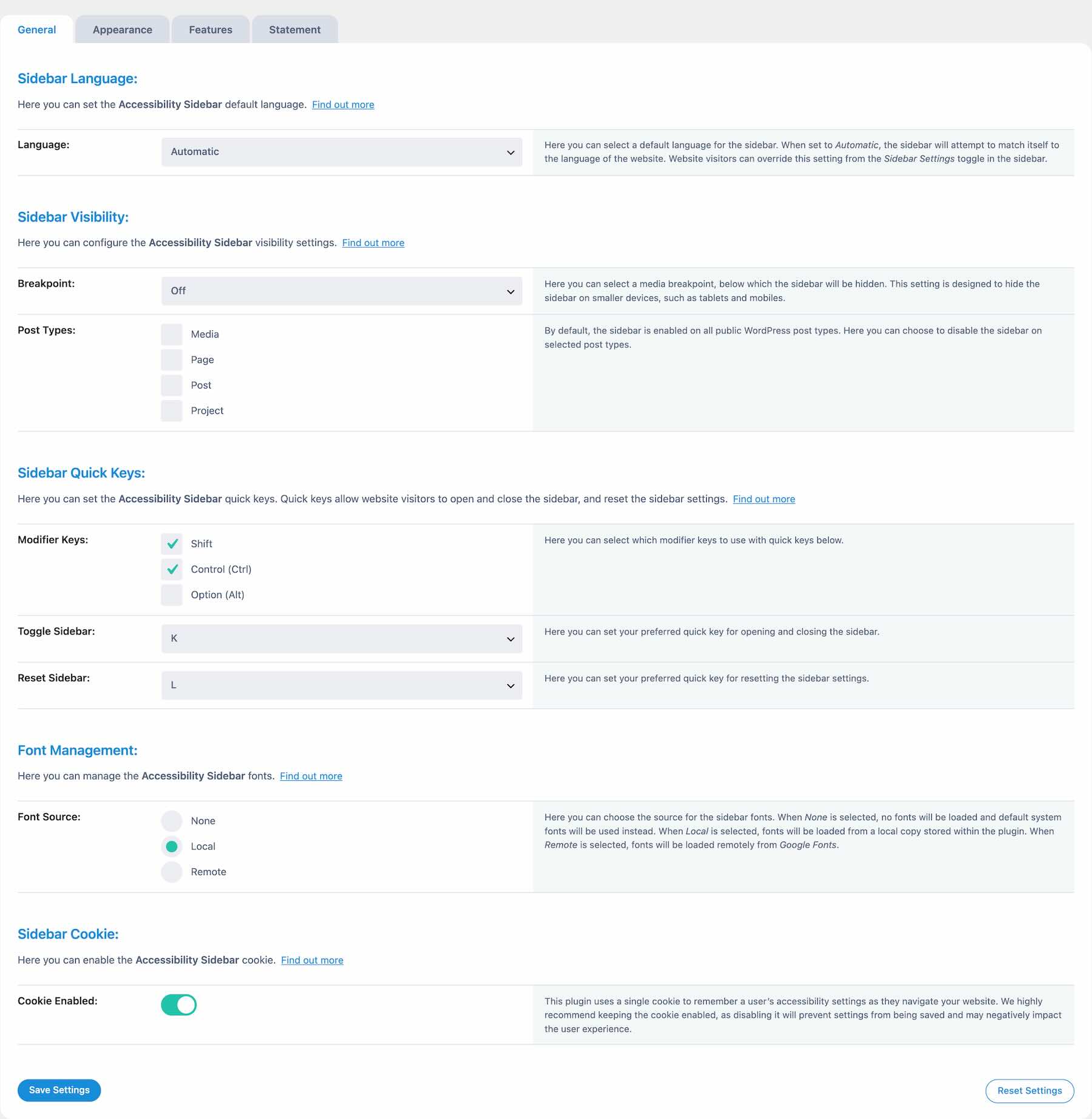
You can set the default language, control sidebar visibility, choose which post types it appears on, configure keyboard shortcuts, manage fonts, and decide whether visitor preferences should be remembered.
You can also control whether the sidebar appears on smaller screens. That matters because a floating accessibility toolbar should not crowd mobile CTAs, menus, or other important interface elements.
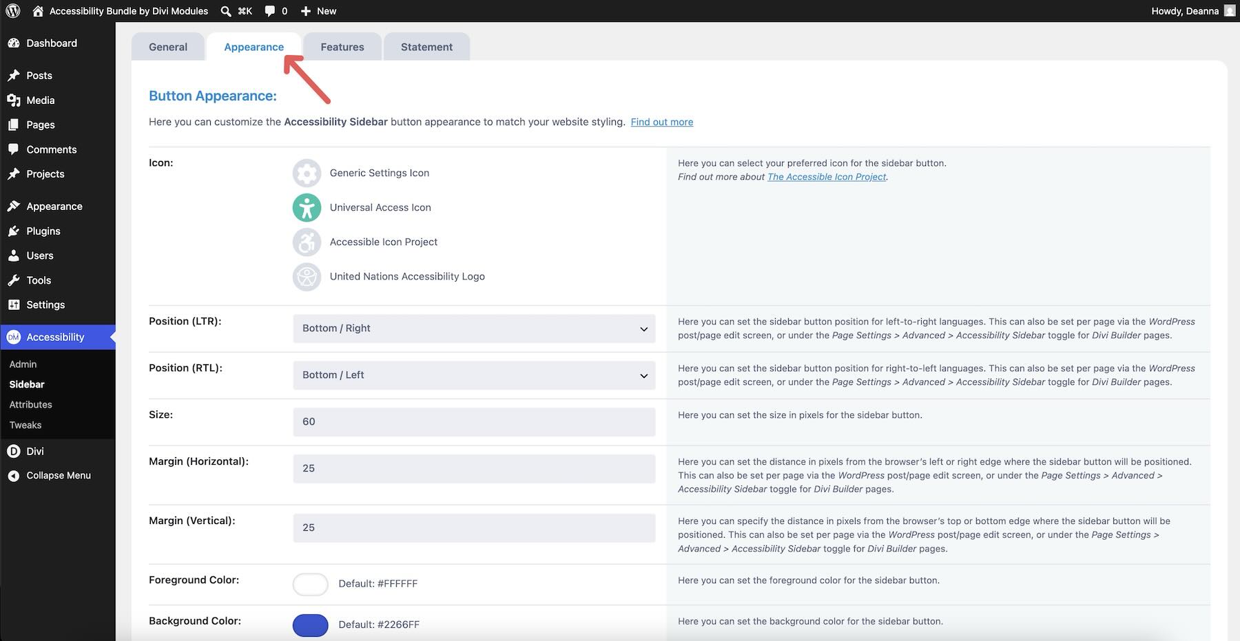
Appearance Tab
The Appearance tab controls how the sidebar and toggle button look.
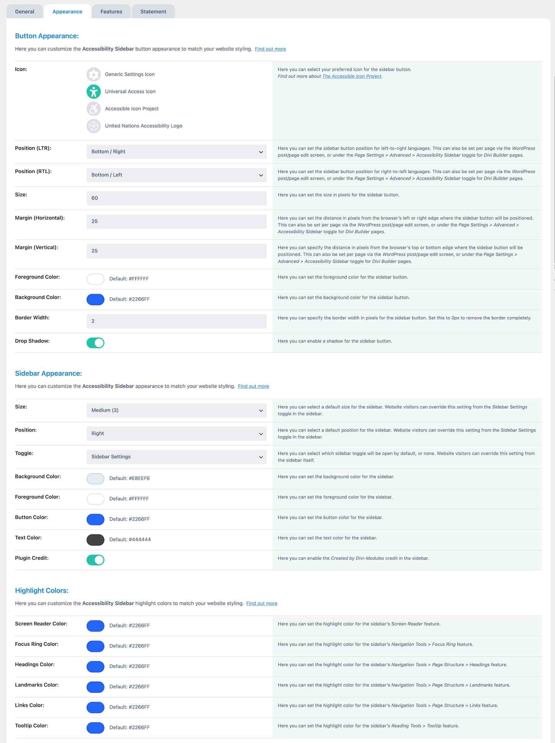
You can choose the toggle icon, set its position and size, adjust colors, borders, and shadows, and customize the sidebar’s size, placement, toggle behavior, and highlight colors.
This matters because accessibility tools should not feel like an afterthought. A styled toggle button that uses the site’s own visual language is more likely to feel like part of the design.
Features Tab
The Features tab controls the visitor-facing tools available inside the sidebar.
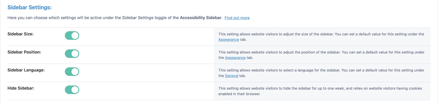
The available feature groups include Accessibility Profiles, Screen Reader, Navigation Tools, Reading Tools, Text Tools, Graphics Tools, and Accessibility Statement options.
Accessibility Profiles
Accessibility Profiles give visitors a starting point based on common needs.
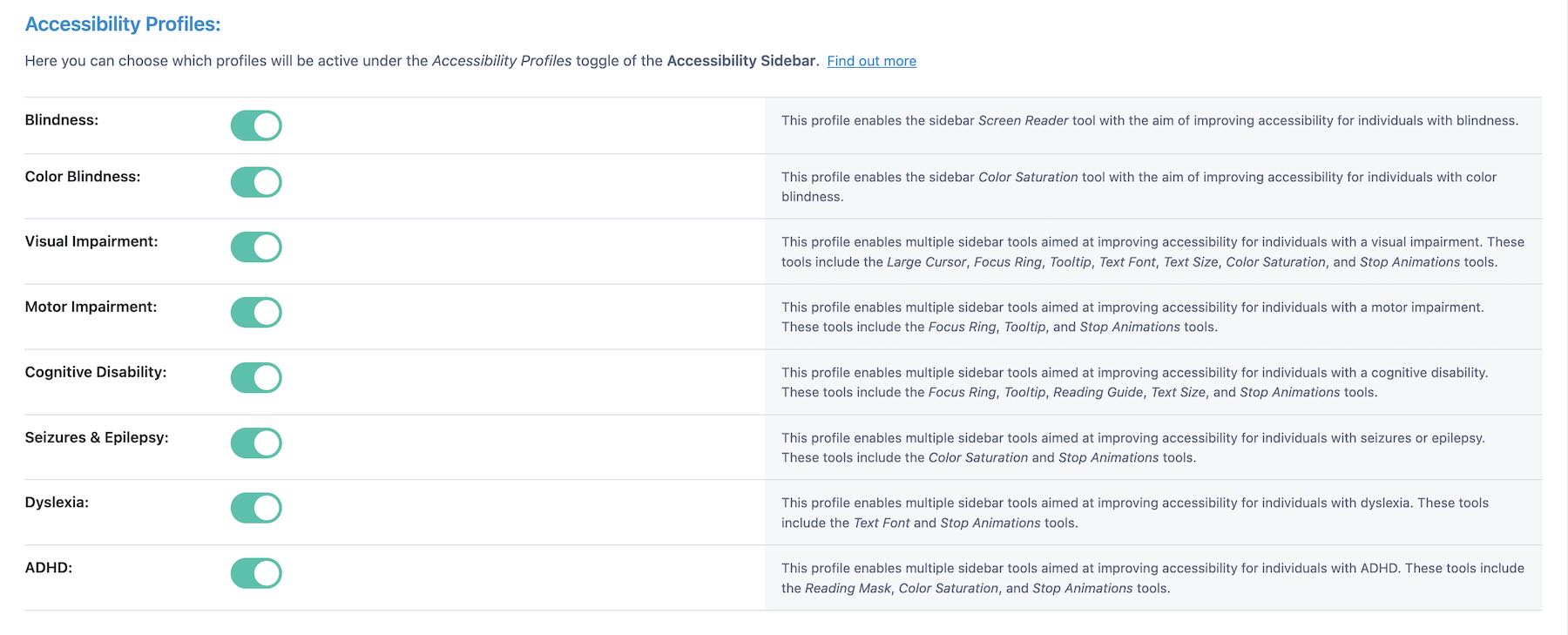
Profiles include options for Blindness, Color Blindness, Visual Impairment, Motor Impairment, Cognitive Disability, Seizures and Epilepsy, Dyslexia, and ADHD.
Profiles are helpful because visitors do not have to understand every individual tool before making the site more comfortable for them. They can choose a profile first, then adjust individual tools afterward.
Screen Reader Tool
The Screen Reader tool converts on-page text to speech.
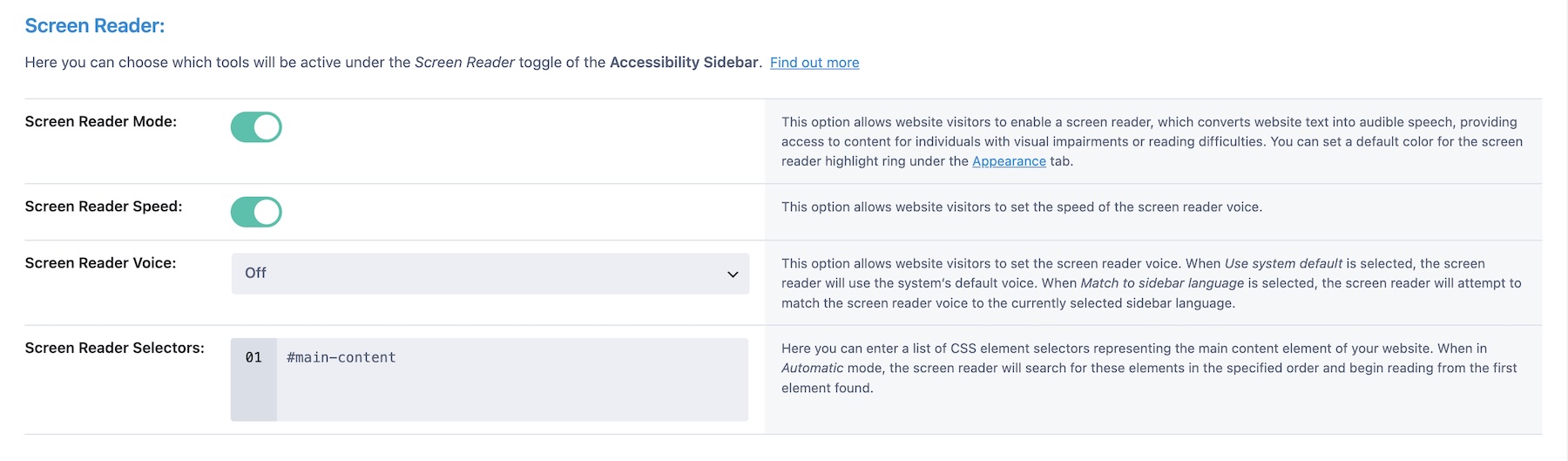
You can configure defaults such as reading speed, voice, and starting content selectors. This gives visitors another way to consume page content when reading visually is difficult or tiring.
Navigation Tools
Navigation Tools include options such as Large Cursor, Focus Ring, and Page Structure.
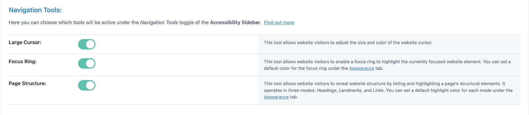
These tools help visitors locate the cursor, track focus, and understand the structure of the page. Page Structure is especially helpful on longer pages because it can give visitors a clearer overview of headings, landmarks, and links.
Reading Tools
Reading Tools include Tooltip, Reading Guide, and Reading Mask.
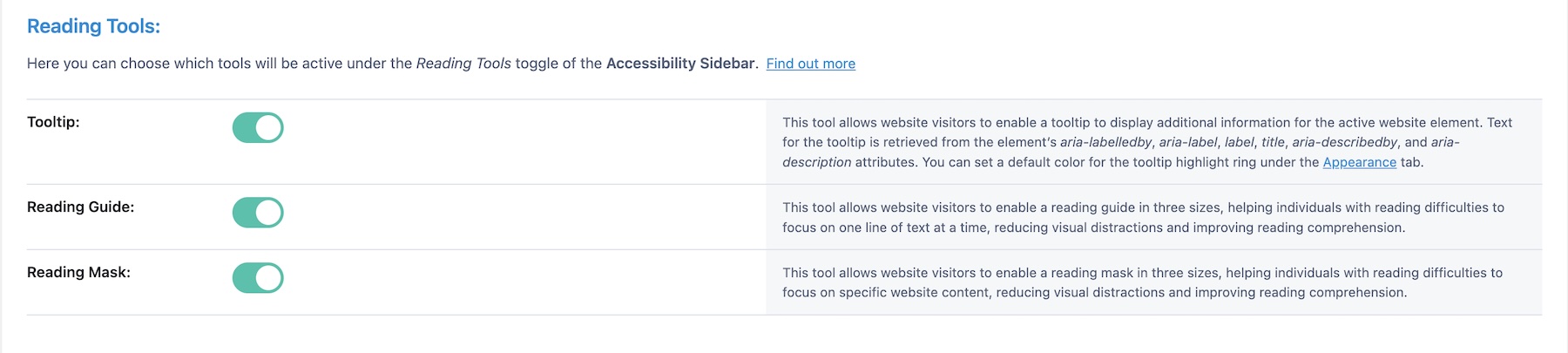
These tools can help visitors focus on one line or section of content at a time. That can be useful on service pages, pricing pages, long blog posts, documentation pages, or any layout where dense text is part of the experience.
Text Tools
Text Tools let visitors adjust the text font, size, line height, spacing, and alignment.
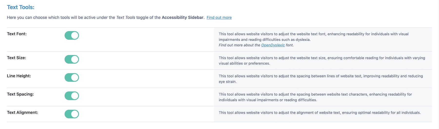
These controls can make dense pages easier to read without requiring visitors to zoom the entire browser or use external tools.
Graphics Tools
Graphics Tools let visitors adjust color saturation and contrast, hide images, and stop different kinds of animation, including Divi animations, GIFs, CSS animations, and transitions.
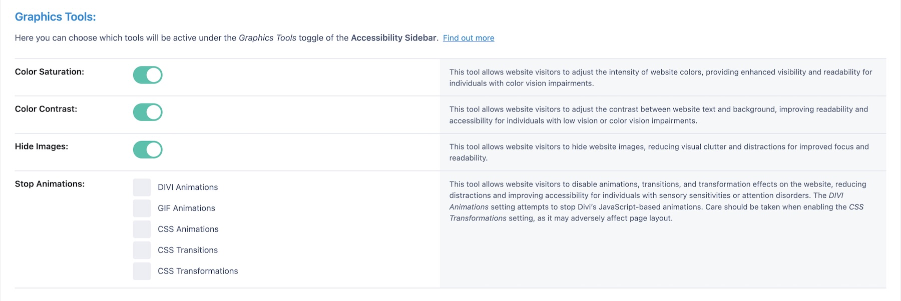
These controls are useful for visitors with sensory sensitivities, color vision deficiencies, motion sensitivity, or difficulty reading low-contrast sections.
Accessibility Statement
The sidebar can also include an accessibility statement or link to a dedicated accessibility statement page.

The Statement tab gives you a dedicated place to manage that content.
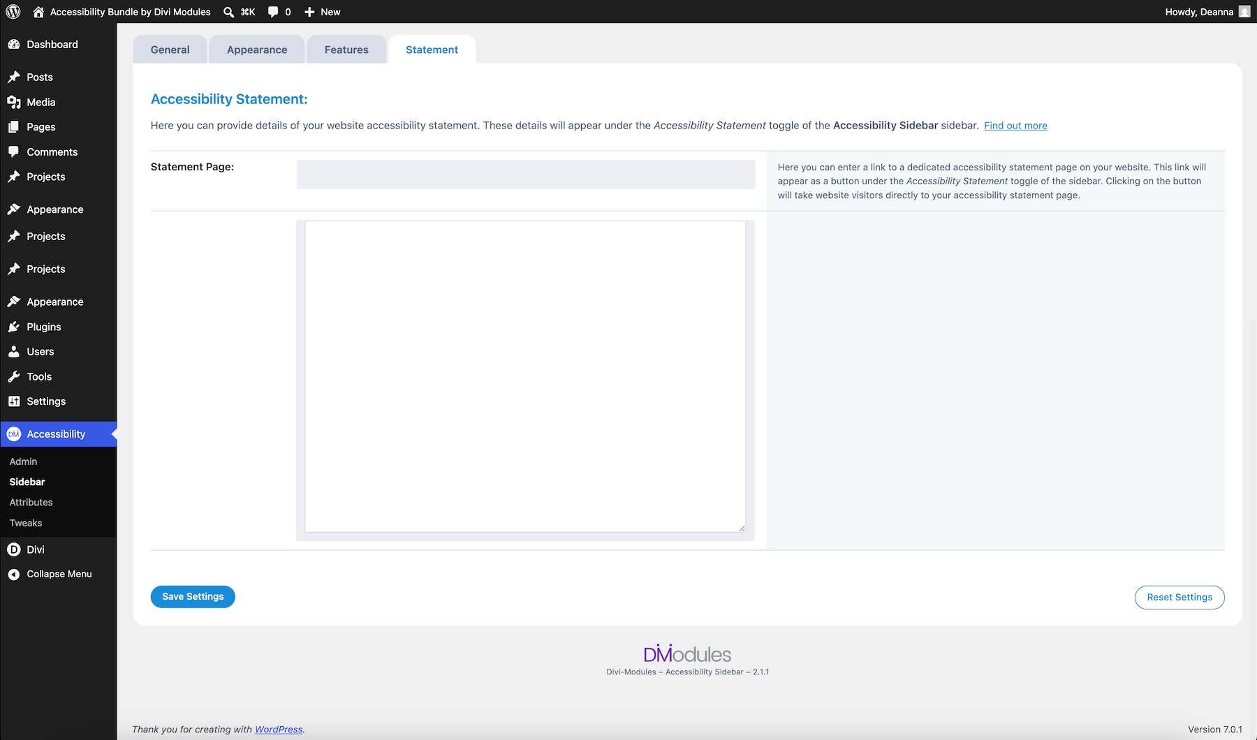
An accessibility statement can show visitors where to find accessibility information, how to contact the site owner about barriers, and what steps the site is taking to improve access.
Applying The Accessibility Bundle To A Divi Page
Now let’s look at how the bundle works on a real Divi page.
The example page is a marketing agency homepage with a hero section, calls to action, a stats bar, service cards, testimonials, and pricing tiers. This kind of page has several accessibility needs: clear button labels, decorative visuals that should not be announced, usable keyboard navigation, reduced motion support, skip links, and visitor controls for reading and contrast.
Step 1: Add Meaning With Accessibility Attributes
With Accessibility Attributes active, Divi elements gain new ARIA groups in the Advanced tab.
Before adding attributes, decide where they actually help. You do not need to fill out every option on every module.
Use attributes where they add real value:
- ARIA Role: Use when the element’s purpose is not clear from the HTML alone.
- ARIA Label: Use for buttons, icons, or links that need a clearer accessible name.
- ARIA Description: Use when a card, section, or repeated element needs more context.
- ARIA Hidden: Use for decorative or duplicated content that should not be announced.
- ARIA Details: Use when an element should be connected to deeper information elsewhere on the page.
A good workflow is to start with interactive elements, then review repeated cards, decorative icons, image modules, and complex sections.
Adding ARIA Role And Label Attributes
Start with a hero CTA button. Open the Button module and expand ARIA Role. In the ARIA Role: Type dropdown, select Widget Role.
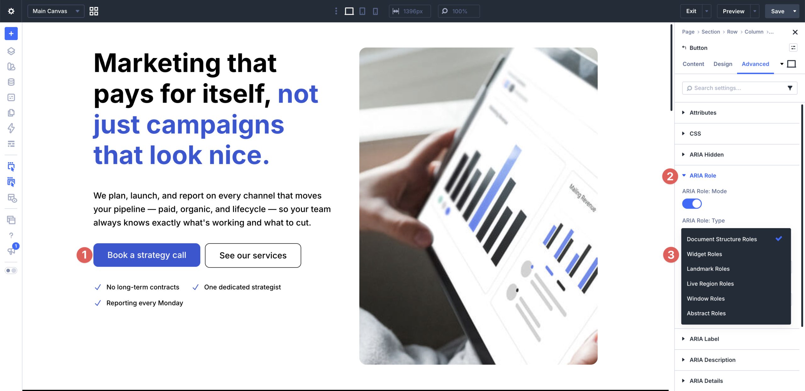
Then choose the appropriate role value. For this example, select Button.
Next, expand ARIA Label and add a clear label, such as Book a free strategy call with our team.
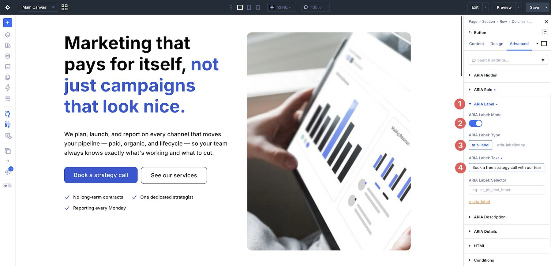
The visible button text may be short, but the ARIA Label can give assistive technologies a clearer description of the action. This is especially useful when a page has multiple CTAs with similar visible labels.
Adding ARIA Description Attributes
For service cards, add a description at the Column or Group level when that container wraps the full card.
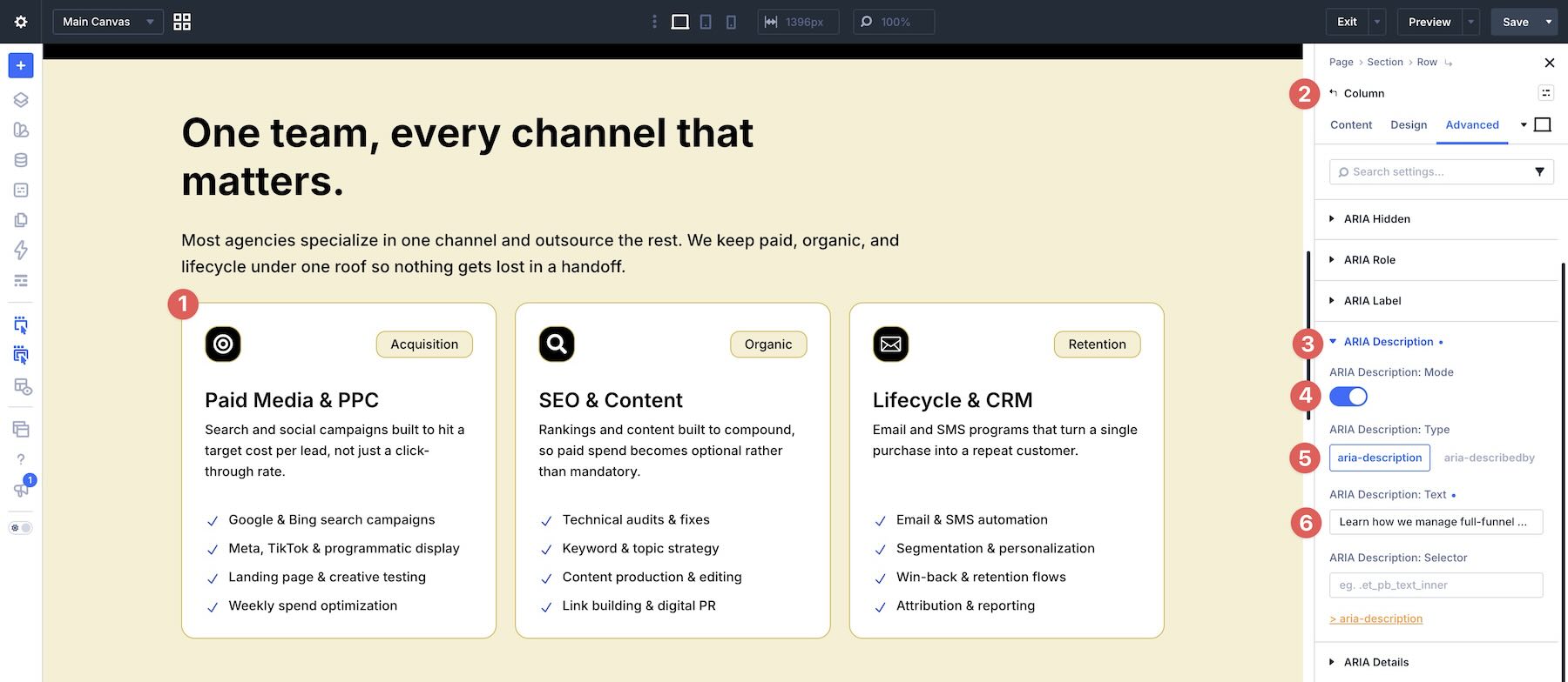
A short description can summarize what the whole card offers. That is often more useful than forcing screen reader users to interpret several separate inner modules without context.
For example, a paid advertising card might use a description such as Learn how we manage full-funnel paid campaigns with weekly optimization.
Adding ARIA Hidden Attributes
For decorative icons or images, use ARIA Hidden when the element does not add meaningful information.
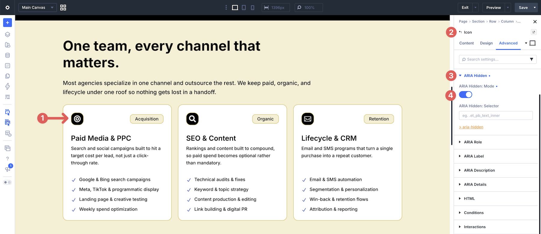
If an icon is purely visual and repeats information already provided by the heading or text, hiding it can reduce noise for screen reader users.
The same can apply to decorative images.
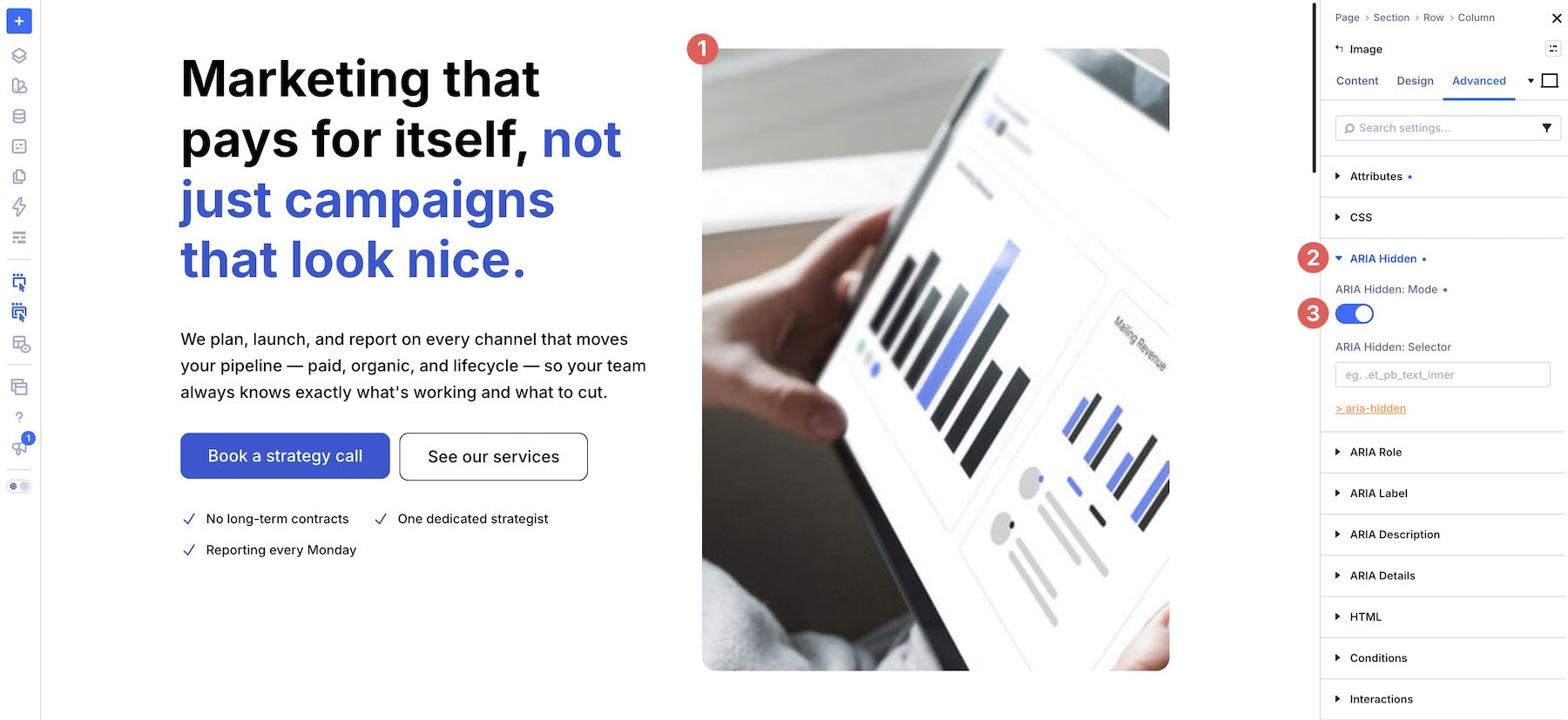
Use this carefully. If an image communicates information, identifies a product, explains a concept, or supports the page’s meaning, it should not be hidden. If it is purely decorative and repeats information already available in the text, hiding it can make the experience cleaner.
Adding ARIA Details Attributes
ARIA Details can connect an element to more detailed information elsewhere on the page.
For example, if a See our services button scrolls to the services section, first give the services section a unique CSS ID through Divi’s Attributes settings.
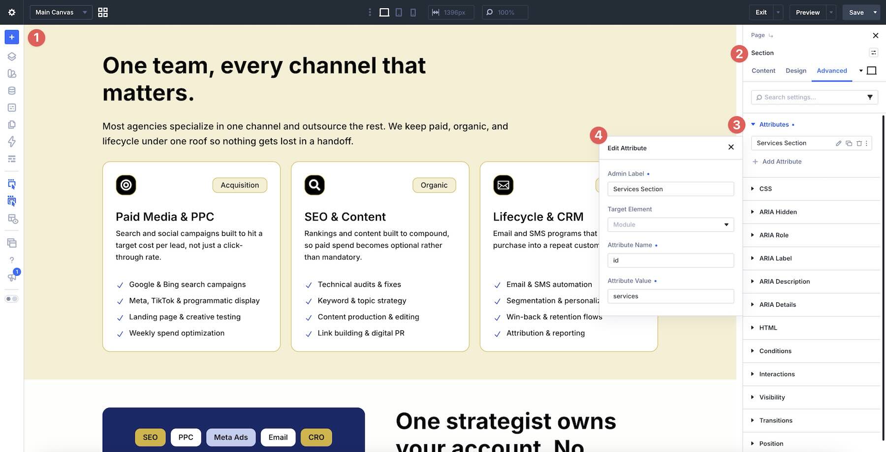
Then open the button settings, expand ARIA Details, and enter that ID.
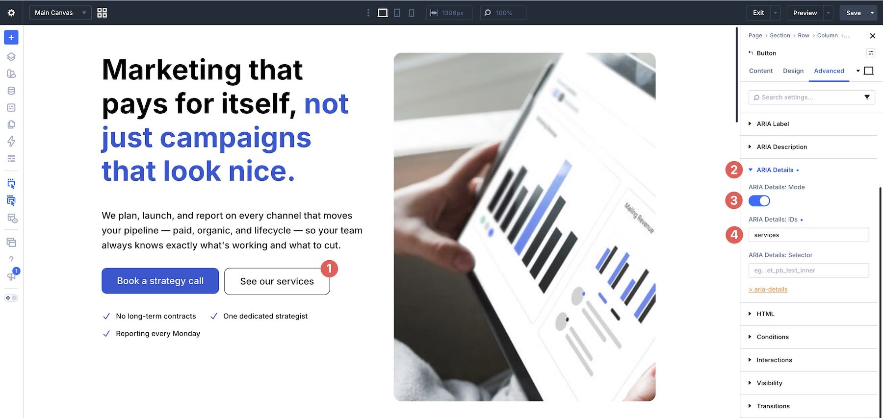
This creates a relationship between the button and the section it points to, giving assistive technologies more context about where the action leads.
Accessibility Attributes works element by element. Accessibility Tweaks handles broader page and site behavior.
Activate Accessibility Tweaks in the Accessibility Bundle settings, then go to Accessibility > Tweaks.
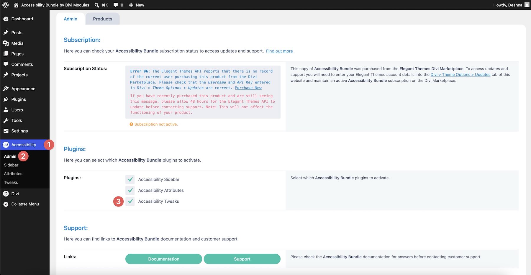
You do not need to configure every setting at once. Start with the improvements that make the biggest difference on the page.
Setting Up The Focus Ring
In the Navigation settings, enable the Focus Ring and choose a color that matches the site’s palette.
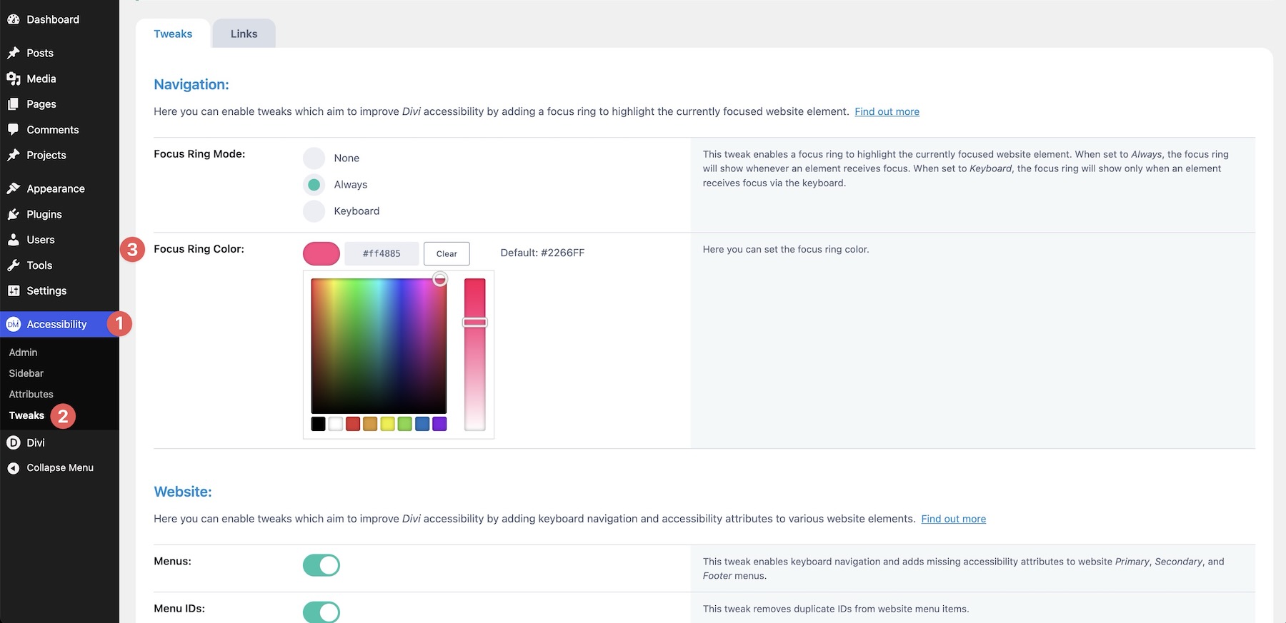
With the Focus Ring enabled, tabbing through the hero buttons clearly outlines each active element. You can also choose how the ring behaves, such as whether it appears for keyboard navigation only.
This small setting can have a large impact because keyboard users need a visible way to know where they are on the page.
Enabling Website-Wide Improvements
Next, move to the Website settings.
Turn on keyboard navigation improvements for menus, search forms, and social icons when your site uses those elements. This helps common interface pieces respond more predictably to keyboard input.
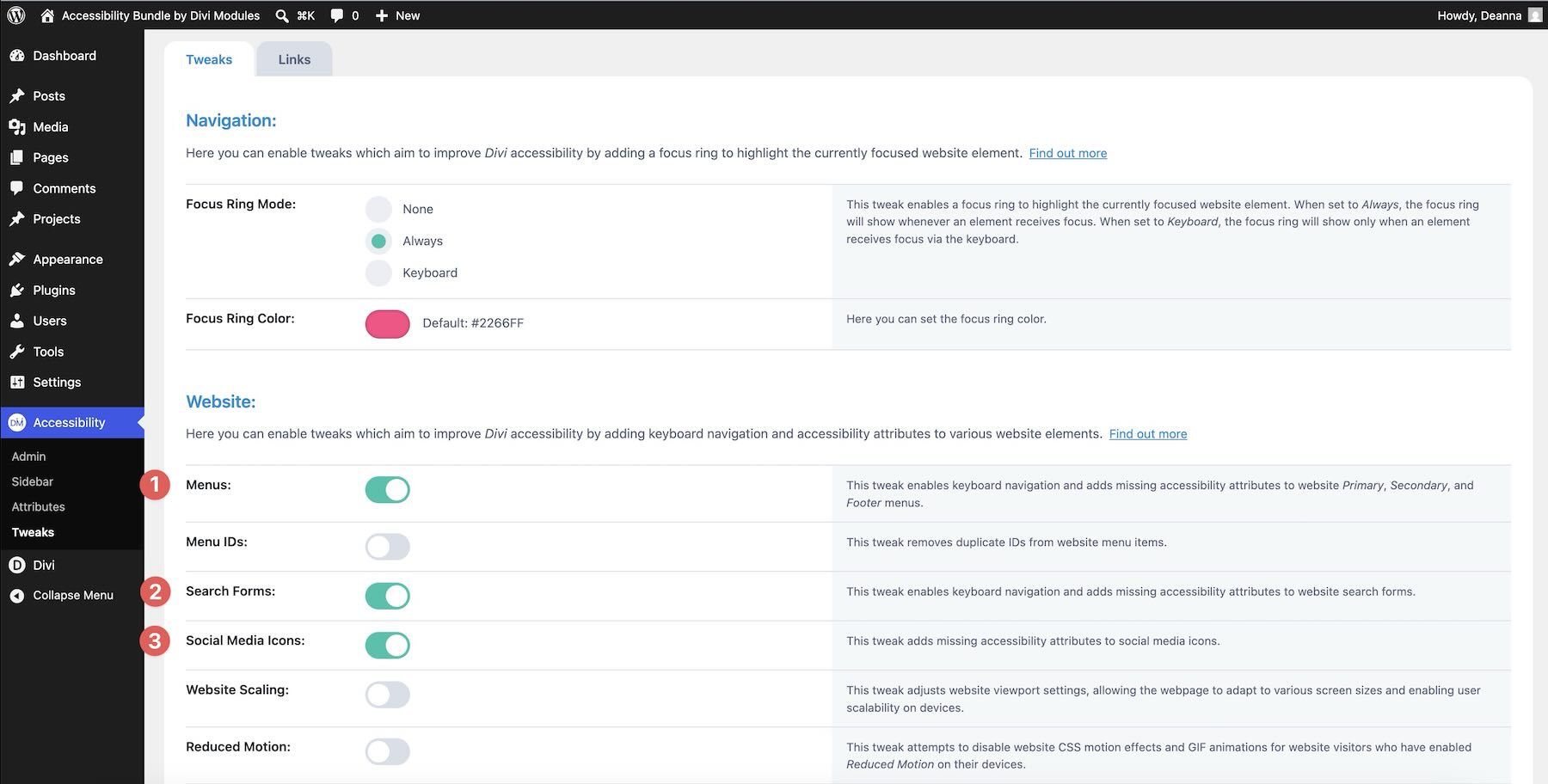
This section is also where Reduced Motion lives.
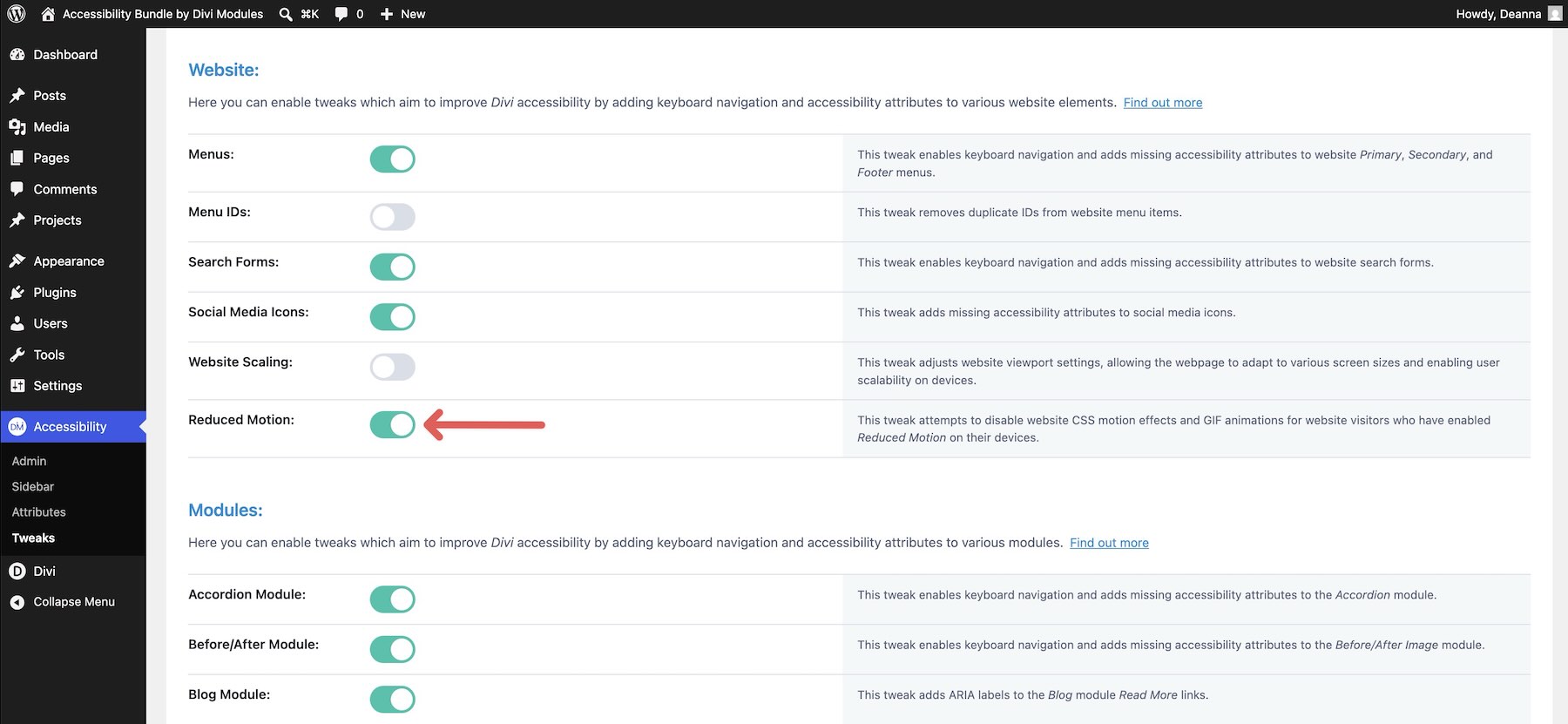
On a marketing page, counters, service cards, and scroll animations can add polish. But for visitors with motion sensitivity, too much animation can make a page uncomfortable. Reduced Motion lets the page respect visitors who prefer less motion.
The Website settings also include duplicate menu ID cleanup.
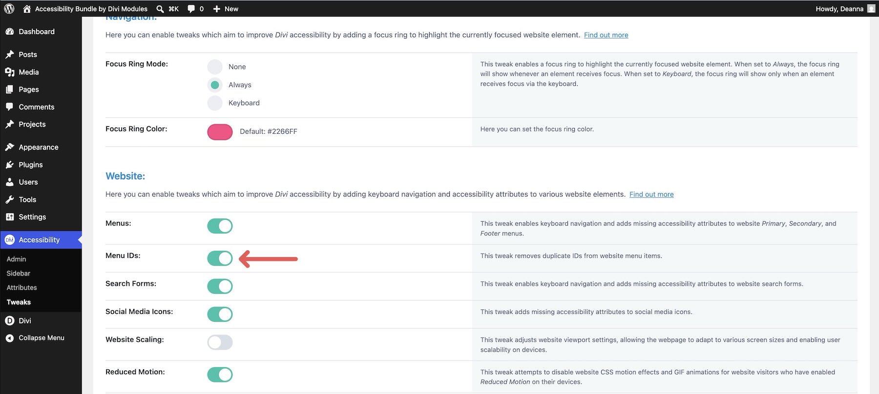
Duplicate IDs can create issues when assistive technologies rely on unique IDs to connect labels, descriptions, and controls. Cleaning them up helps prevent confusing or incorrect relationships.
Fixing Native Modules Automatically
The Modules tab applies supported fixes to Divi modules.
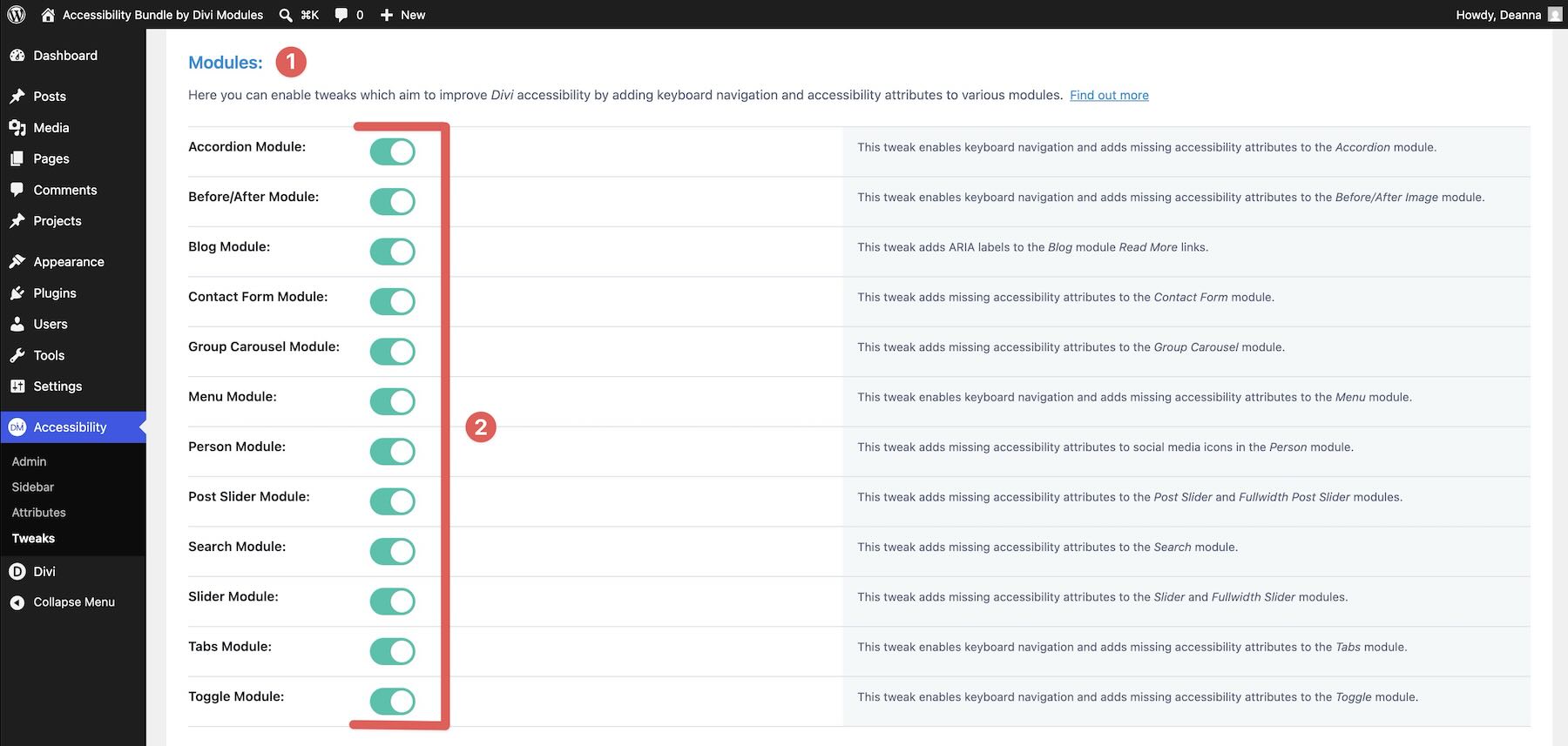
This is useful on pages that use interactive modules such as accordions, tabs, sliders, testimonials, or contact forms. If the page grows later, module-level tweaks can help keep common interactive patterns more usable without requiring a separate setup for every instance.
Refining Menu Behavior
If the page includes navigation, use the Menu settings to fine-tune tab order, arrow key behavior, and submenu handling.
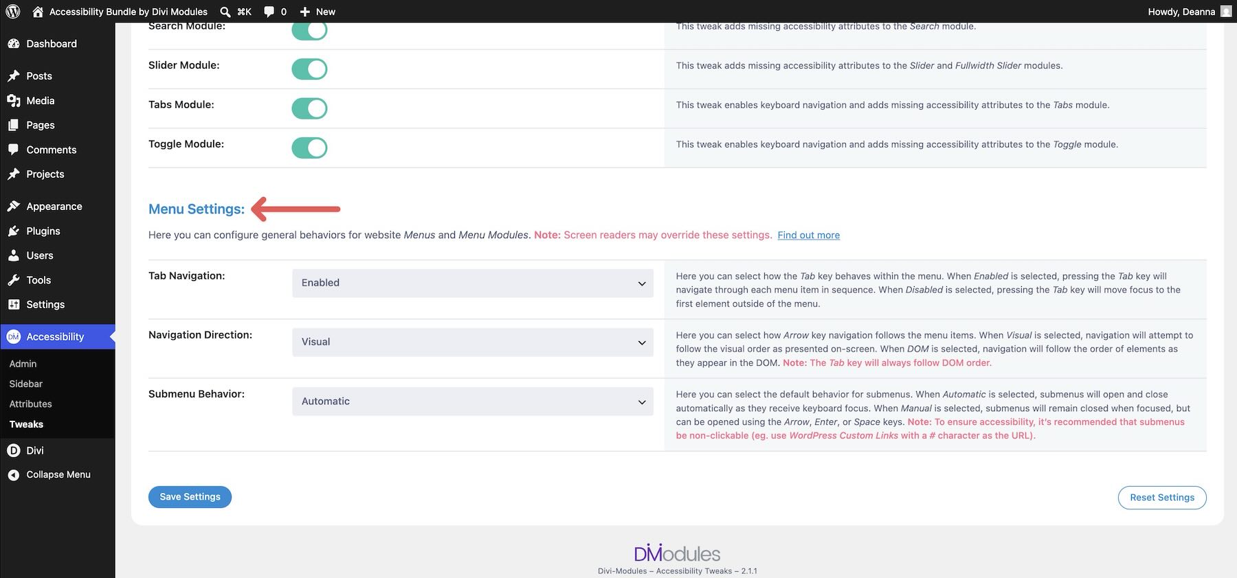
For example, you can adjust how dropdown submenus open, how arrow keys behave, and how menus close. Those details may feel small visually, but they make navigation much more predictable for keyboard users.
Adding Skip Links
Finally, open the Links tab and enable the skip links your layout needs, such as Skip To Content and Skip To Navigation.
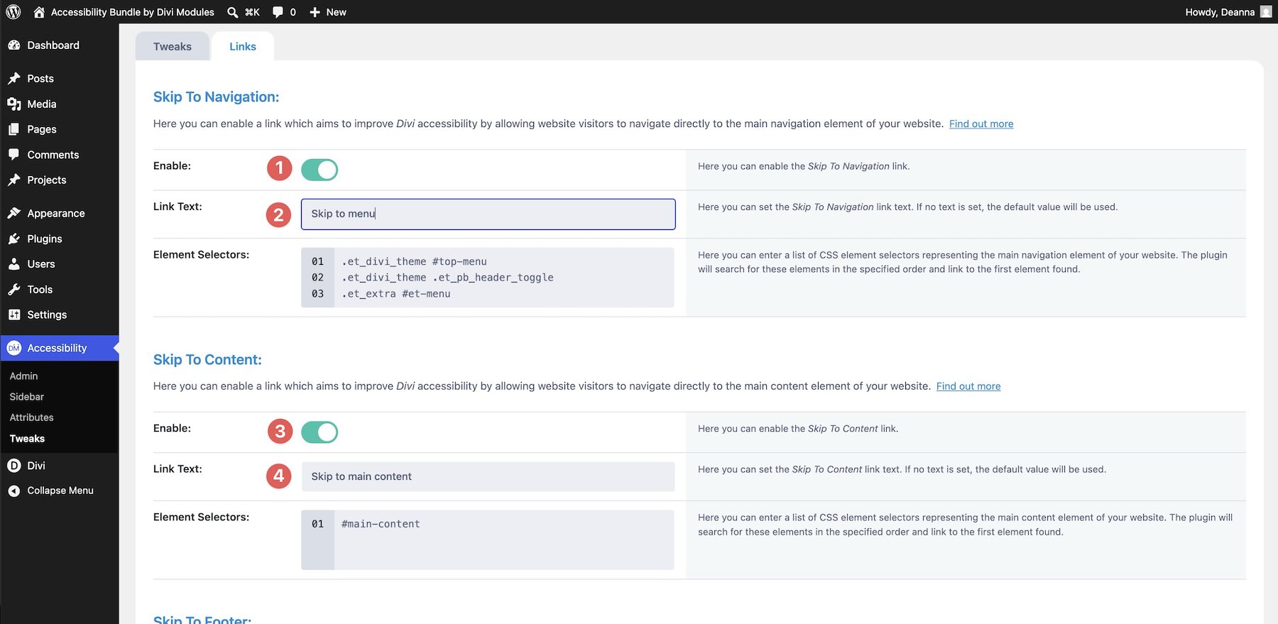
Use short, clear labels such as Skip to main content. You can set skip links to appear on focus so they do not change the page’s look for mouse users, while still giving keyboard users a fast way to bypass repeated areas.
Style the link background, border, and shadow so the skip link looks intentional when it appears.
The last plugin gives control directly to visitors. Instead of making every accessibility decision for them, the Sidebar lets visitors choose the adjustments that help them use the site.
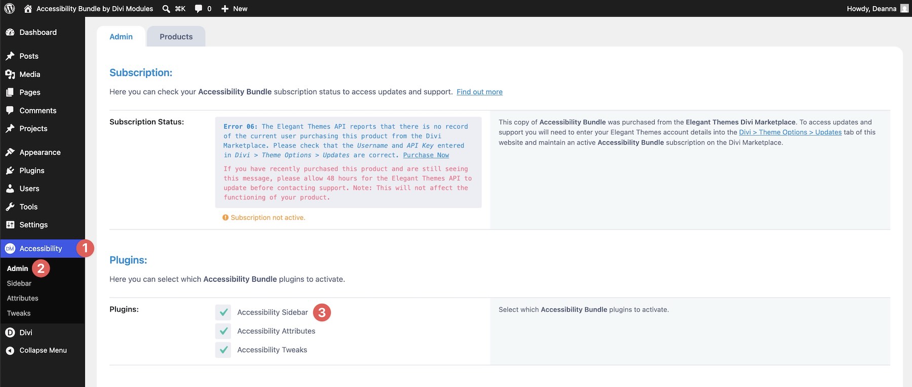
Enable Accessibility Sidebar in the Accessibility Bundle settings.
Configuring Sidebar Settings
Start with the sidebar’s general behavior. Visitors can configure the sidebar’s size and placement, and you can set defaults such as language, visibility, and where the sidebar appears.
This helps keep the sidebar from interfering with important page elements such as CTAs, logos, or fixed navigation.
Choosing Accessibility Profiles
In Accessibility > Sidebar > Features, start with the ready-made Accessibility Profiles.
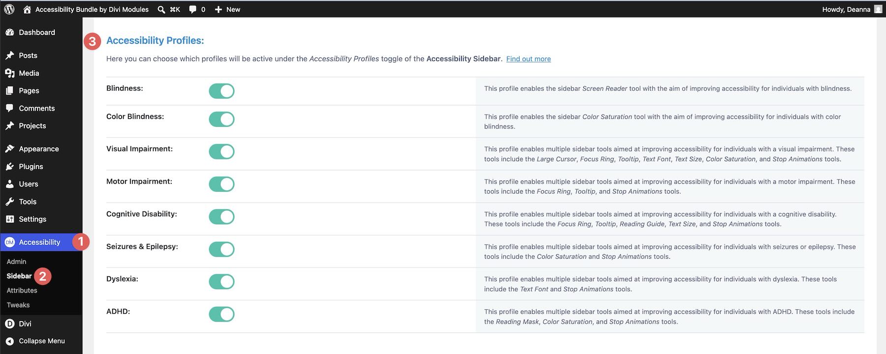
For a text-heavy marketing page, profiles such as Visual Impairment, Motor Impairment, Dyslexia, and Cognitive Disability can give visitors a useful starting point. Enabling a profile activates relevant tools, so visitors do not need to know which specific setting they need before they begin.
Visitors can then adjust individual tools further or hide the sidebar when they do not need it.
Layering In Individual Tools
Profiles are useful, but individual tools give visitors more precise control. Enable the Screen Reader tool for text-to-speech reading.
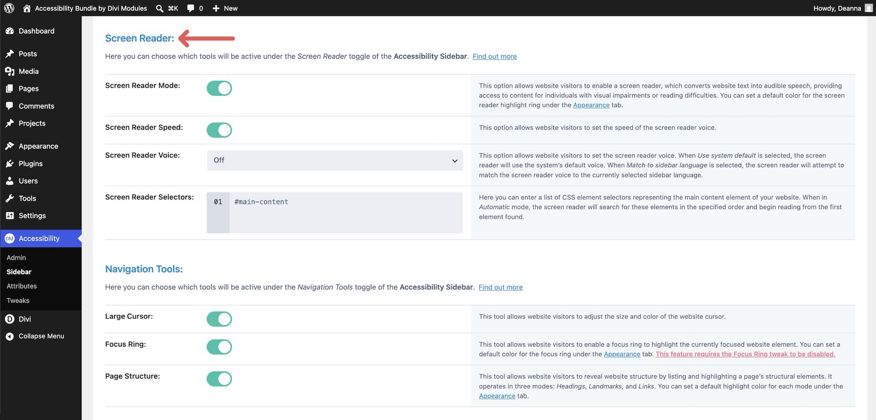
On a marketing page, this can be useful for longer testimonial quotes, service descriptions, or pricing details.
Enable Navigation Tools such as Large Cursor, Focus Ring, and Page Structure.
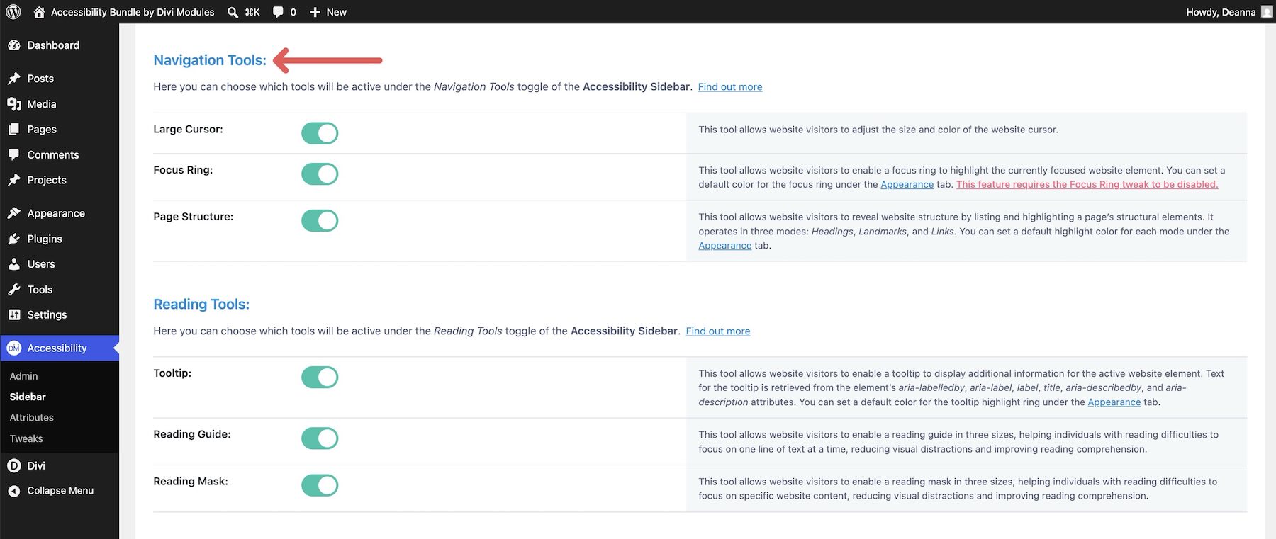
Large Cursor can make the pointer easier to track. Page Structure can give visitors a navigable outline of headings, landmarks, and links, helping them jump to sections such as pricing or testimonials without scanning the whole page.
Enable Reading Tools such as Tooltip, Reading Guide, and Reading Mask.
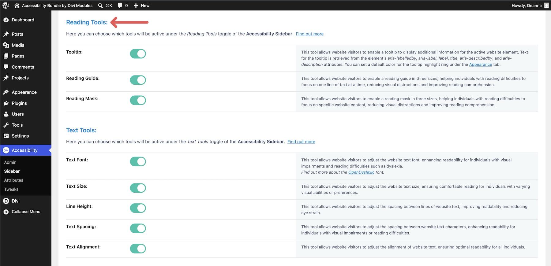
These tools help visitors focus on one line or section of the page at a time, which can be useful on text-heavy service pages, pricing tables, documentation pages, or long landing pages.
Enable Text Tools so visitors can adjust text font, size, line height, spacing, and alignment.
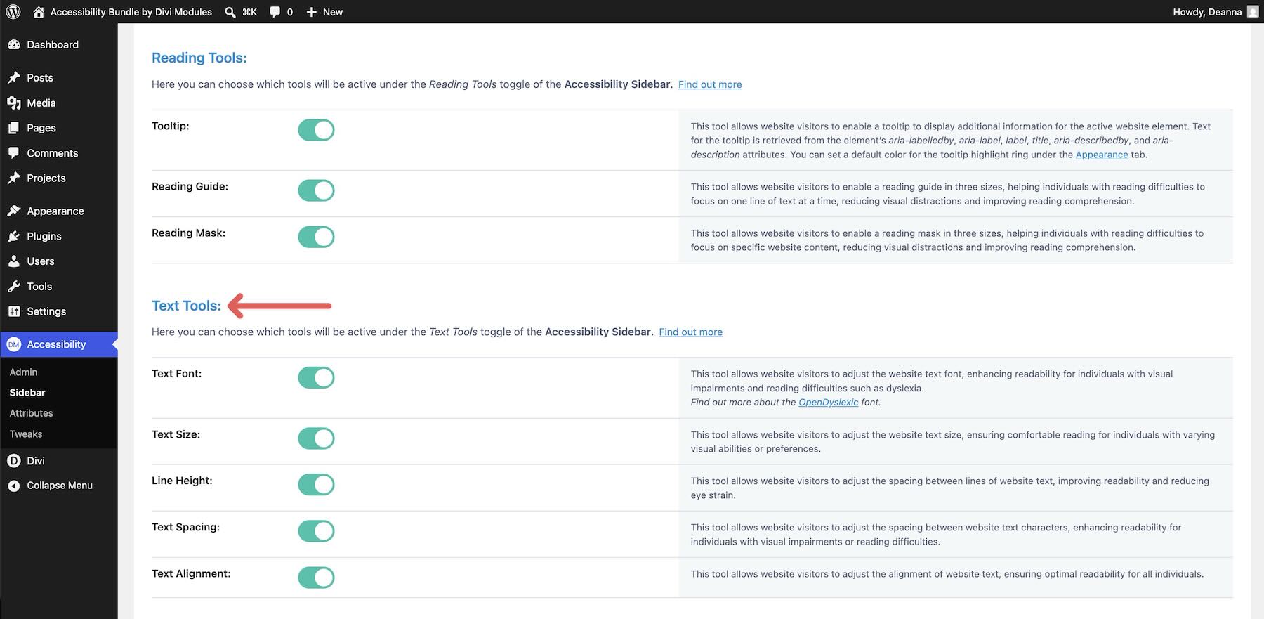
For dense pricing tables, service descriptions, or blog content, these controls can make reading more comfortable without requiring visitors to zoom the whole browser.
Enable Graphics Tools for saturation, contrast, image visibility, and animation control.
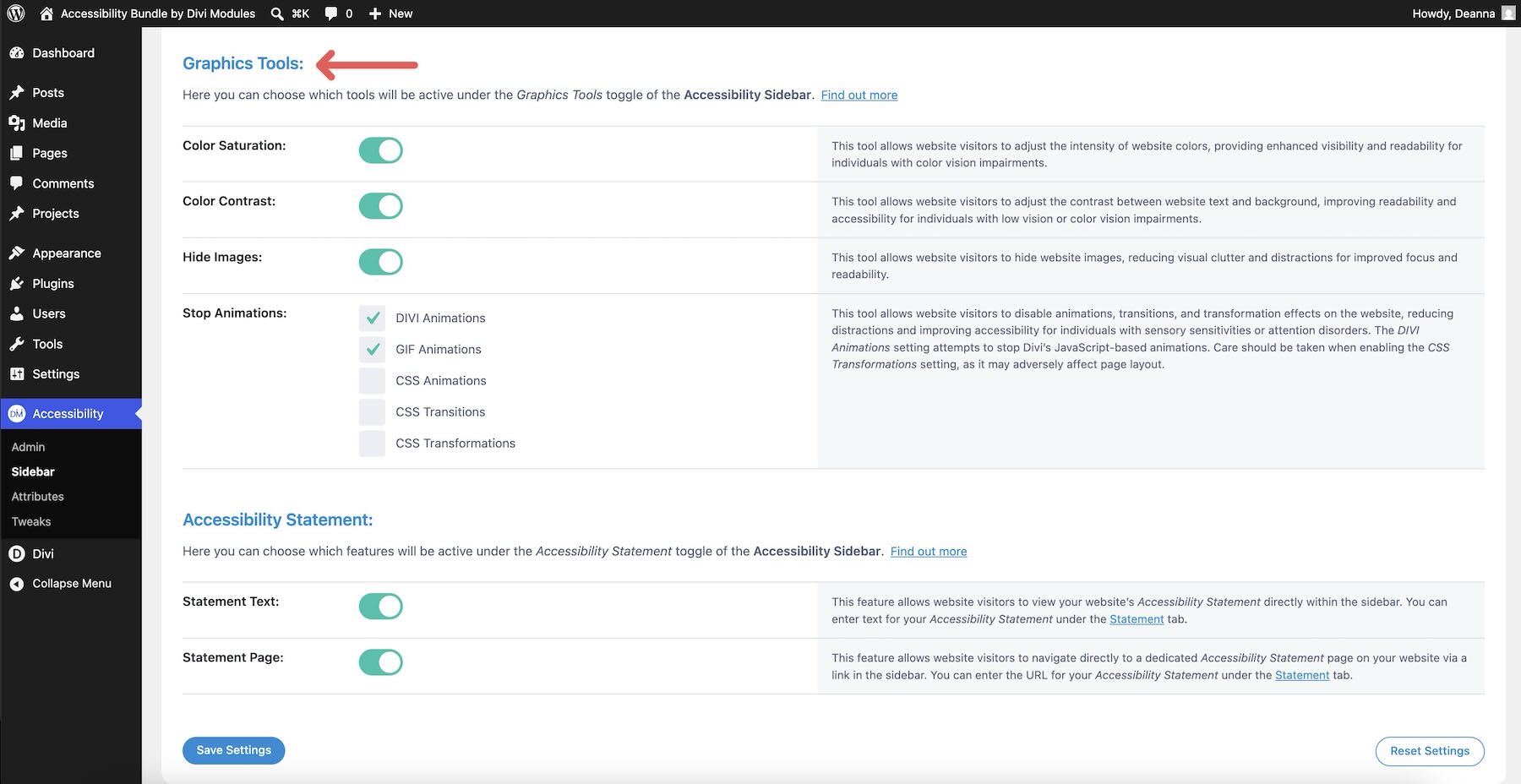
These tools can help visitors who need stronger contrast, lower visual intensity, fewer animations, or less image-heavy browsing.
Matching The Sidebar To Your Brand
Open the Appearance tab to style the sidebar, toggle button, position, size, icon, and highlight colors.
A well-styled toggle button tucked into the corner of the site can feel like a natural part of the interface instead of a plugin bolted onto the design.
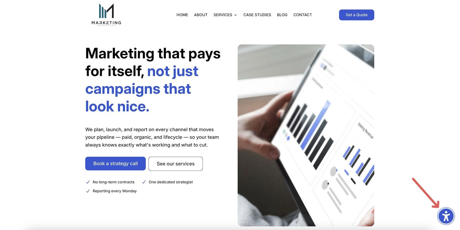
Most visitors may never open the Sidebar. But for visitors who need larger text, stronger contrast, reduced motion, line-by-line reading help, or a clearer page structure, those controls can make the site much easier to use.
Who The Accessibility Bundle Is For
The Accessibility Bundle is a strong fit for Divi users who want a more structured way to improve accessibility without managing several unrelated tools.
It is especially useful for:
- Freelancers and agencies who build client websites and need repeatable accessibility tools across projects.
- Site owners who want to improve usability without writing custom code for every accessibility enhancement.
- Businesses and organizations with content-heavy pages, service pages, pricing tables, forms, and navigation patterns that need better usability.
- Divi 4 users who want accessibility tools for existing sites.
- Divi 5 users who want to expand on Divi’s built-in Custom Attributes workflow.
- Teams managing multiple sites who need a consistent accessibility setup they can apply again and again.
The bundle does not replace careful design, semantic structure, content review, accessibility testing, or legal guidance when compliance matters. But it gives Divi users a practical toolkit for improving many common accessibility gaps from one ecosystem.
Make Accessibility Easier In Divi
The Accessibility Bundle brings three accessibility-focused plugins into one workflow.
Accessibility Attributes helps you add meaning to specific Divi elements. Accessibility Tweaks improves navigation, focus behavior, skip links, menu behavior, and supported modules at a broader level. Accessibility Sidebar gives visitors front-end tools to adjust the website for their own needs.
Because the bundle is compatible with both Divi 4 and Divi 5, you can use it on existing sites as well as new builds. It also pairs well with Divi 5’s Custom Attributes system, giving you both native attribute control and a more specialized accessibility toolkit.
If you build Divi websites for clients, run a content-heavy site, manage an ecommerce store, or simply want your pages to work better for more visitors, the Accessibility Bundle is worth exploring.
Get the Accessibility Bundle from the Divi Marketplace and start building Divi websites that are easier for more visitors to use.





Leave A Reply