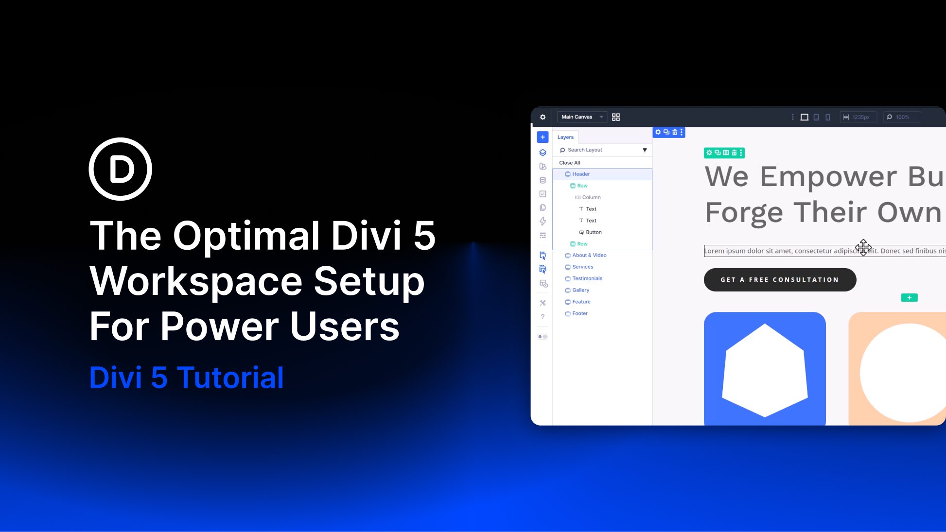

I some cases, keeping a sidebar on mobile can be a bit of overkill. Users are happy to scroll through relevant info on their tablets and phones (to a point). But when you have a significant amount of sidebar content after the main content of the page, users may never reach the footer, which usually consists of some important calls to action. That’s why it is important to optimize the sidebar on mobile.
In this tutorial, we are going to go over ways you can use the Divi Theme Builder to optimize your sidebar on mobile display. Here are some of the things we will cover in this article:
- How to Create a Template with a Sidebar
- Creating Sidebar Content Using Divi Modules and WordPress Widgets
- Using Multiple Widget Areas to hide/show certain widgets on mobile
- Controlling the Spacing Between Sidebar Content on mobile
- Hiding Sidebar Content Completely on Mobile
- Hiding Some Sidebar Content on Mobile
- Hiding Elements within Modules to Minimize Content on Mobile
- Making Sidebar Content Responsive by adjusting text size and spacing
- How to Change the Stacking Order of the Sidebar on Mobile
Let’s get started.
Sneak Peek
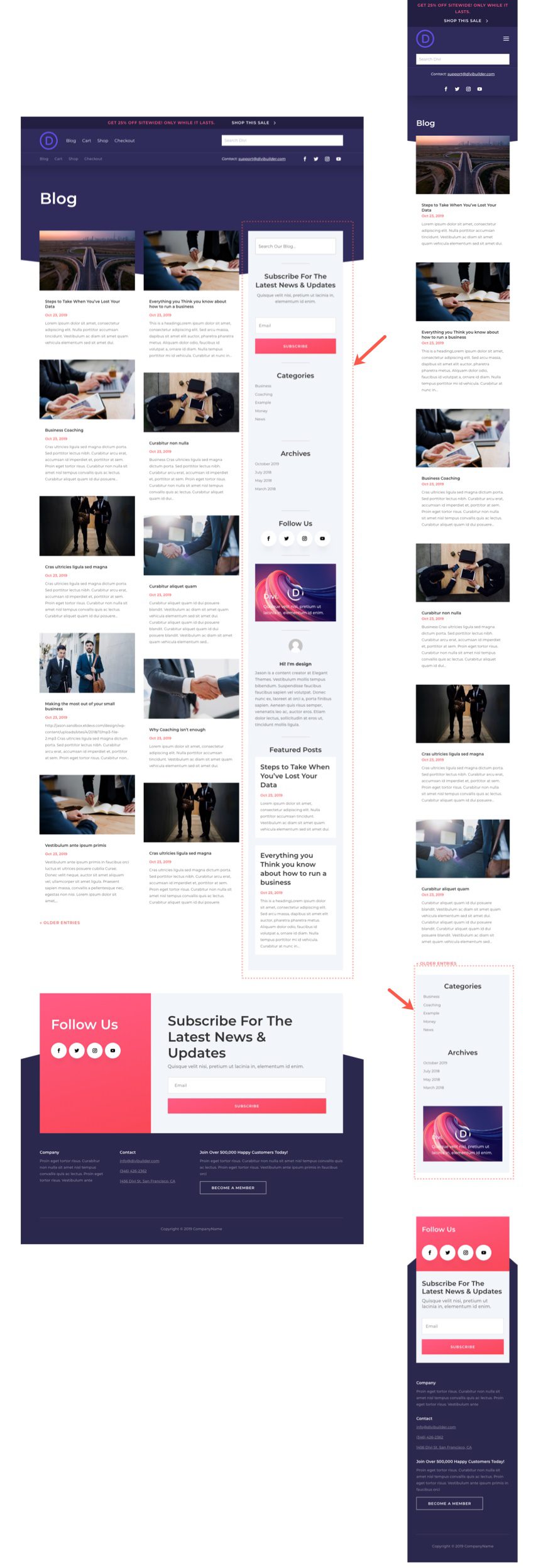
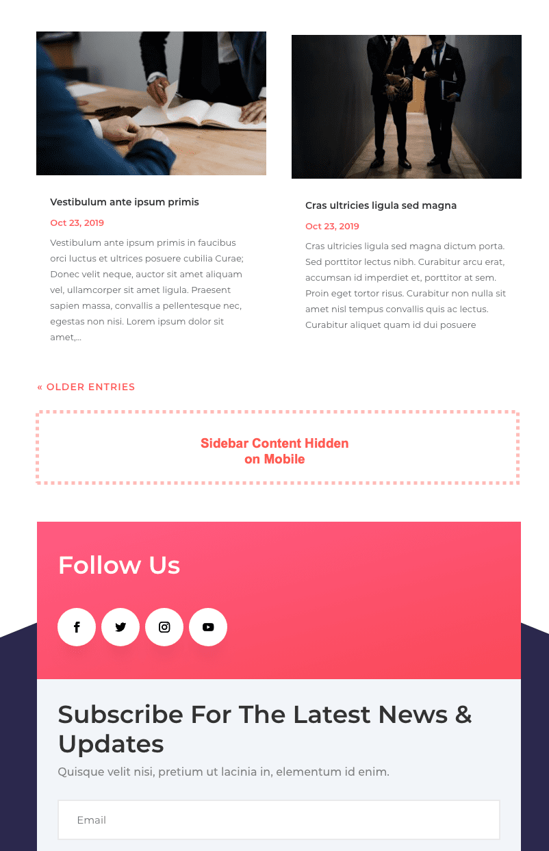
Here is a quick look at the Sidebar layout on Desktop and how it has been optimized for mobile display.
To lay your hands on the template from this tutorial, you will first need to download it using the button below. To gain access to the download you will need to subscribe to our newsletter by using the form below. As a new subscriber, you will receive even more Divi goodness and a free Divi Layout pack every Monday! If youíre already on the list, simply enter your email address below and click download. You will not be ìresubscribedî or receive extra emails.

Subscribe To Our Youtube Channel
To import the layout to your page, simply extract the zip file and drag the json file into the Divi Builder.
Letís get to the tutorial shall we?
What You Need to Get Started
To get started, you will need to install and activate the Divi Theme. Make sure you have the latest version of Divi.
You will also need some posts/pages created for testing purposes in order for the page content to actually show results.
After that, you are ready to go.
Before we start optimizing our sidebar on mobile, we need to get a working model up and running first. We are going to build our sidebar on a page template using the Divi Theme Builder. This will help us gain a better understanding of what it involved in building a sidebar in Divi so that we can better understand how to optimize it on mobile.
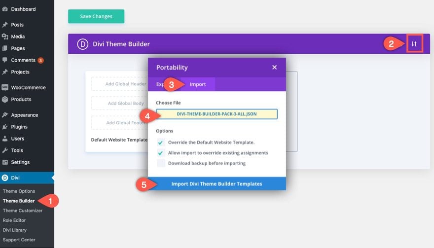
Importing Divi Theme Builder Pack #3
To get things started, we are going to use the Divi Theme Builder Pack #3 to jumpstart our site design. Then, we are going to use one of the templates to add the sidebar we will optimize for mobile.
Once you download the pack, unzip the folder.
From the WordPress Dashboard, navigate to Divi > Theme Builder. Then click the portability icon at the top right menu on the page. From the portability modal, select the import tab and choose the divi-theme-builder-pack-3-all.json file from the folder you downloaded earlier. Then click the import button.
Important: Please use a test site with a fresh install of Divi so that you don’t override live content on your website or break something.
You will see all the templates have been imported to the theme builder.
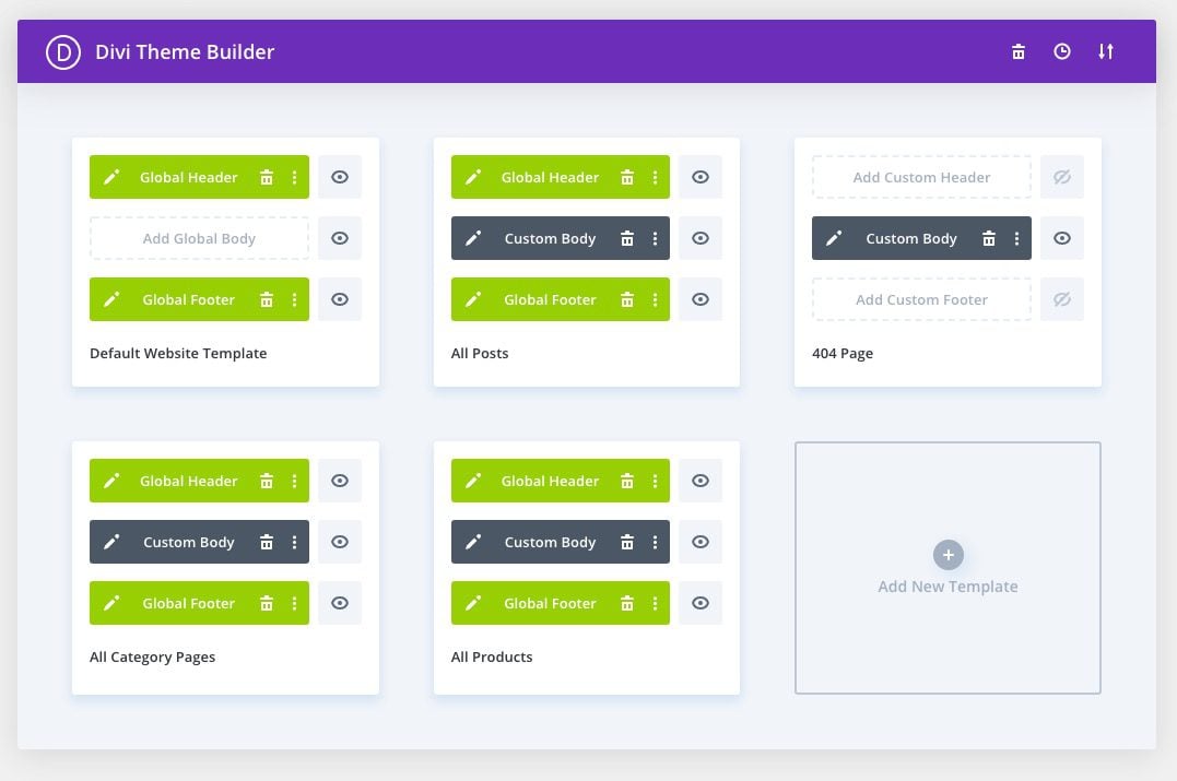
Building the Sidebar Layout inside the Category Page Template
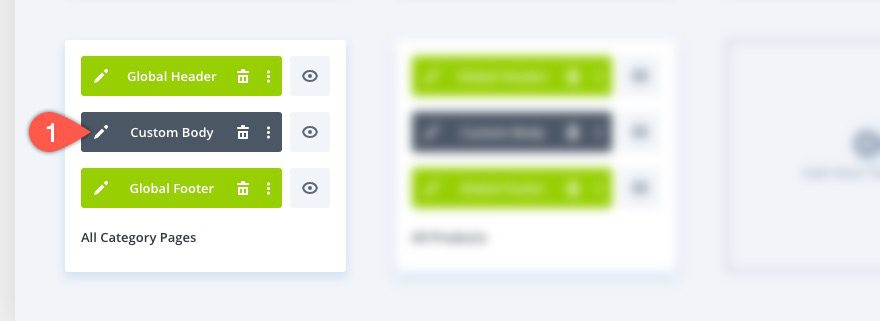
Find the All Category Pages Template and click to edit the custom body layout.
The current layout of the page uses a one column row for the main content area of the page. We will need to change this to a sidebar layout structure. To do this, click the “Choose Layout” icon on the row menu of the second row and choose the two-thirds one-third column layout structure.
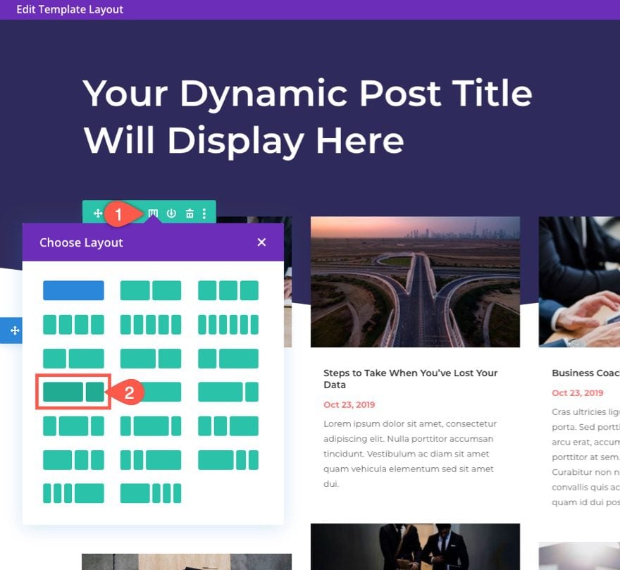
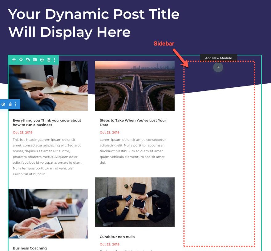
Now you will have an area on the right side for your sidebar.
NOTICE: I’m not using a specialty section for this sidebar layout. Specialty sections are not required when creating a sidebar layout for your page, however, if you want to keep separate row functionality for the main content area, you will want to use a specialty section.
We won’t be concentrating too much recreating the exact design of the modules in this tutorial. Instead, we are going to concentrate on those elements that will help optimize the sidebar on mobile.
That said, we do need to add a background color and padding to the sidebar column.
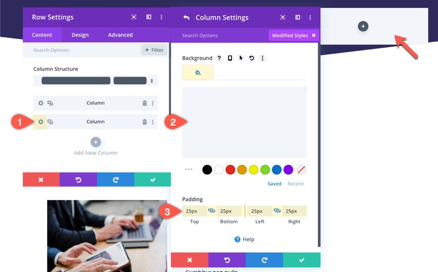
Sidebar Column Settings
Open the settings for the column designated for the sidebar and update the following:
- Background-color: #f2f5f9
- Padding: 25px top, 25px bottom, 25px left, 25px right
Creating the Sidebar Content with Divi Modules and WordPress Widgets
Sidebar content will vary according to the needs of a website. However, if we are talking about a blog site, typically you will find some combination of the following sidebar content elements:
- Author Info (name, pic, bio)
- Social media follow buttons
- Email opt-in
- Links to Products and/or services
- Ads
- Categories
- Recent/Popular posts
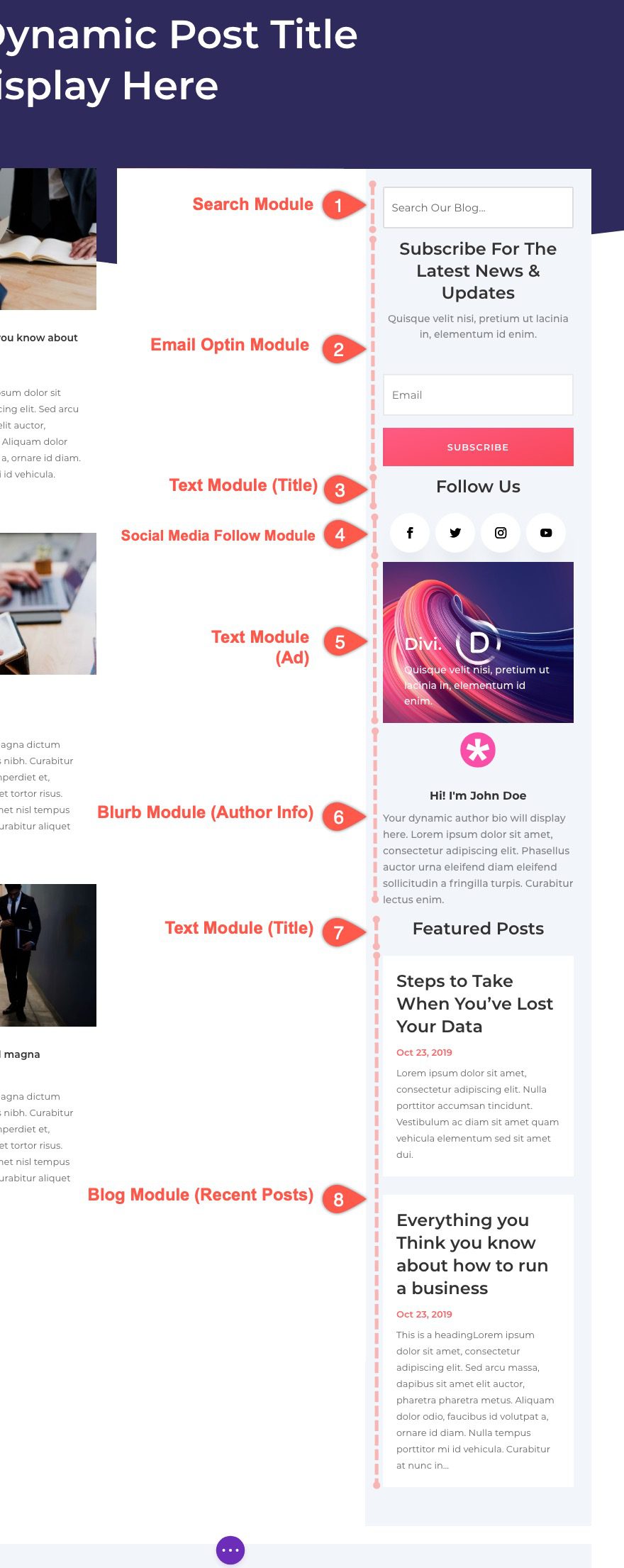
Creating these elements in Divi can be done using a combination of Divi Modules. For this example, we will add the following Divi Modules to build our Sidebar Content.
- Search Module – This will serve as the search form.
- Email Optin Module – This will serve as the email optin form.
- Text Module – This will be the title of the Social Media Follow buttons
- Social Media Follow Module – This will showcase the social media follow buttons.
- Text Module (with bg image) – This will serve as an example Ad for the sidebar.
- Blurb Module (with author content) – This will serve as the Author Info area of the sidebar.
- Text Module – This will serve as a title for the blog module below it.
- Blog Module – This will serve as a recent/featured posts content on the sidebar.
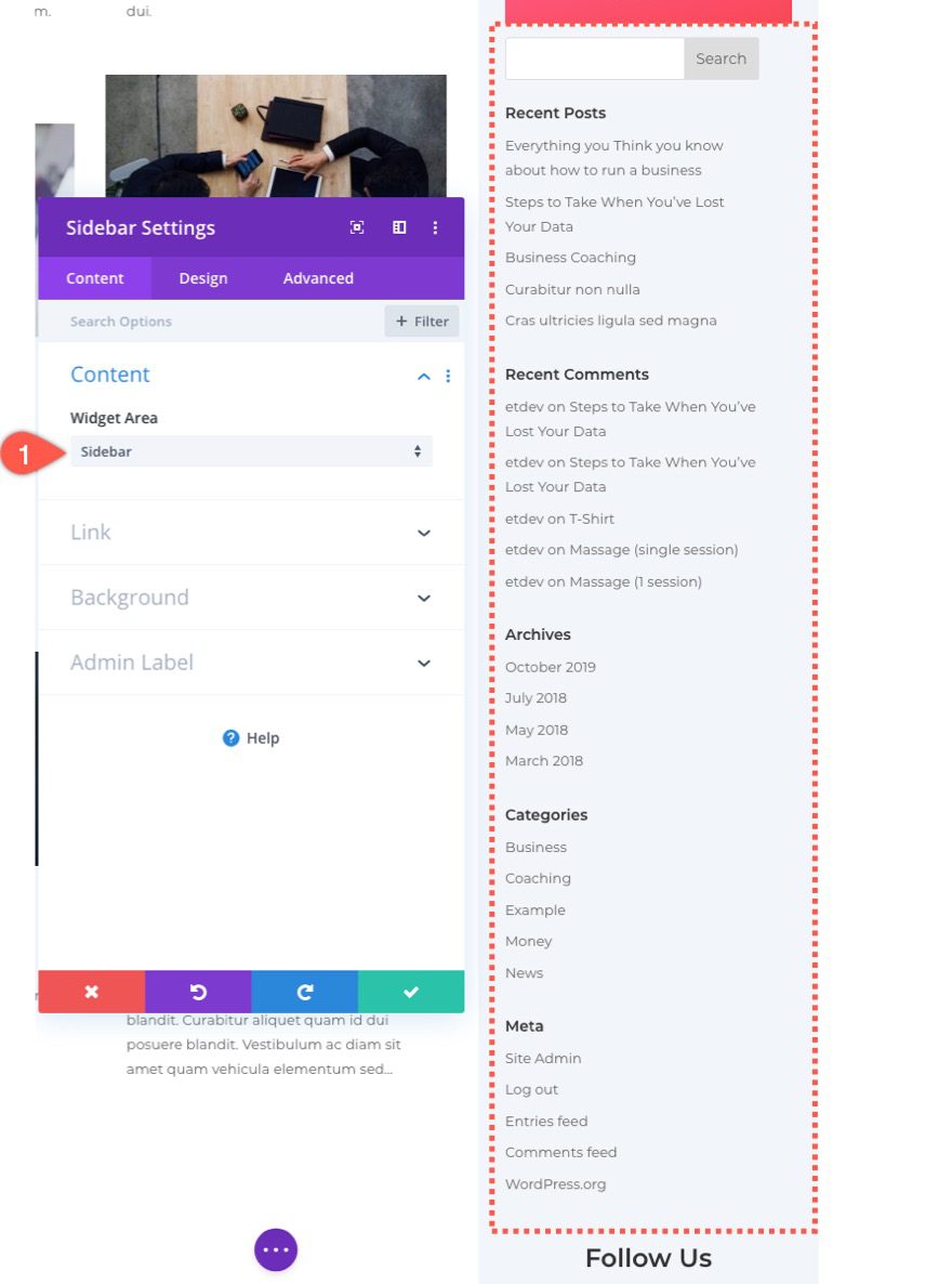
Pulling in WordPress Widgets Using the Sidebar Module
If you aren’t already familiar, Divi has a sidebar module that allows you to pull in widget area content (or widgets) to your Divi Sidebar area. In fact, this template is already using the sidebar widget in the row directly below the one we are working on.
Drag the sidebar module from the row and place it right below the email optin module.
Then open the sidebar module settings. You will see that the module is pulling in the sidebar widget area which should look like the following if you have the default setup in WordPress.
Using Multiple Widget Areas
Right now the “Sidebar” widget area is display multiple widgets because there are multiple widgets inside the Sidebar widget area. But, you can actually gain more control over your Divi’s sidebar design by using multiple widget areas that contain a single widget. Using multiple widget areas will give you more control over the design of your widgets as well as the visibility of widgets on mobile.
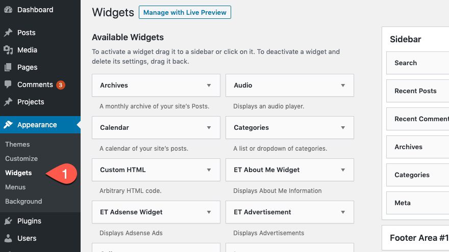
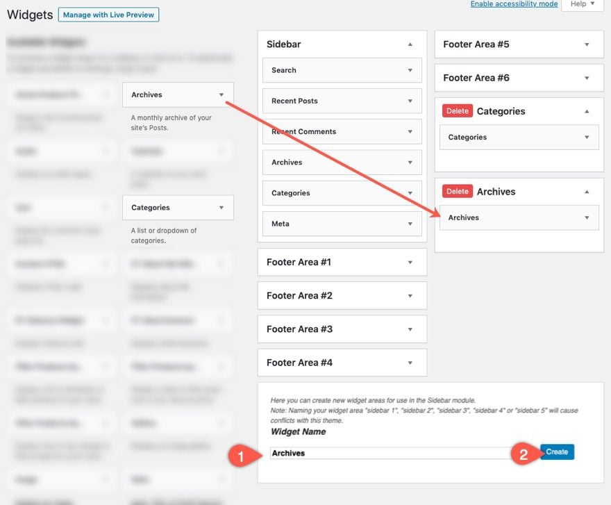
To create multiple widgets, open a new tab and head over to the WordPress Dashboard. Navigate to Appearance > Widgets.
Create a new Widget Area by entering a name and clicking the Create button. Since this widget area will be where we add the Categories widget, let’s name the area “Categories”. Refresh the page to see the widget area. Then drag the Categories widget over to the Categories Widget Area.
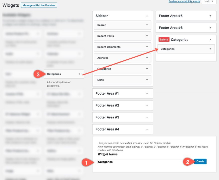
Repeat the process to create a new widget area named “Archives”. Then drag the Archives Widget into the Archives widget area.
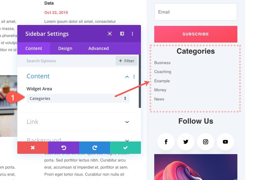
Go back to the Category Pages Template with your sidebar layout and update the Sidebar Module content to display the Categories widget area.
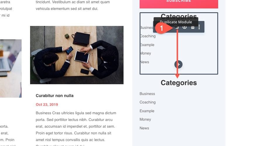
Duplicate the sidebar module (to keep the design)
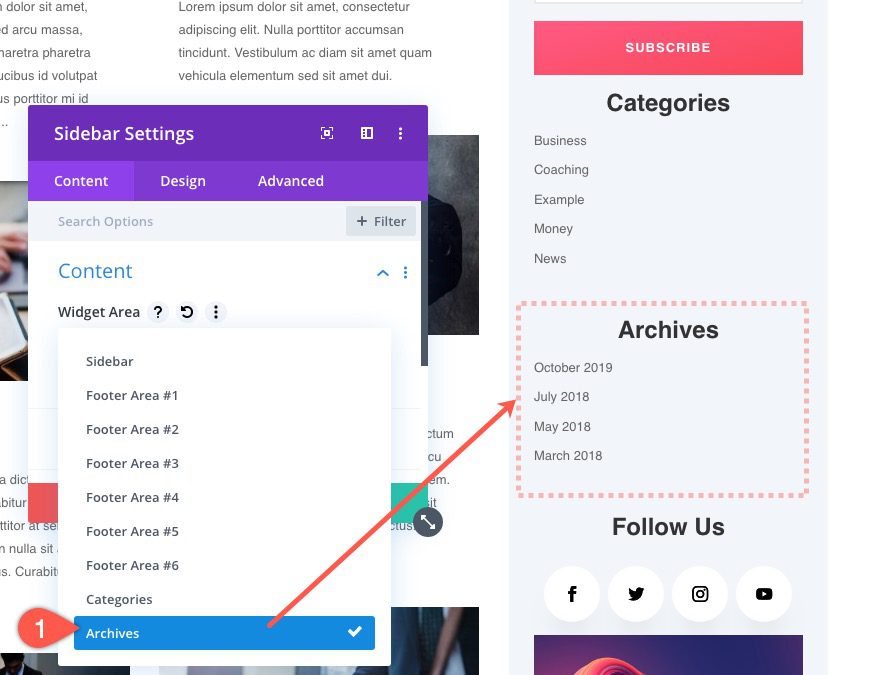
Update the duplicate sidebar module to pull in the Archives Widget Area.
Taking Control Over the Spacing Between Sidebar Modules
Currently the Row that contains the sidebar has a gutter width value of 2. This means that there will be default bottom margin/spacing between each module inside the sidebar. To gain more control over this spacing, we can delete the bottom margin of all module in the sidebar column. To do this, open the search module settings and update the following:
- Margin Bottom: 0px (desktop), 15px (tablet)
Then click the More Settings icon (or right click menu) on the margin option. Then select “Extend Margin”.
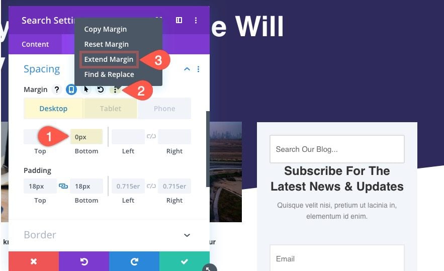
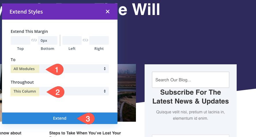
In the Extend Styles Module, update the options to extend the margin to “All Modules” in “This Column”.
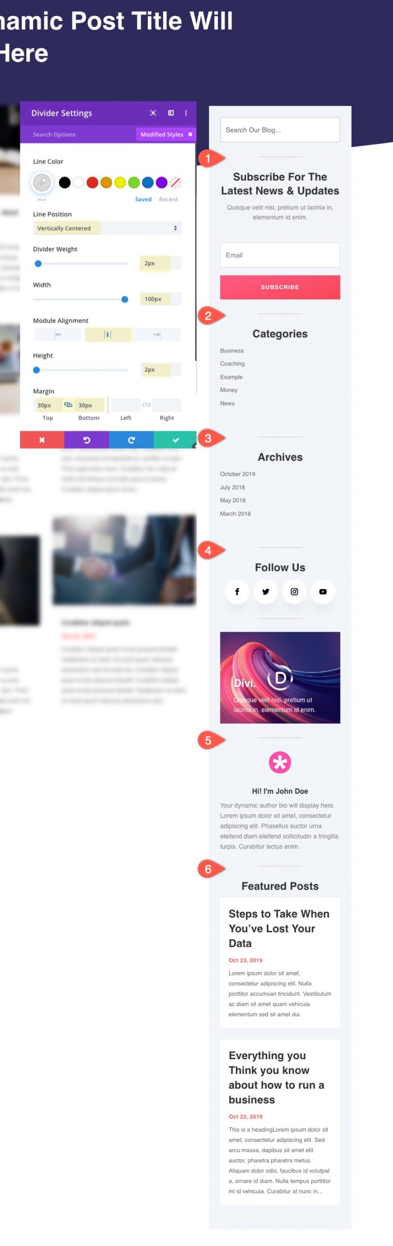
Then we can add spacing between the modules using divider modules.
Hiding the Sidebar on Mobile
Sometimes, you may want to hide the sidebar completely on mobile. To do this, you will need to disable the visibility of the column containing the sidebar on tablet and phone.
Open the row settings and open the settings of the column designated for the sidebar. Then update the visibility as follows:
- Disable On: Tablet, Phone
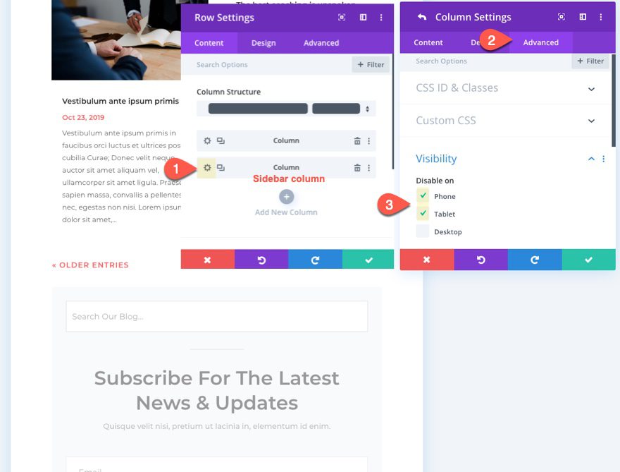
This will hide the entire sidebar on tablet and mobile display.
Hiding Some of the Sidebar Content on Mobile
On desktop, you may have room to keep most (or all) of the sidebar content without it becoming too much of a distraction from the content. But on mobile, the user will need to scroll through a lot of sidebar content that he or she may have little interest in seeing. So, when building your sidebar in the Divi Theme Builder, take advantage of the visibility options to disable some of the sidebar elements on mobile display. And, if you are using WordPress widgets for sidebar content, create multiple widget areas to help design and hide certain widget on mobile as well.
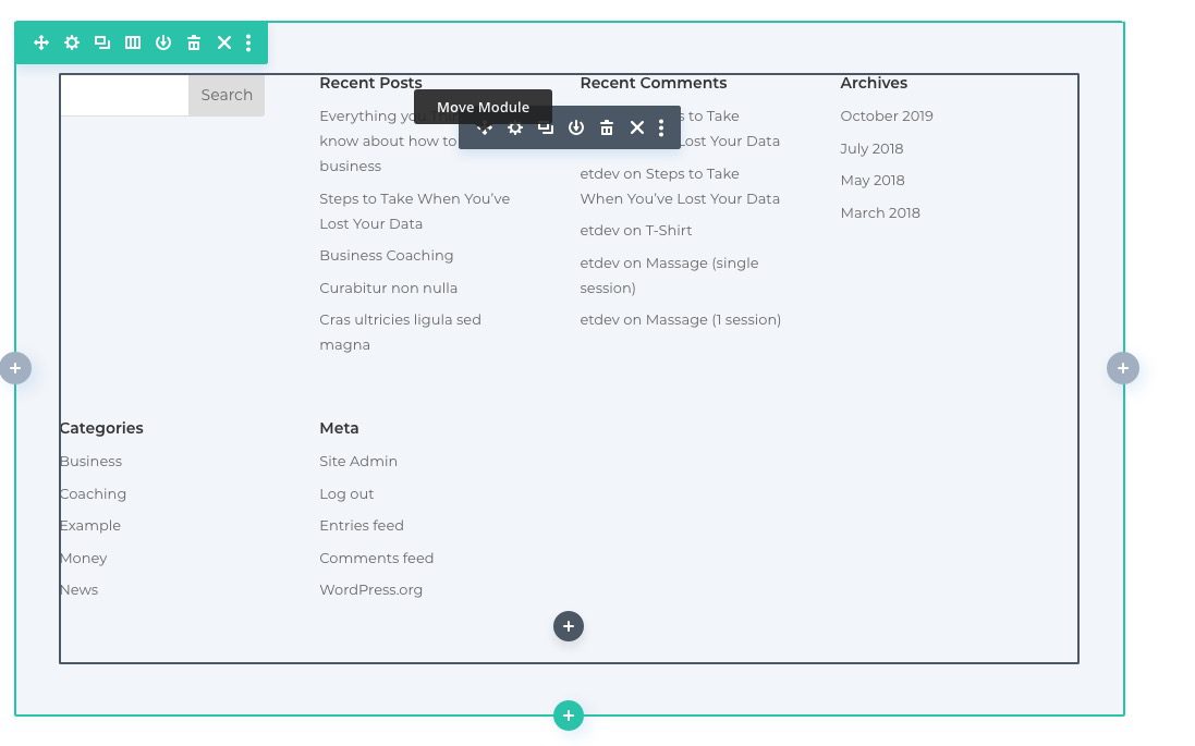
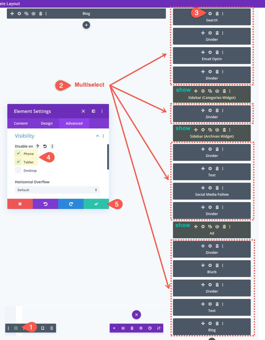
To hide modules on mobile, open the wireframe view module, then use Divi’s multiselect feature to select all of the modules you want to hide/disable on tablet and phone. Then open the settings for one of the selected modules and update the following:
- Disable On: Phone, Tablet
In this illustration, we have hidden all modules (including the dividers) except for the two sidebar modules (containing the categories and archives widgets) and the text module (containing the Ad) on tablet and phone display. To say it another way, only the categories, archives, and ad will show on mobile.
Previewing the Results on a Blog Page
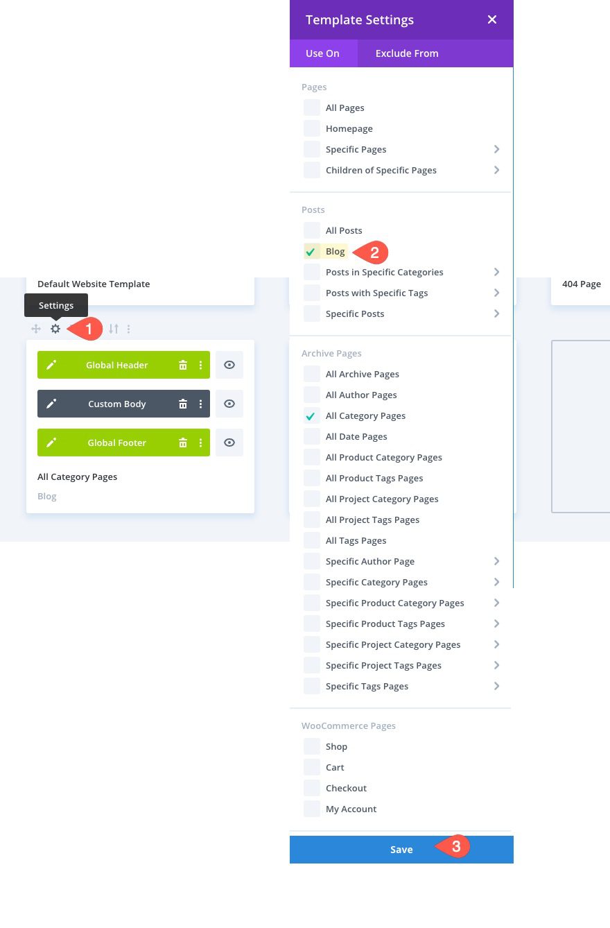
Before we see the results on the live page, let’s assign it to the blog page of the site first. To do this, click the gear icon above the template, select the Blog from the list, and save it.
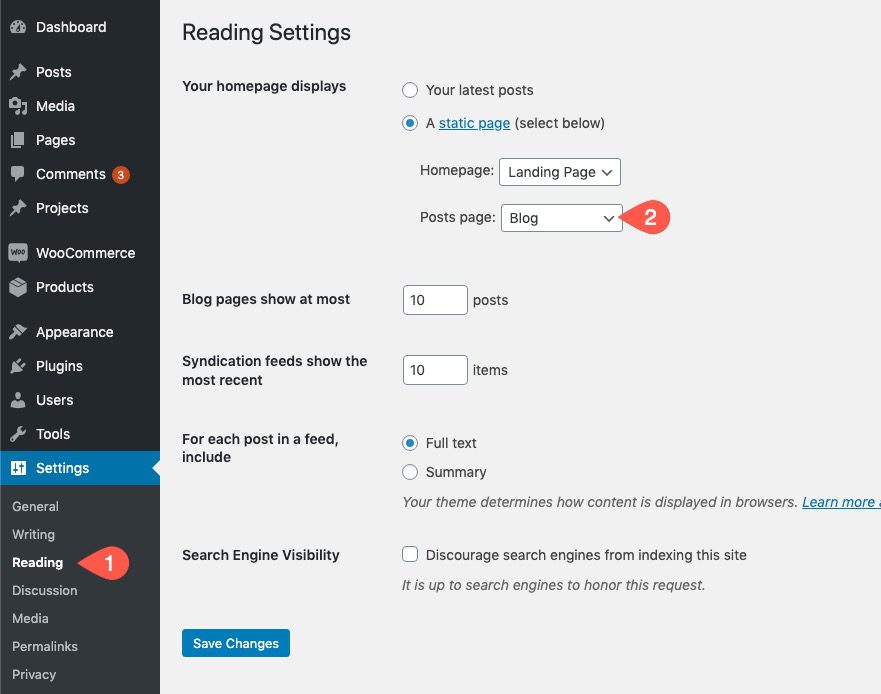
Make sure you have a posts page selected under Appearance > Reading.
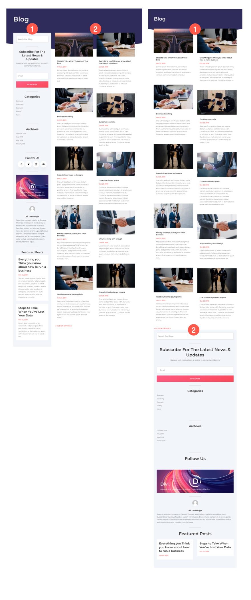
Results
Here is the difference between the desktop sidebar and the mobile sidebar. Notice how the mobile sidebar has lesson content.
Avoiding Duplicate Sidebar and Footer Content on Mobile
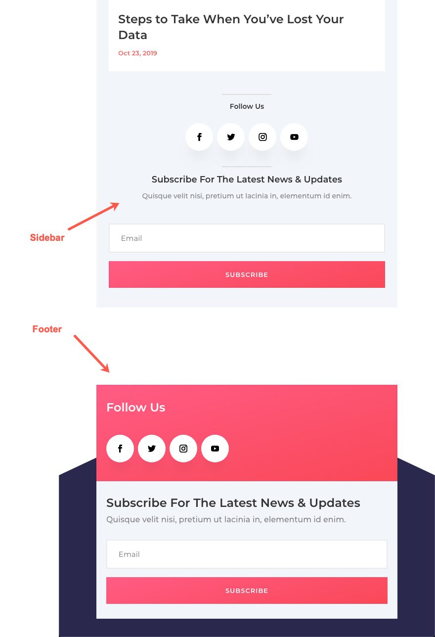
On Desktop, you can get away with adding duplicate content in your sidebar and footer. In fact, this is a good way to increase conversions. For example, on desktop, it makes sense to include an email optin module at the top of your sidebar and inside the footer so users can see the email optin while reading the content of the post as well as at the end of the post. However, on mobile, there isn’t a sidebar layout. Everything is displayed in one column (maybe two). Right sidebars stack under the post/page content and left sidebars stack on top of the post/page content. So, if a sidebar email optin module stacks under the post/page content, the user could scroll through more than one email optin module (one in the sidebar and one in the footer). Furthermore, if there is email optin at the bottom of the right sidebar and one at the top of the footer, the user will scroll through two consecutive email optins on mobile.
Hiding Elements within Modules to Minimize Content on Mobile
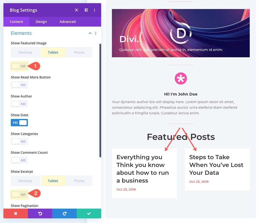
You may decide that hiding an entire module on mobile isn’t necessary. Instead, you can minimize the module content by hiding certain elements only on mobile display.
For example, you may want to show the featured image and excerpt of featured posts on the desktop sidebar. But, on mobile, you can hide the featured image and the excerpt to create a minimized version of the content.
Making Sidebar Content Responsive
You may decide to keep all of the sidebar content on mobile display. Why not? If you have valuable info that you know users will appreciate, by all means, keep it. However, you will want to take steps to make sure the sidebar content is responsive. Meaning, you will want to adjust the size and spacing of the elements to fit smaller screens. This will cut down on the scrolling distance of the page and make the content easier to read.
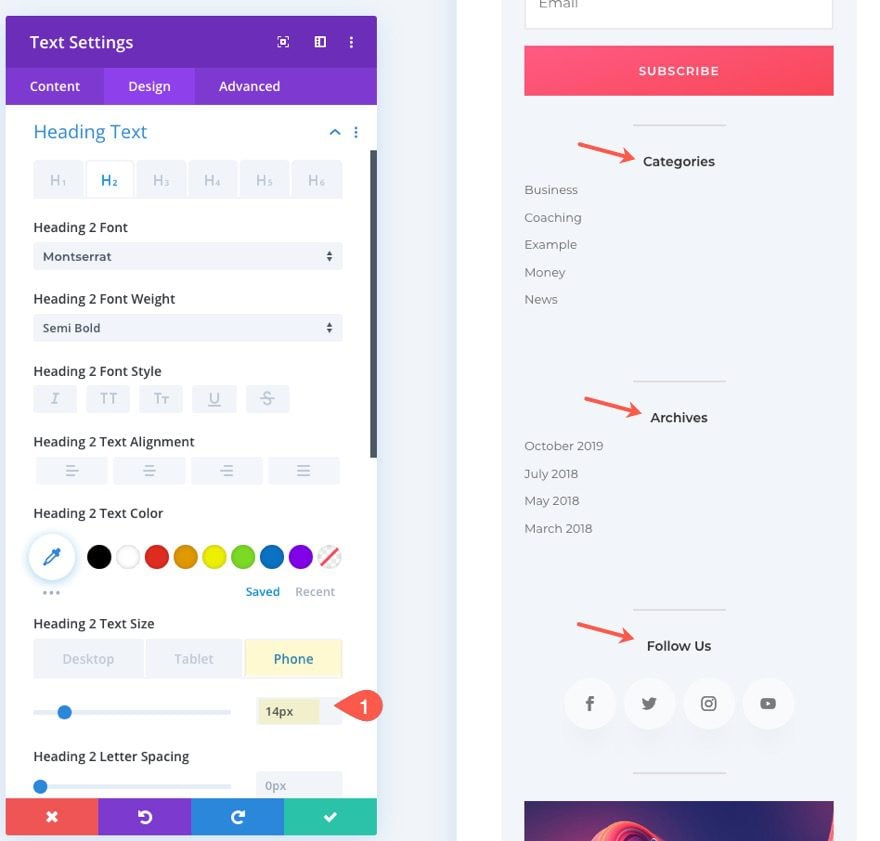
Adjust Text Size on Mobile
One easy way to minimize vertical spacing and improve readability on mobile is to adjust the text size of the module content in the sidebar. For example, you can adjust the heading text from 24px on desktop to 14px on mobile.
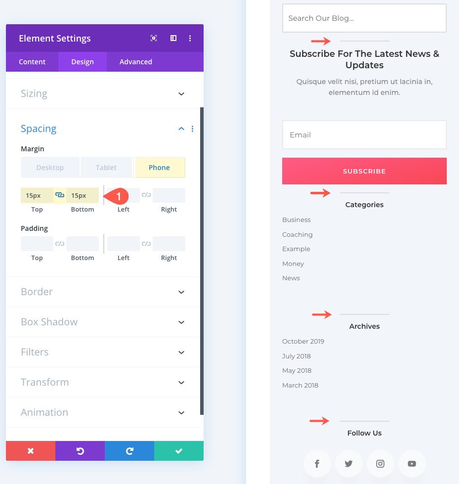
Adjust Spacing/Dividers on Mobile
In this example, we added dividers between the modules to create space. However, we can use Divi’s Divider settings to adjust the spacing of those dividers on mobile. This will cut down on wasted space when scrolling.
For example, you could change the Divider’s top and bottom margin from 30px to 15px on tablet and phone.
Changing the Stacking Order of the Sidebar on Mobile
Stacking order is a common problem with sidebars. This is especially true for left sidebars. As I mentioned earlier, right sidebars stack under (or after) the post/page content and left sidebars stack on top of (or before) the post/page content. This means that when you view a page with a left sidebar on mobile, the first thing a user will see is the sidebar content, instead of the main content of the post/page. This is not good for UX. To fix this, you can either hide the sidebar altogether or you can change the stacking order so that the left sidebar falls below the post/page content on mobile.
To change the stacking order of a left sidebar to stack under (or after) page content on mobile, open the row settings of the row containing the sidebar layout. Then add the following custom CSS to the Main Element:
 display: -webkit-flex;
display: flex;
-webkit-flex-wrap: wrap;
flex-wrap: wrap;
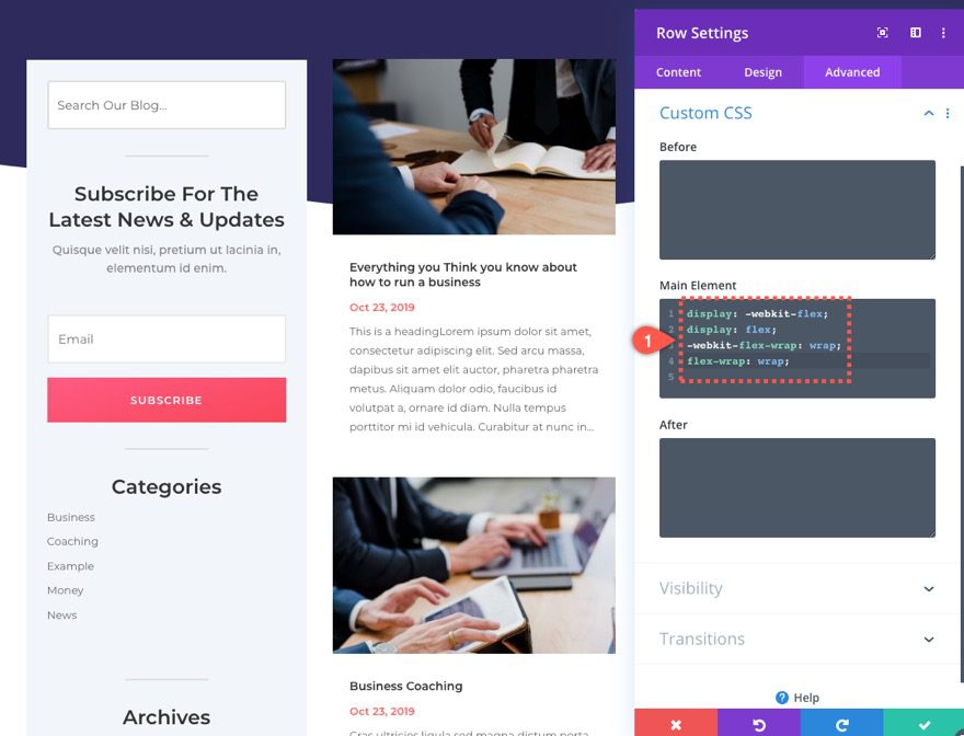
Then open the column settings of the column designated as the sidebar and add the following custom CSS to the Main Element Tablet display:
order: 2;
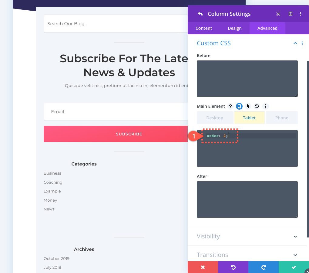
If you haven’t guessed, this little snippet changes the order from the default value (“1”) to the value of “2” which causes the entire column/sidebar to stack under/after the column containing the main content.
Final Thoughts
Sidebars continue to be a familiar space to users that provide helpful secondary content as they engage with the main content of a page. However, the same sidebar content on mobile can become a distraction. Hopefully, this post has inspired you to give your sidebars the attention they deserve on tablets and phones. This may mean that you hide the sidebar completely, show only some sidebar content, or simple optimize the existing content specifically for mobile display.
The sidebar that was built for the template in this tutorial was designed using the existing design elements found in the theme builder layout pack #3. If you like the design of this template with the sidebar, feel free to download it above to take a closer look.
For more info, check out this guide to using sidebars with the Divi Theme Builder.
I look forward to hearing from you in the comments.
Cheers!


Thanks for help
Good post Jason, thanks. What are your thoughts regarding migrating away from widget areas entirely? I personally don’t like having redundancy (Divi Modules and Widget Areas) so my inclination is to do as much as possible entirely in Divi. I appreciate that are a few instances where a plugin may provide a widget that has some useful features only available in the widget. That being said, as Divi expands its capabilities, there is less and less need for widgets. Beyond that, the Divi Library provides a single place where Modules/Layouts can be stored, managed and accessed. Do you see some other benefit from sticking with widgets that isn’t mentioned above?
Cheers,
Emilio,
Not really. There really isn’t a need to stick with widgets unless they provide you with functionality/features not available in Divi. However, since a lot of WordPress sites depend on them, I thought I would provide tips for optimizing the widgets in Divi. Thanks for the comment.
Perfect Blogpost, It will help me to optimize each step of website.
Awesome! Thanks, David.
Nice article….Thanks for sharing this information..
You’re welcome!
Very interesting, good job and thanks for sharing such a good article. Your content is so convincing that I never stop myself to say something about it. You’re doing a great job. Keep it up
This is a very nice article about Theme. Actually I am also web developer and i am making my website is really cool so i need this for my reference
Really a nice meter of this post. I read your post. Thanks for share your post with us.
Wonderful Article! very helpful content! Thanks for this!!
Great post! Thank you for providing a very informative and useful tips.
You’re welcome. Glad they were useful.
These tips are very useful. As more and more people are surfing the Internet on their mobile, it is important to have a website that gives them easy access through the menu.
Thanks for sharing this information.It help me
a lot.
Awesome!
Nice article….Thanks for sharing this information..
Glad you like it!
Thanks you
You are very welcome.