
Rebuilt from the ground up, Divi 5 boasts lightning-fast performance and introduces new features like Design Variables for site-wide styling, Nested Rows for infinite layout depth, and Preset-Based Design for boosting your workflow. With a modern, revamped Visual Builder, Divi 5 allows you to create professional websites with little effort, by either starting from scratch or leveraging thousands of pre-built layouts.
In this post, we’ll highlight Divi 5’s unique features and UI enhancements, and how they help you build your pages more efficiently. From setting up responsive layouts to harnessing innovative features like Module Groups and Divi AI, you’ll see how Divi 5 transforms web design into a faster, smarter, and more creative experience.
👉 One note before we dive in: Divi 5 is ready to be used on new websites, but we don’t recommend converting existing sites to Divi 5 just yet.
With that said, let’s dive in.
Understanding Divi 5’s Modern UI
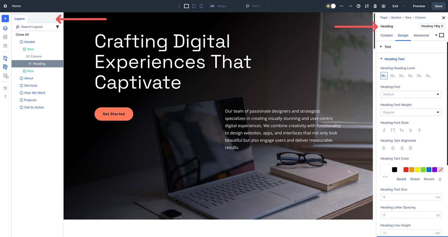
Divi 5’s interface is a complete overhaul of its predecessor, designed for speed, flexibility, and intuitive no-code design. The Visual Builder offers real-time front-end editing with a cleaner settings panel, responsive design toggles, and a nested layers interface for seamless navigation of sections, rows, columns, and Module Groups.
Enhanced by a faster foundation, Divi 5 introduces unique features like Nested Rows for infinite layout depth, Module Groups for streamlined module management, and Design Variables for consistent styling. These advancements make Divi 5 accessible to beginners and powerful for professionals, transforming how websites are built on WordPress.
Visual Builder Evolution
Divi 5’s Visual Builder boasts a redesigned interface with a streamlined experience that’s powerful and user-friendly. Compared to Divi 4, Divi 5 introduces a cleaner, more intuitive settings panel that reduces clutter and organizes options logically, making adjustments faster.
New responsive design toggles let you switch between several desktop, tablet, and mobile views, ensuring designs look flawless across all devices. These UI enhancements make Divi 5 accessible to beginners while offering the precision professionals demand.
Navigating complex layouts is effortless with Divi 5’s layers interface. This interface organizes sections, rows, columns, modules, and new Module Groups into a clear, hierarchical structure. It allows you to drill down into your design’s elements easily, whether adjusting a single module or restructuring an entire section.
The drag-and-drop interface simplifies things, while the wireframe mode provides a birds-eye view of your page’s structure. By combining these tools, Divi 5 makes building and editing complex layouts intuitive, saving time and reducing frustration.
Responsive Design Controls
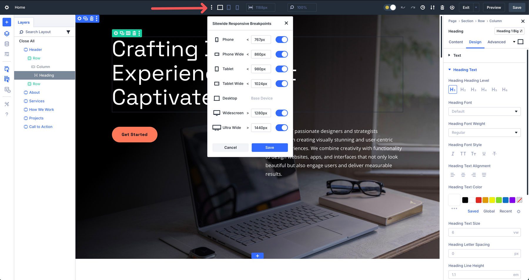
Divi 5 introduces Customizable Breakpoints for precise control over how your designs adapt across devices. You can choose from seven predefined breakpoints or set custom values to match specific device resolutions. This ensures pixel-perfect layouts without manual CSS tweaks.
This granular control, combined with Advanced Units like clamp() for fluid scaling, ensures your designs remain consistent and visually appealing across all screen sizes.
Building Your Page With Divi 5’s Unique Features
Divi 5 introduces innovative tools that will redefine how you use Divi. Nested Rows allow infinite row nesting for complex layouts, while Module Groups simplify styling and managing multiple modules as a single unit. Design Variables enable site-wide consistency for colors, fonts, and more, and Advanced Units support dynamic CSS functions like clamp() and calc() for responsive designs. Preset-Based Design with Option Group Presets streamlines styling across elements, and Divi AI accelerates content creation. Together, these features empower users to create professional, responsive websites efficiently.
Below, we detail how to use these tools to build a web page.
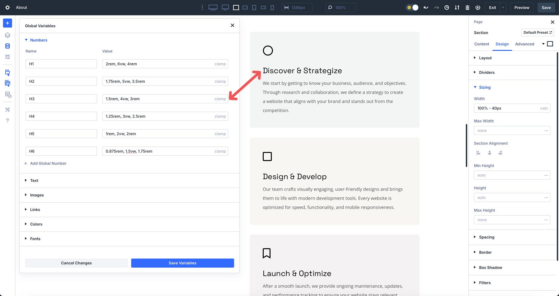
1. Design Variables For Efficient Styling
Design Variables are global settings that can be used for colors, fonts, numbers, images, text, and links that can be applied site-wide. You can define variables by clicking the global variables icon in the Visual Builder.
The benefit of using Design Variables is that you can update them once to update all instances of that variable, ensuring consistency and saving time. For example, if you establish number values to assign clamp() calculations to headings, you establish a global hierarchy for text throughout your website. If you need to make a quick change, any heading or text module with those variables applied will update across your site, allowing you to make quick design changes that populate throughout every instance.
How To Use Design Variables
To maximize the potential of Design Variables, incorporate them early in your design process. Establishing variables at the start creates a consistent framework, freeing you to focus on creativity rather than repetitive tasks. Begin by clicking the Variable Manager icon in the Visual Builder.
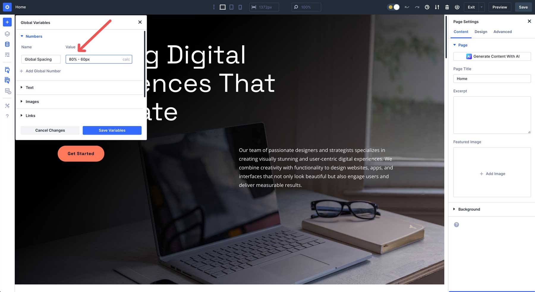
When the dialog box appears, you can add variables to create the foundation of your design. For example, you can use number variables to establish responsive typography.
Number variables can also be used for spacing. For example, you can establish a standard spacing for all columns and rows across your website. Using a calc() formula, such as calc(80% – 60px) establishes the width of a design element as 80% of the container, while adding 30px of padding to either side. Select calc from the dropdown menu to apply the formula.
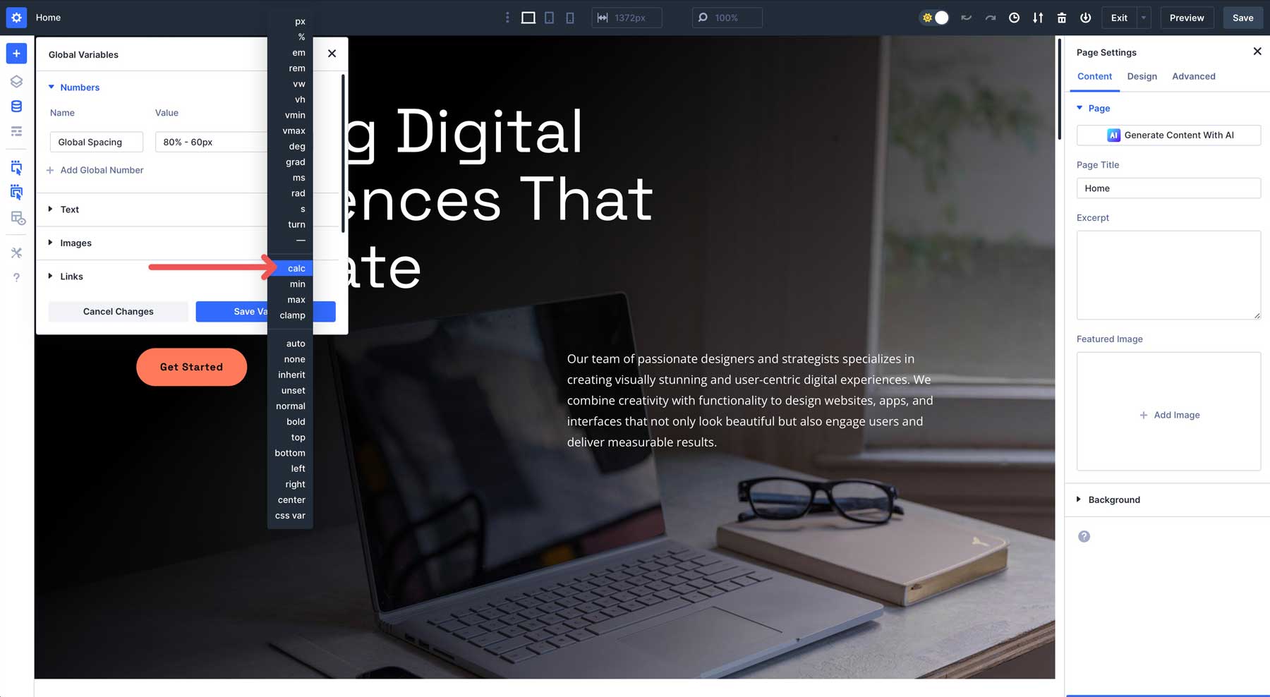
Enter the calc() formula into the value field. Click the Save Variables button to add it to the Variable Manager.
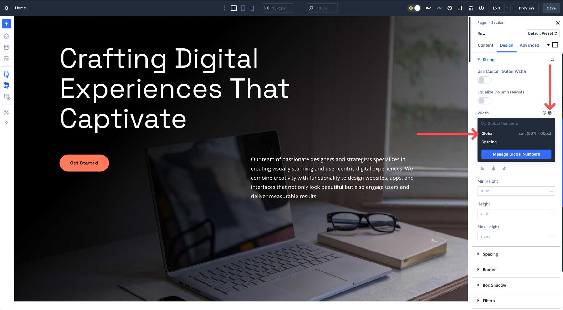
Once your variables are saved, Divi makes it easy to apply them throughout your design. To use the spacing, click on a row, column, or module, navigate to the design tab, and look for the width field.
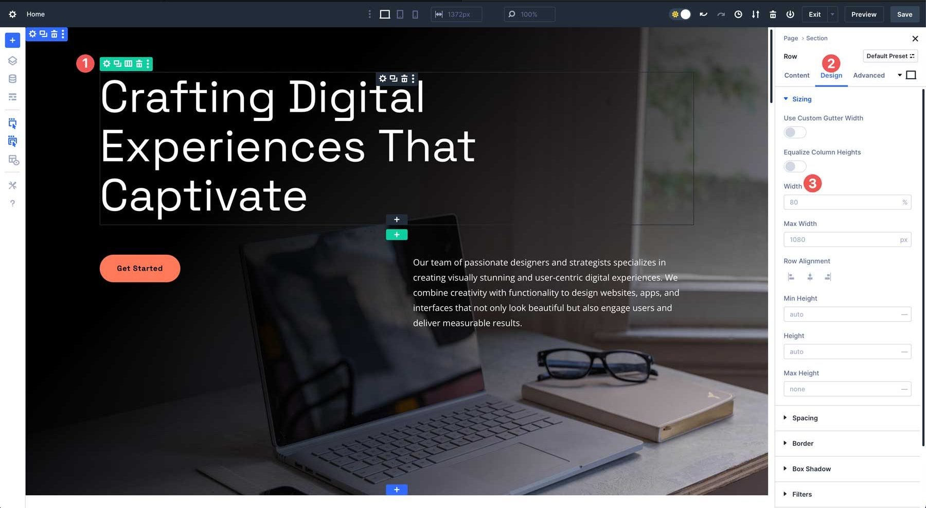
Finally, click the Insert Dynamic Content icon to select the global spacing variable.
As noted earlier, applying a Design Variable ensures consistency across your site. Updating its properties in the Variable Manager instantly syncs all instances, saving you hours of manual adjustments.
Tips For Using Design Variables
- Organize Your Variables Thoughtfully: Name variables descriptively to make them easy to identify in complex projects.
- Leverage Presets: Combine Design Variables with Divi’s global presets to create reusable style templates for modules, reducing setup time for new pages.
- Test Responsiveness: Preview variable-driven designs across devices in the Visual Builder to ensure all variables perform as expected.
2. Preset-Based Design With Option Group Presets
Divi 5’s preset-based design system revolutionizes styling with two powerful tools: Element Presets and Option Group Presets. These features enable you to save and reuse configurations, ensuring consistency and streamlining your project workflow.
Divi 5 Element Presets
Element presets allow you to save a module’s configuration — including text, colors, typography, spacing, and hover effects — for reuse across your website. For example, you can create a fully styled button module with a specific font, gradient background, and a hover animation. Once saved as an Element Preset, you can apply it to any button on your site with a single click, maintaining identical styling. If you update the preset, like changing the background to a solid color, every instance of that button updates automatically, eliminating repetitive edits and ensuring a unified look.
Divi 5 Option Group Presets
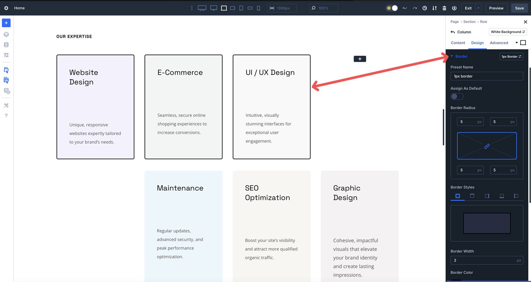
In contrast, Option Group Presets focus on reusable style groups, such as typography, borders, or shadows, that can be applied to different elements for cohesive designs. For instance, you might create an Option Group Preset for a 1px black border with a 5px radius and use it on buttons, images, and rows.
If you later adjust the preset to a 2px border, all linked elements update instantly, saving time and maintaining consistency. This modular approach allows you to mix and match style groups across elements, offering flexibility without sacrificing control.
How To Use Presets Effectively
Element presets are already present when starting with a starter site or premade layout. However, when creating a website from scratch, you’ll need to create them first. Creating these presets allows you to speed up the design process by instantly styling similar modules throughout your website.
Creating An Element Preset
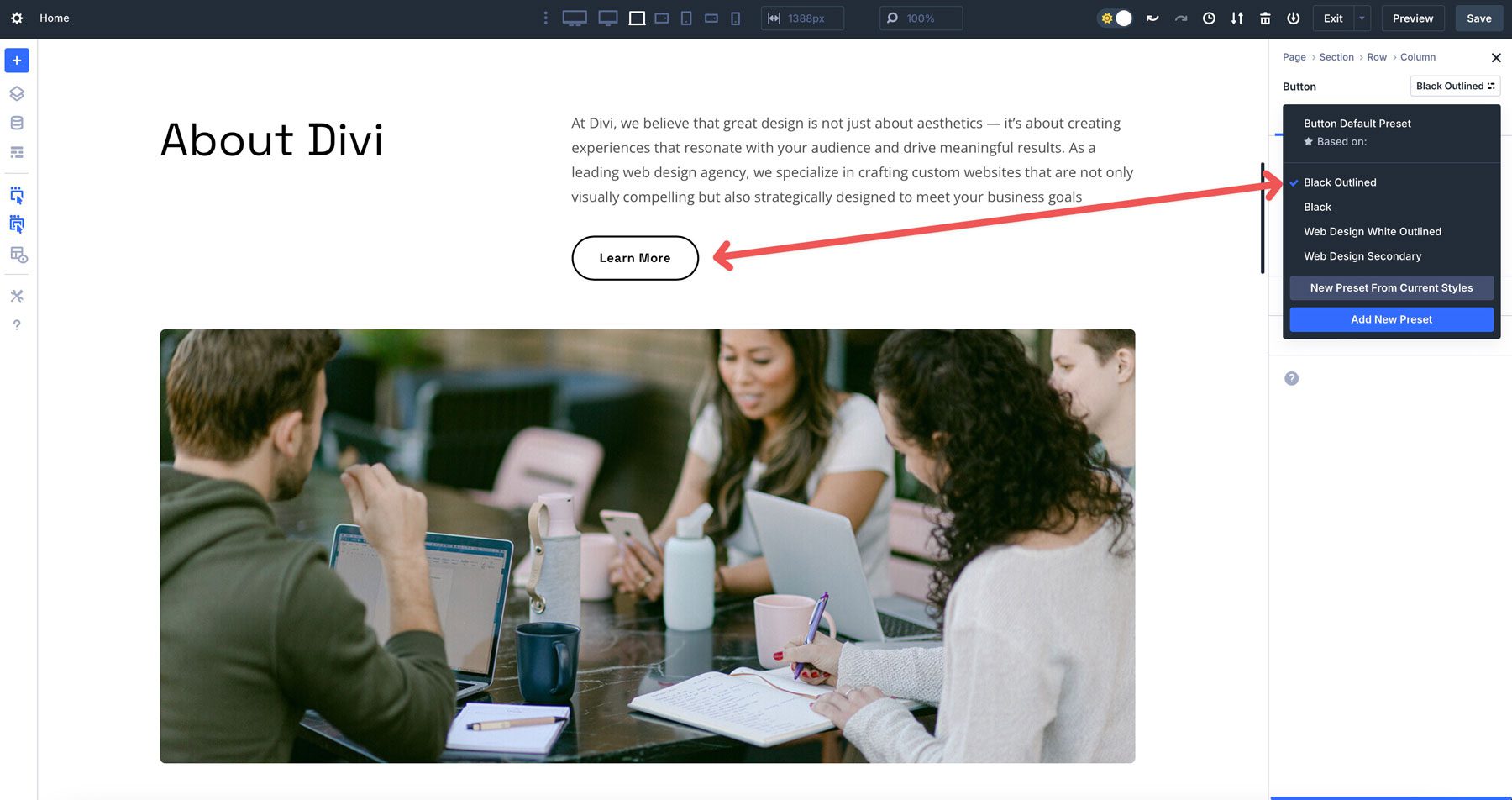
To create an Element Preset, style a module with your desired settings. Then, click the preset menu at the top right corner of the module’s settings.
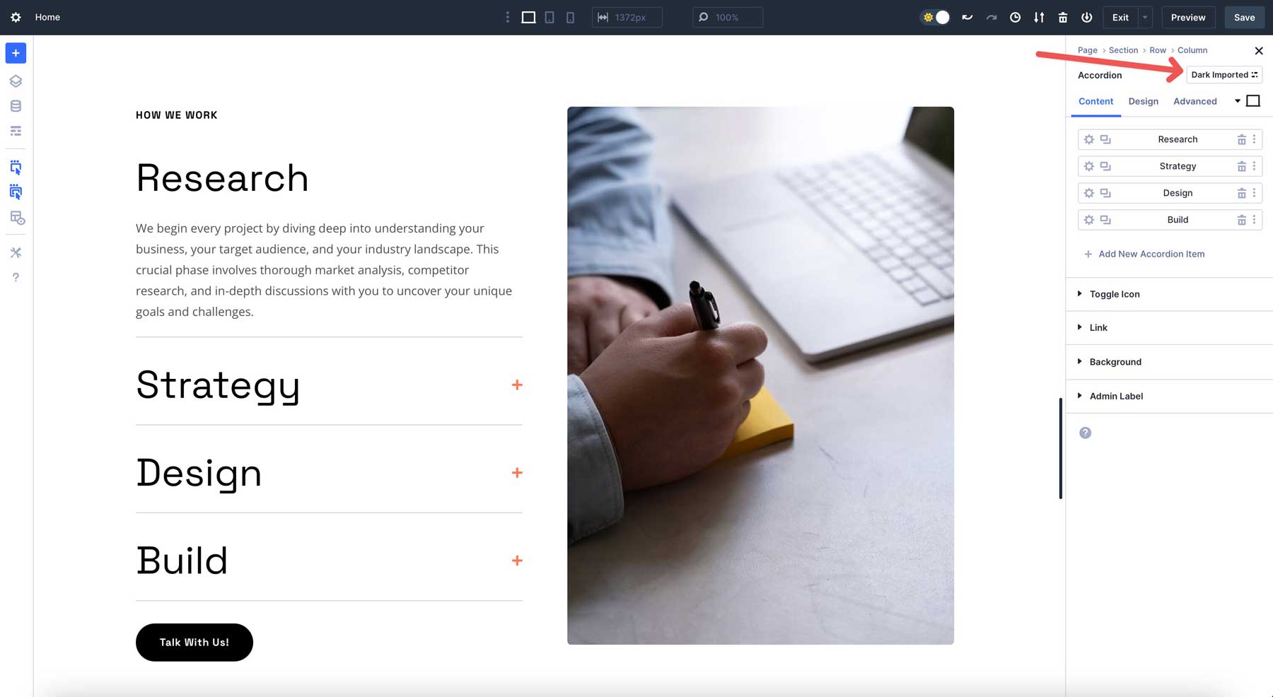
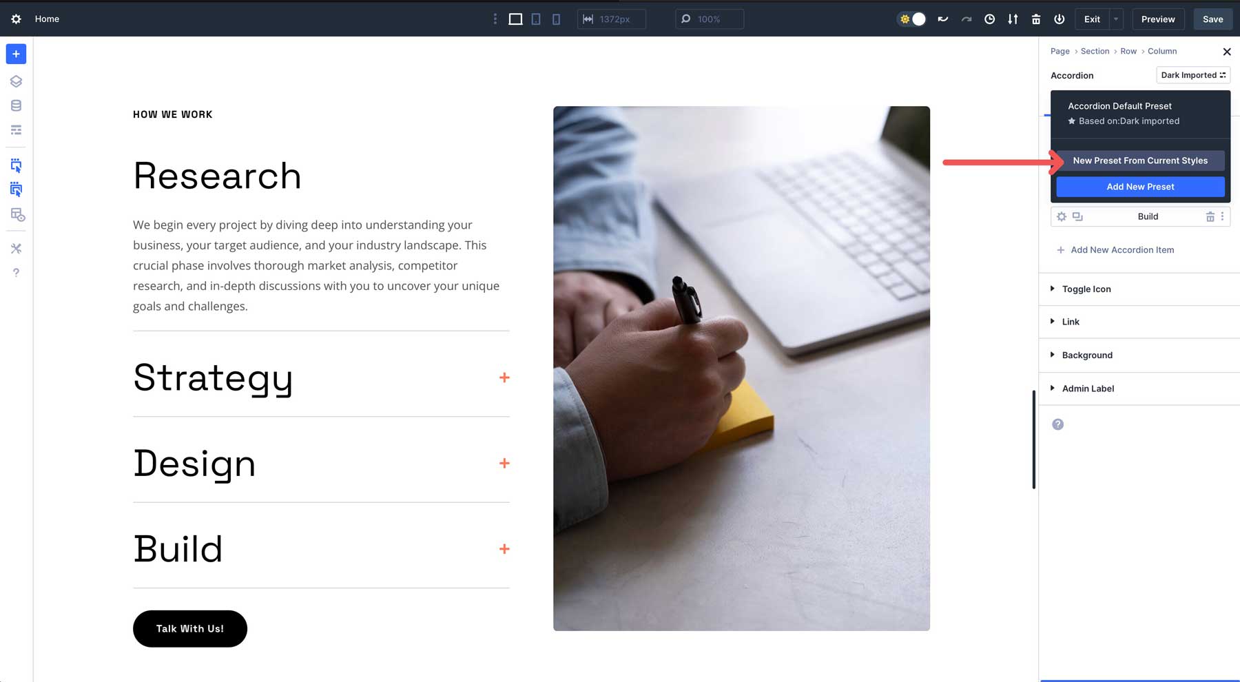
Click New Preset From Current Styles to create a new preset.
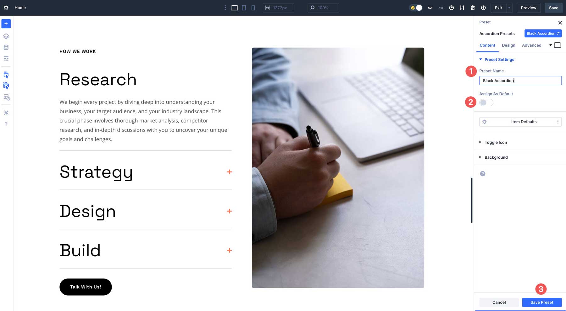
Give the preset a name, choose whether to assign it as the default, and save it. If you choose it as the default preset, every accordion you add to your site will be styled identically, making it easier to build your web pages faster and more efficiently.
Create An Option Group Preset
The process of creating an Option Group Preset is slightly different. Rather than applying a preset to a module, you can assign presets to aspects of a module that can be carried over to other types of modules, columns, rows, or even sections. Option Group Presets are great for styling borders, adding transformation controls, filters, box shadows, and more, allowing you to keep smaller elements consistent throughout.
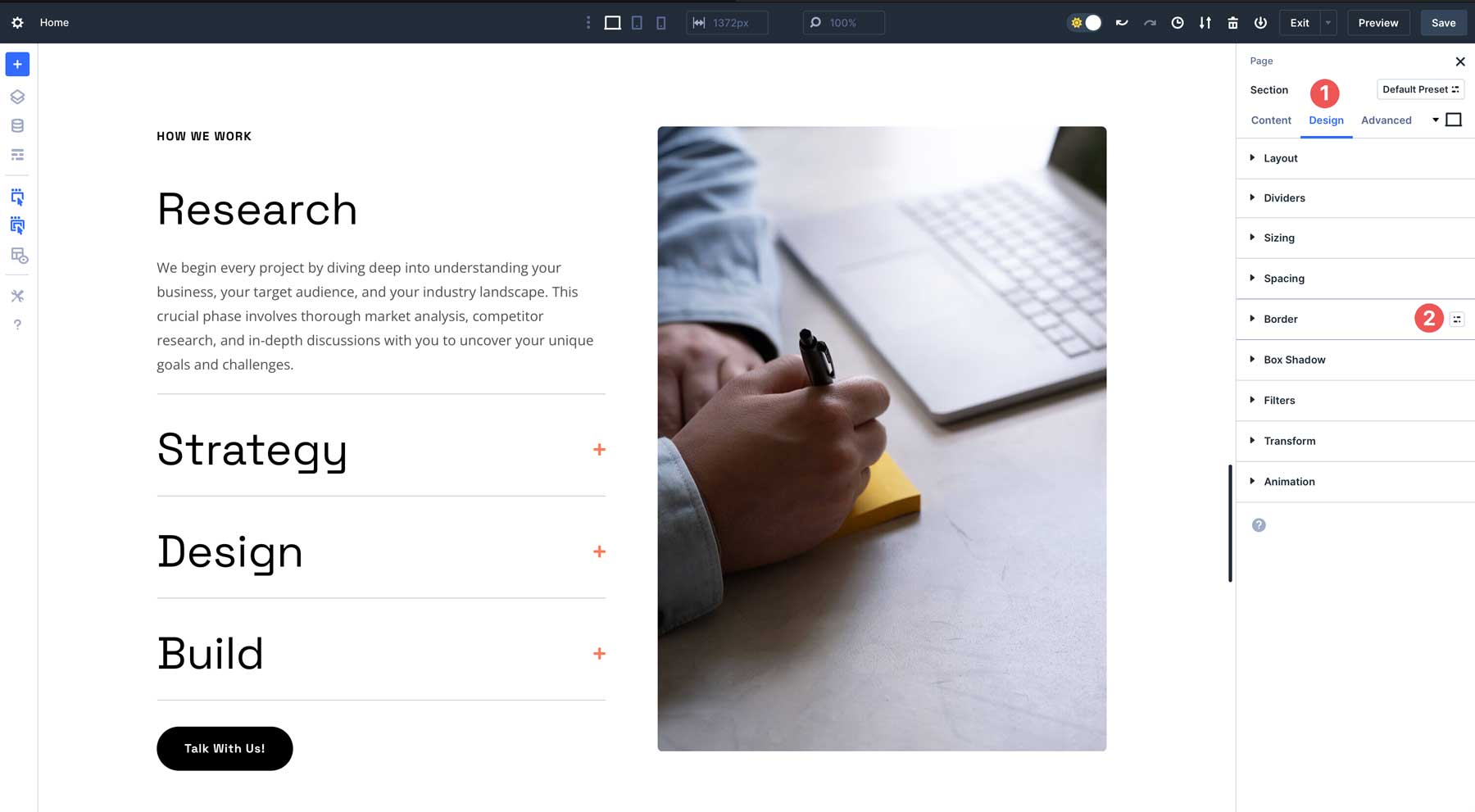
For example, you want to create a border style for images and columns. Select an image module, navigate to the design tab, and hover over the border settings until the Select A Group Preset icon appears.
Next, click Add New Preset.
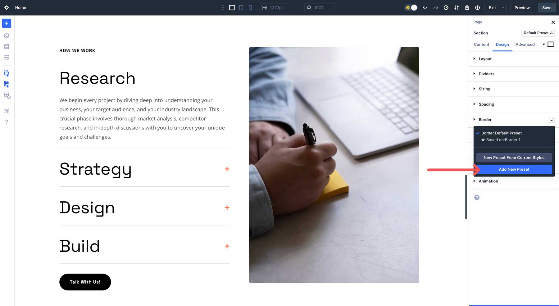
Style the border, name it, and save the preset.
Tips For Using Divi 5’s Design-Based Presets
Combining Element Presets and Option Group Presets allows you to build a scalable design system. Here are some tips for using them effectively to build a web page with Divi 5:
- Use Them For Efficiency: Create Element Presets or Option Group Presets to speed up page building, especially for large websites. This method saves you from repeatedly styling a module, row, or section. You create styles up front and apply them wherever needed.
- Establish Design Consistency: Presets ensure uniform styling across elements, reinforcing your brand identity and professional polish.
- Edit Presets When Your Site Requires Design Changes: Presets allow you to update global styles without manually editing individual elements, making them ideal for design iterations or client revisions.
- Use Them For Scalability: You can combine presets with Design Variables to create a robust framework for sites that often require updates. Need to add a page down the road? Presets allow you to do this faster and more efficiently.
3. Nested Rows for Flexible Layouts
Nested Rows in Divi 5 replaces Divi 4’s specialty sections with a more flexible, infinitely nestable system. Unlike traditional rows, Nested Rows can be placed within columns, allowing you to stack rows, modules, or additional nested rows in virtually any configuration.
To create a Nested Row, simply add one to a column — or under a module within a column — via the Visual Builder and populate it with modules or further nested rows.
This feature allows you to build complex, layered layouts. For instance, in an about section, you might place a 3-column Nested Row under a text module to add buttons to guide users to different pages.
Upcoming flexbox controls in Divi 5 will enhance positioning options, offering precise alignment and spacing for intricate designs like pricing tables, portfolios, or multi-tiered content sections.
How To Use Nested Rows
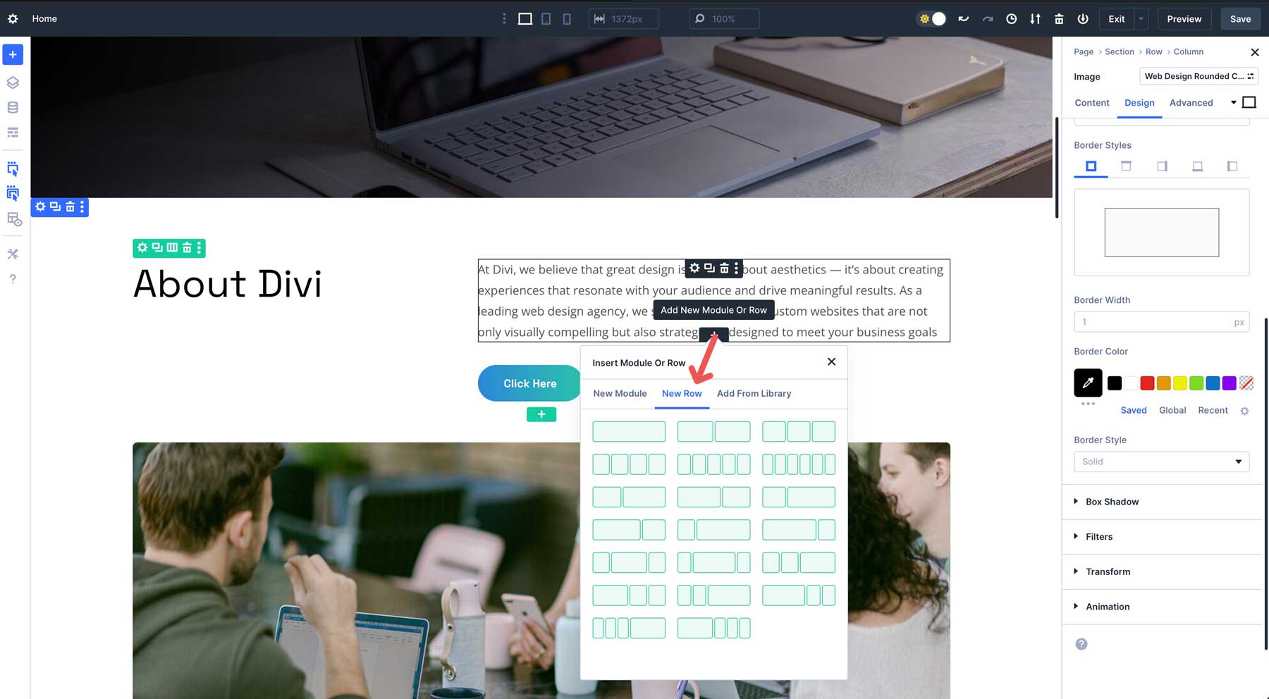
To harness the power of Nested Rows, follow these steps in the Visual Builder:
Start by inserting a standard row into your page layout. This will serve as the foundation. Next, click the new row tab to reveal the column options for your new Nested Row.
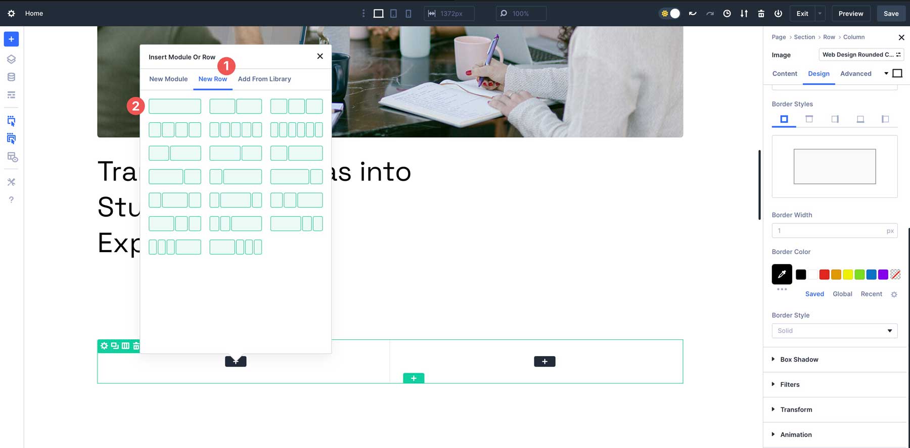
Next, choose the module for the first column. For this example, an image.
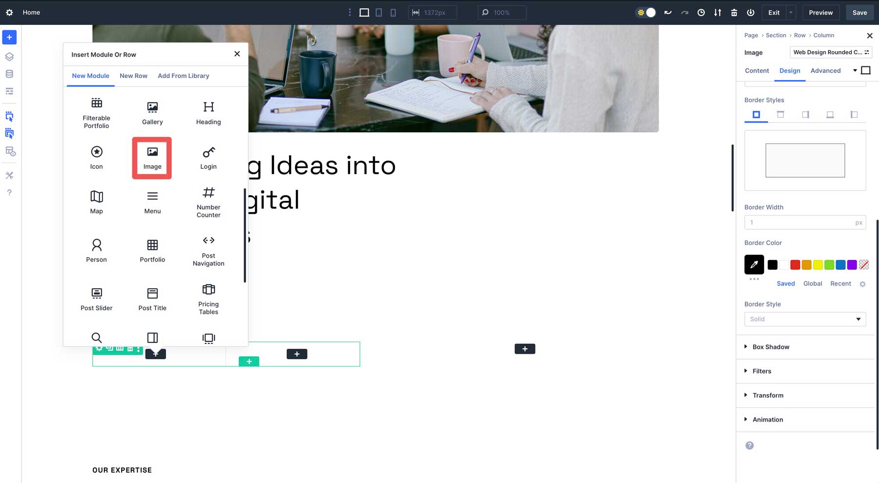
In the second column, add another image. You can create Option Group Presets for borders, box shadows and transform effects from there.
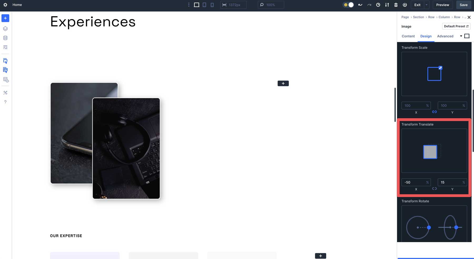
You can add nested rows to the other column or underneath the first one. The possibilities are endless.
You can create advanced layouts that are multiple levels deep. For example, you can make a pricing table with a nested row to feature two buttons side-by-side, a feature lacking in earlier versions of Divi. There are several ways to use Nested Rows, making them a versatile feature when building a web page with Divi. They’re perfect for building hero sections, team pages, headers, footers, and more.
Tips For Using Nested Rows
- Plan Your Layout First: Before adding Nested Rows, sketch your page structure outline to determine where adding them provides value, such as for multi-layered hero sections, pricing tables, or team grids.
- Use For Modular Designs: Create Nested Rows for reusable components, like a row with an image and text for testimonials, then duplicate or save them for consistent styling across your entire website.
- Combine With Module Groups: Pair Nested Rows with Module Groups to organize complex layouts.
- Utilize Divi’s Responsive Breakpoints: Test Nested Rows across Divi 5’s seven breakpoints using responsive toggles to ensure nested elements align properly on all devices.
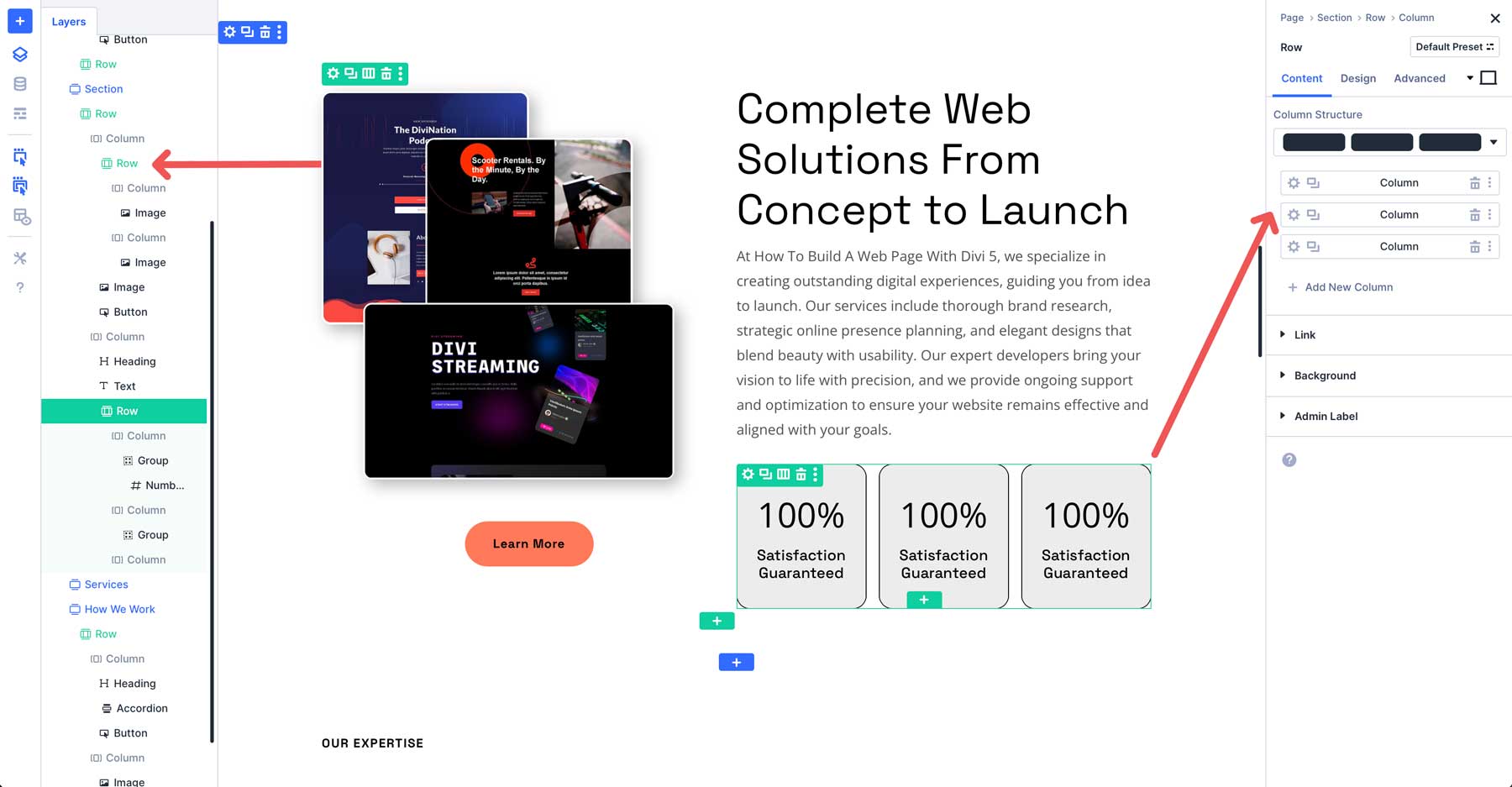
4. Module Groups for Organized Content
Module Groups act as containers in Divi 5 that allow you to group multiple modules within a column. You can style, move, or duplicate them as a single unit. They can simplify your workflow, especially for complex designs, and set the stage for upcoming flexbox support, unlocking even more precise positioning options.
From there, you can add design modules and Nested Rows or apply Option Group Presets to the Group to create styled layouts that you can easily duplicate or save to the Divi Library or Divi Cloud.
How To Use Module Groups
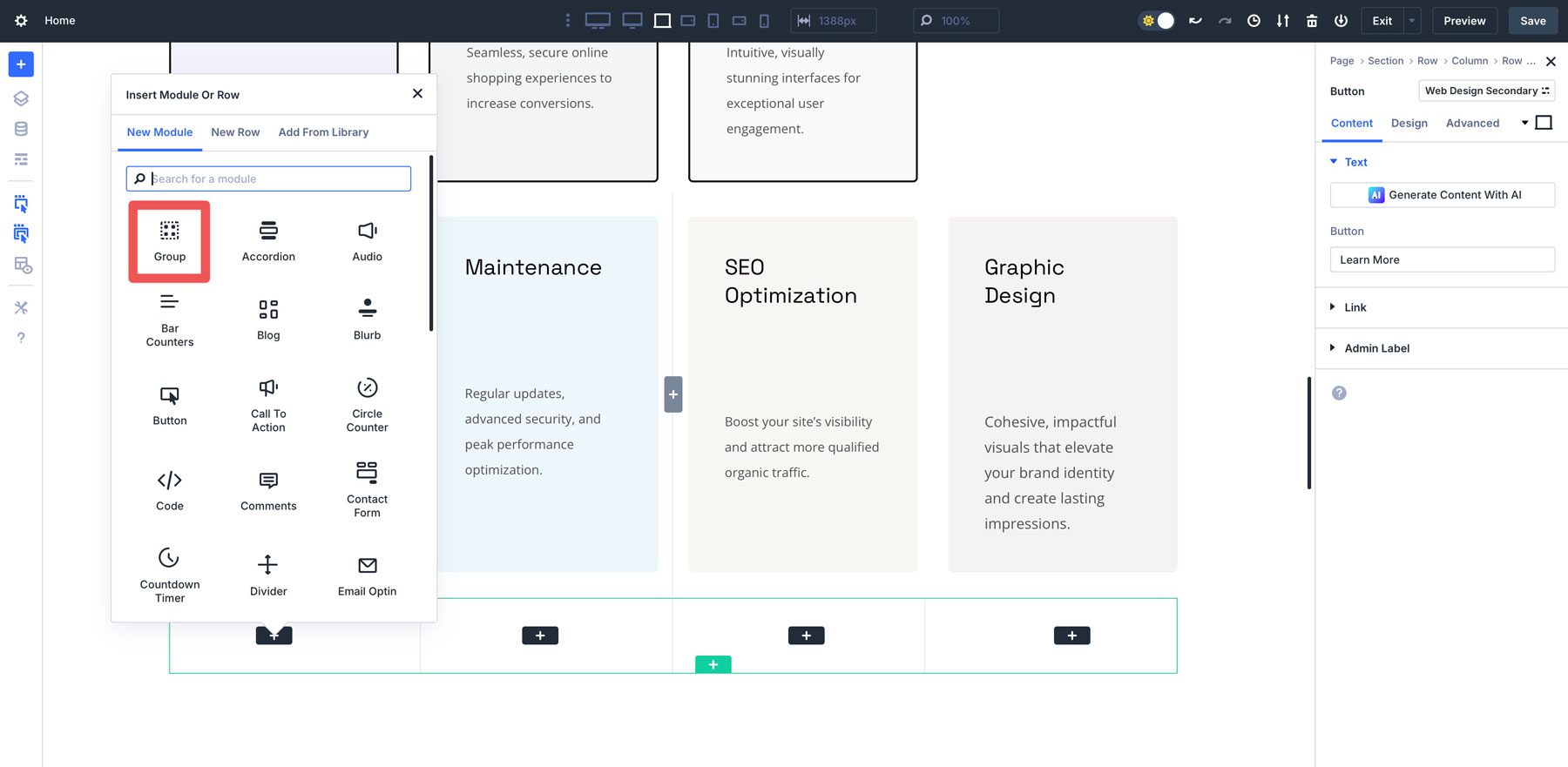
To create a Module Group, add a new row and select a column structure. Select the Group Module from Divi 5’s available options.
Inside the Module Group, you can add modules, like text, images, buttons, or even Nested Rows. For example, you might create a group containing a heading, text, an image, and a button for a call to action section.
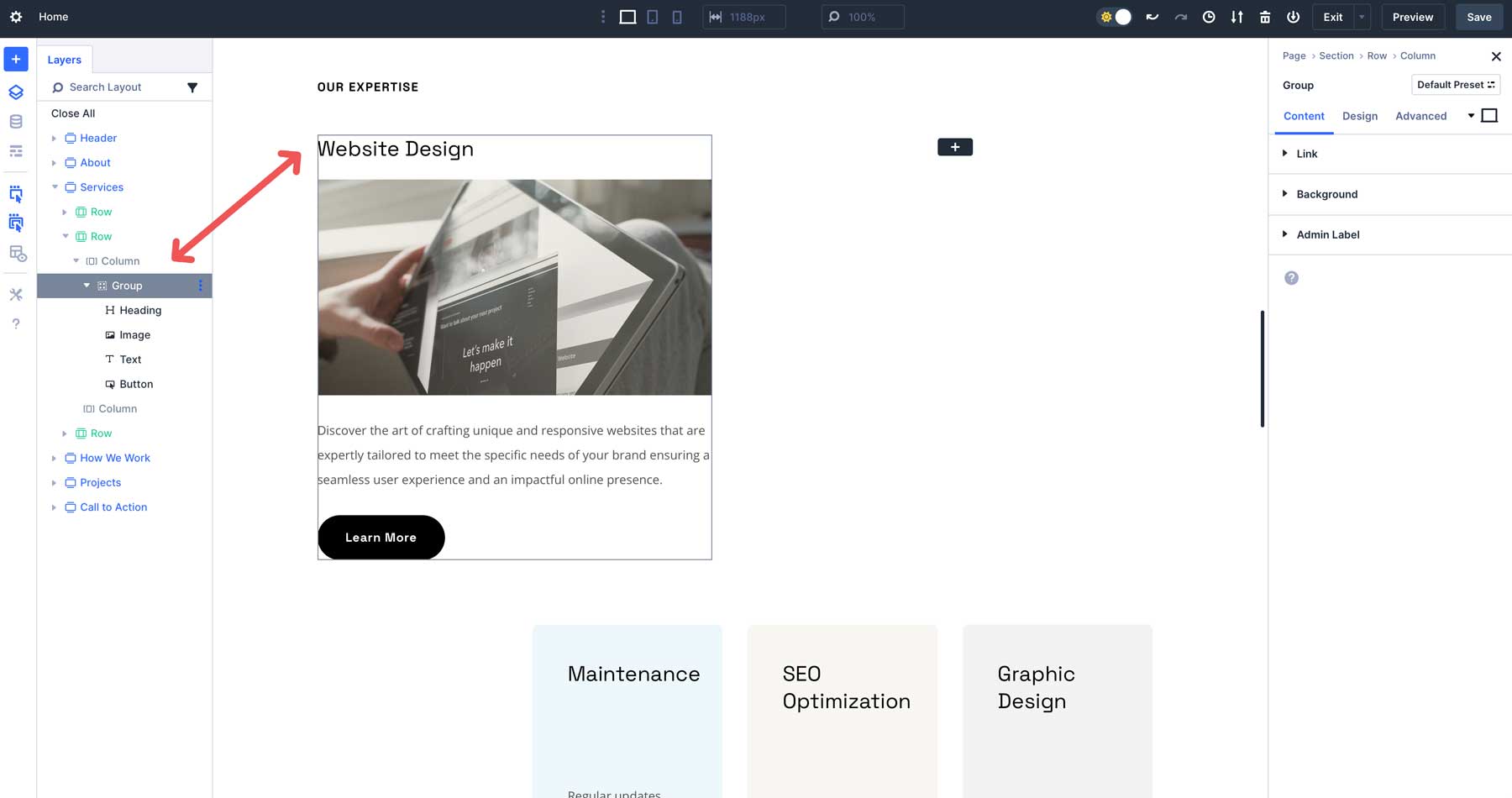
Once styled, you can save or duplicate the Module Group by clicking on the ellipsis menu at the top right corner of the Group.
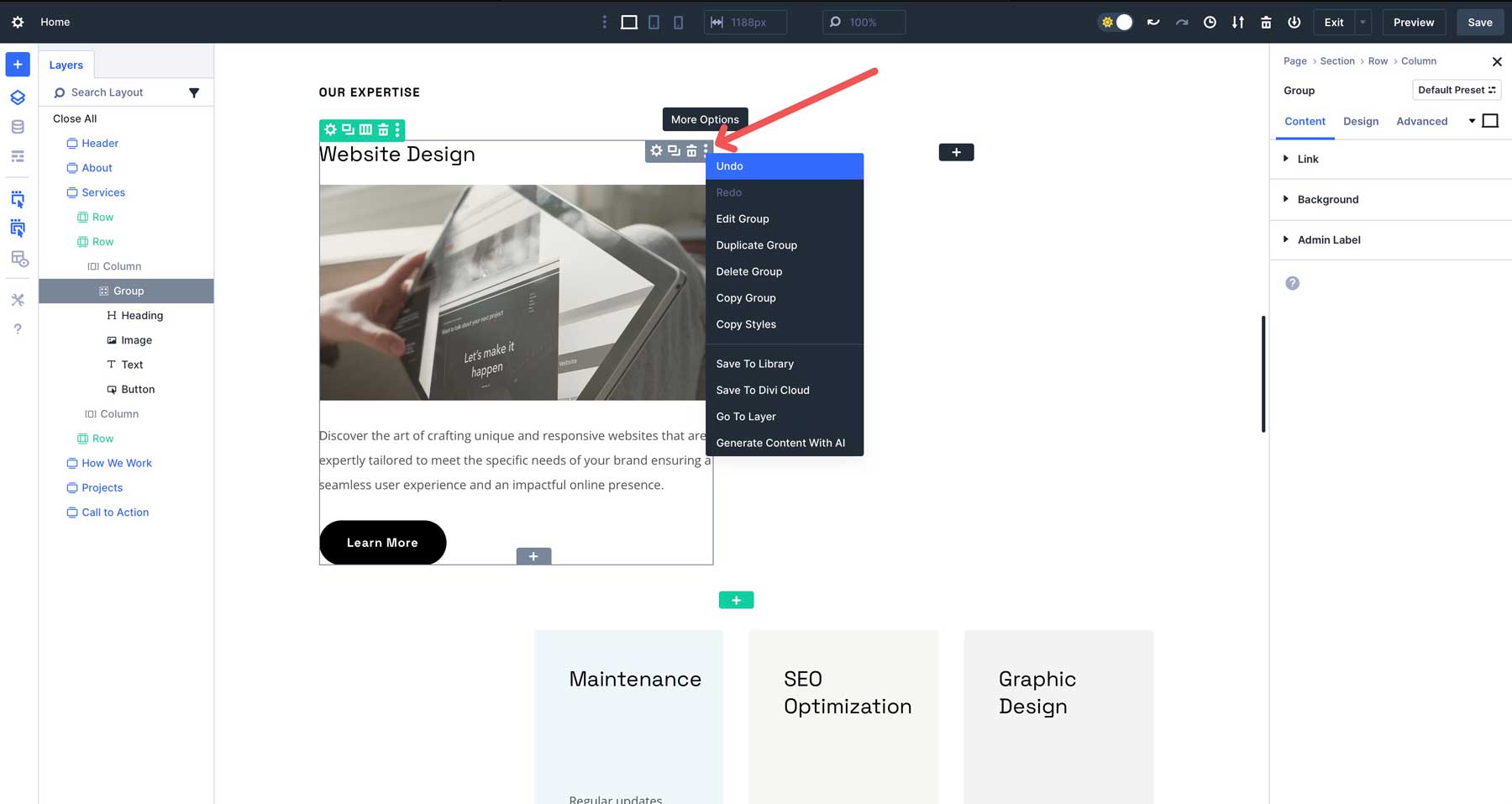
Module Groups can create team member sections, call-to-action sections, interior page headers, and more. But more importantly, Module Groups will become extremely helpful once features like Flexbox and the Loop Builder are released.
Tips For Using Module Groups
- Plan Module Groups Strategically: Use Module Groups for reusable components, like CTAs, testimonials, team members, or product cards. They help streamline the building process and maintain organization.
- Combine Module Groups With Presets: Apply Option Group Presets to Module Groups for consistent styling, such as uniform shadows or borders, across multiple groups.
- Use Divi Cloud: Save frequently used Module Groups to Divi Cloud for quick access across projects, especially for clients with similar design needs.
Using Module Groups, you can create modular, organized designs that are easy to manage and scale, making them ideal for building simple or more complex web pages.
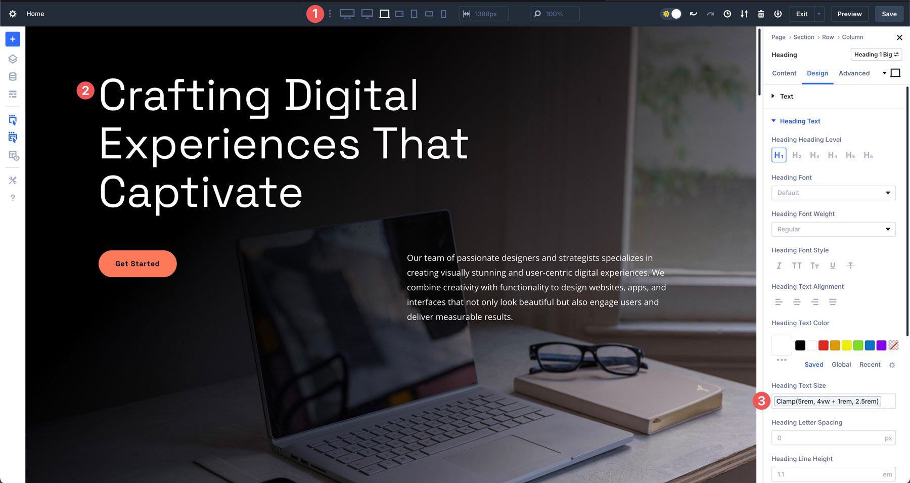
5. Advanced Units For Dynamic Design
Divi 5’s Advanced Units feature supports a wider range of CSS units (px, vw, rem, %, etc.) and functions like calc(), clamp(), min(), and max() within a single input field, enabling dynamic and responsive designs. For example, you can set a section’s width to calc(100% – 40px) or clamp(20px, 3vw, 40px) for fluid typography that scales based on the viewport size.
Advanced units can also be used as Design Variables to set global rules and keep designs consistent throughout your site.
How To Use Advanced Units
There are a couple of ways to use advanced units, but the most effective way is to combine them with Design Variables for design consistency. However, there may be instances where you want to assign them at the module level.
A good example is with text. Sure, you can set clamp() formulas in the Variable Manager to control the size across your entire site, but what if you want to make a heading more impactful by adding space to make it stand out better? That’s where Advanced Units come in.
To demonstrate, click to add a heading module to your web page. In the design tab, navigate to the sizing field.
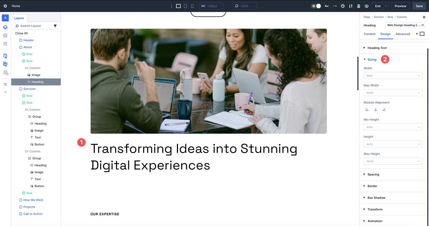
Next to the width field, click the — icon to reveal the Advanced Unit options.
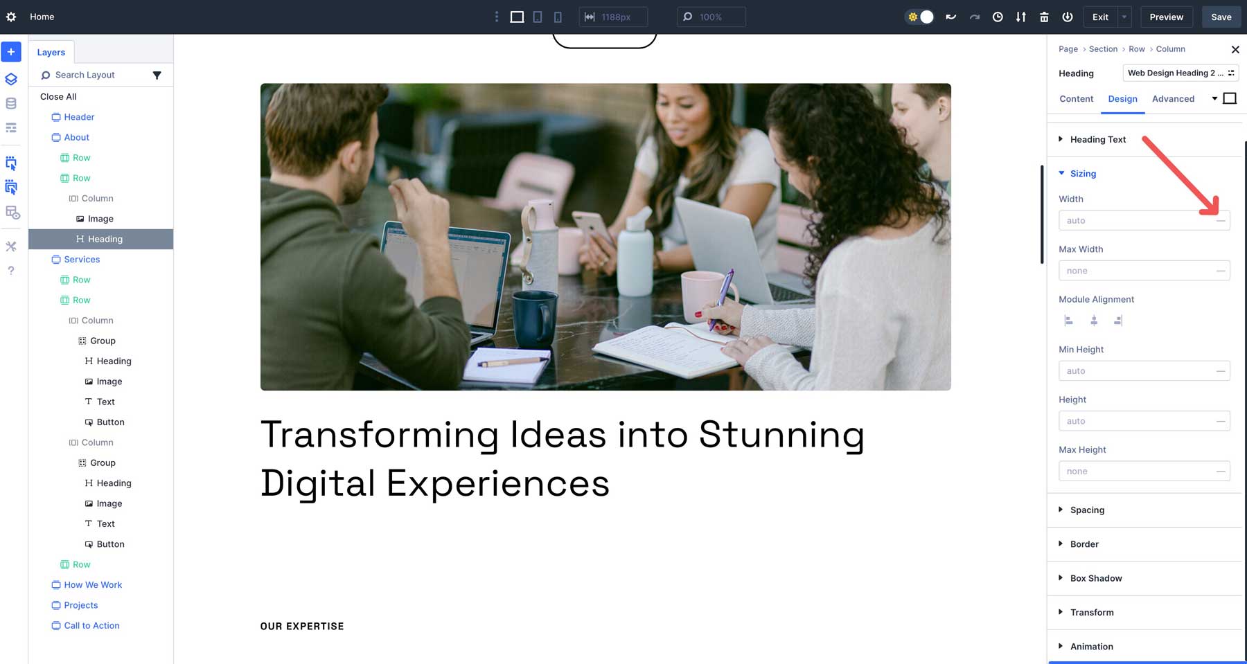
From the dropdown menu, select VW (viewport width) and enter 50. This will tell the heading to occupy 50% of the viewport’s width. The viewport is the visible area of the web browser window. So, regardless of how wide the browser window is, it will always be half the width of the browser window.
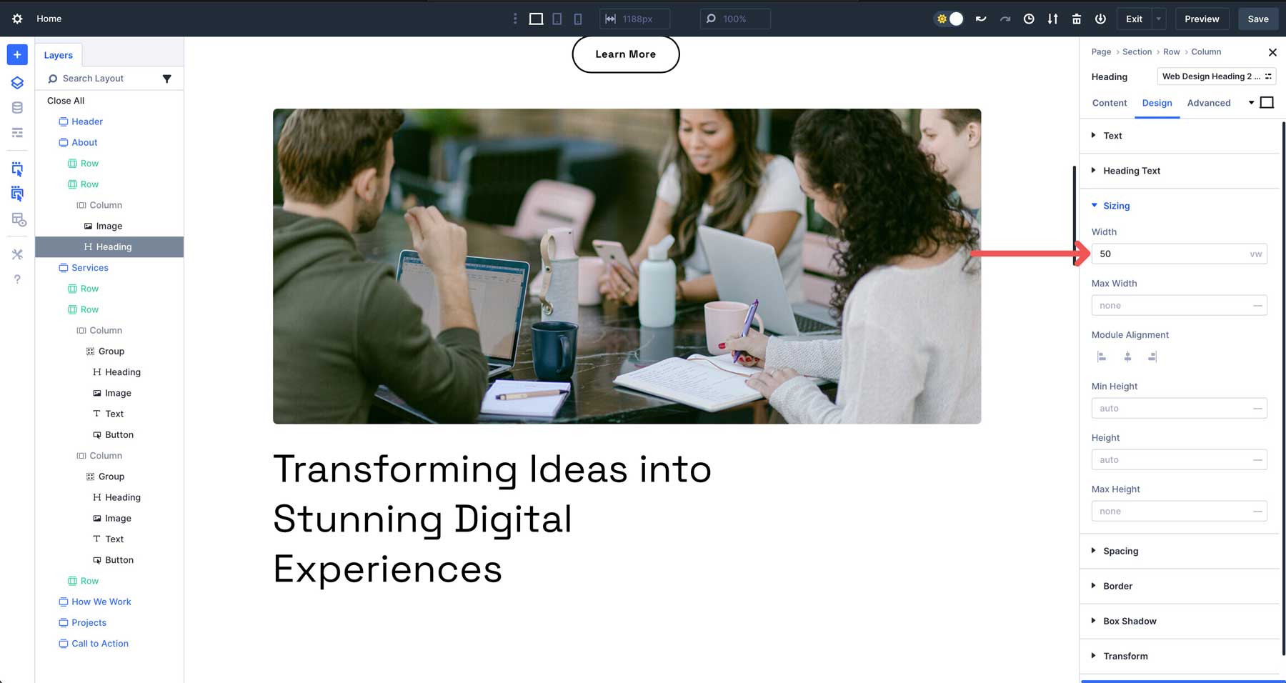
When you preview how the headline will look on other screen sizes, you’ll notice the heading stays the same width, regardless.
Tips for Using Advanced Units
- Start Simple: Begin with basic units like px or % for straightforward designs, then experiment with clamp(), calc(), vh, or vw for responsive effects.
- Use Clamp For Typography: Apply clamp() to font sizes or spacing to create fluid, accessible designs that adapt to any screen size without manual breakpoints.
- Combine With Design Variables: Store frequently used units for headings and body text as Design Variables to maintain consistency and simplify updates.
Advanced Units give you the precision of custom CSS within Divi’s no-code interface, making it easy to build dynamic, professional web pages that adapt seamlessly to any device.
6. Divi AI Integration
Divi AI enhances the design process by generating text, images, code, or entire sections and layouts based on natural language prompts. It works within the Visual Builder in Divi 5, making getting a little design or copywriting help easy when needed.
For example, you can use a prompt like “Create a modern hero section with a headline, button, and background image.” Divi AI will produce a fully styled layout, which you can refine manually to match your vision.
With Divi AI, you can speed up the design process, overcome writer’s block, or get a little creative push when needed.
How To Use Divi AI
To make the most of Divi AI when building a web page in Divi 5, you can use it to help you write on-brand copy, create images, add some CSS to existing modules, or even generate sections. Divi AI can help you create beautiful web pages that resonate with your visitors.
To use Divi AI on an existing text module, hover over the text area and click the Divi AI icon in the content tab.
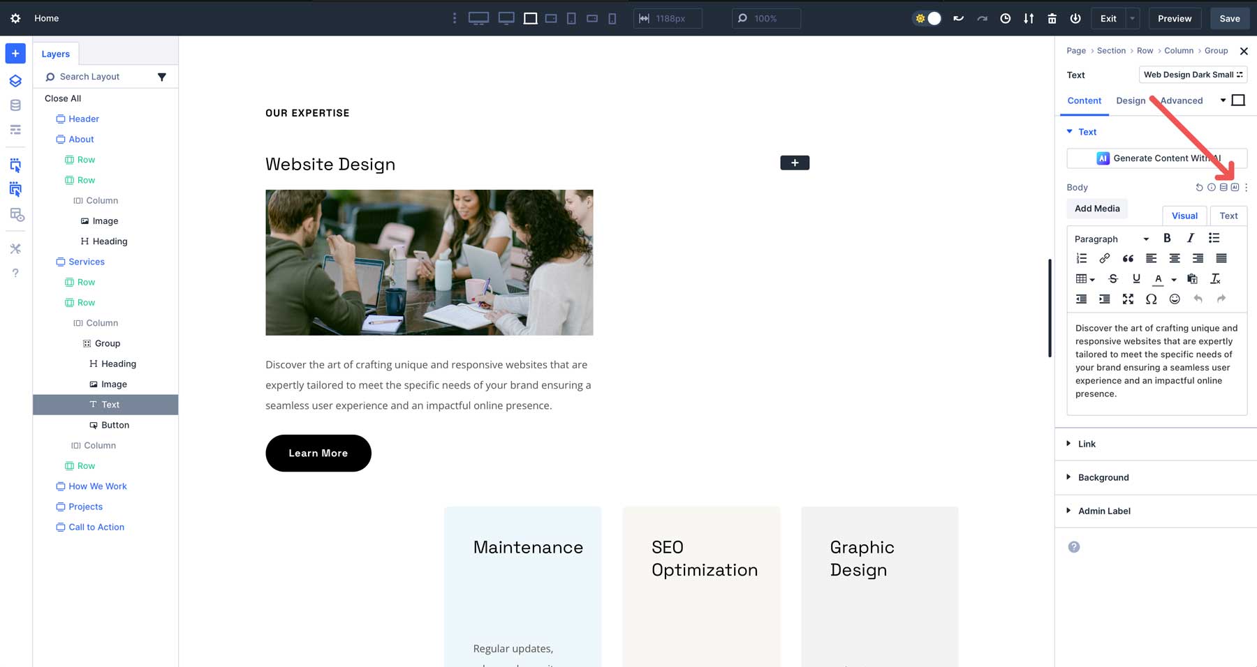
A dialog box with multiple options will appear. You can write & replace the existing content, lengthen, shorten, or simplify it, fix spelling & grammar, translate it, or even change the tone.
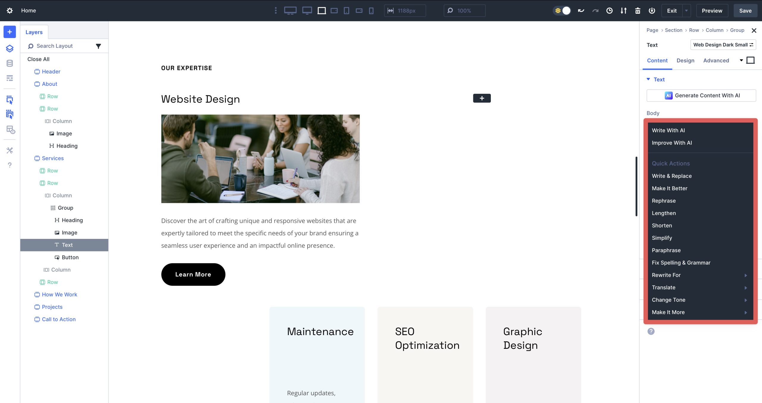
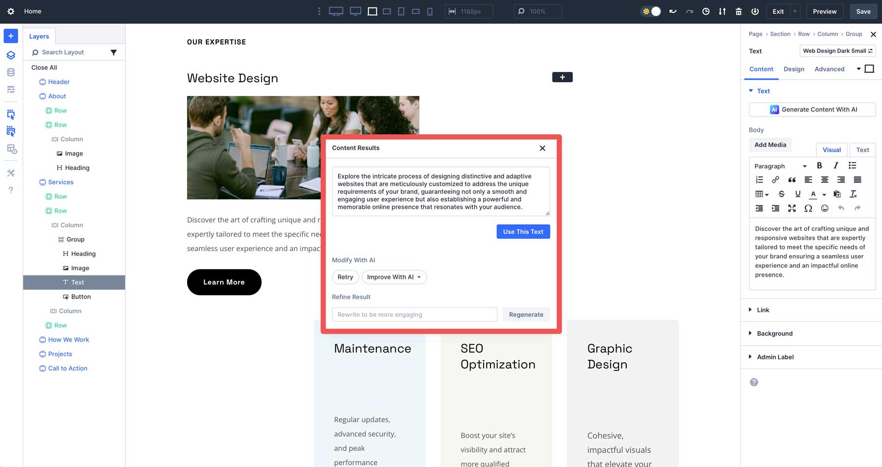
Once you choose an option, Divi AI will alter the copy based on the existing content. Once finished, you can use the text, retry, improve it with AI, or refine the result with a few guiding words.
Tips For Using Divi AI
- Be Specific With Your Prompts: Include details like tone, colors, or layout preferences when using Divi AI to create images or sections. The same goes for text and code. The more specific, the better the output.
- Iterate As Needed: If the initial output isn’t ideal, refine your prompt or generate multiple variations to find the best fit.
- Use It For Inspiration: One of the best ways to use Divi AI is to brainstorm ideas, like generating layout concepts or taglines, even if you plan to customize your web page heavily.
Best Practices for Building Web Pages With Divi 5
Adopting a strategic approach to Divi 5’s features is essential to maximizing its potential. Start by planning your design system upfront. Define core Design Variables, such as primary and secondary colors, relevant links, typography settings, and fonts.
When building your page, establish Option Group Presets for reusable styles like button hover effects, shadows, or typography, which speed up your workflow and maintain a cohesive aesthetic across your site.
Testing early and often is also crucial for positive results. Use Divi 5’s Responsive Breakpoints to preview advanced units to ensure they look good across all devices. Divi 5’s responsive toggles give you seven breakpoints to explore, giving you a better idea of how your design will appear on different-sized screens.
Combine Element Presets with Option Group Presets to balance flexibility and consistency. Use Element Presets for specific modules, like a styled CTA module. In contrast, to maintain uniformity, apply Option Group Presets for shared properties, like border styles or shadows. When updates are needed, you can adjust these preset groups for global changes rather than editing individual elements manually.
Finally, keep your designs simple to maintain performance and usability. Avoid over-nesting rows or relying on complex calc() formulas unless necessary, as these can complicate editing. Similarly, create Module Groups for essential designs you plan to reuse across your website.
Build Smarter Web Pages With Divi 5
Divi 5 redefines WordPress web design, allowing you to easily build stunning, responsive web pages. Its modern Visual Builder, intuitive controls, innovative features, and Divi AI streamline the process, ensuring professional results with minimal effort. Regardless of your skill level, these tools make building effective, dynamic websites faster, smarter, and more creative.
Ready to explore Divi 5’s potential? Download the Divi 5 Alpha release today and experiment with its latest features to bring your vision to life. Divi 5 suits new sites but isn’t yet recommended for converting existing ones.
We’d love to hear your thoughts! Share your feedback by commenting below. Better yet, post about your Divi 5 experience on social media to help spread the word.


It would be helpful if the default values of the Divi theme presets were displayed. For example, a section has a preset padding, but this isn’t shown in the Design panel under ‘Spacing > Padding’.”