
Image cropping sounds simple until the same image needs to work in different layouts. A portrait photo might look great in a team card but awkward in a wide banner. A landscape image might fit a blog grid but lose its subject on mobile. Cropping is less about cutting pixels and more about controlling what stays visible inside the frame.
Divi 5 makes that easier with Aspect Ratio and Image Framing controls built directly into the Visual Builder. You can set a consistent shape, choose how the image fills it, reposition the focal point, adjust the crop across breakpoints, and keep the original file untouched.
In this post, we’ll show you how to crop images in Divi 5 using Aspect Ratio, Object Fit, Object Position, responsive settings, Image Presets, and Loop Builder workflows.
- 1 Why Crop Images In Divi 5?
- 2 Why Traditional Cropping Workflows Slow You Down
- 3 How Divi 5 Handles Cropping Differently
- 4 How To Crop Images In Divi 5
- 5 Adjust Crops For Tablet And Phone
- 6 Save Cropping Styles With Image Presets
- 7 Use Cropping In Loop Builder Layouts
- 8 Best Practices For Cropping Images In Divi 5
- 9 Crop Images Without Leaving Divi 5
Why Crop Images In Divi 5?
Images rarely arrive in the exact shape your layout needs. Stock photos may be 4:3, while phone photos are often vertical. Product images may be square. Team headshots might come from different photographers, devices, and distances.
When those images land in the same row, card grid, gallery, or loop, the layout can start to feel uneven.
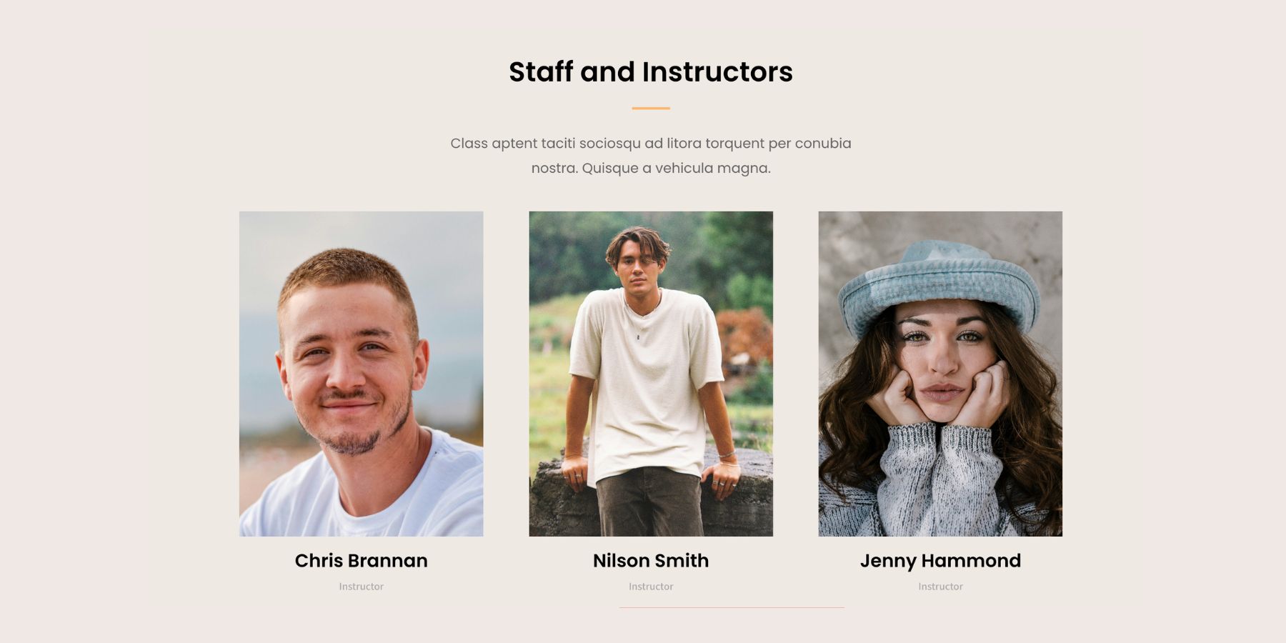
Different image heights break the rhythm of a layout. Cards stop lining up. Text starts at different vertical positions. The page feels less polished even when the photos themselves are good.
Cropping solves that by giving every image the same frame. More importantly, it lets you control the focal point inside that frame.
A headshot cropped with the face near the top third feels different from one centered too low or cropped at the chin. A product photo needs the full object visible. A hero image may need extra space for text on one side. The crop changes how the image reads.
Why Traditional Cropping Workflows Slow You Down
The usual workflow is to crop an image in the WordPress media editor, Photoshop, Canva, or another external tool. That can work for one image, but it becomes frustrating when you need to test the crop inside an actual layout. You edit the image elsewhere, upload or save it, place it in the design, check the result, then repeat the process if the subject sits too close to an edge or the ratio does not fit the card.
That workflow also creates extra image files. A square version, a wide version, a mobile version, and a thumbnail version can all come from the same original image. Over time, that adds clutter to the media library. Responsive design makes the problem harder. A crop that looks right on desktop may not work on a phone. Without live framing controls inside the builder, you have to guess how the image will behave at different screen sizes.
How Divi 5 Handles Cropping Differently
Divi 5 handles image cropping with two connected controls: Aspect Ratio and Framing. Aspect Ratio defines the shape of the frame. Instead of setting a fixed height, you set a proportional relationship between width and height, such as 1:1, 4:5, 3:2, or 16:9.
Framing controls how the image behaves inside that frame. You can decide whether the image covers the full area, stays fully visible, stretches, or displays at its natural size. Then you can reposition the image so the most important part stays visible.
The important part is that this workflow is non-destructive. Divi changes how the image appears inside the layout, but it does not crop or overwrite the original file in your media library.
That means you can adjust the crop, change the ratio, reposition the focal point, and create different responsive crops without uploading new image files.
How To Crop Images In Divi 5
The workflow happens inside the Visual Builder. You add an image, set an aspect ratio, choose how the image fits the frame, then move the focal point until the crop looks right.
1. Add An Image To The Page
Open your page in the Visual Builder. Add an Image module or open an existing module that contains an image. Inside the Image module, go to the Content tab and select your image from the WordPress Media Library.
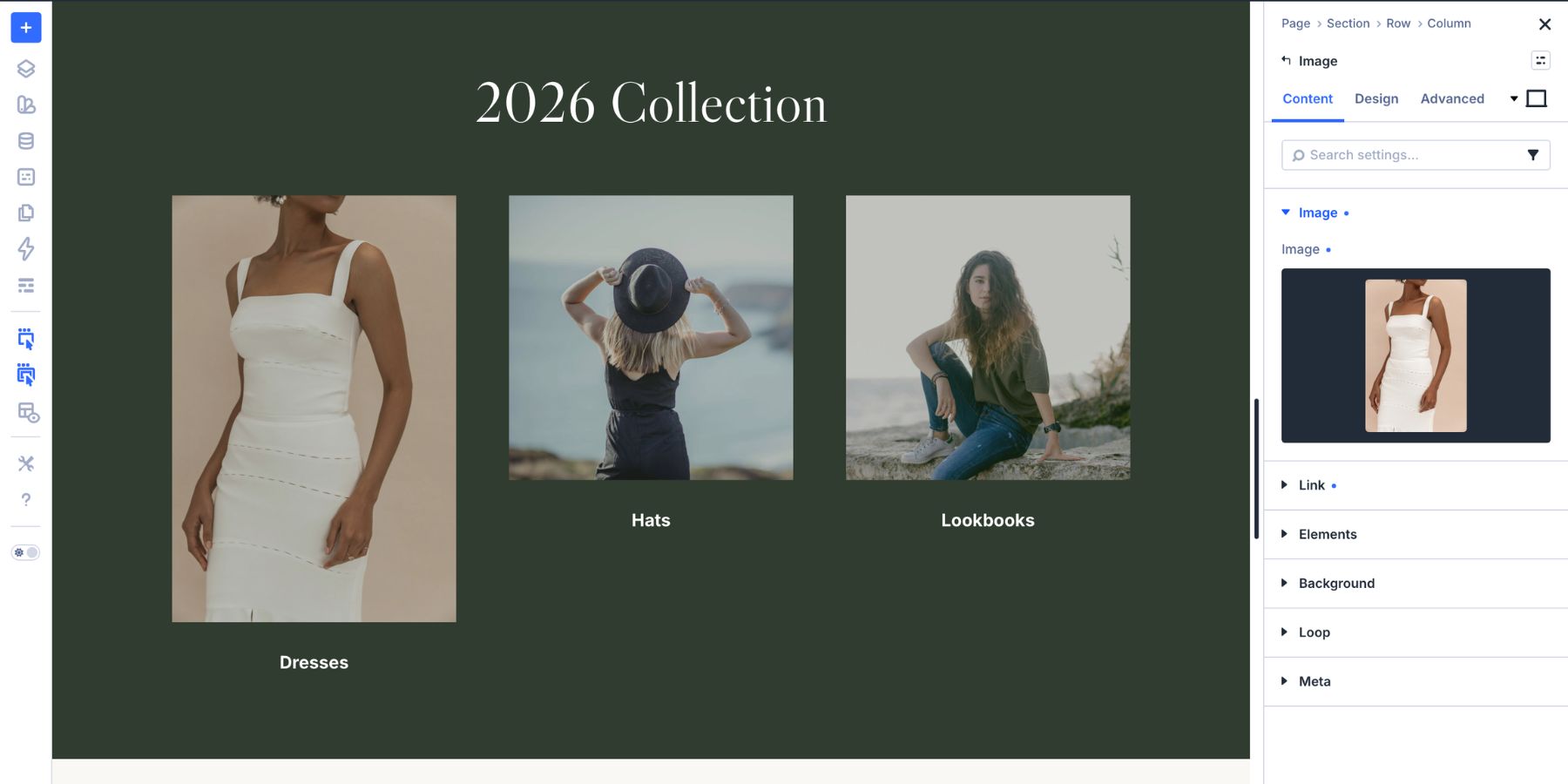
The Image module is the most direct example, but the same general workflow applies to other Divi modules with image controls. For example, you can use Aspect Ratio and Framing with image elements inside modules such as Blurb, Gallery, Person, and other modules that expose the Image option group.
That means a team directory, product grid, blog loop, gallery, or social-style image layout can all use the same cropping system.
2. Set The Aspect Ratio
Open the module settings, go to the Design tab, and expand Sizing. Find the Aspect Ratio field.
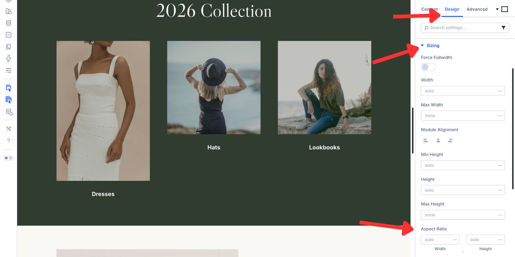
Enter a ratio in W:H format. For example, use 1:1 for a square crop, 4:5 for a portrait crop, or 16:9 for a widescreen crop.
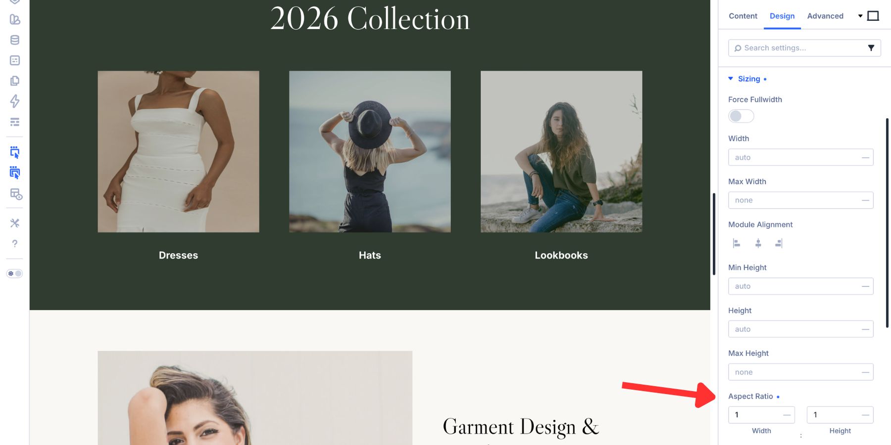
Aspect Ratio is responsive because it is based on the element’s rendered width. A 16:9 image frame that is 1280px wide will be 720px tall. If that same frame becomes 480px wide on a smaller screen, the height adjusts proportionally.
Use the ratio that fits the design:
- Hero images: 16:9, 21:9, or a custom wide ratio
- Blog featured images: 3:2 or 16:9
- Product grids: 1:1 for uniform ecommerce cards
- Team headshots: 4:5 or 3:4 for portrait framing
- Gallery thumbnails: 1:1, 4:3, or 3:2 depending on the layout
- Testimonials: 1:1 for consistent author photos
- Social-style grids: 1:1 for square image layouts
For modules with a nested image group, the path may be slightly different. For example, a Person or Blurb module may place the setting under Design > Image > Sizing > Aspect Ratio.
3. Choose The Object Fit
After setting the ratio, open the Framing option group in the Design tab. The first key setting is Object Fit.
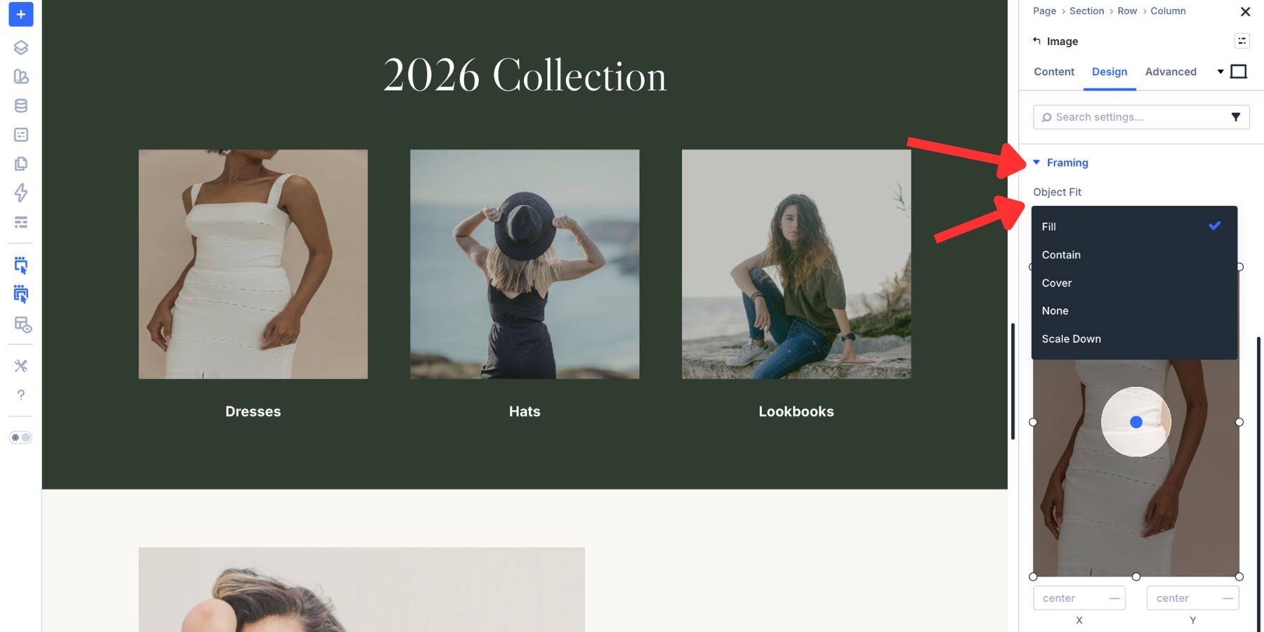
Object Fit controls how the image fills the frame.
- Fill: Stretches the image to fill the frame. This can distort the image if its original ratio does not match the frame.
- Cover: Scales the image proportionally until it fills the frame. Parts of the image may be cropped.
- Contain: Scales the image proportionally so the full image remains visible. Empty space may appear inside the frame.
- None: Displays the image at its original size without scaling.
For most design crops, Cover is the best choice. It keeps the image proportional and fills the frame cleanly.

Use Contain when the full image must remain visible, such as logos, product images on transparent backgrounds, diagrams, certificates, UI screenshots, or illustrations. Avoid Fill for photos unless the source image already matches the exact ratio. Otherwise, faces, products, and scenes can look stretched.
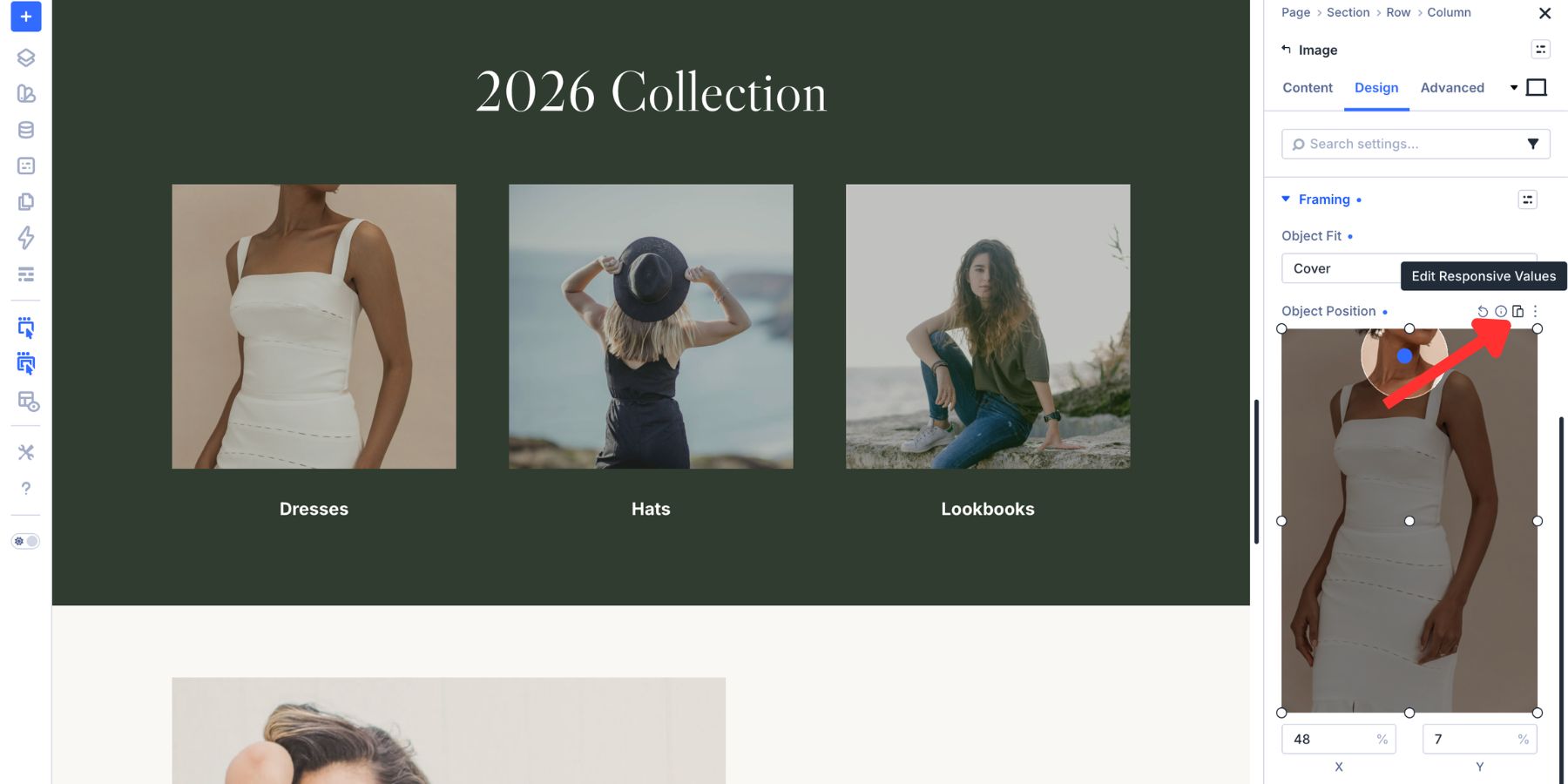
4. Adjust The Object Position
Once Object Fit is set, use Object Position to control which part of the image stays visible. The Framing group includes a live positioning preview. Drag the focal point to the part of the image that should stay in view. The crop updates on the Canvas as you adjust it.
You can also type exact X and Y percentage values for more precise placement.
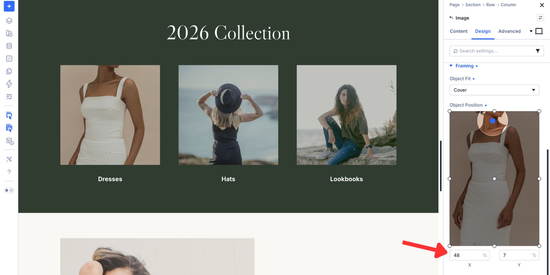
Use Object Position to keep important details in frame:
- Headshots: Keep the face and shoulders visible.
- Product photos: Keep the product centered unless the layout needs negative space.
- Hero images: Move the subject away from text overlays.
- Landscape photos: Keep the horizon, subject, or action point visible.
- Group photos: Avoid cropping people at the edges.
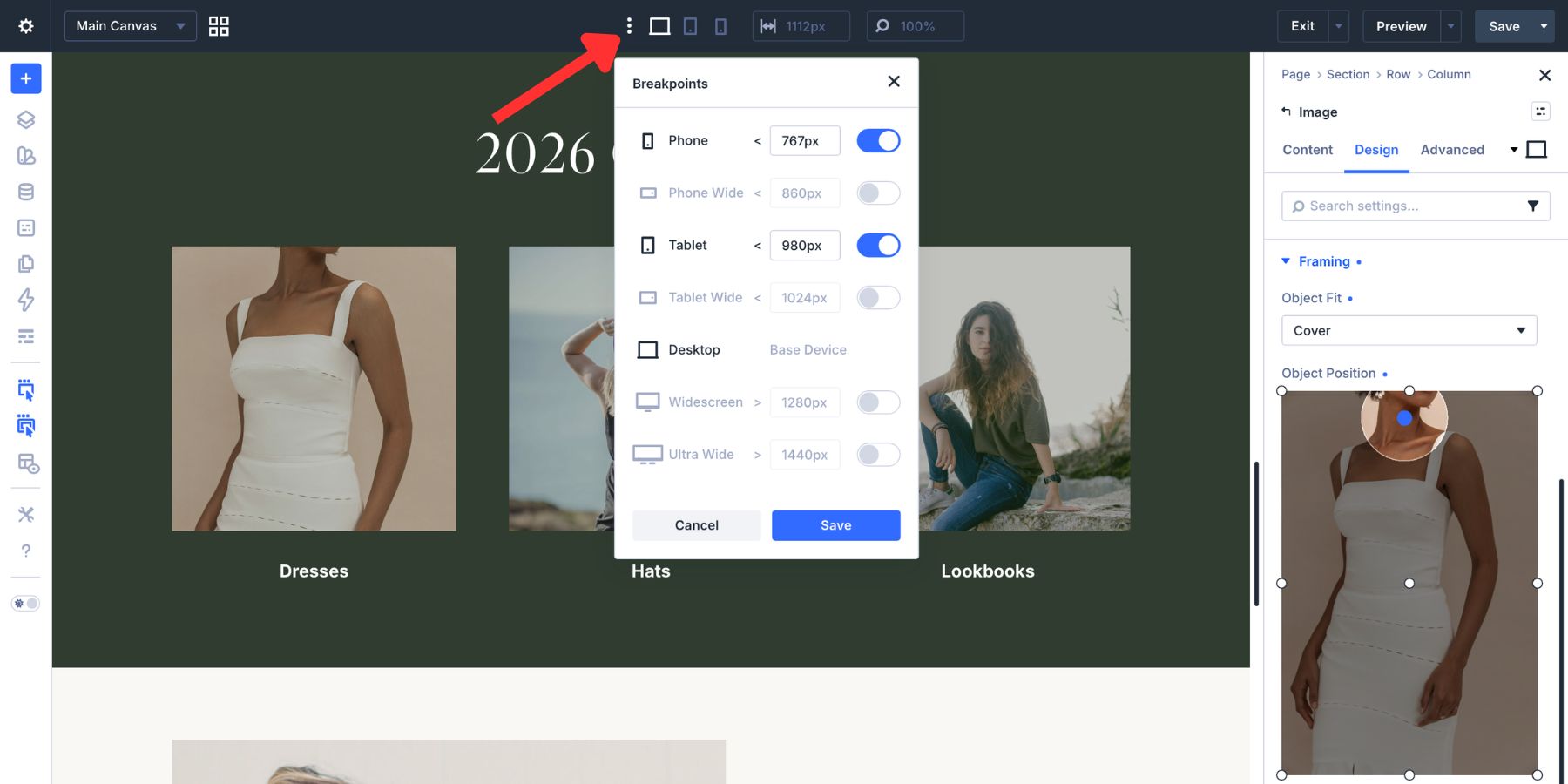
Adjust Crops For Tablet And Phone
A crop that works on desktop may need a different ratio or focal point on smaller screens. Divi 5 lets you adjust these settings per breakpoint. Switch to the breakpoint you want to edit using the device controls at the top of the Visual Builder.
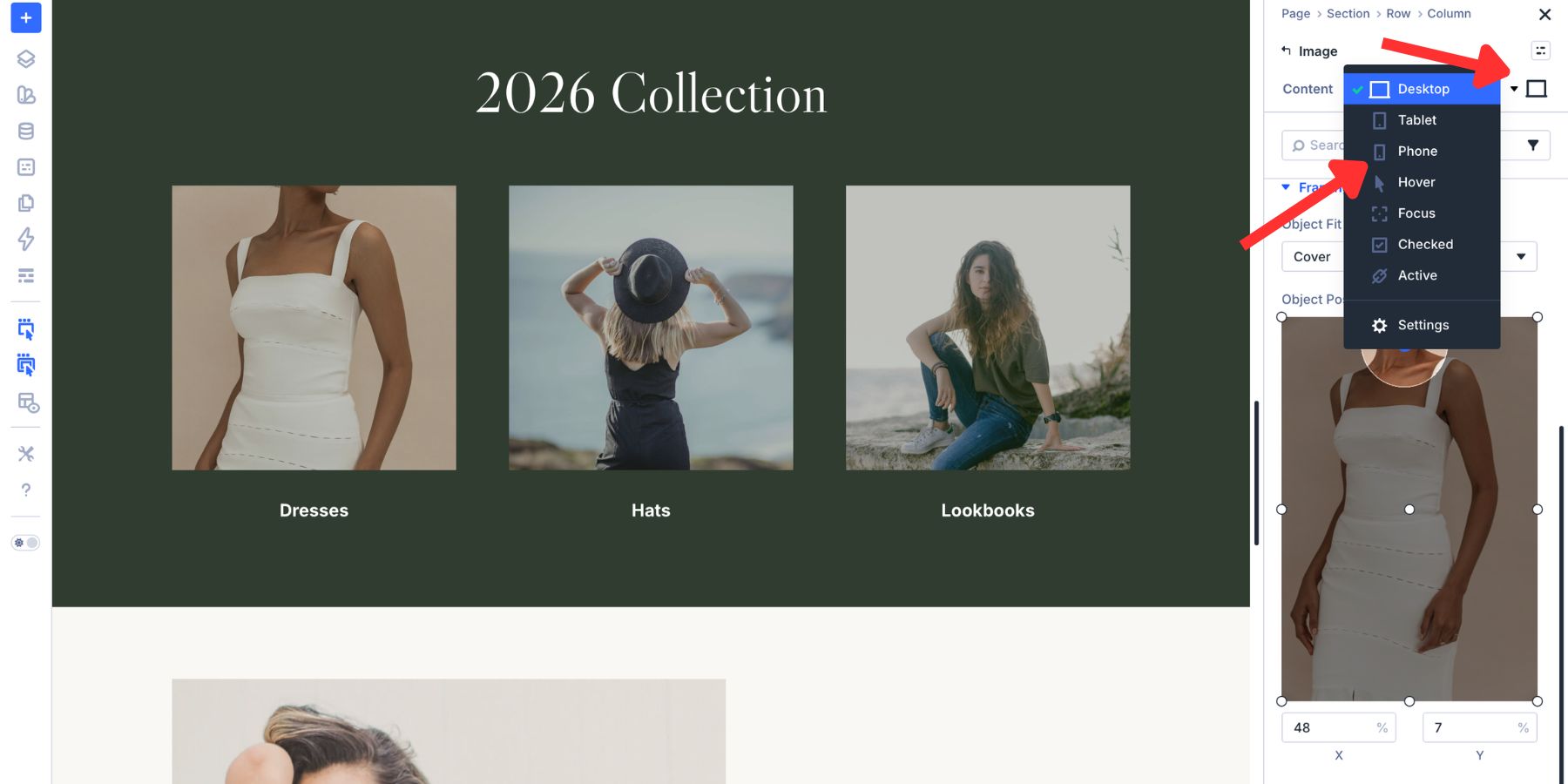
Then change the Aspect Ratio, Object Fit, or Object Position for that breakpoint. For example, a wide 16:9 hero crop might work well on desktop, but a 4:3 or 3:4 crop may work better on phones. A centered subject may need to shift upward on mobile if the image becomes taller.
You can also use Divi 5’s Responsive Editor to set values across breakpoints from one panel.
Once a setting has a responsive override, Divi marks it so you can see which values differ between breakpoints.
Divi 5 includes Desktop, Tablet, and Phone by default. If you want more control, open the responsive breakpoint settings from the top toolbar and enable additional breakpoints such as Phone Wide, Tablet Wide, Widescreen, or Ultra Wide.
Save Cropping Styles With Image Presets
If you use the same crop style repeatedly, save it as a preset. This is useful for team headshots, blog cards, product thumbnails, testimonial photos, portfolio grids, and featured image layouts.
After setting the Aspect Ratio, Object Fit, Object Position, border, spacing, and any other image styling, save the image styling as a preset. Then apply that preset to other compatible image elements instead of rebuilding the same crop each time.
Use presets for patterns such as:
- Team Headshot Crop: 4:5 ratio, Cover fit, centered upper focal point
- Blog Card Image: 3:2 ratio, Cover fit, centered focal point
- Product Thumbnail: 1:1 ratio, Contain fit, centered position
- Hero Image Crop: 16:9 ratio, Cover fit, custom focal point
- Gallery Square: 1:1 ratio, Cover fit, centered position
Presets keep image styling consistent. They also make future updates easier because you can adjust the shared style instead of editing each image individually.
Use Cropping In Loop Builder Layouts
Cropping becomes even more useful when you are working with dynamic content. A blog loop, product loop, portfolio loop, or team member loop may pull images uploaded at different ratios. Without a shared frame, the cards can become uneven.
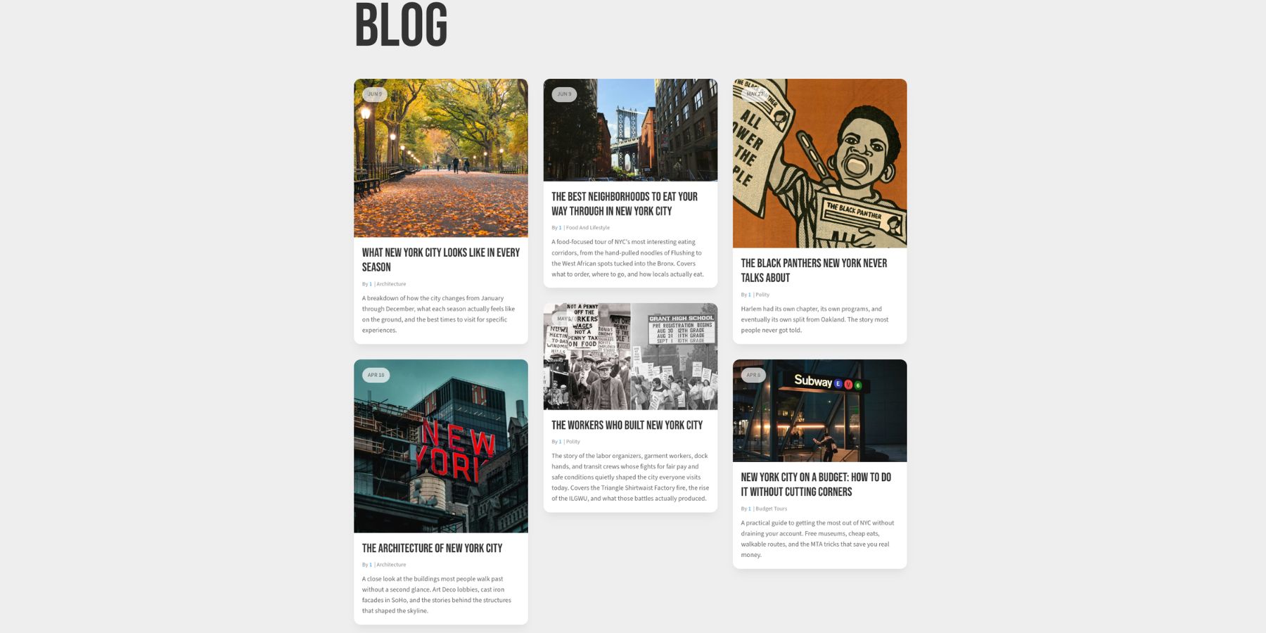
With Divi 5’s Loop Builder, you can design one template card and let the loop repeat it for every post, product, or custom item in the query. Set the Aspect Ratio and Framing on the image inside the loop template. Then connect the image source to the featured image or another dynamic image field.
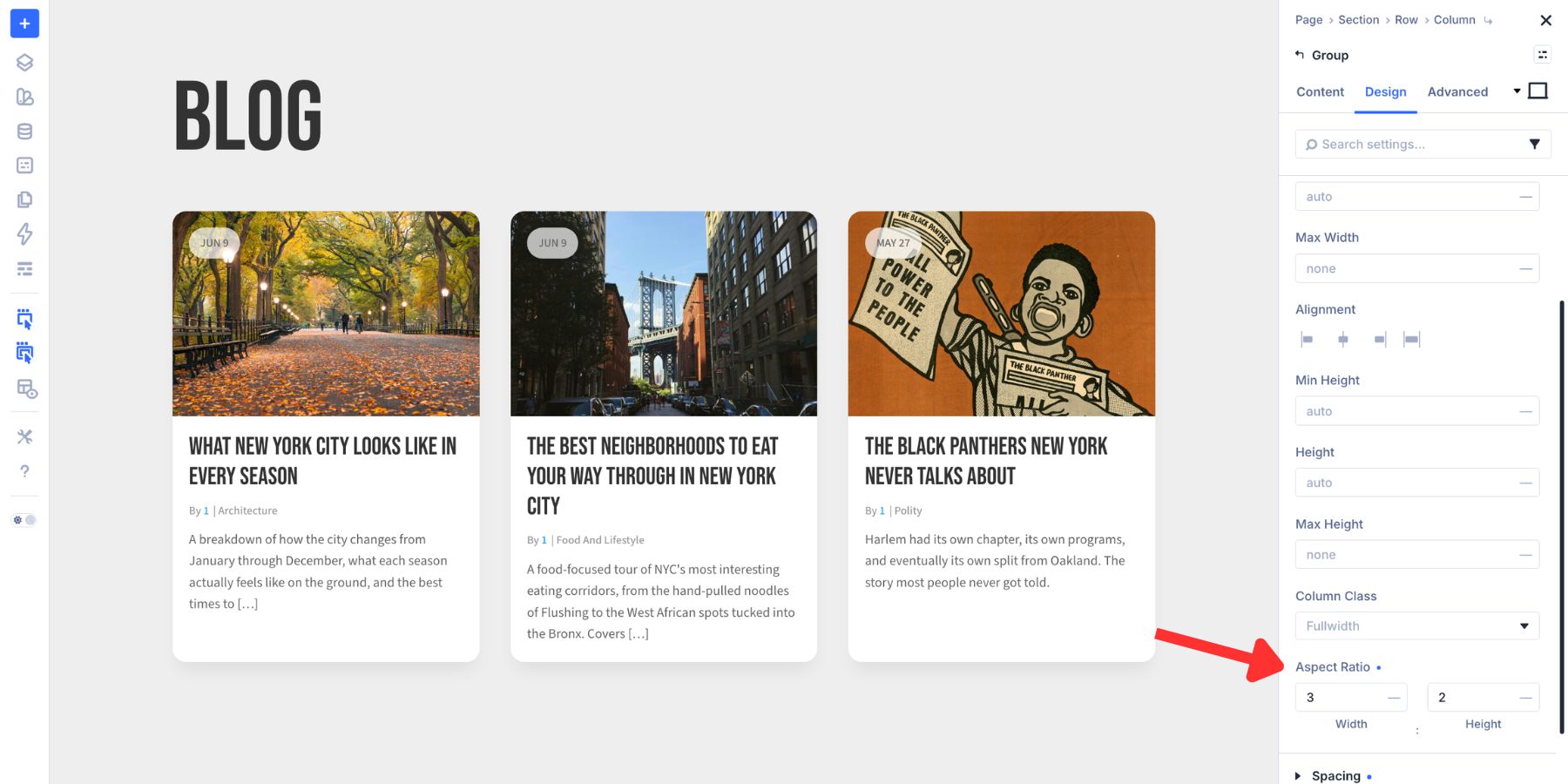
Every generated card follows the same image frame, even if the original uploaded images have different dimensions. That is one of the strongest reasons to use Aspect Ratio and Framing. You are not just fixing one image. You are defining how an entire image system behaves.
Best Practices For Cropping Images In Divi 5
Choose The Ratio Before The Image
Start with the layout. Decide whether the design needs a square, portrait, landscape, or cinematic frame before adjusting individual images. This keeps the layout consistent and prevents every image from making its own rules.
Use Cover For Most Photos
Cover is usually the right fit for photography because it fills the frame while preserving the image’s proportions. Use Object Position to decide what stays visible.
Use Contain For Logos And Product Images
If the full image needs to remain visible, use Contain. This is especially useful for logos, diagrams, interface screenshots, icons, and ecommerce products with transparent backgrounds.
Check The Crop On Mobile
Never assume the desktop crop works everywhere. Check phone and tablet views, especially for hero images, faces, products, and images with text overlays.
Avoid Cropping Important Details
Watch for cropped faces, hands, products, text, logos, and edge details. If the crop feels awkward, adjust Object Position before changing the whole layout.
Use Presets For Repeated Image Patterns
Save common image styles as presets. Team photos, blog cards, product thumbnails, and gallery images should not be styled one by one if they share the same design pattern.
Crop Images Without Leaving Divi 5
Divi 5’s Aspect Ratio and Framing controls give you a better way to crop images directly inside the Visual Builder.
Set the frame with Aspect Ratio. Choose how the image fills it with Object Fit. Move the focal point with Object Position. Adjust the crop across breakpoints when needed. Save repeatable styles as presets and apply the same approach to Loop Builder layouts.
The result is a cleaner image workflow, more consistent layouts, and fewer trips to the media editor or external design tools.


Leave A Reply