
Badges are a small part of web design, but they solve a very specific problem well. They add quick context without interrupting the rest of the layout. You see them on product cards, pricing tables, documentation pages, and feature lists because they can communicate something useful in very little space.
Labels like New, Sale, Beta, or Popular are simple, but they help guide attention and clarify meaning at a glance. That is the real value of a badge. It does not carry the whole design. It adds a clear visual signal exactly where it is needed.
The good news is that this kind of detail is easy to build in Divi 5. You do not need a plugin or a workaround to create a clean text badge. With the right mix of text styling, spacing, background, and sizing, you can build one quickly and make it fit naturally into the rest of your site.
What Are Text Badges?
Text badges are short, styled labels that add context without taking up much space. You will see them clipped to product cards, tucked into pricing tables, attached to headings, or placed beside menu items. Their job is not to explain. Their job is to signal.
That is what makes badges useful. A label like New, Sale, Beta, or Popular can redirect attention faster than a larger block of copy. In a dense layout, that kind of visual shorthand matters.
Good badges also rely on restraint. The text stays short, the shape stays compact, and the color does most of the work. When those three things stay in balance, a badge can support the surrounding content without pulling too much attention away from it.
Building A Text Badge In Divi 5
A text badge might look like something you would normally build with custom CSS or a dedicated plugin. In practice, Divi 5’s Visual Builder is already well-suited for this kind of component. With the right combination of text styling, background, spacing, sizing, and border radius, you can build a clean badge entirely with native controls.
Adding A Text Or Heading Module
Both the Text module and the Heading module can work for a badge. The right choice depends on context.
Use the Text module when the badge is simply a visual label, such as New or Sale. It is quick to add, lightweight, and works well in most cases.
Use the Heading module when the badge needs to fit more intentionally into the page structure. That will be less common, but it can make sense when the badge is closely tied to a title or another structured piece of content.
For this walkthrough, we will use a Text module. Add it to your column, then type your label. One to three words is usually the sweet spot. Once the text gets longer, it starts to feel more like a caption than a badge.
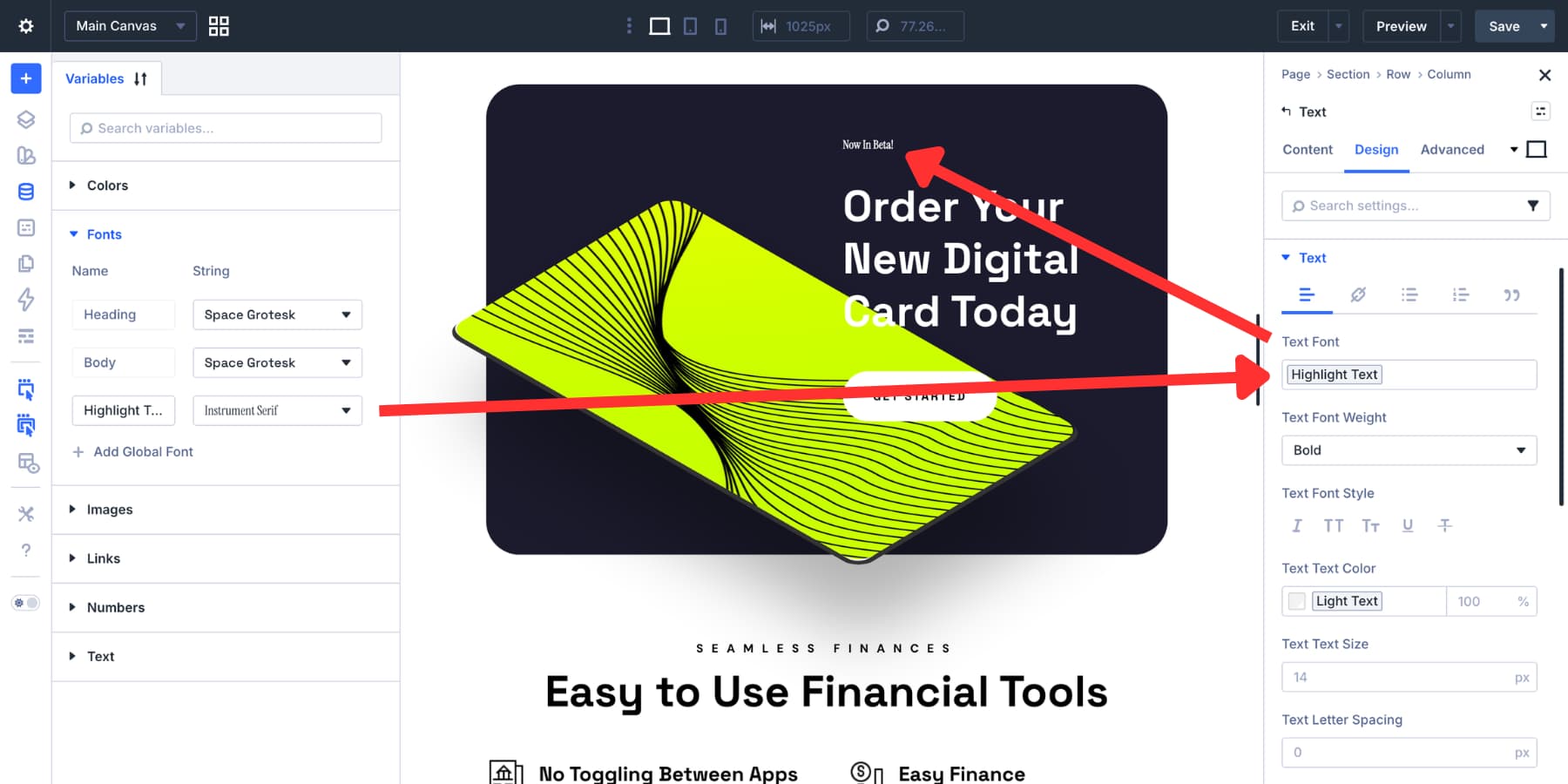
For typography, a sans-serif font usually holds up best at small sizes. Medium or bold weight helps the text stay crisp. If you already use font variables in Divi 5’s Variable Manager, pull from those instead of picking one-off font settings.
The same goes for text color. Choose something with strong contrast against the background you plan to use. White on a dark fill or a dark tone on a light fill usually works well. If your brand colors are saved as variables, use them here too for consistency.
Styling It To Look Like A Badge
The background is the first thing that makes the module read like a badge. Open the Design tab, expand the Background option group, and apply a fill color that clearly contrasts with the text. If your project already uses color variables, this is a good place to use them.
You can also use a subtle gradient. If you do, keep it restrained. Closely related tones of the same hue usually work better at badge size than anything dramatic.
At this stage, you may notice that the background stretches across the full column. That happens because the Text module is block-level by default. Go to Design > Sizing and set the Width to fit-content. That shrinks the module to the width of its contents.
Next, shape the badge with padding. Open Spacing and add padding on all sides.
A good starting point is to make the left and right padding about 1.5 times the top and bottom values. For example, 3px vertically and 5px horizontally creates a compact badge shape without making it feel cramped.
Border radius determines the overall style. Increase it to create a pill shape, or keep it lower for a more rectangular label. Both can work well depending on the rest of the design system.
A subtle box shadow can also help separate the badge from the background. Keep the blur soft and the opacity low so it adds depth without calling too much attention to itself.
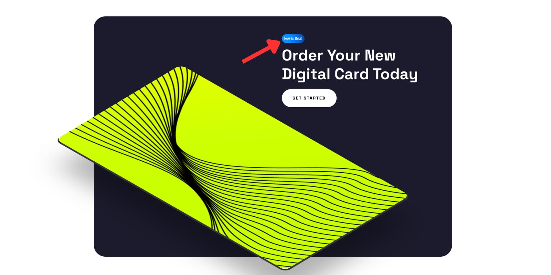
Your text badge is now ready.
Making Your Badge Accessible
Badges are often visually clear, but the surrounding context still matters. In many cases, the visible badge text will already be announced by assistive technology because it is real text inside the module. That means you do not always need to add anything extra.
What matters is whether the badge needs more context than the visible text provides. If it does, go to the Advanced tab, open the Attributes panel, and add an aria-label with a fuller description, such as Product status: Beta.
If the badge is purely decorative and the surrounding content already communicates the same information, you can set aria-hidden to true instead so screen readers skip it.
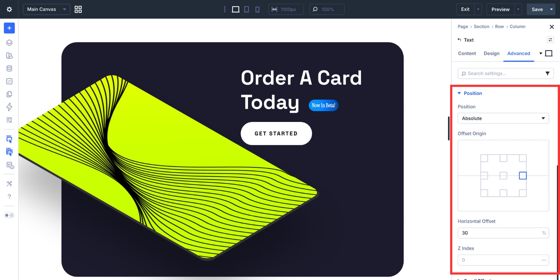
Positioning The Text Badge
A standalone badge usually does not need special positioning. It will follow the alignment of the column it sits in. If the column is centered, the badge centers with it. If the column is left-aligned, the badge follows that alignment too.
Things change when you want the badge to sit directly beside or partially overlap another element, such as a heading or image. In that case, open the Advanced tab and use Position settings. Setting the Position Type to Absolute gives you direct control over placement through horizontal and vertical offsets.
You may need to adjust those offsets for tablet and mobile using Divi 5’s Responsive Editor. Relative units such as percentages often scale more gracefully than fixed pixels in these cases.
Tip: Reuse Badges With Canvases And The Canvas Portal Module
If you plan to use the same badge styles in multiple places, Divi 5’s Canvases offer another useful option. You can build one or more badge variations on a detached Canvas, then place them into pages or Theme Builder templates with the Canvas Portal Module instead of rebuilding them each time.
The Canvas Portal Module inserts content from a detached Canvas directly into your main layout or Theme Builder template, which makes it especially useful for reusable components that need to appear in multiple places.
Here’s a practical way to set that up:
Build Your Badge On A Detached Canvas
Open the Canvas dropdown at the top left of the Visual Builder and create a new Canvas.
If you want the badge available site-wide, make the Canvas global. Name it something clear, such as Sale Badge. Then build your badge there using the same background, padding, border radius, and font settings covered above.
Once your badge is ready, set the section and row width to fit the badge cleanly. Reducing their default padding also helps prevent the Canvas Portal output from feeling larger than necessary when inserted into another layout.
Set Up Your Product Loop
Switch back to the main canvas and build your product loop using Divi 5’s Loop Builder. Query your WooCommerce products, design your card layout, and plug in dynamic content fields such as the product title, image, and price. Here’s a quick guide if you want to learn more about designing WooCommerce loops with Loop Builder.
Then add a Canvas Portal Module where you want the badge to appear.
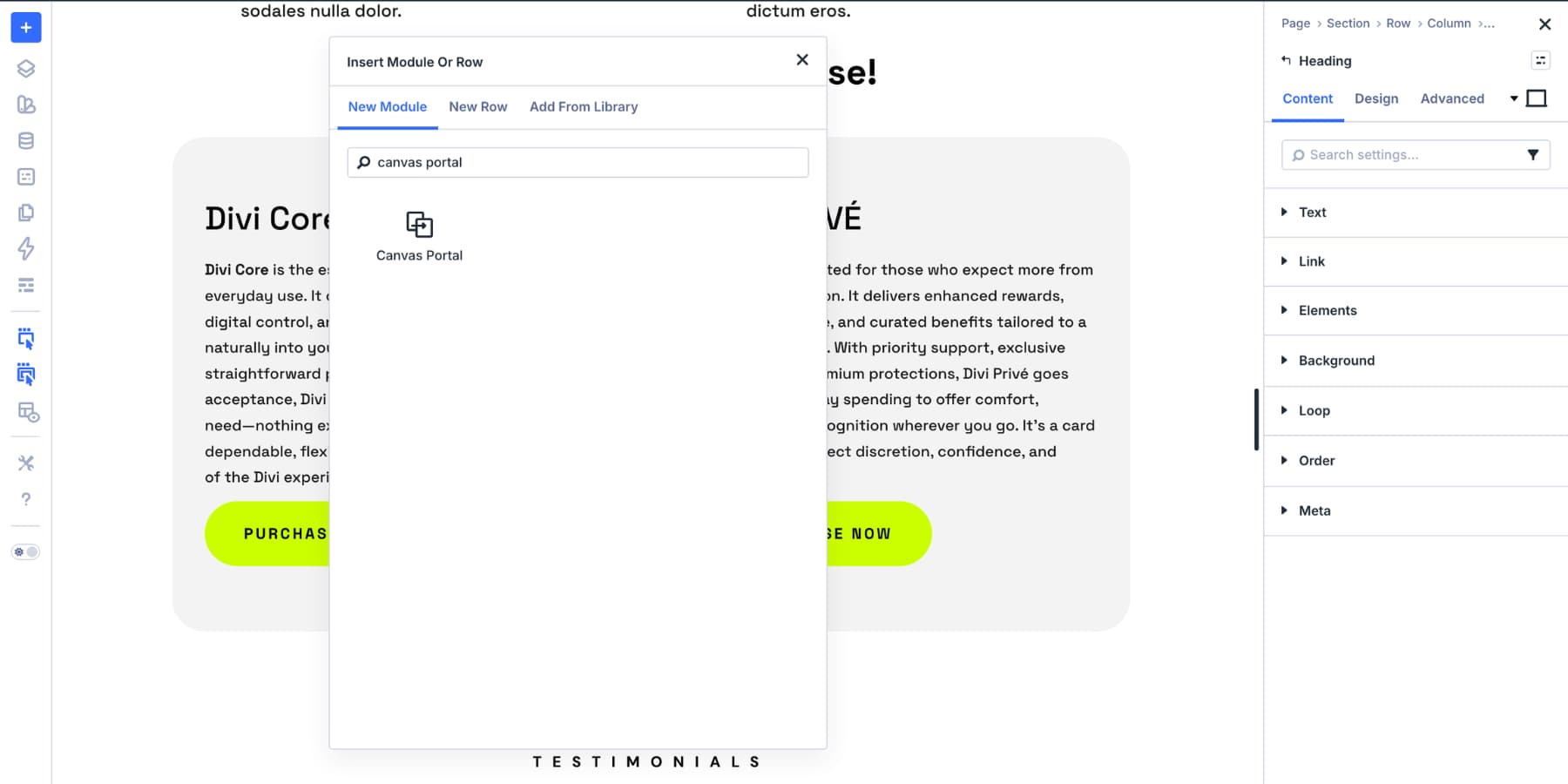
Open the Canvas dropdown inside the module settings and select your Sale Badge canvas. Divi will render that detached Canvas content in that spot on the page, while edits still happen in the original Canvas.
Swap The Label When Needed
To change the badge from Sale to Popular, open that Canvas, update the text in the Text module, and save.
Every location using that Canvas Portal updates with it, which is one of the main advantages of the Canvas Portal workflow for reusable content.
If you need both labels running at the same time on different loops, create a second Canvas named something like Popular Badge and point that loop’s Canvas Portal Module to it instead.
This approach works especially well when your badges are part of a broader reusable system, such as repeated promo labels, feature markers, or announcement tags that appear in multiple templates. It is not necessary for a simple one-off badge, but it is a useful option when consistency and reuse matter.
Some More Types Of Text Badges
The approach above covers most badge use cases, but the same styling logic can be adapted in a few other ways.
- Icon Badges: Use an Icon List module with a single item when you want a small icon alongside the label. Apply the same background, fit-content width, padding, and border radius.
- Image Badges: Divi 5’s Nested Modules let you place an Image module inside another module, which works well for small flags, avatars, or logos in a badge-like container.
- Outline Badges: Skip the filled background and use a 1px or 2px border instead. This lighter style works especially well on dark backgrounds.
- Paired Badges: Place two modules inside a Module Group set to row direction. Leave one as a plain-text label and style the other as a badge. This works well for pairings like Status: Live or Plan: Pro.
- Reusable Badge Presets: Once you land on a badge style you like, save it as a Preset so you can apply the same badge treatment consistently without manually restyling each module.
Text badges are small, but building them well touches many of the things that make Divi 5 useful: color variables, spacing ratios, border radius, presets, responsive controls, custom attributes, and reusable content systems.
None of those pieces are complicated on their own. Put them together, and you can build a badge system that stays consistent across your site with very little maintenance.
Start Building In Divi 5 Today!
Strong pages often stand out in the details. A badge in the right place, with the right color and proportion, can add clarity before a visitor reads a full sentence.
Small details done well make the whole page feel more intentional. Divi 5 gives you the tools to build those details natively, keep them consistent, and reuse them without workarounds.


Leave A Reply