
A sticky post navigation bar is an effective way to boost the user experience of any blog website. In addition to the main navigation of your site, post navigation links allow users to easily jump to the previous post or the next post on your blog. And, if you add those post navigation links to a sticky bar, those links remain visible and more accessible.
In this tutorial, we are going to create a sticky post navigation bar in Divi. To do this, we are going to use Divi’s built-in options to transform a row into a sticky bar. Then we’ll use the post navigation module to design the “previous post” and “next post” links. Plus, we are going add a post title as dynamic content to the middle of the bar that reminds users of what post they are currently viewing which gives the navigation bar a nice “past, present, and future” element.
Let’s get started!
Sneak Peek
Here is a quick look at the design we’ll build in this tutorial.
Download the Layout for FREE
To lay your hands on the designs from this tutorial, you will first need to download it using the button below. To gain access to the download you will need to subscribe to our newsletter by using the form below. As a new subscriber, you will receive even more Divi goodness and a free Divi Layout pack every Monday! If you’re already on the list, simply enter your email address below and click download. You will not be “resubscribed” or receive extra emails.

How to Upload The FREE Template
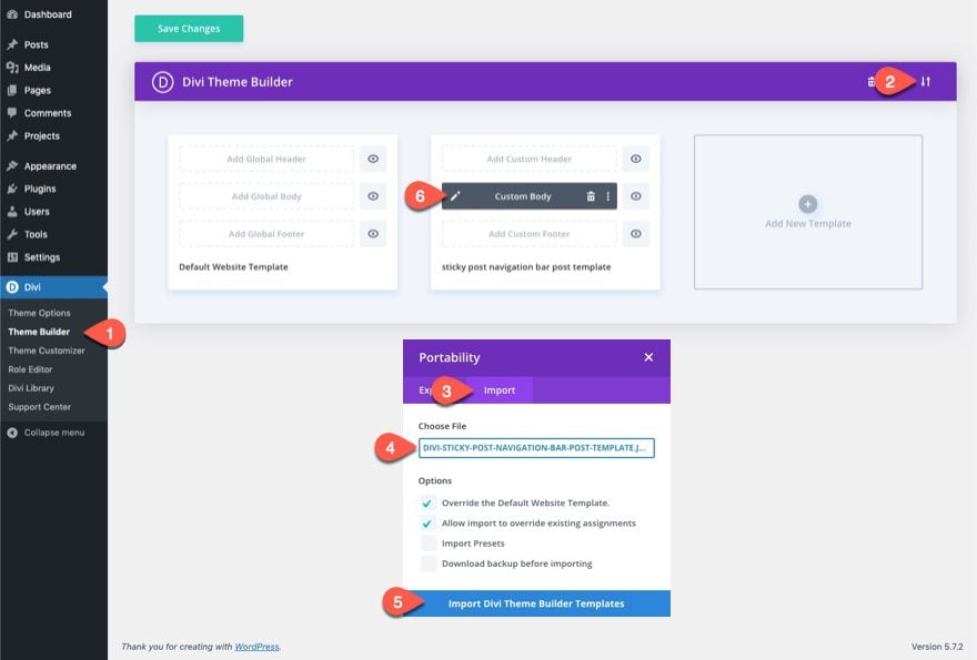
To import the free template to the theme builder, follow these steps:
- Navigate to Divi > Theme Builder.
- Click the Portability Icon.
- In the Portability popup, select the import tab.
- Choose the unzipped file previously downloaded to be imported.
- Click the Import button.
- Click the edit icon to edit the imported template.
Let’s get to the tutorial, shall we?
What You Need to Get Started
Although you can add this sticky post navigation bar to any blog post layout or template in Divi, we are going to use a premade blog post template to speed up the process and get a jump start on the design.
If you haven’t yet, install and activate the Divi Theme.
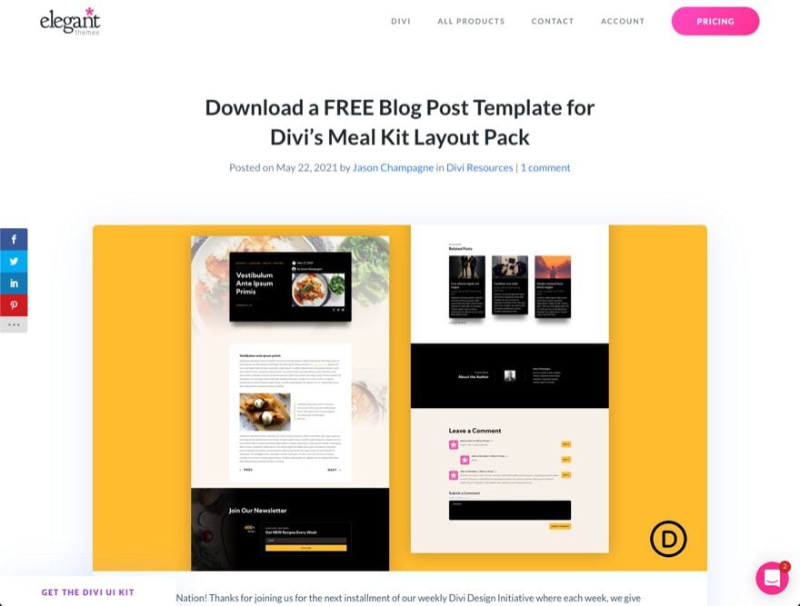
Import the Meal Kit Blog Post Template to Theme Builder
To get started, download the free blog post template for Divi’s Meal Kit Layout Pack. To do this, go to the blog post.
Then enter your email to download the zip file.
After that, unzip the file so that it is ready for import.
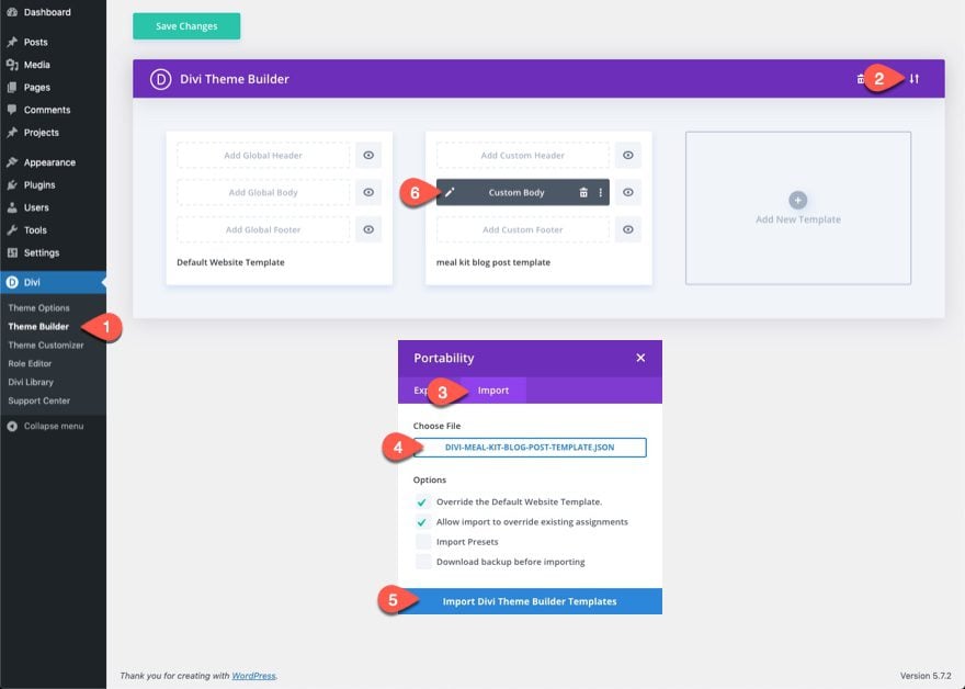
To import the file to the theme builder, follow these steps:
- Navigate to Divi > Theme Builder.
- Click the Portability Icon.
- In the Portability popup, select the import tab.
- Choose the unzipped file previously downloaded to be imported.
- Click the Import button.
- Click the edit icon to edit the imported template.
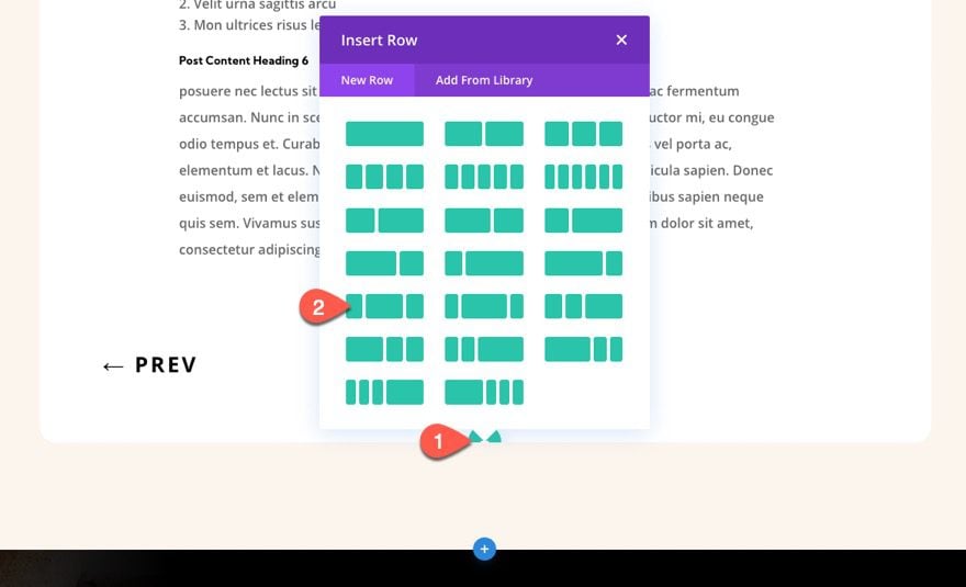
Part 1: Creating the Sticky Row
To create the sticky post navigation bar, we are going to use a three-column row as the sticky container for our post navigation links and post title.
In the second section of the template layout, add a new one-fourth one-half one-fourth column row under the row containing the post content.
Row Settings
Open the row settings.
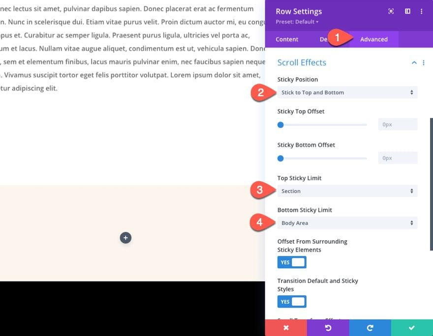
First, we need to add the sticky position to the row so that we can update other design options in the sticky state.
Under the Advanced tab, update the following:
- Sticky Position: Stick to Top and Bottom
- Top Sticky Limit: Section
- Bottom Sticky Limit: Body Area
With this sticky position, the sticky row will stick to the bottom of the browser window whenever section containing the post content is in view. Once the user scrolls past the actual position of the sticky row, the row will remain stuck at the top of the browser window throughout the rest of the post body area.
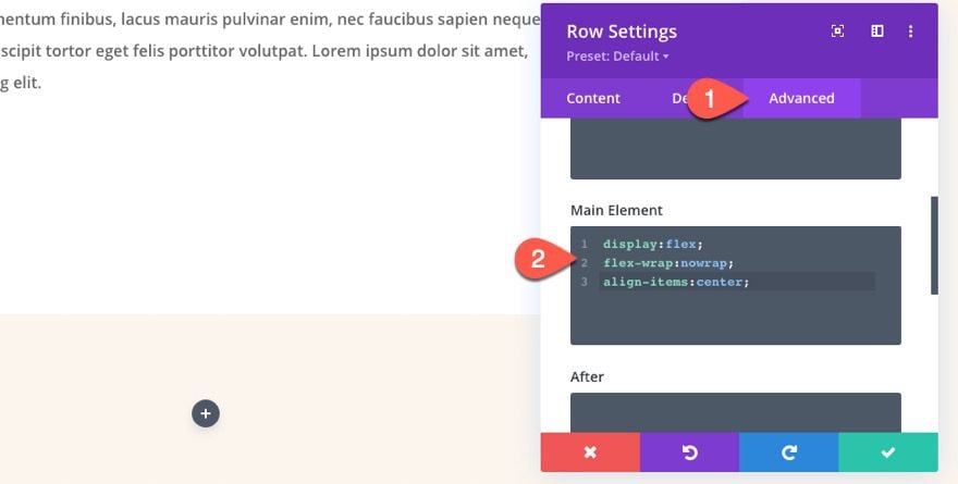
To make sure the columns don’t stack on mobile, add the following custom CSS to the Main Element:
display:flex;
flex-wrap:nowrap;
align-items:center;
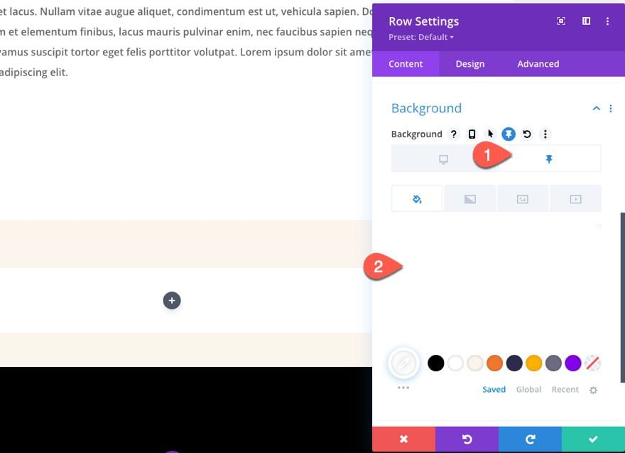
Under the content tab, add a white background color to the row in the sticky state as follows:
- Background Color: none
- Background Color: #ffffff (sticky)
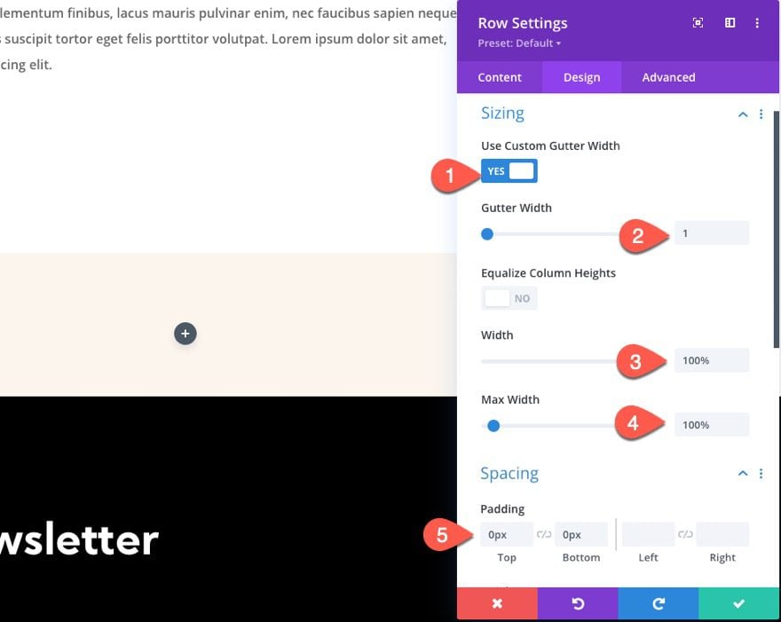
Under the design settings, update the following:
- Use Custom Gutter Width: YES
- Gutter Width: 1
- Width: 100%
- Max Width: 100%
- Padding: 0px top, 0px bottom
Hide Middle Column on Tablet and Phone
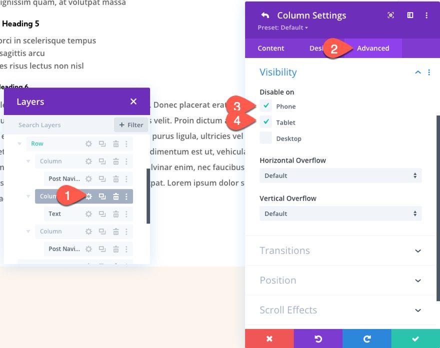
The middle column of the row will eventually hold the dynamic post title which lets users know what post they are reading. For a better experience on mobile, we are going to hide the middle column on tablet and phone.
To hide the column on mobile, open the settings for column 2 (middle column), and update the visibility options as follows:
- Disable on: Phone, Tablet
To open up more design flexibility for the post navigation, we are going to use two separate post navigation modules. In the left column, we are going to add a post navigation module that shows only the previous post link. In the right column, we are going to add a post navigation module that shows only the next post link.
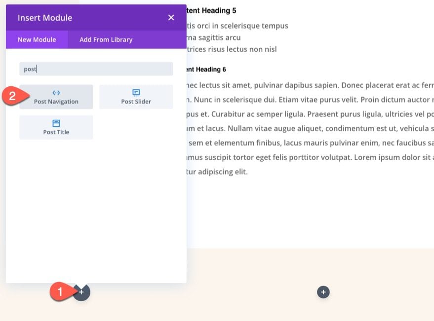
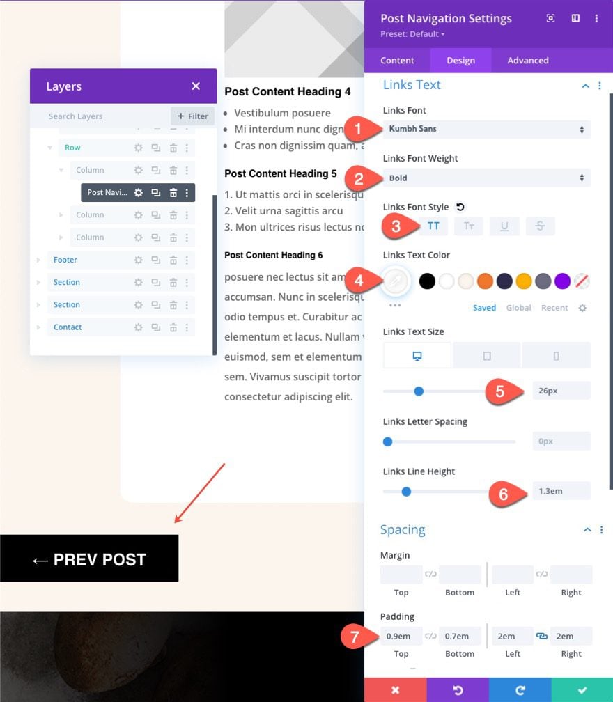
Creating the Previous Post Link
In column 1, add a new post navigation module.
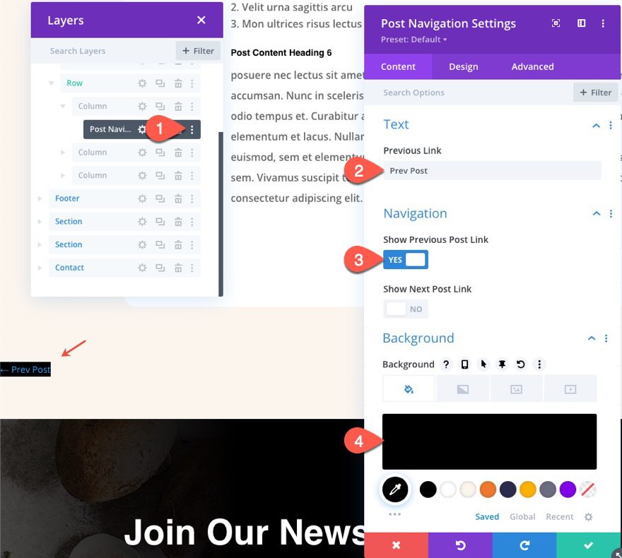
Open the post navigation settings, update the content tab options as follows:
- Previous Link (text): Prev Post
- Show Previous Post Link: YES
- Show Nex Post Link: NO
- Background Color: #000000
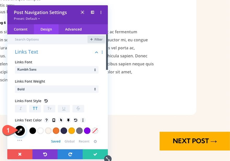
Under the design tab, update the following:
- Links Font: Kumbh Sans
- Links Font Weight: Bold
- Links Font Style: TT
- Links Text Color: #ffffff
- Links Text Size: 26px (desktop), 16px (tablet and phone)
- Links Line Height: 1.3em
- Padding: 0.9em top, 0.7em bottom, 2em left, 2em right
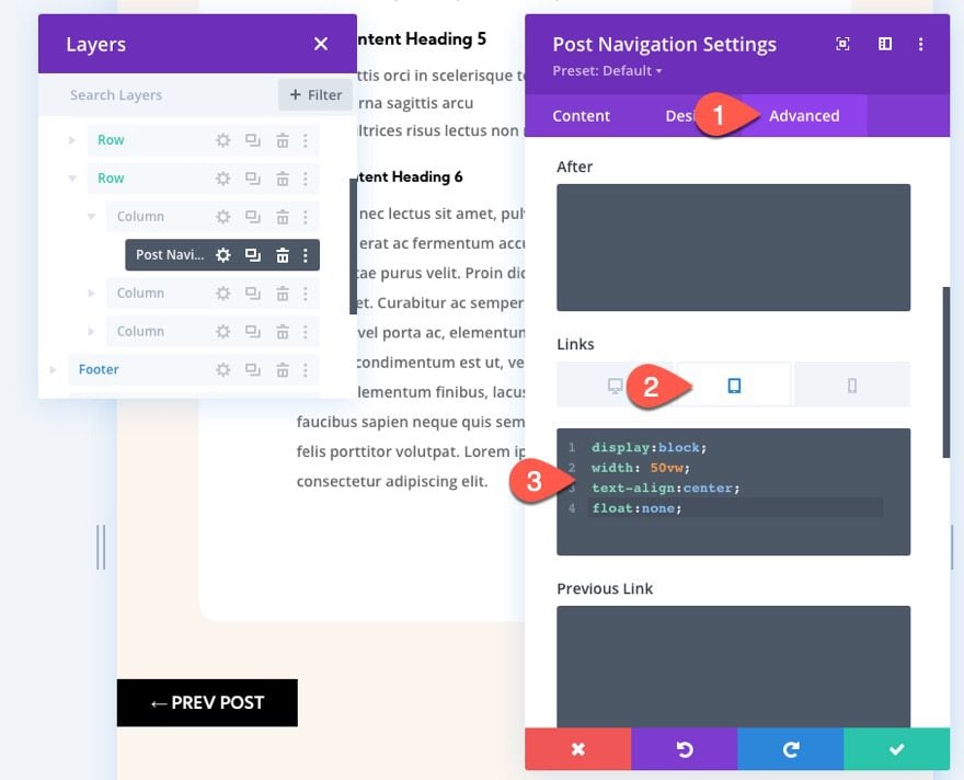
Since we are hiding the middle column on mobile, the two columns that are left that will hold the navigation links can now each take up 50% of the browser width on tablet and phone. To make sure the navigation link spans 50% of the viewport, add the following custom CSS to the Links CSS box for tablet view:
display:block;
width:50vw;
text-align:center;
float:none;
Creating the Next Post Link
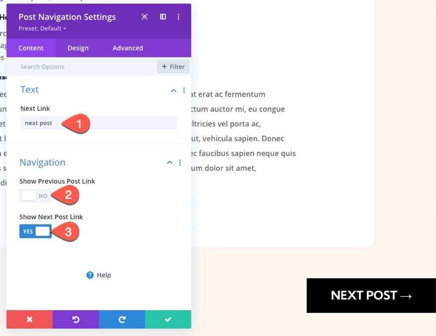
To create the next post link, copy the post navigation module (with the previous post link) we just designed and paste it to column 3 (right column).
Next, open the post navigation settings for the duplicate module in the right column and update the following content tab options:
- Next Link: next post
- Show Previous Post Link: NO
- Show Next Post Link: YES
- Background Color: #ffb100
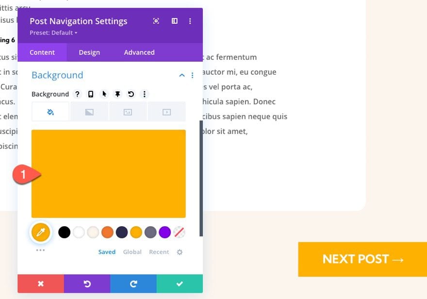
Under the design tab, update the link text color:
- Links Text Color: #000000
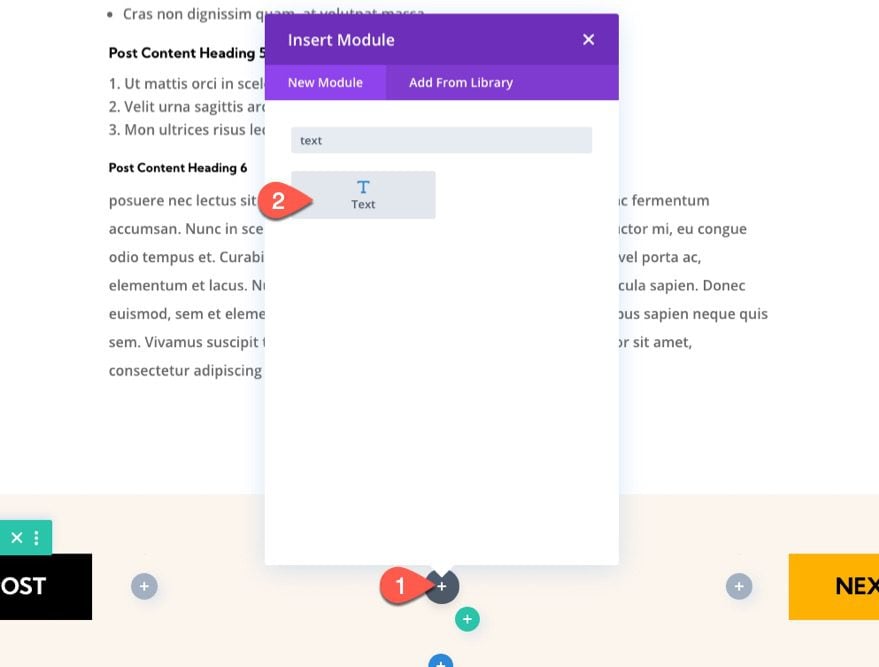
Part 3: Creating the Dynamic Post Title
Once the two navigation links are in place, we are ready to add the post title as dynamic content to the middle column. The idea is to give the user a nice reminder of the post they are reading along with the option to navigate to the previous post and the next post.
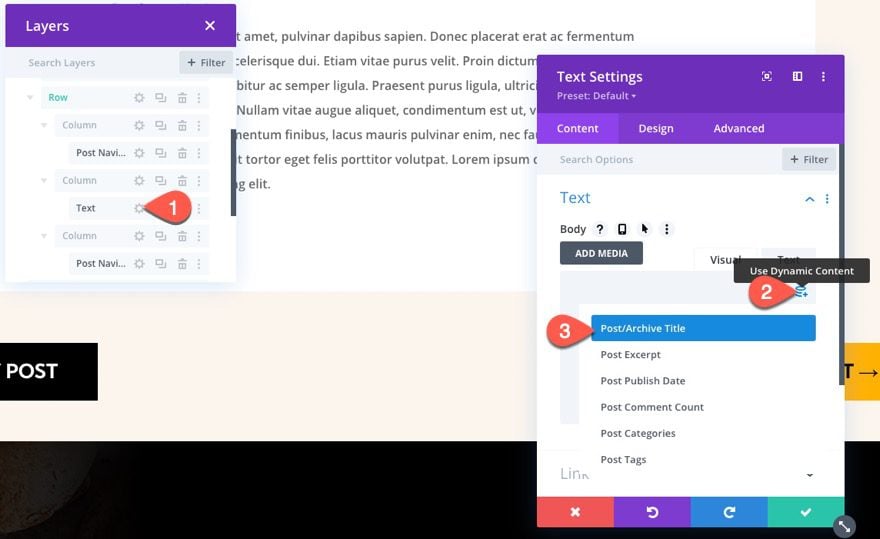
In the middle column, add a new text module.
Under the Content tab, click the “Use Dynamic Content” icon in the body area, and select the Post/Archive Title.
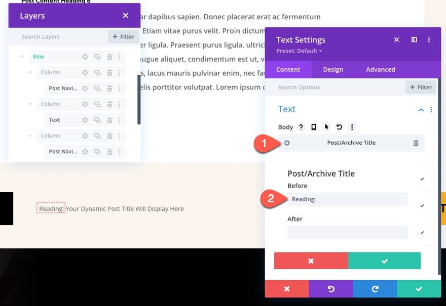
Once the dynamic post title is added, open the settings for the Post/Archive Title, and update the before content:
- Before: “Reading: “
Then save the changes.
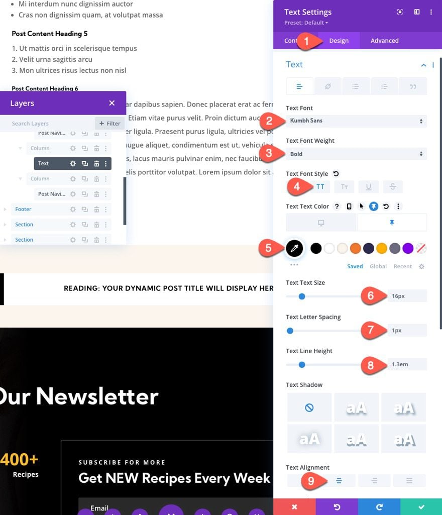
Under the design tab, update the following:
- Text Font: Kumbh Sans
- Text Font Weight: Bold
- Text Font Style: TT
- Text Text Color: transparent (desktop), #000000 (sticky)
- Text Text Size: 16px
- Text Letter Spacing: 1px
- Text Line Height: 1.3em
- Text Alignment: center
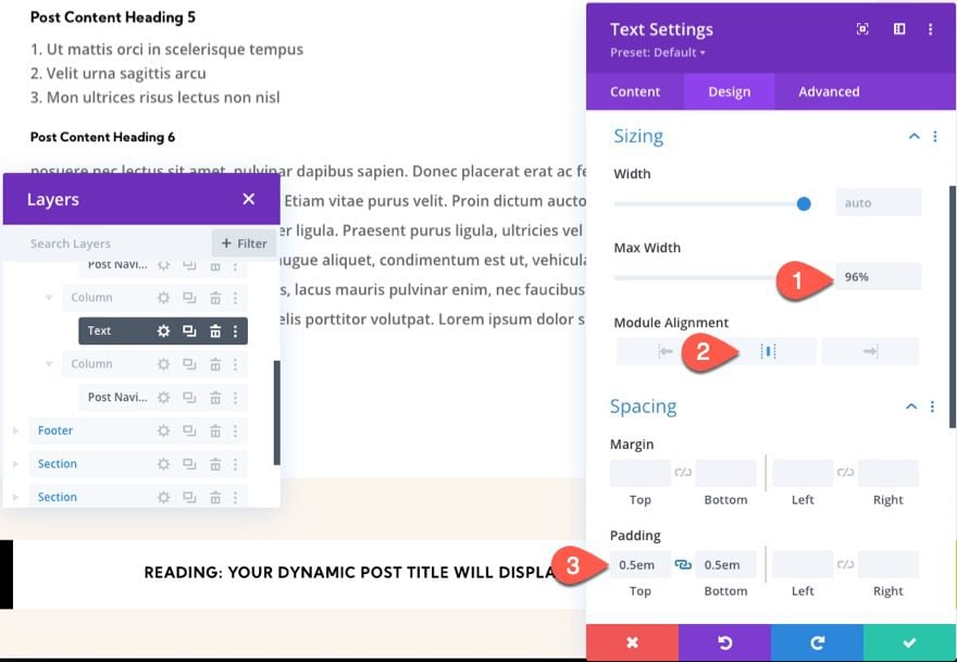
- Max Width: 96%
- Module Alignment: center
- Padding: 0.5em top, 0.5em bottom
Final Result
Final Thoughts
In this tutorial, we showed how easy it is to create a sticky post navigation bar for a blog post template in Divi. The sticky functionality of the bar/row can also be adjusted easily with Divi’s built-in options. For example, you can limit the sticky state to a section or choose to stick it only at the top or bottom of the browser viewport. Hopefully, this will come in handy for your next blog site.
I look forward to hearing from you in the comments.
Cheers!


nice and great article.
amazing navigation Bar. Divi is THE BEST
Thanks, Veronica!