

Switch the canvas to Phone view and the page becomes a narrow column, while the builder panels keep their existing size and position. Depending on your setup, the settings panel can take up as much space as the layout you’re editing.
For a quick check, that may be fine. You switch breakpoints from the top bar, scan the layout, and continue building. A dedicated responsive editing session involves more adjustments, though, and the panel arrangement that works for a full-width canvas may be less convenient at phone width.
Divi 5’s Workspaces let you rearrange the builder for this kind of work and save that setup for next time. Below, we’ll create a Phone Editing workspace and explain the reasoning behind each choice, so you can adapt it to your screen and workflow.
Why Create A Workspace For Responsive Editing?
Divi 5 stores your builder arrangement as a Workspace you can return to whenever you need it. Panel positions, visible toolbar controls, and builder view preferences become part of that saved setup. Our full guide to Divi 5 Workspaces covers the feature in depth if it’s new to you.
The tools you need often change as a build progresses. While creating a layout, you add sections, rows, and modules, or load complete layouts and arrange their content. When refining an existing design for smaller screens, you’re more likely to adjust spacing, resize headings, change stacking order, and review which elements should remain visible.
During that work, settings need to stay close at hand, while controls for adding new content may be less useful. A workspace arranged for building the desktop layout can still work, but it may leave panels or overlays in places that make a narrow preview harder to inspect. Saving a separate arrangement lets you make those choices once.
A workspace saved for phone editing also gives you a consistent starting point. Instead of rearranging panels and switching views at the beginning of every session, you can load a setup intended for that task. Still check the active breakpoint before editing: a saved workspace helps establish the right view, but it doesn’t lock your changes to Phone.
How To Build A Phone Editing Workspace In Divi 5
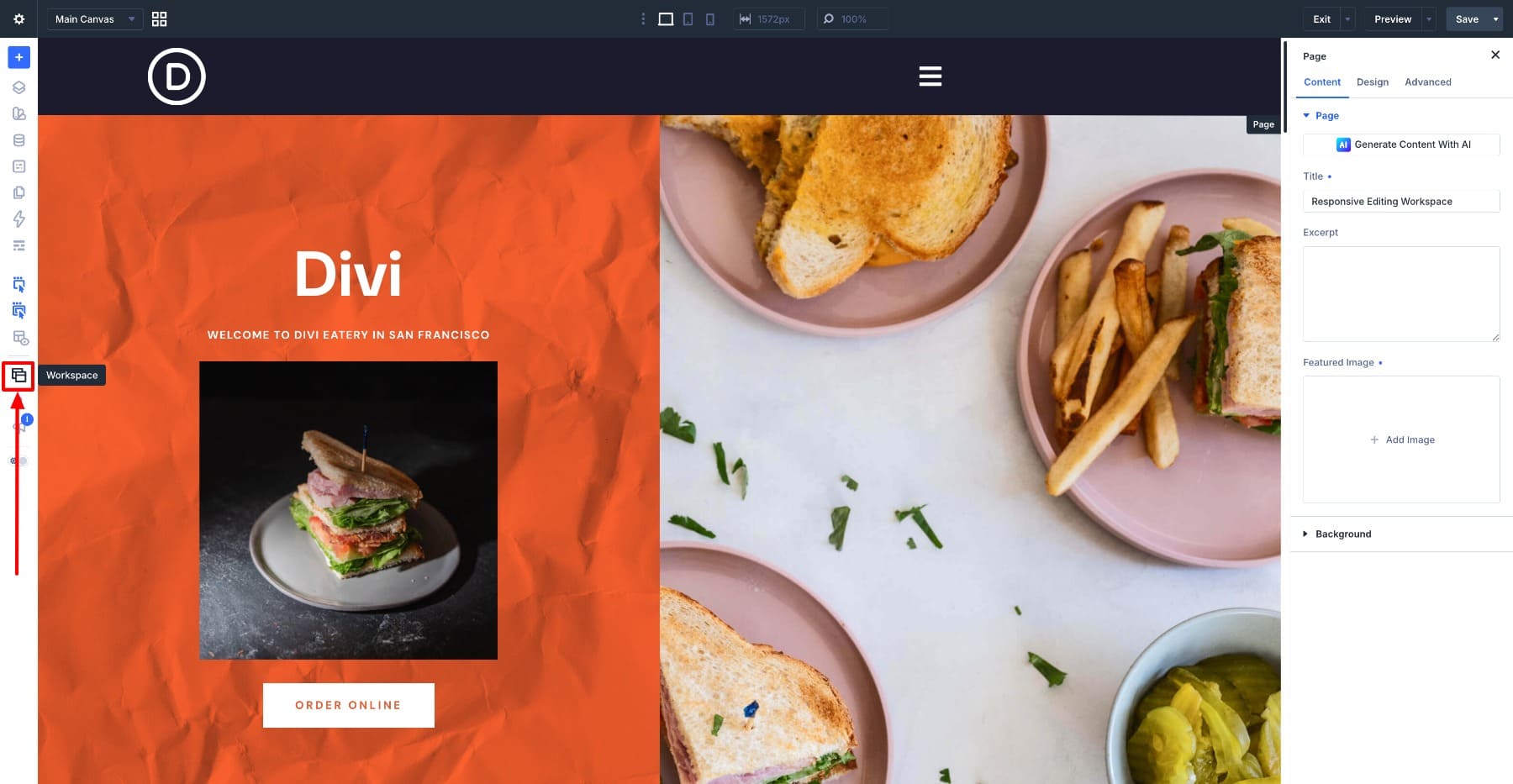
Click the Workspaces icon in the Builder Bar on the left and open the Active Workspace menu. Select the workspace you normally use as your starting point. This keeps your preferred interface mode, color scheme, and other settings in place while you adjust the options below.
We’ll save the finished arrangement with Save as New Workspace in Step 5. There’s no need to duplicate it first or update your existing saved workspace during this setup.
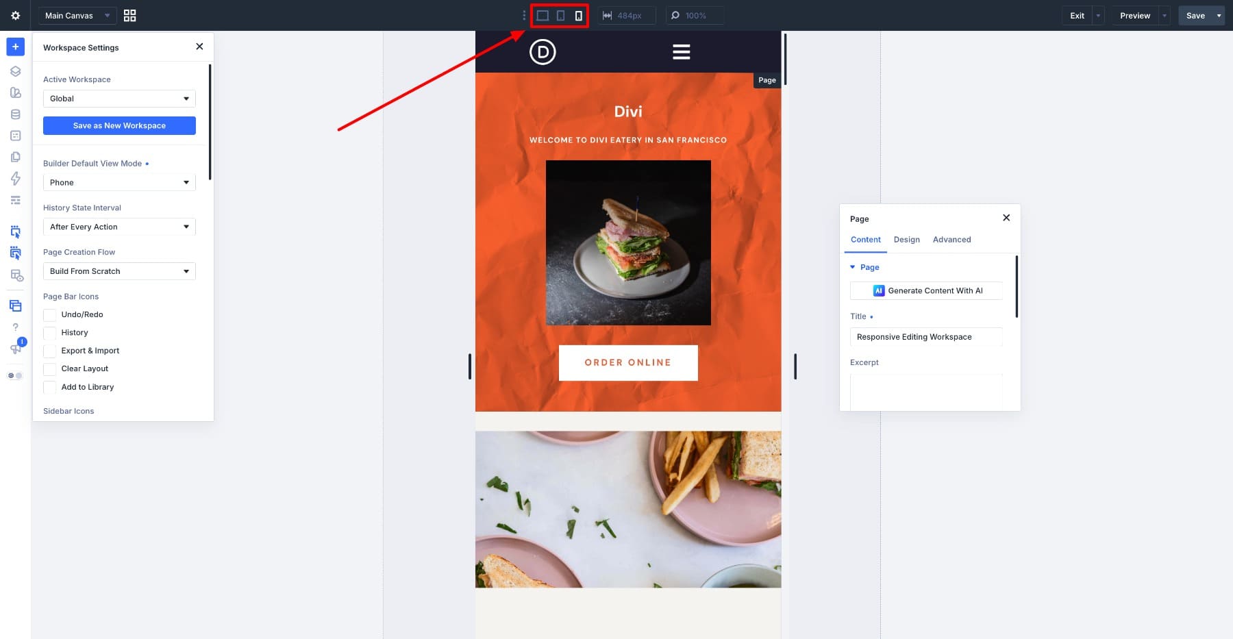
Workspace Settings contains several groups of options, so you may need to scroll to find each one. Keep the panel available while you work through the steps, and close it when you need to check the finished arrangement.
Step 1. Open The Builder At Phone Width
In Workspace Settings, find Builder Default View Mode and choose Phone. This sets Phone as the workspace’s starting view. Check that the canvas has switched to the narrow preview before arranging your panels.
Take this step first because the next adjustments depend on the available space around the phone canvas. Panel placement in Step 2 is the clearest example: the gray area beside a narrow preview gives you somewhere to place settings without covering the design. A position chosen at desktop width may not work as well.
Starting in Phone view also makes it easier to begin with the intended responsive settings. Before changing a value, check the selected breakpoint, especially if you’ve switched views during the session or opened a setting’s Responsive Editor.
Step 2. Float The Settings Panel And Position It Beside The Canvas
Open a settings panel, right-click its header, and choose Undock Panel. The panel becomes a floating window you can drag into position. You can also use Settings Modal Default Position in Workspace Settings to choose a floating placement. Save the final arrangement in Step 5 to reuse it later.
A floating panel lets you position settings independently of the sidebars. Open a module’s settings when you need them, then close the panel for an unobstructed look at the page. Docked panels can also be closed; the advantage here is being able to place the open panel beside the phone preview.
At phone width, the layout occupies a narrow column with gray space on either side. Drag the floating settings panel into the space on the right, keeping it clear of the canvas edge. On a wide monitor, you may have room for a generous panel width. On a smaller laptop, resize the panel to fit the available space, or keep it docked if that gives you a more comfortable arrangement.
The goal is to see the setting and its effect at the same time. For example, change a padding value and watch the section respond without having to move the panel out of the way after each adjustment.
As you simplify the interface in the next step, keep the breakpoint switcher accessible. Switching to Tablet or Desktop after a Phone edit gives you a quick comparison without having to load another workspace.
Step 3. Choose Which Controls And Layouts Stay Visible
Next, reduce distractions around the phone preview. We’ll adjust Theme Builder visibility, hover controls, and sidebar shortcuts, then keep disabled modules visible while editing. These are workspace preferences, so you can retain any controls you use regularly.
Start with Show Theme Builder Layouts in Workspace Settings and switch it off when you’re focusing on page content. This hides the assigned Theme Builder layouts from the editing view, helping you reach the page content without scrolling past the header. It doesn’t remove those layouts from the live site. Turn the option back on when checking how the page works with its header and footer.
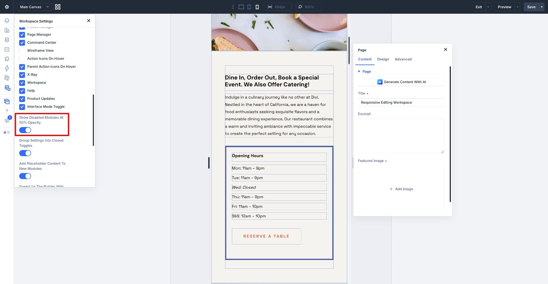
Use the Action Icons On Hover control in the Builder Bar to turn off module action overlays if they obscure the narrow preview. You can still open the element’s settings when you need to edit it. This is useful during a visual review, when toolbars would otherwise cover part of the content.
Do the same with Parent Action Icons On Hover if section and row controls are getting in the way. On narrow layouts, several nested elements can occupy the same small area, making the parent controls distracting. Right-click menus remain available for actions such as duplicating or deleting elements.
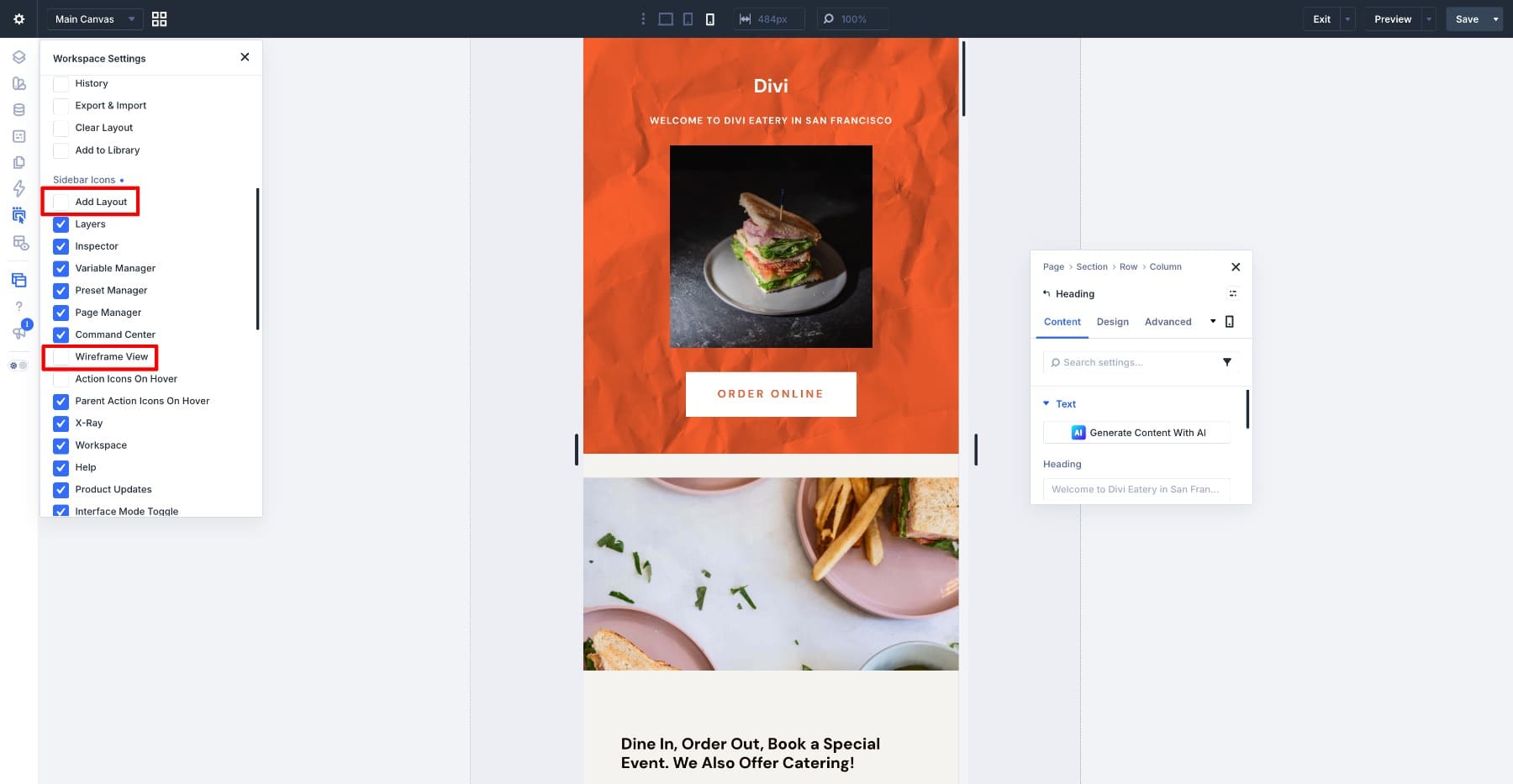
The Sidebar Icons checkboxes in Workspace Settings control whether these shortcuts appear in the Builder Bar. Hiding a shortcut and turning its mode off are separate actions, so set the mode first before hiding a control you don’t need.
Under Sidebar Icons, uncheck Wireframe View and Add Layout if you don’t use them during this stage. These options belong to the sidebar, rather than Page Bar Icons. Keep Wireframe View available if you regularly use it to inspect structure; this example uses Layers and X-Ray Mode instead.
Turn on Show Disabled Modules At 50% Opacity. When a module is disabled for the current device, this preference keeps it visible as a faded element inside the builder. You can select it, review its settings, or enable it again without first locating it through the layout hierarchy. It remains disabled on the front end according to its visibility settings.
Step 4. Keep Layers Closed Until You Need It
Layers View is useful for two jobs: inspecting the page hierarchy and selecting an existing element by its label. Both can help at phone width, where stacked or overlapping content may make it difficult to select the right module directly on the canvas.
For this workspace, keep Layers closed initially and open it when a task calls for it. If you prefer having the structure visible throughout the session, dock it on the left and check that the remaining space still suits your preview. The choice depends on the complexity of the page and the width of your screen.
For quick commands, press Cmd+K on Mac or Ctrl+K on Windows to open the Command Center. Use it to open panels, switch views, or jump to settings without keeping extra panels open. The example below shows it adding a Heading module. To select an existing module by its label, use Layers; typing a module type into the Command Center can offer an action to add a new one.
For an on-canvas view of the structure, turn on X-Ray Mode from the Builder Bar. Its outlines help you identify sections, rows, columns, and modules while keeping the content visible. This can make it easier to locate the container responsible for a spacing issue without opening another panel. Leave it enabled when you save this workspace if you want it in your usual responsive setup.
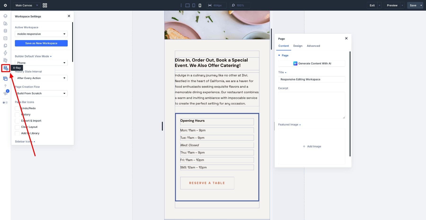
Layers remains available for tasks that benefit from a full hierarchy, such as moving several modules or selecting an element that’s difficult to reach on the canvas. Open it for those adjustments, then close it when you return to visual checks. Our guide to the Divi 5 power user workflow explores Layers and the Command Center in more detail.
Step 5. Save The Workspace
Once the panels and controls are arranged, open Workspace Settings and click Save as New Workspace. In the Save Workspace modal, enter a clear name such as Phone Editing. Leave Set as Default off if you want to keep your regular building workspace as the one that loads by default, then save.
Your new setup is now available from the Active Workspace menu. Switch to another workspace and back to check that the phone view and panel arrangement return as expected. When a page is ready for responsive editing, you can select this saved setup instead of arranging the interface again.
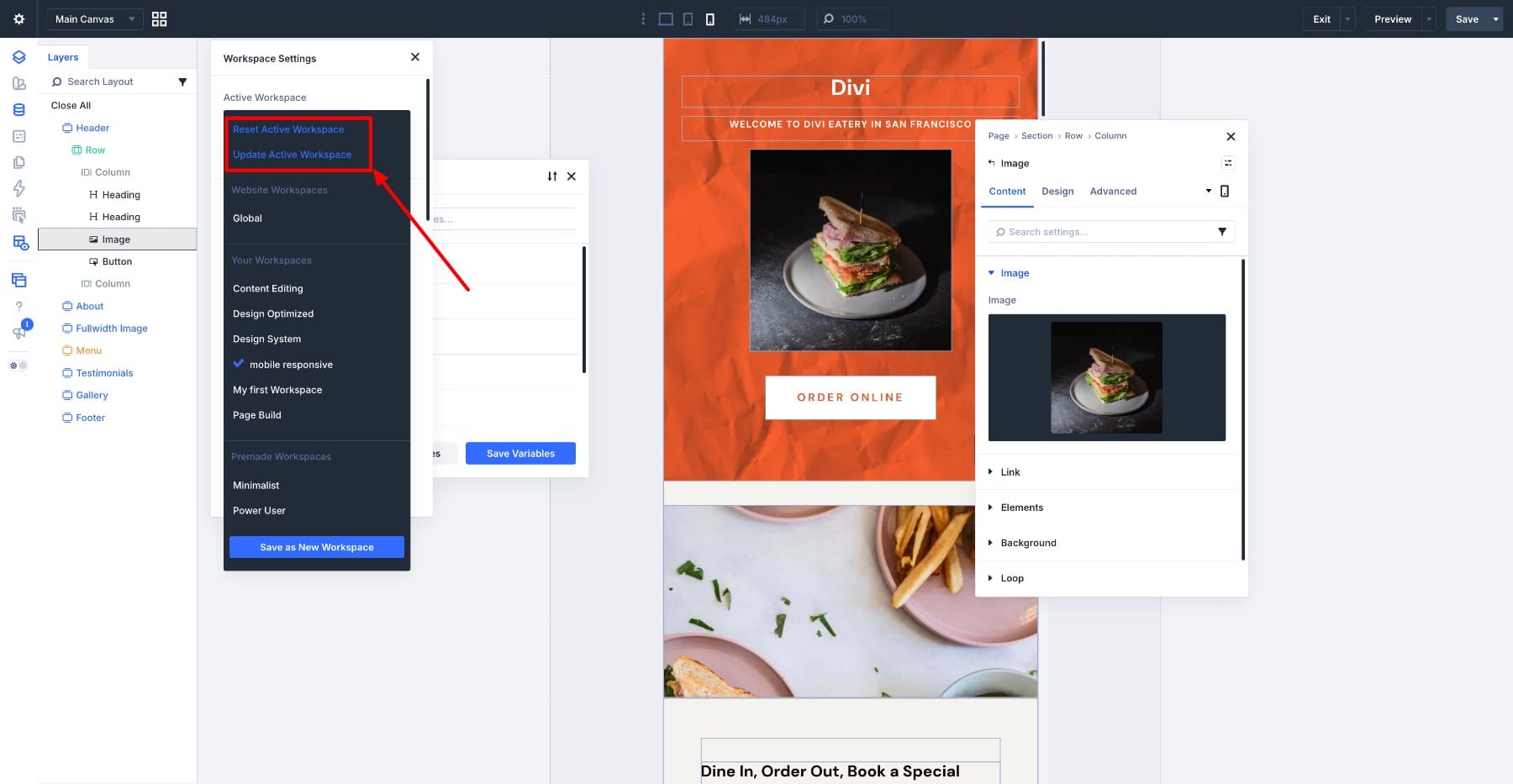
If you later move the panel or change a preference and want to keep the adjustment, run Update Active Workspace from the Command Center. This saves the current arrangement into the active workspace, so you don’t need to create another named workspace for every refinement.
The Reset Active Workspace command resets the active workspace’s settings and closes open panels. Use it when you want to clear workspace adjustments, then switch to your saved Phone Editing workspace to recall its arrangement.
Working In The Phone Workspace
Divi’s responsive values generally inherit from larger breakpoints to smaller ones until you add an override. For example, a padding value set for Desktop can carry through to Tablet and Phone. The value you see at Phone width may therefore be inherited rather than one you entered specifically for that breakpoint.
Suppose a section inherits 80px of padding and you want less space on Phone. With Phone active, changing that responsive setting creates a Phone override; it doesn’t rewrite the Desktop value simply because the original value was inherited. If you open the setting’s Responsive Editor, check which breakpoint’s field you’re changing, since that editor lets you adjust other views without switching the canvas.
To review existing overrides, use the Modified filter beside the settings search field. Apply it, then switch between view modes to inspect modified settings for each breakpoint. In the example below, the filter isolates the heading size changed for Phone. Clear the filter when you need to see and edit settings that haven’t been modified.
The filter is a way to narrow your settings, not a complete explanation of every style affecting the element. A missing result doesn’t prove that a value comes from a Preset: it may be inherited from another breakpoint or supplied by a default or shared style. Check the Responsive Editor for breakpoint values and use the Inspector and assigned Presets to investigate the source of shared styling.
Make A Tablet Version Next
To create a similar setup for Tablet, duplicate the saved Phone Editing workspace and activate the copy. Set Builder Default View Mode to Tablet, then reposition the settings panel to suit the wider preview. There may be less gray space beside the canvas, so resize or dock the panel if necessary. Rename the copy Tablet Editing and use Update Active Workspace to save the changes.
Keep using the breakpoint switcher for quick comparisons. A brief look at Tablet or Desktop doesn’t require a separate workspace. The dedicated Tablet arrangement becomes useful when you’re spending time adjusting that view and want panels positioned around its wider canvas.
If your site uses Customizable Responsive Breakpoints, check the enabled views and their widths in the breakpoint editor. Builder Default View Mode selects a starting view; it isn’t where you define custom breakpoint widths. Use the top-bar controls to select other enabled breakpoints as you review the layout.
Let The Builder Fit The Work
It’s easy to keep using the same interface arrangement for every task. A panel stays where it has always been, even when a different position would make the current job easier. Workspaces in Divi 5 give you a way to save the adjustments that suit each stage of your process.
Try the Phone Editing workspace across a few pages, then refine the panel positions and visible controls to suit your screen. Keep the tools you reach for, hide shortcuts you rarely use, and update the workspace when the arrangement feels right. You’ll have a reusable setup for small-screen work while keeping your regular building workspace available.










Leave A Reply