
Displaying a timeline on your website enables you to showcase your brand’s milestones or project history, providing visual interest for your visitors. Divi 5‘s Group Carousel module offers a fresh way to display this content in a scrollable, engaging format, perfect for storytelling on your website.
In this post, you’ll discover how to use the Group Carousel module to build a timeline carousel in a few simple steps. We’ll cover what the module is, its features and benefits, and provide a step-by-step guide on creating your own timeline.
Let’s dive in.
What Is The Group Carousel Module?
The Group Carousel module is a versatile tool for creating custom carousels and sliders directly in the Visual Builder. It allows you to build dynamic, scrollable displays for various content types, making it ideal for timelines, portfolios, product showcases, and more. At its core, the module acts as a container that holds multiple slides, each functioning as a Group where you can add and arrange content manually or generate it dynamically using Divi 5’s Loop Builder.
Each slide in the Group Carousel is a fully editable group, meaning you can nest any Divi module to build custom layouts. You can configure the Carousel to display a single slide at a time for a focused slider or multiple slides for a broader view, depending on your needs. Navigation is handled through customizable dots and arrows, with options to control the number of slides that scroll, ensuring a smooth user experience.
Key Features
- It Serves As A Blank Canvas: Each slide supports Nested Rows and Flexbox, giving you complete control over the design, from simple text and image combos to complex multi-column arrangements.
- Dynamic Content With The Loop Builder: The module integrates with the Loop Builder to pull content from posts, terms, users, or custom fields, enabling automatic updates as new content is added.
- Slides Are Fully Customizable: The Group Carousel is fully customizable, just like any other Divi module. You can add background images and gradients, style borders, apply transforms, filters, shadows, and animations to create cohesive and polished designs.
- Display Controls: Adjust slides per view, scroll amount per click, animation speed, and navigation controls, allowing you to fine-tune the Carousel’s behavior and responsiveness.
Benefits Of The Group Carousel Module
The Group Carousel module in Divi 5 offers a range of advantages that make it a great tool for creating engaging, efficient, and dynamic carousels.
It’s Highly Flexible
Unlike traditional sliders with fixed layouts, the Group Carousel’s blank canvas approach lets you design slides with complete freedom. You can create anything from simple slides to complex layouts, all without needing third-party plugins. This saves time and keeps your site streamlined by reducing plugin dependency.
Create Dynamic, Scalable Content
With Loop Builder integration, the module can automatically retrieve content from posts, terms, users, or custom fields, such as Advanced Custom Fields (ACF) repeater fields. For timelines, this means that new events can be added as posts or data entries, and the carousel updates automatically without requiring manual edits. It’s ideal for growing sites, such as blogs, portfolios, or e-commerce stores, where content evolves regularly.
Performance And Ease Of Use
Built on Divi 5’s lightweight architecture, the Group Carousel is optimized for fast loading, ensuring your site remains responsive even with dynamic or media-heavy slides. Its intuitive interface makes setup and customization straightforward, even for users with little to no experience with Divi.
Unlimited Creative Potential
The module supports Divi’s robust styling options, like animations, transforms, Integrations, and filters, allowing you to add subtle effects that enhance the timeline’s visual appeal. Integration with tools like WooCommerce or Lottie animations opens up even more creative possibilities, helping engage visitors and keep them on your site longer.
How To Build A Timeline Carousel With Divi 5
Now that you have a basic concept of what the Group Carousel module is and what you can do with it, we can start building our layout. By the end, you’ll have a fully responsive timeline carousel you can use on your website.
Step 1: Set Up The Container
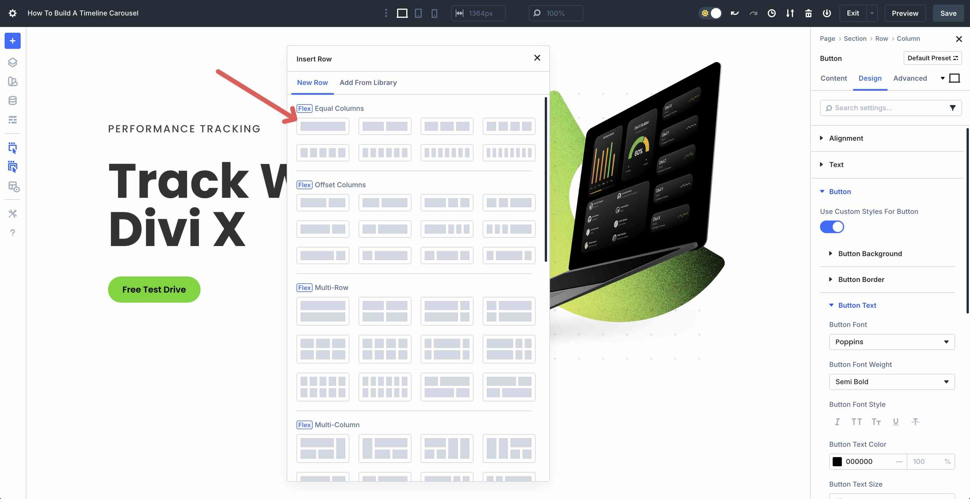
The first step is to configure the parent container for the Group Carousel. Create a new page or open an existing one. Create a new section and add a single-column Flex row to the page.
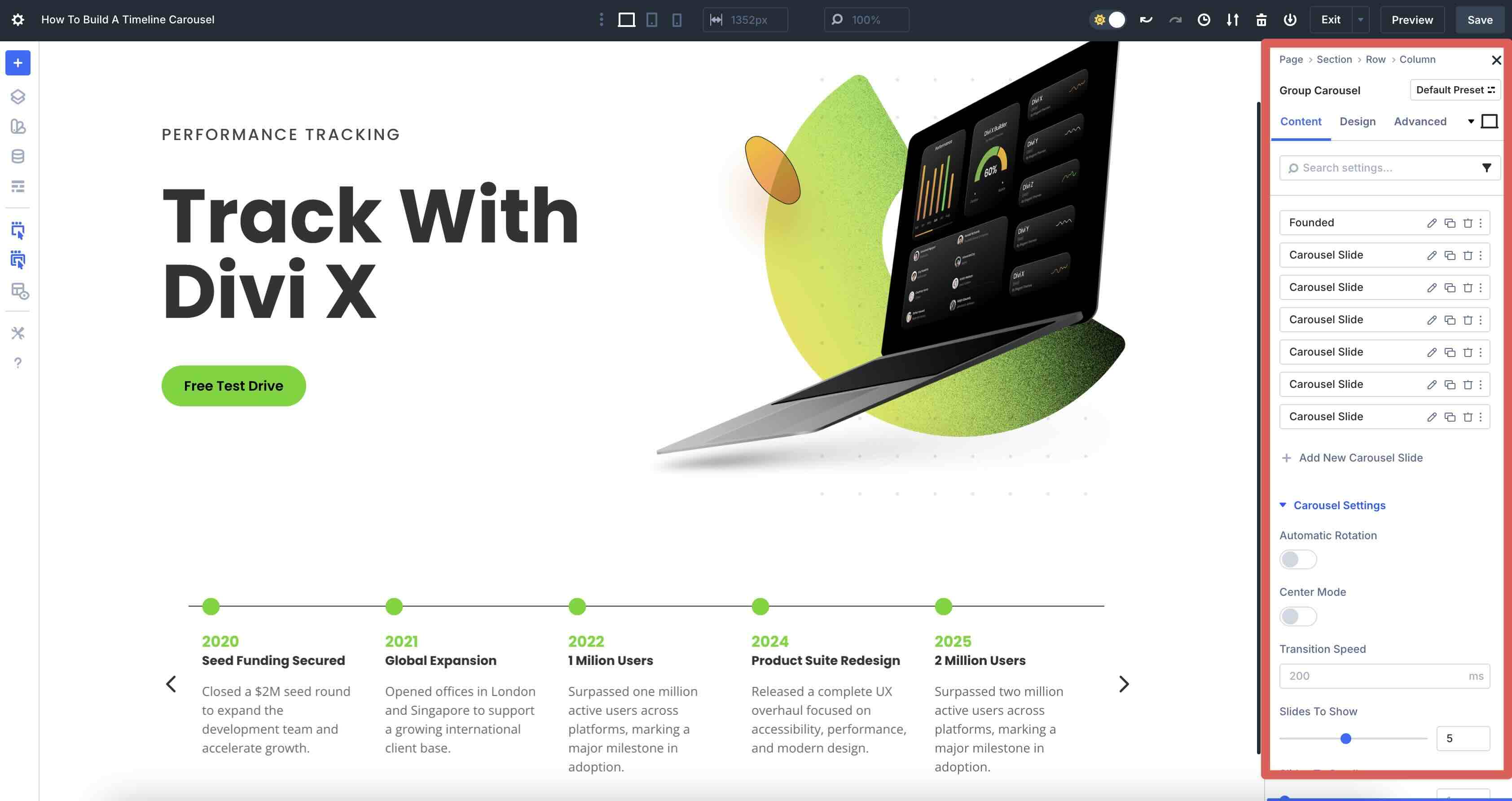
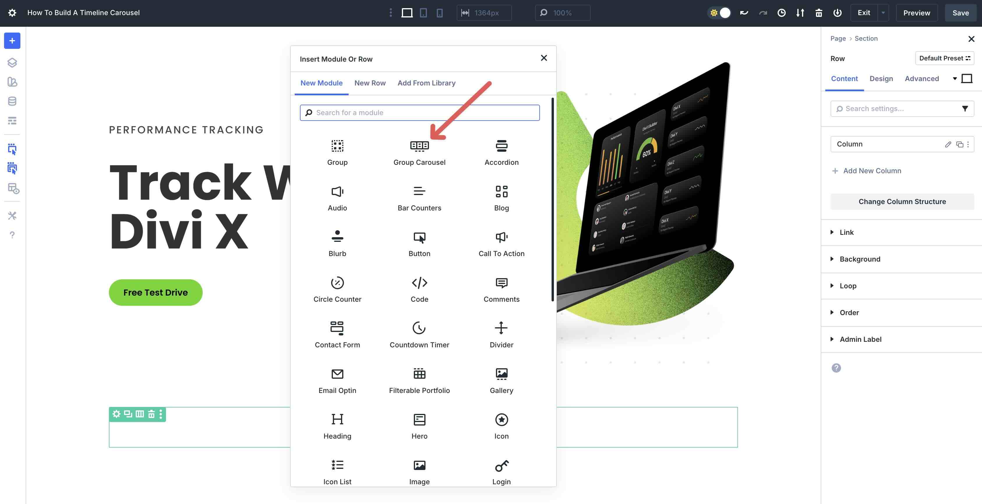
Next, we’ll add the Group Carousel module to the row.
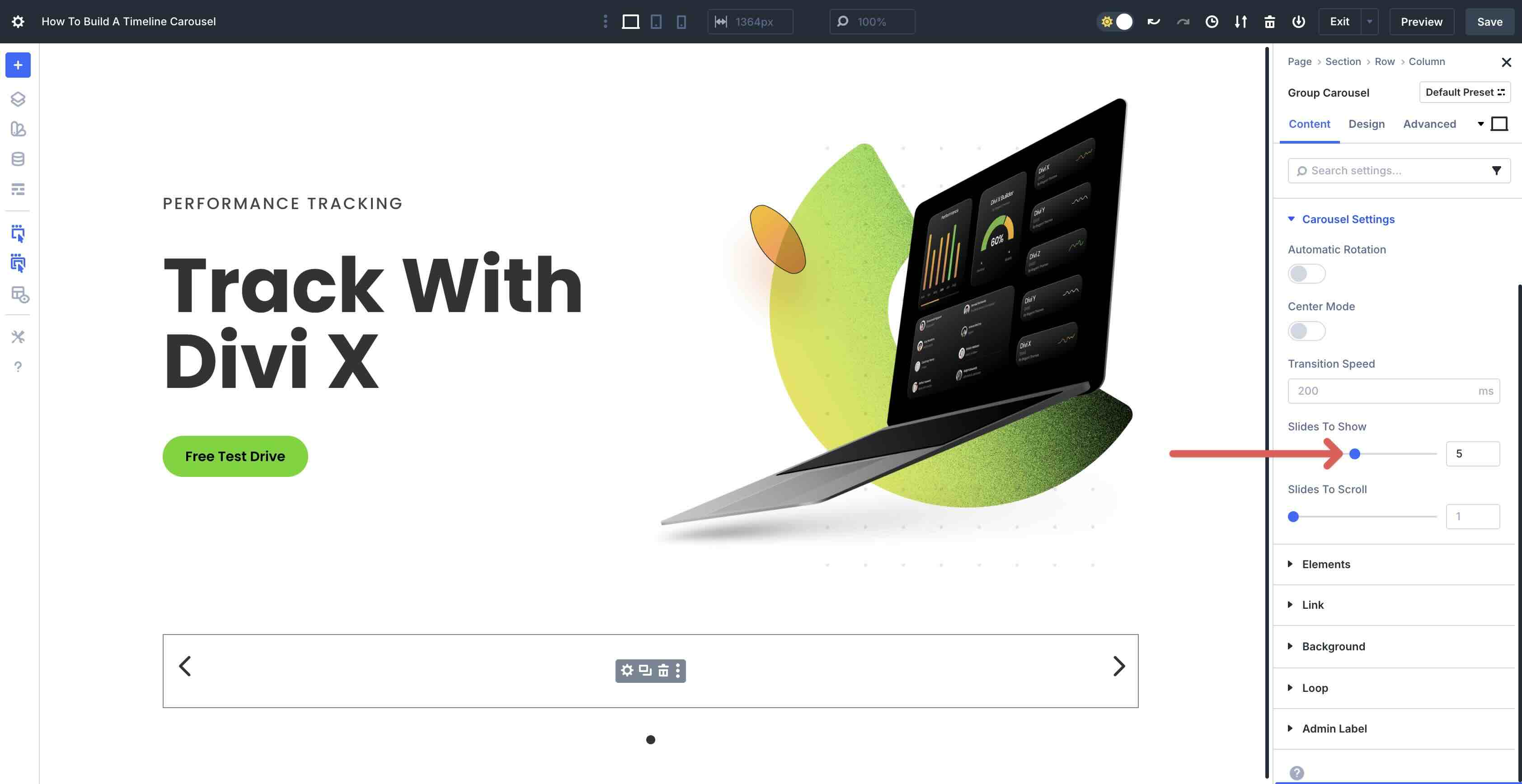
In the Content tab, expand the Carousel Settings menu. Leave all settings at their defaults, but set the Slides To Show to 5.
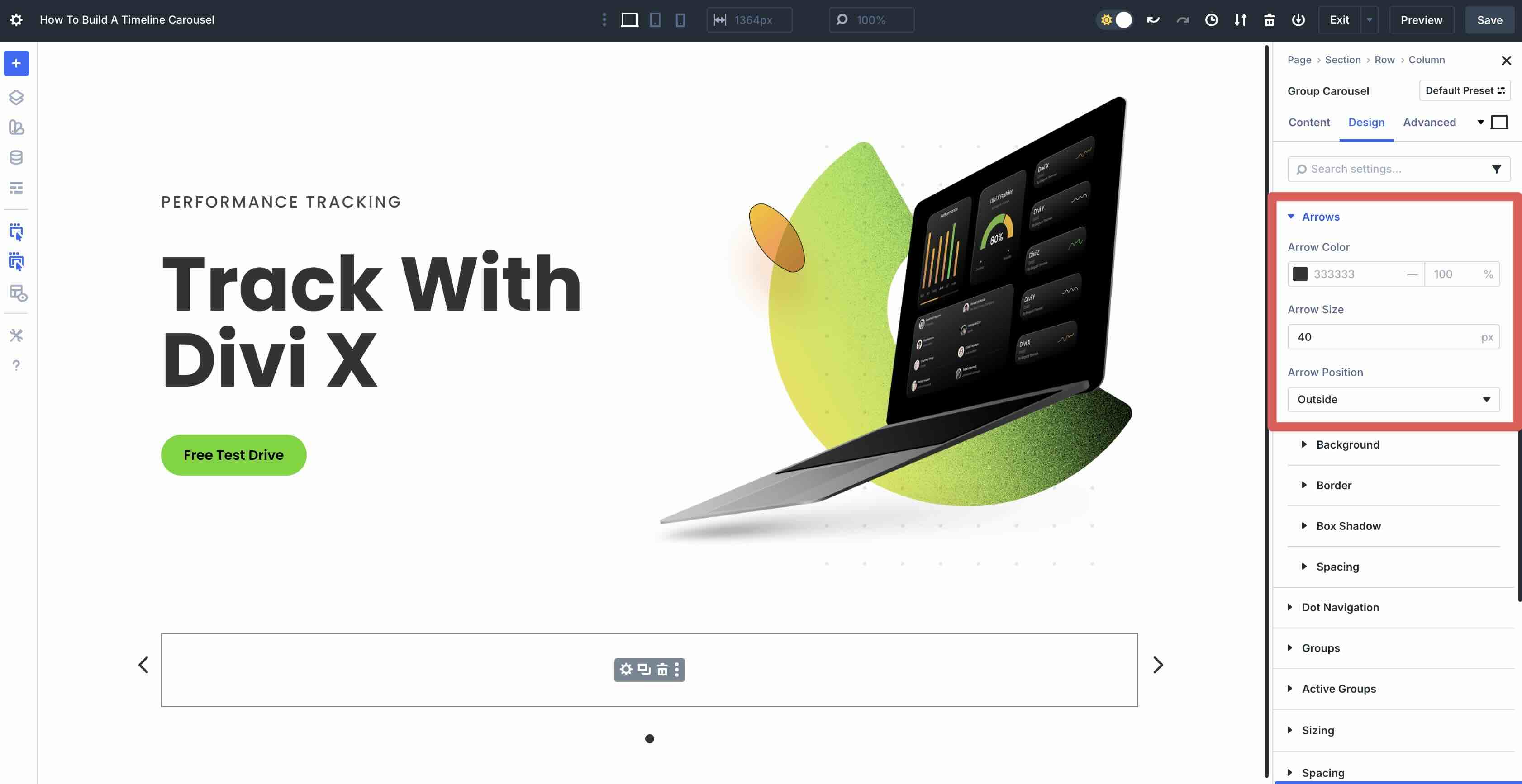
Switch to the Design tab and expand the Arrows menu. Set the Arrow Size to 40px and the Arrow Position to Outside.
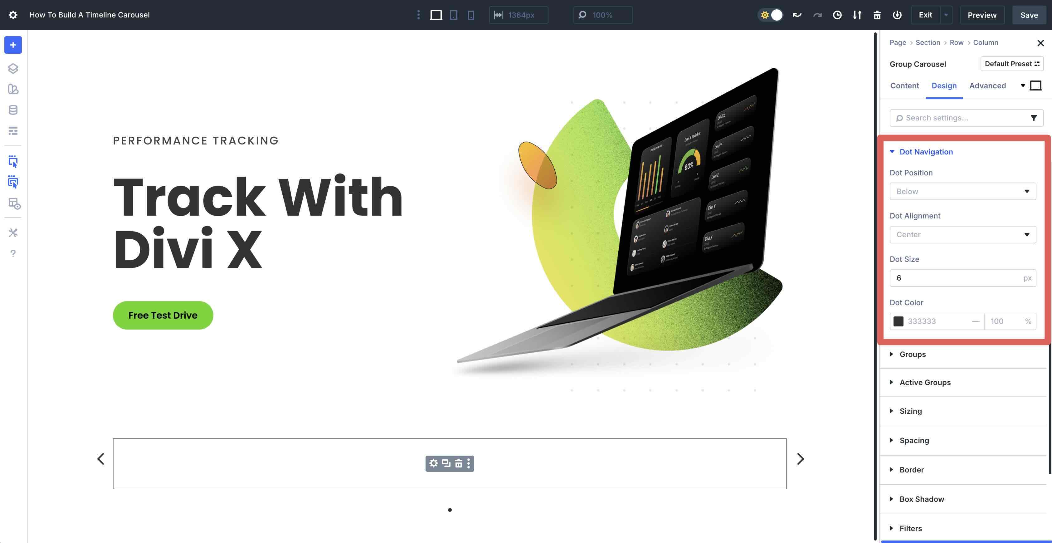
Next, expand the Dot Navigation menu. Set the Dot Size to 6px.
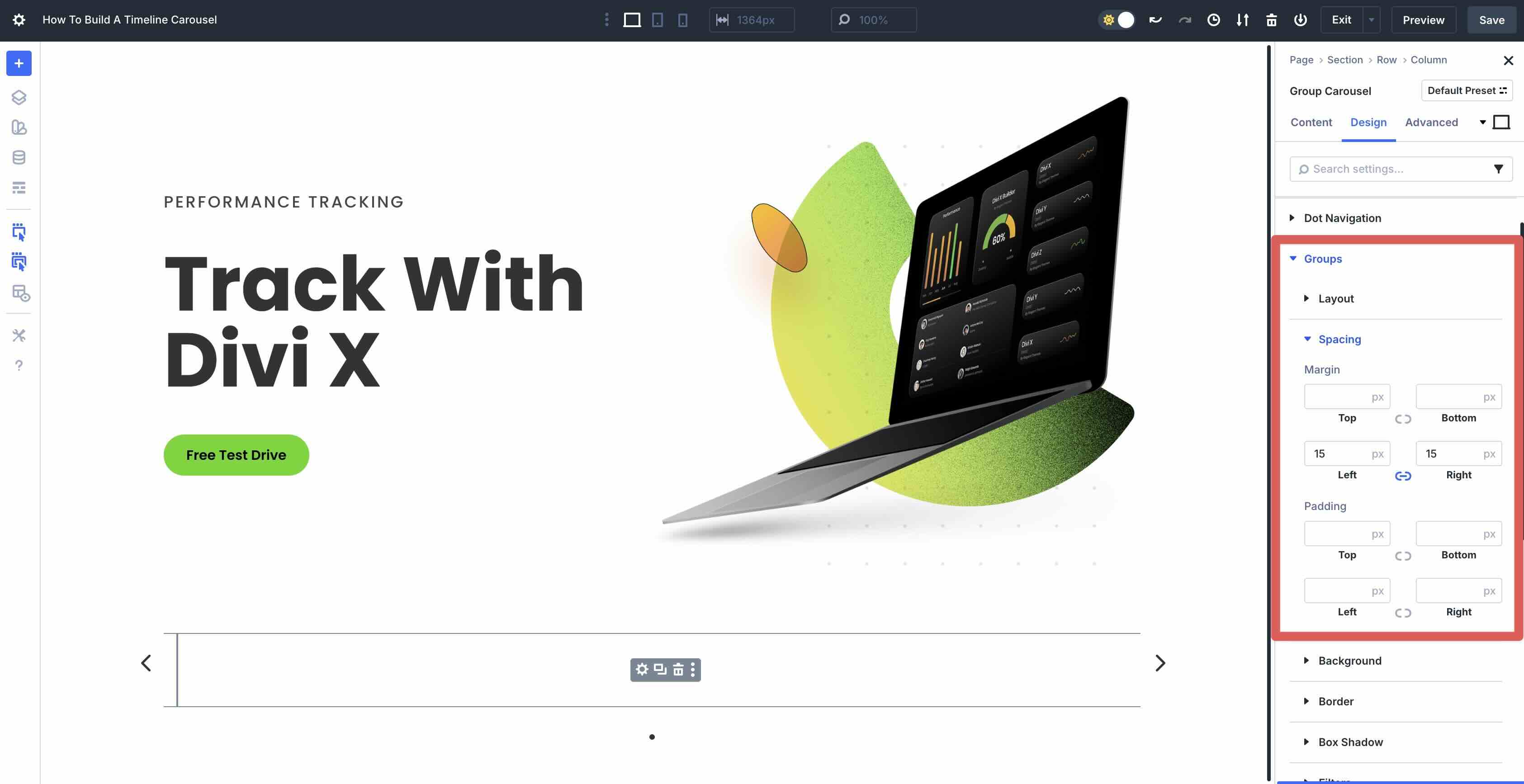
Expand the Groups > Spacing menu and add 15px Margin to the Left and Right.
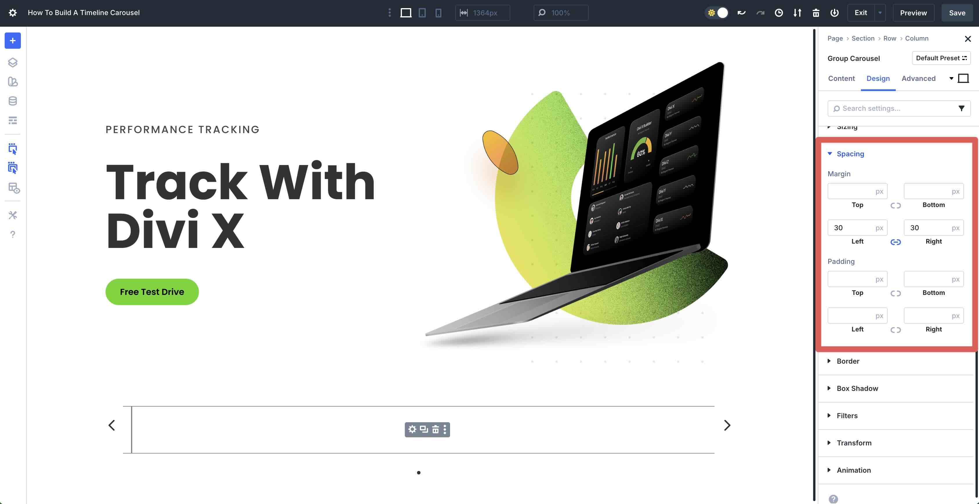
Scroll down and expand the Spacing menu. Add 30px Margin to the Left and Right.
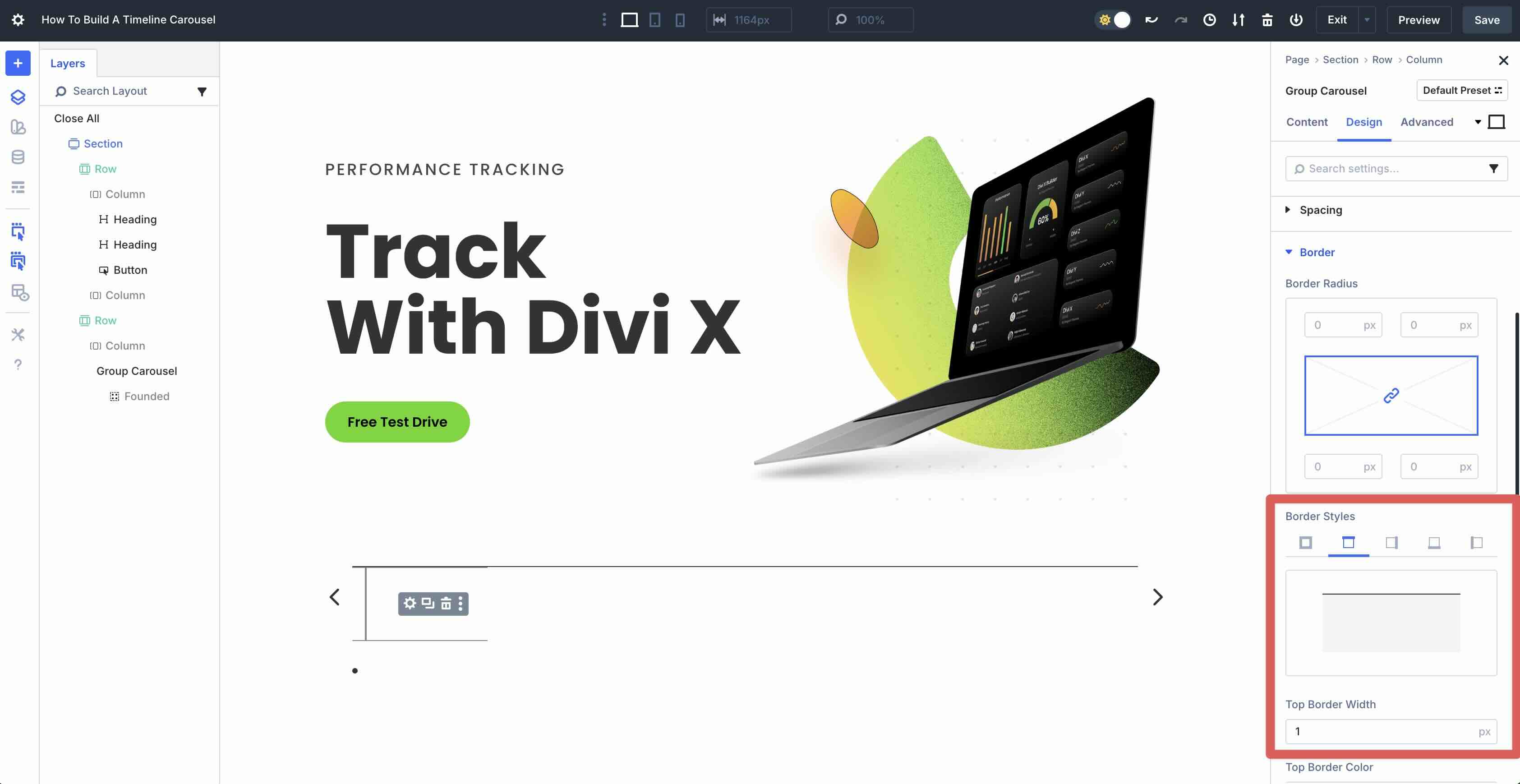
Expand the Border menu. Under Border Styles, click the Border Top tab. Enter 1px Top Border Width.
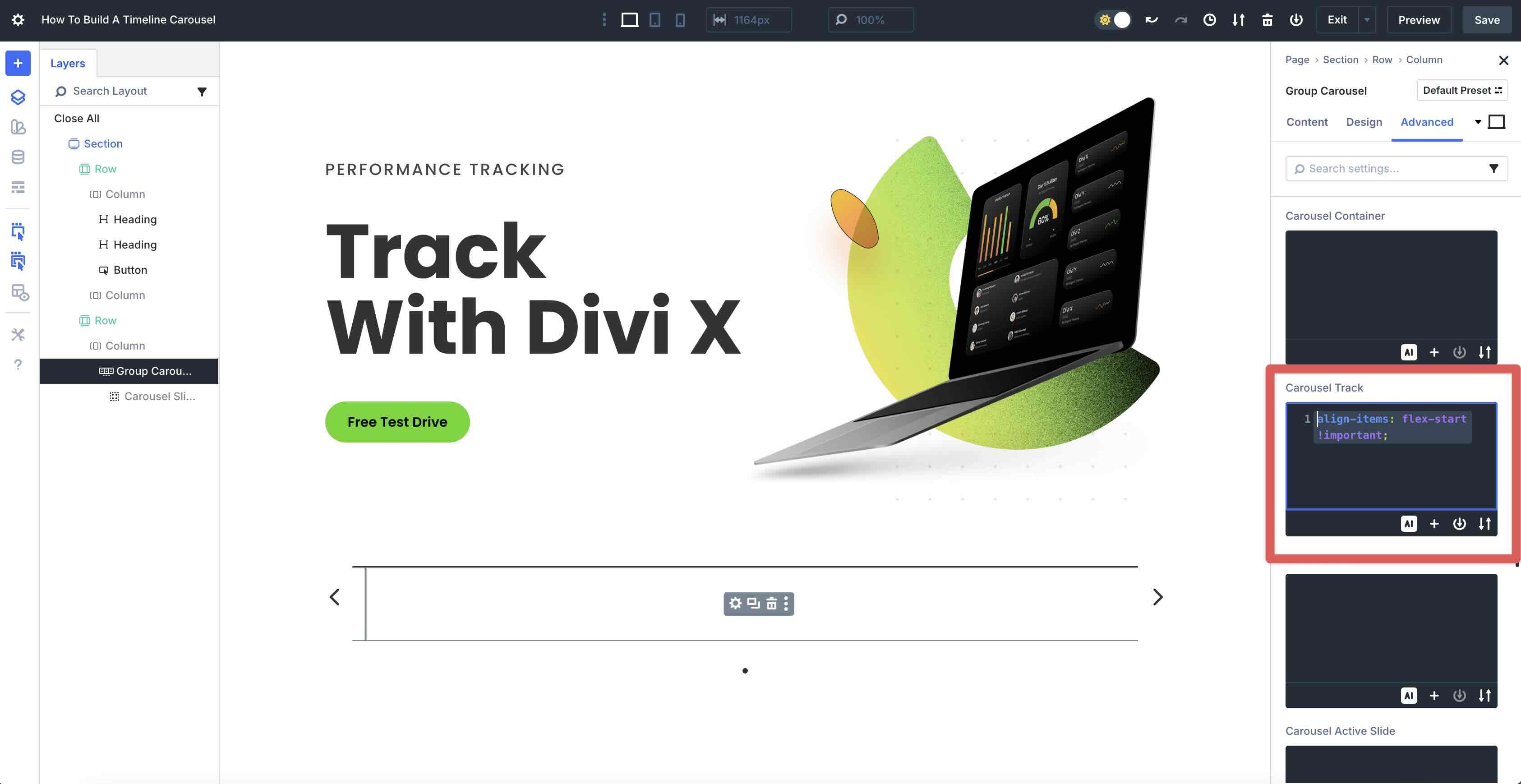
Next, navigate to the Advanced tab. Expand the CSS dropdown menu, tab over to Module Elements, and place the following code in the Carousel Track field:
align-items: flex-start !important;
Step 2: Add The First Group
With our Group Carousel settings in place, we can start designing the first Group. Click to edit the single Group in the Group Carousel module.
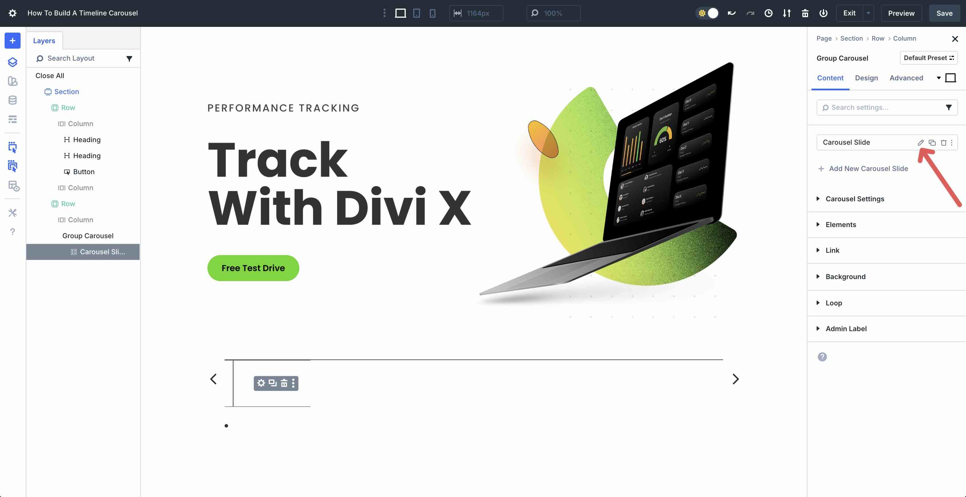
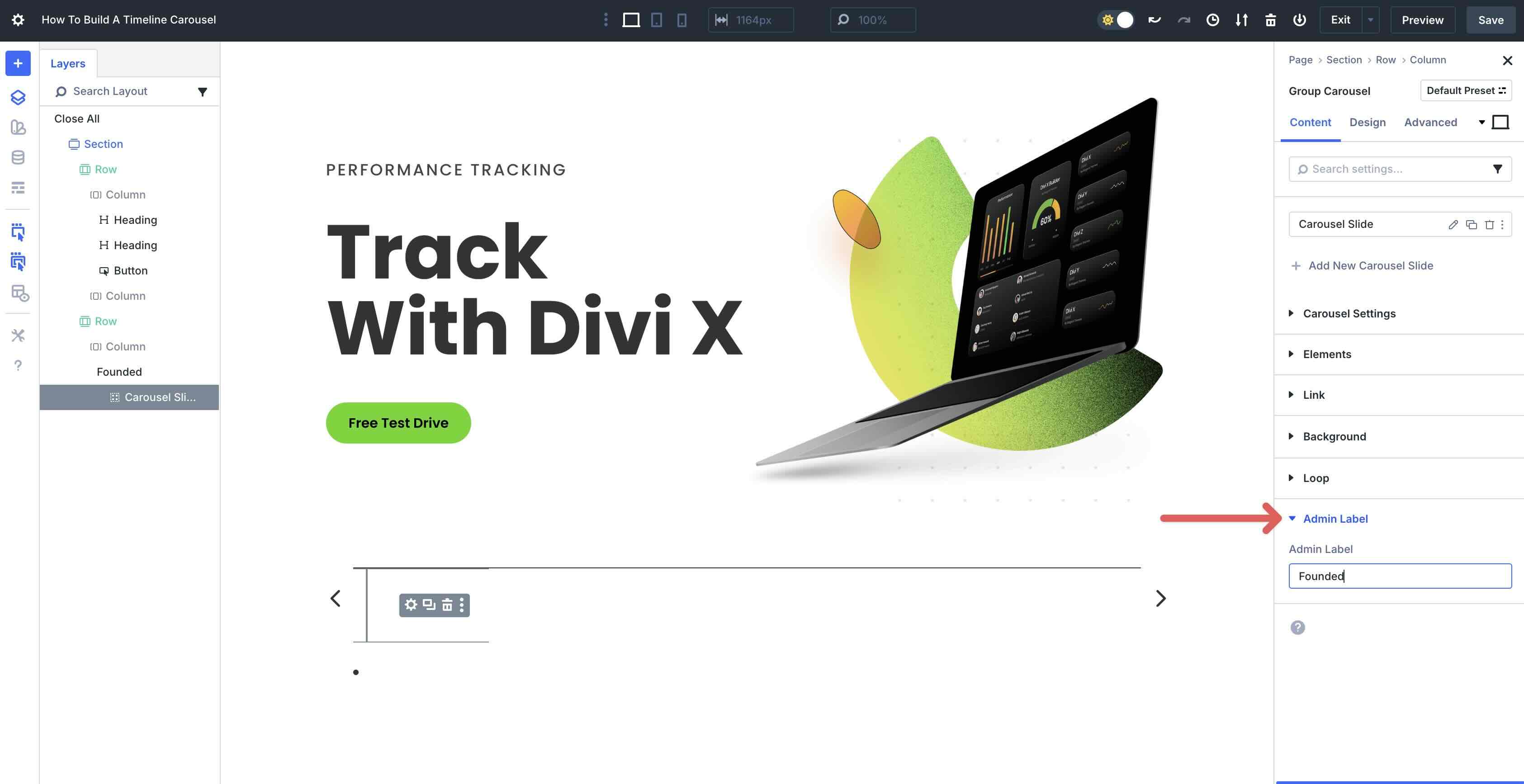
Expand the Admin Label field and assign a name to it. This helps identify groups in the Layers View.
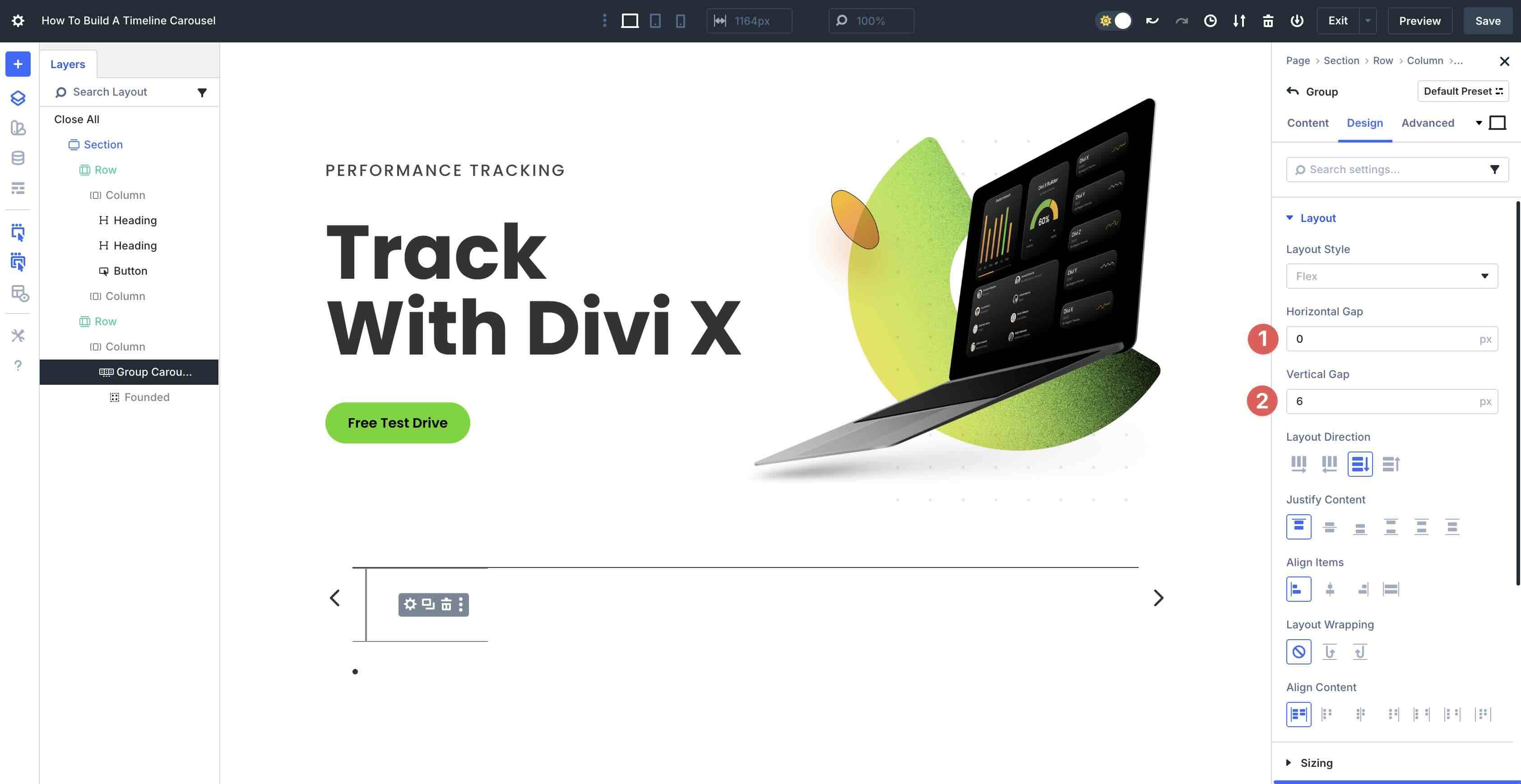
Tab over to the Design settings. Expand the Layout menu and add 0px in the Horizontal Gap field. In the Vertical Gap field, enter 6px.
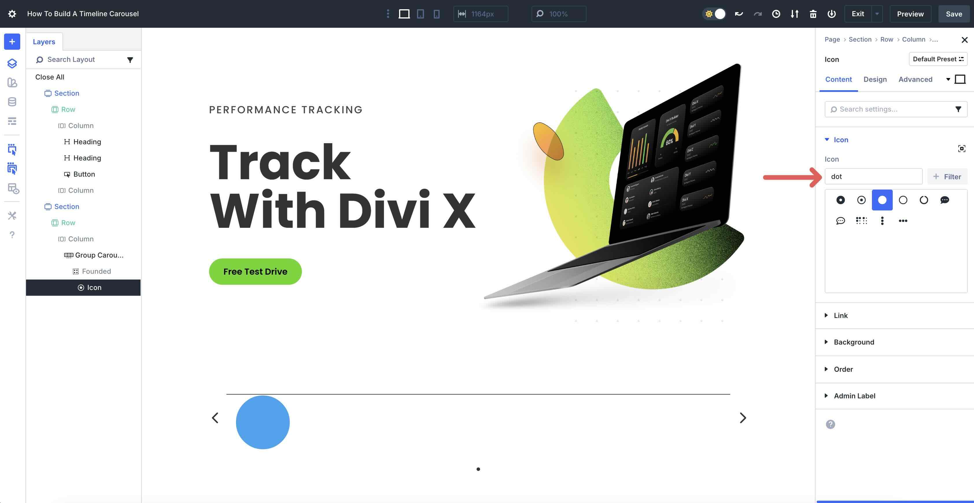
Add An Icon Module
Click to add the Icon module to the first Group. Expand the Icon menu and select an icon.
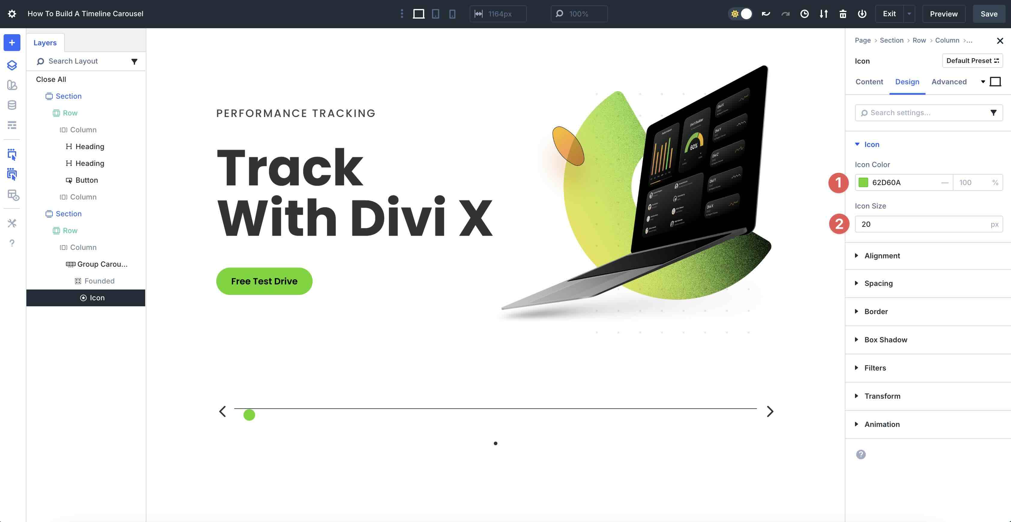
Navigate to the Design tab and expand the Icon menu. Assign #62d60a as the Icon Color, and 20px as the Icon Size.
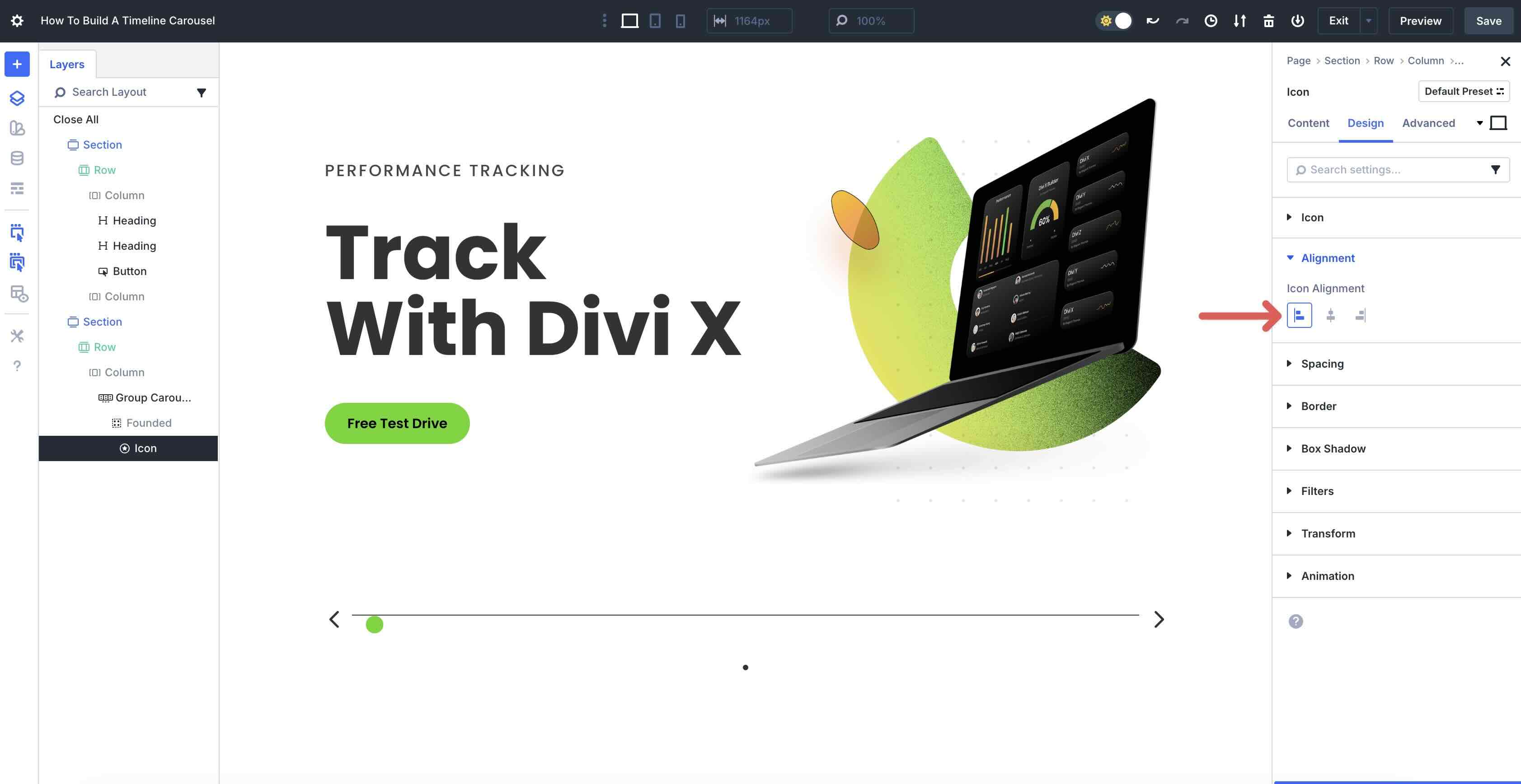
Expand the Alignment menu. Set the Icon Alignment to Left.
Next, we need to set Transforms for the Icon. Expand the Transforms menu and tab over to Transform Translate. Disable the link and set the Y axis to -50%.
Next, click the Transform Origin tab. Set the Origin to Left Center.
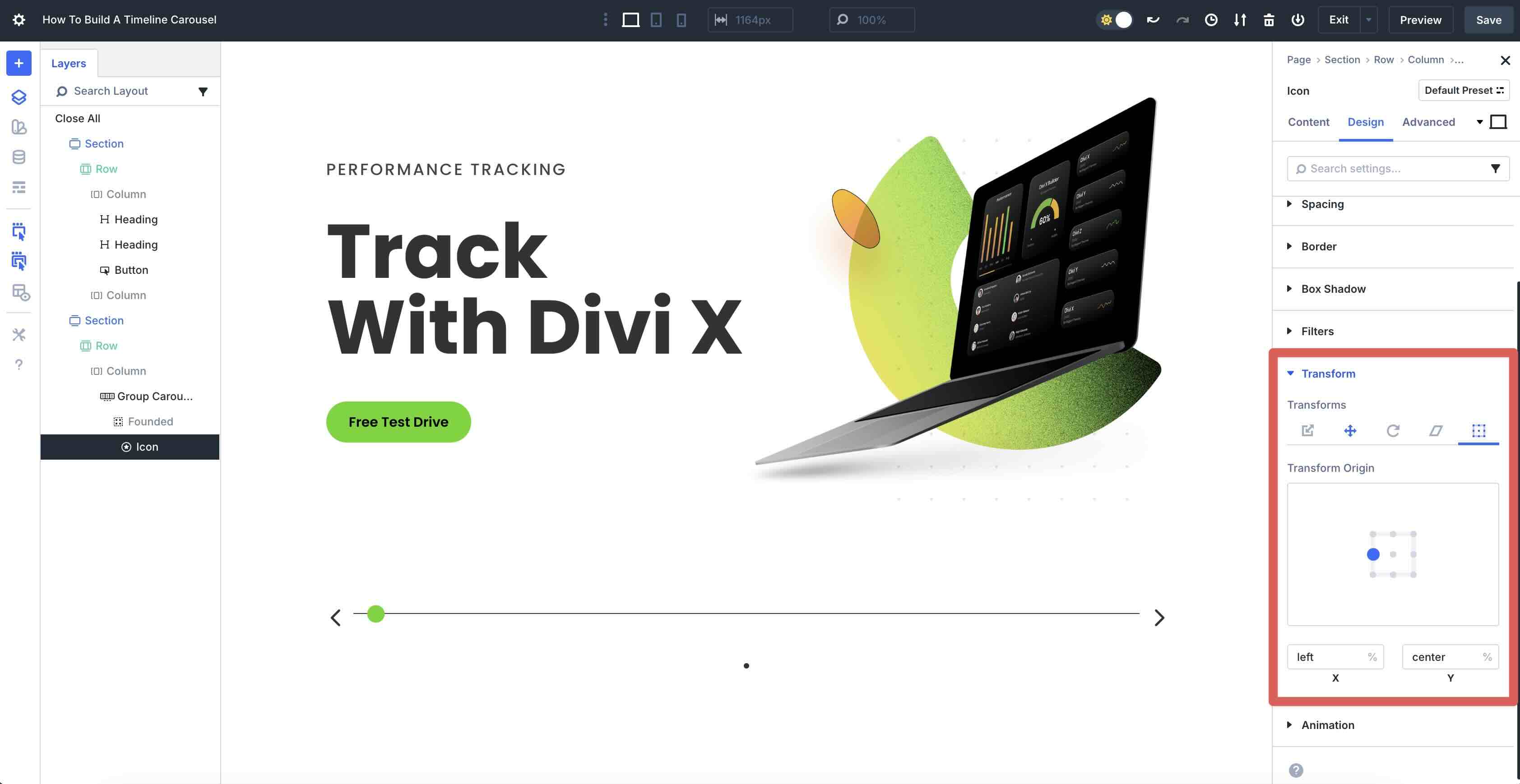
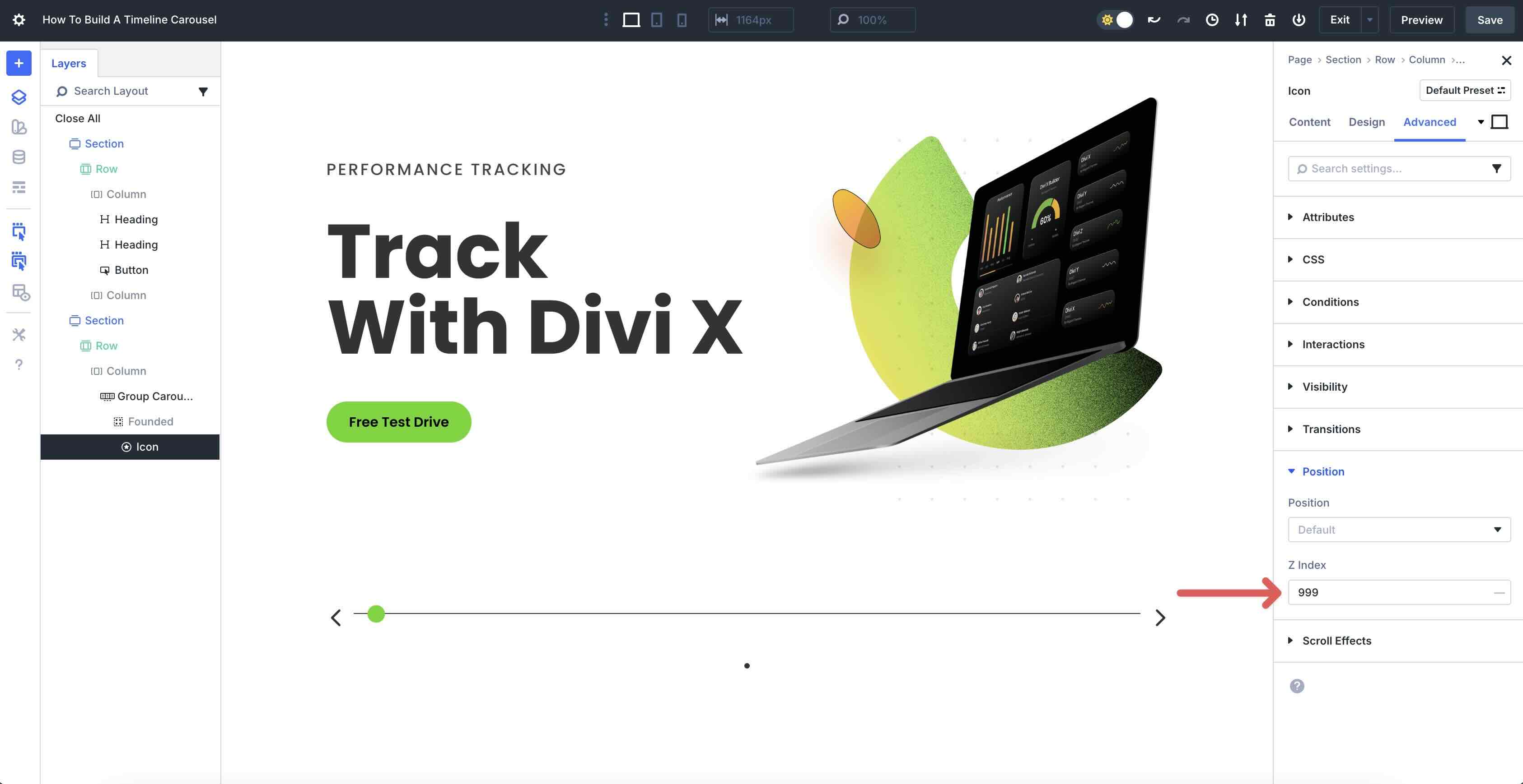
Finally, click the Advanced tab, scroll down and expand the Position menu, and enter 999 in the Z Index field. This will place the Icon above the border of the Group Carousel.
Add A Heading Module
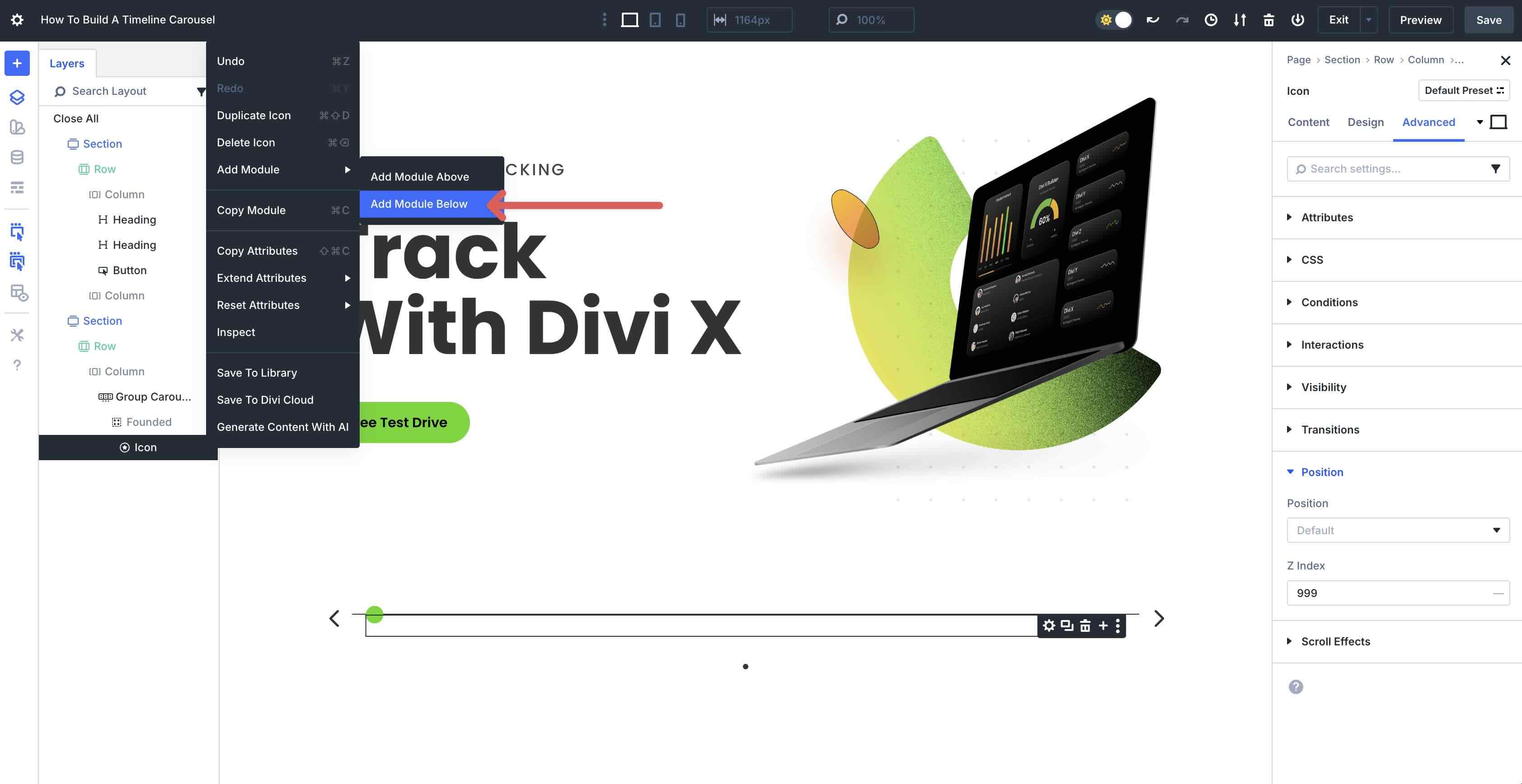
Next, we need to add a Heading module to the first Group. Open the Layers View to add a new module under the Icon module.
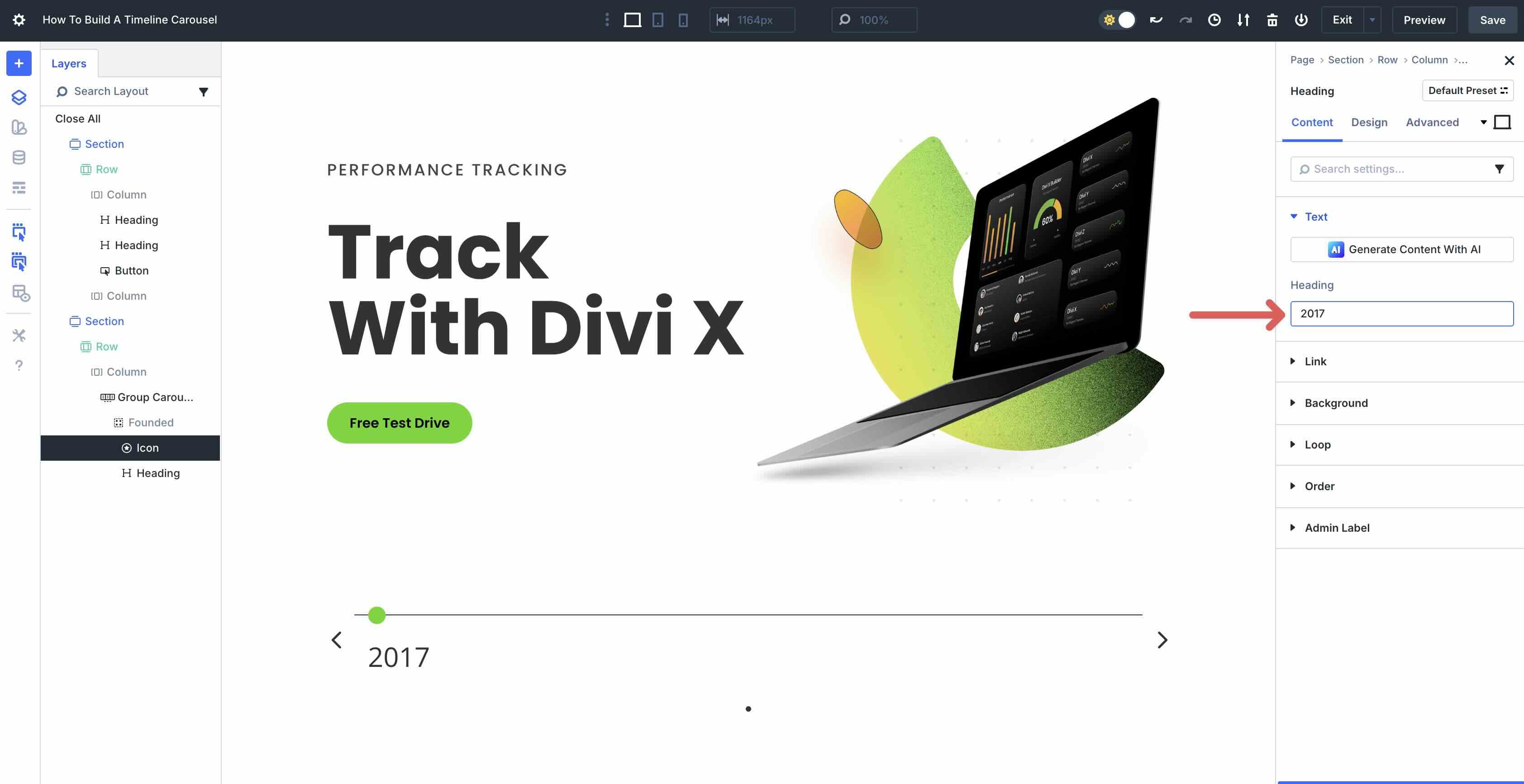
In the Content tab, give the Heading a title.
Switch to the Design tab and expand the Heading Text menu. Select H6 as the Heading Heading Level, Poppins as the Heading Font, and Bold for the Heading Font Weight. Assign #62d60a as the Heading Text Color and set the Heading Text Size to 17px.
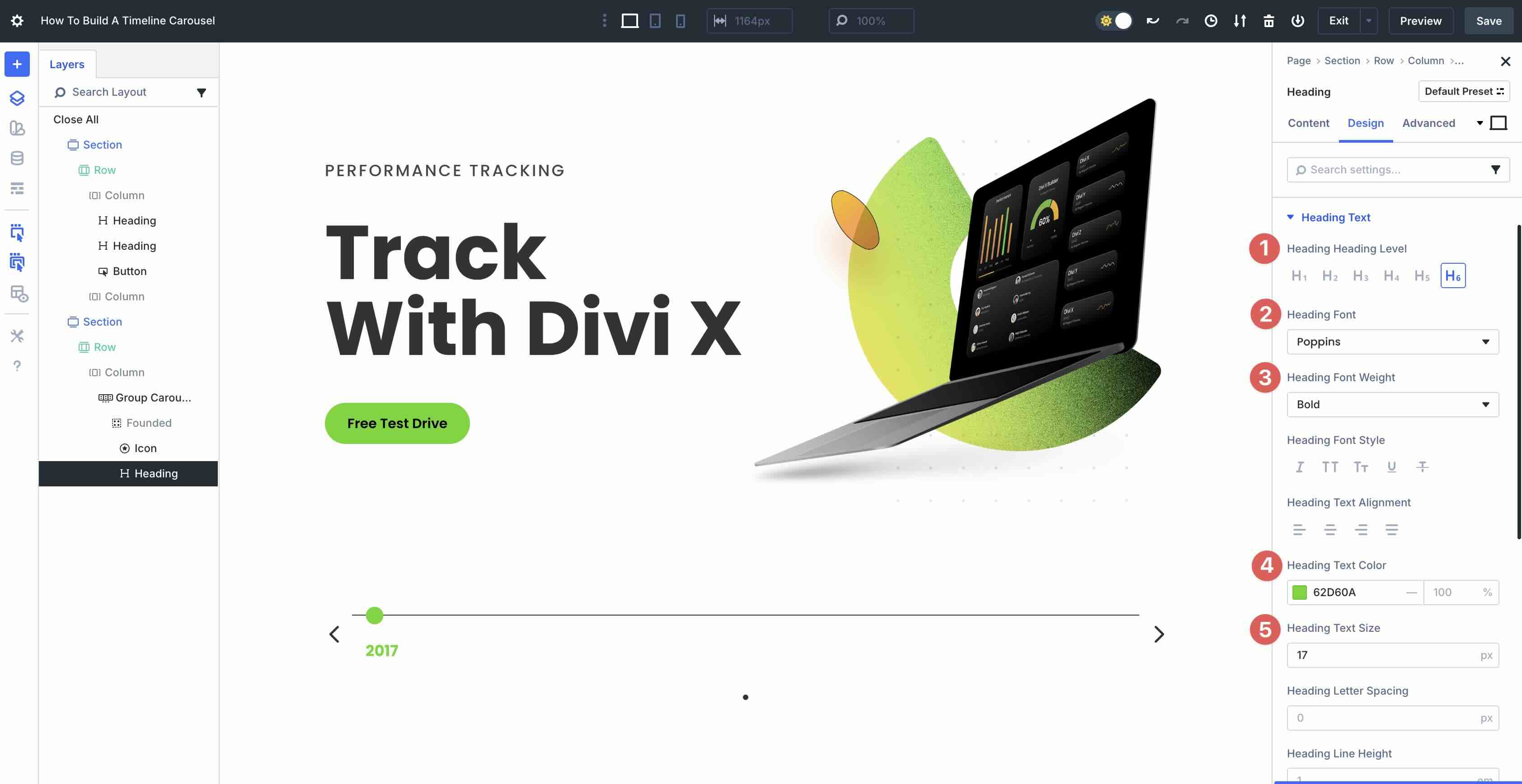
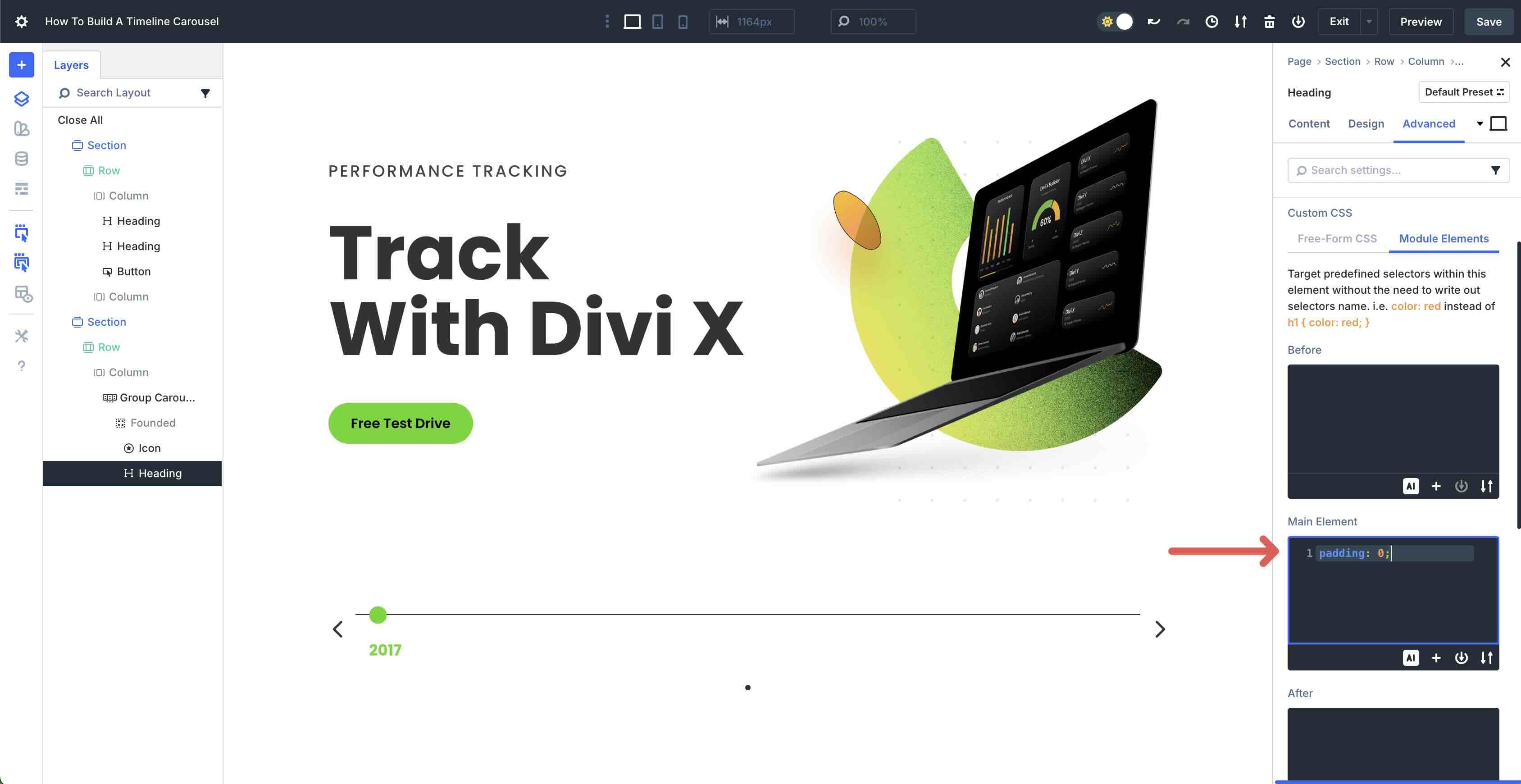
Click the Advanced tab > Module Elements. Enter padding: 0; in the Main Element field.
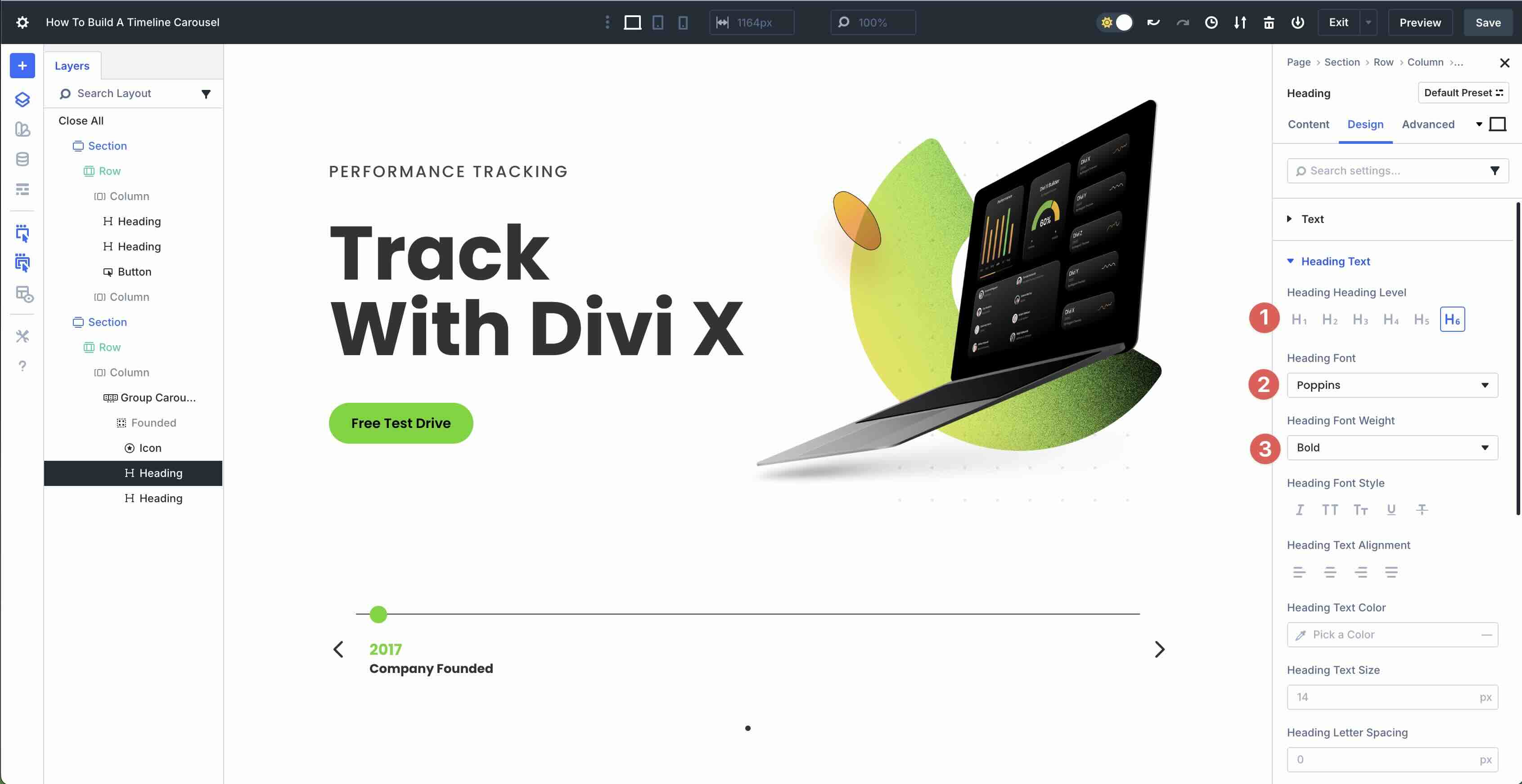
Add A Second Heading Module
Click to add a second Heading module to the Group. Click the Design tab, and set the Heading Heading Level to H6. Select Poppins Bold as the Heading Font and Font Weight. Leave all other settings at their defaults.
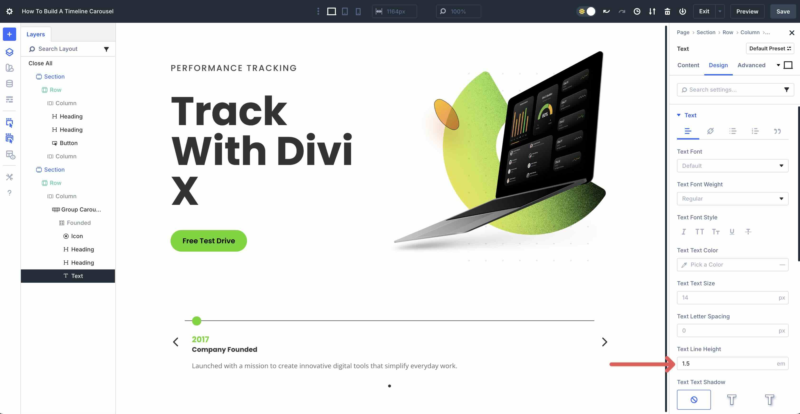
Add A Text Module
The last step is to add a Text module underneath the Heading module in the first Group. Add text into the Body field in the Content tab, and then navigate to the Design tab. The only setting we need to change here is the Text Line Height in the Text menu. Set it to 1.5em.
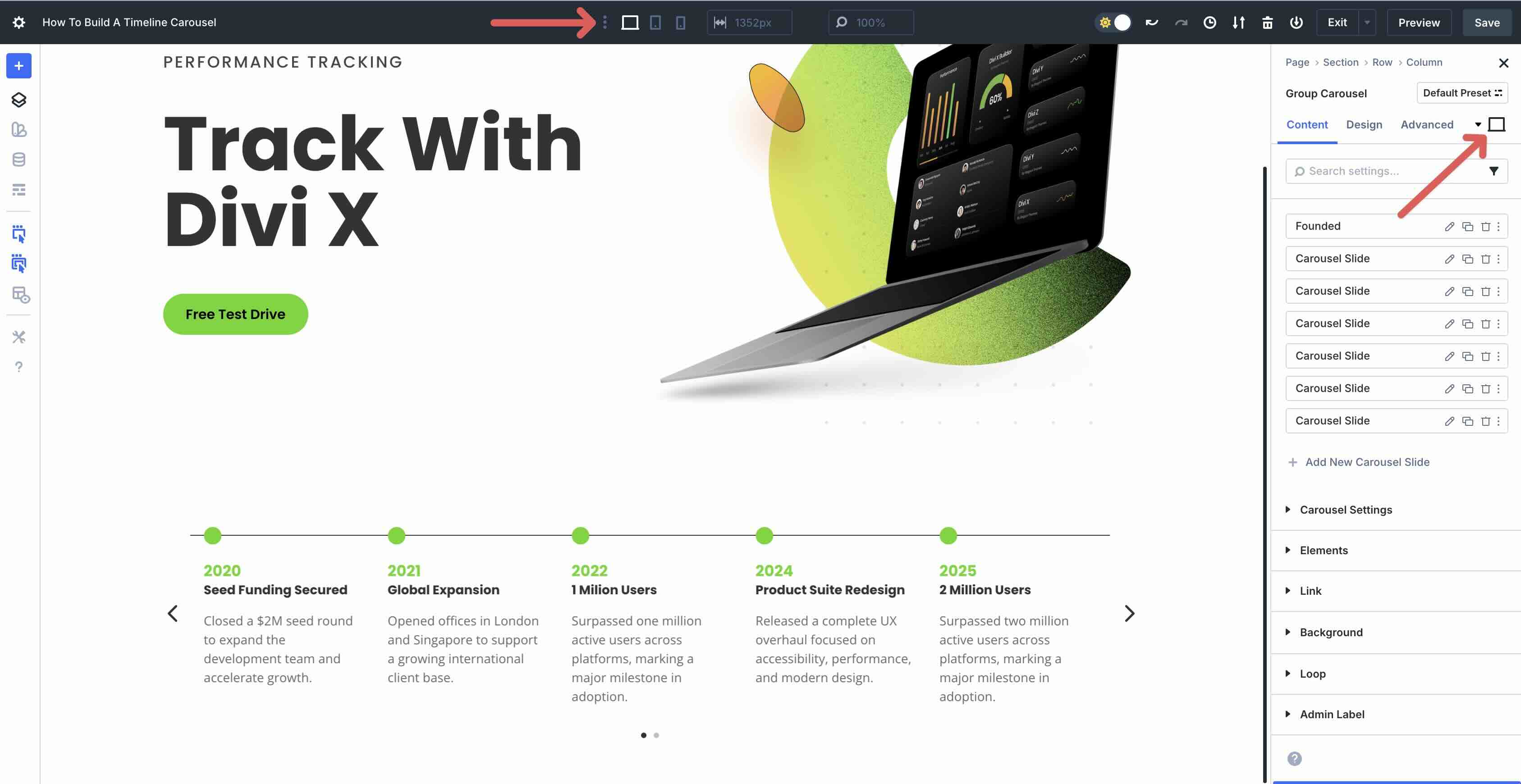
Step 3: Add Additional Groups
With the first Group styled, we can move on to adding additional Groups to the Group Carousel module. Navigate to the main Content tab for the Group Carousel. Click the Duplicate icon for our first Group to copy it.
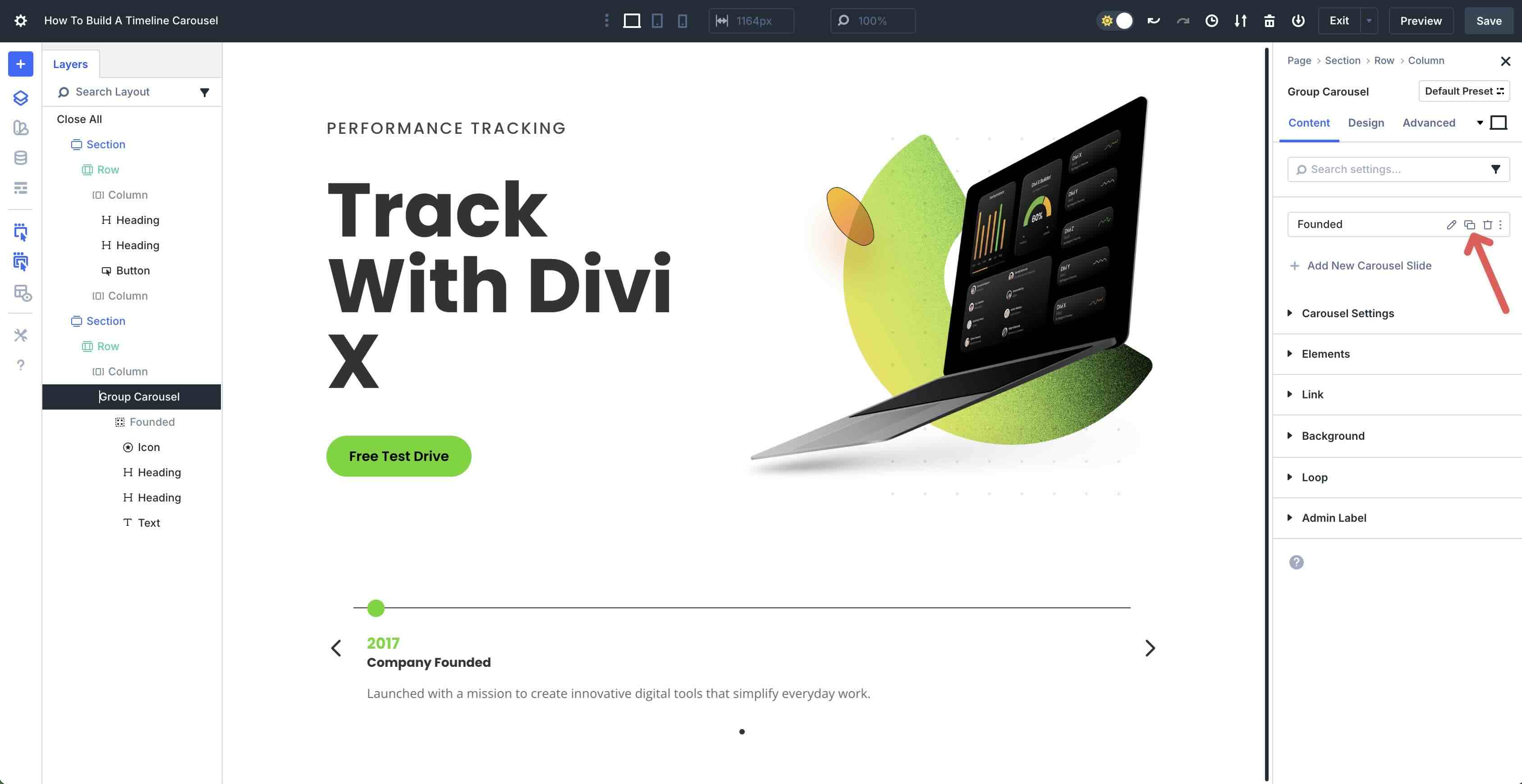
This action will place the second Group into the Carousel, horizontally. Repeat this step 5 times to populate the Carousel.
From there, simply modify the content of the slides as needed.
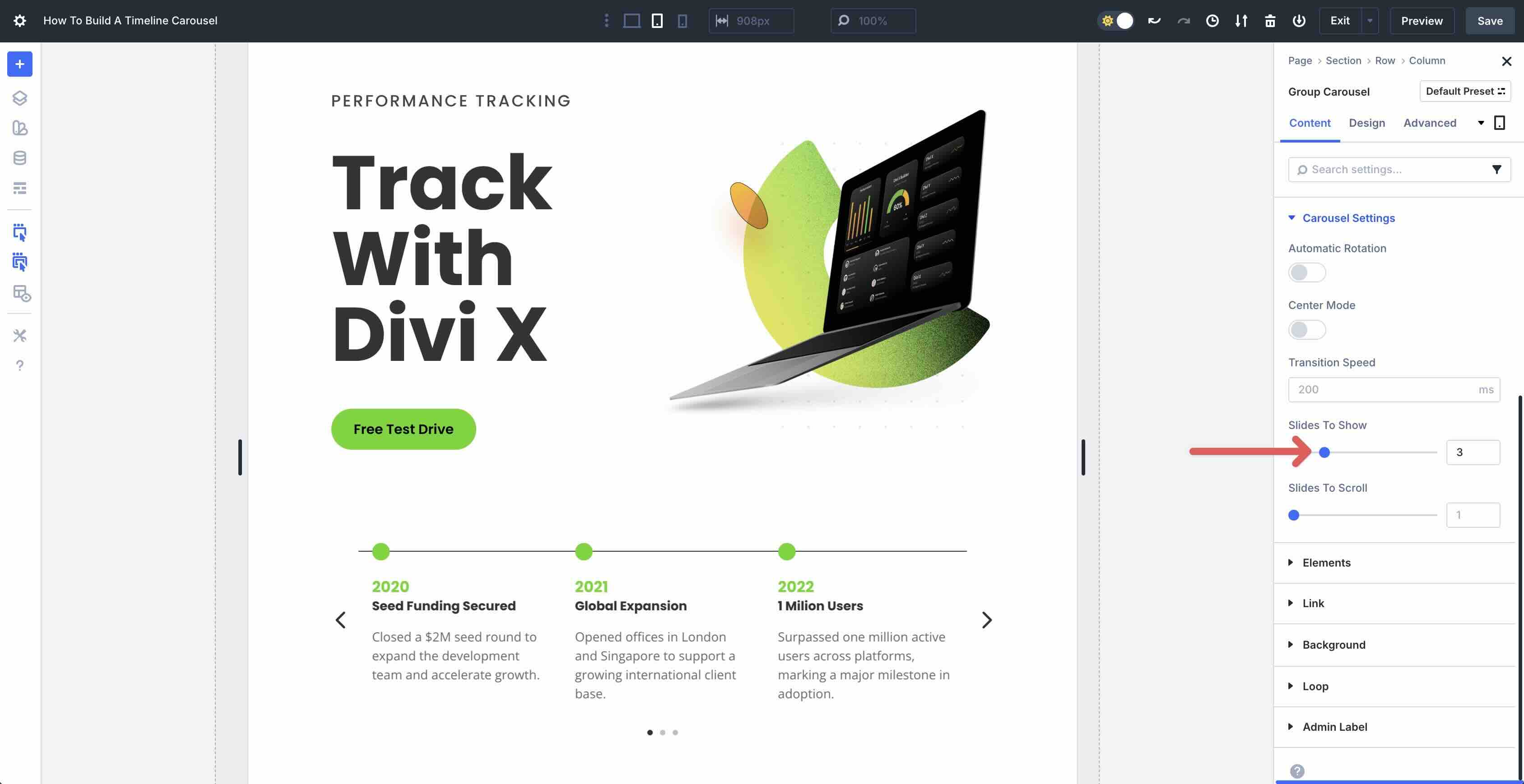
Step 4: Test For Responsiveness
Once all content is in place, you can adjust the Carousel’s settings using Divi 5’s Customizable Responsive Breakpoints or Responsive Editor.
One setting that should be adjusted is the number of slides on mobile devices. Click into the Group Carousel‘s main Content tab. Expand the Carousel Settings and adjust the Slides To Show. In the Tablet View, adjust the Slides To Show to 3.
In the Phone View, set the Slides To Show to 1.
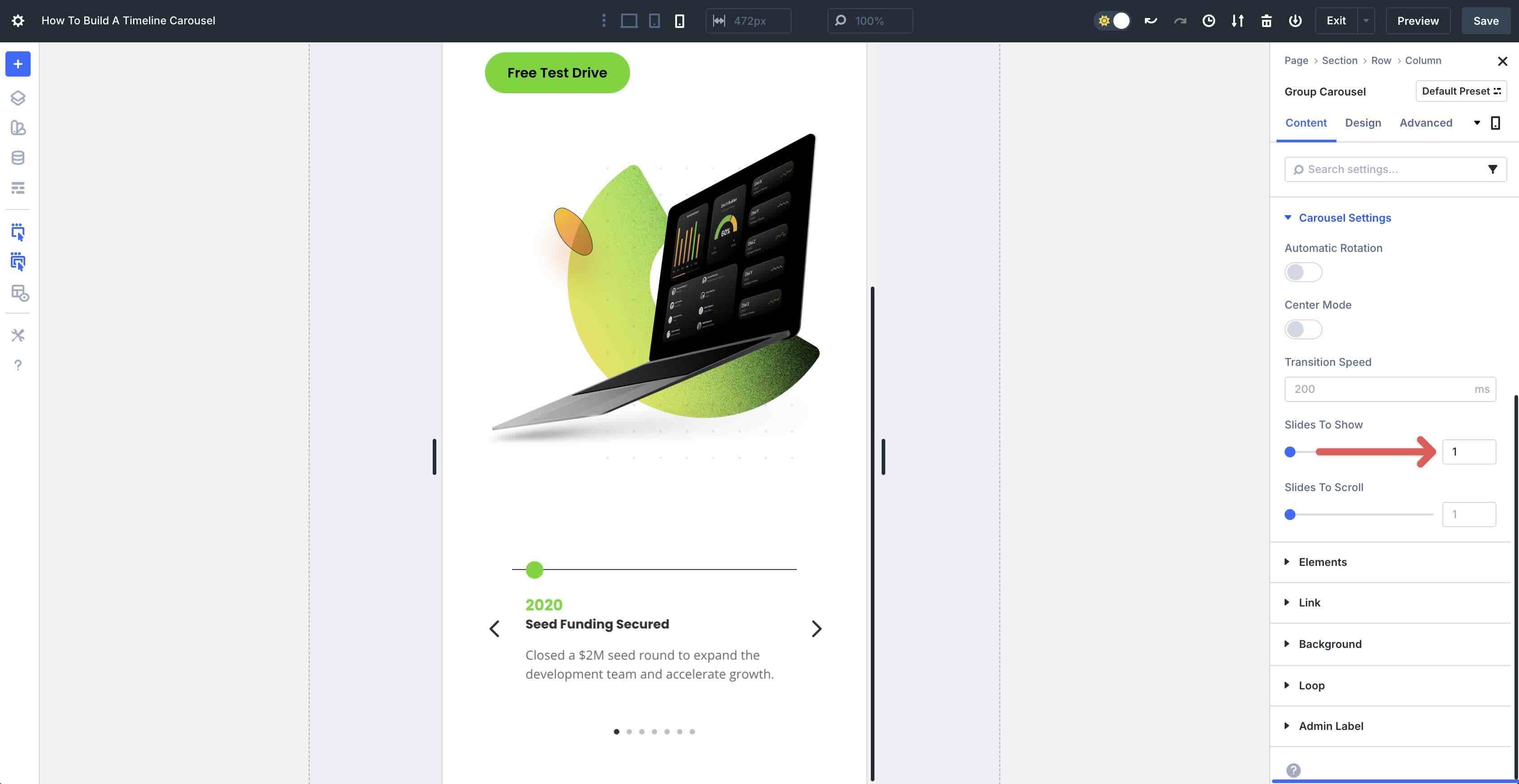
Use the responsive settings to make any necessary adjustments.
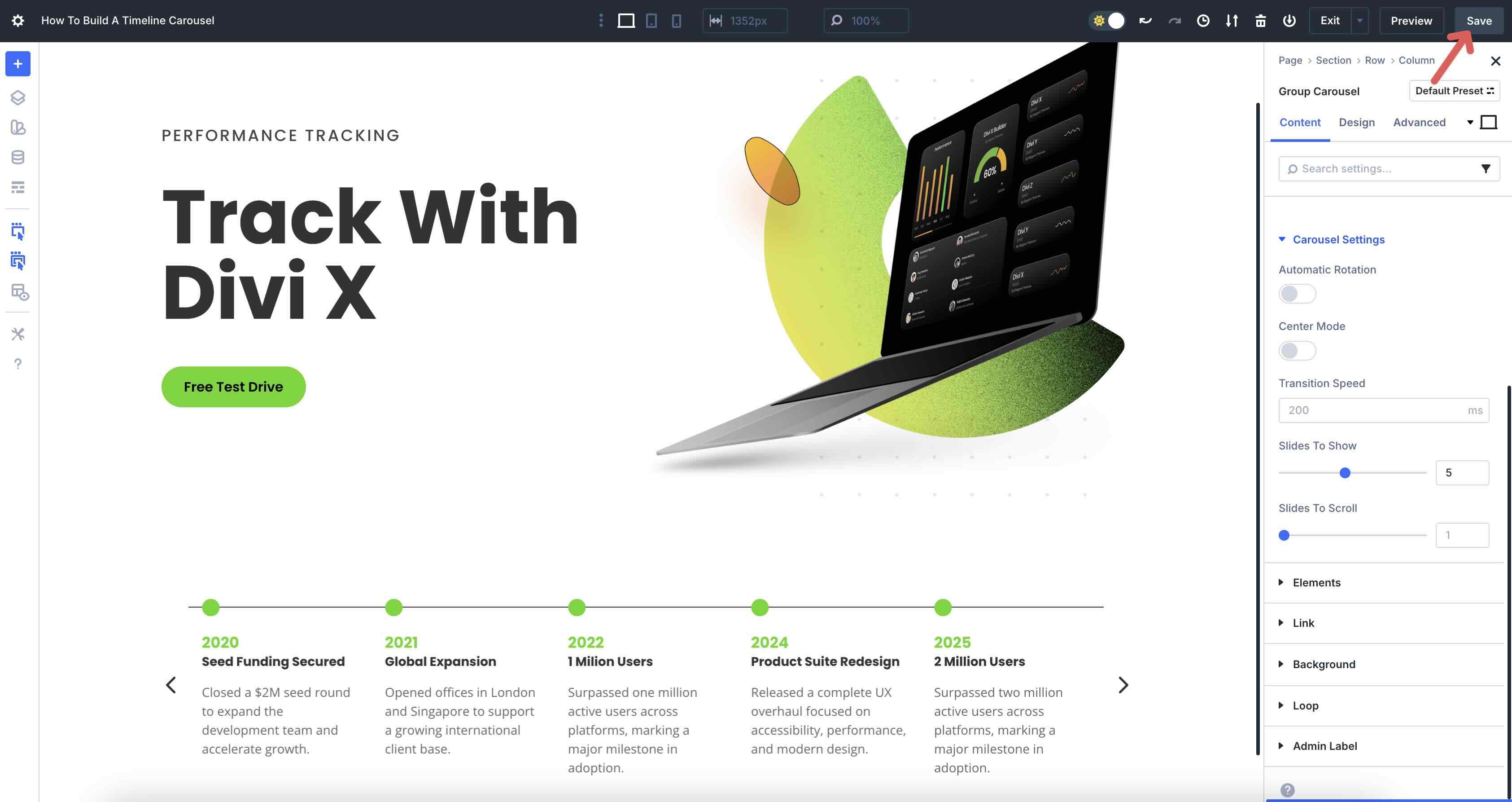
Step 5: Preview And Save The Page
The final step is to preview your layout to ensure that everything functions as expected. To preview the page, click the Preview button at the top right of the Visual Builder.
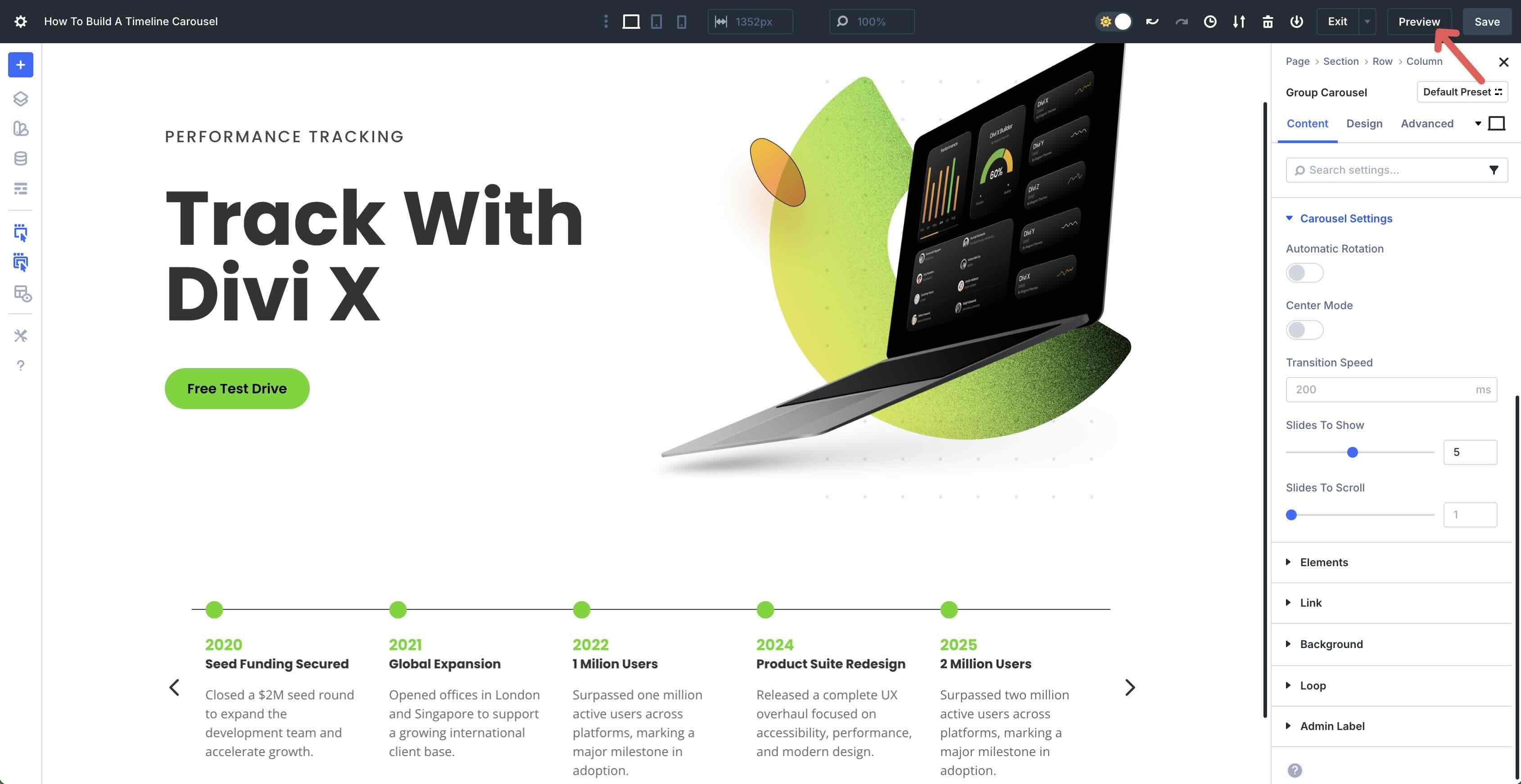
Once you’ve confirmed everything looks good, return to the Visual Builder to save the page.
That’s it! You’ve successfully created a timeline carousel that you can use on your website. If you’d like to download the file to preview the settings before building your own Carousel, fill out the form below.

Build A Timeline Carousel Easily With Divi 5
The Group Carousel module in Divi 5 makes it simple to create a timeline carousel that brings your brand’s milestones or project history to life. Its intuitive design, dynamic content capabilities, and flexible styling allow you to build a visually engaging, responsive timeline without relying on complex coding or third-party plugins.
Now that you’ve walked through the steps to build your own timeline carousel, it’s time to put it into action. Download the latest Divi 5 Beta to explore the Group Carousel module and start experimenting with its features. We’d love to hear how you’re using this feature to enhance your site. Drop a comment below or share your thoughts on our social media channels.


Is there a live demo of this?
+1