
A steps carousel provides an effective way to display information in a structured, easy-to-follow format. With the new Group Carousel module in Divi 5, creating a steps carousel is easier than ever. This new module enables you to create custom carousels using any Divi module, supports dynamic looping for scalable content, and provides advanced styling options to match your site’s branding.
In this post, we’ll walk you through a step-by-step process for building a steps carousel so you’ll have the knowledge you need to create engaging content for your Divi website.
Let’s dive in.
What Is The Group Carousel Module?
The Group Carousel module is a powerful new module in Divi 5 designed to create flexible, interactive sliders that bring your content to life. Unlike traditional sliders, this module enables you to create custom carousels by housing any combination of Divi modules, including text, images, buttons, or even Lottie animations, within individual slides.
Key Features Of The Group Carousel Module
Several features make the Group Carousel module a versatile addition to Divi 5, including:
- Customizable Slides: Each slide serves as a blank canvas, allowing you to add rows, Nested Rows, columns, and any Divi module, giving you complete control over the layout and content.
- Dynamic Looping: The module supports the Loop Builder feature in Divi 5, which enables you to dynamically pull content from posts, terms, users, or custom post types. This makes it ideal for carousels that update automatically with your site’s content.
- Advanced Navigation: Enjoy customizable navigation options, including arrows, dots, and autoplay, so you can configure your carousel’s settings to suit your preferences.
- Responsive Design: Divi 5’s new Responsive Editor makes it easy to optimize your carousel for desktop, mobile, and tablet views, with flexible styling options like shadows, animations, Interactions, or transforms to enhance visual appeal.
Why It’s Perfect For A Steps Carousel
The Group Carousel module’s flexibility makes it ideal for sequential storytelling, allowing you to create slides that guide users through processes like onboarding, tutorials, or workflows. Each slide can be created to highlight a specific step, ensuring clarity and engagement.
How To Build A Steps Carousel With Divi 5
Before diving in, make sure you have the latest version of Divi 5 installed. If you haven’t updated yet, head to your WordPress dashboard and update the Divi theme to make sure you have access to the Group Carousel module. By the end of this post, you’ll have a fully responsive steps carousel that will keep your visitors engaged.
Step 1: Setting Up Your Divi Page And Adding The Group Carousel Module
Create a new page or open an existing one in the Visual Builder. Click the blue “+” icon to add a new section to the page.
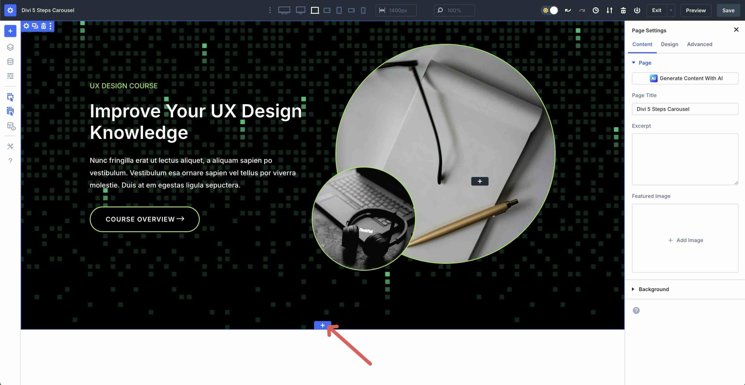
When the Insert Section modal appears, select a single-column row under the Equal Column options.
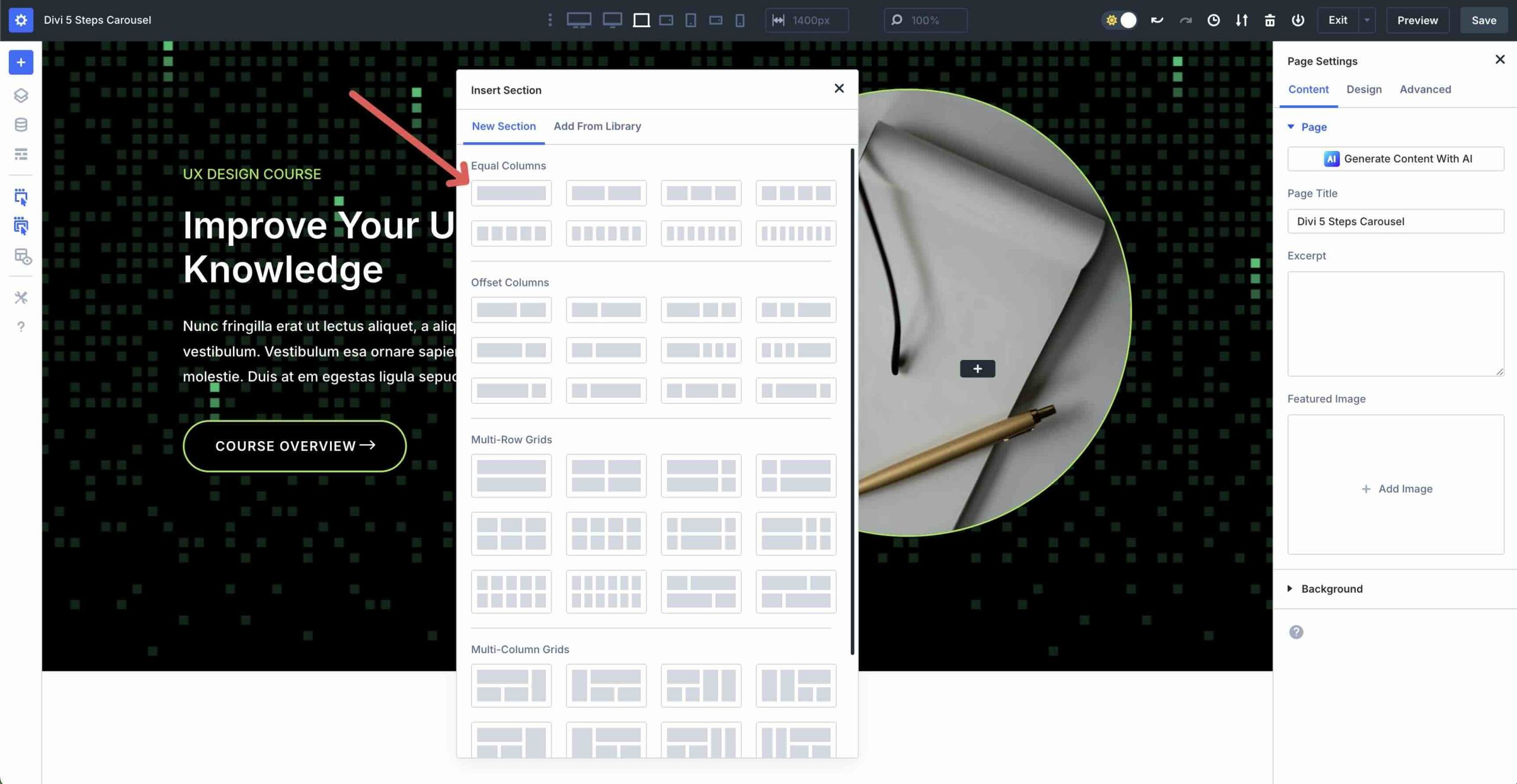
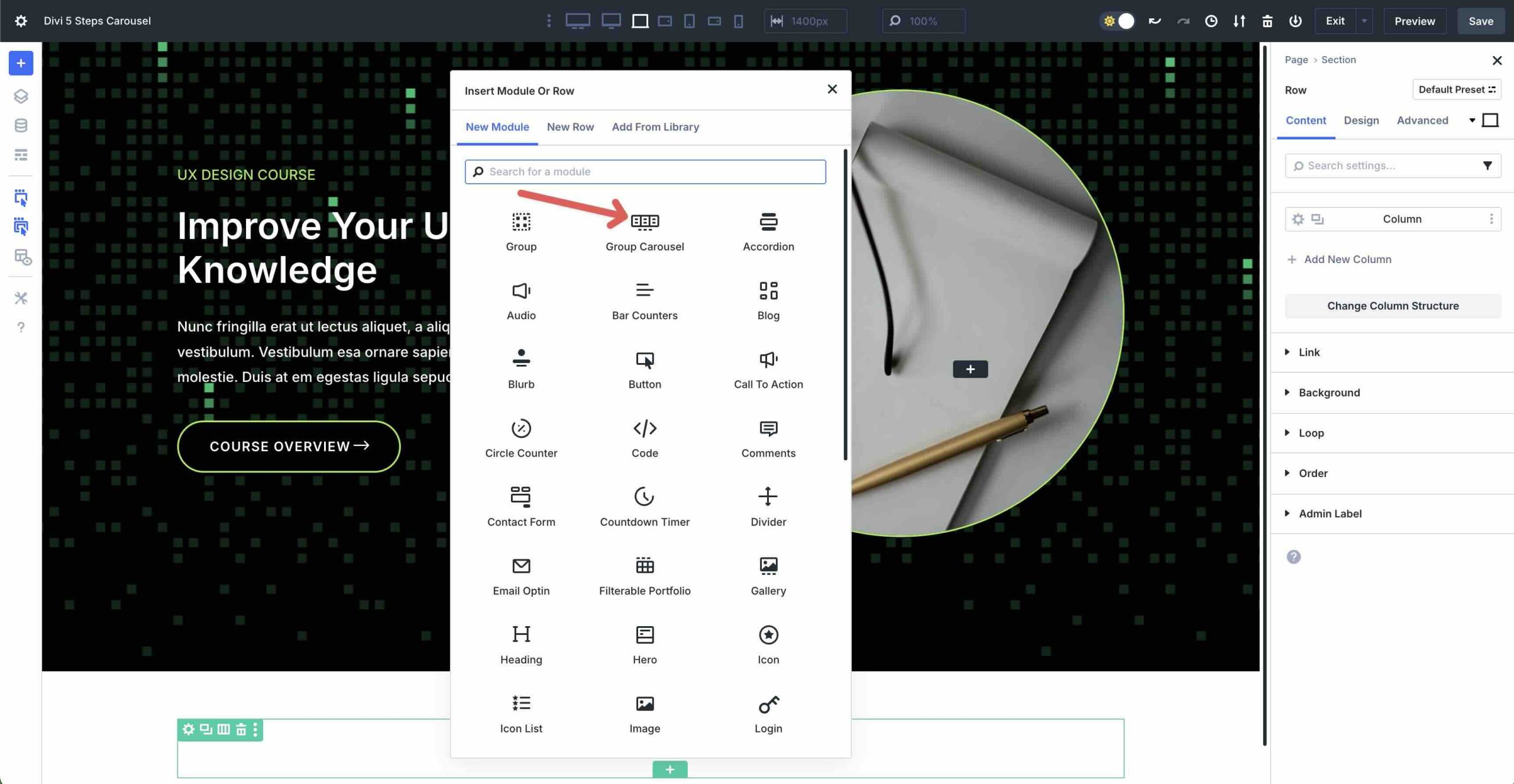
Select the Group Carousel module to add it to the row.
Setting Up The Framework
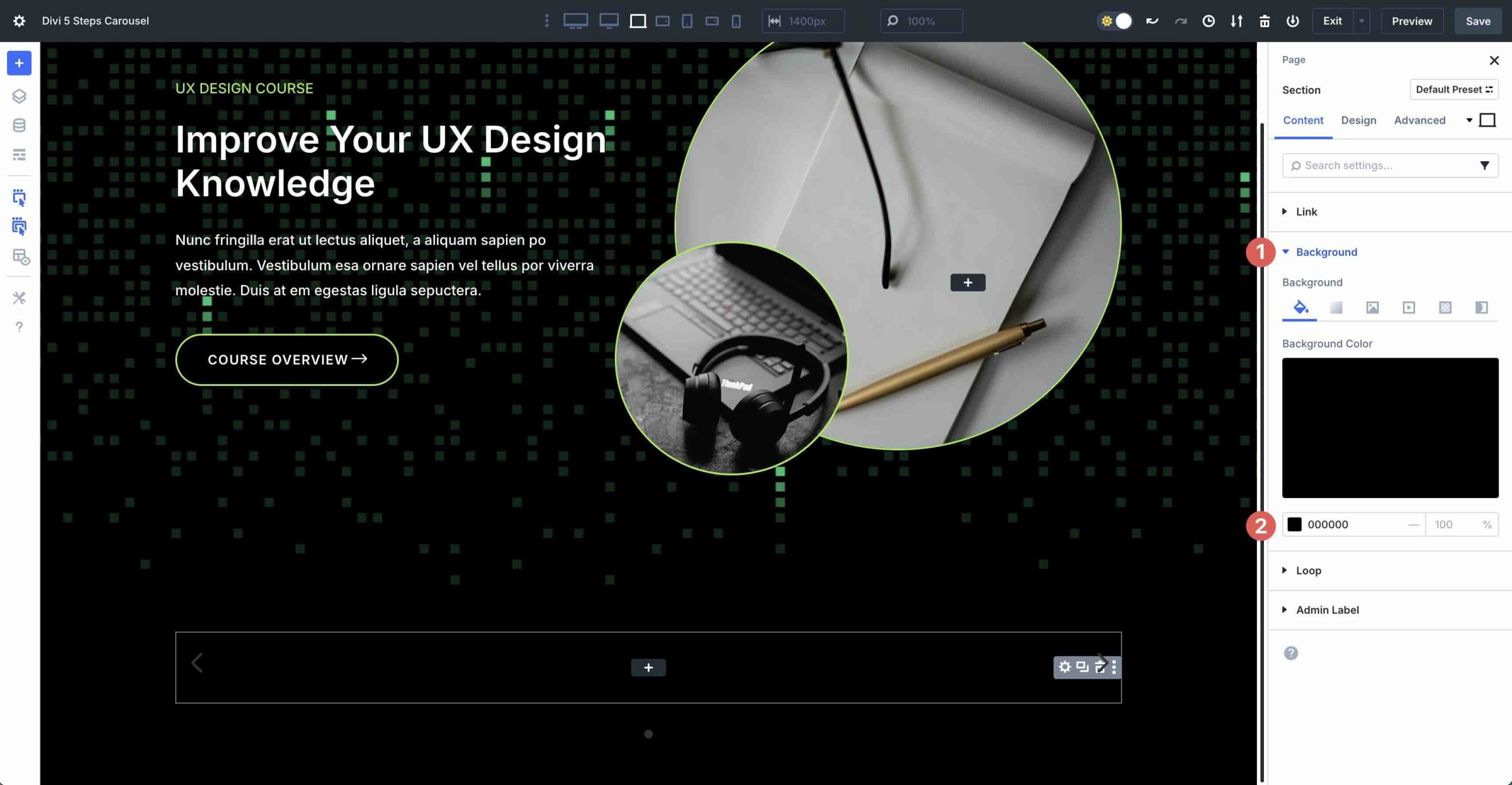
Before we configure the Group Carousel module’s settings, we need to ensure our section and row are set up correctly. First, click the Section’s settings icon to edit it.
Expand the Background tab to reveal the settings. Assign #000000 as the Background Color.
Step 2: Configuring The Carousel’s Settings
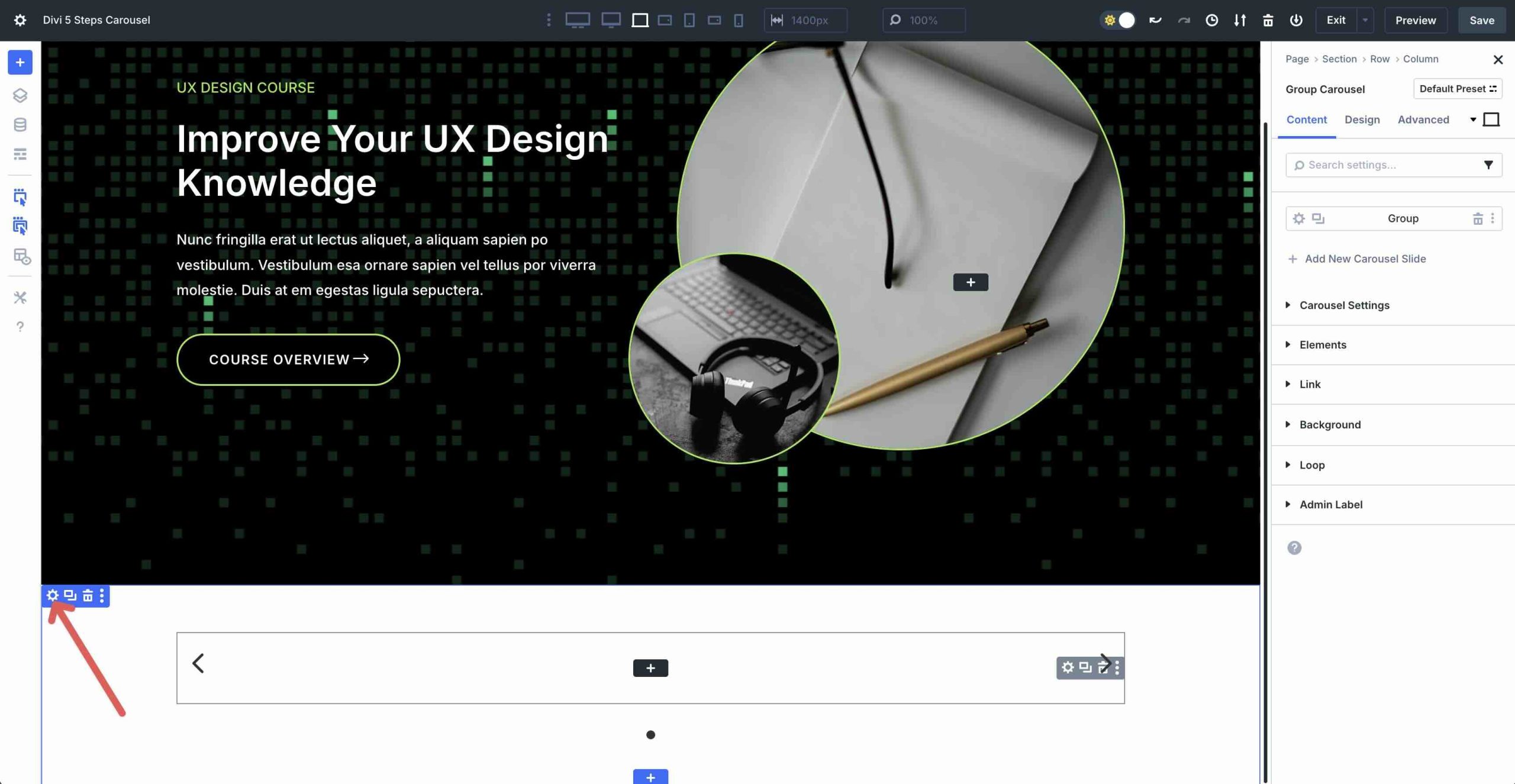
Next, we’ll configure the Group Carousel’s settings. Click the grey settings icon for the main Group Carousel module.
In the Content tab, expand the Carousel Settings menu. Enable the Automatic Rotation toggle. In the Automatic Rotation Speed field, enter 4000ms. Next, enable both the Pause on Hover and Center Mode toggles.
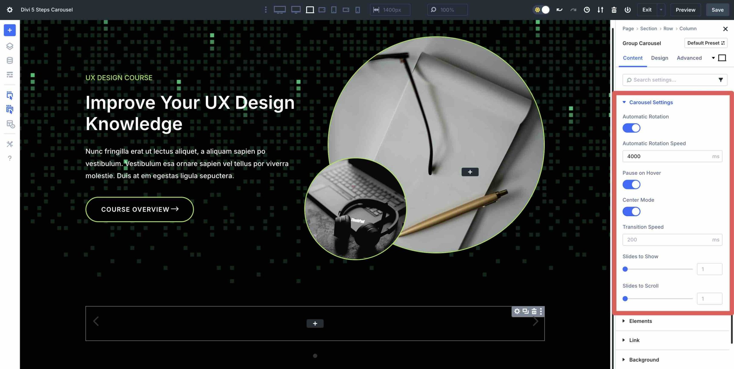
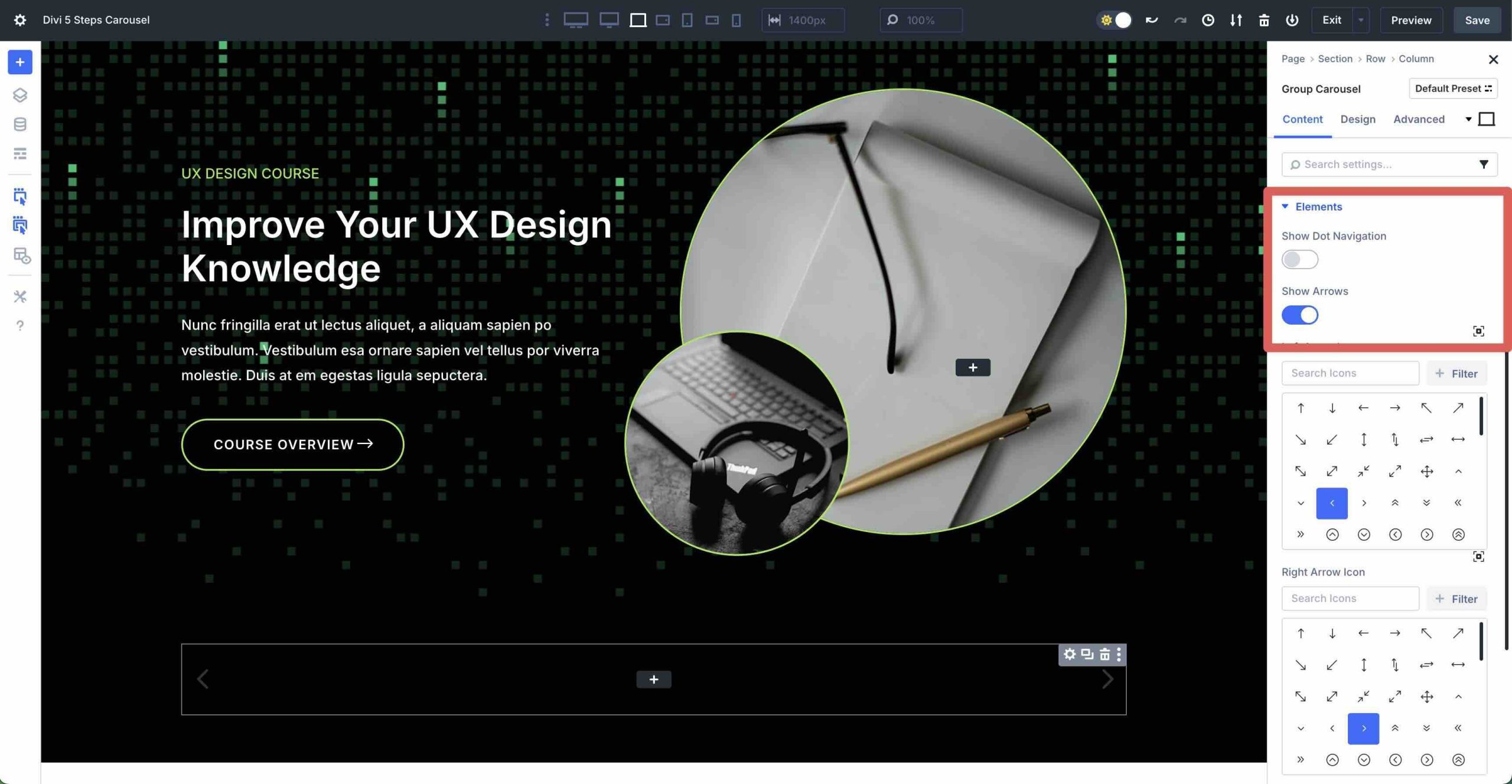
Scroll down and expand the Elements menu. Disable Show Dot Navigation and leave all other settings as is.
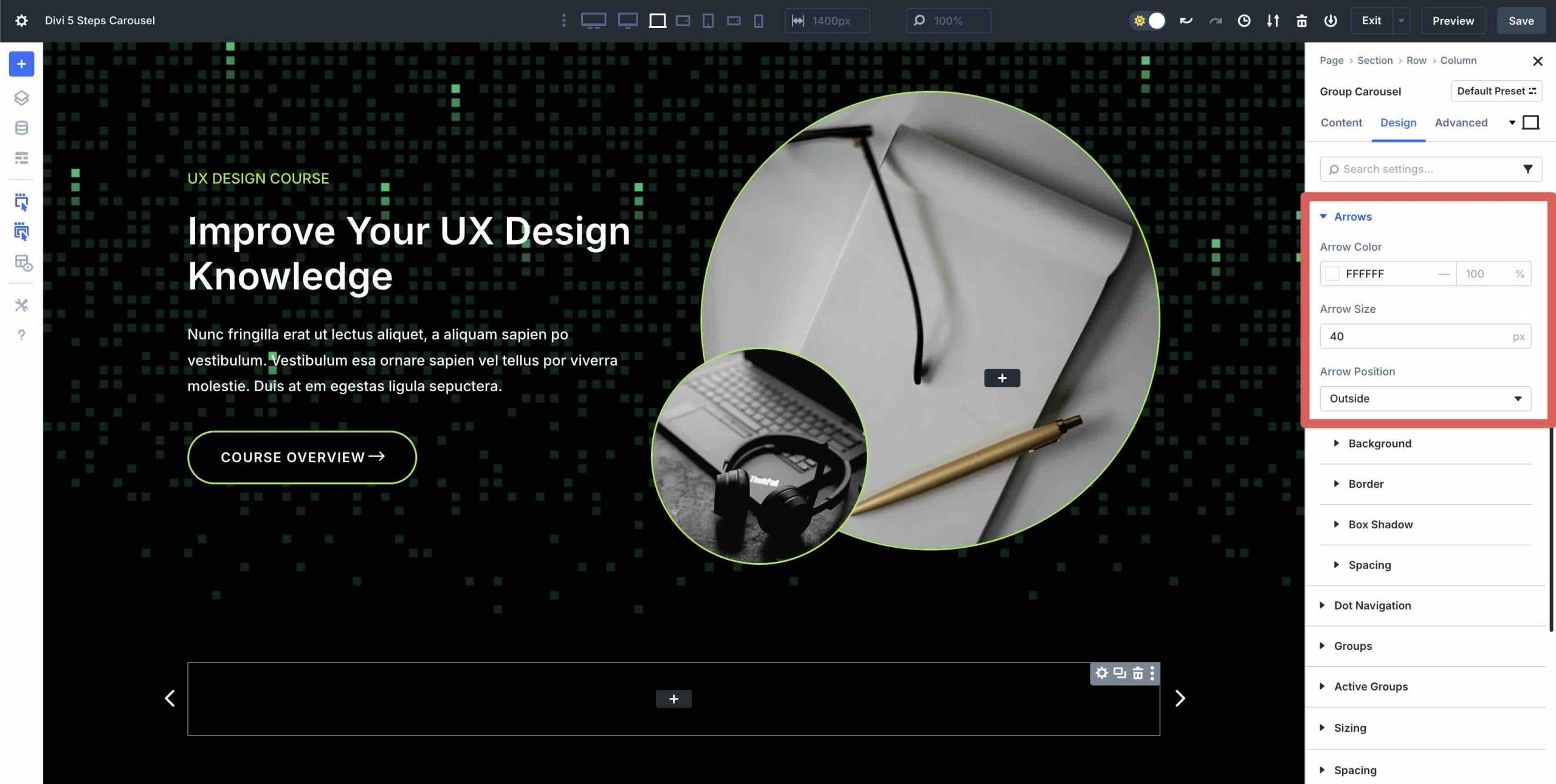
Next, click the Design tab. Expand the Arrows menu to adjust the settings. In the Arrow Color field, enter #ffffff. For Arrow Size, enter 40px. Finally, set the Arrow Position to Outside.
Step 3: Design The First Slide
With the Group Carousel’s settings in place, we can start adding and styling content on the individual Groups. Enter the first Group of the Carousel. Click the grey “+” icon to add a new module.
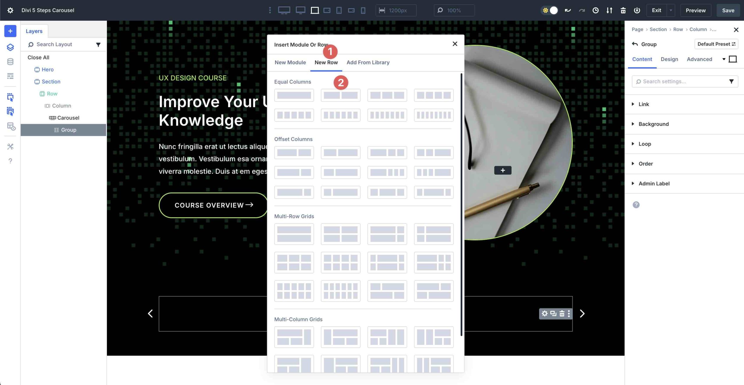
When the Insert Module Or Row modal appears, click the New Row tab. Next, add a two-column row in the Equal Columns options.
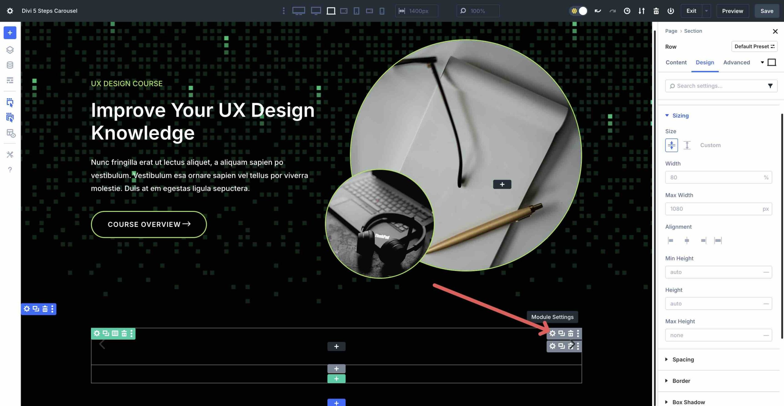
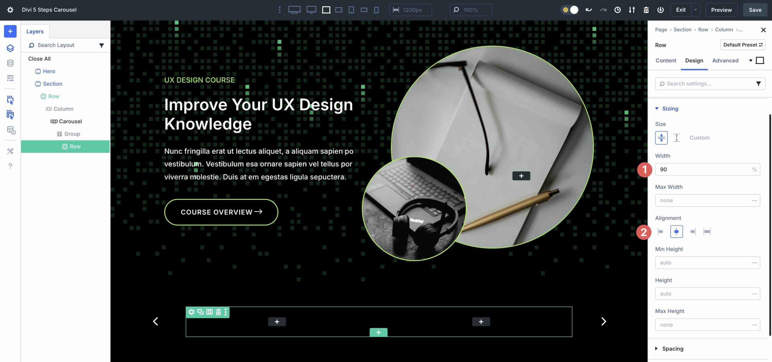
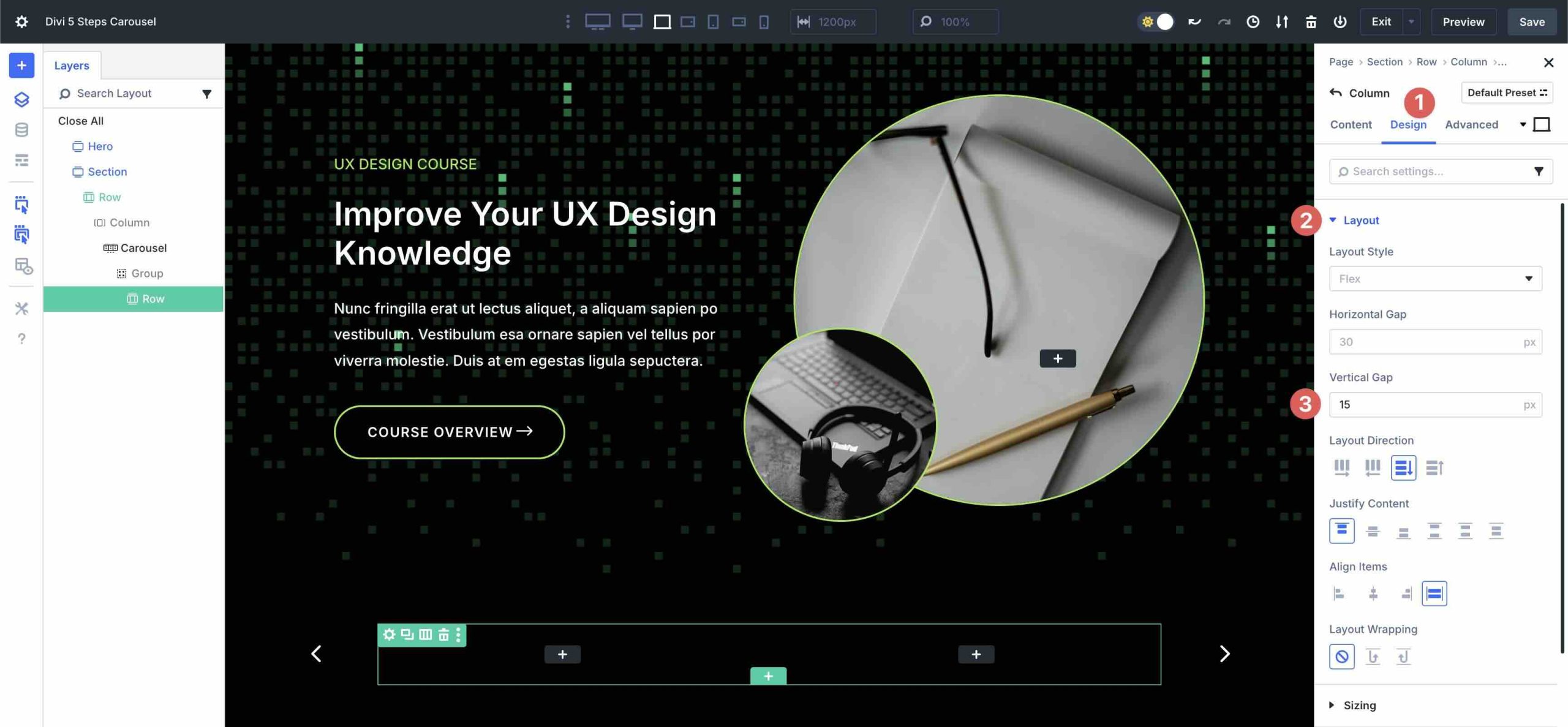
Before we add modules to the row, let’s make some style changes. In the row’s Design tab, expand the Sizing menu. Set the row’s width to 90% in the Width field. Select Center in the Alignment field.
Click the Content tab in the row. Select the first column and navigate to the Design tab. Expand the Layout menu and adjust the Vertical Gap to 15px.
Now, we’ll start adding content to the first slide.
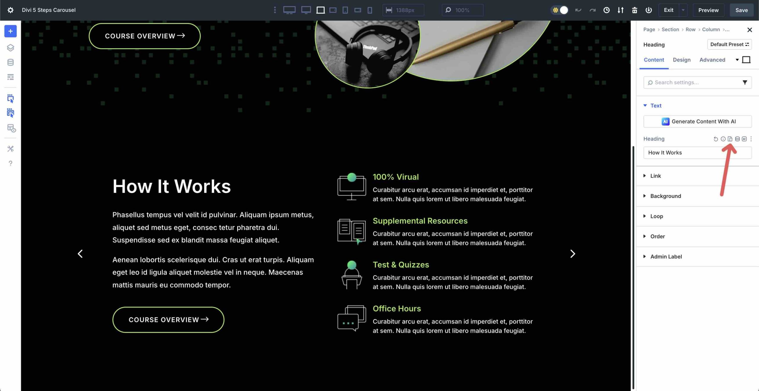
Add a Heading Module
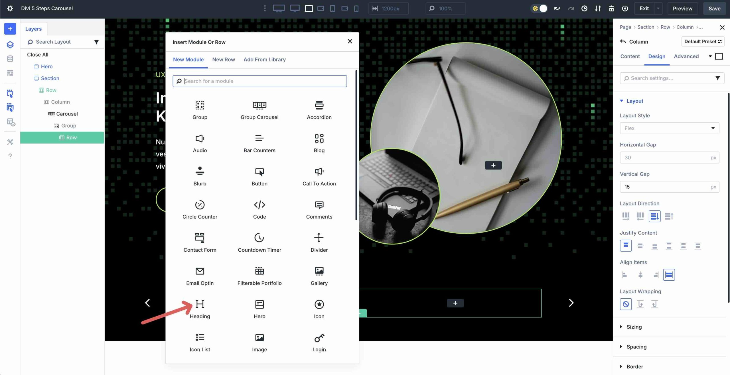
Click the black “+” icon to add a new module to the first column of the row. When the Insert Module Or Row modal appears, add a Heading module.
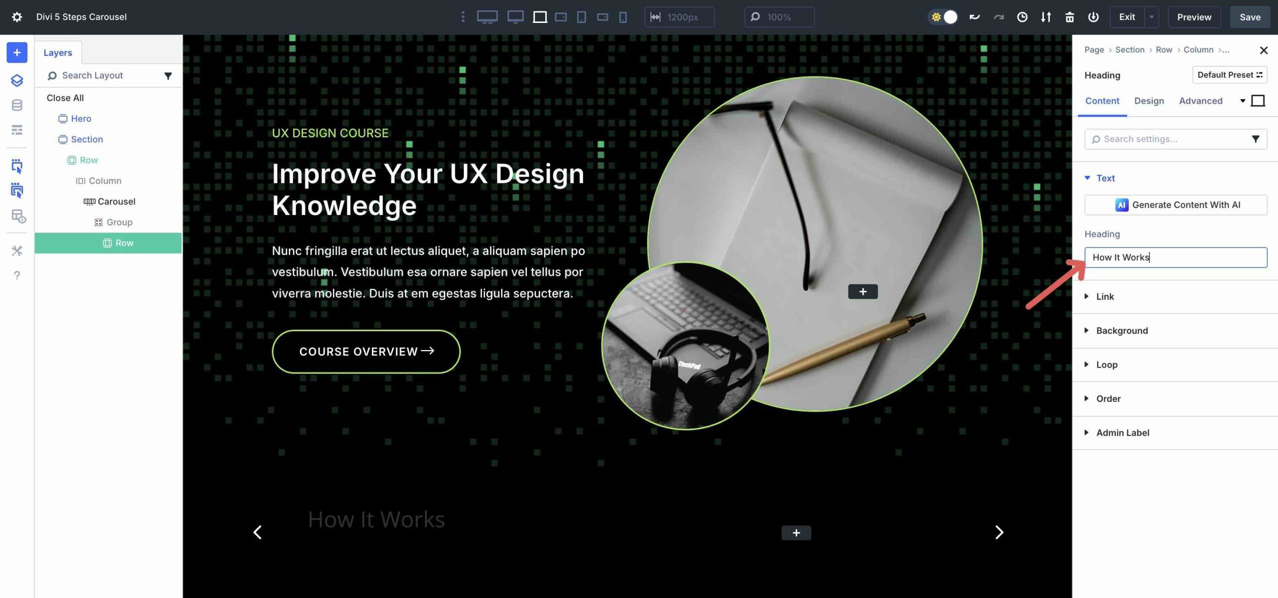
Give the Heading module a Title.
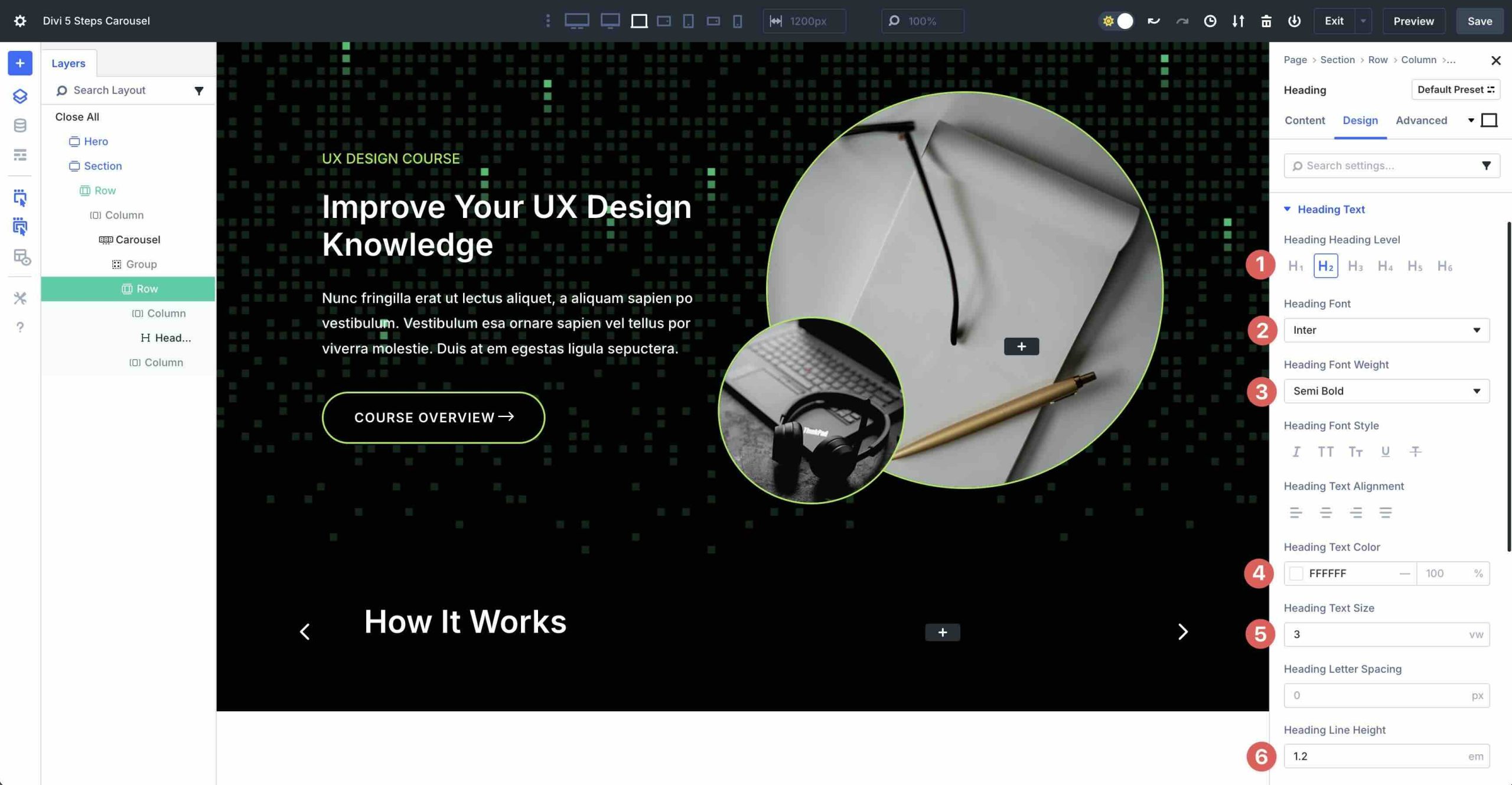
Click the Design tab to adjust the style of the Heading. Enter the following settings:
- Heading Level: H2
- Heading Font: Inter
- Heading Font Weight: Semi Bold
- Heading Text Color: #ffffff
- Heading Text Size: 3vw
- Heading Line Height: 1.2em
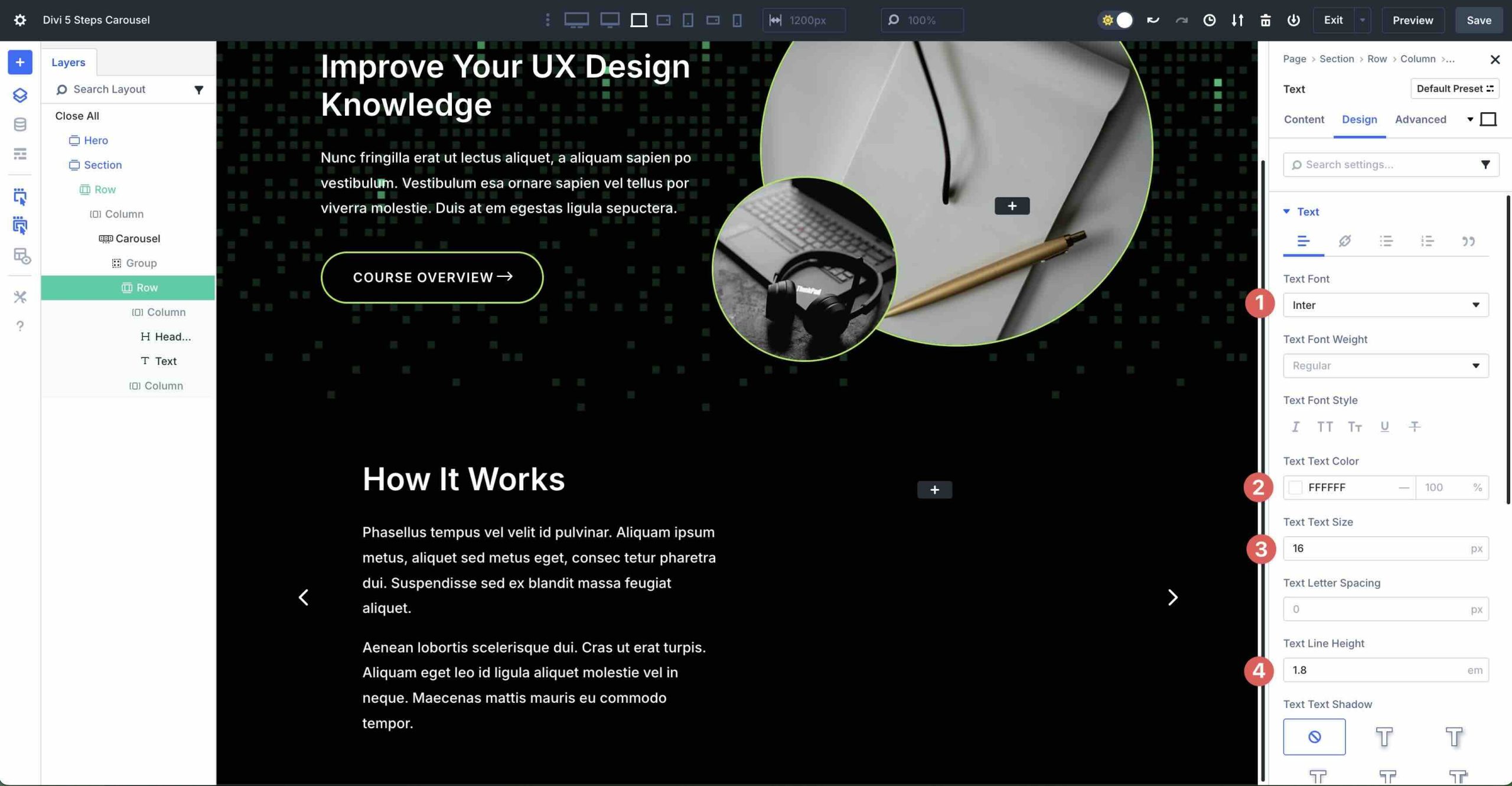
Add a Text Module
Next, click to add a Text module beneath the Heading module. Add text into the Body and click the Design tab to adjust the style settings. Expand the Text menu and enter the following settings:
- Text Font: Inter
- Text Text Color: #ffffff
- Text Text Size: 16px
- Text Line Height: 1.8em
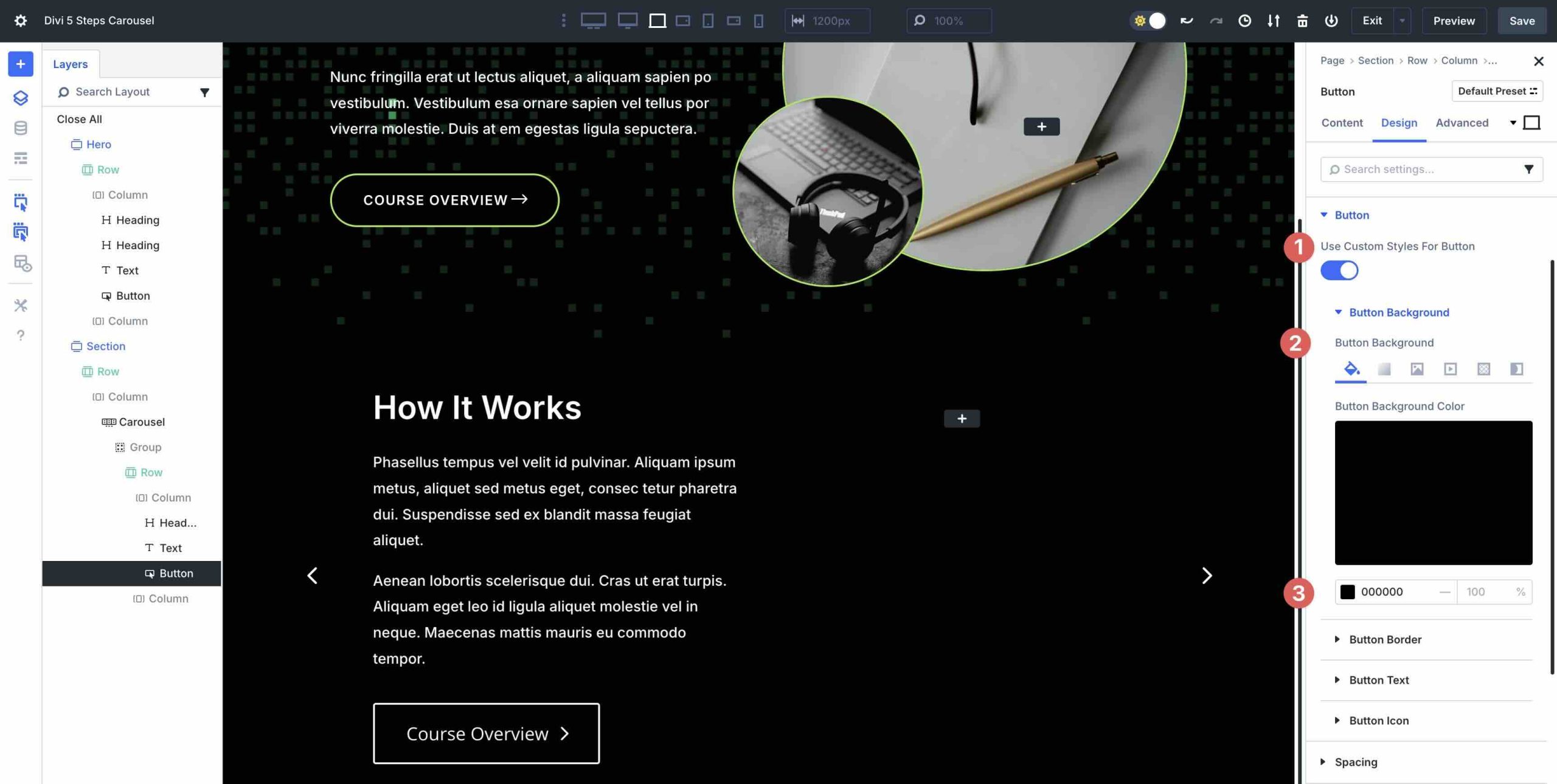
Add a Button Module
Click to add a Button module beneath the Text module in the first column. In the Content tab, add Course Overview for the Button text. Click the Design tab and expand the Button menu. Toggle Use Custom Styles For Button on. In the Button Background field, enter #000000 for the Button Background Color.
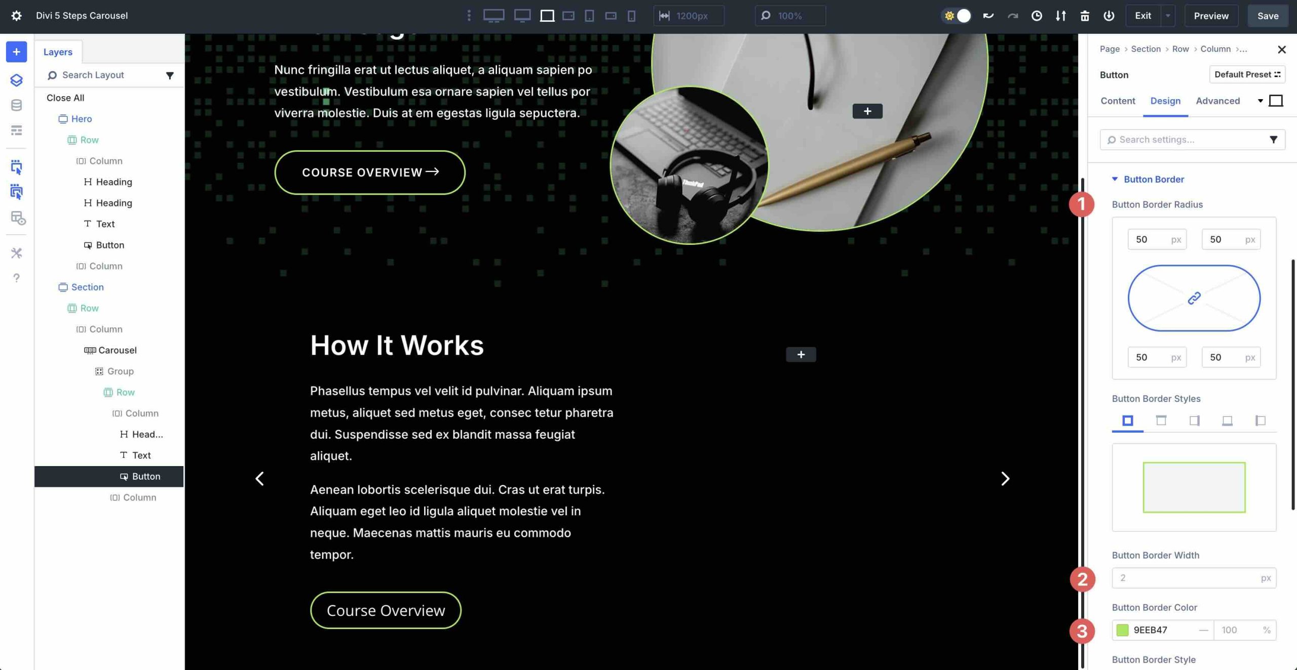
Expand the Button Border menu. Add 50px Button Border Radius, 2px for the Button Border Width, and set the Button Border Color to #9eeb47.
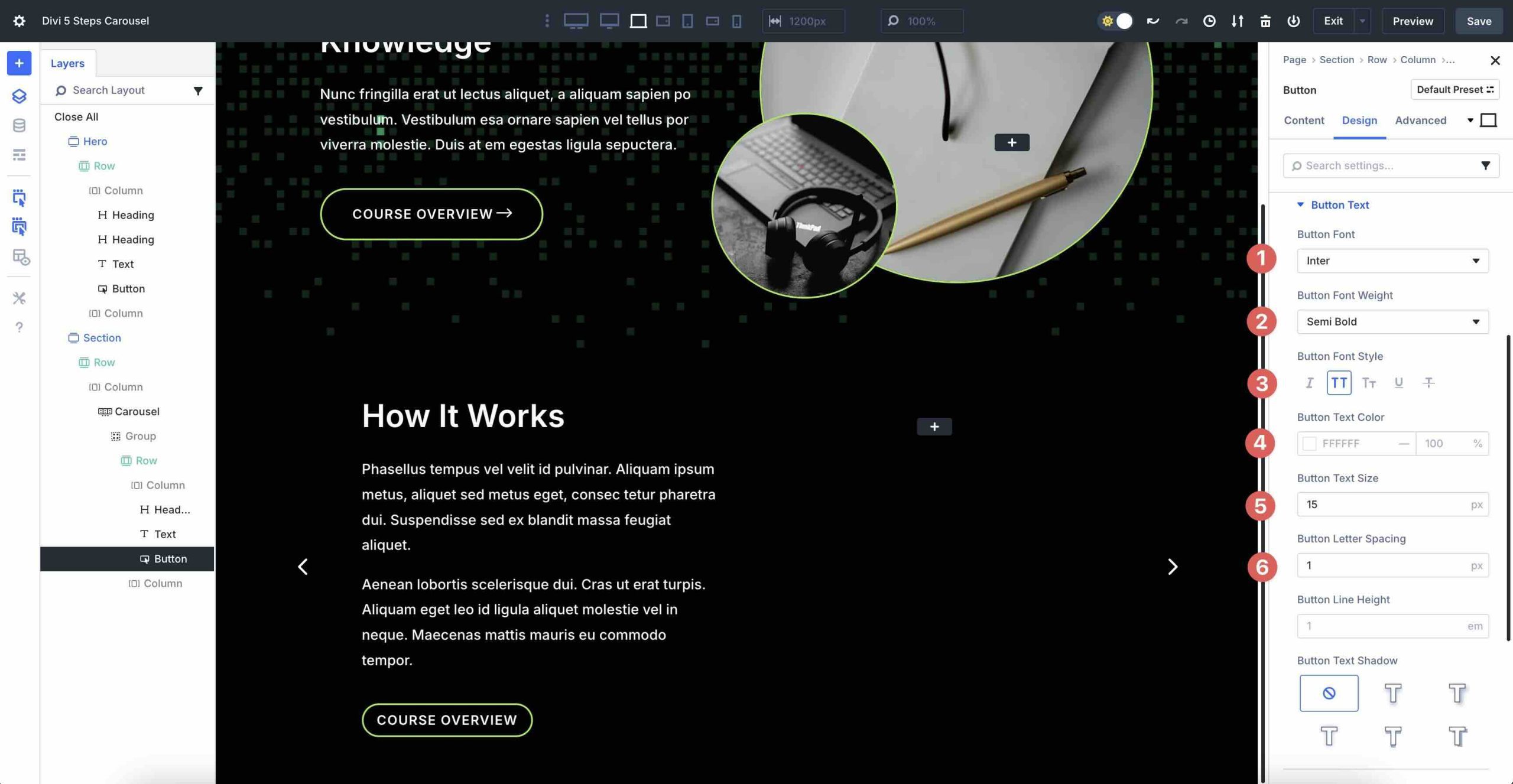
In the Button Text menu, use the following settings:
- Button Font: Inter
- Button Font Weight: Semi Bold
- Button Font Style: Uppercase
- Button Text Size: 15px
- Button Text Color: #ffffff
- Button Letter Spacing: 1px
Expand the Button Icon menu. Choose an arrow for the Button Icon, set the Button Icon Color to #ffffff, and toggle Only Show Icon On Hover For Button off.
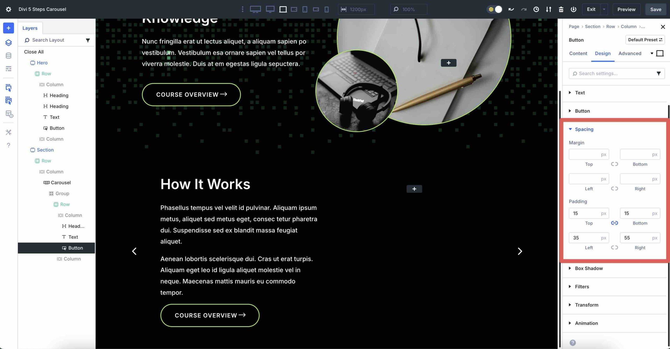
Finally, expand the Spacing menu. Enter 15px Padding for the top and bottom, 35px for the left, and 55px for the right.
We won’t go through all the design settings for additional Groups. For that, you can refer to the file download area further down in the article. After adding content to the first Group, you can preview the slide by clicking on the Preview button at the top right corner of the Visual Builder.
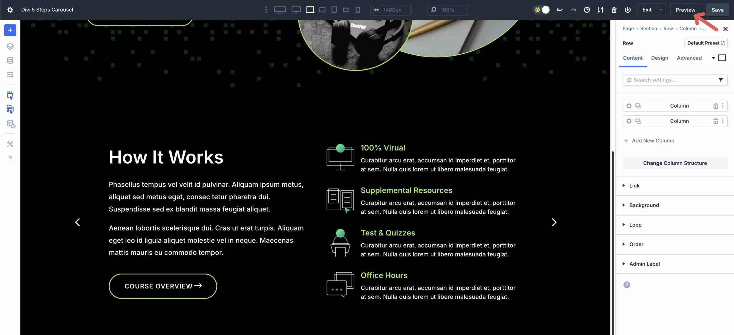
Your page will open in a new tab, allowing you to preview the design.
Step 4: Add Additional Slides
To save time, Divi 5 makes it easy to duplicate Groups for quick editing. Navigate back to the main Group Carousel Content tab. Hover over the first Group and click the duplicate icon to copy it.
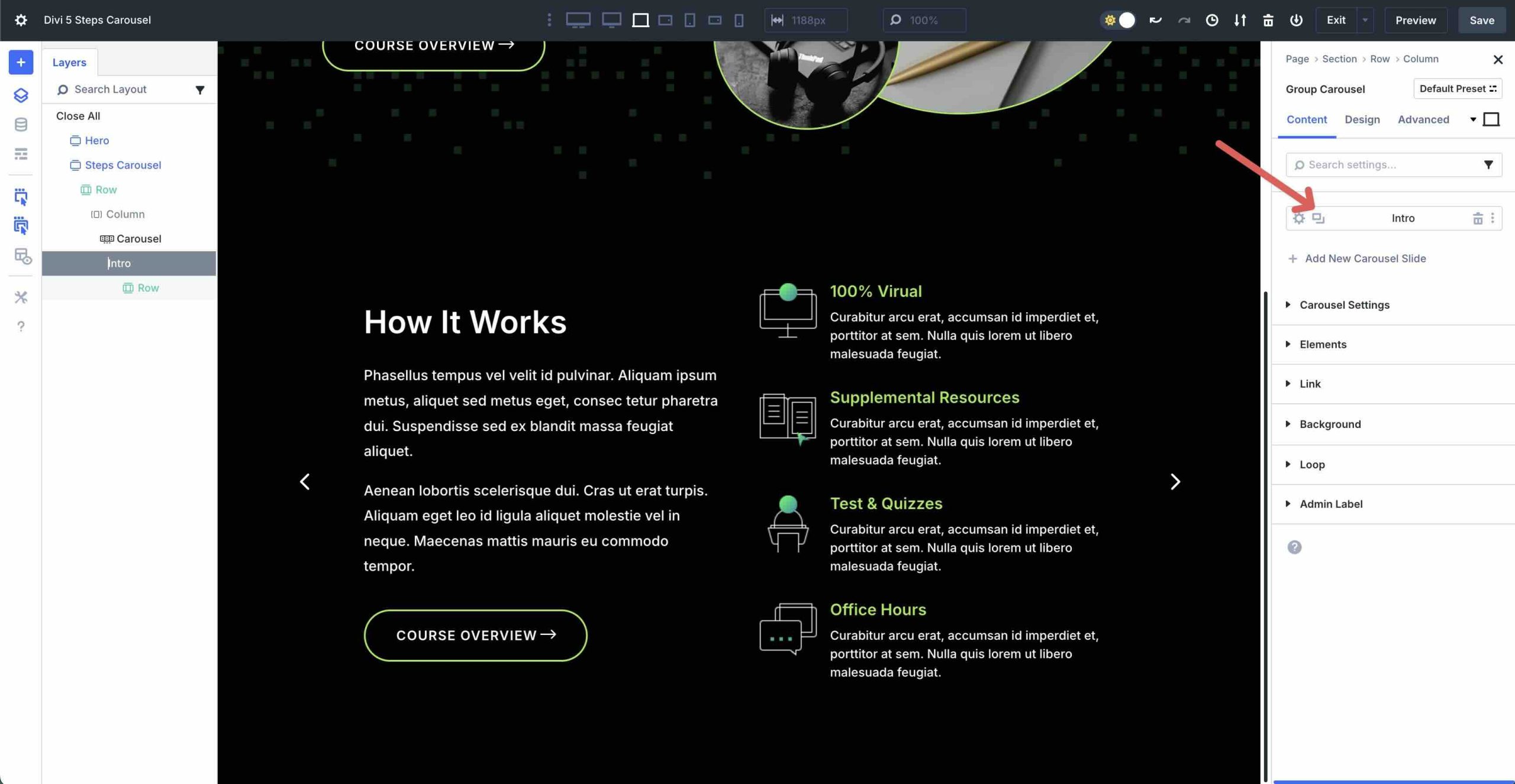
From there, you can quickly change content while maintaining the original styles.
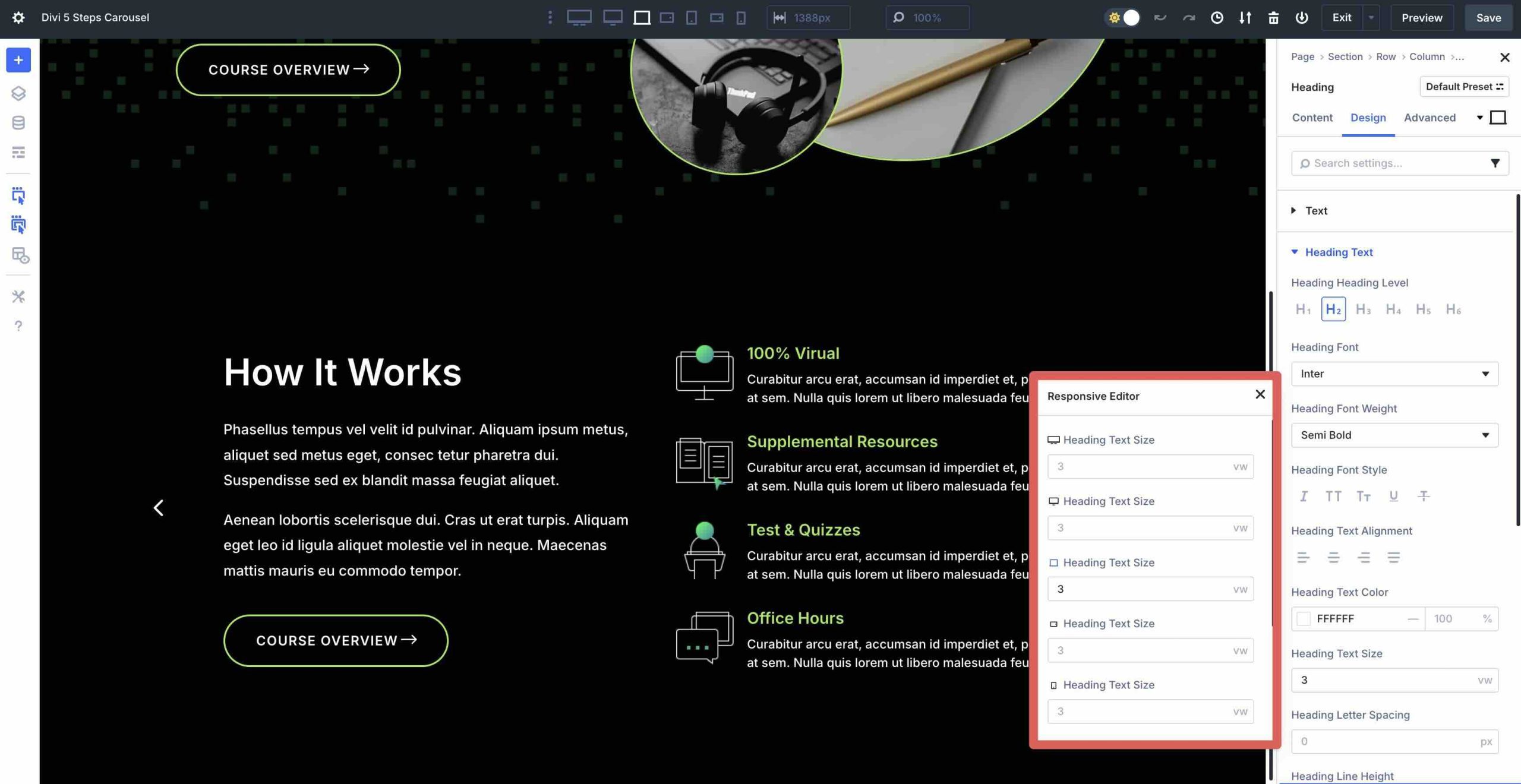
Step 5: Using The Responsive Editor
Once all the Groups are added and styled, you can use Divi 5’s Responsive Editor to fine-tune everything. The Responsive Editor allows you to customize your steps carousel for all screen sizes. By using the Responsive Editor, you can adjust settings such as font sizes, spacing, and layout for each breakpoint, ensuring your carousel looks polished across all screen sizes.
You can access it by clicking the Edit Responsive Values icon in any module.
When the Responsive Editor modal appears, you can make changes at every breakpoint, ensuring everything displays as intended.
If you’d like the full layout, fill out the form below to access the files.

Build Engaging Carousels With Divi 5 Today
Building a steps carousel with Divi 5‘s Group Carousel module is a great way to create engaging, interactive content that guides your audience through processes with clarity and style. By designing a single slide, duplicating it, and adjusting the content, you can create a professional carousel in just a few easy steps. For even more customization, you can experiment with the Loop Builder for dynamic, auto-updating steps.
Download the latest Divi 5 release, experiment with the Group Carousel module, and let us know your thoughts in the comments or through our social media channels.


Looks great! I really like the carousel feature overall. However, after reading about all the responsive and mobile optimizations, I noticed that swipe functionality on mobile devices is missing. It feels like a basic feature for any carousel, especially in today’s mobile-first era. Some of my customers have also requested it. Will this be added in a future update?
Thanks for your feedback. Mel! Our development team has noted the request for mobile swipe functionality and will consider it for future updates.
When will you add swipe function on mobile?
The development team is considering mobile swipe functionality as a valuable improvement option. Thanks for the input!