")
One of Divi 5‘s latest releases introduces the Group Carousel Module, a feature for creating custom, engaging sliders and carousels for your WordPress site. You can easily showcase your portfolio, products, an immersive hero, or a fullscreen slider, and take your site’s design to new heights.
In this post, we’ll provide a step-by-step guide to creating a fullscreen slider using the Group Carousel module. Let’s dive in!
- 1 Understanding The Group Carousel Module
-
2
How To Build A Fullscreen Slider With Divi 5’s Group Carousel Module
- 2.1 Step 1: Setting Up A New Page
- 2.2 Step 2: Configure The Row Settings
- 2.3 Step 3: Configure The Group Carousel Settings
- 2.4 Step 4: Style The First Group
- 2.5 Step 5: Add Content To The First Group
- 2.6 Step 6: Add Animations
- 2.7 Step 7: Overlapping Rows
- 2.8 Step 8: Test Responsiveness
- 2.9 Step 9: Duplicating Groups
- 2.10 Step 10: Preview And Save The Slider
- 3 Download The Fullscreen Carousel Layout
- 4 Download For Free
- 5 Build Your First Carousel In Divi 5 Today
Understanding The Group Carousel Module
The Group Carousel Module is a versatile addition to Divi 5, enabling you to create dynamic sliders and carousels.
Unlike traditional modules, it supports a wide range of layouts, from simple image carousels to complex, post-based sliders powered by the Loop Builder. This flexibility makes it perfect for showcasing content like portfolios, testimonials, or product galleries in a compelling way.
Key Features Of The Group Carousel Module
The Group Carousel Module shines with robust features. It supports dynamic content loops, allowing you to pull in posts, pages, or custom post types directly into your slider using the Loop Builder.
The module also allows you to use any Divi module to build beautiful, engaging sliders using Nested Rows and Module Groups. You can customize navigation with arrows and pagination dots, customizing their position, color, and other styles to match your site.
Autoplay options, adjustable speeds, and pause-on-hover features provide an eye-catching experience for your visitors, ensuring they stay on your site longer. Additionally, the module is fully customizable, allowing you to create fullscreen and fullwidth layouts, making it ideal for hero, service, or feature sections on your website.
How To Build A Fullscreen Slider With Divi 5’s Group Carousel Module
In this tutorial, we’ll show you how to use the Group Carousel Module to build a fullscreen slider for your upcoming Divi 5 websites. By the end, you’ll have the skill set to build captivating sliders to encourage your visitors to act.
Step 1: Setting Up A New Page
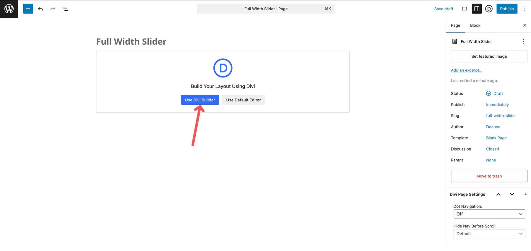
Create a new page, add a title, and click Use Divi Builder to get started.
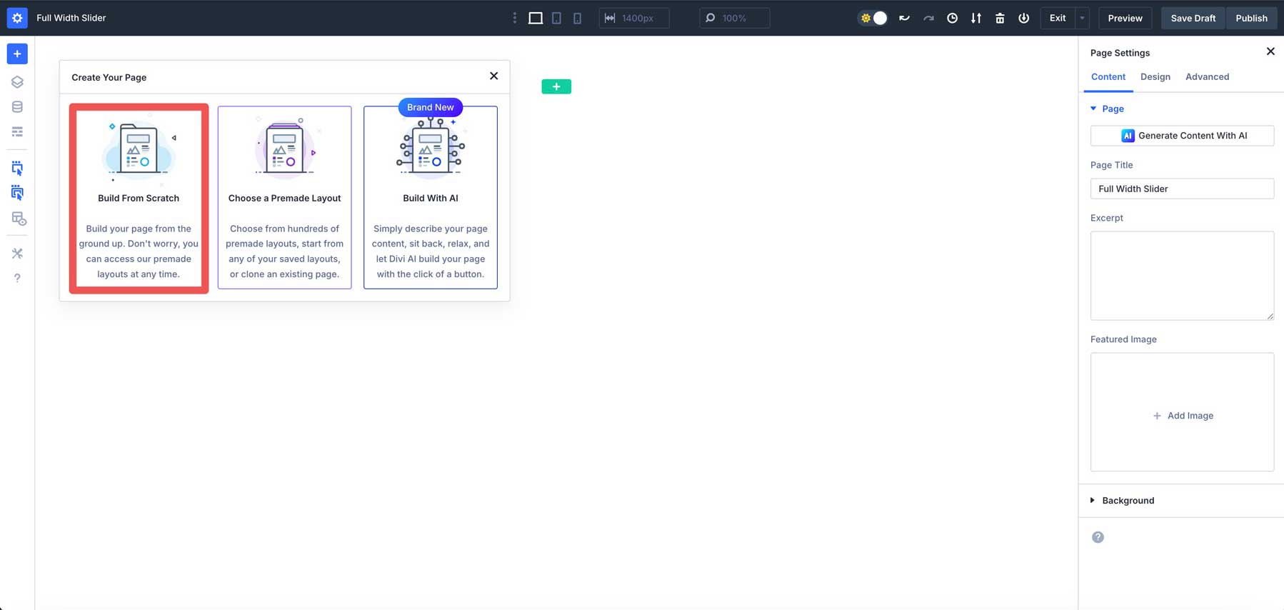
When the Visual Builder opens, choose Build From Scratch under the Create Your Page options.
Hover over the section on your new page to reveal the settings icon. Click on it to reveal the section’s settings.
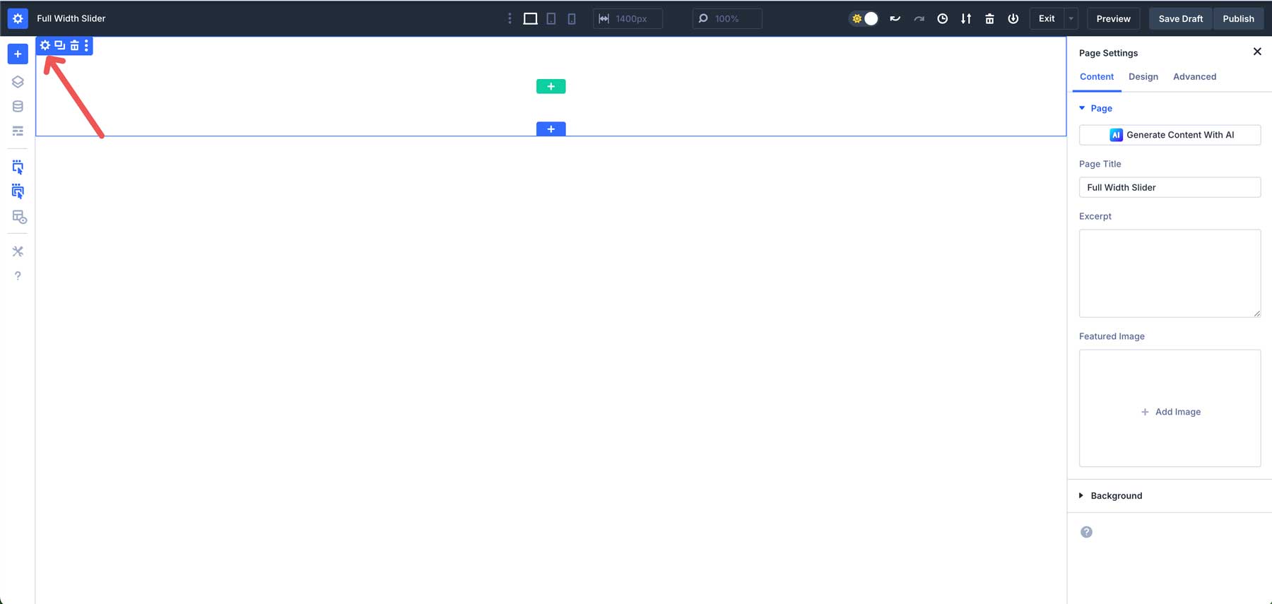
Navigate to the design tab. Click the Layout dropdown menu. Under Justify Content, select center. In the Align Items field, select center. This will allow our section’s content to be centered horizontally and vertically.
Next, we’ll adjust the spacing settings for the section. Expand the Spacing dropdown menu. Set the margin to 0px, top and bottom. Under padding, set the top and bottom to 0px.
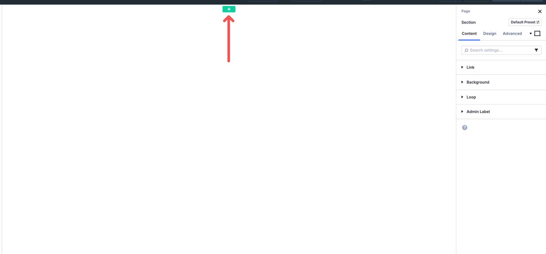
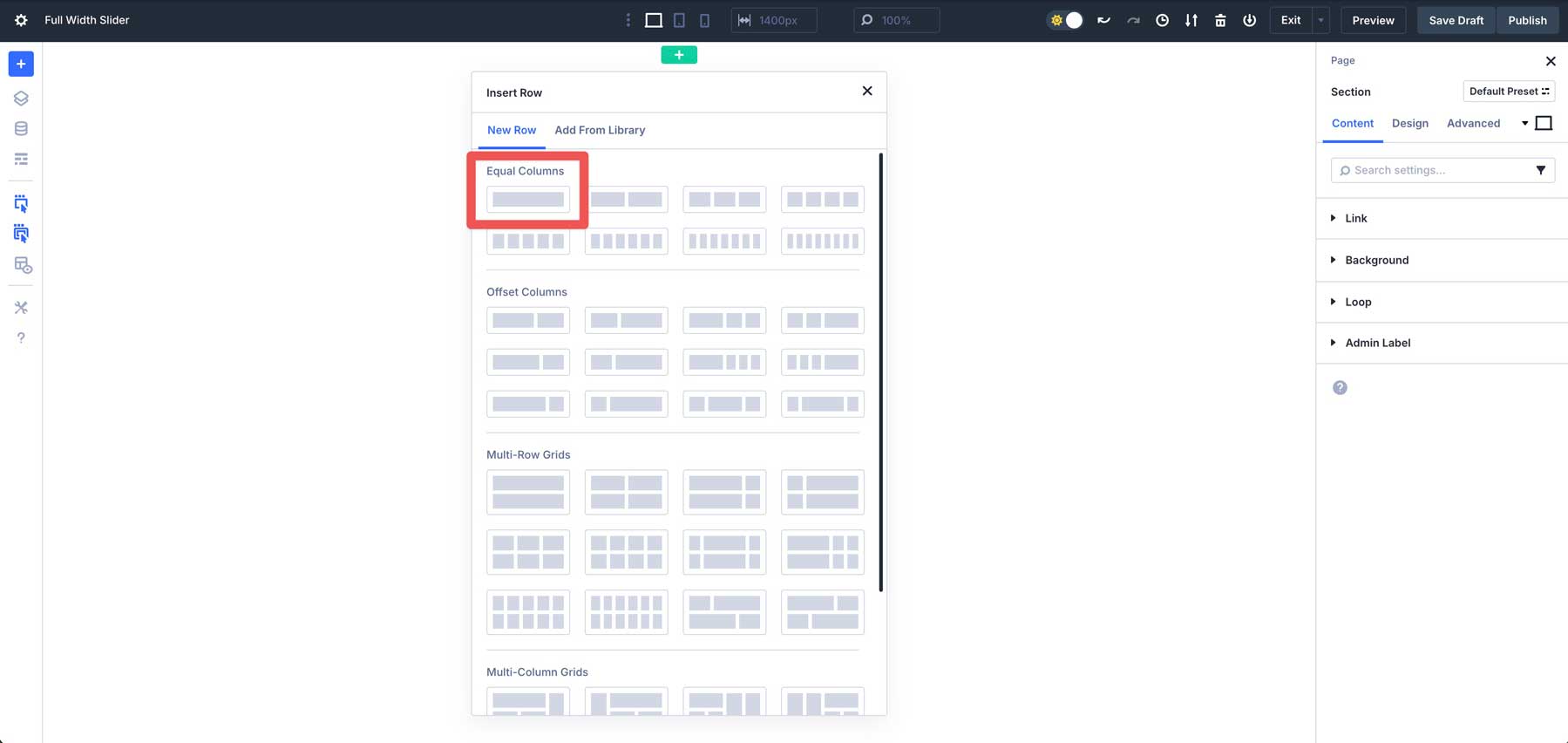
With the section’s settings in place, click the green + icon to add a new row.
Select the single-column row under Equal Columns.
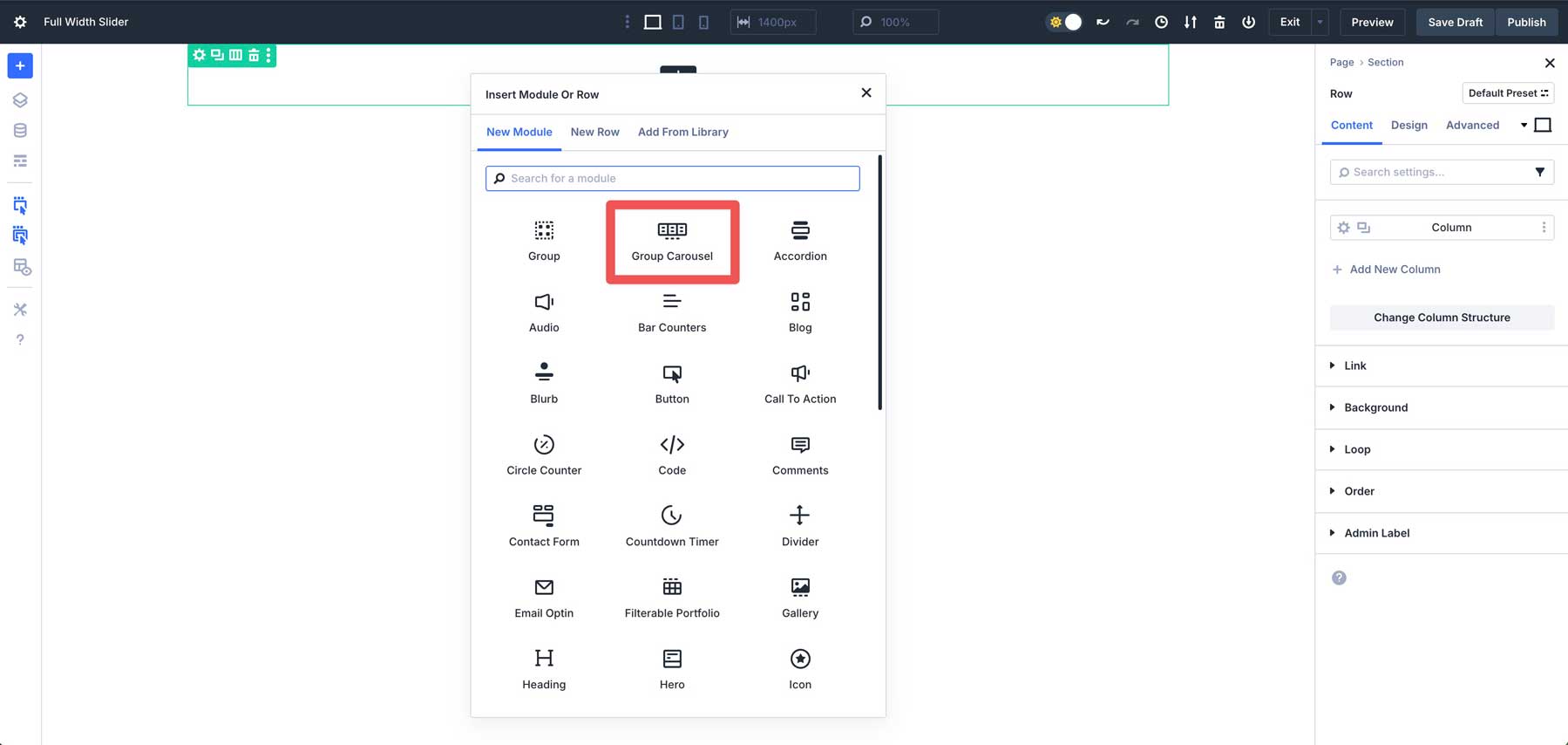
Next, add the Group Carousel Module to the row.
Before adding content, we must set up the row and Group Carousel Module with Flexbox and spacing controls.
Step 2: Configure The Row Settings
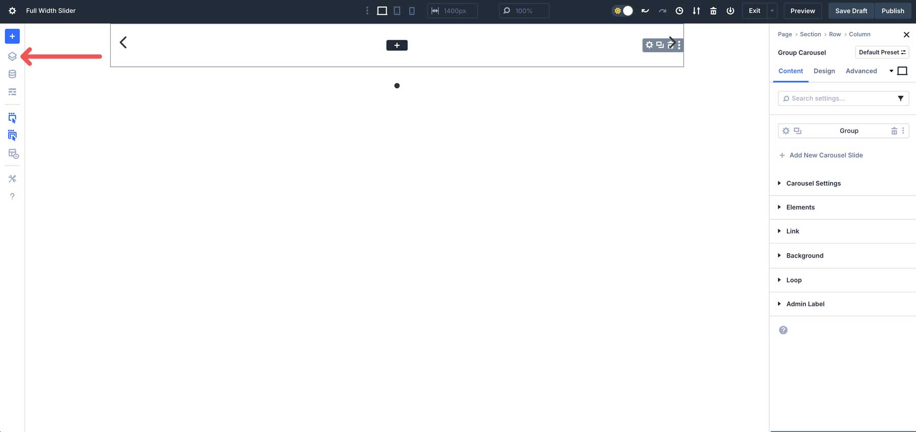
Creating a fullscreen slider requires us to set the row and the Group Carousel Module to 100% width. Click the Layers icon to easily adjust sections. This is crucial when working with fullwidth sections and rows, especially when padding and margin have been set to 0. It makes it easier to see the layout structure of your page
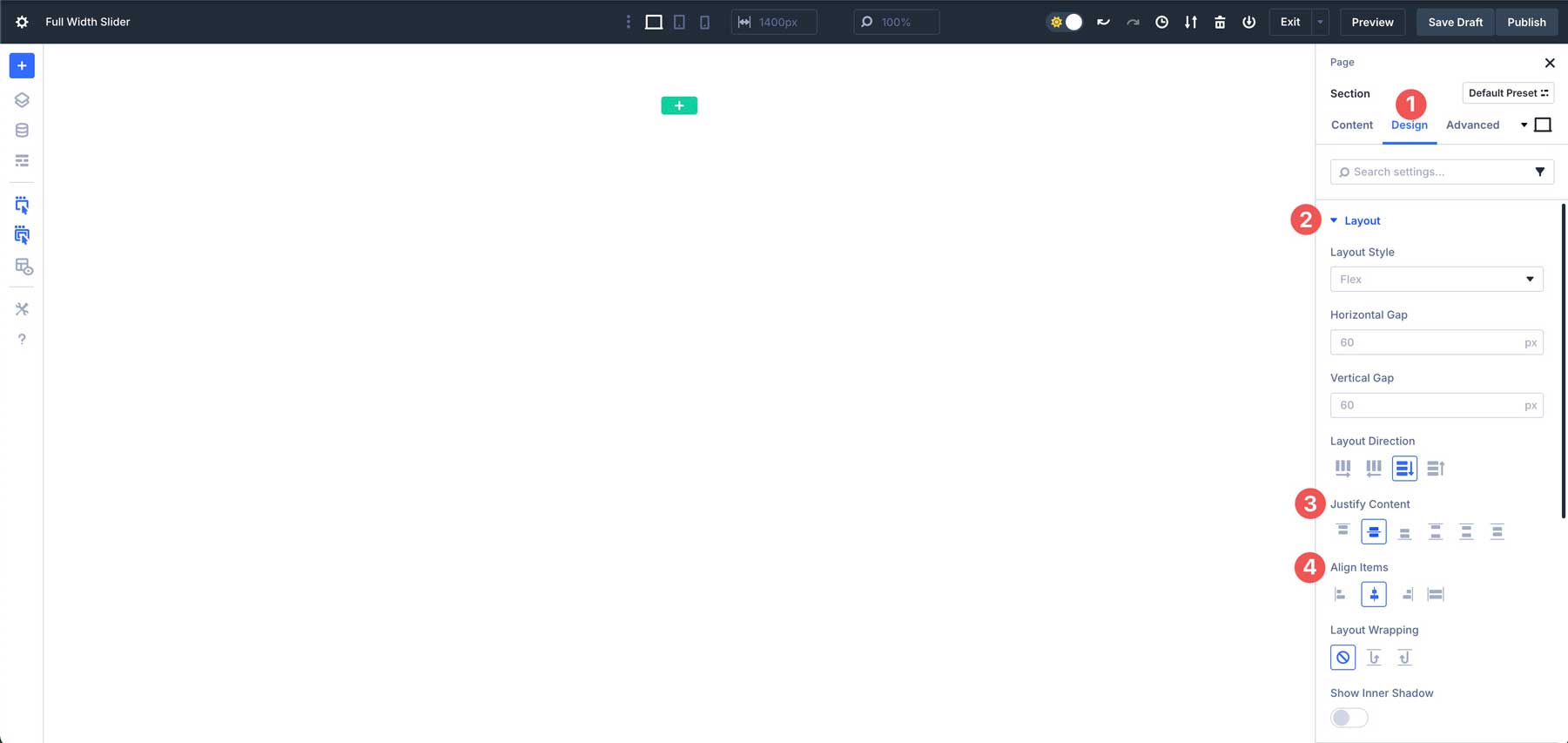
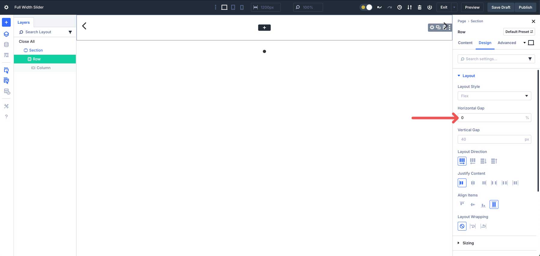
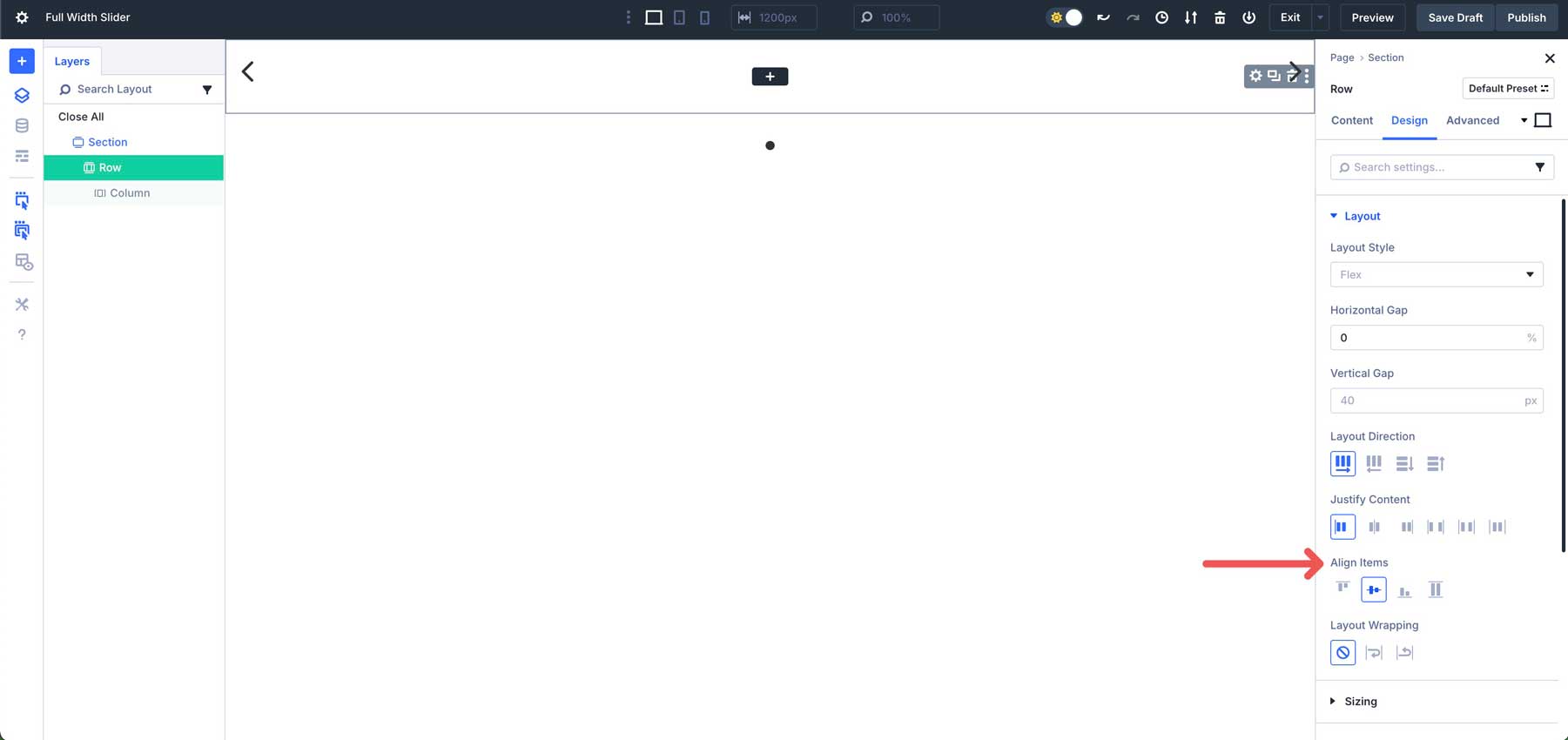
In the layers view, click to select the single-column row that houses the Group Carousel Module. Navigate to the design settings. In the Layout dropdown menu, adjust the horizontal gap to 0.
Also, set Align Items to center for the row.
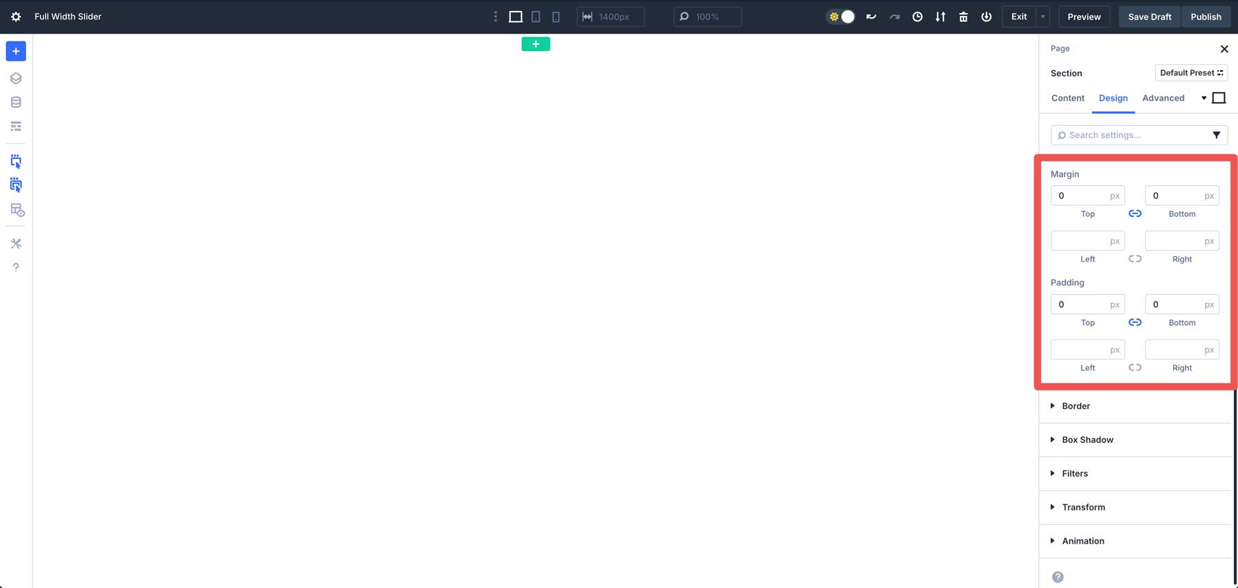
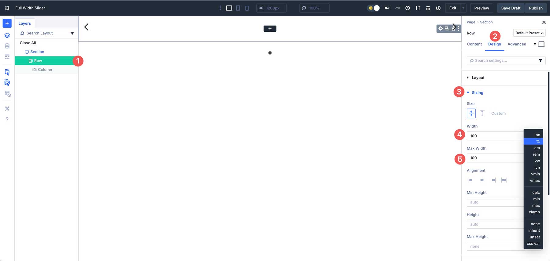
Set the width and max width in the sizing tab to 100%.
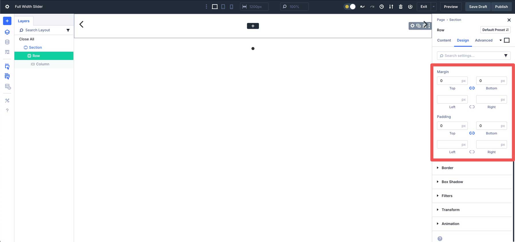
In the spacing tab, set the top and bottom margin and padding to 0px.
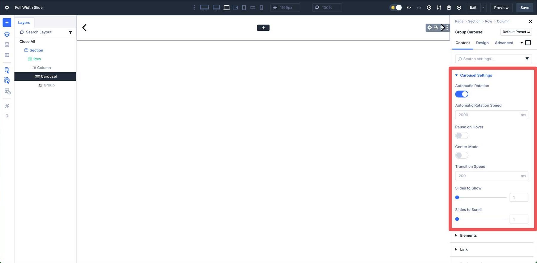
Step 3: Configure The Group Carousel Settings
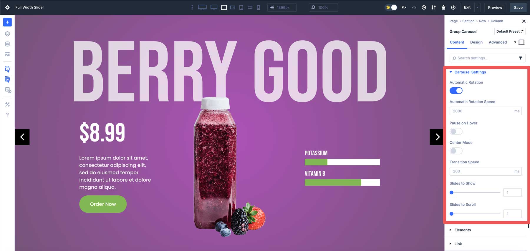
Next, we’ll configure the Group Carousel settings. Expand the Carousel Settings dropdown menu in the content tab. You can toggle Automatic Rotation on, choose the Automatic Rotation Speed at the default setting of 2000ms, and enable Pause on Hover.
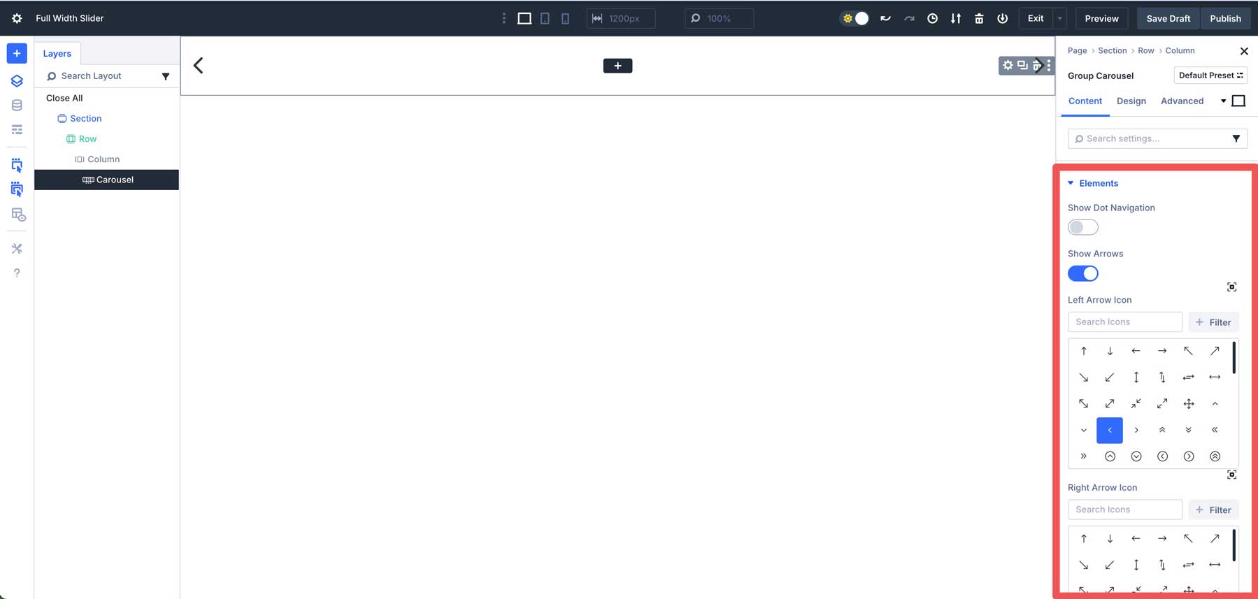
In the Elements tab, disable Show Dot Navigation and leave Show Arrows enabled. You can also choose a custom icon for the left and right arrows.
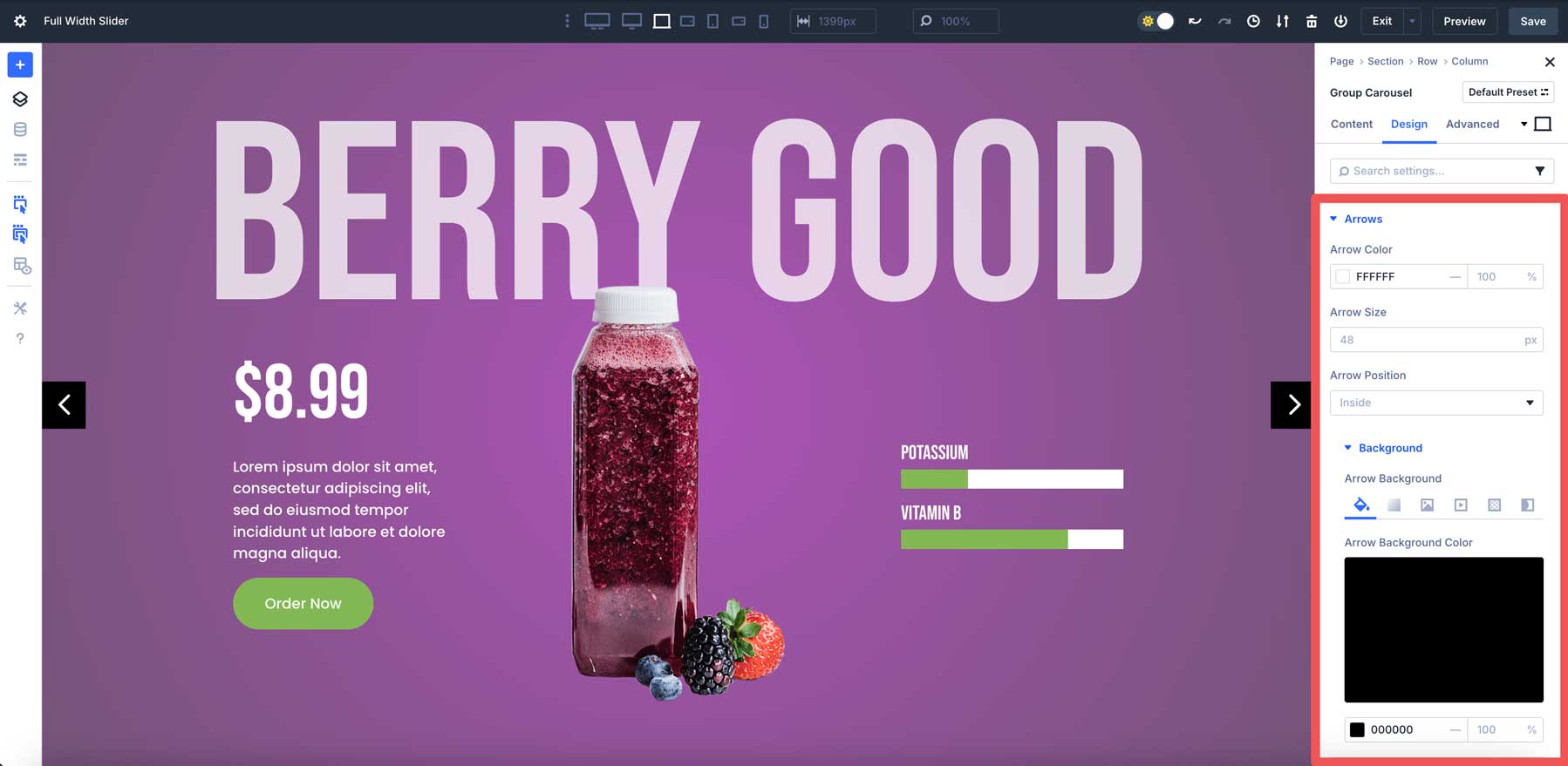
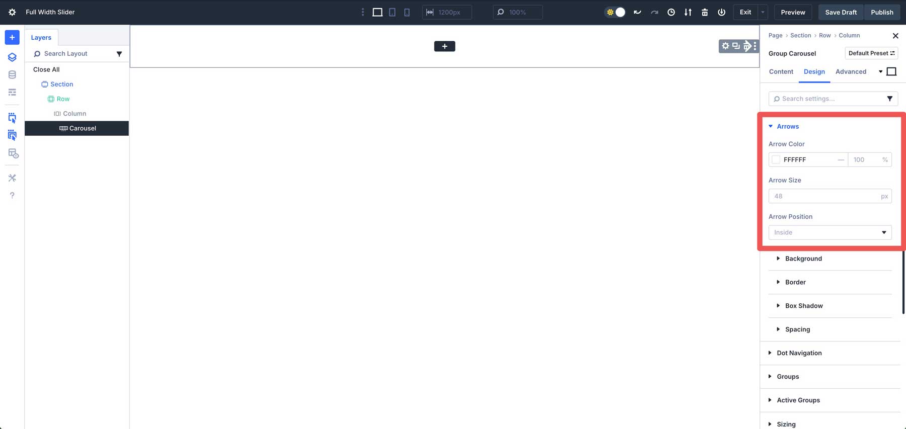
Click to expand the Arrows tab in the Design tab. Assign #ffffff as the Arrow Color, leave the Arrow Size at the default 48px, and leave Arrow Position set to Inside.
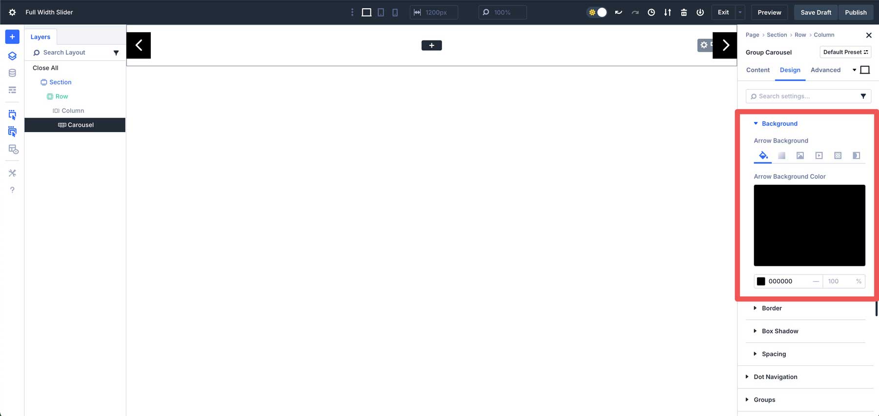
Expand the Background tab and assign #000000 as the Background Color.
Step 4: Style The First Group
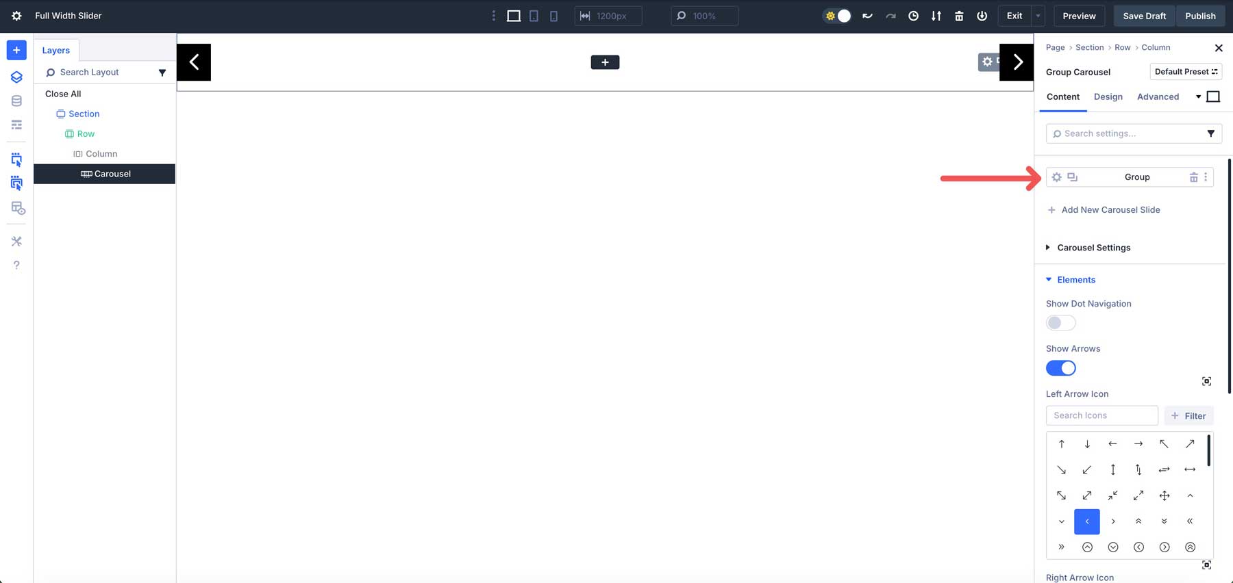
We can add content to the first slide with the section, row, and Group Carousel settings in place. Click the content tab in the Group Carousel Module and click the settings icon for the Group.
Expand the Background dropdown menu and select the Gradient tab.
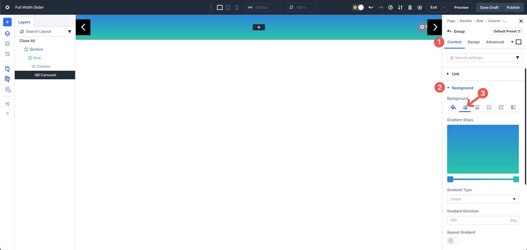
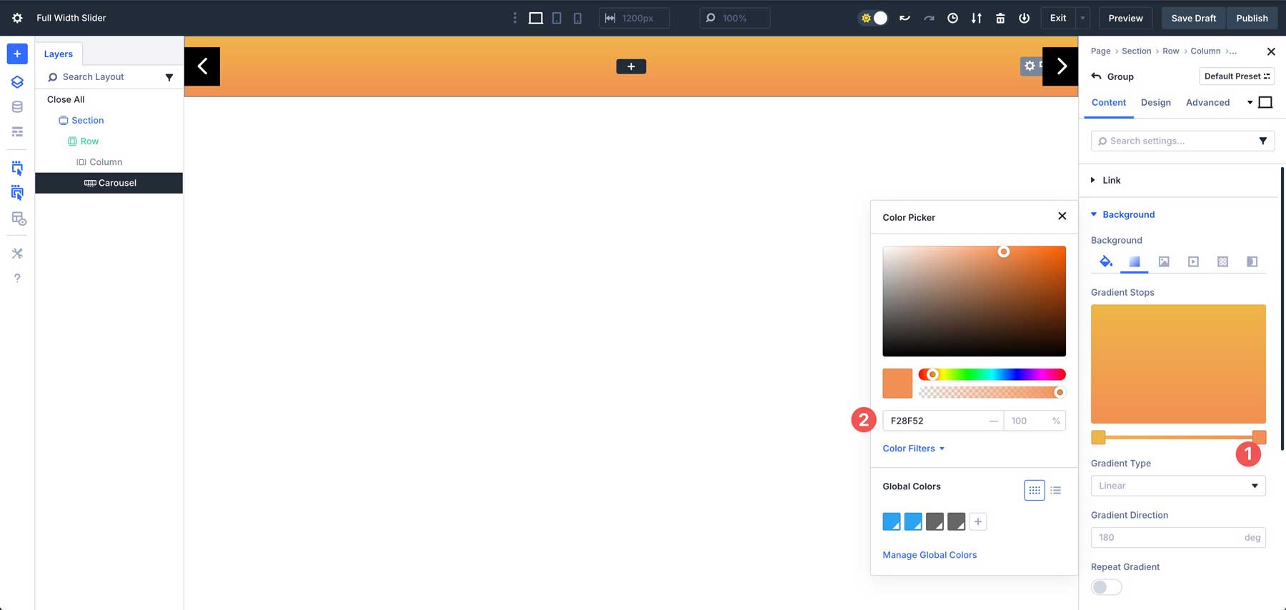
Click the first Gradient Slider to assign a new color. Enter #efb648 into the color field.
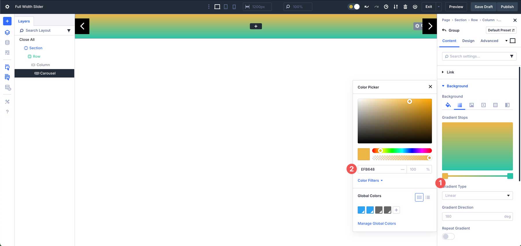
Next, click into the 2nd Gradient Slider and assign #f28f52 as the color.
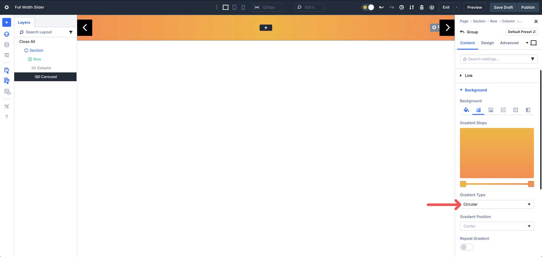
In the Gradient Type field, select Circular.
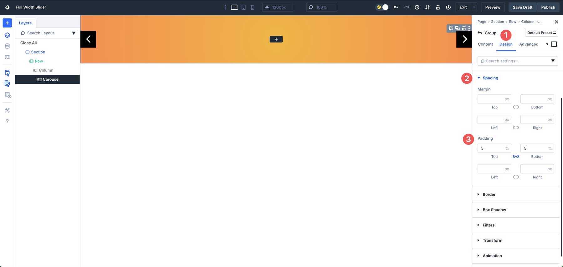
Next, navigate to the Design tab. Expand the Spacing tab and assign 5% padding to the top and bottom of the Group.
Step 5: Add Content To The First Group
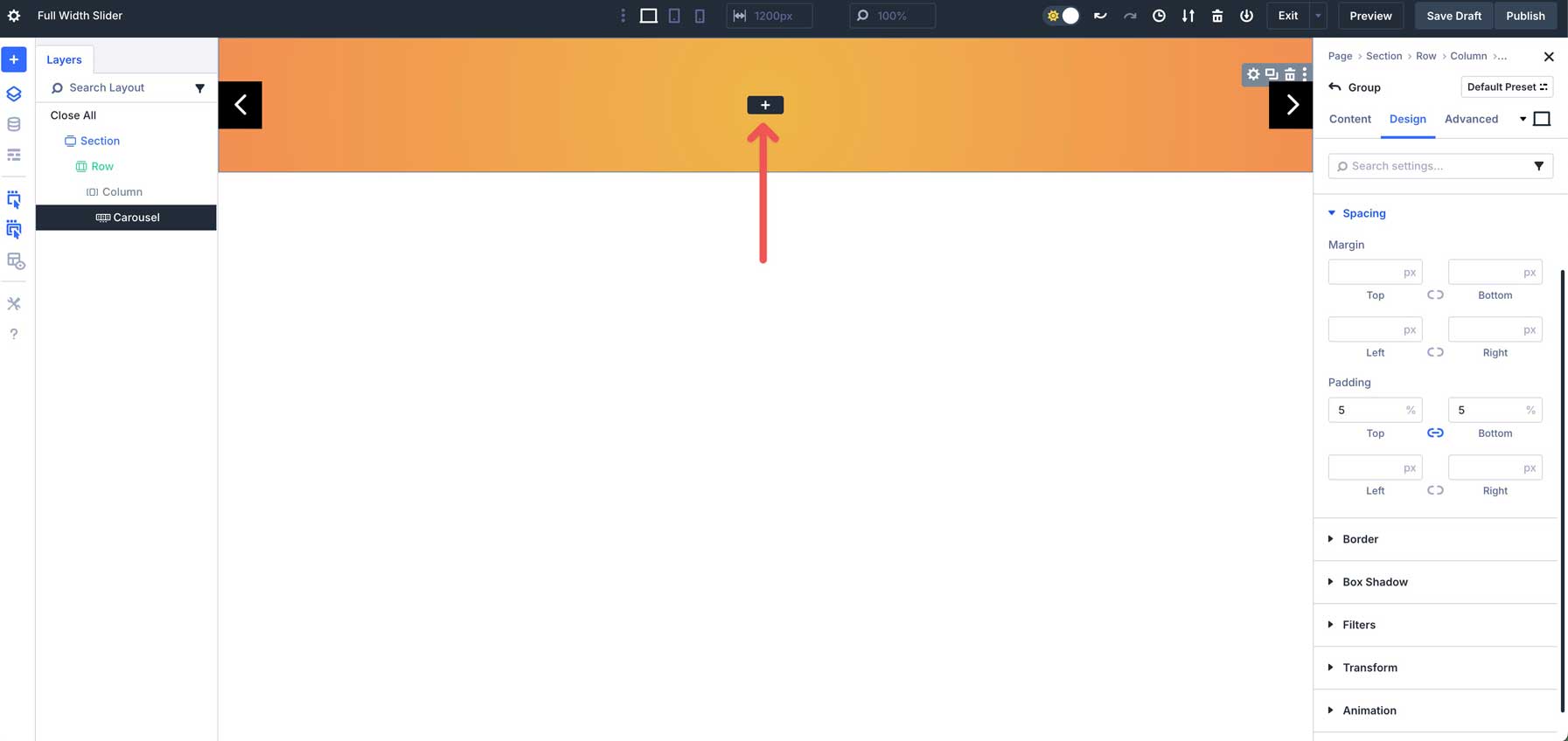
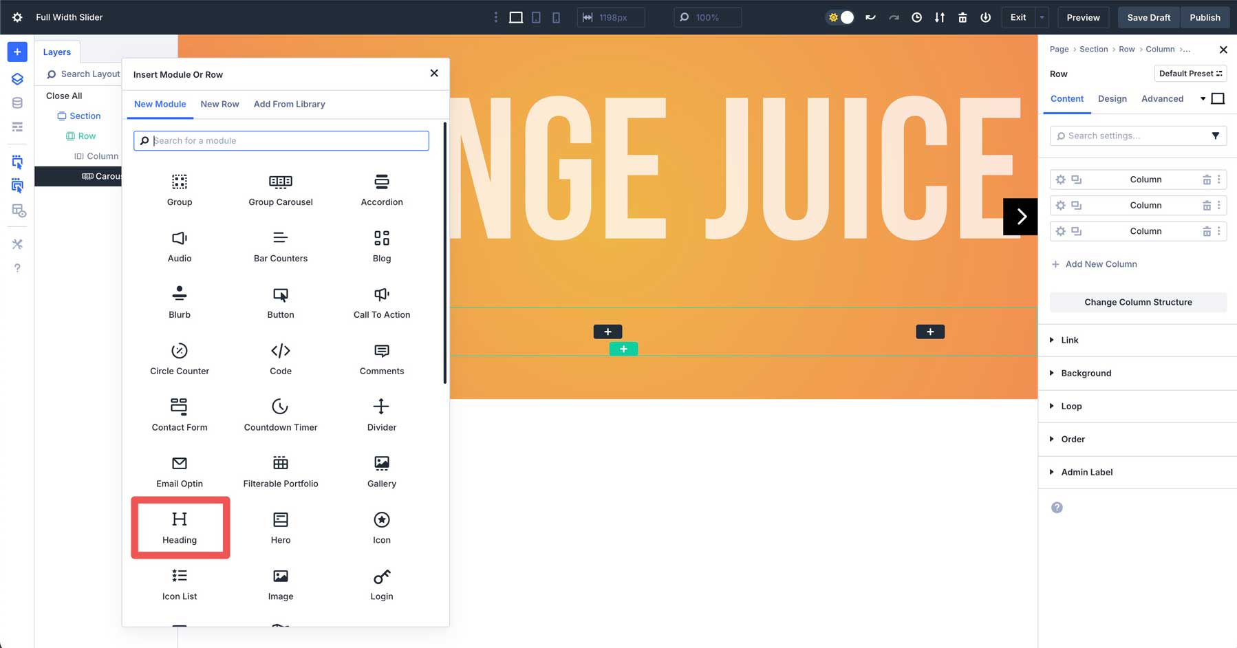
Now that our Group’s settings are configured, we can start adding content to the Group. Click the black + icon to add a module.
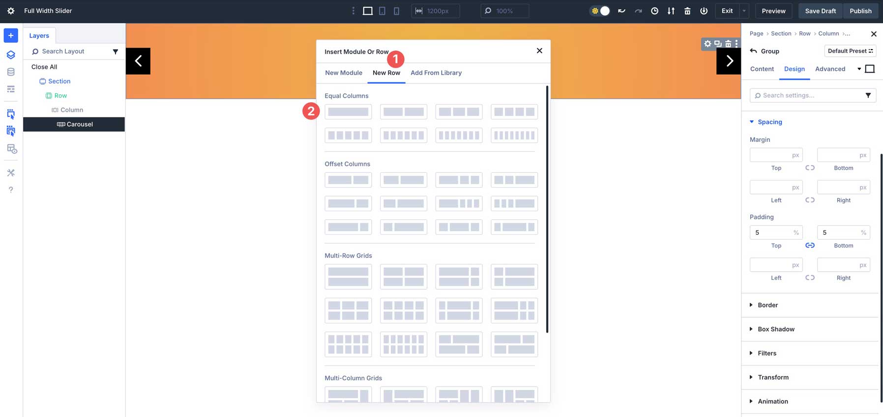
When the Insert Module or Row dialog box appears, click the New Row tab. Under the Equal Columns section, select the single column row.
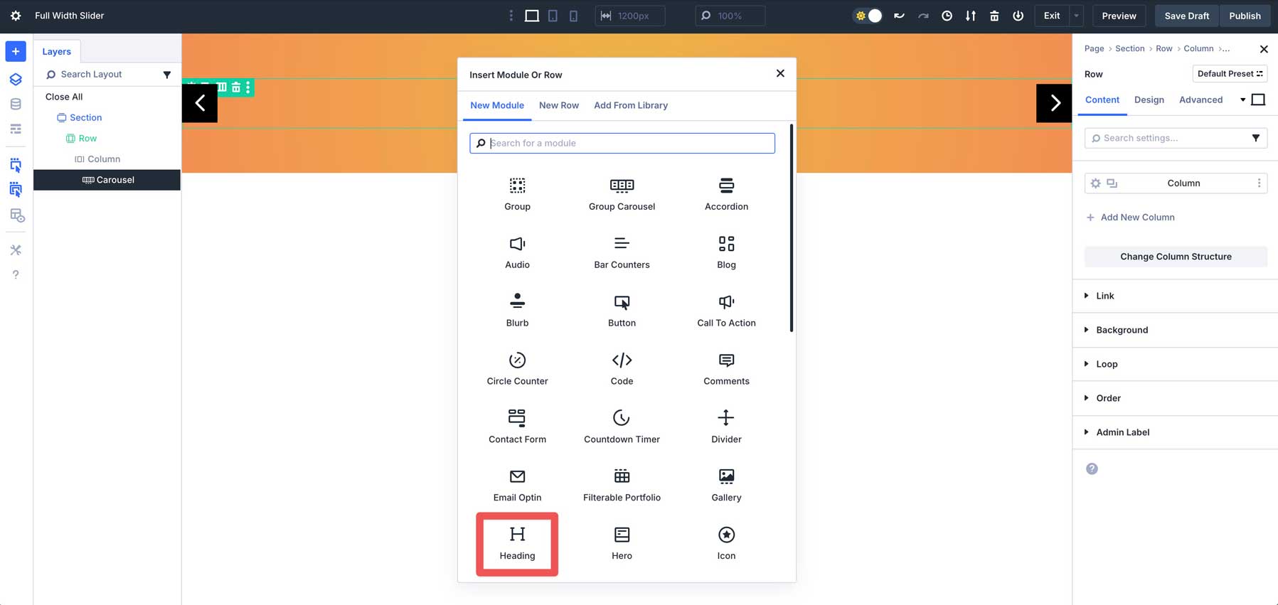
Add A Heading Module
Select and insert the Heading Module.
Expand the Text dropdown menu and enter Orange Juice as the Title.
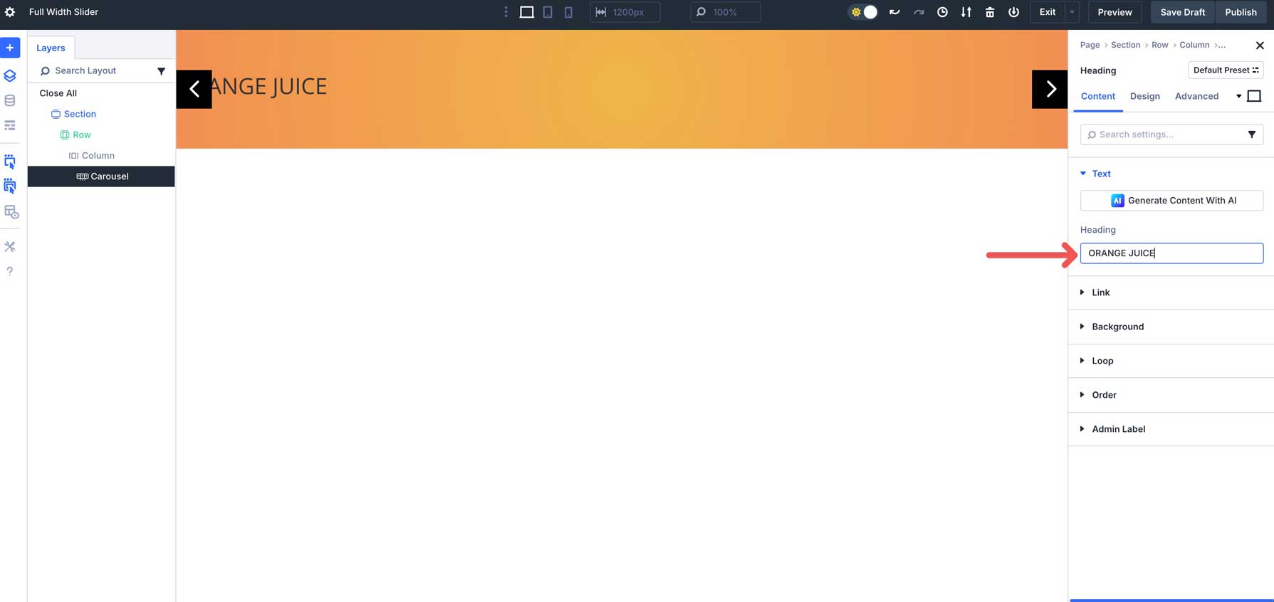
Navigate to the Design tab. Expand the Heading Text dropdown menu. Select H1 as the Heading Level, use Bebas Neue as the Heading Font, set the Heading Font Style to uppercase, the Heading Text Alignment to center, the Heading Text Color to #ffffff, and the Heading Text Size to 20em.
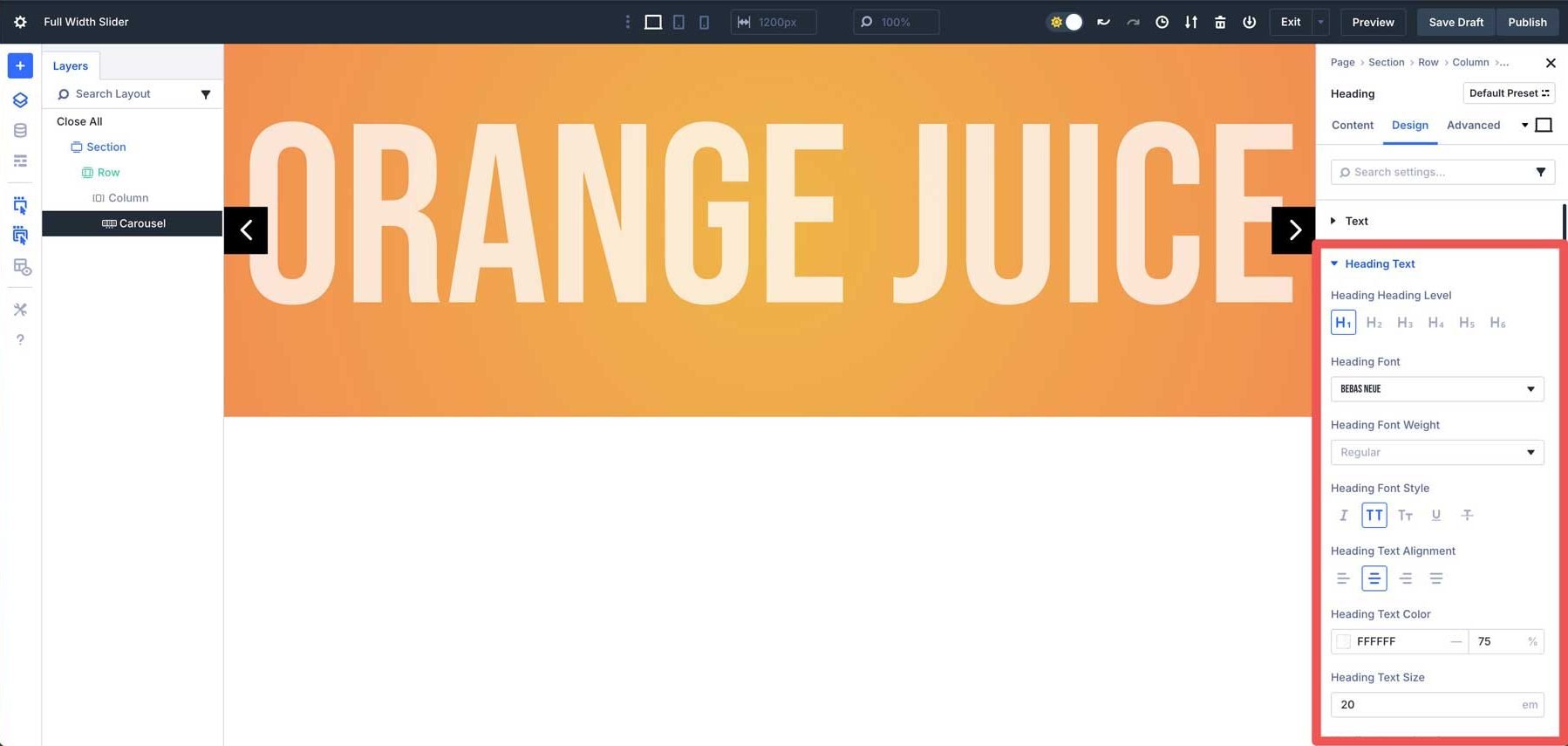
Use Divi 5’s Responsive controls to adjust the Heading Text Size to 15em on tablet, and 8em on mobile.
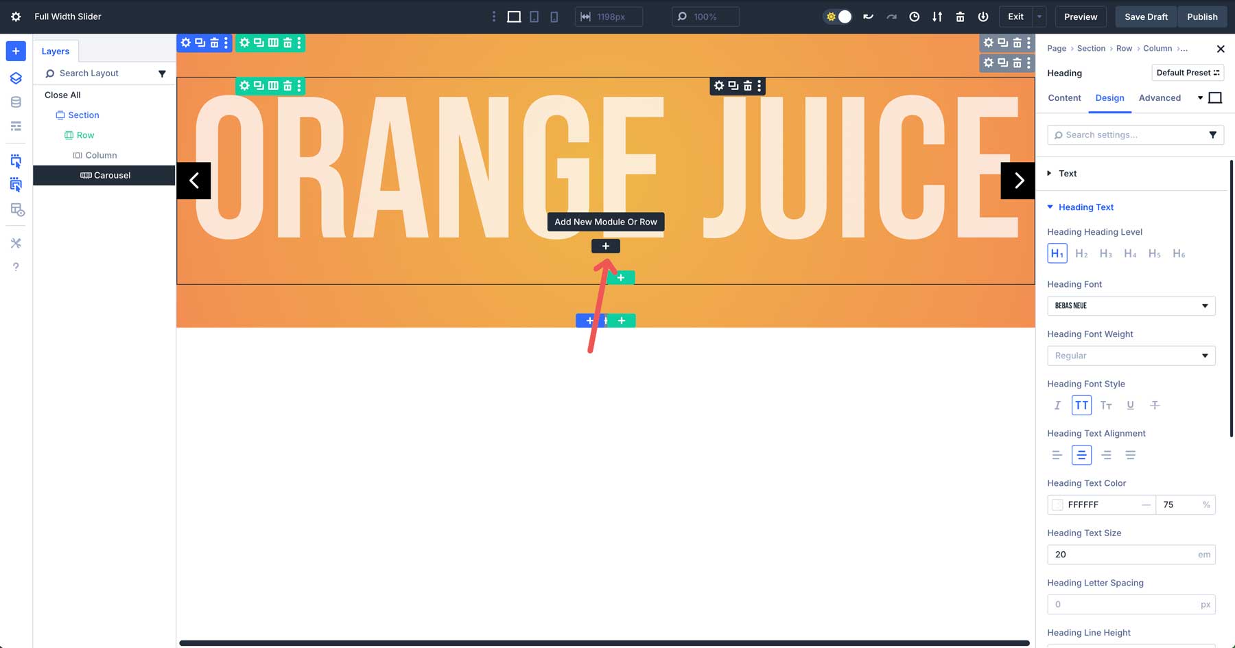
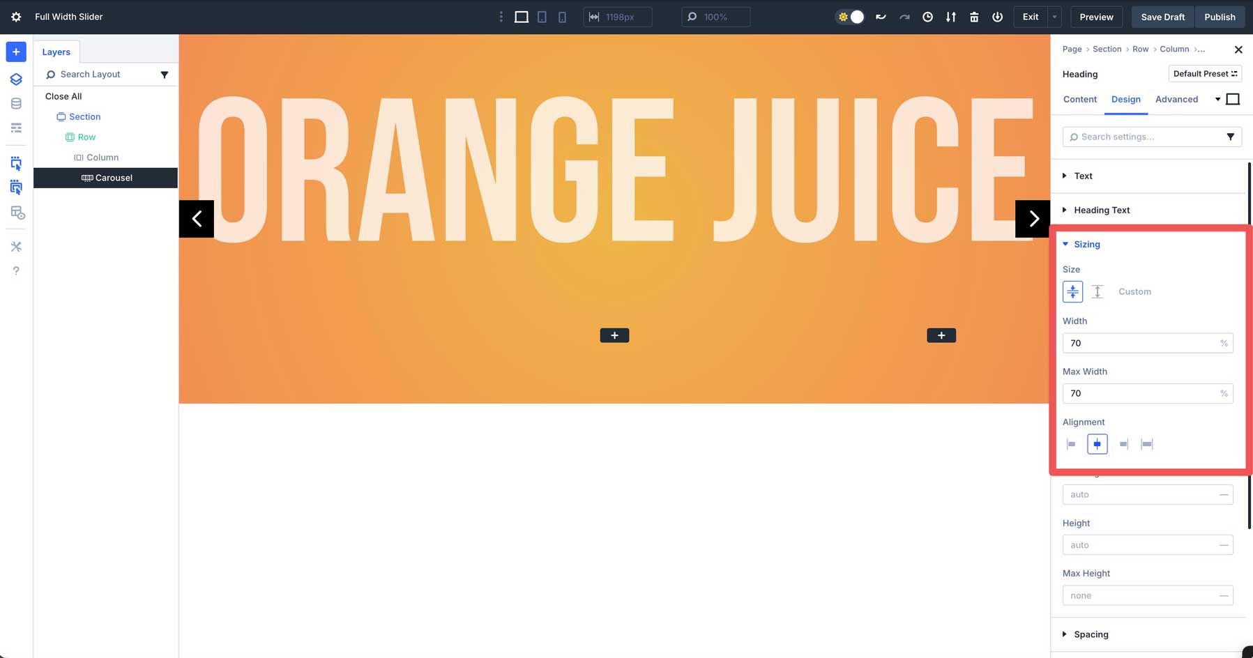
Add A New Row
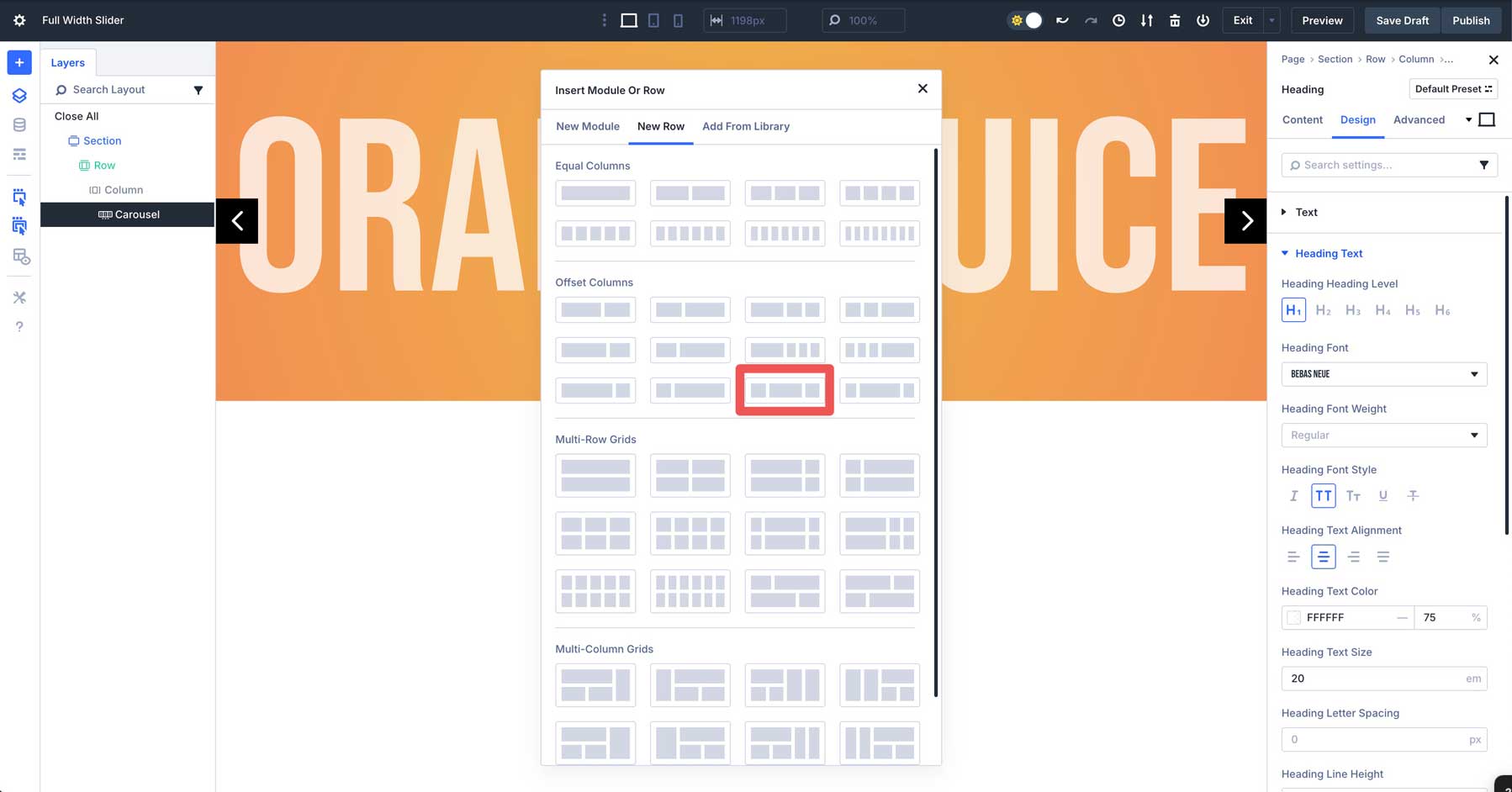
Next, we’ll add a new row under the single-column row containing the Heading Module. Click the black + icon to add a new module.
Click the New Row tab. Under Offset Columns, choose the 1/4 + 1/2 + 1/4 option.
In the Design tab, expand the Sizing tab and enter 70% for the width and max width. Set the Alignment to center.
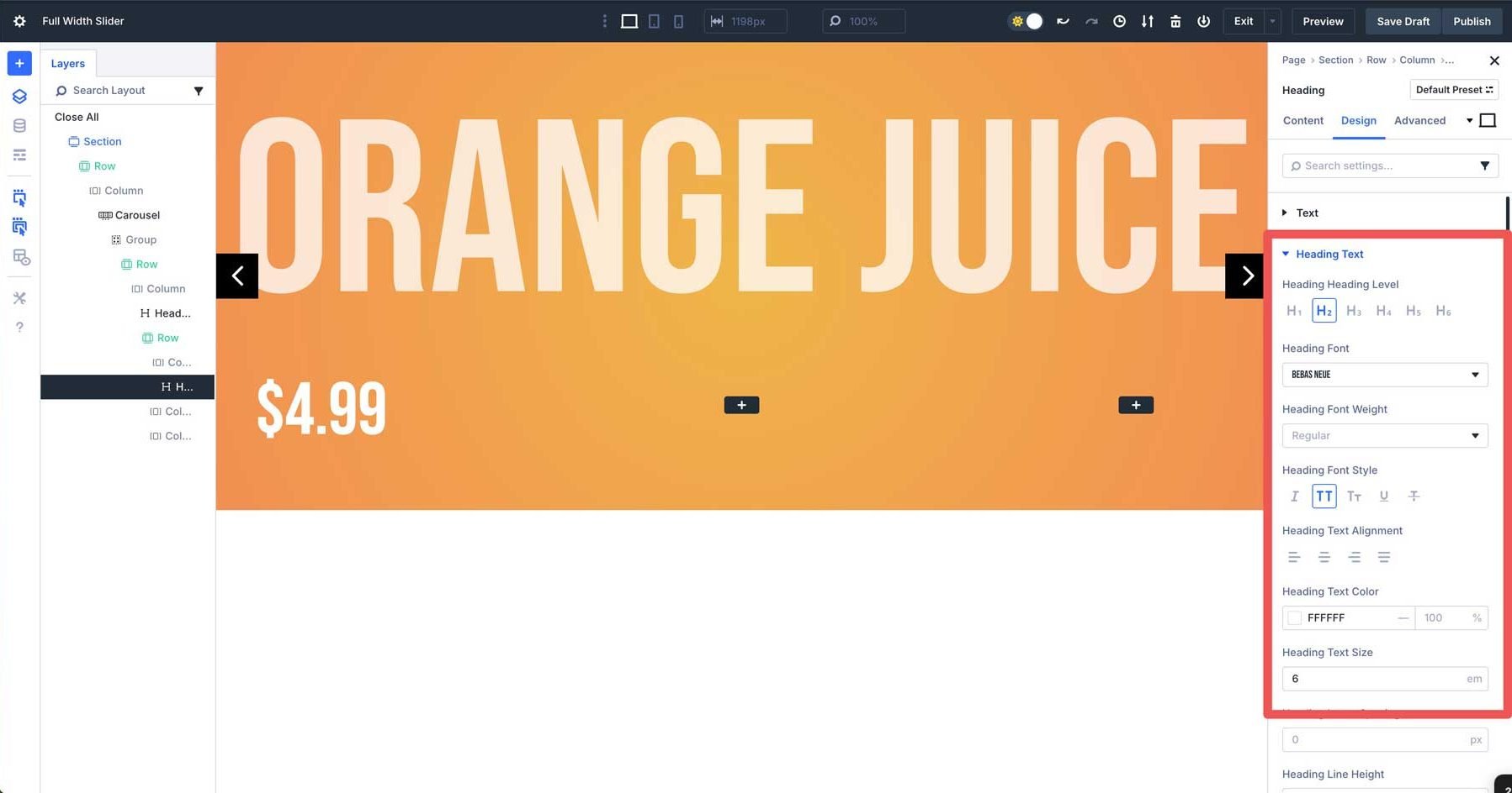
Add A Heading Module
Select the Heading Module and add it to the first column.
Give the Heading a title and head to the Design tab. Expand the Heading Text dropdown menu. Select H2 for the Heading Level, Bebas Neue as the Heading Font, uppercase as the Heading Font Style, #ffffff as the Heading Text Color, and 6em as the Heading Text Size.
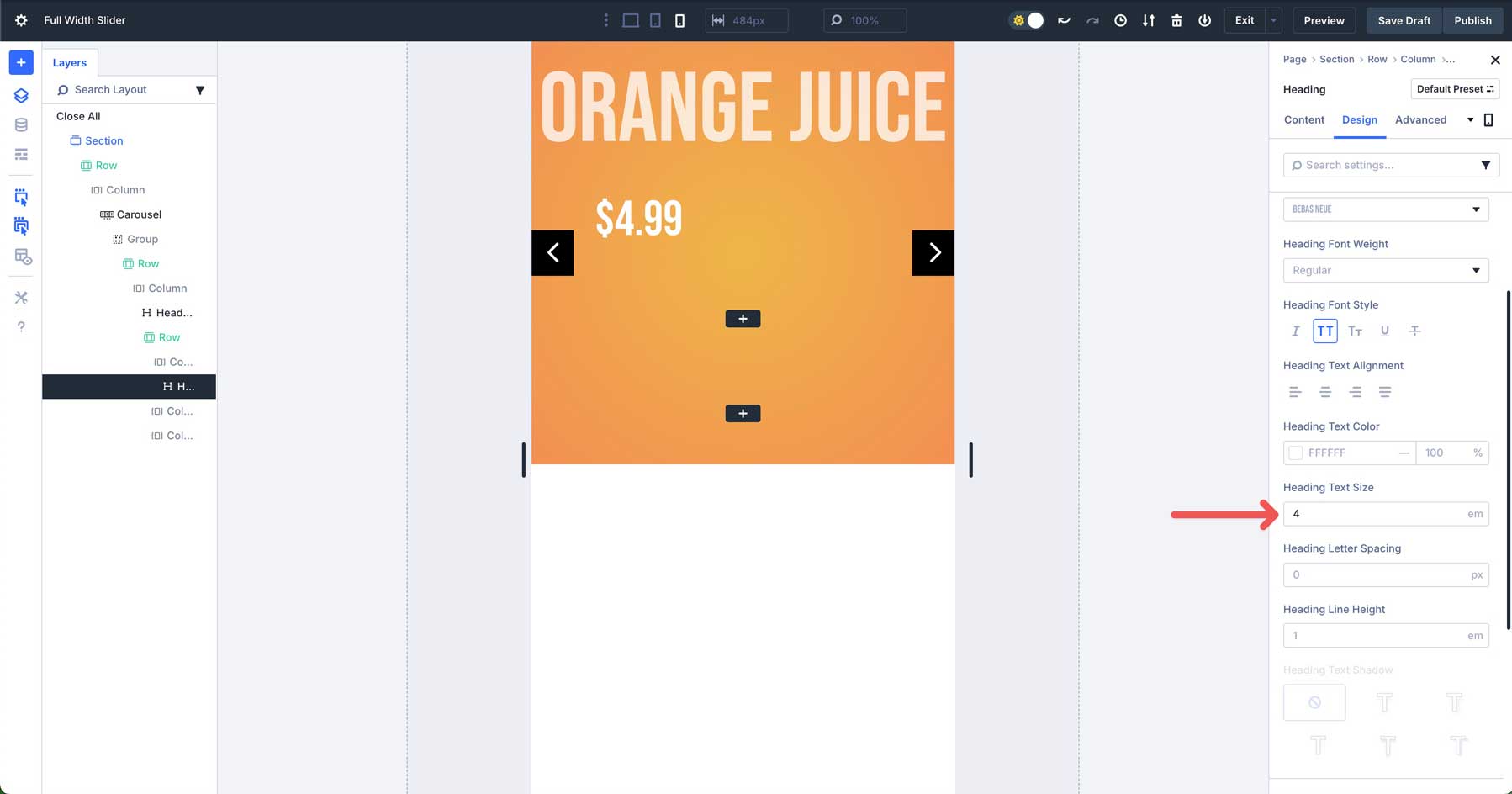
Use Divi’s responsive controls to adjust the Heading Text Size to 4em.
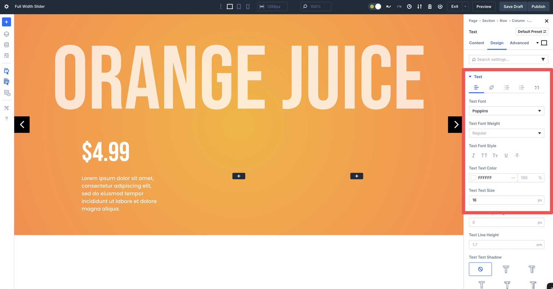
Add A Text Module
Add a Text Module under the Heading in the first column. Enter some body text, and switch to the design tab. Select Poppins as the Text Font, set the Text Color to #ffffff, and the Text Size to 16px.
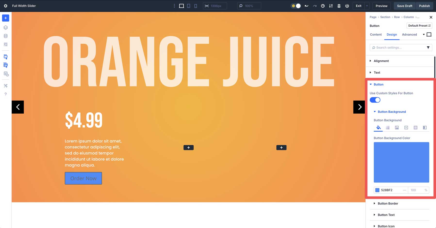
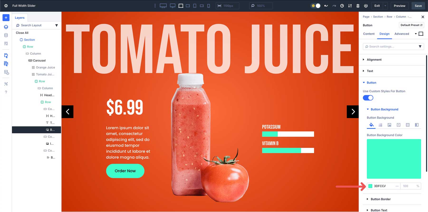
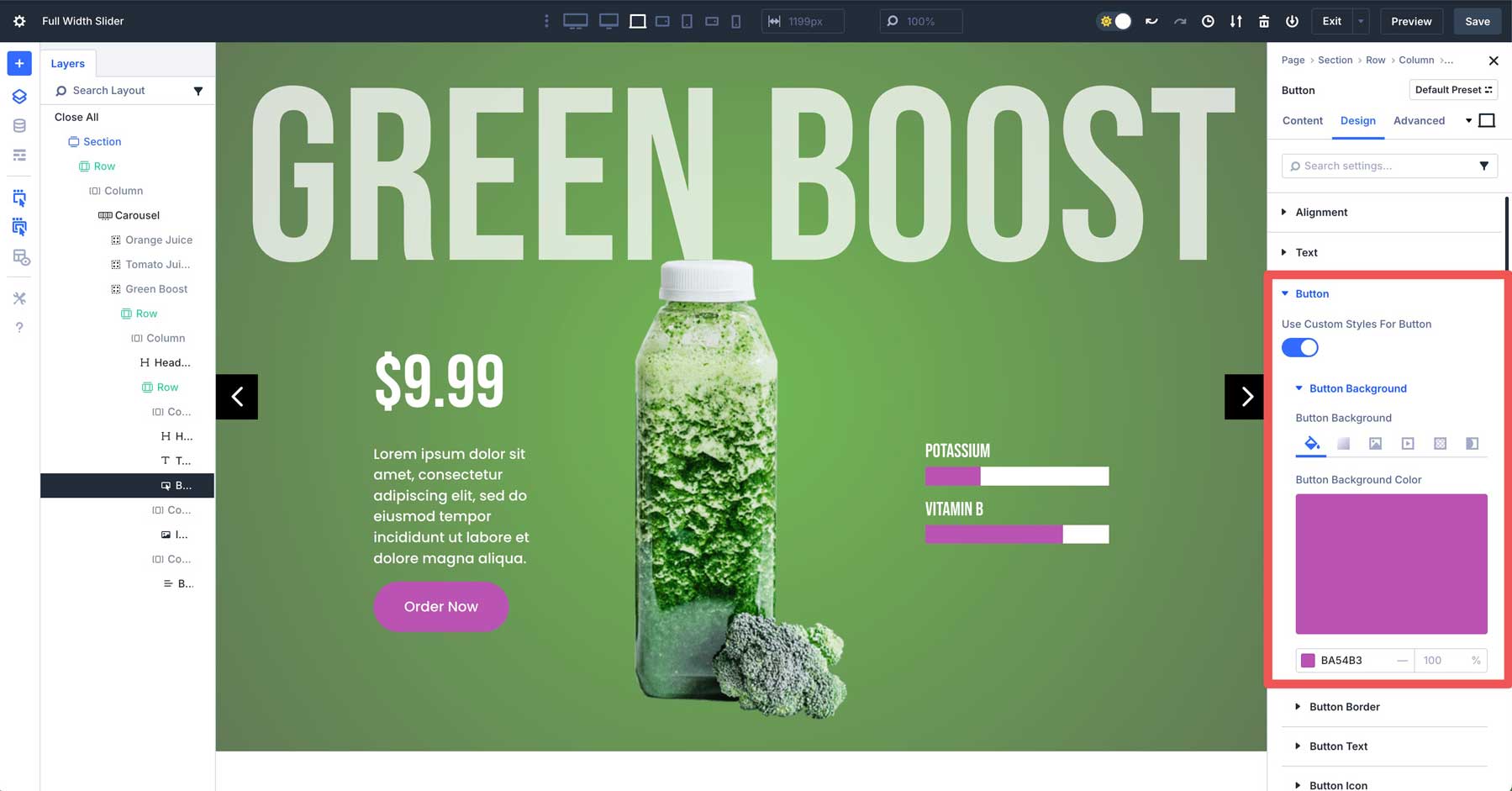
Add A Button Module
Add a Button Module under the Text Module in the first column. Assign text to the button in the content tab and swap to the design tab. Expand the Button dropdown menu and enable Use Custom Styles for Button. Then expand the Button Background menu. In the Background Color tab, add #528bf2 as the button’s color.
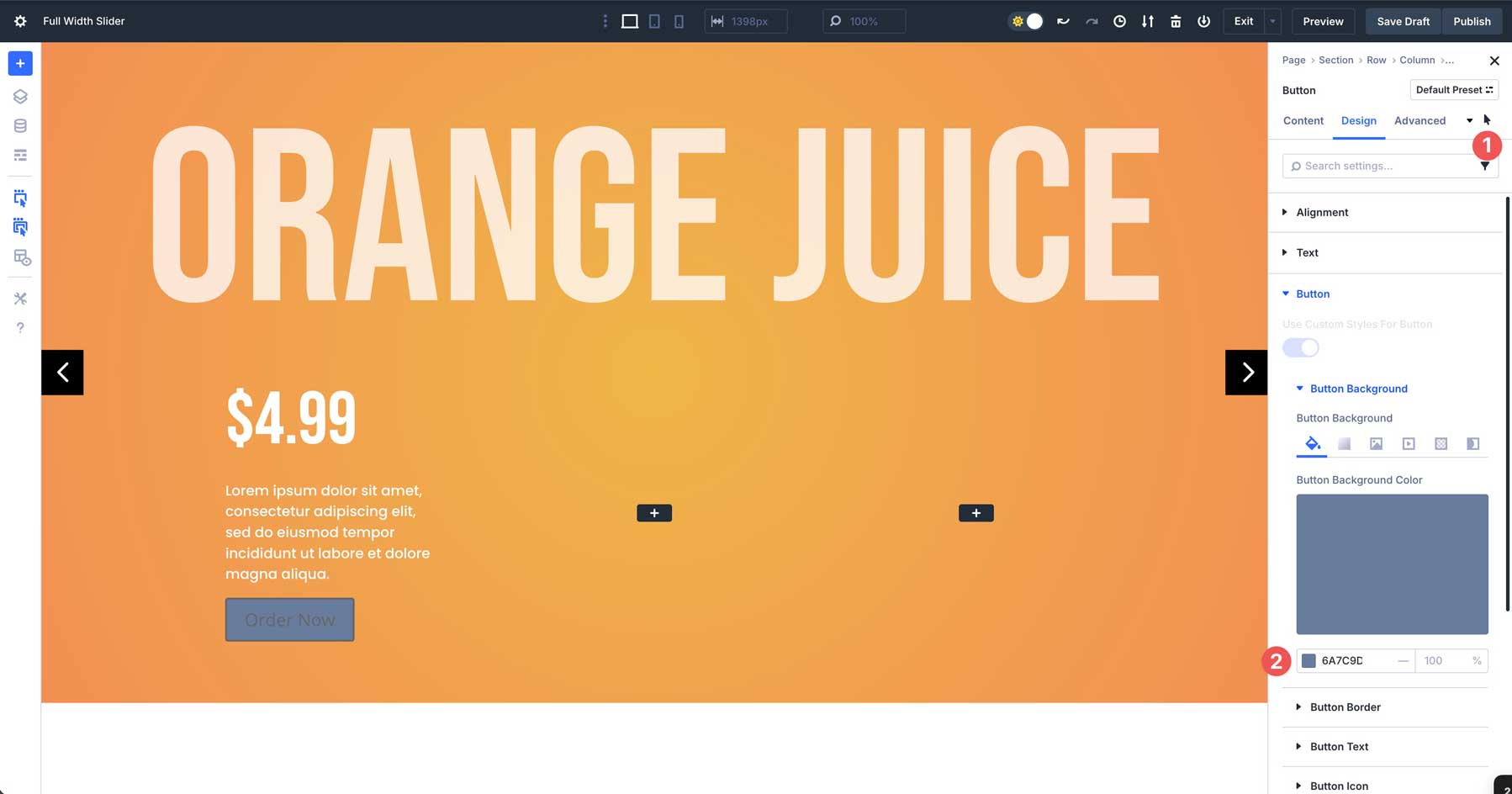
Use Divi 5’s hover controls to assign #6a7c9d as the hover color for the button.
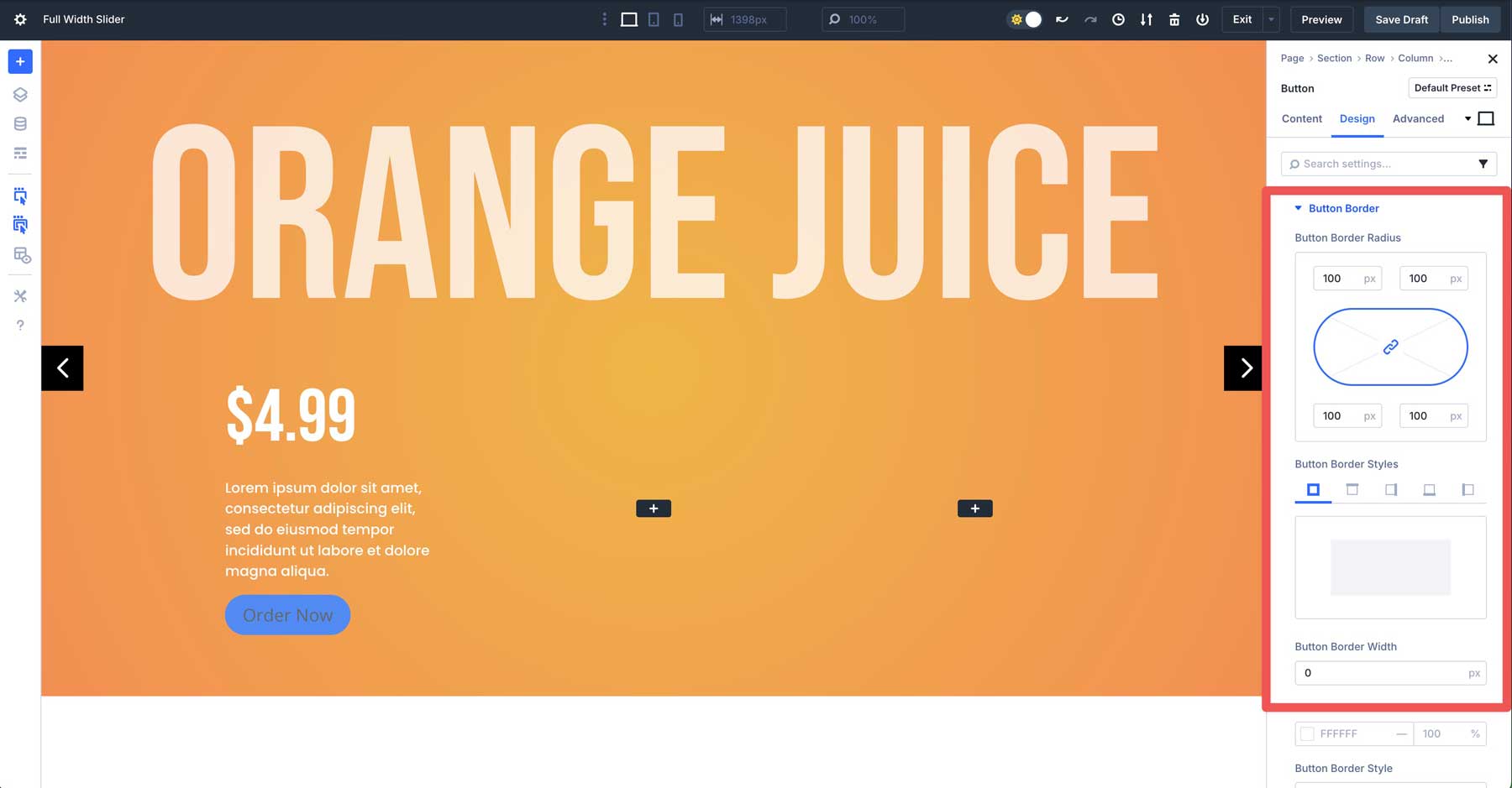
Switch back to the desktop view. Expand the Button Border dropdown tab. Add 100px under Button Border Radius and set the Button Border Width to 0px.
Expand the Button Text dropdown menu. Assign Poppins as the Button Font, #ffffff as the Button Text Color, and 16px as the Button Text Size.
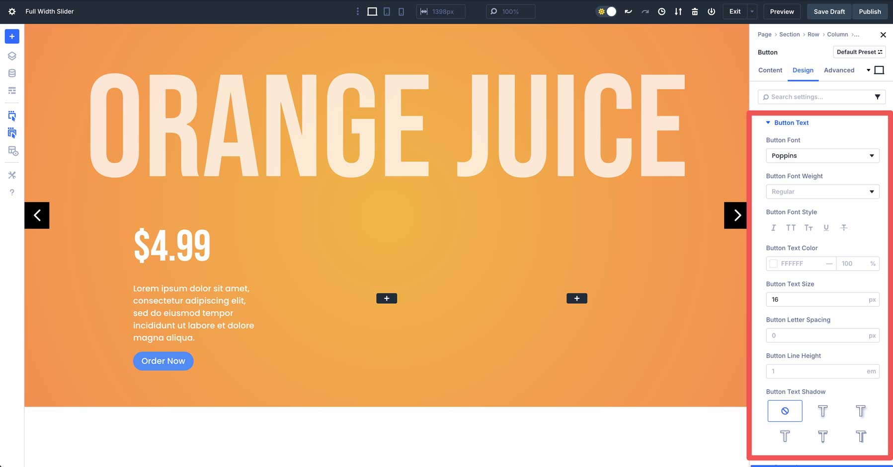
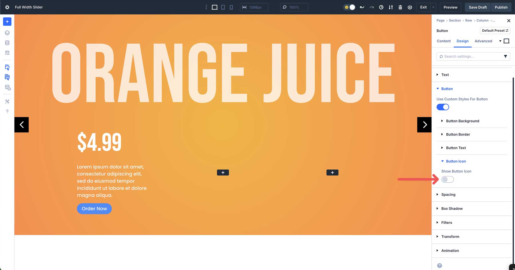
Expand the Button Icon settings and disable the Show Button Icon toggle.
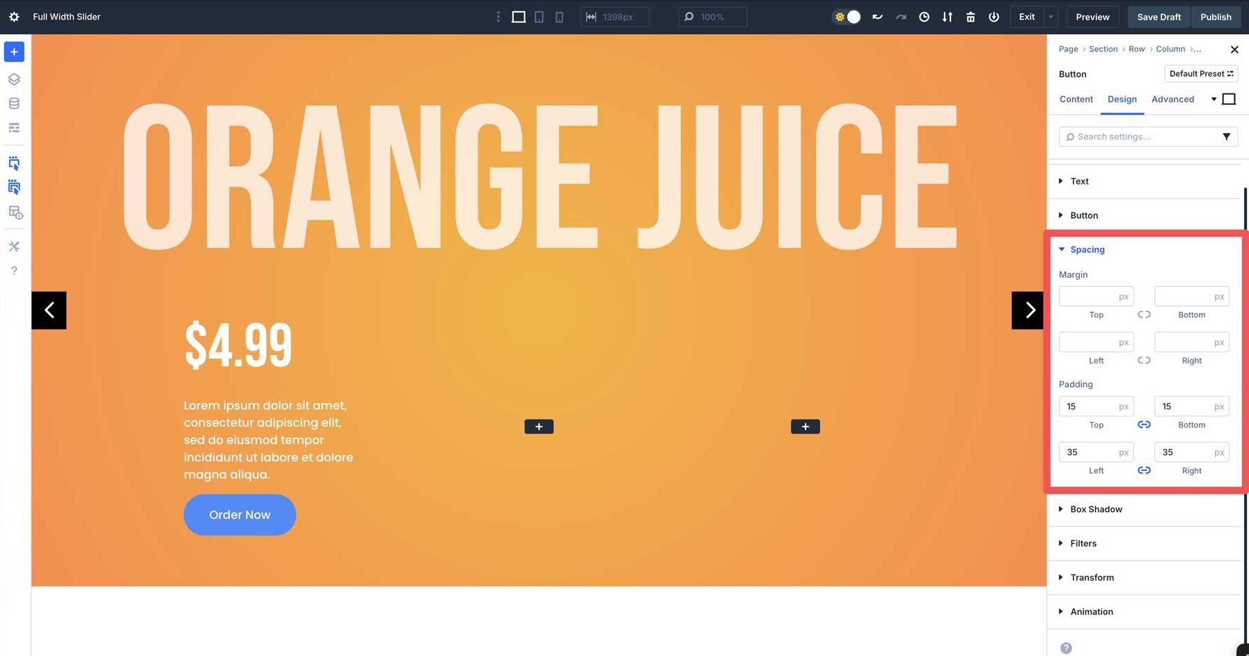
Finally, expand the Spacing dropdown menu. Add 15px padding to the top and bottom and 35px to the left and right.
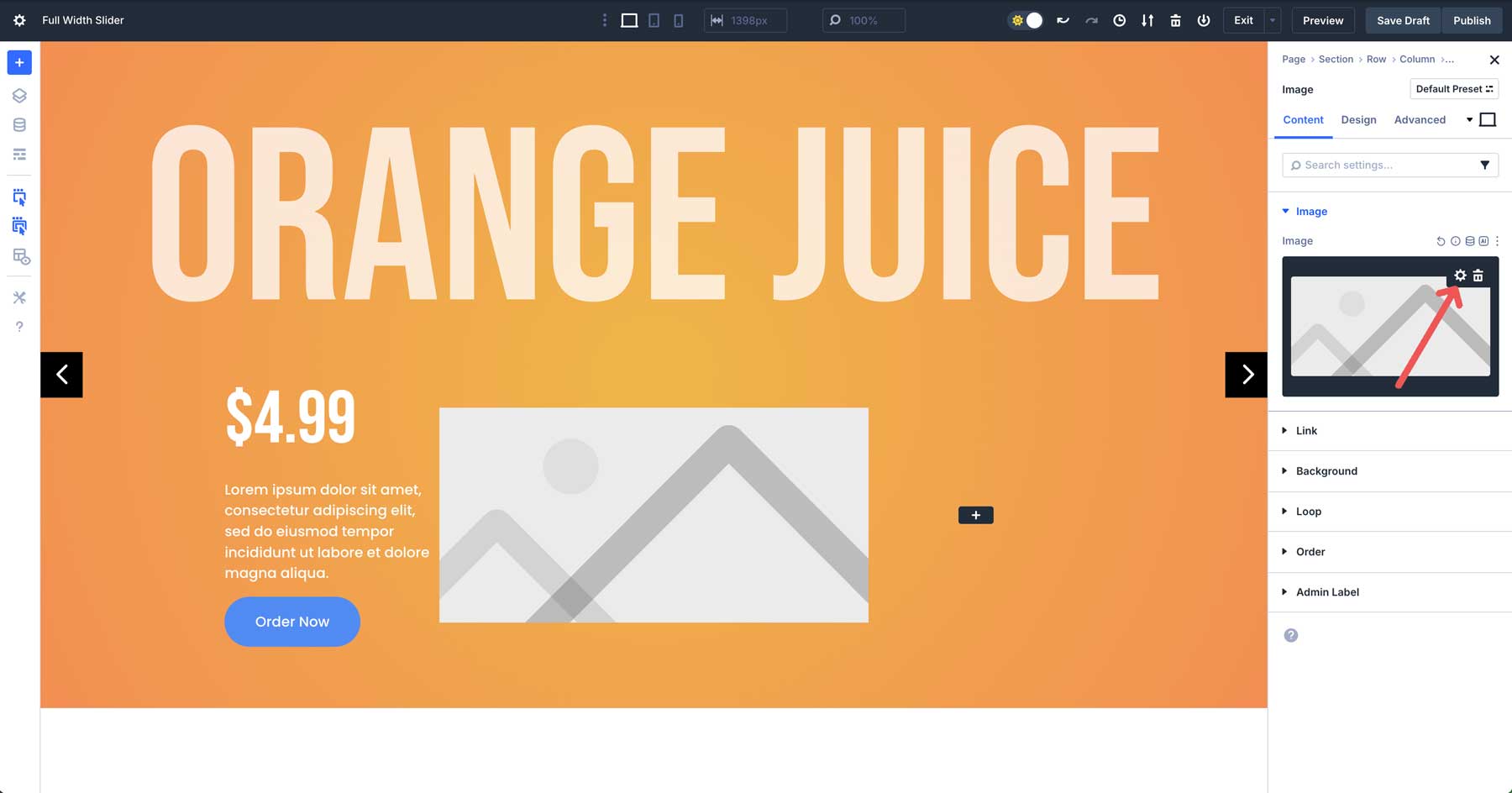
Add An Image Module
Place an Image Module in the second column. When the settings appear, hover over the image field to reveal the settings. Click the settings icon to load the Media Library and upload an image to the module.
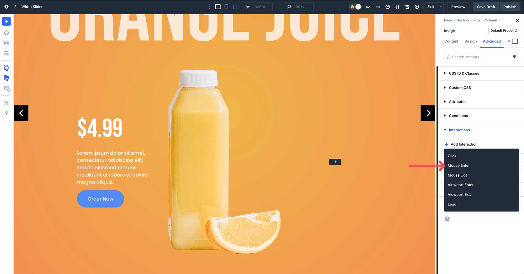
Next, we’ll add an Interaction to the image to create a mouse-over effect. Navigate to the Advanced tab. Expand the Interactions menu to reveal its settings. Click the +Add Interaction button.
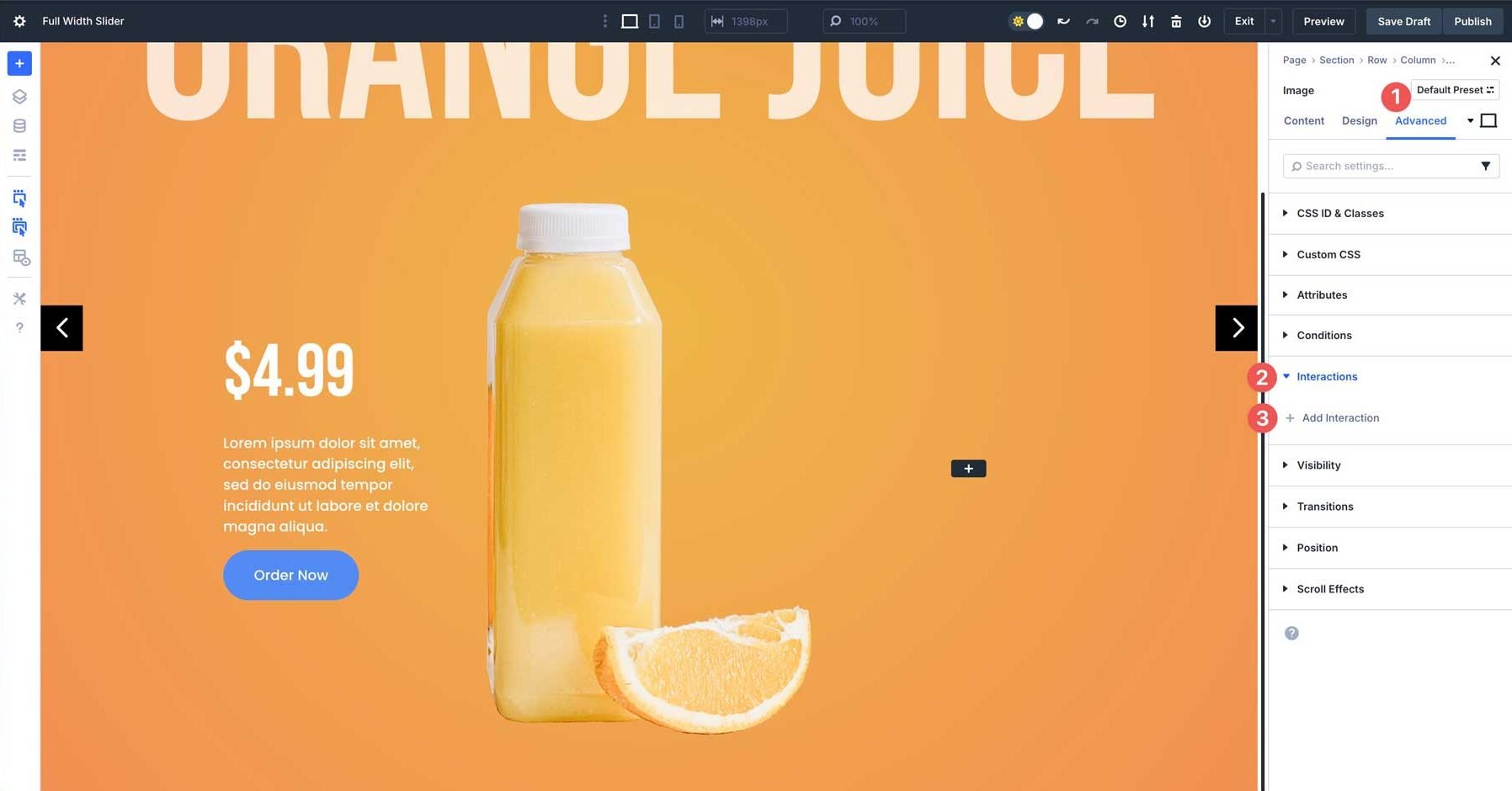
Select Mouse Enter when the options appear.
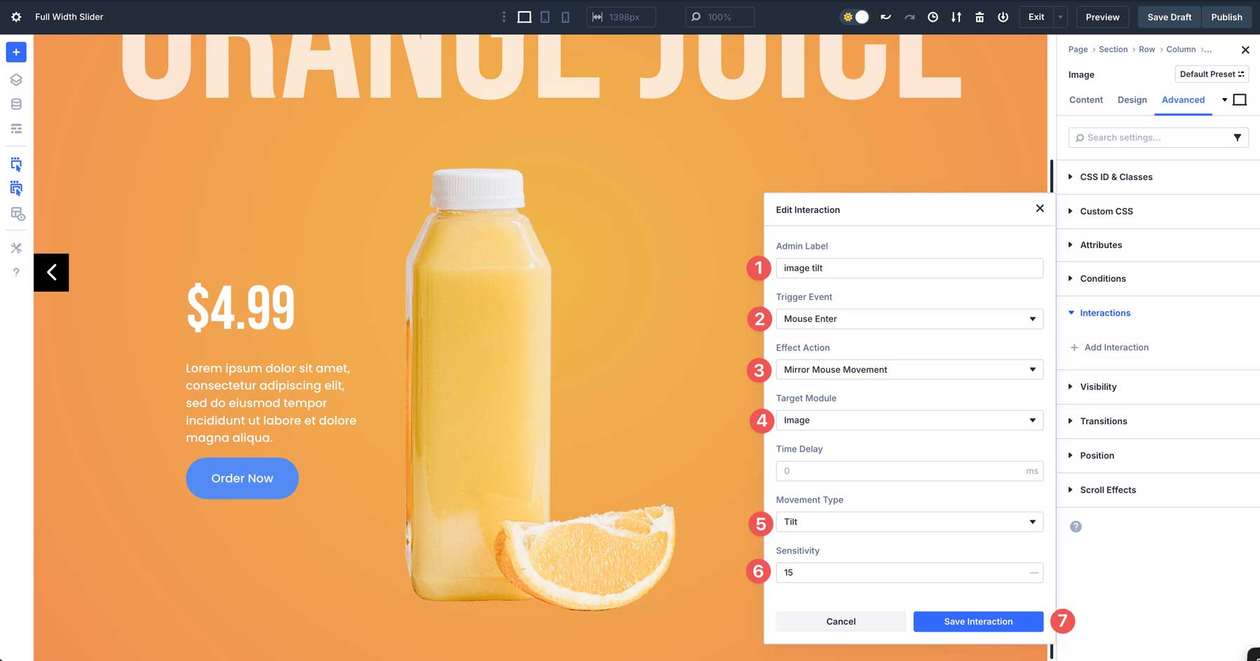
Enter image tilt in the Admin Label field, select Mouse Enter as the Trigger Event, Mirror Mouse Movement as the Effect Action, select the image as the Target Module, Tilt as the Movement Type, and 15 for Sensitivity. Finally, click the Save Interaction button to enable the Interaction.
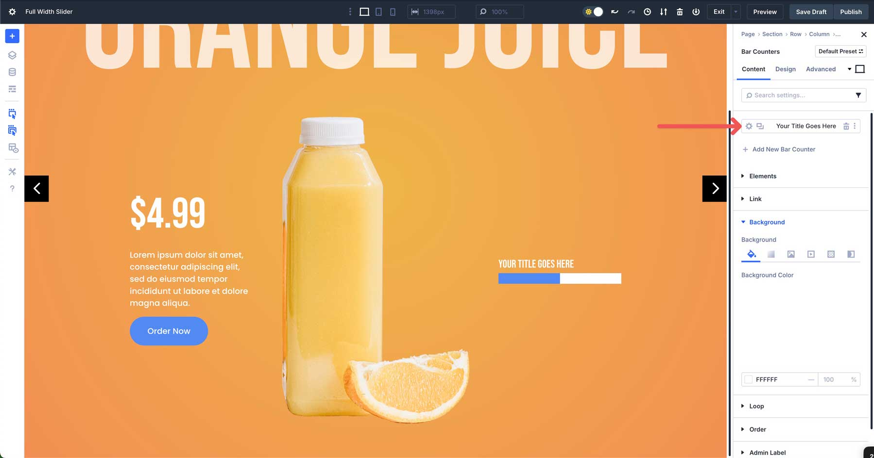
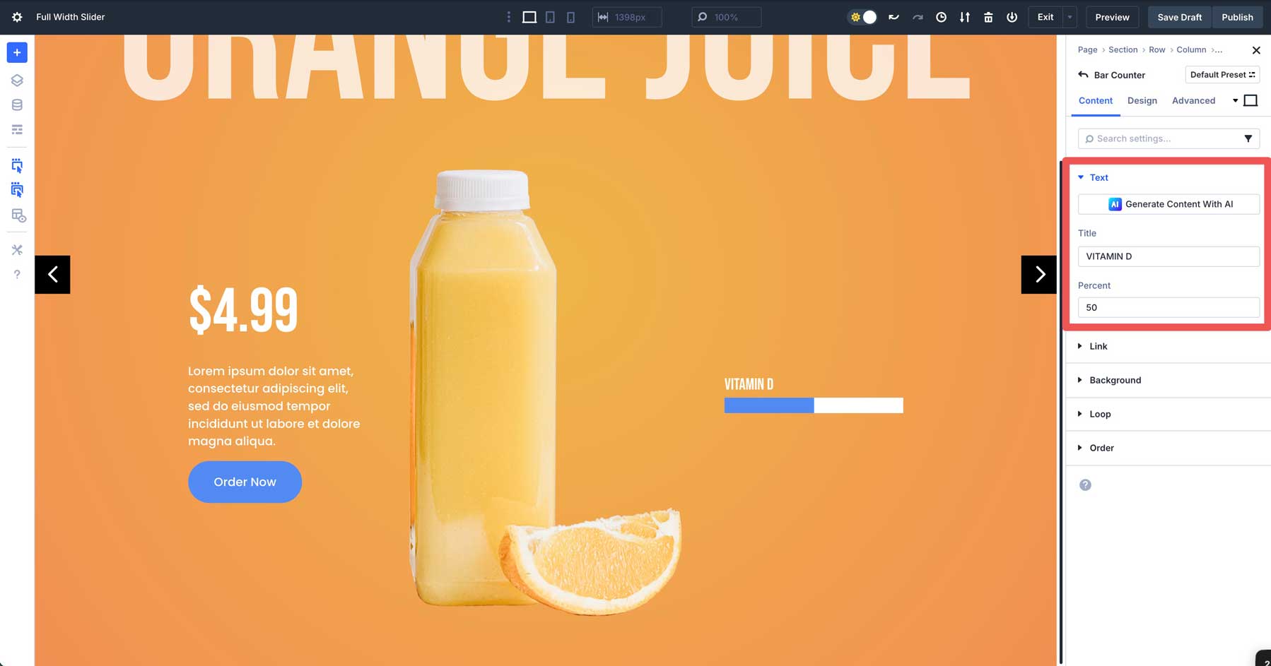
Add A Bar Counters Module
Click to add the Bar Counters Module in the 3rd column. In the content tab. In the Elements tab, disable Show Percentage.
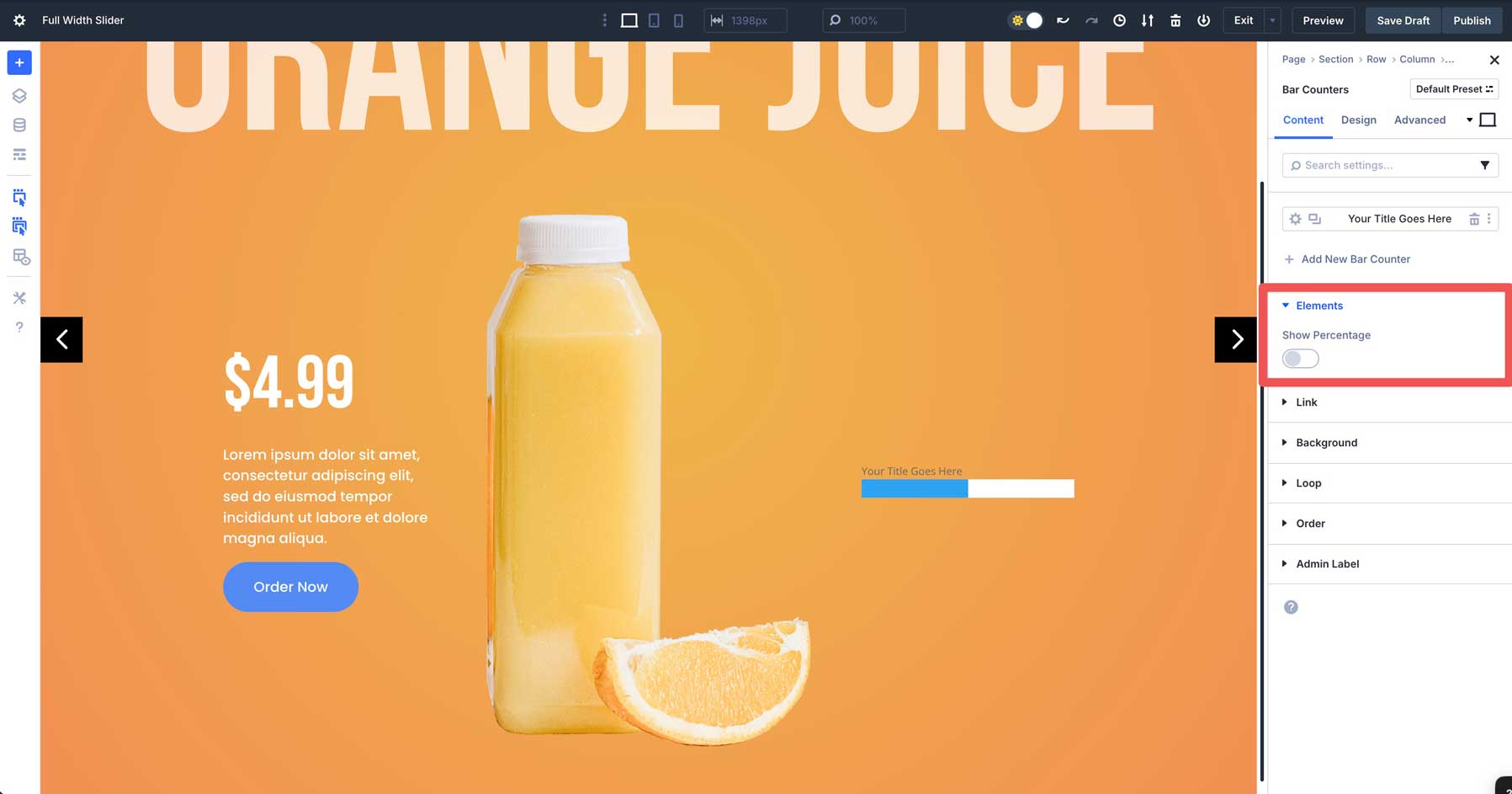
Next, expand the Background tab. Add #ffffff as the Background Color.
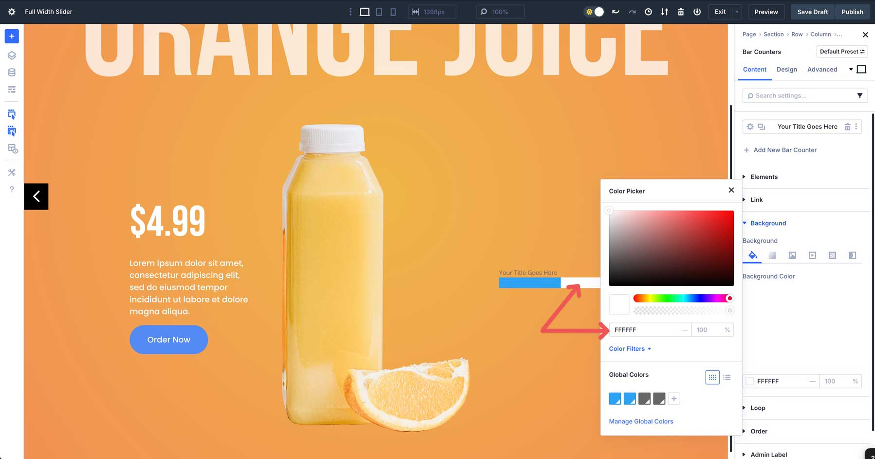
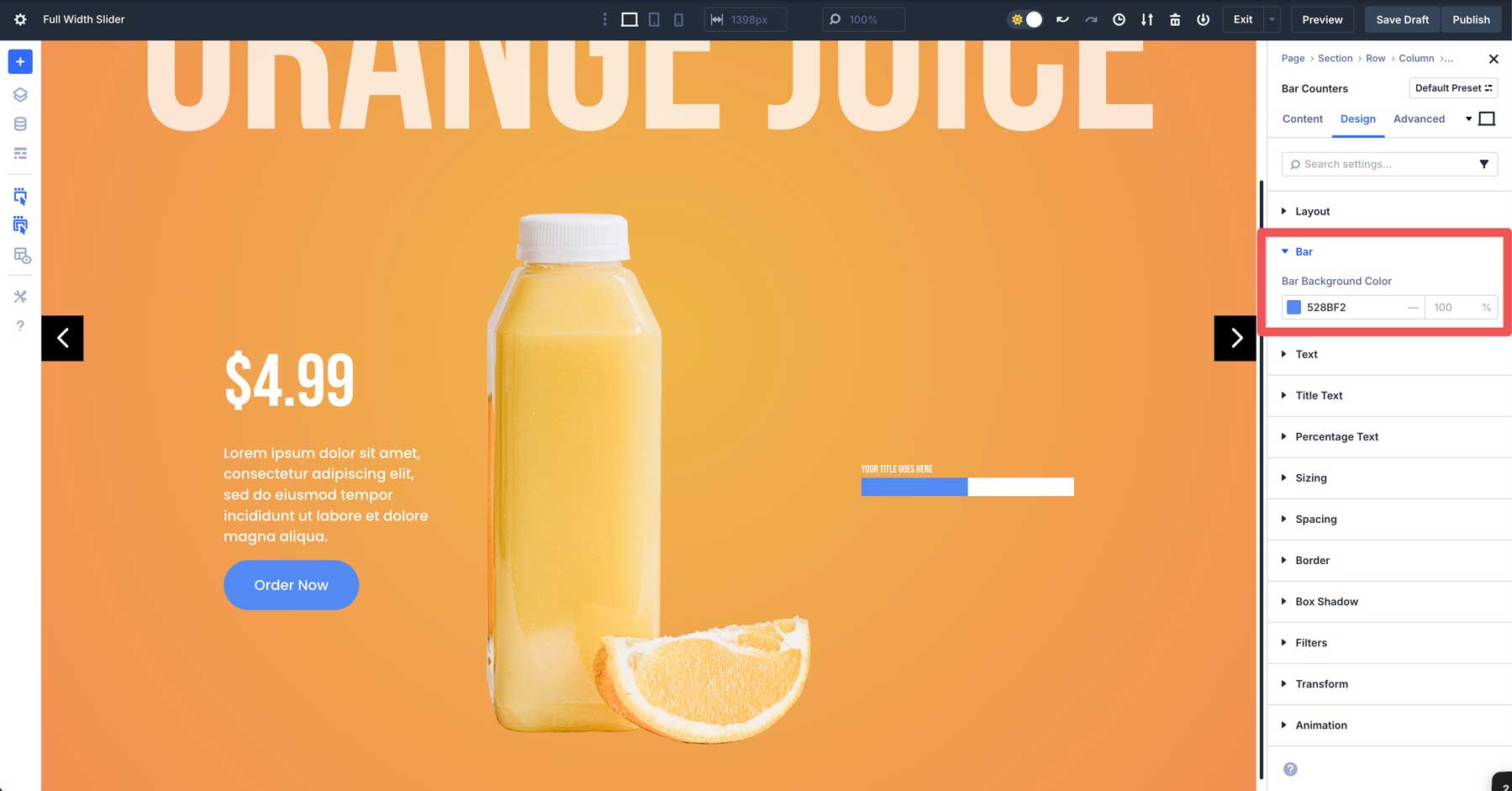
Swap to the Design tab and expand the Bar dropdown menu. In the Bar Background Color field, add #528bf2 as the color.
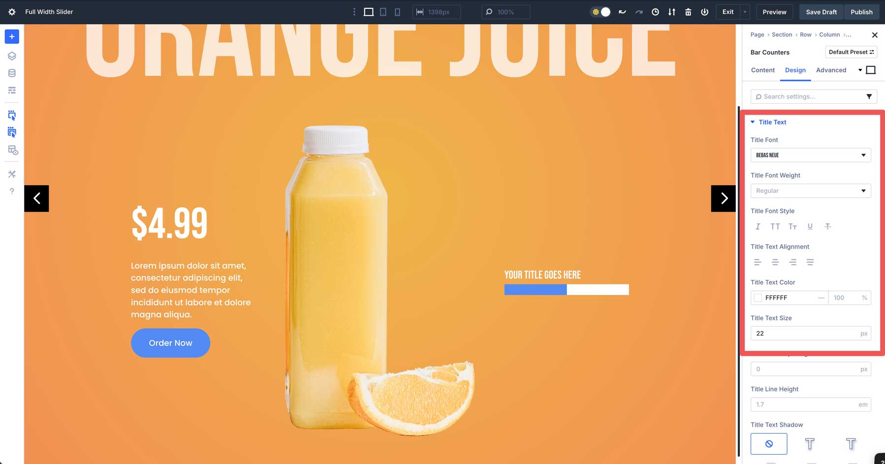
Expand the Title Text dropdown menu. In the Title Font field, select Bebas Neue. Select #ffffff as the Title Text Color and 22px as the Title Text Size.
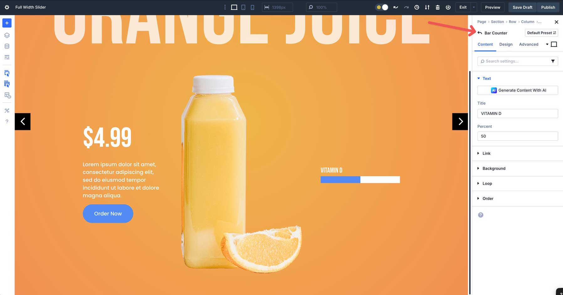
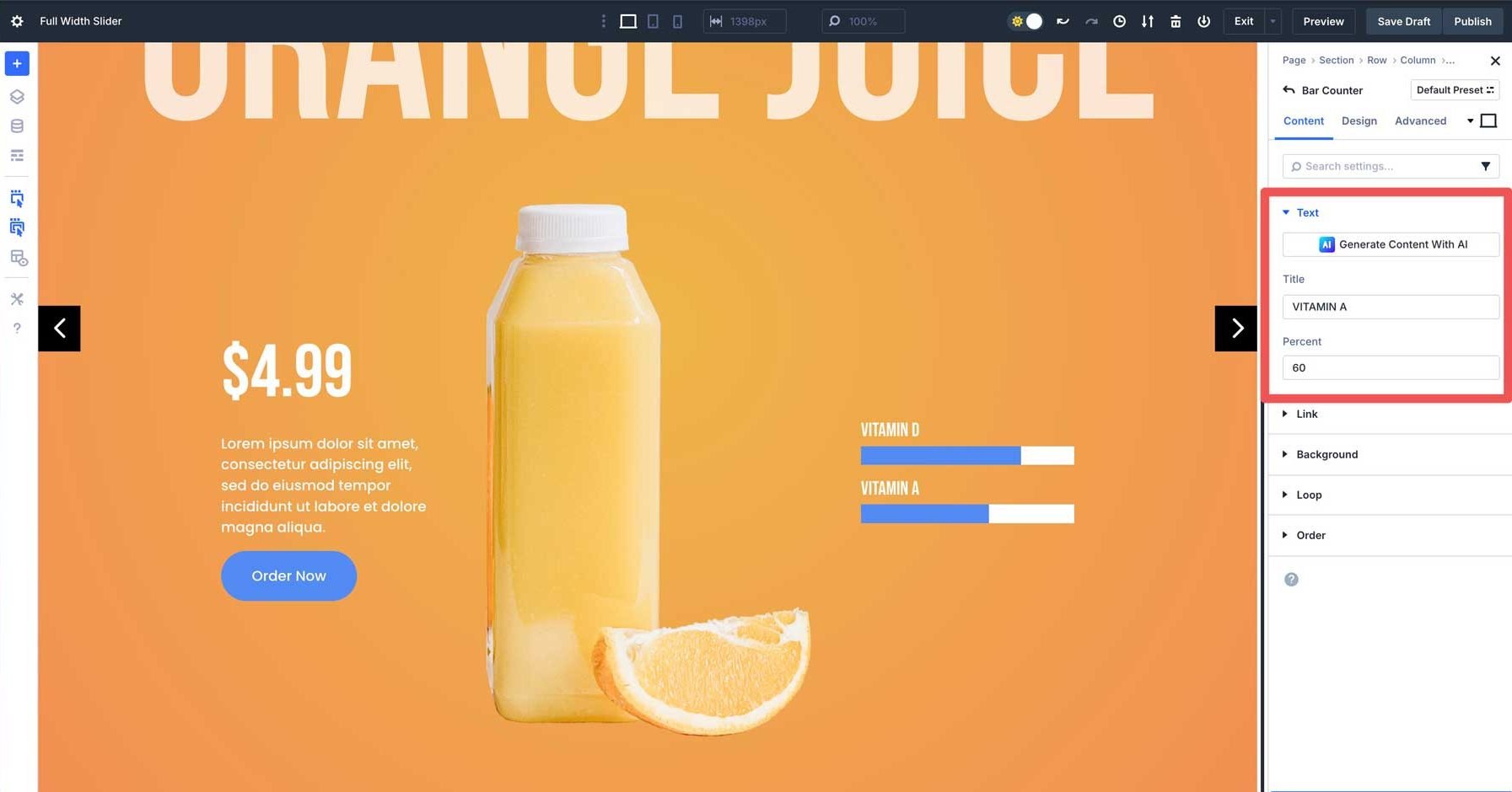
Swap back to the content tab. This time, click the settings icon for the first Bar Counter item.
Enter text into the Title field and set the Percent field to 75.
Click to go back to the main content tab for the Bar Counters Module.
Now that our design settings are set, you can easily copy the first Bar Counter item to preserve the settings.
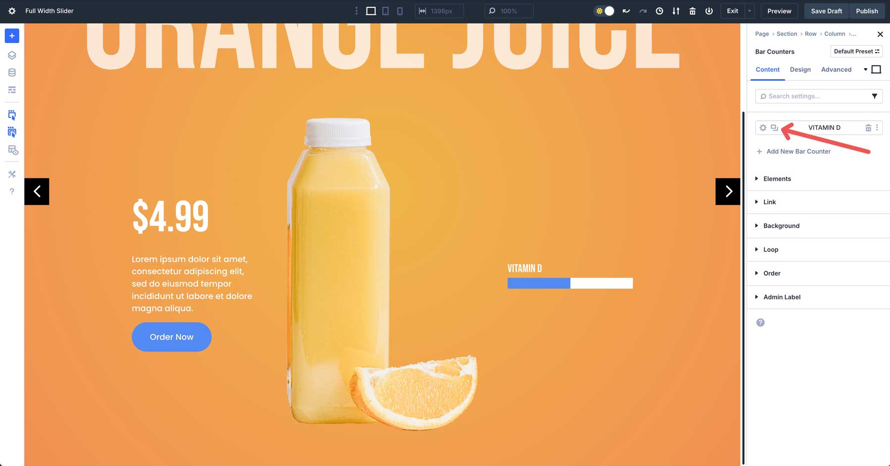
Duplicate the Bar Counter item and change the title and percent to your desired settings.
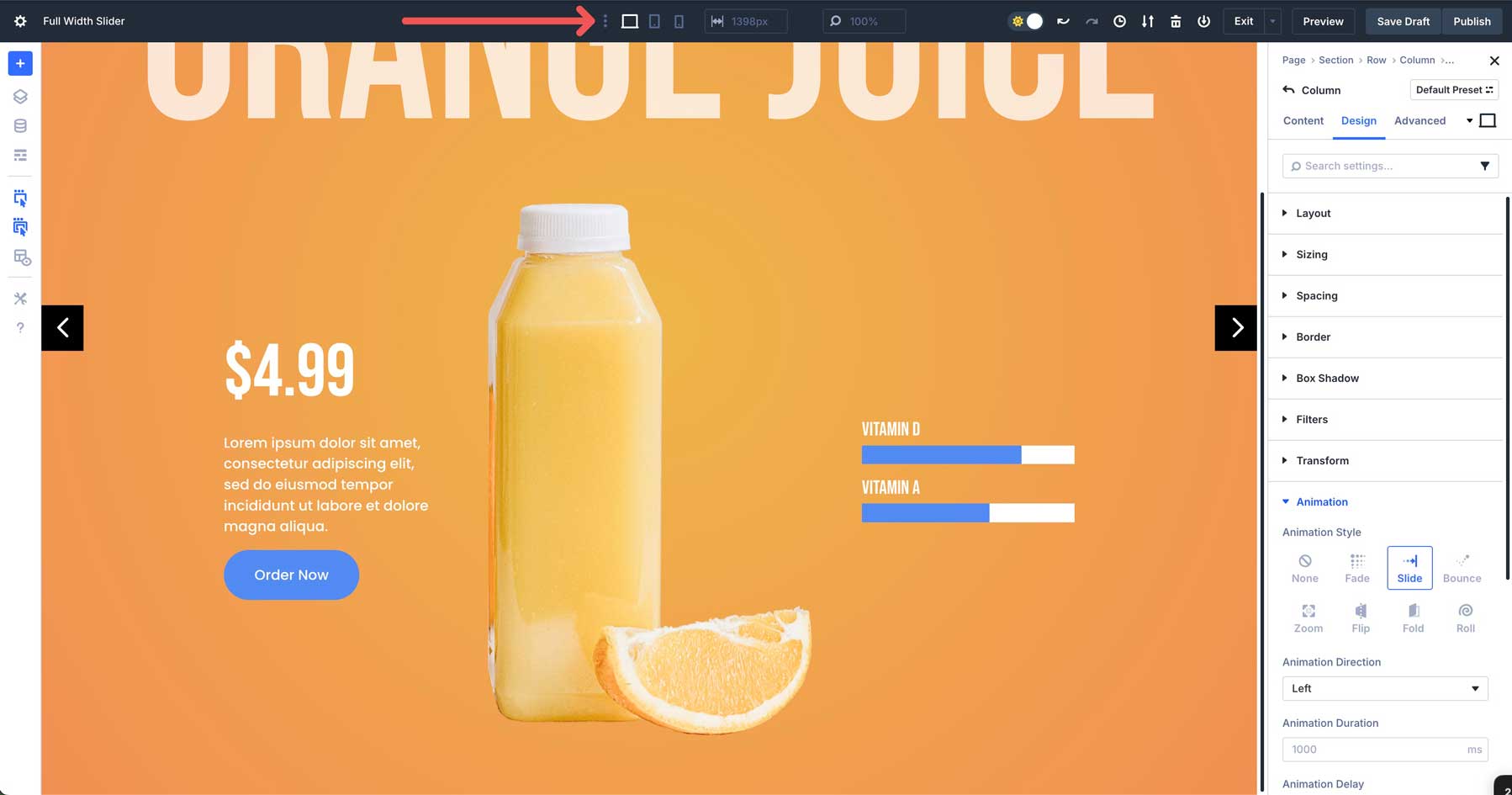
Step 6: Add Animations
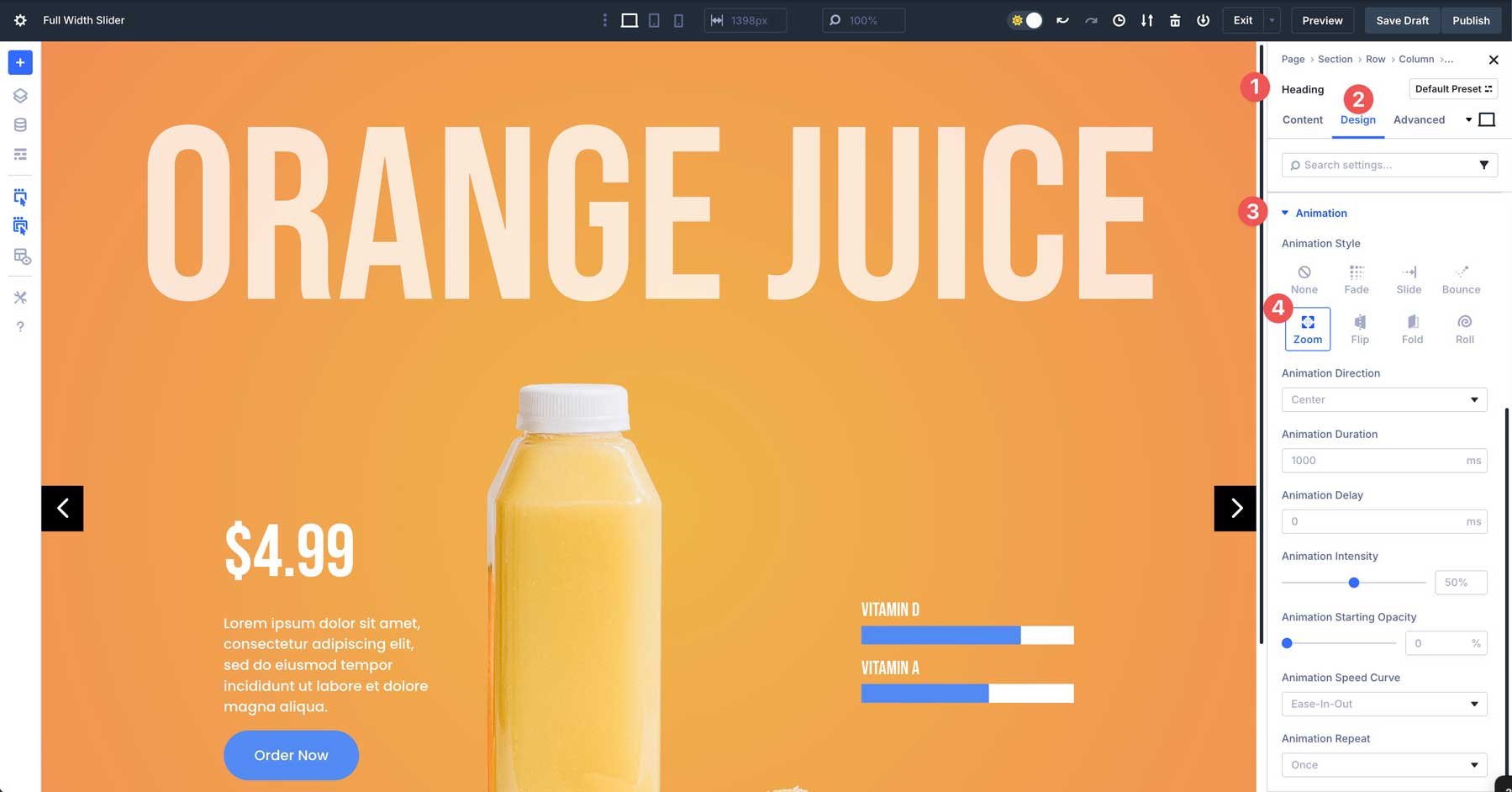
To make the Group more immersive, we’ll add some animation effects. First, we’ll add a zoom effect to our main Heading. Click to select the main Heading for the Group. Navigate to the Design tab and scroll down to expand the Animation tab. Select Zoom for the animation. Leave all of the settings as is.
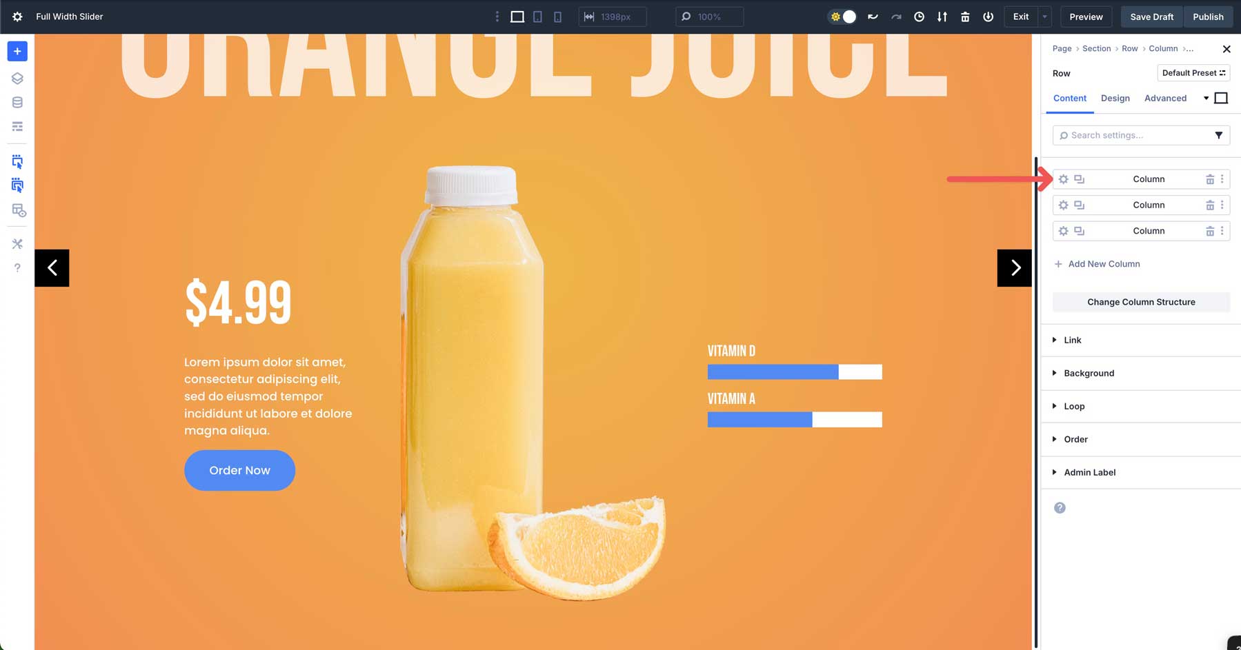
Next, click to expand the 2nd row (three-column row). Click into the first column’s settings.
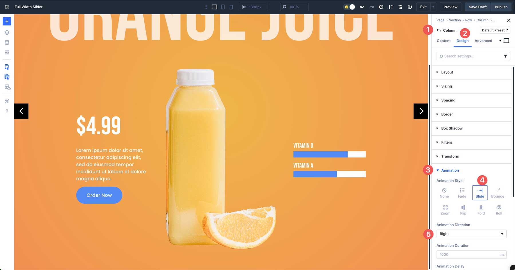
Click the Design tab and scroll down to reveal the Animation tab. Choose Slide for the Animation Style and Right for the Animation Direction. Leave all other settings as is.
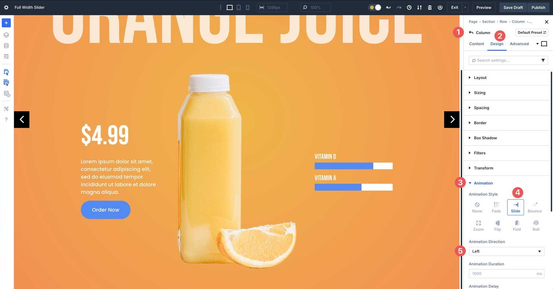
Click back to the main content tab for the row. This time, select the 3rd column. Navigate to the Design tab, expand the Animation tab, and choose Slide > Left for the animation. Leave the other settings at their defaults.
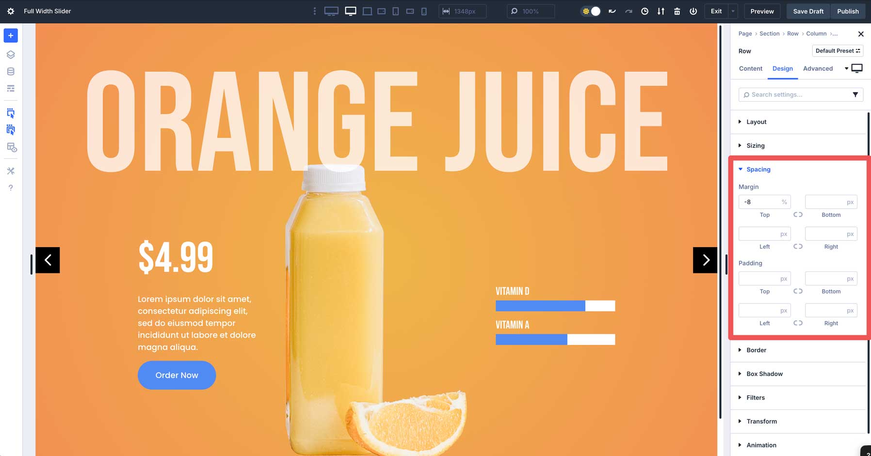
Step 7: Overlapping Rows
To add a little extra flair to the layout, we’ll adjust the margin on the 2nd row to create an overlap effect. This will push the row upward, allowing it to overlap the main Heading for a nice effect. Select the 2nd row in the layout and navigate to the design tab. Expand the Spacing tab to reveal the settings. In the top margin, set the value to -8%.
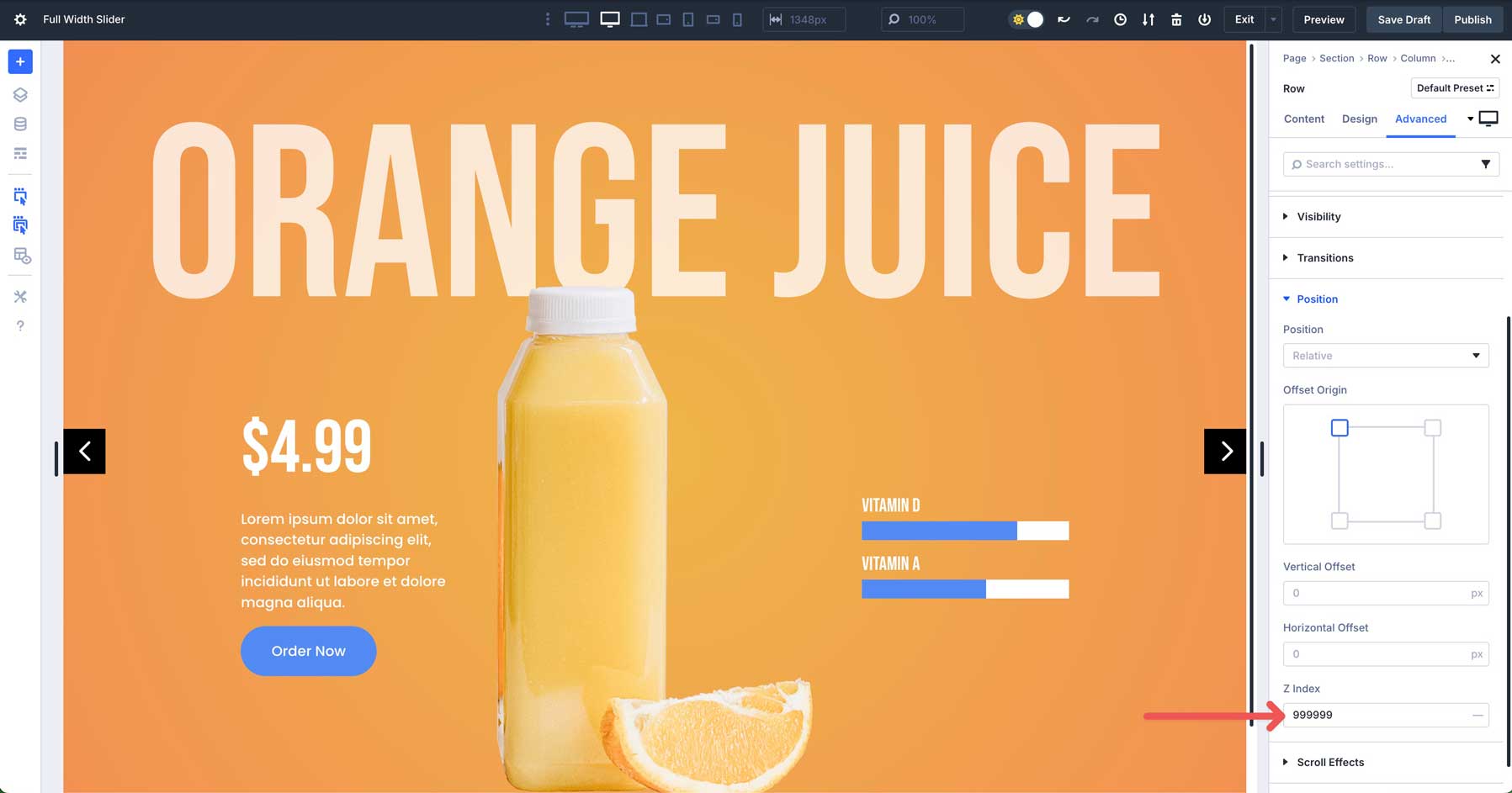
Next, we’ll apply a Z index value to place the 2nd row above the 1st. Navigate to the Advanced tab, expand the Position settings, and apply 999999 to the Z Index field.
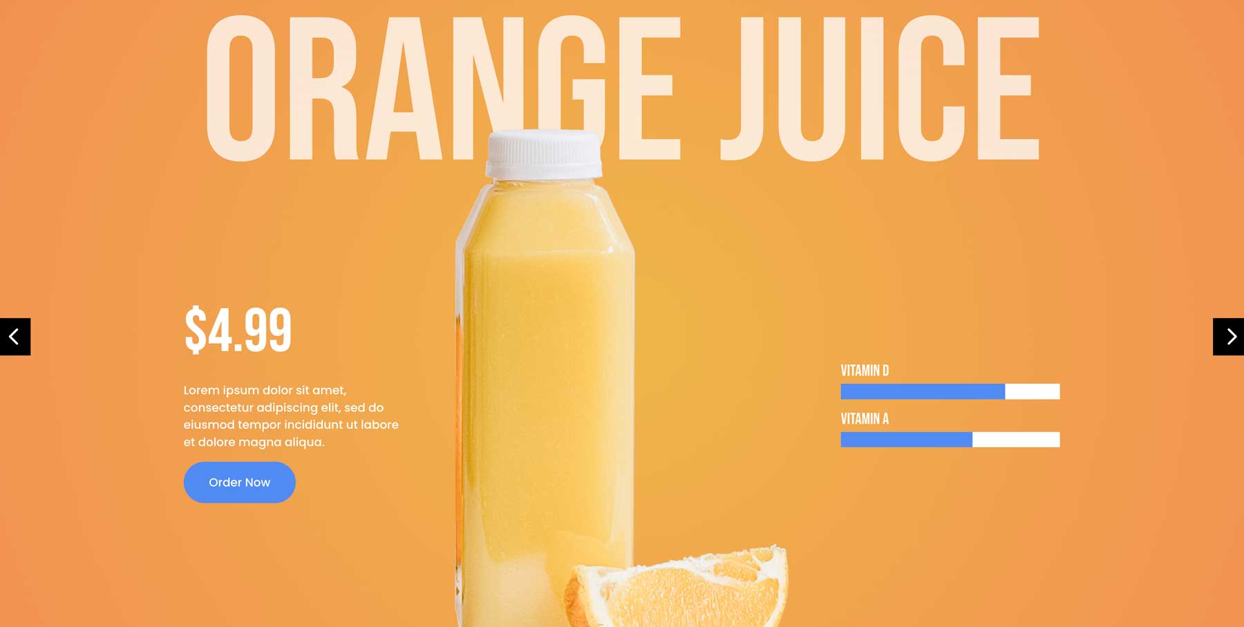
When you preview the slider, you’ll see that the 2nd row has been pushed up to slightly overlap the 1st row, creating a nice overlap effect.
Step 8: Test Responsiveness
Before we copy the first Group, it’s a good idea to test the responsiveness of the layout. Use Divi 5’s Customizable Responsive Breakpoints to make any adjustments.
In Divi 5, there are now 7 breakpoints instead of Divi 4’s 3. You can use these breakpoints to ensure your layout looks incredible on any screen size. Navigate through the breakpoints and make the necessary tweaks before we copy the first Group.
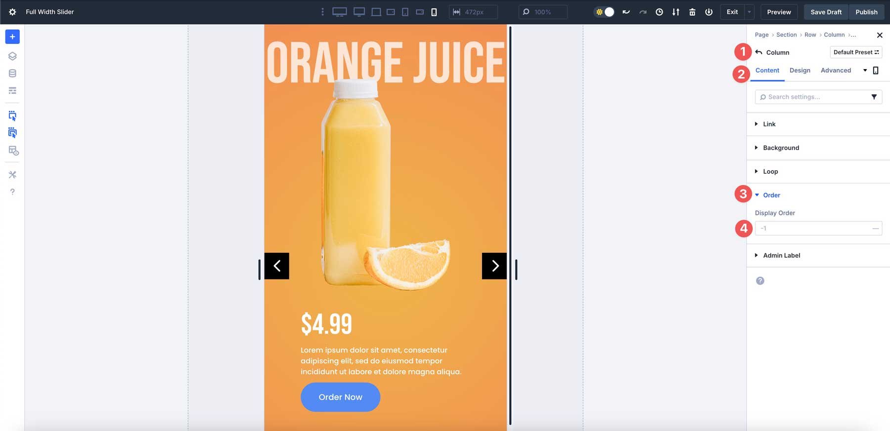
One of the best new features in Divi 5 is the ability to change the order of columns for mobile devices. This is a great way to keep the design functional and effective on all screen sizes. While in mobile view, select the 2nd column of the 2nd row in our layout (3-column row).
In the content tab, expand the Order tab. From there, set the Display Order to -1. That will place the column with the image at the top, allowing the image to overlay the Heading as it does on desktop and tablet views.
Step 9: Duplicating Groups
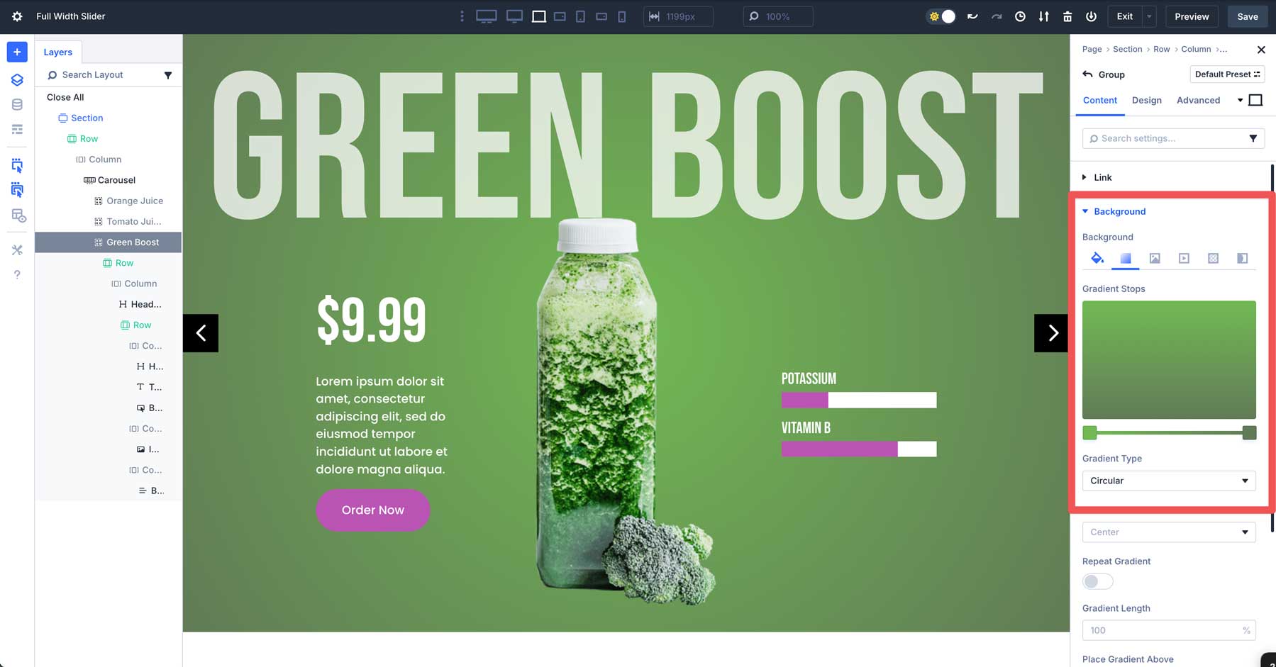
Once we have everything squared away, we can easily copy the first Group and change the background gradient, text, and image without repeating all the steps. In the main Carousel Group content tab, click to duplicate the first Group.
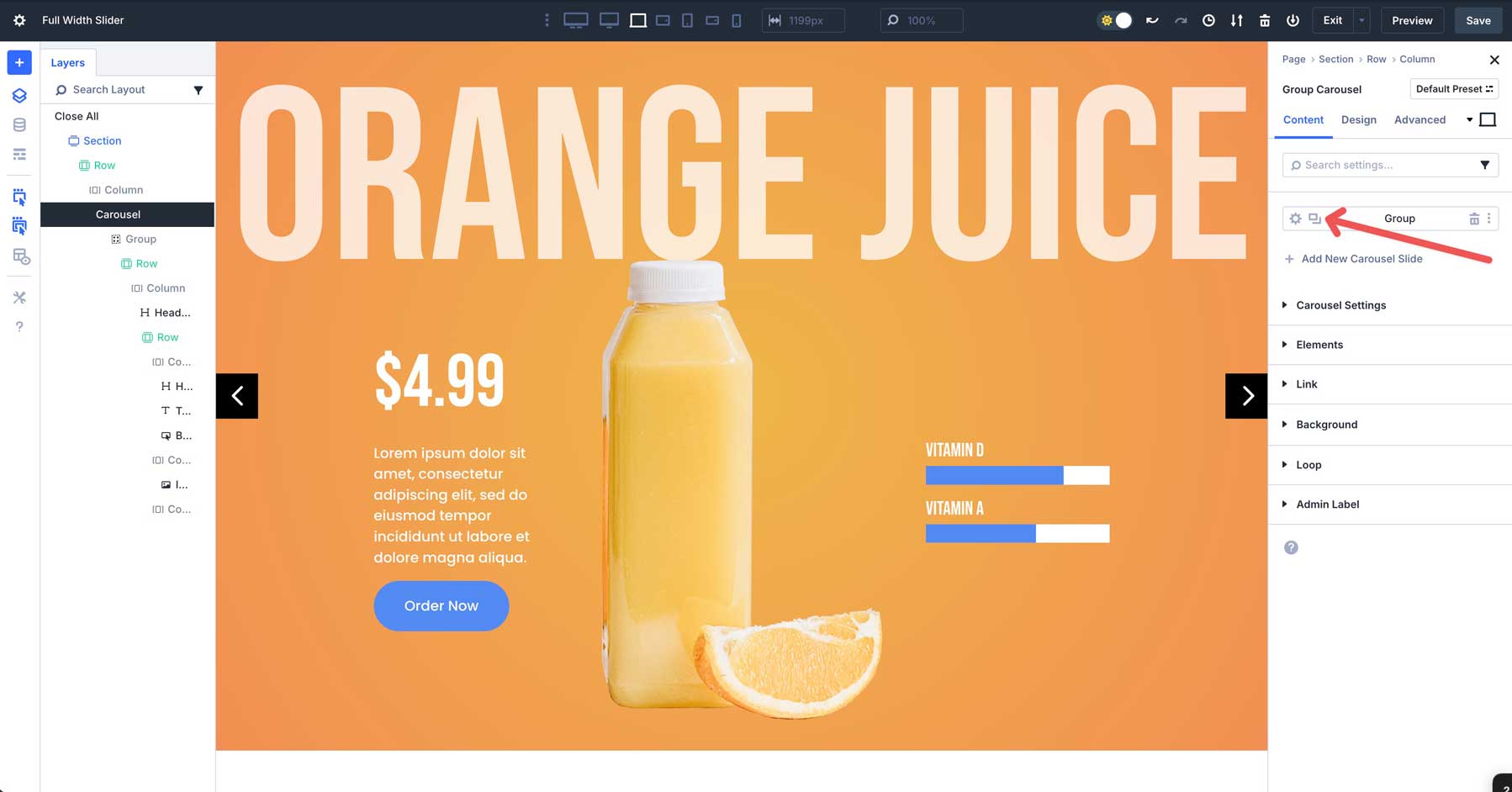
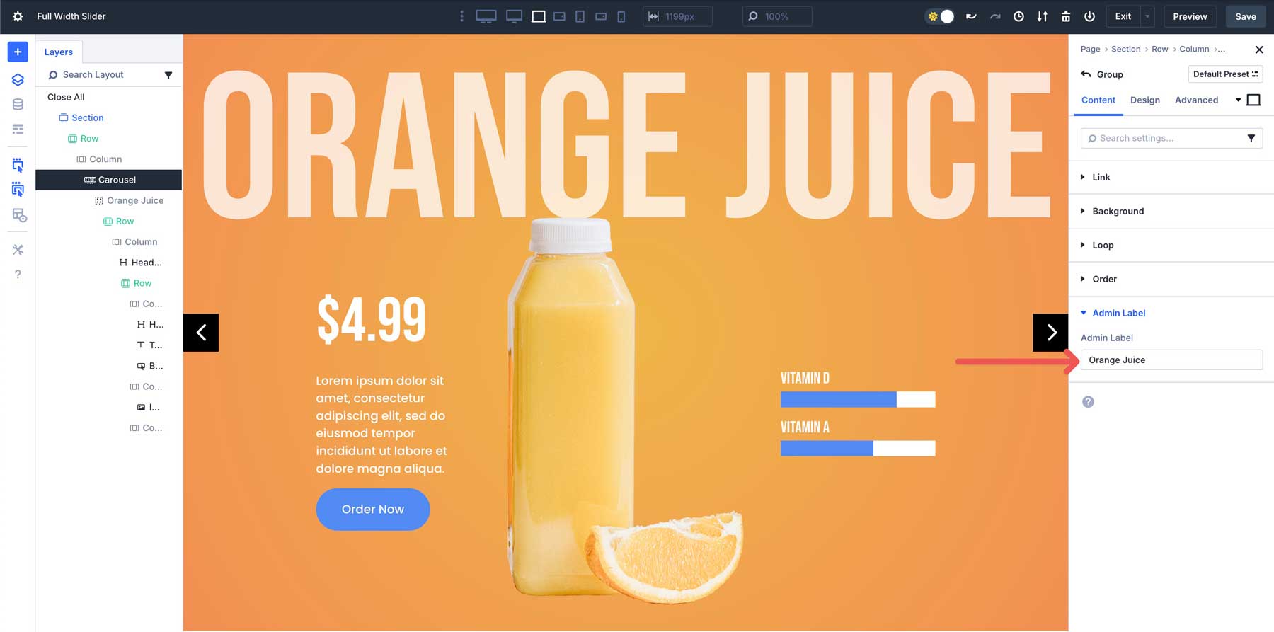
Before copying, assign an Admin Label to the Group to make identifying it easier.
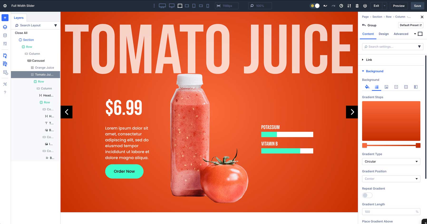
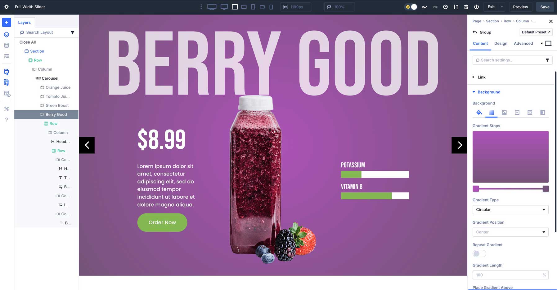
From there, change the title, swap the image, and assign a new background gradient to the Group. Use #fc6a3c for the first Gradient Slider and #c52f00 for the second.
You’ll also want to change the button and bar counter colors to #3dfcca and #c52f00 on hover.
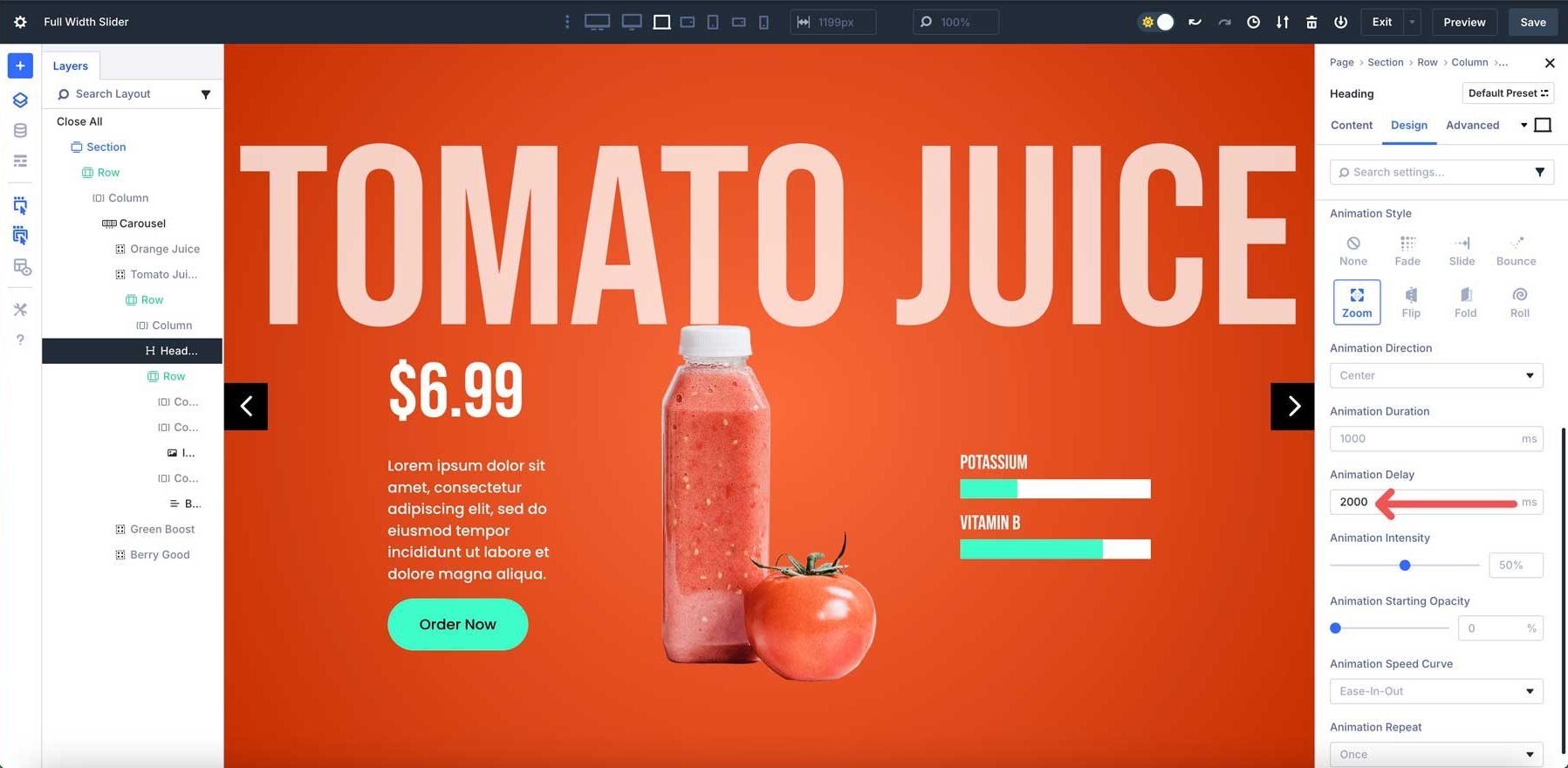
We’ll also need to adjust the animation timing for the 2nd Group. This ensures the animations won’t load for other slides until the slider advances. In the main Heading Module, navigate to the Design tab, expand the Animation menu, and set the Animation Delay to 2000ms.
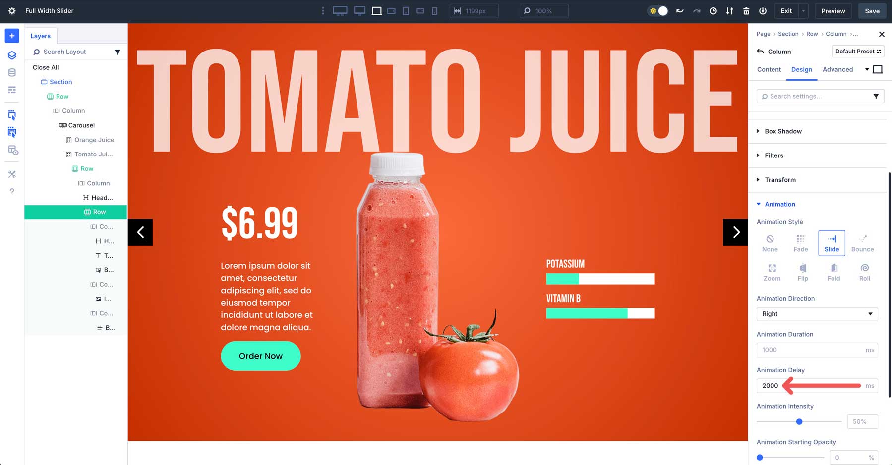
Do the same for the 3-column row. In the first and third columns, set the Animation Delay to 2000ms.
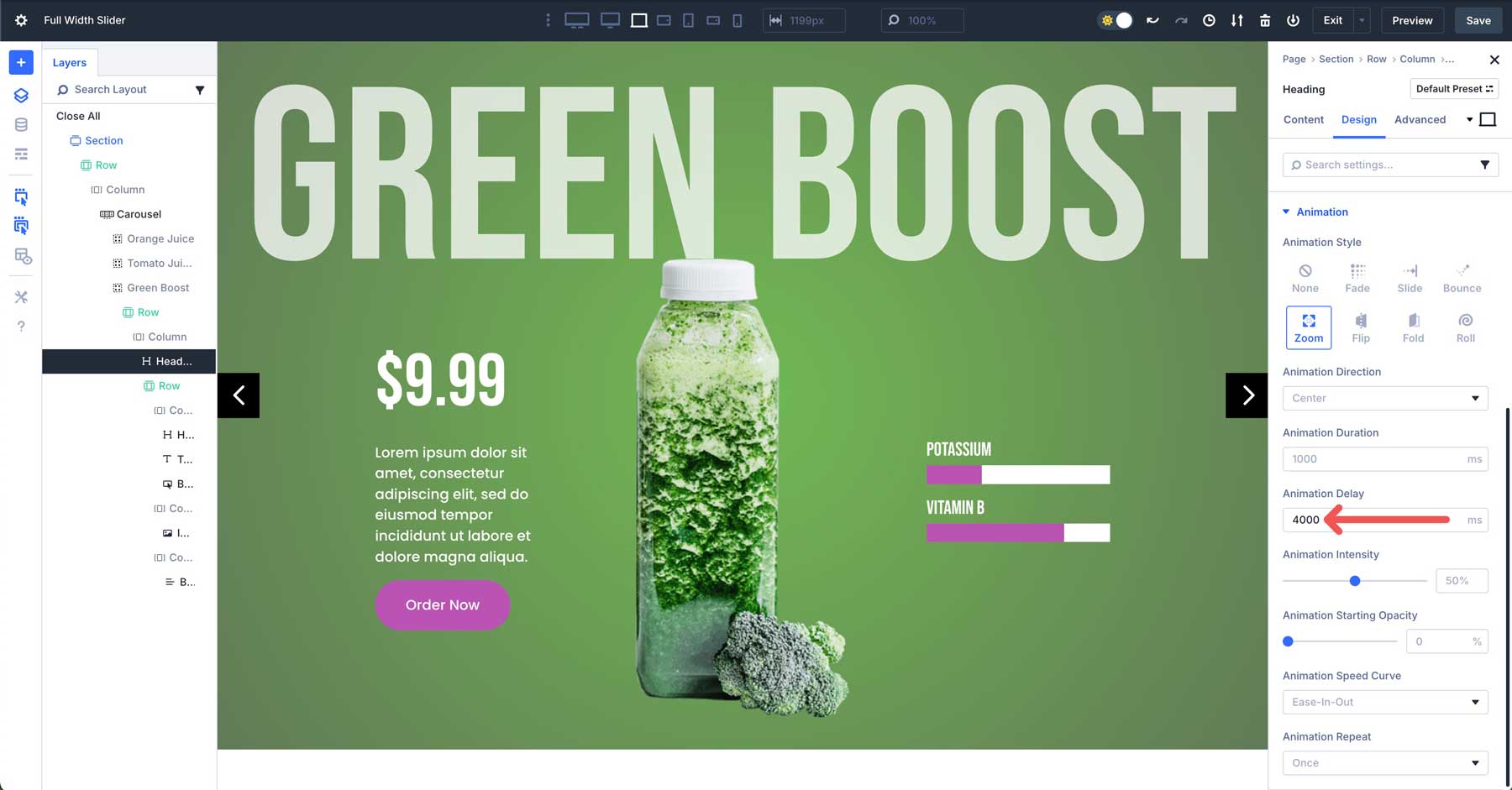
Changes To The Third Group
For the 3rd Group, use #71b953 and #617a56 for the Background Gradient.
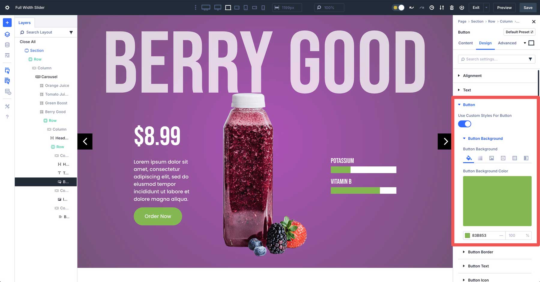
For the Button and Bar Counters Modules, use #ba54b3 and #654f64 for the hover color.
You’ll also need to change the Animation Delay on the Heading Module and first and third columns of the 2nd row to 4000ms.
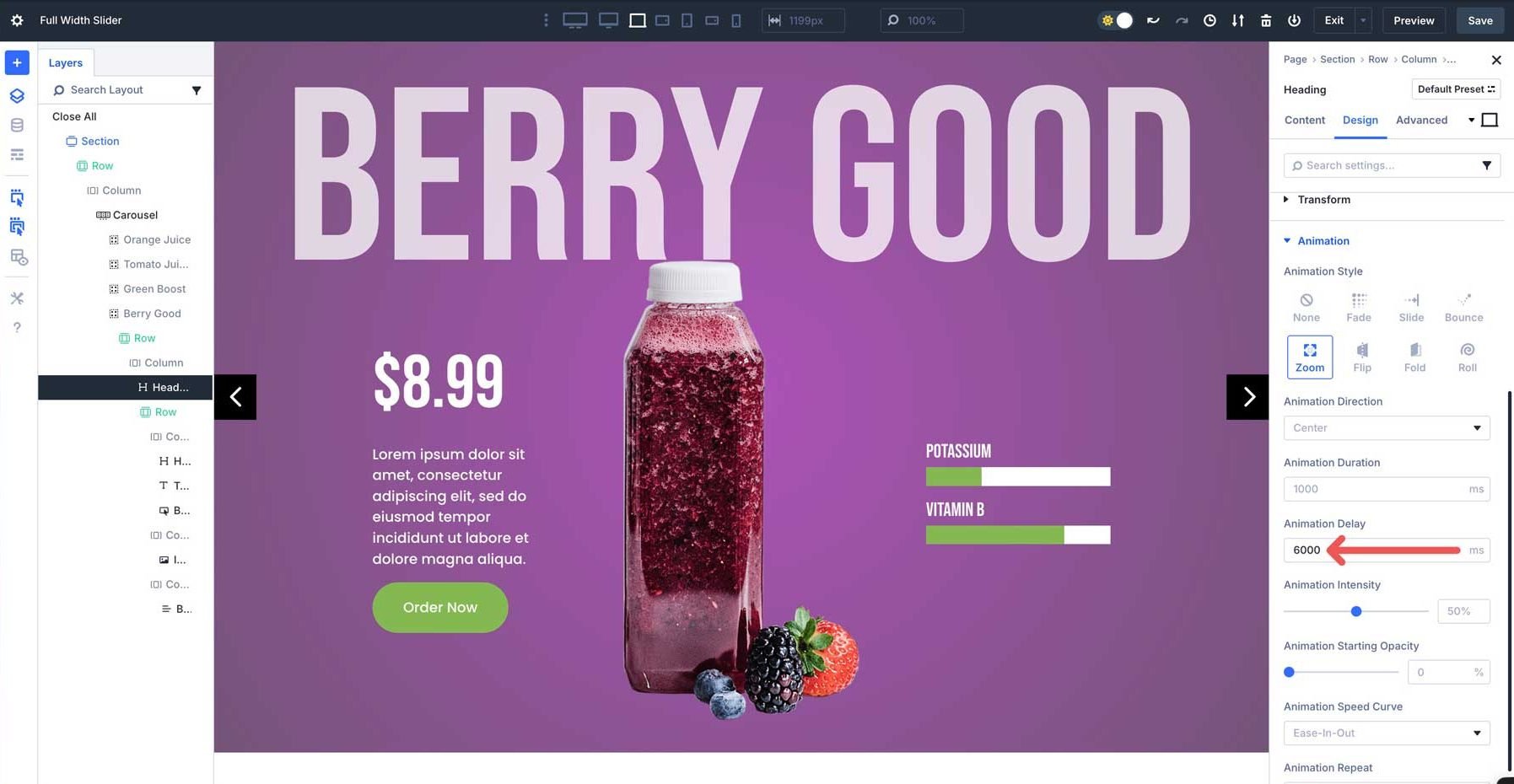
Changes To The Fourth Group
For the Background Gradient, use #ad52b7 and #ad52b7.
Use #83b853 and #83b853 for the Bar Counter and Button Modules.
Finally, set the Animation Delay to 6000ms on the main Heading in the Group, along with the first and third columns of the 3-column row.
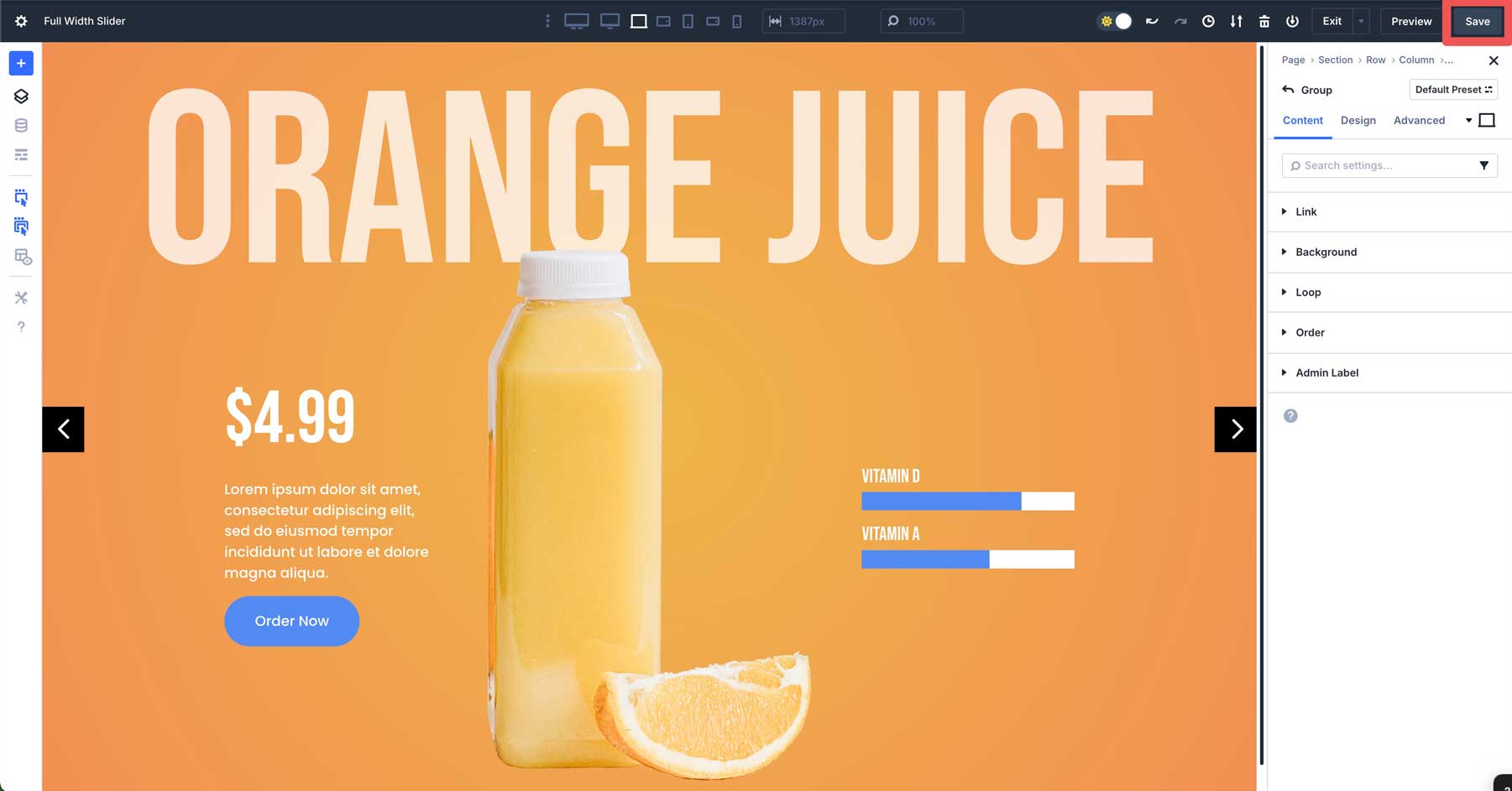
Step 10: Preview And Save The Slider
The final step is to save the layout and preview it to ensure no steps were missed. In the Visual Builder, click the Save button at the top right-hand corner.
Click the Preview button to open the layout in a new tab.
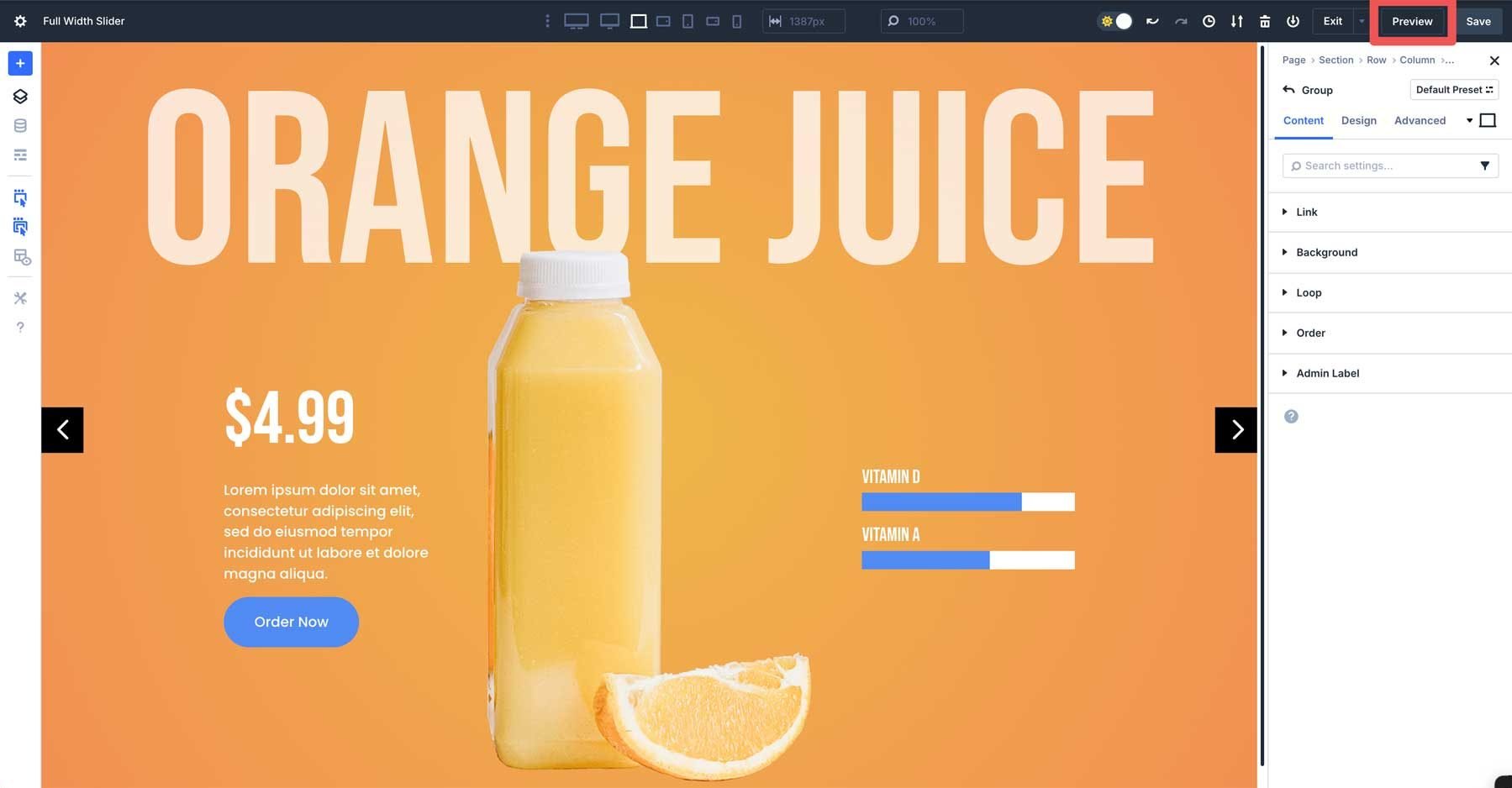
Once complete, your slider should look like this:
That’s it! The Group Carousel Module is a versatile new addition to Divi 5. It allows you to create sliders and carousels for any project and offers unlimited customization options.
Download The Fullscreen Carousel Layout
If you want to use the layout we’ve recreated in this post, you can access it through the form below. Once you’ve downloaded and unzipped the folder, you’ll find a JSON file. Navigate to your Divi Library to upload the file so you can access and use it for any page you build.

Build Your First Carousel In Divi 5 Today
Creating a custom fullscreen slider with Divi 5‘s Group Carousel Module opens up a world of possibilities for creating engaging experiences on your websites. Following the steps in this post, you’ve learned how to use the module’s features, from advanced customization options like animations, responsive breakpoints, and interactive effects. The Group Carousel Module’s flexibility allows you to build slides for anything you can imagine, all while maintaining a seamless, professional look across all screen sizes.
Download the latest Divi 5 Public Alpha, experiment with the Group Carousel Module, and let us know what you think in the comments or on our social media channels.


Guys, the carousel is great, but without the ability to swipe it with your finger, it’s not a carousel. And this module has a big bug with links to the post.