
Divi 5 introduces a system-wide update that changes how layouts are built. Every module now includes Layout controls in the Design tab.
This means that modules can now act as their own layout containers using Flexbox and CSS Grid. Elements inside align, reorder, and space themselves without rebuilding the structure around them. It is a quiet change, but a meaningful one. Layout control now lives closer to the content, making designs cleaner, more flexible, and easier to adjust as they evolve.
A System-Wide Layout Upgrade For Every Module
Divi 5’s layout system is powered by Flexbox, with CSS Grid available as needed. This shift simplified how rows and columns behave, making alignment, spacing, and responsive behavior more predictable. Structural design became easier and more consistent across the board.
However, while the layout system evolved, the internal structures of the modules themselves remained rigid. Each module, like a Blurb, always followed the same internal structure. The image, heading, body text, and button appeared in a fixed content order. Designers could style each element, but they couldn’t control how those elements flowed together.
Adjusting alignment or spacing involved working around the module by adding extra rows, tweaking column settings, or adjusting padding values until everything looked right. That limitation no longer exists. Layout options are now available in the Design tab of every module.
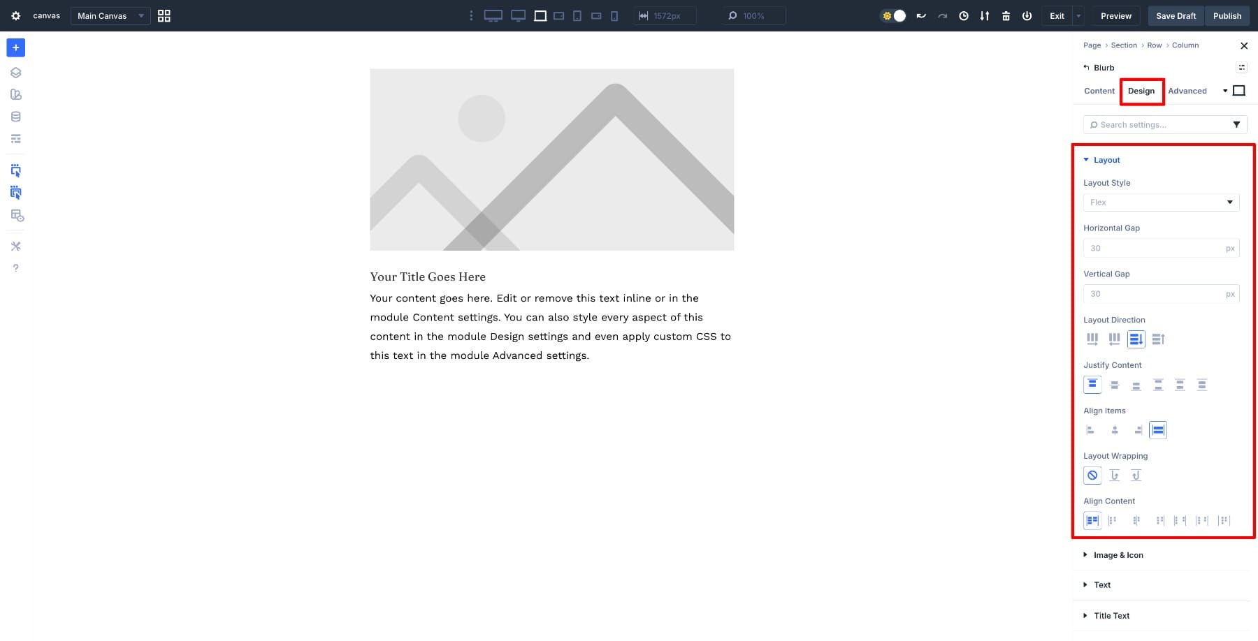
Each module can now act as its own layout container. Alignment, direction, and spacing are controlled directly inside the module, not through the rows or columns around it. The same layout logic applies consistently across different module types, making this a system-wide upgrade.
Take the Blurb Module as an example. With Flex enabled, the Blurb behaves as the layout container, while its internal elements (image, heading, text, button) participate in that layout. The semantic order stays intact, but Flexbox now controls how those elements align, space themselves, and respond across breakpoints.
This means that many Flex options can be applied to elements inside modules.
A Blurb can present its content horizontally on desktop, then stack vertically on mobile by adjusting layout direction per breakpoint. Because the alignment logic lives inside the module, elements position themselves consistently without manual spacing adjustments. The layout adapts cleanly on its own, responding to screen size changes without extra structure or workarounds.
The key change is not structural freedom, but layout intelligence. Modules no longer depend on external wrappers to behave correctly.
Learn Everything About Divi 5’s Flexbox System
How Module-Level Layout Changes The Way You Build
This shift is subtle, but it changes how layouts are built in very practical ways.
- Fewer Structural Layers And Cleaner Layouts: Module-level layout control reduces the need for extra rows, wrapper columns, and alignment-only structure. Layout decisions are made within the module itself, resulting in a cleaner page structure that is easier to understand, update, and maintain over time. If you’ve ever added a row just to center a single Blurb or wrapped a button in a column to control its width, you no longer need to do so. The module handles it.
- Modules As Reusable Design Components: When modules control their own layout, presets become more flexible and reusable. The same module can be dropped into different sections and layouts without adjustment, improving consistency and reducing the need for per-page design work. For example, a testimonial card preset with internal layout settings can be used in a three-column grid, a single-column sidebar, or a full-width hero section without requiring a rebuild of the layout each time.
- Responsive Design Without Duplication: Layout direction, alignment, and spacing can change per breakpoint without duplicating modules or rebuilding sections. Responsive design becomes a series of small adjustments rather than a structural redesign.
- Visual Control Without Breaking Semantics: Layout options affect visual behavior only. HTML order, content hierarchy, and accessibility structure remain unchanged, making it easier to maintain clean markup while still achieving precise layouts.
- Faster Iteration With Flexible Internal Layouts: Since layout logic resides within the module, design changes are quicker and more contained. Adjustments can be made without triggering cascading layout issues across the page. Changing icon alignment in one Blurb no longer requires adjusting padding in three different rows to compensate.
Real-World Examples Using Module Layout Options
These benefits become easier to understand when you see them applied to real layouts. Let’s look at a few practical examples that show how module-level layout works in everyday design scenarios.
1. Blurb Module With Horizontal Desktop And Stacked Mobile Layouts
A common layout issue shows up when a single Blurb sits inside a wide row on desktop. The content stretches awkwardly, leaving large gaps of unused space on both sides.
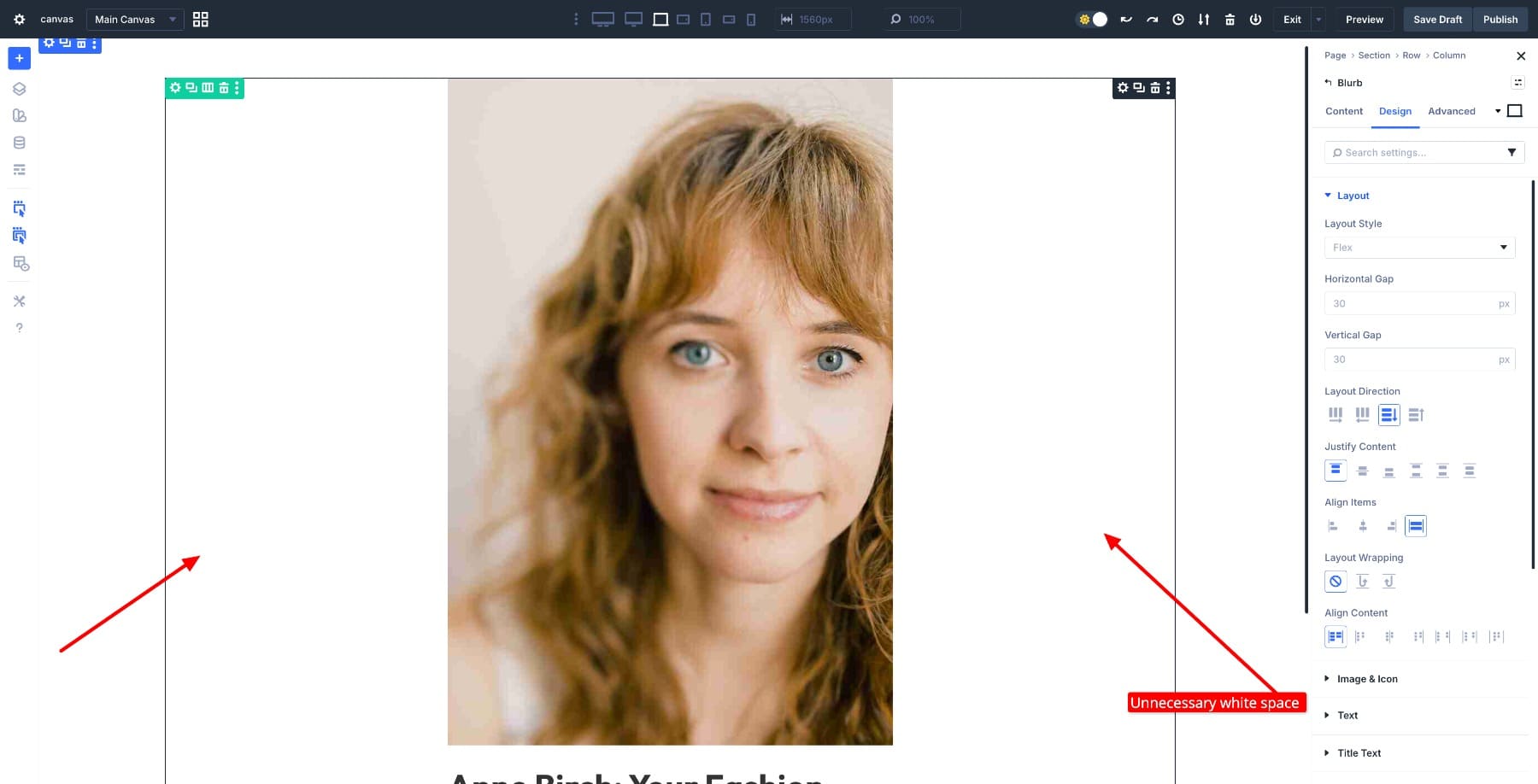
On smaller screens, that same Blurb usually looks fine once it stacks naturally. But fixing the desktop version used to mean reworking the row structure, duplicating the section for different breakpoints, or hiding one version and showing another. Each approach added complexity.
Module-level layout options handle this differently. The Blurb can be placed in a two-column row on desktop and set to display horizontally, so the image and text sit side by side. This fills the space more naturally without stretching the content. On tablet and mobile, the same Blurb switches to a stacked layout by adjusting the layout direction at each breakpoint.
To make this work, set the Layout Direction to Row in Desktop view and Column in Tablet and Mobile views.
The row structure stays the same. The content stays the same. What changes is how the Blurb arranges its internal elements, allowing it to adapt cleanly across screen sizes with a single setting adjustment per breakpoint.
2. Using Elements For Flexible Internal Layouts
The Elements settings open up a different kind of layout control. Rather than treating a module as a fixed block, you can add nested elements (modules or rows) inside it and control how they arrange themselves. Each element participates in the module’s layout, allowing you to build more composed designs without adding extra structure around the module.
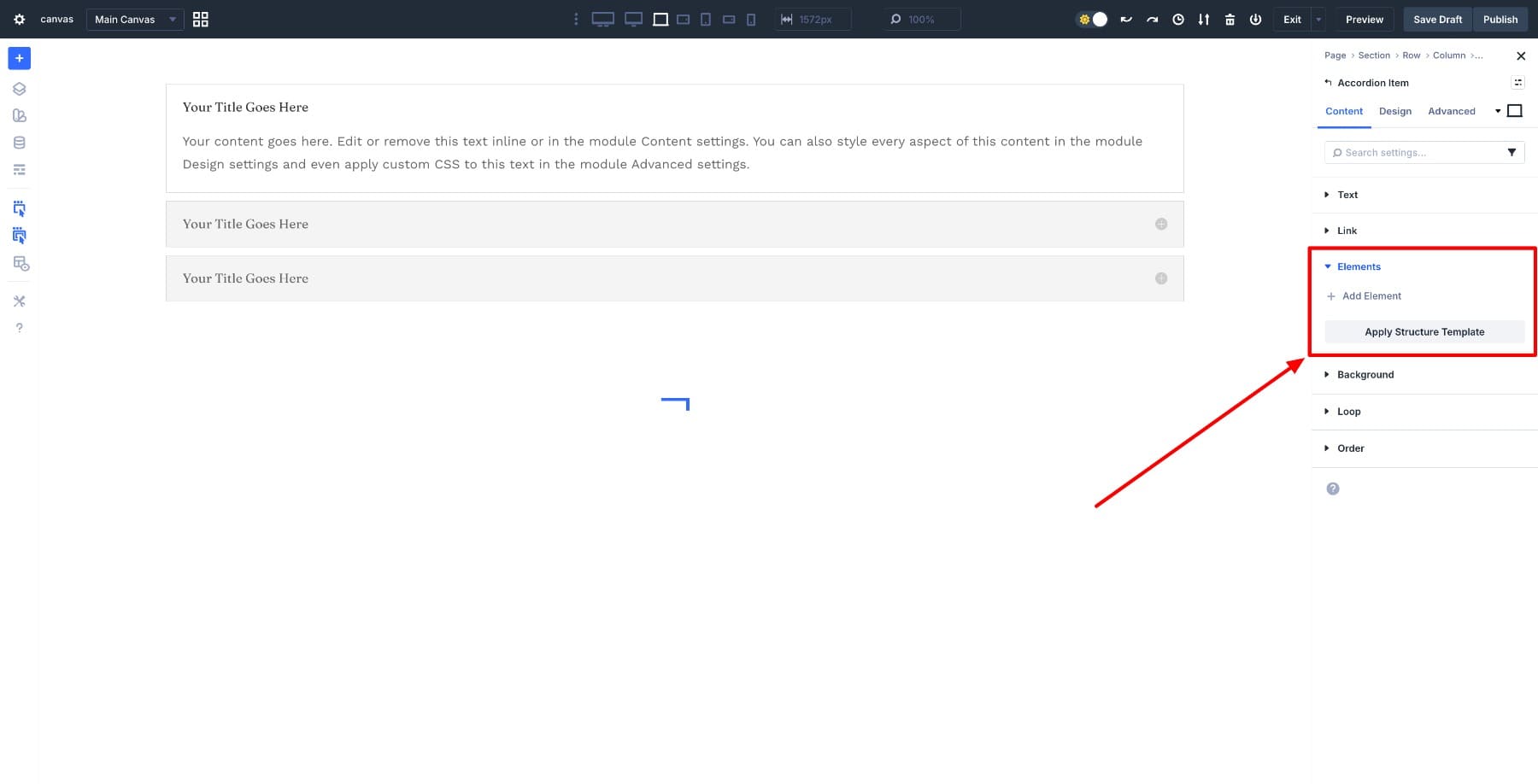
An Accordion module shows this flexibility clearly. Accordions are typically text-heavy, but with Elements, each accordion item can hold different types of content and treat that content as part of its internal layout.
In the first accordion item (What is Divi 5), a video can be added as an element and aligned alongside the text using Flex layout. The video and text sit side by side on desktop, then stack naturally on smaller screens. The accordion structure itself stays the same, but the content inside responds to the layout settings.
In the second item (How Is Divi 5 Different), multiple images can be added as elements and laid out cleanly within the panel. Alignment and spacing are controlled through the module’s layout settings, so there’s no need for nested rows or manual spacing adjustments. For instance, they sit side by side on desktop but stack vertically on tablet and mobile screens.
In the third item (Ready To Try Divi 5), a call-to-action button can be introduced as an element and positioned below or alongside the content. Here you can play around with the Button’s alignment.
Each accordion item can include different types of content, yet all of them follow the same internal layout logic. This consistency makes it easier to build richer, more varied components while maintaining a straightforward structure.
The same approach also works in simpler modules. Buttons, for example, are usually single-purpose elements. You style them and move on. However, if you want to add motion or visual emphasis (such as pairing a button with a Lottie animation), Elements makes that possible without requiring additional structure.
To add a Lottie animation inside a Button module, open the Elements option group, click Add Element, and insert the Lottie file as an internal element.
Once added, the Flex layout allows the button text and Lottie animation to sit side by side on desktop.
The position and spacing can be adjusted per breakpoint so that the animation sits beside the text on desktop and repositions on smaller screens. Alignment is handled through the module’s layout settings, keeping the button as a single, reusable component.
What makes the Elements feature useful is how it extends layout control to the parts inside a module. You’re not limited to the module’s default structure. You can bring in media, buttons, or other components and arrange them according to the design’s needs, all while keeping the module itself intact.
3. Module Group As A Custom Container Layout
Module Groups take the idea of module-level layout control one step further. It allows you to combine multiple modules into a single layout unit that can be controlled, reused, and adjusted as a single piece. This becomes useful when you’re building components that need to hold several different modules but still behave cohesively across breakpoints.
A profile layout demonstrates this clearly. The layout starts with a two-column row. The left column holds an Image module for the profile photo. The right column contains a Module Group, which serves as the container for all other elements: a Heading Module, a Text Module, and a nested two-column row with two Button Modules (View Portfolio and Contact).
By treating the Module Group as the layout container, all of these modules behave as a single component. Layout direction, alignment, and spacing can be adjusted at the group level. The individual modules within maintain their own properties, but they interact with each other based on the group’s layout settings. On desktop, the profile displays horizontally. On smaller screens, it switches to a stacked layout by changing the layout direction per breakpoint.
This approach keeps the structure intentional. Rows still handle high-level placement (where the profile sits on the page), while the Module Group controls how the related modules flow together (how the heading, text, and buttons arrange themselves). You’re not flattening everything into a single module or adding wrapper rows just to control layout. You’re building a custom container that holds the pieces you need and adjusts them collectively based on screen size or design requirements.
Module Groups enable you to create your own reusable components without compromising the flexibility of working with individual modules. The profile layout can be saved as a preset, dropped into different sections, and adjusted per breakpoint without rebuilding the internal structure each time.
Try The Module-Level Layout Options In Divi 5 Today!
Divi 5‘s module-level Layout options shift how layouts are built. Control now resides within each module, rather than in the rows and columns surrounding it. This makes layouts easier to understand, faster to adjust, and more consistent as designs scale.
The real value shows up when Flexbox, Elements, and Module Groups work together. Each piece handles its own layout logic, resulting in fewer structural workarounds and a cleaner page architecture. Once you start building this way, layouts feel less fragile. Adjustments stay contained, responsive behavior becomes predictable, and the structure itself reflects the design intent rather than fighting against it.


Leave A Reply