The Divi margin and gutter controls are two powerful design settings that can really transform your layouts in creative ways. And, if you understand how they work, you’ll be less afraid to break out and try new things for yourself. In this post, I’m going to show you 5 creative ways to use the Divi margin and gutter controls. Some will be easier than others to accomplish, but overall, I think you will walk away with a new appreciation for these two design settings.
- 1 About Margin and Gutter width
- 2 Sneak Peek
- 3 5 Creative Ways to Use Divi’s Built-In Margin and Gutter Controls
- 4 #1 Extending Image Modules Outside the Row
- 5 #2 Expanding Text Modules and Dividers Outside of Columns
- 6 #3 Overlapping Modules with a Buttons
- 7 #4 Overlapping Sections with Rows
- 8 #5 Extending Rows on Hover
- 9 More Inspiration
- 10 Final Thoughts
About Margin and Gutter width
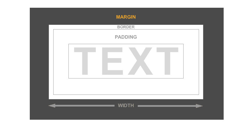
Margin refers to the spacing between (or outside of) elements. So think of a section, row, or module as a box. Margin is what adds space outside of the box and is what is used to separate boxes on the page (this is covered in greater detail here).
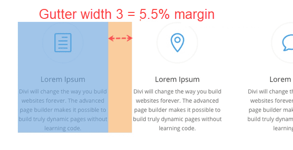
Gutter width is just a fancy term for the margin between columns within a row. It is difficult to adequately build a grid with correct margins on the fly. That is why Divi has the Gutter width option for each row. It helps ease the pain for spacing out columns evenly.
Optional values for gutter width range from 1 to 4.
1 represents zero margin between columns.
2 represents a 3% right margin between columns.
3 represents a 5.5% right margin between columns.
4 represents a 8% right margin between columns.
Now that we have a better handle on what we are dealing with, let’s start putting them to use!
Here are 5 creative ways to use the Divi margin and gutter controls:
Sneak Peek
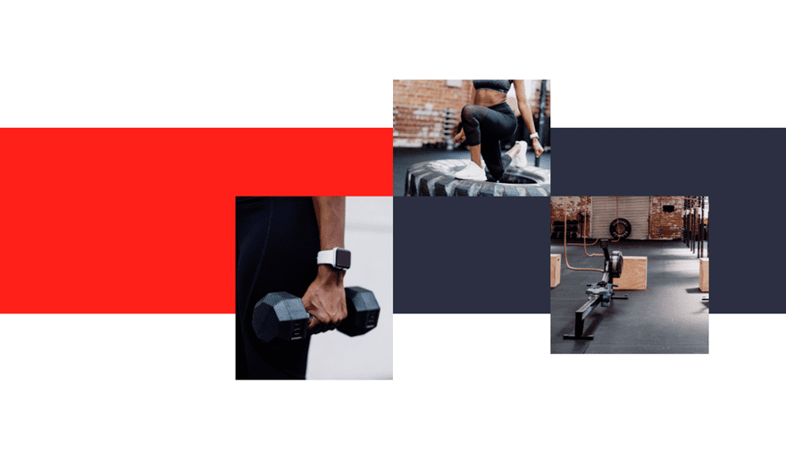
Here is a quick sneak peek of the designs possible with these techniques:


5 Creative Ways to Use Divi’s Built-In Margin and Gutter Controls
Subscribe To Our Youtube Channel
#1 Extending Image Modules Outside the Row

Since broken grid design is all the rage these days, expanding modules outside of their container (or row) is a great way to break up the traditional grid layout for a unique look. The trick is to use negative margins to extend the module in a certain direction.
A great example of this creative technique is found in the Fitness Gym Landing Page Layout. In the section titled “Become a member” you can see how the image are being extended outside their row container.
Here is the basic idea of how to accomplish this design.
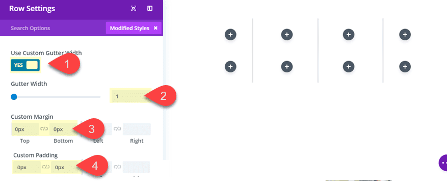
Create a new section with two four-column rows. Give each row the following settings:
Gutter width: 1
Custom Margin: 0px top
Custom Padding: 0px top, 0px bottom
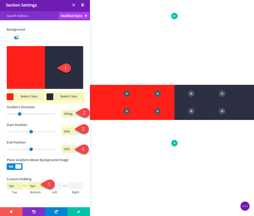
Then update the section settings as follows:
Background Gradient Left Color: #fa2a20
Background Gradient Right Color: rgba(16,23,45,0.85)
Gradient Direction: 90deg
Start Position: 50%
End Position: 50%
Custom Padding: 0px Top, 0px Bottom
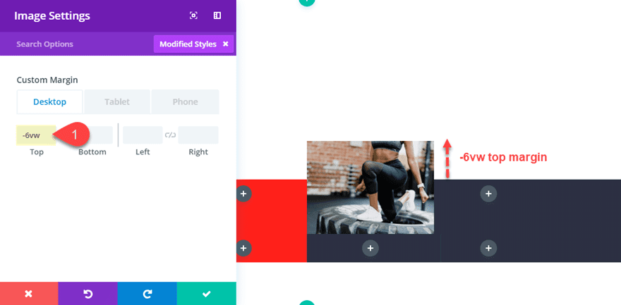
Next in the top row, add an image module to column 3 and add an image to the module. Then update the settings with a negative top margin as follows:
Custom Margin: -6vw Top
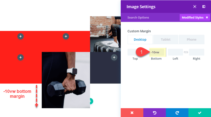
In the second row, add an image module to the column 2 and add an image to the module. Then update the settings with a negative bottom margin as follows:
Then add an image module to column 4 in the same row and add an image to the module. Then update the settings with a negative bottom margin as follows:
Custom Margin: -5vw bottom
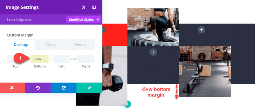
Because we have the gutter width set to 1, the images/modules are flush against each other without any space between them. This combined with the 50% gradient start position gives it a nice symmetrical breaking point in the background.
You may have noticed that I used the vw length unit for the custom margins. The vw (viewport width) length unit is relative to the width of the browser. So 10vw is basically 10% of the browser window. This allows the design to scale along with the browser without jumping around. See our full article on length units for more info.
Here is the final design.

#2 Expanding Text Modules and Dividers Outside of Columns

Expanding text modules outside of a column or row opens the door for unique header designs. The row or column can serve as a custom background element as the text extends beyond the background element to the left and right for a unique look.
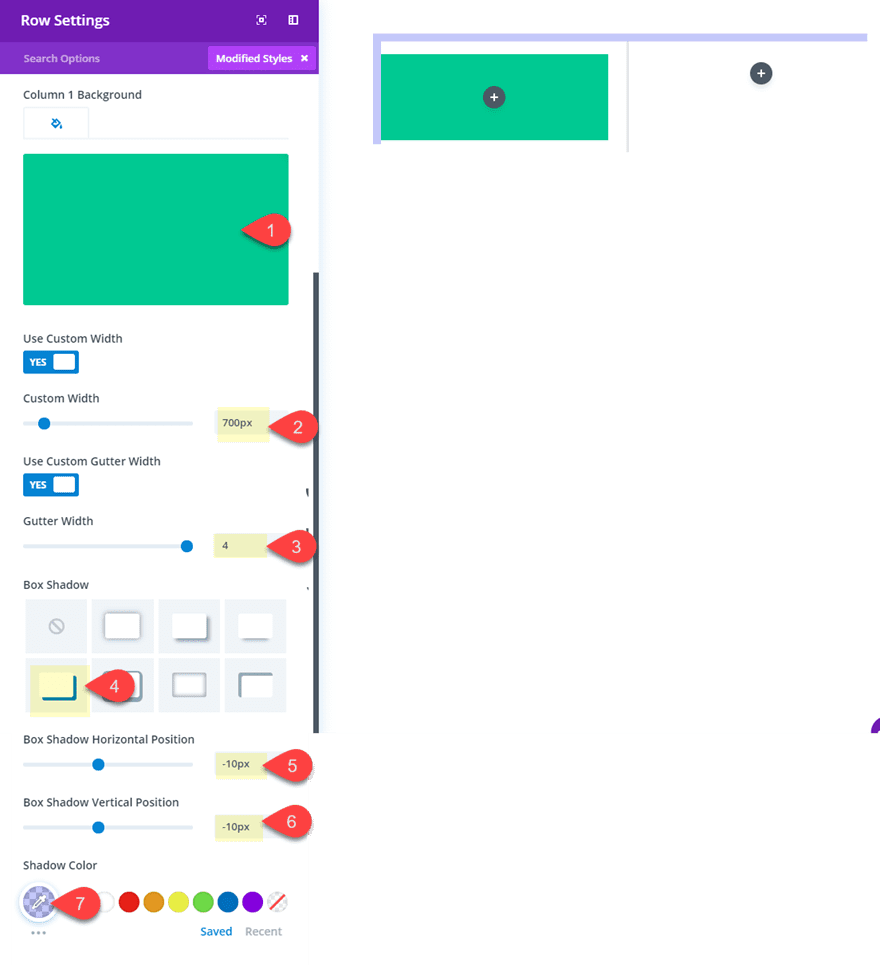
Here is how this is done. First create a new section with a two-column row. Before you add any modules, update the row settings as follows:
Column 1 background color: #00ca8f
Custom Width: 700px
Gutter Width: 4
Box Shadow: see screenshot
Box Shadow Horizontal Position: -10px
Box Shadow Vertical Position: -10px
Box Shadow Color: rgba(100,113,248,0.37)
Setting the gutter width to 4 maximizes the space between columns to make it easier for us to extend modules outside of the column.
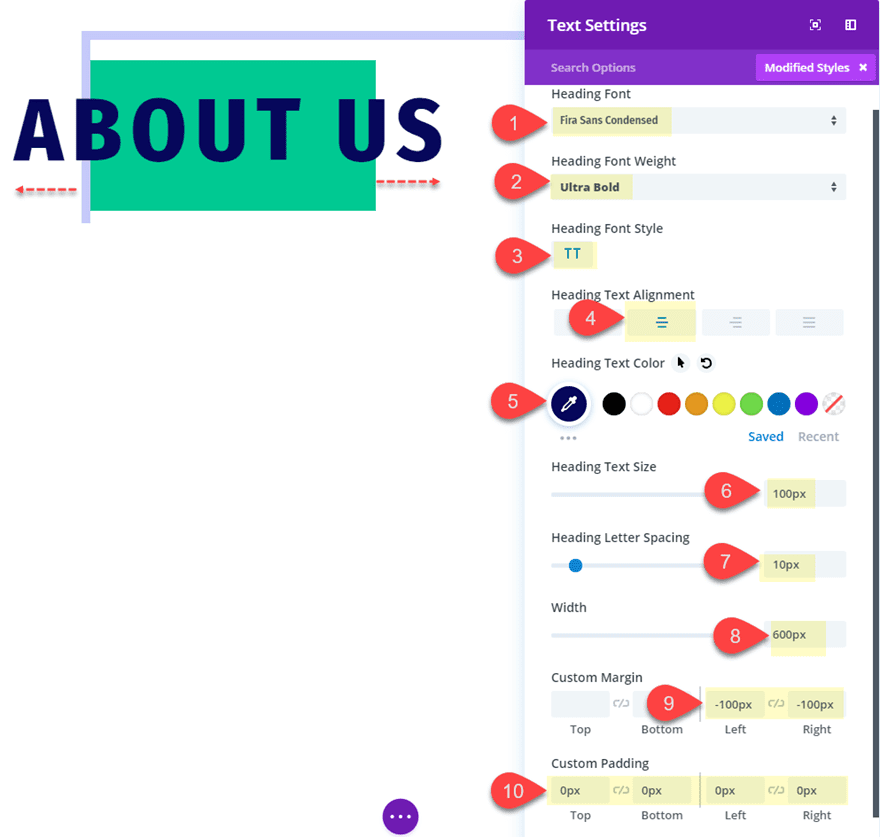
Now let’s add a text module to column 1 and update the settings as follows:
Heading Font: Fira Sans Condensed
Heading Font Weight: Ultra Bold
Heading Font Style: TT
Heading text Alignment: center
Heading Text Color: #0f135d
Heading Text Size: 100px (60
Heading Letter Spacing: 10px
Width: 600px
Custom Margin: -100px Left, -100px Right
Custom Padding: 0px top, 0px bottom, 0px left, 0px right
The key to this design is to increase the width of the module so that, when we add the negative right and left margin, the text module has room to extend beyond the column on both sides.
As an addition design element, you can also add a divider in column 2 that extends outside of the column as well. To do this, add a divider module in column 2 and update the following settings:
Color: #0f135d
Divider Weight: 12px
Width: 150%
Custom Margin: 15px top, -25% left, -25% right
The same design technique is used here as well. We increase the width (or max-width) to 150% so that we can extend the module outside the column on the left and right.
Here is the final result.

Here it is on mobile.

You can also change this into a one-column layout easily with a few updates to the settings for a completely now look. To do this, change the column layout of the row to one-column and change the row width to 400px.
Here is the result.

For more inspiration, check out this post on how to extend modules to create unique column layouts in Divi.
Custom margins can be used to position buttons in unique places throughout your design. One of my favorite things to do is position buttons so that they overlap other modules.
To illustrate this concept, I’m going to use the Soccer Club Landing Page Layout from the Soccer Club Layout Pack. In the top section of the layout, you will notice that there are two buttons placed at the top and bottom of the video. The top button has been given a 0px bottom margin so that it sits flush on top of the video. And the video module has been given a 0px bottom margin so that the bottom button is flush against the bottom of the video. What I’m going to do is move each of those buttons so that they overlap the video module.
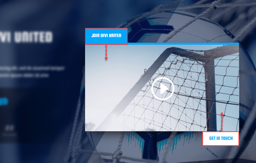
To do this, open up the top button module settings and give it a custom bottom margin of -56px (basically the height of the button).
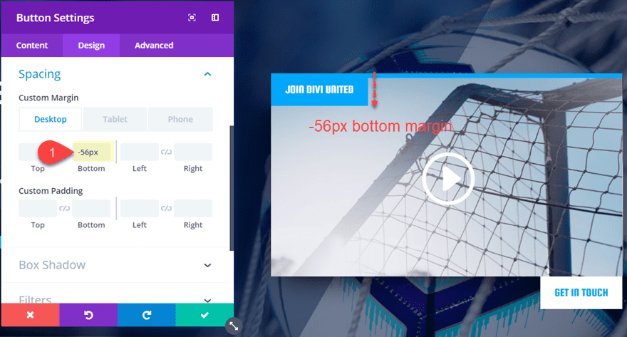
Then open the bottom button settings and give it a custom top margin of -56px.
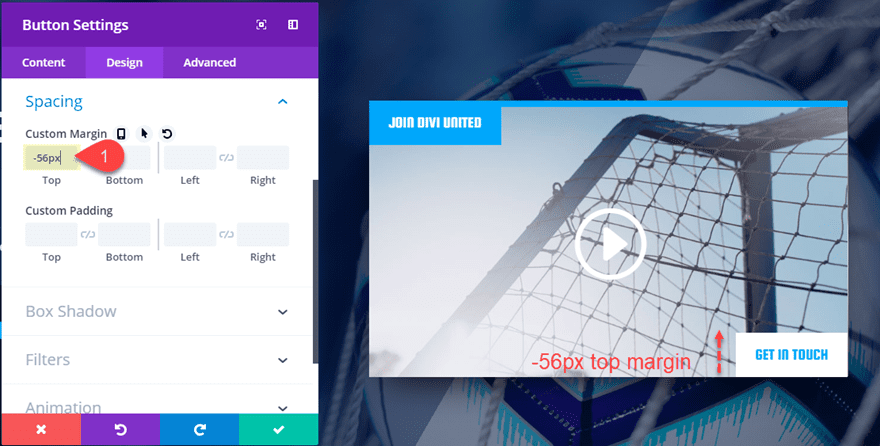
Here is the final design.

And because we used a pixel length value for our negative margins, the buttons will stay in place on mobile as well.

For more inspiration, check out this post on how to add an animated scroll button using similar techniques.
#4 Overlapping Sections with Rows
Overlapping a section with a row is a simple process, but it can really add a degree of creativity to boost the design of your page and make content stand out.
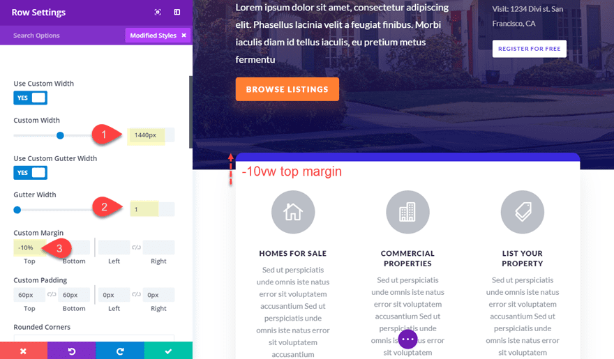
To illustrate this concept, let’s take a look at the Real Estate Landing Page from the Real Estate Layout Pack. Notice how the row of content in the second section has been pulled up to overlap the top section, making the content stand out.
Let’s quickly review how this is done.
The row is given a custom width of 1440px so that it has some spacing on both sides to frame the content nicely.
The gutter width is set to 1 in order to maximize the space needed for the three blurbs and their content.
And finally, the row is given a custom top margin of -10vw. This pull the row up so that it overlaps the section above.

Simple stuff right?
For a more info on this concept, check out the post on on how to overlap modules and rows.
#5 Extending Rows on Hover

This hover style is a great way to reveal more information about a particular service or promotional offer on your website. The key to this hover effect is to use custom margin to extend one half of a row outside of the browser window. Then, when hovering over the visible half of the row, the margin reverts back and reveals the other half of the row content.
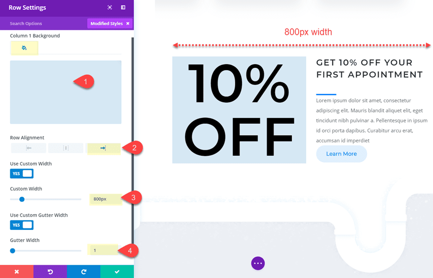
To show you how this is done, I’m going to use the Plumber Services Page from the Plumber Layout Pack. Once you have the Plumber Services Layout loaded onto your page, scroll down to section with the large promotional offer that reads “10% OFF”. This is a two-column row with the large promotion text in column 1 and with more information about the promotion in column 2. What we are going to do is hide the information in column 1 by default and then reveal that information on hover.
To do this, open up the row settings and update the following:
Column 1 Background Color: rgba(12,113,195,0.16)
Row Alignment: right
Custom Width: 800px
Gutter width: 1
Now we need to add our custom margin settings to get the hover effect. And since we are using gutter width 1, we need to add some padding to column 1. Update the following:
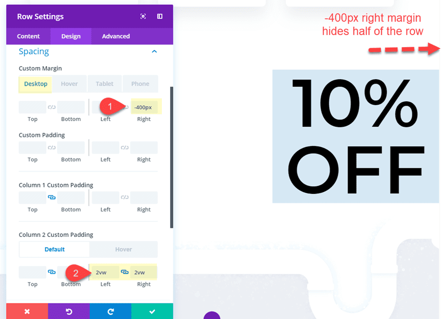
Custom Margin (desktop): -400px right
Column 2 custom padding: 2vw left, 2vw right
Since our row width is 800px, we want to hide 400px (half of the row). So that is why we set the right margin to -400px.
Custom Margin (hover): 0px right
Custom Margin (tablet): 0px right
By setting the right margin back to 0px on hover, the entire row becomes visible!
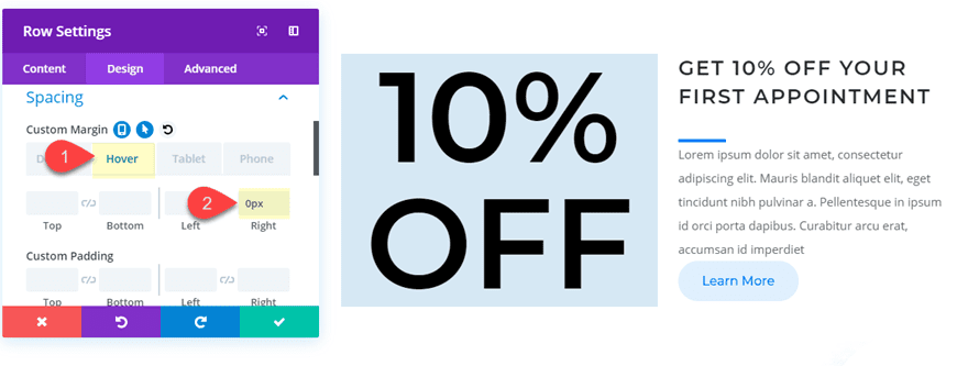
Here is the final result.

And the entire row becomes visible on mobile.
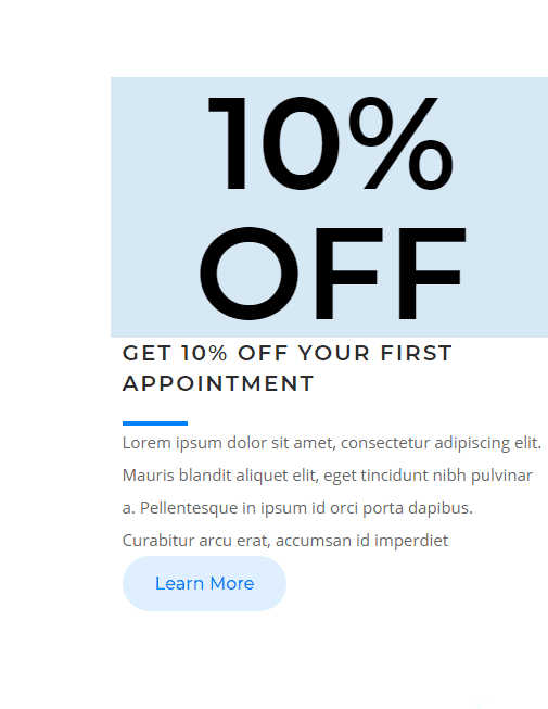
More Inspiration
There are tons of examples of unique styles using margin and gutter values in our premade layouts. I featured a few of those elements on this post already.
If you want more tutorials like this one, check out the following posts from our blog:
- How to use text as an abstract design element in Divi
- How to vertically align content in Divi
- How to Use Opacity, Padding, and Negative Margins to Layer Divi Modules
Final Thoughts
I hope this post was helpful in pointing out a few simple, yet unique, designs using custom margins and gutter values. And, I’m confident that once you get more familiar with these outside-the-box design techniques, you will be surprised at how easy it will be to make your own unique layouts.
I look forward to hearing from you in the comments.
Cheers!


Really great layout examples! In my view, we really miss the effect of hiding part of the rows with the show more button. Is it possible to realize such an effect now?
Hi
How do you get No. 5 to work on mobile. or is it only with me that it does n work;)
Sanne
Sorry Susanne. That design hover functionality is disabled on mobile.
Really interesting, but what is ‘vw’ in settings? I’ve always used px or %…
David,
Check out this post for more info on that… https://www.elegantthemes.com/blog/divi-resources/a-guide-to-understanding-and-applying-css-length-units-in-divi
Relative to 1% of the width of the viewport.
Viewport = the browser window size. If the viewport is 50cm wide, 1vw = 0.5cm.
See https://www.w3schools.com/cssref/css_units.asp
Hello,
the examples n ° 2 and 5 are really nice
Thanks Bruno!
Hey guys,
I tryed all the examples and with the last one I had an issue on a new page (not the one from the plumber)
With the negative marging right set to -500px (for my case) I had an horizontal scrolling bar. This one allow me to scroll to the right and see the second column which was supposed to be hidden.
This not happend with the plumber exemple. Is their any option which is supposed to be activated and I forgot it ?
Cheers
Sorry, I’m not quite sure why that would be happening. Are you adding the margin to the row, section, or module?
very useful effect! thanks man!
Example #5: “And since we are using gutter width 1, we need to add some padding to column 1. Update the following:
Custom Margin (desktop): -400px right
Column 2 custom padding: 2vw left, 2vw right”
So column 1 or 2 now?
Sorry Bob. Good catch. The padding should be added to column 2.
Example #4: “the row is given a custom top margin of -10vw”
Yet in your screenshot you have typed in -10%
Good tutorial, however isn’t the box shadow you show (pick) in the screen shot for the row settings (step 4) for applying bottom and right side shadows, while you actually apply the shadow to the top and left of that row for this effect?
Bob,
The box shadow selection in the screen shot is just a starting point. The rest of the options position it the top left.
Hi,
I don´t have the Button “Hoover” in the Margin-Adjustment Area. I am on the newest Version of DIVI. May you help me.
If no one has answered your question yet the Hover button will appear as in the demo when you click on the first icon to bring up the device choices and then also click the Hover icon (arrow). Now you will see 4 choices – Desktop Hover Tablet Phone