
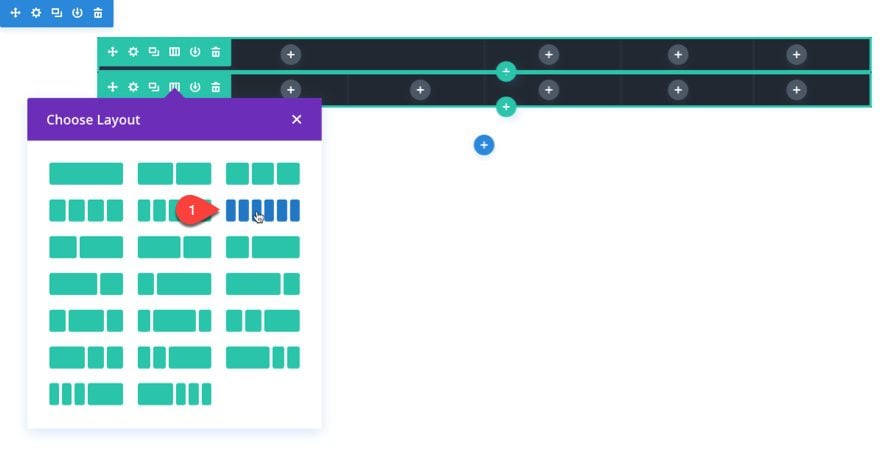
Every new page you design with the Divi Builder is structured using a number of different column layouts. Divi includes built-in column layouts for each row ranging from one column all the way to six columns. But, sometimes, you may feel the need to adjust these columns for even more unique layouts. Today, I’m going to show you a creative way to do just that.
In this tutorial, I’m going to show you a simple design technique that allows you to extend modules using negative margins to occupy more than one column. This technique will allow you to design some unique custom layouts you may not have considered possible.
Let’s get started.
Sneak Peek
To get a better understanding of what we are going to be building, here is a before and after version of the design using this technique.
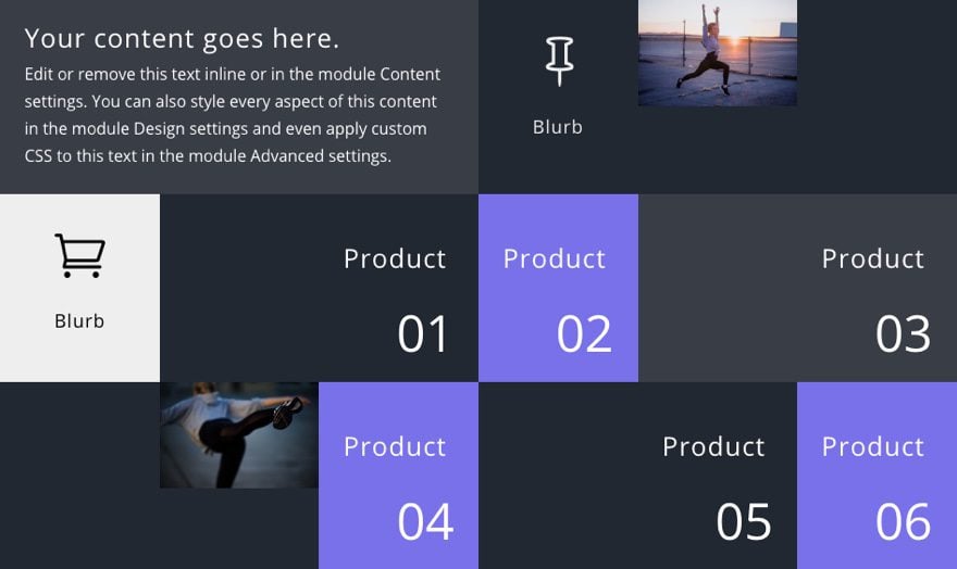
Before
This is the layout design without using custom margins to extend modules to other columns.
After
This is the layout after extending the two image modules and the three text modules labeled with the numbers “01”, “03”, and “05”.
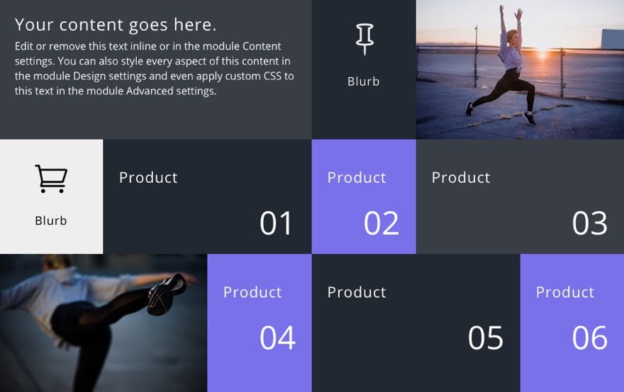
The change is subtle but you should be able to see the that the modules have extended over to occupy the adjacent column. And the only thing needed to accomplish this is a simple margin setting of -100%.
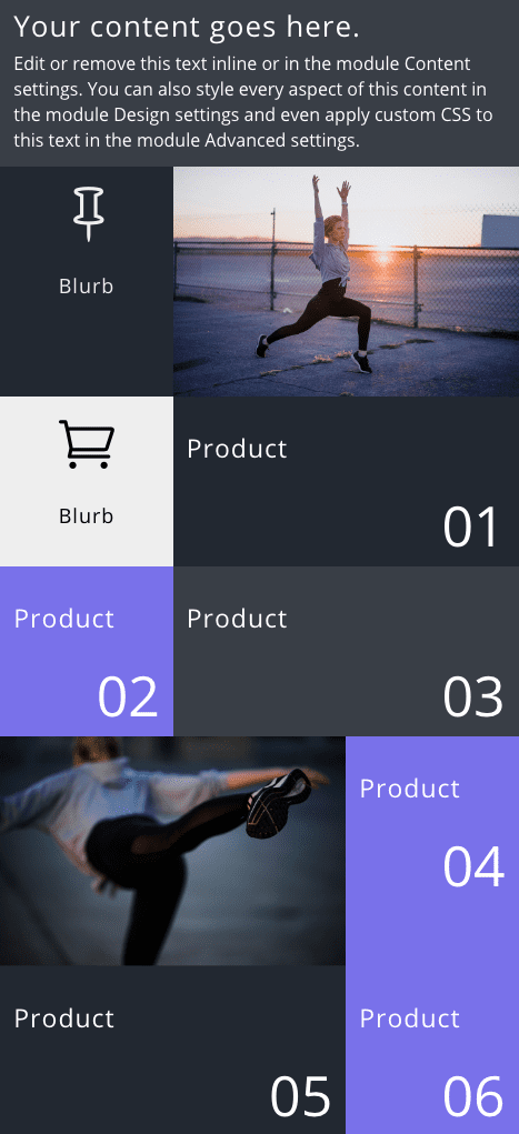
And the result on tablet is even more exciting.
Understanding The Concept
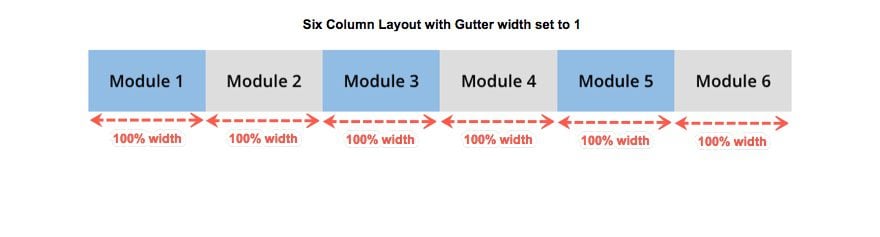
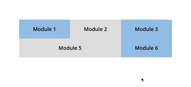
By default, each Divi module has a width of 100% which means each module you place in a column will span the full width of the column in which it sits. Gutter width is what Divi uses to determine the amount of space between each column. So for this tutorial, it is important to set your Gutter width to 1 in order to get rid of that space.
Here is an illustration of how each module spans the full width of a column in a row with a gutter width set to 1.
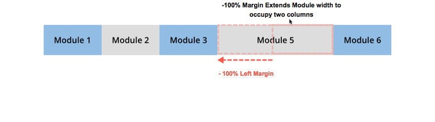
Now, if you add a negative margin (left or right) to a module, you can easily extend that module to occupy more than one column. This allows you to create custom column layouts for your page that you may not have considered.
In this illustration, you can see that by adding a -100% left margin to the module in the column 5, it extends the module to the left to occupy both column 5 and column 4.
And one of the bonuses of using the six column layout is that the design is preserved on tablet nicely.
Also, because of the way the columns are ordered from left to right, modules should generally be extended to the left so that the content will not be hidden behind the column. This is especially true if you have a background color set. So if run into the problem of module content being hidden behind a column, you are probably extending the module in the wrong direction.
Why Use a Six Column Layout?
There are three main reasons to use a six column layout for this design technique. The first reason is that it gives you more columns to work with. The second reason is that six column layouts convert to a three column layout on tablet, which will preserve the design elements really well. The third reason is columns will keep their order on mobile so column background colors will stay the same. This is helpful for grid layouts.
This design also works with the 1/2 1/6 1/6 1/6 column layout and the 1/6 1/6 1/6 1/2 column layout since they both will preserve the three columns on tablet as well.
Implementing the Design
To showcase how this design technique works, I’m going to walk you through the process of building a simple grid layout for featuring products. Then, I’ll show you how to extend modules into other columns to create a custom layout design.
Setting up your Section and Rows
To get started, create a new page and deploy the visual builder. Then choose “Build from Scratch”. Then go ahead and add a 1/2 1/6 1/6 1/6 column layout to your first section.
Then update the row settings as follows:
Background Color: #222831
Gutter Width: 1
Equalize Column Heights: YES
Custom Margin: 0px Top, 0px Bottom
Custom Padding: 0px Top, 0px Bottom
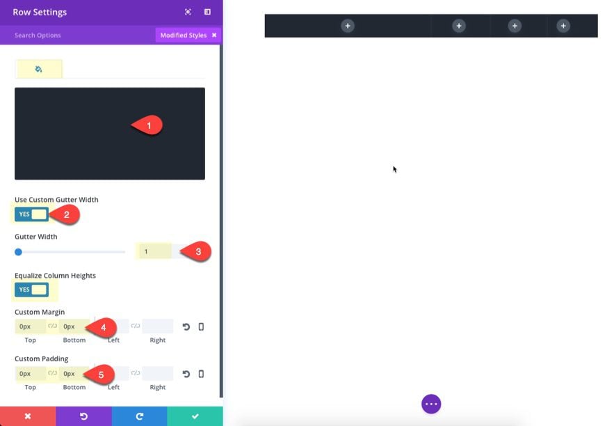
Save Settings.
Since all three rows for this design will share these row settings. Go ahead a duplicate the row to create a second row. Then change the second row to have a six-column layout.
To create the third row, simply duplicate the second row.
Adding Modules to Row 1
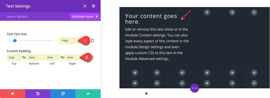
In the first Column of the top first row, add a text module with the following settings:
Text Color: Light
Text Text Size: 16px
Custom Padding: 2vw Top, 2vw Bottom, 2vw Left, 2vw Right
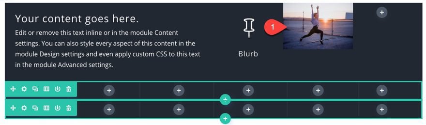
In the second column of the first row, add a blurb module with the following settings:
Title: [enter title]
Content: [delete]
Icon: [choose icon]
Icon Color: #eeeeee
Icon Font Size: 50px
Text Color: Light
Text Orientation: Center
Custom Padding: 3vw Top, 2vw Bottom
Save Settings
In the third column, add an image.
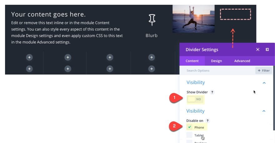
In the last column, we want to leave it empty so that we can extend the image module over to fill that column as well. But we don’t want to leave it completely empty so that the column is active when stacking on mobile. So, the simplest thing to do is add a divider module and choose not to show the divider. Then we can hide the divider for smartphone.
Update the divider settings as follows:
Show Divider: NO
Disable on: Phone
Adding Modules to the Rows 2 and 3
Now let’s move on to Row 2. In the first column copy and paste the blurb module you created in the second column of the first row. Then change the icon and title text to a black color.
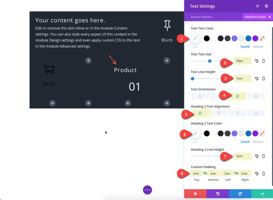
Then Add a Text Module to the second column with the following:
Content:
<h2>Product</h2>
01
Text Text Color: #ffffff
Text Text Size: 50px
Text Line Height: 1em
Text Orientation: Right
Heading 2 Text Alignment: Left
Heading 2 Text Color: #ffffff
Heading 2 Line Height: 3em
Custom Padding: 2vw Top, 2vw Bottom, 2vw Left, 2vw Right
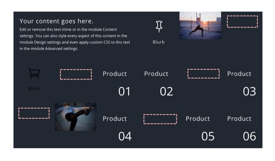
Next Copy the text Module you just created and paste it into column 4 and column 6.
You can also paste the same text module in column 3, column 5, and column 6 of Row 3. After that you can use the inline editor to change the numbers of each of the text modules so you can see how these modules stack up on mobile later on.
In column 2 of Row 3, add another image.
After that fill in all the empty columns throughout your section with a divider by copying and pasting the divider you created in row 1.
Here is what your layout should look like at this point (the empty squares represent a divider module):
Adding Negative Margin to Extend Modules to Other Columns
At this point we can start extending our modules using negative margin. This process is extremely simple to do.
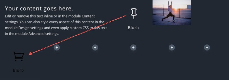
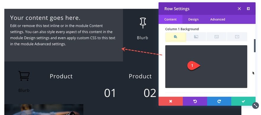
Open the image module settings for the image in the first row. Since we want to extend the image to the right we are going to add a -100% right margin.
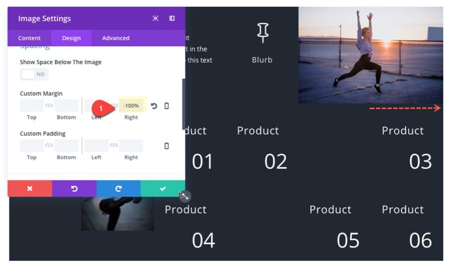
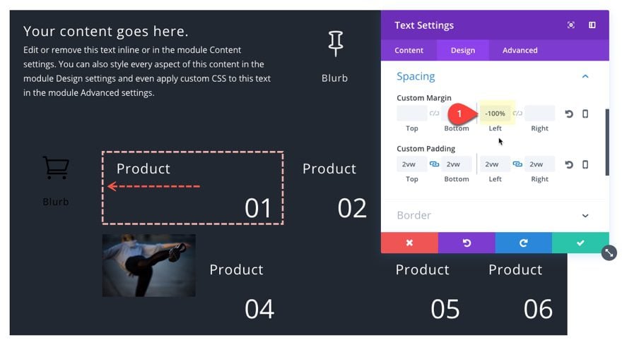
Next, add a -100% Left Margin to the Text Module in Row 2, column 3.
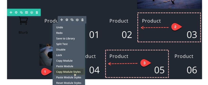
Now copy the module styles and paste those into the text modules in Row 2, column 6 and also into the text module in Row 3, column 5.
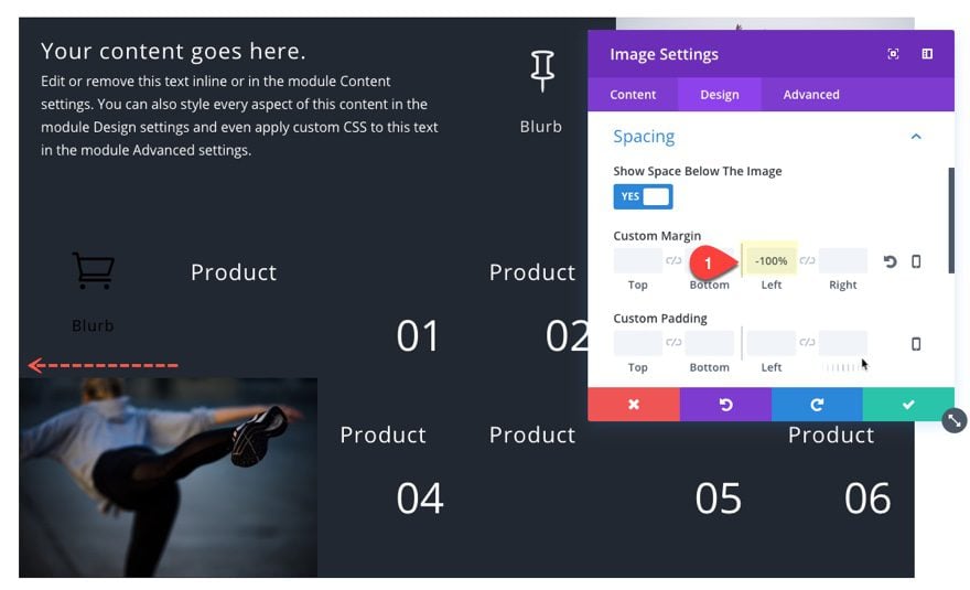
All that is left is to extend the image in row 3, column 2. Update the image module with a custom margin of -100% Left.
Adding background Colors to your columns
The last phase of the design is to add background colors to your columns. For the first (top) row add the following:
Column 1 Background Color: #393e46
For the second row, add the following:
Column 1 Background Color: #eeeeee
Column 4 Background Color: #7971ea
Column 5 Background Color: #393e46
Column 6 Background Color: #393e46
And for the last row, add the following:
Column 3 Background Color: #7971ea
Column 6 Background Color: #7971ea
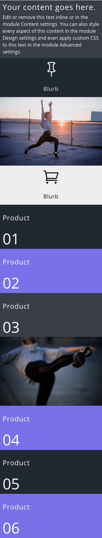
That’s it for the desktop design. Now let’s make sure things are looking good on mobile.
Adjusting the Layout for Smartphone Display
Right now, the current layout will look great on desktop and tablet, but those negative margins that we added will need to be adjusted on smartphone.
Normally, if I wanted to fix the negative margin on smartphone, I would just set the left margin to 0% within the module settings for smartphone devices. However, there will still be an adjustment needed for screen sizes between 479px and 767px wide. Because of this, the best way to fix the negative margin on smartphone is to do it with a snippet of custom CSS.
Go to page settings and add the following Custom CSS under the Advanced Tab:
/** Fixes negative margins on smartphone**/

@media only screen and (max-width: 479px){
.et_pb_module {
    margin-left: 0%!important;
    margin-right: 0%!important;
}
}
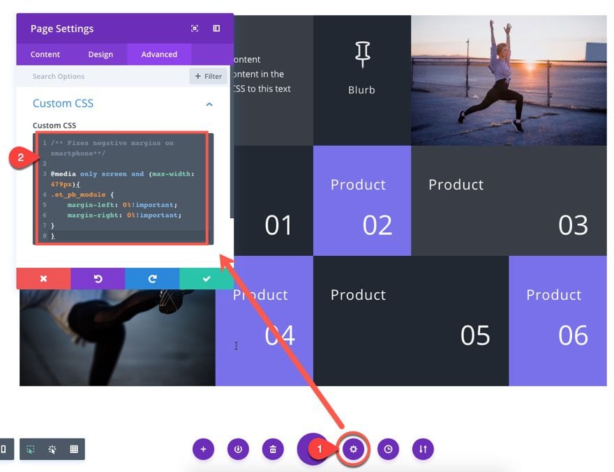
What this CSS snippet does is set the right and left margin of all modules to 0% whenever the screen size is equal to or less than 479px wide. This fixes the problem nicely!
Now let’s check out the final design.
Final Thoughts
Using negative margin to extend modules can be a convenient way to get unique layout designs on desktop and tablet without having to resort to a bunch of CSS to change Divi’s default column layouts. And one of my favorite things about this design technique is how beautiful the layout looks on tablet. Hopefully, it will come in handy for your next project. If anything, it always helps to get a deeper understanding of Divi.
I look forward to hearing from you in the comments.
Cheers!


Would be possible an enhancement? I’m suggesting it.
I’d like to make sure that by clicking on some particular modules, they would occupy a double or triple space both in height and width, maintaning the grid, in order to be able to view either larger images or show videos staying in the same single page, rather than open a new one.
How could I implement it?
I really wanted to implement this on a website I am building and it looks really great on the desktop and tablet, but I can’t get it to work right on the phone. When it changes to a single column as on a smart phone, some of the top picture is cutoff (is there an optimum size for images or should the media queries set the image width to 100%). The bottom picture slides off to the left of the screen showing only half of the image
Ian,
Did you add the custom CSS to your page? This should fix the design on phone.
Thank you, great tutorial! I’ve some issue. I followed it all. In the visual builder it works exactly like the tutorial. I saved and published the page. however, when I try to view the page in any browser (maxthon, brave, firefox, edge, chrome) the images remain small and in the text modules the negative spacing seems not to work. what could have happened? Thank you for a little help.
Set the module width to 200% and then set the margin to -100%. This should fix your problem.
Thanks!
Tnx, now it work!
Great post, I really like the way you layout the format of the post. And,
thank you for sharing all the Ideas and resources from the conference.
Oops, it works for desktop, but not for mobile. I have been trying and get the one in the first row by changing mobile to 100% again, but the one in the third row dissapears if you do that. Can’t get it right yet.
Whit the new update this kind of things doesnt funtion – you can help us to make that this funtion, the new update broke to much in my page!!
Luis,
For each module you want to extend to the other column, just set the module width to 200%. This will fix the problem.
I got it. Width for mobile to 100% and margin for mobile to 0 again for the third row image works.
Oops, it works for desktop, but not for mobile. I have been trying and get the one in the first row by changing mobile to 100% again, but the one in the third row dissapears if you do that. Can’t get it right yet.
That works! Great, thank you.
If you are experiencing any issues, be sure to open a support ticket so we can help you out!
I tried implementing this, and it works in the Visual Builder, but once it’s rendered, the -100% margin isn’t being applied as described. On my end, the modules stay within the cell they are placed and do not extend in the direction of the -100% margin.
I’m running the latest Divi version.
Emilio,
Looks like the easy fix is to set the width of the module you are extending to 200%. That seems to work for me.
Thank you kindly. That achieves the desired outcome.
Oh yes, I had totally misinterpreted where to apply the 200% ! Thanks for your reply, it works a treat now!
Hey Jason. Thanks for this tutorial, LOVE how this looks. Except that I’m having the same issue and extending the image and text modules to 200% doesn’t appear to work for me. 200% for the images don’t seem to make any difference. 200% on the text modules pushes all the text to left of the module.
Looks like a few people are experiencing the same issue. Is this already being addressed or should I raise a ticket for it (don’t want to bombard you guys tickets unnecessarily!).
Sharon,
I think I may have confused you. Set the image module width to 200%. Then give the image module a negative margin of -100%.
i have the same problem y think the last update change everithing
Same here, I’m following.
So great!, I’m exicted with this.
Thanks!.
Why not a Json file for us to download? It would add a greater value to the post. I’ll keep asking for a download link every time I see a layout tutorial. 😛
I agree a Json with their tutorials would be a nice addition to Elegant themes 😉
Beautiful! Love it!
Hello,
Thank you for your tutorial.
Hello
Thank you for this tutorial.
To have a presentation like yours, I have
enable “Harmonize Column Heights” on yes.
But this presentation is really very interesting.
Bruno,
Technically, you can do without the “equalize column heights” and just add background colors to the modules. But you are right, it would be difficult to accomplish the same grid design. Thanks for the comment.
Hey,
Cool to see the video tutorials back again. I actually missed them in the recent weeks, where I just found some tutorials without videos. I really estimate these cool video tutorials!
Thanks for this one 🙂
Cheers
Urs,
Sometimes the post will go out before the video, so if you don’t see a video, be sure to check the next day or so. Glad you liked it!
I’m not sure whether it’s the images I used or not, but the padding for the individual modules through the images out, and they didn’t work on Tablet 🙁
Love the look of the design though…
Ashleigh,
Make sure you add dividers to columns that are empty. If you don’t, the design will be broken on tablet. Hope that helps.
Finally! This is a method I had never considered to accomplish this task. I have built custom modules that use CSS Grid to accomplish this kind of design concept. I still think that the CSS Grid method works better because I have vastly more control. Plus, I already have my modules built, but this is a nice alternative to creating this kind of design. Thank you.
David,
Thanks for the comment. Glad you liked it.
I agree that creating the grid layout ideally should be done in CSS to provide a more solid framework. But this alternative is just so easy to do I had to share 🙂
Nice, can you show your CSS Grid Divi site? 🙂