
One of the most underused and underrated features of Divi is the opacity slider. You can find it in many different places in the builder, giving you minute control over exactly how all of your modules and their elements appear in relation to others near them. You can also combine Divi’s opacity features alongside transparency in images (PNGs) to give your site’s elements the illusion of being stacked on top of each other. Best of all, you can do it without having to mess with the nuts and bolts of CSS float and z-axis.
In this tutorial, I want to show you how the Divi Builder can be used to combine these elements into some pretty neat sections or module combinations you can adapt to your own website.
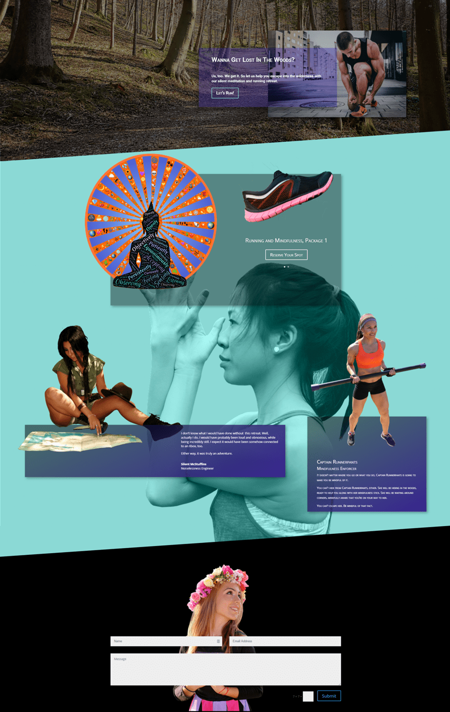
Preview of End Result
Here are some examples of what you’ll be able to achieve after this tutorial. The examples are laid out in sections to show how they interact with other elements and backgrounds, but not as a functional site.
Creating the First Section
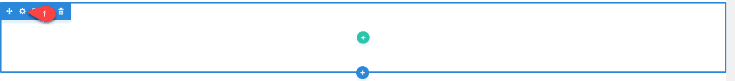
Start out by creating a new page in your WordPress dashboard and selecting the Blank Page template. You’ll need to open the Section Settings by pressing the blue gear.
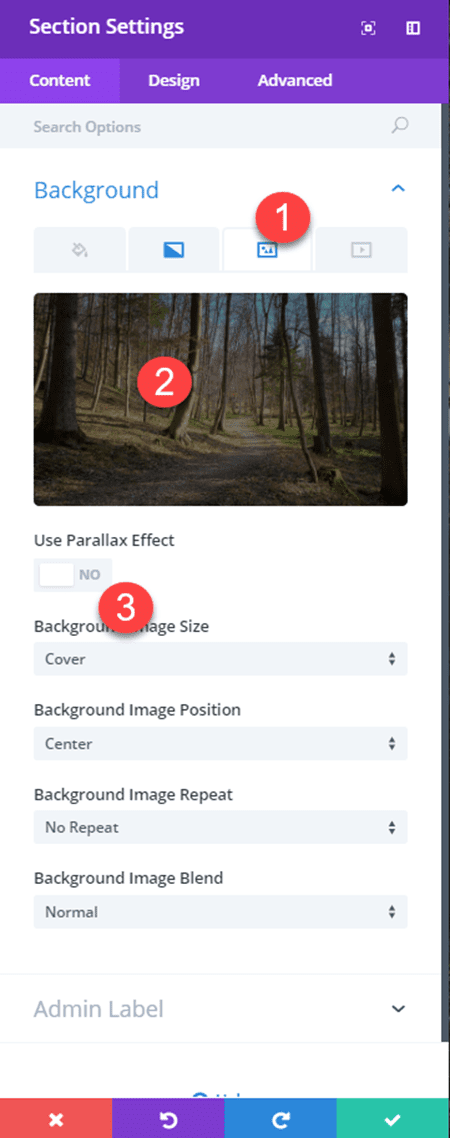
You then click into the Background tab and choose the third tab for adding a background image. Upload your choice and make sure you have the Background Image Size to Cover.
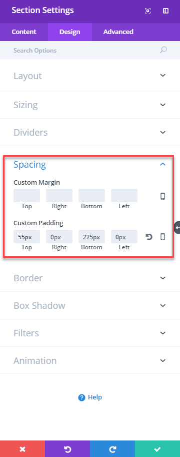
After that, you’ll change Custom Padding in the Spacing section of the Design tab to
- Top: 55px
- Bottom: 255px
Now you can start adding in the elements for the modules that you’ll be stacking. First, add a new double-column row and go into settings. From there, set the Alignment to Right and Custom Margin to 10% under the Design tab.
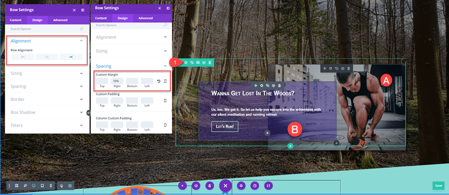
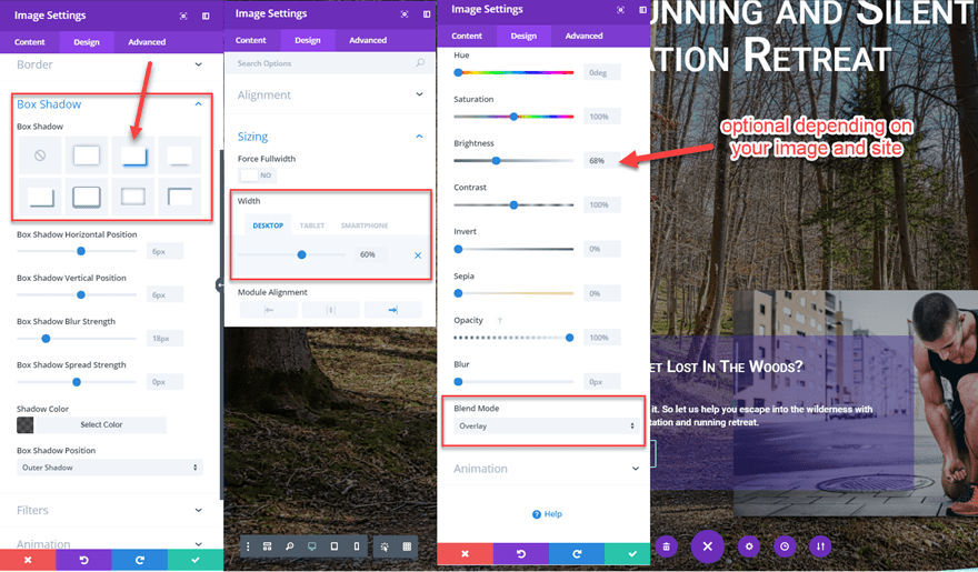
Within the single-column row, add an Image module on top (A in the image above), and a Call to Action module (B) under it. Go into the Image module’s settings first and change these values in the Design tab:
- Box Shadow: Option 2
- Sizing, Width: 60%
- Filters, Blend Mode: Overlay
The blend mode filter is incredibly important because that is how you will make sure any element under the image (the CTA module in this case) will overlay and stay on top of the image itself. This is how you’re avoiding the float and z-axis CSS. The filter helps the visibility and coloring, while the negative margins and padding affect positioning.
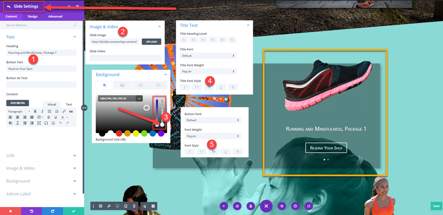
Text Module Settings
In the Text module settings, you will adjust a lot of stuff.
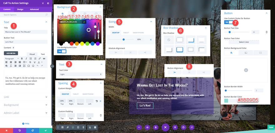
- Content tab: fill in any title you want for a headline, button text to convert your traffic, and the content area will be any copy you want superimposed over the image.
- Background: rgba(57.37,145,0.43). The important part is the 0.43 or the right-most slider. That’s the opacity percentage, or how much you can see through the background itself.
- Under the Design tab, the text color should be Light
- Spacing: to move the CTA box from beneath the image, you will make a -30% Top margin and 30% right. They should now be overlaid.
- Sizing, Width: 60%
- Box shadow: second option
- Button: Use custom styling, then set the text to white (#ffffff) and the button border color to #8BD9D5 which is going to be the same color as the background of our second section. So if you’re changing that, change this, too.
- Button alignment should be to the left.
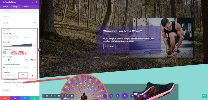
And finally, you will go back into your Section settings and set a bottom divider. You’ll pick the top choice from the dropdown (a slant), flip the divider upside down, and set the color to #8BD9D5 to match the upcoming section. Make sure the Divider Arrangement is set to “Underneath Section Content” so that your next section’s content appears above it, too, as you adjust their margins. Once that’s in place, you’re done with your first multi-level transparent overlay without CSS! Congrats! It should look like you’ve aligned these using different z-axis values and other positioning code.
Creating Section Two
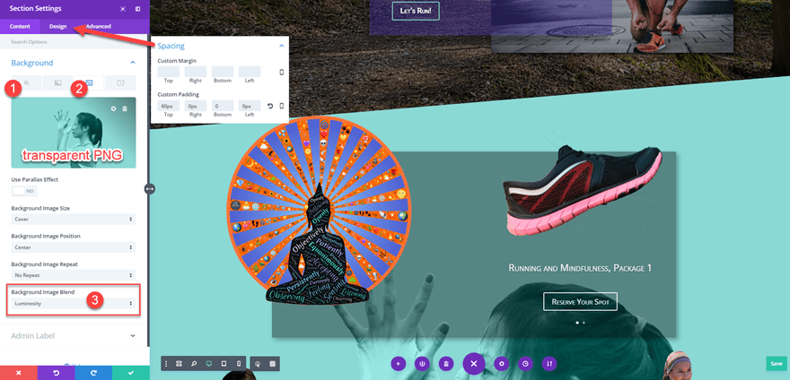
First off, creating the middle section is exactly like the first. When you’re in the settings, though, we are playing with the background a little.
- Set the background color under the first tab to #8BD9D5.
- Add your background image under the third tab. Use an simple image of a single subject with a transparent background and use Cover as your size.
- Select Luminosity as your Background Image Blend to match up the colors (if you chose to use parallax, the color blend won’t work).
- Under the design tab, give the section 60px Top Padding under Spacing.
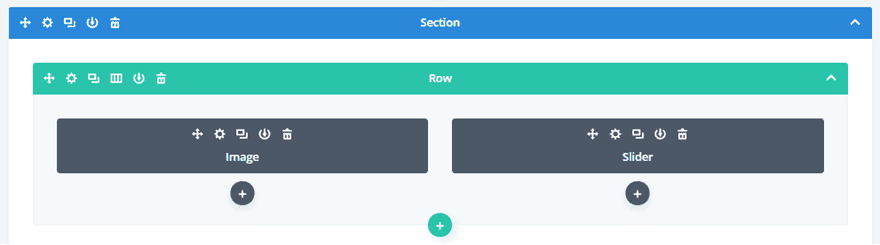
Row 1
Now, you will need to add a double-column row with an image module on the left and slider on the right. When those are added, go into the Row Settings.
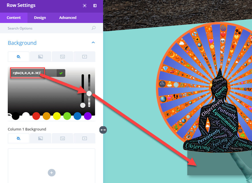
You have just two changes here: make the background black with a 38% opacity and add the same box shadow as before.
Corner Image
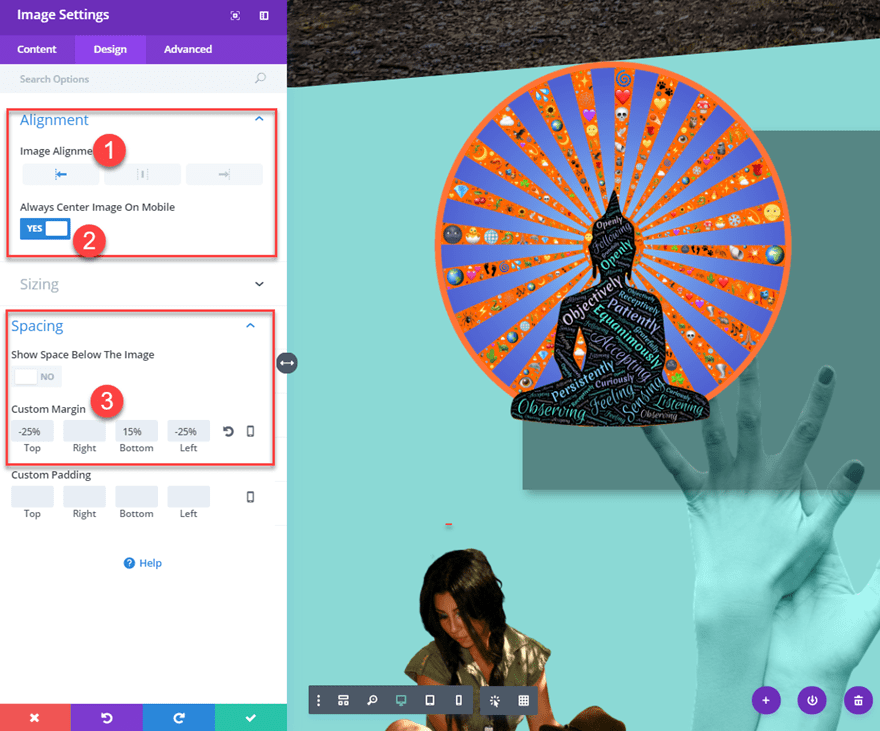
Now it’s time to set up the image that’s floating over the corner. Inside the Image module’s settings, upload your image. Again, this one works best with a transparent PNG, just for effect. We are going to overlay the image on the corner, so a shape other than a 90 degree angle will be a much better look. Once that’s done, the Design tab awaits.
- Image Alignment: Left
- Always Center Image on Mobile: Yes (just looks so much better, and it retains the upper overlay)
- Top Margin: -25%, Bottom Margin: 15%, Left Margin: -25%
Those negative margins let you get that image wherever you need it on the page, and because you set the divider to be under content, it’ll float above that, too.
Slider Module
For the Slider Module, it’s a bit trickier because you have to add individual slides with their own images and such. It’s not that bad, though. The main thing you’ll want to pay attention to is whether you’re in the Slider settings or an individual Slide’s settings.
The primary element you’re worried about in the general Slider settings is the Custom Margin under the Design tab. Set it to -30%. Your slide images will always push just slightly above the row’s background this way, drawing more attention to them than sliders typically get.
- Add a slide. Under the Content tab, the heading and button text are most important. If you want descriptive copy, do that with the content box.
- You need to add a Slide image in the content tab, too. It is good to be a transparent PNG of a single focus item here, too. Round images work well here, too. Square-edged ones look out of place.
- Under the Slide settings, you can change the background of each individual slide. Don’t. What you want to do is set the opacity slider down to 0%. Anything else will clash with the row’s background.
- Set the title text to have small caps.
- Set the button to small caps, too.
Row 2
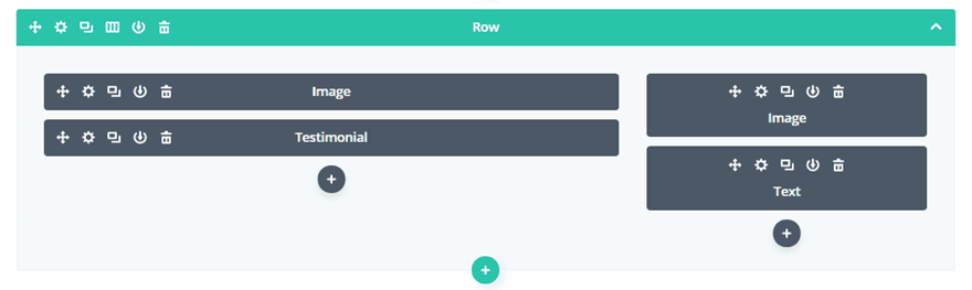
The next row is pretty cool, if you ask me. We will use use a Testimonial module here, as well as text and images to achieve a couple of different overlay effects. We will add padding to extend a module beyond its bounds, while taking another image and resting it on top of the new padding, to make it look like the figure is sitting on the edge.
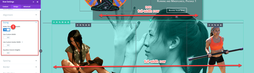
The only setting you really need to change for this row is under the Design tab. Make sure that the toggle for “Make This Row Fullwidth” is on. The difference this single option can make for spacing is amazing.
Two Images, Similar Settings
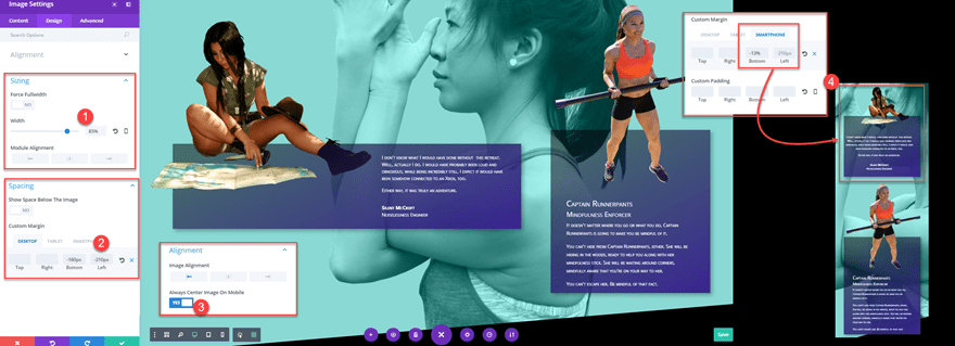
The two images in this row do have very similar settings. They’re pretty simple to get their overlays working, too.
- Width: 85% for left image, 100% for right image
- Spacing -160px Bottom and -210px Left Margins for the left image, and leave as default for the right
- Both images should be aligned left, and always centered in mobile
- For the left image, you will need to adjust the breakpoint spacing. For this one, it will be a -13% bottom margin. No changes will need to be made to the right one.
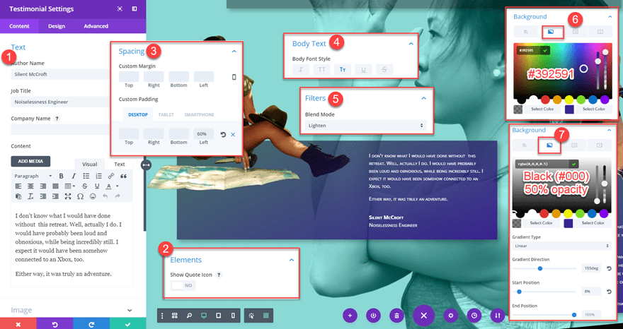
Testimonial Module
The Testimonial module has a lot of moving parts, but none of them are really tricky. You just have to play with it to get everything aligned. If you want, you can do most of this with the text module, too, but I like the styling of the testimonial personally.
- Fill out the testimonial author’s name and information. The testimonial itself will go in the content box.
- Below the text area, an you can turn on or off the quote icon, depending on your decisions. It is aligned center with the text.
- In the Design tab, you are adding 60% Padding to the left of the module. Not Margin. That 60% Padding is where Silent McCroft is sitting in the image above.
- Under Body Text, again go with Small Caps, and you can add a Box Shadow if you like it. I do, so I did.
- With the Blend Mode Filter, this time you will use “Lighten.” The transparency of the testimonial’s background calls attention to the fact that we’re not actually adjusting the z-axis of the elements. We use the Lighten filter to keep the colors from bleeding together, giving the illusion of the image is being rendered on top, rather than being recolored.
- For the background itself, we are using just the gradient tab (the second one) instead of a background color. If you have to, set the background to 0% opacity like before. Otherwise, just use a Linear Gradient with 155deg Gradient Direction, 8% Start Position, and 100% End Position.
- The first color should be Black (#000000) with 50% opacity, and the second one should be Purple (#392591) with 100% opacity.
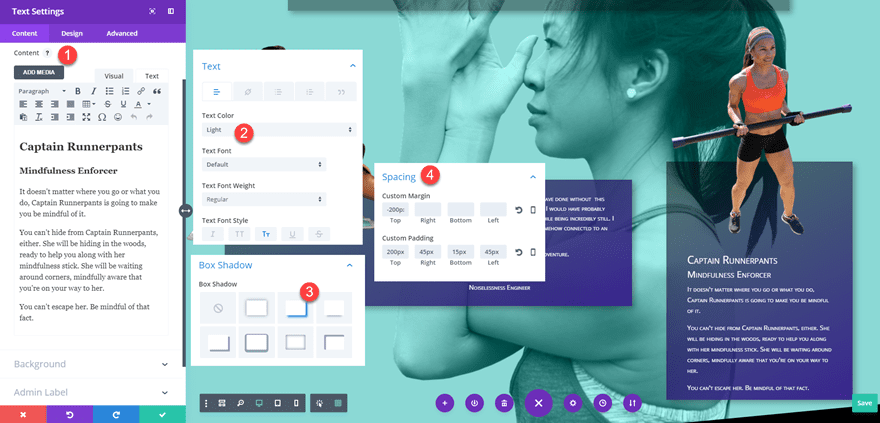
Text Module
Finally, we have the text module to the right. Instead of a testimonial for your business, perhaps, I wanted to use this as either a featured-event section or even a team member bio. Styling it is very similar to the testimonial. It uses the same gradient background colors, so you can just copy/paste those into the module settings. You are almost done!
- Fill out the text area however you want. I’ve used H2 and H3 tags to give different headings and subheadings, such as name and position. Then I wrote a quick description in the content area.
- For the design of the text, I made it all Light in color and, once again, Small Caps.
- The same box shadow goes around the module.
- The Spacing area is where things get fun. We want a negative margin on top of -200px, which shoves the module in-line with the image it’s stacked with. That will make the text illegible. So we need to add a 200px Padding as well, to put the words back in their original position, while keeping the gradient background behind the image of Captain Runnerpants and her Mindfulness Stick. You should also add 45px padding to the Left and Right, as well as a 15-25px padding on bottom. That will keep it nice and stable on multiple screen sizes.
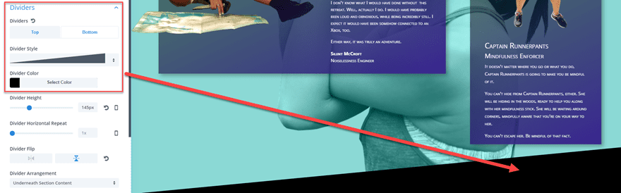
Finally, you will add a bottom divider to the section itself. This time, I went with a solid black slant and a solid black section background as a contrast to the softer feeling of the top two sections.
The Final Section
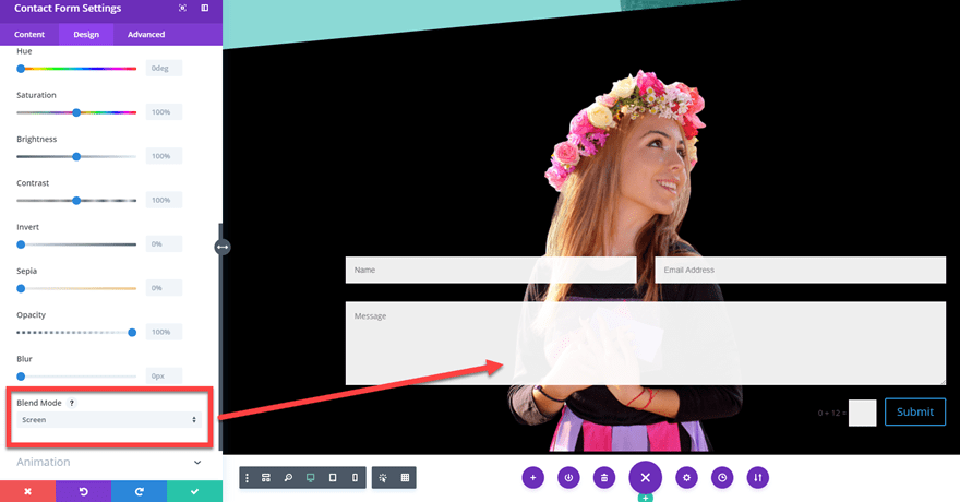
The third and final section I wanted to layer using built-in transparencies. I’ve always loved backgrounds that kind of merge with the elements stacked with them, so I took an image with a transparent background of a woman and wanted to overlay the Divi contact form over it.
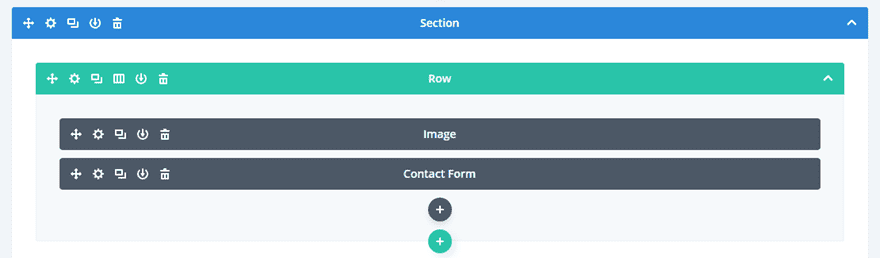
Literally, the only change we make to the section settings is giving it a black background. So do that first. Then you need a single-column row, and you don’t even have to touch the settings. You’re welcome. All you have to do now is add an Image module and a Contact Form module. When you’ve got that done, open up the Image settings. You will just be changing a single option here: the bottom margin.
- Desktop: -350px
- Tablet: -100px
- Smartphone: -50px
That’s it. It doesn’t even take a lot of tweaking to get them to line up. The Lady of the Contact Form is easy to get set up. And as for the Contact Form settings? You don’t have to do a thing. This example is solely using the default styling. Since it’s transparent when it’s added to the layout, the PNG background blends right in.
However, if you do want to a very subtle visual shift to the contact form, go into the Design tab and change the Blend Mode Filter to “Screen.” Doing so will make the fields on the firm ever so slightly translucent, so you see a faint ghost of the image behind it. These are the kinds of effects that make site visitors smile. It’s not quite a microinteraction, but it has that same kind of effect.
Kinda neato, huh?
That’s It and That’s All!
Hopefully, y’all thought that was as fun as I did. Being able to do cool stuff like overlays and multi-layered designs without CSS is super cool. So if you’re ever looking for a way to spice up your designs, think about making stuff see-through. Yank around the images and elements with negative margins, and you’ll be well on your way to taking your designs to a whole new level.
What are some design tricks you’ve used to make elements interact in new and interesting ways?


Great tutorial and examples.
Thank you! Yeah, there’s so much stuff packed in there, I tend to learn something new every week by watching one of the live streams. It’s nuts!
I love the blend modes available in Divi – but these aren’t compatible with microsoft edge or IE – so I can’t use them as a lot of people still use these as they come with the operating system! I only wish there was an easy work around for this – would save a lot of time in photoshop etc.
Looks quite good and completely agree with these elements used to build quality design.
This is a good way to spice up the website design (especially the Header Part) and will apply on my website too. The image explanation with the steps (1,2,3) is something awesome for me to understand the process easily.
Thanks, BJ for this wonderful tutorial.
Great tutorial and no doubt about it.
I have only one query that can we use different padding, margin, height, width and opacity according to our website or need to use listed size only to get a better design quality?
I liked the way of explanation and yes, no need for the video explanation.
Waiting for the next tutorial for Divi theme!
Yeah, feel free to use any amount of padding and margins that work best for you. The values I listed are just the ones I used to create the specific elements above — each site and its unique assets will require its own.
Thanks for another great tutorial. This theme stands head and shoulders above many others, including some of the ones I have recently bought thinking that the theme wasn’t capable but clearly is.
I love the live streams but these tutorials, whilst costly in terms of time to make, are invaluable as a reference.
I love the look of the opacity overlay! I have to say that my eyes were rolling back in my head trying to follow all this though. I guess it will be easier when actually follow this step-by-step. Is there a video version of this tutorial?
There’s not a video for this one, as of yet. I am the same way when following one of these, myself. It does tend to work out for me when I go step-by-step and don’t try to take it all in at once and remember. The first written tutorial I ever used from ET was a 3-parter, so I had my trial by far that way, haha.
Thanks for tutorial
Divi is a WordPress Theme so full of resources that is easy not to pay attention to all its amazing features. This one with the opacity slider is really cool and for sure I will use it soon. Great explanation too.
Thank you! Yeah, there’s so much stuff packed in there, I tend to learn something new every week by watching one of the live streams. It’s nuts!
Hi BJ,
One small request. I see this isn’t one of the layouts we already have access to. We can go off to get our own assets for this but for brevity and time saving can you please zip all the images for download.
+1 for this request. Access to the tutorial images would make it much easier to follow.
Thanks for the tutorial though. Much appreciated.
Hi, folks! All of the images in this tutorial are from either Pixabay or Unsplash with a non-attribution/commercial license. I don’t, however, have the rights to distribute them. Sorry!
Ok, get you Will see if I can find them…
Great tut, thank you. I like how you’re adding humour in there. Two questions. 1) when it comes to positioning elements, do you have a heuristic to decide whether you use padding or margins? In the case of negative margins, obviously, you can’t use padding, but under normal circumstances, padding and margin can equally be used. 2) Is there a reference anywhere you’ve seen that explains what each filter is doing with examples? Ok, 2b) why does enabling parallax disable filters?
Hi, Emilio!
1. I pick margins over padding when I need to move the element around. Since padding adds “mass” to the element itself, I use it when I need to specifically adjust the element’s visual style (sometimes as simply as giving bleed for a background around text, or giving the explorer above a place to sit). Margins aren’t attached to the element itself, which is why they can be negative. They are solely there for spacing and positioning.
2. I can’t seem to find one!
3. #shrug I can’t figure that one out myself, I’ll be honest.
Looks good! However I find that the layouts are all over the place on certain devices even after adjusting padding and margins for these devices.
Also, on a side note – I think a video tutorial would have been good, but instructions are clear anyway.
Thanks
I am currently dealing with GForce’s problem myself. Simple layout but moved a text box over an image hanging over the left and bottom of the image. Made changes using template and smartphone options in Visual B and when I looked on my smartphone things were totally messed up. I’ve spent hours trying to fix it and it’s still not right. Until the responsive system where I have to go multiple places to make changes and try to look through grayed out sections and assume I can see the actual spacing between elements, I’m going to pass on these wonderful but over-the-top projects. They just don’t translate easily to responsive sites.
Completely agree with GForce Web Design. A video would have been so much easier to follow.
I do like the effects that you have achieved. Will be interested to see how they display on different devices, including high res monitors which have caused me trouble with other designs.
I’m not a video guy, so I apologize for that. I hope that we can go back and add videos to tutorials like this one that don’t have them eventually.
I don’t think you’d get very much out of a tutorial video I made about it, haha. 😉