")
If you’ve ever tried building an image gallery manually, you know how quickly things get messy. Uneven images, misaligned rows, and unresponsive designs turn a simple gallery into a layout nightmare.
Even in Divi 4, complex image structures often meant stacking multiple rows and specialty sections, tweaking spacing, and hours of manual customization. But with Divi 5, you can skip all of that.
Thanks to its new Nested Rows feature, you can build more advanced image gallery structures. In this post, we’ll show you how and provide you with 6 gallery layout designs to give you a head start.
👉 Divi 5 is ready to be used on new websites, but wait a little before migrating existing ones.
Using Nested Rows To Build Complex Layouts
Divi 4 already had everything you needed to build image galleries, but creating complex layouts often felt clunky. Divi 5 introduces Nested Rows that give you a faster and cleaner way to build advanced gallery layouts visually, with no hacks required.
Subscribe To Our Youtube Channel
What Are Nested Rows?
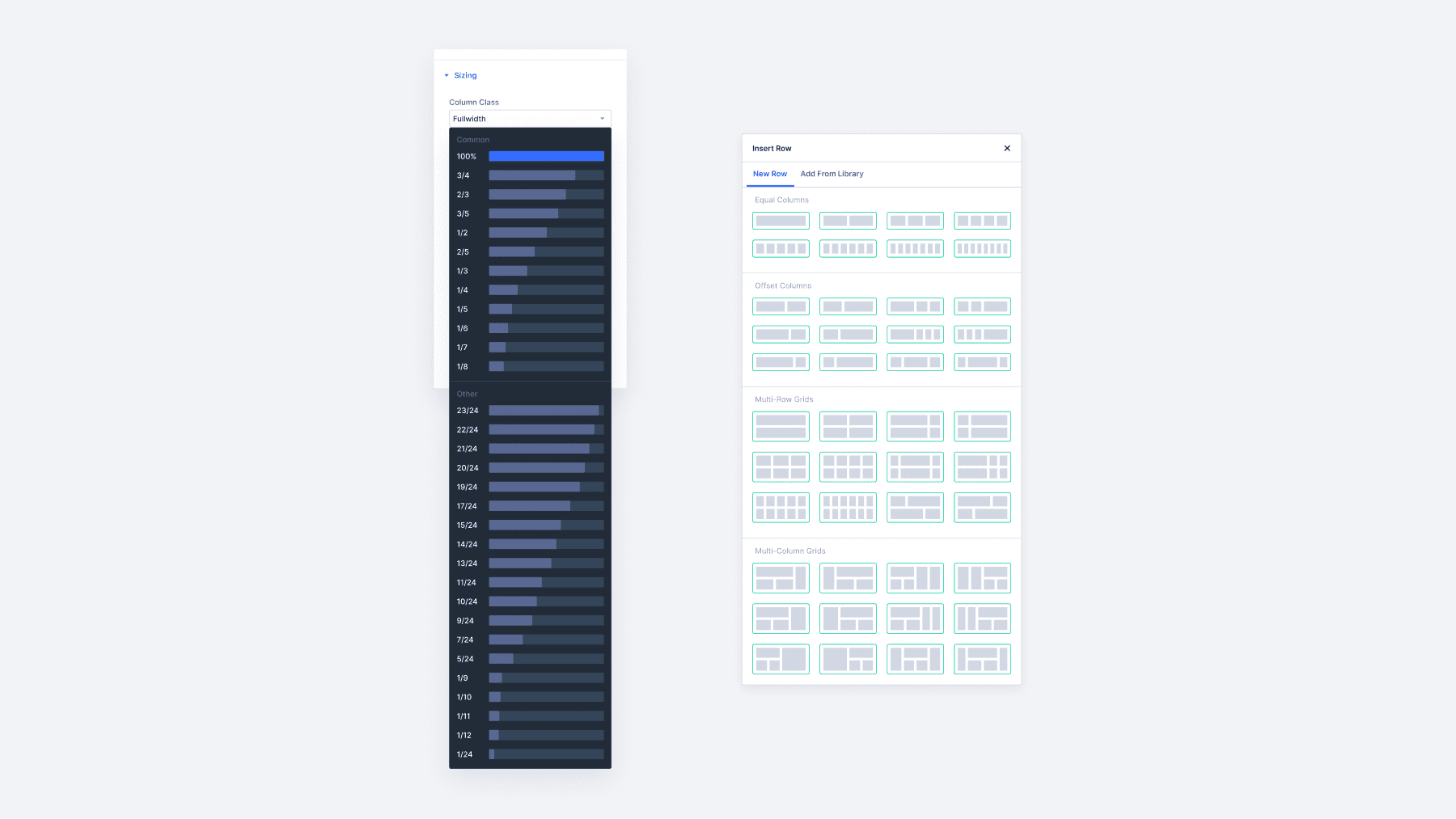
Nested Rows are a powerful new layout feature in Divi 5 that allows you to place one row inside another, giving you more control over how you structure your page. This makes it possible to design complex sections directly inside the visual builder without needing to write code or rely on workarounds.
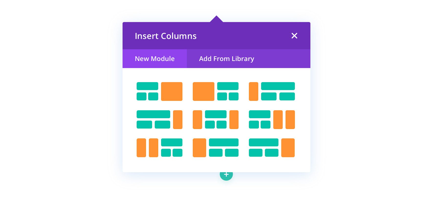
Nesting a row is like adding another module. You only need to hover over the element where you want to place your row and click the plus button to choose New Row. Then you can choose from all these row layouts, which are perfect for various gallery structures.
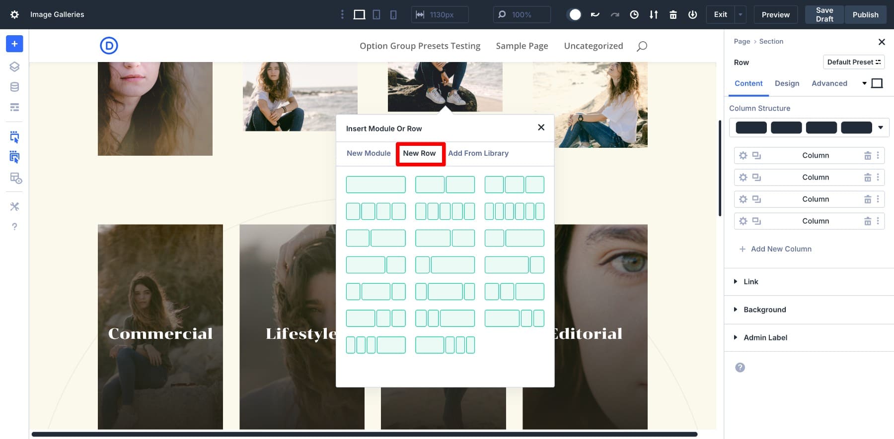
This Nested Row behaves exactly like a regular row. You can choose a column structure, add modules, and nest another row if needed — thanks to its infinite nestability. You can also resize columns by dragging, so adjusting widths feels intuitive and doesn’t involve math or spacing hacks.
Nested Rows are also fully responsive by default. Right from the builder, you can tweak your layout across various screens. Since it’s part of the Divi 5 framework, it works perfectly with other features like Option Group Presets and Design Variables. We’ll also share tips for combining Nested Rows with Divi 5’s advanced features to optimize your gallery design workflow.
Learn Everything About Divi 5’s Nested Rows
What Makes Nested Rows Different?
In Divi 4, building custom image gallery layouts involved creatively using rows, specialty sections, and layouts to achieve more advanced designs. This meant that it would be challenging if you didn’t have design know-how. And even if you had the experience, you were limited to a few layout structures.
Nested Rows offer a more intuitive approach. You no longer have to rely on separate rows or specialty sections. You can easily nest rows and mix and match them with modules to create unlimited design patterns. Want to create a product showcase? Create a two-column row, add your featured image on the left and description on the right, nest a three-column row under the left image, and add supporting images. Your imagination is the limit!
6 Image Gallery Layouts You Can Build With Nested Rows
To give you a glimpse of what’s possible, we’ve created six image gallery layout designs with instructions on how Nested Rows were used to design them. Let’s go over them.
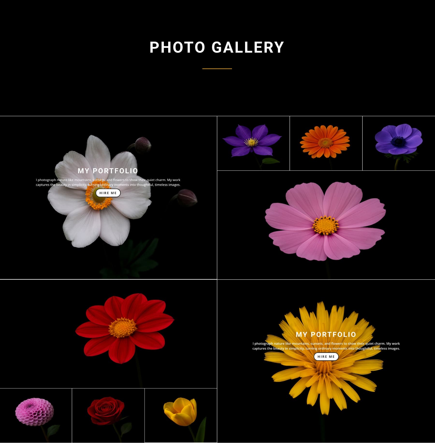
Layout 1: Inline CTA Gallery
The layered grid layout uses a modern, magazine-style grid that highlights one project with a combination of large visuals, supporting shots, and carefully placed text. The first section is a 2-column Nested Row (nested in another 2-column row) featuring two images, and next is another big image. A horizontal text banner breaks the grid, adding context and a call-to-action. The bottom section brings another three-column layout to continue the story, but with room for a longer text description.
This design is perfect for portfolios, real estate showcases, or editorial layouts that require visual rhythm and clear content hierarchy. It works beautifully across screen sizes while still feeling structured and intentional.
How To Build It
Start with a two-column row. Add one image on the right and nest another row in the left column. Add pictures to all. Then, another Nested Row is placed under a banner to hold a text paragraph alongside another set of visuals. Repeat the entire structure or make a few changes, like putting the text row about nested images.
This layout is unique in how Nested Rows are used inside each visual section. Divi 5’s Nested Rows allow for structural flexibility, mixing row formats inside a single column and layering them under contextual elements.
Layout 2: Split Focus Gallery
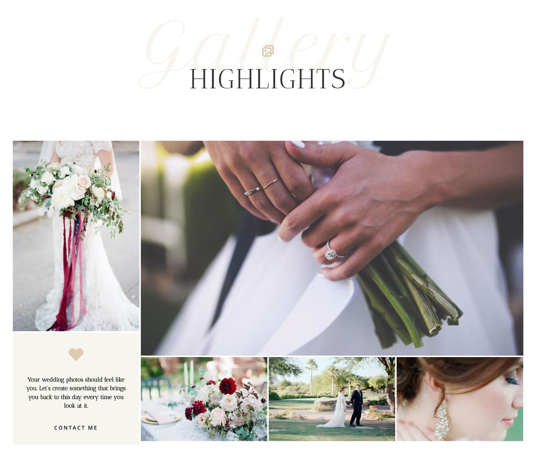
A two-column layout where the left column stacks a vertical image above a short text block, and the right column features a large image followed by a row of three smaller supporting images. This arrangement highlights one main visual moment while allowing space for both written context and a secondary image strip within the same layout.
The split focus gallery layout is perfect for wedding, event, or floral galleries where each visual block captures a single moment or emotion. It also works well when you want to combine a bold focal image with supporting thumbnails and a small quote, testimonial, or intro message alongside.
How To Build It
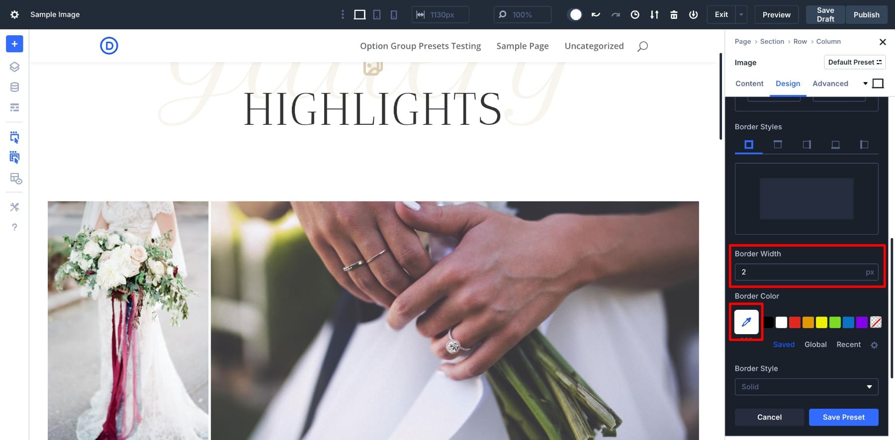
Create a 2-column row. In the left column, stack a vertical image on top and a Text Module below it using two separate rows. In the right column, insert a single Image Module at the top for the featured photo, then add a Nested Row with three columns directly beneath it to hold smaller supporting images.
The key is adjusting padding and setting the gutter width to 1 in the Nested Row to keep everything tight and clean. Later, when you’ve added the images, create a border preset (set border width to 2 and border color white) and apply it to all elements.
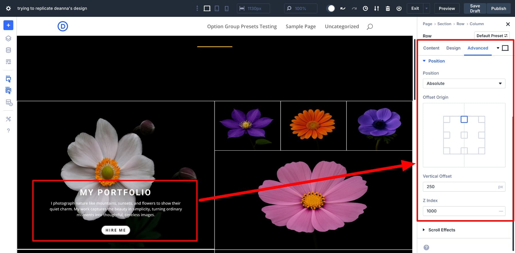
Layout 3: Project Spotlight Gallery
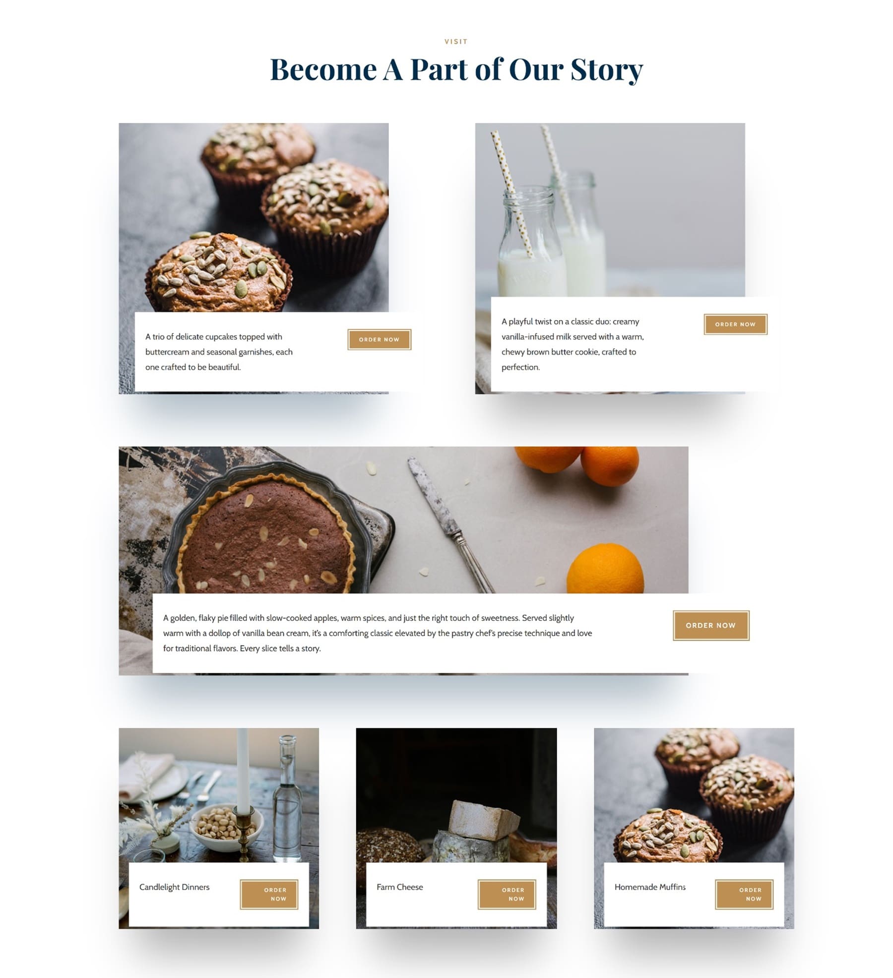
This layout transforms your image gallery into a showcase of individual projects or offerings. Instead of just displaying visuals, each item gets its own label and call-to-action, making it ideal for portfolios, recipes, product highlights, or case studies.
A short two-column row follows each image. The left side contains a quick description or project name, and the right side features a button inviting the user to take action, like Order Now. The project spotlight gallery layout brings more purpose and interaction to your gallery.
How To Build It
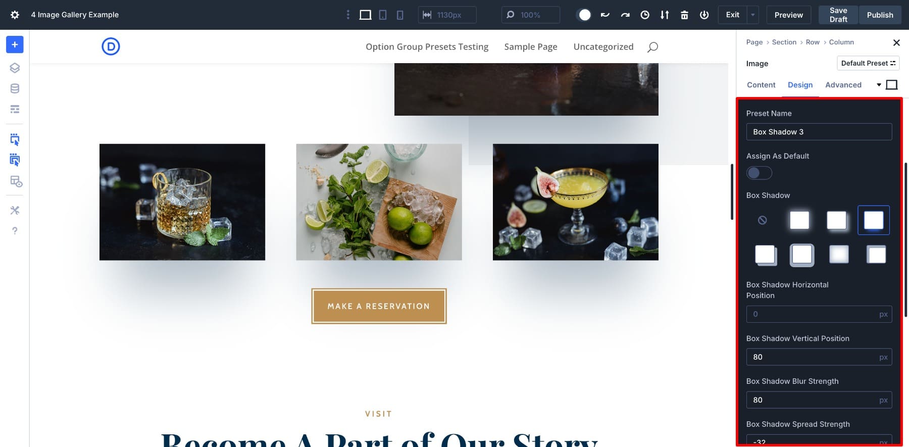
Under each image, we’ve added a two-column Nested Row. We used the left column for a short description, and the right column for a call-to-action button. Then we styled the button using global styles, and repeated this structure for each gallery item to maintain consistency. To make the row overlay the image, we’ve set the Position to Absolute with Vertical Offset 40px and Z index 1000.
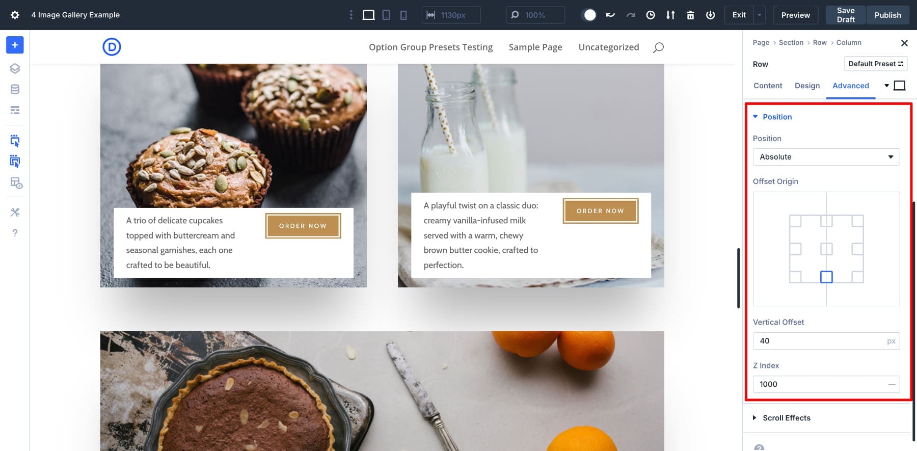
We’ve also added a shadow preset to all images, which not only gave the gallery a polished look but also saved me time by letting me apply the consistent branding across multiple modules in just a few clicks.
Layout 4: Scroll Reveal Gallery
The scroll reveal gallery layout is designed for visual storytelling that unfolds as users scroll. Each section features a large image paired with smaller supporting visuals (created by nesting multiple rows together).
It’s perfect for editorial galleries, recipe showcases (highlighting steps or ingredients), or company team pages that want to capture group moments interactively. Instead of overwhelming viewers, it guides them through each story visually, one block at a time.
How To Build It
The structure is simple: Create a two-column row. Add an Image Module, heading, text, and a button on the left. On the right, nest a new row with two columns and insert Image Modules into each one to support visuals. Then, you can alternatively stack single and two-column rows to create a masonry-like grid.
The key player of this layout is the left section, which sticks. To make your featured section stick, you need to create a Module Group and enable the Scroll Effects settings. Click on your Module Group and go to Settings > Advanced > Scroll Effects.
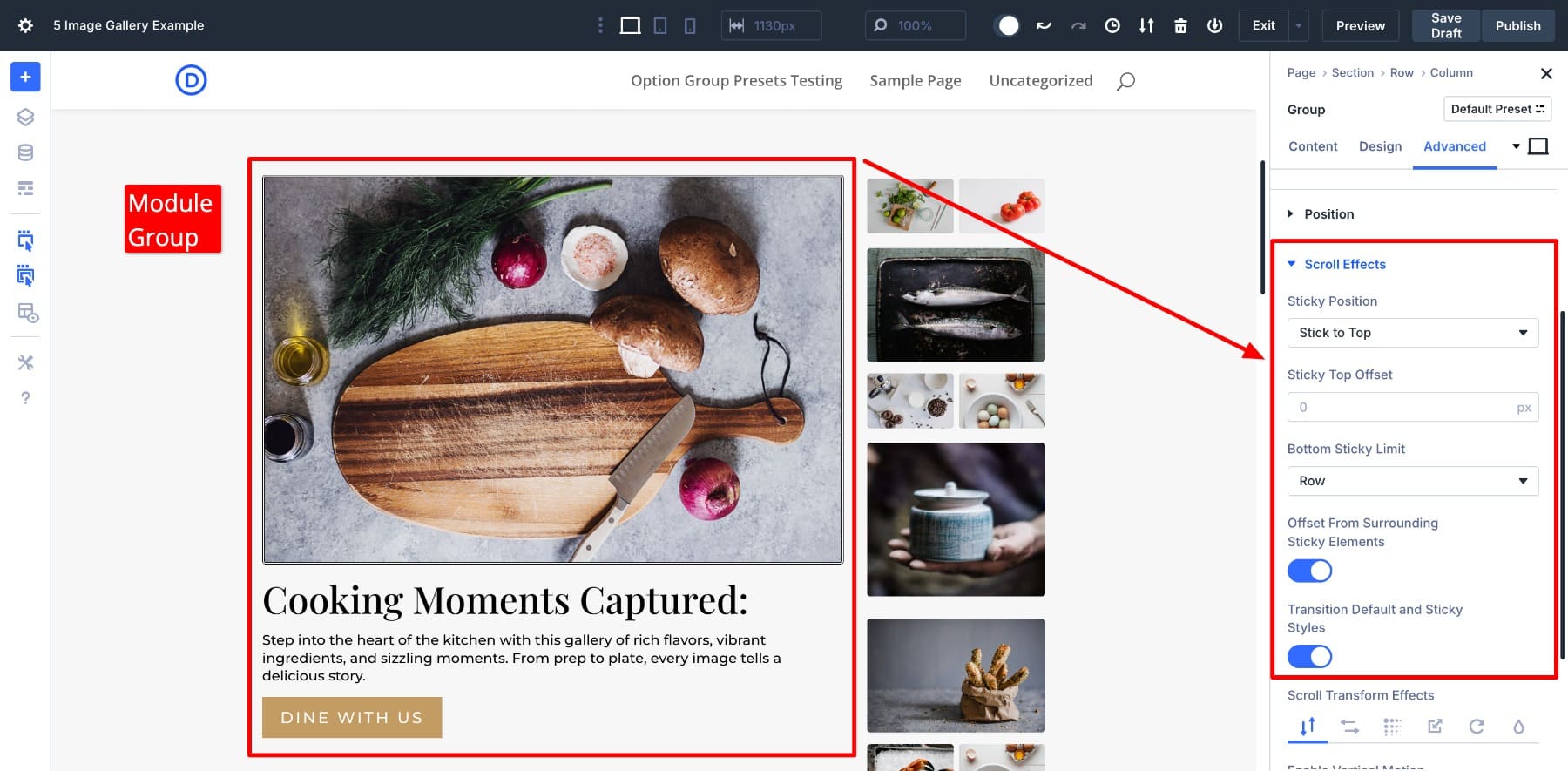
Make your Module Group Stick to Top and set the Bottom Sticky Limit to Body Area. As users scroll down, the featured image will stick, while the other images keep moving up.
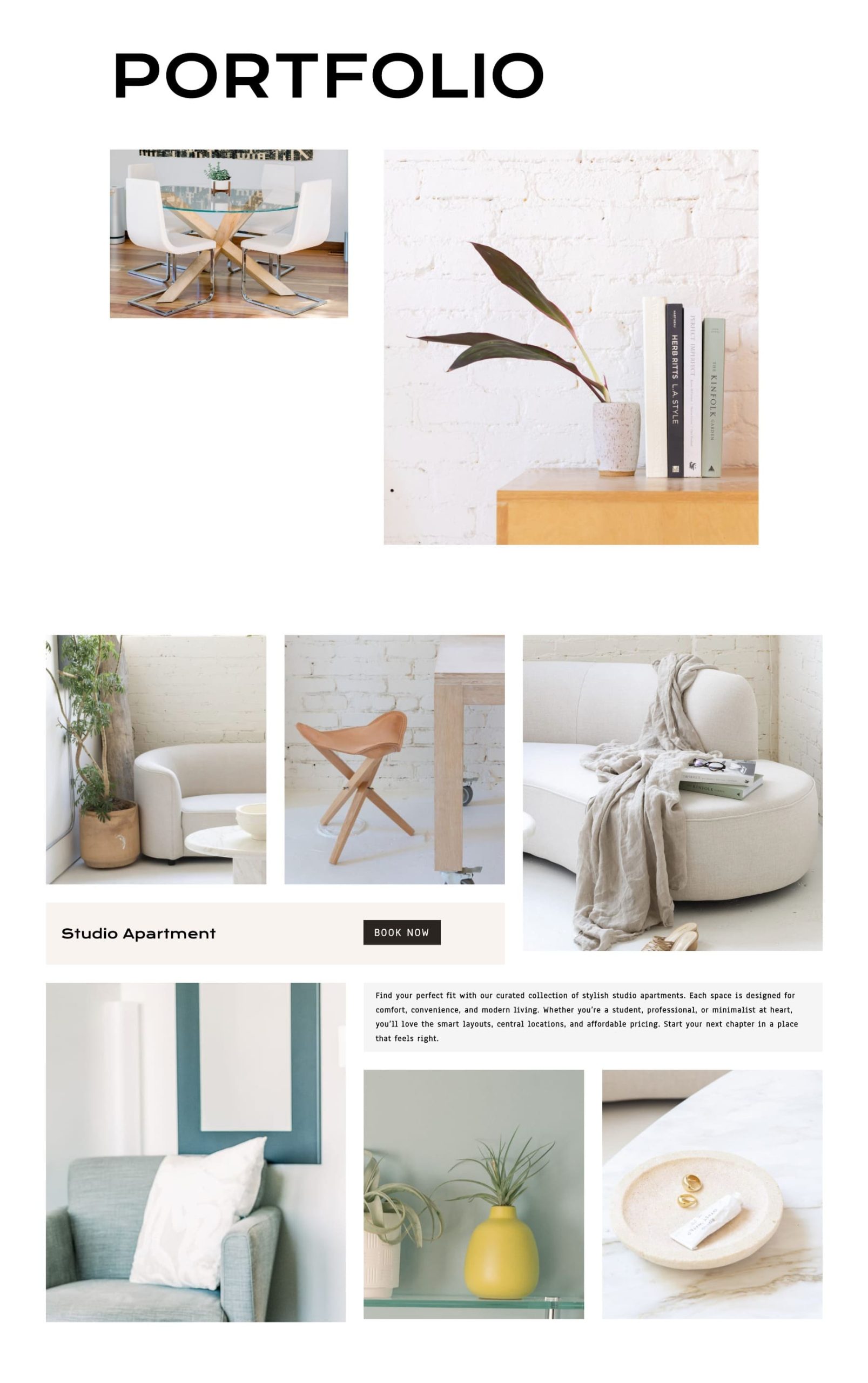
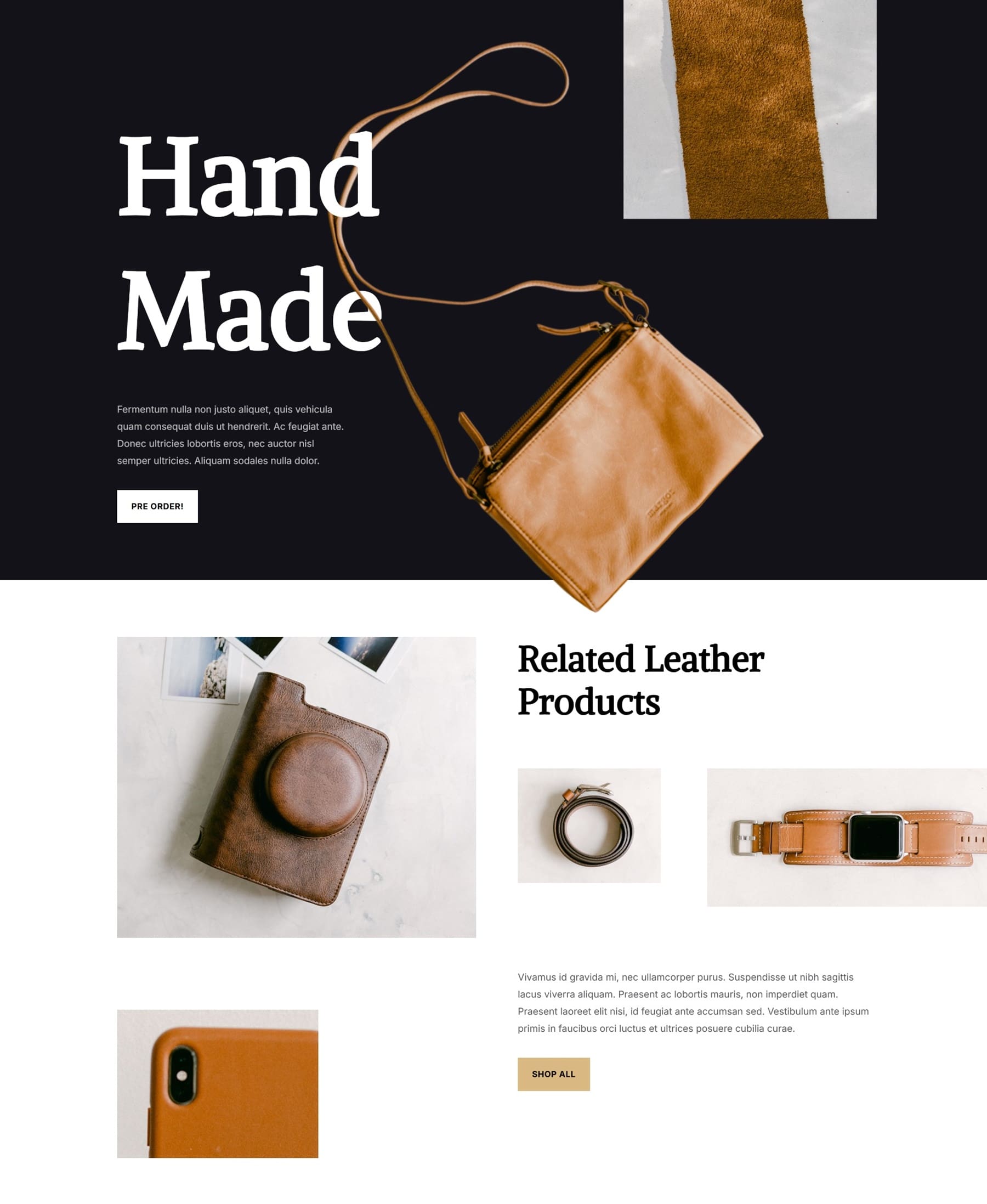
Layout 5: Staggered Product Gallery
Not every gallery needs a focal image or complex structure. Sometimes, all you need is a set of images arranged in a staggered structure, and that’s where Nested Rows quietly shine.
This layout is ideal for e-commerce or product-focused sites where you want to highlight a collection without making it feel like a typical grid. It uses lots of white space and Nested Rows to break visual monotony by mixing one, two, and three-column image rows inside a single section. The result is a well-balanced layout that feels handcrafted and editorial, perfect for showcasing product details, material close-ups, or complementary items.
It works especially well for brands with tactile or luxury products like leather goods, ceramics, or handmade items where visual storytelling matters.
How To Build It
Create a two-column row. Add a stacked layout of images using Nested Rows in the left column. One row has two small photos side by side, and the other has a vertical image. In the right column, nest a new row with three columns and insert product images. Below that, place your text and button.
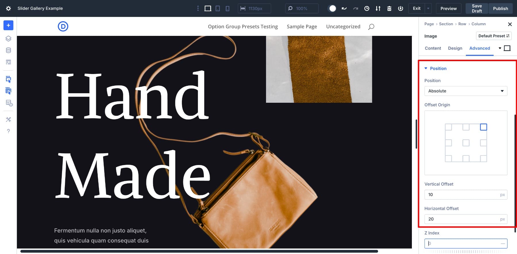
To create the overlapping handbag effect (like in the Hand Made section), add an image module in its row and use absolute positioning (Advanced > Position > Absolute). Then use the offset sliders and z-index to layer it between the two sections. This lets you create magazine-style layouts where images break the grid for added visual interest.
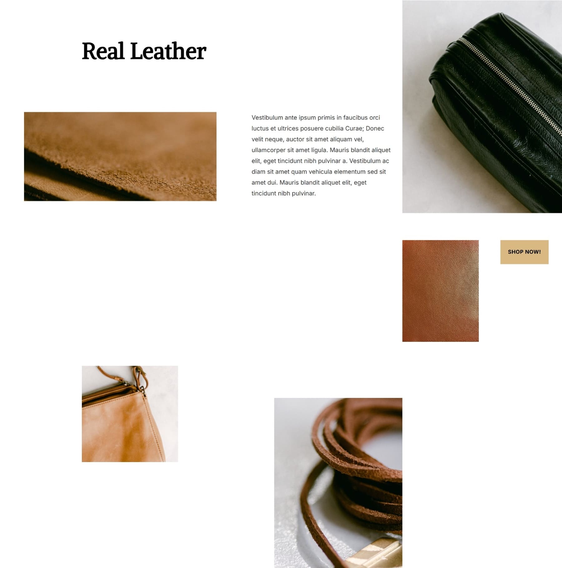
Layout 6: Asymmetric Portfolio Grid
The asymmetric portfolio grid layout combines storytelling and imagery in a clean two-column format. Use the left column to introduce a project with a heading, short description, and CTA. In the right column, a three-column Nested Row comes above a large featured image, giving a perfect opportunity to show key visuals with supporting shots.
This design is ideal for designers, photographers, or agencies presenting curated case studies or portfolios. It keeps attention focused while offering a natural scroll rhythm and mobile-friendly flow.
How To Build It
Start with a two-column row. In the left column, add a Text Module for your title and description, followed by a Button Module (if you want).
Add a Nested Row in the right column. Choose the three-column layout and stack another Image Module. Insert three supporting images in the Nested Row and a large image in the stacked Image Module. Use other row structures to create more patterns.
To keep everything aligned, set the gutter width to 1 and crop your pictures to consistent heights before uploading. Use a global image preset (such as a soft border or drop shadow) and hover effects to keep things interactive but refined.
You’d also notice another Nested Row overlaying the image. We‘ve set the Position to Absolute to create the overlay effect.
Top Tips To Build Interactive Image Galleries
Once your layout is in place, sprinkle in a few extra details to make your galleries more polished. Here’s how:
1. Create Hover Effects
Adding hover effects is one of the easiest ways to make your image galleries feel more dynamic. It adds interactivity without distracting from the content, and helps images feel alive when users engage with them.
In Divi 5, adding hover effects to your images is easy. While editing, you can easily switch to hover (and responsive modes) and customize your settings.
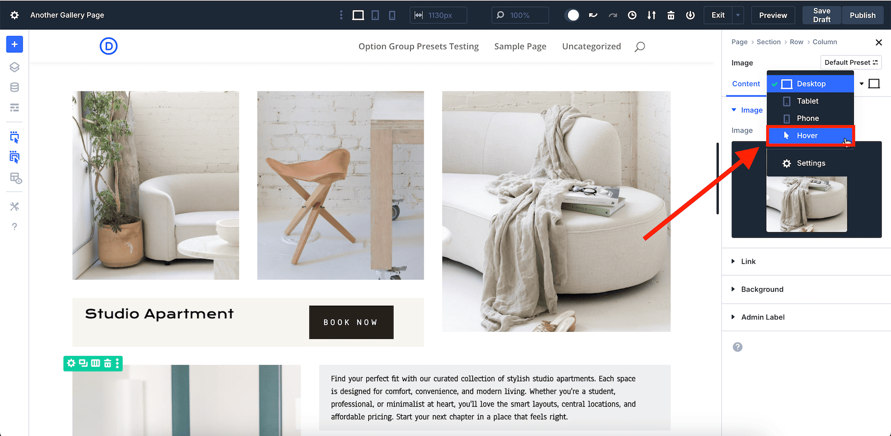
You don’t have to switch to hover for every different image or setting option; just switch once, make changes to all the elements you want to customize, and save. We changed the border color, but you can also try filters, transform, add shadow, and more easily.
You can apply this to individual images or save it as a preset if you want all your images to behave the same way. It’s a small detail, but it makes your gallery feel thoughtful and interactive, and Divi makes it effortless.
2. Use Copy/Paste Attributes To Apply Styles To Images Quickly
Manually customizing each image in a gallery can be time-consuming, especially when applying consistent styles like borders, shadows, or hover effects. While presets are great for global styles, you might not want to create a new preset for every minor adjustment.
Divi 5’s Attribute Management system offers a streamlined solution. With just a few clicks, you can copy styles from one image and apply them to others. You don’t have to manually repeat the same customization process for every image. You can just copy and paste and maintain consistency.
For example, customize one element and copy and paste its attributes to the other elements to replicate the style.
Divi 5 also allows for more granular control. For instance, you can copy and paste specific attribute groups, such as only the design settings or only the hover effects. This makes your workflow efficient and cohesive.
3. Use Clamp To Create Fluid And Responsive Images
In a modern gallery layout, your images shouldn’t just scale but also respond intelligently to different screen sizes. That’s exactly what the clamp() function helps you achieve.
Divi 5 supports clamp() and many other advanced units that allow you to manually enter size values anywhere, including image width, padding, and margin fields. Clamp() is ideal for responsiveness. It lets you set a minimum, ideal, and maximum value, all in one line.
For example, a clamp(1200px, 30vw, 1400px) tells Divi never to go below 1200px, scale up to 30% of the viewport width, but cap it at 1400px.
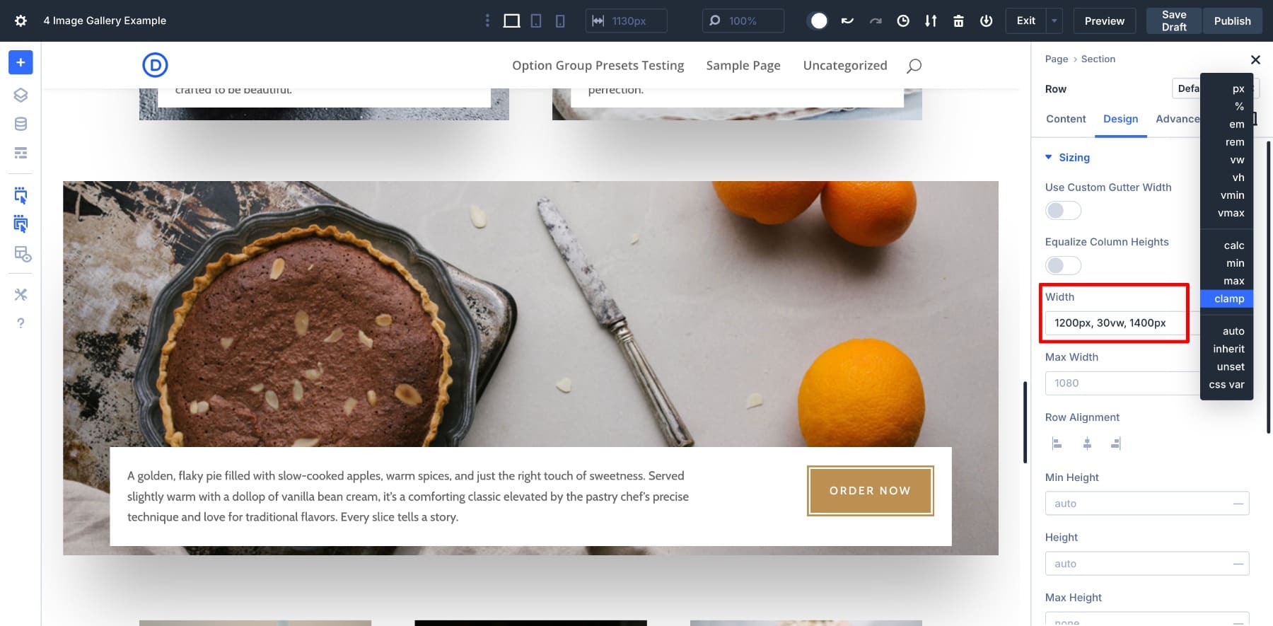
This is especially useful for image strips or staggered layouts where you want a more fluid grid without breakpoints. When combined with Nested Rows, clamp() helps each block adapt naturally without needing separate mobile adjustments.
4. Preview And Tweak For Different Devices
Once your layout looks good on desktop, it’s easy to fine-tune it for tablets and mobile using Divi’s built-in responsive editing tools. Toggle between device views and adjust settings like image size, spacing, and text alignment for each screen.
For example, you might want to reduce padding between rows on mobile or stack columns differently for a better scroll experience. Taking a few minutes to adjust these settings can make your gallery feel clean and professional on every screen.
Download The Gallery Layouts For Free
Want to start using the gallery layouts inside Divi 5? Subscribe below to gain access to the JSON files. You can upload these to your Divi Library and import them to your pages afterward.

Build Nested Image Galleries (And More) With Divi 5
Divi 5’s Nested Rows simplify complex layouts by allowing you to place rows within rows. They also offer infinite nestability and precise control over your designs.
Nested Rows is just one of Divi 5’s exclusive features. Be on the lookout for Divi’s new Flexbox-based layout system, which also introduces a wide range of new row templates and flexbox controls to give you all the tools and simplicity to craft any layout you can imagine.
As we continue to improve Divi 5, you can expect even more features that enhance your design capabilities and simplify your workflow.
If you’ve been building galleries the hard way, now’s the perfect time to try Divi 5 and experience how Nested Rows and visual layout tools can simplify everything.
👉 Divi 5 is ready to be used on new websites, but wait a little before migrating existing ones.


How are the images linked together in lightbox so you can move to the next image in the Gallery without closing the lightbox and clicking on next image?
Hey, Paul! They are not linked automatically, but that behaviour can be customized.
One library that comes with such functionality is lightGallery. It’s a free, flexible solution that can take all the images inside a chosen element and turn them into a lightbox carousel. You can click on any image, and it will open a larger view with options to scroll through others, which is great for user-friendly galleries.
Thanks for this tip.
I’ve been missing this functionality in Divi for a while. I’m about to explore it. I have wanted to build out custom column set-ups and have them behave as a gallery.
Another function I recently had to produce for a client was a full section slider. It was mildly successful, but still a little clunky.
For a simple gallery though, what will it take to get Light Gallery to work with Divi?
Hey Lou, thanks for chiming in!
Good news is, getting lightGallery to work with Divi is pretty straightforward.
As the blog comment is not, perhaps, the best medium to convey this information, I’ve put the instructions in a PDF file you can download: http://bit.ly/3TLoluJ
Hope this helps!
That is great.
BUT what about if you have whole page of this beatitufull examples in countless DOM elements, and when you want to view all of them in lightbox, you cant.
They are not connected.
WHY lightbox can be connected automaticly if there is more galleries on page, as simplest solution.
Lightbox just continues.
Of course there is more advance solutions.
Hey, Igor! You can tie them all together using lightGallery.
It’s a free, flexible library that can take all the images inside a chosen element and turn them into a lightbox carousel. Once implemented, you can click on any image, and it will open a larger view with options to scroll through others.
Looks nice, but I agree those are not galleries, more like image collages / compilations. Would be nice if there was a native solution to put them all in a lightbox.