")
We’re rolling out new Divi 5 features at a rapid pace, and each one is designed to improve performance, streamline your workflow, and bring powerful design capabilities to your fingertips. Need an overview? This post will tackle the Divi 5 exclusive features that are worth checking out. And this is only the beginning. We have exciting new features like Flexbox and the Loop Builder coming out soon. Our updates address common pain points we’ve heard from designers and developers who use Divi daily.
👉 Divi 5 is ready to be used on new websites.
8 Features Exclusive To Divi 5 (And How They Work)
Divi 5 introduces innovative upgrades to website design and uses an array of tools that reinvent and accelerate design tasks, making them more intuitive. The following eight features demonstrate the potential of our newly re-envisioned Divi:
1. Customizable Breakpoints
🚀 Feature Released On February 6, 2025
Divi 5 introduces improved flexibility in responsive design with its Customizable Breakpoints system. Most page builders restrict users to just three standard views, but Divi 5 allows for up to seven unique breakpoints, all of which can be set to custom pixel values.
This gives users more control than other popular builders, which usually stick to fixed device sizes and offer limited adjustment options. While many platforms force you to design within rigid boundaries, Divi 5 lets you target exact screen widths where your design needs special attention.
Beyond The Standard Trio
Most website builders stick to the desktop, tablet, and mobile trio because it’s straightforward. Divi 5 recognized that this doesn’t match how people actually browse the web today, on dozens of different screen sizes.
With Divi 5, you can set breakpoints for:
- Phone (< 767px)
- Phone Wide (< 860px) – perfect for landscape mobile viewing
- Tablet (< 980px)
- Tablet Wide (< 1024px) – catches larger tablets and similar devices
- Desktop (> 981px)
- Widescreen (> 1280px)
- Ultra Wide (> 1440px)
Other WordPress page builders offer some breakpoint control, but none match Divi 5’s precision and ease of use. The system remains intuitive, with the same familiar Divi controls applied across all breakpoints.
Visual Breakpoint Handling
Divi 5 introduces canvas scaling, a feature that differentiates it from most other builders. Instead of being limited to switching between fixed device previews, you can drag the edge of the canvas to see your layout at any width you want.
This approach gives you immediate, realistic feedback, almost like working directly within a web browser. When designing for wider breakpoints than your current window, the canvas adjusts proportionally, so you still get an accurate look at your design, even on smaller screens.
The experience stays consistent as you move between breakpoints. Controls behave the same way, and your layout doesn’t unexpectedly shift. This reliability reduces guesswork and troubleshooting from responsive design, which can be a headache in other page builders.
2. Option Group Presets
🚀 Feature Released On March 11, 2025
Option Group Presets is one of the most exciting new features in Divi 5, expanding your capabilities of building a design system that works for you. Option Group Presets are your design’s building blocks. While Element Presets locks you into styling a particular element, Divi 5’s Option Group Presets work across any element type.
You can create reusable styles for specific design properties, like typography, borders, shadows, or backgrounds, and mix these styles across different elements. For example, you might create a preset for your heading style, another for button styling, and a third for box shadows.
Once set up, you can apply these styles to any compatible element with a click, regardless of whether it’s a text module, blurb, call to action, or even containers like sections and rows.
Why This Matters For Your Workflow
This is a time-saver when you need to update your design. Say you decide to change the border radius on elements throughout your site. Instead of hunting down each button, image, and section, you simply edit the border preset once, and every element using that preset updates automatically.
The ability to work across different element types makes Divi 5’s Option Group Presets really helpful. The same border style can apply to a module, column, row, or section. This cross-element compatibility saves hours of repetitive styling work.
This flexibility goes one step further. Divi’s Option Group Presets extend beyond basic styling options. They also cover script-based features like conditional displays, HTML background videos, and scroll effects. This gives you consistent control over both static styling and interactive behaviors across your site.
3. Advanced Units
🚀 Feature Released On March 19, 2025
Divi 5 has improved its handling of CSS units, making responsive design way easier.
Now, you can access the full range of CSS units needed for today’s web design directly inside the builder. That means you can use pixels (px), percentages (%), ems (em), root ems (rem), viewport units (vw, vh, vmin, vmax), and even more advanced choices like character width (ch) or fractional units (fr) for grids.
This might look like a minor update at first, but it actually gives you a lot more flexibility for building responsive layouts.
Why Different Units Matter
When you build sites that you want to look good on phones, tablets, and desktops, using only pixels can create headaches. A 300px wide element looks fine on desktop but might break your layout on mobile.
With advanced units such as viewport, you can set that same element to 80vw (80% of viewport width), and it will scale perfectly across all devices. Or use rem units to keep text proportional to your base font size, making accessibility adjustments much easier.
Now, combine units with CSS functions like calc(), min(), max(), and clamp() and see the real magic happen. Divi 5 supports all of these, letting you create truly fluid layouts that adapt to any screen size.
For example, you might set a section height to calc(80vh – 60px) to make it take up most of the screen while leaving room for a header. Or use clamp(16px, 4vw, 22px) for text that grows with the screen but stays within readable limits.
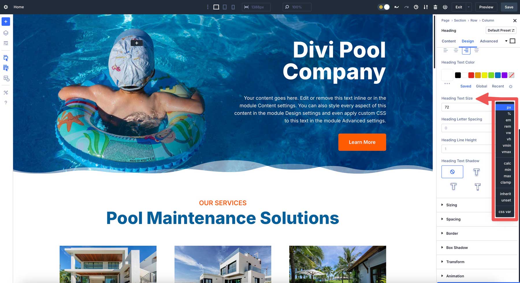
The Flexibility Of Clamp()
The clamp() function deserves special attention because it solves many responsive design problems. It lets you set minimum, preferred, and maximum sizes in one go, making the clamp() function a favorite feature of many web designers.
You might want headings that grow with screen size but stay readable. In a Heading module, you can set the text size to clamp(36px, 5vw, 72px). The heading won’t be smaller than 36px or larger than 72px, but between those sizes, it will scale at 5% of the viewport width.
This creates smooth transitions between screen sizes without breakpoints. Text that’s too big on tablets or too small on large monitors won’t be an issue. Your typography breathes with the layout.
We also understand that different design elements need different units, which is why Divi 5’s Advanced Units feature works malleably, not just with typography, but margins, padding, and other spacing values:
- For text, rem units keep everything in proportion. If you set your body text to 1rem and headings to 2.5rem, changing the base font size updates everything proportionally.
- For layouts, you can try mixing fixed and fluid units. A sidebar might work best at 300px, while main content could use calc(100% – 350px) to fill the remaining space.
- For spacing, em units create padding that scales with text size. This keeps your design proportions consistent even when text sizes change.
Also Plays Well With Other Discussed Features
What’s particularly nice is that you don’t need to write custom CSS to use these units. They’re built right into the visual interface. You can experiment with different values and see the results instantly, making the learning curve much gentler than coding these solutions by hand.
These units are integrated with other features in Divi 5. You can store your value, using any unit you prefer, as Design Variables, and then apply them site-wide through Option Group Presets. This creates a chain reaction of good design that flows through your entire site. For example:
- Create a number variable like heading-size: clamp(26px, 5vw, 82px); for your H1 headings. Apply this variable to your heading text preset. Your headings will now scale smoothly between 26px on mobile and 82px on desktop, with a fluid 5vw calculation between those sizes.
- Setting a number variable to clamp(20px, 5vw, 80px) and then using it as margins, you have tight spacing on mobile and generous breathing room on desktop, with a smooth transition between.
- Set a base spacing using a number variable space-unit: 20px, and use it with calc() in your layout presets. For example, apply calc(var(–space-unit) * 2) for larger gaps and calc(var(–space-unit) / 2) for tighter spaces. When you update the base value, all derived spacing adjusts proportionally.
This just scratches the surface. By blending these configurations, you can \create websites that harness Divi’s simplicity and newfound capabilities.
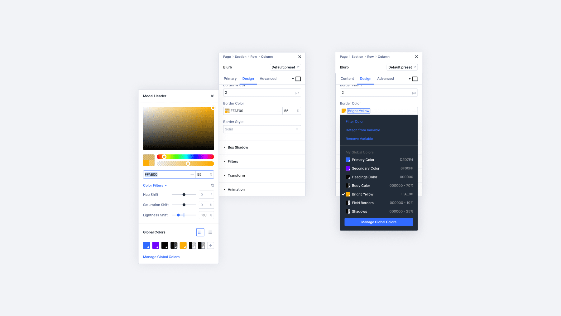
4. Design Variables
🚀 Feature Released On April 3, 2025
Most website builders have ways to set global colors and fonts. Divi 5 takes this idea and runs with it. You can create variables not just for colors and fonts, but also for numbers, images, plain text, and even web links.
Think about this: most builders let you set a primary color that updates everywhere. But what if you want to change your phone number across multiple pages? Or swap a recurring image used throughout your site? Divi 5 handles these situations with ease.
All your variables live in a simple panel in the Visual Builder’s sidebar. It’s clean, easy to find, and puts everything in one spot.
A Perfect Match With Presets
Design Variables and Presets (both Option Group Presets and Element Presets) work together to make a maintainable and scalable design. You can build presets that reference your variables, creating a flexible design system.
For example, you might create a Design Variable for your main heading font, then use that variable in your heading typography preset. If you decide to change your font later, you only need to update the variable once, not the preset itself. This creates another layer of control that most builders simply don’t offer.
This two-layer approach gives you more control than other builders. You separate what something looks like (variables) from where it appears (presets).
You can use number variables with CSS functions like calc() and clamp() to create responsive designs that adapt perfectly to different screen sizes. Set a variable for your site’s spacing rhythm, and apply it throughout your layout for consistent proportions that scale beautifully.
When you change a variable, everything using it updates right away. This turns what might be hours of work into a few seconds of clicking.
How This Helps With Creating A Maintainable Design
Let’s look at a few practical examples of Design Variables in action:
- Keep your brand looking the same everywhere: Set up variables for your colors, fonts, and spacing. Use them in presets across your site for a consistent look.
- Run a holiday sale: Create image variables for campaign graphics and text variables for promotional copy. When the season ends, update them once to refresh your entire site.
- Border Styles: Create a number variable for border radius, like 10px, and apply it to all button presets, image modules, and cards. If your design direction changes, one update affects all rounded corners throughout your site.
- Make client updates easy: When building sites for clients who’ll need to make updates, Design Variables shine. Set up variables for content they’ll change often, like contact information or business hours. They can update these without touching design settings.
Design Variables also work with Divi’s Theme Builder. This means your headers, footers, and templates use the same variable pool as your pages. Unlike other systems that lock you into rigid patterns, Divi 5’s variables keep things flexible while helping you stay organized.
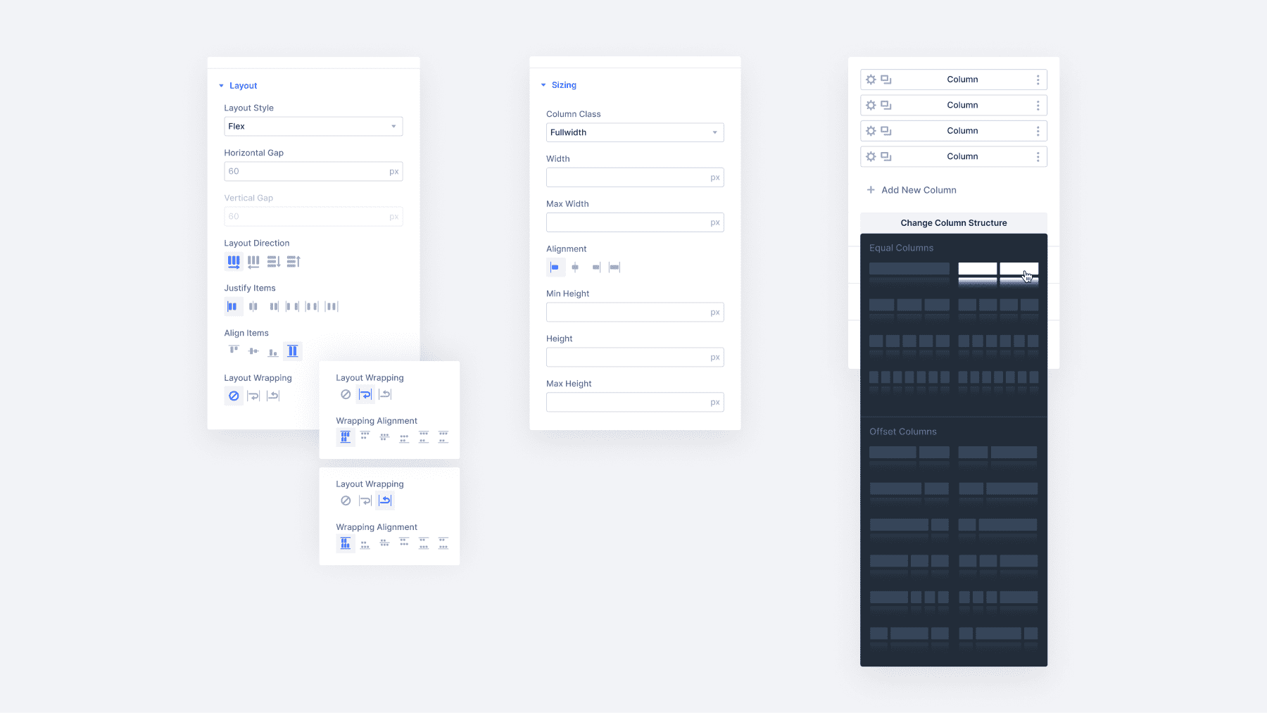
5. Nested Rows
🚀 Feature Released On April 17, 2025
Divi 5 introduces Nested Rows, which gives you more control over layouts. This addition lets you place rows inside columns, creating complex layouts that were not possible in previous versions without custom code.
With nested rows, you can build advanced grid layouts, magazine-style content blocks, and card-based designs with much less effort. Need a section with columns that contain their own multi-column layouts? Now you can do it right in the builder.
Building With Depth
Adding a nested row works just like adding any module. Select a section, click the plus button, and choose “Row” from your options. From there, you can add a row to create a nested row and fill it with content.
This seemingly simple change opens up many design possibilities. You can create sidebar widgets with their own column structures, build product showcases with nested galleries, or design feature comparison tables with complex layouts.
The best part is how naturally it fits into your workflow. There’s nothing new to learn. You’re just using rows in more places. If you know how to build with Divi, you already know how to use nested rows.
Nested rows solve real problems for site builders. Want to create a services section where each service has its own two-column layout? Previously, you’d need custom CSS or complex workarounds. Now it’s built right in.
For content-heavy sites, you can create magazine-style layouts with mixed column widths and nested content areas. Each article or feature can have its own column structure while maintaining the page layout.
Just The First Step
Nested rows are just the beginning of Divi 5’s layout evolution. The team is working toward a complete flexbox-based layout system to make Divi even more flexible.
Future updates will introduce additional layout controls, giving you even more options for creating complex designs without custom code. This methodical approach ensures each new feature works perfectly before moving to the next.
Rather than rushing out half-baked features, the Divi development team is building a rock-solid foundation for the future of layout design. Each step builds on the last, creating a system that’s both future-proof and easy to use.
6. Module Groups
🚀 Feature Released On May 1, 2025
Building websites often means creating the same content patterns repeatedly. You design a perfect team member card, then spend twenty minutes recreating it for the next person. Module Groups solve this by letting you package related elements together into reusable units.
Here’s what changes: instead of treating each piece separately, you work with complete blocks. A product card becomes one thing you move around, not six different modules you have to select individually. When you need to adjust spacing across fifty product cards, you update the group template once instead of editing each card manually.
The real benefit shows up on larger sites. Client projects with dozens of team members, product catalogs, or service listings become manageable. You’re not doing repetitive assembly work – you’re focusing on content and fine-tuning.
Creating Custom Module Combinations
Module Groups open up possibilities that single modules can’t usually handle. Build a service card where you need a background image, an overlaid icon, a headline, a description, and two action buttons: “Learn More” and “Get Quote.”
With Module Groups, you layer these elements exactly how you want them. This becomes helpful for content that doesn’t fit standard templates.
For pricing tables, you can use three nested rows within a Module Group: a heading in the first row, price details in the second, and a feature list in the third. This gives you individual control over fonts, colors, and spacing that the built-in Pricing Table module doesn’t offer.
The same approach works for testimonials using the Icon, Image, Heading, and Text modules arranged within the group structure. You get more layout flexibility than the standard Testimonial module while keeping everything manageable as a single unit.
The key advantage is combining the layout control of building from scratch with the convenience of treating multiple elements as one piece.
Building Reusable Component Libraries
Once you create effective Module Groups, save them as Global Elements. This creates a component library that grows with each project. When you refine the styling, your testimonial layout updates across twenty pages, and your product showcase stays consistent while you iterate on the design.
Instead of starting from scratch each time you build a page, you begin with consistent layouts and adapt them to new pages and layout requirements.
Embrace the ease of the Divi Cloud integration. With this tool, components can effortlessly move from project to project. Let’s say you develop a robust set of Module Groups for a particular client site; you can now leverage them as a basis for upcoming assignments. This way, every project gets the advantage of prior solutions but retains its distinct aesthetics.
Works Seamlessly With Divi 5’s Design System
Module Groups get really interesting when you use them with Design Variables and Option Group Presets. Say you build a testimonial group: quote, author name, company, and photo.
Instead of setting fixed colors, you reference your brand color variables. For the quote styling, you create an Option Group Preset for typography that includes your custom font, size, and line height. For the author name, you apply a different heading Option Group Preset.
Now save that Module Group as a Global Element. These option group presets connect every testimonial across your site to your design system. If the client wants a darker grey, change the variable once, and all testimonial group modules will update. If you need to adjust the quote styling, edit the typography Option Group Preset once; every testimonial quote will change instantly.
This beats managing individual modules scattered everywhere. Your Module Groups use Option Group Presets for borders, backgrounds, and text styling, so updating any preset flows through all your grouped elements automatically.
7. Attribute Manager
🚀 Feature Released On May 16, 2025
You’ve styled a button in a Call to Action module. The colors work, and the hover effects look good. Now you want those same button styles on a Contact Form, but don’t want the CTA’s headline or background.
Regular copy-paste won’t work here: you’d get everything or nothing. Divi 5 lets you copy just the button parts thanks to its Attribute Management feature. Right-click the CTA, choose what to copy,
Then paste only those button styles onto the Contact Form.
Pick And Choose What Travels
Divi 5 splits every element into different types of attributes. You pick which ones to copy:
- All Attributes – everything gets copied
- Design Attributes – colors, spacing, presets, but no text or images
- Style Attributes – just your custom changes
- Content Attributes – text and images only
- Presets – preset assignments only
Say you want a button’s styling but not its text. Copy design attributes. Want a section’s background preset but not its padding? Copy presets only.
Works Between Different Modules
You can copy attributes from one type of module and paste them onto a different type. For example, you could copy from a Call to Action module and paste it onto a Contact Form. Divi 5 figures out which settings work on both modules and ignores the rest.
This helps when building sites that need the same styling across different module types. You don’t have to recreate your button colors for every form, testimonial, or other module that uses buttons.
Group-Level Shortcuts
The attribute system goes deeper with selective group management. Skip the settings panels entirely. Right-click and apply specific attribute groups directly from the context menu.
Have you copied a module with the perfect button preset? You can paste just that button preset to other elements through the selective menu. There is no tab hunting, and no setting diving.
Same precision works for resetting. Wipe all design attributes while keeping content intact. Or reset just presets while preserving custom styling overrides.
Speed Through Shortcuts
Every action gets keyboard shortcuts that show up right in the context menus. Learn a few key combinations and styling accelerates. The shortcuts stay consistent across all attribute types, so your fingers learn the patterns quickly.
This goes beyond saving clicks. When building sites with hundreds of elements, these micro-efficiencies compound into hours of saved time. Repetitive manual work becomes quick, targeted actions.
Plays Nice With Your Design System
The attribute manager connects directly to Divi 5’s preset ecosystem. Those system connections travel along when you copy a module using Option Group Presets and Design Variables.
Paste attributes that include presets, and those new elements immediately plug into your global styling system. Update a preset later, and every copied element reflects the change automatically. Your design system stays connected as you rapidly build and duplicate elements.
8. Settings Search And Filtering
🚀 Feature Released On May 29, 2025
Building websites means tweaking settings. Divi modules pack dozens of options into their panels, and hunting through tabs for that one color field can eat up your day. Divi 5 brings back the search feature from Divi 4, but makes it work better.
You get a search bar right at the top of every settings panel. Type what you need, and Divi shows only matching options. Looking for “border”? Every border-related setting appears while everything else fades away. Need to adjust “padding”? All spacing controls pop up instantly.
This eliminates the clicking and scrolling that slows down your work. Instead of opening tabs and hunting through groups, you can find what you need in seconds.
Filter By What You’ve Changed
The real time-saver is the “modified” filter. Click it and see only the settings you’ve already adjusted. This helps when you grab a layout pack or starter site and want to see what’s been customized.
Say you import a business layout but want to change the colors. Hit the modified filter and spot every custom color choice without digging through every module. You can see which fonts were changed, which spacing was tweaked, and which effects were added.
This works great for client projects, too. When someone asks what you customized on their site, the modified filter shows your work clearly.
Smart Filtering Options
Beyond the modified filter, you get sorting by setting types. When updating your palette, the “colors” filter shows every color field at once. When typography changes are needed, the “font families” and “font weights” filters reveal text settings across all your modules.
The system knows which settings matter most. Colors and fonts get their filters because they’re the most common changes people make. Sizes get grouped since spacing adjustments happen frequently.
These filters save clicks when you’re making site-wide changes. Instead of opening every module individually, you work through filtered lists of the settings you need to modify.
How Divi 5 Stacks Up Against Popular Options
The website builder market is crowded with options, but Divi 5 stands out thanks to some genuinely new features. Here’s a look at what makes Divi 5 different:
| Divi 5 | Divi 4 | Elementor | Gutenberg | Bricks Builder | |
|---|---|---|---|---|---|
| Responsive Breakpoints | 7 customizable breakpoints with canvas scaling | 3 fixed breakpoints (Desktop, Tablet, Mobile) | 6 breakpoints with customizable values. No canvas scaling. | No visual breakpoint controls - requires custom CSS | 4 default + unlimited custom breakpoints. No canvas scaling. |
| Design Variables | Colors, fonts, numbers, images, text, and URLs | Global colors only | Global colors only | Limited Global colors options | CSS variables support (may require extensive setup or a CSS framework) |
| Preset System | Element Presets + Option Group Presets (cross-element compatibility) | Element Presets only | Global styles for some elements (Global classes currently in limited alpha) | Block patterns and reusable blocks | Global classes system (may require extensive setup or a CSS framework) |
| Advanced CSS Units | Full CSS unit support: clamp(), calc(), min(), max() through visual interface | Basic units: px, %, em. Option to use custom units such as vh and vw | Basic units in native interface | Limited unit support | Full CSS support |
| Layout System | Nested rows with infinite nesting | Fixed section-row-column structure | Nested elements support | Block-based with Group blocks | Flexbox and CSS Grid |
| Attribute Management | Selective copy/paste - choose specific attributes to transfer | Basic copy/paste for full modules | Style transfer between same element types | Block copy/paste only | Global classes for style sharing |
| Module Groups | Native Module Groups for bundling multiple modules into reusable units | No module grouping capability | Nestable containers | Group blocks for combining multiple blocks as single units. Very basic and often clunky | Section, Container, Block, Div elements + Components (currently experimental reusable elements) |
| Builder Interface | Docked panels, multi-panel workspace, light/dark mode | Floating modals | Side panel interface | Block editor within content area | Side panels with structure view |
What This Means For Your Projects
Divi 5’s combination of features creates a design system that other builders can’t quite match. The Option Group Presets and Module Groups alone put Divi 5 ahead of competitors.
When Design Variables work with Presets and Module Groups, you get something versatile. Reference variables inside presets, apply them to grouped elements, and changing values updates every element automatically across your site. Add the upcoming Flexbox and Loop Builder features to the mix, and you’ll find yourself creating any website without the need for custom coding.
What’s Coming Next?
The Divi 5 roadmap shows continuous updates that will be landing soon. Our developers, divided into seven teams, work full-time on different features, shipping updates at least every two weeks. Here’s a sneak peek of what you can expect in the coming weeks:
Flexbox Layouts
The biggest change is the complete Flexbox layout system, which is a few weeks away from completion. This will completely replace how you build layouts. You will get new row templates, automatic vertical centering, content wrapping, and spacing distribution through visual controls instead of custom CSS.
Module Groups just shipped as containers that bundle related modules together. Combined with Flexbox, you can create magazine layouts, product showcases with matched heights, and complex alignments that previously required workarounds. Specialty sections disappear once Flexbox arrives.
Loop Builder And WooCommerce Updates
Building upon the flexbox layout system and module groups, the Loop Builder will let you repeat anything: single modules, groups, or entire sections. Unlike other builders that will lock you into templates, you will define what repeats and connect it to dynamic content. Nested loops will work too. For example, blog categories that will loop through posts, with each post showing looped reviews.
WooCommerce modules will be rebuilt from scratch using Divi 5’s architecture. Current modules will work through backward compatibility but won’t interact with presets or variables. New product modules will be finished within a few weeks, putting WooCommerce support on track for beta.
Advanced Colors
Relative Colors with Hue, Saturation, and Lightness (HSL) support lets you build mathematical color relationships. Set your primary color once, then generate variations automatically: “primary blue but 20% lighter” or complementary shades that update when you change the base.
Beta And Migration Planning
Beta begins when the three goals are complete: improved backward compatibility for existing sites, complete WooCommerce module support, and continued bug fixes based on alpha feedback.
If we go by current progress, it suggests a beta in a couple of months. The team is also working on the backend so Divi 4 sites can migrate without requiring changes. Third-party modules from the Divi Marketplace need full compatibility.
For new projects, Divi 5 alpha provides enough capability for most builds. The performance improvements alone justify the switch. Existing sites benefit from waiting for beta unless specific new features are needed.
When beta arrives, you get the complete feature set plus confidence from thorough testing. The official release follows shortly after, giving you a solid foundation for future projects.
Ready to Try Divi 5? Here’s How To Begin
These Divi 5 exclusive features work together to create something different. Instead of fighting your builder for consistent designs, you set up systems that maintain themselves. Instead of rebuilding the same styles repeatedly, you create once and reuse everywhere — and this is just the beginning!
So, get ahead of the curve today by building a new website using Divi 5. It is available to all Divi members for free. Just head over to your account area and grab a copy.
Once WordPress is installed, upload Divi 5 as you would upload a normal theme: Appearance > Themes > Add New > Upload Theme. Activate the theme, log in with your credentials, and build away! Your first build will show you why we rebuilt everything from scratch.
💡Remember: Use Divi 5 only for new websites right now. We don’t recommend migrating existing sites during the alpha phase.


Looking great! Let’s have CCS Grid too please.
Is it possible to add a wish list module on Woocommerce for (favorites) and a waiting list module for Woocommerce, so customers can subscribe for out of stock products and get an email when products are back in stock.
Also it would be nice to have a search and filter module for Woocommerce products, categories, tags, brands and attributes.
We have added votes of interest to existing feaure requests for product wishlist and out of stock form funcionality, on your behalf. Thank you for your input!
Filters are planed for a later stage release, as an add-on funcionality to the upcoming Divi 5 Loop Builder. 😊
Thank you Vojin.
I’m looking forward to these new features. I hope they will be added soon.
Don’t forget to add Popup Builder feature.
Clearly this all represents a major update to the best theme out there. Having used divi for all my sites for quite a while now I’m hoping that when fully released there will be an extensive video covering all the new features, including using it for existing sites, not just new sites. I know that designers like me are going to need to invest a considerable amount of time learning all the new features and before we attempt to use it on our existing client sites.
Looking forward to the functionality to edit Theme Builder headers and footers in a page. I love it so far. Very fast in my opinion.
Personally I like the interface of 4.0 but I get it with having to adapt. Great job!
Trying it out on 2 new sites and it’s great (and fast!) but the dark mode, while a great improvement, is too dark when you look at the background options. Even in light mode this option stays dark. Can’t see a thing 🙂
First of all, congratulations on the excellent work with Divi 5 and the new modules. I’ve started testing the latest alpha and noticed that it now includes native support for uploading custom fonts. I’ve tried uploading both TTF and OTF files, but the fonts are not displaying on the frontend. Could you please confirm if the custom font upload feature is fully functional in this version, or if it’s still under development?
Good day, Jay! 😊
Custom fonts functionality is fully working on the D5 Alpha, but depending on your WordPress configuration, you may need to explicitly allow TTF and OTF filetypes, as explained in our guide.
If you have done all these steps, but the issues still persist, feel free to reach out to our friendly support team for a closer look. 👍