
Building a color palette in Divi 5 no longer has to start with a blank canvas or a separate color tool. With the Variable Generator, you can start with one primary color, choose how the rest of the palette should relate to it, and save the result directly to Divi’s Variable Manager.
That matters because the generated colors are not just static swatches. They become reusable color variables you can apply across modules, presets, layouts, and Theme Builder templates. When your design uses those variables, you can update the palette from one place instead of replacing individual color values by hand.
In this post, we’ll look at how Divi 5’s Color Palette Generator works, what the main settings do, and five generated palettes you can use as starting points for your own projects.
What Divi 5’s Variable Generator Does
The Variable Generator lives inside Divi 5’s Variable Manager. It can generate both sizing systems and color palettes, but this post focuses on the color workflow.
For color palettes, you choose a primary color and adjust the generator settings. Divi then creates a connected palette with base colors, tints, shades, tones, and alpha variants. Those colors are added to the Colors group in the Variable Manager so you can reuse them throughout the builder.
Subscribe To Our YouTube Channel
The system works because Divi 5’s relative color tools are built around HSL. Hue controls the color family. Saturation controls how vivid or muted the color feels. Lightness controls how dark or light it becomes. Opacity controls transparency.
Because generated colors can be based on a primary color through HSL relationships, the palette stays connected. Change the base color, and related variables can keep their relationships instead of becoming a disconnected set of hex values.
That is the difference between a static palette and a design-system palette. A static palette gives you individual colors. A relative palette gives you colors that are designed to work together.
You can still fine-tune the output. The generator gives you controls for palette type, hue offsets, saturation offsets, variation counts, intensity, alpha variants, and naming. That means you can start quickly, then refine the palette until it fits the brand.
Once you save the palette, the generated variables are ready to use in Divi’s color fields. You can apply them to backgrounds, text, borders, buttons, gradients, overlays, shadows, forms, and presets.
The same Variable Generator also includes sizing workflows for font sizes, spacing, gaps, border radius, and other design values. We will stay focused on color here, but the release post covers the sizing system in more detail. For a deeper look at HSL, read our guide on building a dark color palette with Divi 5’s relative colors.
How To Use The Color Palette Generator
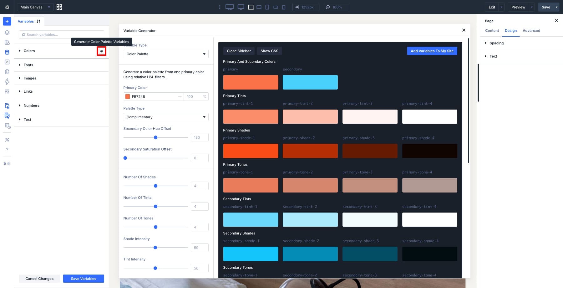
To open the Color Palette Generator, open the Variable Manager in the Visual Builder. Hover over the Colors group header and click the Generate Color Palette Variables button that appears.
The generator opens with the variable type set to Color Palette.
The left side contains the settings. The right side shows a live preview of the generated palette. As you adjust the settings, the preview updates so you can judge the colors before adding them to your site.
Primary Color
The Primary Color is the anchor for the palette. Tints, shades, tones, alpha variants, and related colors are generated from this starting point.
Choose a color that represents the brand well. Very pale or very dark colors can limit the usefulness of some generated variations, so check the preview carefully before saving.
Palette Type
The Palette Type controls how the generated colors relate to the primary color. You can use harmony models such as Analogous, Complementary, Split Complementary, Triadic, and Tetradic depending on how simple or varied the palette should feel.
Analogous palettes tend to feel calm and connected. Complementary palettes create stronger contrast. Split Complementary, Triadic, and Tetradic palettes introduce more color variety, which can work well for larger or more expressive designs.
Hue And Saturation Offsets
The hue offset controls shift generated colors around the color wheel. The saturation offset controls make those generated colors more vivid or more muted compared to the primary color.
Small changes usually work best. A few degrees of hue offset can make an accent color feel more natural. A small saturation reduction can keep a secondary color from competing too strongly with the primary.
Shade, Tint, And Tone Counts
The variation count settings control how many supporting colors Divi generates for each base color.
- Number Of Shades: Creates darker versions of the base color.
- Number Of Tints: Creates lighter versions of the base color.
- Number Of Tones: Creates more muted versions of the base color.
A large palette gives you more flexibility, but it also gives you more variables to manage. Start with the smallest useful set, then add more steps only when the design needs them.
Shade, Tint, Tone, And Alpha Intensity
Intensity controls how far each generated variation moves from the base color.
- Shade Intensity: Controls how dark the shade steps become.
- Tint Intensity: Controls how light the tint steps become.
- Tone Intensity: Controls how muted the tone steps become.
- Alpha Intensity: Controls the opacity range of transparent alpha variants.
Alpha variants are useful for overlays, glows, shadows, soft borders, and layered backgrounds.
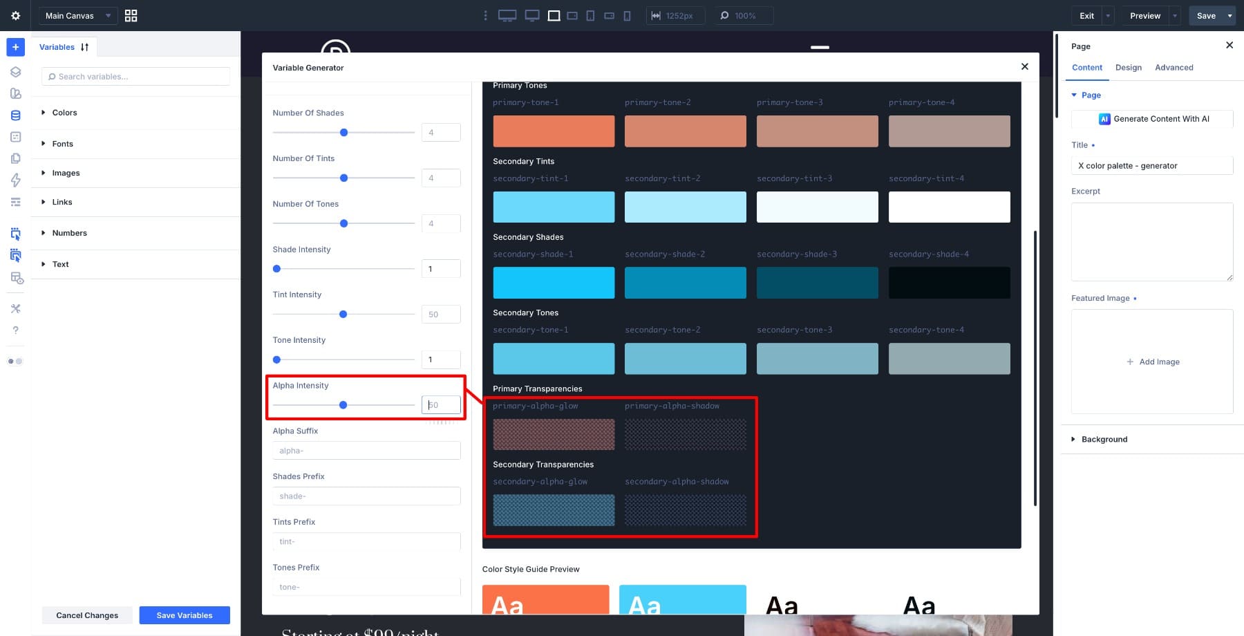
Variable Names
The naming controls let you customize prefixes and suffixes for generated variables. Defaults such as shade-, tint-, tone-, and alpha- are easy to understand.
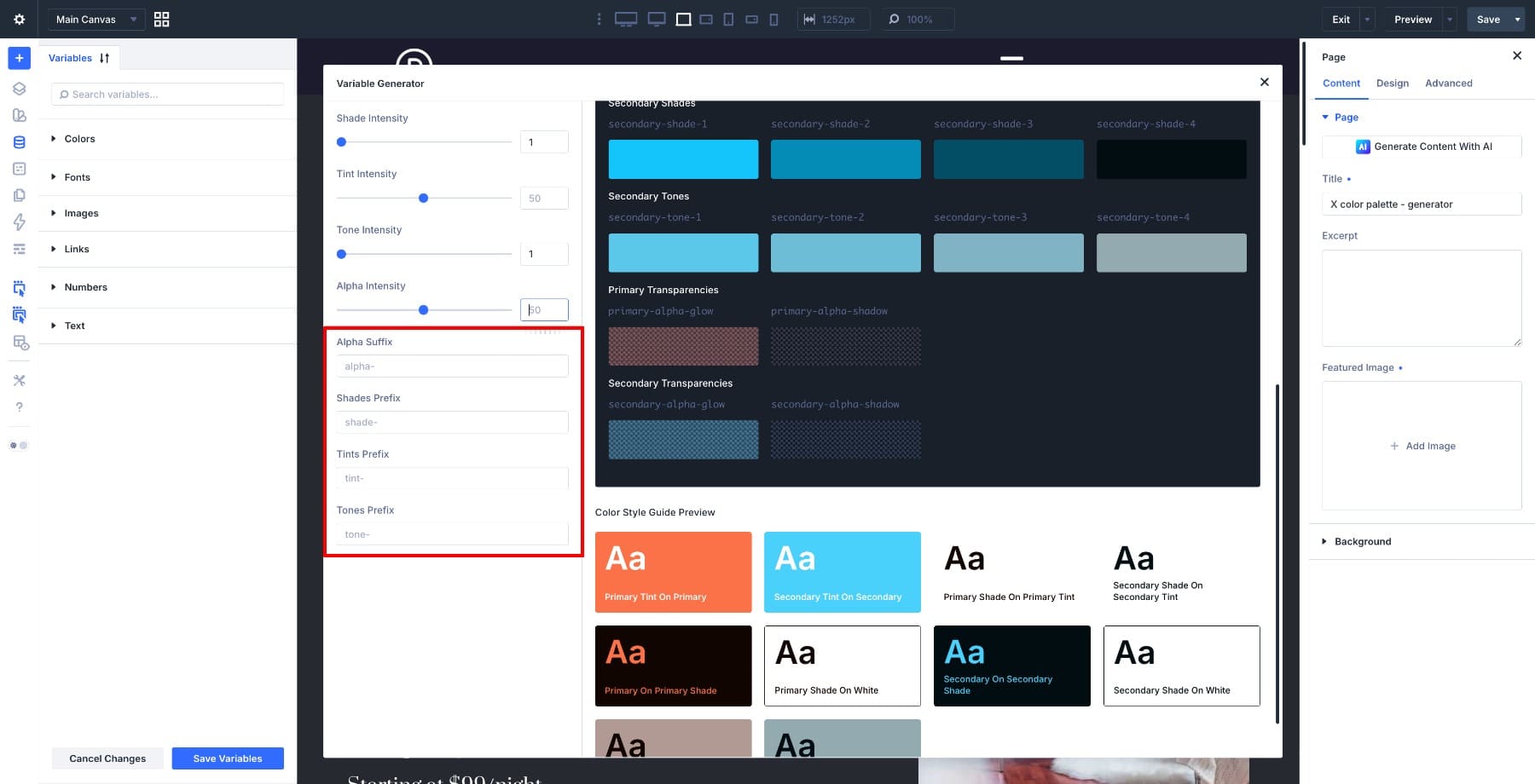
Change these only if your site already uses a different naming convention. Clear names make variables easier to find later when you are applying colors inside modules and presets.
Add The Variables To Your Site
Once the preview looks right, click Add Variables To My Site. Divi saves the generated palette to the Colors group in the Variable Manager.
The exact set of variables depends on your settings. If you generate more variables than you need, reduce the counts and generate a smaller palette. If matching variable names already exist, review the confirmation prompts carefully so you understand what will be added or replaced.
Learn Everything About Divi 5’s Color Palette Generator
Before You Use A Generated Palette
A generated palette is a strong starting point, but it still needs design judgment. Review the palette before applying it across a live site.
Check these details first:
- Contrast: Test important text and background combinations with a contrast checker.
- Role: Decide which colors are for backgrounds, buttons, borders, headings, links, and subtle UI details.
- Restraint: Do not use every generated color just because it exists.
- Presets: Apply colors through Divi 5 Presets so your design choices stay reusable.
- Variables: Use the generated variables instead of hardcoded color values whenever possible.
This turns the palette into a working design system instead of a decorative color board.
5 Color Palettes Generated With Divi 5’s Variable Generator
Each palette below uses a different palette type or relationship style. Use the settings as starting points, then adjust the offsets, counts, and intensities to fit your own brand.
Palette 1: Analogous — Warm And Welcoming
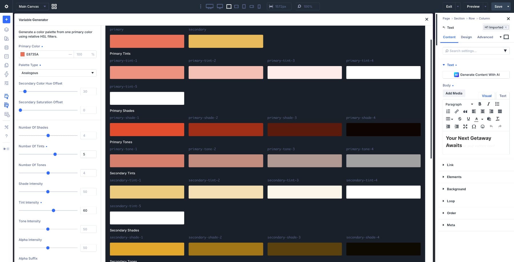
Settings Used:
- Primary Color: #E8735A
- Palette Type: Analogous
- Secondary Color Hue Offset: 30
- Secondary Saturation Offset: 0
- Number Of Shades: 4
- Number Of Tints: 5
- Tint Intensity: 60
- Shade Intensity: 50
Why It Works: The coral primary moves into a nearby warm secondary color, which keeps the palette connected and friendly. The extra tint step gives you more light values for section backgrounds, cards, and soft visual breaks.
Best For: Hospitality brands, wellness sites, food blogs, boutique hotels, and personal brands that need warmth without feeling loud.
How To Use It: Use the primary color for buttons and key accents. Use the light tints for backgrounds and cards. Save the darker shades for text, borders, hover states, and small emphasis details.
Palette 2: Custom Complementary — Bold And Expressive
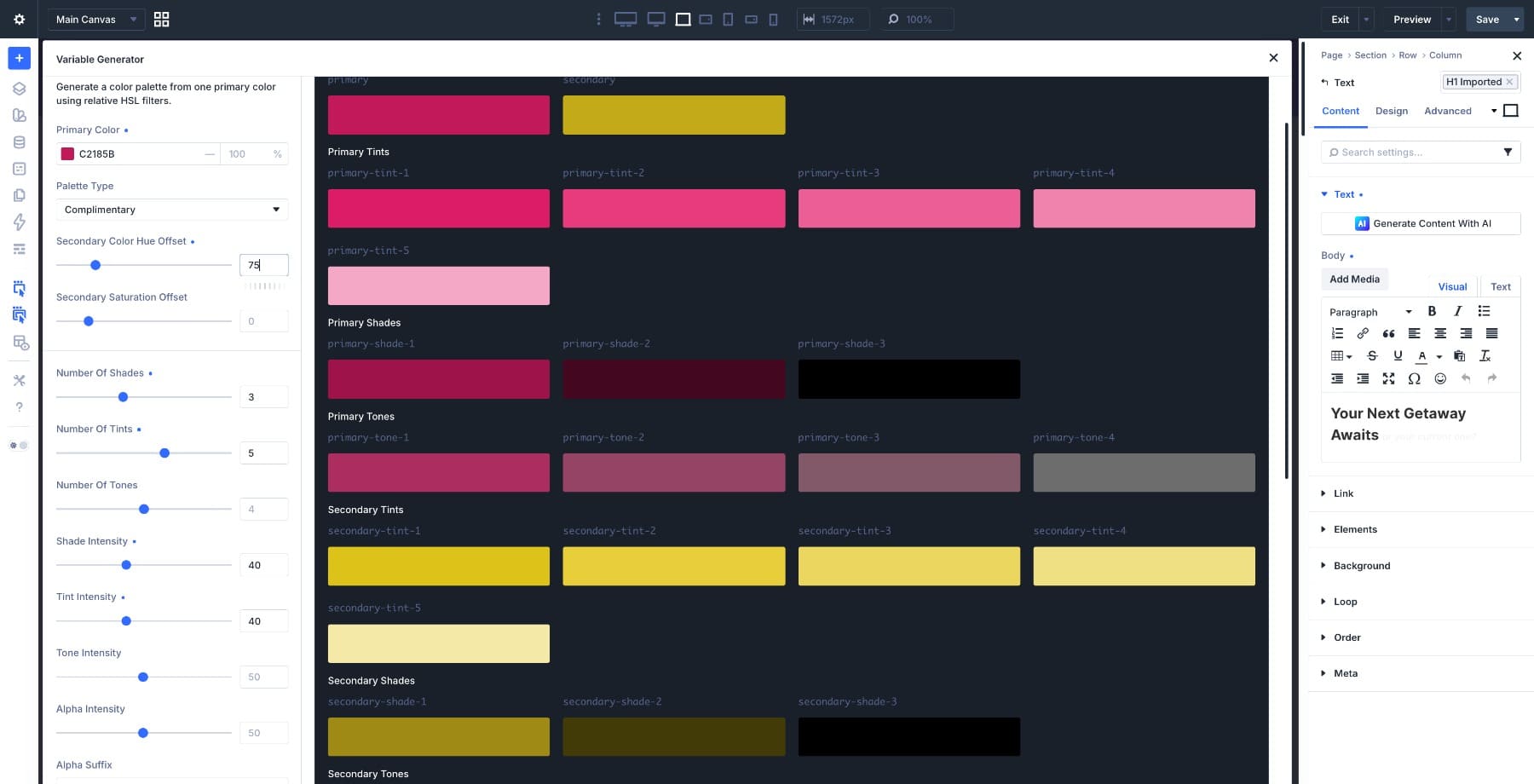
Settings Used:
- Primary Color: #C2185B
- Palette Type: Complementary
- Secondary Color Hue Offset: 75
- Secondary Saturation Offset: 0
- Number Of Shades: 3
- Number Of Tints: 5
- Shade Intensity: 40
- Tint Intensity: 40
Why It Works: This setup uses the Complementary palette type but customizes the hue offset so the secondary color lands closer to a warm gold than a strict opposite-color complement. The result is bold, polished, and easier to use than a harsh direct contrast.
Best For: Fashion, beauty, luxury ecommerce, boutique creative agencies, and campaign pages that need strong visual personality.
How To Use It: Use magenta for brand presence and gold for high-value accents, badges, buttons, or featured calls to action. Keep larger background areas light so the palette does not become too heavy.
Palette 3: Split Complementary — Fresh And Versatile
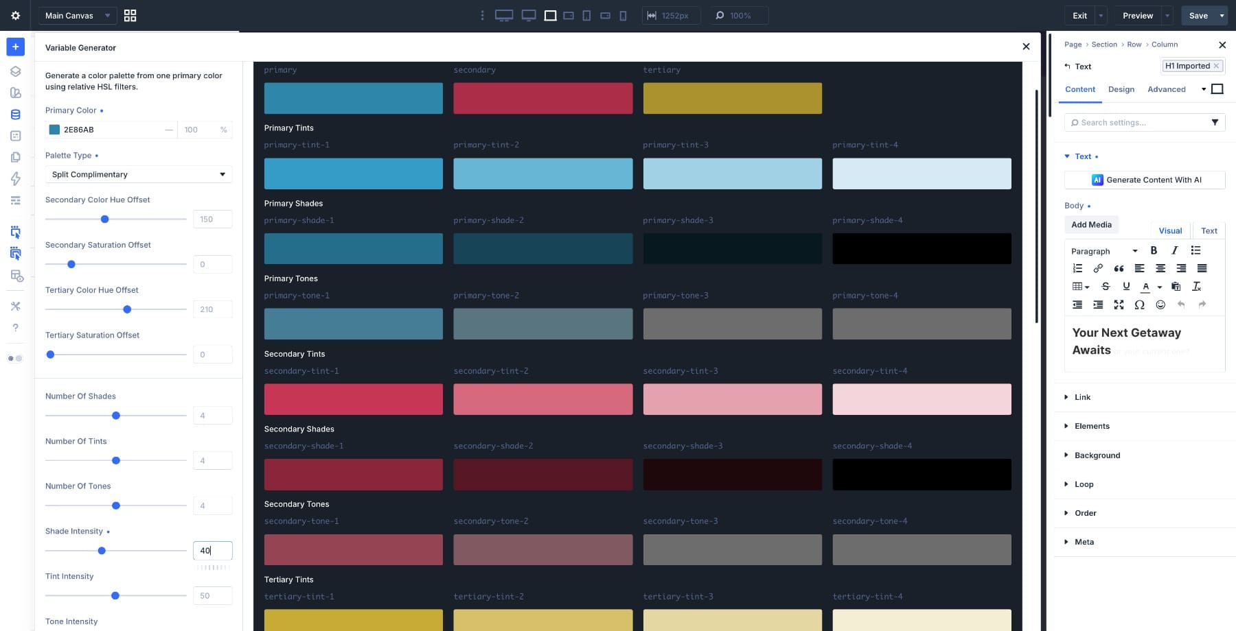
Settings Used:
- Primary Color: #2E86AB
- Palette Type: Split Complementary
- Secondary Color Hue Offset: 150
- Tertiary Color Hue Offset: 210
- Secondary Saturation Offset: 0
- Tertiary Saturation Offset: 0
- Number Of Shades: 4
- Number Of Tints: 4
- Shade Intensity: 40
- Tint Intensity: 50
Why It Works: The blue primary is steady and versatile, while the split accents add warmth and contrast. The palette has enough range for more complex page sections without feeling random.
Best For: Creative agencies, portfolio sites, SaaS products, education brands, and service pages that need more than two colors.
How To Use It: Use blue as the main brand color. Use the red accent sparingly for highlights or important calls to action. Use the gold range for supporting accents, icons, or secondary labels.
Palette 4: Triadic — Balanced And Expressive
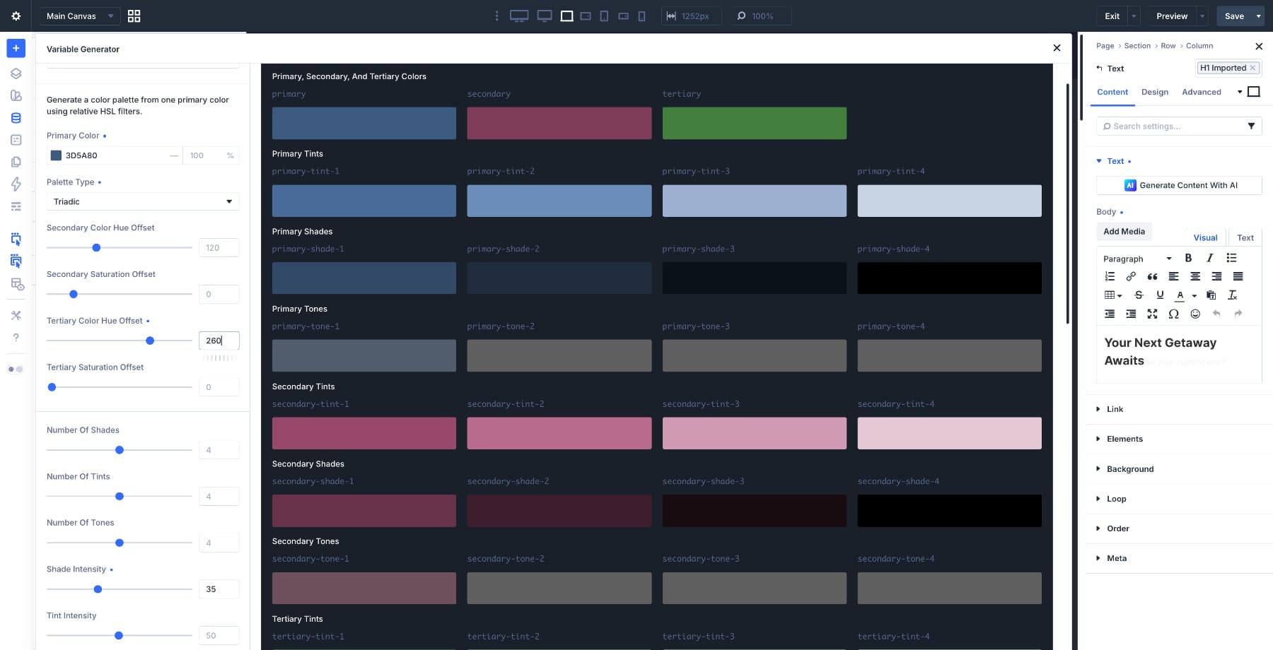
Settings Used:
- Primary Color: #3D5A80
- Palette Type: Triadic
- Secondary Color Hue Offset: 120
- Tertiary Color Hue Offset: 260
- Secondary Saturation Offset: 0
- Tertiary Saturation Offset: 0
- Number Of Shades: 4
- Number Of Tints: 4
- Shade Intensity: 35
- Tint Intensity: 50
Why It Works: The steel blue primary creates a calm base, while the warm and earthy supporting colors give the palette more range. Lower shade intensity keeps the darker values useful instead of making them too dense.
Best For: Corporate sites with a human tone, healthcare brands, SaaS dashboards, education platforms, and professional services.
How To Use It: Use blue for structure and trust. Use rose for emphasis and human-centered moments. Use the green or olive range for secondary UI, success states, or grounded section accents.
Palette 5: Tetradic — Rich And Multidimensional
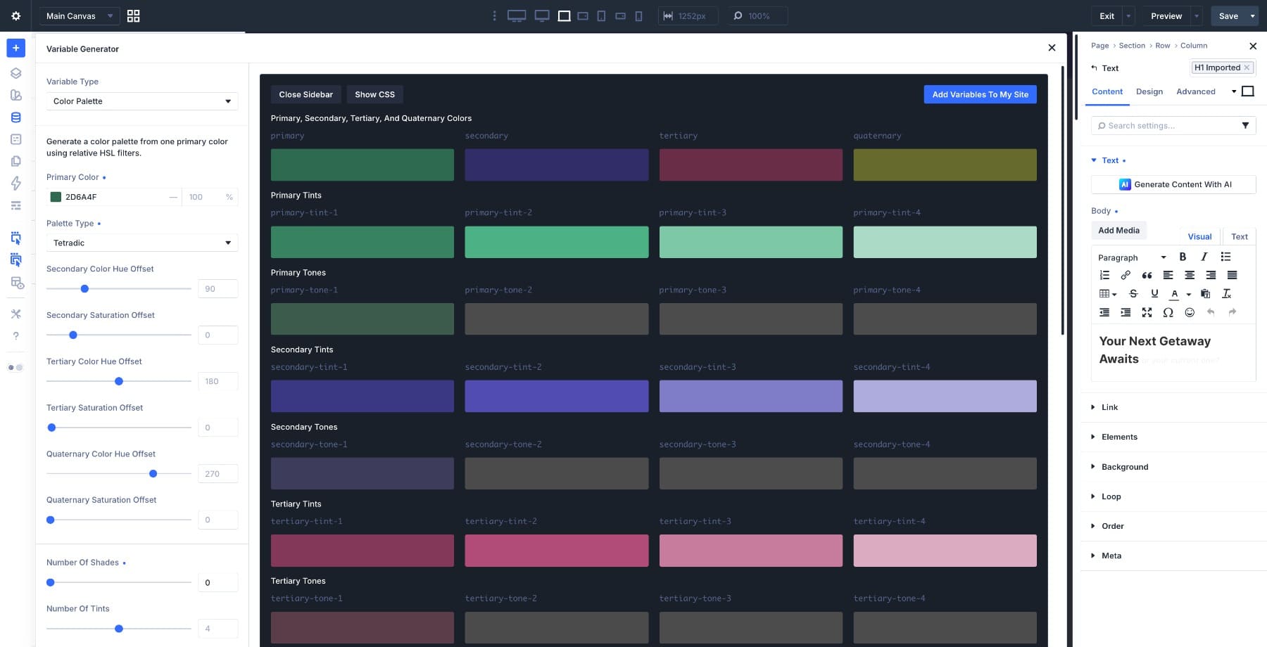
Settings Used:
- Primary Color: #2D6A4F
- Palette Type: Tetradic
- Secondary Color Hue Offset: 90
- Tertiary Color Hue Offset: 180
- Quaternary Color Hue Offset: 270
- Number Of Shades: 0
- Number Of Tints: 4
- Number Of Tones: 4
- Shade Intensity: 35
- Tint Intensity: 50
Why It Works: The forest green primary expands into a richer set of supporting colors. Since the base colors are already dark, skipping shades keeps the palette more practical. The tints carry the lighter end of the system and make the palette easier to use in real layouts.
Best For: Luxury brands, premium editorial sites, immersive landing pages, event sites, and complex multi-section layouts.
How To Use It: Choose one dominant color and treat the others as accents. Tetradic palettes can become overwhelming if every color competes at once. Use tints and tones for larger areas, then reserve the deepest colors for emphasis.
How To Apply Your Generated Palette
Once you generate a palette and save it to the Variable Manager, the next step is applying it through your design system.
For the cleanest workflow, use generated color variables inside Divi 5 Presets. For example, a Button Preset might use the primary color for its background, a light tint for its text color, and a darker shade for its hover state. A Card Preset might use a tint for the background, a tone for the border, and a shade for the heading.
To show the basic idea, we applied Palette 1, the warm coral analogous palette with primary color #E8735A, to an existing design. Open the Variable Manager, update the relevant color variables, and review the modules and presets that reference those variables.
The key phrase is that reference those variables. A generated palette does not automatically recolor hardcoded values. The update flows through the parts of the site that use the variables. That is why Design Variables and Presets are strongest together. Variables store the color values. Presets decide where those values are used. If your site is built around that structure, changing the palette becomes much faster.
If your site isn’t set up that way yet, Divi 5 Mastery Course Part 3 walks you through building a complete variable system from scratch.
Try Divi 5’s Color Palette Generator Today!
The five palettes here are starting points. Each one begins with the same workflow: choose a primary color, choose a palette type, adjust the settings, and let Divi generate the related variables. The value is not just speed. It is control.
You can swap the primary color, adjust an offset, reduce the number of shades, increase the tint range, or change alpha intensity without rebuilding the palette manually. Use the generator to create the palette. Use Design Variables to manage the colors. Use Presets to apply those colors consistently across your site.


Leave A Reply