Helping kids with their homework at a tutoring center. Catering in mid-August heat for a senior citizen’s summertime luncheon. Topping sundaes with all the fixings at a group home’s ice cream social. For all of the time, patience and hard work required, volunteering truly gives more back than it takes – that accomplished, do-gooder feeling is second to none.
While donating and volunteering are wonderful, though, your organization won’t get the help it needs if your website doesn’t urge visitors to take the next step. Since most people research online today instead of reading about a nonprofit’s event in the paper, your website has to convert visitors to supporters. Here’s how to do that, with examples from actual nonprofits to illustrate my points.
I’ve purposely skipped general UX best practices, like how to create an easily-navigable menu. Instead, I talk about nonprofit-specific digital techniques. We have a lot of web design-related articles on our blog, like How to Perform a UX Audit of Your WordPress Site and 10 Rules of Good UI Design to Follow On Every Web Design Project.
- 1 1. Highlight your mission.
- 2 2. Embrace visual storytelling.
- 3 3. Leverage content to get your supporters involved.
- 4 4. Make it easy for visitors to donate.
- 5 5. Volunteering should be simple, too.
- 6 6. Offer options for newsletter opt-in.
- 7 7. Build a mobile-friendly website.
- 8 8. Tap into social media marketing.
- 9 Final Thoughts
1. Highlight your mission.
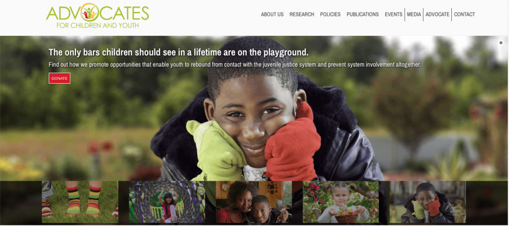
Just as nonprofits have a goal, so do non-profit websites – and your website has to clarify both. What is the mission of your nonprofit and what do you want to accomplish through your website? What’s the next step your website visitors should take? When you visit the ACY website, which stands for Advocates for Children and Youth, you know immediately what they work for:
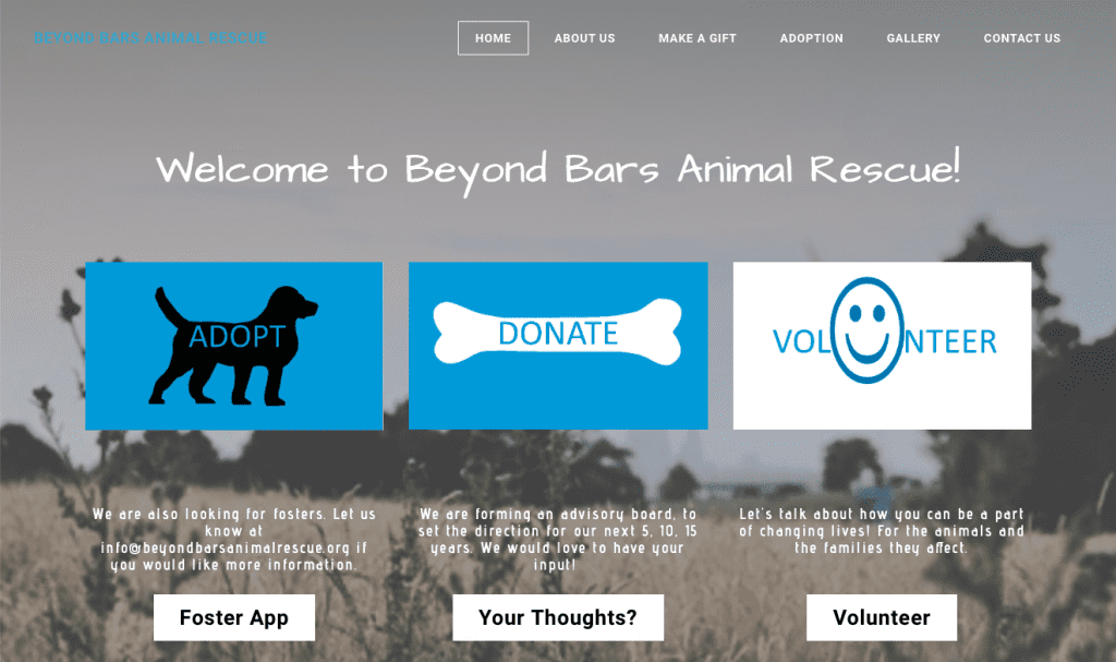
On the Beyond Bars Animal Rescue site, it’s immediately obvious what they want you to do next, and they have options so you can choose the type of support you want to offer:
Also, your website shouldn’t just talk about the issue broadly. Instead, explain the specific part of the issue that your nonprofit hopes to improve or solve. Where’s the focus?
2. Embrace visual storytelling.
The mission of your nonprofit should guide your content. If you help fund education, gather testimonials from students and their parents. Nonprofits that protect animals can use adorable puppy pictures. You don’t want to shove your mission down people’s throats, but you do want to make it clear what you do from the second they see your homepage. Visuals also quickly appeal to people’s emotions, and they’re a fast way to encourage supporters to act.
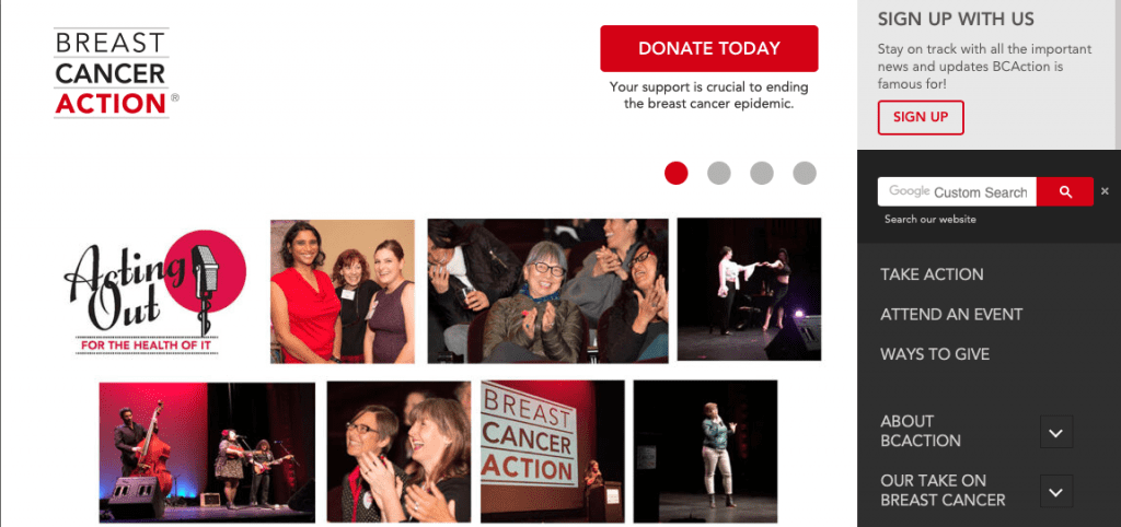
Breast Cancer Action has photos from a recent event on their homepage slider, which is a quick way to show volunteers what getting involved can look like:
3. Leverage content to get your supporters involved.
Your website should immediately answer two questions:
- What should a visitor do next?
- How will that help make a change?
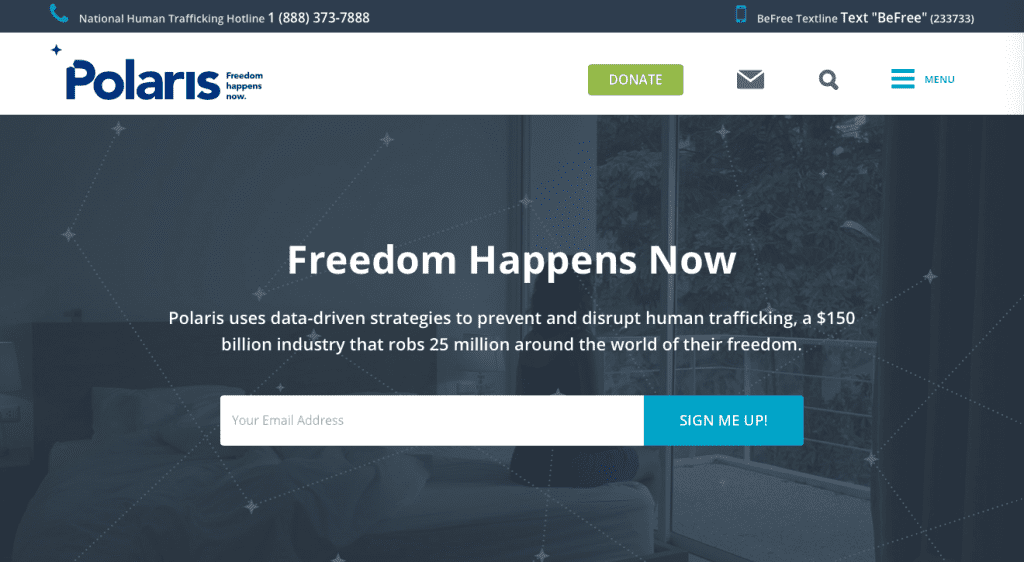
Polaris has three calls-to-action above-the-fold, giving you three options for getting involved:
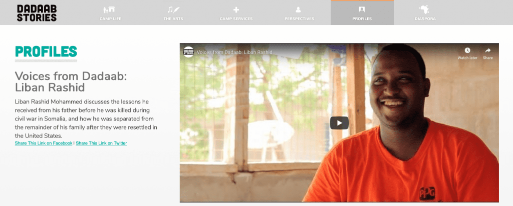
Interactive websites are great, too, and video content can squeeze a lot of information into a minute.
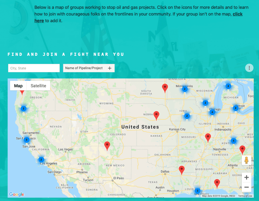
Power Shift, which fights climate change, has an interactive map that shows where there are groups pushing against fossil fuel projects – and, by default, where there’s a need for groups.
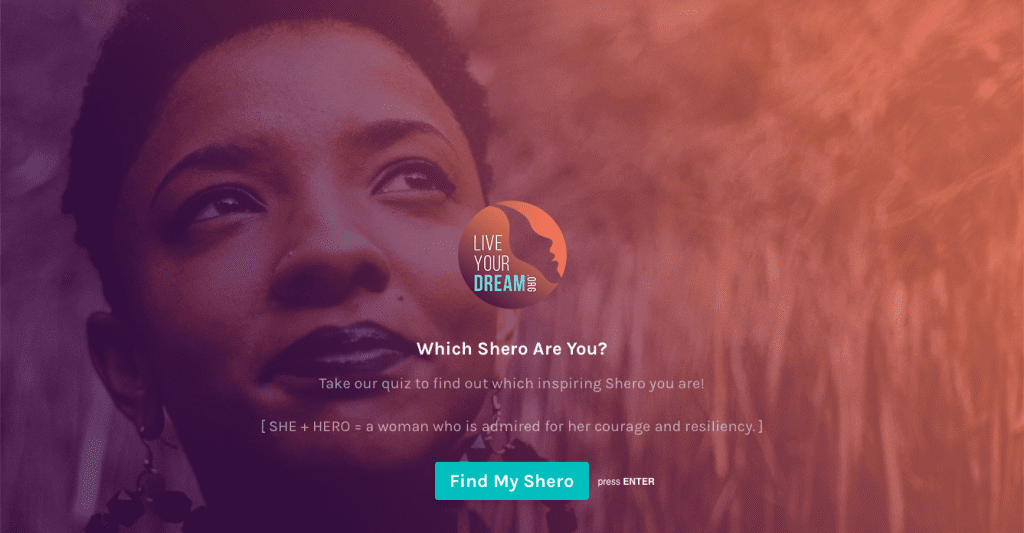
Live Your Dream has a “Which Shero Are You?” quiz (Shero = She + Hero) to help you determine…something. It’s cute and fun, but it could be shorter (16 buttons to hit) and clearer about what you get out of it. It’s interactive, though, and just going through the questions makes you feel a bit more invested in the nonprofit.
Also make sure to showcase how your nonprofit has made an impact – for example, use stories from people who have been positively affected, feature videos of your volunteers in action or give stats about the changes your organization has made.
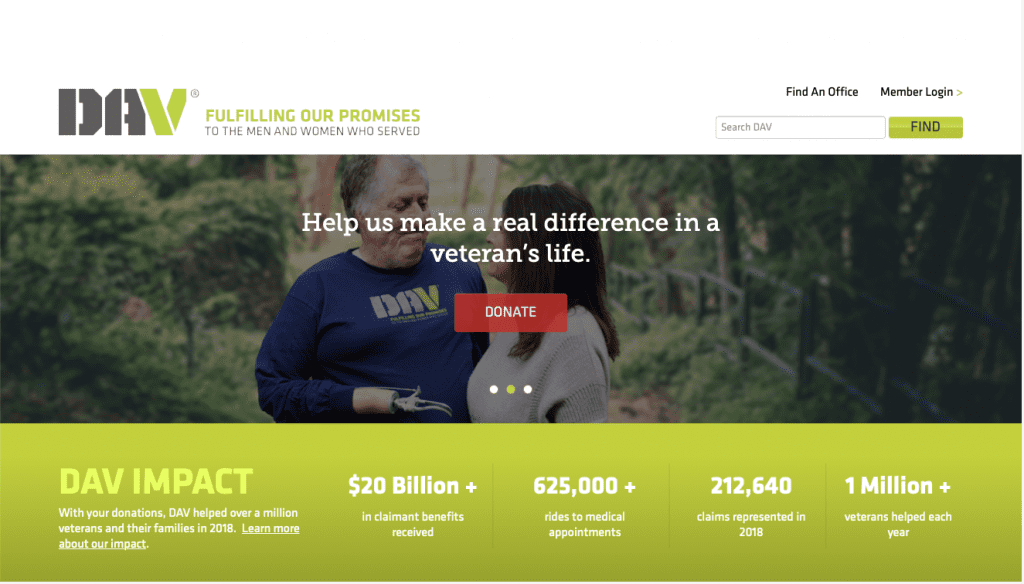
4. Make it easy for visitors to donate.
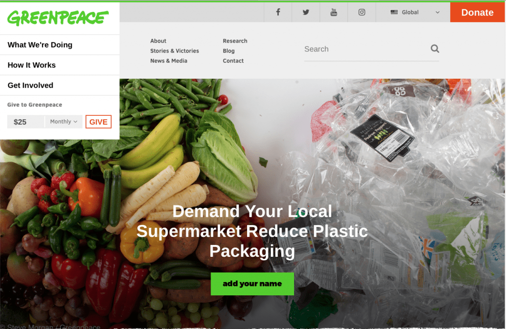
Nonprofits survive on fundraising, so your website should have a clear and easy way to collect donations. Greenpeace does a great job at this with their “Give to Greenpeace” donation box on the top-left of their homepage. It defaults to “Monthly,” but you can change the dollar amount and choose “Single” for a one-time donation.
Here are some donor-friendly best practices:
-
- Visitors should always be one click from being able to donate, no matter where they are on your website. That means putting a donation button or link on every page, maybe even in multiple locations.
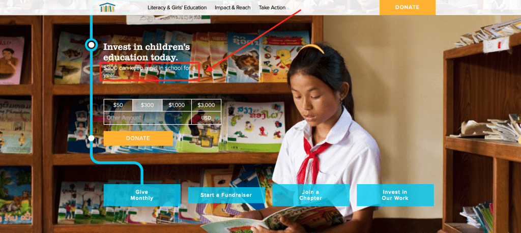
- Tell donors exactly what their donation does. Room to Read was one of the only websites I came across that clarifies the dollar amount that makes a difference:
-
- If you have several programs or causes that you collect for, customize donation pages to the specific campaign. Find and use a donation plugin that is flexible enough for you to be able to do this.
- Create a member login so that regular donors can save their payment information. Don’t make this a requirement, just an option.
- Offer an option for automatic monthly giving. Again, this shouldn’t be a requirement – one-time donations are still generous and helpful.
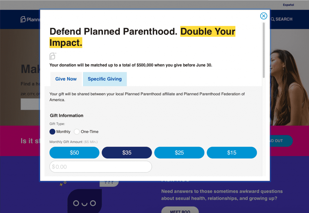
- If your nonprofit is part of a matching gift program, make sure that’s clear on your website and donation page – some donors will be more likely to contribute if they know their donation will double. (If you don’t know what a matching gift is, this website has a great overview.)
- Don’t forget the donor “thank you” page! Not only should it include a heartfelt “thank you,” but it can also feature a story about your nonprofit’s impact or link to top blog posts or news coverage.
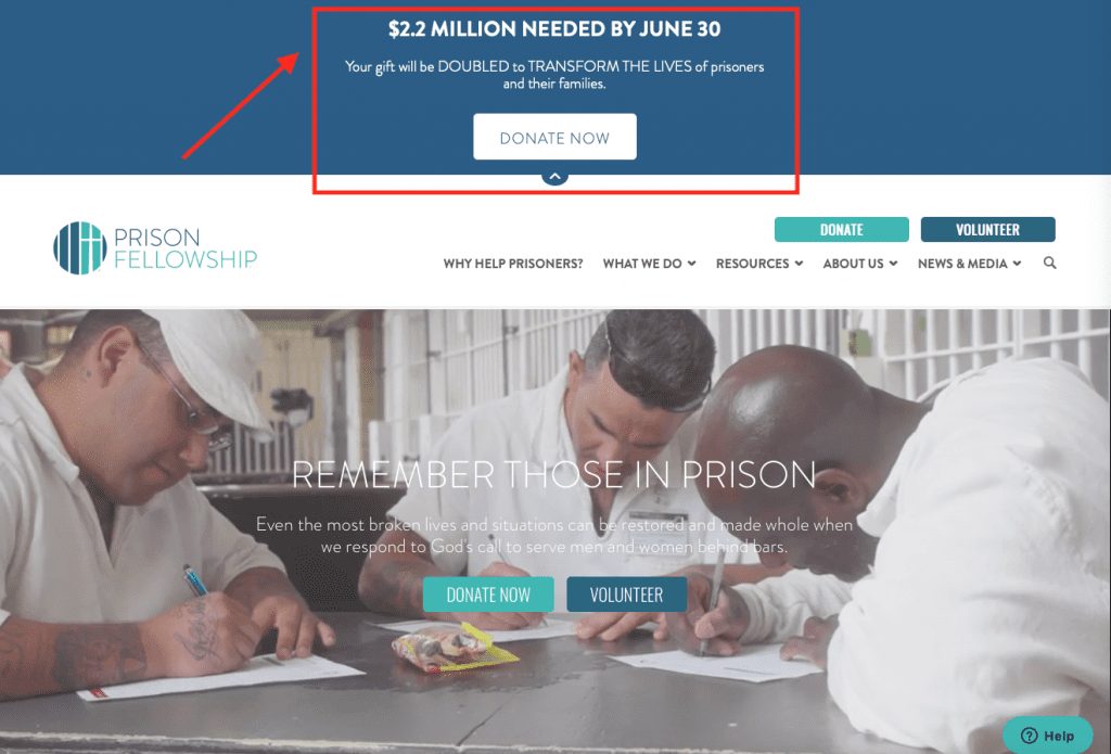
The homepage for Prison Fellowship has a time-sensitive donation button right on the very top. It tells you exactly what they need and how to help them, and it puts a time limit on it so that donors act now instead of wait.
5. Volunteering should be simple, too.
The hoops you have to jump through to volunteer for some organizations are wild – even learning about volunteering and getting in touch with someone for information can be a hassle. Non-profit websites should make it easy for volunteers to find information about available opportunities and how to get involved.
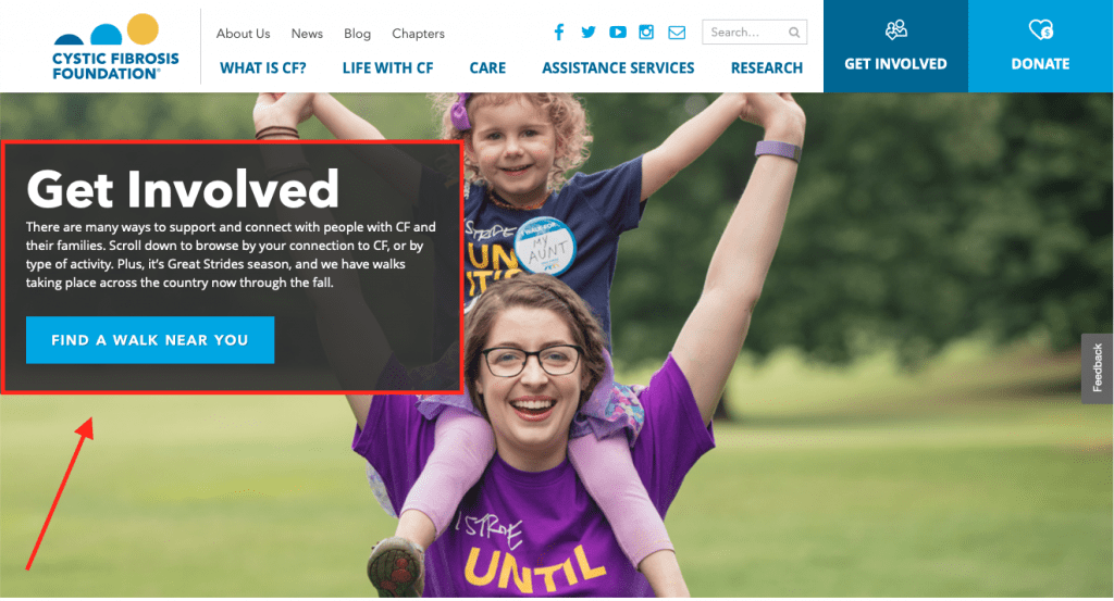
Moreover, try to offer a variety of volunteer opportunities. People who aren’t located near your nonprofit or who don’t have time to volunteer in person may still be able to help online. Marketers could offer their services, and anyone who knows how to use a computer or social media could help with recruiting or spreading the word. If you have flexible volunteer opportunities, you’ll open the door to more volunteers.
If your nonprofit covers a few different issues or offers several programs, your newsletter opt-in should let subscribers pick and choose what they want more info about. Your automated welcome series can briefly mention the categories they didn’t opt-in to and give them the chance to update their subscription settings. Make-A-Wish does this in a small way by letting you choose from getting all emails or just information about your local chapter.
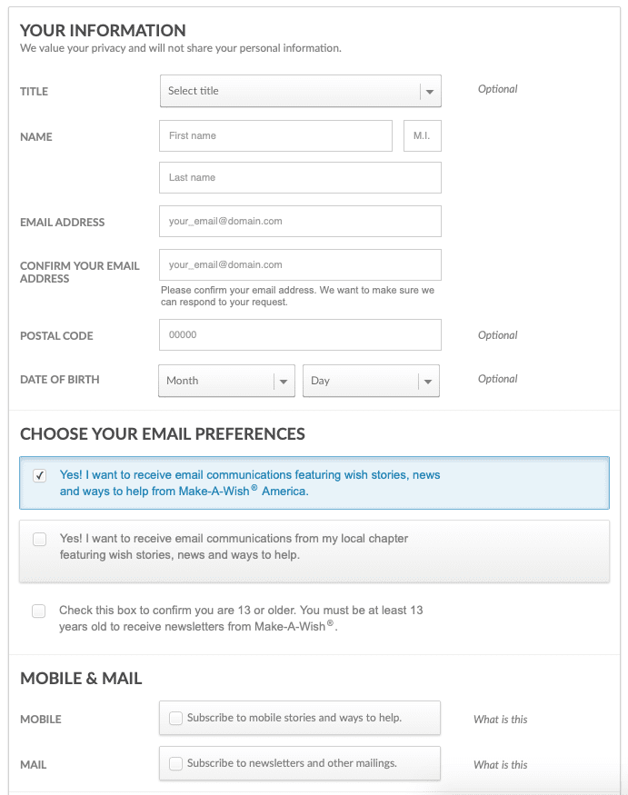
There are a few other ways to segment subscribers, too, such as donors vs. non-donors; history of giving (such as donation level); location; and volunteer type. This will also help you create supporter personas for more targeted marketing.
Here’s an important takeaway: supporters tend to support in the same way. That means that if they donate but don’t volunteer, encourage them to donate again – you’ll waste your time trying to get them to volunteer. If they connect with your nonprofit in person, tell them about upcoming events but don’t expect to engage them online other than that. If they express interest in other types of support, great, but otherwise they’ve shown you how they prefer to support and you should continue to meet them on their terms.
7. Build a mobile-friendly website.
A lot of people are going to navigate to your website already knowing what they want to do – learn more, donate or volunteer. They should be able to find this information right away, even if they’re on a small screen.
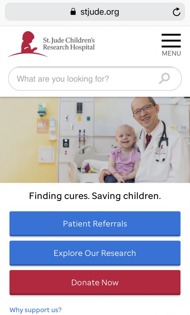
When it comes to the imagery you use above-the-fold, it should be horizontal and not too large (i.e., long). A header that’s half-image and half-info means that users checking out your non-profit website on a small screen won’t have to scroll, scroll, scroll down to get to the info. St. Jude has an excellent mobile website, with all the information you want to see first right at the top, large enough to read and click on:
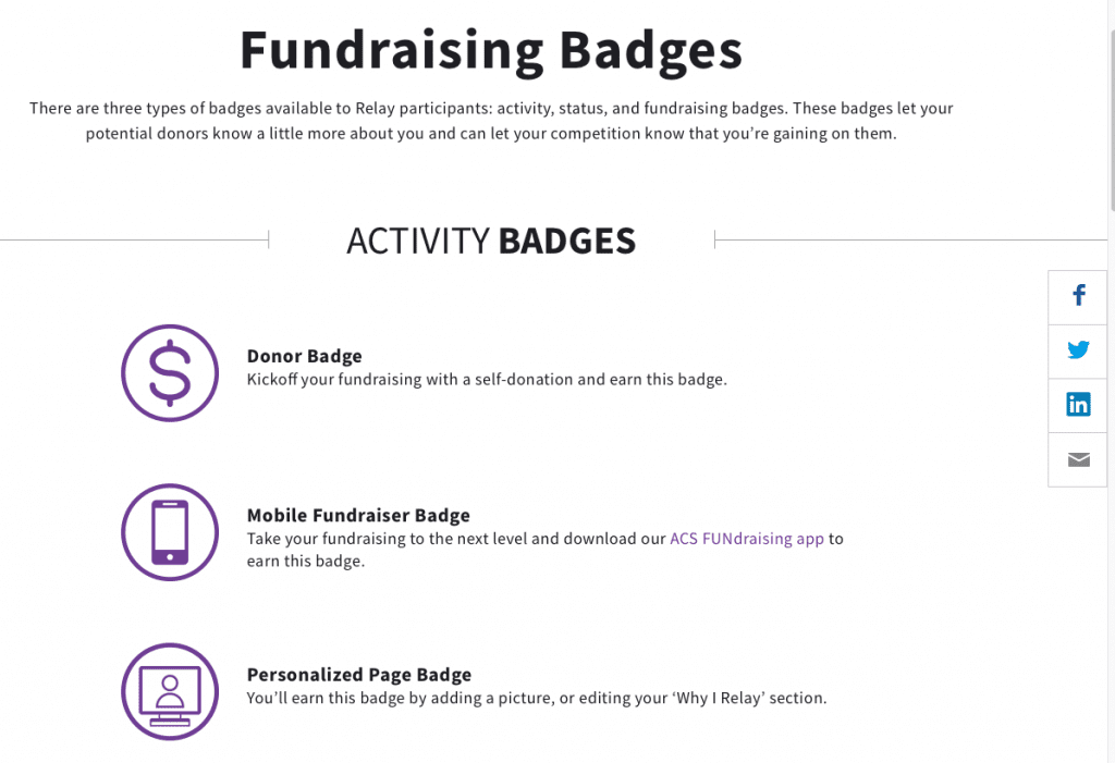
The donation “thank you” page should include an “I donated!” badge or hashtag that donors can share on their social media (don’t forget the sharing links). They can get pats on the back for supporting a great cause (there’s nothing wrong with wanting a little credit, guys) and your nonprofit can increase its reach. The American Cancer Society has a number of Relay For Life badges:
You could even go a step further if you’re using Instagram by pulling those posts that your donors have shared with a plugin on your website so that they can get the recognition they deserve for contributing to your cause.
Final Thoughts
Creating a non-profit website for your organization is a must – that’s where potential donors, supporters and volunteers are going to head when they want to learn more. When designed well, your website can increase awareness and fundraising.
People want to feel like they make a difference, and your website can show them how their actions create change. Your non-profit website has to appeal to them on both sides, before they donate or volunteer as well as after. When a supporter feels like they matter, they’re more likely to give again in the future.
Ready to get even more donations or volunteers? You’ll want to read this article, too: How to Create a Giving Tuesday Landing Page with Divi and GiveWP. You might also be interested in exploring our list of the top WordPress plugins for nonprofit websites.
Featured Image via Vector Goddess / shutterstock.com


Hey, Lindsay, you provide such great info about non-profit websites. For small businesses or startups, these tips are beneficial as designing is important part and it tells people about your brand, website or business.
Thank you, Lindsay, for sharing such an amazing post about non-profit websites. One of the keys to building viable websites for nonprofits is to make sure that everything on your website speaks to your mission and your cause.
Thanks so much Varun, and I completely agree!
Thanks For Sharing The Valuable Information. This will help me to Build My Website with Attractive Concept.
Thank you Lindsay,
You have shared very useful information. It will help me to build my website. Explained everything in detail.
Thank you for this valuable information.
Thanks for giving this information. It really helpful for for creating my website with good design .
Why don’t you create or offer a website and forum based offering together as I have been seeking a good dependable portal for our currently 100k strong user group on Facebook that dramatically has grown of late and significantly outgrown our current FB home but nobody appears to supply such a thing, I’m happy to adapt to suit so long as the main functions are in place to begin with I.e. website page/pages, a full working easily adaptable forum, contact page, joining/registration page and a easily changeable header area, and lastly an easy to use and see page links list running up one side, containing page links, log-in/register link, top posts from forum, stats showing currently online etc, direct contact page link and last but not least a Join our team link.
So tell me why has nothing like this ever been offered, I have been looking through many of your emails for a long time now but have yet to find anything even remotely with a great deal of adaption would work, so far I could only run it with a totally seperate forum and website which is not ideal and complicates matters to much.
Would love to hear your suggestions
Dave