
Gone are the days of Geocities sites with their hardcoded, never-changing HTML. Sites and apps today are dynamic and interactive. Our job as designers is to make it so that the interface through which they interact with our web UI design is as close to ideal as possible. Luckily, there are some nearly universal rules of that can help. We have put together what we think are the best design principles so that you can enhance all your future web design projects.
10 Rules of Good UI Design to Follow On Every Web Design Project
Subscribe To Our Youtube Channel
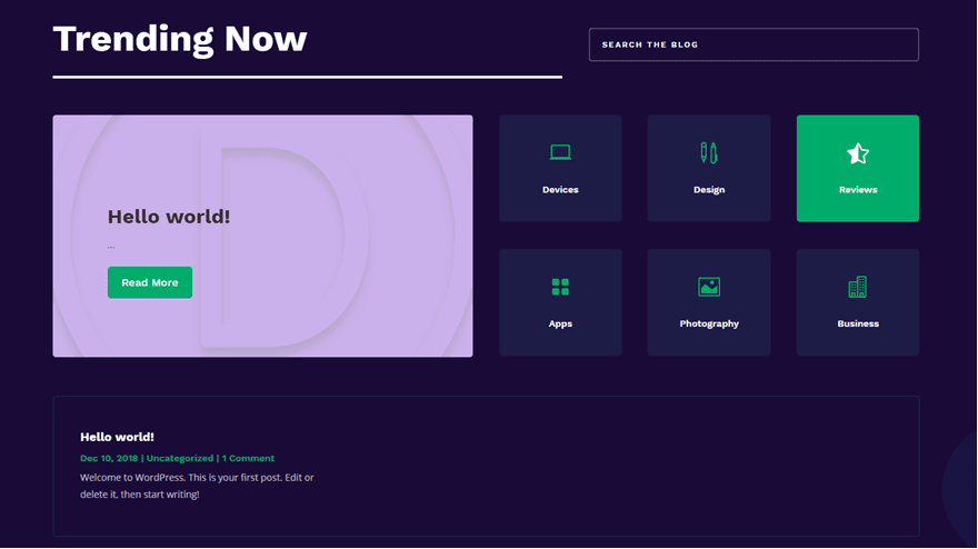
1. Make Everything the User Needs Readily Accessible
Whether it’s a series of design tools for web design apps, the inventory for a character in a video game, a spreadsheet, or anything else, if the user can’t find what they want, they bounce off your software. Tabs make things accessible. Shortcuts and hover tooltips, too.
We chose to use tabs to organize Divi, for instance. All the tools you need are right there in the builder, separated by category. Toolbars are similarly accessible. If you use WordPress, the admin toolbar gives you the ability to quickly get to the post editor, the theme customizer, plugin settings, and so on. The options are clearly labeled, and you don’t have to search them out.
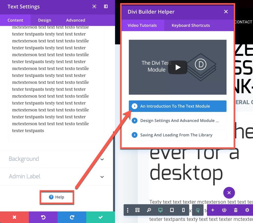
Another example is the Help/Support/Contact options. When designing a UI, whether it’s for a mobile app, web apps, WordPress websites, or anything else, your users will always need to find the Help button (or the Contact Support button). They will absolutely need to contact you at some point. That’s why you must always be sure to put the help buttons front-and-center. Look at Divi. In every module, we have the support button ready for you, at your fingertips, whenever you need it.
On top of that, the help window pops up with a video tutorial on whatever feature you’re working with. By including this in-module, Divi becomes far more accessible and less frustrating. Plus, as a part of the UI, the location for help is consistent across the entire product. Which brings us to the next point…
2. Be Consistent
Like we said just a moment ago, being consistent in feature placement within your UI is important. But you should also be concerned that your UI works and looks consistent across the entire product, too. Don’t have the menu on top of one page and at the bottom of another. Don’t rearrange menu items every time it loads. Make sure that your users know where things are on your site. If you keep a contact form underneath your blog posts, don’t decide to leave it off. Users will notice and be baffled.
Consistency also includes your fonts and design should work from page to page to page. Don’t go swapping header/body fonts from page to page.
There’s an interesting idea called the principle of least surprise that says if you make your user surprised at how something works…rework it so it’s more intuitive.
Additionally, you should make sure that your UI is proper for your platform — iOS apps work differently in some cases than Android. Desktop sites have different needs than mobile sites for menus, galleries, and even product checkout. Consistency means that you don’t frustrate your users by making them have to figure out what to do on your site.
3. Be Clear
This may seem like a repeat of above, but clarity and consistency are different. Clarity means that you want your users to know what to do at all times. In some ways, this also bleeds into UX design because it reduces frustration on your users and increases retention and reduces bounce rate.
Clarity is the reason minimalist (and to an extent brutalist) web design has been so popular. People are not confused about the purpose of any site or page because there is no (or little) clutter. You want to provide the opposite experience that Ling’s Cars does.
One way to achieve clarity is to move from one step to another on different pages. Instead of having a checkout process scroll down the page — or be contained within a single section or box — have your users navigate from a Product Page to a Shopping Cart page to a Checkout Page to a Choose Your Payment page to a Place Order page to a Confirmation page. (Amazon does this, as you can see in the image below).
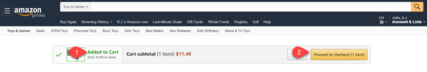
They will know exactly where they stand in the process, eliminating any ambiguity. This is especially important for mobile users, as screen real estate is at a premium.
4. Give Feedback
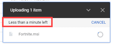
The last thing that users want is to not understand what is going on. If they press a button, provide an indication that the button was pressed. You can do it in multiple ways. You can animate the button, making it appear to sink into the page. Loading icons (like the MacOS Rainbow Wheel) provide feedback, “We are working on your request”, without having to say it.
If you allow users to upload files (such as with Dropbox or Google Drive), give an indication of time remaining. Provide a pop-up or modal that tells them their action was a success reduces frustration and confusion.
Really, whenever the user takes any action within your interface, just a small acknowledgment can be the difference in a good experience and a lackluster one.
5. Use Recognition, Not Recall

The opposite of good test-taking skills, you want your users to recognize everything about your site when they see it. They shouldn’t have to think about it and recall the information. More than anything, you are streamlining your interface so that every part is intuitive and moves from one point to another. This can be done by using recognizable icons as we mentioned above. People recognize certain icons for certain things.
It can also be done by using virtual tours to guide a user through a process, even when it’s not their first time. They will recognize the process once the first modal appears, and they won’t have to expend the energy recalling exactly how to perform those actions.
You may also be able to accomplish this through well-placed messaging that reminds your users of what on your site does what. We accomplish this in Divi with simple hover tooltips — even if someone doesn’t recall what the icon does, we lead them to its function. After that, they should recognize the icon. Or at least the tooltip if they hover again. Or even the process of hovering to get the information.
6. Choose How People Will Interact First

photo credit John Picklap, courtesy of MarieClaire.com
You know what’s the worst? Pushing on a pull door. Especially when you just pushed on a previous to get to that one. That building’s designer made the user interface inconsistent, so you had no clue how to do what you needed to do. What about pressing something that looks like a button that isn’t, but waiting for a response anyway? Well, that’s because those designers didn’t take into consideration how their users were going to interact with their product. So when you’re designing your UI, pick one movement (maybe two) and stick with it.
On mobile devices, that tends to be swiping. Look at Snapchat. Pretty much every single action is performed by swiping, including reaching your settings and profile. You can swipe down on Snapchat to see yourself, swipe left to get to the conversations, right to stories, and up to get to your memories (or whatever they’re being called this week). They chose how they wanted their users to interact with their product and designed their UI to accommodate that. Not the other way around.
When you’re designing your UI, choose if you’re going to use menus and taps, iconography, swipes and gestures, or something else entirely. Alexa and Siri use voice input as their primary UI interaction. The way they provide information and perform their tasks is designed around that particular input. And as a user, you know what to do intuitively because that information was set out for you at the beginning. The designers told you what to do, and you did it. Your users will appreciate you doing the same for them.
7. Follow Design Standards
The old saying if it ain’t broke, don’t fix it applies here. There really is no need to try to revitalize something if the standard works. That goes from icon usage to standard placement of elements. You don’t want to go against what your users expect things to do. People know that question marks (?) indicate help. So don’t use an exclamation point (!). If you want users to find your mobile menu, use the hamburger icon (the three stacked lines), not a grid.
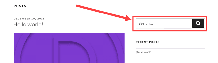
Think about search bars. They tend to be in similar places on most sites: the top of the sidebar or the end of the header menu. If not there, the center of the top section of the page. If you decide to include the only search field at the bottom of your sidebar, page footers, or beneath the text of your blog posts, folks won’t know where to look. Even if you identify it with the standard magnifying glass icon.
There’s nothing wrong with thinking outside the box and going for a new and innovative design, but that shouldn’t mean the design is hard to use.
8. Elemental Hierarchy Matters
No, we don’t mean that either Earth, Wind, Water, or Fire is the boss of the others. We mean that the elements on your page need to have a clear hierarchy for both utility and the way the user sees the page. Basically, you want to make sure that the most important functions are at the top of their respective pages. Additionally, this kind of hierarchy can lead the user down the page organically, leading the user through your service.
Large elements that decrease in size as you move through the process are indicative of importance and order. So does color and contrast. Making use of whitespace is also important, as clutter can stall user progress and draw the eye away from the purpose of the page. Clean lines, lots of space, and well-defined elements can visually indicate to your users how to move through your UI without any documentation or annotation.
A decent rule of thumb is that you want to keep things flowing from left to right, top to bottom.
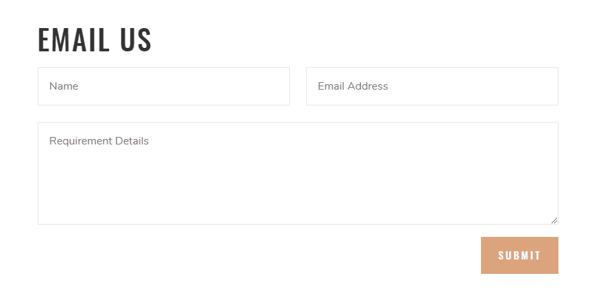
9. Keep Things Simple
Look at this contact form:
Now look at this one:
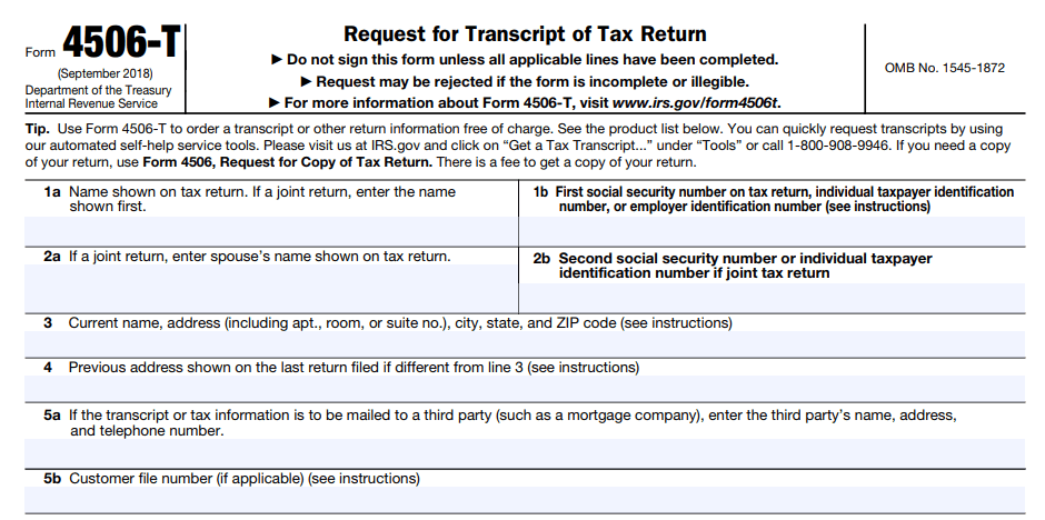
Both are contact forms to make a request. One of these is no problem to fill out, while the other is a bit more of a headache. Outside of being a government form, the design of the bottom form is not made for the user but for the administrator. That’s not your job. Your job is to make things as frictionless for the user as possible. And one of the best ways to do that is to cut out anything that’s not absolutely necessary.
10. Keep Your Users Free & In Control
The very last thing we want to touch on — and the very last thing you want to do with your UI — is taking control from the user. Or to make them feel confined or restricted by your design. You want to empower them, and your UI should allow them to perform the actions they want. There are two parts to this rule: context and permission.
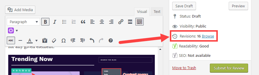
First, whatever action the user needs to take should be located near what they want to act on. If they need to edit a post, the edit button should be near the save, publish/submit, preview buttons. In fact, the better option is for contextual menus for all of the actions the user can take on any particular item (or page). If you’re consistent in your UI, as we talked about above, your users will understand that these context menus or toolbars will always have the entire list of actions for any given element.
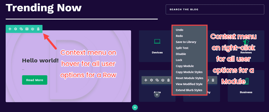
Additionally, your UI should always make the user feel as though they can get out of or revert any action they take. While you design the UI, they are going to be using it. So they need permission (or maybe even freedom) to do what they need to get the job done. Doing this can be as simple as adding a cancel button to every page of your ecommerce checkout (because pressing the browser’s back button may cause things to go haywire). Maybe it’s an undo feature so they feel that experimentation is okay. Or a revision history for large-scale projects (such as in Google Drive or WordPress or Git).
When your users feel free and unconstrained, you’ve obviously followed some good UI design principles.
Are UI Ready?
Bad pun. I know, sorry. But with these UI rules, you are absolutely going to be ready to knock your next web design project out of the park. While some of these may apply more to some projects than others, good UI is good UI, and good UI leads to good UX. But that’s a topic for a whole different post.
Do you have any rules for good UI design that you always follow?
Article featured image by emojoez / shutterstock.com


Great! This is such a valuable list to share. Thank you for contributing to better experiences for us all.
In this article i will build and publish a simple Google Chrome extension to easily access Traversy Media links. This is beginner friendly as it is only HTML, CSS and a bit of JSON. Use it to create your own launcher. If you are interested, please download and rate
Fantastic blog! Do you have any recommendations for aspiring writers? I’m planning to start my own website soon but I’m a little lost on everything. Would you propose starting with a free platform like WordPress or go for a paid option? There are so many options out there that I’m completely overwhelmed .. Any tips?
Thanks for sharing such useful information with us…
In point #2, I’ve been using Divi for almost 5 years and I have never seen icon options like that in the blurb module. What plugin are you using for icons?
I noticed that, too. Just did a quick search and found this: https://www.elegantthemes.com/blog/divi-resources/divi-plugin-highlight-divi-font-awesome
I think Divi Icon King 🙂
Very helpful advices.
Thx Divi to make things so easy to make websites
Nice article!
In the first point you mention Divi as an example because it makes “Everything the User Needs Readily Accessible”. That’s not entirely true though. For example, you don’t see right away which module design settings have a responsive or hover option. You’ll need to hover over the element title to see the little mobile/arrow buttons.
Thank you, BJ for sharing your insight into a good UI design. Do you know where to edit the size of the 3 lines on the mobile menu or the hamburger like icon?
Since you are mentioning DIVI as example a couple of times, I thought to chime in that I miss a prominent category selection on the DIVI blog. Yes, I see there is a list of categories at the bottom. But I cannot tell you how long it took me to find it. I expected a drop down in the menu at the top or a list in a sidebar. I tried the search feature when looking for a certain article that I saw in the past but the the search results where always useless. Not sure if others feel the same way but this was a big aggravation for me until I finally saw the list at the bottom.
WELL, I agree times have changed regarding Websites and the first question I ask when a new client needs a website is “show me some websites you have visited that you like”! You need to classify how website friendly they need to be! You also have to classify if they are selling a service or a product. You also have to hit them with a RANGE of money they have to spend on a Website. WHY! Because a startup is just as important as an experienced Website USER.
This system is more for an experienced Website USER who knows what they want. And it willing to pay for it, and has a website that can handle LOTS of information.
This a good reminder. Thanks Tom for writing it and BJ for updating this article. 2 Years on and I’m sure in another couple of years there’s going to be another update to this 🙂
1. Remember the KISS principle, “keep it simple, stupid”.
2. Read Don’t Make Me Think: A Common Sense Approach to Web Usability by Steve Krug
3. See 1 and 2.
Great post.
Thanks for the great insight!
I have so much to learn when it comes to proper web design. I definitely hit on all the points here but so much room for improvement.
Excellent Post
You mentioned very good points for an attractive UI design
Thanks for the Post.
Regards,
This is a good post
That’s a nice article!!
I think easy navigation and color appearance are the most important aspects for better UX.
Thanks Raxix! Easy navigation and color appearance are certainly important, but we believe everything on the list above is important 🙂
This is a very good article for every designer. Thank you very much
#11. Become best friends with your copywriter. And YES, use a copywriter.
If design and copy aren’t working together, the UI (and the UX) suffers. It’s all about the easiest path through your website/app/anything, so the storytelling must be seamless. Intuitive. Natural. And that only happens when everyone (designers, coders, copywriters) are collaborating.
I’ve seen so many UX/UI articles where copywriting is never even mentioned, and it’s one of the most important aspects. Not THE most important, but it’s critical.
You sum it up! This is a good post and a good list of rules to follow on every web design project. Thanks for sharing.
Fantastic article with some really good tips in it. Thanks for sharing
Fantastic article with some really good tips in it. Thanks for sharing
Great article Tom, thanks!
Though I have to admit my ‘chuckling’
when I see the phrase “User Interface/UI”.
Largely due to having come from a career spanning stints as a graphic designer, art director, creative director, then director of creative services.
Although heavily involved in most-things-web now, I still am responsible for “UI” for print marketing media, to include ads, direct mail, brochures, etceteras.
Designing for the media.
Designing for the market.
Designing for the user.
IMHO, interfaces are no better defined than “any visual that is in dialogue (if you will), with the user.”
My chuckle is that although the above rings true– you rarely hear someone, working on a print campaign, discussing the media at hand for same (postcard, advertisement, pamphlet/brochure) in terms of UI when well they could.
🙂
Again, thanks for the article.
And the chuckle.
— Michael
A great post, always good to be reminded of what underpins good designs. When we work with clients, we always highlight the importance of knowing your audience in designing the UX.
It is amazing how many businesses do not know their target markets and prospects well. Going through the process of creating customer personas, we find, informs both the design and content creation processes and, in the end, makes for a site that creates more conversions.
A good summary, thanks. I agree with Ben that content and brand strategy are key drivers for vitrines / content-driven sites. When it comes to transactional or enterprise apps, the focus will be more on task flow, efficiency (of task completion), clear visualization of data, and feedback mechanisms.
This is another great post by Tom Ewer. It is a great post for learning proper web design. I think every steps of this post are very helpful for every web designers. Thanks you Tom Ewer for such type of informative and knowledgeable article.
Content architecture is also at the heart of UI design, especially in the WordPress sites sphere (as it is a content management system after all).
If you have a strong content fondation, which has also consistency, you will be surprise how easy it can be to build pages with such great tools as the Divi Theme/Builder.
Thanks for this nice round up of best practices. I most definitely agree that these skills are the ones that keeps you ahead of the pack as a web dev/designer (not being elitist here – just realistic about the service value).
I love Elegant Themes! I love Divi! But, you’ve had several blogs in which you use – and don’t define – acronyms such as UI and UX. For the neophytes among us, could you please define the terms you’re using?
Thank you.
UI is user interface. UX is user experience.
I believe UI Design helps us to engage our customer.according to me,Ui design can easily maximize the conversion.Thanks for the UI Design rule.I appreciate your hard work 🙂
A Fabulous Post! Shareing…
Great article, thanks tom..
Nice! for rules of good ui desing!!
Thanks.
Excellent information but I think these days responsiveness is also playing very important role when it comes to taking decisions on designing part.
I completely agree; we are design for responsiveness and a quicker learning curve.