
There’s a lot more to being a great web designer than simply having the necessary technical skills. Another key element to success is keeping up to date with the latest web design tips and trends from the world of online publishing and beyond.
Keeping your finger on the pulse gives you the option of becoming an early adopter of emerging design trends and styles. This, in turn, can help you to deliver projects, whether your own or for your clients, that really pack a punch. Having a solid arsenal of web design tips to turn to when it’s time to get down to work can also help to speed up your workflow.
Even if you’re a bit of a maverick who prefers to walk your own path rather than following the herd, keeping abreast of the latest web design tips and trends has it advantages. For one, it’ll make it easier to understand the needs and wants of your clients when discussing their vision for a project and they want to emulate something they’ve seen elsewhere.
And if you really want to be original, being aware of what’s popular now will help you to avoid those trending web design tips and styles and create something that is all your own.
So in this article, you’ll find a collection of useful web design tips that will help your WordPress website and the client projects you work on in 2016 achieve success – whether you want to implement them or ignore them in your quest for originality.
-
1
12 Web Design Tips to Help You Achieve Success in 2016
- 1.1 1. Use Style Guides
- 1.2 2. Phase Out Sidebars
- 1.3 3. Start Your Designs Offscreen
- 1.4 4. Use Larger Font Sizes
- 1.5 5. Create More Space
- 1.6 6. Responsive Design isn’t Optional
- 1.7 7. Take Advantage of Google’s Material Design
- 1.8 8. Expand and Reevaluate Your Toolkit
- 1.9 9. Simplify Navigation
- 1.10 10. Up Your Imagery Game
- 1.11 11. Phase Out Sliders
- 1.12 12. Learn A/B Testing
- 2 Final Thoughts on Web Design Tip for 2016
12 Web Design Tips to Help You Achieve Success in 2016
When it comes to creating websites, whether for yourself or for your clients, success doesn’t come easy. To increase your productivity and keep your output looking fresh and modern, not to mention optimized for search engines and conversion rates, it’s essential that you’re always learning as many new tips and techniques as possible.
So, let’s explore a few different web design tips that can help you out in 2016.
1. Use Style Guides
Create your own or adopt an existing style guide – image by Google
Style guides are popular in the publishing world. They can come in the form of large books or documents that media publications follow to maintain uniform styles throughout their content. This can include everything from how states and countries are labeled to how numbers are written.
Web designers can create their own style guides to ensure the sites they build have uniform styles throughout. This is especially useful for designers who collaborate with other freelancers. A well-written style guide can help keep a disparate team on the same page.
The style guide Google produced for its own Material Design is a great example of a thorough, well-written style guide. If you’re looking for a more generic style guide or set of rules to apply to your work, be sure to check out our guide to the essential typography books for 2016.
Maybe it’s time to reconsider the sidebar
Sidebars create clutter. They were meant to improve the usability of a site by displaying additional navigational elements, such as links to recent posts and popular content.
Over time, it’s fair to say they’ve been hijacked by savvy marketers looking for a way to display email optin forms and other promotional content that doesn’t always offer much to the user experience.
While in theory sidebars containing links and other useful content should enhance the user experience, in reality, very few site visitors actually use them, at least according to heatmap tests conducted by ConversionXL. Therefore, compromising your site’s design in favor of a sidebar for marketing purposes may not deliver the results you desire.
Try phasing sidebars out in your designs, especially if a site doesn’t really need one. Make your content the most important element on a page by using designs that force readers to focus on it.
If the thought of abandoning sidebars altogether sounds a bit extreme, look for a theme that gives you the option of publishing full-width content, alongside more traditional layouts that feature an accompanying sidebar.
You can do a lot with the humble WordPress sidebar and one web design tip for 2016 is to get smarter with the way you do or don’t use them.
3. Start Your Designs Offscreen
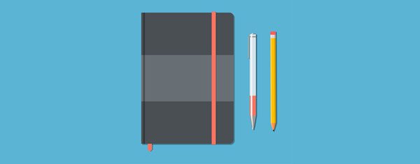
Try starting your designs outside of the code editor – image by MoonRock / shutterstock.com
Do you create code and designs on the screen at a rapid rate, without a care of how things will turn out as you know you’ll edit and clean things up later on? If so, why not try a new approach in 2016.
Instead of jumping right in and figuring things out as you go, why not turn to the trusty pencil and paper or use a whiteboard to plan an overall site layout offscreen first. Use this approach to get an idea of where you want specific elements to go, much like how an architect uses floor plans to plot out where windows, doors, and rooms should go.
If adopting a pen and paper doesn’t appeal, there are plenty of great wireframing and prototyping web design tools out there that can help you quickly get your ideas out of your head, before you get started in your development environment.
4. Use Larger Font Sizes
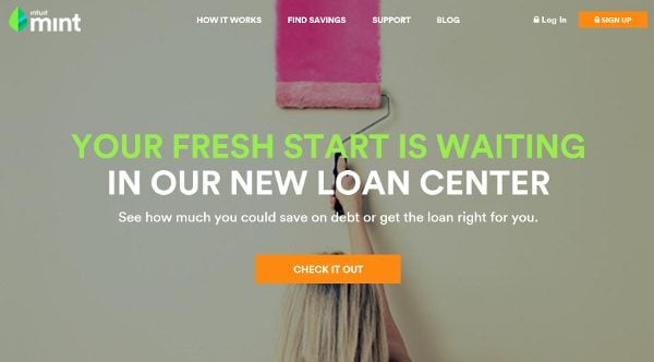
Experiment with large typefaces – image from mint.com
Big typography isn’t a new trend or aspect of design, but it’s still a great practice to follow in 2016. This is because it has the power to grab the reader’s attention and places the focus on your content.
Readability on smaller screens, such as mobile devices, has played a huge role in this trend’s rising popularity, but it also fits in nicely with the ever-popular minimalist and flat design trends.
One web design tip for 2016 is to try incorporating larger font sizes in your designs, such as a minimum font size of 18 points for body text, where it makes sense. This includes any text you place in header images or even the text on a homepage when using a large, hero image. Just make sure you focus on choosing a web-friendly typeface that scales well, rather than agonizing about which size to choose.
5. Create More Space
Don’t fear the whitespace – image by grop / shutterstock.om
Too much clutter can distract readers and make a site appear overly complicated. That’s one reason why phasing out sidebars is recommended. However, you should also try creating more space in general rather than trying to include as many elements as you can on a page. Again, it helps a reader focus on what’s important while giving you the opportunity to build better-looking designs.
This space is typically referred to as “whitespace” or “negative space,”. However, this space doesn’t always need to be white, especially if you’re building a website that uses large images on its homepage and headers.
Minimize the amount of clutter in your designs and include more space around and between elements to help guide your users through your site. Whitespace can make it clear where a reader’s attention should be focused.
6. Responsive Design isn’t Optional

Are you ready for mobile first design? – image by MPFphotography / shutterstock.com
Mobile device usage continues to grow, especially when it comes to accessing websites. This means that it’s never been more important to ensure your websites are mobile-friendly.
So one key web design tip for 2016 is to fully commit to responsive design. In the past, this simply meant checking off the responsive design box on your to-do list. However, as this technology matures, you need to start considering more than just fluid layouts. Think mobile optimized images, whether hamburger menus are the right choice, and much more.
For 2016, you might even want to embrace the concept of mobile-first web design.
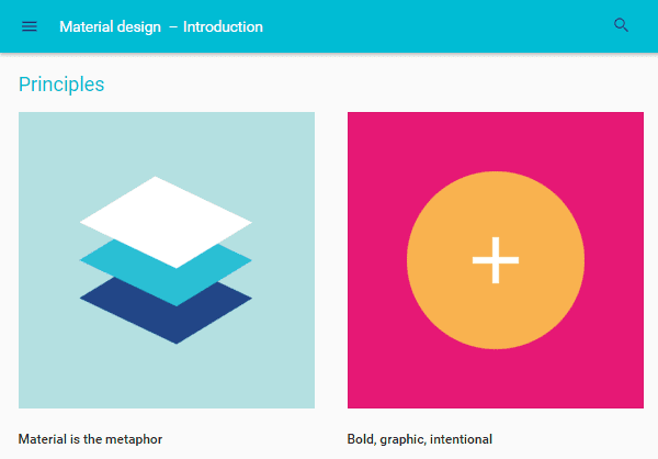
7. Take Advantage of Google’s Material Design

Google’s Material Design is here to stay – image by Google
Google ramped up the use of the Material Design philosophy in 2014, and digital designers have been quick to follow suit.
If you’ve embraced the flat web design trend, then it’s probably time for you to jump on the Material Design bandwagon and update your style for 2016. The core concepts of this web design framework include using layers to create elegant shadows alongside the edges of elements, helping to add some much-needed style and depth to the minimal flat design trend.
If you want to get started, there are some great, free Material Design UI kits around that can help get you up to speed.
8. Expand and Reevaluate Your Toolkit

Keep an eye out for new tools that can help you – image by Adobe.com
Are there tasks in your workflow you feel could be more efficient or at least, more enjoyable? Then one web design tips that can help you out is to do a little research and find out if there are any new tools that better meet your needs.
Just as new web design tips are emerging all the time, so too are new web design tools. From hot new free apps like Pixate, through to updates to industry favorites like the Adobe CC apps for web designers, it’s always worth keeping an eye out for something new that could help improve your workflow and enjoyment levels.
Unclutter your menus – image by Titov Nikolai / shutterstock.com
Placing tons of links in your navigation menu, sidebar, blog posts, and even the homepage may seem like a great way to keep people on your site, but it can actually go the other way. Complicated navigation systems create way too many options for people, so much so that they may decide to leave your site altogether.
Placing fewer items in your navigation menus and eliminating sidebars are great ways to cut down on the amount of clutter that exists on your site. This can allow you to build better-looking designs without compromising user experience or conversion rate optimization.
10. Up Your Imagery Game

Take your imagery more seriously – image by Fouaddesigns / shutterstock.com
Upgrading the quality of the images you use in your work is a great web design tip for elevating your projects. Instead of simply using the free images that everyone else has access to, it might be time to invest in a premium stock image service.
The next level up could be to create or commission your own images from scratch, whether that’s going out and taking high-quality photographs, drawing them yourself, or a combination of the two. Combining typography with your chosen images can be another effective way to make them more original and assist you in delivering your message.
Choosing beautiful imagery for your website is a proven way to assist you in achieving your goals and help your content stand out from the crowd.
11. Phase Out Sliders
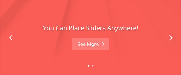
Are your sliders really adding anything to the user experience?
The decision between whether or not to use sliders is a highly-debated topic.
However, in most cases, they should really be phased out in 2016, especially if you want to decrease the amount of distractions on your site and make it easier for users to find their way around. Sliders don’t do either of those things. They’re very similar to sidebars. They create way too many options for your visitors to choose from, and very few people actually use them.
If it’s your homepage you’re concerned about, opt for a large header space that uses a unique, well-crafted static design that clearly defines your brand of that of your client. Again, play around with big typography to make static images more visually appealing and come up with better page designs that make sliders redundant.
12. Learn A/B Testing
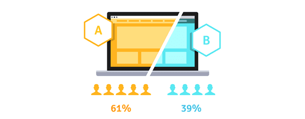
Validate your ideas with split testing – image by Iconic Bestiary / shutterstock.com
A lot of these web design tips are general advice based on current and upcoming trends in the digital space. However, there’s no guarantee they’ll work for your site.
You also shouldn’t necessarily feel obligated to use or forego certain design elements simply because it’s a current trend or now an unpopular style. A/B testing is a skill you can learn to find out whether or not your designs are working or not.
Maybe you or your client want to use a slider or a busy sidebar and don’t want to give in to the conventional wisdom that states they’re outdated and ineffective. A/B testing is a great way to implement a new design and test its effectiveness yourself. Split testing is also an effective way to negotiate compromises between you and your clients, thanks to the evidence that can help back up your recommendations.
Check out our guide on how to use A/B testing with WordPress if you want to learn more.
Final Thoughts on Web Design Tip for 2016
Continuing to learn and pick up new web design tips, no matter how much experience you have, is one of the most important things you can do to achieve and maintain success throughout your career.
Hopefully, these web design tips have given you something to think about and help point you in the right direction for more learning and experimentations. Perhaps the final web design tip should be not to rest on your laurels, no matter how successful your 2015 was.
Which web design tips will you be embracing in 2016? Please let us know in the comments below.
Article thumbnail image by Bloomua / shutterstock.com


Some excellent information within this article! Brilliant read and helped me to learn a bit more!
Brilliant article 🙂
As designers, I think we can often get caught up in making websites a little too fancy.
While it’s important to set your design apart (and create something for a client that sets him apart), I find that I have to constantly remind myself that great design is ALWAYS compromised if navigation, layout, and wireframe structure are not first in place.
I think the whole idea of using more white space and having no sidebar helps facilitate a much easier website experience on almost every single website.
I agree Jeremy. The best design is the one that achieves its objective. If that can’t be achieved because the design is too abstract or “cool” then it’s not actually that great of a design.
I enjoy reading your blog posts. Always learn something new! Thanks.
Any thoughts on the Long Scroll? I am building a new Divi website and I’m focusing the most important information on the first page in a long scroll design. My old website is becoming boring with way too many links and sidebar links. My new website has no sidebar and minimal navigation links.
Hi Brea,
I think ditching the sidebar is probably a wise decision. But with that decision it sounds like you recognize that simplicity and ease-of-use are what you’re pursuing so I would be cautious in creating a really long, scrolling design.
To put it another way, don’t remove the “sidebar” and then just put it in another place. Your design should always be confident in saying: “each piece, each section, each element of me is essential to the message and purpose.”
https://www.paypal.com/us/webapps/mpp/how-to-use-paypal
I actually think that PayPal does a really good job with long scrolling design so I thought I’d include it if you needed some inspiration!
As usual, great article. I’m glad the new design trends are looking towards uncluttering. Unclutter sidebars, menus, avoid redundant sliders if they do not add value. I truly think this makes a difference. We already live in a world where we are constantly cluttered with packaging, colors, shapes, sizes in every possible combination. You just take a quick look at a supermaket consumer products area and you can tell what I mean. I’m glad the web design trends are getting more mature than this. Uncluttered designs look much more peacefull, clean, willing to read.
I couldn’t agree more.
Thank you for these tips, Joe. Great post!
That is a good point about supermarket products and displays. I always think more uncluttered designs give a more premium feel so maybe offline products will head in that direction.
Joe
Great Post.
Liked the lines- “Continuing to learn and pick up new web design tips, no matter how much experience you have, is one of the most important things you can do to achieve and maintain success throughout your career.”
Very Useful
Thanks.
Thank you. Beautiful collections!!!
Sidebars are irrelevant in most of the cases now, they don’t drive any traffic in most of the cases.
Yes, but always try testing your designs to see how this tip applies to your project.
Good point, Joe. In addition, I think Brian Gardner’s Divi Nation episode made a powerful point in saying that sidebars were originally created to compensate for some of the more inefficient aspects of web design at the time. With advances in fullwidth display and mobile responsiveness, however, sidebars tend to add clutter and length (on mobile view) which isn’t good for conversion.
Great tips Joe! Web designers should re-assess their web design skills and implement some of the tips that you shared here.
Thanks George.
Good article. In the Create More Space section it got me thinking, what is the optimal website content width. Divi theme is set at 1080 but according to StatCounter Global Stats the most viewed size is 1366px wide. This is the setting I use. So my questions are:
1. Why does Divi default at 1080?
2. What do you (Elegant Themes) think the optimal website content width should be?
I know many will say with responsive design it doesn’t matter, but you do need to set a reference point.
Thanks
Just curious, why this page isn’t responsive? Clicked over from Facebook (but I am a paying member for several yearsl I can’t read this post on my phone.
We’re in the process of a re-design. It’s overdue but we’re confident it’ll be awesome when we’re done 🙂
Wow!!! great thank you….
Hey Joy,
Nice to meet you here… 🙂
A very-very special site for me.. you know. This twelve tip are more beneficial for me. You don’t know that I was searching and waiting for like this article. And finally I found all the techniques here.
This tip can enhance our style in making site you know. After reading this tip I just can’t hold myself comment you.
Thanks a lot for sharing a bunch of informative tips…:)
Have a great week ahead.
– Ravi.
I’m still new to designing websites, but if I have too many links for a menu, and it’s not a good idea to use a sidebar, where do the additional links go? It doesn’t always work to create dropdown menus if the items aren’t related.
You might want to try mega-menus with multiple drop down menus all in one. That way you can use more general terms as a single option in your main menu. For example, instead of listing all categories in your menu with a drop down for each, you might simply list “categories” in your menu. The drop down would display each category name, and each category name would also have it’s own drop down menu when hovered over.
That seems like it would really bury the pages down several levels.
I keep telling my husband this all the time!– The size of the text really matters which newer devices coming on the market!
Great article, but for me using sliders depends on the website and the client. I have several clients that actually insist on them. I still think they can be useful in some cases. Should be interesting to see what’s next 😉
That’s absolutely true for me too. Most of the clients (that by the way know nothing about conversion and web practices) just WANT to have a slider in their homepage. It gets difficult to convince them with static imagery.
As everyone here, I am also the one who hates sliders. I mostly avoid it using in our projects. I would rather use big image with gradient effect and big font #4 tip which gives me better result than sliders. And material design is cool, same time look like google product.
I love that design changes every few years as it always has and we have to stay in shape to keep up with it! Thanks for the tips!
I was just wondering about sidebars the other day. That real estate is too valuable to have something there that doesn’t perform.
Agreed. Some blogs still make great use of their sidebars…BUT the data suggests overwhelmingly that items like email sign-up forms and social follow widgets simply do not perform well in the sidebar. They’re just expected. Things like in-line prompts, slide-ins, pop-ups, hello bars, etc. are what really convert.
This is to true. I really like this article. Particularly the part about starting the design off screen. It’s important to put together sketches, and ideas about what you can do for your site and how it may look and flow. Good article.
Yes, you can’t beat a pencil and paper sometimes.
I am still not 100% convinced having sliders on your front page is a bad thing. That said, I would like to be able to make the slider “clickable” and not just the CTA button we attach to them. I feel that, as long as they help tell the story of the product or service they can be a useful tool.
Not willing to throw the baby out with the bathwater.
I have used the Google Material Design Guide as much as possible, as it does have many excellent ideas in it.
However, you need to be aware that if you wish to adhere to the Google guidelines on fonts, then ET make if very difficult to do so within Divi.
This because Google recommend Black text with an opacity of 87% for headlines and body text on white backgrounds, but it is not possible to set opacity for typography in the Divi Theme Customiser, so you have to use css in the ePanel to acheive this. You can then use the rbga( ) colour settings.
Best regards
Thanks for pointing that out Paul. I’ll make a note of it and pass it on to the team. Would be cool if we could adjust the transparency of text from Divi’s customizer.
One of the problems with sliders is the fact that a number of customers want to see sliders on their front pages and it can be difficult to dissuade them.
how do others go about this?
Martin, there are conversion tests that have shown sliders reduce sales. That’s always been convincing enough in my experience. Sorry I don’t have a link, but Google Wider Funnel Marketing and poke around.
You could point them towards literature on this topic.
You could also do some page speed testing using something like Pingdom and show them the difference in loading times of a page with a fully loaded slider with images, vs. a non slider page. Then explain the benefits of a fast loading website.
You could even do some user testing and show them how non-technical users interact with sliders.
Then there’s the mobile user consdierations to take into account.
Hope this helps.
This is a really good point. Sliders are popular with people who are not concerned about performance…until they become concerned about performance.
Excellent tips. I’m working on my style guide to keep myself organized. I got rid of my slider a while ago. They slow up a site dramatically. I definitely want to incorporate larger font sizes as well. And I’ve been thinking of getting rid of my sidebar, but I don’t want my blog posts to span the whole width of my site. I think that will be uncomfortable to read. Any suggestions? Should I just leave it a blank white column?
As I mentioned to Korgster above, try manipulating your “max width” for that content to see if you can’t find a good balance.
Another fine article! Thank you.
1. I second WP Propeller’s point (and in this article), phase out the sliders. This is always a tough sell with my clients but as it’s been said… adds little to a site.
2. I do have a question regarding elimination of the sidebar.
Because themes such as Divi display the content in a wide area, I’m finding readability of standard content/pages is compromised. Lines of text are now very long and it has always been said that we should have limited words on a line for legibility … think newspapers.
I welcome comments on this. Cheers!
Good point Korgster.
I still think there is a long way to go towards perfecting how website content is displayed on the growing range of screen sizes available.
If you lose the sidebar without considering large screen resolutions, then you’re going to run into more readablity issues.
Indeed Joe. And readability is of utmost importance. Without it, it matters none how good the content is… it won’t get read. 🙁 I tried narrowing the text width (Divi’s Max Width) as Nathan suggested but on desktops, without a sidebar, the lines are still too long. I predict one would lose potential readers. In conclusion, for “regular” content pages I would seriously reconsider removing a sidebar altogether and instead, keep it by displaying something useful to the reader (contact number, Visit our store, etc.)
Hi Korgster, I’d recommend taking advantage of the text module’s advanced design setting for “Max Width”. This will help you control the width of text on full-width pages.
Thanks Nathan. Good suggestion. I’m new to Divi and I wasn’t aware this option existed. Thanks again for the pointer! Cheers,
Great post. I couldn’t agree more with #11, phasing out sliders. It’s shocking how many designers still create websites with sliders on the homepage despite the plethora of data that shows how sliders are absolutely terrible for user experience, which results in terrible conversion rates.
PS – your Propeller service looks very interesting!
Thanks Joe! We’re hoping to solve the technical problems that many WordPress users face; allowing users to create top notch websites without dealing with hosting, security, caching, updates, etc.
Thaks!
Yeah, sliders are easy to get wrong and difficult to get right. Although I do believe they have a place and still see them being used effectively from time to time.
Always Be Testing!
I totally agree with you, Joe. Years ago I was spending a lot of time to get the sliders right and I was never satisfied.
Now I prefer static content. It’s harder to fail with this.
These are really helpful tips to achieve success in web design in 2016. Style guides, font sizes, sidebars, color combinations and A/B testing plays important roles to make your site look good.
Thanks, Gaurav.
Yes, I think the testing aspect is probably the most important tip as its hard to say what will work the best for certain projects, even if its a tip that has worked well in the past.
Hello Joe,
I am a fresher looking to make a living with wesites. I want to start up a website on motivational or healthy articles. please guide me with some tips on how should I proceed with the website. I mean what kind of format should I chose and other such specifications so that I can reach global audience also.
I am a resident of India.
Thanks In Advance 🙂
Hi CBugs,
I’m afraid it’s not quite that simple. For a blog to become globally significant a great many things need to happen. Each of which a whole book could be (and probably has been) written about. That said, as the editor of this blog which has reached a large global audience I can tell you what has made the biggest difference for us.
Nick, our CEO/Founder, started this blog and grew it to where it’s at today. The three biggest growth factors have been effective email list building, SEO centric content planning, and domain authority.
Email List Building – we highly recommend using pop-up email opt-in forms for gathering email addresses. This simple practice increased the amount of emails we captured by something like 6,000%.
SEO Content Planning – try using tools like SEMRush and Buzzsumo to figure out who is creating the best content and around what search terms for your niche. Then make better content more highly optimized for those same terms. Also, branch out into related terms and “long tail” terms associated with the primary terms.
Domain authority – there’s actually not a lot you can do to manipulate this metric. One of its biggest indicators though is the number of healthy backlinks your website has. Do your homework on non-spammy backlinking practices and get ready for a long grind.
I’d recommend reading everything you can from moz.com and Neil Patel. Those are two of the most solid resources and if you start there and branch out you’ll be better off than trying to absorb advice from hundreds of places right off the bat.
Hope this helps!
Best,
Nathan
Great Post! I’m a total novice and anytime I can learn just a bit, it’s great. Thanks.
Any web page is made of HTML elements that lay themselves out in a tree structure. We start at the top and then have multiple branches with branches that branch out from there.
A diagram of a DOM tree
To decorate our tree, we use CSS to specify which branches should receive the tinsel we wish to adorn upon it. It’s all so lovely.
In years past, this was rather straightforward. But these days, our trees need to be versatile. They need to be responsive!
Responsive web design is pretty wonderful, isn’t it? Based on our viewport, we can decide how elements on the page should change their appearance to accommodate various constraints using media queries.
This is the place for you then! Thanks for reading and come back often 🙂