6 Text With Background Designs For Divi 5 (Free Download!)
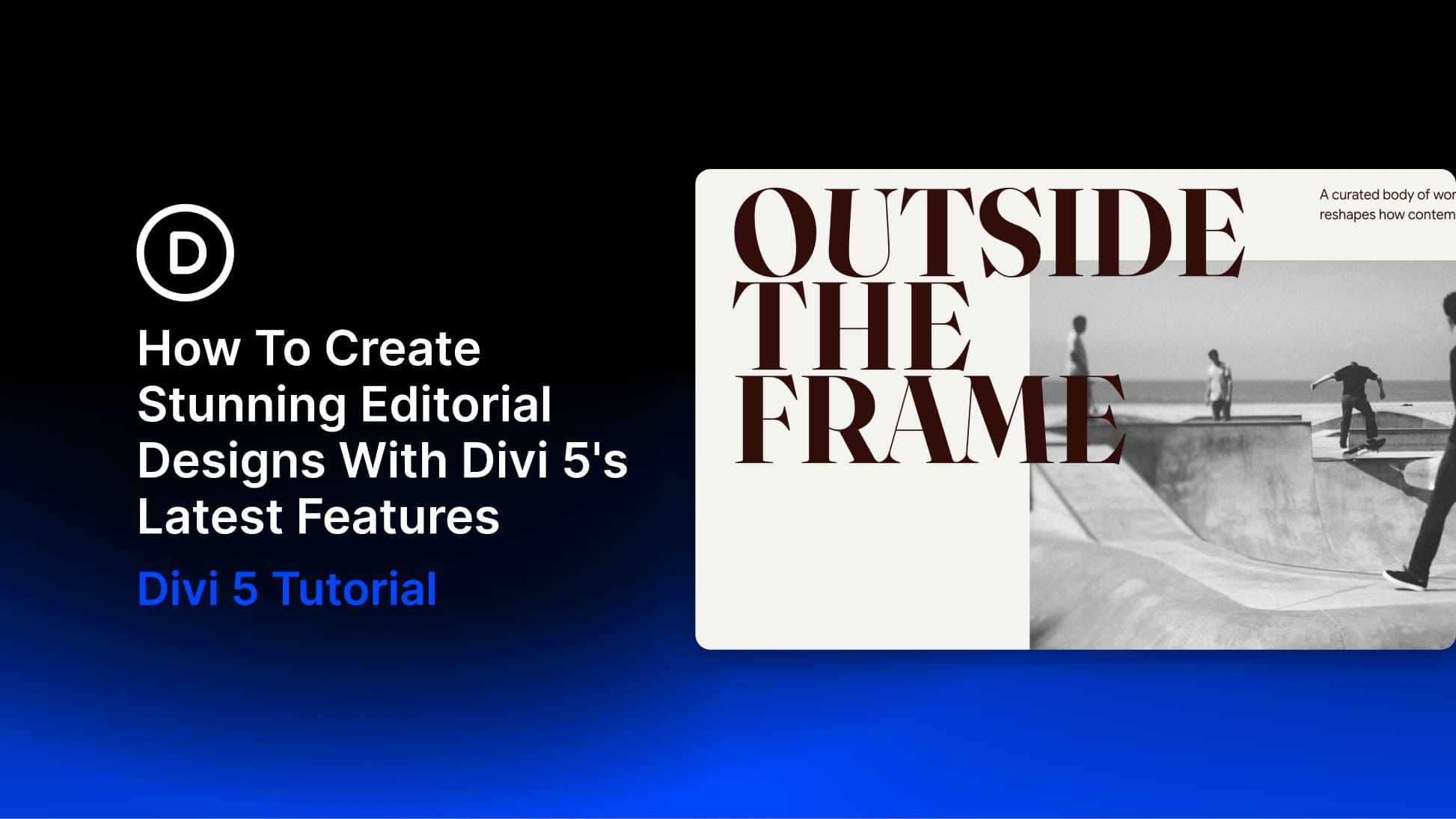
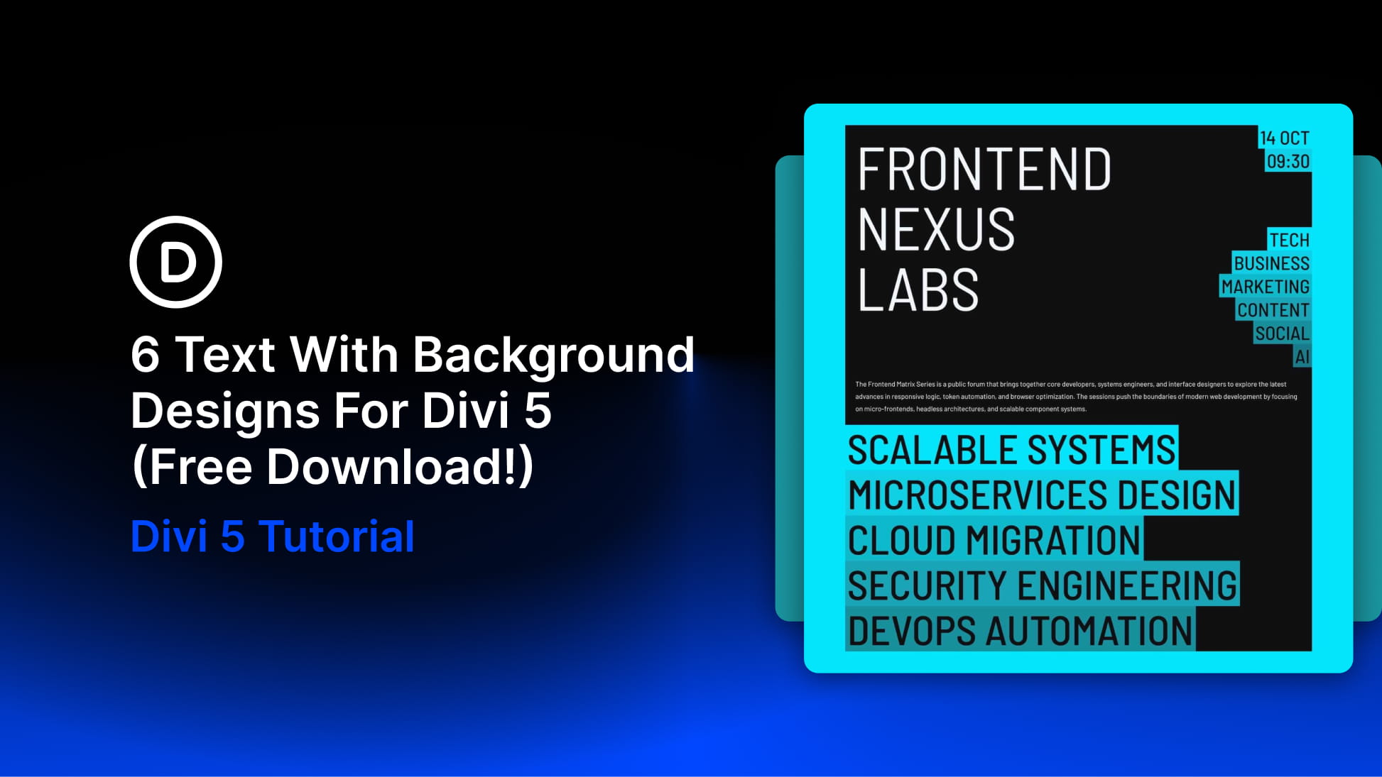
A background behind a few words can change the emphasis of an entire section. In this free pack, you’ll get 6 Text With Background Designs for Divi 5, combining bold typography, contrasting color, and supporting imagery to give your message a clear focal point. These styled sections work as...
View Full Post