
Creating visually balanced and responsive layouts is essential in modern web design, and Divi 5‘s new Flexbox Layout System makes it easier than ever to achieve vertical alignment. This powerful new feature allows Divi users to design flexible, dynamic layouts, offering complete control over vertical positioning. Whether aligning text within a section, balancing content in multi-column rows, or creating responsive designs, Divi 5 simplifies the process with intuitive controls built directly into the Visual Builder.
In this post, we’ll walk you through the steps to master vertical alignment, provide real-world examples, and offer tips for creating responsive, polished layouts. Let’s explore how Divi 5’s Flexbox Layout System can transform your approach to vertical alignment.
Understanding Divi 5’s Flexbox Layout System
Flexbox, or Flexible Box Layout, is a CSS layout model designed to simplify the arrangement of elements within a container, making it ideal for horizontal and vertical alignment. Unlike traditional methods like floats or margins, Flexbox provides a straightforward approach to organizing content. It allows elements to dynamically adjust their size, order, and alignment based on the container’s dimensions and the viewport, ensuring layouts are consistent and responsive across all screen sizes.
With Flexbox, you can effortlessly center content, distribute space evenly, or stack elements in a specific order. This flexibility makes it a must for web designers, and Divi 5 harnesses its power to allow users to create sophisticated layouts without needing advanced knowledge of CSS.
How Divi 5 Integrates Flexbox
Divi 5 has recently introduced its Flexbox Layout System. This system integrates Flexbox directly into the Visual Builder, allowing users to control section, row, column, and module arrangements with intuitive settings.
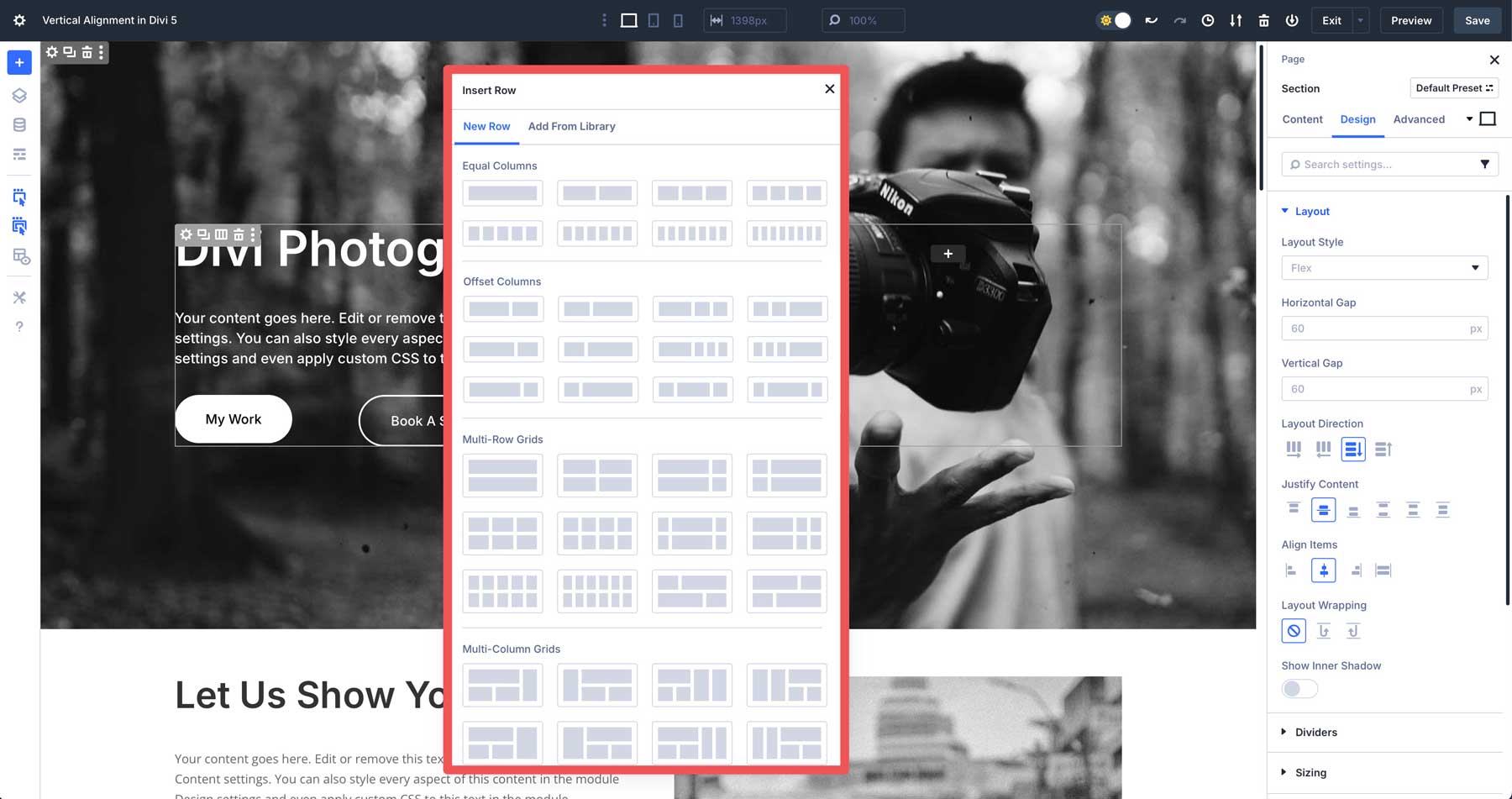
Key features include a variety of new row templates, from single columns to multi-row sections, making it easier than ever to build layouts in Divi.
Divi 5’s Flexbox controls allow you to control the direction of your layouts, adjust horizontal and vertical gaps, justify content to the start, center, or end, enable wrapping, and more.
Divi 5’s new Change Column Structure feature gives you more control over how columns behave on smaller devices. You can easily change the number of columns or reorder them, making designs look great on any screen size.
Divi 5 moves away from specialty and fullwidth sections, as rows can now be nested within one another to create complex, responsive designs without relying on outdated section types. These advancements make Divi 5’s Flexbox Layout System a powerful tool for building modern, adaptable layouts directly within the builder.
Setting Up Vertical Alignment In Divi 5
Divi 5’s Flexbox Layout System is seamlessly integrated into the Visual Builder, making it accessible for users to create flexible and responsive designs. To start, open the Visual Builder on a new or existing page and add a section and row. We’ve created an entire layout so we can walk through the steps to align items vertically in various scenarios.
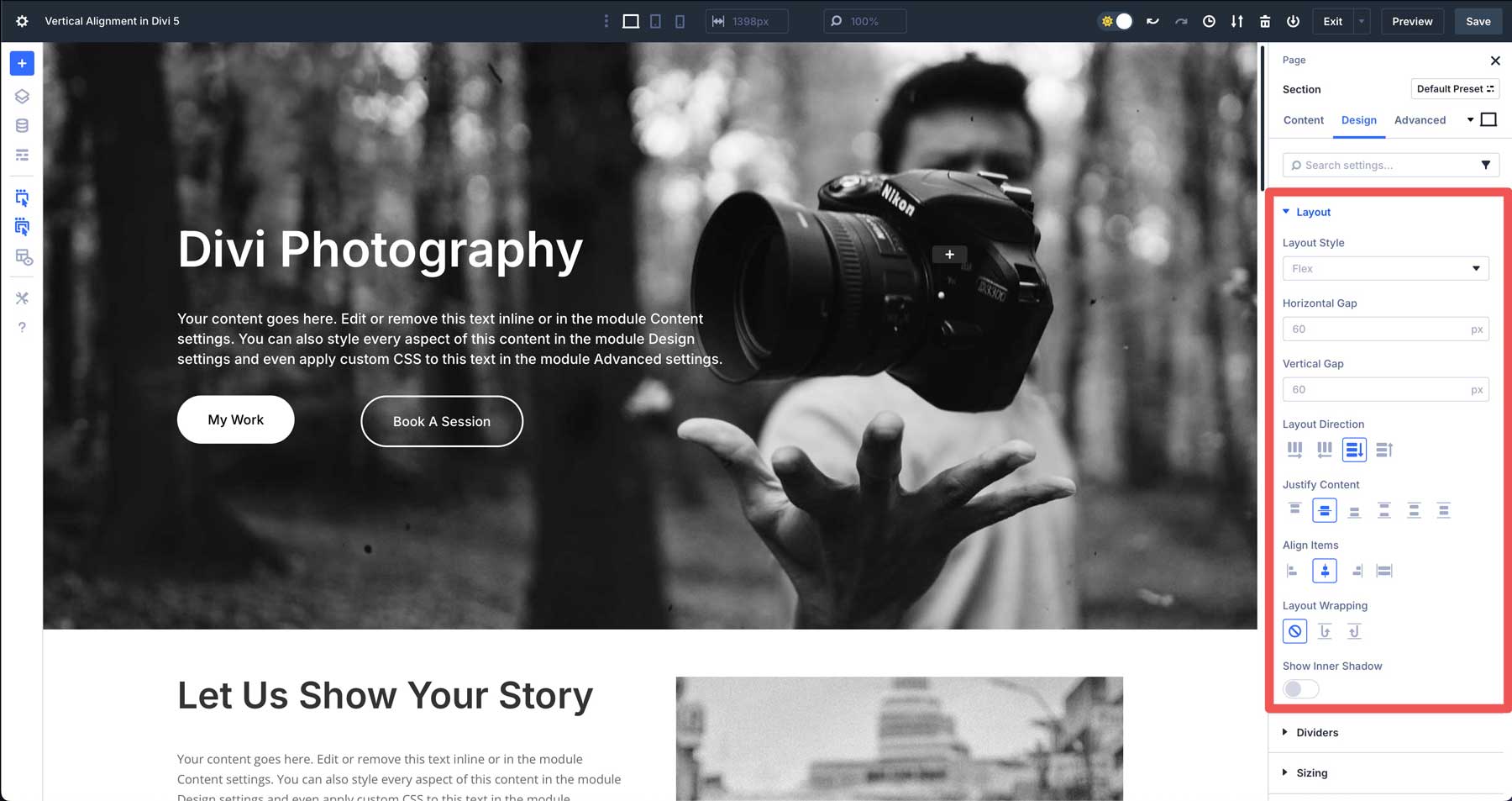
Vertical Alignment On A Section
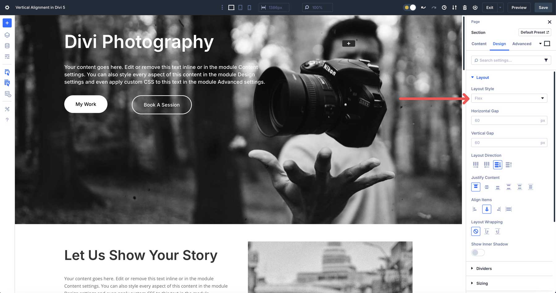
In the section’s settings, navigate to the Design tab and locate the Layout options, where you’ll find the Flexbox controls.
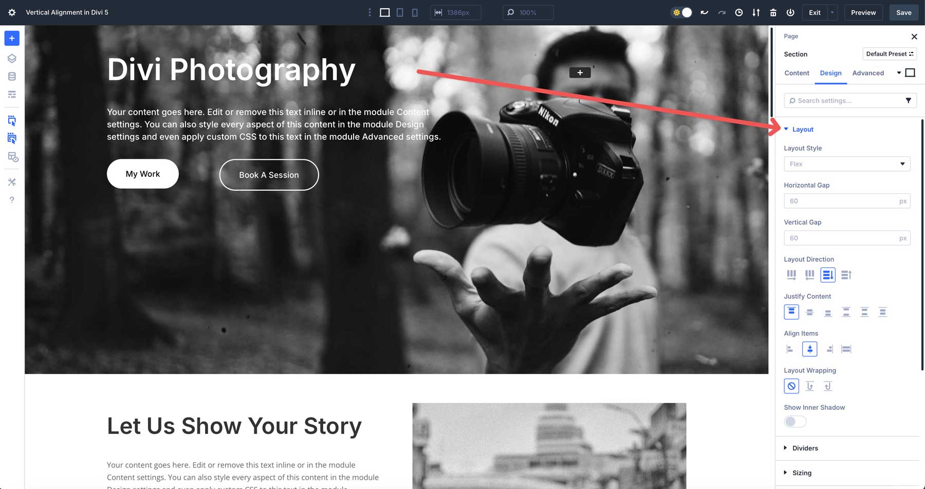
Ensure that Flex is selected under Layout Style. This ensures that Flexbox is enabled for the section.
By default, Start (flex-start) is selected under Justify Content. This aligns all items at the start of the container. In this example, when wanting to center items vertically, you can choose to align them to the center, space around, or space evenly. Since we have a single row with a Nested Row included, all the design elements in our section will center vertically with any option mentioned above.
Vertical Alignment On A Row
You can also vertically align content at the row level. However, in this example, we’ll use Align Items rather than Justify Content to vertically align the modules within the row. In the Design tab for the row, locate the Layout settings. Make sure you enable flex and find the Align Items settings. By default, Start is selected, and this aligns all the modules in the row to the top of the container.
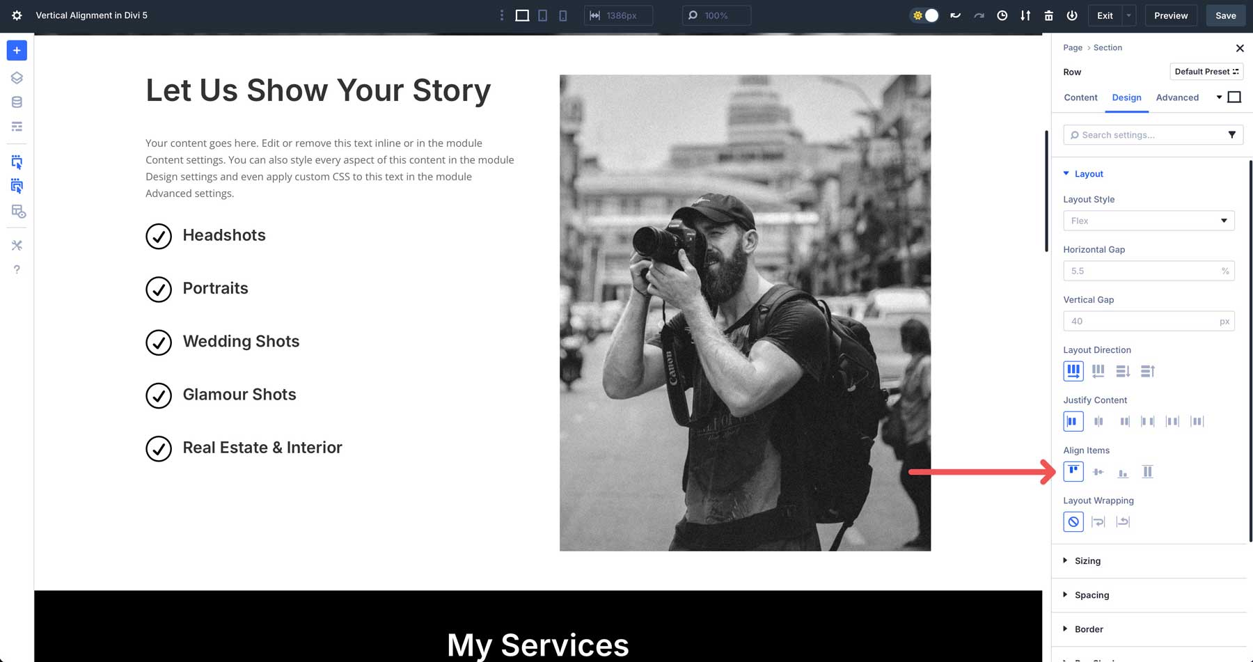
There are a few options depending on how you want to align the elements. Choose center if you’d like the items in the row to center vertically. When choosing end, all items will align to the bottom of the row. Stretch makes all items fill the row’s height.
Vertical Alignment On Multi-Row Sections
In this scenario, we have three rows in a section, including a single-column row and two three-column rows. We’ll use the Justify Content settings to vertically align all content within the rows.
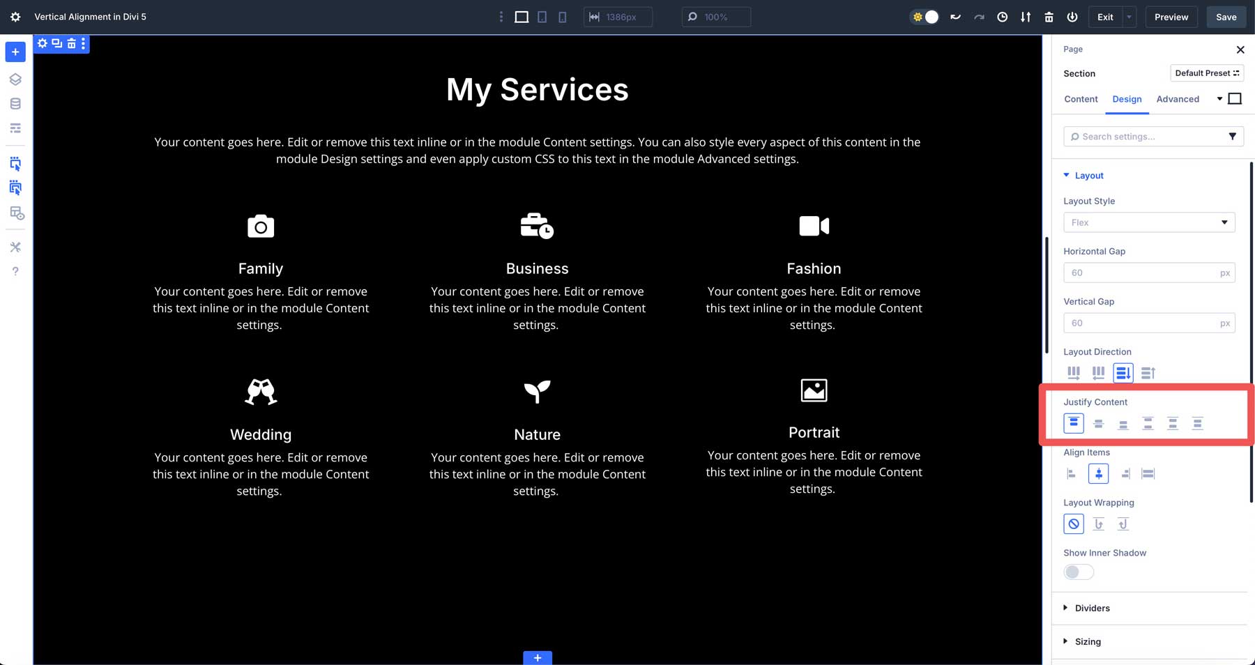
When a section uses columns as the Layout Direction, Justify Content will vertically align its rows. Start is selected by default. It aligns all rows to the top of the section. The rows will be packed together, starting from the top edge. Center aligns all rows in the section vertically. The rows will be packed together starting from the bottom edge. When you choose end, all rows align to the bottom of the section. The rows will pack together, starting from the bottom edge.
Space Between distributes the rows evenly along the main axis (vertical). The first row will be flush against the top of the section, the last row against the bottom, and any rows in between will have an equal amount of space separating them. Space Around distributes the rows with equal space around each item.
The space between adjacent rows will be double the space at the ends of the rows (the space between the first row and the top of the section, and the space between the last row and the bottom of the section). Finally, Space Evenly is similar to Space Around, but it ensures that the space between each row is the same, and the space at the beginning and end of the section is also equal to that spacing.
Vertical Alignment In Module Groups
Divi 5’s Flexbox system also simplifies vertical alignment within Module Groups, especially when using features like the Loop Builder for dynamic content. Consider a module group displaying blog posts with an image, post title, post excerpt, and a button. Without proper alignment, elements like buttons may appear misaligned across columns. In previous Divi versions, this required equal column heights and custom CSS. Divi 5 streamlines this process with Flexbox.
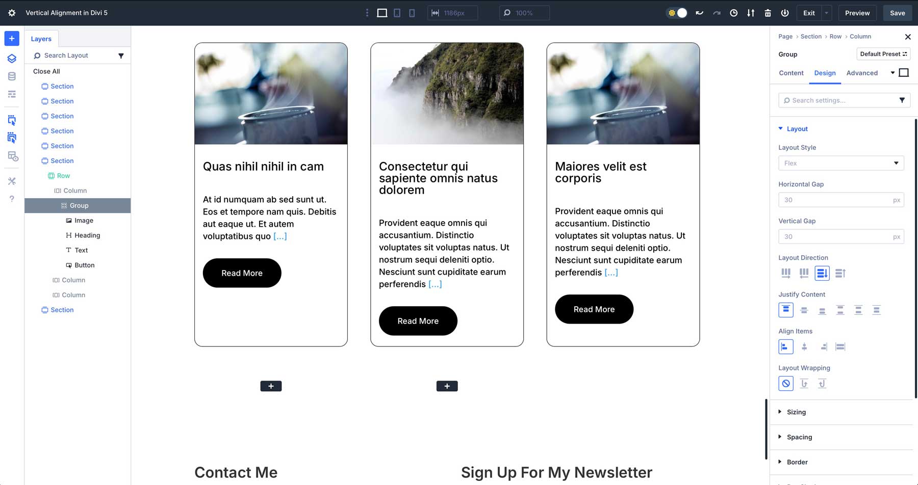
To align elements, click into the first column of the Module Group, navigate to the Design tab, and locate the Flex settings. Set Justify Content to Space Between. This evenly distributes the modules within the column, perfectly aligning the Read More buttons across all columns without custom CSS. This approach ensures consistent, professional layouts for dynamic content like blog grids or product listings.

Tips For Responsive Vertical Alignment
Divi 5’s Flexbox Layout System makes vertically aligning content easy, but there are some tips to consider. Divi 5 offers robust tools for responsive design, allowing you to fine-tune vertical alignment on all devices. Whether you’re centering content in a hero section or aligning buttons in a multi-column layout, the following tips will help you leverage Divi 5’s features to maintain consistent, professional layouts.
Use Divi 5’s Customizable Responsive Breakpoints
Divi 5’s Flexbox system allows you to customize module ordering and alignment for different screen sizes, ensuring your layouts adapt to all screen sizes. In the Visual Builder, you can use seven Customizable Responsive Breakpoints to control how layouts appear across devices.
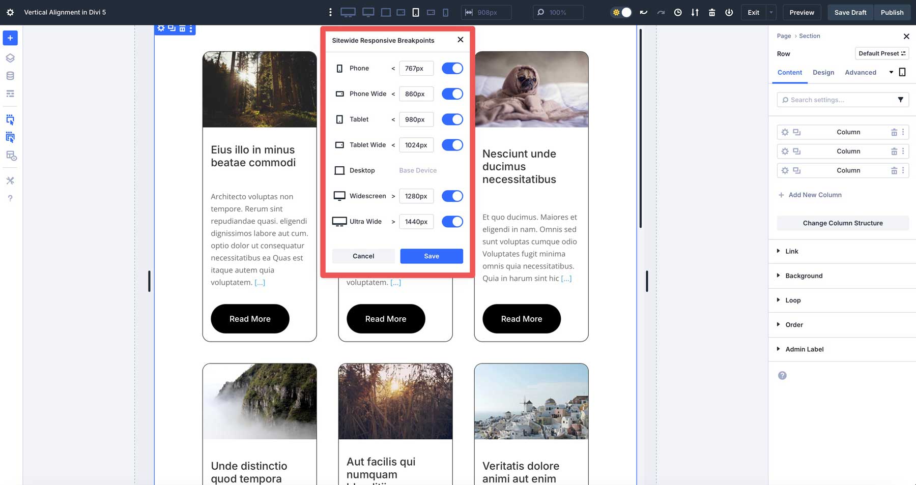
To optimize vertical alignment, you can adjust column structures on tablet and mobile devices. This ensures your layouts look perfect on every screen size. For example, you may want two columns on a tablet and only one on mobile devices.
Divi 5’s Flexbox Layout System also allows you to change the order of your columns on mobile devices, controlling what mobile users see first in a section or row.
Use Divi 5’s Design Variables
Divi 5’s Design Variables feature is perfect for maintaining consistent spacing and alignment across responsive views. Design Variables allow you to define reusable values for properties like padding, margins, and font sizes, ensuring uniformity in your layouts. For vertical alignment, you can create a variable for vertical padding to standardize spacing within rows or sections. For example, set a Design Variable named vertical padding to 30px in Divi’s Variable Manager.
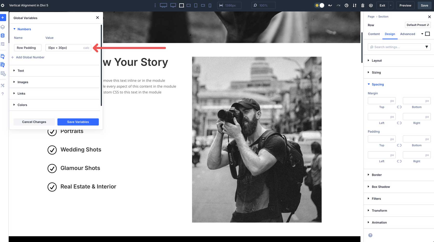
To apply the variable to a row, navigate to the Design tab, click the Spacing dropdown menu, and click the dynamic content icon to use it.
Flexbox Makes Vertical Alignment Easy
Divi 5’s Flexbox Layout System makes vertical alignment easy, offering a flexible and responsive solution for creating polished layouts. By integrating Flexbox into the Visual Builder, Divi 5 allows users to control the alignment of sections, rows, columns, and Module Groups with precision, all without needing advanced knowledge of CSS. Its features ensure consistent, professional designs across all devices. Whether you’re centering content, aligning dynamic Module Groups, or building multi-row layouts, Divi 5 simplifies the process while delivering results.
Download the latest Divi 5 Alpha and experiment with the Flexbox Layout System on a new project.


Leave A Reply